suiss/ui
  • Docs
  • Components
  • Patterns
  • Interactions
  • Charts
  • Blocks
GitHubGet started
DocsComponentsPatternsInteractionsChartsBlocks
Patterns19
  • Overview
  • Action Bar
  • Action Menu
  • App Shell
  • Command Palette
  • Confirm
  • Context Actions
  • Date Picker
  • Flyout
  • Modal
  • Navbar
  • Paged List
  • Panel
  • Picker
  • Preview
  • Search Picker
  • Segment Picker
  • Split View
  • Table List
  • Trail

suiss/ui · Pattern

Picker

A single-choice picker that renders a custom Select on desktop and a native select on mobile.

Picker is an open-source pattern from suiss/ui for React, React Native, SwiftUI and Jetpack Compose. The @esuiss/ui CLI copies its source into your project, so you own the code.

import { Picker, PickerItem } from "@/components/patterns/picker"

const fruits = [
  { value: "apple", label: "Apple" },
  { value: "banana", label: "Banana" },
  { value: "blueberry", label: "Blueberry" },
  { value: "grapes", label: "Grapes" },
  { value: "pineapple", label: "Pineapple" },
]

const fruitItems = fruits.map((fruit) => (
  <PickerItem key={fruit.value} value={fruit.value}>
    {fruit.label}
  </PickerItem>
))

export default function PickerDemo() {
  return (
    <Picker placeholder="Select a fruit" aria-label="Fruit" className="w-48">
      {fruitItems}
    </Picker>
  )
}

Picker lets the user choose one option from a short list. On desktop it renders a suiss/ui Select with a trigger, a popup list, labelled groups and separators. On mobile (below 48rem, via useIsMobile) it renders a NativeSelect, so the platform's own picker wheel or sheet appears; groups become optgroup elements and separators are omitted.

You describe options once with PickerItem, PickerGroup and PickerSeparator, and the same markup drives both presentations. Use it for form fields where the options are known and do not need search; for long lists, use SearchPicker.

Installation

CLI

$ pnpm dlx shadcn@latest add @esuiss/picker

Works in any project with a components.json. See Installation for the one-line registry setup. Or use the suiss/ui CLI:

$ pnpm dlx @esuiss/ui@latest add patterns picker

Manual

  1. Add the pieces it builds on: Native Select, Select, use-mobile.

  2. Copy the source into components/patterns/picker.tsx:

components/patterns/picker.tsx
"use client"

import * as React from "react"

import {
  NativeSelect,
  NativeSelectOptGroup,
  NativeSelectOption,
} from "@/components/ui/native-select"
import {
  Select,
  SelectContent,
  SelectGroup,
  SelectItem,
  SelectLabel,
  SelectSeparator,
  1. Update the import paths to match your project.

Usage

import { Picker, PickerGroup, PickerItem, PickerSeparator } from "@/components/patterns/picker"
<Picker placeholder="Select a fruit" aria-label="Fruit" className="w-48">{fruitItems}</Picker>
  • The value is uncontrolled by default; use defaultValue, or value with onValueChange to control it.
  • Picker collects the value and label of each PickerItem from its children so the desktop trigger can show the selected label. Pass items only when options are not rendered as direct or nested PickerItem elements.
  • PickerGroup, PickerItem and PickerSeparator must be used inside Picker, or they throw.
  • Give the picker an accessible name with aria-label or a Label that points at its id.

Examples

With value

Starts with an initial value through defaultValue.

import { Picker, PickerItem } from "@/components/patterns/picker"

const fruits = [
  { value: "apple", label: "Apple" },
  { value: "banana", label: "Banana" },
  { value: "blueberry", label: "Blueberry" },
  { value: "grapes", label: "Grapes" },
  { value: "pineapple", label: "Pineapple" },
]

const fruitItems = fruits.map((fruit) => (
  <PickerItem key={fruit.value} value={fruit.value}>
    {fruit.label}
  </PickerItem>
))

export default function PickerWithValue() {
  return (
    <Picker
      placeholder="Select a fruit"
      aria-label="Fruit"
      className="w-48"
      defaultValue="banana"
    >
      {fruitItems}
    </Picker>
  )
}

Sizes

Shows the sm and default sizes side by side.

import { Picker, PickerItem } from "@/components/patterns/picker"

const fruits = [
  { value: "apple", label: "Apple" },
  { value: "banana", label: "Banana" },
  { value: "blueberry", label: "Blueberry" },
  { value: "grapes", label: "Grapes" },
  { value: "pineapple", label: "Pineapple" },
]

const fruitItems = fruits.map((fruit) => (
  <PickerItem key={fruit.value} value={fruit.value}>
    {fruit.label}
  </PickerItem>
))

export default function PickerSizes() {
  return (
    <div className="flex items-center gap-3">
      <Picker
        placeholder="Select a fruit"
        aria-label="Fruit"
        className="w-48"
        size="sm"
      >
        {fruitItems}
      </Picker>
      <Picker placeholder="Select a fruit" aria-label="Fruit" className="w-48">
        {fruitItems}
      </Picker>
    </div>
  )
}

Grouped

Organizes options under labelled groups with a separator and a disabled option.

import {
  Picker,
  PickerGroup,
  PickerItem,
  PickerSeparator,
} from "@/components/patterns/picker"

export default function PickerGrouped() {
  return (
    <Picker
      placeholder="Select a time zone"
      aria-label="Time zone"
      className="w-64"
    >
      <PickerGroup label="North America">
        <PickerItem value="est">Eastern Time</PickerItem>
        <PickerItem value="cst">Central Time</PickerItem>
        <PickerItem value="pst">Pacific Time</PickerItem>
      </PickerGroup>
      <PickerSeparator />
      <PickerGroup label="Europe">
        <PickerItem value="gmt">Greenwich Mean Time</PickerItem>
        <PickerItem value="cet">Central European Time</PickerItem>
        <PickerItem value="trt" disabled>
          Turkey Time
        </PickerItem>
      </PickerGroup>
    </Picker>
  )
}

Disabled

Prevents opening and changing the value.

import { Picker, PickerItem } from "@/components/patterns/picker"

const fruits = [
  { value: "apple", label: "Apple" },
  { value: "banana", label: "Banana" },
  { value: "blueberry", label: "Blueberry" },
  { value: "grapes", label: "Grapes" },
  { value: "pineapple", label: "Pineapple" },
]

const fruitItems = fruits.map((fruit) => (
  <PickerItem key={fruit.value} value={fruit.value}>
    {fruit.label}
  </PickerItem>
))

export default function PickerDisabled() {
  return (
    <Picker
      placeholder="Select a fruit"
      aria-label="Fruit"
      className="w-48"
      disabled
    >
      {fruitItems}
    </Picker>
  )
}

Invalid

Shows the invalid style through aria-invalid.

import { Picker, PickerItem } from "@/components/patterns/picker"

const fruits = [
  { value: "apple", label: "Apple" },
  { value: "banana", label: "Banana" },
  { value: "blueberry", label: "Blueberry" },
  { value: "grapes", label: "Grapes" },
  { value: "pineapple", label: "Pineapple" },
]

const fruitItems = fruits.map((fruit) => (
  <PickerItem key={fruit.value} value={fruit.value}>
    {fruit.label}
  </PickerItem>
))

export default function PickerInvalid() {
  return (
    <Picker
      placeholder="Select a fruit"
      aria-label="Fruit"
      className="w-48"
      aria-invalid
    >
      {fruitItems}
    </Picker>
  )
}

Controlled

Owns the value in state with value and onValueChange.

import * as React from "react"
import { Picker, PickerItem } from "@/components/patterns/picker"

const fruits = [
  { value: "apple", label: "Apple" },
  { value: "banana", label: "Banana" },
  { value: "blueberry", label: "Blueberry" },
  { value: "grapes", label: "Grapes" },
  { value: "pineapple", label: "Pineapple" },
]

const fruitItems = fruits.map((fruit) => (
  <PickerItem key={fruit.value} value={fruit.value}>
    {fruit.label}
  </PickerItem>
))

function ControlledExample(props: React.ComponentProps<typeof Picker>) {
  const [value, setValue] = React.useState("grapes")

  return (
    <div className="flex flex-col items-start gap-2">
      <Picker {...props} value={value} onValueChange={setValue}>
        {fruitItems}
      </Picker>
      <p className="text-sm text-muted-foreground">Selected: {value}</p>
    </div>
  )
}

export default function PickerControlled() {
  return (
    <ControlledExample
      placeholder="Select a fruit"
      aria-label="Fruit"
      className="w-48"
    />
  )
}

API Reference

Anatomy4 parts
<Picker>
<PickerGroup>
<PickerItem />
</PickerGroup>
<PickerSeparator />
</Picker>
01

Picker

The root that renders the Select or native select and holds the value.

PropTypeDefaultDescription
valuestring-The selected value when controlled.
defaultValuestring-The initially selected value when uncontrolled.
onValueChange(value: string) => void-Called with the new value when the user picks an option.
placeholderstring-Text shown when no value is selected; on mobile it is a disabled first option.
itemsPickerItemData[]-Value and label pairs used to display the selected label; collected from PickerItem children when omitted.
size"sm" | "default""default"The control height.
idstring-The ID of the trigger on desktop or the native select on mobile.
namestring-The field name submitted with a form.
disabledboolean-Disables the picker.
requiredboolean-Marks the field as required for form validation.
classNamestring-Classes applied to the trigger on desktop or the native select on mobile.
childrenReact.ReactNode-The PickerItem, PickerGroup and PickerSeparator elements.
aria-invalidboolean-Marks the field as invalid and applies the error style.
aria-labelstring-The accessible name of the control.
aria-describedbystring-The ID of an element that describes the control.
02

PickerGroup

Groups related options under an optional label.

PropTypeDefaultDescription
labelstring-The group's heading; becomes the optgroup label on mobile.
childrenReact.ReactNode-The options in the group.
03

PickerItem

A selectable option.

PropTypeDefaultDescription
valuestringRequiredThe value selected by this option.
disabledboolean-Prevents selecting this option.
childrenReact.ReactNode-The option's label.

Accessibility

  • The desktop trigger has the combobox role and opens a listbox; the selected option has aria-selected, and disabled options have aria-disabled.
  • Labelled groups are exposed as group elements named by their label.
  • Escape closes the desktop list without changing the value.
  • On mobile the control is a native select, with the platform's built-in keyboard and screen reader support.

Notes

Styling hooks: data-slot="picker", picker-group, picker-item and picker-separator.
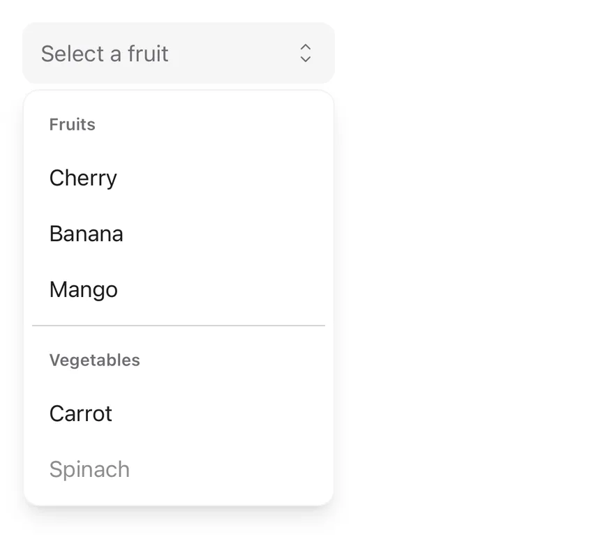
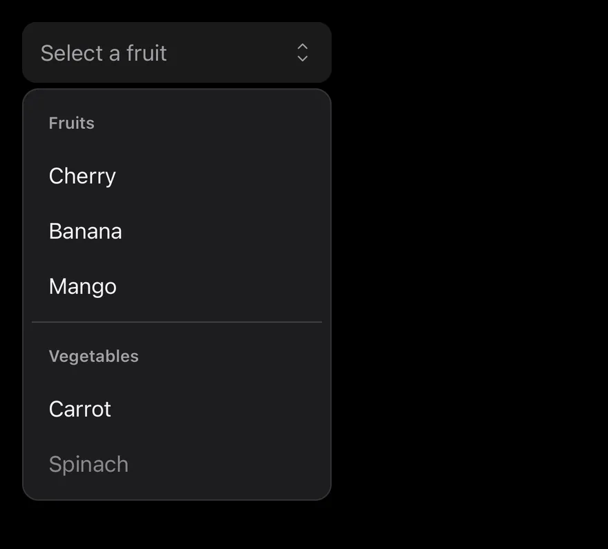
iOS
Picker on iOS in light modePicker on iOS in dark mode
import * as React from "react"
import { View } from "react-native"
import { Picker, PickerGroup, PickerItem, PickerSeparator } from "@/components/patterns/picker"
import { Text } from "@/components/ui/text"

function PickerDemo() {
  const [value, setValue] = React.useState<string>()
  return (
    <View className="gap-2">
      <Picker
        value={value}
        onValueChange={setValue}
        placeholder="Select a fruit"
        accessibilityLabel="Fruit"
        className="w-56"
      >
        <PickerGroup label="Fruits">
          <PickerItem value="cherry">Cherry</PickerItem>
          <PickerItem value="banana">Banana</PickerItem>
          <PickerItem value="mango">Mango</PickerItem>
        </PickerGroup>
        <PickerSeparator />
        <PickerGroup label="Vegetables">
          <PickerItem value="carrot">Carrot</PickerItem>
          <PickerItem value="spinach" disabled>
            Spinach
          </PickerItem>
        </PickerGroup>
      </Picker>
      <Text className="text-sm text-muted-foreground">
        Selected: {value ?? "none"}
      </Text>
    </View>
  )
}

export function PickerExample() {
  return (
    <PickerDemo />
  )
}
import EsuissUI
import SwiftUI

struct PickerDemo: View {
  @State private var value: String?

  var body: some View {
    VStack(alignment: .leading, spacing: 8) {
      OptionPicker(selection: $value, placeholder: "Select a fruit") {
        OptionPickerGroup("Fruits") {
          OptionPickerItem("Cherry", value: "cherry")
          OptionPickerItem("Banana", value: "banana")
          OptionPickerItem("Mango", value: "mango")
        }
        OptionPickerSeparator()
        OptionPickerGroup("Vegetables") {
          OptionPickerItem("Carrot", value: "carrot")
          OptionPickerItem("Spinach", value: "spinach")
            .disabled(true)
        }
      }
      .frame(width: 224)
      .accessibilityLabel(Text("Fruit"))
      Text(verbatim: "Selected: \(value ?? "none")")
        .textStyle(.sm)
        .foregroundStyle(EsuissColor.mutedForeground)
    }
  }
}
import androidx.compose.foundation.layout.Arrangement
import androidx.compose.foundation.layout.Column
import androidx.compose.foundation.layout.width
import androidx.compose.runtime.Composable
import androidx.compose.runtime.getValue
import androidx.compose.runtime.mutableStateOf
import androidx.compose.runtime.saveable.rememberSaveable
import androidx.compose.runtime.setValue
import androidx.compose.ui.Modifier
import androidx.compose.ui.semantics.contentDescription
import androidx.compose.ui.semantics.semantics
import androidx.compose.ui.unit.dp
import com.esuiss.ui.components.Text
import com.esuiss.ui.patterns.Picker
import com.esuiss.ui.patterns.PickerGroup
import com.esuiss.ui.patterns.PickerItem
import com.esuiss.ui.patterns.PickerSeparator
import com.esuiss.ui.theme.EsuissTheme
import com.esuiss.ui.theme.Typography

@Composable
fun PickerDefault() {
    var value by rememberSaveable { mutableStateOf<String?>(null) }
    Column(verticalArrangement = Arrangement.spacedBy(8.dp)) {
        Picker(
            value = value,
            onValueChange = { value = it },
            modifier = Modifier.width(224.dp).semantics { contentDescription = "Fruit" },
            placeholder = "Select a fruit",
        ) {
            PickerGroup(label = "Fruits") {
                PickerItem("cherry", "Cherry")
                PickerItem("banana", "Banana")
                PickerItem("mango", "Mango")
            }
            PickerSeparator()
            PickerGroup(label = "Vegetables") {
                PickerItem("carrot", "Carrot")
                PickerItem("spinach", "Spinach", enabled = false)
            }
        }
        Text("Selected: ${value ?: "none"}", style = Typography.sm.copy(color = EsuissTheme.colors.mutedForeground))
    }
}

Picker composes Select: a SelectTrigger showing the current value and a SelectContent popup with the options. The selected option shows a check mark.

Use it to choose one value from a short or grouped list in a form.

Installation

$ pnpm dlx shadcn@latest add @esuiss-rn/picker

See Installation for the components.json setup. Or use the suiss/ui CLI:

$ pnpm dlx @esuiss/ui@latest add picker
$ pnpm dlx @esuiss/ui@latest add picker --platform swift
$ pnpm dlx @esuiss/ui@latest add picker --platform kotlin

The CLI also adds what it builds on: Select.

Manual

  1. Add the pieces it builds on: Select.

  2. Copy the source into components/patterns/picker.tsx:

uniwind/components/patterns/picker.tsx
import * as React from "react"
import {
  Select,
  SelectContent,
  SelectGroup,
  SelectItem,
  SelectLabel,
  SelectSeparator,
  SelectTrigger,
  SelectValue,
} from "@/components/ui/select"

type PickerItemData = {
  value: string
  label: React.ReactNode
}
  1. Update the import paths to match your project.
  1. Add the pieces it builds on: Select.

  2. Copy the source into components/patterns/picker.tsx:

nativewind/components/patterns/picker.tsx
import * as React from "react"
import {
  Select,
  SelectContent,
  SelectGroup,
  SelectItem,
  SelectLabel,
  SelectSeparator,
  SelectTrigger,
  SelectValue,
} from "@/components/ui/select"

type PickerItemData = {
  value: string
  label: React.ReactNode
}
  1. Update the import paths to match your project.
  1. Add the pieces it builds on: Select.

  2. Copy the source into components/patterns/picker.tsx:

stylesheet/components/patterns/picker.tsx
import * as React from "react"
import type { StyleProp, ViewStyle } from "react-native"
import {
  Select,
  SelectContent,
  SelectGroup,
  SelectItem,
  SelectLabel,
  SelectSeparator,
  SelectTrigger,
  SelectValue,
} from "@/components/ui/select"

type PickerItemData = {
  value: string
  label: React.ReactNode
  1. Update the import paths to match your project.
  1. Target iOS 17 or later.

  2. Add the Swift package to your app:

Package.swift
.package(url: "https://github.com/phosphor-icons/swift", from: "2.1.0")
  1. Copy the theme files every view uses:
swift/Theme/Theme.swift
import SwiftUI
import UIKit

struct RGBA: Sendable {
  let red: CGFloat
  let green: CGFloat
  let blue: CGFloat
  let alpha: CGFloat

  init(_ hex: UInt32, _ alpha: CGFloat = 1) {
    red = CGFloat((hex >> 16) & 0xFF) / 255
    green = CGFloat((hex >> 8) & 0xFF) / 255
    blue = CGFloat(hex & 0xFF) / 255
    self.alpha = alpha
  }
swift/Theme/Tokens.swift
import SwiftUI

public enum EsuissColor {
  public static let background = Color.adaptive(light: .init(0xFFFFFF), dark: .init(0x000000))
  public static let foreground = Color.adaptive(light: .init(0x1D1D1F), dark: .init(0xF5F5F7))
  public static let card = Color.adaptive(light: .init(0xFFFFFF), dark: .init(0x1D1D1F))
  public static let cardForeground = Color.adaptive(light: .init(0x1D1D1F), dark: .init(0xF5F5F7))
  public static let popover = Color.adaptive(light: .init(0xFFFFFF), dark: .init(0x1D1D1F))
  public static let popoverForeground = Color.adaptive(light: .init(0x1D1D1F), dark: .init(0xF5F5F7))
  public static let primary = Color.adaptive(light: .init(0x0071E3), dark: .init(0x2997FF))
  public static let primaryForeground = Color.adaptive(light: .init(0xFFFFFF), dark: .init(0xFFFFFF))
  public static let secondary = Color.adaptive(light: .init(0x000000, 0.04), dark: .init(0xFFFFFF, 0.1))
  public static let secondaryForeground = Color.adaptive(light: .init(0x1D1D1F), dark: .init(0xF5F5F7))
  public static let muted = Color.adaptive(light: .init(0xF5F5F7), dark: .init(0x161617))
  public static let mutedForeground = Color.adaptive(light: .init(0x6E6E73), dark: .init(0xA1A1A6))
  public static let accent = Color.adaptive(light: .init(0x000000, 0.06), dark: .init(0xFFFFFF, 0.1))
  1. Copy the source and every file it uses:
swift/Patterns/OptionPicker.swift
import PhosphorSwift
import SwiftUI

extension EnvironmentValues {
  @Entry var optionPickerNative = false
}

public struct OptionPicker<Value: Hashable & Sendable, Content: View>: View {
  public typealias Size = SelectSize

  let selection: Binding<Value?>
  let placeholder: LocalizedStringKey
  let size: Size
  let content: () -> Content

  @State private var labels: [AnyHashable: Text] = [:]
swift/Components/Button.swift
import SwiftUI

public struct VariantButtonStyle: ButtonStyle {
  public enum Variant: CaseIterable, Sendable {
    case `default`, outline, secondary, tinted, ghost, plain, destructive, link
  }

  public enum Size: CaseIterable, Sendable {
    case `default`, xs, sm, lg, xl, icon, iconXs, iconSm, iconLg, iconXl

    var height: CGFloat {
      switch self {
      case .xs, .iconXs: 24
      case .sm, .iconSm: 32
      case .default, .icon: 36
      case .lg, .iconLg: 44
swift/Components/ButtonGroup.swift
import SwiftUI

extension EnvironmentValues {
  @Entry var buttonGroup: Axis? = nil
  @Entry var buttonGroupSize: CGSize = .zero
}

enum ButtonGroupSpace: Hashable {
  case group
}

struct ButtonGroupFrame {
  let bounds: Anchor<CGRect>
  let outlined: Bool
}
swift/Components/DropdownMenu.swift
import PhosphorSwift
import SwiftUI

enum MenuPresentation: Sendable {
  case system, popup
}

extension EnvironmentValues {
  @Entry var menuPresentation: MenuPresentation = .system
  @Entry var menuRadio = MenuRadioContext()
}

struct MenuRadioContext: @unchecked Sendable {
  var selected: AnyHashable?
  var select: @MainActor @Sendable (AnyHashable) -> Void = { _ in }
}
swift/Components/Field.swift
import SwiftUI

extension EnvironmentValues {
  @Entry public var isInvalid = false
  @Entry var fieldInset = false
  @Entry var fieldGroupInset = false
  @Entry var fieldSetInset = false
}

extension View {
  public func invalid(_ isInvalid: Bool = true) -> some View {
    environment(\.isInvalid, isInvalid)
  }
}

public enum FieldOrientation: CaseIterable, Sendable {
swift/Components/Overlay.swift
import PhosphorSwift
import Observation
import SwiftUI

public enum PopupAlignment: Sendable, CaseIterable {
  case start, center, end
}

struct OverlayDismiss: Sendable {
  let action: @MainActor @Sendable () -> Void

  @MainActor func callAsFunction() {
    action()
  }
}
swift/Components/Select.swift
import PhosphorSwift
import SwiftUI

struct SelectContext: @unchecked Sendable {
  var selected: AnyHashable?
  var registering = false
  var select: @MainActor @Sendable (AnyHashable) -> Void = { _ in }
}

extension EnvironmentValues {
  @Entry var select = SelectContext()
}

struct SelectLabelsKey: PreferenceKey {
  static var defaultValue: [AnyHashable: Text] { [:] }
swift/Components/Separator.swift
import SwiftUI

public struct Separator: View {
  let orientation: Axis

  public init(_ orientation: Axis = .horizontal) {
    self.orientation = orientation
  }

  public var body: some View {
    Rectangle()
      .fill(EsuissColor.border)
      .frame(width: orientation == .vertical ? 1 : nil, height: orientation == .horizontal ? 1 : nil)
      .frame(maxWidth: orientation == .horizontal ? .infinity : nil, maxHeight: orientation == .vertical ? .infinity : nil)
      .accessibilityHidden(true)
  }
swift/Components/TextVariant.swift
import SwiftUI

public enum TextVariant: CaseIterable, Sendable {
  case `default`, h1, h2, h3, h4, p, blockquote, code, lead, large, small, muted

  var style: TextStyle {
    switch self {
    case .h1: .xl3
    case .h2: .xl2
    case .h3: .xl
    case .h4, .lead, .large: .lg
    case .code, .small, .muted: .sm
    default: .base
    }
  }
swift/Patterns/Adaptive.swift
import SwiftUI

extension EnvironmentValues {
  @Entry var patternCompact: Bool? = nil
}

@propertyWrapper
struct CompactLayout: DynamicProperty {
  @Environment(\.patternCompact) private var forced
  @Environment(\.horizontalSizeClass) private var sizeClass

  init() {}

  var wrappedValue: Bool {
    forced ?? (sizeClass != .regular)
  }
  1. Add the files to your app target.
  1. Set minSdk to 24 or higher and add the dependencies:
build.gradle.kts
implementation(platform("androidx.compose:compose-bom:2026.09.00"))
implementation("androidx.compose.foundation:foundation")
implementation("androidx.compose.ui:ui")
implementation("com.adamglin:phosphor-icon-android:1.0.0")
  1. Copy the theme files every view uses:
kotlin/theme/Theme.kt
package com.esuiss.ui.theme

import androidx.compose.foundation.isSystemInDarkTheme
import androidx.compose.runtime.Composable
import androidx.compose.runtime.CompositionLocalProvider
import androidx.compose.runtime.Immutable
import androidx.compose.runtime.staticCompositionLocalOf
import androidx.compose.ui.Modifier
import androidx.compose.ui.draw.dropShadow
import androidx.compose.ui.graphics.Color
import androidx.compose.ui.graphics.Shape
import androidx.compose.ui.graphics.shadow.Shadow as DropShadow
import androidx.compose.ui.text.TextStyle
import androidx.compose.ui.text.style.LineHeightStyle
import androidx.compose.ui.unit.Dp
import androidx.compose.ui.unit.DpOffset
kotlin/theme/Tokens.kt
package com.esuiss.ui.theme

import androidx.compose.runtime.Immutable
import androidx.compose.ui.graphics.Color
import androidx.compose.ui.unit.dp

@Immutable
data class Colors(
    val background: Color,
    val foreground: Color,
    val card: Color,
    val cardForeground: Color,
    val popover: Color,
    val popoverForeground: Color,
    val primary: Color,
    val primaryForeground: Color,
  1. Copy the source and every file it uses:
kotlin/patterns/Picker.kt
package com.esuiss.ui.patterns

import androidx.compose.foundation.layout.ColumnScope
import androidx.compose.runtime.Composable
import androidx.compose.runtime.Immutable
import androidx.compose.ui.Modifier
import com.esuiss.ui.components.Select
import com.esuiss.ui.components.SelectGroup
import com.esuiss.ui.components.SelectItem
import com.esuiss.ui.components.SelectLabel
import com.esuiss.ui.components.SelectSeparator
import com.esuiss.ui.components.SelectSize

@Immutable
class PickerItemData(
    val value: String,
kotlin/components/Button.kt
package com.esuiss.ui.components

import androidx.compose.foundation.background
import androidx.compose.foundation.border
import androidx.compose.foundation.clickable
import androidx.compose.foundation.interaction.MutableInteractionSource
import androidx.compose.foundation.interaction.collectIsPressedAsState
import androidx.compose.foundation.layout.Arrangement
import androidx.compose.foundation.layout.Row
import androidx.compose.foundation.layout.RowScope
import androidx.compose.foundation.layout.fillMaxWidth
import androidx.compose.foundation.layout.height
import androidx.compose.foundation.layout.padding
import androidx.compose.foundation.layout.size
import androidx.compose.foundation.shape.CircleShape
import androidx.compose.foundation.shape.RoundedCornerShape
kotlin/components/ButtonGroup.kt
package com.esuiss.ui.components

import androidx.compose.foundation.background
import androidx.compose.foundation.gestures.Orientation
import androidx.compose.foundation.layout.Arrangement
import androidx.compose.foundation.layout.Box
import androidx.compose.foundation.layout.Row
import androidx.compose.foundation.layout.RowScope
import androidx.compose.foundation.layout.padding
import androidx.compose.foundation.shape.CircleShape
import androidx.compose.foundation.shape.CornerSize
import androidx.compose.foundation.shape.RoundedCornerShape
import androidx.compose.runtime.Composable
import androidx.compose.runtime.CompositionLocalProvider
import androidx.compose.runtime.DisposableEffect
import androidx.compose.runtime.Immutable
kotlin/components/Content.kt
package com.esuiss.ui.components

import androidx.compose.runtime.compositionLocalOf
import androidx.compose.ui.graphics.Color
import androidx.compose.ui.text.TextStyle
import androidx.compose.ui.unit.Dp
import androidx.compose.ui.unit.dp

val LocalContentStyle = compositionLocalOf { TextStyle.Default }

val LocalContentColor = compositionLocalOf { Color.Unspecified }

val LocalIconSize = compositionLocalOf { 20.dp }
kotlin/components/Field.kt
package com.esuiss.ui.components

import androidx.compose.foundation.background
import androidx.compose.foundation.gestures.Orientation
import androidx.compose.foundation.layout.Arrangement
import androidx.compose.foundation.layout.Box
import androidx.compose.foundation.layout.Column
import androidx.compose.foundation.layout.ColumnScope
import androidx.compose.foundation.layout.LayoutScopeMarker
import androidx.compose.foundation.layout.Row
import androidx.compose.foundation.layout.RowScope
import androidx.compose.foundation.layout.fillMaxWidth
import androidx.compose.foundation.layout.heightIn
import androidx.compose.foundation.layout.padding
import androidx.compose.foundation.shape.RoundedCornerShape
import androidx.compose.foundation.text.BasicText
kotlin/components/FormSupport.kt
package com.esuiss.ui.components

import android.provider.Settings
import androidx.compose.animation.core.CubicBezierEasing
import androidx.compose.foundation.background
import androidx.compose.foundation.border
import androidx.compose.foundation.gestures.Orientation
import androidx.compose.foundation.text.selection.TextSelectionColors
import androidx.compose.runtime.Composable
import androidx.compose.runtime.mutableStateOf
import androidx.compose.runtime.remember
import androidx.compose.ui.Modifier
import androidx.compose.ui.draw.alpha
import androidx.compose.ui.draw.clip
import androidx.compose.ui.draw.drawWithContent
import androidx.compose.ui.geometry.Offset
kotlin/components/Icon.kt
package com.esuiss.ui.components

import androidx.compose.foundation.Image
import androidx.compose.foundation.layout.size
import androidx.compose.runtime.Composable
import androidx.compose.ui.Modifier
import androidx.compose.ui.graphics.Color
import androidx.compose.ui.graphics.ColorFilter
import androidx.compose.ui.graphics.takeOrElse
import androidx.compose.ui.graphics.vector.ImageVector
import androidx.compose.ui.unit.Dp
import com.esuiss.ui.theme.EsuissTheme

@Composable
fun Icon(
    imageVector: ImageVector,
kotlin/components/Label.kt
package com.esuiss.ui.components

import androidx.compose.foundation.layout.Arrangement
import androidx.compose.foundation.layout.Row
import androidx.compose.foundation.layout.RowScope
import androidx.compose.foundation.text.BasicText
import androidx.compose.runtime.Composable
import androidx.compose.runtime.CompositionLocalProvider
import androidx.compose.ui.Alignment
import androidx.compose.ui.Modifier
import androidx.compose.ui.draw.alpha
import androidx.compose.ui.text.font.FontWeight
import androidx.compose.ui.unit.dp
import com.esuiss.ui.theme.EsuissTheme
import com.esuiss.ui.theme.Typography
kotlin/components/Overlay.kt
package com.esuiss.ui.components

import android.os.Build
import android.view.Window
import android.view.WindowManager
import androidx.compose.animation.AnimatedVisibility
import androidx.compose.animation.AnimatedVisibilityScope
import androidx.compose.animation.EnterExitState
import androidx.compose.animation.core.MutableTransitionState
import androidx.compose.animation.core.animateFloat
import androidx.compose.animation.core.tween
import androidx.compose.animation.fadeIn
import androidx.compose.animation.fadeOut
import androidx.compose.animation.scaleIn
import androidx.compose.animation.scaleOut
import androidx.compose.animation.slideIn
kotlin/components/Select.kt
package com.esuiss.ui.components

import androidx.compose.foundation.background
import androidx.compose.foundation.border
import androidx.compose.foundation.clickable
import androidx.compose.foundation.interaction.MutableInteractionSource
import androidx.compose.foundation.interaction.collectIsPressedAsState
import androidx.compose.foundation.layout.Arrangement
import androidx.compose.foundation.layout.Box
import androidx.compose.foundation.layout.Column
import androidx.compose.foundation.layout.ColumnScope
import androidx.compose.foundation.layout.IntrinsicSize
import androidx.compose.foundation.layout.Row
import androidx.compose.foundation.layout.fillMaxWidth
import androidx.compose.foundation.layout.height
import androidx.compose.foundation.layout.heightIn
kotlin/components/Separator.kt
package com.esuiss.ui.components

import androidx.compose.foundation.background
import androidx.compose.foundation.gestures.Orientation
import androidx.compose.foundation.layout.Box
import androidx.compose.foundation.layout.fillMaxHeight
import androidx.compose.foundation.layout.fillMaxWidth
import androidx.compose.foundation.layout.height
import androidx.compose.foundation.layout.width
import androidx.compose.runtime.Composable
import androidx.compose.ui.Modifier
import androidx.compose.ui.unit.dp
import com.esuiss.ui.theme.EsuissTheme

@Composable
fun Separator(
  1. Update the com.esuiss.ui package names to match your project.

Usage

import { Picker, PickerGroup, PickerItem, PickerSeparator } from "@/components/patterns/picker"
<PickerDemo />

List PickerItems as children, optionally inside PickerGroups separated by PickerSeparator. The picker collects the items from its children to show the selected label, or you can pass items directly.

Use it uncontrolled with defaultValue, or controlled with value and onValueChange. placeholder shows while nothing is selected.

Examples

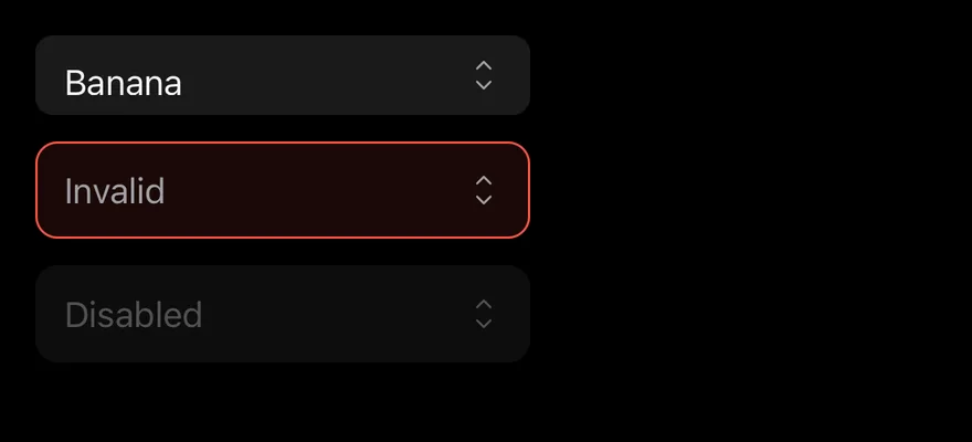
States

A small picker with a value, an invalid picker and a disabled picker.
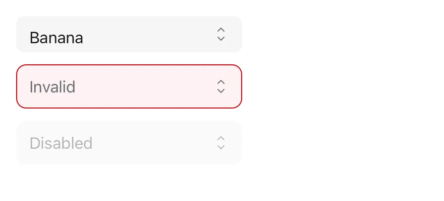
iOS
Picker (states) on iOS in light modePicker (states) on iOS in dark mode
import { View } from "react-native"
import { Picker, PickerItem } from "@/components/patterns/picker"

export function PickerStatesExample() {
  return (
    <View className="gap-3">
      <Picker defaultValue="banana" size="sm" className="w-56">
        <PickerItem value="cherry">Cherry</PickerItem>
        <PickerItem value="banana">Banana</PickerItem>
      </Picker>
      <Picker placeholder="Invalid" invalid className="w-56">
        <PickerItem value="cherry">Cherry</PickerItem>
      </Picker>
      <Picker placeholder="Disabled" disabled className="w-56">
        <PickerItem value="cherry">Cherry</PickerItem>
      </Picker>
    </View>
  )
}
import EsuissUI
import SwiftUI

struct PickerStates: View {
  @State private var small: String? = "banana"
  @State private var invalid: String?
  @State private var disabled: String?

  var body: some View {
    VStack(alignment: .leading, spacing: 12) {
      OptionPicker(selection: $small, size: .sm) {
        OptionPickerItem("Cherry", value: "cherry")
        OptionPickerItem("Banana", value: "banana")
      }
      .frame(width: 224)
      OptionPicker(selection: $invalid, placeholder: "Invalid") {
        OptionPickerItem("Cherry", value: "cherry")
      }
      .frame(width: 224)
      .invalid()
      OptionPicker(selection: $disabled, placeholder: "Disabled") {
        OptionPickerItem("Cherry", value: "cherry")
      }
      .frame(width: 224)
      .disabled(true)
    }
  }
}
import androidx.compose.foundation.layout.Arrangement
import androidx.compose.foundation.layout.Column
import androidx.compose.foundation.layout.width
import androidx.compose.runtime.Composable
import androidx.compose.runtime.getValue
import androidx.compose.runtime.mutableStateOf
import androidx.compose.runtime.saveable.rememberSaveable
import androidx.compose.runtime.setValue
import androidx.compose.ui.Modifier
import androidx.compose.ui.unit.dp
import com.esuiss.ui.components.SelectSize
import com.esuiss.ui.patterns.Picker
import com.esuiss.ui.patterns.PickerItem

@Composable
fun PickerStates() {
    var fruit by rememberSaveable { mutableStateOf<String?>("banana") }
    var invalid by rememberSaveable { mutableStateOf<String?>(null) }
    Column(verticalArrangement = Arrangement.spacedBy(12.dp)) {
        Picker(
            value = fruit,
            onValueChange = { fruit = it },
            modifier = Modifier.width(224.dp),
            size = SelectSize.Sm,
        ) {
            PickerItem("cherry", "Cherry")
            PickerItem("banana", "Banana")
        }
        Picker(
            value = invalid,
            onValueChange = { invalid = it },
            modifier = Modifier.width(224.dp),
            placeholder = "Invalid",
            invalid = true,
        ) {
            PickerItem("cherry", "Cherry")
        }
        Picker(
            value = null,
            onValueChange = {},
            modifier = Modifier.width(224.dp),
            placeholder = "Disabled",
            enabled = false,
        ) {
            PickerItem("cherry", "Cherry")
        }
    }
}

API Reference

01

Picker

The root that renders the trigger and the options popup.

PropTypeDefaultDescription
valuestring-The selected value when controlled.
defaultValuestring-The initial value when uncontrolled.
onValueChange(value: string) => void-Called with the new value when an option is chosen.
placeholderstring-Text shown when no value is selected.
itemsPickerItemData[]-{ value, label } pairs used to show the selected label; collected from children when omitted.
size"sm" | "default""default"Trigger height: sm or default.
disabledboolean-Prevents opening the list.
invalidboolean-Applies the error style to the trigger.
classNamestring-
accessibilityLabelstring-Label for the trigger.
accessibilityLabelledBystring-Links the trigger to a visible label.
childrenReact.ReactNode-
02

PickerGroup

Groups options under an optional label.

PropTypeDefaultDescription
labelstring-Heading shown above the group.
childrenReact.ReactNode-
03

PickerItem

One selectable option.

PropTypeDefaultDescription
valuestringRequiredThe value this option selects.
disabledboolean-Prevents choosing this option.
childrenReact.ReactNode-

Accessibility

  • Give the picker an accessibilityLabel or accessibilityLabelledBy, since the trigger shows only the value.

Notes

  • The popup uses bg-popover with a subtle border that is stronger in dark mode.
  • The popup fades in and out, and respects the system reduce motion setting.
  • On iOS the popup renders in a full-window overlay so it appears above native screens.
NextPreviewPreviousPanel

On this page

  1. 01Installation
    • CLI
    • Manual
  2. 02Usage
  3. 03Examples
    • With value
    • Sizes
    • Grouped
    • Disabled
    • Invalid
    • Controlled
  4. 04API Reference
    • Picker
    • PickerGroup
    • PickerItem
  5. 05Accessibility
  6. 06Notes
  7. 07Installation
    • Manual
  8. 08Usage
  9. 09Examples
    • States
  10. 10API Reference
    • Picker
    • PickerGroup
    • PickerItem
  11. 11Accessibility
  12. 12Notes