suiss/ui · Pattern
Split View
A two- or three-column sidebar, list and detail layout that becomes a push navigation stack on mobile.
Split View is an open-source pattern from suiss/ui for React, React Native, SwiftUI and Jetpack Compose. The @esuiss/ui CLI copies its source into your project, so you own the code.
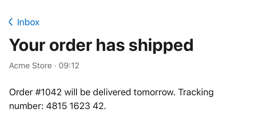
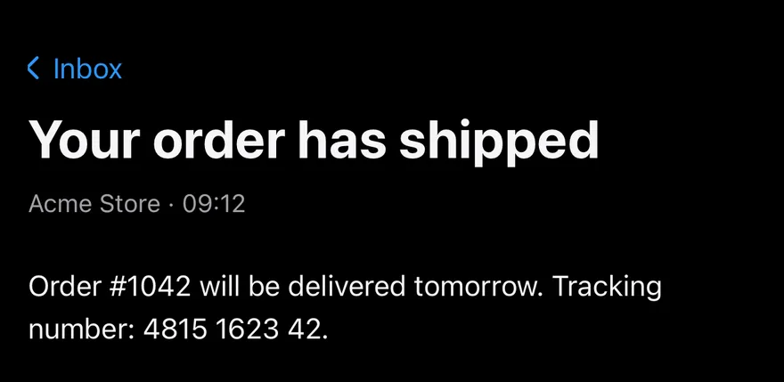
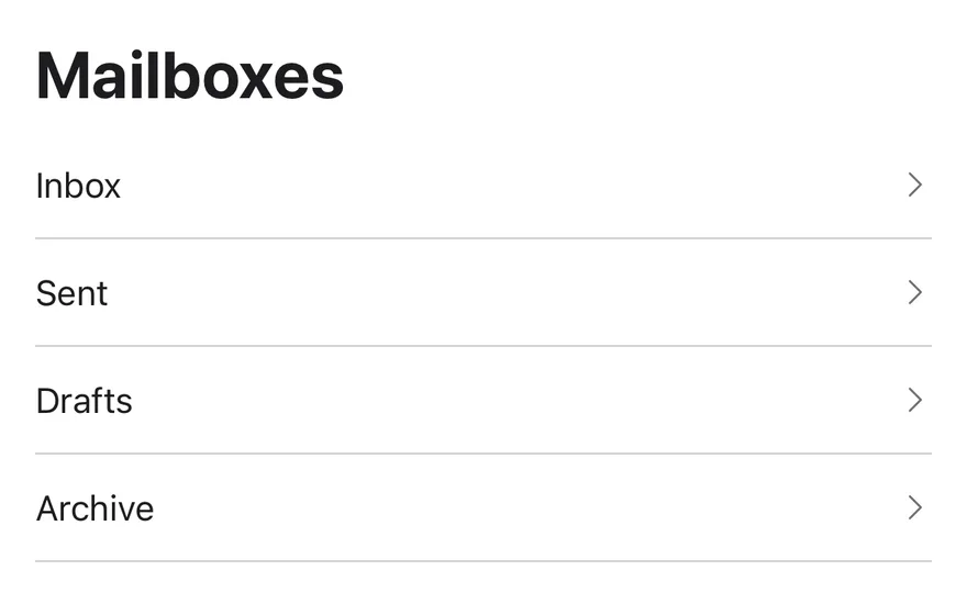
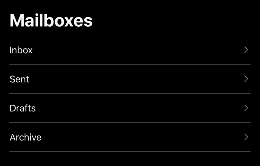
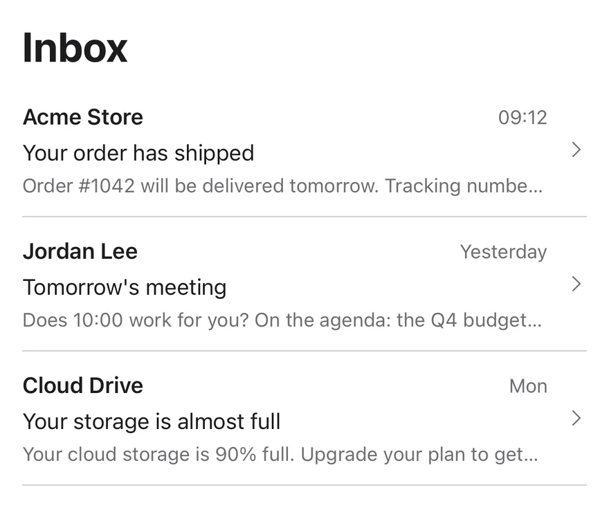
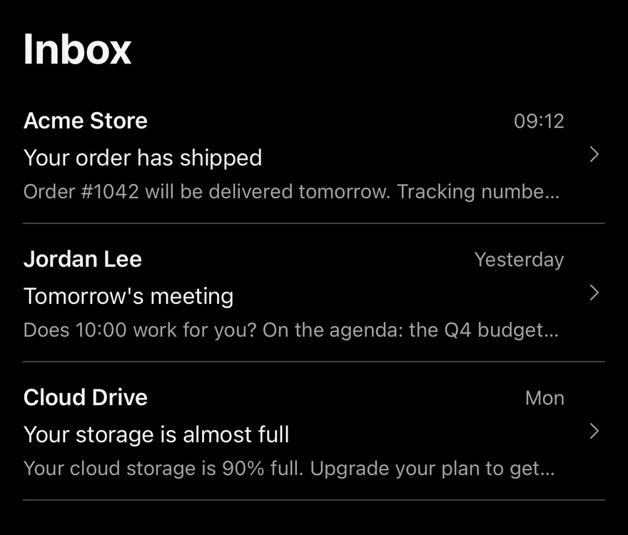
SplitView arranges content in up to three columns, like Mail: a sidebar, a list and a detail pane. On desktop it places the panes in a horizontal suiss/ui ResizablePanelGroup with resize handles between them. The panes default to 20%, 32% and 48% of the width, with minimum sizes of 15%, 22% and 30%.
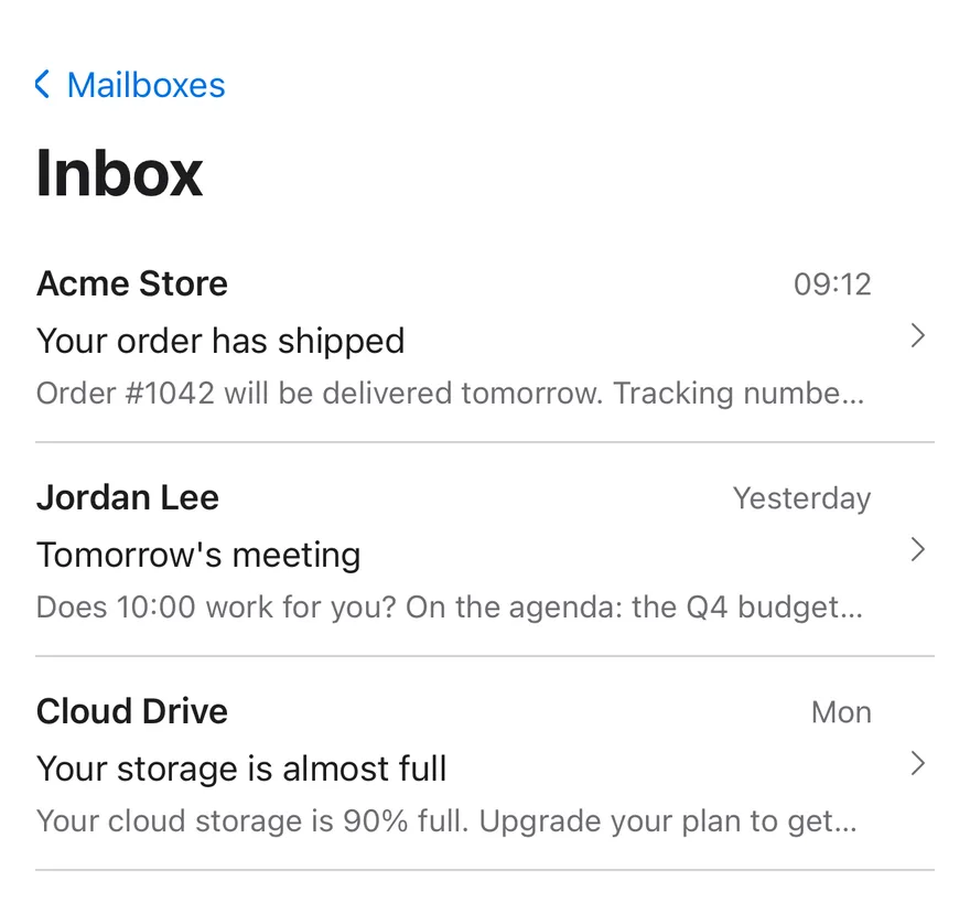
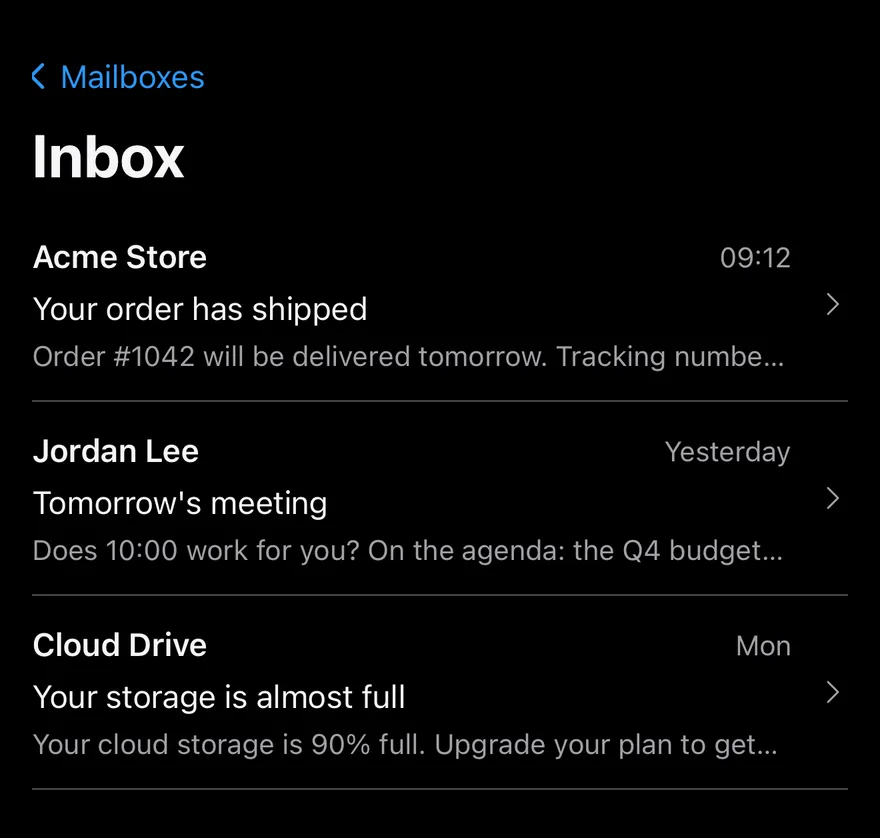
On mobile (below 48rem, via useIsMobile) only one column shows at a time. Tapping a SplitViewItem pushes the next column, and a back button labelled with the previous pane's title returns to it. After navigation, focus moves to the new pane's heading and the view scrolls into place. Use it for master-detail interfaces such as mail, settings or file browsers.
Installation
CLI
Works in any project with a components.json. See Installation for the one-line registry setup. Or use the suiss/ui CLI:
Manual
- Install the dependencies and add the
cnhelper:
-
Add the pieces it builds on: Resizable,
use-mobile. -
Copy the source into
components/patterns/split-view.tsx:
- Update the import paths to match your project.
Usage
- Place
SplitViewSidebar,SplitViewListandSplitViewDetailas direct children ofSplitView. Leave out the sidebar for a two-column layout. - The mobile column is uncontrolled by default and starts at
defaultColumn. UsecolumnwithonColumnChangeto control it. SplitViewItemadvances to the next column on click and runs your ownonClicktoo. SetisActiveon the current item.- The list pane shows a back button to the sidebar only when the sidebar has a
title. useSplitViewreturnsisMobile,columnandsetColumnfor custom navigation inside the view.
Examples
Two columns
Leaves out the sidebar for a list and detail layout.
Start on sidebar
Starts on the sidebar column on mobile through defaultColumn.
API Reference
SplitView
The root that lays out the panes and tracks the visible mobile column.
| Prop | Type | Default | Description |
|---|---|---|---|
column | SplitViewColumn | - | The visible mobile column when controlled: sidebar, list or detail. |
defaultColumn | SplitViewColumn | "list" | The mobile column shown first when uncontrolled. |
onColumnChange | (column: SplitViewColumn) => void | - | Called with the new column when navigation changes it. |
Also accepts the props of React.ComponentProps<"div">.
SplitViewSidebar
The leading pane, usually for sources or categories.
| Prop | Type | Default | Description |
|---|---|---|---|
title | React.ReactNode | - | The pane heading and accessible name; also labels the back button in the list pane. |
Also accepts the props of React.ComponentProps<"section">.
SplitViewList
The middle pane, usually a list of items.
| Prop | Type | Default | Description |
|---|---|---|---|
title | React.ReactNode | - | The pane heading and accessible name; visually hidden on desktop and used for the back button in the detail pane. |
Also accepts the props of React.ComponentProps<"section">.
SplitViewDetail
The trailing pane that shows the selected item.
| Prop | Type | Default | Description |
|---|---|---|---|
title | React.ReactNode | - | The pane heading and accessible name. |
Also accepts the props of React.ComponentProps<"section">.
SplitViewItem
A button row that marks the current selection and advances to the next column on mobile.
| Prop | Type | Default | Description |
|---|---|---|---|
isActive | boolean | false | Marks the item as the current selection with aria-current and data-active. |
Also accepts the props of useRender.ComponentProps<"button">, React.ComponentProps<"button">.
Accessibility
- Each pane is a
sectionlabelled by itstitleheading, so titled panes are exposed as regions. - The active item has
aria-current="true". - On mobile, navigating moves focus to the new pane's heading. The back button's chevron is hidden from assistive technology.
Notes
Styling hooks: data-slot="split-view", split-view-sidebar, split-view-list, split-view-detail, split-view-back and split-view-item; desktop panels use split-view-sidebar-panel, split-view-list-panel and split-view-detail-panel. On mobile the root has data-column set to the visible column.
Use the render prop on SplitViewItem to render it as a link.
Set asChild on SplitViewItem and pass a link as the child to render it as a link.
Pass a render function to SplitViewItem that returns a link with the props it receives.
SplitView lays out up to three panes: SplitViewSidebar, SplitViewList and SplitViewDetail. When the window is at least breakpoint wide (768 by default), they sit side by side in a bordered row, sized 20, 32 and 48 parts.
Below the breakpoint only the current column is shown, full screen and scrollable, with a large title. Pressing a SplitViewItem moves to the next column, and a back button titled with the previous pane returns to it. On Android the hardware back button also goes back. Use it for mail, notes or settings screens that drill down.