suiss/ui · Pattern
Date Picker
A date field that opens a calendar popover on desktop and wheel pickers in a drawer on mobile.
Date Picker is an open-source pattern from suiss/ui for React, React Native, SwiftUI and Jetpack Compose. The @esuiss/ui CLI copies its source into your project, so you own the code.
DatePicker is a single component that renders a field-style trigger showing the selected date, formatted with Intl.DateTimeFormat in the medium date style, or the placeholder. On desktop the trigger opens a Popover containing a single-selection Calendar; picking a day selects it and closes the popover.
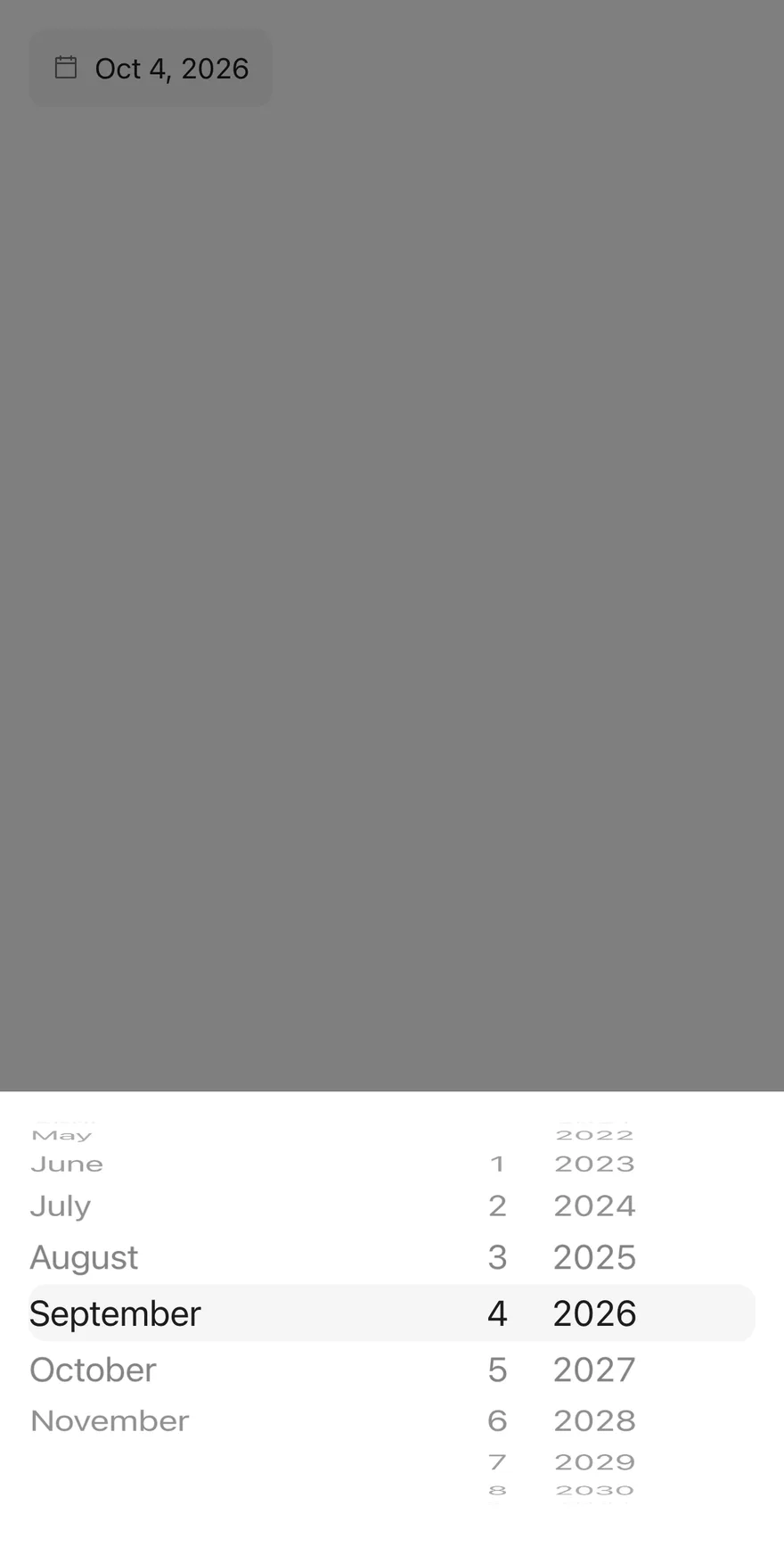
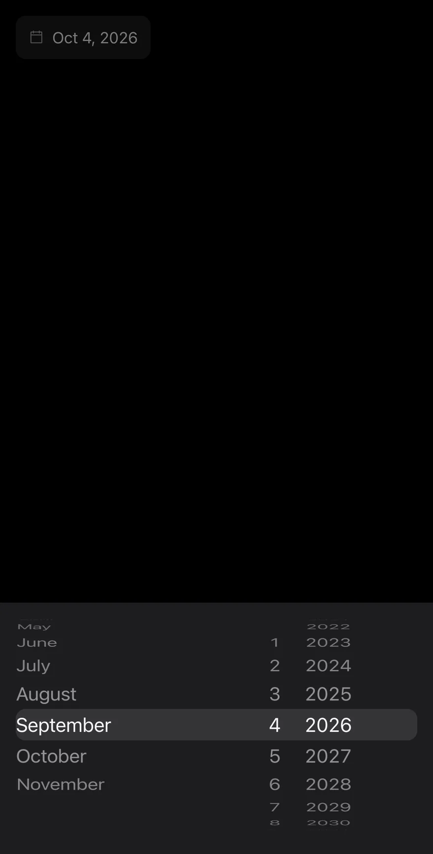
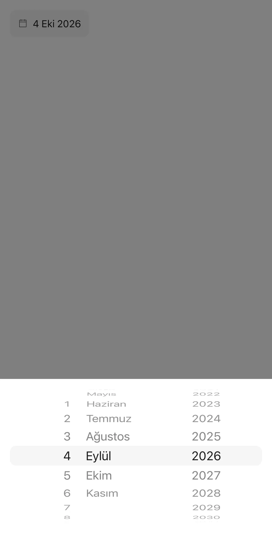
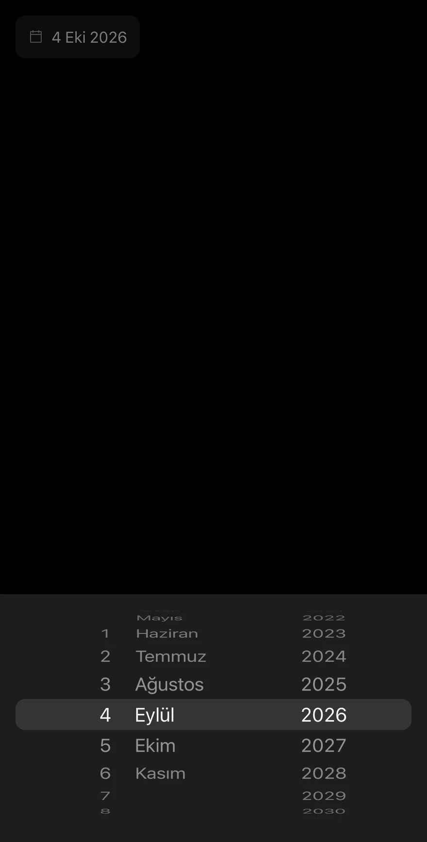
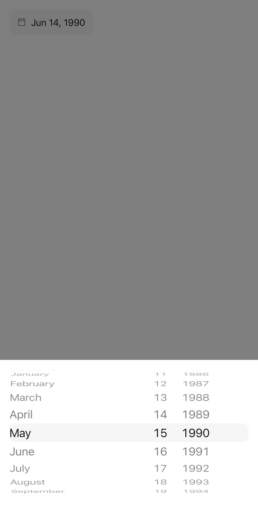
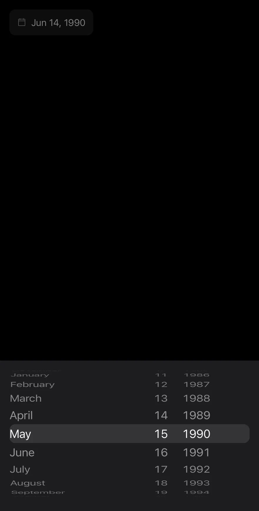
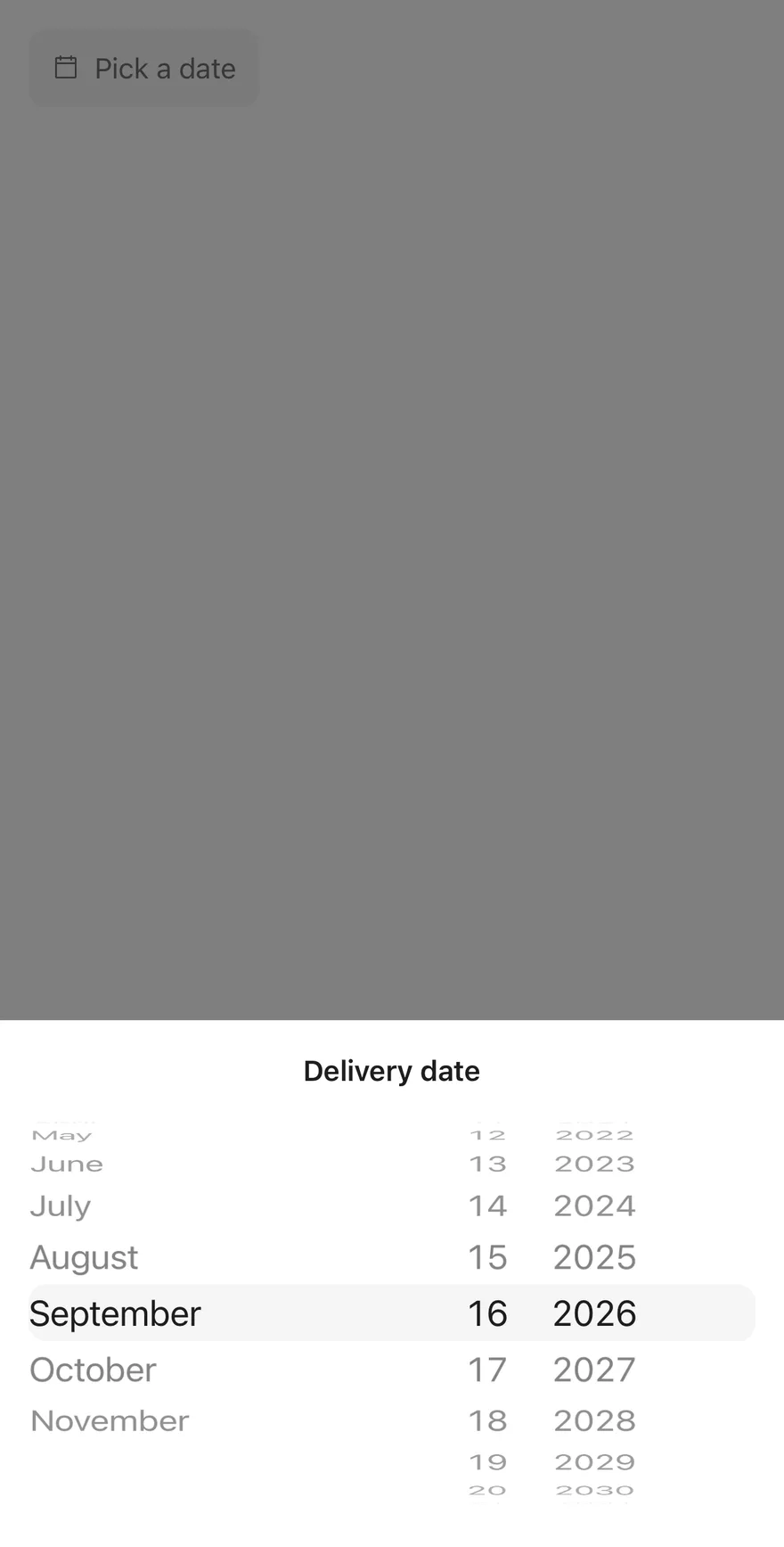
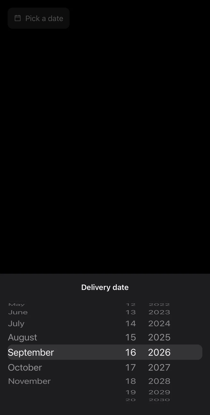
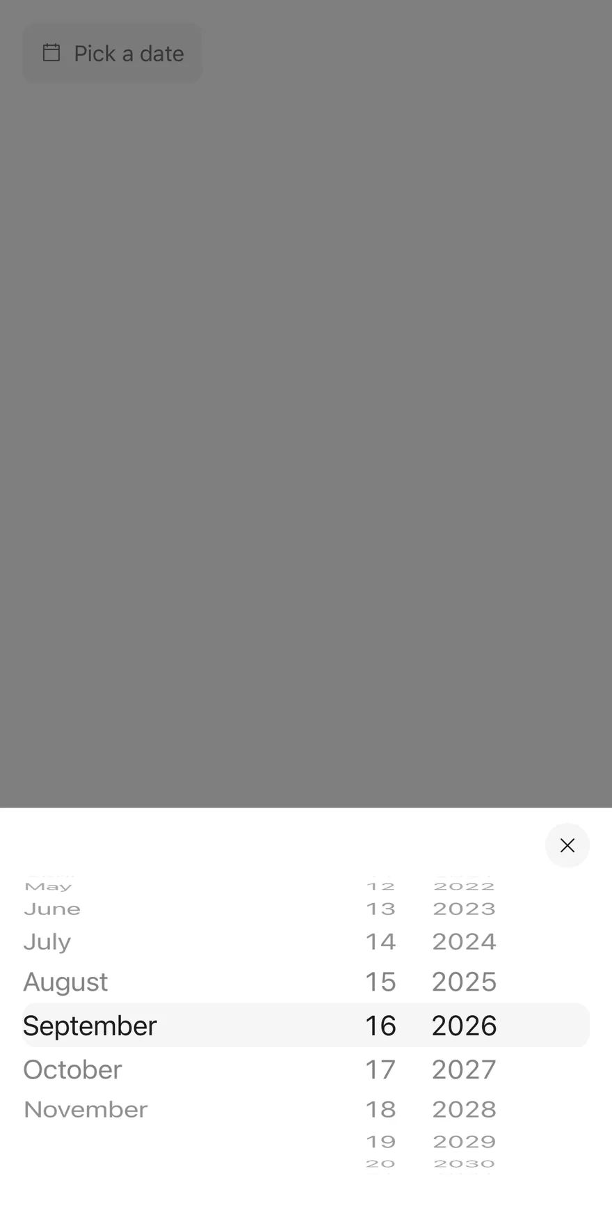
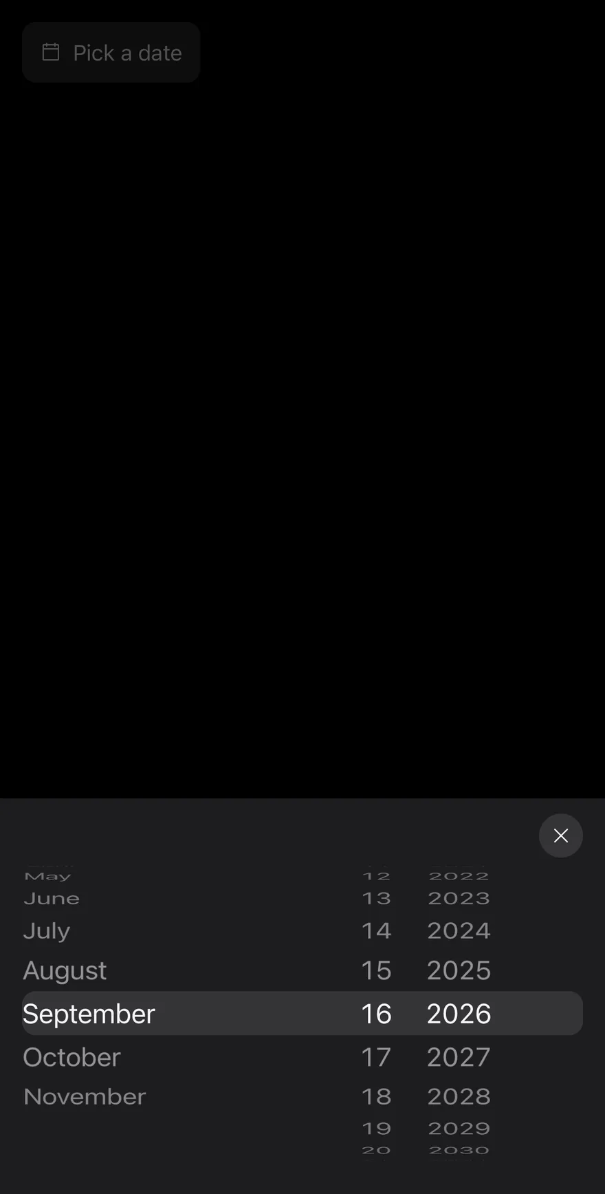
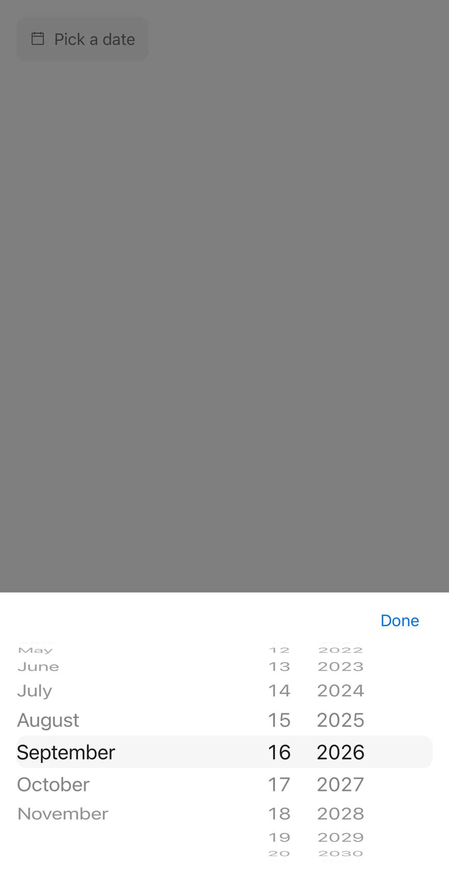
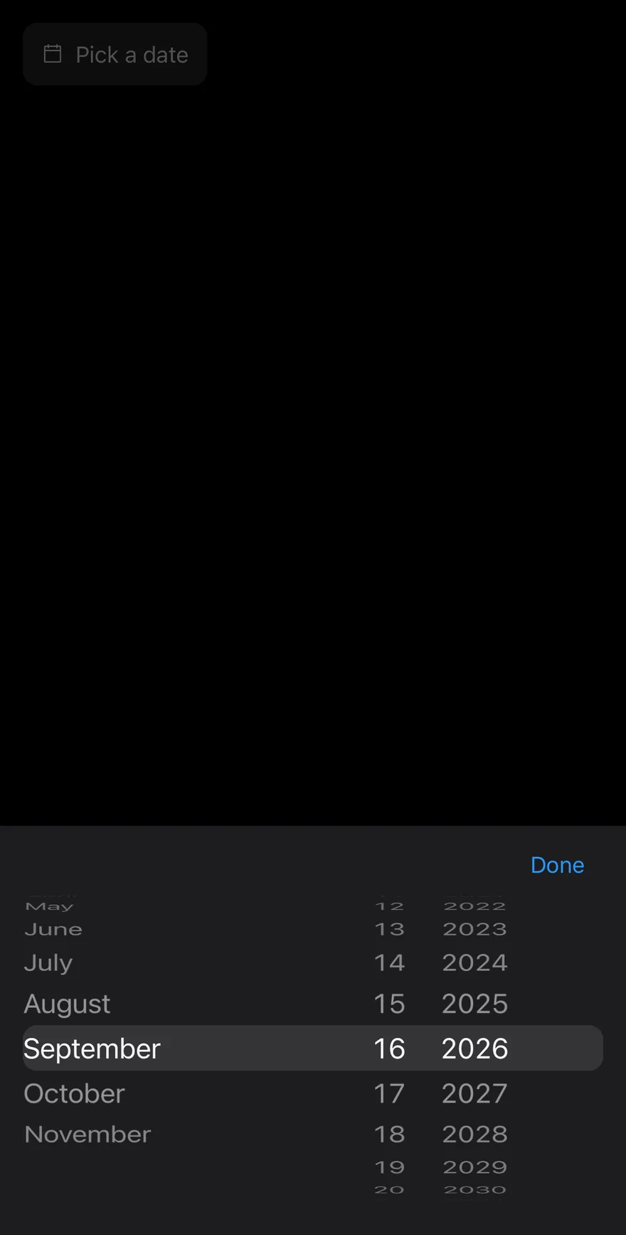
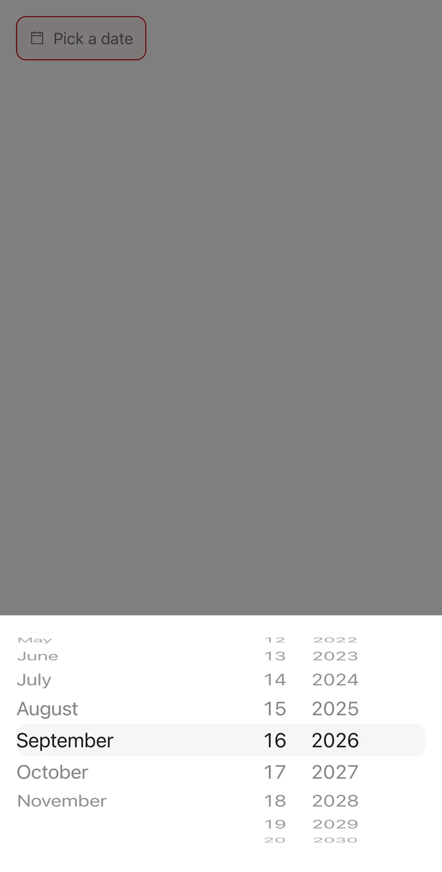
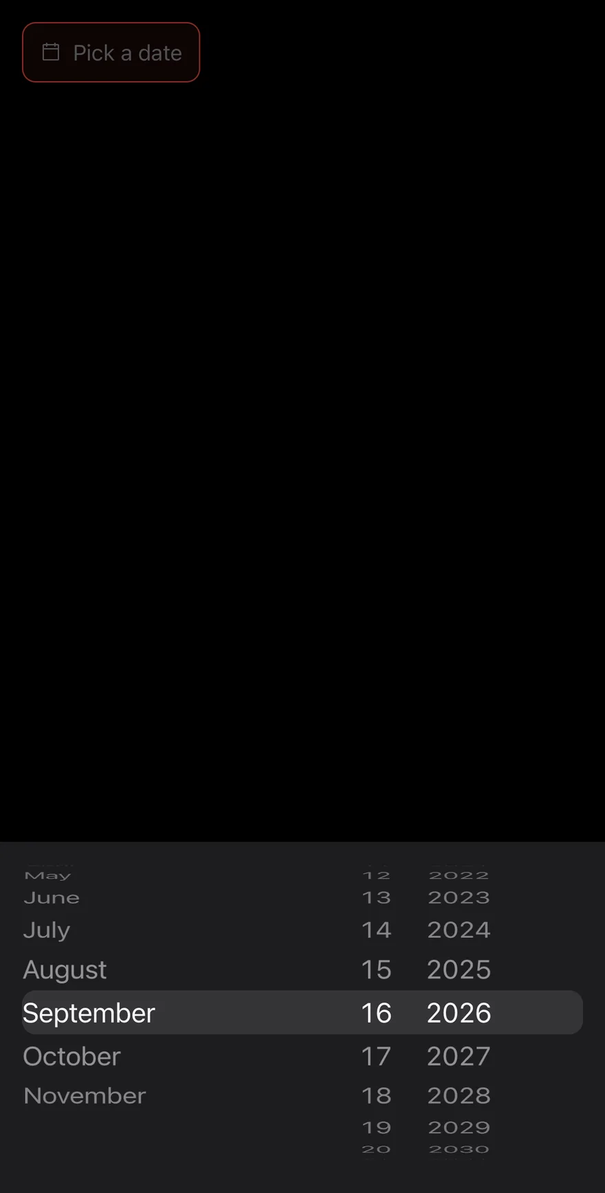
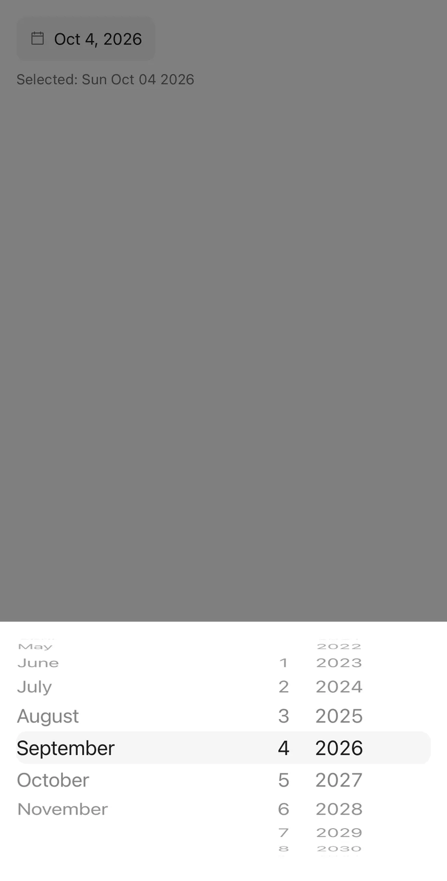
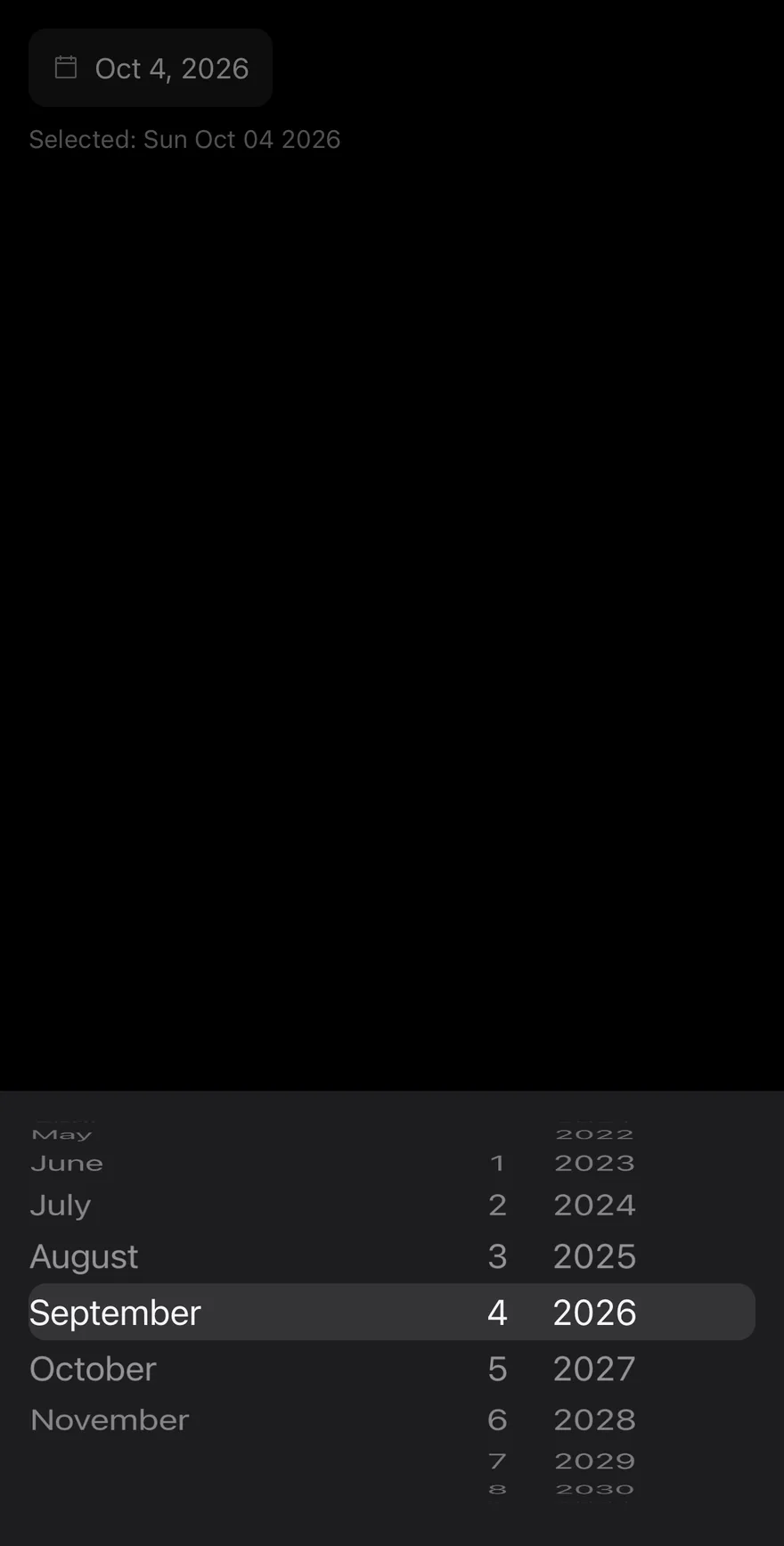
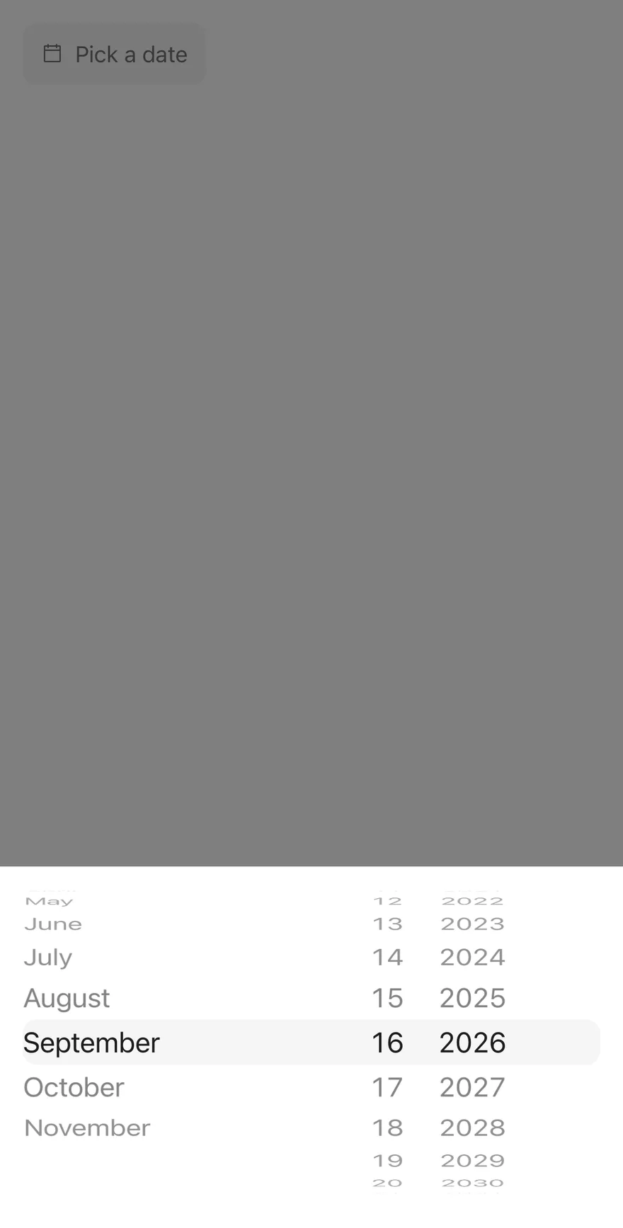
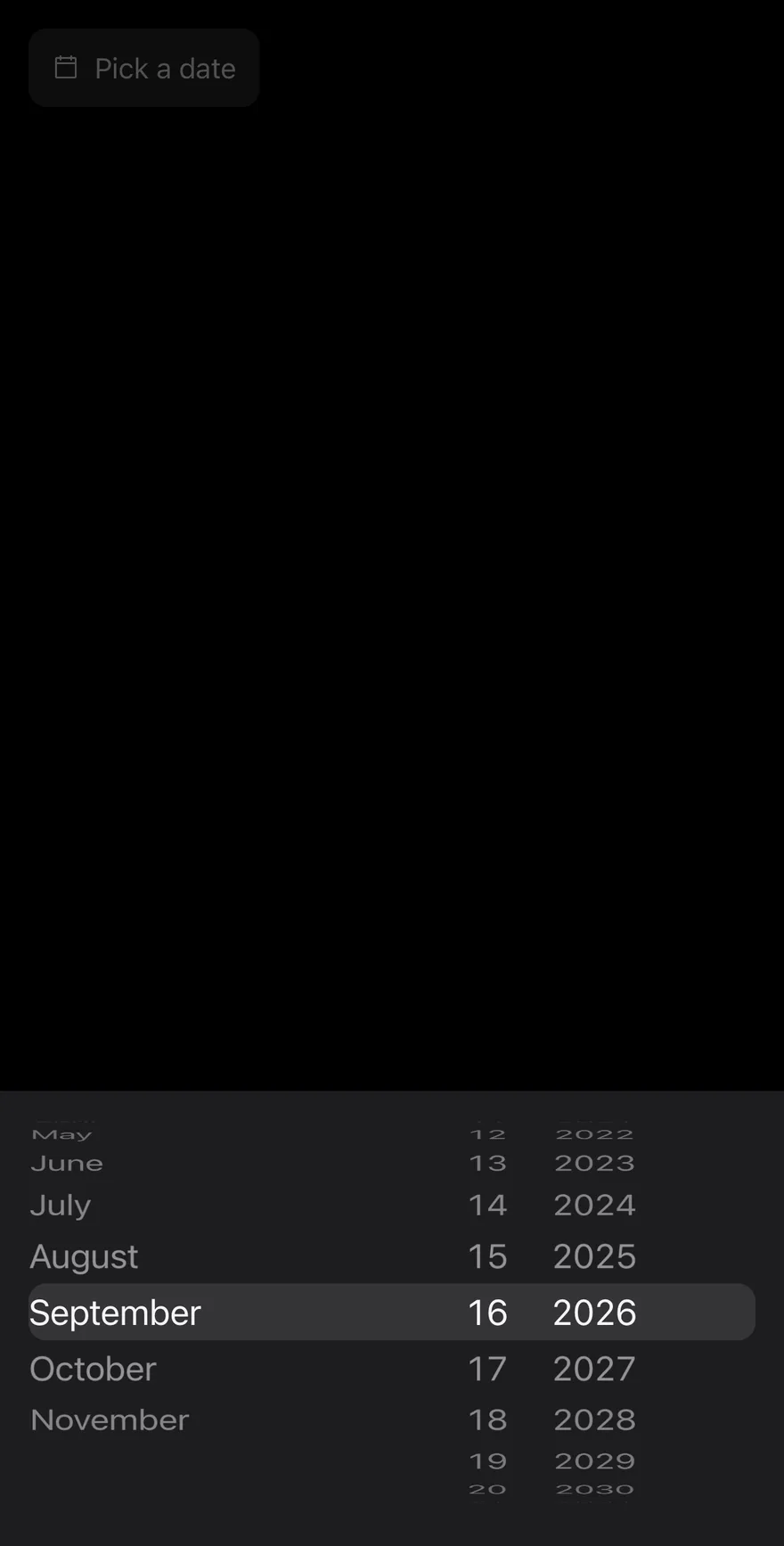
Below the 48rem breakpoint the trigger opens a bottom Drawer with a WheelPicker of day, month and year columns, ordered to match the locale's short date format. Turning a wheel updates the value immediately, and the day is clamped to the length of the chosen month. Use it for form fields such as delivery dates or dates of birth.
Installation
CLI
Works in any project with a components.json. See Installation for the one-line registry setup. Or use the suiss/ui CLI:
Manual
- Install the dependencies and add the
cnhelper:
-
Add the pieces it builds on: Calendar, Drawer, Popover,
use-mobile, Wheel Picker. -
Copy the source into
components/patterns/date-picker.tsx:
- Update the import paths to match your project.
Usage
Use value and onValueChange for a controlled field, or defaultValue for an uncontrolled one; the value is a Date or null. locale drives the trigger format, calendar captions, weekday names, the first day of the week, day labels and the wheel order. fromYear and toYear bound both the calendar's months and the year wheel. Pass id, aria-label and aria-describedby to connect the field to a label and help text.
Examples
With value
Starts with a defaultValue, and the calendar opens on that month.
Locale
Formats the trigger and calendar in Turkish with locale="tr-TR".
Year range
Limits selection to 1940 through 2010 for a date of birth.
With title
Shows a visible Delivery date title in the mobile drawer.
With close button
Adds an icon close button to the mobile drawer.
With close label
Adds a text close button labelled Done to the mobile drawer.
Disabled
Disables the trigger so the picker cannot open.
Invalid
Marks the field invalid with aria-invalid.
Controlled
Owns the value in parent state and shows the picked date below the field.
Floating
Insets the mobile drawer from the screen edges with floating.
API Reference
DatePicker
The field trigger with its desktop calendar popover and mobile wheel drawer.
| Prop | Type | Default | Description |
|---|---|---|---|
value | Date | null | - | The selected date when controlled; null for no date. |
defaultValue | Date | null | - | The initial date when uncontrolled. |
onValueChange | (value: Date | null) => void | - | Called with the new date when the user picks a day or turns a wheel. |
placeholder | string | "Pick a date" | Text shown in the trigger when no date is selected. |
locale | string | - | BCP 47 locale used for formatting, week start, labels and wheel order; defaults to the runtime locale. |
fromYear | number | new Date().getFullYear() - 100 | The earliest selectable year. |
toYear | number | new Date().getFullYear() + 10 | The latest selectable year. |
title | string | - | Visible title of the mobile drawer; without it the drawer title is visually hidden. |
disabled | boolean | - | Disables the trigger. |
floating | boolean | - | Insets the mobile drawer from the screen edges with fully rounded corners. |
showCloseButton | boolean | false | Shows a close button in the mobile drawer. |
closeLabel | string | - | Replaces the drawer's close icon with this text; requires . |
Accessibility
- The trigger is a
button; give it a name witharia-labelor alabellinked throughid. - On desktop the calendar is a
gridnamed by its month caption, and each day button is named with the full localized date, prefixed with today's relative name for the current day. Escapecloses the calendar and returns focus to the trigger.- On mobile each wheel column is labelled Day, Month or Year, and the drawer always has a title, visually hidden when
titleis not set.
Notes
The trigger carries data-slot="date-picker-trigger" and data-placeholder while empty; the popup carries data-slot="date-picker-content" and the wheels data-slot="date-picker-wheels". When no value is set, the mobile wheels start at today's date. The open state is internal and cannot be controlled.
DatePicker renders a field-style DrawerTrigger with a calendar icon and the selected date formatted with Intl.DateTimeFormat in the medium date style. The trigger sizes itself to its content rather than filling the width; pass className to change that. Pressing it opens a Drawer with three WheelPicker columns.
The column order follows the locale's short date format, falling back to month, day, year. Month names come from the locale, and the day column shrinks or grows with the chosen month and year, clamping the day when needed.