suiss/ui · Pattern
Paged List
A list that pages through items with numbered pagination on desktop and a Load more button on mobile.
Paged List is an open-source pattern from suiss/ui for React, React Native, SwiftUI and Jetpack Compose. The @esuiss/ui CLI copies its source into your project, so you own the code.
PagedList slices an array of items into pages and renders each one through renderItem inside a plain list. On desktop it shows a suiss/ui Pagination with previous and next links, the first and last page, the pages next to the current one, and ellipses for the gaps. The pagination is hidden when everything fits on one page.
On mobile (below 48rem, via useIsMobile), the list grows instead of paging: a full-width secondary Button appends the next page of items, and focus moves to the first newly loaded item. Use it for long feeds, search results or topic lists where the user moves through a known set of items.
Installation
CLI
Works in any project with a components.json. See Installation for the one-line registry setup. Or use the suiss/ui CLI:
Manual
-
Add the
cnhelper. -
Add the pieces it builds on: Button, Pagination,
use-mobile. -
Copy the source into
components/patterns/paged-list.tsx:
- Update the import paths to match your project.
Usage
- The current page is uncontrolled by default and starts at
defaultPage. PasspageandonPageChangeto control it. - Out-of-range page values are clamped between
1and the page count. - Without
getPageHref, page links use#and prevent navigation. With it, each link gets a realhrefand still updates the page on click. - Provide
getKeywhen items have stable IDs; the default key is the item's index. - The mobile Load more state is internal and independent of
page.
Examples
Start on later page
Opens on page 4 by setting defaultPage.
Single page
Renders every item without pagination when the items fit on one page.
Page links
Gives each page link a real href through getPageHref.
Custom labels
Replaces the previous, next and Load more labels.
Controlled
Owns the current page in state with page and onPageChange.
API Reference
PagedList
The root that renders the visible items and the pagination or Load more control.
| Prop | Type | Default | Description |
|---|---|---|---|
items | T[] | Required | The full array of items to page through. |
pageSize | number | 10 | The number of items per page, and per Load more step on mobile. |
page | number | - | The current page when controlled. |
defaultPage | number | 1 | The page shown first when uncontrolled. |
onPageChange | (page: number) => void | - | Called with the new page number when the user changes pages. |
getPageHref | (page: number) => string | - | Returns the href for a page link, turning pagination into real links. |
getKey | (item: T, index: number) => React.Key | (_, index) => index | Returns the React key for an item. |
renderItem | (item: T, index: number) => React.ReactNode | Required | Renders one item; receives the item and its index in items. |
loadMoreLabel | string | "Load more" | The label of the mobile Load more button. |
previousLabel | string | - | Visible text for the previous link; it also becomes its accessible name. |
nextLabel | string | - | Visible text for the next link; it also becomes its accessible name. |
listClassName | string | - | Classes applied to the inner list element. |
Also accepts the props of React.ComponentProps<"div">.
Accessibility
- Items render in a
ul, each inside its ownli. - The desktop pagination is a navigation landmark; the current page link has
aria-current="page". - Previous and next links get
aria-disabledon the first and last page. Their default accessible names are Go to previous page and Go to next page. - Changing pages scrolls the list into view. Loading more on mobile moves focus to the first focusable element of the first new item.
Notes
Styling hooks: data-slot="paged-list", paged-list-items, paged-list-item, paged-list-pagination and paged-list-load-more. Because renderItem output is wrapped in an li, return row content such as an Item, not another list item.
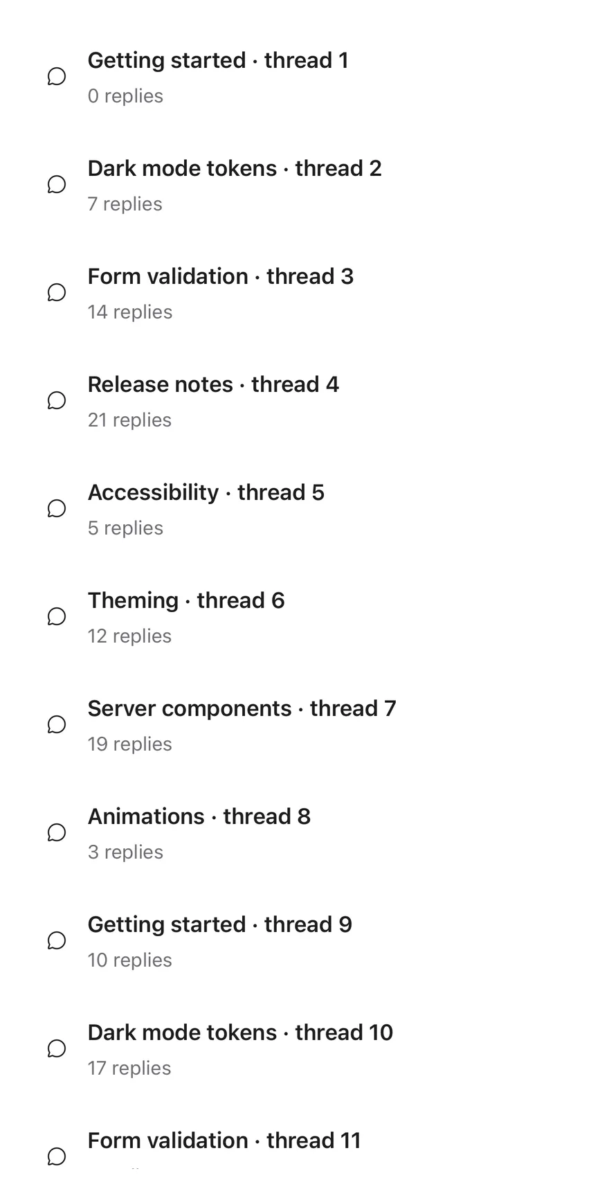
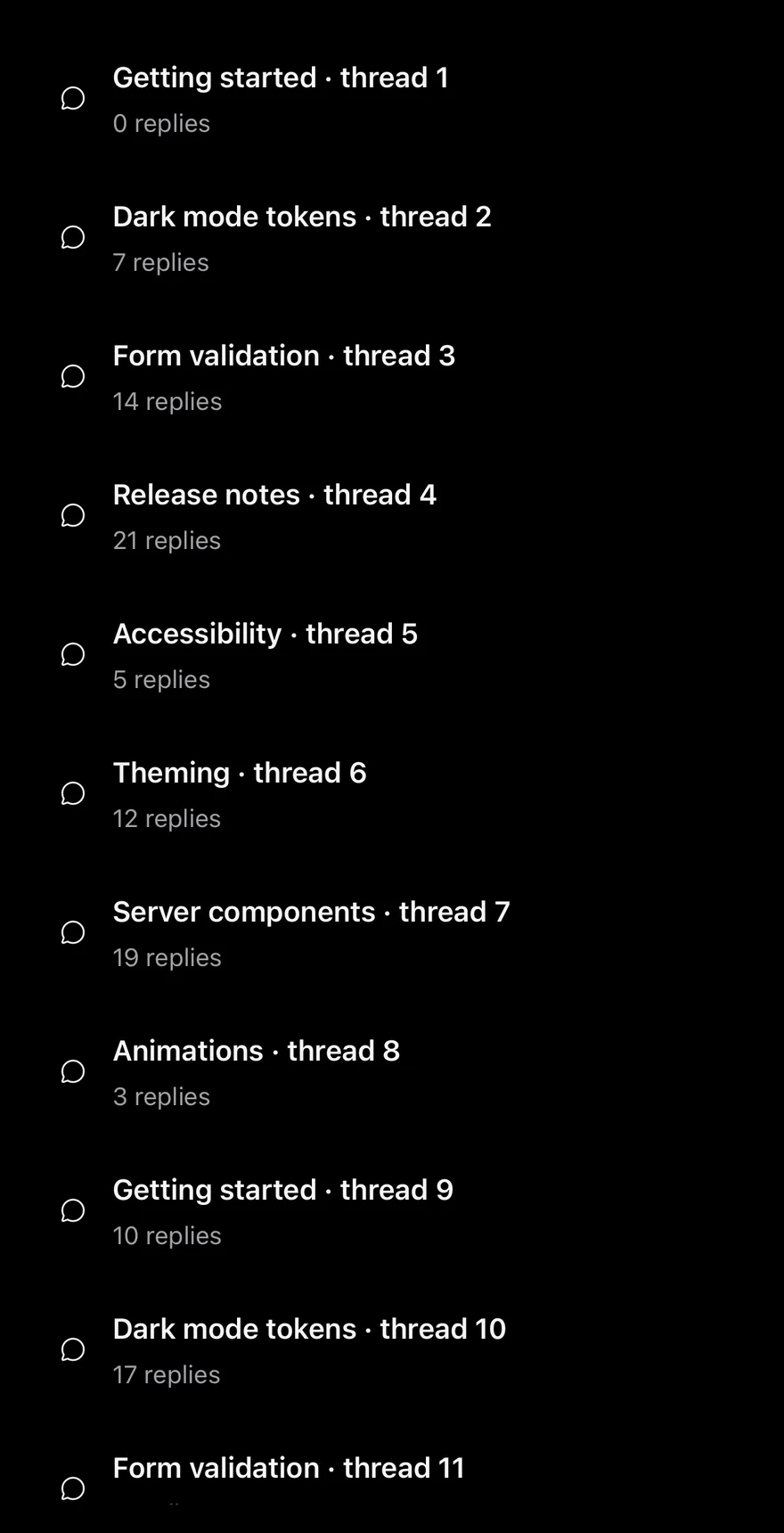
PagedList takes the full items array and renders only the first pageSize items. When the user scrolls near the end, or presses the Load more button in the footer, the next page is appended.
The button disappears once every item is shown. Use it for long local lists where rendering everything at once is not needed.
Installation
The CLI also adds what it builds on: Button, Text.
Manual
-
Target iOS 17 or later.
-
Copy the theme files every view uses:
- Copy the source and every file it uses:
- Add the files to your app target.
- Set
minSdkto 24 or higher and add the dependencies:
- Copy the theme files every view uses:
- Copy the source and every file it uses:
- Update the
com.esuiss.uipackage names to match your project.
Usage
Pass items, renderItem and a getKey that returns a stable key for each item. renderItem receives the item and its index, not the FlatList info object.
Other FlatList props pass through, except data, keyExtractor, onEndReached and ListFooterComponent, which the list manages. Use listClassName to style the content container.
Examples
Small pages
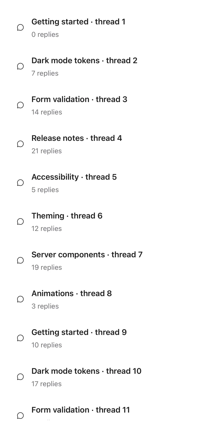
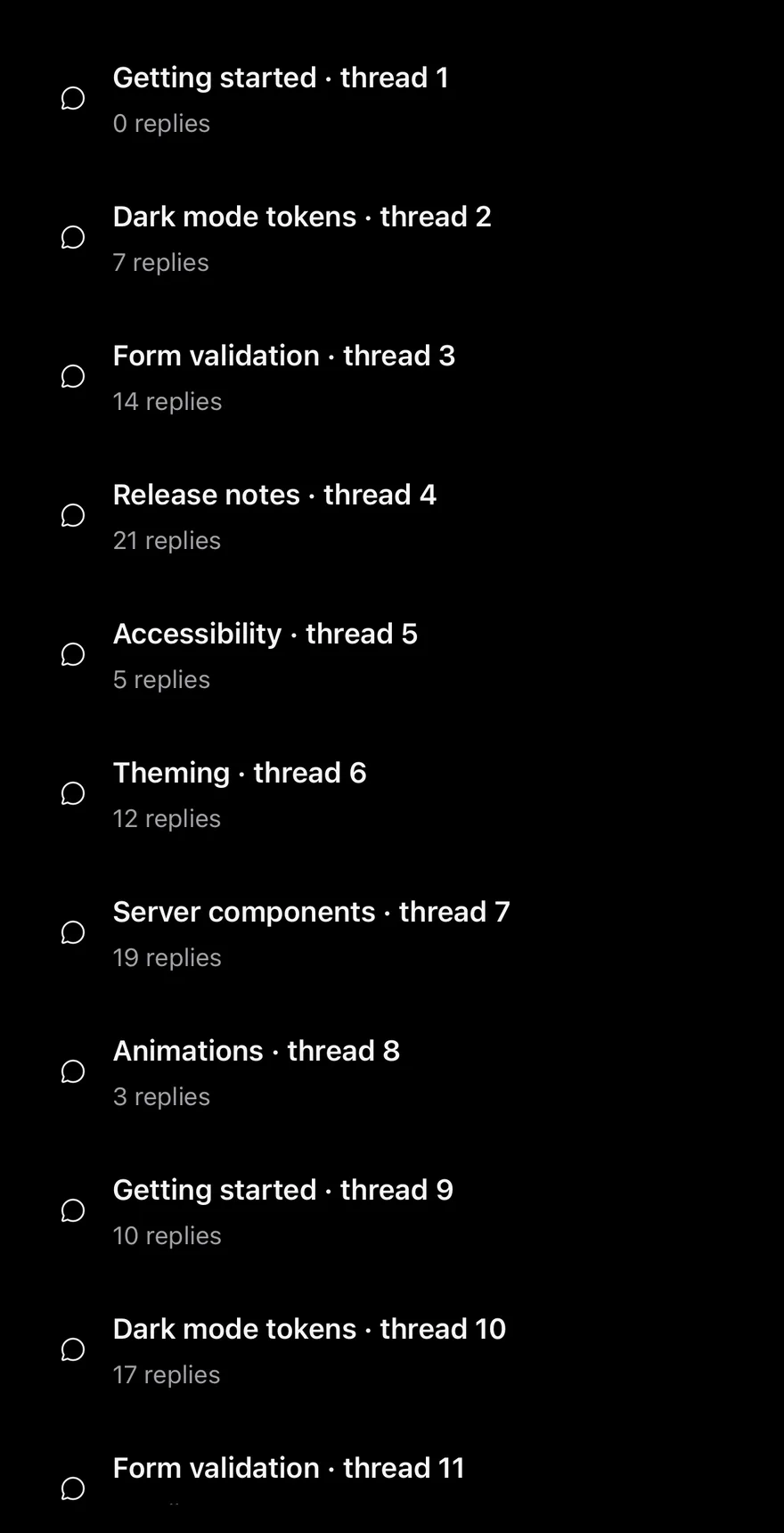
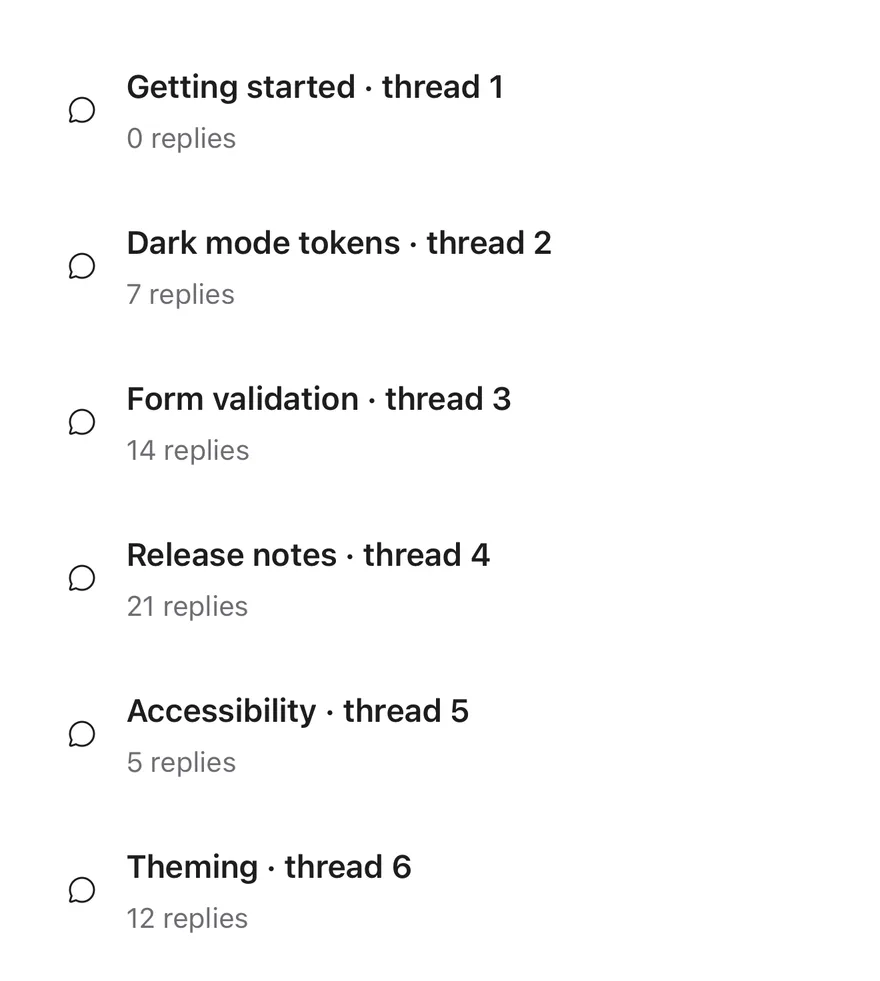
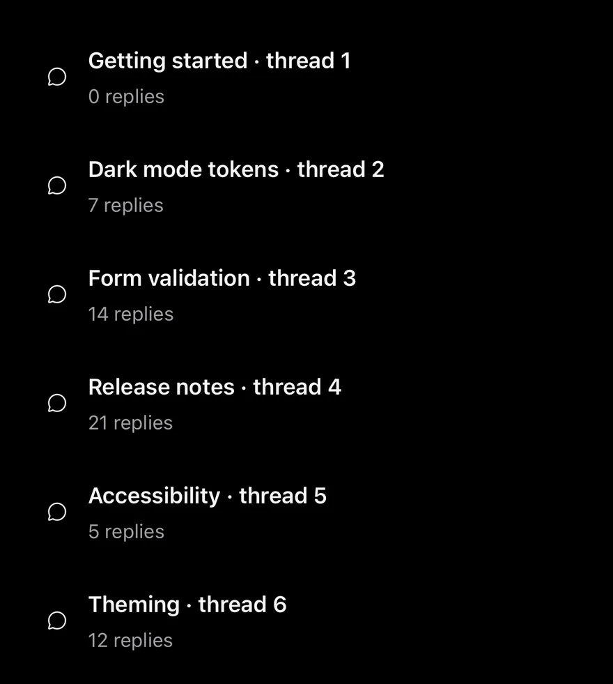
Uses a pageSize of 3 so pages load sooner.
Single page
Fewer items than one page, so no Load more button appears.
Custom labels
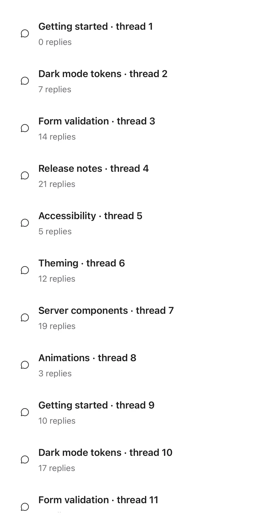
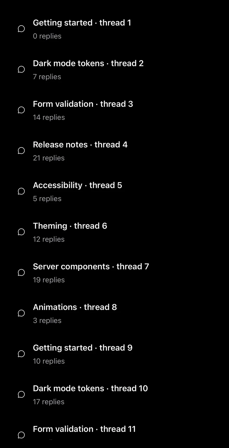
Renames the button with loadMoreLabel.
API Reference
PagedList
| Prop | Type | Default | Description |
|---|---|---|---|
items | T[] | Required | The full array of items. |
pageSize | number | 10 | Items added per page. Defaults to 10. |
getKey | (item: T, index: number) => React.Key | (_, index) => index | Returns a unique key for an item. Defaults to the index. |
renderItem | (item: T, index: number) => React.ReactNode | Required | Renders one item from the item and its index. |
loadMoreLabel | string | "Load more" | Text of the footer button. Defaults to Load more. |
className | string | - | Classes for the FlatList. |
listClassName | string | - | Classes for the list's content container. |
Also accepts the props of FlatListProps<T>.
Accessibility
- The Load more button is a
Button, so screen reader users can load the next page without scrolling to the end.
Notes
- The next page loads when the scroll position is within half a screen of the end (
onEndReachedThresholdof0.5). - The footer is a full-width
secondarybutton.