suiss/ui
  • Docs
  • Components
  • Patterns
  • Interactions
  • Charts
  • Blocks
GitHubGet started
DocsComponentsPatternsInteractionsChartsBlocks
Patterns19
  • Overview
  • Action Bar
  • Action Menu
  • App Shell
  • Command Palette
  • Confirm
  • Context Actions
  • Date Picker
  • Flyout
  • Modal
  • Navbar
  • Paged List
  • Panel
  • Picker
  • Preview
  • Search Picker
  • Segment Picker
  • Split View
  • Table List
  • Trail

suiss/ui · Pattern

Table List

Tabular data that renders as a table on desktop and a grouped list on mobile.

Table List is an open-source pattern from suiss/ui for React, React Native, SwiftUI and Jetpack Compose. The @esuiss/ui CLI copies its source into your project, so you own the code.

import {
  TableList,
  type TableListColumn,
} from "@/components/patterns/table-list"
import { cn } from "@/lib/utils"

type Order = {
  id: number
  product: string
  status: "shipped" | "delivered" | "preparing" | "returned"
  date: string
  total: number
}

const orders: Order[] = [
  {
    id: 1042,
    product: "Wireless earbuds",
    status: "shipped",
    date: "Oct 3",
    total: 249,
  },
  {
    id: 1041,
    product: "Magnetic charger",
    status: "delivered",
    date: "Sep 28",
    total: 49,
  },
  {
    id: 1040,
    product: "Phone case",
    status: "preparing",
    date: "Sep 27",
    total: 59,
  },
  {
    id: 1039,
    product: "Watch band",
    status: "returned",
    date: "Sep 20",
    total: 39,
  },
]

const statusLabel: Record<Order["status"], string> = {
  shipped: "Shipped",
  delivered: "Delivered",
  preparing: "Preparing",
  returned: "Returned",
}

const currency = new Intl.NumberFormat("en-US", {
  style: "currency",
  currency: "USD",
})

const columns: TableListColumn<Order>[] = [
  {
    key: "id",
    header: "Order",
    cell: (order) => `#${order.id}`,
    slot: "description",
  },
  {
    key: "product",
    header: "Product",
    cell: (order) => order.product,
    slot: "title",
  },
  {
    key: "status",
    header: "Status",
    cell: (order) => (
      <span
        className={cn(
          "font-semibold text-muted-foreground",
          order.status === "shipped" && "text-primary",
          order.status === "returned" && "text-destructive"
        )}
      >
        {statusLabel[order.status]}
      </span>
    ),
    mobileCell: (order) => statusLabel[order.status],
    slot: "description",
  },
  {
    key: "date",
    header: "Date",
    cell: (order) => order.date,
    slot: "description",
  },
  {
    key: "total",
    header: "Total",
    cell: (order) => currency.format(order.total),
    slot: "trailing",
    align: "end",
  },
]

export default function TableListDemo() {
  return (
    <TableList<Order>
      rows={orders}
      columns={columns}
      getKey={(order: Order) => order.id}
      title="Orders"
      className="mx-auto w-full max-w-3xl"
    />
  )
}

TableList displays rows of data from a column definition. On desktop it renders a suiss/ui Table inside a bordered section, with a header row and one cell per column. On mobile (below 48rem, via useIsMobile), where wide tables do not fit, it renders an inset grouped list: each row shows a title line, a secondary line that joins description columns with a middle dot, and trailing values on the end.

Each column chooses its place in the mobile row through slot, and can provide a simpler mobileCell. Use it for orders, invoices, transactions and other records that people compare in columns on large screens.

Installation

CLI

$ pnpm dlx shadcn@latest add @esuiss/table-list

Works in any project with a components.json. See Installation for the one-line registry setup. Or use the suiss/ui CLI:

$ pnpm dlx @esuiss/ui@latest add patterns table-list

Manual

  1. Add the cn helper.

  2. Add the pieces it builds on: Table, use-mobile.

  3. Copy the source into components/patterns/table-list.tsx:

components/patterns/table-list.tsx
"use client"

import * as React from "react"
import {
  Table,
  TableBody,
  TableCell,
  TableHead,
  TableHeader,
  TableRow,
} from "@/components/ui/table"
import { useIsMobile } from "@/hooks/use-mobile"
import { cn } from "@/lib/utils"

type TableListColumn<T> = {
  key: string
  1. Update the import paths to match your project.

Usage

import { TableList } from "@/components/patterns/table-list"
<TableList<Order> rows={orders} columns={columns} getKey={(order: Order) => order.id} title="Orders" className="mx-auto w-full max-w-3xl" />
  • Each TableListColumn has a key, a header and a cell renderer. Optional fields are mobileCell, slot (title, description, trailing or hidden) and align (start or end).
  • On mobile, the first title column becomes the primary line, description columns form the secondary line, and trailing columns appear at the end. Columns without a slot, or with hidden, are left out on mobile.
  • mobileCell replaces cell on mobile, for example to drop styling that does not fit the list.
  • align: "end" right-aligns the desktop header and cells.

Examples

Without title

Renders the table without a heading or region.

import {
  TableList,
  type TableListColumn,
} from "@/components/patterns/table-list"
import { cn } from "@/lib/utils"

type Order = {
  id: number
  product: string
  status: "shipped" | "delivered" | "preparing" | "returned"
  date: string
  total: number
}

const orders: Order[] = [
  {
    id: 1042,
    product: "Wireless earbuds",
    status: "shipped",
    date: "Oct 3",
    total: 249,
  },
  {
    id: 1041,
    product: "Magnetic charger",
    status: "delivered",
    date: "Sep 28",
    total: 49,
  },
  {
    id: 1040,
    product: "Phone case",
    status: "preparing",
    date: "Sep 27",
    total: 59,
  },
  {
    id: 1039,
    product: "Watch band",
    status: "returned",
    date: "Sep 20",
    total: 39,
  },
]

const statusLabel: Record<Order["status"], string> = {
  shipped: "Shipped",
  delivered: "Delivered",
  preparing: "Preparing",
  returned: "Returned",
}

const currency = new Intl.NumberFormat("en-US", {
  style: "currency",
  currency: "USD",
})

const columns: TableListColumn<Order>[] = [
  {
    key: "id",
    header: "Order",
    cell: (order) => `#${order.id}`,
    slot: "description",
  },
  {
    key: "product",
    header: "Product",
    cell: (order) => order.product,
    slot: "title",
  },
  {
    key: "status",
    header: "Status",
    cell: (order) => (
      <span
        className={cn(
          "font-semibold text-muted-foreground",
          order.status === "shipped" && "text-primary",
          order.status === "returned" && "text-destructive"
        )}
      >
        {statusLabel[order.status]}
      </span>
    ),
    mobileCell: (order) => statusLabel[order.status],
    slot: "description",
  },
  {
    key: "date",
    header: "Date",
    cell: (order) => order.date,
    slot: "description",
  },
  {
    key: "total",
    header: "Total",
    cell: (order) => currency.format(order.total),
    slot: "trailing",
    align: "end",
  },
]

export default function TableListWithoutTitle() {
  return (
    <TableList<Order>
      rows={orders}
      columns={columns}
      getKey={(order: Order) => order.id}
      title={undefined}
      className="mx-auto w-full max-w-3xl"
    />
  )
}

Empty

Shows custom emptyText when there are no rows.

import {
  TableList,
  type TableListColumn,
} from "@/components/patterns/table-list"
import { cn } from "@/lib/utils"

type Order = {
  id: number
  product: string
  status: "shipped" | "delivered" | "preparing" | "returned"
  date: string
  total: number
}

const statusLabel: Record<Order["status"], string> = {
  shipped: "Shipped",
  delivered: "Delivered",
  preparing: "Preparing",
  returned: "Returned",
}

const currency = new Intl.NumberFormat("en-US", {
  style: "currency",
  currency: "USD",
})

const columns: TableListColumn<Order>[] = [
  {
    key: "id",
    header: "Order",
    cell: (order) => `#${order.id}`,
    slot: "description",
  },
  {
    key: "product",
    header: "Product",
    cell: (order) => order.product,
    slot: "title",
  },
  {
    key: "status",
    header: "Status",
    cell: (order) => (
      <span
        className={cn(
          "font-semibold text-muted-foreground",
          order.status === "shipped" && "text-primary",
          order.status === "returned" && "text-destructive"
        )}
      >
        {statusLabel[order.status]}
      </span>
    ),
    mobileCell: (order) => statusLabel[order.status],
    slot: "description",
  },
  {
    key: "date",
    header: "Date",
    cell: (order) => order.date,
    slot: "description",
  },
  {
    key: "total",
    header: "Total",
    cell: (order) => currency.format(order.total),
    slot: "trailing",
    align: "end",
  },
]

export default function TableListEmpty() {
  return (
    <TableList<Order>
      rows={[]}
      columns={columns}
      getKey={(order: Order) => order.id}
      title="Orders"
      className="mx-auto w-full max-w-3xl"
      emptyText="No orders yet."
    />
  )
}

API Reference

01

TableList

The section that renders the rows as a table or a grouped list.

PropTypeDefaultDescription
rowsT[]RequiredThe data rows to display.
columnsTableListColumn<T>[]RequiredThe column definitions that render each row.
getKey(row: T, index: number) => React.Key(_, index) => indexReturns the React key for a row.
titleReact.ReactNode-A heading above the data that also names the section.
emptyTextReact.ReactNode"No results."Content shown when rows is empty.

Also accepts the props of React.ComponentProps<"section">.

Accessibility

  • With a title, the section is labelled by its heading and exposed as a region.
  • On desktop the data is a real table with column headers; an empty state is a single cell that spans every column.
  • On mobile the rows are list items in a ul.

Notes

Styling hooks: data-slot="table-list" and table-list-title; on mobile also table-list-items and table-list-item. The TableListColumn type is exported.
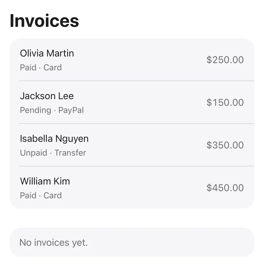
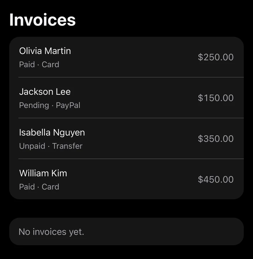
iOS
Table List on iOS in light modeTable List on iOS in dark mode
import { View } from "react-native"
import { TableList, type TableListColumn } from "@/components/patterns/table-list"

type Invoice = {
  id: string
  customer: string
  status: string
  method: string
  amount: string
}

const invoices: Invoice[] = [
  {
    id: "INV001",
    customer: "Olivia Martin",
    status: "Paid",
    method: "Card",
    amount: "$250.00",
  },
  {
    id: "INV002",
    customer: "Jackson Lee",
    status: "Pending",
    method: "PayPal",
    amount: "$150.00",
  },
  {
    id: "INV003",
    customer: "Isabella Nguyen",
    status: "Unpaid",
    method: "Transfer",
    amount: "$350.00",
  },
  {
    id: "INV004",
    customer: "William Kim",
    status: "Paid",
    method: "Card",
    amount: "$450.00",
  },
]

const columns: TableListColumn<Invoice>[] = [
  {
    key: "customer",
    header: "Customer",
    cell: (row) => row.customer,
    slot: "title",
  },
  {
    key: "status",
    header: "Status",
    cell: (row) => row.status,
    slot: "description",
  },
  {
    key: "method",
    header: "Method",
    cell: (row) => row.method,
    slot: "description",
  },
  {
    key: "amount",
    header: "Amount",
    cell: (row) => row.amount,
    slot: "trailing",
    align: "end",
  },
]

export function TableListExample() {
  return (
    <View className="gap-8">
      <TableList
        title="Invoices"
        rows={invoices}
        columns={columns}
        getKey={(row) => row.id}
        onRowPress={() => undefined}
      />
      <TableList rows={[]} columns={columns} emptyText="No invoices yet." />
    </View>
  )
}
import EsuissUI
import SwiftUI

struct TableListExample: View {
  var body: some View {
    VStack(alignment: .leading, spacing: 32) {
      TableList(tableListInvoices, columns: tableListColumns, title: "Invoices", action: { _ in })
      TableList([TableListInvoice](), columns: tableListColumns, emptyText: "No invoices yet.")
    }
  }
}

struct TableListInvoice: Identifiable {
  let id: String
  let customer: String
  let status: String
  let method: String
  let amount: String
}

let tableListInvoices = [
  TableListInvoice(id: "INV001", customer: "Olivia Martin", status: "Paid", method: "Card", amount: "$250.00"),
  TableListInvoice(id: "INV002", customer: "Jackson Lee", status: "Pending", method: "PayPal", amount: "$150.00"),
  TableListInvoice(id: "INV003", customer: "Isabella Nguyen", status: "Unpaid", method: "Transfer", amount: "$350.00"),
  TableListInvoice(id: "INV004", customer: "William Kim", status: "Paid", method: "Card", amount: "$450.00"),
]

let tableListColumns: [TableListColumn<TableListInvoice>] = [
  TableListColumn("customer", header: "Customer", slot: .title) { Text(verbatim: $0.customer) },
  TableListColumn("status", header: "Status", slot: .description) { Text(verbatim: $0.status) },
  TableListColumn("method", header: "Method", slot: .description) { Text(verbatim: $0.method) },
  TableListColumn("amount", header: "Amount", slot: .trailing) { Text(verbatim: $0.amount) },
]
import androidx.compose.foundation.layout.Arrangement
import androidx.compose.foundation.layout.Column
import androidx.compose.runtime.Composable
import androidx.compose.ui.unit.dp
import com.esuiss.ui.components.Text
import com.esuiss.ui.patterns.TableList
import com.esuiss.ui.patterns.TableListAlign
import com.esuiss.ui.patterns.TableListColumn
import com.esuiss.ui.patterns.TableListSlot

class TableListInvoice(
    val id: String,
    val customer: String,
    val status: String,
    val method: String,
    val amount: String,
)

val tableListInvoices = listOf(
    TableListInvoice("INV001", "Olivia Martin", "Paid", "Card", "$250.00"),
    TableListInvoice("INV002", "Jackson Lee", "Pending", "PayPal", "$150.00"),
    TableListInvoice("INV003", "Isabella Nguyen", "Unpaid", "Transfer", "$350.00"),
    TableListInvoice("INV004", "William Kim", "Paid", "Card", "$450.00"),
)

val tableListColumns = listOf(
    TableListColumn<TableListInvoice>("customer", "Customer", slot = TableListSlot.Title) { Text(it.customer, maxLines = 1) },
    TableListColumn<TableListInvoice>("status", "Status", slot = TableListSlot.Description) { Text(it.status, maxLines = 1) },
    TableListColumn<TableListInvoice>("method", "Method", slot = TableListSlot.Description) { Text(it.method, maxLines = 1) },
    TableListColumn<TableListInvoice>("amount", "Amount", slot = TableListSlot.Trailing, align = TableListAlign.End) {
        Text(it.amount, maxLines = 1)
    },
)

@Composable
fun TableListDefault() {
    Column(verticalArrangement = Arrangement.spacedBy(32.dp)) {
        TableList(
            rows = tableListInvoices,
            columns = tableListColumns,
            getKey = { row, _ -> row.id },
            title = "Invoices",
            onRowClick = {},
        )
        TableList(rows = emptyList(), columns = tableListColumns, emptyText = "No invoices yet.")
    }
}

TableList takes rows and a columns definition, and renders each row as a TableListRow inside one rounded group. Each column has a slot that decides where its cell goes: the row title, the description line, the trailing side, or nowhere.

The row parts are also exported, so you can build the same grouped look inside a FlatList for long or virtualized lists.

Installation

$ pnpm dlx shadcn@latest add @esuiss-rn/table-list

See Installation for the components.json setup. Or use the suiss/ui CLI:

$ pnpm dlx @esuiss/ui@latest add table-list
$ pnpm dlx @esuiss/ui@latest add table-list --platform swift
$ pnpm dlx @esuiss/ui@latest add table-list --platform kotlin

The CLI also adds what it builds on: Item, Text.

Manual

  1. Install the dependencies:
npx expo install cn
  1. Add the pieces it builds on: Item, Text.

  2. Copy the source into components/patterns/table-list.tsx:

uniwind/components/patterns/table-list.tsx
import { cn } from "cn"
import * as React from "react"
import { View, type ViewProps } from "react-native"
import {
  Item,
  ItemActions,
  ItemContent,
  ItemDescription,
  ItemTitle,
} from "@/components/ui/item"
import { Text } from "@/components/ui/text"

type TableListColumn<T> = {
  key: string
  header: React.ReactNode
  cell: (row: T) => React.ReactNode
  1. Update the import paths to match your project.
  1. Install the dependencies:
npx expo install cn
  1. Add the pieces it builds on: Item, Text.

  2. Copy the source into components/patterns/table-list.tsx:

nativewind/components/patterns/table-list.tsx
import { cn } from "cn"
import * as React from "react"
import { View, type ViewProps } from "react-native"
import {
  Item,
  ItemActions,
  ItemContent,
  ItemDescription,
  ItemTitle,
} from "@/components/ui/item"
import { Text } from "@/components/ui/text"

type TableListColumn<T> = {
  key: string
  header: React.ReactNode
  cell: (row: T) => React.ReactNode
  1. Update the import paths to match your project.
  1. Add the pieces it builds on: Item, Text.

  2. Copy the source into components/patterns/table-list.tsx:

stylesheet/components/patterns/table-list.tsx
import * as React from "react"
import { StyleSheet, View, type ViewProps } from "react-native"
import {
  Item,
  ItemActions,
  ItemContent,
  ItemDescription,
  ItemTitle,
} from "@/components/ui/item"
import { Text } from "@/components/ui/text"
import { fontSize, radius, useTheme } from "@/components/ui/theme"

type TableListColumn<T> = {
  key: string
  header: React.ReactNode
  cell: (row: T) => React.ReactNode
  1. Update the import paths to match your project.
  1. Target iOS 17 or later.

  2. Copy the theme files every view uses:

swift/Theme/Theme.swift
import SwiftUI
import UIKit

struct RGBA: Sendable {
  let red: CGFloat
  let green: CGFloat
  let blue: CGFloat
  let alpha: CGFloat

  init(_ hex: UInt32, _ alpha: CGFloat = 1) {
    red = CGFloat((hex >> 16) & 0xFF) / 255
    green = CGFloat((hex >> 8) & 0xFF) / 255
    blue = CGFloat(hex & 0xFF) / 255
    self.alpha = alpha
  }
swift/Theme/Tokens.swift
import SwiftUI

public enum EsuissColor {
  public static let background = Color.adaptive(light: .init(0xFFFFFF), dark: .init(0x000000))
  public static let foreground = Color.adaptive(light: .init(0x1D1D1F), dark: .init(0xF5F5F7))
  public static let card = Color.adaptive(light: .init(0xFFFFFF), dark: .init(0x1D1D1F))
  public static let cardForeground = Color.adaptive(light: .init(0x1D1D1F), dark: .init(0xF5F5F7))
  public static let popover = Color.adaptive(light: .init(0xFFFFFF), dark: .init(0x1D1D1F))
  public static let popoverForeground = Color.adaptive(light: .init(0x1D1D1F), dark: .init(0xF5F5F7))
  public static let primary = Color.adaptive(light: .init(0x0071E3), dark: .init(0x2997FF))
  public static let primaryForeground = Color.adaptive(light: .init(0xFFFFFF), dark: .init(0xFFFFFF))
  public static let secondary = Color.adaptive(light: .init(0x000000, 0.04), dark: .init(0xFFFFFF, 0.1))
  public static let secondaryForeground = Color.adaptive(light: .init(0x1D1D1F), dark: .init(0xF5F5F7))
  public static let muted = Color.adaptive(light: .init(0xF5F5F7), dark: .init(0x161617))
  public static let mutedForeground = Color.adaptive(light: .init(0x6E6E73), dark: .init(0xA1A1A6))
  public static let accent = Color.adaptive(light: .init(0x000000, 0.06), dark: .init(0xFFFFFF, 0.1))
  1. Copy the source and every file it uses:
swift/Patterns/TableList.swift
import SwiftUI

public enum TableListSlot: CaseIterable, Sendable {
  case title, description, trailing, hidden
}

public struct TableListColumn<Row> {
  public let key: String
  public let header: LocalizedStringKey
  public let slot: TableListSlot
  public let cell: (Row) -> Text

  public init(
    _ key: String,
    header: LocalizedStringKey,
    slot: TableListSlot = .hidden,
swift/Components/Item.swift
import SwiftUI

public enum ItemVariant: CaseIterable, Sendable {
  case `default`, outline, muted
}

public enum ItemSize: CaseIterable, Sendable {
  case `default`, sm, xs

  var horizontalPadding: CGFloat {
    switch self {
    case .default: 16
    case .sm: 14
    case .xs: 12
    }
  }
swift/Components/Separator.swift
import SwiftUI

public struct Separator: View {
  let orientation: Axis

  public init(_ orientation: Axis = .horizontal) {
    self.orientation = orientation
  }

  public var body: some View {
    Rectangle()
      .fill(EsuissColor.border)
      .frame(width: orientation == .vertical ? 1 : nil, height: orientation == .horizontal ? 1 : nil)
      .frame(maxWidth: orientation == .horizontal ? .infinity : nil, maxHeight: orientation == .vertical ? .infinity : nil)
      .accessibilityHidden(true)
  }
swift/Components/TextVariant.swift
import SwiftUI

public enum TextVariant: CaseIterable, Sendable {
  case `default`, h1, h2, h3, h4, p, blockquote, code, lead, large, small, muted

  var style: TextStyle {
    switch self {
    case .h1: .xl3
    case .h2: .xl2
    case .h3: .xl
    case .h4, .lead, .large: .lg
    case .code, .small, .muted: .sm
    default: .base
    }
  }
  1. Add the files to your app target.
  1. Set minSdk to 24 or higher and add the dependencies:
build.gradle.kts
implementation(platform("androidx.compose:compose-bom:2026.09.00"))
implementation("androidx.compose.foundation:foundation")
implementation("androidx.compose.ui:ui")
implementation("com.adamglin:phosphor-icon-android:1.0.0")
  1. Copy the theme files every view uses:
kotlin/theme/Theme.kt
package com.esuiss.ui.theme

import androidx.compose.foundation.isSystemInDarkTheme
import androidx.compose.runtime.Composable
import androidx.compose.runtime.CompositionLocalProvider
import androidx.compose.runtime.Immutable
import androidx.compose.runtime.staticCompositionLocalOf
import androidx.compose.ui.Modifier
import androidx.compose.ui.draw.dropShadow
import androidx.compose.ui.graphics.Color
import androidx.compose.ui.graphics.Shape
import androidx.compose.ui.graphics.shadow.Shadow as DropShadow
import androidx.compose.ui.text.TextStyle
import androidx.compose.ui.text.style.LineHeightStyle
import androidx.compose.ui.unit.Dp
import androidx.compose.ui.unit.DpOffset
kotlin/theme/Tokens.kt
package com.esuiss.ui.theme

import androidx.compose.runtime.Immutable
import androidx.compose.ui.graphics.Color
import androidx.compose.ui.unit.dp

@Immutable
data class Colors(
    val background: Color,
    val foreground: Color,
    val card: Color,
    val cardForeground: Color,
    val popover: Color,
    val popoverForeground: Color,
    val primary: Color,
    val primaryForeground: Color,
  1. Copy the source and every file it uses:
kotlin/patterns/TableList.kt
package com.esuiss.ui.patterns

import androidx.compose.foundation.background
import androidx.compose.foundation.layout.Arrangement
import androidx.compose.foundation.layout.Column
import androidx.compose.foundation.layout.PaddingValues
import androidx.compose.foundation.layout.Row
import androidx.compose.foundation.layout.Spacer
import androidx.compose.foundation.layout.fillMaxWidth
import androidx.compose.foundation.layout.height
import androidx.compose.foundation.layout.padding
import androidx.compose.foundation.lazy.LazyListScope
import androidx.compose.foundation.shape.RoundedCornerShape
import androidx.compose.foundation.text.BasicText
import androidx.compose.runtime.Composable
import androidx.compose.runtime.CompositionLocalProvider
kotlin/components/Button.kt
package com.esuiss.ui.components

import androidx.compose.foundation.background
import androidx.compose.foundation.border
import androidx.compose.foundation.clickable
import androidx.compose.foundation.interaction.MutableInteractionSource
import androidx.compose.foundation.interaction.collectIsPressedAsState
import androidx.compose.foundation.layout.Arrangement
import androidx.compose.foundation.layout.Row
import androidx.compose.foundation.layout.RowScope
import androidx.compose.foundation.layout.fillMaxWidth
import androidx.compose.foundation.layout.height
import androidx.compose.foundation.layout.padding
import androidx.compose.foundation.layout.size
import androidx.compose.foundation.shape.CircleShape
import androidx.compose.foundation.shape.RoundedCornerShape
kotlin/components/ButtonGroup.kt
package com.esuiss.ui.components

import androidx.compose.foundation.background
import androidx.compose.foundation.gestures.Orientation
import androidx.compose.foundation.layout.Arrangement
import androidx.compose.foundation.layout.Box
import androidx.compose.foundation.layout.Row
import androidx.compose.foundation.layout.RowScope
import androidx.compose.foundation.layout.padding
import androidx.compose.foundation.shape.CircleShape
import androidx.compose.foundation.shape.CornerSize
import androidx.compose.foundation.shape.RoundedCornerShape
import androidx.compose.runtime.Composable
import androidx.compose.runtime.CompositionLocalProvider
import androidx.compose.runtime.DisposableEffect
import androidx.compose.runtime.Immutable
kotlin/components/Content.kt
package com.esuiss.ui.components

import androidx.compose.runtime.compositionLocalOf
import androidx.compose.ui.graphics.Color
import androidx.compose.ui.text.TextStyle
import androidx.compose.ui.unit.Dp
import androidx.compose.ui.unit.dp

val LocalContentStyle = compositionLocalOf { TextStyle.Default }

val LocalContentColor = compositionLocalOf { Color.Unspecified }

val LocalIconSize = compositionLocalOf { 20.dp }
kotlin/components/Header.kt
package com.esuiss.ui.components

import androidx.compose.animation.core.animate
import androidx.compose.animation.core.animateFloatAsState
import androidx.compose.animation.core.tween
import androidx.compose.foundation.clickable
import androidx.compose.foundation.interaction.MutableInteractionSource
import androidx.compose.foundation.interaction.collectIsPressedAsState
import androidx.compose.foundation.layout.Arrangement
import androidx.compose.foundation.layout.Column
import androidx.compose.foundation.layout.Row
import androidx.compose.foundation.layout.RowScope
import androidx.compose.foundation.layout.height
import androidx.compose.foundation.layout.padding
import androidx.compose.foundation.text.BasicText
import androidx.compose.runtime.Composable
kotlin/components/Icon.kt
package com.esuiss.ui.components

import androidx.compose.foundation.Image
import androidx.compose.foundation.layout.size
import androidx.compose.runtime.Composable
import androidx.compose.ui.Modifier
import androidx.compose.ui.graphics.Color
import androidx.compose.ui.graphics.ColorFilter
import androidx.compose.ui.graphics.takeOrElse
import androidx.compose.ui.graphics.vector.ImageVector
import androidx.compose.ui.unit.Dp
import com.esuiss.ui.theme.EsuissTheme

@Composable
fun Icon(
    imageVector: ImageVector,
kotlin/components/Item.kt
package com.esuiss.ui.components

import androidx.compose.foundation.background
import androidx.compose.foundation.border
import androidx.compose.foundation.combinedClickable
import androidx.compose.foundation.interaction.MutableInteractionSource
import androidx.compose.foundation.interaction.collectIsPressedAsState
import androidx.compose.foundation.layout.Arrangement
import androidx.compose.foundation.layout.Box
import androidx.compose.foundation.layout.BoxScope
import androidx.compose.foundation.layout.Column
import androidx.compose.foundation.layout.ColumnScope
import androidx.compose.foundation.layout.PaddingValues
import androidx.compose.foundation.layout.Row
import androidx.compose.foundation.layout.RowScope
import androidx.compose.foundation.layout.fillMaxWidth
  1. Update the com.esuiss.ui package names to match your project.

Usage

import { TableListTitle, TableListHeader, TableListFooter, TableListSeparator, TableListRow, TableList } from "@/components/patterns/table-list"
<View className="gap-8">
  <TableList
    title="Invoices"
    rows={invoices}
    columns={columns}
    getKey={(row) => row.id}
    onRowPress={() => undefined}
  />
  <TableList rows={[]} columns={columns} emptyText="No invoices yet." />
</View>

Define columns with key, header, cell and slot. Several description columns are joined with ·, and several trailing columns are shown side by side. Use mobileCell to render a different value than cell in the list, such as a shorter date.

Pass onRowPress to make rows pressable. When there are no rows, emptyText is shown in the group. The TableListColumn type is exported.

With a FlatList, use TableListRow as the item, pass first and last to round the ends, TableListSeparator as ItemSeparatorComponent, and TableListHeader and TableListFooter around the list.

Examples

With flat list

Builds the grouped list in a FlatList with a header, footer and separators.
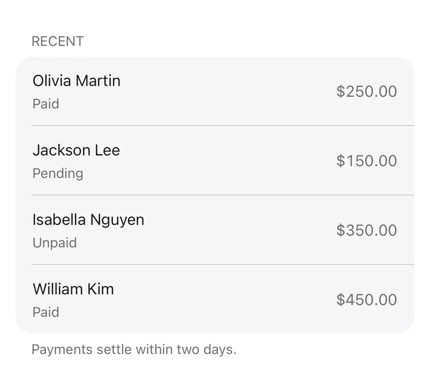
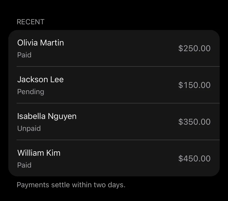
iOS
Table List (with flat list) on iOS in light modeTable List (with flat list) on iOS in dark mode
import { FlatList } from "react-native"
import { TableListFooter, TableListHeader, TableListRow, TableListSeparator } from "@/components/patterns/table-list"

type Invoice = {
  id: string
  customer: string
  status: string
  method: string
  amount: string
}

const invoices: Invoice[] = [
  {
    id: "INV001",
    customer: "Olivia Martin",
    status: "Paid",
    method: "Card",
    amount: "$250.00",
  },
  {
    id: "INV002",
    customer: "Jackson Lee",
    status: "Pending",
    method: "PayPal",
    amount: "$150.00",
  },
  {
    id: "INV003",
    customer: "Isabella Nguyen",
    status: "Unpaid",
    method: "Transfer",
    amount: "$350.00",
  },
  {
    id: "INV004",
    customer: "William Kim",
    status: "Paid",
    method: "Card",
    amount: "$450.00",
  },
]

export function TableListWithFlatListExample() {
  return (
    <FlatList
      data={invoices}
      keyExtractor={(item) => item.id}
      ListHeaderComponent={<TableListHeader>Recent</TableListHeader>}
      ListFooterComponent={
        <TableListFooter>Payments settle within two days.</TableListFooter>
      }
      ItemSeparatorComponent={TableListSeparator}
      renderItem={({ item, index }) => (
        <TableListRow
          first={index === 0}
          last={index === invoices.length - 1}
          title={item.customer}
          description={item.status}
          trailing={item.amount}
          onPress={() => undefined}
        />
      )}
    />
  )
}
import EsuissUI
import SwiftUI

struct TableListWithFlatListExample: View {
  var body: some View {
    TableListSection(header: "Recent", footer: "Payments settle within two days.") {
      ForEach(tableListInvoices) { invoice in
        TableListRow(action: {}) {
          VStack(alignment: .leading, spacing: 2) {
            Text(verbatim: invoice.customer)
              .textStyle(.base)
              .foregroundStyle(EsuissColor.foreground)
              .lineLimit(1)
            Text(verbatim: invoice.status)
              .textStyle(.sm)
              .foregroundStyle(EsuissColor.mutedForeground)
              .lineLimit(1)
          }
          .frame(maxWidth: .infinity, alignment: .leading)
          Text(verbatim: invoice.amount)
            .textStyle(.base)
            .monospacedDigit()
            .foregroundStyle(EsuissColor.mutedForeground)
            .lineLimit(1)
            .fixedSize()
        }
      }
    }
  }
}

struct TableListInvoice: Identifiable {
  let id: String
  let customer: String
  let status: String
  let method: String
  let amount: String
}

let tableListInvoices = [
  TableListInvoice(id: "INV001", customer: "Olivia Martin", status: "Paid", method: "Card", amount: "$250.00"),
  TableListInvoice(id: "INV002", customer: "Jackson Lee", status: "Pending", method: "PayPal", amount: "$150.00"),
  TableListInvoice(id: "INV003", customer: "Isabella Nguyen", status: "Unpaid", method: "Transfer", amount: "$350.00"),
  TableListInvoice(id: "INV004", customer: "William Kim", status: "Paid", method: "Card", amount: "$450.00"),
]
import androidx.compose.foundation.layout.fillMaxWidth
import androidx.compose.foundation.layout.heightIn
import androidx.compose.foundation.lazy.LazyColumn
import androidx.compose.foundation.lazy.itemsIndexed
import androidx.compose.runtime.Composable
import androidx.compose.ui.Modifier
import androidx.compose.ui.unit.dp
import com.esuiss.ui.patterns.TableListFooter
import com.esuiss.ui.patterns.TableListHeader
import com.esuiss.ui.patterns.TableListRow
import com.esuiss.ui.patterns.TableListRowText

class TableListInvoice(
    val id: String,
    val customer: String,
    val status: String,
    val method: String,
    val amount: String,
)

val tableListInvoices = listOf(
    TableListInvoice("INV001", "Olivia Martin", "Paid", "Card", "$250.00"),
    TableListInvoice("INV002", "Jackson Lee", "Pending", "PayPal", "$150.00"),
    TableListInvoice("INV003", "Isabella Nguyen", "Unpaid", "Transfer", "$350.00"),
    TableListInvoice("INV004", "William Kim", "Paid", "Card", "$450.00"),
)

@Composable
fun TableListWithFlatList() {
    LazyColumn(Modifier.fillMaxWidth().heightIn(max = 640.dp)) {
        item(key = "header") { TableListHeader("Recent") }
        itemsIndexed(tableListInvoices, key = { _, item -> item.id }) { index, item ->
            TableListRow(first = index == 0, last = index == tableListInvoices.lastIndex, onClick = {}) {
                TableListRowText(item.customer, item.status, item.amount)
            }
        }
        item(key = "footer") { TableListFooter("Payments settle within two days.") }
    }
}

API Reference

01

TableListTitle

A large heading above the list.

Also accepts the props of React.ComponentProps<typeof Text>.

02

TableListHeader

A small uppercase heading above a group.

Also accepts the props of React.ComponentProps<typeof Text>.

03

TableListFooter

A note below a group.

Also accepts the props of React.ComponentProps<typeof Text>.

04

TableListSeparator

An inset divider between rows.

Also accepts the props of ViewProps.

05

TableListRow

One row with a title, description and trailing content.

PropTypeDefaultDescription
titleReact.ReactNode-The row's main text.
descriptionReact.ReactNode-A single-line secondary text.
trailingReact.ReactNode-Content on the end side; text is shown in secondary color with tabular numbers.
firstbooleanfalseRounds the top corners.
lastbooleanfalseRounds the bottom corners.
childrenReact.ReactNode-

Also accepts the props of React.ComponentProps<typeof Item>.

06

TableList

Renders rows from a column definition, with an optional title and empty state.

PropTypeDefaultDescription
rowsT[]RequiredThe data to render.
columnsTableListColumn<T>[]RequiredColumn definitions with key, header, cell, optional mobileCell, slot and align.
getKey(row: T, index: number) => React.Key(_, index) => indexReturns a unique key for a row. Defaults to the index.
titleReact.ReactNode-Heading shown above the list.
emptyTextReact.ReactNode"No results."Content shown when rows is empty. Defaults to No results..
onRowPress(row: T, index: number) => void-Called with the row and index when a row is pressed.

Also accepts the props of ViewProps.

Accessibility

  • The group has the list role; rows have the listitem role, or button when onRowPress is set.
  • TableListTitle and TableListHeader have the heading role.
  • Separators are hidden from screen readers.

Notes

  • Rows use bg-muted and opacity-80 when pressed.
  • The header and align column fields are not rendered by the list layout.
NextTrailPreviousSplit View

On this page

  1. 01Installation
    • CLI
    • Manual
  2. 02Usage
  3. 03Examples
    • Without title
    • Empty
  4. 04API Reference
    • TableList
  5. 05Accessibility
  6. 06Notes
  7. 07Installation
    • Manual
  8. 08Usage
  9. 09Examples
    • With flat list
  10. 10API Reference
    • TableListTitle
    • TableListHeader
    • TableListFooter
    • TableListSeparator
    • TableListRow
    • TableList
  11. 11Accessibility
  12. 12Notes