suiss/ui · Pattern
Confirm
A confirmation prompt that opens as an alert dialog on desktop and an action sheet on mobile.
Confirm is an open-source pattern from suiss/ui for React, React Native, SwiftUI and Jetpack Compose. The @esuiss/ui CLI copies its source into your project, so you own the code.
Confirm asks the user to confirm or cancel an action. On desktop it renders an AlertDialog with a header and a footer of buttons. Below the 48rem breakpoint it renders an AlertSheet: ConfirmContent lifts the buttons out of ConfirmFooter, places the title, description and actions in one grouped card, and moves ConfirmCancel into its own button below the card.
Use it before destructive or irreversible actions, such as deleting a record, where the user must make an explicit choice.
Installation
CLI
Works in any project with a components.json. See Installation for the one-line registry setup. Or use the suiss/ui CLI:
Manual
-
Add the pieces it builds on: Alert Dialog, Alert Sheet,
use-mobile. -
Copy the source into
components/patterns/confirm.tsx:
- Update the import paths to match your project.
Usage
Write the content once with the desktop structure: ConfirmHeader holding ConfirmTitle and ConfirmDescription, then ConfirmFooter holding ConfirmCancel and ConfirmAction. Keep ConfirmCancel and ConfirmAction as direct children of ConfirmFooter so the mobile layout can find them. Confirm accepts open, defaultOpen and onOpenChange for controlled or uncontrolled use. The mobile sheet is not dismissible by default; pass dismissible to let an outside press close it.
Examples
Dismissible
Sets dismissible so the mobile sheet also closes when the user presses outside it.
API Reference
Confirm
The root that renders an AlertDialog on desktop and an AlertSheet on mobile.
Also accepts the props of React.ComponentProps<typeof AlertSheet>.
ConfirmTrigger
The button that opens the confirmation.
Also accepts the props of React.ComponentProps<typeof AlertDialogTrigger>.
ConfirmContent
The popup; on mobile it regroups the footer buttons into the sheet layout.
Also accepts the props of React.ComponentProps<typeof AlertDialogContent>.
ConfirmHeader
Groups the title and description.
Also accepts the props of React.ComponentProps<"div">.
ConfirmFooter
Holds the cancel and action buttons on desktop; on mobile its buttons are moved into the sheet.
Also accepts the props of React.ComponentProps<"div">.
ConfirmTitle
The prompt's title, used as the dialog's accessible name.
Also accepts the props of React.ComponentProps<typeof AlertDialogTitle>.
ConfirmDescription
Supporting text, used as the dialog's accessible description.
Also accepts the props of React.ComponentProps<typeof AlertDialogDescription>.
ConfirmAction
A button that performs the action and closes the prompt.
Also accepts the props of React.ComponentProps<typeof AlertSheetAction>.
ConfirmCancel
A button that closes the prompt without acting; shown separately below the actions on mobile.
Also accepts the props of React.ComponentProps<typeof AlertSheetCancel>.
Accessibility
- The popup has the
alertdialogrole, named byConfirmTitleand described byConfirmDescription. On mobile withdismissibleset, it has thedialogrole instead. - Opening moves focus into the dialog, and closing returns it to the trigger.
- On desktop, pressing outside does not close the dialog;
Escape, Cancel or an action does.
Notes
Parts carry data-slot values from confirm through confirm-cancel. Pass variant="destructive" to ConfirmAction for destructive actions. The size prop of ConfirmContent applies to the desktop AlertDialogContent only.
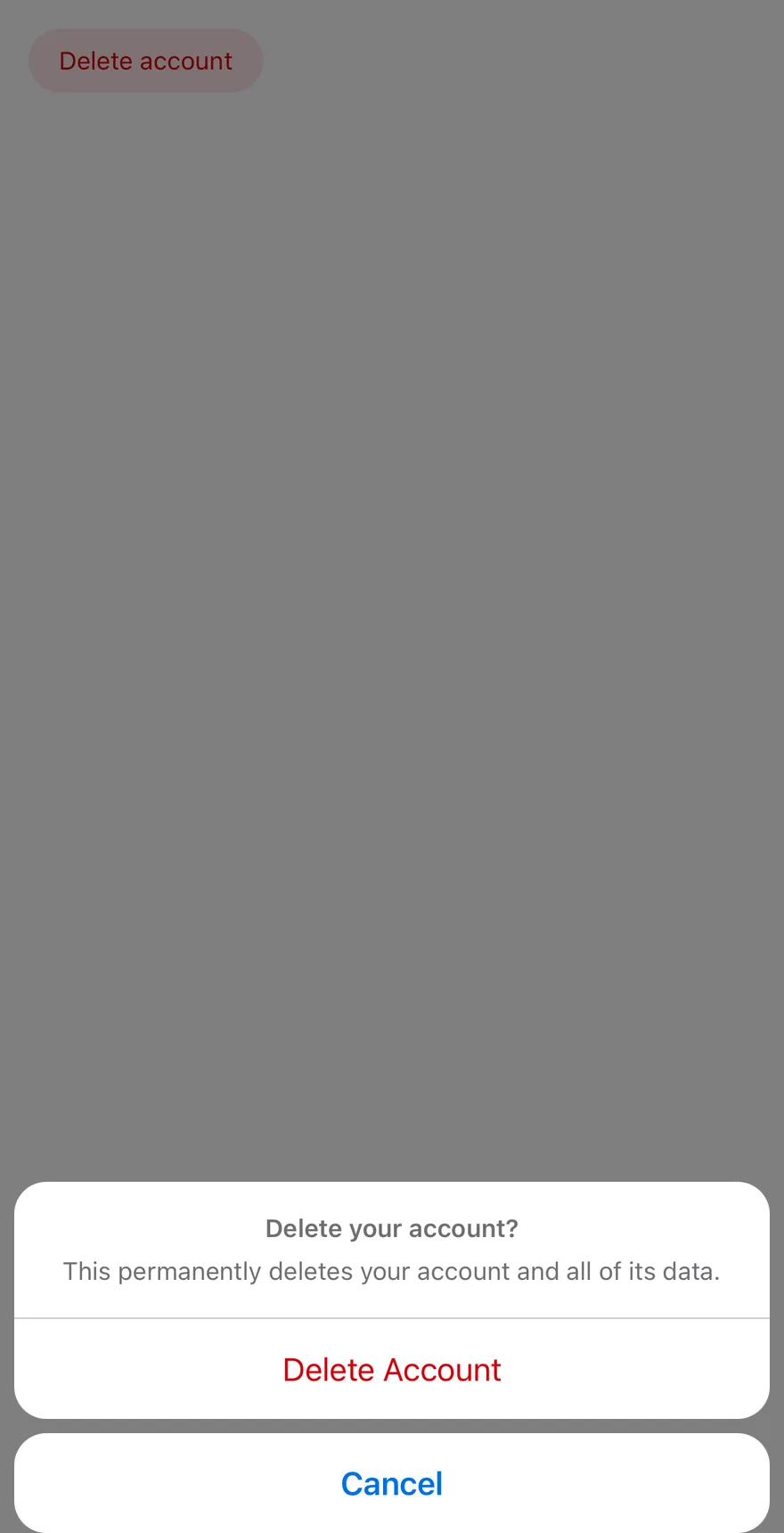
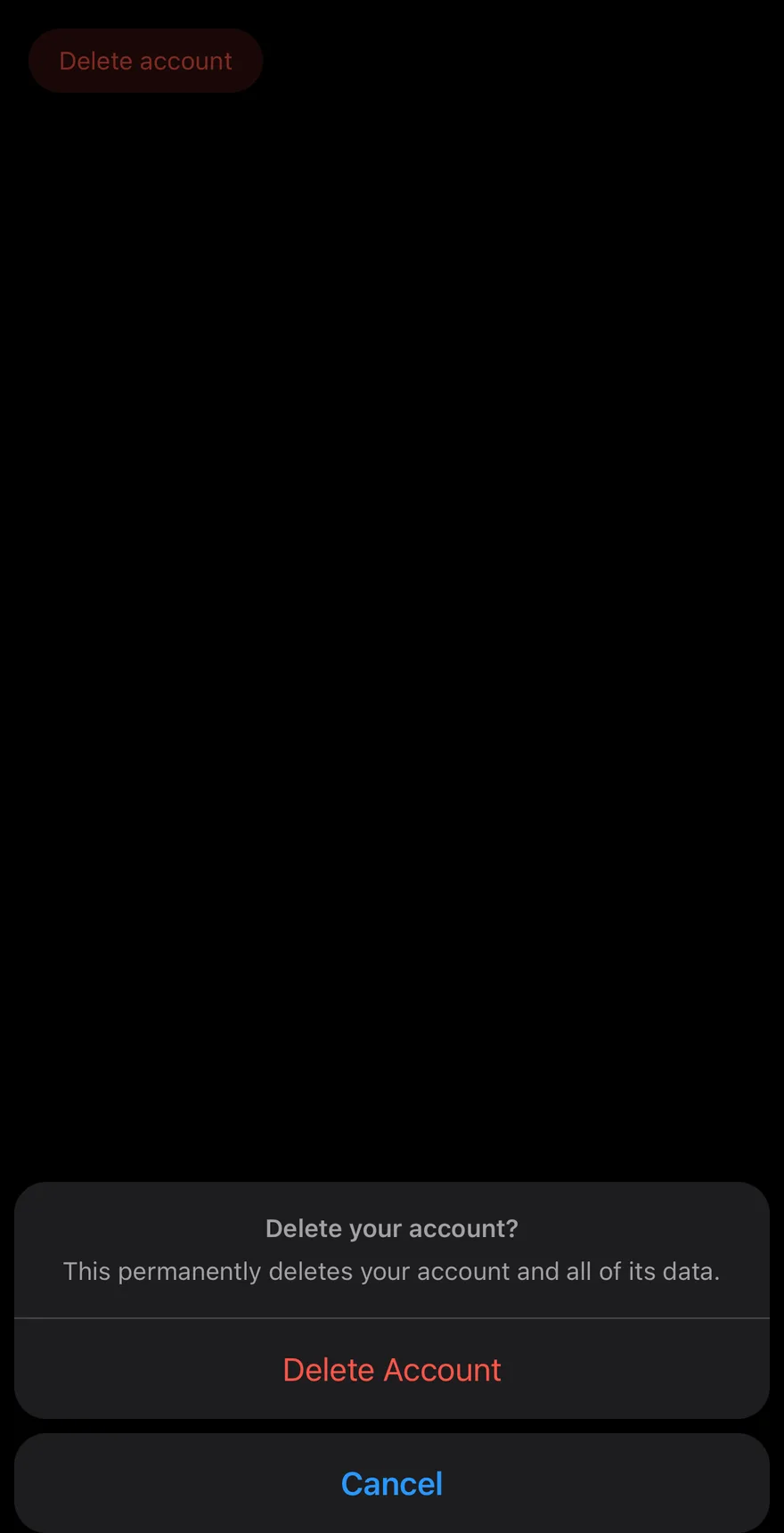
Confirm wraps AlertSheet with dismissible set to false by default, so the sheet closes only through one of its buttons.
ConfirmContent rearranges its children: the header and every non-cancel button from ConfirmFooter go into one rounded group, and ConfirmCancel is placed below it as a separate button. Use it before destructive or irreversible actions.
Installation
The CLI also adds what it builds on: Alert Sheet.
Manual
- Install the dependencies:
-
Add the pieces it builds on: Alert Sheet.
-
Copy the source into
components/patterns/confirm.tsx:
- Update the import paths to match your project.
- Install the dependencies:
-
Add the pieces it builds on: Alert Sheet.
-
Copy the source into
components/patterns/confirm.tsx:
- Update the import paths to match your project.
-
Add the pieces it builds on: Alert Sheet.
-
Copy the source into
components/patterns/confirm.tsx:
- Update the import paths to match your project.
-
Target iOS 17 or later.
-
Add the Swift package to your app:
- Copy the theme files every view uses:
- Copy the source and every file it uses:
- Add the files to your app target.
- Set
minSdkto 24 or higher and add the dependencies:
- Copy the theme files every view uses:
- Copy the source and every file it uses:
- Update the
com.esuiss.uipackage names to match your project.
Usage
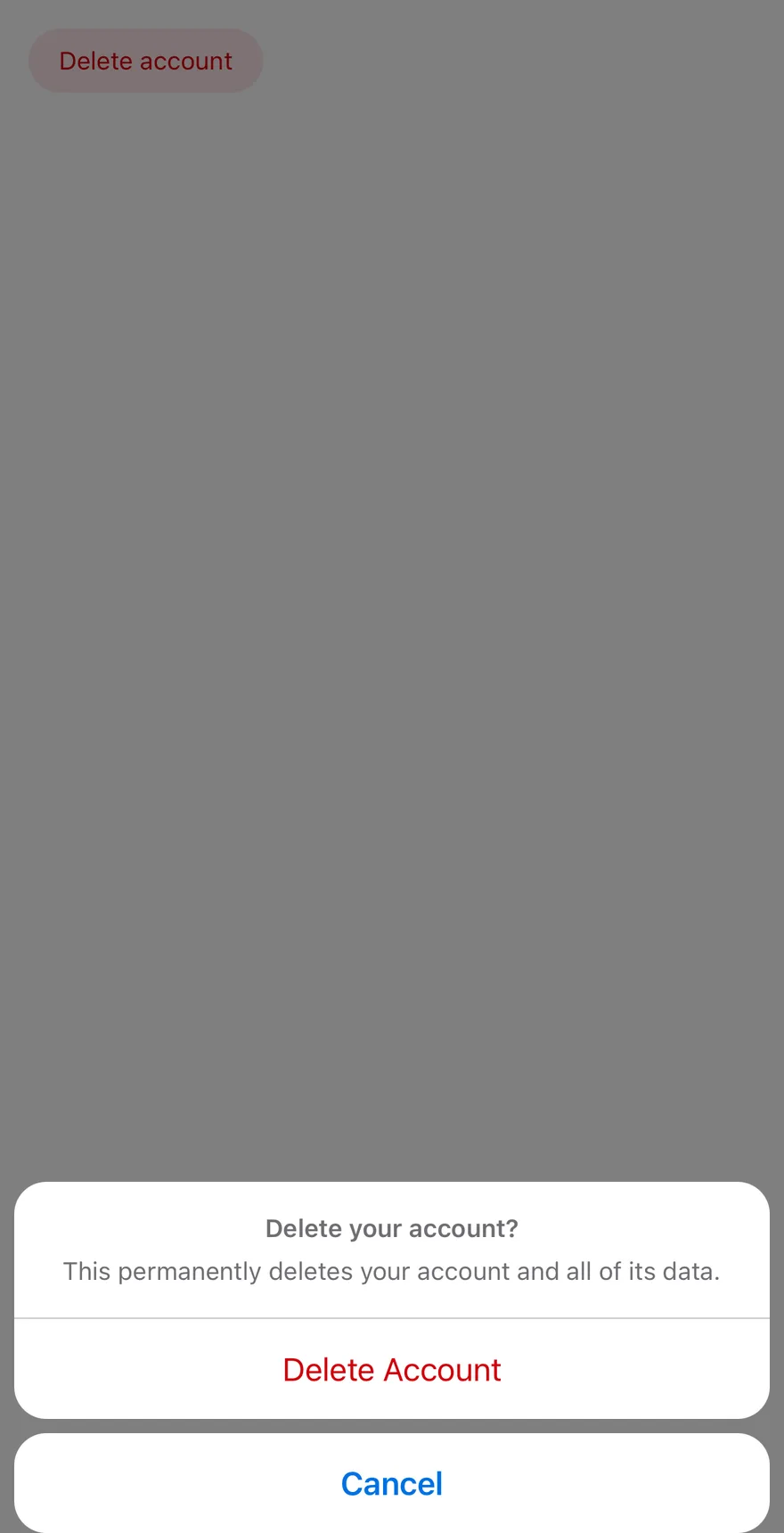
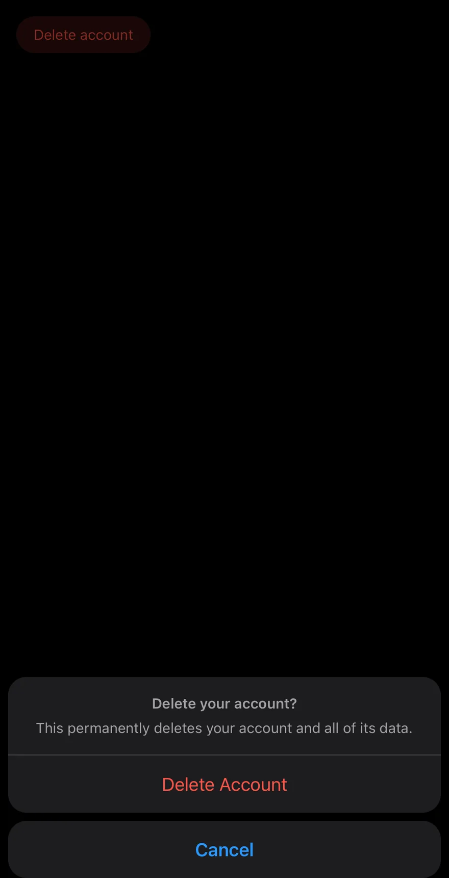
Put ConfirmTitle and ConfirmDescription in a ConfirmHeader, and the buttons in a ConfirmFooter inside ConfirmContent. Any ConfirmAction goes into the group; ConfirmCancel is moved out of it.
The root accepts open, defaultOpen and onOpenChange. Pass dismissible to let outside presses close it. Set variant="destructive" on ConfirmAction for delete-style actions.
Examples
Default
API Reference
Confirm
The root that owns the open state.
Also accepts the props of React.ComponentProps<typeof AlertSheet>.
ConfirmTrigger
The element that opens the sheet.
Also accepts the props of React.ComponentProps<typeof AlertSheetTrigger>.
ConfirmContent
The sheet that groups the header and actions and places Cancel below.
Also accepts the props of React.ComponentProps<typeof AlertSheetContent>.
ConfirmHeader
Holds the title and description.
Also accepts the props of React.ComponentProps<typeof AlertSheetHeader>.
ConfirmFooter
Holds the action and cancel buttons.
Also accepts the props of ViewProps.
ConfirmTitle
The question being asked.
Also accepts the props of React.ComponentProps<typeof AlertSheetTitle>.
ConfirmDescription
Supporting text about the consequences.
Also accepts the props of React.ComponentProps<typeof AlertSheetDescription>.
ConfirmAction
A confirming action, rendered as an AlertSheetAction.
Also accepts the props of React.ComponentProps<typeof AlertSheetAction>.
ConfirmCancel
The cancel button, shown separately below the group.
Also accepts the props of React.ComponentProps<typeof AlertSheetCancel>.
Accessibility
- With the default
dismissible={false}, the sheet uses the alert dialog primitive, so it closes only through its buttons.
Notes
- Action text uses
text-primary, ortext-destructivefor thedestructivevariant. - On iOS the sheet renders in a full-window overlay so it appears above native screens.