suiss/ui
  • Docs
  • Components
  • Patterns
  • Interactions
  • Charts
  • Blocks
GitHubGet started
DocsComponentsPatternsInteractionsChartsBlocks
Interactions15
  • Overview
  • Card Stack
  • Image Viewer
  • Island
  • OTP Autofill
  • Preview Menu
  • Pull to Refresh
  • Reorder List
  • Search Reveal
  • Section Index
  • Selection List
  • Stepper
  • Swipe Actions
  • Tip
  • Top Banner
  • Undo Bar

suiss/ui · Interaction

OTP Autofill

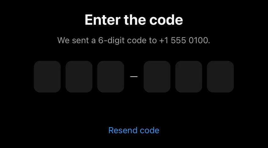
A one-time code field that offers an incoming code, fills it digit by digit, and verifies it automatically.

OTP Autofill is an open-source interaction from suiss/ui for React, React Native, SwiftUI and Jetpack Compose. The @esuiss/ui CLI copies its source into your project, so you own the code.

import * as React from "react"
import {
  OtpAutofill,
  OtpAutofillInput,
  OtpAutofillSuggestion,
  useOtpAutofill,
} from "@/components/interactions/otp-autofill"
import { Button } from "@/components/ui/button"
import {
  InputOTPGroup,
  InputOTPSeparator,
  InputOTPSlot,
} from "@/components/ui/input-otp"

const CODE = "482913"

function wait(ms: number) {
  return new Promise((resolve) => setTimeout(resolve, ms))
}

function Status() {
  const { state } = useOtpAutofill()

  return (
    <p
      role="status"
      className="min-h-5 text-sm text-muted-foreground data-[state=invalid]:text-destructive data-[state=verified]:text-green-600 dark:data-[state=verified]:text-green-400"
      data-state={state}
    >
      {state === "verifying" && "Verifying…"}
      {state === "verified" && "Verified"}
      {state === "invalid" && "That code didn't work. Try again."}
    </p>
  )
}

function VerificationExample({ incoming }: { incoming: string }) {
  const [suggestion, setSuggestion] = React.useState<string | null>(null)
  const [sending, setSending] = React.useState(false)

  const send = React.useCallback(async () => {
    setSending(true)
    setSuggestion(null)
    await wait(1200)
    setSuggestion(incoming)
    setSending(false)
  }, [incoming])

  React.useEffect(() => {
    send()
  }, [send])

  return (
    <div className="mx-auto flex w-[min(28rem,calc(100vw-2rem))] flex-col items-center gap-2 text-center">
      <h2 className="text-2xl font-bold tracking-tight">Enter the code</h2>
      <p className="text-sm text-muted-foreground">
        We sent a 6-digit code to +1 555 0100.
      </p>
      <OtpAutofill
        maxLength={6}
        onVerify={async (code) => {
          await wait(700)
          return code === CODE
        }}
        className="mt-4"
      >
        <OtpAutofillInput autoFocus aria-label="Verification code">
          <InputOTPGroup>
            <InputOTPSlot index={0} />
            <InputOTPSlot index={1} />
            <InputOTPSlot index={2} />
          </InputOTPGroup>
          <InputOTPSeparator />
          <InputOTPGroup>
            <InputOTPSlot index={3} />
            <InputOTPSlot index={4} />
            <InputOTPSlot index={5} />
          </InputOTPGroup>
        </OtpAutofillInput>
        <Status />
        <OtpAutofillSuggestion code={suggestion} />
      </OtpAutofill>
      <Button variant="plain" onClick={send} disabled={sending}>
        {sending ? "Sending…" : "Resend code"}
      </Button>
    </div>
  )
}

export default function OtpAutofillDemo() {
  return <VerificationExample incoming={CODE} />
}

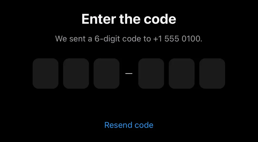
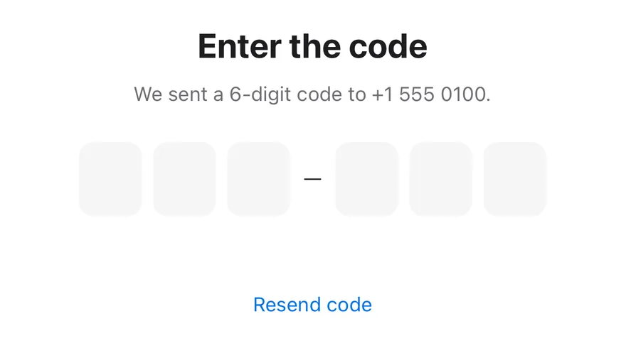
OtpAutofill builds on the suiss/ui InputOTP component to recreate the iOS security code autofill flow. When the field is focused and empty, OtpAutofillSuggestion offers the received code; choosing it types the digits in with a short pop animation and calls onVerify once all slots are filled. A valid code turns the slots green and locks the field; an invalid one shakes the slots, marks them red, then clears the field and refocuses it.

The suggestion adapts to the device through useIsMobile. Below 48rem it docks above the on-screen keyboard like the QuickType bar, tracking the visual viewport; on wider screens it appears as an inline pill under the field. In supporting browsers, the WebOTP API also reads codes from SMS and fills them automatically.

Installation

CLI

$ pnpm dlx shadcn@latest add @esuiss/otp-autofill

Works in any project with a components.json. See Installation for the one-line registry setup. Or use the suiss/ui CLI:

$ pnpm dlx @esuiss/ui@latest add interactions otp-autofill

Manual

  1. Install the dependencies and add the cn helper:
$ pnpm add @phosphor-icons/react
  1. Add the pieces it builds on: Input OTP, use-mobile.

  2. Copy the source into components/interactions/otp-autofill.tsx:

components/interactions/otp-autofill.tsx
"use client"

import { ChatCircleTextIcon } from "@phosphor-icons/react"
import * as React from "react"
import { InputOTP } from "@/components/ui/input-otp"
import { useIsMobile } from "@/hooks/use-mobile"
import { cn } from "@/lib/utils"

type OtpAutofillState =
  | "idle"
  | "filling"
  | "verifying"
  | "verified"
  | "invalid"

type OtpAutofillContextProps = {
  1. Update the import paths to match your project.

Usage

import { OtpAutofill, OtpAutofillInput, OtpAutofillSuggestion } from "@/components/interactions/otp-autofill"
<VerificationExample incoming={CODE} />
  • Place OtpAutofillInput and OtpAutofillSuggestion inside OtpAutofill. Pass InputOTPGroup, InputOTPSlot, and InputOTPSeparator from input-otp as the input's children.
  • The value is managed internally. Typing or pasting also verifies automatically once the code reaches maxLength; a paste of several characters fills with the same animation.
  • onVerify may be async. Use useOtpAutofill to read state (idle, filling, verifying, verified, invalid) for status text or other UI.
  • Set code on the suggestion to null until a code arrives; the suggestion stays hidden without one.

Examples

Wrong code

A rejected code shakes the field, shows an error, clears, and accepts a code typed by hand.

import * as React from "react"
import {
  OtpAutofill,
  OtpAutofillInput,
  OtpAutofillSuggestion,
  useOtpAutofill,
} from "@/components/interactions/otp-autofill"
import { Button } from "@/components/ui/button"
import {
  InputOTPGroup,
  InputOTPSeparator,
  InputOTPSlot,
} from "@/components/ui/input-otp"

const CODE = "482913"

function wait(ms: number) {
  return new Promise((resolve) => setTimeout(resolve, ms))
}

function Status() {
  const { state } = useOtpAutofill()

  return (
    <p
      role="status"
      className="min-h-5 text-sm text-muted-foreground data-[state=invalid]:text-destructive data-[state=verified]:text-green-600 dark:data-[state=verified]:text-green-400"
      data-state={state}
    >
      {state === "verifying" && "Verifying…"}
      {state === "verified" && "Verified"}
      {state === "invalid" && "That code didn't work. Try again."}
    </p>
  )
}

function VerificationExample({ incoming }: { incoming: string }) {
  const [suggestion, setSuggestion] = React.useState<string | null>(null)
  const [sending, setSending] = React.useState(false)

  const send = React.useCallback(async () => {
    setSending(true)
    setSuggestion(null)
    await wait(1200)
    setSuggestion(incoming)
    setSending(false)
  }, [incoming])

  React.useEffect(() => {
    send()
  }, [send])

  return (
    <div className="mx-auto flex w-[min(28rem,calc(100vw-2rem))] flex-col items-center gap-2 text-center">
      <h2 className="text-2xl font-bold tracking-tight">Enter the code</h2>
      <p className="text-sm text-muted-foreground">
        We sent a 6-digit code to +1 555 0100.
      </p>
      <OtpAutofill
        maxLength={6}
        onVerify={async (code) => {
          await wait(700)
          return code === CODE
        }}
        className="mt-4"
      >
        <OtpAutofillInput autoFocus aria-label="Verification code">
          <InputOTPGroup>
            <InputOTPSlot index={0} />
            <InputOTPSlot index={1} />
            <InputOTPSlot index={2} />
          </InputOTPGroup>
          <InputOTPSeparator />
          <InputOTPGroup>
            <InputOTPSlot index={3} />
            <InputOTPSlot index={4} />
            <InputOTPSlot index={5} />
          </InputOTPGroup>
        </OtpAutofillInput>
        <Status />
        <OtpAutofillSuggestion code={suggestion} />
      </OtpAutofill>
      <Button variant="plain" onClick={send} disabled={sending}>
        {sending ? "Sending…" : "Resend code"}
      </Button>
    </div>
  )
}

export default function OtpAutofillWrongCode() {
  return <VerificationExample incoming="113355" />
}

API Reference

01

OtpAutofill

The root that holds the code value and verification state.

PropTypeDefaultDescription
maxLengthnumberRequiredThe number of characters in the code; verification runs once it is reached.
onVerify(code: string) => Promise<boolean> | booleanRequiredCalled with the complete code; return or resolve true to accept it or false to reject it.
webOtpbooleantrueListens for SMS codes through the WebOTP API, where supported.

Also accepts the props of React.ComponentProps<"div">.

02

OtpAutofillInput

The InputOTP field wired to the autofill state.

PropTypeDefaultDescription
containerClassNamestring-Classes for the slot container, merged with the state styles.
childrenReact.ReactNodeRequiredThe slot groups and separators that make up the field.

Also accepts the props of React.ComponentProps<"input">.

03

OtpAutofillSuggestion

The button that offers the received code and fills it when pressed.

PropTypeDefaultDescription
codestring | null | undefinedRequiredThe received code to offer; the suggestion is hidden while it is empty.
sourceReact.ReactNode"From Messages"The label that names where the code came from.

Also accepts the props of React.ComponentProps<"button">.

Accessibility

  • Label the field with aria-label on OtpAutofillInput, which renders a single text input.
  • The input is read-only while filling, verifying, or verified, and sets aria-invalid when the code is rejected.
  • The suggestion is a native button that is inert while hidden, and it prevents focus from leaving the field on press.
  • After a rejected code, focus returns to the field. Pair the root with a role="status" element to announce the result.

Notes

  • The root exposes data-slot="otp-autofill" and data-state. The suggestion uses data-slot="otp-autofill-suggestion", data-placement (keyboard or inline), and data-closed while hidden.
  • The pop and shake animations are skipped under prefers-reduced-motion.
iOS
Otp Autofill on iOS in light modeOtp Autofill on iOS in dark mode
import * as React from "react"
import { View } from "react-native"
import { OtpAutofill, OtpAutofillInput, OtpAutofillSuggestion, useOtpAutofill } from "@/components/interactions/otp-autofill"
import { Button } from "@/components/ui/button"
import { InputOTPGroup, InputOTPSeparator, InputOTPSlot } from "@/components/ui/input-otp"
import { Text } from "@/components/ui/text"

const CODE = "482913"

function wait(ms: number) {
  return new Promise((resolve) => setTimeout(resolve, ms))
}

function statusClassName(state: string) {
  if (state === "invalid") return "min-h-5 text-sm text-destructive"
  if (state === "verified")
    return "min-h-5 text-sm text-green-600 dark:text-green-400"
  return "min-h-5 text-sm text-muted-foreground"
}

function statusText(state: string) {
  if (state === "verifying") return "Verifying…"
  if (state === "verified") return "Verified"
  if (state === "invalid") return "That code didn't work. Try again."
  return ""
}

function Status() {
  const { state } = useOtpAutofill()

  return (
    <Text
      role="status"
      accessibilityLiveRegion="polite"
      className={statusClassName(state)}
    >
      {statusText(state)}
    </Text>
  )
}

function VerificationExample({ incoming }: { incoming: string }) {
  const [suggestion, setSuggestion] = React.useState<string | null>(null)
  const [sending, setSending] = React.useState(false)

  const send = React.useCallback(async () => {
    setSending(true)
    setSuggestion(null)
    await wait(1200)
    setSuggestion(incoming)
    setSending(false)
  }, [incoming])

  React.useEffect(() => {
    send()
  }, [send])

  return (
    <View className="w-full items-center gap-2">
      <Text className="text-center text-2xl font-bold">Enter the code</Text>
      <Text className="text-center text-sm text-muted-foreground">
        We sent a 6-digit code to +1 555 0100.
      </Text>
      <OtpAutofill
        maxLength={6}
        onVerify={async (code) => {
          await wait(700)
          return code === CODE
        }}
        className="mt-4"
      >
        <OtpAutofillInput autoFocus accessibilityLabel="Verification code">
          <InputOTPGroup>
            <InputOTPSlot index={0} />
            <InputOTPSlot index={1} />
            <InputOTPSlot index={2} />
          </InputOTPGroup>
          <InputOTPSeparator />
          <InputOTPGroup>
            <InputOTPSlot index={3} />
            <InputOTPSlot index={4} />
            <InputOTPSlot index={5} />
          </InputOTPGroup>
        </OtpAutofillInput>
        <Status />
        <OtpAutofillSuggestion code={suggestion} />
      </OtpAutofill>
      <Button variant="plain" onPress={send} disabled={sending}>
        <Text>{sending ? "Sending…" : "Resend code"}</Text>
      </Button>
    </View>
  )
}

export function OtpAutofillExample() {
  return (
    <VerificationExample incoming={CODE} />
  )
}
import EsuissUI
import SwiftUI

struct OTPAutofillExample: View {
  var body: some View {
    OtpAutofillVerification(incoming: otpAutofillCode)
  }
}

let otpAutofillCode = "482913"

struct OtpAutofillStatus: View {
  let state: OtpAutofillState

  var body: some View {
    Text(text)
      .textStyle(.sm)
      .foregroundStyle(color)
      .frame(minHeight: 20)
      .accessibilityAddTraits(.updatesFrequently)
  }

  var text: LocalizedStringKey {
    switch state {
    case .verifying: "Verifying…"
    case .verified: "Verified"
    case .invalid: "That code didn't work. Try again."
    case .idle, .filling: ""
    }
  }

  var color: Color {
    switch state {
    case .verified: Color.adaptive(light: Palette.green600, dark: Palette.green400)
    case .invalid: EsuissColor.destructive
    default: EsuissColor.mutedForeground
    }
  }
}

struct OtpAutofillVerification: View {
  let incoming: String

  @State private var suggestion: String?
  @State private var sending = false

  var body: some View {
    VStack(spacing: 8) {
      Text("Enter the code")
        .textStyle(.xl2, weight: .bold)
        .foregroundStyle(EsuissColor.foreground)
        .multilineTextAlignment(.center)
      Text("We sent a 6-digit code to +1 555 0100.")
        .textStyle(.sm)
        .foregroundStyle(EsuissColor.mutedForeground)
        .multilineTextAlignment(.center)
      OtpAutofill(length: 6, onVerify: { code in
        try? await Task.sleep(for: .milliseconds(700))
        return code == otpAutofillCode
      }) { state in
        OtpAutofillInput(autoFocus: true) {
          InputOTPGroup {
            InputOTPSlot(index: 0)
            InputOTPSlot(index: 1)
            InputOTPSlot(index: 2)
          }
          InputOTPSeparator()
          InputOTPGroup {
            InputOTPSlot(index: 3)
            InputOTPSlot(index: 4)
            InputOTPSlot(index: 5)
          }
        }
        .accessibilityLabel(Text("Verification code"))
        OtpAutofillStatus(state: state)
        OtpAutofillSuggestion(code: suggestion)
      }
      .padding(.top, 16)
      Button {
        Task { await send() }
      } label: {
        Text(sending ? "Sending…" : "Resend code")
      }
      .buttonStyle(.variant(.plain))
      .disabled(sending)
    }
    .frame(maxWidth: .infinity)
    .task {
      await send()
    }
  }

  func send() async {
    sending = true
    suggestion = nil
    try? await Task.sleep(for: .milliseconds(1200))
    suggestion = incoming
    sending = false
  }
}
import androidx.compose.foundation.layout.Arrangement
import androidx.compose.foundation.layout.Column
import androidx.compose.foundation.layout.fillMaxWidth
import androidx.compose.foundation.layout.padding
import androidx.compose.runtime.Composable
import androidx.compose.runtime.LaunchedEffect
import androidx.compose.runtime.getValue
import androidx.compose.runtime.mutableIntStateOf
import androidx.compose.runtime.mutableStateOf
import androidx.compose.runtime.saveable.rememberSaveable
import androidx.compose.runtime.setValue
import androidx.compose.ui.Alignment
import androidx.compose.ui.Modifier
import androidx.compose.ui.text.font.FontWeight
import androidx.compose.ui.text.style.TextAlign
import androidx.compose.ui.unit.dp
import com.esuiss.ui.components.Button
import com.esuiss.ui.components.ButtonVariant
import com.esuiss.ui.components.InputOTPGroup
import com.esuiss.ui.components.InputOTPSeparator
import com.esuiss.ui.components.InputOTPSlot
import com.esuiss.ui.components.Text
import com.esuiss.ui.interactions.OtpAutofill
import com.esuiss.ui.interactions.OtpAutofillInput
import com.esuiss.ui.interactions.OtpAutofillSuggestion
import com.esuiss.ui.theme.EsuissTheme
import com.esuiss.ui.theme.Typography
import kotlinx.coroutines.delay

@Composable
fun OTPAutofillExample() {
    OtpAutofillVerification(incoming = OtpAutofillCode)
}

@Composable
fun OtpAutofillVerification(incoming: String) {
    val colors = EsuissTheme.colors
    var suggestion by rememberSaveable { mutableStateOf<String?>(null) }
    var sending by rememberSaveable { mutableStateOf(false) }
    var request by rememberSaveable { mutableIntStateOf(0) }
    LaunchedEffect(request) {
        sending = true
        suggestion = null
        delay(1200)
        suggestion = incoming
        sending = false
    }
    Column(
        modifier = Modifier.fillMaxWidth(),
        horizontalAlignment = Alignment.CenterHorizontally,
        verticalArrangement = Arrangement.spacedBy(8.dp),
    ) {
        Text("Enter the code", style = Typography.xl2.copy(fontWeight = FontWeight.Bold), textAlign = TextAlign.Center)
        Text(
            "We sent a 6-digit code to +1 555 0100.",
            style = Typography.sm.copy(color = colors.mutedForeground),
            textAlign = TextAlign.Center,
        )
        OtpAutofill(
            maxLength = 6,
            onVerify = { code ->
                delay(700)
                code == OtpAutofillCode
            },
            modifier = Modifier.padding(top = 16.dp),
        ) {
            OtpAutofillInput(contentDescription = "Verification code", autoFocus = true) {
                InputOTPGroup {
                    InputOTPSlot(0)
                    InputOTPSlot(1)
                    InputOTPSlot(2)
                }
                InputOTPSeparator()
                InputOTPGroup {
                    InputOTPSlot(3)
                    InputOTPSlot(4)
                    InputOTPSlot(5)
                }
            }
            OtpAutofillStatus()
            OtpAutofillSuggestion(code = suggestion)
        }
        Button(
            if (sending) "Sending…" else "Resend code",
            onClick = { request += 1 },
            variant = ButtonVariant.Plain,
            enabled = !sending,
        )
    }
}

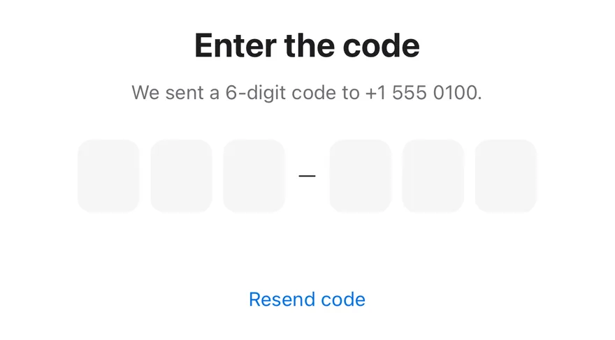
OtpAutofill wraps an InputOTP and runs it through idle, filling, verifying, verified and invalid states. When the input is focused and empty, OtpAutofillSuggestion slides up above the keyboard with the incoming code; pressing it types the code one digit at a time.

When all digits are entered, onVerify runs and the slots dim while it is pending. A valid code turns the slots green and locks the input. An invalid code turns them red and shakes the row, then clears the input and refocuses it. Pasting or a system autofill of several digits plays the same digit-by-digit fill.

Installation

$ pnpm dlx shadcn@latest add @esuiss-rn/otp-autofill

See Installation for the components.json setup. Or use the suiss/ui CLI:

$ pnpm dlx @esuiss/ui@latest add otp-autofill
$ pnpm dlx @esuiss/ui@latest add otp-autofill --platform swift
$ pnpm dlx @esuiss/ui@latest add otp-autofill --platform kotlin

The CLI also adds what it builds on: Input OTP, Text. On React Native it also adds the animated view components/ui/animated-view.tsx.

Manual

  1. Install the dependencies:
npx expo install cn react-native-reanimated react-native-safe-area-context react-native-worklets
  1. Add the pieces it builds on: Input OTP, Text, and the primitives components/primitives/keyboard.tsx, components/primitives/portal.tsx, and the animated view components/ui/animated-view.tsx from the next step.

  2. Copy the animated view into components/ui/animated-view.tsx:

uniwind/components/ui/animated-view.tsx
import { Pressable } from "react-native"
import Animated from "react-native-reanimated"

const AnimatedPressable = Animated.createAnimatedComponent(Pressable)

type AnimatedViewProps =
  | (React.ComponentProps<typeof Animated.View> &
      React.RefAttributes<React.ComponentRef<typeof Animated.View>> & {
        as?: "View"
      })
  | (React.ComponentProps<typeof AnimatedPressable> &
      React.RefAttributes<React.ComponentRef<typeof AnimatedPressable>> & {
        as: "Pressable"
      })

function AnimatedView(props: AnimatedViewProps) {
  1. Copy the source into components/interactions/otp-autofill.tsx:
uniwind/components/interactions/otp-autofill.tsx
import { cn } from "cn"
import * as React from "react"
import { Platform, Pressable, type TextInput, View } from "react-native"
import {
  Easing,
  Keyframe,
  ReduceMotion,
  useAnimatedStyle,
  useSharedValue,
  withSequence,
  withTiming,
} from "react-native-reanimated"
import { useSafeAreaInsets } from "react-native-safe-area-context"
import { useKeyboard } from "@/components/primitives/keyboard"
import { Portal } from "@/components/primitives/portal"
import { AnimatedView } from "@/components/ui/animated-view"
  1. Update the import paths to match your project.
  1. Install the dependencies:
npx expo install cn react-native-reanimated react-native-safe-area-context react-native-worklets
  1. Add the pieces it builds on: Input OTP, Text, and the primitives components/primitives/keyboard.tsx, components/primitives/portal.tsx, and the animated view components/ui/animated-view.tsx from the next step.

  2. Copy the animated view into components/ui/animated-view.tsx:

nativewind/components/ui/animated-view.tsx
import { Pressable } from "react-native"
import Animated from "react-native-reanimated"

const AnimatedPressable = Animated.createAnimatedComponent(Pressable)

type AnimatedViewProps =
  | (React.ComponentProps<typeof Animated.View> &
      React.RefAttributes<React.ComponentRef<typeof Animated.View>> & {
        as?: "View"
      })
  | (React.ComponentProps<typeof AnimatedPressable> &
      React.RefAttributes<React.ComponentRef<typeof AnimatedPressable>> & {
        as: "Pressable"
      })

function AnimatedView(props: AnimatedViewProps) {
  1. Copy the source into components/interactions/otp-autofill.tsx:
nativewind/components/interactions/otp-autofill.tsx
import { cn } from "cn"
import * as React from "react"
import { Platform, Pressable, type TextInput, View } from "react-native"
import {
  Easing,
  Keyframe,
  ReduceMotion,
  useAnimatedStyle,
  useSharedValue,
  withSequence,
  withTiming,
} from "react-native-reanimated"
import { useSafeAreaInsets } from "react-native-safe-area-context"
import { useKeyboard } from "@/components/primitives/keyboard"
import { Portal } from "@/components/primitives/portal"
import { AnimatedView } from "@/components/ui/animated-view"
  1. Update the import paths to match your project.
  1. Install the dependencies:
npx expo install react-native-reanimated react-native-safe-area-context react-native-worklets
  1. Add the pieces it builds on: Input OTP, Text, and the primitives components/primitives/keyboard.tsx, components/primitives/portal.tsx, and the animated view components/ui/animated-view.tsx from the next step.

  2. Copy the animated view into components/ui/animated-view.tsx:

stylesheet/components/ui/animated-view.tsx
import { Pressable } from "react-native"
import Animated from "react-native-reanimated"

const AnimatedPressable = Animated.createAnimatedComponent(Pressable)

type AnimatedViewProps =
  | (React.ComponentProps<typeof Animated.View> &
      React.RefAttributes<React.ComponentRef<typeof Animated.View>> & {
        as?: "View"
      })
  | (React.ComponentProps<typeof AnimatedPressable> &
      React.RefAttributes<React.ComponentRef<typeof AnimatedPressable>> & {
        as: "Pressable"
      })

function AnimatedView(props: AnimatedViewProps) {
  1. Copy the source into components/interactions/otp-autofill.tsx:
stylesheet/components/interactions/otp-autofill.tsx
import * as React from "react"
import {
  Platform,
  Pressable,
  type StyleProp,
  StyleSheet,
  type TextInput,
  View,
  type ViewStyle,
} from "react-native"
import {
  Easing,
  Keyframe,
  ReduceMotion,
  useAnimatedStyle,
  useSharedValue,
  1. Update the import paths to match your project.
  1. Target iOS 17 or later.

  2. Add the Swift package to your app:

Package.swift
.package(url: "https://github.com/phosphor-icons/swift", from: "2.1.0")
  1. Copy the theme files every view uses:
swift/Theme/Theme.swift
import SwiftUI
import UIKit

struct RGBA: Sendable {
  let red: CGFloat
  let green: CGFloat
  let blue: CGFloat
  let alpha: CGFloat

  init(_ hex: UInt32, _ alpha: CGFloat = 1) {
    red = CGFloat((hex >> 16) & 0xFF) / 255
    green = CGFloat((hex >> 8) & 0xFF) / 255
    blue = CGFloat(hex & 0xFF) / 255
    self.alpha = alpha
  }
swift/Theme/Tokens.swift
import SwiftUI

public enum EsuissColor {
  public static let background = Color.adaptive(light: .init(0xFFFFFF), dark: .init(0x000000))
  public static let foreground = Color.adaptive(light: .init(0x1D1D1F), dark: .init(0xF5F5F7))
  public static let card = Color.adaptive(light: .init(0xFFFFFF), dark: .init(0x1D1D1F))
  public static let cardForeground = Color.adaptive(light: .init(0x1D1D1F), dark: .init(0xF5F5F7))
  public static let popover = Color.adaptive(light: .init(0xFFFFFF), dark: .init(0x1D1D1F))
  public static let popoverForeground = Color.adaptive(light: .init(0x1D1D1F), dark: .init(0xF5F5F7))
  public static let primary = Color.adaptive(light: .init(0x0071E3), dark: .init(0x2997FF))
  public static let primaryForeground = Color.adaptive(light: .init(0xFFFFFF), dark: .init(0xFFFFFF))
  public static let secondary = Color.adaptive(light: .init(0x000000, 0.04), dark: .init(0xFFFFFF, 0.1))
  public static let secondaryForeground = Color.adaptive(light: .init(0x1D1D1F), dark: .init(0xF5F5F7))
  public static let muted = Color.adaptive(light: .init(0xF5F5F7), dark: .init(0x161617))
  public static let mutedForeground = Color.adaptive(light: .init(0x6E6E73), dark: .init(0xA1A1A6))
  public static let accent = Color.adaptive(light: .init(0x000000, 0.06), dark: .init(0xFFFFFF, 0.1))
  1. Copy the source and every file it uses:
swift/Interactions/OtpAutofill.swift
import Observation
import SwiftUI

public enum OtpAutofillState: String, CaseIterable, Sendable {
  case idle
  case filling
  case verifying
  case verified
  case invalid
}

@MainActor
@Observable
final class OtpAutofillModel {
  var value = ""
  var state = OtpAutofillState.idle
swift/Components/Checkbox.swift
import PhosphorSwift
import SwiftUI

extension Shadow {
  static let control = Shadow(color: .black.opacity(0.08), radius: 0.5, y: 0.5)
  static let thumb = Shadow(color: .black.opacity(0.12), radius: 1.5, y: 1)
}

struct SelectionIndicator<Mark: View>: View {
  let checked: Bool
  let pressed: Bool
  let cornerRadius: CGFloat
  let mark: Mark

  @Environment(\.isEnabled) private var isEnabled
  @Environment(\.isInvalid) private var invalid
swift/Components/Field.swift
import SwiftUI

extension EnvironmentValues {
  @Entry public var isInvalid = false
  @Entry var fieldInset = false
  @Entry var fieldGroupInset = false
  @Entry var fieldSetInset = false
}

extension View {
  public func invalid(_ isInvalid: Bool = true) -> some View {
    environment(\.isInvalid, isInvalid)
  }
}

public enum FieldOrientation: CaseIterable, Sendable {
swift/Components/Haptics.swift
import SwiftUI

extension EnvironmentValues {
  @Entry public var hapticsEnabled = true
}

extension View {
  public func haptics(_ enabled: Bool) -> some View {
    environment(\.hapticsEnabled, enabled)
  }

  func hapticFeedback<Trigger: Equatable>(_ feedback: SensoryFeedback, trigger: Trigger) -> some View {
    modifier(HapticFeedbackModifier(feedback: feedback, trigger: trigger) { _, _ in true })
  }

  func hapticFeedback<Trigger: Equatable>(
swift/Components/InputOTP.swift
import PhosphorSwift
import SwiftUI

struct InputOTPContext {
  var characters: [Character]
  var length: Int
  var focused: Bool
}

struct InputOTPTone: Equatable {
  var danger = false
  var verified = false
  var dimmed = false
  var pops: [Int] = []
}
swift/Components/Keypad.swift
import PhosphorSwift
import SwiftUI

public enum KeypadKey: Hashable, Sendable {
  case digit(Int)
  case decimal
  case delete
  case biometric
}

public enum KeypadAccessory {
  case none
  case decimal(String, label: LocalizedStringKey = "Decimal separator")
  case biometric(Image, label: LocalizedStringKey = "Use biometrics")
}
swift/Components/Separator.swift
import SwiftUI

public struct Separator: View {
  let orientation: Axis

  public init(_ orientation: Axis = .horizontal) {
    self.orientation = orientation
  }

  public var body: some View {
    Rectangle()
      .fill(EsuissColor.border)
      .frame(width: orientation == .vertical ? 1 : nil, height: orientation == .horizontal ? 1 : nil)
      .frame(maxWidth: orientation == .horizontal ? .infinity : nil, maxHeight: orientation == .vertical ? .infinity : nil)
      .accessibilityHidden(true)
  }
swift/Components/TextVariant.swift
import SwiftUI

public enum TextVariant: CaseIterable, Sendable {
  case `default`, h1, h2, h3, h4, p, blockquote, code, lead, large, small, muted

  var style: TextStyle {
    switch self {
    case .h1: .xl3
    case .h2: .xl2
    case .h3: .xl
    case .h4, .lead, .large: .lg
    case .code, .small, .muted: .sm
    default: .base
    }
  }
  1. Add the files to your app target.
  1. Set minSdk to 24 or higher and add the dependencies:
build.gradle.kts
implementation(platform("androidx.compose:compose-bom:2026.09.00"))
implementation("androidx.compose.foundation:foundation")
implementation("androidx.compose.ui:ui")
implementation("com.adamglin:phosphor-icon-android:1.0.0")
  1. Copy the theme files every view uses:
kotlin/theme/Theme.kt
package com.esuiss.ui.theme

import androidx.compose.foundation.isSystemInDarkTheme
import androidx.compose.runtime.Composable
import androidx.compose.runtime.CompositionLocalProvider
import androidx.compose.runtime.Immutable
import androidx.compose.runtime.staticCompositionLocalOf
import androidx.compose.ui.Modifier
import androidx.compose.ui.draw.dropShadow
import androidx.compose.ui.graphics.Color
import androidx.compose.ui.graphics.Shape
import androidx.compose.ui.graphics.shadow.Shadow as DropShadow
import androidx.compose.ui.text.TextStyle
import androidx.compose.ui.text.style.LineHeightStyle
import androidx.compose.ui.unit.Dp
import androidx.compose.ui.unit.DpOffset
kotlin/theme/Tokens.kt
package com.esuiss.ui.theme

import androidx.compose.runtime.Immutable
import androidx.compose.ui.graphics.Color
import androidx.compose.ui.unit.dp

@Immutable
data class Colors(
    val background: Color,
    val foreground: Color,
    val card: Color,
    val cardForeground: Color,
    val popover: Color,
    val popoverForeground: Color,
    val primary: Color,
    val primaryForeground: Color,
  1. Copy the source and every file it uses:
kotlin/interactions/OtpAutofill.kt
package com.esuiss.ui.interactions

import androidx.compose.animation.AnimatedVisibility
import androidx.compose.animation.core.Animatable
import androidx.compose.animation.core.MutableTransitionState
import androidx.compose.animation.core.tween
import androidx.compose.animation.fadeIn
import androidx.compose.animation.fadeOut
import androidx.compose.animation.slideInVertically
import androidx.compose.animation.slideOutVertically
import androidx.compose.foundation.background
import androidx.compose.foundation.clickable
import androidx.compose.foundation.interaction.MutableInteractionSource
import androidx.compose.foundation.interaction.collectIsFocusedAsState
import androidx.compose.foundation.interaction.collectIsPressedAsState
import androidx.compose.foundation.layout.Arrangement
kotlin/components/Button.kt
package com.esuiss.ui.components

import androidx.compose.foundation.background
import androidx.compose.foundation.border
import androidx.compose.foundation.clickable
import androidx.compose.foundation.interaction.MutableInteractionSource
import androidx.compose.foundation.interaction.collectIsPressedAsState
import androidx.compose.foundation.layout.Arrangement
import androidx.compose.foundation.layout.Row
import androidx.compose.foundation.layout.RowScope
import androidx.compose.foundation.layout.fillMaxWidth
import androidx.compose.foundation.layout.height
import androidx.compose.foundation.layout.padding
import androidx.compose.foundation.layout.size
import androidx.compose.foundation.shape.CircleShape
import androidx.compose.foundation.shape.RoundedCornerShape
kotlin/components/ButtonGroup.kt
package com.esuiss.ui.components

import androidx.compose.foundation.background
import androidx.compose.foundation.gestures.Orientation
import androidx.compose.foundation.layout.Arrangement
import androidx.compose.foundation.layout.Box
import androidx.compose.foundation.layout.Row
import androidx.compose.foundation.layout.RowScope
import androidx.compose.foundation.layout.padding
import androidx.compose.foundation.shape.CircleShape
import androidx.compose.foundation.shape.CornerSize
import androidx.compose.foundation.shape.RoundedCornerShape
import androidx.compose.runtime.Composable
import androidx.compose.runtime.CompositionLocalProvider
import androidx.compose.runtime.DisposableEffect
import androidx.compose.runtime.Immutable
kotlin/components/Content.kt
package com.esuiss.ui.components

import androidx.compose.runtime.compositionLocalOf
import androidx.compose.ui.graphics.Color
import androidx.compose.ui.text.TextStyle
import androidx.compose.ui.unit.Dp
import androidx.compose.ui.unit.dp

val LocalContentStyle = compositionLocalOf { TextStyle.Default }

val LocalContentColor = compositionLocalOf { Color.Unspecified }

val LocalIconSize = compositionLocalOf { 20.dp }
kotlin/components/Field.kt
package com.esuiss.ui.components

import androidx.compose.foundation.background
import androidx.compose.foundation.gestures.Orientation
import androidx.compose.foundation.layout.Arrangement
import androidx.compose.foundation.layout.Box
import androidx.compose.foundation.layout.Column
import androidx.compose.foundation.layout.ColumnScope
import androidx.compose.foundation.layout.LayoutScopeMarker
import androidx.compose.foundation.layout.Row
import androidx.compose.foundation.layout.RowScope
import androidx.compose.foundation.layout.fillMaxWidth
import androidx.compose.foundation.layout.heightIn
import androidx.compose.foundation.layout.padding
import androidx.compose.foundation.shape.RoundedCornerShape
import androidx.compose.foundation.text.BasicText
kotlin/components/FormSupport.kt
package com.esuiss.ui.components

import android.provider.Settings
import androidx.compose.animation.core.CubicBezierEasing
import androidx.compose.foundation.background
import androidx.compose.foundation.border
import androidx.compose.foundation.gestures.Orientation
import androidx.compose.foundation.text.selection.TextSelectionColors
import androidx.compose.runtime.Composable
import androidx.compose.runtime.mutableStateOf
import androidx.compose.runtime.remember
import androidx.compose.ui.Modifier
import androidx.compose.ui.draw.alpha
import androidx.compose.ui.draw.clip
import androidx.compose.ui.draw.drawWithContent
import androidx.compose.ui.geometry.Offset
kotlin/components/Haptics.kt
package com.esuiss.ui.components

import androidx.compose.runtime.Composable
import androidx.compose.runtime.CompositionLocalProvider
import androidx.compose.runtime.remember
import androidx.compose.runtime.staticCompositionLocalOf
import androidx.compose.ui.hapticfeedback.HapticFeedback
import androidx.compose.ui.hapticfeedback.HapticFeedbackType
import androidx.compose.ui.platform.LocalHapticFeedback

val LocalHapticsEnabled = staticCompositionLocalOf { true }

@Composable
fun ProvideHaptics(enabled: Boolean, content: @Composable () -> Unit) {
    CompositionLocalProvider(LocalHapticsEnabled provides enabled, content = content)
}
kotlin/components/Icon.kt
package com.esuiss.ui.components

import androidx.compose.foundation.Image
import androidx.compose.foundation.layout.size
import androidx.compose.runtime.Composable
import androidx.compose.ui.Modifier
import androidx.compose.ui.graphics.Color
import androidx.compose.ui.graphics.ColorFilter
import androidx.compose.ui.graphics.takeOrElse
import androidx.compose.ui.graphics.vector.ImageVector
import androidx.compose.ui.unit.Dp
import com.esuiss.ui.theme.EsuissTheme

@Composable
fun Icon(
    imageVector: ImageVector,
kotlin/components/InputOTP.kt
package com.esuiss.ui.components

import androidx.compose.animation.animateColorAsState
import androidx.compose.animation.core.Animatable
import androidx.compose.animation.core.animateFloat
import androidx.compose.animation.core.animateFloatAsState
import androidx.compose.animation.core.infiniteRepeatable
import androidx.compose.animation.core.keyframes
import androidx.compose.animation.core.rememberInfiniteTransition
import androidx.compose.animation.core.tween
import androidx.compose.foundation.background
import androidx.compose.foundation.border
import androidx.compose.foundation.interaction.MutableInteractionSource
import androidx.compose.foundation.interaction.collectIsFocusedAsState
import androidx.compose.foundation.layout.Arrangement
import androidx.compose.foundation.layout.Box
kotlin/components/Keypad.kt
package com.esuiss.ui.components

import androidx.compose.animation.core.Animatable
import androidx.compose.animation.core.AnimationVector1D
import androidx.compose.animation.core.keyframes
import androidx.compose.foundation.background
import androidx.compose.foundation.clickable
import androidx.compose.foundation.interaction.MutableInteractionSource
import androidx.compose.foundation.interaction.collectIsPressedAsState
import androidx.compose.foundation.layout.Arrangement
import androidx.compose.foundation.layout.Box
import androidx.compose.foundation.layout.Column
import androidx.compose.foundation.layout.Row
import androidx.compose.foundation.layout.size
import androidx.compose.foundation.shape.CircleShape
import androidx.compose.foundation.text.BasicText
kotlin/components/Label.kt
package com.esuiss.ui.components

import androidx.compose.foundation.layout.Arrangement
import androidx.compose.foundation.layout.Row
import androidx.compose.foundation.layout.RowScope
import androidx.compose.foundation.text.BasicText
import androidx.compose.runtime.Composable
import androidx.compose.runtime.CompositionLocalProvider
import androidx.compose.ui.Alignment
import androidx.compose.ui.Modifier
import androidx.compose.ui.draw.alpha
import androidx.compose.ui.text.font.FontWeight
import androidx.compose.ui.unit.dp
import com.esuiss.ui.theme.EsuissTheme
import com.esuiss.ui.theme.Typography
kotlin/components/Separator.kt
package com.esuiss.ui.components

import androidx.compose.foundation.background
import androidx.compose.foundation.gestures.Orientation
import androidx.compose.foundation.layout.Box
import androidx.compose.foundation.layout.fillMaxHeight
import androidx.compose.foundation.layout.fillMaxWidth
import androidx.compose.foundation.layout.height
import androidx.compose.foundation.layout.width
import androidx.compose.runtime.Composable
import androidx.compose.ui.Modifier
import androidx.compose.ui.unit.dp
import com.esuiss.ui.theme.EsuissTheme

@Composable
fun Separator(
  1. Update the com.esuiss.ui package names to match your project.

Usage

import { OtpAutofill, OtpAutofillInput, OtpAutofillSuggestion } from "@/components/interactions/otp-autofill"
<VerificationExample incoming={CODE} />

Pass maxLength and onVerify, which returns a boolean or a promise of one. Put InputOTPGroup and InputOTPSlots inside OtpAutofillInput, and render an OtpAutofillSuggestion with the code your app received; it hides when code is empty.

The input sets textContentType="oneTimeCode" and the platform's one-time code autoComplete, so the system can also offer the code. useOtpAutofill returns state, value, fill and inputRef for custom controls.

Examples

Wrong code

An incoming code that fails verification, showing the shake and reset.
iOS
Otp Autofill (wrong code) on iOS in light modeOtp Autofill (wrong code) on iOS in dark mode
import * as React from "react"
import { View } from "react-native"
import { OtpAutofill, OtpAutofillInput, OtpAutofillSuggestion, useOtpAutofill } from "@/components/interactions/otp-autofill"
import { Button } from "@/components/ui/button"
import { InputOTPGroup, InputOTPSeparator, InputOTPSlot } from "@/components/ui/input-otp"
import { Text } from "@/components/ui/text"

const CODE = "482913"

function wait(ms: number) {
  return new Promise((resolve) => setTimeout(resolve, ms))
}

function statusClassName(state: string) {
  if (state === "invalid") return "min-h-5 text-sm text-destructive"
  if (state === "verified")
    return "min-h-5 text-sm text-green-600 dark:text-green-400"
  return "min-h-5 text-sm text-muted-foreground"
}

function statusText(state: string) {
  if (state === "verifying") return "Verifying…"
  if (state === "verified") return "Verified"
  if (state === "invalid") return "That code didn't work. Try again."
  return ""
}

function Status() {
  const { state } = useOtpAutofill()

  return (
    <Text
      role="status"
      accessibilityLiveRegion="polite"
      className={statusClassName(state)}
    >
      {statusText(state)}
    </Text>
  )
}

function VerificationExample({ incoming }: { incoming: string }) {
  const [suggestion, setSuggestion] = React.useState<string | null>(null)
  const [sending, setSending] = React.useState(false)

  const send = React.useCallback(async () => {
    setSending(true)
    setSuggestion(null)
    await wait(1200)
    setSuggestion(incoming)
    setSending(false)
  }, [incoming])

  React.useEffect(() => {
    send()
  }, [send])

  return (
    <View className="w-full items-center gap-2">
      <Text className="text-center text-2xl font-bold">Enter the code</Text>
      <Text className="text-center text-sm text-muted-foreground">
        We sent a 6-digit code to +1 555 0100.
      </Text>
      <OtpAutofill
        maxLength={6}
        onVerify={async (code) => {
          await wait(700)
          return code === CODE
        }}
        className="mt-4"
      >
        <OtpAutofillInput autoFocus accessibilityLabel="Verification code">
          <InputOTPGroup>
            <InputOTPSlot index={0} />
            <InputOTPSlot index={1} />
            <InputOTPSlot index={2} />
          </InputOTPGroup>
          <InputOTPSeparator />
          <InputOTPGroup>
            <InputOTPSlot index={3} />
            <InputOTPSlot index={4} />
            <InputOTPSlot index={5} />
          </InputOTPGroup>
        </OtpAutofillInput>
        <Status />
        <OtpAutofillSuggestion code={suggestion} />
      </OtpAutofill>
      <Button variant="plain" onPress={send} disabled={sending}>
        <Text>{sending ? "Sending…" : "Resend code"}</Text>
      </Button>
    </View>
  )
}

export function OtpAutofillWrongCodeExample() {
  return (
    <VerificationExample incoming="113355" />
  )
}
import EsuissUI
import SwiftUI

struct OTPAutofillWrongCodeExample: View {
  var body: some View {
    OtpAutofillVerification(incoming: "113355")
  }
}

let otpAutofillCode = "482913"

struct OtpAutofillStatus: View {
  let state: OtpAutofillState

  var body: some View {
    Text(text)
      .textStyle(.sm)
      .foregroundStyle(color)
      .frame(minHeight: 20)
      .accessibilityAddTraits(.updatesFrequently)
  }

  var text: LocalizedStringKey {
    switch state {
    case .verifying: "Verifying…"
    case .verified: "Verified"
    case .invalid: "That code didn't work. Try again."
    case .idle, .filling: ""
    }
  }

  var color: Color {
    switch state {
    case .verified: Color.adaptive(light: Palette.green600, dark: Palette.green400)
    case .invalid: EsuissColor.destructive
    default: EsuissColor.mutedForeground
    }
  }
}

struct OtpAutofillVerification: View {
  let incoming: String

  @State private var suggestion: String?
  @State private var sending = false

  var body: some View {
    VStack(spacing: 8) {
      Text("Enter the code")
        .textStyle(.xl2, weight: .bold)
        .foregroundStyle(EsuissColor.foreground)
        .multilineTextAlignment(.center)
      Text("We sent a 6-digit code to +1 555 0100.")
        .textStyle(.sm)
        .foregroundStyle(EsuissColor.mutedForeground)
        .multilineTextAlignment(.center)
      OtpAutofill(length: 6, onVerify: { code in
        try? await Task.sleep(for: .milliseconds(700))
        return code == otpAutofillCode
      }) { state in
        OtpAutofillInput(autoFocus: true) {
          InputOTPGroup {
            InputOTPSlot(index: 0)
            InputOTPSlot(index: 1)
            InputOTPSlot(index: 2)
          }
          InputOTPSeparator()
          InputOTPGroup {
            InputOTPSlot(index: 3)
            InputOTPSlot(index: 4)
            InputOTPSlot(index: 5)
          }
        }
        .accessibilityLabel(Text("Verification code"))
        OtpAutofillStatus(state: state)
        OtpAutofillSuggestion(code: suggestion)
      }
      .padding(.top, 16)
      Button {
        Task { await send() }
      } label: {
        Text(sending ? "Sending…" : "Resend code")
      }
      .buttonStyle(.variant(.plain))
      .disabled(sending)
    }
    .frame(maxWidth: .infinity)
    .task {
      await send()
    }
  }

  func send() async {
    sending = true
    suggestion = nil
    try? await Task.sleep(for: .milliseconds(1200))
    suggestion = incoming
    sending = false
  }
}
import androidx.compose.foundation.layout.Arrangement
import androidx.compose.foundation.layout.Column
import androidx.compose.foundation.layout.fillMaxWidth
import androidx.compose.foundation.layout.padding
import androidx.compose.runtime.Composable
import androidx.compose.runtime.LaunchedEffect
import androidx.compose.runtime.getValue
import androidx.compose.runtime.mutableIntStateOf
import androidx.compose.runtime.mutableStateOf
import androidx.compose.runtime.saveable.rememberSaveable
import androidx.compose.runtime.setValue
import androidx.compose.ui.Alignment
import androidx.compose.ui.Modifier
import androidx.compose.ui.text.font.FontWeight
import androidx.compose.ui.text.style.TextAlign
import androidx.compose.ui.unit.dp
import com.esuiss.ui.components.Button
import com.esuiss.ui.components.ButtonVariant
import com.esuiss.ui.components.InputOTPGroup
import com.esuiss.ui.components.InputOTPSeparator
import com.esuiss.ui.components.InputOTPSlot
import com.esuiss.ui.components.Text
import com.esuiss.ui.interactions.OtpAutofill
import com.esuiss.ui.interactions.OtpAutofillInput
import com.esuiss.ui.interactions.OtpAutofillSuggestion
import com.esuiss.ui.theme.EsuissTheme
import com.esuiss.ui.theme.Typography
import kotlinx.coroutines.delay

@Composable
fun OTPAutofillWrongCodeExample() {
    OtpAutofillVerification(incoming = "113355")
}

@Composable
fun OtpAutofillVerification(incoming: String) {
    val colors = EsuissTheme.colors
    var suggestion by rememberSaveable { mutableStateOf<String?>(null) }
    var sending by rememberSaveable { mutableStateOf(false) }
    var request by rememberSaveable { mutableIntStateOf(0) }
    LaunchedEffect(request) {
        sending = true
        suggestion = null
        delay(1200)
        suggestion = incoming
        sending = false
    }
    Column(
        modifier = Modifier.fillMaxWidth(),
        horizontalAlignment = Alignment.CenterHorizontally,
        verticalArrangement = Arrangement.spacedBy(8.dp),
    ) {
        Text("Enter the code", style = Typography.xl2.copy(fontWeight = FontWeight.Bold), textAlign = TextAlign.Center)
        Text(
            "We sent a 6-digit code to +1 555 0100.",
            style = Typography.sm.copy(color = colors.mutedForeground),
            textAlign = TextAlign.Center,
        )
        OtpAutofill(
            maxLength = 6,
            onVerify = { code ->
                delay(700)
                code == OtpAutofillCode
            },
            modifier = Modifier.padding(top = 16.dp),
        ) {
            OtpAutofillInput(contentDescription = "Verification code", autoFocus = true) {
                InputOTPGroup {
                    InputOTPSlot(0)
                    InputOTPSlot(1)
                    InputOTPSlot(2)
                }
                InputOTPSeparator()
                InputOTPGroup {
                    InputOTPSlot(3)
                    InputOTPSlot(4)
                    InputOTPSlot(5)
                }
            }
            OtpAutofillStatus()
            OtpAutofillSuggestion(code = suggestion)
        }
        Button(
            if (sending) "Sending…" else "Resend code",
            onClick = { request += 1 },
            variant = ButtonVariant.Plain,
            enabled = !sending,
        )
    }
}

Four digits

A four-digit code with its own suggestion.

iOS
Otp Autofill (four digits) on iOS in light modeOtp Autofill (four digits) on iOS in dark mode
import { OtpAutofill, OtpAutofillInput, OtpAutofillSuggestion, useOtpAutofill } from "@/components/interactions/otp-autofill"
import { InputOTPGroup, InputOTPSlot } from "@/components/ui/input-otp"
import { Text } from "@/components/ui/text"

function statusClassName(state: string) {
  if (state === "invalid") return "min-h-5 text-sm text-destructive"
  if (state === "verified")
    return "min-h-5 text-sm text-green-600 dark:text-green-400"
  return "min-h-5 text-sm text-muted-foreground"
}

function statusText(state: string) {
  if (state === "verifying") return "Verifying…"
  if (state === "verified") return "Verified"
  if (state === "invalid") return "That code didn't work. Try again."
  return ""
}

function Status() {
  const { state } = useOtpAutofill()

  return (
    <Text
      role="status"
      accessibilityLiveRegion="polite"
      className={statusClassName(state)}
    >
      {statusText(state)}
    </Text>
  )
}

export function OtpAutofillFourDigitsExample() {
  return (
    <OtpAutofill maxLength={4} onVerify={(code) => code === "2468"}>
      <OtpAutofillInput accessibilityLabel="Verification code">
        <InputOTPGroup>
          <InputOTPSlot index={0} />
          <InputOTPSlot index={1} />
          <InputOTPSlot index={2} />
          <InputOTPSlot index={3} />
        </InputOTPGroup>
      </OtpAutofillInput>
      <Status />
      <OtpAutofillSuggestion code="2468" source="From Messages" />
    </OtpAutofill>
  )
}
import EsuissUI
import SwiftUI

struct OTPAutofillFourDigitsExample: View {
  var body: some View {
    OtpAutofill(length: 4, onVerify: { $0 == "2468" }) { state in
      OtpAutofillInput {
        InputOTPGroup {
          InputOTPSlot(index: 0)
          InputOTPSlot(index: 1)
          InputOTPSlot(index: 2)
          InputOTPSlot(index: 3)
        }
      }
      .accessibilityLabel(Text("Verification code"))
      OtpAutofillStatus(state: state)
      OtpAutofillSuggestion(code: "2468", source: "From Messages")
    }
    .frame(maxWidth: .infinity)
  }
}

struct OtpAutofillStatus: View {
  let state: OtpAutofillState

  var body: some View {
    Text(text)
      .textStyle(.sm)
      .foregroundStyle(color)
      .frame(minHeight: 20)
      .accessibilityAddTraits(.updatesFrequently)
  }

  var text: LocalizedStringKey {
    switch state {
    case .verifying: "Verifying…"
    case .verified: "Verified"
    case .invalid: "That code didn't work. Try again."
    case .idle, .filling: ""
    }
  }

  var color: Color {
    switch state {
    case .verified: Color.adaptive(light: Palette.green600, dark: Palette.green400)
    case .invalid: EsuissColor.destructive
    default: EsuissColor.mutedForeground
    }
  }
}
import androidx.compose.foundation.layout.fillMaxWidth
import androidx.compose.runtime.Composable
import androidx.compose.ui.Modifier
import com.esuiss.ui.components.InputOTPGroup
import com.esuiss.ui.components.InputOTPSlot
import com.esuiss.ui.interactions.OtpAutofill
import com.esuiss.ui.interactions.OtpAutofillInput
import com.esuiss.ui.interactions.OtpAutofillSuggestion

@Composable
fun OtpAutofillFourDigits() {
    OtpAutofill(maxLength = 4, onVerify = { code -> code == "2468" }, modifier = Modifier.fillMaxWidth()) {
        OtpAutofillInput(contentDescription = "Verification code") {
            InputOTPGroup {
                InputOTPSlot(0)
                InputOTPSlot(1)
                InputOTPSlot(2)
                InputOTPSlot(3)
            }
        }
        OtpAutofillStatus()
        OtpAutofillSuggestion(code = "2468", source = "From Messages")
    }
}

API Reference

01

OtpAutofill

The root that holds the code and verification state.

PropTypeDefaultDescription
maxLengthnumberRequiredNumber of digits in the code.
onVerify(code: string) => Promise<boolean> | booleanRequiredChecks a complete code; return true when it is valid.

Also accepts the props of React.ComponentProps<typeof View>.

02

OtpAutofillInput

The InputOTP that shows each state and shakes on an invalid code.

PropTypeDefaultDescription
containerClassNamestring-Classes for the animated container around the input.
childrenReact.ReactNodeRequired

Also accepts the props of React.ComponentProps<typeof InputOTP>.

03

OtpAutofillSuggestion

A bar above the keyboard that fills the suggested code on press.

PropTypeDefaultDescription
codestring | null | undefinedRequiredThe code to suggest, or null to hide the bar.
sourceReact.ReactNode"From Messages"Label above the code. Defaults to From Messages.
portalHoststring-Name of a portal host to render into.
classNamestring-

Also accepts the props of React.ComponentProps<typeof Pressable>.

Accessibility

  • accessibilityLabel on OtpAutofillInput is passed to the underlying text input.
  • The suggestion bar has the button role.
  • The input is read-only while filling, verifying and after a valid code.

Notes

  • Invalid slots use border-destructive with a bg-destructive tint that is stronger in dark mode; verified slots use border-green-500 and bg-green-500/10 dark:bg-green-500/20.
  • The suggestion bar uses bg-popover, or bg-muted in dark mode, and sits on the keyboard or above the bottom safe area.
  • Slide and shake animations respect the system reduce motion setting.
NextPreview MenuPreviousIsland

On this page

  1. 01Installation
    • CLI
    • Manual
  2. 02Usage
  3. 03Examples
    • Wrong code
  4. 04API Reference
    • OtpAutofill
    • OtpAutofillInput
    • OtpAutofillSuggestion
  5. 05Accessibility
  6. 06Notes
  7. 07Installation
    • Manual
  8. 08Usage
  9. 09Examples
    • Wrong code
    • Four digits
  10. 10API Reference
    • OtpAutofill
    • OtpAutofillInput
    • OtpAutofillSuggestion
  11. 11Accessibility
  12. 12Notes