suiss/ui · Interaction
Card Stack
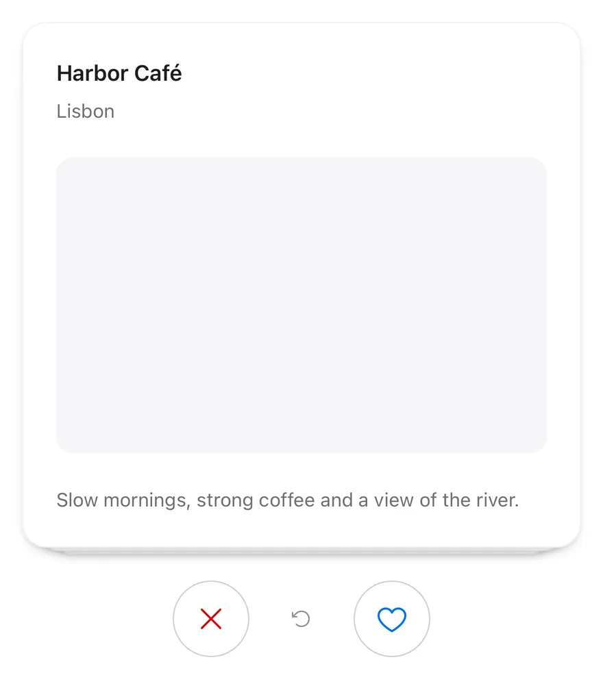
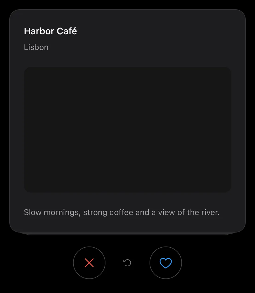
A deck of cards the user swipes left or right one at a time, with buttons, undo and an empty state.
Card Stack is an open-source interaction from suiss/ui for React Native, SwiftUI and Jetpack Compose. The @esuiss/ui CLI copies its source into your project, so you own the code.
import * as React from "react"
import { View } from "react-native"
import { CardStack, CardStackActions, CardStackEmpty, CardStackSwipeButton, CardStackUndo } from "@/components/interactions/card-stack"
import { Card, CardContent, CardDescription, CardHeader, CardTitle } from "@/components/ui/card"
import { Text } from "@/components/ui/text"

type Place = { id: string; name: string; city: string; detail: string }

const places: Place[] = [
  {
    id: "harbor",
    name: "Harbor Café",
    city: "Lisbon",
    detail: "Slow mornings, strong coffee and a view of the river.",
  },
  {
    id: "garden",
    name: "Garden Library",
    city: "Kyoto",
    detail: "Quiet reading rooms around a moss garden.",
  },
  {
    id: "market",
    name: "Night Market",
    city: "Taipei",
    detail: "Street food stalls open until two in the morning.",
  },
]

function PlaceCard({ place }: { place: Place }) {
  return (
    <Card className="h-full">
      <CardHeader>
        <CardTitle>{place.name}</CardTitle>
        <CardDescription>{place.city}</CardDescription>
      </CardHeader>
      <CardContent className="grow">
        <View className="grow rounded-xl bg-muted" />
      </CardContent>
      <CardContent>
        <Text className="text-sm text-muted-foreground">{place.detail}</Text>
      </CardContent>
    </Card>
  )
}

function Demo({ disabled = false }: { disabled?: boolean }) {
  const [log, setLog] = React.useState("")
  return (
    <View className="gap-3">
      <CardStack
        data={places}
        keyExtractor={(place) => place.id}
        renderItem={(place) => <PlaceCard place={place} />}
        itemAccessibilityLabel={(place) => `${place.name}, ${place.city}`}
        disabled={disabled}
        onSwipe={(direction, place) =>
          setLog(`${direction === "left" ? "Skipped" : "Liked"} ${place.name}`)
        }
        onUndo={(place) => setLog(`Restored ${place.name}`)}
      >
        <CardStackEmpty>You have seen every place.</CardStackEmpty>
        <CardStackActions>
          <CardStackSwipeButton direction="left" />
          <CardStackUndo />
          <CardStackSwipeButton direction="right" />
        </CardStackActions>
      </CardStack>
      <Text role="status" className="text-center text-sm text-muted-foreground">
        {log}
      </Text>
    </View>
  )
}

export function CardStackExample() {
  return (
    <Demo />
  )
}import EsuissUI
import SwiftUI
struct CardStackExample: View {
var body: some View {
CardStackDemo(places: cardStackPlaces)
}
}
struct CardStackPlace: Identifiable {
let id: String
let name: String
let city: String
let detail: String
}
let cardStackPlaces = [
CardStackPlace(id: "harbor", name: "Harbor Café", city: "Lisbon", detail: "Slow mornings, strong coffee and a view of the river."),
CardStackPlace(id: "garden", name: "Garden Library", city: "Kyoto", detail: "Quiet reading rooms around a moss garden."),
CardStackPlace(id: "market", name: "Night Market", city: "Taipei", detail: "Street food stalls open until two in the morning."),
]
struct CardStackPlaceCard: View {
let place: CardStackPlace
var body: some View {
Card {
CardHeader(LocalizedStringKey(place.name), description: LocalizedStringKey(place.city))
CardContent {
RoundedRectangle(cornerRadius: Radius.xl, style: .continuous)
.fill(EsuissColor.muted)
.frame(maxHeight: .infinity)
}
.frame(maxHeight: .infinity)
CardContent {
Text(verbatim: place.detail)
.textStyle(.sm)
.foregroundStyle(EsuissColor.mutedForeground)
}
}
.frame(maxHeight: .infinity)
.accessibilityElement(children: .combine)
.accessibilityLabel(Text(verbatim: "\(place.name), \(place.city)"))
}
}
struct CardStackDemo: View {
let places: [CardStackPlace]
var showsLog = true
@State private var controller = CardStackController()
@State private var log = ""
var body: some View {
VStack(spacing: 12) {
VStack(spacing: 24) {
ZStack {
if !controller.canSwipe {
Text("You have seen every place.")
.textStyle(.sm)
.foregroundStyle(EsuissColor.mutedForeground)
.multilineTextAlignment(.center)
.padding(24)
.frame(maxWidth: .infinity, maxHeight: .infinity)
.overlay {
RoundedRectangle(cornerRadius: Radius.xl2, style: .continuous)
.strokeBorder(EsuissColor.border, style: StrokeStyle(lineWidth: 1, dash: [4, 4]))
}
}
CardStack(
places,
controller: controller,
onSwipe: { direction, place in
log = "\(direction == .left ? "Skipped" : "Liked") \(place.name)"
},
onUndo: { place in
log = "Restored \(place.name)"
}
) { place in
CardStackPlaceCard(place: place)
}
}
.frame(height: 384)
HStack(spacing: 16) {
CardStackButton(.swipeLeft, controller: controller)
CardStackButton(.undo, controller: controller)
CardStackButton(.swipeRight, controller: controller)
}
}
if showsLog {
Text(verbatim: log)
.textStyle(.sm)
.foregroundStyle(EsuissColor.mutedForeground)
.multilineTextAlignment(.center)
.frame(maxWidth: .infinity)
.accessibilityAddTraits(.updatesFrequently)
}
}
}
}import androidx.compose.foundation.background
import androidx.compose.foundation.layout.Arrangement
import androidx.compose.foundation.layout.Box
import androidx.compose.foundation.layout.Column
import androidx.compose.foundation.layout.Row
import androidx.compose.foundation.layout.fillMaxSize
import androidx.compose.foundation.layout.fillMaxWidth
import androidx.compose.foundation.layout.height
import androidx.compose.foundation.layout.padding
import androidx.compose.foundation.layout.size
import androidx.compose.foundation.shape.RoundedCornerShape
import androidx.compose.runtime.Composable
import androidx.compose.runtime.getValue
import androidx.compose.runtime.mutableStateOf
import androidx.compose.runtime.saveable.rememberSaveable
import androidx.compose.runtime.setValue
import androidx.compose.ui.Alignment
import androidx.compose.ui.Modifier
import androidx.compose.ui.draw.drawBehind
import androidx.compose.ui.geometry.CornerRadius
import androidx.compose.ui.geometry.Offset
import androidx.compose.ui.geometry.Size
import androidx.compose.ui.graphics.PathEffect
import androidx.compose.ui.graphics.drawscope.Stroke
import androidx.compose.ui.semantics.LiveRegionMode
import androidx.compose.ui.semantics.contentDescription
import androidx.compose.ui.semantics.liveRegion
import androidx.compose.ui.semantics.semantics
import androidx.compose.ui.text.style.TextAlign
import androidx.compose.ui.unit.dp
import com.adamglin.PhosphorIcons
import com.adamglin.phosphoricons.Regular
import com.adamglin.phosphoricons.regular.ArrowCounterClockwise
import com.adamglin.phosphoricons.regular.Heart
import com.adamglin.phosphoricons.regular.X
import com.esuiss.ui.components.Button
import com.esuiss.ui.components.ButtonSize
import com.esuiss.ui.components.ButtonVariant
import com.esuiss.ui.components.Card
import com.esuiss.ui.components.CardContent
import com.esuiss.ui.components.CardHeader
import com.esuiss.ui.components.Icon
import com.esuiss.ui.components.Text
import com.esuiss.ui.interactions.CardStack
import com.esuiss.ui.interactions.CardStackDirection
import com.esuiss.ui.interactions.CardStackState
import com.esuiss.ui.interactions.rememberCardStackState
import com.esuiss.ui.theme.EsuissTheme
import com.esuiss.ui.theme.Radius
import com.esuiss.ui.theme.Typography
@Composable
fun CardStackExample() {
CardStackDemo(enabled = true)
}
class CardStackPlace(val id: String, val name: String, val city: String, val detail: String)
val cardStackPlaces = listOf(
CardStackPlace("harbor", "Harbor Café", "Lisbon", "Slow mornings, strong coffee and a view of the river."),
CardStackPlace("garden", "Garden Library", "Kyoto", "Quiet reading rooms around a moss garden."),
CardStackPlace("market", "Night Market", "Taipei", "Street food stalls open until two in the morning."),
)
val cardStackDeckHeight = 384.dp
@Composable
fun CardStackPlaceCard(place: CardStackPlace, modifier: Modifier = Modifier) {
val colors = EsuissTheme.colors
Card(modifier.fillMaxWidth().height(cardStackDeckHeight)) {
CardHeader(place.name, description = place.city)
CardContent(Modifier.weight(1f)) {
Box(
Modifier
.fillMaxSize()
.background(colors.muted, RoundedCornerShape(Radius.xl)),
)
}
CardContent {
Text(place.detail, style = Typography.sm.copy(color = colors.mutedForeground))
}
}
}
@Composable
fun CardStackEmptyBox() {
val colors = EsuissTheme.colors
Box(
modifier = Modifier
.fillMaxWidth()
.height(cardStackDeckHeight)
.drawBehind {
val stroke = 1.dp.toPx()
val radius = Radius.xl2.toPx()
drawRoundRect(
color = colors.border,
topLeft = Offset(stroke / 2, stroke / 2),
size = Size(size.width - stroke, size.height - stroke),
cornerRadius = CornerRadius(radius, radius),
style = Stroke(width = stroke, pathEffect = PathEffect.dashPathEffect(floatArrayOf(3.dp.toPx(), 3.dp.toPx()))),
)
}
.padding(24.dp),
contentAlignment = Alignment.Center,
) {
Text(
"You have seen every place.",
style = Typography.sm.copy(color = colors.mutedForeground),
textAlign = TextAlign.Center,
)
}
}
@Composable
fun CardStackActions(state: CardStackState, enabled: Boolean) {
val colors = EsuissTheme.colors
val canSwipe = enabled && !state.isEmpty
Row(
modifier = Modifier.fillMaxWidth(),
horizontalArrangement = Arrangement.spacedBy(16.dp, Alignment.CenterHorizontally),
verticalAlignment = Alignment.CenterVertically,
) {
Button(
onClick = { state.swipe(CardStackDirection.Left) },
modifier = Modifier.size(56.dp),
variant = ButtonVariant.Outline,
size = ButtonSize.IconLg,
enabled = canSwipe,
) {
Icon(PhosphorIcons.Regular.X, contentDescription = "Swipe left", size = 24.dp, tint = colors.destructive)
}
Button(
onClick = { state.undo() },
variant = ButtonVariant.Ghost,
size = ButtonSize.IconLg,
enabled = state.canUndo,
) {
Icon(PhosphorIcons.Regular.ArrowCounterClockwise, contentDescription = "Undo")
}
Button(
onClick = { state.swipe(CardStackDirection.Right) },
modifier = Modifier.size(56.dp),
variant = ButtonVariant.Outline,
size = ButtonSize.IconLg,
enabled = canSwipe,
) {
Icon(PhosphorIcons.Regular.Heart, contentDescription = "Swipe right", size = 24.dp, tint = colors.primary)
}
}
}
@Composable
fun CardStackDemo(enabled: Boolean) {
var log by rememberSaveable { mutableStateOf("") }
val state = rememberCardStackState()
Column(verticalArrangement = Arrangement.spacedBy(12.dp)) {
Column(verticalArrangement = Arrangement.spacedBy(24.dp)) {
CardStack(
items = cardStackPlaces,
onSwipe = { direction, place ->
log = "${if (direction == CardStackDirection.Left) "Skipped" else "Liked"} ${place.name}"
},
state = state,
key = { it.id },
enabled = enabled,
onUndo = { _, place -> log = "Restored ${place.name}" },
empty = { CardStackEmptyBox() },
) { place ->
CardStackPlaceCard(place, Modifier.semantics(mergeDescendants = true) { contentDescription = "${place.name}, ${place.city}" })
}
CardStackActions(state, enabled)
}
Text(
log,
modifier = Modifier.fillMaxWidth().semantics { liveRegion = LiveRegionMode.Polite },
style = Typography.sm.copy(color = EsuissTheme.colors.mutedForeground),
textAlign = TextAlign.Center,
)
}
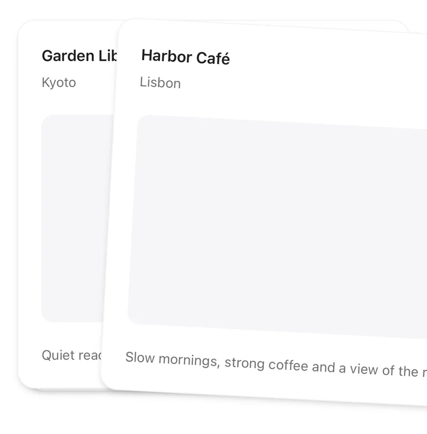
}CardStack shows the top card of data with up to visibleCount cards stacked behind it, each slightly smaller and lower. Dragging the top card sideways moves and tilts it, while the cards behind grow into place.
Releasing past threshold, or flicking faster than 800 points per second, flies the card off in that direction and shows the next one; otherwise it springs back. Use it for one-at-a-time decisions such as keep or skip.
Installation
$ pnpm dlx shadcn@latest add @esuiss-rn/card-stackSee Installation for the components.json setup. Or use the suiss/ui CLI:
$ pnpm dlx @esuiss/ui@latest add card-stack$ pnpm dlx @esuiss/ui@latest add card-stack --platform swift$ pnpm dlx @esuiss/ui@latest add card-stack --platform kotlinThe CLI also adds what it builds on: Button, Icon, Text. On React Native it also adds the animated view components/ui/animated-view.tsx.
Manual
- Install the dependencies:
npx expo install cn phosphor-react-native react-native-gesture-handler react-native-reanimated react-native-svg react-native-worklets-
Add the pieces it builds on: Button, Icon, Text, and the primitives
components/primitives/haptics.tsx, and the animated viewcomponents/ui/animated-view.tsxfrom the next step. -
Copy the animated view into
components/ui/animated-view.tsx:
import { Pressable } from "react-native"
import Animated from "react-native-reanimated"

const AnimatedPressable = Animated.createAnimatedComponent(Pressable)

type AnimatedViewProps =
  | (React.ComponentProps<typeof Animated.View> &
      React.RefAttributes<React.ComponentRef<typeof Animated.View>> & {
        as?: "View"
      })
  | (React.ComponentProps<typeof AnimatedPressable> &
      React.RefAttributes<React.ComponentRef<typeof AnimatedPressable>> & {
        as: "Pressable"
      })

function AnimatedView(props: AnimatedViewProps) {- Copy the source into
components/interactions/card-stack.tsx:
import { cn } from "cn"
import {
  ArrowCounterClockwiseIcon,
  HeartIcon,
  XIcon,
} from "phosphor-react-native"
import * as React from "react"
import {
  type AccessibilityActionEvent,
  View,
  type ViewProps,
} from "react-native"
import { Gesture, GestureDetector } from "react-native-gesture-handler"
import {
  Easing,
ReduceMotion,- Update the import paths to match your project.
- Install the dependencies:
npx expo install cn phosphor-react-native react-native-gesture-handler react-native-reanimated react-native-svg react-native-worklets-
Add the pieces it builds on: Button, Icon, Text, and the primitives
components/primitives/haptics.tsx, and the animated viewcomponents/ui/animated-view.tsxfrom the next step. -
Copy the animated view into
components/ui/animated-view.tsx:
import { Pressable } from "react-native"
import Animated from "react-native-reanimated"

const AnimatedPressable = Animated.createAnimatedComponent(Pressable)

type AnimatedViewProps =
  | (React.ComponentProps<typeof Animated.View> &
      React.RefAttributes<React.ComponentRef<typeof Animated.View>> & {
        as?: "View"
      })
  | (React.ComponentProps<typeof AnimatedPressable> &
      React.RefAttributes<React.ComponentRef<typeof AnimatedPressable>> & {
        as: "Pressable"
      })

function AnimatedView(props: AnimatedViewProps) {- Copy the source into
components/interactions/card-stack.tsx:
import { cn } from "cn"
import {
  ArrowCounterClockwiseIcon,
  HeartIcon,
  XIcon,
} from "phosphor-react-native"
import * as React from "react"
import {
  type AccessibilityActionEvent,
  View,
  type ViewProps,
} from "react-native"
import { Gesture, GestureDetector } from "react-native-gesture-handler"
import {
  Easing,
ReduceMotion,- Update the import paths to match your project.
- Install the dependencies:
npx expo install phosphor-react-native react-native-gesture-handler react-native-reanimated react-native-svg react-native-worklets-
Add the pieces it builds on: Button, Icon, Text, and the primitives
components/primitives/haptics.tsx, and the animated viewcomponents/ui/animated-view.tsxfrom the next step. -
Copy the animated view into
components/ui/animated-view.tsx:
import { Pressable } from "react-native"
import Animated from "react-native-reanimated"

const AnimatedPressable = Animated.createAnimatedComponent(Pressable)

type AnimatedViewProps =
  | (React.ComponentProps<typeof Animated.View> &
      React.RefAttributes<React.ComponentRef<typeof Animated.View>> & {
        as?: "View"
      })
  | (React.ComponentProps<typeof AnimatedPressable> &
      React.RefAttributes<React.ComponentRef<typeof AnimatedPressable>> & {
        as: "Pressable"
      })

function AnimatedView(props: AnimatedViewProps) {- Copy the source into
components/interactions/card-stack.tsx:
import {
  ArrowCounterClockwiseIcon,
  HeartIcon,
  XIcon,
} from "phosphor-react-native"
import * as React from "react"
import {
  type AccessibilityActionEvent,
  type StyleProp,
  StyleSheet,
  type TextStyle,
  View,
  type ViewProps,
  type ViewStyle,
} from "react-native"
import { Gesture, GestureDetector } from "react-native-gesture-handler"- Update the import paths to match your project.
-
Target iOS 17 or later.
-
Add the Swift package to your app:
.package(url: "https://github.com/phosphor-icons/swift", from: "2.1.0")- Copy the theme files every view uses:
import SwiftUI
import UIKit

struct RGBA: Sendable {
  let red: CGFloat
  let green: CGFloat
  let blue: CGFloat
  let alpha: CGFloat

  init(_ hex: UInt32, _ alpha: CGFloat = 1) {
    red = CGFloat((hex >> 16) & 0xFF) / 255
    green = CGFloat((hex >> 8) & 0xFF) / 255
    blue = CGFloat(hex & 0xFF) / 255
    self.alpha = alpha
}import SwiftUI
public enum EsuissColor {
public static let background = Color.adaptive(light: .init(0xFFFFFF), dark: .init(0x000000))
public static let foreground = Color.adaptive(light: .init(0x1D1D1F), dark: .init(0xF5F5F7))
public static let card = Color.adaptive(light: .init(0xFFFFFF), dark: .init(0x1D1D1F))
public static let cardForeground = Color.adaptive(light: .init(0x1D1D1F), dark: .init(0xF5F5F7))
public static let popover = Color.adaptive(light: .init(0xFFFFFF), dark: .init(0x1D1D1F))
public static let popoverForeground = Color.adaptive(light: .init(0x1D1D1F), dark: .init(0xF5F5F7))
public static let primary = Color.adaptive(light: .init(0x0071E3), dark: .init(0x2997FF))
public static let primaryForeground = Color.adaptive(light: .init(0xFFFFFF), dark: .init(0xFFFFFF))
public static let secondary = Color.adaptive(light: .init(0x000000, 0.04), dark: .init(0xFFFFFF, 0.1))
public static let secondaryForeground = Color.adaptive(light: .init(0x1D1D1F), dark: .init(0xF5F5F7))
public static let muted = Color.adaptive(light: .init(0xF5F5F7), dark: .init(0x161617))
public static let mutedForeground = Color.adaptive(light: .init(0x6E6E73), dark: .init(0xA1A1A6))
public static let accent = Color.adaptive(light: .init(0x000000, 0.06), dark: .init(0xFFFFFF, 0.1))- Copy the source and every file it uses:
import Observation
import PhosphorSwift
import SwiftUI

public enum CardStackDirection: CaseIterable, Sendable {
  case left, right

  var sign: CGFloat { self == .left ? -1 : 1 }
}

enum CardStackMath {
  static let maxRotation: Double = 12
  static let depthScale: CGFloat = 0.05
  static let depthOffset: CGFloat = 12

static func threshold(width: CGFloat) -> CGFloat {import SwiftUI
public struct VariantButtonStyle: ButtonStyle {
public enum Variant: CaseIterable, Sendable {
case `default`, outline, secondary, tinted, ghost, plain, destructive, link
}
public enum Size: CaseIterable, Sendable {
case `default`, xs, sm, lg, xl, icon, iconXs, iconSm, iconLg, iconXl
var height: CGFloat {
switch self {
case .xs, .iconXs: 24
case .sm, .iconSm: 32
case .default, .icon: 36
case .lg, .iconLg: 44import SwiftUI
extension EnvironmentValues {
@Entry var buttonGroup: Axis? = nil
@Entry var buttonGroupSize: CGSize = .zero
}
enum ButtonGroupSpace: Hashable {
case group
}
struct ButtonGroupFrame {
let bounds: Anchor<CGRect>
let outlined: Bool
}import SwiftUI
public struct Card<Content: View>: View {
public enum Variant: CaseIterable, Sendable {
case `default`, filled
}
public enum Size: CaseIterable, Sendable {
case `default`, sm
var spacing: CGFloat {
switch self {
case .default: 24
case .sm: 16
}
}import SwiftUI
extension EnvironmentValues {
@Entry public var hapticsEnabled = true
}
extension View {
public func haptics(_ enabled: Bool) -> some View {
environment(\.hapticsEnabled, enabled)
}
func hapticFeedback<Trigger: Equatable>(_ feedback: SensoryFeedback, trigger: Trigger) -> some View {
modifier(HapticFeedbackModifier(feedback: feedback, trigger: trigger) { _, _ in true })
}
func hapticFeedback<Trigger: Equatable>(import SwiftUI
public enum ItemVariant: CaseIterable, Sendable {
case `default`, outline, muted
}
public enum ItemSize: CaseIterable, Sendable {
case `default`, sm, xs
var horizontalPadding: CGFloat {
switch self {
case .default: 16
case .sm: 14
case .xs: 12
}
}import SwiftUI
public struct Separator: View {
let orientation: Axis
public init(_ orientation: Axis = .horizontal) {
self.orientation = orientation
}
public var body: some View {
Rectangle()
.fill(EsuissColor.border)
.frame(width: orientation == .vertical ? 1 : nil, height: orientation == .horizontal ? 1 : nil)
.frame(maxWidth: orientation == .horizontal ? .infinity : nil, maxHeight: orientation == .vertical ? .infinity : nil)
.accessibilityHidden(true)
}import SwiftUI
public enum TextVariant: CaseIterable, Sendable {
case `default`, h1, h2, h3, h4, p, blockquote, code, lead, large, small, muted
var style: TextStyle {
switch self {
case .h1: .xl3
case .h2: .xl2
case .h3: .xl
case .h4, .lead, .large: .lg
case .code, .small, .muted: .sm
default: .base
}
}- Add the files to your app target.
- Set
minSdkto 24 or higher and add the dependencies:
implementation(platform("androidx.compose:compose-bom:2026.09.00"))
implementation("androidx.compose.foundation:foundation")
implementation("androidx.compose.ui:ui")- Copy the theme files every view uses:
package com.esuiss.ui.theme

import androidx.compose.foundation.isSystemInDarkTheme
import androidx.compose.runtime.Composable
import androidx.compose.runtime.CompositionLocalProvider
import androidx.compose.runtime.Immutable
import androidx.compose.runtime.staticCompositionLocalOf
import androidx.compose.ui.Modifier
import androidx.compose.ui.draw.dropShadow
import androidx.compose.ui.graphics.Color
import androidx.compose.ui.graphics.Shape
import androidx.compose.ui.graphics.shadow.Shadow as DropShadow
import androidx.compose.ui.text.TextStyle
import androidx.compose.ui.text.style.LineHeightStyle
import androidx.compose.ui.unit.Dp
import androidx.compose.ui.unit.DpOffsetpackage com.esuiss.ui.theme
import androidx.compose.runtime.Immutable
import androidx.compose.ui.graphics.Color
import androidx.compose.ui.unit.dp
@Immutable
data class Colors(
val background: Color,
val foreground: Color,
val card: Color,
val cardForeground: Color,
val popover: Color,
val popoverForeground: Color,
val primary: Color,
val primaryForeground: Color,- Copy the source and every file it uses:
package com.esuiss.ui.interactions

import androidx.compose.animation.core.Animatable
import androidx.compose.animation.core.Spring
import androidx.compose.animation.core.VectorConverter
import androidx.compose.animation.core.spring
import androidx.compose.animation.core.tween
import androidx.compose.foundation.gestures.detectDragGestures
import androidx.compose.foundation.layout.Box
import androidx.compose.foundation.layout.BoxWithConstraints
import androidx.compose.foundation.layout.fillMaxWidth
import androidx.compose.foundation.layout.padding
import androidx.compose.runtime.Composable
import androidx.compose.runtime.LaunchedEffect
import androidx.compose.runtime.Stable
import androidx.compose.runtime.getValuepackage com.esuiss.ui.components
import android.provider.Settings
import androidx.compose.animation.core.CubicBezierEasing
import androidx.compose.foundation.background
import androidx.compose.foundation.border
import androidx.compose.foundation.gestures.Orientation
import androidx.compose.foundation.text.selection.TextSelectionColors
import androidx.compose.runtime.Composable
import androidx.compose.runtime.mutableStateOf
import androidx.compose.runtime.remember
import androidx.compose.ui.Modifier
import androidx.compose.ui.draw.alpha
import androidx.compose.ui.draw.clip
import androidx.compose.ui.draw.drawWithContent
import androidx.compose.ui.geometry.Offsetpackage com.esuiss.ui.components
import androidx.compose.runtime.Composable
import androidx.compose.runtime.CompositionLocalProvider
import androidx.compose.runtime.remember
import androidx.compose.runtime.staticCompositionLocalOf
import androidx.compose.ui.hapticfeedback.HapticFeedback
import androidx.compose.ui.hapticfeedback.HapticFeedbackType
import androidx.compose.ui.platform.LocalHapticFeedback
val LocalHapticsEnabled = staticCompositionLocalOf { true }
@Composable
fun ProvideHaptics(enabled: Boolean, content: @Composable () -> Unit) {
CompositionLocalProvider(LocalHapticsEnabled provides enabled, content = content)
}- Update the
com.esuiss.uipackage names to match your project.
Usage
import { CardStack, CardStackEmpty, CardStackActions, CardStackSwipeButton, CardStackUndo } from "@/components/interactions/card-stack"<Demo />Pass data and renderItem, and handle onSwipe(direction, item, index). Add children below the deck: CardStackActions with CardStackSwipeButtons and a CardStackUndo, and a CardStackEmpty shown once every card is swiped.
Undo brings back the last card from the side it left and calls onUndo. useCardStack exposes index, count, remaining, canUndo, swipe and undo for custom controls. The CardStackDirection type is exported.
Examples
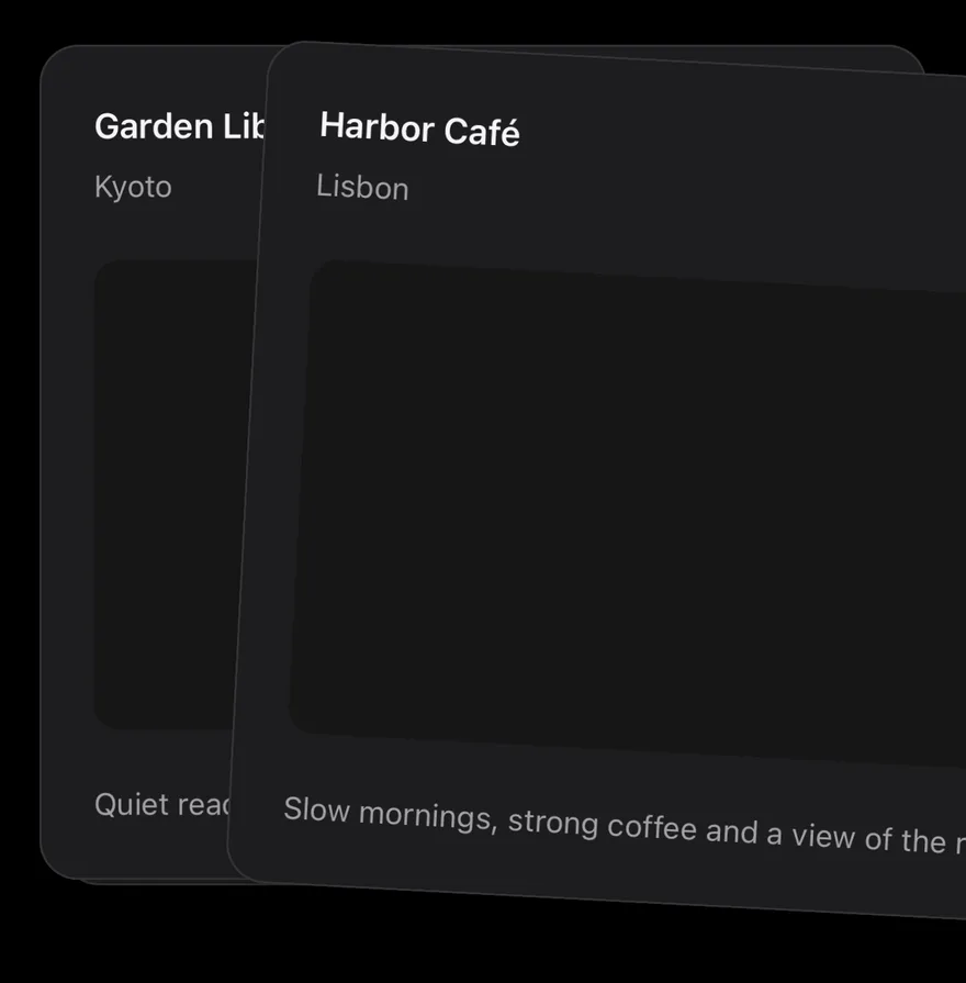
Mid swipe
A static frame of the top card dragged to the right.
import { View } from "react-native"
import { Card, CardContent, CardDescription, CardHeader, CardTitle } from "@/components/ui/card"
import { Text } from "@/components/ui/text"

type Place = { id: string; name: string; city: string; detail: string }

const places: Place[] = [
  {
    id: "harbor",
    name: "Harbor Café",
    city: "Lisbon",
    detail: "Slow mornings, strong coffee and a view of the river.",
  },
  {
    id: "garden",
    name: "Garden Library",
    city: "Kyoto",
    detail: "Quiet reading rooms around a moss garden.",
  },
  {
    id: "market",
    name: "Night Market",
    city: "Taipei",
    detail: "Street food stalls open until two in the morning.",
  },
]

function PlaceCard({ place }: { place: Place }) {
  return (
    <Card className="h-full">
      <CardHeader>
        <CardTitle>{place.name}</CardTitle>
        <CardDescription>{place.city}</CardDescription>
      </CardHeader>
      <CardContent className="grow">
        <View className="grow rounded-xl bg-muted" />
      </CardContent>
      <CardContent>
        <Text className="text-sm text-muted-foreground">{place.detail}</Text>
      </CardContent>
    </Card>
  )
}

export function CardStackMidSwipeExample() {
  return (
    <View className="gap-6">
      <View className="h-96 w-full">
        <View
          className="absolute inset-0"
          style={{ transform: [{ translateY: 14.4 }, { scale: 0.94 }] }}
        >
          <PlaceCard place={places[2]} />
        </View>
        <View
          className="absolute inset-0"
          style={{ transform: [{ translateY: 2.4 }, { scale: 0.99 }] }}
        >
          <PlaceCard place={places[1]} />
        </View>
        <View
          className="absolute inset-0"
          style={{
            transform: [
              { translateX: 96 },
              { translateY: 12 },
              { rotate: "3deg" },
            ],
          }}
        >
          <PlaceCard place={places[0]} />
        </View>
      </View>
    </View>
  )
}import EsuissUI
import SwiftUI
struct CardStackMidSwipeExample: View {
var body: some View {
ZStack {
CardStackPlaceCard(place: cardStackPlaces[2])
.scaleEffect(0.94)
.offset(y: 14.4)
CardStackPlaceCard(place: cardStackPlaces[1])
.scaleEffect(0.99)
.offset(y: 2.4)
CardStackPlaceCard(place: cardStackPlaces[0])
.rotationEffect(.degrees(3))
.offset(x: 96, y: 12)
}
.frame(height: 384)
}
}
struct CardStackPlace: Identifiable {
let id: String
let name: String
let city: String
let detail: String
}
let cardStackPlaces = [
CardStackPlace(id: "harbor", name: "Harbor Café", city: "Lisbon", detail: "Slow mornings, strong coffee and a view of the river."),
CardStackPlace(id: "garden", name: "Garden Library", city: "Kyoto", detail: "Quiet reading rooms around a moss garden."),
CardStackPlace(id: "market", name: "Night Market", city: "Taipei", detail: "Street food stalls open until two in the morning."),
]
struct CardStackPlaceCard: View {
let place: CardStackPlace
var body: some View {
Card {
CardHeader(LocalizedStringKey(place.name), description: LocalizedStringKey(place.city))
CardContent {
RoundedRectangle(cornerRadius: Radius.xl, style: .continuous)
.fill(EsuissColor.muted)
.frame(maxHeight: .infinity)
}
.frame(maxHeight: .infinity)
CardContent {
Text(verbatim: place.detail)
.textStyle(.sm)
.foregroundStyle(EsuissColor.mutedForeground)
}
}
.frame(maxHeight: .infinity)
.accessibilityElement(children: .combine)
.accessibilityLabel(Text(verbatim: "\(place.name), \(place.city)"))
}
}import androidx.compose.foundation.background
import androidx.compose.foundation.layout.Box
import androidx.compose.foundation.layout.fillMaxSize
import androidx.compose.foundation.layout.fillMaxWidth
import androidx.compose.foundation.layout.height
import androidx.compose.foundation.shape.RoundedCornerShape
import androidx.compose.runtime.Composable
import androidx.compose.ui.Modifier
import androidx.compose.ui.graphics.TransformOrigin
import androidx.compose.ui.graphics.graphicsLayer
import androidx.compose.ui.unit.dp
import com.esuiss.ui.components.Card
import com.esuiss.ui.components.CardContent
import com.esuiss.ui.components.CardHeader
import com.esuiss.ui.components.Text
import com.esuiss.ui.theme.EsuissTheme
import com.esuiss.ui.theme.Radius
import com.esuiss.ui.theme.Typography
class CardStackPlace(val id: String, val name: String, val city: String, val detail: String)
val cardStackPlaces = listOf(
CardStackPlace("harbor", "Harbor Café", "Lisbon", "Slow mornings, strong coffee and a view of the river."),
CardStackPlace("garden", "Garden Library", "Kyoto", "Quiet reading rooms around a moss garden."),
CardStackPlace("market", "Night Market", "Taipei", "Street food stalls open until two in the morning."),
)
val cardStackDeckHeight = 384.dp
@Composable
fun CardStackPlaceCard(place: CardStackPlace, modifier: Modifier = Modifier) {
val colors = EsuissTheme.colors
Card(modifier.fillMaxWidth().height(cardStackDeckHeight)) {
CardHeader(place.name, description = place.city)
CardContent(Modifier.weight(1f)) {
Box(
Modifier
.fillMaxSize()
.background(colors.muted, RoundedCornerShape(Radius.xl)),
)
}
CardContent {
Text(place.detail, style = Typography.sm.copy(color = colors.mutedForeground))
}
}
}
@Composable
fun CardStackMidSwipe() {
Box(Modifier.fillMaxWidth().height(cardStackDeckHeight)) {
CardStackPlaceCard(
cardStackPlaces[2],
Modifier.graphicsLayer {
translationY = 14.4.dp.toPx()
scaleX = 0.94f
scaleY = 0.94f
},
)
CardStackPlaceCard(
cardStackPlaces[1],
Modifier.graphicsLayer {
translationY = 2.4.dp.toPx()
scaleX = 0.99f
scaleY = 0.99f
},
)
CardStackPlaceCard(
cardStackPlaces[0],
Modifier.graphicsLayer {
translationX = 96.dp.toPx()
translationY = 12.dp.toPx()
rotationZ = 3f
transformOrigin = TransformOrigin.Center
},
)
}
}Empty
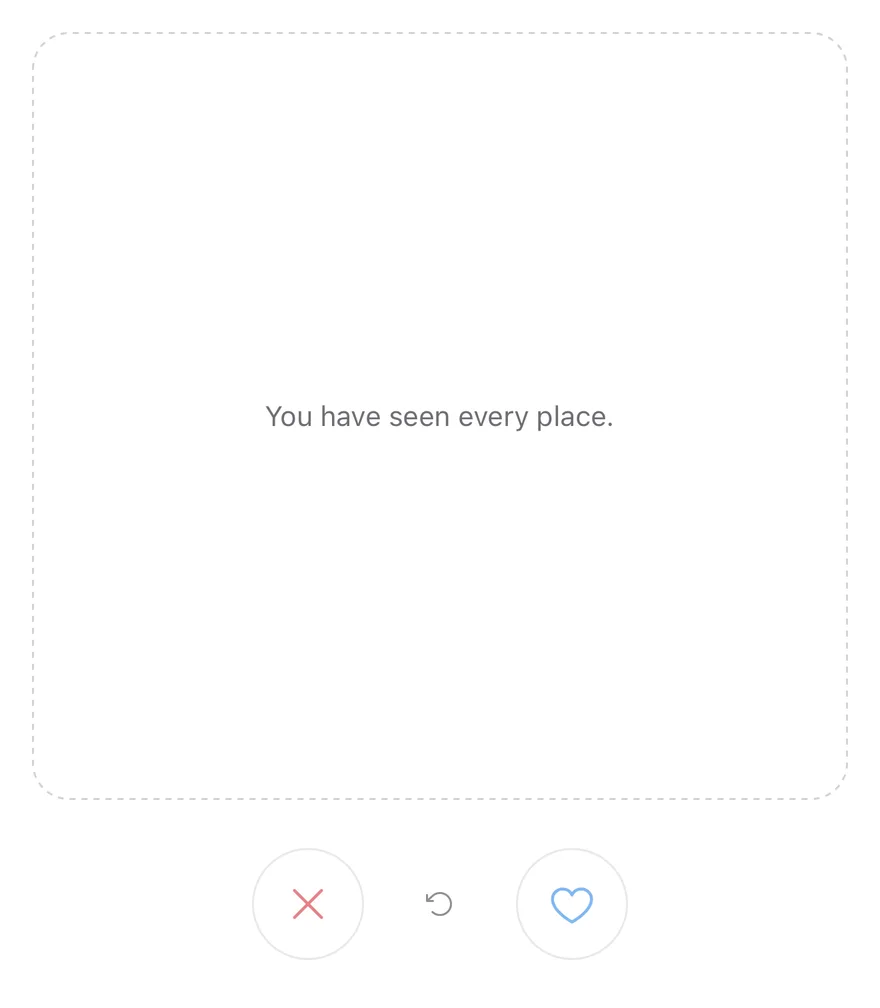
An empty deck showing CardStackEmpty.
import { CardStack, CardStackActions, CardStackEmpty, CardStackSwipeButton, CardStackUndo } from "@/components/interactions/card-stack"

type Place = { id: string; name: string; city: string; detail: string }

export function CardStackEmptyExample() {
  return (
    <CardStack data={[] as Place[]} renderItem={() => null}>
      <CardStackEmpty>You have seen every place.</CardStackEmpty>
      <CardStackActions>
        <CardStackSwipeButton direction="left" />
        <CardStackUndo />
        <CardStackSwipeButton direction="right" />
      </CardStackActions>
    </CardStack>
  )
}import EsuissUI
import SwiftUI
struct CardStackEmptyExample: View {
var body: some View {
CardStackDemo(places: [], showsLog: false)
}
}
struct CardStackPlace: Identifiable {
let id: String
let name: String
let city: String
let detail: String
}
struct CardStackPlaceCard: View {
let place: CardStackPlace
var body: some View {
Card {
CardHeader(LocalizedStringKey(place.name), description: LocalizedStringKey(place.city))
CardContent {
RoundedRectangle(cornerRadius: Radius.xl, style: .continuous)
.fill(EsuissColor.muted)
.frame(maxHeight: .infinity)
}
.frame(maxHeight: .infinity)
CardContent {
Text(verbatim: place.detail)
.textStyle(.sm)
.foregroundStyle(EsuissColor.mutedForeground)
}
}
.frame(maxHeight: .infinity)
.accessibilityElement(children: .combine)
.accessibilityLabel(Text(verbatim: "\(place.name), \(place.city)"))
}
}
struct CardStackDemo: View {
let places: [CardStackPlace]
var showsLog = true
@State private var controller = CardStackController()
@State private var log = ""
var body: some View {
VStack(spacing: 12) {
VStack(spacing: 24) {
ZStack {
if !controller.canSwipe {
Text("You have seen every place.")
.textStyle(.sm)
.foregroundStyle(EsuissColor.mutedForeground)
.multilineTextAlignment(.center)
.padding(24)
.frame(maxWidth: .infinity, maxHeight: .infinity)
.overlay {
RoundedRectangle(cornerRadius: Radius.xl2, style: .continuous)
.strokeBorder(EsuissColor.border, style: StrokeStyle(lineWidth: 1, dash: [4, 4]))
}
}
CardStack(
places,
controller: controller,
onSwipe: { direction, place in
log = "\(direction == .left ? "Skipped" : "Liked") \(place.name)"
},
onUndo: { place in
log = "Restored \(place.name)"
}
) { place in
CardStackPlaceCard(place: place)
}
}
.frame(height: 384)
HStack(spacing: 16) {
CardStackButton(.swipeLeft, controller: controller)
CardStackButton(.undo, controller: controller)
CardStackButton(.swipeRight, controller: controller)
}
}
if showsLog {
Text(verbatim: log)
.textStyle(.sm)
.foregroundStyle(EsuissColor.mutedForeground)
.multilineTextAlignment(.center)
.frame(maxWidth: .infinity)
.accessibilityAddTraits(.updatesFrequently)
}
}
}
}import androidx.compose.foundation.layout.Arrangement
import androidx.compose.foundation.layout.Box
import androidx.compose.foundation.layout.Column
import androidx.compose.foundation.layout.Row
import androidx.compose.foundation.layout.fillMaxWidth
import androidx.compose.foundation.layout.height
import androidx.compose.foundation.layout.padding
import androidx.compose.foundation.layout.size
import androidx.compose.runtime.Composable
import androidx.compose.ui.Alignment
import androidx.compose.ui.Modifier
import androidx.compose.ui.draw.drawBehind
import androidx.compose.ui.geometry.CornerRadius
import androidx.compose.ui.geometry.Offset
import androidx.compose.ui.geometry.Size
import androidx.compose.ui.graphics.PathEffect
import androidx.compose.ui.graphics.drawscope.Stroke
import androidx.compose.ui.semantics.contentDescription
import androidx.compose.ui.text.style.TextAlign
import androidx.compose.ui.unit.dp
import com.adamglin.PhosphorIcons
import com.adamglin.phosphoricons.Regular
import com.adamglin.phosphoricons.regular.ArrowCounterClockwise
import com.adamglin.phosphoricons.regular.Heart
import com.adamglin.phosphoricons.regular.X
import com.esuiss.ui.components.Button
import com.esuiss.ui.components.ButtonSize
import com.esuiss.ui.components.ButtonVariant
import com.esuiss.ui.components.Icon
import com.esuiss.ui.components.Text
import com.esuiss.ui.interactions.CardStack
import com.esuiss.ui.interactions.CardStackDirection
import com.esuiss.ui.interactions.CardStackState
import com.esuiss.ui.interactions.rememberCardStackState
import com.esuiss.ui.theme.EsuissTheme
import com.esuiss.ui.theme.Radius
import com.esuiss.ui.theme.Typography
class CardStackPlace(val id: String, val name: String, val city: String, val detail: String)
val cardStackDeckHeight = 384.dp
@Composable
fun CardStackEmptyBox() {
val colors = EsuissTheme.colors
Box(
modifier = Modifier
.fillMaxWidth()
.height(cardStackDeckHeight)
.drawBehind {
val stroke = 1.dp.toPx()
val radius = Radius.xl2.toPx()
drawRoundRect(
color = colors.border,
topLeft = Offset(stroke / 2, stroke / 2),
size = Size(size.width - stroke, size.height - stroke),
cornerRadius = CornerRadius(radius, radius),
style = Stroke(width = stroke, pathEffect = PathEffect.dashPathEffect(floatArrayOf(3.dp.toPx(), 3.dp.toPx()))),
)
}
.padding(24.dp),
contentAlignment = Alignment.Center,
) {
Text(
"You have seen every place.",
style = Typography.sm.copy(color = colors.mutedForeground),
textAlign = TextAlign.Center,
)
}
}
@Composable
fun CardStackActions(state: CardStackState, enabled: Boolean) {
val colors = EsuissTheme.colors
val canSwipe = enabled && !state.isEmpty
Row(
modifier = Modifier.fillMaxWidth(),
horizontalArrangement = Arrangement.spacedBy(16.dp, Alignment.CenterHorizontally),
verticalAlignment = Alignment.CenterVertically,
) {
Button(
onClick = { state.swipe(CardStackDirection.Left) },
modifier = Modifier.size(56.dp),
variant = ButtonVariant.Outline,
size = ButtonSize.IconLg,
enabled = canSwipe,
) {
Icon(PhosphorIcons.Regular.X, contentDescription = "Swipe left", size = 24.dp, tint = colors.destructive)
}
Button(
onClick = { state.undo() },
variant = ButtonVariant.Ghost,
size = ButtonSize.IconLg,
enabled = state.canUndo,
) {
Icon(PhosphorIcons.Regular.ArrowCounterClockwise, contentDescription = "Undo")
}
Button(
onClick = { state.swipe(CardStackDirection.Right) },
modifier = Modifier.size(56.dp),
variant = ButtonVariant.Outline,
size = ButtonSize.IconLg,
enabled = canSwipe,
) {
Icon(PhosphorIcons.Regular.Heart, contentDescription = "Swipe right", size = 24.dp, tint = colors.primary)
}
}
}
@Composable
fun CardStackEmptyDemo() {
val state = rememberCardStackState()
Column(verticalArrangement = Arrangement.spacedBy(24.dp)) {
CardStack(
items = emptyList<CardStackPlace>(),
onSwipe = { _, _ -> },
state = state,
empty = { CardStackEmptyBox() },
) { }
CardStackActions(state, enabled = true)
}
}Disabled
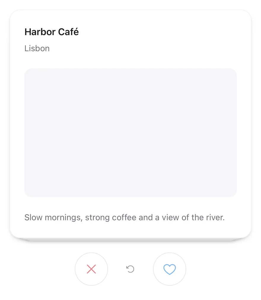
Turns off swiping and the buttons with disabled.
import * as React from "react"
import { View } from "react-native"
import { CardStack, CardStackActions, CardStackEmpty, CardStackSwipeButton, CardStackUndo } from "@/components/interactions/card-stack"
import { Card, CardContent, CardDescription, CardHeader, CardTitle } from "@/components/ui/card"
import { Text } from "@/components/ui/text"

type Place = { id: string; name: string; city: string; detail: string }

const places: Place[] = [
  {
    id: "harbor",
    name: "Harbor Café",
    city: "Lisbon",
    detail: "Slow mornings, strong coffee and a view of the river.",
  },
  {
    id: "garden",
    name: "Garden Library",
    city: "Kyoto",
    detail: "Quiet reading rooms around a moss garden.",
  },
  {
    id: "market",
    name: "Night Market",
    city: "Taipei",
    detail: "Street food stalls open until two in the morning.",
  },
]

function PlaceCard({ place }: { place: Place }) {
  return (
    <Card className="h-full">
      <CardHeader>
        <CardTitle>{place.name}</CardTitle>
        <CardDescription>{place.city}</CardDescription>
      </CardHeader>
      <CardContent className="grow">
        <View className="grow rounded-xl bg-muted" />
      </CardContent>
      <CardContent>
        <Text className="text-sm text-muted-foreground">{place.detail}</Text>
      </CardContent>
    </Card>
  )
}

function Demo({ disabled = false }: { disabled?: boolean }) {
  const [log, setLog] = React.useState("")
  return (
    <View className="gap-3">
      <CardStack
        data={places}
        keyExtractor={(place) => place.id}
        renderItem={(place) => <PlaceCard place={place} />}
        itemAccessibilityLabel={(place) => `${place.name}, ${place.city}`}
        disabled={disabled}
        onSwipe={(direction, place) =>
          setLog(`${direction === "left" ? "Skipped" : "Liked"} ${place.name}`)
        }
        onUndo={(place) => setLog(`Restored ${place.name}`)}
      >
        <CardStackEmpty>You have seen every place.</CardStackEmpty>
        <CardStackActions>
          <CardStackSwipeButton direction="left" />
          <CardStackUndo />
          <CardStackSwipeButton direction="right" />
        </CardStackActions>
      </CardStack>
      <Text role="status" className="text-center text-sm text-muted-foreground">
        {log}
      </Text>
    </View>
  )
}

export function CardStackDisabledExample() {
  return (
    <Demo disabled />
  )
}import EsuissUI
import SwiftUI
struct CardStackDisabledExample: View {
var body: some View {
CardStackDemo(places: cardStackPlaces)
.disabled(true)
}
}
struct CardStackPlace: Identifiable {
let id: String
let name: String
let city: String
let detail: String
}
let cardStackPlaces = [
CardStackPlace(id: "harbor", name: "Harbor Café", city: "Lisbon", detail: "Slow mornings, strong coffee and a view of the river."),
CardStackPlace(id: "garden", name: "Garden Library", city: "Kyoto", detail: "Quiet reading rooms around a moss garden."),
CardStackPlace(id: "market", name: "Night Market", city: "Taipei", detail: "Street food stalls open until two in the morning."),
]
struct CardStackPlaceCard: View {
let place: CardStackPlace
var body: some View {
Card {
CardHeader(LocalizedStringKey(place.name), description: LocalizedStringKey(place.city))
CardContent {
RoundedRectangle(cornerRadius: Radius.xl, style: .continuous)
.fill(EsuissColor.muted)
.frame(maxHeight: .infinity)
}
.frame(maxHeight: .infinity)
CardContent {
Text(verbatim: place.detail)
.textStyle(.sm)
.foregroundStyle(EsuissColor.mutedForeground)
}
}
.frame(maxHeight: .infinity)
.accessibilityElement(children: .combine)
.accessibilityLabel(Text(verbatim: "\(place.name), \(place.city)"))
}
}
struct CardStackDemo: View {
let places: [CardStackPlace]
var showsLog = true
@State private var controller = CardStackController()
@State private var log = ""
var body: some View {
VStack(spacing: 12) {
VStack(spacing: 24) {
ZStack {
if !controller.canSwipe {
Text("You have seen every place.")
.textStyle(.sm)
.foregroundStyle(EsuissColor.mutedForeground)
.multilineTextAlignment(.center)
.padding(24)
.frame(maxWidth: .infinity, maxHeight: .infinity)
.overlay {
RoundedRectangle(cornerRadius: Radius.xl2, style: .continuous)
.strokeBorder(EsuissColor.border, style: StrokeStyle(lineWidth: 1, dash: [4, 4]))
}
}
CardStack(
places,
controller: controller,
onSwipe: { direction, place in
log = "\(direction == .left ? "Skipped" : "Liked") \(place.name)"
},
onUndo: { place in
log = "Restored \(place.name)"
}
) { place in
CardStackPlaceCard(place: place)
}
}
.frame(height: 384)
HStack(spacing: 16) {
CardStackButton(.swipeLeft, controller: controller)
CardStackButton(.undo, controller: controller)
CardStackButton(.swipeRight, controller: controller)
}
}
if showsLog {
Text(verbatim: log)
.textStyle(.sm)
.foregroundStyle(EsuissColor.mutedForeground)
.multilineTextAlignment(.center)
.frame(maxWidth: .infinity)
.accessibilityAddTraits(.updatesFrequently)
}
}
}
}import androidx.compose.foundation.background
import androidx.compose.foundation.layout.Arrangement
import androidx.compose.foundation.layout.Box
import androidx.compose.foundation.layout.Column
import androidx.compose.foundation.layout.Row
import androidx.compose.foundation.layout.fillMaxSize
import androidx.compose.foundation.layout.fillMaxWidth
import androidx.compose.foundation.layout.height
import androidx.compose.foundation.layout.padding
import androidx.compose.foundation.layout.size
import androidx.compose.foundation.shape.RoundedCornerShape
import androidx.compose.runtime.Composable
import androidx.compose.runtime.getValue
import androidx.compose.runtime.mutableStateOf
import androidx.compose.runtime.saveable.rememberSaveable
import androidx.compose.runtime.setValue
import androidx.compose.ui.Alignment
import androidx.compose.ui.Modifier
import androidx.compose.ui.draw.drawBehind
import androidx.compose.ui.geometry.CornerRadius
import androidx.compose.ui.geometry.Offset
import androidx.compose.ui.geometry.Size
import androidx.compose.ui.graphics.PathEffect
import androidx.compose.ui.graphics.drawscope.Stroke
import androidx.compose.ui.semantics.LiveRegionMode
import androidx.compose.ui.semantics.contentDescription
import androidx.compose.ui.semantics.liveRegion
import androidx.compose.ui.semantics.semantics
import androidx.compose.ui.text.style.TextAlign
import androidx.compose.ui.unit.dp
import com.adamglin.PhosphorIcons
import com.adamglin.phosphoricons.Regular
import com.adamglin.phosphoricons.regular.ArrowCounterClockwise
import com.adamglin.phosphoricons.regular.Heart
import com.adamglin.phosphoricons.regular.X
import com.esuiss.ui.components.Button
import com.esuiss.ui.components.ButtonSize
import com.esuiss.ui.components.ButtonVariant
import com.esuiss.ui.components.Card
import com.esuiss.ui.components.CardContent
import com.esuiss.ui.components.CardHeader
import com.esuiss.ui.components.Icon
import com.esuiss.ui.components.Text
import com.esuiss.ui.interactions.CardStack
import com.esuiss.ui.interactions.CardStackDirection
import com.esuiss.ui.interactions.CardStackState
import com.esuiss.ui.interactions.rememberCardStackState
import com.esuiss.ui.theme.EsuissTheme
import com.esuiss.ui.theme.Radius
import com.esuiss.ui.theme.Typography
@Composable
fun CardStackDisabledExample() {
CardStackDemo(enabled = false)
}
class CardStackPlace(val id: String, val name: String, val city: String, val detail: String)
val cardStackPlaces = listOf(
CardStackPlace("harbor", "Harbor Café", "Lisbon", "Slow mornings, strong coffee and a view of the river."),
CardStackPlace("garden", "Garden Library", "Kyoto", "Quiet reading rooms around a moss garden."),
CardStackPlace("market", "Night Market", "Taipei", "Street food stalls open until two in the morning."),
)
val cardStackDeckHeight = 384.dp
@Composable
fun CardStackPlaceCard(place: CardStackPlace, modifier: Modifier = Modifier) {
val colors = EsuissTheme.colors
Card(modifier.fillMaxWidth().height(cardStackDeckHeight)) {
CardHeader(place.name, description = place.city)
CardContent(Modifier.weight(1f)) {
Box(
Modifier
.fillMaxSize()
.background(colors.muted, RoundedCornerShape(Radius.xl)),
)
}
CardContent {
Text(place.detail, style = Typography.sm.copy(color = colors.mutedForeground))
}
}
}
@Composable
fun CardStackEmptyBox() {
val colors = EsuissTheme.colors
Box(
modifier = Modifier
.fillMaxWidth()
.height(cardStackDeckHeight)
.drawBehind {
val stroke = 1.dp.toPx()
val radius = Radius.xl2.toPx()
drawRoundRect(
color = colors.border,
topLeft = Offset(stroke / 2, stroke / 2),
size = Size(size.width - stroke, size.height - stroke),
cornerRadius = CornerRadius(radius, radius),
style = Stroke(width = stroke, pathEffect = PathEffect.dashPathEffect(floatArrayOf(3.dp.toPx(), 3.dp.toPx()))),
)
}
.padding(24.dp),
contentAlignment = Alignment.Center,
) {
Text(
"You have seen every place.",
style = Typography.sm.copy(color = colors.mutedForeground),
textAlign = TextAlign.Center,
)
}
}
@Composable
fun CardStackActions(state: CardStackState, enabled: Boolean) {
val colors = EsuissTheme.colors
val canSwipe = enabled && !state.isEmpty
Row(
modifier = Modifier.fillMaxWidth(),
horizontalArrangement = Arrangement.spacedBy(16.dp, Alignment.CenterHorizontally),
verticalAlignment = Alignment.CenterVertically,
) {
Button(
onClick = { state.swipe(CardStackDirection.Left) },
modifier = Modifier.size(56.dp),
variant = ButtonVariant.Outline,
size = ButtonSize.IconLg,
enabled = canSwipe,
) {
Icon(PhosphorIcons.Regular.X, contentDescription = "Swipe left", size = 24.dp, tint = colors.destructive)
}
Button(
onClick = { state.undo() },
variant = ButtonVariant.Ghost,
size = ButtonSize.IconLg,
enabled = state.canUndo,
) {
Icon(PhosphorIcons.Regular.ArrowCounterClockwise, contentDescription = "Undo")
}
Button(
onClick = { state.swipe(CardStackDirection.Right) },
modifier = Modifier.size(56.dp),
variant = ButtonVariant.Outline,
size = ButtonSize.IconLg,
enabled = canSwipe,
) {
Icon(PhosphorIcons.Regular.Heart, contentDescription = "Swipe right", size = 24.dp, tint = colors.primary)
}
}
}
@Composable
fun CardStackDemo(enabled: Boolean) {
var log by rememberSaveable { mutableStateOf("") }
val state = rememberCardStackState()
Column(verticalArrangement = Arrangement.spacedBy(12.dp)) {
Column(verticalArrangement = Arrangement.spacedBy(24.dp)) {
CardStack(
items = cardStackPlaces,
onSwipe = { direction, place ->
log = "${if (direction == CardStackDirection.Left) "Skipped" else "Liked"} ${place.name}"
},
state = state,
key = { it.id },
enabled = enabled,
onUndo = { _, place -> log = "Restored ${place.name}" },
empty = { CardStackEmptyBox() },
) { place ->
CardStackPlaceCard(place, Modifier.semantics(mergeDescendants = true) { contentDescription = "${place.name}, ${place.city}" })
}
CardStackActions(state, enabled)
}
Text(
log,
modifier = Modifier.fillMaxWidth().semantics { liveRegion = LiveRegionMode.Polite },
style = Typography.sm.copy(color = EsuissTheme.colors.mutedForeground),
textAlign = TextAlign.Center,
)
}
}API Reference
CardStack
The root that renders the deck and handles the drag gesture.
| Prop | Type | Default | Description |
|---|---|---|---|
data | readonly T[] | Required | The items to show as cards. |
renderItem | (item: T, index: number) => React.ReactNode | Required | Renders one card from the item and its index. |
keyExtractor | (item: T, index: number) => string | - | Returns a key for a card. Defaults to its position. |
onSwipe | (direction: CardStackDirection, item: T, index: number) => void | - | Called with the direction, item and index after a card leaves. |
onUndo | (item: T, index: number) => void | - | Called with the item and index after undo. |
threshold | number | 120 | Drag distance that commits a swipe. Defaults to 120. |
visibleCount | number | 3 | Cards stacked behind the top card. Defaults to 3. |
disabled | boolean | false | Turns off the gesture and the swipe buttons. |
itemAccessibilityLabel | (item: T, index: number) => string | - | Returns the label for the top card. |
deckClassName | string | - | Classes for the deck area, which is h-96 by default. |
Also accepts the props of ViewProps.
CardStackEmpty
A dashed placeholder shown when no cards remain.
Also accepts the props of ViewProps, React.RefAttributes<View>.
CardStackActions
A centered row for the buttons.
Also accepts the props of ViewProps, React.RefAttributes<View>.
CardStackSwipeButton
A round button that swipes the top card left or right.
| Prop | Type | Default | Description |
|---|---|---|---|
direction | CardStackDirection | Required | left shows an X icon, right shows a heart icon. |
Also accepts the props of React.ComponentProps<typeof Button>.
CardStackUndo
A button that restores the last swiped card.
Also accepts the props of React.ComponentProps<typeof Button>.
Accessibility
- The top card has
Swipe leftandSwipe rightaccessibility actions. - Cards behind the top card are hidden from screen readers.
- Swipe buttons are labelled
Swipe leftandSwipe right, and undo is labelledUndo, unless you passaccessibilityLabel.
Notes
- A medium impact haptic plays when a card is swiped by gesture, button or accessibility action, if the app provides an adapter through
HapticsProvider. - Fly-out and spring animations respect the system reduce motion setting.
- The left button icon uses
text-destructive; the right usestext-primary.