suiss/ui · Interaction
Section Index
An A to Z index bar for jumping between sections of a long list by tapping, dragging, or typing.
Section Index is an open-source interaction from suiss/ui for React, React Native, SwiftUI and Jetpack Compose. The @esuiss/ui CLI copies its source into your project, so you own the code.
SectionIndex recreates the iOS list index. Sections marked with SectionIndexSection carry sticky SectionIndexHeader titles, and SectionIndexBar sits along the trailing edge. Tapping or dragging over the bar scrolls the nearest scrollable ancestor so the matching section is at the top; while dragging, a bubble shows the current letter. If a letter has no section, it jumps to the next one that exists.
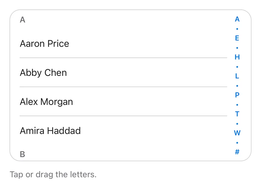
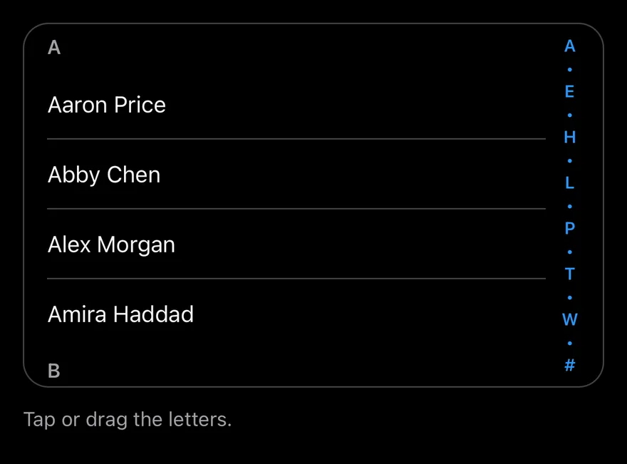
When the container is too short to fit every letter, the bar collapses to fewer letters separated by dots, while still mapping the full alphabet across its height. Use it for long alphabetized lists such as contacts.
Installation
CLI
Works in any project with a components.json. See Installation for the one-line registry setup. Or use the suiss/ui CLI:
Manual
-
Add the
cnhelper. -
Copy the source into
components/interactions/section-index.tsx:
- Update the import paths to match your project.
Usage
- Wrap the scrolling list and
SectionIndexBarinSectionIndex, which positions the bar. The list can scroll in its own container, such asScrollArea, or in the page. - Set
valueon eachSectionIndexSectionto a letter fromlettersso the bar can find it. - Use
onValueChangeto react to jumps.
Examples
Compact
In a short list, the bar collapses its letters with dots and still jumps to any section.
API Reference
SectionIndex
The relative container that holds the list and the index bar.
Also accepts the props of React.ComponentProps<"div">.
SectionIndexSection
A section of the list identified by a letter.
| Prop | Type | Default | Description |
|---|---|---|---|
value | string | Required | The letter this section belongs to. |
Also accepts the props of React.ComponentProps<"section">.
SectionIndexHeader
The sticky title at the top of a section.
Also accepts the props of React.ComponentProps<"h3">.
SectionIndexBar
The vertical letter bar that jumps between sections.
| Prop | Type | Default | Description |
|---|---|---|---|
letters | string[] | LETTERS | The letters shown on the bar; defaults to A through Z followed by #. |
onValueChange | (value: string) => void | - | Called with the letter whenever the bar jumps to a section. |
Also accepts the props of React.ComponentProps<"div">.
Accessibility
- The bar is a vertical
sliderlabelledSection index, witharia-valuetextset to the current letter. - Arrow keys move one letter,
PageUpandPageDownmove five, andHomeandEndreach the first and last letters. - Typing a letter jumps directly to it.
- The visible letters and drag bubble are
aria-hidden.
Notes
- Parts use
data-slotvaluessection-index,section-index-section,section-index-header,section-index-bar, andsection-index-bubble. Sections exposedata-value, and the bar setsdata-draggingduring a drag. - The bar extends its hit area toward the list so it is easier to grab.
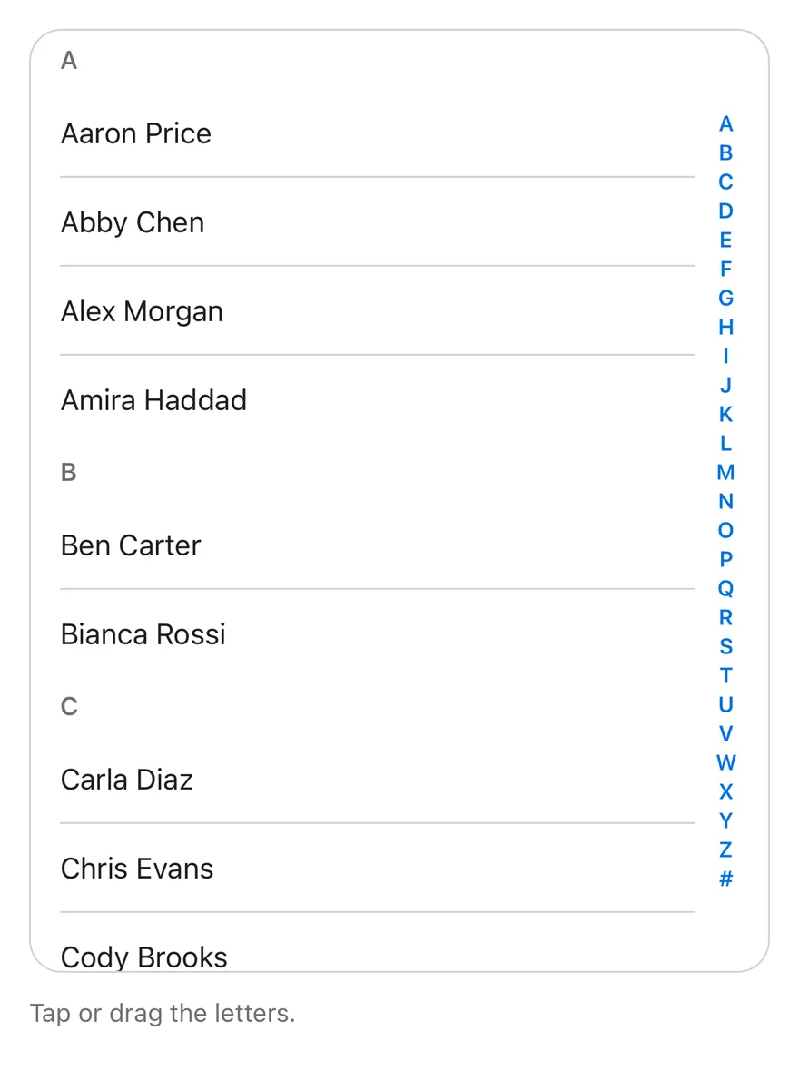
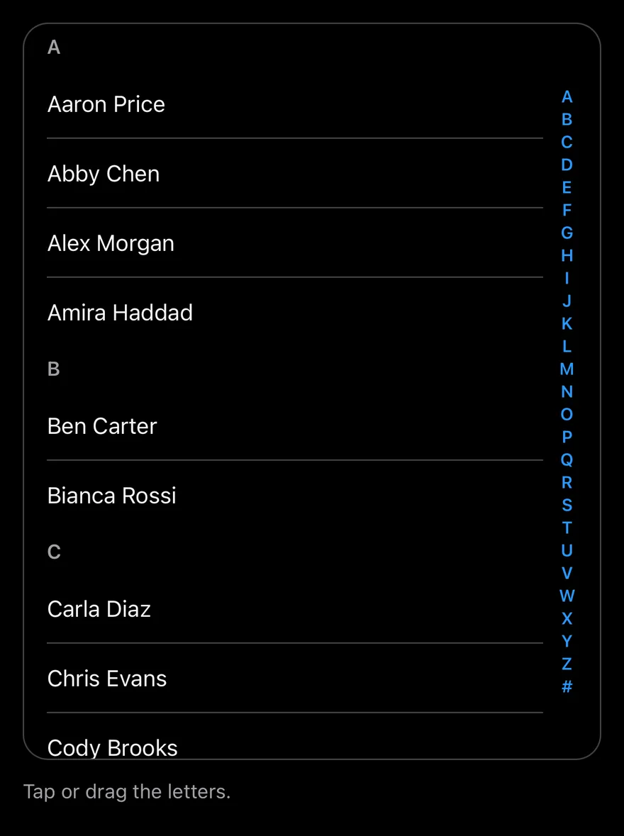
SectionIndex pairs a scroll view of lettered sections with SectionIndexBar, a column of letters on the end edge. Tapping a letter scrolls to that section; dragging along the bar scrubs through sections and shows the current letter in a large bubble beside the finger.
When the bar is too short for every letter, it shows a subset with • between them. Use it for long alphabetical lists such as contacts.
Installation
The CLI also adds what it builds on: Text. On React Native it also adds the animated view components/ui/animated-view.tsx.
Manual
- Install the dependencies:
-
Add the pieces it builds on: Text, and the primitives
components/primitives/section-index.tsx,components/primitives/use-render.tsx, and the animated viewcomponents/ui/animated-view.tsxfrom the next step. -
Copy the animated view into
components/ui/animated-view.tsx:
- Copy the source into
components/interactions/section-index.tsx:
- Update the import paths to match your project.
- Install the dependencies:
-
Add the pieces it builds on: Text, and the primitives
components/primitives/section-index.tsx,components/primitives/use-render.tsx, and the animated viewcomponents/ui/animated-view.tsxfrom the next step. -
Copy the animated view into
components/ui/animated-view.tsx:
- Copy the source into
components/interactions/section-index.tsx:
- Update the import paths to match your project.
- Install the dependencies:
-
Add the pieces it builds on: Text, and the primitives
components/primitives/section-index.tsx,components/primitives/use-render.tsx, and the animated viewcomponents/ui/animated-view.tsxfrom the next step. -
Copy the animated view into
components/ui/animated-view.tsx:
- Copy the source into
components/interactions/section-index.tsx:
- Update the import paths to match your project.
-
Target iOS 17 or later.
-
Add the Swift package to your app:
- Copy the theme files every view uses:
- Copy the source and every file it uses:
- Add the files to your app target.
- Set
minSdkto 24 or higher and add the dependencies:
- Copy the theme files every view uses:
- Copy the source and every file it uses:
- Update the
com.esuiss.uipackage names to match your project.
Usage
Put a SectionIndexScrollView and a SectionIndexBar inside SectionIndex. Wrap each group in a SectionIndexSection with its letter as value, and start it with a SectionIndexHeader.
The bar shows A to Z and # by default; pass letters to match your sections. onValueChange is called with the letter when the user jumps.
Examples
Compact
A short list where the bar collapses letters into dots.
API Reference
SectionIndex
The root that tracks section positions.
Also accepts the props of React.ComponentProps<typeof SectionIndexPrimitive.Root>.
SectionIndexScrollView
The scroll view that holds the sections.
Also accepts the props of React.ComponentProps<typeof SectionIndexPrimitive.ScrollView>.
SectionIndexSection
One section, registered by its value.
Also accepts the props of React.ComponentProps<typeof SectionIndexPrimitive.Section>.
SectionIndexHeader
A section heading; string children are styled.
Also accepts the props of React.ComponentProps<typeof View>.
SectionIndexBar
The letter bar with the drag bubble.
Also accepts the props of React.ComponentProps<typeof SectionIndexPrimitive.Bar>.
Accessibility
- The bar is
adjustable: swiping up or down with a screen reader moves to the previous or next section, and the current letter is announced as its value. SectionIndexHeaderhas theheadingrole.
Notes
- A selection haptic plays on each letter change from touch, if the app provides an adapter through
HapticsProvider. - Letters use
text-primary; the bubble usesbg-popover. - The bubble animation respects the system reduce motion setting.