suiss/ui · Interaction
Reorder List
A list whose rows are dragged by a handle to change their order, with haptics and move up and down actions.
Reorder List is an open-source interaction from suiss/ui for React Native, SwiftUI and Jetpack Compose. The @esuiss/ui CLI copies its source into your project, so you own the code.
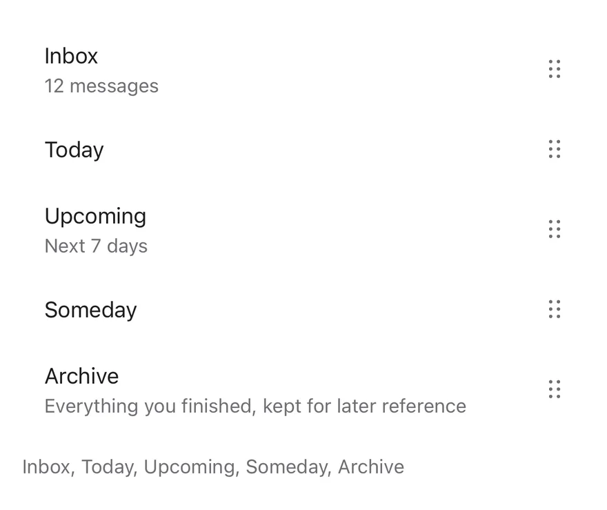
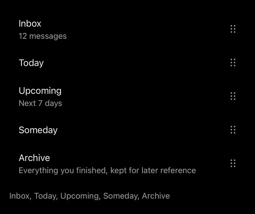
import * as React from "react"
import { View } from "react-native"
import { ReorderList, ReorderListHandle, ReorderListItem } from "@/components/interactions/reorder-list"
import { ItemGroup } from "@/components/ui/item"
import { Text } from "@/components/ui/text"

const tasks: Record<string, { title: string; detail?: string }> = {
  inbox: { title: "Inbox", detail: "12 messages" },
  today: { title: "Today" },
  upcoming: { title: "Upcoming", detail: "Next 7 days" },
  someday: { title: "Someday" },
  archive: {
    title: "Archive",
    detail: "Everything you finished, kept for later reference",
  },
}

const initialOrder = Object.keys(tasks)

function renderRows(value: string[]) {
  return value.map((key) => {
    const task = tasks[key]
    return (
      <ReorderListItem key={key} value={key} className="ps-4">
        <View className="min-w-0 flex-1 py-3">
          <Text numberOfLines={1}>{task.title}</Text>
          {task.detail ? (
            <Text className="text-sm text-muted-foreground">{task.detail}</Text>
          ) : null}
        </View>
        <ReorderListHandle accessibilityLabel={`Reorder ${task.title}`} />
      </ReorderListItem>
    )
  })
}

function ReorderDemo({ inset = false }: { inset?: boolean }) {
  const [value, setValue] = React.useState(initialOrder)
  return (
    <View className="gap-3">
      {inset ? (
        <ItemGroup variant="inset">
          <ReorderList value={value} onValueChange={setValue}>
            {renderRows(value)}
          </ReorderList>
        </ItemGroup>
      ) : (
        <ReorderList value={value} onValueChange={setValue}>
          {renderRows(value)}
        </ReorderList>
      )}
      <Text role="status" className="text-sm text-muted-foreground">
        {value.map((key) => tasks[key].title).join(", ")}
      </Text>
    </View>
  )
}

export function ReorderListExample() {
  return (
    <ReorderDemo />
  )
}import EsuissUI
import SwiftUI
struct ReorderListTask {
let title: String
var detail: String?
}
let reorderListTasks: [String: ReorderListTask] = [
"inbox": ReorderListTask(title: "Inbox", detail: "12 messages"),
"today": ReorderListTask(title: "Today"),
"upcoming": ReorderListTask(title: "Upcoming", detail: "Next 7 days"),
"someday": ReorderListTask(title: "Someday"),
"archive": ReorderListTask(title: "Archive", detail: "Everything you finished, kept for later reference"),
]
let reorderListOrder = ["inbox", "today", "upcoming", "someday", "archive"]
struct ReorderListDemo: View {
var inset = false
@State private var value = reorderListOrder
var body: some View {
VStack(alignment: .leading, spacing: 12) {
list
Text(verbatim: value.compactMap { reorderListTasks[$0]?.title }.joined(separator: ", "))
.textStyle(.sm)
.foregroundStyle(EsuissColor.mutedForeground)
.accessibilityAddTraits(.updatesFrequently)
}
}
@ViewBuilder
var list: some View {
if inset {
ItemGroup(.inset) {
rows
}
} else {
rows
}
}
var rows: some View {
ReorderList($value) { key in
if let task = reorderListTasks[key] {
VStack(alignment: .leading, spacing: 0) {
Text(verbatim: task.title)
.textStyle(.base)
.foregroundStyle(EsuissColor.foreground)
.lineLimit(1)
if let detail = task.detail {
Text(verbatim: detail)
.textStyle(.sm)
.foregroundStyle(EsuissColor.mutedForeground)
}
}
.padding(.vertical, 12)
}
}
}
}import androidx.compose.foundation.layout.Arrangement
import androidx.compose.foundation.layout.Column
import androidx.compose.foundation.layout.padding
import androidx.compose.runtime.Composable
import androidx.compose.runtime.getValue
import androidx.compose.runtime.mutableStateOf
import androidx.compose.runtime.saveable.rememberSaveable
import androidx.compose.runtime.setValue
import androidx.compose.ui.Modifier
import androidx.compose.ui.semantics.LiveRegionMode
import androidx.compose.ui.semantics.liveRegion
import androidx.compose.ui.semantics.semantics
import androidx.compose.ui.text.style.TextOverflow
import androidx.compose.ui.unit.dp
import com.esuiss.ui.components.ItemGroup
import com.esuiss.ui.components.ItemGroupVariant
import com.esuiss.ui.components.Text
import com.esuiss.ui.interactions.ReorderList
import com.esuiss.ui.interactions.ReorderListHandle
import com.esuiss.ui.interactions.ReorderListItem
import com.esuiss.ui.theme.EsuissTheme
import com.esuiss.ui.theme.Typography
@Composable
fun ReorderListExample() {
ReorderListDemo(inset = false)
}
class ReorderListTask(val title: String, val detail: String? = null)
val reorderListTasks = linkedMapOf(
"inbox" to ReorderListTask("Inbox", "12 messages"),
"today" to ReorderListTask("Today"),
"upcoming" to ReorderListTask("Upcoming", "Next 7 days"),
"someday" to ReorderListTask("Someday"),
"archive" to ReorderListTask("Archive", "Everything you finished, kept for later reference"),
)
val reorderListInitial = reorderListTasks.keys.toList()
@Composable
fun ReorderListDemo(inset: Boolean) {
val colors = EsuissTheme.colors
var value by rememberSaveable { mutableStateOf(reorderListInitial) }
Column(verticalArrangement = Arrangement.spacedBy(12.dp)) {
val list = @Composable {
ReorderList(
value = value,
onValueChange = { value = it },
) { key ->
val task = reorderListTasks.getValue(key)
ReorderListItem {
Column(Modifier.weight(1f).padding(vertical = 12.dp)) {
Text(task.title, maxLines = 1, overflow = TextOverflow.Ellipsis)
if (task.detail != null) {
Text(task.detail, style = Typography.sm.copy(color = colors.mutedForeground))
}
}
ReorderListHandle(contentDescription = "Reorder ${task.title}")
}
}
}
if (inset) ItemGroup(variant = ItemGroupVariant.Inset) { list() } else list()
Text(
value.joinToString(", ") { reorderListTasks.getValue(it).title },
modifier = Modifier.semantics { liveRegion = LiveRegionMode.Polite },
style = Typography.sm.copy(color = colors.mutedForeground),
)
}
}ReorderList renders its ReorderListItems in the order given by value. Dragging a row's ReorderListHandle lifts the row: a raised surface with a shadow fades in behind it and, outside an inset group, the row grows slightly. It follows the finger while the other rows spring out of the way.
On release the row springs into its new slot and onValueChange receives the new order. Rows can have different heights. Use it for ordering favorites, playlists or priorities.
Installation
$ pnpm dlx shadcn@latest add @esuiss-rn/reorder-listSee Installation for the components.json setup. Or use the suiss/ui CLI:
$ pnpm dlx @esuiss/ui@latest add reorder-list$ pnpm dlx @esuiss/ui@latest add reorder-list --platform swift$ pnpm dlx @esuiss/ui@latest add reorder-list --platform kotlinThe CLI also adds what it builds on: Icon, Item. On React Native it also adds the animated view components/ui/animated-view.tsx.
Manual
- Install the dependencies:
npx expo install cn phosphor-react-native react-native-gesture-handler react-native-reanimated react-native-svg react-native-worklets-
Add the pieces it builds on: Icon, Item, and the primitives
components/primitives/haptics.tsx, and the animated viewcomponents/ui/animated-view.tsxfrom the next step. -
Copy the animated view into
components/ui/animated-view.tsx:
import { Pressable } from "react-native"
import Animated from "react-native-reanimated"

const AnimatedPressable = Animated.createAnimatedComponent(Pressable)

type AnimatedViewProps =
  | (React.ComponentProps<typeof Animated.View> &
      React.RefAttributes<React.ComponentRef<typeof Animated.View>> & {
        as?: "View"
      })
  | (React.ComponentProps<typeof AnimatedPressable> &
      React.RefAttributes<React.ComponentRef<typeof AnimatedPressable>> & {
        as: "Pressable"
      })

function AnimatedView(props: AnimatedViewProps) {- Copy the source into
components/interactions/reorder-list.tsx:
import { cn } from "cn"
import { DotsSixVerticalIcon } from "phosphor-react-native"
import * as React from "react"
import { View, type ViewProps } from "react-native"
import { Gesture, GestureDetector } from "react-native-gesture-handler"
import {
  ReduceMotion,
  runOnJS,
  type SharedValue,
  useAnimatedStyle,
  useReducedMotion,
  useSharedValue,
  withSpring,
} from "react-native-reanimated"
import { useHaptics } from "@/components/primitives/haptics"
import { AnimatedView } from "@/components/ui/animated-view"- Update the import paths to match your project.
- Install the dependencies:
npx expo install cn phosphor-react-native react-native-gesture-handler react-native-reanimated react-native-svg react-native-worklets-
Add the pieces it builds on: Icon, Item, and the primitives
components/primitives/haptics.tsx, and the animated viewcomponents/ui/animated-view.tsxfrom the next step. -
Copy the animated view into
components/ui/animated-view.tsx:
import { Pressable } from "react-native"
import Animated from "react-native-reanimated"

const AnimatedPressable = Animated.createAnimatedComponent(Pressable)

type AnimatedViewProps =
  | (React.ComponentProps<typeof Animated.View> &
      React.RefAttributes<React.ComponentRef<typeof Animated.View>> & {
        as?: "View"
      })
  | (React.ComponentProps<typeof AnimatedPressable> &
      React.RefAttributes<React.ComponentRef<typeof AnimatedPressable>> & {
        as: "Pressable"
      })

function AnimatedView(props: AnimatedViewProps) {- Copy the source into
components/interactions/reorder-list.tsx:
import { cn } from "cn"
import { DotsSixVerticalIcon } from "phosphor-react-native"
import * as React from "react"
import { View, type ViewProps } from "react-native"
import { Gesture, GestureDetector } from "react-native-gesture-handler"
import {
  ReduceMotion,
  runOnJS,
  type SharedValue,
  useAnimatedStyle,
  useReducedMotion,
  useSharedValue,
  withSpring,
} from "react-native-reanimated"
import { useHaptics } from "@/components/primitives/haptics"
import { AnimatedView } from "@/components/ui/animated-view"- Update the import paths to match your project.
- Install the dependencies:
npx expo install phosphor-react-native react-native-gesture-handler react-native-reanimated react-native-svg react-native-worklets-
Add the pieces it builds on: Icon, Item, and the primitives
components/primitives/haptics.tsx, and the animated viewcomponents/ui/animated-view.tsxfrom the next step. -
Copy the animated view into
components/ui/animated-view.tsx:
import { Pressable } from "react-native"
import Animated from "react-native-reanimated"

const AnimatedPressable = Animated.createAnimatedComponent(Pressable)

type AnimatedViewProps =
  | (React.ComponentProps<typeof Animated.View> &
      React.RefAttributes<React.ComponentRef<typeof Animated.View>> & {
        as?: "View"
      })
  | (React.ComponentProps<typeof AnimatedPressable> &
      React.RefAttributes<React.ComponentRef<typeof AnimatedPressable>> & {
        as: "Pressable"
      })

function AnimatedView(props: AnimatedViewProps) {- Copy the source into
components/interactions/reorder-list.tsx:
import { DotsSixVerticalIcon } from "phosphor-react-native"
import * as React from "react"
import { StyleSheet, View, type ViewProps } from "react-native"
import { Gesture, GestureDetector } from "react-native-gesture-handler"
import {
  ReduceMotion,
  runOnJS,
  type SharedValue,
  useAnimatedStyle,
  useReducedMotion,
  useSharedValue,
  withSpring,
} from "react-native-reanimated"
import { useHaptics } from "@/components/primitives/haptics"
import { AnimatedView } from "@/components/ui/animated-view"
import { Icon } from "@/components/ui/icon"- Update the import paths to match your project.
-
Target iOS 17 or later.
-
Add the Swift package to your app:
.package(url: "https://github.com/phosphor-icons/swift", from: "2.1.0")- Copy the theme files every view uses:
import SwiftUI
import UIKit

struct RGBA: Sendable {
  let red: CGFloat
  let green: CGFloat
  let blue: CGFloat
  let alpha: CGFloat

  init(_ hex: UInt32, _ alpha: CGFloat = 1) {
    red = CGFloat((hex >> 16) & 0xFF) / 255
    green = CGFloat((hex >> 8) & 0xFF) / 255
    blue = CGFloat(hex & 0xFF) / 255
    self.alpha = alpha
}import SwiftUI
public enum EsuissColor {
public static let background = Color.adaptive(light: .init(0xFFFFFF), dark: .init(0x000000))
public static let foreground = Color.adaptive(light: .init(0x1D1D1F), dark: .init(0xF5F5F7))
public static let card = Color.adaptive(light: .init(0xFFFFFF), dark: .init(0x1D1D1F))
public static let cardForeground = Color.adaptive(light: .init(0x1D1D1F), dark: .init(0xF5F5F7))
public static let popover = Color.adaptive(light: .init(0xFFFFFF), dark: .init(0x1D1D1F))
public static let popoverForeground = Color.adaptive(light: .init(0x1D1D1F), dark: .init(0xF5F5F7))
public static let primary = Color.adaptive(light: .init(0x0071E3), dark: .init(0x2997FF))
public static let primaryForeground = Color.adaptive(light: .init(0xFFFFFF), dark: .init(0xFFFFFF))
public static let secondary = Color.adaptive(light: .init(0x000000, 0.04), dark: .init(0xFFFFFF, 0.1))
public static let secondaryForeground = Color.adaptive(light: .init(0x1D1D1F), dark: .init(0xF5F5F7))
public static let muted = Color.adaptive(light: .init(0xF5F5F7), dark: .init(0x161617))
public static let mutedForeground = Color.adaptive(light: .init(0x6E6E73), dark: .init(0xA1A1A6))
public static let accent = Color.adaptive(light: .init(0x000000, 0.06), dark: .init(0xFFFFFF, 0.1))- Copy the source and every file it uses:
import PhosphorSwift
import SwiftUI

enum ReorderMath {
  static func move<Element>(_ items: [Element], from source: Int, to destination: Int) -> [Element] {
    guard items.indices.contains(source), items.indices.contains(destination), source != destination else {
      return items
    }
    var result = items
    let element = result.remove(at: source)
    result.insert(element, at: destination)
    return result
  }

  static func target(from index: Int, translation: CGFloat, heights: [CGFloat]) -> Int {
guard heights.indices.contains(index) else { return index }import SwiftUI
extension EnvironmentValues {
@Entry public var hapticsEnabled = true
}
extension View {
public func haptics(_ enabled: Bool) -> some View {
environment(\.hapticsEnabled, enabled)
}
func hapticFeedback<Trigger: Equatable>(_ feedback: SensoryFeedback, trigger: Trigger) -> some View {
modifier(HapticFeedbackModifier(feedback: feedback, trigger: trigger) { _, _ in true })
}
func hapticFeedback<Trigger: Equatable>(import SwiftUI
public enum ItemVariant: CaseIterable, Sendable {
case `default`, outline, muted
}
public enum ItemSize: CaseIterable, Sendable {
case `default`, sm, xs
var horizontalPadding: CGFloat {
switch self {
case .default: 16
case .sm: 14
case .xs: 12
}
}import SwiftUI
public struct Separator: View {
let orientation: Axis
public init(_ orientation: Axis = .horizontal) {
self.orientation = orientation
}
public var body: some View {
Rectangle()
.fill(EsuissColor.border)
.frame(width: orientation == .vertical ? 1 : nil, height: orientation == .horizontal ? 1 : nil)
.frame(maxWidth: orientation == .horizontal ? .infinity : nil, maxHeight: orientation == .vertical ? .infinity : nil)
.accessibilityHidden(true)
}import SwiftUI
public enum TextVariant: CaseIterable, Sendable {
case `default`, h1, h2, h3, h4, p, blockquote, code, lead, large, small, muted
var style: TextStyle {
switch self {
case .h1: .xl3
case .h2: .xl2
case .h3: .xl
case .h4, .lead, .large: .lg
case .code, .small, .muted: .sm
default: .base
}
}- Add the files to your app target.
- Set
minSdkto 24 or higher and add the dependencies:
implementation(platform("androidx.compose:compose-bom:2026.09.00"))
implementation("androidx.compose.foundation:foundation")
implementation("androidx.compose.ui:ui")
implementation("com.adamglin:phosphor-icon-android:1.0.0")- Copy the theme files every view uses:
package com.esuiss.ui.theme

import androidx.compose.foundation.isSystemInDarkTheme
import androidx.compose.runtime.Composable
import androidx.compose.runtime.CompositionLocalProvider
import androidx.compose.runtime.Immutable
import androidx.compose.runtime.staticCompositionLocalOf
import androidx.compose.ui.Modifier
import androidx.compose.ui.draw.dropShadow
import androidx.compose.ui.graphics.Color
import androidx.compose.ui.graphics.Shape
import androidx.compose.ui.graphics.shadow.Shadow as DropShadow
import androidx.compose.ui.text.TextStyle
import androidx.compose.ui.text.style.LineHeightStyle
import androidx.compose.ui.unit.Dp
import androidx.compose.ui.unit.DpOffsetpackage com.esuiss.ui.theme
import androidx.compose.runtime.Immutable
import androidx.compose.ui.graphics.Color
import androidx.compose.ui.unit.dp
@Immutable
data class Colors(
val background: Color,
val foreground: Color,
val card: Color,
val cardForeground: Color,
val popover: Color,
val popoverForeground: Color,
val primary: Color,
val primaryForeground: Color,- Copy the source and every file it uses:
package com.esuiss.ui.interactions

import androidx.compose.animation.core.Animatable
import androidx.compose.animation.core.AnimationVector1D
import androidx.compose.animation.core.Spring
import androidx.compose.animation.core.animateFloatAsState
import androidx.compose.animation.core.snap
import androidx.compose.animation.core.spring
import androidx.compose.foundation.background
import androidx.compose.foundation.gestures.Orientation
import androidx.compose.foundation.gestures.draggable
import androidx.compose.foundation.gestures.rememberDraggableState
import androidx.compose.foundation.layout.Arrangement
import androidx.compose.foundation.layout.Box
import androidx.compose.foundation.layout.Column
import androidx.compose.foundation.layout.Rowpackage com.esuiss.ui.components
import androidx.compose.foundation.background
import androidx.compose.foundation.border
import androidx.compose.foundation.clickable
import androidx.compose.foundation.interaction.MutableInteractionSource
import androidx.compose.foundation.interaction.collectIsPressedAsState
import androidx.compose.foundation.layout.Arrangement
import androidx.compose.foundation.layout.Row
import androidx.compose.foundation.layout.RowScope
import androidx.compose.foundation.layout.fillMaxWidth
import androidx.compose.foundation.layout.height
import androidx.compose.foundation.layout.padding
import androidx.compose.foundation.layout.size
import androidx.compose.foundation.shape.CircleShape
import androidx.compose.foundation.shape.RoundedCornerShapepackage com.esuiss.ui.components
import androidx.compose.foundation.background
import androidx.compose.foundation.gestures.Orientation
import androidx.compose.foundation.layout.Arrangement
import androidx.compose.foundation.layout.Box
import androidx.compose.foundation.layout.Row
import androidx.compose.foundation.layout.RowScope
import androidx.compose.foundation.layout.padding
import androidx.compose.foundation.shape.CircleShape
import androidx.compose.foundation.shape.CornerSize
import androidx.compose.foundation.shape.RoundedCornerShape
import androidx.compose.runtime.Composable
import androidx.compose.runtime.CompositionLocalProvider
import androidx.compose.runtime.DisposableEffect
import androidx.compose.runtime.Immutablepackage com.esuiss.ui.components
import androidx.compose.runtime.compositionLocalOf
import androidx.compose.ui.graphics.Color
import androidx.compose.ui.text.TextStyle
import androidx.compose.ui.unit.Dp
import androidx.compose.ui.unit.dp
val LocalContentStyle = compositionLocalOf { TextStyle.Default }
val LocalContentColor = compositionLocalOf { Color.Unspecified }
val LocalIconSize = compositionLocalOf { 20.dp }package com.esuiss.ui.components
import android.provider.Settings
import androidx.compose.animation.core.CubicBezierEasing
import androidx.compose.foundation.background
import androidx.compose.foundation.border
import androidx.compose.foundation.gestures.Orientation
import androidx.compose.foundation.text.selection.TextSelectionColors
import androidx.compose.runtime.Composable
import androidx.compose.runtime.mutableStateOf
import androidx.compose.runtime.remember
import androidx.compose.ui.Modifier
import androidx.compose.ui.draw.alpha
import androidx.compose.ui.draw.clip
import androidx.compose.ui.draw.drawWithContent
import androidx.compose.ui.geometry.Offsetpackage com.esuiss.ui.components
import androidx.compose.runtime.Composable
import androidx.compose.runtime.CompositionLocalProvider
import androidx.compose.runtime.remember
import androidx.compose.runtime.staticCompositionLocalOf
import androidx.compose.ui.hapticfeedback.HapticFeedback
import androidx.compose.ui.hapticfeedback.HapticFeedbackType
import androidx.compose.ui.platform.LocalHapticFeedback
val LocalHapticsEnabled = staticCompositionLocalOf { true }
@Composable
fun ProvideHaptics(enabled: Boolean, content: @Composable () -> Unit) {
CompositionLocalProvider(LocalHapticsEnabled provides enabled, content = content)
}package com.esuiss.ui.components
import androidx.compose.animation.core.animate
import androidx.compose.animation.core.animateFloatAsState
import androidx.compose.animation.core.tween
import androidx.compose.foundation.clickable
import androidx.compose.foundation.interaction.MutableInteractionSource
import androidx.compose.foundation.interaction.collectIsPressedAsState
import androidx.compose.foundation.layout.Arrangement
import androidx.compose.foundation.layout.Column
import androidx.compose.foundation.layout.Row
import androidx.compose.foundation.layout.RowScope
import androidx.compose.foundation.layout.height
import androidx.compose.foundation.layout.padding
import androidx.compose.foundation.text.BasicText
import androidx.compose.runtime.Composablepackage com.esuiss.ui.components
import androidx.compose.foundation.Image
import androidx.compose.foundation.layout.size
import androidx.compose.runtime.Composable
import androidx.compose.ui.Modifier
import androidx.compose.ui.graphics.Color
import androidx.compose.ui.graphics.ColorFilter
import androidx.compose.ui.graphics.takeOrElse
import androidx.compose.ui.graphics.vector.ImageVector
import androidx.compose.ui.unit.Dp
import com.esuiss.ui.theme.EsuissTheme
@Composable
fun Icon(
imageVector: ImageVector,package com.esuiss.ui.components
import androidx.compose.foundation.background
import androidx.compose.foundation.border
import androidx.compose.foundation.combinedClickable
import androidx.compose.foundation.interaction.MutableInteractionSource
import androidx.compose.foundation.interaction.collectIsPressedAsState
import androidx.compose.foundation.layout.Arrangement
import androidx.compose.foundation.layout.Box
import androidx.compose.foundation.layout.BoxScope
import androidx.compose.foundation.layout.Column
import androidx.compose.foundation.layout.ColumnScope
import androidx.compose.foundation.layout.PaddingValues
import androidx.compose.foundation.layout.Row
import androidx.compose.foundation.layout.RowScope
import androidx.compose.foundation.layout.fillMaxWidth- Update the
com.esuiss.uipackage names to match your project.
Usage
import { ReorderList, ReorderListItem, ReorderListHandle } from "@/components/interactions/reorder-list"<ReorderDemo />ReorderList is controlled: pass value as an array of item keys and update it in onValueChange. Give each ReorderListItem a value matching its key, and place a ReorderListHandle anywhere inside it, at the start or end. Place the list inside an ItemGroup with the inset variant for a rounded group; the lifted row then keeps the group's shape.
Only the handle starts a drag, so the rest of the row can still be pressed or scrolled.
Examples
Inset
Rows inside an inset ItemGroup.
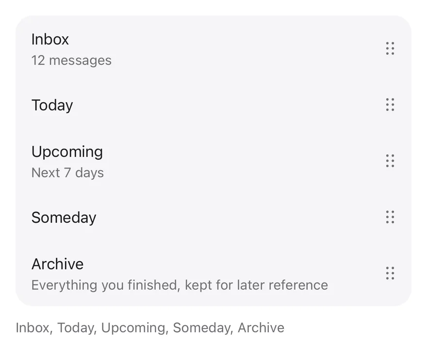
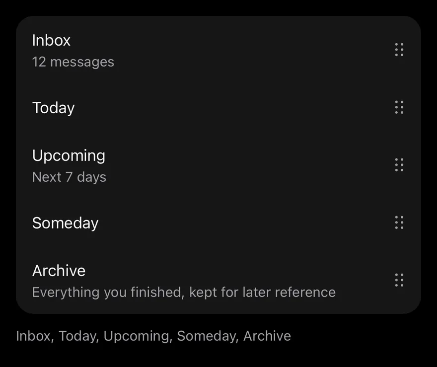
import * as React from "react"
import { View } from "react-native"
import { ReorderList, ReorderListHandle, ReorderListItem } from "@/components/interactions/reorder-list"
import { ItemGroup } from "@/components/ui/item"
import { Text } from "@/components/ui/text"

const tasks: Record<string, { title: string; detail?: string }> = {
  inbox: { title: "Inbox", detail: "12 messages" },
  today: { title: "Today" },
  upcoming: { title: "Upcoming", detail: "Next 7 days" },
  someday: { title: "Someday" },
  archive: {
    title: "Archive",
    detail: "Everything you finished, kept for later reference",
  },
}

const initialOrder = Object.keys(tasks)

function renderRows(value: string[]) {
  return value.map((key) => {
    const task = tasks[key]
    return (
      <ReorderListItem key={key} value={key} className="ps-4">
        <View className="min-w-0 flex-1 py-3">
          <Text numberOfLines={1}>{task.title}</Text>
          {task.detail ? (
            <Text className="text-sm text-muted-foreground">{task.detail}</Text>
          ) : null}
        </View>
        <ReorderListHandle accessibilityLabel={`Reorder ${task.title}`} />
      </ReorderListItem>
    )
  })
}

function ReorderDemo({ inset = false }: { inset?: boolean }) {
  const [value, setValue] = React.useState(initialOrder)
  return (
    <View className="gap-3">
      {inset ? (
        <ItemGroup variant="inset">
          <ReorderList value={value} onValueChange={setValue}>
            {renderRows(value)}
          </ReorderList>
        </ItemGroup>
      ) : (
        <ReorderList value={value} onValueChange={setValue}>
          {renderRows(value)}
        </ReorderList>
      )}
      <Text role="status" className="text-sm text-muted-foreground">
        {value.map((key) => tasks[key].title).join(", ")}
      </Text>
    </View>
  )
}

export function ReorderListInsetExample() {
  return (
    <ReorderDemo inset />
  )
}import EsuissUI
import SwiftUI
struct ReorderListInsetExample: View {
var body: some View {
ReorderListDemo(inset: true)
}
}
struct ReorderListTask {
let title: String
var detail: String?
}
let reorderListTasks: [String: ReorderListTask] = [
"inbox": ReorderListTask(title: "Inbox", detail: "12 messages"),
"today": ReorderListTask(title: "Today"),
"upcoming": ReorderListTask(title: "Upcoming", detail: "Next 7 days"),
"someday": ReorderListTask(title: "Someday"),
"archive": ReorderListTask(title: "Archive", detail: "Everything you finished, kept for later reference"),
]
let reorderListOrder = ["inbox", "today", "upcoming", "someday", "archive"]
struct ReorderListDemo: View {
var inset = false
@State private var value = reorderListOrder
var body: some View {
VStack(alignment: .leading, spacing: 12) {
list
Text(verbatim: value.compactMap { reorderListTasks[$0]?.title }.joined(separator: ", "))
.textStyle(.sm)
.foregroundStyle(EsuissColor.mutedForeground)
.accessibilityAddTraits(.updatesFrequently)
}
}
@ViewBuilder
var list: some View {
if inset {
ItemGroup(.inset) {
rows
}
} else {
rows
}
}
var rows: some View {
ReorderList($value) { key in
if let task = reorderListTasks[key] {
VStack(alignment: .leading, spacing: 0) {
Text(verbatim: task.title)
.textStyle(.base)
.foregroundStyle(EsuissColor.foreground)
.lineLimit(1)
if let detail = task.detail {
Text(verbatim: detail)
.textStyle(.sm)
.foregroundStyle(EsuissColor.mutedForeground)
}
}
.padding(.vertical, 12)
}
}
}
}import androidx.compose.foundation.layout.Arrangement
import androidx.compose.foundation.layout.Column
import androidx.compose.foundation.layout.padding
import androidx.compose.runtime.Composable
import androidx.compose.runtime.getValue
import androidx.compose.runtime.mutableStateOf
import androidx.compose.runtime.saveable.rememberSaveable
import androidx.compose.runtime.setValue
import androidx.compose.ui.Modifier
import androidx.compose.ui.semantics.LiveRegionMode
import androidx.compose.ui.semantics.liveRegion
import androidx.compose.ui.semantics.semantics
import androidx.compose.ui.text.style.TextOverflow
import androidx.compose.ui.unit.dp
import com.esuiss.ui.components.ItemGroup
import com.esuiss.ui.components.ItemGroupVariant
import com.esuiss.ui.components.Text
import com.esuiss.ui.interactions.ReorderList
import com.esuiss.ui.interactions.ReorderListHandle
import com.esuiss.ui.interactions.ReorderListItem
import com.esuiss.ui.theme.EsuissTheme
import com.esuiss.ui.theme.Typography
@Composable
fun ReorderListInsetExample() {
ReorderListDemo(inset = true)
}
class ReorderListTask(val title: String, val detail: String? = null)
val reorderListTasks = linkedMapOf(
"inbox" to ReorderListTask("Inbox", "12 messages"),
"today" to ReorderListTask("Today"),
"upcoming" to ReorderListTask("Upcoming", "Next 7 days"),
"someday" to ReorderListTask("Someday"),
"archive" to ReorderListTask("Archive", "Everything you finished, kept for later reference"),
)
val reorderListInitial = reorderListTasks.keys.toList()
@Composable
fun ReorderListDemo(inset: Boolean) {
val colors = EsuissTheme.colors
var value by rememberSaveable { mutableStateOf(reorderListInitial) }
Column(verticalArrangement = Arrangement.spacedBy(12.dp)) {
val list = @Composable {
ReorderList(
value = value,
onValueChange = { value = it },
) { key ->
val task = reorderListTasks.getValue(key)
ReorderListItem {
Column(Modifier.weight(1f).padding(vertical = 12.dp)) {
Text(task.title, maxLines = 1, overflow = TextOverflow.Ellipsis)
if (task.detail != null) {
Text(task.detail, style = Typography.sm.copy(color = colors.mutedForeground))
}
}
ReorderListHandle(contentDescription = "Reorder ${task.title}")
}
}
}
if (inset) ItemGroup(variant = ItemGroupVariant.Inset) { list() } else list()
Text(
value.joinToString(", ") { reorderListTasks.getValue(it).title },
modifier = Modifier.semantics { liveRegion = LiveRegionMode.Polite },
style = Typography.sm.copy(color = colors.mutedForeground),
)
}
}Leading handle
Places the handle at the start of each row.


import * as React from "react"
import { ReorderList, ReorderListHandle, ReorderListItem } from "@/components/interactions/reorder-list"
import { Text } from "@/components/ui/text"

const tasks: Record<string, { title: string; detail?: string }> = {
  inbox: { title: "Inbox", detail: "12 messages" },
  today: { title: "Today" },
  upcoming: { title: "Upcoming", detail: "Next 7 days" },
  someday: { title: "Someday" },
  archive: {
    title: "Archive",
    detail: "Everything you finished, kept for later reference",
  },
}

const initialOrder = Object.keys(tasks)

function LeadingHandleDemo() {
  const [value, setValue] = React.useState(initialOrder)
  return (
    <ReorderList
      value={value}
      onValueChange={setValue}
      moveUpLabel="Move earlier"
      moveDownLabel="Move later"
    >
      {value.map((key) => (
        <ReorderListItem key={key} value={key} className="pe-4">
          <ReorderListHandle
            accessibilityLabel={`Reorder ${tasks[key].title}`}
          />
          <Text numberOfLines={1} className="flex-1 py-3">
            {tasks[key].title}
          </Text>
        </ReorderListItem>
      ))}
    </ReorderList>
  )
}

export function ReorderListLeadingHandleExample() {
  return (
    <LeadingHandleDemo />
  )
}import androidx.compose.foundation.layout.padding
import androidx.compose.runtime.Composable
import androidx.compose.runtime.getValue
import androidx.compose.runtime.mutableStateOf
import androidx.compose.runtime.saveable.rememberSaveable
import androidx.compose.runtime.setValue
import androidx.compose.ui.Modifier
import androidx.compose.ui.text.style.TextOverflow
import androidx.compose.ui.unit.dp
import com.esuiss.ui.components.Text
import com.esuiss.ui.interactions.ReorderList
import com.esuiss.ui.interactions.ReorderListHandle
import com.esuiss.ui.interactions.ReorderListItem
class ReorderListTask(val title: String, val detail: String? = null)
val reorderListTasks = linkedMapOf(
"inbox" to ReorderListTask("Inbox", "12 messages"),
"today" to ReorderListTask("Today"),
"upcoming" to ReorderListTask("Upcoming", "Next 7 days"),
"someday" to ReorderListTask("Someday"),
"archive" to ReorderListTask("Archive", "Everything you finished, kept for later reference"),
)
val reorderListInitial = reorderListTasks.keys.toList()
@Composable
fun ReorderListLeadingHandle() {
var value by rememberSaveable { mutableStateOf(reorderListInitial) }
ReorderList(
value = value,
onValueChange = { value = it },
moveUpLabel = "Move earlier",
moveDownLabel = "Move later",
) { key ->
val task = reorderListTasks.getValue(key)
ReorderListItem(Modifier.padding(end = 12.dp)) {
ReorderListHandle(contentDescription = "Reorder ${task.title}")
Text(
task.title,
modifier = Modifier.weight(1f).padding(vertical = 12.dp),
maxLines = 1,
overflow = TextOverflow.Ellipsis,
)
}
}
}API Reference
ReorderList
The root that renders items in value order.
| Prop | Type | Default | Description |
|---|---|---|---|
value | string[] | Required | Item keys in their current order. |
onValueChange | (value: string[]) => void | Required | Called with the new order after a move. |
moveUpLabel | string | "Move up" | Label of the move up accessibility action. Defaults to Move up. |
moveDownLabel | string | "Move down" | Label of the move down accessibility action. Defaults to Move down. |
Also accepts the props of ViewProps.
ReorderListItem
One row, keyed by its value.
| Prop | Type | Default | Description |
|---|---|---|---|
value | string | Required | The key of this item. |
Also accepts the props of ViewProps.
ReorderListHandle
The grip that starts a drag.
Also accepts the props of ViewProps.
Accessibility
- The handle has the
buttonrole and offersmoveUpandmoveDownaccessibility actions, so screen reader users can reorder without dragging. - Move up is omitted on the first row and move down on the last.
Notes
- Haptics play when the drag starts (medium impact), each time the target slot changes (selection) and on release (light impact), if the app provides an adapter through
HapticsProvider. - The dragged row shows a
bg-cardlayer with a shadow, rounded inside an inset group. - The lift scale is skipped inside an inset group and when reduce motion is on; springs respect the system reduce motion setting.