suiss/ui · Interaction
Tip
A dismissible feature tip shown inline or as a popover, remembered once dismissed and sequenced in groups.
Tip is an open-source interaction from suiss/ui for React, React Native, SwiftUI and Jetpack Compose. The @esuiss/ui CLI copies its source into your project, so you own the code.
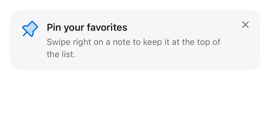
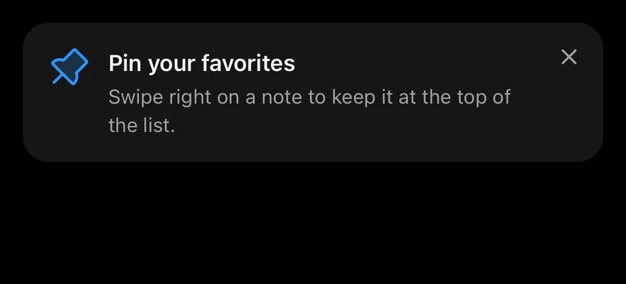
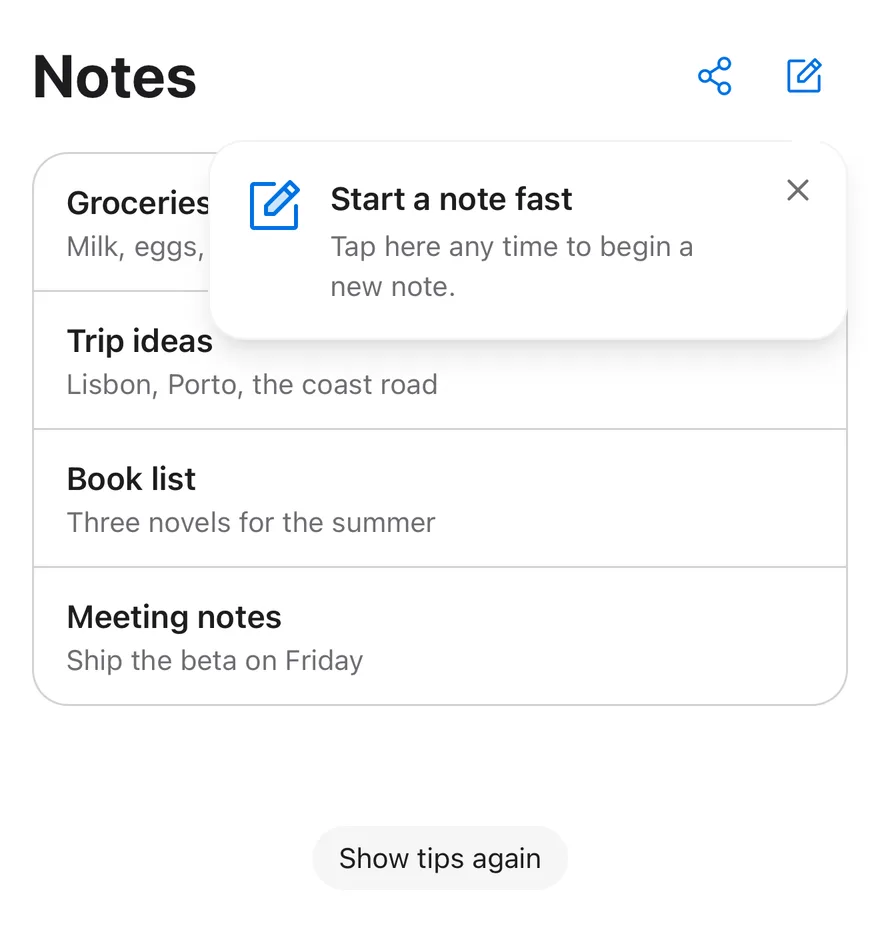
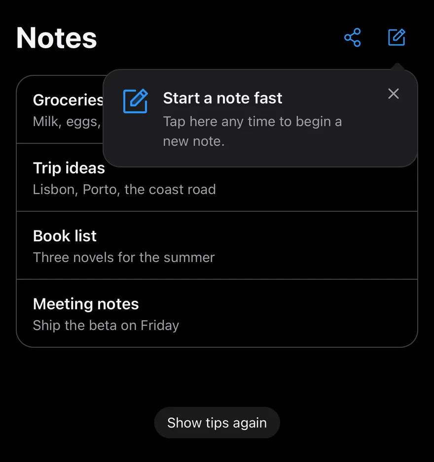
Tip recreates TipKit-style feature tips. Each tip has an id; once dismissed, the id is stored in localStorage and the tip no longer appears. Show a tip inline with TipCard, which expands into the layout, or attach it to a control with TipAnchor and TipPopover, which uses a non-modal popover with an arrow. Using the anchored control also dismisses its tip.
Wrap several tips in TipGroup to show them one at a time, in the order they mount; when one is dismissed, the next appears. Use tips sparingly to point out features people might otherwise miss.
Installation
CLI
Works in any project with a components.json. See Installation for the one-line registry setup. Or use the suiss/ui CLI:
Manual
- Install the dependencies and add the
cnhelper:
- Copy the source into
components/interactions/tip.tsx:
- Update the import paths to match your project.
Usage
- Give every
Tipa stable, uniqueid. Place either aTipCard, or aTipAnchorwith aTipPopover, inside it. - Build the content with
TipIcon,TipContent,TipTitle,TipDescription, andTipClose. TipPopoveracceptsside,align, andsideOffsetfor positioning, defaulting tobottom,center, and10.- Call
resetTipswith a list of ids to clear their dismissed state, for example from a Show tips again control.
API Reference
TipGroup
Shows the tips inside it one at a time, in order.
| Prop | Type | Default | Description |
|---|---|---|---|
children | React.ReactNode | - | The tips to show in sequence. |
Tip
Holds a single tip's visibility and dismissed state.
| Prop | Type | Default | Description |
|---|---|---|---|
id | string | Required | The unique key used to remember that the tip was dismissed. |
delay | number | 0 | Milliseconds to wait before showing the tip. |
onDismiss | () => void | - | Called when the tip is dismissed. |
children | React.ReactNode | - | The card or anchored popover for the tip. |
TipCard
An inline card that expands into the layout while the tip is visible.
Also accepts the props of React.ComponentProps<"div">.
TipAnchor
Wraps the control that a popover tip points to.
Also accepts the props of React.ComponentProps<"span">.
TipPopover
A popover with an arrow, positioned against TipAnchor.
Also accepts the props of the primitive parts it wraps.
TipIcon
The leading icon of the tip.
Also accepts the props of React.ComponentProps<"span">.
TipContent
The container for the title and description.
Also accepts the props of React.ComponentProps<"div">.
TipTitle
The tip's title.
Also accepts the props of React.ComponentProps<"p">.
TipDescription
The tip's supporting text.
Also accepts the props of React.ComponentProps<"p">.
TipClose
The button that dismisses the tip.
Also accepts the props of React.ComponentProps<"button">.
Accessibility
TipCardrenders withrole="note".TipPopoveris labelled byTipTitleand described byTipDescription. It does not move focus when it opens or closes, and pressingEscapeor outside dismisses it.TipCloseis labelledDismiss tip.TipIconisaria-hidden.
Notes
- Dismissed tips are stored under
tip:followed by the id inlocalStorage. When storage is unavailable, tips still dismiss for the current session. - Parts use
data-slotvaluestip-card-frame,tip-card,tip-anchor,tip-popover,tip-icon,tip-content,tip-title,tip-description, andtip-close.
Tip shows a hint until the user dismisses it, then records the dismissal under its id so it does not return. It renders either as a TipCard placed in the layout, or as a TipPopover with an arrow pointing at a TipAnchor. Touching the anchor also dismisses the tip.
TipGroup shows several tips one at a time in the order they mount, moving to the next when one is dismissed. Use tips to introduce a feature or gesture the user may not discover.