suiss/ui
  • Docs
  • Components
  • Patterns
  • Interactions
  • Charts
  • Blocks
GitHubGet started
DocsComponentsPatternsInteractionsChartsBlocks
Interactions15
  • Overview
  • Card Stack
  • Image Viewer
  • Island
  • OTP Autofill
  • Preview Menu
  • Pull to Refresh
  • Reorder List
  • Search Reveal
  • Section Index
  • Selection List
  • Stepper
  • Swipe Actions
  • Tip
  • Top Banner
  • Undo Bar

suiss/ui · Interaction

Swipe Actions

A list row that reveals action buttons when swiped sideways, with optional full swipe to run an action.

Swipe Actions is an open-source interaction from suiss/ui for React, React Native, SwiftUI and Jetpack Compose. The @esuiss/ui CLI copies its source into your project, so you own the code.

import {
  ArchiveIcon,
  EnvelopeSimpleIcon,
  TrashIcon,
} from "@phosphor-icons/react"
import * as React from "react"
import {
  SwipeAction,
  SwipeActions,
  SwipeActionsActions,
  SwipeActionsContent,
} from "@/components/interactions/swipe-actions"
import { Button } from "@/components/ui/button"

const initialMessages = [
  {
    id: 1,
    from: "Acme Store",
    subject: "Your order has shipped",
    preview: "Order #1042 will be delivered tomorrow.",
  },
  {
    id: 2,
    from: "Jordan Lee",
    subject: "Tomorrow's meeting",
    preview: "Does 10:00 work for you?",
  },
  {
    id: 3,
    from: "Cloud Drive",
    subject: "Your storage is almost full",
    preview: "Upgrade your plan to get more space.",
  },
  {
    id: 4,
    from: "Taylor Kim",
    subject: "Weekend plans",
    preview: "Are we still on for Saturday?",
  },
]

function MailExample({ withLeading = false }: { withLeading?: boolean }) {
  const [messages, setMessages] = React.useState(initialMessages)
  const [unread, setUnread] = React.useState<number[]>([])
  const [log, setLog] = React.useState("Swipe a message to the left.")

  const remove = (id: number, action: string) => {
    setMessages((current) => current.filter((message) => message.id !== id))
    setLog(`${action} message ${id}`)
  }

  return (
    <div className="mx-auto flex w-full max-w-md flex-col gap-3">
      <ul className="overflow-hidden rounded-2xl border">
        {messages.map((message) => (
          <li key={message.id} className="not-first:border-t">
            <SwipeActions>
              {withLeading && (
                <SwipeActionsActions side="leading">
                  <SwipeAction
                    onClick={() => {
                      setUnread((current) =>
                        current.includes(message.id)
                          ? current.filter((id) => id !== message.id)
                          : [...current, message.id]
                      )
                      setLog(`Toggled unread on message ${message.id}`)
                    }}
                  >
                    <EnvelopeSimpleIcon />
                    Unread
                  </SwipeAction>
                </SwipeActionsActions>
              )}
              <SwipeActionsContent className="flex flex-col gap-0.5 px-4 py-3">
                <span className="flex items-center gap-2 font-semibold">
                  {unread.includes(message.id) && (
                    <span className="size-2 rounded-full bg-primary" />
                  )}
                  {message.from}
                </span>
                <span className="text-sm">{message.subject}</span>
                <span className="truncate text-sm text-muted-foreground">
                  {message.preview}
                </span>
              </SwipeActionsContent>
              <SwipeActionsActions>
                <SwipeAction
                  variant="archive"
                  onClick={() => remove(message.id, "Archived")}
                >
                  <ArchiveIcon />
                  Archive
                </SwipeAction>
                <SwipeAction
                  variant="destructive"
                  fullSwipe
                  onClick={() => remove(message.id, "Deleted")}
                >
                  <TrashIcon />
                  Delete
                </SwipeAction>
              </SwipeActionsActions>
            </SwipeActions>
          </li>
        ))}
      </ul>
      <div className="flex items-center justify-between gap-3">
        <p role="status" className="text-sm text-muted-foreground">
          {log}
        </p>
        <Button
          size="sm"
          variant="secondary"
          onClick={() => {
            setMessages(initialMessages)
            setUnread([])
            setLog("Swipe a message to the left.")
          }}
        >
          Reset
        </Button>
      </div>
    </div>
  )
}

export default function SwipeActionsDemo() {
  return <MailExample />
}

SwipeActions recreates iOS swipe actions for list rows. Dragging SwipeActionsContent sideways reveals the buttons in SwipeActionsActions on that side; releasing past half their width snaps the row open, otherwise it springs closed. Dragging past the actions meets increasing resistance, unless an action has fullSwipe: then dragging past 60% of the row width expands that action across the row, and releasing collapses the row and runs it.

Only one row stays open at a time. Tapping the content or pressing elsewhere closes an open row, and choosing an action closes it after the action runs. Use it for quick per-row actions such as archive, delete, or mark as unread.

Installation

CLI

$ pnpm dlx shadcn@latest add @esuiss/swipe-actions

Works in any project with a components.json. See Installation for the one-line registry setup. Or use the suiss/ui CLI:

$ pnpm dlx @esuiss/ui@latest add interactions swipe-actions

Manual

  1. Install the dependencies and add the cn helper:
$ pnpm add class-variance-authority
  1. Copy the source into components/interactions/swipe-actions.tsx:
components/interactions/swipe-actions.tsx
"use client"

import { cva, type VariantProps } from "class-variance-authority"
import * as React from "react"
import { cn } from "@/lib/utils"

type SwipeActionsSide = "leading" | "trailing"

type SwipeActionsContextProps = {
  close: () => void
  onContentPointerDown: (event: React.PointerEvent<HTMLElement>) => void
  onContentClickCapture: (event: React.MouseEvent<HTMLElement>) => void
}

const SwipeActionsContext =
  React.createContext<SwipeActionsContextProps | null>(null)
  1. Update the import paths to match your project.

Usage

import { SwipeActions, SwipeActionsContent, SwipeActionsActions, SwipeAction } from "@/components/interactions/swipe-actions"
<MailExample />
  • Place SwipeActionsContent inside SwipeActions, with a SwipeActionsActions for each side that has actions. Rows can have leading actions, trailing actions, or both.
  • Handle each action with onClick. A full swipe runs the action by clicking it, so the same handler covers both.
  • useSwipeActions returns close for closing the row from custom controls.
  • Gestures are detected with pointer events and locked to the horizontal axis after a few pixels, so vertical scrolling still works.

Examples

Both sides

A row with a leading Unread action on one side and trailing Archive and Delete actions on the other.

import {
  ArchiveIcon,
  EnvelopeSimpleIcon,
  TrashIcon,
} from "@phosphor-icons/react"
import * as React from "react"
import {
  SwipeAction,
  SwipeActions,
  SwipeActionsActions,
  SwipeActionsContent,
} from "@/components/interactions/swipe-actions"
import { Button } from "@/components/ui/button"

const initialMessages = [
  {
    id: 1,
    from: "Acme Store",
    subject: "Your order has shipped",
    preview: "Order #1042 will be delivered tomorrow.",
  },
  {
    id: 2,
    from: "Jordan Lee",
    subject: "Tomorrow's meeting",
    preview: "Does 10:00 work for you?",
  },
  {
    id: 3,
    from: "Cloud Drive",
    subject: "Your storage is almost full",
    preview: "Upgrade your plan to get more space.",
  },
  {
    id: 4,
    from: "Taylor Kim",
    subject: "Weekend plans",
    preview: "Are we still on for Saturday?",
  },
]

function MailExample({ withLeading = false }: { withLeading?: boolean }) {
  const [messages, setMessages] = React.useState(initialMessages)
  const [unread, setUnread] = React.useState<number[]>([])
  const [log, setLog] = React.useState("Swipe a message to the left.")

  const remove = (id: number, action: string) => {
    setMessages((current) => current.filter((message) => message.id !== id))
    setLog(`${action} message ${id}`)
  }

  return (
    <div className="mx-auto flex w-full max-w-md flex-col gap-3">
      <ul className="overflow-hidden rounded-2xl border">
        {messages.map((message) => (
          <li key={message.id} className="not-first:border-t">
            <SwipeActions>
              {withLeading && (
                <SwipeActionsActions side="leading">
                  <SwipeAction
                    onClick={() => {
                      setUnread((current) =>
                        current.includes(message.id)
                          ? current.filter((id) => id !== message.id)
                          : [...current, message.id]
                      )
                      setLog(`Toggled unread on message ${message.id}`)
                    }}
                  >
                    <EnvelopeSimpleIcon />
                    Unread
                  </SwipeAction>
                </SwipeActionsActions>
              )}
              <SwipeActionsContent className="flex flex-col gap-0.5 px-4 py-3">
                <span className="flex items-center gap-2 font-semibold">
                  {unread.includes(message.id) && (
                    <span className="size-2 rounded-full bg-primary" />
                  )}
                  {message.from}
                </span>
                <span className="text-sm">{message.subject}</span>
                <span className="truncate text-sm text-muted-foreground">
                  {message.preview}
                </span>
              </SwipeActionsContent>
              <SwipeActionsActions>
                <SwipeAction
                  variant="archive"
                  onClick={() => remove(message.id, "Archived")}
                >
                  <ArchiveIcon />
                  Archive
                </SwipeAction>
                <SwipeAction
                  variant="destructive"
                  fullSwipe
                  onClick={() => remove(message.id, "Deleted")}
                >
                  <TrashIcon />
                  Delete
                </SwipeAction>
              </SwipeActionsActions>
            </SwipeActions>
          </li>
        ))}
      </ul>
      <div className="flex items-center justify-between gap-3">
        <p role="status" className="text-sm text-muted-foreground">
          {log}
        </p>
        <Button
          size="sm"
          variant="secondary"
          onClick={() => {
            setMessages(initialMessages)
            setUnread([])
            setLog("Swipe a message to the left.")
          }}
        >
          Reset
        </Button>
      </div>
    </div>
  )
}

export default function SwipeActionsBothSides() {
  return <MailExample withLeading />
}

Variants

The default, neutral, archive, and destructive action colors side by side.

import {
  ArchiveIcon,
  BellSlashIcon,
  FlagIcon,
  TrashIcon,
} from "@phosphor-icons/react"
import {
  SwipeAction,
  SwipeActions,
  SwipeActionsActions,
  SwipeActionsContent,
} from "@/components/interactions/swipe-actions"

export default function SwipeActionsVariants() {
  return (
    <div className="mx-auto w-full max-w-md overflow-hidden rounded-2xl border">
      <SwipeActions>
        <SwipeActionsContent className="px-4 py-3">
          Swipe to see every action style
        </SwipeActionsContent>
        <SwipeActionsActions>
          <SwipeAction>
            <FlagIcon className="fill-current" />
            Flag
          </SwipeAction>
          <SwipeAction variant="neutral">
            <BellSlashIcon />
            Mute
          </SwipeAction>
          <SwipeAction variant="archive">
            <ArchiveIcon />
            Archive
          </SwipeAction>
          <SwipeAction variant="destructive">
            <TrashIcon />
            Delete
          </SwipeAction>
        </SwipeActionsActions>
      </SwipeActions>
    </div>
  )
}

API Reference

Anatomy4 parts
<SwipeActions>
<SwipeActionsContent />
<SwipeActionsActions>
<SwipeAction />
</SwipeActionsActions>
</SwipeActions>
01

SwipeActions

The row container that tracks the swipe and manages open state.

Also accepts the props of React.ComponentProps<"div">.

02

SwipeActionsContent

The visible row content that moves with the swipe.

Also accepts the props of React.ComponentProps<"div">.

03

SwipeActionsActions

The group of actions revealed on one side of the row.

PropTypeDefaultDescription
sideSwipeActionsSide"trailing"The edge the actions appear on: leading or trailing.

Also accepts the props of React.ComponentProps<"div">.

04

SwipeAction

A single action button revealed by the swipe.

PropTypeDefaultDescription
variant"default" | "destructive" | "archive" | "neutral""default"The background color of the action: default, destructive, archive, or neutral.
fullSwipebooleanfalseLets a long swipe expand this action across the row and run it.

Also accepts the props of React.ComponentProps<"button">.

Accessibility

  • The row has role="group", and actions are native buttons that stay in the tab order.
  • Moving focus to an action opens its side of the row so the button is visible; moving focus out of the row closes it.
  • Escape closes an open row.
  • Leading and trailing sides follow the writing direction, so swipes mirror in right-to-left layouts.

Notes

  • The root uses data-slot="swipe-actions" and sets data-open (leading or trailing), data-full during a full swipe, and data-removing while the row collapses. Action groups expose data-side, and full-swipe actions set data-full-swipe.
  • The --swipe-actions-offset custom property holds the current offset.
  • swipeActionVariants is exported for styling other elements like an action.
iOS
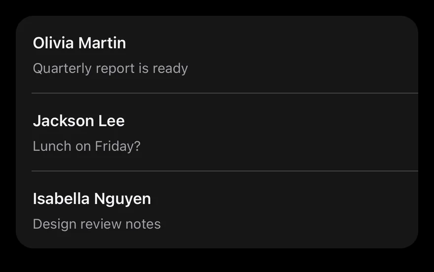
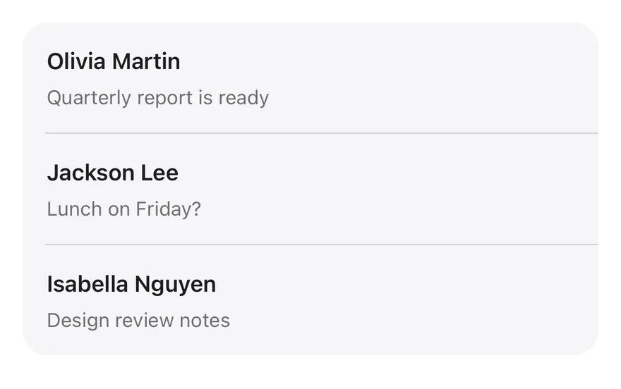
Swipe Actions on iOS in light modeSwipe Actions on iOS in dark mode
import { ArchiveIcon, BellSlashIcon, EnvelopeOpenIcon, TrashIcon } from "phosphor-react-native"
import * as React from "react"
import { View } from "react-native"
import { SwipeAction, SwipeActions, SwipeActionsActions, SwipeActionsContent } from "@/components/interactions/swipe-actions"
import { Icon } from "@/components/ui/icon"
import { Item, ItemContent, ItemDescription, ItemGroup, ItemSeparator, ItemTitle } from "@/components/ui/item"
import { Text } from "@/components/ui/text"

const MESSAGES = [
  { id: "1", from: "Olivia Martin", subject: "Quarterly report is ready" },
  { id: "2", from: "Jackson Lee", subject: "Lunch on Friday?" },
  { id: "3", from: "Isabella Nguyen", subject: "Design review notes" },
]

function Inbox() {
  const [messages, setMessages] = React.useState(MESSAGES)
  const remove = (id: string) =>
    setMessages((current) => current.filter((message) => message.id !== id))
  return (
    <ItemGroup variant="inset">
      {messages.map((message, index) => (
        <React.Fragment key={message.id}>
          {index > 0 ? <ItemSeparator /> : null}
          <SwipeActions>
            <SwipeActionsActions side="leading">
              <SwipeAction>
                <Icon as={EnvelopeOpenIcon} />
                <Text>Read</Text>
              </SwipeAction>
            </SwipeActionsActions>
            <SwipeActionsContent className="bg-muted">
              <Item onPress={() => undefined}>
                <ItemContent>
                  <ItemTitle>{message.from}</ItemTitle>
                  <ItemDescription>{message.subject}</ItemDescription>
                </ItemContent>
              </Item>
            </SwipeActionsContent>
            <SwipeActionsActions side="trailing">
              <SwipeAction variant="neutral">
                <Icon as={BellSlashIcon} />
                <Text>Mute</Text>
              </SwipeAction>
              <SwipeAction variant="archive">
                <Icon as={ArchiveIcon} />
                <Text>Archive</Text>
              </SwipeAction>
              <SwipeAction
                variant="destructive"
                fullSwipe
                onPress={() => remove(message.id)}
              >
                <Icon as={TrashIcon} />
                <Text>Delete</Text>
              </SwipeAction>
            </SwipeActionsActions>
          </SwipeActions>
        </React.Fragment>
      ))}
    </ItemGroup>
  )
}

export function SwipeActionsExample() {
  return (
    <View>
      <Inbox />
    </View>
  )
}
import EsuissUI
import PhosphorSwift
import SwiftUI

struct SwipeActionsMessage: Identifiable {
  let id: String
  let from: String
  let subject: String
}

let swipeActionsMessages = [
  SwipeActionsMessage(id: "1", from: "Olivia Martin", subject: "Quarterly report is ready"),
  SwipeActionsMessage(id: "2", from: "Jackson Lee", subject: "Lunch on Friday?"),
  SwipeActionsMessage(id: "3", from: "Isabella Nguyen", subject: "Design review notes"),
]

struct SwipeActionsInbox: View {
  @State private var messages = swipeActionsMessages

  var body: some View {
    ItemGroup(.inset) {
      ForEach(Array(messages.enumerated()), id: \.element.id) { index, message in
        if index > 0 {
          ItemSeparator()
        }
        SwipeActions(background: EsuissColor.muted) {
          Item(action: {}) {
            ItemContent {
              ItemTitle(verbatim: message.from)
              ItemDescription(verbatim: message.subject)
            }
          }
        } leading: {
          SwipeAction("Read", icon: Ph.envelopeOpen.regular) {}
        } trailing: {
          SwipeAction("Mute", icon: Ph.bellSlash.regular, variant: .neutral) {}
          SwipeAction("Archive", icon: Ph.archive.regular, variant: .archive) {}
          SwipeAction("Delete", icon: Ph.trash.regular, variant: .destructive, fullSwipe: true) {
            messages.removeAll { $0.id == message.id }
          }
        }
      }
    }
  }
}
import androidx.compose.runtime.Composable
import androidx.compose.runtime.getValue
import androidx.compose.runtime.key
import androidx.compose.runtime.mutableStateOf
import androidx.compose.runtime.remember
import androidx.compose.runtime.setValue
import com.adamglin.PhosphorIcons
import com.adamglin.phosphoricons.Regular
import com.adamglin.phosphoricons.regular.Archive
import com.adamglin.phosphoricons.regular.BellSlash
import com.adamglin.phosphoricons.regular.EnvelopeOpen
import com.adamglin.phosphoricons.regular.Trash
import com.esuiss.ui.components.Item
import com.esuiss.ui.components.ItemContent
import com.esuiss.ui.components.ItemDescription
import com.esuiss.ui.components.ItemGroup
import com.esuiss.ui.components.ItemGroupVariant
import com.esuiss.ui.components.ItemSeparator
import com.esuiss.ui.components.ItemTitle
import com.esuiss.ui.interactions.SwipeAction
import com.esuiss.ui.interactions.SwipeActionVariant
import com.esuiss.ui.interactions.SwipeActions
import com.esuiss.ui.theme.EsuissTheme

class SwipeActionsMessage(val id: String, val from: String, val subject: String)

val swipeActionsMessages = listOf(
    SwipeActionsMessage("1", "Olivia Martin", "Quarterly report is ready"),
    SwipeActionsMessage("2", "Jackson Lee", "Lunch on Friday?"),
    SwipeActionsMessage("3", "Isabella Nguyen", "Design review notes"),
)

@Composable
fun SwipeActionsInbox() {
    var messages by remember { mutableStateOf(swipeActionsMessages) }
    ItemGroup(variant = ItemGroupVariant.Inset) {
        messages.forEachIndexed { index, message ->
            key(message.id) {
                if (index > 0) ItemSeparator()
                SwipeActions(
                    leading = listOf(SwipeAction("Read", {}, icon = PhosphorIcons.Regular.EnvelopeOpen)),
                    trailing = listOf(
                        SwipeAction("Mute", {}, icon = PhosphorIcons.Regular.BellSlash, variant = SwipeActionVariant.Neutral),
                        SwipeAction("Archive", {}, icon = PhosphorIcons.Regular.Archive, variant = SwipeActionVariant.Archive),
                        SwipeAction(
                            "Delete",
                            { messages = messages.filterNot { it.id == message.id } },
                            icon = PhosphorIcons.Regular.Trash,
                            variant = SwipeActionVariant.Destructive,
                            fullSwipe = true,
                        ),
                    ),
                    background = EsuissTheme.colors.muted,
                ) {
                    Item(onClick = {}) {
                        ItemContent {
                            ItemTitle(message.from)
                            ItemDescription(message.subject)
                        }
                    }
                }
            }
        }
    }
}

SwipeActions wraps a row so it can be dragged left or right to reveal SwipeAction buttons on the leading or trailing side. The buttons stretch to fill the revealed space, and opening one row closes any other open row.

When an action has fullSwipe, dragging past 60% of the row width expands that action over the others with a medium impact haptic. Releasing there slides the row off, collapses its height, then runs the action, which suits delete or archive. Use it for mail, message or task lists.

Installation

$ pnpm dlx shadcn@latest add @esuiss-rn/swipe-actions

See Installation for the components.json setup. Or use the suiss/ui CLI:

$ pnpm dlx @esuiss/ui@latest add swipe-actions
$ pnpm dlx @esuiss/ui@latest add swipe-actions --platform swift
$ pnpm dlx @esuiss/ui@latest add swipe-actions --platform kotlin

The CLI also adds what it builds on: Icon, Text. On React Native it also adds the animated view components/ui/animated-view.tsx.

Manual

  1. Install the dependencies:
npx expo install class-variance-authority cn react-native-gesture-handler react-native-reanimated react-native-worklets
  1. Add the pieces it builds on: Icon, Text, and the primitives components/primitives/haptics.tsx, and the animated view components/ui/animated-view.tsx from the next step.

  2. Copy the animated view into components/ui/animated-view.tsx:

uniwind/components/ui/animated-view.tsx
import { Pressable } from "react-native"
import Animated from "react-native-reanimated"

const AnimatedPressable = Animated.createAnimatedComponent(Pressable)

type AnimatedViewProps =
  | (React.ComponentProps<typeof Animated.View> &
      React.RefAttributes<React.ComponentRef<typeof Animated.View>> & {
        as?: "View"
      })
  | (React.ComponentProps<typeof AnimatedPressable> &
      React.RefAttributes<React.ComponentRef<typeof AnimatedPressable>> & {
        as: "Pressable"
      })

function AnimatedView(props: AnimatedViewProps) {
  1. Copy the source into components/interactions/swipe-actions.tsx:
uniwind/components/interactions/swipe-actions.tsx
import { cva, type VariantProps } from "class-variance-authority"
import { cn } from "cn"
import * as React from "react"
import {
  type AccessibilityActionEvent,
  I18nManager,
  Pressable,
  View,
  type ViewProps,
} from "react-native"
import ReanimatedSwipeable, {
  type SwipeableMethods,
} from "react-native-gesture-handler/ReanimatedSwipeable"
import {
  Easing,
  runOnJS,
  1. Update the import paths to match your project.
  1. Install the dependencies:
npx expo install class-variance-authority cn react-native-gesture-handler react-native-reanimated react-native-worklets
  1. Add the pieces it builds on: Icon, Text, and the primitives components/primitives/haptics.tsx, and the animated view components/ui/animated-view.tsx from the next step.

  2. Copy the animated view into components/ui/animated-view.tsx:

nativewind/components/ui/animated-view.tsx
import { Pressable } from "react-native"
import Animated from "react-native-reanimated"

const AnimatedPressable = Animated.createAnimatedComponent(Pressable)

type AnimatedViewProps =
  | (React.ComponentProps<typeof Animated.View> &
      React.RefAttributes<React.ComponentRef<typeof Animated.View>> & {
        as?: "View"
      })
  | (React.ComponentProps<typeof AnimatedPressable> &
      React.RefAttributes<React.ComponentRef<typeof AnimatedPressable>> & {
        as: "Pressable"
      })

function AnimatedView(props: AnimatedViewProps) {
  1. Copy the source into components/interactions/swipe-actions.tsx:
nativewind/components/interactions/swipe-actions.tsx
import { cva, type VariantProps } from "class-variance-authority"
import { cn } from "cn"
import * as React from "react"
import {
  type AccessibilityActionEvent,
  I18nManager,
  Pressable,
  View,
  type ViewProps,
} from "react-native"
import ReanimatedSwipeable, {
  type SwipeableMethods,
} from "react-native-gesture-handler/ReanimatedSwipeable"
import {
  Easing,
  runOnJS,
  1. Update the import paths to match your project.
  1. Install the dependencies:
npx expo install react-native-gesture-handler react-native-reanimated react-native-worklets
  1. Add the pieces it builds on: Icon, Text, and the primitives components/primitives/haptics.tsx, and the animated view components/ui/animated-view.tsx from the next step.

  2. Copy the animated view into components/ui/animated-view.tsx:

stylesheet/components/ui/animated-view.tsx
import { Pressable } from "react-native"
import Animated from "react-native-reanimated"

const AnimatedPressable = Animated.createAnimatedComponent(Pressable)

type AnimatedViewProps =
  | (React.ComponentProps<typeof Animated.View> &
      React.RefAttributes<React.ComponentRef<typeof Animated.View>> & {
        as?: "View"
      })
  | (React.ComponentProps<typeof AnimatedPressable> &
      React.RefAttributes<React.ComponentRef<typeof AnimatedPressable>> & {
        as: "Pressable"
      })

function AnimatedView(props: AnimatedViewProps) {
  1. Copy the source into components/interactions/swipe-actions.tsx:
stylesheet/components/interactions/swipe-actions.tsx
import * as React from "react"
import {
  type AccessibilityActionEvent,
  I18nManager,
  Pressable,
  StyleSheet,
  View,
  type ViewProps,
} from "react-native"
import ReanimatedSwipeable, {
  type SwipeableMethods,
} from "react-native-gesture-handler/ReanimatedSwipeable"
import {
  Easing,
  runOnJS,
  type SharedValue,
  1. Update the import paths to match your project.
  1. Target iOS 17 or later.

  2. Copy the theme files every view uses:

swift/Theme/Theme.swift
import SwiftUI
import UIKit

struct RGBA: Sendable {
  let red: CGFloat
  let green: CGFloat
  let blue: CGFloat
  let alpha: CGFloat

  init(_ hex: UInt32, _ alpha: CGFloat = 1) {
    red = CGFloat((hex >> 16) & 0xFF) / 255
    green = CGFloat((hex >> 8) & 0xFF) / 255
    blue = CGFloat(hex & 0xFF) / 255
    self.alpha = alpha
  }
swift/Theme/Tokens.swift
import SwiftUI

public enum EsuissColor {
  public static let background = Color.adaptive(light: .init(0xFFFFFF), dark: .init(0x000000))
  public static let foreground = Color.adaptive(light: .init(0x1D1D1F), dark: .init(0xF5F5F7))
  public static let card = Color.adaptive(light: .init(0xFFFFFF), dark: .init(0x1D1D1F))
  public static let cardForeground = Color.adaptive(light: .init(0x1D1D1F), dark: .init(0xF5F5F7))
  public static let popover = Color.adaptive(light: .init(0xFFFFFF), dark: .init(0x1D1D1F))
  public static let popoverForeground = Color.adaptive(light: .init(0x1D1D1F), dark: .init(0xF5F5F7))
  public static let primary = Color.adaptive(light: .init(0x0071E3), dark: .init(0x2997FF))
  public static let primaryForeground = Color.adaptive(light: .init(0xFFFFFF), dark: .init(0xFFFFFF))
  public static let secondary = Color.adaptive(light: .init(0x000000, 0.04), dark: .init(0xFFFFFF, 0.1))
  public static let secondaryForeground = Color.adaptive(light: .init(0x1D1D1F), dark: .init(0xF5F5F7))
  public static let muted = Color.adaptive(light: .init(0xF5F5F7), dark: .init(0x161617))
  public static let mutedForeground = Color.adaptive(light: .init(0x6E6E73), dark: .init(0xA1A1A6))
  public static let accent = Color.adaptive(light: .init(0x000000, 0.06), dark: .init(0xFFFFFF, 0.1))
  1. Copy the source and every file it uses:
swift/Interactions/SwipeActions.swift
import SwiftUI

public enum SwipeActionVariant: CaseIterable, Sendable {
  case `default`, destructive, archive, neutral

  var color: Color {
    switch self {
    case .default: EsuissColor.primary
    case .destructive: EsuissColor.destructive
    case .archive: Palette.purple500
    case .neutral: Palette.zinc500
    }
  }
}

enum SwipeActionsMode: Sendable {
swift/Components/Haptics.swift
import SwiftUI

extension EnvironmentValues {
  @Entry public var hapticsEnabled = true
}

extension View {
  public func haptics(_ enabled: Bool) -> some View {
    environment(\.hapticsEnabled, enabled)
  }

  func hapticFeedback<Trigger: Equatable>(_ feedback: SensoryFeedback, trigger: Trigger) -> some View {
    modifier(HapticFeedbackModifier(feedback: feedback, trigger: trigger) { _, _ in true })
  }

  func hapticFeedback<Trigger: Equatable>(
  1. Add the files to your app target.
  1. Set minSdk to 24 or higher and add the dependencies:
build.gradle.kts
implementation(platform("androidx.compose:compose-bom:2026.09.00"))
implementation("androidx.compose.foundation:foundation")
implementation("androidx.compose.ui:ui")
  1. Copy the theme files every view uses:
kotlin/theme/Theme.kt
package com.esuiss.ui.theme

import androidx.compose.foundation.isSystemInDarkTheme
import androidx.compose.runtime.Composable
import androidx.compose.runtime.CompositionLocalProvider
import androidx.compose.runtime.Immutable
import androidx.compose.runtime.staticCompositionLocalOf
import androidx.compose.ui.Modifier
import androidx.compose.ui.draw.dropShadow
import androidx.compose.ui.graphics.Color
import androidx.compose.ui.graphics.Shape
import androidx.compose.ui.graphics.shadow.Shadow as DropShadow
import androidx.compose.ui.text.TextStyle
import androidx.compose.ui.text.style.LineHeightStyle
import androidx.compose.ui.unit.Dp
import androidx.compose.ui.unit.DpOffset
kotlin/theme/Tokens.kt
package com.esuiss.ui.theme

import androidx.compose.runtime.Immutable
import androidx.compose.ui.graphics.Color
import androidx.compose.ui.unit.dp

@Immutable
data class Colors(
    val background: Color,
    val foreground: Color,
    val card: Color,
    val cardForeground: Color,
    val popover: Color,
    val popoverForeground: Color,
    val primary: Color,
    val primaryForeground: Color,
  1. Copy the source and every file it uses:
kotlin/interactions/SwipeActions.kt
package com.esuiss.ui.interactions

import androidx.compose.animation.core.Animatable
import androidx.compose.animation.core.animateFloatAsState
import androidx.compose.animation.core.tween
import androidx.compose.foundation.background
import androidx.compose.foundation.clickable
import androidx.compose.foundation.gestures.AnchoredDraggableDefaults
import androidx.compose.foundation.gestures.AnchoredDraggableState
import androidx.compose.foundation.gestures.DraggableAnchors
import androidx.compose.foundation.gestures.Orientation
import androidx.compose.foundation.gestures.anchoredDraggable
import androidx.compose.foundation.gestures.animateTo
import androidx.compose.foundation.gestures.detectTapGestures
import androidx.compose.foundation.gestures.snapTo
import androidx.compose.foundation.interaction.MutableInteractionSource
kotlin/components/Content.kt
package com.esuiss.ui.components

import androidx.compose.runtime.compositionLocalOf
import androidx.compose.ui.graphics.Color
import androidx.compose.ui.text.TextStyle
import androidx.compose.ui.unit.Dp
import androidx.compose.ui.unit.dp

val LocalContentStyle = compositionLocalOf { TextStyle.Default }

val LocalContentColor = compositionLocalOf { Color.Unspecified }

val LocalIconSize = compositionLocalOf { 20.dp }
kotlin/components/FormSupport.kt
package com.esuiss.ui.components

import android.provider.Settings
import androidx.compose.animation.core.CubicBezierEasing
import androidx.compose.foundation.background
import androidx.compose.foundation.border
import androidx.compose.foundation.gestures.Orientation
import androidx.compose.foundation.text.selection.TextSelectionColors
import androidx.compose.runtime.Composable
import androidx.compose.runtime.mutableStateOf
import androidx.compose.runtime.remember
import androidx.compose.ui.Modifier
import androidx.compose.ui.draw.alpha
import androidx.compose.ui.draw.clip
import androidx.compose.ui.draw.drawWithContent
import androidx.compose.ui.geometry.Offset
kotlin/components/Haptics.kt
package com.esuiss.ui.components

import androidx.compose.runtime.Composable
import androidx.compose.runtime.CompositionLocalProvider
import androidx.compose.runtime.remember
import androidx.compose.runtime.staticCompositionLocalOf
import androidx.compose.ui.hapticfeedback.HapticFeedback
import androidx.compose.ui.hapticfeedback.HapticFeedbackType
import androidx.compose.ui.platform.LocalHapticFeedback

val LocalHapticsEnabled = staticCompositionLocalOf { true }

@Composable
fun ProvideHaptics(enabled: Boolean, content: @Composable () -> Unit) {
    CompositionLocalProvider(LocalHapticsEnabled provides enabled, content = content)
}
kotlin/components/Icon.kt
package com.esuiss.ui.components

import androidx.compose.foundation.Image
import androidx.compose.foundation.layout.size
import androidx.compose.runtime.Composable
import androidx.compose.ui.Modifier
import androidx.compose.ui.graphics.Color
import androidx.compose.ui.graphics.ColorFilter
import androidx.compose.ui.graphics.takeOrElse
import androidx.compose.ui.graphics.vector.ImageVector
import androidx.compose.ui.unit.Dp
import com.esuiss.ui.theme.EsuissTheme

@Composable
fun Icon(
    imageVector: ImageVector,
  1. Update the com.esuiss.ui package names to match your project.

Usage

import { SwipeActions, SwipeActionsContent, SwipeActionsActions, SwipeAction } from "@/components/interactions/swipe-actions"
<View>
  <Inbox />
</View>

Put the row in SwipeActionsContent, and the buttons in one SwipeActionsActions per side, with side set to leading or trailing (the default). Leading actions are on the left in left-to-right layouts and on the right in right-to-left layouts.

Pressing an action runs onPress and closes the row. For a full-swipe action, onPress runs after the row collapses, so remove the item from your data there. useSwipeActions returns close for closing the row from inside it. swipeActionVariants is also exported.

API Reference

01

SwipeActions

The root that handles the swipe gesture.

PropTypeDefaultDescription
onOpenChange(side: SwipeActionsSide | null) => void-Called with leading, trailing or null when the row opens or closes.

Also accepts the props of ViewProps.

02

SwipeActionsContent

The row content that slides.

Also accepts the props of ViewProps.

03

SwipeActionsActions

The group of actions for one side.

PropTypeDefaultDescription
sideSwipeActionsSide-leading or trailing. Defaults to trailing.
childrenReact.ReactNode-

Also accepts the props of ViewProps.

04

SwipeAction

One action button.

PropTypeDefaultDescription
variant"default" | "destructive" | "archive" | "neutral""default"Background color of the action.
fullSwipebooleanfalseRuns the action when the row is swiped all the way.
onPress() => void-Called when the action is pressed or fully swiped.

Also accepts the props of SwipeActionProps.

Accessibility

  • Every action is offered as an accessibility action on SwipeActionsContent, labelled by its accessibilityLabel or text, so screen reader users can run it without swiping.
  • Hidden actions are removed from the accessibility tree until their side is open.
  • The row has the group role and each action the button role.

Notes

  • The full-swipe haptic plays only if the app provides an adapter through HapticsProvider.
  • Action colors use bg-primary, bg-destructive, bg-purple-500 and bg-zinc-500 with text-primary-foreground labels and icons; the content uses bg-background.
NextTipPreviousStepper

On this page

  1. 01Installation
    • CLI
    • Manual
  2. 02Usage
  3. 03Examples
    • Both sides
    • Variants
  4. 04API Reference
    • SwipeActions
    • SwipeActionsContent
    • SwipeActionsActions
    • SwipeAction
  5. 05Accessibility
  6. 06Notes
  7. 07Installation
    • Manual
  8. 08Usage
  9. 09API Reference
    • SwipeActions
    • SwipeActionsContent
    • SwipeActionsActions
    • SwipeAction
  10. 10Accessibility
  11. 11Notes