# Picker
A single-choice picker that renders a custom Select on desktop and a native select on mobile.
Picker is an open-source pattern from suiss/ui for React, React Native, SwiftUI and Jetpack Compose. The @esuiss/ui CLI copies its source into your project, so you own the code.
Source: https://ui.suiss.app/docs/patterns/picker
**React**
**Example**
```tsx
import { Picker, PickerItem } from "@/components/patterns/picker"
const fruits = [
{ value: "apple", label: "Apple" },
{ value: "banana", label: "Banana" },
{ value: "blueberry", label: "Blueberry" },
{ value: "grapes", label: "Grapes" },
{ value: "pineapple", label: "Pineapple" },
]
const fruitItems = fruits.map((fruit) => (
{fruit.label}
))
export default function PickerDemo() {
return (
{fruitItems}
)
}
```
`Picker` lets the user choose one option from a short list. On desktop it renders a suiss/ui `Select` with a trigger, a popup list, labelled groups and separators. On mobile (below `48rem`, via `useIsMobile`) it renders a `NativeSelect`, so the platform's own picker wheel or sheet appears; groups become `optgroup` elements and separators are omitted.
You describe options once with `PickerItem`, `PickerGroup` and `PickerSeparator`, and the same markup drives both presentations. Use it for form fields where the options are known and do not need search; for long lists, use `SearchPicker`.
## Installation
### CLI
```bash title="Terminal"
npx shadcn@latest add @esuiss/picker
```
Works in any project with a `components.json`. See [Installation](https://ui.suiss.app/docs/installation#add-components) for the one-line registry setup. Or use the suiss/ui CLI:
```bash title="Terminal"
npx @esuiss/ui@latest add patterns picker
```
### Manual
1. Add the pieces it builds on: [Native Select](https://ui.suiss.app/docs/components/native-select), [Select](https://ui.suiss.app/docs/components/select), `use-mobile`.
2. Copy the source into `components/patterns/picker.tsx`:
```tsx title="components/patterns/picker.tsx"
"use client"
import * as React from "react"
import {
NativeSelect,
NativeSelectOptGroup,
NativeSelectOption,
} from "@/components/ui/native-select"
import {
Select,
SelectContent,
SelectGroup,
SelectItem,
SelectLabel,
SelectSeparator,
SelectTrigger,
SelectValue,
} from "@/components/ui/select"
import { useIsMobile } from "@/hooks/use-mobile"
type PickerContextProps = {
isMobile: boolean
}
const PickerContext = React.createContext(null)
function usePicker() {
const context = React.useContext(PickerContext)
if (!context) {
throw new Error("usePicker must be used within a ")
}
return context
}
type PickerItemData = {
value: string
label: React.ReactNode
}
function collectItems(children: React.ReactNode): PickerItemData[] {
const items: PickerItemData[] = []
React.Children.forEach(children, (child) => {
if (
!React.isValidElement<{ value?: string; children?: React.ReactNode }>(
child
)
) {
return
}
if (child.type === PickerItem && child.props.value !== undefined) {
items.push({ value: child.props.value, label: child.props.children })
} else if (child.props.children) {
items.push(...collectItems(child.props.children))
}
})
return items
}
function Picker({
value,
defaultValue,
onValueChange,
placeholder,
items: itemsProp,
size = "default",
id,
name,
disabled,
required,
className,
children,
"aria-invalid": ariaInvalid,
"aria-label": ariaLabel,
"aria-describedby": ariaDescribedBy,
}: {
value?: string
defaultValue?: string
onValueChange?: (value: string) => void
placeholder?: string
items?: PickerItemData[]
size?: "sm" | "default"
id?: string
name?: string
disabled?: boolean
required?: boolean
className?: string
children?: React.ReactNode
"aria-invalid"?: boolean
"aria-label"?: string
"aria-describedby"?: string
}) {
const isMobile = useIsMobile()
const items = React.useMemo(
() => itemsProp ?? collectItems(children),
[itemsProp, children]
)
return (
{isMobile ? (
onValueChange?.(event.target.value)}
>
{placeholder && (
{placeholder}
)}
{children}
) : (
)}
)
}
function PickerGroup({
label,
children,
}: {
label?: string
children?: React.ReactNode
}) {
const { isMobile } = usePicker()
if (isMobile) {
return (
{children}
)
}
return (
{label && {label}}
{children}
)
}
function PickerItem({
value,
disabled,
children,
}: {
value: string
disabled?: boolean
children?: React.ReactNode
}) {
const { isMobile } = usePicker()
if (isMobile) {
return (
{children}
)
}
return (
{children}
)
}
function PickerSeparator() {
const { isMobile } = usePicker()
if (isMobile) return null
return
}
export { Picker, PickerGroup, PickerItem, PickerSeparator }
```
3. Update the import paths to match your project.
## Usage
```tsx
import { Picker, PickerGroup, PickerItem, PickerSeparator } from "@/components/patterns/picker"
```
```tsx
{fruitItems}
```
- The value is uncontrolled by default; use `defaultValue`, or `value` with `onValueChange` to control it.
- `Picker` collects the value and label of each `PickerItem` from its children so the desktop trigger can show the selected label. Pass `items` only when options are not rendered as direct or nested `PickerItem` elements.
- `PickerGroup`, `PickerItem` and `PickerSeparator` must be used inside `Picker`, or they throw.
- Give the picker an accessible name with `aria-label` or a `Label` that points at its `id`.
## Examples
### With value
Starts with an initial value through `defaultValue`.
**Example**
```tsx
import { Picker, PickerItem } from "@/components/patterns/picker"
const fruits = [
{ value: "apple", label: "Apple" },
{ value: "banana", label: "Banana" },
{ value: "blueberry", label: "Blueberry" },
{ value: "grapes", label: "Grapes" },
{ value: "pineapple", label: "Pineapple" },
]
const fruitItems = fruits.map((fruit) => (
{fruit.label}
))
export default function PickerWithValue() {
return (
{fruitItems}
)
}
```
### Sizes
Shows the `sm` and `default` sizes side by side.
**Example**
```tsx
import { Picker, PickerItem } from "@/components/patterns/picker"
const fruits = [
{ value: "apple", label: "Apple" },
{ value: "banana", label: "Banana" },
{ value: "blueberry", label: "Blueberry" },
{ value: "grapes", label: "Grapes" },
{ value: "pineapple", label: "Pineapple" },
]
const fruitItems = fruits.map((fruit) => (
{fruit.label}
))
export default function PickerSizes() {
return (
{fruitItems}
{fruitItems}
)
}
```
### Grouped
Organizes options under labelled groups with a separator and a disabled option.
**Example**
```tsx
import {
Picker,
PickerGroup,
PickerItem,
PickerSeparator,
} from "@/components/patterns/picker"
export default function PickerGrouped() {
return (
Eastern TimeCentral TimePacific TimeGreenwich Mean TimeCentral European Time
Turkey Time
)
}
```
### Disabled
Prevents opening and changing the value.
**Example**
```tsx
import { Picker, PickerItem } from "@/components/patterns/picker"
const fruits = [
{ value: "apple", label: "Apple" },
{ value: "banana", label: "Banana" },
{ value: "blueberry", label: "Blueberry" },
{ value: "grapes", label: "Grapes" },
{ value: "pineapple", label: "Pineapple" },
]
const fruitItems = fruits.map((fruit) => (
{fruit.label}
))
export default function PickerDisabled() {
return (
{fruitItems}
)
}
```
### Invalid
Shows the invalid style through `aria-invalid`.
**Example**
```tsx
import { Picker, PickerItem } from "@/components/patterns/picker"
const fruits = [
{ value: "apple", label: "Apple" },
{ value: "banana", label: "Banana" },
{ value: "blueberry", label: "Blueberry" },
{ value: "grapes", label: "Grapes" },
{ value: "pineapple", label: "Pineapple" },
]
const fruitItems = fruits.map((fruit) => (
{fruit.label}
))
export default function PickerInvalid() {
return (
{fruitItems}
)
}
```
### Controlled
Owns the value in state with `value` and `onValueChange`.
**Example**
```tsx
import * as React from "react"
import { Picker, PickerItem } from "@/components/patterns/picker"
const fruits = [
{ value: "apple", label: "Apple" },
{ value: "banana", label: "Banana" },
{ value: "blueberry", label: "Blueberry" },
{ value: "grapes", label: "Grapes" },
{ value: "pineapple", label: "Pineapple" },
]
const fruitItems = fruits.map((fruit) => (
{fruit.label}
))
function ControlledExample(props: React.ComponentProps) {
const [value, setValue] = React.useState("grapes")
return (
{fruitItems}
Selected: {value}
)
}
export default function PickerControlled() {
return (
)
}
```
## API Reference
- `Picker`
- `PickerGroup`
- `PickerItem`
- `PickerSeparator`
### Picker
The root that renders the Select or native select and holds the value.
| Prop | Type | Default | Description |
| --- | --- | --- | --- |
| `value` | `string` | - | The selected value when controlled. |
| `defaultValue` | `string` | - | The initially selected value when uncontrolled. |
| `onValueChange` | `(value: string) => void` | - | Called with the new value when the user picks an option. |
| `placeholder` | `string` | - | Text shown when no value is selected; on mobile it is a disabled first option. |
| `items` | `PickerItemData[]` | - | Value and label pairs used to display the selected label; collected from `PickerItem` children when omitted. |
| `size` | `"sm" \| "default"` | `"default"` | The control height. |
| `id` | `string` | - | The ID of the trigger on desktop or the native select on mobile. |
| `name` | `string` | - | The field name submitted with a form. |
| `disabled` | `boolean` | - | Disables the picker. |
| `required` | `boolean` | - | Marks the field as required for form validation. |
| `className` | `string` | - | Classes applied to the trigger on desktop or the native select on mobile. |
| `children` | `React.ReactNode` | - | The `PickerItem`, `PickerGroup` and `PickerSeparator` elements. |
| `aria-invalid` | `boolean` | - | Marks the field as invalid and applies the error style. |
| `aria-label` | `string` | - | The accessible name of the control. |
| `aria-describedby` | `string` | - | The ID of an element that describes the control. |
### PickerGroup
Groups related options under an optional label.
| Prop | Type | Default | Description |
| --- | --- | --- | --- |
| `label` | `string` | - | The group's heading; becomes the `optgroup` label on mobile. |
| `children` | `React.ReactNode` | - | The options in the group. |
### PickerItem
A selectable option.
| Prop | Type | Default | Description |
| --- | --- | --- | --- |
| `value` | `string` | Required | The value selected by this option. |
| `disabled` | `boolean` | - | Prevents selecting this option. |
| `children` | `React.ReactNode` | - | The option's label. |
## Accessibility
- The desktop trigger has the `combobox` role and opens a `listbox`; the selected option has `aria-selected`, and disabled options have `aria-disabled`.
- Labelled groups are exposed as `group` elements named by their label.
- Escape closes the desktop list without changing the value.
- On mobile the control is a native `select`, with the platform's built-in keyboard and screen reader support.
## Notes
Styling hooks: `data-slot="picker"`, `picker-group`, `picker-item` and `picker-separator`.
**React Native, SwiftUI, Jetpack Compose**
```tsx
import * as React from "react"
import { View } from "react-native"
import { Picker, PickerGroup, PickerItem, PickerSeparator } from "@/components/patterns/picker"
import { Text } from "@/components/ui/text"
function PickerDemo() {
const [value, setValue] = React.useState()
return (
CherryBananaMangoCarrot
Spinach
Selected: {value ?? "none"}
)
}
export function PickerExample() {
return (
)
}
```
```swift
import EsuissUI
import SwiftUI
struct PickerDemo: View {
@State private var value: String?
var body: some View {
VStack(alignment: .leading, spacing: 8) {
OptionPicker(selection: $value, placeholder: "Select a fruit") {
OptionPickerGroup("Fruits") {
OptionPickerItem("Cherry", value: "cherry")
OptionPickerItem("Banana", value: "banana")
OptionPickerItem("Mango", value: "mango")
}
OptionPickerSeparator()
OptionPickerGroup("Vegetables") {
OptionPickerItem("Carrot", value: "carrot")
OptionPickerItem("Spinach", value: "spinach")
.disabled(true)
}
}
.frame(width: 224)
.accessibilityLabel(Text("Fruit"))
Text(verbatim: "Selected: \(value ?? "none")")
.textStyle(.sm)
.foregroundStyle(EsuissColor.mutedForeground)
}
}
}
```
```kotlin
import androidx.compose.foundation.layout.Arrangement
import androidx.compose.foundation.layout.Column
import androidx.compose.foundation.layout.width
import androidx.compose.runtime.Composable
import androidx.compose.runtime.getValue
import androidx.compose.runtime.mutableStateOf
import androidx.compose.runtime.saveable.rememberSaveable
import androidx.compose.runtime.setValue
import androidx.compose.ui.Modifier
import androidx.compose.ui.semantics.contentDescription
import androidx.compose.ui.semantics.semantics
import androidx.compose.ui.unit.dp
import com.esuiss.ui.components.Text
import com.esuiss.ui.patterns.Picker
import com.esuiss.ui.patterns.PickerGroup
import com.esuiss.ui.patterns.PickerItem
import com.esuiss.ui.patterns.PickerSeparator
import com.esuiss.ui.theme.EsuissTheme
import com.esuiss.ui.theme.Typography
@Composable
fun PickerDefault() {
var value by rememberSaveable { mutableStateOf(null) }
Column(verticalArrangement = Arrangement.spacedBy(8.dp)) {
Picker(
value = value,
onValueChange = { value = it },
modifier = Modifier.width(224.dp).semantics { contentDescription = "Fruit" },
placeholder = "Select a fruit",
) {
PickerGroup(label = "Fruits") {
PickerItem("cherry", "Cherry")
PickerItem("banana", "Banana")
PickerItem("mango", "Mango")
}
PickerSeparator()
PickerGroup(label = "Vegetables") {
PickerItem("carrot", "Carrot")
PickerItem("spinach", "Spinach", enabled = false)
}
}
Text("Selected: ${value ?: "none"}", style = Typography.sm.copy(color = EsuissTheme.colors.mutedForeground))
}
}
```
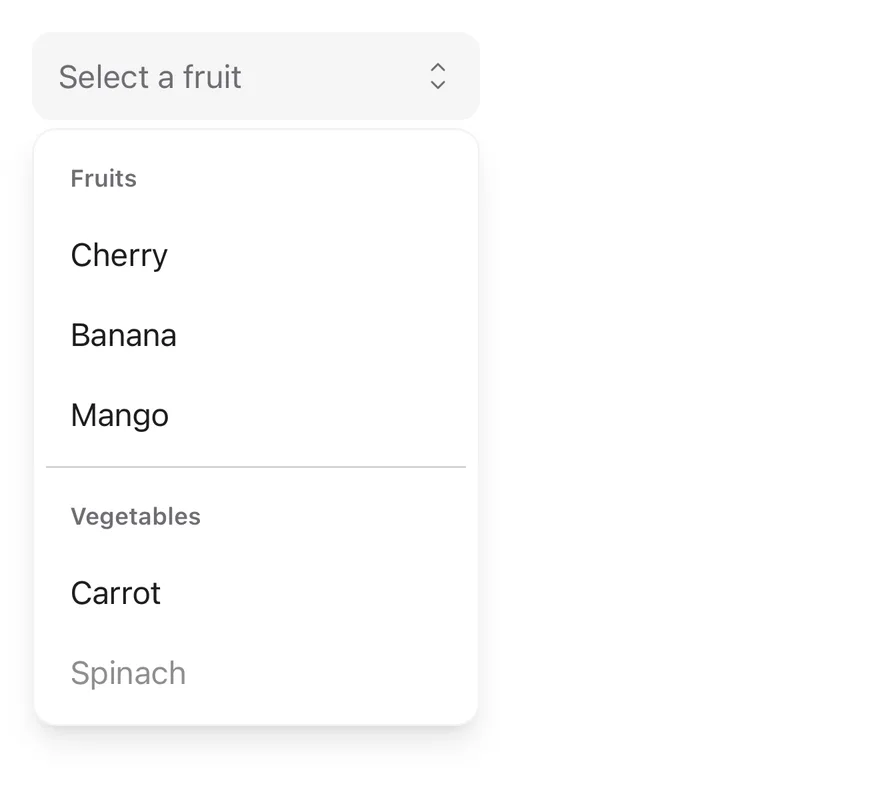
`Picker` composes `Select`: a `SelectTrigger` showing the current value and a `SelectContent` popup with the options. The selected option shows a check mark.
Use it to choose one value from a short or grouped list in a form.
## Installation
**React Native**
```bash title="Terminal"
npx shadcn@latest add @esuiss-rn/picker
```
See [Installation](https://ui.suiss.app/docs/installation) for the `components.json` setup. Or use the suiss/ui CLI:
```bash title="Terminal"
npx @esuiss/ui@latest add picker
```
**SwiftUI**
```bash title="Terminal"
npx @esuiss/ui@latest add picker --platform swift
```
**Jetpack Compose**
```bash title="Terminal"
npx @esuiss/ui@latest add picker --platform kotlin
```
The CLI also adds what it builds on: [Select](https://ui.suiss.app/docs/components/select).
### Manual
**React Native**
**Uniwind**
1. Add the pieces it builds on: [Select](https://ui.suiss.app/docs/components/select).
2. Copy the source into `components/patterns/picker.tsx`:
```tsx title="uniwind/components/patterns/picker.tsx"
import * as React from "react"
import {
Select,
SelectContent,
SelectGroup,
SelectItem,
SelectLabel,
SelectSeparator,
SelectTrigger,
SelectValue,
} from "@/components/ui/select"
type PickerItemData = {
value: string
label: React.ReactNode
}
function collectItems(children: React.ReactNode): PickerItemData[] {
const items: PickerItemData[] = []
React.Children.forEach(children, (child) => {
if (
!React.isValidElement<{ value?: string; children?: React.ReactNode }>(
child
)
) {
return
}
if (child.type === PickerItem && child.props.value !== undefined) {
items.push({ value: child.props.value, label: child.props.children })
} else if (child.props.children) {
items.push(...collectItems(child.props.children))
}
})
return items
}
function Picker({
value,
defaultValue,
onValueChange,
placeholder,
items: itemsProp,
size = "default",
disabled,
invalid,
className,
accessibilityLabel,
accessibilityLabelledBy,
children,
}: {
value?: string
defaultValue?: string
onValueChange?: (value: string) => void
placeholder?: string
items?: PickerItemData[]
size?: "sm" | "default"
disabled?: boolean
invalid?: boolean
className?: string
accessibilityLabel?: string
accessibilityLabelledBy?: string
children?: React.ReactNode
}) {
const items = React.useMemo(
() => itemsProp ?? collectItems(children),
[itemsProp, children]
)
return (
)
}
function PickerGroup({
label,
children,
}: {
label?: string
children?: React.ReactNode
}) {
return (
<>
{label ? {label} : null}
{children}
)
}
function PickerItem({
value,
disabled,
children,
}: {
value: string
disabled?: boolean
children?: React.ReactNode
}) {
return (
{children}
)
}
function PickerSeparator() {
return
}
export { Picker, PickerGroup, PickerItem, PickerSeparator }
```
3. Update the import paths to match your project.
**NativeWind**
1. Add the pieces it builds on: [Select](https://ui.suiss.app/docs/components/select).
2. Copy the source into `components/patterns/picker.tsx`:
```tsx title="nativewind/components/patterns/picker.tsx"
import * as React from "react"
import {
Select,
SelectContent,
SelectGroup,
SelectItem,
SelectLabel,
SelectSeparator,
SelectTrigger,
SelectValue,
} from "@/components/ui/select"
type PickerItemData = {
value: string
label: React.ReactNode
}
function collectItems(children: React.ReactNode): PickerItemData[] {
const items: PickerItemData[] = []
React.Children.forEach(children, (child) => {
if (
!React.isValidElement<{ value?: string; children?: React.ReactNode }>(
child
)
) {
return
}
if (child.type === PickerItem && child.props.value !== undefined) {
items.push({ value: child.props.value, label: child.props.children })
} else if (child.props.children) {
items.push(...collectItems(child.props.children))
}
})
return items
}
function Picker({
value,
defaultValue,
onValueChange,
placeholder,
items: itemsProp,
size = "default",
disabled,
invalid,
className,
accessibilityLabel,
accessibilityLabelledBy,
children,
}: {
value?: string
defaultValue?: string
onValueChange?: (value: string) => void
placeholder?: string
items?: PickerItemData[]
size?: "sm" | "default"
disabled?: boolean
invalid?: boolean
className?: string
accessibilityLabel?: string
accessibilityLabelledBy?: string
children?: React.ReactNode
}) {
const items = React.useMemo(
() => itemsProp ?? collectItems(children),
[itemsProp, children]
)
return (
)
}
function PickerGroup({
label,
children,
}: {
label?: string
children?: React.ReactNode
}) {
return (
<>
{label ? {label} : null}
{children}
)
}
function PickerItem({
value,
disabled,
children,
}: {
value: string
disabled?: boolean
children?: React.ReactNode
}) {
return (
{children}
)
}
function PickerSeparator() {
return
}
export { Picker, PickerGroup, PickerItem, PickerSeparator }
```
3. Update the import paths to match your project.
**StyleSheet**
1. Add the pieces it builds on: [Select](https://ui.suiss.app/docs/components/select).
2. Copy the source into `components/patterns/picker.tsx`:
```tsx title="stylesheet/components/patterns/picker.tsx"
import * as React from "react"
import type { StyleProp, ViewStyle } from "react-native"
import {
Select,
SelectContent,
SelectGroup,
SelectItem,
SelectLabel,
SelectSeparator,
SelectTrigger,
SelectValue,
} from "@/components/ui/select"
type PickerItemData = {
value: string
label: React.ReactNode
}
function collectItems(children: React.ReactNode): PickerItemData[] {
const items: PickerItemData[] = []
React.Children.forEach(children, (child) => {
if (
!React.isValidElement<{ value?: string; children?: React.ReactNode }>(
child
)
) {
return
}
if (child.type === PickerItem && child.props.value !== undefined) {
items.push({ value: child.props.value, label: child.props.children })
} else if (child.props.children) {
items.push(...collectItems(child.props.children))
}
})
return items
}
function Picker({
value,
defaultValue,
onValueChange,
placeholder,
items: itemsProp,
size = "default",
disabled,
invalid,
style,
accessibilityLabel,
accessibilityLabelledBy,
children,
}: {
value?: string
defaultValue?: string
onValueChange?: (value: string) => void
placeholder?: string
items?: PickerItemData[]
size?: "sm" | "default"
disabled?: boolean
invalid?: boolean
style?: StyleProp
accessibilityLabel?: string
accessibilityLabelledBy?: string
children?: React.ReactNode
}) {
const items = React.useMemo(
() => itemsProp ?? collectItems(children),
[itemsProp, children]
)
return (
)
}
function PickerGroup({
label,
children,
}: {
label?: string
children?: React.ReactNode
}) {
return (
<>
{label ? {label} : null}
{children}
)
}
function PickerItem({
value,
disabled,
children,
}: {
value: string
disabled?: boolean
children?: React.ReactNode
}) {
return (
{children}
)
}
function PickerSeparator() {
return
}
export { Picker, PickerGroup, PickerItem, PickerSeparator }
```
3. Update the import paths to match your project.
**SwiftUI**
1. Target iOS 17 or later.
2. Add the Swift package to your app:
```swift title="Package.swift"
.package(url: "https://github.com/phosphor-icons/swift", from: "2.1.0")
```
3. Copy the theme files every view uses:
- `swift/Theme/Theme.swift`: [source](https://github.com/e-suiss/ui/blob/main/packages/mobile/swiftui/Sources/EsuissUI/Theme/Theme.swift)
- `swift/Theme/Tokens.swift`: [source](https://github.com/e-suiss/ui/blob/main/packages/mobile/swiftui/Sources/EsuissUI/Theme/Tokens.swift)
4. Copy the source and every file it uses:
- `swift/Patterns/OptionPicker.swift`: [source](https://github.com/e-suiss/ui/blob/main/packages/mobile/swiftui/Sources/EsuissUI/Patterns/OptionPicker.swift)
- `swift/Components/Button.swift`: see [Button](https://ui.suiss.app/docs/components/button.md)
- `swift/Components/ButtonGroup.swift`: see [Button Group](https://ui.suiss.app/docs/components/button-group.md)
- `swift/Components/DropdownMenu.swift`: see [Dropdown Menu](https://ui.suiss.app/docs/components/dropdown-menu.md)
- `swift/Components/Field.swift`: see [Field](https://ui.suiss.app/docs/components/field.md)
- `swift/Components/Overlay.swift`: [source](https://github.com/e-suiss/ui/blob/main/packages/mobile/swiftui/Sources/EsuissUI/Components/Overlay.swift)
- `swift/Components/Select.swift`: see [Select](https://ui.suiss.app/docs/components/select.md)
- `swift/Components/Separator.swift`: see [Separator](https://ui.suiss.app/docs/components/separator.md)
- `swift/Components/TextVariant.swift`: [source](https://github.com/e-suiss/ui/blob/main/packages/mobile/swiftui/Sources/EsuissUI/Components/TextVariant.swift)
- `swift/Patterns/Adaptive.swift`: [source](https://github.com/e-suiss/ui/blob/main/packages/mobile/swiftui/Sources/EsuissUI/Patterns/Adaptive.swift)
5. Add the files to your app target.
**Jetpack Compose**
1. Set `minSdk` to 24 or higher and add the dependencies:
```kotlin title="build.gradle.kts"
implementation(platform("androidx.compose:compose-bom:2026.09.00"))
implementation("androidx.compose.foundation:foundation")
implementation("androidx.compose.ui:ui")
implementation("com.adamglin:phosphor-icon-android:1.0.0")
```
2. Copy the theme files every view uses:
- `kotlin/theme/Theme.kt`: [source](https://github.com/e-suiss/ui/blob/main/packages/mobile/kotlin/ui/src/main/kotlin/com/esuiss/ui/theme/Theme.kt)
- `kotlin/theme/Tokens.kt`: [source](https://github.com/e-suiss/ui/blob/main/packages/mobile/kotlin/ui/src/main/kotlin/com/esuiss/ui/theme/Tokens.kt)
3. Copy the source and every file it uses:
```kt title="kotlin/patterns/Picker.kt"
package com.esuiss.ui.patterns
import androidx.compose.foundation.layout.ColumnScope
import androidx.compose.runtime.Composable
import androidx.compose.runtime.Immutable
import androidx.compose.ui.Modifier
import com.esuiss.ui.components.Select
import com.esuiss.ui.components.SelectGroup
import com.esuiss.ui.components.SelectItem
import com.esuiss.ui.components.SelectLabel
import com.esuiss.ui.components.SelectSeparator
import com.esuiss.ui.components.SelectSize
@Immutable
class PickerItemData(
val value: String,
val label: String,
val enabled: Boolean = true,
)
@Composable
fun Picker(
value: String?,
onValueChange: (String) -> Unit,
modifier: Modifier = Modifier,
items: List = emptyList(),
placeholder: String = "",
size: SelectSize = SelectSize.Default,
enabled: Boolean = true,
invalid: Boolean? = null,
content: (@Composable ColumnScope.() -> Unit)? = null,
) {
Select(
value = value,
onValueChange = onValueChange,
displayValue = items.firstOrNull { it.value == value }?.label,
modifier = modifier,
placeholder = placeholder,
size = size,
invalid = invalid,
enabled = enabled,
) {
if (content != null) {
content()
} else {
SelectGroup {
items.forEach { PickerItem(it.value, it.label, enabled = it.enabled) }
}
}
}
}
@Composable
fun PickerGroup(
label: String? = null,
modifier: Modifier = Modifier,
content: @Composable ColumnScope.() -> Unit,
) {
SelectGroup(modifier) {
if (label != null) SelectLabel(label)
content()
}
}
@Composable
fun PickerItem(
value: String,
text: String,
modifier: Modifier = Modifier,
enabled: Boolean = true,
) {
SelectItem(value, text, modifier, enabled)
}
@Composable
fun PickerSeparator() {
SelectSeparator()
}
```
- `kotlin/components/Button.kt`: see [Button](https://ui.suiss.app/docs/components/button.md)
- `kotlin/components/ButtonGroup.kt`: see [Button Group](https://ui.suiss.app/docs/components/button-group.md)
- `kotlin/components/Content.kt`: [source](https://github.com/e-suiss/ui/blob/main/packages/mobile/kotlin/ui/src/main/kotlin/com/esuiss/ui/components/Content.kt)
- `kotlin/components/Field.kt`: see [Field](https://ui.suiss.app/docs/components/field.md)
- `kotlin/components/FormSupport.kt`: [source](https://github.com/e-suiss/ui/blob/main/packages/mobile/kotlin/ui/src/main/kotlin/com/esuiss/ui/components/FormSupport.kt)
- `kotlin/components/Icon.kt`: see [Icon](https://ui.suiss.app/docs/components/icon.md)
- `kotlin/components/Label.kt`: see [Label](https://ui.suiss.app/docs/components/label.md)
- `kotlin/components/Overlay.kt`: [source](https://github.com/e-suiss/ui/blob/main/packages/mobile/kotlin/ui/src/main/kotlin/com/esuiss/ui/components/Overlay.kt)
- `kotlin/components/Select.kt`: see [Select](https://ui.suiss.app/docs/components/select.md)
- `kotlin/components/Separator.kt`: see [Separator](https://ui.suiss.app/docs/components/separator.md)
4. Update the `com.esuiss.ui` package names to match your project.
## Usage
```tsx
import { Picker, PickerGroup, PickerItem, PickerSeparator } from "@/components/patterns/picker"
```
```tsx
```
List `PickerItem`s as children, optionally inside `PickerGroup`s separated by `PickerSeparator`. The picker collects the items from its children to show the selected label, or you can pass `items` directly.
Use it uncontrolled with `defaultValue`, or controlled with `value` and `onValueChange`. `placeholder` shows while nothing is selected.
## Examples
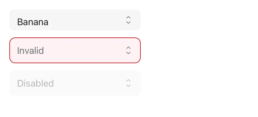
### States
A small picker with a value, an invalid picker and a disabled picker.
```tsx
import { View } from "react-native"
import { Picker, PickerItem } from "@/components/patterns/picker"
export function PickerStatesExample() {
return (
CherryBananaCherryCherry
)
}
```
```swift
import EsuissUI
import SwiftUI
struct PickerStates: View {
@State private var small: String? = "banana"
@State private var invalid: String?
@State private var disabled: String?
var body: some View {
VStack(alignment: .leading, spacing: 12) {
OptionPicker(selection: $small, size: .sm) {
OptionPickerItem("Cherry", value: "cherry")
OptionPickerItem("Banana", value: "banana")
}
.frame(width: 224)
OptionPicker(selection: $invalid, placeholder: "Invalid") {
OptionPickerItem("Cherry", value: "cherry")
}
.frame(width: 224)
.invalid()
OptionPicker(selection: $disabled, placeholder: "Disabled") {
OptionPickerItem("Cherry", value: "cherry")
}
.frame(width: 224)
.disabled(true)
}
}
}
```
```kotlin
import androidx.compose.foundation.layout.Arrangement
import androidx.compose.foundation.layout.Column
import androidx.compose.foundation.layout.width
import androidx.compose.runtime.Composable
import androidx.compose.runtime.getValue
import androidx.compose.runtime.mutableStateOf
import androidx.compose.runtime.saveable.rememberSaveable
import androidx.compose.runtime.setValue
import androidx.compose.ui.Modifier
import androidx.compose.ui.unit.dp
import com.esuiss.ui.components.SelectSize
import com.esuiss.ui.patterns.Picker
import com.esuiss.ui.patterns.PickerItem
@Composable
fun PickerStates() {
var fruit by rememberSaveable { mutableStateOf("banana") }
var invalid by rememberSaveable { mutableStateOf(null) }
Column(verticalArrangement = Arrangement.spacedBy(12.dp)) {
Picker(
value = fruit,
onValueChange = { fruit = it },
modifier = Modifier.width(224.dp),
size = SelectSize.Sm,
) {
PickerItem("cherry", "Cherry")
PickerItem("banana", "Banana")
}
Picker(
value = invalid,
onValueChange = { invalid = it },
modifier = Modifier.width(224.dp),
placeholder = "Invalid",
invalid = true,
) {
PickerItem("cherry", "Cherry")
}
Picker(
value = null,
onValueChange = {},
modifier = Modifier.width(224.dp),
placeholder = "Disabled",
enabled = false,
) {
PickerItem("cherry", "Cherry")
}
}
}
```
## API Reference
### Picker
The root that renders the trigger and the options popup.
| Prop | Type | Default | Description |
| --- | --- | --- | --- |
| `value` | `string` | - | The selected value when controlled. |
| `defaultValue` | `string` | - | The initial value when uncontrolled. |
| `onValueChange` | `(value: string) => void` | - | Called with the new value when an option is chosen. |
| `placeholder` | `string` | - | Text shown when no value is selected. |
| `items` | `PickerItemData[]` | - | `{ value, label }` pairs used to show the selected label; collected from children when omitted. |
| `size` | `"sm" \| "default"` | `"default"` | Trigger height: `sm` or `default`. |
| `disabled` | `boolean` | - | Prevents opening the list. |
| `invalid` | `boolean` | - | Applies the error style to the trigger. |
| `className` | `string` | - | |
| `accessibilityLabel` | `string` | - | Label for the trigger. |
| `accessibilityLabelledBy` | `string` | - | Links the trigger to a visible label. |
| `children` | `React.ReactNode` | - | |
### PickerGroup
Groups options under an optional label.
| Prop | Type | Default | Description |
| --- | --- | --- | --- |
| `label` | `string` | - | Heading shown above the group. |
| `children` | `React.ReactNode` | - | |
### PickerItem
One selectable option.
| Prop | Type | Default | Description |
| --- | --- | --- | --- |
| `value` | `string` | Required | The value this option selects. |
| `disabled` | `boolean` | - | Prevents choosing this option. |
| `children` | `React.ReactNode` | - | |
## Accessibility
- Give the picker an `accessibilityLabel` or `accessibilityLabelledBy`, since the trigger shows only the value.
## Notes
- The popup uses `bg-popover` with a subtle border that is stronger in dark mode.
- The popup fades in and out, and respects the system reduce motion setting.
- On iOS the popup renders in a full-window overlay so it appears above native screens.