# Date Picker
A date field that opens a calendar popover on desktop and wheel pickers in a drawer on mobile.
Date Picker is an open-source pattern from suiss/ui for React, React Native, SwiftUI and Jetpack Compose. The @esuiss/ui CLI copies its source into your project, so you own the code.
Source: https://ui.suiss.app/docs/patterns/date-picker
**React**
**Example**
```tsx
import { DatePicker } from "@/components/patterns/date-picker"
export default function DatePickerDemo() {
return
}
```
`DatePicker` is a single component that renders a field-style trigger showing the selected date, formatted with `Intl.DateTimeFormat` in the `medium` date style, or the placeholder. On desktop the trigger opens a `Popover` containing a single-selection `Calendar`; picking a day selects it and closes the popover.
Below the `48rem` breakpoint the trigger opens a bottom `Drawer` with a `WheelPicker` of day, month and year columns, ordered to match the locale's short date format. Turning a wheel updates the value immediately, and the day is clamped to the length of the chosen month. Use it for form fields such as delivery dates or dates of birth.
## Installation
### CLI
```bash title="Terminal"
npx shadcn@latest add @esuiss/date-picker
```
Works in any project with a `components.json`. See [Installation](https://ui.suiss.app/docs/installation#add-components) for the one-line registry setup. Or use the suiss/ui CLI:
```bash title="Terminal"
npx @esuiss/ui@latest add patterns date-picker
```
### Manual
1. Install the dependencies and add the [`cn` helper](https://ui.suiss.app/docs/installation#the-cn-helper):
```bash title="Terminal"
npm install @phosphor-icons/react
```
2. Add the pieces it builds on: [Calendar](https://ui.suiss.app/docs/components/calendar), [Drawer](https://ui.suiss.app/docs/components/drawer), [Popover](https://ui.suiss.app/docs/components/popover), `use-mobile`, [Wheel Picker](https://ui.suiss.app/docs/components/wheel-picker).
3. Copy the source into `components/patterns/date-picker.tsx`:
```tsx title="components/patterns/date-picker.tsx"
"use client"
import { CalendarBlankIcon } from "@phosphor-icons/react"
import * as React from "react"
import { Calendar } from "@/components/ui/calendar"
import {
Drawer,
DrawerContent,
DrawerHeader,
DrawerTitle,
DrawerTrigger,
} from "@/components/ui/drawer"
import {
Popover,
PopoverContent,
PopoverTrigger,
} from "@/components/ui/popover"
import {
WheelPicker,
WheelPickerColumn,
WheelPickerItem,
} from "@/components/ui/wheel-picker"
import { useIsMobile } from "@/hooks/use-mobile"
import { cn } from "@/lib/utils"
type DatePart = "day" | "month" | "year"
function daysInMonth(year: number, month: number) {
return new Date(year, month + 1, 0).getDate()
}
function fallbackDate(fromYear: number, toYear: number) {
const today = new Date()
const year = Math.min(Math.max(today.getFullYear(), fromYear), toYear)
if (year === today.getFullYear()) return today
return new Date(
year,
today.getMonth(),
Math.min(today.getDate(), daysInMonth(year, today.getMonth()))
)
}
function yearRange(fromYear: number | undefined, toYear: number | undefined) {
if (fromYear !== undefined && toYear !== undefined) {
return { fromYear, toYear }
}
const year = new Date().getFullYear()
return { fromYear: fromYear ?? year - 100, toYear: toYear ?? year + 10 }
}
function partOrder(locale: string | undefined): DatePart[] {
const order = new Intl.DateTimeFormat(locale, { dateStyle: "short" })
.formatToParts(new Date(2000, 11, 31))
.map((part) => part.type)
.filter(
(type): type is DatePart =>
type === "day" || type === "month" || type === "year"
)
return order.length === 3 ? order : ["month", "day", "year"]
}
type LocaleWithWeekInfo = Intl.Locale & {
getWeekInfo?: () => { firstDay: number }
weekInfo?: { firstDay: number }
}
function weekStart(locale: string | undefined) {
const resolved = new Intl.DateTimeFormat(locale).resolvedOptions().locale
const info = new Intl.Locale(resolved) as LocaleWithWeekInfo
const firstDay = (info.getWeekInfo?.() ?? info.weekInfo)?.firstDay
return firstDay === undefined
? undefined
: ((firstDay % 7) as 0 | 1 | 2 | 3 | 4 | 5 | 6)
}
function DatePicker({
value: valueProp,
defaultValue,
onValueChange,
placeholder = "Pick a date",
locale,
fromYear,
toYear,
title,
disabled,
floating,
showCloseButton = false,
closeLabel,
id,
className,
"aria-invalid": ariaInvalid,
"aria-label": ariaLabel,
"aria-describedby": ariaDescribedBy,
}: {
value?: Date | null
defaultValue?: Date | null
onValueChange?: (value: Date | null) => void
placeholder?: string
locale?: string
fromYear?: number
toYear?: number
title?: string
disabled?: boolean
floating?: boolean
showCloseButton?: boolean
closeLabel?: string
id?: string
className?: string
"aria-invalid"?: boolean
"aria-label"?: string
"aria-describedby"?: string
}) {
const isMobile = useIsMobile()
const [uncontrolledValue, setUncontrolledValue] = React.useState(
defaultValue ?? null
)
const value = valueProp === undefined ? uncontrolledValue : valueProp
const [open, setOpen] = React.useState(false)
const select = (next: Date | null) => {
if (valueProp === undefined) setUncontrolledValue(next)
onValueChange?.(next)
}
const calendarLocale = React.useMemo(() => {
const caption = new Intl.DateTimeFormat(locale, {
month: "long",
year: "numeric",
})
const weekday = new Intl.DateTimeFormat(locale, { weekday: "short" })
const weekdayName = new Intl.DateTimeFormat(locale, { weekday: "long" })
const fullDate = new Intl.DateTimeFormat(locale, { dateStyle: "full" })
const today = new Intl.RelativeTimeFormat(locale, {
numeric: "auto",
}).format(0, "day")
return {
weekStartsOn: weekStart(locale),
formatters: {
formatCaption: (date: Date) => caption.format(date),
formatWeekdayName: (date: Date) => weekday.format(date),
},
labels: {
labelGrid: (date: Date) => caption.format(date),
labelWeekday: (date: Date) => weekdayName.format(date),
labelDayButton: (date: Date, modifiers: { today?: boolean }) =>
modifiers.today
? `${today}, ${fullDate.format(date)}`
: fullDate.format(date),
},
}
}, [locale])
const label = value
? new Intl.DateTimeFormat(locale, { dateStyle: "medium" }).format(value)
: placeholder
const trigger = (
)
const triggerContent = (
<>
{label}
)
if (isMobile) {
return (
{triggerContent}{title ?? ariaLabel ?? placeholder}
)
}
return (
{triggerContent} {
select(next ?? null)
setOpen(false)
}}
/>
)
}
function DateCalendar({
value,
fromYear,
toYear,
onSelect,
...props
}: Pick<
React.ComponentProps,
"weekStartsOn" | "formatters" | "labels"
> & {
value: Date | null
fromYear?: number
toYear?: number
onSelect: (value: Date | undefined) => void
}) {
const range = yearRange(fromYear, toYear)
return (
)
}
function DateWheels({
value: valueProp,
onValueChange,
locale,
fromYear: fromYearProp,
toYear: toYearProp,
className,
}: {
className?: string
value: Date | null
onValueChange: (value: Date) => void
locale?: string
fromYear?: number
toYear?: number
}) {
const { fromYear, toYear } = yearRange(fromYearProp, toYearProp)
const value = valueProp ?? fallbackDate(fromYear, toYear)
const year = value.getFullYear()
const month = value.getMonth()
const day = value.getDate()
const order = React.useMemo(() => partOrder(locale), [locale])
const monthNames = React.useMemo(() => {
const format = new Intl.DateTimeFormat(locale, { month: "long" })
return Array.from({ length: 12 }, (_, index) =>
format.format(new Date(2000, index, 1))
)
}, [locale])
const days = Array.from(
{ length: daysInMonth(year, month) },
(_, index) => index + 1
)
const years = React.useMemo(
() =>
Array.from(
{ length: toYear - fromYear + 1 },
(_, index) => fromYear + index
),
[fromYear, toYear]
)
const update = (next: Partial>) => {
const nextYear = next.year ?? year
const nextMonth = next.month ?? month
const nextDay = Math.min(next.day ?? day, daysInMonth(nextYear, nextMonth))
onValueChange(new Date(nextYear, nextMonth, nextDay))
}
const columns: Record = {
day: (
update({ day: Number(next) })}
className="w-12 *:justify-end *:px-0"
>
{days.map((item) => (
{item}
))}
),
month: (
update({ month: Number(next) })}
className="w-24 *:justify-start *:px-0"
>
{monthNames.map((name, index) => (
{name}
))}
),
year: (
update({ year: Number(next) })}
className="w-16 *:justify-start *:px-0"
>
{years.map((item) => (
{item}
))}
),
}
return (
{order.map((part) => columns[part])}
)
}
export { DatePicker }
```
4. Update the import paths to match your project.
## Usage
```tsx
import { DatePicker } from "@/components/patterns/date-picker"
```
```tsx
```
Use `value` and `onValueChange` for a controlled field, or `defaultValue` for an uncontrolled one; the value is a `Date` or `null`. `locale` drives the trigger format, calendar captions, weekday names, the first day of the week, day labels and the wheel order. `fromYear` and `toYear` bound both the calendar's months and the year wheel. Pass `id`, `aria-label` and `aria-describedby` to connect the field to a label and help text.
## Examples
### With value
Starts with a `defaultValue`, and the calendar opens on that month.
**Example**
```tsx
import { DatePicker } from "@/components/patterns/date-picker"
export default function DatePickerWithValue() {
return (
)
}
```
### Locale
Formats the trigger and calendar in Turkish with `locale="tr-TR"`.
**Example**
```tsx
import { DatePicker } from "@/components/patterns/date-picker"
export default function DatePickerLocale() {
return (
)
}
```
### Year range
Limits selection to 1940 through 2010 for a date of birth.
**Example**
```tsx
import { DatePicker } from "@/components/patterns/date-picker"
export default function DatePickerYearRange() {
return (
)
}
```
### With title
Shows a visible Delivery date title in the mobile drawer.
**Example**
```tsx
import { DatePicker } from "@/components/patterns/date-picker"
export default function DatePickerWithTitle() {
return
}
```
### With close button
Adds an icon close button to the mobile drawer.
**Example**
```tsx
import { DatePicker } from "@/components/patterns/date-picker"
export default function DatePickerWithCloseButton() {
return
}
```
### With close label
Adds a text close button labelled Done to the mobile drawer.
**Example**
```tsx
import { DatePicker } from "@/components/patterns/date-picker"
export default function DatePickerWithCloseLabel() {
return (
)
}
```
### Disabled
Disables the trigger so the picker cannot open.
**Example**
```tsx
import { DatePicker } from "@/components/patterns/date-picker"
export default function DatePickerDisabled() {
return
}
```
### Invalid
Marks the field invalid with `aria-invalid`.
**Example**
```tsx
import { DatePicker } from "@/components/patterns/date-picker"
export default function DatePickerInvalid() {
return
}
```
### Controlled
Owns the value in parent state and shows the picked date below the field.
**Example**
```tsx
import * as React from "react"
import { DatePicker } from "@/components/patterns/date-picker"
function ControlledExample(props: React.ComponentProps) {
const [value, setValue] = React.useState(new Date(2026, 9, 4))
return (
Selected: {value ? value.toDateString() : "none"}
)
}
export default function DatePickerControlled() {
return
}
```
### Floating
Insets the mobile drawer from the screen edges with `floating`.
**Example**
```tsx
import { DatePicker } from "@/components/patterns/date-picker"
export default function DatePickerFloating() {
return
}
```
## API Reference
### DatePicker
The field trigger with its desktop calendar popover and mobile wheel drawer.
| Prop | Type | Default | Description |
| --- | --- | --- | --- |
| `value` | `Date \| null` | - | The selected date when controlled; `null` for no date. |
| `defaultValue` | `Date \| null` | - | The initial date when uncontrolled. |
| `onValueChange` | `(value: Date \| null) => void` | - | Called with the new date when the user picks a day or turns a wheel. |
| `placeholder` | `string` | `"Pick a date"` | Text shown in the trigger when no date is selected. |
| `locale` | `string` | - | BCP 47 locale used for formatting, week start, labels and wheel order; defaults to the runtime locale. |
| `fromYear` | `number` | `new Date().getFullYear() - 100` | The earliest selectable year. |
| `toYear` | `number` | `new Date().getFullYear() + 10` | The latest selectable year. |
| `title` | `string` | - | Visible title of the mobile drawer; without it the drawer title is visually hidden. |
| `disabled` | `boolean` | - | Disables the trigger. |
| `floating` | `boolean` | - | Insets the mobile drawer from the screen edges with fully rounded corners. |
| `showCloseButton` | `boolean` | `false` | Shows a close button in the mobile drawer. |
| `closeLabel` | `string` | - | Replaces the drawer's close icon with this text; requires `showCloseButton`. |
| `id` | `string` | - | The `id` of the trigger button, for use with a `label`. |
| `className` | `string` | - | Classes applied to the trigger button. |
| `aria-invalid` | `boolean` | - | Marks the field invalid and applies the destructive border and ring. |
| `aria-label` | `string` | - | Accessible name of the trigger; also used as the hidden drawer title when `title` is absent. |
| `aria-describedby` | `string` | - | IDs of elements that describe the field, such as help or error text. |
## Accessibility
- The trigger is a `button`; give it a name with `aria-label` or a `label` linked through `id`.
- On desktop the calendar is a `grid` named by its month caption, and each day button is named with the full localized date, prefixed with today's relative name for the current day.
- `Escape` closes the calendar and returns focus to the trigger.
- On mobile each wheel column is labelled Day, Month or Year, and the drawer always has a title, visually hidden when `title` is not set.
## Notes
The trigger carries `data-slot="date-picker-trigger"` and `data-placeholder` while empty; the popup carries `data-slot="date-picker-content"` and the wheels `data-slot="date-picker-wheels"`. When no value is set, the mobile wheels start at today's date. The open state is internal and cannot be controlled.
**React Native, SwiftUI, Jetpack Compose**
```tsx
import { DatePicker } from "@/components/patterns/date-picker"
export function DatePickerExample() {
return (
)
}
```
```swift
import EsuissUI
import SwiftUI
struct DatePickerDemo: View {
var placeholder: LocalizedStringKey = "Pick a date"
var fromYear: Int?
var toYear: Int?
var title: LocalizedStringKey?
var showCloseButton = false
var closeLabel: LocalizedStringKey?
@State private var value: Date?
init(
value: Date? = nil,
placeholder: LocalizedStringKey = "Pick a date",
fromYear: Int? = nil,
toYear: Int? = nil,
title: LocalizedStringKey? = nil,
showCloseButton: Bool = false,
closeLabel: LocalizedStringKey? = nil
) {
_value = State(initialValue: value)
self.placeholder = placeholder
self.fromYear = fromYear
self.toYear = toYear
self.title = title
self.showCloseButton = showCloseButton
self.closeLabel = closeLabel
}
var body: some View {
DatePickerField(
selection: $value,
placeholder: placeholder,
fromYear: fromYear,
toYear: toYear,
title: title,
showCloseButton: showCloseButton,
closeLabel: closeLabel
)
.fixedSize()
.accessibilityLabel(Text("Date"))
}
}
```
```kotlin
import androidx.compose.runtime.Composable
import androidx.compose.runtime.getValue
import androidx.compose.runtime.mutableStateOf
import androidx.compose.runtime.saveable.rememberSaveable
import androidx.compose.runtime.setValue
import androidx.compose.ui.Modifier
import androidx.compose.ui.semantics.contentDescription
import androidx.compose.ui.semantics.semantics
import com.esuiss.ui.patterns.DatePicker
import java.util.Calendar
import java.util.Date
import java.util.Locale
@Composable
fun DatePickerDemo(
initial: Long? = null,
locale: Locale = Locale.getDefault(),
placeholder: String = "Pick a date",
fromYear: Int = Calendar.getInstance().get(Calendar.YEAR) - 100,
toYear: Int = Calendar.getInstance().get(Calendar.YEAR) + 10,
title: String? = null,
enabled: Boolean = true,
invalid: Boolean? = null,
floating: Boolean = false,
showCloseButton: Boolean = false,
closeLabel: String? = null,
) {
var value by rememberSaveable { mutableStateOf(initial) }
DatePicker(
value = value?.let(::Date),
onValueChange = { value = it.time },
modifier = Modifier.semantics { contentDescription = "Date" },
placeholder = placeholder,
locale = locale,
fromYear = fromYear,
toYear = toYear,
title = title,
enabled = enabled,
invalid = invalid,
floating = floating,
showCloseButton = showCloseButton,
closeLabel = closeLabel,
)
}
```
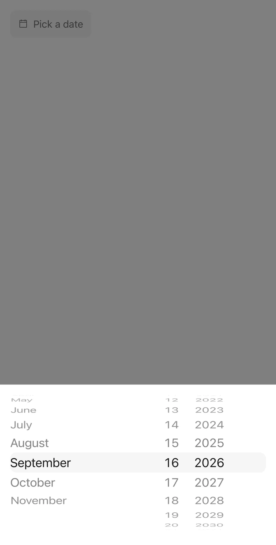
`DatePicker` renders a field-style `DrawerTrigger` with a calendar icon and the selected date formatted with `Intl.DateTimeFormat` in the `medium` date style. The trigger sizes itself to its content rather than filling the width; pass `className` to change that. Pressing it opens a `Drawer` with three `WheelPicker` columns.
The column order follows the locale's short date format, falling back to month, day, year. Month names come from the locale, and the day column shrinks or grows with the chosen month and year, clamping the day when needed.
## Installation
**React Native**
```bash title="Terminal"
npx shadcn@latest add @esuiss-rn/date-picker
```
See [Installation](https://ui.suiss.app/docs/installation) for the `components.json` setup. Or use the suiss/ui CLI:
```bash title="Terminal"
npx @esuiss/ui@latest add date-picker
```
**SwiftUI**
```bash title="Terminal"
npx @esuiss/ui@latest add date-picker --platform swift
```
**Jetpack Compose**
```bash title="Terminal"
npx @esuiss/ui@latest add date-picker --platform kotlin
```
The CLI also adds what it builds on: [Drawer](https://ui.suiss.app/docs/components/drawer), [Icon](https://ui.suiss.app/docs/components/icon), [Text](https://ui.suiss.app/docs/components/text), [Wheel Picker](https://ui.suiss.app/docs/components/wheel-picker).
### Manual
**React Native**
**Uniwind**
1. Install the dependencies:
```bash title="Terminal"
npx expo install cn phosphor-react-native react-native-svg
```
2. Add the pieces it builds on: [Drawer](https://ui.suiss.app/docs/components/drawer), [Icon](https://ui.suiss.app/docs/components/icon), [Text](https://ui.suiss.app/docs/components/text), [Wheel Picker](https://ui.suiss.app/docs/components/wheel-picker).
3. Copy the source into `components/patterns/date-picker.tsx`:
```tsx title="uniwind/components/patterns/date-picker.tsx"
import { cn } from "cn"
import { CalendarBlankIcon } from "phosphor-react-native"
import * as React from "react"
import {
Drawer,
DrawerContent,
DrawerHeader,
DrawerTitle,
DrawerTrigger,
} from "@/components/ui/drawer"
import { Icon } from "@/components/ui/icon"
import { Text } from "@/components/ui/text"
import {
WheelPicker,
WheelPickerColumn,
WheelPickerItem,
} from "@/components/ui/wheel-picker"
type DatePart = "day" | "month" | "year"
function daysInMonth(year: number, month: number) {
return new Date(year, month + 1, 0).getDate()
}
function partOrder(locale: string | undefined): DatePart[] {
try {
const order = new Intl.DateTimeFormat(locale, { dateStyle: "short" })
.formatToParts(new Date(2000, 11, 31))
.map((part) => part.type)
.filter(
(type): type is DatePart =>
type === "day" || type === "month" || type === "year"
)
return order.length === 3 ? order : ["month", "day", "year"]
} catch {
return ["month", "day", "year"]
}
}
function DatePicker({
value: valueProp,
defaultValue,
onValueChange,
placeholder = "Pick a date",
locale,
fromYear = new Date().getFullYear() - 100,
toYear = new Date().getFullYear() + 10,
title,
disabled,
floating,
showCloseButton = false,
closeLabel,
invalid,
className,
accessibilityLabel,
accessibilityLabelledBy,
}: {
value?: Date | null
defaultValue?: Date | null
onValueChange?: (value: Date | null) => void
placeholder?: string
locale?: string
fromYear?: number
toYear?: number
title?: string
disabled?: boolean
floating?: boolean
showCloseButton?: boolean
closeLabel?: string
invalid?: boolean
className?: string
accessibilityLabel?: string
accessibilityLabelledBy?: string
}) {
const [uncontrolledValue, setUncontrolledValue] = React.useState(
defaultValue ?? null
)
const value = valueProp === undefined ? uncontrolledValue : valueProp
const [open, setOpen] = React.useState(false)
const select = (next: Date | null) => {
if (valueProp === undefined) setUncontrolledValue(next)
onValueChange?.(next)
}
const label = value
? new Intl.DateTimeFormat(locale, { dateStyle: "medium" }).format(value)
: placeholder
return (
{label}
{title ? (
{title}
) : null}
)
}
function DateWheels({
value,
onValueChange,
locale,
fromYear,
toYear,
className,
}: {
value: Date
onValueChange: (value: Date) => void
locale?: string
fromYear: number
toYear: number
className?: string
}) {
const year = value.getFullYear()
const month = value.getMonth()
const day = value.getDate()
const order = React.useMemo(() => partOrder(locale), [locale])
const monthNames = React.useMemo(() => {
const format = new Intl.DateTimeFormat(locale, { month: "long" })
return Array.from({ length: 12 }, (_, index) =>
format.format(new Date(2000, index, 1))
)
}, [locale])
const days = Array.from(
{ length: daysInMonth(year, month) },
(_, index) => index + 1
)
const years = React.useMemo(
() =>
Array.from(
{ length: toYear - fromYear + 1 },
(_, index) => fromYear + index
),
[fromYear, toYear]
)
const update = (next: Partial>) => {
const nextYear = next.year ?? year
const nextMonth = next.month ?? month
const nextDay = Math.min(next.day ?? day, daysInMonth(nextYear, nextMonth))
onValueChange(new Date(nextYear, nextMonth, nextDay))
}
const columns: Record = {
day: (
update({ day: Number(next) })}
className="w-12"
>
{days.map((item) => (
{item}
))}
),
month: (
update({ month: Number(next) })}
className="w-24"
>
{monthNames.map((name, index) => (
{name}
))}
),
year: (
update({ year: Number(next) })}
className="w-16"
>
{years.map((item) => (
{item}
))}
),
}
return (
{order.map((part) => columns[part])}
)
}
export { DatePicker }
```
4. Update the import paths to match your project.
**NativeWind**
1. Install the dependencies:
```bash title="Terminal"
npx expo install cn phosphor-react-native react-native-svg
```
2. Add the pieces it builds on: [Drawer](https://ui.suiss.app/docs/components/drawer), [Icon](https://ui.suiss.app/docs/components/icon), [Text](https://ui.suiss.app/docs/components/text), [Wheel Picker](https://ui.suiss.app/docs/components/wheel-picker).
3. Copy the source into `components/patterns/date-picker.tsx`:
```tsx title="nativewind/components/patterns/date-picker.tsx"
import { cn } from "cn"
import { CalendarBlankIcon } from "phosphor-react-native"
import * as React from "react"
import {
Drawer,
DrawerContent,
DrawerHeader,
DrawerTitle,
DrawerTrigger,
} from "@/components/ui/drawer"
import { Icon } from "@/components/ui/icon"
import { Text } from "@/components/ui/text"
import {
WheelPicker,
WheelPickerColumn,
WheelPickerItem,
} from "@/components/ui/wheel-picker"
type DatePart = "day" | "month" | "year"
function daysInMonth(year: number, month: number) {
return new Date(year, month + 1, 0).getDate()
}
function partOrder(locale: string | undefined): DatePart[] {
try {
const order = new Intl.DateTimeFormat(locale, { dateStyle: "short" })
.formatToParts(new Date(2000, 11, 31))
.map((part) => part.type)
.filter(
(type): type is DatePart =>
type === "day" || type === "month" || type === "year"
)
return order.length === 3 ? order : ["month", "day", "year"]
} catch {
return ["month", "day", "year"]
}
}
function DatePicker({
value: valueProp,
defaultValue,
onValueChange,
placeholder = "Pick a date",
locale,
fromYear = new Date().getFullYear() - 100,
toYear = new Date().getFullYear() + 10,
title,
disabled,
floating,
showCloseButton = false,
closeLabel,
invalid,
className,
accessibilityLabel,
accessibilityLabelledBy,
}: {
value?: Date | null
defaultValue?: Date | null
onValueChange?: (value: Date | null) => void
placeholder?: string
locale?: string
fromYear?: number
toYear?: number
title?: string
disabled?: boolean
floating?: boolean
showCloseButton?: boolean
closeLabel?: string
invalid?: boolean
className?: string
accessibilityLabel?: string
accessibilityLabelledBy?: string
}) {
const [uncontrolledValue, setUncontrolledValue] = React.useState(
defaultValue ?? null
)
const value = valueProp === undefined ? uncontrolledValue : valueProp
const [open, setOpen] = React.useState(false)
const select = (next: Date | null) => {
if (valueProp === undefined) setUncontrolledValue(next)
onValueChange?.(next)
}
const label = value
? new Intl.DateTimeFormat(locale, { dateStyle: "medium" }).format(value)
: placeholder
return (
{label}
{title ? (
{title}
) : null}
)
}
function DateWheels({
value,
onValueChange,
locale,
fromYear,
toYear,
className,
}: {
value: Date
onValueChange: (value: Date) => void
locale?: string
fromYear: number
toYear: number
className?: string
}) {
const year = value.getFullYear()
const month = value.getMonth()
const day = value.getDate()
const order = React.useMemo(() => partOrder(locale), [locale])
const monthNames = React.useMemo(() => {
const format = new Intl.DateTimeFormat(locale, { month: "long" })
return Array.from({ length: 12 }, (_, index) =>
format.format(new Date(2000, index, 1))
)
}, [locale])
const days = Array.from(
{ length: daysInMonth(year, month) },
(_, index) => index + 1
)
const years = React.useMemo(
() =>
Array.from(
{ length: toYear - fromYear + 1 },
(_, index) => fromYear + index
),
[fromYear, toYear]
)
const update = (next: Partial>) => {
const nextYear = next.year ?? year
const nextMonth = next.month ?? month
const nextDay = Math.min(next.day ?? day, daysInMonth(nextYear, nextMonth))
onValueChange(new Date(nextYear, nextMonth, nextDay))
}
const columns: Record = {
day: (
update({ day: Number(next) })}
className="w-12"
>
{days.map((item) => (
{item}
))}
),
month: (
update({ month: Number(next) })}
className="w-24"
>
{monthNames.map((name, index) => (
{name}
))}
),
year: (
update({ year: Number(next) })}
className="w-16"
>
{years.map((item) => (
{item}
))}
),
}
return (
{order.map((part) => columns[part])}
)
}
export { DatePicker }
```
4. Update the import paths to match your project.
**StyleSheet**
1. Install the dependencies:
```bash title="Terminal"
npx expo install phosphor-react-native react-native-svg
```
2. Add the pieces it builds on: [Drawer](https://ui.suiss.app/docs/components/drawer), [Icon](https://ui.suiss.app/docs/components/icon), [Text](https://ui.suiss.app/docs/components/text), [Wheel Picker](https://ui.suiss.app/docs/components/wheel-picker).
3. Copy the source into `components/patterns/date-picker.tsx`:
```tsx title="stylesheet/components/patterns/date-picker.tsx"
import { CalendarBlankIcon } from "phosphor-react-native"
import * as React from "react"
import { type StyleProp, StyleSheet, type ViewStyle } from "react-native"
import {
Drawer,
DrawerContent,
DrawerHeader,
DrawerTitle,
DrawerTrigger,
} from "@/components/ui/drawer"
import { Icon } from "@/components/ui/icon"
import { Text } from "@/components/ui/text"
import { fontSize, radius, useTheme } from "@/components/ui/theme"
import {
WheelPicker,
WheelPickerColumn,
WheelPickerItem,
} from "@/components/ui/wheel-picker"
const styles = StyleSheet.create({
trigger: {
height: 44,
flexDirection: "row",
alignSelf: "flex-start",
alignItems: "center",
gap: 8,
borderRadius: radius.lg,
borderWidth: 1,
borderColor: "transparent",
paddingHorizontal: 12,
},
icon: { flexShrink: 0 },
label: { flexShrink: 1, ...fontSize.base },
docked: { borderTopLeftRadius: 0, borderTopRightRadius: 0 },
wheels: { margin: 16, gap: 24 },
spaced: { marginTop: 48 },
day: { width: 48 },
month: { width: 96 },
year: { width: 64 },
end: { justifyContent: "flex-end", paddingHorizontal: 0 },
start: { justifyContent: "flex-start", paddingHorizontal: 0 },
})
function withAlpha(color: string, alpha: number) {
if (!color.startsWith("#") || color.length !== 7) return color
const r = Number.parseInt(color.slice(1, 3), 16)
const g = Number.parseInt(color.slice(3, 5), 16)
const b = Number.parseInt(color.slice(5, 7), 16)
return `rgba(${r}, ${g}, ${b}, ${alpha})`
}
type DatePart = "day" | "month" | "year"
function daysInMonth(year: number, month: number) {
return new Date(year, month + 1, 0).getDate()
}
function partOrder(locale: string | undefined): DatePart[] {
try {
const order = new Intl.DateTimeFormat(locale, { dateStyle: "short" })
.formatToParts(new Date(2000, 11, 31))
.map((part) => part.type)
.filter(
(type): type is DatePart =>
type === "day" || type === "month" || type === "year"
)
return order.length === 3 ? order : ["month", "day", "year"]
} catch {
return ["month", "day", "year"]
}
}
function DatePicker({
value: valueProp,
defaultValue,
onValueChange,
placeholder = "Pick a date",
locale,
fromYear = new Date().getFullYear() - 100,
toYear = new Date().getFullYear() + 10,
title,
disabled,
floating,
showCloseButton = false,
closeLabel,
invalid,
style,
accessibilityLabel,
accessibilityLabelledBy,
}: {
value?: Date | null
defaultValue?: Date | null
onValueChange?: (value: Date | null) => void
placeholder?: string
locale?: string
fromYear?: number
toYear?: number
title?: string
disabled?: boolean
floating?: boolean
showCloseButton?: boolean
closeLabel?: string
invalid?: boolean
style?: StyleProp
accessibilityLabel?: string
accessibilityLabelledBy?: string
}) {
const { colors, isDark } = useTheme()
const [uncontrolledValue, setUncontrolledValue] = React.useState(
defaultValue ?? null
)
const value = valueProp === undefined ? uncontrolledValue : valueProp
const [open, setOpen] = React.useState(false)
const select = (next: Date | null) => {
if (valueProp === undefined) setUncontrolledValue(next)
onValueChange?.(next)
}
const label = value
? new Intl.DateTimeFormat(locale, { dateStyle: "medium" }).format(value)
: placeholder
const labelColor = value ? colors.foreground : colors.mutedForeground
return (
{label}
{title ? (
{title}
) : null}
)
}
function DateWheels({
value,
onValueChange,
locale,
fromYear,
toYear,
style,
}: {
value: Date
onValueChange: (value: Date) => void
locale?: string
fromYear: number
toYear: number
style?: StyleProp
}) {
const year = value.getFullYear()
const month = value.getMonth()
const day = value.getDate()
const order = React.useMemo(() => partOrder(locale), [locale])
const monthNames = React.useMemo(() => {
const format = new Intl.DateTimeFormat(locale, { month: "long" })
return Array.from({ length: 12 }, (_, index) =>
format.format(new Date(2000, index, 1))
)
}, [locale])
const days = Array.from(
{ length: daysInMonth(year, month) },
(_, index) => index + 1
)
const years = React.useMemo(
() =>
Array.from(
{ length: toYear - fromYear + 1 },
(_, index) => fromYear + index
),
[fromYear, toYear]
)
const update = (next: Partial>) => {
const nextYear = next.year ?? year
const nextMonth = next.month ?? month
const nextDay = Math.min(next.day ?? day, daysInMonth(nextYear, nextMonth))
onValueChange(new Date(nextYear, nextMonth, nextDay))
}
const columns: Record = {
day: (
update({ day: Number(next) })}
style={styles.day}
>
{days.map((item) => (
{item}
))}
),
month: (
update({ month: Number(next) })}
style={styles.month}
>
{monthNames.map((name, index) => (
{name}
))}
),
year: (
update({ year: Number(next) })}
style={styles.year}
>
{years.map((item) => (
{item}
))}
),
}
return (
{order.map((part) => columns[part])}
)
}
export { DatePicker }
```
4. Update the import paths to match your project.
**SwiftUI**
1. Target iOS 17 or later.
2. Add the Swift package to your app:
```swift title="Package.swift"
.package(url: "https://github.com/phosphor-icons/swift", from: "2.1.0")
```
3. Copy the theme files every view uses:
- `swift/Theme/Theme.swift`: [source](https://github.com/e-suiss/ui/blob/main/packages/mobile/swiftui/Sources/EsuissUI/Theme/Theme.swift)
- `swift/Theme/Tokens.swift`: [source](https://github.com/e-suiss/ui/blob/main/packages/mobile/swiftui/Sources/EsuissUI/Theme/Tokens.swift)
4. Copy the source and every file it uses:
```swift title="swift/Patterns/DatePicker.swift"
import PhosphorSwift
import SwiftUI
enum DatePart: Hashable, Sendable {
case day, month, year
static func order(locale: Locale) -> [DatePart] {
let format = DateFormatter.dateFormat(fromTemplate: "yMd", options: 0, locale: locale) ?? ""
var parts: [DatePart] = []
for character in format {
let part: DatePart? = switch character {
case "d": .day
case "M", "L": .month
case "y": .year
default: nil
}
if let part, !parts.contains(part) { parts.append(part) }
}
return parts.count == 3 ? parts : [.month, .day, .year]
}
}
enum DateWheelMath {
static func days(year: Int, month: Int, calendar: Foundation.Calendar) -> Int {
guard let date = calendar.date(from: DateComponents(year: year, month: month, day: 1)) else { return 31 }
return calendar.range(of: .day, in: .month, for: date)?.count ?? 31
}
static func update(_ date: Date, year: Int? = nil, month: Int? = nil, day: Int? = nil, calendar: Foundation.Calendar) -> Date {
let current = calendar.dateComponents([.year, .month, .day], from: date)
let nextYear = year ?? current.year ?? 2000
let nextMonth = month ?? current.month ?? 1
let nextDay = min(day ?? current.day ?? 1, days(year: nextYear, month: nextMonth, calendar: calendar))
return calendar.date(from: DateComponents(year: nextYear, month: nextMonth, day: nextDay)) ?? date
}
}
public struct DatePickerField: View {
let selection: Binding
let placeholder: LocalizedStringKey
let fromYear: Int
let toYear: Int
let title: LocalizedStringKey?
let showCloseButton: Bool
let closeLabel: LocalizedStringKey?
@State private var open = false
@CompactLayout private var compact
@Environment(\.isEnabled) private var isEnabled
@Environment(\.isInvalid) private var invalid
@Environment(\.colorScheme) private var colorScheme
@Environment(\.locale) private var locale
public init(
selection: Binding,
placeholder: LocalizedStringKey = "Pick a date",
fromYear: Int? = nil,
toYear: Int? = nil,
title: LocalizedStringKey? = nil,
showCloseButton: Bool = false,
closeLabel: LocalizedStringKey? = nil
) {
let year = Foundation.Calendar.current.component(.year, from: Date())
self.selection = selection
self.placeholder = placeholder
self.fromYear = fromYear ?? year - 100
self.toYear = toYear ?? year + 10
self.title = title
self.showCloseButton = showCloseButton
self.closeLabel = closeLabel
}
public var body: some View {
let binding = selection
let isOpen = $open
trigger
.drawer(isPresented: $open.gated(compact)) {
DatePickerSheet(
selection: binding,
fromYear: fromYear,
toYear: toYear,
title: title,
showCloseButton: showCloseButton,
closeLabel: closeLabel
)
.environment(\.locale, locale)
}
.popover(isPresented: $open.gated(!compact)) {
DateCalendar(
selection: Binding(
get: { binding.wrappedValue },
set: { value in
binding.wrappedValue = value
isOpen.wrappedValue = false
}
),
startMonth: Foundation.Calendar.current.date(from: DateComponents(year: fromYear, month: 1)),
endMonth: Foundation.Calendar.current.date(from: DateComponents(year: toYear, month: 12))
)
.environment(\.calendarTransparent, true)
.environment(\.locale, locale)
.presentationCompactAdaptation(.popover)
.presentationBackground(EsuissColor.card)
}
}
private var label: Text {
guard let value = selection.wrappedValue else { return Text(placeholder) }
return Text(value.formatted(Date.FormatStyle(date: .abbreviated, time: .omitted).locale(locale)))
}
private var trigger: some View {
let shape = RoundedRectangle(cornerRadius: Radius.lg, style: .continuous)
let empty = selection.wrappedValue == nil
return Button {
open = true
} label: {
HStack(spacing: 8) {
Ph.calendarBlank.regular
.frame(width: 16, height: 16)
.foregroundStyle(EsuissColor.mutedForeground)
.accessibilityHidden(true)
label
.scaledFont(TextStyle.base)
.lineLimit(1)
.foregroundStyle(empty ? EsuissColor.mutedForeground : EsuissColor.foreground)
.frame(maxWidth: .infinity, alignment: .leading)
}
.padding(.horizontal, 12)
.frame(height: 44)
.background(background, in: shape)
.overlay {
if invalid { shape.strokeBorder(EsuissColor.destructive) }
}
.contentShape(shape)
.opacity(isEnabled ? 1 : 0.5)
}
.buttonStyle(.plain)
.accessibilityHint(Text("Shows date picker"))
}
private var background: Color {
if invalid { return EsuissColor.destructive.opacity(colorScheme == .dark ? 0.1 : 0.05) }
return EsuissColor.secondary
}
}
struct DatePickerSheet: View {
let selection: Binding
let fromYear: Int
let toYear: Int
let title: LocalizedStringKey?
let showCloseButton: Bool
let closeLabel: LocalizedStringKey?
var body: some View {
DrawerContent(showCloseButton: showCloseButton, closeLabel: closeLabel) {
if let title {
DrawerHeader {
DrawerTitle(title)
}
}
DateWheels(
selection: Binding(
get: { selection.wrappedValue ?? Date() },
set: { selection.wrappedValue = $0 }
),
fromYear: fromYear,
toYear: toYear
)
.padding(16)
.padding(.top, showCloseButton && title == nil ? 48 : 0)
}
}
}
struct DateWheels: View {
let selection: Binding
let fromYear: Int
let toYear: Int
@Environment(\.locale) private var locale
@Environment(\.calendar) private var environmentCalendar
private var calendar: Foundation.Calendar {
var resolved = Foundation.Calendar(identifier: .gregorian)
resolved.locale = locale
resolved.timeZone = environmentCalendar.timeZone
return resolved
}
var body: some View {
let calendar = calendar
let components = calendar.dateComponents([.year, .month, .day], from: selection.wrappedValue)
let year = components.year ?? fromYear
let month = components.month ?? 1
let day = components.day ?? 1
let binding = selection
WheelPicker(spacing: 24) {
ForEach(DatePart.order(locale: locale), id: \.self) { part in
switch part {
case .day:
WheelPickerColumn(
selection: Binding(
get: { day },
set: { binding.wrappedValue = DateWheelMath.update(binding.wrappedValue, day: $0, calendar: calendar) }
),
alignment: .trailing
) {
ForEach(1...DateWheelMath.days(year: year, month: month, calendar: calendar), id: \.self) { value in
WheelPickerItem(verbatim: String(value), value: value)
}
}
.frame(minWidth: 48, alignment: .trailing)
.accessibilityLabel(Text("Day"))
case .month:
WheelPickerColumn(
selection: Binding(
get: { month },
set: { binding.wrappedValue = DateWheelMath.update(binding.wrappedValue, month: $0, calendar: calendar) }
),
alignment: .leading
) {
ForEach(Array(calendar.standaloneMonthSymbols.enumerated()), id: \.offset) { index, name in
WheelPickerItem(verbatim: name, value: index + 1)
}
}
.frame(minWidth: 96, alignment: .leading)
.accessibilityLabel(Text("Month"))
case .year:
WheelPickerColumn(
selection: Binding(
get: { year },
set: { binding.wrappedValue = DateWheelMath.update(binding.wrappedValue, year: $0, calendar: calendar) }
),
alignment: .leading
) {
ForEach(fromYear...max(fromYear, toYear), id: \.self) { value in
WheelPickerItem(verbatim: String(value), value: value)
}
}
.frame(minWidth: 64, alignment: .leading)
.accessibilityLabel(Text("Year"))
}
}
}
.environment(\.wheelPickerItemInset, 0)
}
}
```
- `swift/Components/Button.swift`: see [Button](https://ui.suiss.app/docs/components/button.md)
- `swift/Components/ButtonGroup.swift`: see [Button Group](https://ui.suiss.app/docs/components/button-group.md)
- `swift/Components/Calendar.swift`: see [Calendar](https://ui.suiss.app/docs/components/calendar.md)
- `swift/Components/Checkbox.swift`: see [Checkbox](https://ui.suiss.app/docs/components/checkbox.md)
- `swift/Components/Dialog.swift`: see [Dialog](https://ui.suiss.app/docs/components/dialog.md)
- `swift/Components/Drawer.swift`: see [Drawer](https://ui.suiss.app/docs/components/drawer.md)
- `swift/Components/DropdownMenu.swift`: see [Dropdown Menu](https://ui.suiss.app/docs/components/dropdown-menu.md)
- `swift/Components/Field.swift`: see [Field](https://ui.suiss.app/docs/components/field.md)
- `swift/Components/Haptics.swift`: see [Haptics](https://ui.suiss.app/docs/components/haptics.md)
- `swift/Components/Overlay.swift`: [source](https://github.com/e-suiss/ui/blob/main/packages/mobile/swiftui/Sources/EsuissUI/Components/Overlay.swift)
- `swift/Components/Select.swift`: see [Select](https://ui.suiss.app/docs/components/select.md)
- `swift/Components/Separator.swift`: see [Separator](https://ui.suiss.app/docs/components/separator.md)
- `swift/Components/TextVariant.swift`: [source](https://github.com/e-suiss/ui/blob/main/packages/mobile/swiftui/Sources/EsuissUI/Components/TextVariant.swift)
- `swift/Components/WheelPicker.swift`: see [Wheel Picker](https://ui.suiss.app/docs/components/wheel-picker.md)
- `swift/Patterns/Adaptive.swift`: [source](https://github.com/e-suiss/ui/blob/main/packages/mobile/swiftui/Sources/EsuissUI/Patterns/Adaptive.swift)
5. Add the files to your app target.
**Jetpack Compose**
1. Set `minSdk` to 24 or higher and add the dependencies:
```kotlin title="build.gradle.kts"
implementation(platform("androidx.compose:compose-bom:2026.09.00"))
implementation("androidx.compose.foundation:foundation")
implementation("androidx.compose.ui:ui")
implementation("com.adamglin:phosphor-icon-android:1.0.0")
```
2. Copy the theme files every view uses:
- `kotlin/theme/Theme.kt`: [source](https://github.com/e-suiss/ui/blob/main/packages/mobile/kotlin/ui/src/main/kotlin/com/esuiss/ui/theme/Theme.kt)
- `kotlin/theme/Tokens.kt`: [source](https://github.com/e-suiss/ui/blob/main/packages/mobile/kotlin/ui/src/main/kotlin/com/esuiss/ui/theme/Tokens.kt)
3. Copy the source and every file it uses:
```kt title="kotlin/patterns/DatePicker.kt"
package com.esuiss.ui.patterns
import androidx.compose.foundation.border
import androidx.compose.foundation.background
import androidx.compose.foundation.clickable
import androidx.compose.foundation.interaction.MutableInteractionSource
import androidx.compose.foundation.layout.Arrangement
import androidx.compose.foundation.layout.Box
import androidx.compose.foundation.layout.Row
import androidx.compose.foundation.layout.fillMaxWidth
import androidx.compose.foundation.layout.height
import androidx.compose.foundation.layout.padding
import androidx.compose.foundation.layout.width
import androidx.compose.foundation.layout.widthIn
import androidx.compose.foundation.shape.RoundedCornerShape
import androidx.compose.foundation.text.BasicText
import androidx.compose.runtime.Composable
import androidx.compose.runtime.getValue
import androidx.compose.runtime.mutableStateOf
import androidx.compose.runtime.remember
import androidx.compose.runtime.setValue
import androidx.compose.ui.Alignment
import androidx.compose.ui.Modifier
import androidx.compose.ui.draw.alpha
import androidx.compose.ui.draw.clip
import androidx.compose.ui.graphics.Color
import androidx.compose.ui.semantics.Role
import androidx.compose.ui.semantics.error
import androidx.compose.ui.semantics.semantics
import androidx.compose.ui.text.style.TextOverflow
import androidx.compose.ui.unit.dp
import com.adamglin.PhosphorIcons
import com.adamglin.phosphoricons.Regular
import com.adamglin.phosphoricons.regular.CalendarBlank
import com.esuiss.ui.components.Drawer
import com.esuiss.ui.components.DrawerHeader
import com.esuiss.ui.components.DrawerTitle
import com.esuiss.ui.components.Icon
import com.esuiss.ui.components.LocalFieldState
import com.esuiss.ui.components.RegisterPaneTitle
import com.esuiss.ui.components.WheelPicker
import com.esuiss.ui.components.WheelPickerColumn
import com.esuiss.ui.components.controlBackground
import com.esuiss.ui.theme.EsuissTheme
import com.esuiss.ui.theme.Radius
import com.esuiss.ui.theme.Typography
import java.util.Calendar
import java.util.Date
import java.util.Locale
private enum class DatePart { Day, Month, Year }
@Composable
fun DatePicker(
value: Date?,
onValueChange: (Date) -> Unit,
modifier: Modifier = Modifier,
placeholder: String = "Pick a date",
locale: Locale = Locale.getDefault(),
fromYear: Int = Calendar.getInstance().get(Calendar.YEAR) - 100,
toYear: Int = Calendar.getInstance().get(Calendar.YEAR) + 10,
title: String? = null,
enabled: Boolean = true,
invalid: Boolean? = null,
floating: Boolean = false,
showCloseButton: Boolean = false,
closeLabel: String? = null,
) {
var open by remember { mutableStateOf(false) }
val label = value?.let {
android.icu.text.DateFormat.getDateInstance(android.icu.text.DateFormat.MEDIUM, locale).format(it)
}
PickerTrigger(
text = label,
placeholder = placeholder,
modifier = modifier,
enabled = enabled,
invalid = invalid,
onClick = { open = true },
fill = false,
leading = { tint -> Icon(PhosphorIcons.Regular.CalendarBlank, contentDescription = null, size = 16.dp, tint = tint) },
)
Drawer(
open = open,
onOpenChange = { open = it },
floating = floating,
showCloseButton = showCloseButton,
closeLabel = closeLabel,
) {
if (title != null) {
DrawerHeader { DrawerTitle(title) }
} else {
RegisterPaneTitle(placeholder)
}
DateWheels(
value = value ?: Date(),
onValueChange = onValueChange,
locale = locale,
fromYear = fromYear,
toYear = toYear,
modifier = Modifier
.padding(16.dp)
.then(if (showCloseButton && title == null) Modifier.padding(top = 48.dp) else Modifier),
)
}
}
@Composable
internal fun PickerTrigger(
text: String?,
placeholder: String,
modifier: Modifier,
enabled: Boolean,
invalid: Boolean?,
onClick: () -> Unit,
fill: Boolean = true,
leading: (@Composable (Color) -> Unit)? = null,
trailing: (@Composable (Color) -> Unit)? = null,
) {
val colors = EsuissTheme.colors
val field = LocalFieldState.current
val isInvalid = invalid ?: field.invalid
val isEnabled = enabled && field.enabled
val shape = RoundedCornerShape(Radius.lg)
val foreground = when {
text == null -> colors.mutedForeground
else -> colors.foreground
}
val iconTint = colors.mutedForeground
Row(
modifier = modifier
.then(if (fill) Modifier.fillMaxWidth() else Modifier)
.height(44.dp)
.alpha(if (isEnabled) 1f else 0.5f)
.clip(shape)
.background(controlBackground(colors, isInvalid), shape)
.border(1.dp, if (isInvalid) colors.destructive else Color.Transparent, shape)
.then(if (isInvalid) Modifier.semantics { error("Invalid") } else Modifier)
.clickable(
interactionSource = remember { MutableInteractionSource() },
indication = null,
enabled = isEnabled,
role = Role.Button,
onClick = onClick,
)
.padding(horizontal = 12.dp),
horizontalArrangement = Arrangement.spacedBy(if (leading != null) 8.dp else 6.dp),
verticalAlignment = Alignment.CenterVertically,
) {
leading?.invoke(iconTint)
Box(modifier = Modifier.weight(1f, fill = fill)) {
BasicText(
text ?: placeholder,
style = Typography.base.copy(color = foreground),
maxLines = 1,
overflow = TextOverflow.Ellipsis,
)
}
trailing?.invoke(iconTint)
}
}
private fun partOrder(locale: Locale): List {
val format = android.icu.text.DateFormat.getDateInstance(android.icu.text.DateFormat.SHORT, locale)
val pattern = (format as? android.icu.text.SimpleDateFormat)?.toPattern().orEmpty()
val order = mutableListOf()
var quoted = false
pattern.forEach { char ->
if (char == '\'') quoted = !quoted
if (quoted) return@forEach
val part = when (char) {
'd' -> DatePart.Day
'M', 'L' -> DatePart.Month
'y' -> DatePart.Year
else -> null
}
if (part != null && part !in order) order += part
}
return if (order.size == 3) order else listOf(DatePart.Month, DatePart.Day, DatePart.Year)
}
private fun daysInMonth(year: Int, month: Int): Int =
Calendar.getInstance().apply {
clear()
set(year, month, 1)
}.getActualMaximum(Calendar.DAY_OF_MONTH)
@Composable
private fun DateWheels(
value: Date,
onValueChange: (Date) -> Unit,
locale: Locale,
fromYear: Int,
toYear: Int,
modifier: Modifier,
) {
val calendar = Calendar.getInstance().apply { time = value }
val year = calendar.get(Calendar.YEAR)
val month = calendar.get(Calendar.MONTH)
val day = calendar.get(Calendar.DAY_OF_MONTH)
val order = remember(locale) { partOrder(locale) }
val monthNames = remember(locale) {
val format = android.icu.text.SimpleDateFormat("LLLL", locale)
List(12) { index ->
format.format(Calendar.getInstance().apply {
clear()
set(2000, index, 1)
}.time)
}
}
val days = daysInMonth(year, month)
val update = { nextYear: Int, nextMonth: Int, nextDay: Int ->
val clamped = minOf(nextDay, daysInMonth(nextYear, nextMonth))
onValueChange(
Calendar.getInstance().apply {
clear()
set(nextYear, nextMonth, clamped)
}.time,
)
}
WheelPicker(
modifier = modifier.fillMaxWidth(),
horizontalArrangement = Arrangement.spacedBy(24.dp, Alignment.CenterHorizontally),
) {
order.forEach { part ->
when (part) {
DatePart.Day -> WheelPickerColumn(
value = day.toString(),
onValueChange = { update(year, month, it.toInt()) },
modifier = Modifier.width(48.dp),
label = "Day",
horizontalAlignment = Alignment.End,
itemPadding = 0.dp,
) {
for (item in 1..days) WheelPickerItem(item.toString(), item.toString())
}
DatePart.Month -> WheelPickerColumn(
value = month.toString(),
onValueChange = { update(year, it.toInt(), day) },
modifier = Modifier.widthIn(min = 96.dp),
label = "Month",
horizontalAlignment = Alignment.Start,
itemPadding = 0.dp,
) {
monthNames.forEachIndexed { index, name -> WheelPickerItem(index.toString(), name) }
}
DatePart.Year -> WheelPickerColumn(
value = year.toString(),
onValueChange = { update(it.toInt(), month, day) },
modifier = Modifier.width(64.dp),
label = "Year",
horizontalAlignment = Alignment.Start,
itemPadding = 0.dp,
) {
for (item in fromYear..toYear) WheelPickerItem(item.toString(), item.toString())
}
}
}
}
}
```
- `kotlin/components/Button.kt`: see [Button](https://ui.suiss.app/docs/components/button.md)
- `kotlin/components/ButtonGroup.kt`: see [Button Group](https://ui.suiss.app/docs/components/button-group.md)
- `kotlin/components/Content.kt`: [source](https://github.com/e-suiss/ui/blob/main/packages/mobile/kotlin/ui/src/main/kotlin/com/esuiss/ui/components/Content.kt)
- `kotlin/components/Drawer.kt`: see [Drawer](https://ui.suiss.app/docs/components/drawer.md)
- `kotlin/components/Field.kt`: see [Field](https://ui.suiss.app/docs/components/field.md)
- `kotlin/components/FormSupport.kt`: [source](https://github.com/e-suiss/ui/blob/main/packages/mobile/kotlin/ui/src/main/kotlin/com/esuiss/ui/components/FormSupport.kt)
- `kotlin/components/Haptics.kt`: see [Haptics](https://ui.suiss.app/docs/components/haptics.md)
- `kotlin/components/Icon.kt`: see [Icon](https://ui.suiss.app/docs/components/icon.md)
- `kotlin/components/Label.kt`: see [Label](https://ui.suiss.app/docs/components/label.md)
- `kotlin/components/Overlay.kt`: [source](https://github.com/e-suiss/ui/blob/main/packages/mobile/kotlin/ui/src/main/kotlin/com/esuiss/ui/components/Overlay.kt)
- `kotlin/components/Select.kt`: see [Select](https://ui.suiss.app/docs/components/select.md)
- `kotlin/components/Separator.kt`: see [Separator](https://ui.suiss.app/docs/components/separator.md)
- `kotlin/components/WheelPicker.kt`: see [Wheel Picker](https://ui.suiss.app/docs/components/wheel-picker.md)
4. Update the `com.esuiss.ui` package names to match your project.
## Usage
```tsx
import { DatePicker } from "@/components/patterns/date-picker"
```
```tsx
```
Use it uncontrolled with `defaultValue`, or controlled with `value` and `onValueChange`. The value is a `Date` or `null`; `onValueChange` fires on every wheel change, so there is no separate confirm step.
When no value is set the wheels start at today and the field shows `placeholder`. Limit the year column with `fromYear` and `toYear`.
## Examples
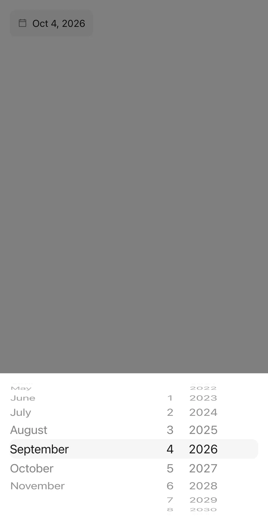
### With value
Starts with a preset date via `defaultValue`.
```tsx
import { DatePicker } from "@/components/patterns/date-picker"
export function DatePickerWithValueExample() {
return (
)
}
```
```swift
import EsuissUI
import SwiftUI
struct DatePickerWithValueExample: View {
var body: some View {
DatePickerDemo(value: datePickerDay(2026, 10, 4))
}
}
func datePickerDay(_ year: Int, _ month: Int, _ day: Int) -> Date? {
Foundation.Calendar.current.date(from: DateComponents(year: year, month: month, day: day))
}
struct DatePickerDemo: View {
var placeholder: LocalizedStringKey = "Pick a date"
var fromYear: Int?
var toYear: Int?
var title: LocalizedStringKey?
var showCloseButton = false
var closeLabel: LocalizedStringKey?
@State private var value: Date?
init(
value: Date? = nil,
placeholder: LocalizedStringKey = "Pick a date",
fromYear: Int? = nil,
toYear: Int? = nil,
title: LocalizedStringKey? = nil,
showCloseButton: Bool = false,
closeLabel: LocalizedStringKey? = nil
) {
_value = State(initialValue: value)
self.placeholder = placeholder
self.fromYear = fromYear
self.toYear = toYear
self.title = title
self.showCloseButton = showCloseButton
self.closeLabel = closeLabel
}
var body: some View {
DatePickerField(
selection: $value,
placeholder: placeholder,
fromYear: fromYear,
toYear: toYear,
title: title,
showCloseButton: showCloseButton,
closeLabel: closeLabel
)
.fixedSize()
.accessibilityLabel(Text("Date"))
}
}
```
```kotlin
import androidx.compose.runtime.Composable
import androidx.compose.runtime.getValue
import androidx.compose.runtime.mutableStateOf
import androidx.compose.runtime.saveable.rememberSaveable
import androidx.compose.runtime.setValue
import androidx.compose.ui.Modifier
import androidx.compose.ui.semantics.contentDescription
import androidx.compose.ui.semantics.semantics
import com.esuiss.ui.patterns.DatePicker
import java.util.Calendar
import java.util.Date
import java.util.Locale
@Composable
fun DatePickerWithValueExample() {
DatePickerDemo(initial = datePickerDate(2026, 9, 4))
}
fun datePickerDate(year: Int, month: Int, day: Int): Long =
Calendar.getInstance().apply {
clear()
set(year, month, day)
}.timeInMillis
@Composable
fun DatePickerDemo(
initial: Long? = null,
locale: Locale = Locale.getDefault(),
placeholder: String = "Pick a date",
fromYear: Int = Calendar.getInstance().get(Calendar.YEAR) - 100,
toYear: Int = Calendar.getInstance().get(Calendar.YEAR) + 10,
title: String? = null,
enabled: Boolean = true,
invalid: Boolean? = null,
floating: Boolean = false,
showCloseButton: Boolean = false,
closeLabel: String? = null,
) {
var value by rememberSaveable { mutableStateOf(initial) }
DatePicker(
value = value?.let(::Date),
onValueChange = { value = it.time },
modifier = Modifier.semantics { contentDescription = "Date" },
placeholder = placeholder,
locale = locale,
fromYear = fromYear,
toYear = toYear,
title = title,
enabled = enabled,
invalid = invalid,
floating = floating,
showCloseButton = showCloseButton,
closeLabel = closeLabel,
)
}
```
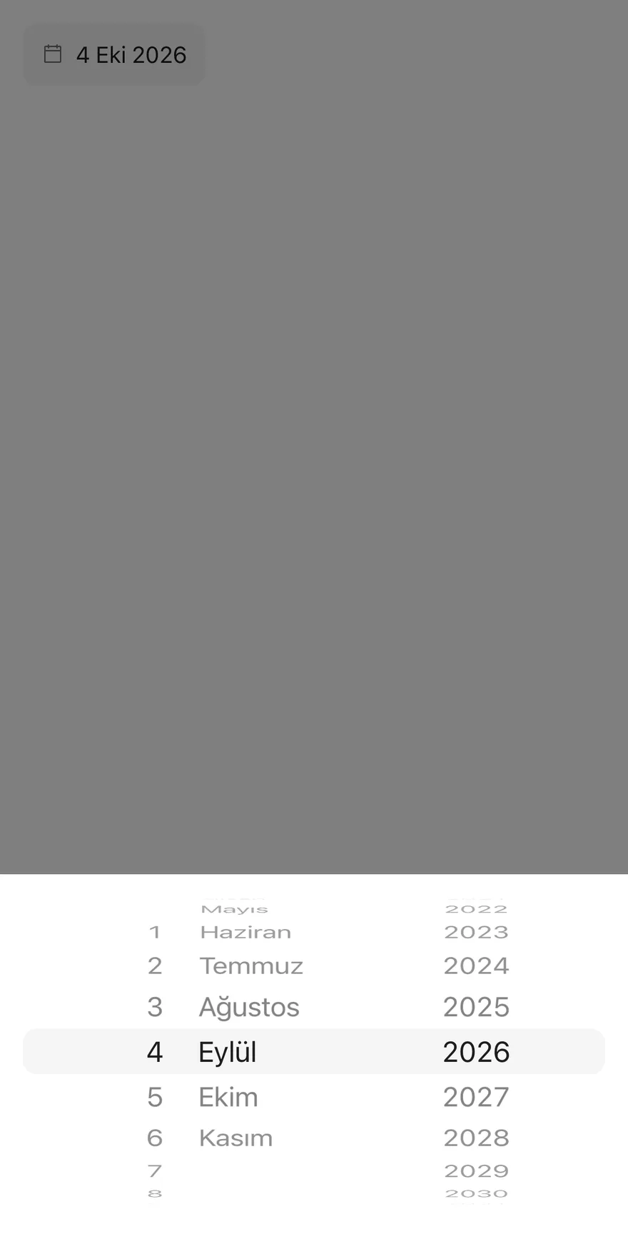
### Locale
Uses `tr-TR`, which reorders the wheels and translates month names.
```tsx
import { DatePicker } from "@/components/patterns/date-picker"
export function DatePickerLocaleExample() {
return (
)
}
```
```swift
import EsuissUI
import SwiftUI
struct DatePickerLocaleExample: View {
var body: some View {
DatePickerDemo(value: datePickerDay(2026, 10, 4), placeholder: "Tarih seç")
.environment(\.locale, Locale(identifier: "tr_TR"))
}
}
func datePickerDay(_ year: Int, _ month: Int, _ day: Int) -> Date? {
Foundation.Calendar.current.date(from: DateComponents(year: year, month: month, day: day))
}
struct DatePickerDemo: View {
var placeholder: LocalizedStringKey = "Pick a date"
var fromYear: Int?
var toYear: Int?
var title: LocalizedStringKey?
var showCloseButton = false
var closeLabel: LocalizedStringKey?
@State private var value: Date?
init(
value: Date? = nil,
placeholder: LocalizedStringKey = "Pick a date",
fromYear: Int? = nil,
toYear: Int? = nil,
title: LocalizedStringKey? = nil,
showCloseButton: Bool = false,
closeLabel: LocalizedStringKey? = nil
) {
_value = State(initialValue: value)
self.placeholder = placeholder
self.fromYear = fromYear
self.toYear = toYear
self.title = title
self.showCloseButton = showCloseButton
self.closeLabel = closeLabel
}
var body: some View {
DatePickerField(
selection: $value,
placeholder: placeholder,
fromYear: fromYear,
toYear: toYear,
title: title,
showCloseButton: showCloseButton,
closeLabel: closeLabel
)
.fixedSize()
.accessibilityLabel(Text("Date"))
}
}
```
```kotlin
import androidx.compose.runtime.Composable
import androidx.compose.runtime.getValue
import androidx.compose.runtime.mutableStateOf
import androidx.compose.runtime.saveable.rememberSaveable
import androidx.compose.runtime.setValue
import androidx.compose.ui.Modifier
import androidx.compose.ui.semantics.contentDescription
import androidx.compose.ui.semantics.semantics
import com.esuiss.ui.patterns.DatePicker
import java.util.Calendar
import java.util.Date
import java.util.Locale
@Composable
fun DatePickerLocaleExample() {
DatePickerDemo(
initial = datePickerDate(2026, 9, 4),
locale = Locale.forLanguageTag("tr-TR"),
placeholder = "Tarih seç",
)
}
fun datePickerDate(year: Int, month: Int, day: Int): Long =
Calendar.getInstance().apply {
clear()
set(year, month, day)
}.timeInMillis
@Composable
fun DatePickerDemo(
initial: Long? = null,
locale: Locale = Locale.getDefault(),
placeholder: String = "Pick a date",
fromYear: Int = Calendar.getInstance().get(Calendar.YEAR) - 100,
toYear: Int = Calendar.getInstance().get(Calendar.YEAR) + 10,
title: String? = null,
enabled: Boolean = true,
invalid: Boolean? = null,
floating: Boolean = false,
showCloseButton: Boolean = false,
closeLabel: String? = null,
) {
var value by rememberSaveable { mutableStateOf(initial) }
DatePicker(
value = value?.let(::Date),
onValueChange = { value = it.time },
modifier = Modifier.semantics { contentDescription = "Date" },
placeholder = placeholder,
locale = locale,
fromYear = fromYear,
toYear = toYear,
title = title,
enabled = enabled,
invalid = invalid,
floating = floating,
showCloseButton = showCloseButton,
closeLabel = closeLabel,
)
}
```
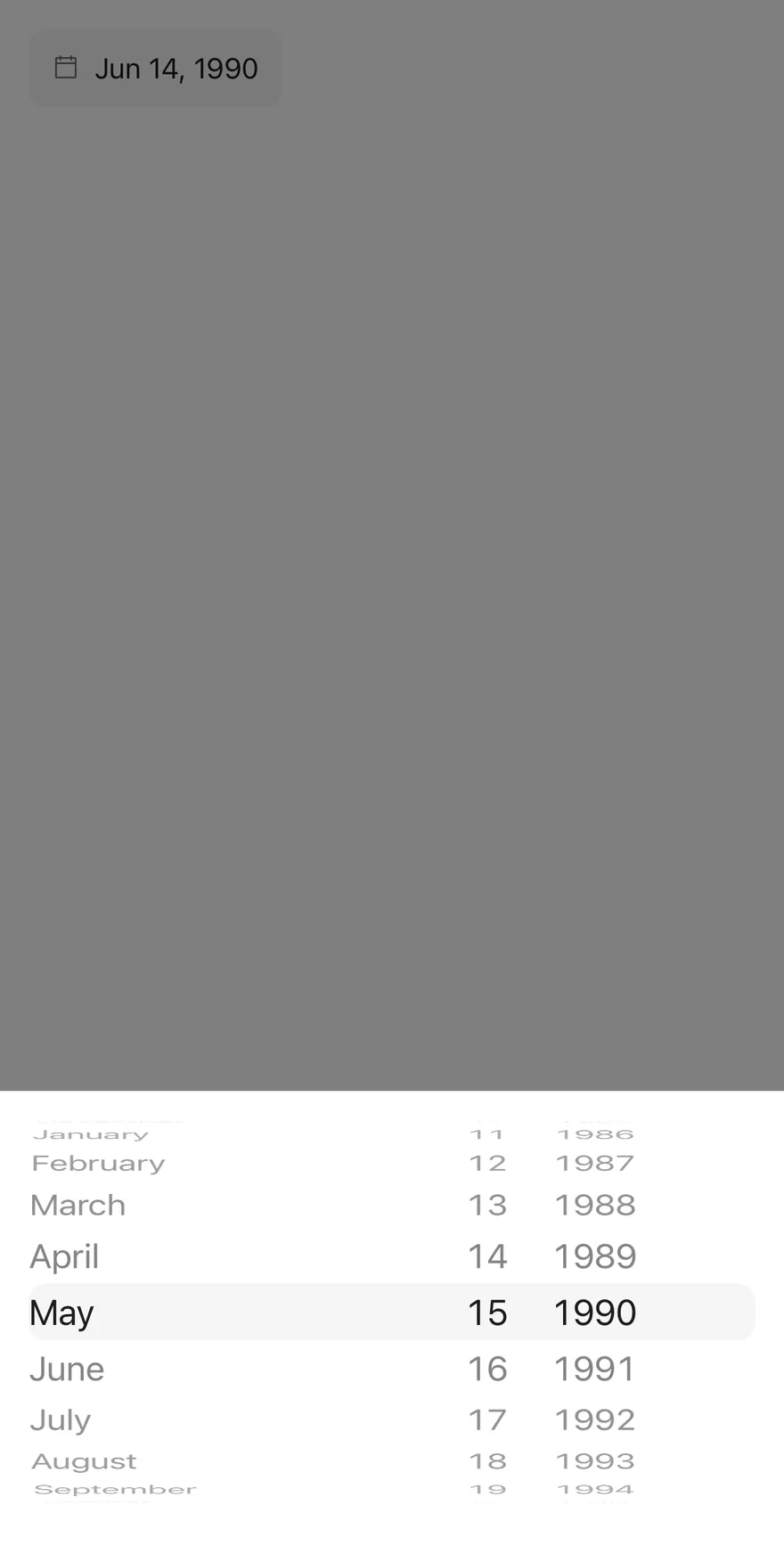
### Year range
A date-of-birth field limited to 1940 through 2010.
```tsx
import { DatePicker } from "@/components/patterns/date-picker"
export function DatePickerYearRangeExample() {
return (
)
}
```
```swift
import EsuissUI
import SwiftUI
struct DatePickerYearRangeExample: View {
var body: some View {
DatePickerDemo(value: datePickerDay(1990, 6, 15), placeholder: "Date of birth", fromYear: 1940, toYear: 2010)
}
}
func datePickerDay(_ year: Int, _ month: Int, _ day: Int) -> Date? {
Foundation.Calendar.current.date(from: DateComponents(year: year, month: month, day: day))
}
struct DatePickerDemo: View {
var placeholder: LocalizedStringKey = "Pick a date"
var fromYear: Int?
var toYear: Int?
var title: LocalizedStringKey?
var showCloseButton = false
var closeLabel: LocalizedStringKey?
@State private var value: Date?
init(
value: Date? = nil,
placeholder: LocalizedStringKey = "Pick a date",
fromYear: Int? = nil,
toYear: Int? = nil,
title: LocalizedStringKey? = nil,
showCloseButton: Bool = false,
closeLabel: LocalizedStringKey? = nil
) {
_value = State(initialValue: value)
self.placeholder = placeholder
self.fromYear = fromYear
self.toYear = toYear
self.title = title
self.showCloseButton = showCloseButton
self.closeLabel = closeLabel
}
var body: some View {
DatePickerField(
selection: $value,
placeholder: placeholder,
fromYear: fromYear,
toYear: toYear,
title: title,
showCloseButton: showCloseButton,
closeLabel: closeLabel
)
.fixedSize()
.accessibilityLabel(Text("Date"))
}
}
```
```kotlin
import androidx.compose.runtime.Composable
import androidx.compose.runtime.getValue
import androidx.compose.runtime.mutableStateOf
import androidx.compose.runtime.saveable.rememberSaveable
import androidx.compose.runtime.setValue
import androidx.compose.ui.Modifier
import androidx.compose.ui.semantics.contentDescription
import androidx.compose.ui.semantics.semantics
import com.esuiss.ui.patterns.DatePicker
import java.util.Calendar
import java.util.Date
import java.util.Locale
@Composable
fun DatePickerYearRangeExample() {
DatePickerDemo(
initial = datePickerDate(1990, 5, 15),
placeholder = "Date of birth",
fromYear = 1940,
toYear = 2010,
)
}
fun datePickerDate(year: Int, month: Int, day: Int): Long =
Calendar.getInstance().apply {
clear()
set(year, month, day)
}.timeInMillis
@Composable
fun DatePickerDemo(
initial: Long? = null,
locale: Locale = Locale.getDefault(),
placeholder: String = "Pick a date",
fromYear: Int = Calendar.getInstance().get(Calendar.YEAR) - 100,
toYear: Int = Calendar.getInstance().get(Calendar.YEAR) + 10,
title: String? = null,
enabled: Boolean = true,
invalid: Boolean? = null,
floating: Boolean = false,
showCloseButton: Boolean = false,
closeLabel: String? = null,
) {
var value by rememberSaveable { mutableStateOf(initial) }
DatePicker(
value = value?.let(::Date),
onValueChange = { value = it.time },
modifier = Modifier.semantics { contentDescription = "Date" },
placeholder = placeholder,
locale = locale,
fromYear = fromYear,
toYear = toYear,
title = title,
enabled = enabled,
invalid = invalid,
floating = floating,
showCloseButton = showCloseButton,
closeLabel = closeLabel,
)
}
```
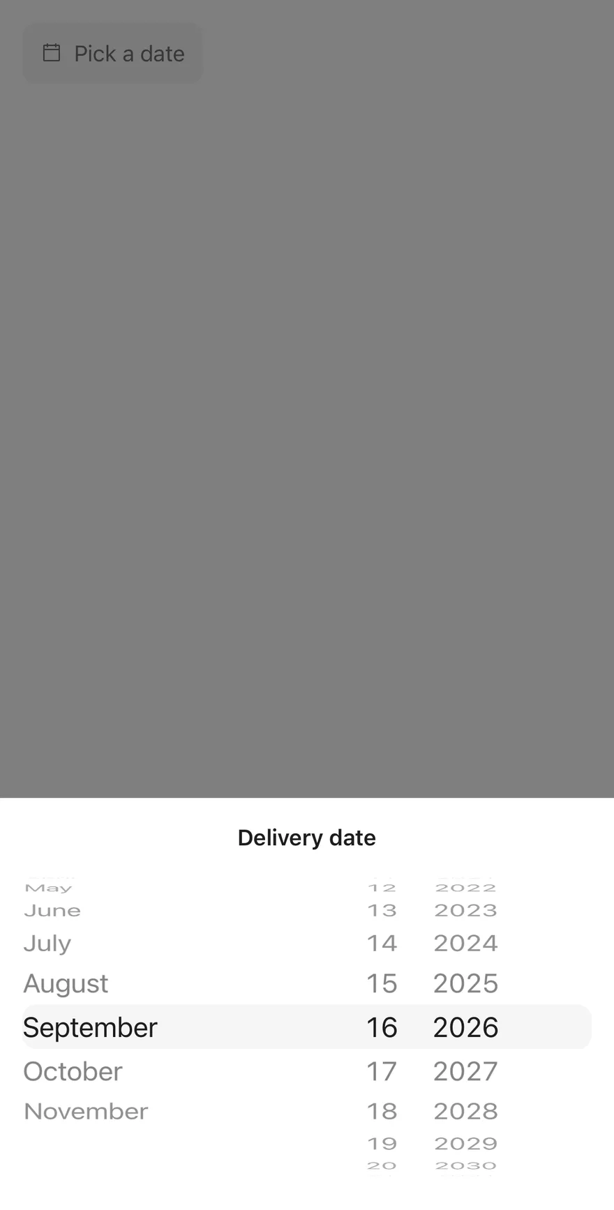
### With title
Adds a heading to the drawer with `title`.
```tsx
import { DatePicker } from "@/components/patterns/date-picker"
export function DatePickerWithTitleExample() {
return (
)
}
```
```swift
import EsuissUI
import SwiftUI
struct DatePickerWithTitleExample: View {
var body: some View {
DatePickerDemo(title: "Delivery date")
}
}
struct DatePickerDemo: View {
var placeholder: LocalizedStringKey = "Pick a date"
var fromYear: Int?
var toYear: Int?
var title: LocalizedStringKey?
var showCloseButton = false
var closeLabel: LocalizedStringKey?
@State private var value: Date?
init(
value: Date? = nil,
placeholder: LocalizedStringKey = "Pick a date",
fromYear: Int? = nil,
toYear: Int? = nil,
title: LocalizedStringKey? = nil,
showCloseButton: Bool = false,
closeLabel: LocalizedStringKey? = nil
) {
_value = State(initialValue: value)
self.placeholder = placeholder
self.fromYear = fromYear
self.toYear = toYear
self.title = title
self.showCloseButton = showCloseButton
self.closeLabel = closeLabel
}
var body: some View {
DatePickerField(
selection: $value,
placeholder: placeholder,
fromYear: fromYear,
toYear: toYear,
title: title,
showCloseButton: showCloseButton,
closeLabel: closeLabel
)
.fixedSize()
.accessibilityLabel(Text("Date"))
}
}
```
```kotlin
import androidx.compose.runtime.Composable
import androidx.compose.runtime.getValue
import androidx.compose.runtime.mutableStateOf
import androidx.compose.runtime.saveable.rememberSaveable
import androidx.compose.runtime.setValue
import androidx.compose.ui.Modifier
import androidx.compose.ui.semantics.contentDescription
import androidx.compose.ui.semantics.semantics
import com.esuiss.ui.patterns.DatePicker
import java.util.Calendar
import java.util.Date
import java.util.Locale
@Composable
fun DatePickerWithTitleExample() {
DatePickerDemo(title = "Delivery date")
}
@Composable
fun DatePickerDemo(
initial: Long? = null,
locale: Locale = Locale.getDefault(),
placeholder: String = "Pick a date",
fromYear: Int = Calendar.getInstance().get(Calendar.YEAR) - 100,
toYear: Int = Calendar.getInstance().get(Calendar.YEAR) + 10,
title: String? = null,
enabled: Boolean = true,
invalid: Boolean? = null,
floating: Boolean = false,
showCloseButton: Boolean = false,
closeLabel: String? = null,
) {
var value by rememberSaveable { mutableStateOf(initial) }
DatePicker(
value = value?.let(::Date),
onValueChange = { value = it.time },
modifier = Modifier.semantics { contentDescription = "Date" },
placeholder = placeholder,
locale = locale,
fromYear = fromYear,
toYear = toYear,
title = title,
enabled = enabled,
invalid = invalid,
floating = floating,
showCloseButton = showCloseButton,
closeLabel = closeLabel,
)
}
```
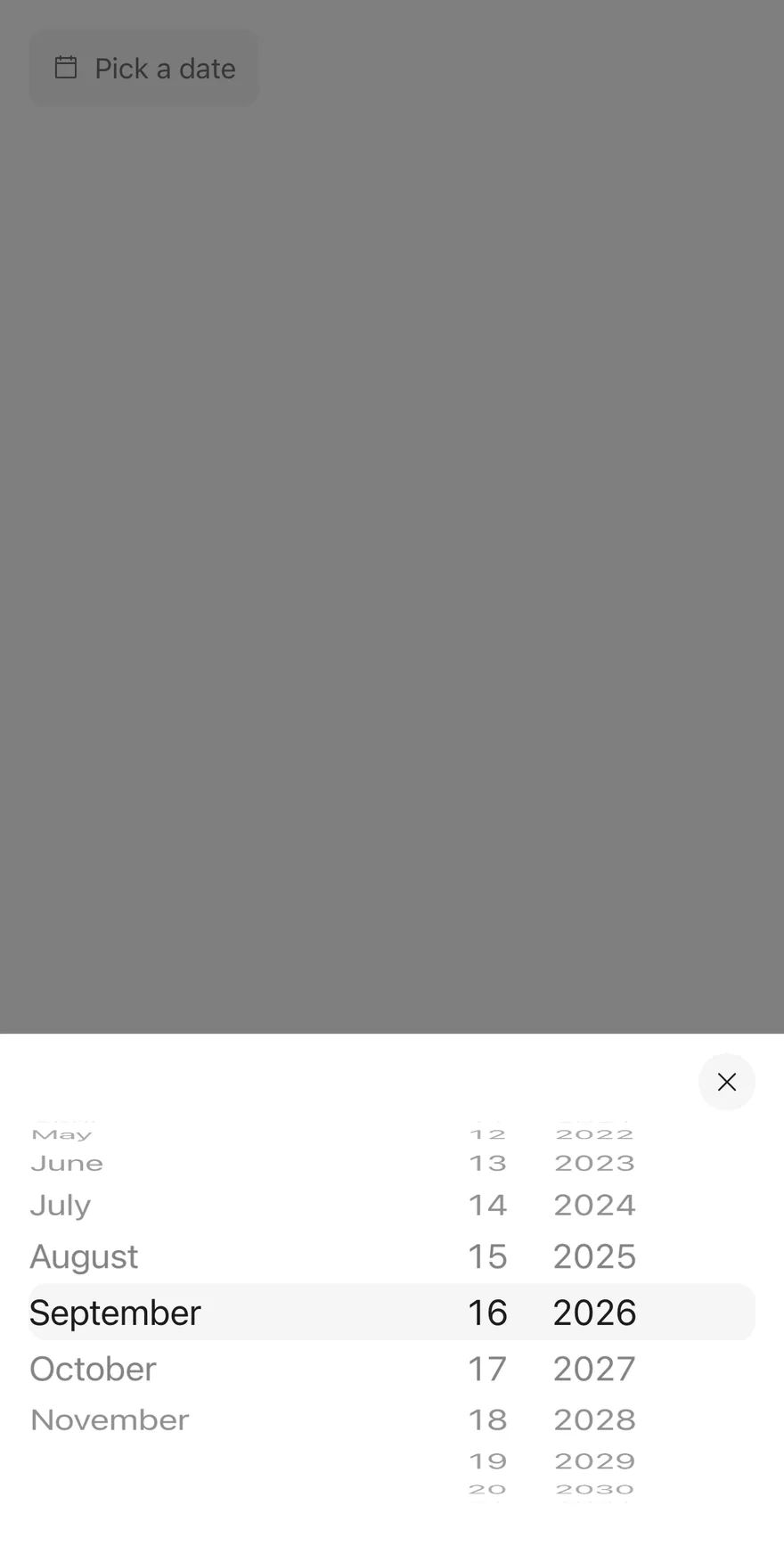
### With close button
Shows a close button in the drawer.
```tsx
import { DatePicker } from "@/components/patterns/date-picker"
export function DatePickerWithCloseButtonExample() {
return (
)
}
```
```swift
import EsuissUI
import SwiftUI
struct DatePickerWithCloseButtonExample: View {
var body: some View {
DatePickerDemo(showCloseButton: true)
}
}
struct DatePickerDemo: View {
var placeholder: LocalizedStringKey = "Pick a date"
var fromYear: Int?
var toYear: Int?
var title: LocalizedStringKey?
var showCloseButton = false
var closeLabel: LocalizedStringKey?
@State private var value: Date?
init(
value: Date? = nil,
placeholder: LocalizedStringKey = "Pick a date",
fromYear: Int? = nil,
toYear: Int? = nil,
title: LocalizedStringKey? = nil,
showCloseButton: Bool = false,
closeLabel: LocalizedStringKey? = nil
) {
_value = State(initialValue: value)
self.placeholder = placeholder
self.fromYear = fromYear
self.toYear = toYear
self.title = title
self.showCloseButton = showCloseButton
self.closeLabel = closeLabel
}
var body: some View {
DatePickerField(
selection: $value,
placeholder: placeholder,
fromYear: fromYear,
toYear: toYear,
title: title,
showCloseButton: showCloseButton,
closeLabel: closeLabel
)
.fixedSize()
.accessibilityLabel(Text("Date"))
}
}
```
```kotlin
import androidx.compose.runtime.Composable
import androidx.compose.runtime.getValue
import androidx.compose.runtime.mutableStateOf
import androidx.compose.runtime.saveable.rememberSaveable
import androidx.compose.runtime.setValue
import androidx.compose.ui.Modifier
import androidx.compose.ui.semantics.contentDescription
import androidx.compose.ui.semantics.semantics
import com.esuiss.ui.patterns.DatePicker
import java.util.Calendar
import java.util.Date
import java.util.Locale
@Composable
fun DatePickerWithCloseButtonExample() {
DatePickerDemo(showCloseButton = true)
}
@Composable
fun DatePickerDemo(
initial: Long? = null,
locale: Locale = Locale.getDefault(),
placeholder: String = "Pick a date",
fromYear: Int = Calendar.getInstance().get(Calendar.YEAR) - 100,
toYear: Int = Calendar.getInstance().get(Calendar.YEAR) + 10,
title: String? = null,
enabled: Boolean = true,
invalid: Boolean? = null,
floating: Boolean = false,
showCloseButton: Boolean = false,
closeLabel: String? = null,
) {
var value by rememberSaveable { mutableStateOf(initial) }
DatePicker(
value = value?.let(::Date),
onValueChange = { value = it.time },
modifier = Modifier.semantics { contentDescription = "Date" },
placeholder = placeholder,
locale = locale,
fromYear = fromYear,
toYear = toYear,
title = title,
enabled = enabled,
invalid = invalid,
floating = floating,
showCloseButton = showCloseButton,
closeLabel = closeLabel,
)
}
```
### With close label
Labels the close button `Done` with `closeLabel`.
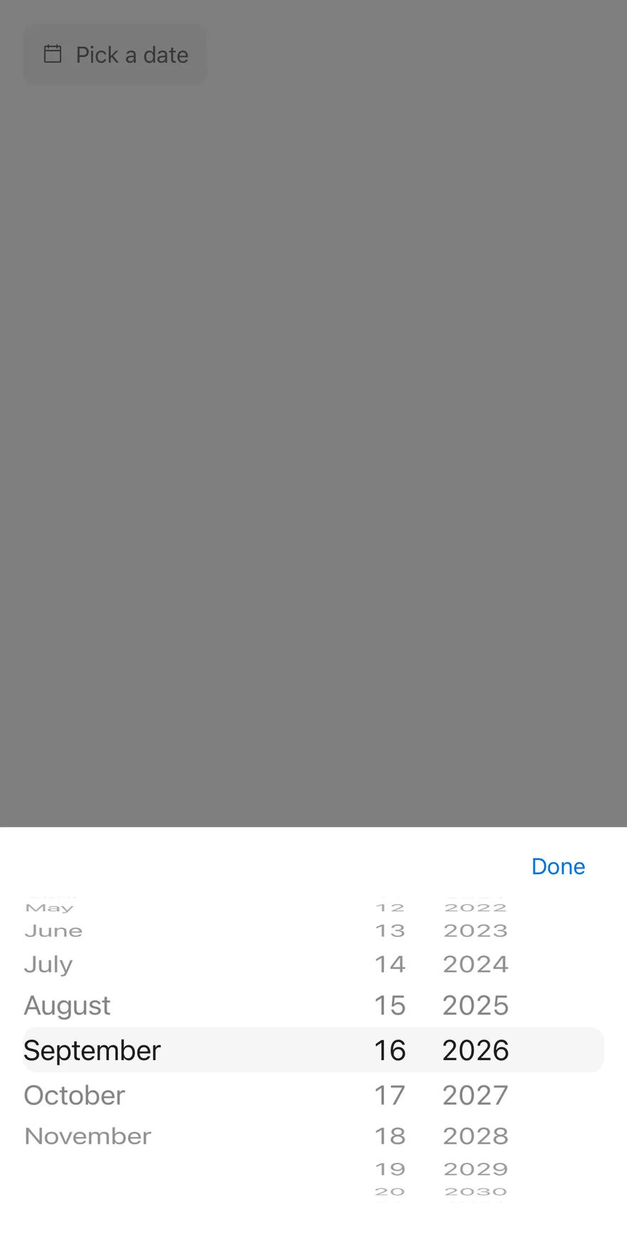
```tsx
import { DatePicker } from "@/components/patterns/date-picker"
export function DatePickerWithCloseLabelExample() {
return (
)
}
```
```swift
import EsuissUI
import SwiftUI
struct DatePickerWithCloseLabelExample: View {
var body: some View {
DatePickerDemo(showCloseButton: true, closeLabel: "Done")
}
}
struct DatePickerDemo: View {
var placeholder: LocalizedStringKey = "Pick a date"
var fromYear: Int?
var toYear: Int?
var title: LocalizedStringKey?
var showCloseButton = false
var closeLabel: LocalizedStringKey?
@State private var value: Date?
init(
value: Date? = nil,
placeholder: LocalizedStringKey = "Pick a date",
fromYear: Int? = nil,
toYear: Int? = nil,
title: LocalizedStringKey? = nil,
showCloseButton: Bool = false,
closeLabel: LocalizedStringKey? = nil
) {
_value = State(initialValue: value)
self.placeholder = placeholder
self.fromYear = fromYear
self.toYear = toYear
self.title = title
self.showCloseButton = showCloseButton
self.closeLabel = closeLabel
}
var body: some View {
DatePickerField(
selection: $value,
placeholder: placeholder,
fromYear: fromYear,
toYear: toYear,
title: title,
showCloseButton: showCloseButton,
closeLabel: closeLabel
)
.fixedSize()
.accessibilityLabel(Text("Date"))
}
}
```
```kotlin
import androidx.compose.runtime.Composable
import androidx.compose.runtime.getValue
import androidx.compose.runtime.mutableStateOf
import androidx.compose.runtime.saveable.rememberSaveable
import androidx.compose.runtime.setValue
import androidx.compose.ui.Modifier
import androidx.compose.ui.semantics.contentDescription
import androidx.compose.ui.semantics.semantics
import com.esuiss.ui.patterns.DatePicker
import java.util.Calendar
import java.util.Date
import java.util.Locale
@Composable
fun DatePickerWithCloseLabelExample() {
DatePickerDemo(showCloseButton = true, closeLabel = "Done")
}
@Composable
fun DatePickerDemo(
initial: Long? = null,
locale: Locale = Locale.getDefault(),
placeholder: String = "Pick a date",
fromYear: Int = Calendar.getInstance().get(Calendar.YEAR) - 100,
toYear: Int = Calendar.getInstance().get(Calendar.YEAR) + 10,
title: String? = null,
enabled: Boolean = true,
invalid: Boolean? = null,
floating: Boolean = false,
showCloseButton: Boolean = false,
closeLabel: String? = null,
) {
var value by rememberSaveable { mutableStateOf(initial) }
DatePicker(
value = value?.let(::Date),
onValueChange = { value = it.time },
modifier = Modifier.semantics { contentDescription = "Date" },
placeholder = placeholder,
locale = locale,
fromYear = fromYear,
toYear = toYear,
title = title,
enabled = enabled,
invalid = invalid,
floating = floating,
showCloseButton = showCloseButton,
closeLabel = closeLabel,
)
}
```
### Disabled
A disabled field that cannot open the drawer.

```tsx
import { DatePicker } from "@/components/patterns/date-picker"
export function DatePickerDisabledExample() {
return (
)
}
```
```swift
import EsuissUI
import SwiftUI
struct DatePickerDisabledExample: View {
var body: some View {
DatePickerDemo()
.disabled(true)
}
}
struct DatePickerDemo: View {
var placeholder: LocalizedStringKey = "Pick a date"
var fromYear: Int?
var toYear: Int?
var title: LocalizedStringKey?
var showCloseButton = false
var closeLabel: LocalizedStringKey?
@State private var value: Date?
init(
value: Date? = nil,
placeholder: LocalizedStringKey = "Pick a date",
fromYear: Int? = nil,
toYear: Int? = nil,
title: LocalizedStringKey? = nil,
showCloseButton: Bool = false,
closeLabel: LocalizedStringKey? = nil
) {
_value = State(initialValue: value)
self.placeholder = placeholder
self.fromYear = fromYear
self.toYear = toYear
self.title = title
self.showCloseButton = showCloseButton
self.closeLabel = closeLabel
}
var body: some View {
DatePickerField(
selection: $value,
placeholder: placeholder,
fromYear: fromYear,
toYear: toYear,
title: title,
showCloseButton: showCloseButton,
closeLabel: closeLabel
)
.fixedSize()
.accessibilityLabel(Text("Date"))
}
}
```
```kotlin
import androidx.compose.runtime.Composable
import androidx.compose.runtime.getValue
import androidx.compose.runtime.mutableStateOf
import androidx.compose.runtime.saveable.rememberSaveable
import androidx.compose.runtime.setValue
import androidx.compose.ui.Modifier
import androidx.compose.ui.semantics.contentDescription
import androidx.compose.ui.semantics.semantics
import com.esuiss.ui.patterns.DatePicker
import java.util.Calendar
import java.util.Date
import java.util.Locale
@Composable
fun DatePickerDisabledExample() {
DatePickerDemo(enabled = false)
}
@Composable
fun DatePickerDemo(
initial: Long? = null,
locale: Locale = Locale.getDefault(),
placeholder: String = "Pick a date",
fromYear: Int = Calendar.getInstance().get(Calendar.YEAR) - 100,
toYear: Int = Calendar.getInstance().get(Calendar.YEAR) + 10,
title: String? = null,
enabled: Boolean = true,
invalid: Boolean? = null,
floating: Boolean = false,
showCloseButton: Boolean = false,
closeLabel: String? = null,
) {
var value by rememberSaveable { mutableStateOf(initial) }
DatePicker(
value = value?.let(::Date),
onValueChange = { value = it.time },
modifier = Modifier.semantics { contentDescription = "Date" },
placeholder = placeholder,
locale = locale,
fromYear = fromYear,
toYear = toYear,
title = title,
enabled = enabled,
invalid = invalid,
floating = floating,
showCloseButton = showCloseButton,
closeLabel = closeLabel,
)
}
```
### Invalid
Shows the error border and tint with `invalid`.
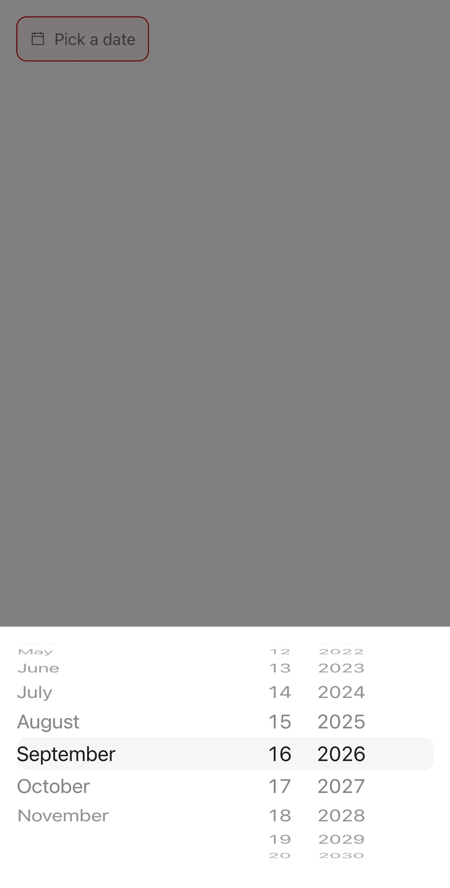
```tsx
import { DatePicker } from "@/components/patterns/date-picker"
export function DatePickerInvalidExample() {
return (
)
}
```
```swift
import EsuissUI
import SwiftUI
struct DatePickerInvalidExample: View {
var body: some View {
DatePickerDemo()
.invalid()
}
}
struct DatePickerDemo: View {
var placeholder: LocalizedStringKey = "Pick a date"
var fromYear: Int?
var toYear: Int?
var title: LocalizedStringKey?
var showCloseButton = false
var closeLabel: LocalizedStringKey?
@State private var value: Date?
init(
value: Date? = nil,
placeholder: LocalizedStringKey = "Pick a date",
fromYear: Int? = nil,
toYear: Int? = nil,
title: LocalizedStringKey? = nil,
showCloseButton: Bool = false,
closeLabel: LocalizedStringKey? = nil
) {
_value = State(initialValue: value)
self.placeholder = placeholder
self.fromYear = fromYear
self.toYear = toYear
self.title = title
self.showCloseButton = showCloseButton
self.closeLabel = closeLabel
}
var body: some View {
DatePickerField(
selection: $value,
placeholder: placeholder,
fromYear: fromYear,
toYear: toYear,
title: title,
showCloseButton: showCloseButton,
closeLabel: closeLabel
)
.fixedSize()
.accessibilityLabel(Text("Date"))
}
}
```
```kotlin
import androidx.compose.runtime.Composable
import androidx.compose.runtime.getValue
import androidx.compose.runtime.mutableStateOf
import androidx.compose.runtime.saveable.rememberSaveable
import androidx.compose.runtime.setValue
import androidx.compose.ui.Modifier
import androidx.compose.ui.semantics.contentDescription
import androidx.compose.ui.semantics.semantics
import com.esuiss.ui.patterns.DatePicker
import java.util.Calendar
import java.util.Date
import java.util.Locale
@Composable
fun DatePickerInvalidExample() {
DatePickerDemo(invalid = true)
}
@Composable
fun DatePickerDemo(
initial: Long? = null,
locale: Locale = Locale.getDefault(),
placeholder: String = "Pick a date",
fromYear: Int = Calendar.getInstance().get(Calendar.YEAR) - 100,
toYear: Int = Calendar.getInstance().get(Calendar.YEAR) + 10,
title: String? = null,
enabled: Boolean = true,
invalid: Boolean? = null,
floating: Boolean = false,
showCloseButton: Boolean = false,
closeLabel: String? = null,
) {
var value by rememberSaveable { mutableStateOf(initial) }
DatePicker(
value = value?.let(::Date),
onValueChange = { value = it.time },
modifier = Modifier.semantics { contentDescription = "Date" },
placeholder = placeholder,
locale = locale,
fromYear = fromYear,
toYear = toYear,
title = title,
enabled = enabled,
invalid = invalid,
floating = floating,
showCloseButton = showCloseButton,
closeLabel = closeLabel,
)
}
```
### Controlled
Holds the date in state and prints the selection below.
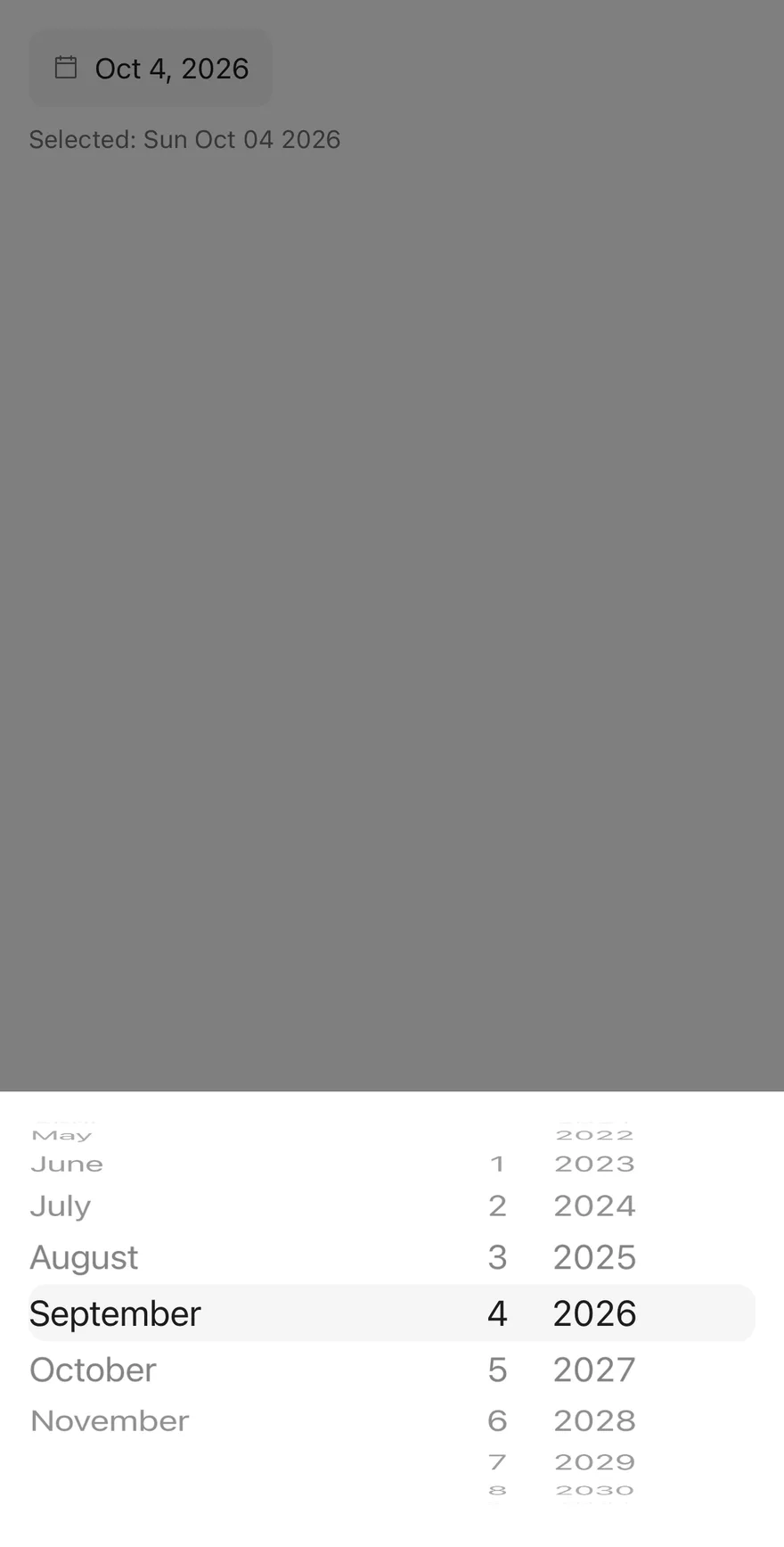
```tsx
import * as React from "react"
import { View } from "react-native"
import { DatePicker } from "@/components/patterns/date-picker"
import { Text } from "@/components/ui/text"
function ControlledExample(args: React.ComponentProps) {
const [value, setValue] = React.useState(new Date(2026, 9, 4))
return (
Selected: {value ? value.toDateString() : "none"}
)
}
export function DatePickerControlledExample() {
return (
)
}
```
```swift
import EsuissUI
import SwiftUI
func datePickerDay(_ year: Int, _ month: Int, _ day: Int) -> Date? {
Foundation.Calendar.current.date(from: DateComponents(year: year, month: month, day: day))
}
struct DatePickerControlled: View {
@State private var value: Date? = datePickerDay(2026, 10, 4)
var selected: String {
guard let value else { return "none" }
let formatter = DateFormatter()
formatter.locale = Locale(identifier: "en_US_POSIX")
formatter.dateFormat = "EEE MMM dd yyyy"
return formatter.string(from: value)
}
var body: some View {
VStack(alignment: .leading, spacing: 8) {
DatePickerField(selection: $value)
.fixedSize()
.accessibilityLabel(Text("Date"))
Text(verbatim: "Selected: \(selected)")
.textStyle(.sm)
.foregroundStyle(EsuissColor.mutedForeground)
}
}
}
```
```kotlin
import androidx.compose.foundation.layout.Arrangement
import androidx.compose.foundation.layout.Column
import androidx.compose.runtime.Composable
import androidx.compose.runtime.getValue
import androidx.compose.runtime.mutableStateOf
import androidx.compose.runtime.saveable.rememberSaveable
import androidx.compose.runtime.setValue
import androidx.compose.ui.Modifier
import androidx.compose.ui.semantics.contentDescription
import androidx.compose.ui.semantics.semantics
import androidx.compose.ui.unit.dp
import com.esuiss.ui.components.Text
import com.esuiss.ui.patterns.DatePicker
import com.esuiss.ui.theme.EsuissTheme
import com.esuiss.ui.theme.Typography
import java.text.SimpleDateFormat
import java.util.Calendar
import java.util.Date
import java.util.Locale
fun datePickerDate(year: Int, month: Int, day: Int): Long =
Calendar.getInstance().apply {
clear()
set(year, month, day)
}.timeInMillis
@Composable
fun DatePickerControlled() {
var value by rememberSaveable { mutableStateOf(datePickerDate(2026, 9, 4)) }
val format = SimpleDateFormat("EEE MMM dd yyyy", Locale.US)
Column(verticalArrangement = Arrangement.spacedBy(8.dp)) {
DatePicker(
value = value?.let(::Date),
onValueChange = { value = it.time },
modifier = Modifier.semantics { contentDescription = "Date" },
)
Text(
"Selected: ${value?.let { format.format(Date(it)) } ?: "none"}",
style = Typography.sm.copy(color = EsuissTheme.colors.mutedForeground),
)
}
}
```
**React Native, Jetpack Compose**
### Floating
Detaches the drawer from the screen edges.

```tsx
import { DatePicker } from "@/components/patterns/date-picker"
export function DatePickerFloatingExample() {
return (
)
}
```
```kotlin
import androidx.compose.runtime.Composable
import androidx.compose.runtime.getValue
import androidx.compose.runtime.mutableStateOf
import androidx.compose.runtime.saveable.rememberSaveable
import androidx.compose.runtime.setValue
import androidx.compose.ui.Modifier
import androidx.compose.ui.semantics.contentDescription
import androidx.compose.ui.semantics.semantics
import com.esuiss.ui.patterns.DatePicker
import java.util.Calendar
import java.util.Date
import java.util.Locale
@Composable
fun DatePickerFloatingExample() {
DatePickerDemo(floating = true)
}
@Composable
fun DatePickerDemo(
initial: Long? = null,
locale: Locale = Locale.getDefault(),
placeholder: String = "Pick a date",
fromYear: Int = Calendar.getInstance().get(Calendar.YEAR) - 100,
toYear: Int = Calendar.getInstance().get(Calendar.YEAR) + 10,
title: String? = null,
enabled: Boolean = true,
invalid: Boolean? = null,
floating: Boolean = false,
showCloseButton: Boolean = false,
closeLabel: String? = null,
) {
var value by rememberSaveable { mutableStateOf(initial) }
DatePicker(
value = value?.let(::Date),
onValueChange = { value = it.time },
modifier = Modifier.semantics { contentDescription = "Date" },
placeholder = placeholder,
locale = locale,
fromYear = fromYear,
toYear = toYear,
title = title,
enabled = enabled,
invalid = invalid,
floating = floating,
showCloseButton = showCloseButton,
closeLabel = closeLabel,
)
}
```
## API Reference
### DatePicker
| Prop | Type | Default | Description |
| --- | --- | --- | --- |
| `value` | `Date \| null` | - | The selected date when controlled, or `null`. |
| `defaultValue` | `Date \| null` | - | The initial date when uncontrolled. |
| `onValueChange` | `(value: Date \| null) => void` | - | Called with the new `Date` on every wheel change. |
| `placeholder` | `string` | `"Pick a date"` | Text shown when no date is set. Defaults to `Pick a date`. |
| `locale` | `string` | - | BCP 47 locale for formatting, month names and wheel order. |
| `fromYear` | `number` | `new Date().getFullYear() - 100` | First year in the year wheel. Defaults to 100 years ago. |
| `toYear` | `number` | `new Date().getFullYear() + 10` | Last year in the year wheel. Defaults to 10 years ahead. |
| `title` | `string` | - | Heading shown at the top of the drawer. |
| `disabled` | `boolean` | - | Prevents opening and dims the field. |
| `floating` | `boolean` | - | Insets the drawer from the screen edges. |
| `showCloseButton` | `boolean` | `false` | Shows a close button in the drawer. Defaults to `false`. |
| `closeLabel` | `string` | - | Label of the close button. |
| `invalid` | `boolean` | - | Applies the error border and background. |
| `className` | `string` | - | Extra classes for the field, for example `w-full` to fill the width. |
| `accessibilityLabel` | `string` | - | Label for the field, also used for the drawer when there is no `title`. |
| `accessibilityLabelledBy` | `string` | - | Links the field to a visible label. |
## Accessibility
- The wheels are labelled `Day`, `Month` and `Year`.
- Without a `title`, the drawer is labelled by `accessibilityLabel` or the placeholder.
## Notes
- The field uses `bg-secondary`, `border-destructive` with a `bg-destructive` tint when invalid, and `opacity-50` when disabled; the tint is stronger in dark mode.
- Without `floating`, the drawer's top corners are square.