# Context Actions

Actions for an element that open as a context menu on right click, or an action sheet on long press on mobile.

Context Actions is an open-source pattern from suiss/ui for React, React Native, SwiftUI and Jetpack Compose. The @esuiss/ui CLI copies its source into your project, so you own the code.

Source: https://ui.suiss.app/docs/patterns/context-actions

**React**

**Example**

```tsx
import {
  ContextActions,
  ContextActionsContent,
  ContextActionsItem,
  ContextActionsLabel,
  ContextActionsSeparator,
  ContextActionsTrigger,
} from "@/components/patterns/context-actions"

export default function ContextActionsDemo() {
  return (
    <div className="flex min-h-svh items-center justify-center p-4">
      <ContextActions>
        <ContextActionsTrigger className="flex h-40 w-72 items-center justify-center rounded-2xl border border-dashed text-sm text-muted-foreground">
          Right click or long press
        </ContextActionsTrigger>
        <ContextActionsContent>
          <ContextActionsLabel>Photo.jpg</ContextActionsLabel>
          <ContextActionsItem>Edit</ContextActionsItem>
          <ContextActionsItem>Duplicate</ContextActionsItem>
          <ContextActionsItem>Share</ContextActionsItem>
          <ContextActionsSeparator />
          <ContextActionsItem variant="destructive">Delete</ContextActionsItem>
        </ContextActionsContent>
      </ContextActions>
    </div>
  )
}
```

`ContextActions` attaches a set of actions to an area of the page. On desktop it renders a `ContextMenu` that opens at the pointer on right click. Below the `48rem` breakpoint it renders an `AlertSheet` instead, opened by a 500 ms long press on touch, by the context menu event, or by the `ContextMenu` key or `Shift+F10`; the sheet groups the items in a card and appends a Cancel button.

Use it for secondary actions on content such as photos, files or list rows, where actions should stay out of the way until requested.

## Installation

### CLI

```bash title="Terminal"
npx shadcn@latest add @esuiss/context-actions
```

Works in any project with a `components.json`. See [Installation](https://ui.suiss.app/docs/installation#add-components) for the one-line registry setup. Or use the suiss/ui CLI:

```bash title="Terminal"
npx @esuiss/ui@latest add patterns context-actions
```

### Manual

1. Install the dependencies and add the [`cn` helper](https://ui.suiss.app/docs/installation#the-cn-helper):

```bash title="Terminal"
npm install @base-ui/react
```

2. Add the pieces it builds on: [Alert Sheet](https://ui.suiss.app/docs/components/alert-sheet), [Context Menu](https://ui.suiss.app/docs/components/context-menu), `use-mobile`.

3. Copy the source into `components/patterns/context-actions.tsx`:

```tsx title="components/patterns/context-actions.tsx"
"use client"

import { mergeProps } from "@base-ui/react/merge-props"
import * as React from "react"
import {
  AlertSheet,
  AlertSheetAction,
  AlertSheetCancel,
  AlertSheetContent,
  AlertSheetGroup,
  AlertSheetHeader,
  AlertSheetTitle,
} from "@/components/ui/alert-sheet"
import {
  ContextMenu,
  ContextMenuContent,
  ContextMenuGroup,
  ContextMenuItem,
  ContextMenuLabel,
  ContextMenuSeparator,
  ContextMenuTrigger,
} from "@/components/ui/context-menu"
import { useIsMobile } from "@/hooks/use-mobile"
import { cn } from "@/lib/utils"

const LONG_PRESS_DELAY = 500
const LONG_PRESS_TOLERANCE = 10

type ContextActionsContextProps = {
  isMobile: boolean
  setOpen: (open: boolean) => void
}

const ContextActionsContext =
  React.createContext<ContextActionsContextProps | null>(null)

function useContextActions() {
  const context = React.useContext(ContextActionsContext)

  if (!context) {
    throw new Error(
      "useContextActions must be used within a <ContextActions />"
    )
  }

  return context
}

function ContextActions({
  onOpenChange,
  dismissible = true,
  children,
}: Pick<React.ComponentProps<typeof ContextMenu>, "children"> & {
  onOpenChange?: (open: boolean) => void
  dismissible?: boolean
}) {
  const isMobile = useIsMobile()
  const [open, setOpenState] = React.useState(false)

  const setOpen = React.useCallback(
    (next: boolean) => {
      setOpenState(next)
      onOpenChange?.(next)
    },
    [onOpenChange]
  )

  return (
    <ContextActionsContext.Provider value={{ isMobile, setOpen }}>
      {isMobile ? (
        <AlertSheet
          data-slot="context-actions"
          open={open}
          onOpenChange={(next) => setOpen(next)}
          dismissible={dismissible}
        >
          {children}
        </AlertSheet>
      ) : (
        <ContextMenu
          data-slot="context-actions"
          onOpenChange={(next) => onOpenChange?.(next)}
        >
          {children}
        </ContextMenu>
      )}
    </ContextActionsContext.Provider>
  )
}

function ContextActionsTrigger({
  className,
  ...props
}: React.HTMLAttributes<HTMLElement>) {
  const { isMobile, setOpen } = useContextActions()
  const timerRef = React.useRef<ReturnType<typeof setTimeout>>(undefined)
  const startRef = React.useRef<{ x: number; y: number } | null>(null)

  React.useEffect(() => () => clearTimeout(timerRef.current), [])

  if (!isMobile) {
    return (
      <ContextMenuTrigger
        data-slot="context-actions-trigger"
        className={className}
        {...props}
      />
    )
  }

  const cancel = () => {
    clearTimeout(timerRef.current)
    startRef.current = null
  }

  return (
    <div
      {...mergeProps<"div">(props, {
        onKeyDown: (event) => {
          if (
            event.key === "ContextMenu" ||
            (event.shiftKey && event.key === "F10")
          ) {
            event.preventDefault()
            setOpen(true)
          }
        },
        onContextMenu: (event) => {
          event.preventDefault()
          cancel()
          setOpen(true)
        },
        onPointerDown: (event) => {
          if (event.pointerType === "mouse") return
          startRef.current = { x: event.clientX, y: event.clientY }
          clearTimeout(timerRef.current)
          timerRef.current = setTimeout(() => {
            startRef.current = null
            setOpen(true)
          }, LONG_PRESS_DELAY)
        },
        onPointerMove: (event) => {
          const start = startRef.current
          if (!start) return
          const moved = Math.hypot(
            event.clientX - start.x,
            event.clientY - start.y
          )
          if (moved > LONG_PRESS_TOLERANCE) cancel()
        },
        onPointerUp: cancel,
        onPointerCancel: cancel,
        onPointerLeave: cancel,
      })}
      data-slot="context-actions-trigger"
      role="button"
      tabIndex={0}
      aria-haspopup="dialog"
      className={cn(
        "touch-manipulation outline-none select-none [-webkit-touch-callout:none] focus-visible:ring-3 focus-visible:ring-ring/50",
        className
      )}
    />
  )
}

function ContextActionsContent({
  cancelLabel = "Cancel",
  className,
  children,
  ...props
}: React.HTMLAttributes<HTMLElement> & {
  cancelLabel?: string
}) {
  const { isMobile } = useContextActions()

  if (isMobile) {
    return (
      <AlertSheetContent
        data-slot="context-actions-content"
        className={className}
        {...props}
      >
        <AlertSheetGroup>{children}</AlertSheetGroup>
        <AlertSheetCancel>{cancelLabel}</AlertSheetCancel>
      </AlertSheetContent>
    )
  }

  return (
    <ContextMenuContent
      data-slot="context-actions-content"
      className={className}
      {...props}
    >
      {children}
    </ContextMenuContent>
  )
}

function ContextActionsLabel({
  className,
  children,
  ...props
}: React.HTMLAttributes<HTMLElement>) {
  const { isMobile } = useContextActions()

  if (isMobile) {
    return (
      <AlertSheetHeader data-slot="context-actions-label">
        <AlertSheetTitle className={className} {...props}>
          {children}
        </AlertSheetTitle>
      </AlertSheetHeader>
    )
  }

  return (
    <ContextMenuGroup>
      <ContextMenuLabel
        data-slot="context-actions-label"
        className={className}
        {...props}
      >
        {children}
      </ContextMenuLabel>
    </ContextMenuGroup>
  )
}

function ContextActionsItem({
  variant,
  disabled,
  ...props
}: React.HTMLAttributes<HTMLElement> & {
  variant?: "default" | "destructive"
  disabled?: boolean
}) {
  const { isMobile } = useContextActions()
  const Item = isMobile ? AlertSheetAction : ContextMenuItem

  return (
    <Item
      data-slot="context-actions-item"
      variant={variant}
      disabled={disabled}
      {...props}
    />
  )
}

function ContextActionsSeparator(props: React.HTMLAttributes<HTMLElement>) {
  const { isMobile } = useContextActions()

  if (isMobile) return null

  return (
    <ContextMenuSeparator data-slot="context-actions-separator" {...props} />
  )
}

export {
  ContextActions,
  ContextActionsContent,
  ContextActionsItem,
  ContextActionsLabel,
  ContextActionsSeparator,
  ContextActionsTrigger,
}
```

4. Update the import paths to match your project.

## Usage

```tsx
import { ContextActions, ContextActionsTrigger, ContextActionsContent, ContextActionsLabel, ContextActionsItem, ContextActionsSeparator } from "@/components/patterns/context-actions"
```

```tsx
<div className="flex min-h-svh items-center justify-center p-4">
  <ContextActions>
    <ContextActionsTrigger className="flex h-40 w-72 items-center justify-center rounded-2xl border border-dashed text-sm text-muted-foreground">
      Right click or long press
    </ContextActionsTrigger>
    <ContextActionsContent>
      <ContextActionsLabel>Photo.jpg</ContextActionsLabel>
      <ContextActionsItem>Edit</ContextActionsItem>
      <ContextActionsItem>Duplicate</ContextActionsItem>
      <ContextActionsItem>Share</ContextActionsItem>
      <ContextActionsSeparator />
      <ContextActionsItem variant="destructive">Delete</ContextActionsItem>
    </ContextActionsContent>
  </ContextActions>
</div>
```

Wrap the target area in `ContextActionsTrigger` and list the actions in `ContextActionsContent`. The open state is internal; use `onOpenChange` to react to it. A long press is cancelled if the finger moves more than 10 pixels, so scrolling over the trigger does not open the sheet.

## Examples

### With icons

Places an icon before every action, including a destructive Delete item.

**Example**

```tsx
import {
  CopyIcon,
  PencilSimpleIcon,
  ShareIcon,
  TrashIcon,
} from "@phosphor-icons/react"
import {
  ContextActions,
  ContextActionsContent,
  ContextActionsItem,
  ContextActionsSeparator,
  ContextActionsTrigger,
} from "@/components/patterns/context-actions"

export default function ContextActionsWithIcons() {
  return (
    <div className="flex min-h-svh items-center justify-center p-4">
      <ContextActions>
        <ContextActionsTrigger className="flex h-40 w-72 items-center justify-center rounded-2xl border border-dashed text-sm text-muted-foreground">
          Right click or long press
        </ContextActionsTrigger>
        <ContextActionsContent>
          <ContextActionsItem>
            <PencilSimpleIcon />
            Edit
          </ContextActionsItem>
          <ContextActionsItem>
            <CopyIcon />
            Duplicate
          </ContextActionsItem>
          <ContextActionsItem>
            <ShareIcon />
            Share
          </ContextActionsItem>
          <ContextActionsSeparator />
          <ContextActionsItem variant="destructive">
            <TrashIcon />
            Delete
          </ContextActionsItem>
        </ContextActionsContent>
      </ContextActions>
    </div>
  )
}
```

### Not dismissible

Sets `dismissible` to `false` so the mobile sheet closes only through an action or Cancel.

**Example**

```tsx
import {
  ContextActions,
  ContextActionsContent,
  ContextActionsItem,
  ContextActionsLabel,
  ContextActionsSeparator,
  ContextActionsTrigger,
} from "@/components/patterns/context-actions"

export default function ContextActionsNotDismissible() {
  return (
    <div className="flex min-h-svh items-center justify-center p-4">
      <ContextActions dismissible={false}>
        <ContextActionsTrigger className="flex h-40 w-72 items-center justify-center rounded-2xl border border-dashed text-sm text-muted-foreground">
          Right click or long press
        </ContextActionsTrigger>
        <ContextActionsContent>
          <ContextActionsLabel>Photo.jpg</ContextActionsLabel>
          <ContextActionsItem>Edit</ContextActionsItem>
          <ContextActionsItem>Duplicate</ContextActionsItem>
          <ContextActionsItem>Share</ContextActionsItem>
          <ContextActionsSeparator />
          <ContextActionsItem variant="destructive">Delete</ContextActionsItem>
        </ContextActionsContent>
      </ContextActions>
    </div>
  )
}
```

## API Reference

- `ContextActions`
- `ContextActionsTrigger`
- `ContextActionsContent`
  - `ContextActionsLabel`
  - `ContextActionsItem`
  - `ContextActionsSeparator`

### ContextActions

The root that renders a `ContextMenu` on desktop and an `AlertSheet` on mobile.

| Prop | Type | Default | Description |
| --- | --- | --- | --- |
| `onOpenChange` | `(open: boolean) => void` | - | Called when the menu or sheet opens or closes. |
| `dismissible` | `boolean` | `true` | When `true`, the mobile sheet closes on an outside press; when `false`, it uses an alert dialog that closes only through an action or Cancel. |

Also accepts the props of `React.ComponentProps<typeof ContextMenu>`.

### ContextActionsTrigger

The area that opens the actions on right click, or on long press and keyboard on mobile.

Also accepts the props of `React.HTMLAttributes<HTMLElement>`.

### ContextActionsContent

The popup holding the actions; on mobile it adds a Cancel button below them.

| Prop | Type | Default | Description |
| --- | --- | --- | --- |
| `cancelLabel` | `string` | `"Cancel"` | Text of the Cancel button shown below the actions on mobile. |

Also accepts the props of `React.HTMLAttributes<HTMLElement>`.

### ContextActionsLabel

A non-interactive heading; a menu label on desktop and the sheet title on mobile.

Also accepts the props of `React.HTMLAttributes<HTMLElement>`.

### ContextActionsItem

An actionable entry that closes the actions when chosen.

| Prop | Type | Default | Description |
| --- | --- | --- | --- |
| `variant` | `"default" \| "destructive"` | - | Use `destructive` to style the item as a destructive action. |
| `disabled` | `boolean` | - | Prevents the item from being chosen. |

Also accepts the props of `React.HTMLAttributes<HTMLElement>`.

### ContextActionsSeparator

A divider between groups of items, rendered on desktop only.

Also accepts the props of `React.HTMLAttributes<HTMLElement>`.

## Accessibility

- On desktop the popup has the `menu` role and receives focus when opened; arrow keys move between `menuitem`s and `Enter` runs the focused one.
- `Escape` closes the menu.
- On mobile the trigger has `role="button"`, `tabIndex={0}` and `aria-haspopup="dialog"`, and opens with the `ContextMenu` key or `Shift+F10`.

## Notes

Parts carry `data-slot` values `context-actions`, `context-actions-trigger`, `context-actions-content`, `context-actions-label`, `context-actions-item` and `context-actions-separator`. On mobile the trigger disables text selection and the iOS touch callout so a long press does not select text.

**React Native, SwiftUI, Jetpack Compose**
![Preview](https://ui.suiss.app/previews/patterns-context-actions--default.light.webp)

```tsx
import { ImageIcon } from "phosphor-react-native"
import { ContextActions, ContextActionsContent, ContextActionsItem, ContextActionsLabel, ContextActionsTrigger } from "@/components/patterns/context-actions"
import { Icon } from "@/components/ui/icon"
import { Text } from "@/components/ui/text"

export function ContextActionsExample() {
  return (
    <ContextActions>
      <ContextActionsTrigger
        accessibilityLabel="Photo"
        className="h-40 items-center justify-center gap-2 rounded-2xl bg-muted active:opacity-80"
      >
        <Icon as={ImageIcon} className="size-8 text-muted-foreground" />
        <Text className="text-sm text-muted-foreground">Long press</Text>
      </ContextActionsTrigger>
      <ContextActionsContent>
        <ContextActionsLabel>Photo</ContextActionsLabel>
        <ContextActionsItem>Copy</ContextActionsItem>
        <ContextActionsItem>Share</ContextActionsItem>
        <ContextActionsItem variant="destructive">Delete</ContextActionsItem>
      </ContextActionsContent>
    </ContextActions>
  )
}
```

```swift
import EsuissUI
import PhosphorSwift
import SwiftUI

struct ContextActionsExample: View {
  var body: some View {
    ContextActions {
      ContextActionsLabel("Photo")
      ContextActionsItem("Copy") {}
      ContextActionsItem("Share") {}
      ContextActionsItem("Delete", variant: .destructive) {}
    } label: {
      VStack(spacing: 8) {
        Ph.image.regular
          .frame(width: 32, height: 32)
        Text("Long press")
          .textStyle(.sm)
      }
      .foregroundStyle(EsuissColor.mutedForeground)
      .frame(maxWidth: .infinity)
      .frame(height: 160)
      .background(EsuissColor.muted, in: RoundedRectangle(cornerRadius: Radius.xl2, style: .continuous))
      .accessibilityElement(children: .ignore)
      .accessibilityLabel(Text("Photo"))
    }
  }
}
```

```kotlin
import androidx.compose.foundation.background
import androidx.compose.foundation.layout.Arrangement
import androidx.compose.foundation.layout.Column
import androidx.compose.foundation.layout.fillMaxWidth
import androidx.compose.foundation.layout.height
import androidx.compose.foundation.shape.RoundedCornerShape
import androidx.compose.runtime.Composable
import androidx.compose.ui.Alignment
import androidx.compose.ui.Modifier
import androidx.compose.ui.draw.clip
import androidx.compose.ui.unit.dp
import com.adamglin.PhosphorIcons
import com.adamglin.phosphoricons.Regular
import com.adamglin.phosphoricons.regular.Image
import com.esuiss.ui.components.Icon
import com.esuiss.ui.components.MenuItemVariant
import com.esuiss.ui.components.Text
import com.esuiss.ui.patterns.ContextActions
import com.esuiss.ui.patterns.ContextActionsContent
import com.esuiss.ui.patterns.ContextActionsItem
import com.esuiss.ui.patterns.ContextActionsLabel
import com.esuiss.ui.patterns.ContextActionsTrigger
import com.esuiss.ui.theme.EsuissTheme
import com.esuiss.ui.theme.Radius
import com.esuiss.ui.theme.Typography

@Composable
fun ContextActionsDefault() {
    val colors = EsuissTheme.colors
    val shape = RoundedCornerShape(Radius.xl2)
    ContextActions {
        ContextActionsTrigger(
            modifier = Modifier
                .fillMaxWidth()
                .height(160.dp)
                .clip(shape)
                .background(colors.muted, shape),
            label = "Photo",
        ) {
            Column(
                modifier = Modifier.align(Alignment.Center),
                horizontalAlignment = Alignment.CenterHorizontally,
                verticalArrangement = Arrangement.spacedBy(8.dp),
            ) {
                Icon(PhosphorIcons.Regular.Image, contentDescription = null, size = 32.dp, tint = colors.mutedForeground)
                Text("Long press", style = Typography.sm.copy(color = colors.mutedForeground))
            }
        }
        ContextActionsContent {
            ContextActionsLabel("Photo")
            ContextActionsItem("Copy", onClick = {})
            ContextActionsItem("Share", onClick = {})
            ContextActionsItem("Delete", onClick = {}, variant = MenuItemVariant.Destructive)
        }
    }
}
```

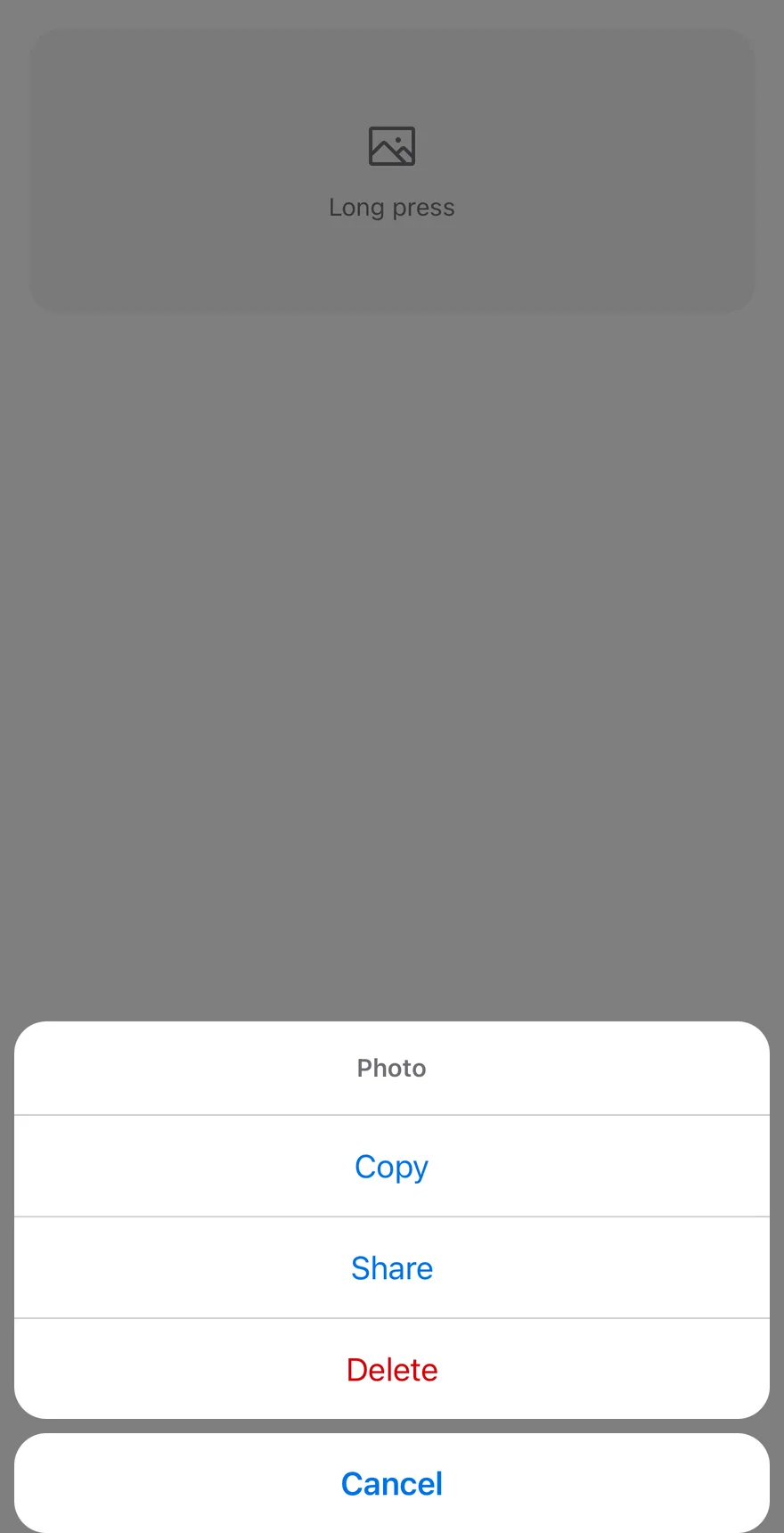
`ContextActions` turns any content into a long-press target. Holding `ContextActionsTrigger` for 500 ms opens an `AlertSheet` with the actions grouped in one block and a separate Cancel button below.

Use it for secondary actions on photos, messages or list rows that should not take up space on screen.

## Installation

**React Native**

```bash title="Terminal"
npx shadcn@latest add @esuiss-rn/context-actions
```

See [Installation](https://ui.suiss.app/docs/installation) for the `components.json` setup. Or use the suiss/ui CLI:

```bash title="Terminal"
npx @esuiss/ui@latest add context-actions
```

**SwiftUI**

```bash title="Terminal"
npx @esuiss/ui@latest add context-actions --platform swift
```

**Jetpack Compose**

```bash title="Terminal"
npx @esuiss/ui@latest add context-actions --platform kotlin
```

The CLI also adds what it builds on: [Alert Sheet](https://ui.suiss.app/docs/components/alert-sheet).

### Manual

**React Native**

**Uniwind**

1. Add the pieces it builds on: [Alert Sheet](https://ui.suiss.app/docs/components/alert-sheet).

2. Copy the source into `components/patterns/context-actions.tsx`:

```tsx title="uniwind/components/patterns/context-actions.tsx"
import * as React from "react"
import { Pressable } from "react-native"
import {
  AlertSheet,
  AlertSheetAction,
  AlertSheetCancel,
  AlertSheetContent,
  AlertSheetGroup,
  AlertSheetHeader,
  AlertSheetTitle,
} from "@/components/ui/alert-sheet"

const LONG_PRESS_DELAY = 500

type ContextActionsContextProps = {
  setOpen: (open: boolean) => void
}

const ContextActionsContext =
  React.createContext<ContextActionsContextProps | null>(null)

function useContextActions() {
  const context = React.useContext(ContextActionsContext)

  if (!context) {
    throw new Error(
      "useContextActions must be used within a <ContextActions />"
    )
  }

  return context
}

function ContextActions({
  onOpenChange,
  dismissible = true,
  children,
}: {
  onOpenChange?: (open: boolean) => void
  dismissible?: boolean
  children?: React.ReactNode
}) {
  const [open, setOpenState] = React.useState(false)

  const setOpen = React.useCallback(
    (next: boolean) => {
      setOpenState(next)
      onOpenChange?.(next)
    },
    [onOpenChange]
  )

  const contextValue = React.useMemo(() => ({ setOpen }), [setOpen])

  return (
    <ContextActionsContext.Provider value={contextValue}>
      <AlertSheet
        open={open}
        onOpenChange={(next) => setOpen(next)}
        dismissible={dismissible}
      >
        {children}
      </AlertSheet>
    </ContextActionsContext.Provider>
  )
}

function ContextActionsTrigger({
  onLongPress,
  onAccessibilityAction,
  accessibilityActions,
  delayLongPress = LONG_PRESS_DELAY,
  ...props
}: React.ComponentProps<typeof Pressable>) {
  const { setOpen } = useContextActions()

  return (
    <Pressable
      accessibilityHint="Long press for actions"
      accessibilityActions={[
        ...(accessibilityActions ?? []),
        { name: "longpress" },
        { name: "showActions", label: "Show actions" },
      ]}
      onAccessibilityAction={(event) => {
        const { actionName } = event.nativeEvent
        if (actionName === "longpress" || actionName === "showActions") {
          setOpen(true)
          return
        }
        onAccessibilityAction?.(event)
      }}
      delayLongPress={delayLongPress}
      onLongPress={(event) => {
        onLongPress?.(event)
        setOpen(true)
      }}
      {...props}
    />
  )
}

function ContextActionsContent({
  cancelLabel = "Cancel",
  children,
  ...props
}: React.ComponentProps<typeof AlertSheetContent> & {
  cancelLabel?: string
}) {
  return (
    <AlertSheetContent {...props}>
      <AlertSheetGroup>{children}</AlertSheetGroup>
      <AlertSheetCancel>{cancelLabel}</AlertSheetCancel>
    </AlertSheetContent>
  )
}

function ContextActionsLabel(
  props: React.ComponentProps<typeof AlertSheetTitle>
) {
  return (
    <AlertSheetHeader>
      <AlertSheetTitle {...props} />
    </AlertSheetHeader>
  )
}

function ContextActionsItem(
  props: React.ComponentProps<typeof AlertSheetAction>
) {
  return <AlertSheetAction {...props} />
}

function ContextActionsSeparator(_props: { className?: string }) {
  return null
}

export {
  ContextActions,
  ContextActionsContent,
  ContextActionsItem,
  ContextActionsLabel,
  ContextActionsSeparator,
  ContextActionsTrigger,
}
```

3. Update the import paths to match your project.

**NativeWind**

1. Add the pieces it builds on: [Alert Sheet](https://ui.suiss.app/docs/components/alert-sheet).

2. Copy the source into `components/patterns/context-actions.tsx`:

```tsx title="nativewind/components/patterns/context-actions.tsx"
import * as React from "react"
import { Pressable } from "react-native"
import {
  AlertSheet,
  AlertSheetAction,
  AlertSheetCancel,
  AlertSheetContent,
  AlertSheetGroup,
  AlertSheetHeader,
  AlertSheetTitle,
} from "@/components/ui/alert-sheet"

const LONG_PRESS_DELAY = 500

type ContextActionsContextProps = {
  setOpen: (open: boolean) => void
}

const ContextActionsContext =
  React.createContext<ContextActionsContextProps | null>(null)

function useContextActions() {
  const context = React.useContext(ContextActionsContext)

  if (!context) {
    throw new Error(
      "useContextActions must be used within a <ContextActions />"
    )
  }

  return context
}

function ContextActions({
  onOpenChange,
  dismissible = true,
  children,
}: {
  onOpenChange?: (open: boolean) => void
  dismissible?: boolean
  children?: React.ReactNode
}) {
  const [open, setOpenState] = React.useState(false)

  const setOpen = React.useCallback(
    (next: boolean) => {
      setOpenState(next)
      onOpenChange?.(next)
    },
    [onOpenChange]
  )

  const contextValue = React.useMemo(() => ({ setOpen }), [setOpen])

  return (
    <ContextActionsContext.Provider value={contextValue}>
      <AlertSheet
        open={open}
        onOpenChange={(next) => setOpen(next)}
        dismissible={dismissible}
      >
        {children}
      </AlertSheet>
    </ContextActionsContext.Provider>
  )
}

function ContextActionsTrigger({
  onLongPress,
  onAccessibilityAction,
  accessibilityActions,
  delayLongPress = LONG_PRESS_DELAY,
  ...props
}: React.ComponentProps<typeof Pressable>) {
  const { setOpen } = useContextActions()

  return (
    <Pressable
      accessibilityHint="Long press for actions"
      accessibilityActions={[
        ...(accessibilityActions ?? []),
        { name: "longpress" },
        { name: "showActions", label: "Show actions" },
      ]}
      onAccessibilityAction={(event) => {
        const { actionName } = event.nativeEvent
        if (actionName === "longpress" || actionName === "showActions") {
          setOpen(true)
          return
        }
        onAccessibilityAction?.(event)
      }}
      delayLongPress={delayLongPress}
      onLongPress={(event) => {
        onLongPress?.(event)
        setOpen(true)
      }}
      {...props}
    />
  )
}

function ContextActionsContent({
  cancelLabel = "Cancel",
  children,
  ...props
}: React.ComponentProps<typeof AlertSheetContent> & {
  cancelLabel?: string
}) {
  return (
    <AlertSheetContent {...props}>
      <AlertSheetGroup>{children}</AlertSheetGroup>
      <AlertSheetCancel>{cancelLabel}</AlertSheetCancel>
    </AlertSheetContent>
  )
}

function ContextActionsLabel(
  props: React.ComponentProps<typeof AlertSheetTitle>
) {
  return (
    <AlertSheetHeader>
      <AlertSheetTitle {...props} />
    </AlertSheetHeader>
  )
}

function ContextActionsItem(
  props: React.ComponentProps<typeof AlertSheetAction>
) {
  return <AlertSheetAction {...props} />
}

function ContextActionsSeparator(_props: { className?: string }) {
  return null
}

export {
  ContextActions,
  ContextActionsContent,
  ContextActionsItem,
  ContextActionsLabel,
  ContextActionsSeparator,
  ContextActionsTrigger,
}
```

3. Update the import paths to match your project.

**StyleSheet**

1. Add the pieces it builds on: [Alert Sheet](https://ui.suiss.app/docs/components/alert-sheet).

2. Copy the source into `components/patterns/context-actions.tsx`:

```tsx title="stylesheet/components/patterns/context-actions.tsx"
import * as React from "react"
import { Pressable, type StyleProp, type ViewStyle } from "react-native"
import {
  AlertSheet,
  AlertSheetAction,
  AlertSheetCancel,
  AlertSheetContent,
  AlertSheetGroup,
  AlertSheetHeader,
  AlertSheetTitle,
} from "@/components/ui/alert-sheet"

const LONG_PRESS_DELAY = 500

type ContextActionsContextProps = {
  setOpen: (open: boolean) => void
}

const ContextActionsContext =
  React.createContext<ContextActionsContextProps | null>(null)

function useContextActions() {
  const context = React.useContext(ContextActionsContext)

  if (!context) {
    throw new Error(
      "useContextActions must be used within a <ContextActions />"
    )
  }

  return context
}

function ContextActions({
  onOpenChange,
  dismissible = true,
  children,
}: {
  onOpenChange?: (open: boolean) => void
  dismissible?: boolean
  children?: React.ReactNode
}) {
  const [open, setOpenState] = React.useState(false)

  const setOpen = React.useCallback(
    (next: boolean) => {
      setOpenState(next)
      onOpenChange?.(next)
    },
    [onOpenChange]
  )

  const contextValue = React.useMemo(() => ({ setOpen }), [setOpen])

  return (
    <ContextActionsContext.Provider value={contextValue}>
      <AlertSheet
        open={open}
        onOpenChange={(next) => setOpen(next)}
        dismissible={dismissible}
      >
        {children}
      </AlertSheet>
    </ContextActionsContext.Provider>
  )
}

function ContextActionsTrigger({
  onLongPress,
  onAccessibilityAction,
  accessibilityActions,
  delayLongPress = LONG_PRESS_DELAY,
  ...props
}: React.ComponentProps<typeof Pressable>) {
  const { setOpen } = useContextActions()

  return (
    <Pressable
      accessibilityHint="Long press for actions"
      accessibilityActions={[
        ...(accessibilityActions ?? []),
        { name: "longpress" },
        { name: "showActions", label: "Show actions" },
      ]}
      onAccessibilityAction={(event) => {
        const { actionName } = event.nativeEvent
        if (actionName === "longpress" || actionName === "showActions") {
          setOpen(true)
          return
        }
        onAccessibilityAction?.(event)
      }}
      delayLongPress={delayLongPress}
      onLongPress={(event) => {
        onLongPress?.(event)
        setOpen(true)
      }}
      {...props}
    />
  )
}

function ContextActionsContent({
  cancelLabel = "Cancel",
  children,
  ...props
}: React.ComponentProps<typeof AlertSheetContent> & {
  cancelLabel?: string
}) {
  return (
    <AlertSheetContent {...props}>
      <AlertSheetGroup>{children}</AlertSheetGroup>
      <AlertSheetCancel>{cancelLabel}</AlertSheetCancel>
    </AlertSheetContent>
  )
}

function ContextActionsLabel(
  props: React.ComponentProps<typeof AlertSheetTitle>
) {
  return (
    <AlertSheetHeader>
      <AlertSheetTitle {...props} />
    </AlertSheetHeader>
  )
}

function ContextActionsItem(
  props: React.ComponentProps<typeof AlertSheetAction>
) {
  return <AlertSheetAction {...props} />
}

function ContextActionsSeparator(_props: { style?: StyleProp<ViewStyle> }) {
  return null
}

export {
  ContextActions,
  ContextActionsContent,
  ContextActionsItem,
  ContextActionsLabel,
  ContextActionsSeparator,
  ContextActionsTrigger,
}
```

3. Update the import paths to match your project.

**SwiftUI**

1. Target iOS 17 or later.

2. Add the Swift package to your app:

```swift title="Package.swift"
.package(url: "https://github.com/phosphor-icons/swift", from: "2.1.0")
```

3. Copy the theme files every view uses:

- `swift/Theme/Theme.swift`: [source](https://github.com/e-suiss/ui/blob/main/packages/mobile/swiftui/Sources/EsuissUI/Theme/Theme.swift)

- `swift/Theme/Tokens.swift`: [source](https://github.com/e-suiss/ui/blob/main/packages/mobile/swiftui/Sources/EsuissUI/Theme/Tokens.swift)

4. Copy the source and every file it uses:

```swift title="swift/Patterns/ContextActions.swift"
import SwiftUI

public struct ContextActions<Label: View, Content: View>: View {
  let dismissible: Bool
  let cancelLabel: LocalizedStringKey
  let onOpenChange: ((Bool) -> Void)?
  let content: () -> Content
  let label: Label

  @State private var open = false
  @State private var lifts = 0
  @CompactLayout private var compact

  public init(
    dismissible: Bool = true,
    cancelLabel: LocalizedStringKey = "Cancel",
    onOpenChange: ((Bool) -> Void)? = nil,
    @ViewBuilder content: @escaping () -> Content,
    @ViewBuilder label: () -> Label
  ) {
    self.dismissible = dismissible
    self.cancelLabel = cancelLabel
    self.onOpenChange = onOpenChange
    self.content = content
    self.label = label()
  }

  public var body: some View {
    if !compact {
      label
        .contextMenu {
          content().environment(\.actionListMode, .menu)
        }
    } else {
      let cancelLabel = cancelLabel
      let content = content
      label
        .contentShape(Rectangle())
        .onLongPressGesture(minimumDuration: 0.5, maximumDistance: 10) {
          lifts += 1
          open = true
        }
        .hapticFeedback(.impact(weight: .medium), trigger: lifts)
        .accessibilityAction(named: Text("Show actions")) { open = true }
        .accessibilityHint(Text("Long press to show actions"))
        .alertSheet(isPresented: $open, dismissible: dismissible) {
          ActionSheetBody(cancelLabel: cancelLabel, content: content)
        }
        .onChange(of: open) { _, value in onOpenChange?(value) }
    }
  }
}

extension View {
  public func contextActions<Content: View>(
    dismissible: Bool = true,
    cancelLabel: LocalizedStringKey = "Cancel",
    onOpenChange: ((Bool) -> Void)? = nil,
    @ViewBuilder content: @escaping () -> Content
  ) -> some View {
    ContextActions(dismissible: dismissible, cancelLabel: cancelLabel, onOpenChange: onOpenChange, content: content) {
      self
    }
  }
}

public typealias ContextActionsItem<Label: View> = ActionBarItem<Label>
public typealias ContextActionsLabel = ActionBarLabel
public typealias ContextActionsSeparator = ActionBarSeparator
```

- `swift/Components/AlertSheet.swift`: see [Alert Sheet](https://ui.suiss.app/docs/components/alert-sheet.md)

- `swift/Components/Button.swift`: see [Button](https://ui.suiss.app/docs/components/button.md)

- `swift/Components/ButtonGroup.swift`: see [Button Group](https://ui.suiss.app/docs/components/button-group.md)

- `swift/Components/ContextMenu.swift`: see [Context Menu](https://ui.suiss.app/docs/components/context-menu.md)

- `swift/Components/Dialog.swift`: see [Dialog](https://ui.suiss.app/docs/components/dialog.md)

- `swift/Components/DropdownMenu.swift`: see [Dropdown Menu](https://ui.suiss.app/docs/components/dropdown-menu.md)

- `swift/Components/Field.swift`: see [Field](https://ui.suiss.app/docs/components/field.md)

- `swift/Components/Haptics.swift`: see [Haptics](https://ui.suiss.app/docs/components/haptics.md)

- `swift/Components/Overlay.swift`: [source](https://github.com/e-suiss/ui/blob/main/packages/mobile/swiftui/Sources/EsuissUI/Components/Overlay.swift)

- `swift/Components/Select.swift`: see [Select](https://ui.suiss.app/docs/components/select.md)

- `swift/Components/Separator.swift`: see [Separator](https://ui.suiss.app/docs/components/separator.md)

- `swift/Components/Sheet.swift`: see [Sheet](https://ui.suiss.app/docs/components/sheet.md)

- `swift/Components/TextVariant.swift`: [source](https://github.com/e-suiss/ui/blob/main/packages/mobile/swiftui/Sources/EsuissUI/Components/TextVariant.swift)

- `swift/Patterns/ActionList.swift`: [source](https://github.com/e-suiss/ui/blob/main/packages/mobile/swiftui/Sources/EsuissUI/Patterns/ActionList.swift)

- `swift/Patterns/Adaptive.swift`: [source](https://github.com/e-suiss/ui/blob/main/packages/mobile/swiftui/Sources/EsuissUI/Patterns/Adaptive.swift)

5. Add the files to your app target.

**Jetpack Compose**

1. Set `minSdk` to 24 or higher and add the dependencies:

```kotlin title="build.gradle.kts"
implementation(platform("androidx.compose:compose-bom:2026.09.00"))
implementation("androidx.compose.foundation:foundation")
implementation("androidx.compose.ui:ui")
implementation("com.adamglin:phosphor-icon-android:1.0.0")
```

2. Copy the theme files every view uses:

- `kotlin/theme/Theme.kt`: [source](https://github.com/e-suiss/ui/blob/main/packages/mobile/kotlin/ui/src/main/kotlin/com/esuiss/ui/theme/Theme.kt)

- `kotlin/theme/Tokens.kt`: [source](https://github.com/e-suiss/ui/blob/main/packages/mobile/kotlin/ui/src/main/kotlin/com/esuiss/ui/theme/Tokens.kt)

3. Copy the source and every file it uses:

```kt title="kotlin/patterns/ContextActions.kt"
package com.esuiss.ui.patterns

import androidx.compose.foundation.layout.Box
import androidx.compose.foundation.layout.BoxScope
import androidx.compose.runtime.Composable
import androidx.compose.runtime.CompositionLocalProvider
import androidx.compose.runtime.getValue
import androidx.compose.runtime.mutableStateOf
import androidx.compose.runtime.remember
import androidx.compose.runtime.rememberUpdatedState
import androidx.compose.runtime.setValue
import androidx.compose.runtime.staticCompositionLocalOf
import androidx.compose.ui.Modifier
import androidx.compose.ui.graphics.vector.ImageVector
import androidx.compose.ui.hapticfeedback.HapticFeedbackType
import androidx.compose.ui.semantics.onLongClick
import androidx.compose.ui.semantics.semantics
import com.esuiss.ui.components.AlertSheetAction
import com.esuiss.ui.components.MenuItemVariant
import com.esuiss.ui.components.rememberHaptics
import com.esuiss.ui.components.rememberLongPressModifier

private val LocalContextActions = staticCompositionLocalOf<SheetMenuState?> { null }

@Composable
fun ContextActions(
    onOpenChange: (Boolean) -> Unit = {},
    dismissible: Boolean = true,
    content: @Composable () -> Unit,
) {
    var open by remember { mutableStateOf(false) }
    val notify by rememberUpdatedState(onOpenChange)
    val setOpen: (Boolean) -> Unit = remember {
        { next ->
            open = next
            notify(next)
        }
    }
    CompositionLocalProvider(
        LocalContextActions provides SheetMenuState(open, setOpen, dismissible),
        content = content,
    )
}

@Composable
fun ContextActionsTrigger(
    modifier: Modifier = Modifier,
    enabled: Boolean = true,
    label: String = "Show actions",
    content: @Composable BoxScope.() -> Unit,
) {
    val state = LocalContextActions.current
    val haptics = rememberHaptics()
    val show = {
        if (state != null) {
            haptics.perform(HapticFeedbackType.LongPress)
            state.onOpenChange(true)
        }
    }
    Box(
        modifier = modifier
            .then(rememberLongPressModifier(enabled && state != null) { show() })
            .semantics {
                if (enabled && state != null) {
                    onLongClick(label = label) {
                        state.onOpenChange(true)
                        true
                    }
                }
            },
        content = content,
    )
}

@Composable
fun ContextActionsContent(
    modifier: Modifier = Modifier,
    cancelLabel: String = "Cancel",
    content: @Composable () -> Unit,
) {
    SheetMenuContent(LocalContextActions.current, cancelLabel, modifier, content)
}

@Composable
fun ContextActionsLabel(text: String, modifier: Modifier = Modifier) {
    SheetMenuLabel(text, modifier)
}

@Composable
fun ContextActionsItem(
    text: String,
    onClick: () -> Unit,
    modifier: Modifier = Modifier,
    variant: MenuItemVariant = MenuItemVariant.Default,
    enabled: Boolean = true,
    icon: ImageVector? = null,
) {
    AlertSheetAction(text, onClick, modifier, variant.toSheetVariant(), enabled, icon)
}

@Composable
fun ContextActionsSeparator() {
}
```

- `kotlin/components/AlertSheet.kt`: see [Alert Sheet](https://ui.suiss.app/docs/components/alert-sheet.md)

- `kotlin/components/Button.kt`: see [Button](https://ui.suiss.app/docs/components/button.md)

- `kotlin/components/ButtonGroup.kt`: see [Button Group](https://ui.suiss.app/docs/components/button-group.md)

- `kotlin/components/Checkbox.kt`: see [Checkbox](https://ui.suiss.app/docs/components/checkbox.md)

- `kotlin/components/Content.kt`: [source](https://github.com/e-suiss/ui/blob/main/packages/mobile/kotlin/ui/src/main/kotlin/com/esuiss/ui/components/Content.kt)

- `kotlin/components/DropdownMenu.kt`: see [Dropdown Menu](https://ui.suiss.app/docs/components/dropdown-menu.md)

- `kotlin/components/Field.kt`: see [Field](https://ui.suiss.app/docs/components/field.md)

- `kotlin/components/FormSupport.kt`: [source](https://github.com/e-suiss/ui/blob/main/packages/mobile/kotlin/ui/src/main/kotlin/com/esuiss/ui/components/FormSupport.kt)

- `kotlin/components/Haptics.kt`: see [Haptics](https://ui.suiss.app/docs/components/haptics.md)

- `kotlin/components/Icon.kt`: see [Icon](https://ui.suiss.app/docs/components/icon.md)

- `kotlin/components/Label.kt`: see [Label](https://ui.suiss.app/docs/components/label.md)

- `kotlin/components/Overlay.kt`: [source](https://github.com/e-suiss/ui/blob/main/packages/mobile/kotlin/ui/src/main/kotlin/com/esuiss/ui/components/Overlay.kt)

- `kotlin/components/Separator.kt`: see [Separator](https://ui.suiss.app/docs/components/separator.md)

- `kotlin/patterns/ActionList.kt`: [source](https://github.com/e-suiss/ui/blob/main/packages/mobile/kotlin/ui/src/main/kotlin/com/esuiss/ui/patterns/ActionList.kt)

4. Update the `com.esuiss.ui` package names to match your project.

## Usage

```tsx
import { ContextActions, ContextActionsTrigger, ContextActionsContent, ContextActionsLabel, ContextActionsItem, ContextActionsSeparator } from "@/components/patterns/context-actions"
```

```tsx
<ContextActions>
  <ContextActionsTrigger
    accessibilityLabel="Photo"
    className="h-40 items-center justify-center gap-2 rounded-2xl bg-muted active:opacity-80"
  >
    <Icon as={ImageIcon} className="size-8 text-muted-foreground" />
    <Text className="text-sm text-muted-foreground">Long press</Text>
  </ContextActionsTrigger>
  <ContextActionsContent>
    <ContextActionsLabel>Photo</ContextActionsLabel>
    <ContextActionsItem>Copy</ContextActionsItem>
    <ContextActionsItem>Share</ContextActionsItem>
    <ContextActionsItem variant="destructive">Delete</ContextActionsItem>
  </ContextActionsContent>
</ContextActions>
```

Wrap the target in `ContextActionsTrigger` and list `ContextActionsItem`s in `ContextActionsContent`. Add a `ContextActionsLabel` first to show a title.

The open state is managed internally; use `onOpenChange` to react to it. `ContextActionsTrigger` accepts every `Pressable` prop, so `onPress` still works for a normal tap, and your own `onLongPress` runs before the sheet opens. Change the hold time with `delayLongPress`.

## Examples

### Inline

A small message bubble as the trigger, with a custom `cancelLabel`.

![Preview](https://ui.suiss.app/previews/patterns-context-actions--inline.light.webp)

```tsx
import { View } from "react-native"
import { ContextActions, ContextActionsContent, ContextActionsItem, ContextActionsTrigger } from "@/components/patterns/context-actions"
import { Text } from "@/components/ui/text"

export function ContextActionsInlineExample() {
  return (
    <View className="items-start">
      <ContextActions>
        <ContextActionsTrigger className="rounded-lg bg-secondary px-3 py-2">
          <Text>Hold this message</Text>
        </ContextActionsTrigger>
        <ContextActionsContent cancelLabel="Close">
          <ContextActionsItem>Reply</ContextActionsItem>
          <ContextActionsItem>Forward</ContextActionsItem>
        </ContextActionsContent>
      </ContextActions>
    </View>
  )
}
```

```swift
import EsuissUI
import SwiftUI

struct ContextActionsInlineExample: View {
  var body: some View {
    ContextActions(cancelLabel: "Close") {
      ContextActionsItem("Reply") {}
      ContextActionsItem("Forward") {}
    } label: {
      Text("Hold this message")
        .textStyle(.base)
        .foregroundStyle(EsuissColor.foreground)
        .padding(.horizontal, 12)
        .padding(.vertical, 8)
        .background(EsuissColor.secondary, in: RoundedRectangle(cornerRadius: Radius.lg, style: .continuous))
    }
  }
}
```

```kotlin
import androidx.compose.foundation.background
import androidx.compose.foundation.layout.Column
import androidx.compose.foundation.layout.padding
import androidx.compose.foundation.shape.RoundedCornerShape
import androidx.compose.runtime.Composable
import androidx.compose.ui.Modifier
import androidx.compose.ui.draw.clip
import androidx.compose.ui.unit.dp
import com.esuiss.ui.components.Text
import com.esuiss.ui.patterns.ContextActions
import com.esuiss.ui.patterns.ContextActionsContent
import com.esuiss.ui.patterns.ContextActionsItem
import com.esuiss.ui.patterns.ContextActionsTrigger
import com.esuiss.ui.theme.EsuissTheme
import com.esuiss.ui.theme.Radius

@Composable
fun ContextActionsInline() {
    val shape = RoundedCornerShape(Radius.lg)
    Column {
        ContextActions {
            ContextActionsTrigger(
                modifier = Modifier
                    .clip(shape)
                    .background(EsuissTheme.colors.secondary, shape)
                    .padding(horizontal = 12.dp, vertical = 8.dp),
            ) {
                Text("Hold this message")
            }
            ContextActionsContent(cancelLabel = "Close") {
                ContextActionsItem("Reply", onClick = {})
                ContextActionsItem("Forward", onClick = {})
            }
        }
    }
}
```

## API Reference

### ContextActions

The root that owns the open state.

| Prop | Type | Default | Description |
| --- | --- | --- | --- |
| `onOpenChange` | `(open: boolean) => void` | - | Called when the sheet opens or closes. |
| `dismissible` | `boolean` | `true` | When `false`, the sheet ignores outside presses. Defaults to `true`. |
| `children` | `React.ReactNode` | - |  |

### ContextActionsTrigger

A `Pressable` that opens the sheet on long press.

Also accepts the props of `React.ComponentProps<typeof Pressable>`.

### ContextActionsContent

The sheet with the grouped items and a Cancel button.

| Prop | Type | Default | Description |
| --- | --- | --- | --- |
| `cancelLabel` | `string` | `"Cancel"` | Text of the Cancel button. Defaults to `Cancel`. |

Also accepts the props of `React.ComponentProps<typeof AlertSheetContent>`.

### ContextActionsLabel

A title shown at the top of the group.

Also accepts the props of `React.ComponentProps<typeof AlertSheetTitle>`.

### ContextActionsItem

An actionable entry, rendered as an `AlertSheetAction`.

Also accepts the props of `React.ComponentProps<typeof AlertSheetAction>`.

### ContextActionsSeparator

Kept for API parity; renders nothing.

| Prop | Type | Default | Description |
| --- | --- | --- | --- |
| `className` | `string` | - |  |

## Accessibility

- The trigger has the hint "Long press for actions".
- It adds `longpress` and `showActions` ("Show actions") accessibility actions, so screen reader users can open the sheet without holding.
- Your own `accessibilityActions` and `onAccessibilityAction` are kept.

## Notes

- Item text uses `text-primary`, or `text-destructive` for the `destructive` variant.
- On iOS the sheet renders in a full-window overlay so it appears above native screens.

