# Confirm
A confirmation prompt that opens as an alert dialog on desktop and an action sheet on mobile.
Confirm is an open-source pattern from suiss/ui for React, React Native, SwiftUI and Jetpack Compose. The @esuiss/ui CLI copies its source into your project, so you own the code.
Source: https://ui.suiss.app/docs/patterns/confirm
**React**
**Example**
```tsx
import {
Confirm,
ConfirmAction,
ConfirmCancel,
ConfirmContent,
ConfirmDescription,
ConfirmFooter,
ConfirmHeader,
ConfirmTitle,
ConfirmTrigger,
} from "@/components/patterns/confirm"
import { Button } from "@/components/ui/button"
export default function ConfirmDemo() {
return (
}>
Delete order
Delete order?
Order #1042 will be permanently deleted. This action cannot be
undone.
Cancel
Delete
)
}
```
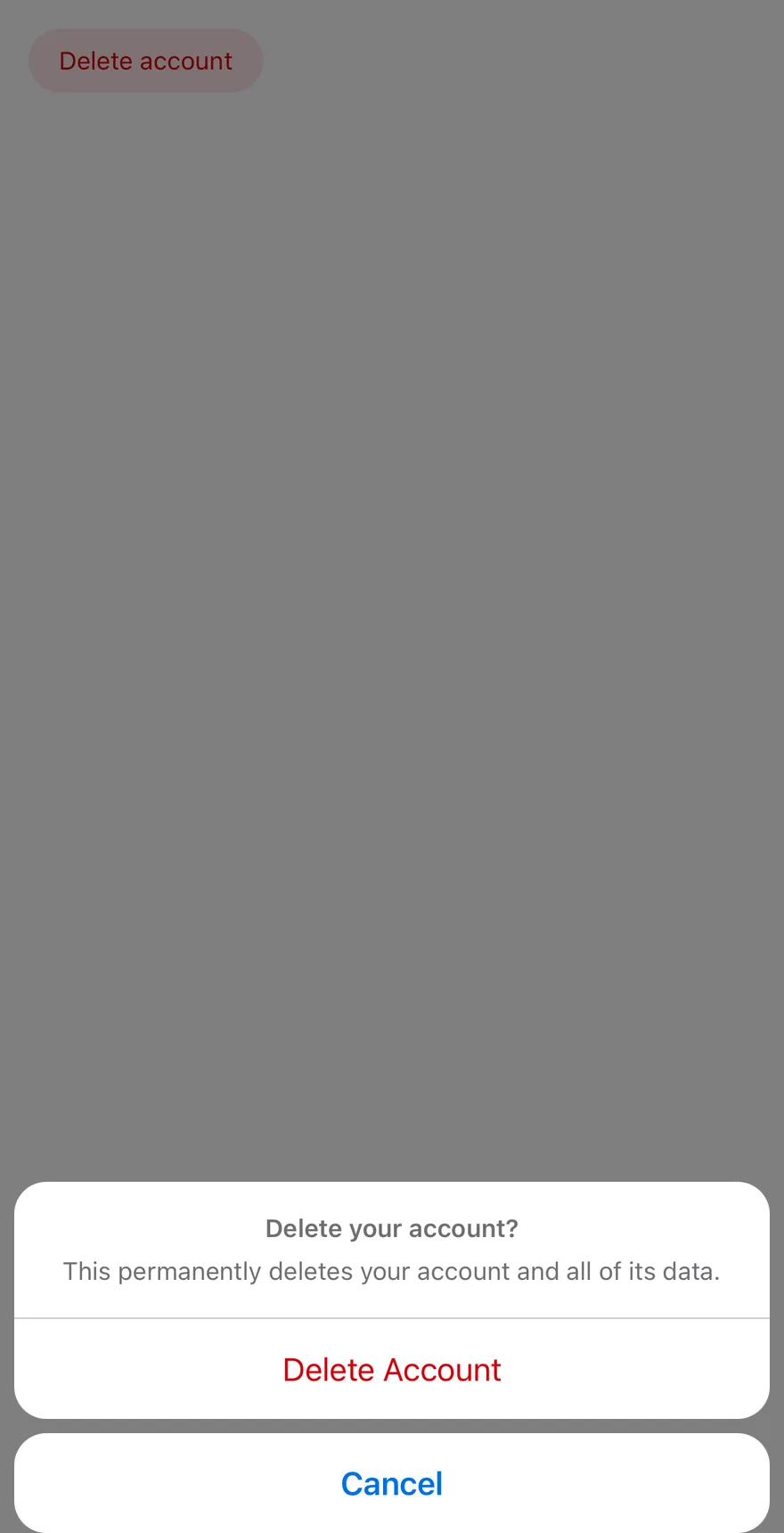
`Confirm` asks the user to confirm or cancel an action. On desktop it renders an `AlertDialog` with a header and a footer of buttons. Below the `48rem` breakpoint it renders an `AlertSheet`: `ConfirmContent` lifts the buttons out of `ConfirmFooter`, places the title, description and actions in one grouped card, and moves `ConfirmCancel` into its own button below the card.
Use it before destructive or irreversible actions, such as deleting a record, where the user must make an explicit choice.
## Installation
### CLI
```bash title="Terminal"
npx shadcn@latest add @esuiss/confirm
```
Works in any project with a `components.json`. See [Installation](https://ui.suiss.app/docs/installation#add-components) for the one-line registry setup. Or use the suiss/ui CLI:
```bash title="Terminal"
npx @esuiss/ui@latest add patterns confirm
```
### Manual
1. Add the pieces it builds on: [Alert Dialog](https://ui.suiss.app/docs/components/alert-dialog), [Alert Sheet](https://ui.suiss.app/docs/components/alert-sheet), `use-mobile`.
2. Copy the source into `components/patterns/confirm.tsx`:
```tsx title="components/patterns/confirm.tsx"
"use client"
import * as React from "react"
import {
AlertDialog,
AlertDialogAction,
AlertDialogCancel,
AlertDialogContent,
AlertDialogDescription,
AlertDialogFooter,
AlertDialogHeader,
AlertDialogTitle,
AlertDialogTrigger,
} from "@/components/ui/alert-dialog"
import {
AlertSheet,
AlertSheetAction,
AlertSheetCancel,
AlertSheetContent,
AlertSheetDescription,
AlertSheetGroup,
AlertSheetHeader,
AlertSheetTitle,
AlertSheetTrigger,
} from "@/components/ui/alert-sheet"
import { useIsMobile } from "@/hooks/use-mobile"
type ConfirmContextProps = {
isMobile: boolean
}
const ConfirmContext = React.createContext(null)
function useConfirm() {
const context = React.useContext(ConfirmContext)
if (!context) {
throw new Error("useConfirm must be used within a ")
}
return context
}
function Confirm({
dismissible = false,
...props
}: React.ComponentProps) {
const isMobile = useIsMobile()
return (
{isMobile ? (
) : (
)}
)
}
function ConfirmTrigger(
props: React.ComponentProps
) {
const { isMobile } = useConfirm()
const Trigger = isMobile ? AlertSheetTrigger : AlertDialogTrigger
return
}
function ConfirmContent({
size,
children,
...props
}: React.ComponentProps) {
const { isMobile } = useConfirm()
if (!isMobile) {
return (
{children}
)
}
const nodes = React.Children.toArray(children)
const footer = nodes.find(
(node): node is React.ReactElement<{ children?: React.ReactNode }> =>
React.isValidElement(node) && node.type === ConfirmFooter
)
const buttons = React.Children.toArray(footer?.props.children)
const isCancel = (node: React.ReactNode) =>
React.isValidElement(node) && node.type === ConfirmCancel
return (
{nodes.filter((node) => node !== footer)}
{buttons.filter((node) => !isCancel(node))}
{buttons.filter(isCancel)}
)
}
function ConfirmHeader(props: React.ComponentProps<"div">) {
const { isMobile } = useConfirm()
const Header = isMobile ? AlertSheetHeader : AlertDialogHeader
return
}
function ConfirmFooter(props: React.ComponentProps<"div">) {
return
}
function ConfirmTitle(props: React.ComponentProps) {
const { isMobile } = useConfirm()
const Title = isMobile ? AlertSheetTitle : AlertDialogTitle
return
}
function ConfirmDescription(
props: React.ComponentProps
) {
const { isMobile } = useConfirm()
const Description = isMobile ? AlertSheetDescription : AlertDialogDescription
return
}
function ConfirmAction(props: React.ComponentProps) {
const { isMobile } = useConfirm()
const Action = isMobile ? AlertSheetAction : AlertDialogAction
return
}
function ConfirmCancel(props: React.ComponentProps) {
const { isMobile } = useConfirm()
const Cancel = isMobile ? AlertSheetCancel : AlertDialogCancel
return
}
export {
Confirm,
ConfirmAction,
ConfirmCancel,
ConfirmContent,
ConfirmDescription,
ConfirmFooter,
ConfirmHeader,
ConfirmTitle,
ConfirmTrigger,
}
```
3. Update the import paths to match your project.
## Usage
```tsx
import { Confirm, ConfirmTrigger, ConfirmContent, ConfirmHeader, ConfirmFooter, ConfirmTitle, ConfirmDescription, ConfirmAction, ConfirmCancel } from "@/components/patterns/confirm"
```
```tsx
}>
Delete order
Delete order?
Order #1042 will be permanently deleted. This action cannot be
undone.
Cancel
Delete
```
Write the content once with the desktop structure: `ConfirmHeader` holding `ConfirmTitle` and `ConfirmDescription`, then `ConfirmFooter` holding `ConfirmCancel` and `ConfirmAction`. Keep `ConfirmCancel` and `ConfirmAction` as direct children of `ConfirmFooter` so the mobile layout can find them. `Confirm` accepts `open`, `defaultOpen` and `onOpenChange` for controlled or uncontrolled use. The mobile sheet is not dismissible by default; pass `dismissible` to let an outside press close it.
## Examples
### Dismissible
Sets `dismissible` so the mobile sheet also closes when the user presses outside it.
**Example**
```tsx
import {
Confirm,
ConfirmAction,
ConfirmCancel,
ConfirmContent,
ConfirmDescription,
ConfirmFooter,
ConfirmHeader,
ConfirmTitle,
ConfirmTrigger,
} from "@/components/patterns/confirm"
import { Button } from "@/components/ui/button"
export default function ConfirmDismissible() {
return (
}>
Delete order
Delete order?
Order #1042 will be permanently deleted. This action cannot be
undone.
Cancel
Delete
)
}
```
## API Reference
- `Confirm`
- `ConfirmTrigger`
- `ConfirmContent`
- `ConfirmHeader`
- `ConfirmTitle`
- `ConfirmDescription`
- `ConfirmFooter`
- `ConfirmCancel`
- `ConfirmAction`
### Confirm
The root that renders an `AlertDialog` on desktop and an `AlertSheet` on mobile.
Also accepts the props of `React.ComponentProps`.
### ConfirmTrigger
The button that opens the confirmation.
Also accepts the props of `React.ComponentProps`.
### ConfirmContent
The popup; on mobile it regroups the footer buttons into the sheet layout.
Also accepts the props of `React.ComponentProps`.
### ConfirmHeader
Groups the title and description.
Also accepts the props of `React.ComponentProps<"div">`.
### ConfirmFooter
Holds the cancel and action buttons on desktop; on mobile its buttons are moved into the sheet.
Also accepts the props of `React.ComponentProps<"div">`.
### ConfirmTitle
The prompt's title, used as the dialog's accessible name.
Also accepts the props of `React.ComponentProps`.
### ConfirmDescription
Supporting text, used as the dialog's accessible description.
Also accepts the props of `React.ComponentProps`.
### ConfirmAction
A button that performs the action and closes the prompt.
Also accepts the props of `React.ComponentProps`.
### ConfirmCancel
A button that closes the prompt without acting; shown separately below the actions on mobile.
Also accepts the props of `React.ComponentProps`.
## Accessibility
- The popup has the `alertdialog` role, named by `ConfirmTitle` and described by `ConfirmDescription`. On mobile with `dismissible` set, it has the `dialog` role instead.
- Opening moves focus into the dialog, and closing returns it to the trigger.
- On desktop, pressing outside does not close the dialog; `Escape`, Cancel or an action does.
## Notes
Parts carry `data-slot` values from `confirm` through `confirm-cancel`. Pass `variant="destructive"` to `ConfirmAction` for destructive actions. The `size` prop of `ConfirmContent` applies to the desktop `AlertDialogContent` only.
**React Native, SwiftUI, Jetpack Compose**
```tsx
import { View } from "react-native"
import { Confirm, ConfirmAction, ConfirmCancel, ConfirmContent, ConfirmDescription, ConfirmFooter, ConfirmHeader, ConfirmTitle, ConfirmTrigger } from "@/components/patterns/confirm"
import { Button } from "@/components/ui/button"
import { Text } from "@/components/ui/text"
function ConfirmDemo({ defaultOpen }: { defaultOpen?: boolean }) {
return (
}>
Delete account
Delete your account?
This permanently deletes your account and all of its data.
Cancel
Delete Account
)
}
export function ConfirmOpenByDefaultExample() {
return (
)
}
```
```swift
import EsuissUI
import SwiftUI
struct ConfirmOpenByDefaultExample: View {
var body: some View {
ConfirmDemo(open: true)
}
}
struct ConfirmDemo: View {
@State private var open: Bool
init(open: Bool) {
_open = State(initialValue: open)
}
var body: some View {
Button("Delete account") { open = true }
.buttonStyle(.variant(.destructive))
.confirm(isPresented: $open) {
ConfirmContent {
ConfirmHeader {
ConfirmTitle("Delete your account?")
ConfirmDescription("This permanently deletes your account and all of its data.")
}
ConfirmFooter {
ConfirmCancel("Cancel")
ConfirmAction("Delete Account", variant: .destructive)
}
}
}
}
}
```
```kotlin
import androidx.compose.foundation.layout.Column
import androidx.compose.runtime.Composable
import androidx.compose.runtime.getValue
import androidx.compose.runtime.mutableStateOf
import androidx.compose.runtime.saveable.rememberSaveable
import androidx.compose.runtime.setValue
import com.esuiss.ui.components.AlertSheetActionVariant
import com.esuiss.ui.components.Button
import com.esuiss.ui.components.ButtonVariant
import com.esuiss.ui.patterns.Confirm
import com.esuiss.ui.patterns.ConfirmAction
import com.esuiss.ui.patterns.ConfirmCancel
import com.esuiss.ui.patterns.ConfirmDescription
import com.esuiss.ui.patterns.ConfirmFooter
import com.esuiss.ui.patterns.ConfirmHeader
import com.esuiss.ui.patterns.ConfirmTitle
@Composable
fun ConfirmOpenByDefaultExample() {
ConfirmDemo(defaultOpen = true)
}
@Composable
fun ConfirmDemo(defaultOpen: Boolean) {
var open by rememberSaveable { mutableStateOf(defaultOpen) }
Column {
Button("Delete account", onClick = { open = true }, variant = ButtonVariant.Destructive)
Confirm(open = open, onOpenChange = { open = it }) {
ConfirmHeader {
ConfirmTitle("Delete your account?")
ConfirmDescription("This permanently deletes your account and all of its data.")
}
ConfirmFooter {
ConfirmCancel("Cancel")
ConfirmAction("Delete Account", onClick = {}, variant = AlertSheetActionVariant.Destructive)
}
}
}
}
```
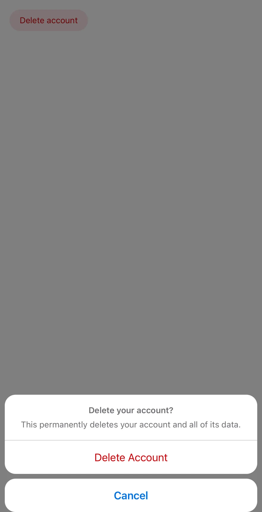
`Confirm` wraps `AlertSheet` with `dismissible` set to `false` by default, so the sheet closes only through one of its buttons.
`ConfirmContent` rearranges its children: the header and every non-cancel button from `ConfirmFooter` go into one rounded group, and `ConfirmCancel` is placed below it as a separate button. Use it before destructive or irreversible actions.
## Installation
**React Native**
```bash title="Terminal"
npx shadcn@latest add @esuiss-rn/confirm
```
See [Installation](https://ui.suiss.app/docs/installation) for the `components.json` setup. Or use the suiss/ui CLI:
```bash title="Terminal"
npx @esuiss/ui@latest add confirm
```
**SwiftUI**
```bash title="Terminal"
npx @esuiss/ui@latest add confirm --platform swift
```
**Jetpack Compose**
```bash title="Terminal"
npx @esuiss/ui@latest add confirm --platform kotlin
```
The CLI also adds what it builds on: [Alert Sheet](https://ui.suiss.app/docs/components/alert-sheet).
### Manual
**React Native**
**Uniwind**
1. Install the dependencies:
```bash title="Terminal"
npx expo install cn
```
2. Add the pieces it builds on: [Alert Sheet](https://ui.suiss.app/docs/components/alert-sheet).
3. Copy the source into `components/patterns/confirm.tsx`:
```tsx title="uniwind/components/patterns/confirm.tsx"
import { cn } from "cn"
import * as React from "react"
import { View, type ViewProps } from "react-native"
import {
AlertSheet,
AlertSheetAction,
AlertSheetCancel,
AlertSheetContent,
AlertSheetDescription,
AlertSheetGroup,
AlertSheetHeader,
AlertSheetTitle,
AlertSheetTrigger,
} from "@/components/ui/alert-sheet"
function Confirm({
dismissible = false,
...props
}: React.ComponentProps) {
return
}
function ConfirmTrigger(props: React.ComponentProps) {
return
}
function ConfirmContent({
children,
...props
}: React.ComponentProps) {
const nodes = React.Children.toArray(children)
const footer = nodes.find(
(node): node is React.ReactElement<{ children?: React.ReactNode }> =>
React.isValidElement(node) && node.type === ConfirmFooter
)
const buttons = React.Children.toArray(footer?.props.children)
const isCancel = (node: React.ReactNode) =>
React.isValidElement(node) && node.type === ConfirmCancel
return (
{nodes.filter((node) => node !== footer)}
{buttons.filter((node) => !isCancel(node))}
{buttons.filter(isCancel)}
)
}
function ConfirmHeader(props: React.ComponentProps) {
return
}
function ConfirmFooter({ className, ...props }: ViewProps) {
return
}
function ConfirmTitle(props: React.ComponentProps) {
return
}
function ConfirmDescription(
props: React.ComponentProps
) {
return
}
function ConfirmAction(props: React.ComponentProps) {
return
}
function ConfirmCancel(props: React.ComponentProps) {
return
}
export {
Confirm,
ConfirmAction,
ConfirmCancel,
ConfirmContent,
ConfirmDescription,
ConfirmFooter,
ConfirmHeader,
ConfirmTitle,
ConfirmTrigger,
}
```
4. Update the import paths to match your project.
**NativeWind**
1. Install the dependencies:
```bash title="Terminal"
npx expo install cn
```
2. Add the pieces it builds on: [Alert Sheet](https://ui.suiss.app/docs/components/alert-sheet).
3. Copy the source into `components/patterns/confirm.tsx`:
```tsx title="nativewind/components/patterns/confirm.tsx"
import { cn } from "cn"
import * as React from "react"
import { View, type ViewProps } from "react-native"
import {
AlertSheet,
AlertSheetAction,
AlertSheetCancel,
AlertSheetContent,
AlertSheetDescription,
AlertSheetGroup,
AlertSheetHeader,
AlertSheetTitle,
AlertSheetTrigger,
} from "@/components/ui/alert-sheet"
function Confirm({
dismissible = false,
...props
}: React.ComponentProps) {
return
}
function ConfirmTrigger(props: React.ComponentProps) {
return
}
function ConfirmContent({
children,
...props
}: React.ComponentProps) {
const nodes = React.Children.toArray(children)
const footer = nodes.find(
(node): node is React.ReactElement<{ children?: React.ReactNode }> =>
React.isValidElement(node) && node.type === ConfirmFooter
)
const buttons = React.Children.toArray(footer?.props.children)
const isCancel = (node: React.ReactNode) =>
React.isValidElement(node) && node.type === ConfirmCancel
return (
{nodes.filter((node) => node !== footer)}
{buttons.filter((node) => !isCancel(node))}
{buttons.filter(isCancel)}
)
}
function ConfirmHeader(props: React.ComponentProps) {
return
}
function ConfirmFooter({ className, ...props }: ViewProps) {
return
}
function ConfirmTitle(props: React.ComponentProps) {
return
}
function ConfirmDescription(
props: React.ComponentProps
) {
return
}
function ConfirmAction(props: React.ComponentProps) {
return
}
function ConfirmCancel(props: React.ComponentProps) {
return
}
export {
Confirm,
ConfirmAction,
ConfirmCancel,
ConfirmContent,
ConfirmDescription,
ConfirmFooter,
ConfirmHeader,
ConfirmTitle,
ConfirmTrigger,
}
```
4. Update the import paths to match your project.
**StyleSheet**
1. Add the pieces it builds on: [Alert Sheet](https://ui.suiss.app/docs/components/alert-sheet).
2. Copy the source into `components/patterns/confirm.tsx`:
```tsx title="stylesheet/components/patterns/confirm.tsx"
import * as React from "react"
import { View, type ViewProps } from "react-native"
import {
AlertSheet,
AlertSheetAction,
AlertSheetCancel,
AlertSheetContent,
AlertSheetDescription,
AlertSheetGroup,
AlertSheetHeader,
AlertSheetTitle,
AlertSheetTrigger,
} from "@/components/ui/alert-sheet"
function Confirm({
dismissible = false,
...props
}: React.ComponentProps) {
return
}
function ConfirmTrigger(props: React.ComponentProps) {
return
}
function ConfirmContent({
children,
...props
}: React.ComponentProps) {
const nodes = React.Children.toArray(children)
const footer = nodes.find(
(node): node is React.ReactElement<{ children?: React.ReactNode }> =>
React.isValidElement(node) && node.type === ConfirmFooter
)
const buttons = React.Children.toArray(footer?.props.children)
const isCancel = (node: React.ReactNode) =>
React.isValidElement(node) && node.type === ConfirmCancel
return (
{nodes.filter((node) => node !== footer)}
{buttons.filter((node) => !isCancel(node))}
{buttons.filter(isCancel)}
)
}
function ConfirmHeader(props: React.ComponentProps) {
return
}
function ConfirmFooter({ style, ...props }: ViewProps) {
return (
)
}
function ConfirmTitle(props: React.ComponentProps) {
return
}
function ConfirmDescription(
props: React.ComponentProps
) {
return
}
function ConfirmAction(props: React.ComponentProps) {
return
}
function ConfirmCancel(props: React.ComponentProps) {
return
}
export {
Confirm,
ConfirmAction,
ConfirmCancel,
ConfirmContent,
ConfirmDescription,
ConfirmFooter,
ConfirmHeader,
ConfirmTitle,
ConfirmTrigger,
}
```
3. Update the import paths to match your project.
**SwiftUI**
1. Target iOS 17 or later.
2. Add the Swift package to your app:
```swift title="Package.swift"
.package(url: "https://github.com/phosphor-icons/swift", from: "2.1.0")
```
3. Copy the theme files every view uses:
- `swift/Theme/Theme.swift`: [source](https://github.com/e-suiss/ui/blob/main/packages/mobile/swiftui/Sources/EsuissUI/Theme/Theme.swift)
- `swift/Theme/Tokens.swift`: [source](https://github.com/e-suiss/ui/blob/main/packages/mobile/swiftui/Sources/EsuissUI/Theme/Tokens.swift)
4. Copy the source and every file it uses:
```swift title="swift/Patterns/Confirm.swift"
import SwiftUI
extension View {
public func confirm(
isPresented: Binding,
dismissible: Bool = false,
@ViewBuilder content: @escaping () -> Content
) -> some View {
modifier(ConfirmPresenter(isPresented: isPresented, dismissible: dismissible, content: content))
}
}
struct ConfirmPresenter: ViewModifier {
@Binding var isPresented: Bool
let dismissible: Bool
@ViewBuilder let content: () -> Body
@CompactLayout private var compact
func body(content host: Content) -> some View {
let compact = self.compact
host.modifier(
CoverPresenter(
isPresented: $isPresented,
enter: compact ? .timingCurve(0.32, 0.72, 0, 1, duration: 0.3) : .easeOut(duration: 0.15),
exit: compact ? .timingCurve(0.32, 0.72, 0, 1, duration: 0.25) : .easeIn(duration: 0.1)
) { visible in
Group {
if compact {
AlertSheetStage(visible: visible, dismissible: dismissible, content: content)
} else {
CenteredStage(visible: visible, dismissible: dismissible, content: content)
}
}
.environment(\.patternCompact, compact)
}
)
}
}
struct ConfirmCancelEntry: Equatable {
let title: LocalizedStringKey
let action: (() -> Void)?
static func == (lhs: ConfirmCancelEntry, rhs: ConfirmCancelEntry) -> Bool {
lhs.title == rhs.title
}
}
struct ConfirmCancelKey: PreferenceKey {
static var defaultValue: ConfirmCancelEntry? { nil }
static func reduce(value: inout ConfirmCancelEntry?, nextValue: () -> ConfirmCancelEntry?) {
value = value ?? nextValue()
}
}
public struct ConfirmContent: View {
let size: AlertDialogContent.Size
let content: Content
@State private var cancel: ConfirmCancelEntry?
@CompactLayout private var compact
public init(size: AlertDialogContent.Size = .default, @ViewBuilder content: () -> Content) {
self.size = size
self.content = content()
}
public var body: some View {
if !compact {
AlertDialogContent(size: size) { content }
} else {
AlertSheetContent {
AlertSheetGroup { content }
if let cancel {
AlertSheetCancel(cancel.title, action: cancel.action)
}
}
.onPreferenceChange(ConfirmCancelKey.self) { cancel = $0 }
}
}
}
public struct ConfirmHeader: View {
let content: Content
@CompactLayout private var compact
public init(@ViewBuilder content: () -> Content) {
self.content = content()
}
public var body: some View {
if !compact {
AlertDialogHeader { content }
} else {
AlertSheetHeader { content }
}
}
}
public struct ConfirmTitle: View {
let title: LocalizedStringKey
@CompactLayout private var compact
public init(_ title: LocalizedStringKey) {
self.title = title
}
public var body: some View {
if !compact {
AlertDialogTitle(title)
} else {
AlertSheetTitle(title)
}
}
}
public struct ConfirmDescription: View {
let description: LocalizedStringKey
@CompactLayout private var compact
public init(_ description: LocalizedStringKey) {
self.description = description
}
public var body: some View {
if !compact {
AlertDialogDescription(description)
} else {
AlertSheetDescription(description)
}
}
}
public struct ConfirmFooter: View {
let content: Content
@CompactLayout private var compact
public init(@ViewBuilder content: () -> Content) {
self.content = content()
}
public var body: some View {
if !compact {
AlertDialogFooter { content }
} else {
SeparatedStack { content }
}
}
}
public struct ConfirmAction: View {
let title: LocalizedStringKey
let variant: AlertSheetActionVariant
let action: (() -> Void)?
@CompactLayout private var compact
public init(
_ title: LocalizedStringKey,
variant: AlertSheetActionVariant = .default,
action: (() -> Void)? = nil
) {
self.title = title
self.variant = variant
self.action = action
}
public var body: some View {
if !compact {
AlertDialogAction(title, variant: variant == .destructive ? .destructive : .default, action: action)
} else {
AlertSheetAction(title, variant: variant, action: action)
}
}
}
public struct ConfirmCancel: View {
let title: LocalizedStringKey
let action: (() -> Void)?
@CompactLayout private var compact
public init(_ title: LocalizedStringKey = "Cancel", action: (() -> Void)? = nil) {
self.title = title
self.action = action
}
public var body: some View {
if !compact {
AlertDialogCancel(title, action: action)
} else {
Color.clear
.frame(width: 0, height: 0)
.accessibilityHidden(true)
.preference(key: ConfirmCancelKey.self, value: ConfirmCancelEntry(title: title, action: action))
}
}
}
```
- `swift/Components/AlertDialog.swift`: see [Alert Dialog](https://ui.suiss.app/docs/components/alert-dialog.md)
- `swift/Components/AlertSheet.swift`: see [Alert Sheet](https://ui.suiss.app/docs/components/alert-sheet.md)
- `swift/Components/Button.swift`: see [Button](https://ui.suiss.app/docs/components/button.md)
- `swift/Components/ButtonGroup.swift`: see [Button Group](https://ui.suiss.app/docs/components/button-group.md)
- `swift/Components/Dialog.swift`: see [Dialog](https://ui.suiss.app/docs/components/dialog.md)
- `swift/Components/Overlay.swift`: [source](https://github.com/e-suiss/ui/blob/main/packages/mobile/swiftui/Sources/EsuissUI/Components/Overlay.swift)
- `swift/Components/TextVariant.swift`: [source](https://github.com/e-suiss/ui/blob/main/packages/mobile/swiftui/Sources/EsuissUI/Components/TextVariant.swift)
- `swift/Patterns/Adaptive.swift`: [source](https://github.com/e-suiss/ui/blob/main/packages/mobile/swiftui/Sources/EsuissUI/Patterns/Adaptive.swift)
5. Add the files to your app target.
**Jetpack Compose**
1. Set `minSdk` to 24 or higher and add the dependencies:
```kotlin title="build.gradle.kts"
implementation(platform("androidx.compose:compose-bom:2026.09.00"))
implementation("androidx.compose.foundation:foundation")
implementation("androidx.compose.ui:ui")
implementation("com.adamglin:phosphor-icon-android:1.0.0")
```
2. Copy the theme files every view uses:
- `kotlin/theme/Theme.kt`: [source](https://github.com/e-suiss/ui/blob/main/packages/mobile/kotlin/ui/src/main/kotlin/com/esuiss/ui/theme/Theme.kt)
- `kotlin/theme/Tokens.kt`: [source](https://github.com/e-suiss/ui/blob/main/packages/mobile/kotlin/ui/src/main/kotlin/com/esuiss/ui/theme/Tokens.kt)
3. Copy the source and every file it uses:
```kt title="kotlin/patterns/Confirm.kt"
package com.esuiss.ui.patterns
import androidx.compose.foundation.layout.ColumnScope
import androidx.compose.runtime.Composable
import androidx.compose.runtime.CompositionLocalProvider
import androidx.compose.runtime.DisposableEffect
import androidx.compose.runtime.Stable
import androidx.compose.runtime.getValue
import androidx.compose.runtime.mutableStateOf
import androidx.compose.runtime.remember
import androidx.compose.runtime.rememberUpdatedState
import androidx.compose.runtime.setValue
import androidx.compose.runtime.staticCompositionLocalOf
import androidx.compose.ui.Modifier
import com.esuiss.ui.components.AlertSheet
import com.esuiss.ui.components.AlertSheetAction
import com.esuiss.ui.components.AlertSheetActionVariant
import com.esuiss.ui.components.AlertSheetCancel
import com.esuiss.ui.components.AlertSheetDescription
import com.esuiss.ui.components.AlertSheetGroup
import com.esuiss.ui.components.AlertSheetHeader
import com.esuiss.ui.components.AlertSheetTitle
internal class SheetCancel(val text: String, val onClick: () -> Unit)
@Stable
internal class SheetCancelSlot {
var cancel by mutableStateOf(null)
}
@Composable
internal fun RegisterSheetCancel(slot: SheetCancelSlot?, text: String, onClick: () -> Unit) {
val click by rememberUpdatedState(onClick)
if (slot == null) return
DisposableEffect(slot, text) {
val entry = SheetCancel(text) { click() }
slot.cancel = entry
onDispose { if (slot.cancel === entry) slot.cancel = null }
}
}
private val LocalConfirm = staticCompositionLocalOf { null }
@Composable
fun Confirm(
open: Boolean,
onOpenChange: (Boolean) -> Unit,
modifier: Modifier = Modifier,
dismissible: Boolean = false,
content: @Composable () -> Unit,
) {
val slot = remember { SheetCancelSlot() }
AlertSheet(open = open, onOpenChange = onOpenChange, modifier = modifier, dismissible = dismissible) {
CompositionLocalProvider(LocalConfirm provides slot) {
AlertSheetGroup(content = content)
slot.cancel?.let { AlertSheetCancel(it.text, onClick = it.onClick) }
}
}
}
@Composable
fun ConfirmHeader(
modifier: Modifier = Modifier,
content: @Composable ColumnScope.() -> Unit,
) {
AlertSheetHeader(modifier, content)
}
@Composable
fun ConfirmTitle(text: String, modifier: Modifier = Modifier) {
AlertSheetTitle(text, modifier)
}
@Composable
fun ConfirmDescription(text: String, modifier: Modifier = Modifier) {
AlertSheetDescription(text, modifier)
}
@Composable
fun ConfirmFooter(content: @Composable () -> Unit) {
content()
}
@Composable
fun ConfirmAction(
text: String,
onClick: () -> Unit,
modifier: Modifier = Modifier,
variant: AlertSheetActionVariant = AlertSheetActionVariant.Default,
enabled: Boolean = true,
) {
AlertSheetAction(text, onClick, modifier, variant, enabled)
}
@Composable
fun ConfirmCancel(
text: String = "Cancel",
onClick: () -> Unit = {},
) {
RegisterSheetCancel(LocalConfirm.current, text, onClick)
}
```
- `kotlin/components/AlertSheet.kt`: see [Alert Sheet](https://ui.suiss.app/docs/components/alert-sheet.md)
- `kotlin/components/Button.kt`: see [Button](https://ui.suiss.app/docs/components/button.md)
- `kotlin/components/ButtonGroup.kt`: see [Button Group](https://ui.suiss.app/docs/components/button-group.md)
- `kotlin/components/Content.kt`: [source](https://github.com/e-suiss/ui/blob/main/packages/mobile/kotlin/ui/src/main/kotlin/com/esuiss/ui/components/Content.kt)
- `kotlin/components/FormSupport.kt`: [source](https://github.com/e-suiss/ui/blob/main/packages/mobile/kotlin/ui/src/main/kotlin/com/esuiss/ui/components/FormSupport.kt)
- `kotlin/components/Icon.kt`: see [Icon](https://ui.suiss.app/docs/components/icon.md)
- `kotlin/components/Overlay.kt`: [source](https://github.com/e-suiss/ui/blob/main/packages/mobile/kotlin/ui/src/main/kotlin/com/esuiss/ui/components/Overlay.kt)
4. Update the `com.esuiss.ui` package names to match your project.
## Usage
```tsx
import { Confirm, ConfirmTrigger, ConfirmContent, ConfirmHeader, ConfirmFooter, ConfirmTitle, ConfirmDescription, ConfirmAction, ConfirmCancel } from "@/components/patterns/confirm"
```
```tsx
```
Put `ConfirmTitle` and `ConfirmDescription` in a `ConfirmHeader`, and the buttons in a `ConfirmFooter` inside `ConfirmContent`. Any `ConfirmAction` goes into the group; `ConfirmCancel` is moved out of it.
The root accepts `open`, `defaultOpen` and `onOpenChange`. Pass `dismissible` to let outside presses close it. Set `variant="destructive"` on `ConfirmAction` for delete-style actions.
## Examples
### Default
```tsx
import { View } from "react-native"
import { Confirm, ConfirmAction, ConfirmCancel, ConfirmContent, ConfirmDescription, ConfirmFooter, ConfirmHeader, ConfirmTitle, ConfirmTrigger } from "@/components/patterns/confirm"
import { Button } from "@/components/ui/button"
import { Text } from "@/components/ui/text"
function ConfirmDemo({ defaultOpen }: { defaultOpen?: boolean }) {
return (
}>
Delete account
Delete your account?
This permanently deletes your account and all of its data.
Cancel
Delete Account
)
}
export function ConfirmExample() {
return (
)
}
```
```swift
import EsuissUI
import SwiftUI
struct ConfirmExample: View {
var body: some View {
ConfirmDemo(open: false)
}
}
struct ConfirmDemo: View {
@State private var open: Bool
init(open: Bool) {
_open = State(initialValue: open)
}
var body: some View {
Button("Delete account") { open = true }
.buttonStyle(.variant(.destructive))
.confirm(isPresented: $open) {
ConfirmContent {
ConfirmHeader {
ConfirmTitle("Delete your account?")
ConfirmDescription("This permanently deletes your account and all of its data.")
}
ConfirmFooter {
ConfirmCancel("Cancel")
ConfirmAction("Delete Account", variant: .destructive)
}
}
}
}
}
```
```kotlin
import androidx.compose.foundation.layout.Column
import androidx.compose.runtime.Composable
import androidx.compose.runtime.getValue
import androidx.compose.runtime.mutableStateOf
import androidx.compose.runtime.saveable.rememberSaveable
import androidx.compose.runtime.setValue
import com.esuiss.ui.components.AlertSheetActionVariant
import com.esuiss.ui.components.Button
import com.esuiss.ui.components.ButtonVariant
import com.esuiss.ui.patterns.Confirm
import com.esuiss.ui.patterns.ConfirmAction
import com.esuiss.ui.patterns.ConfirmCancel
import com.esuiss.ui.patterns.ConfirmDescription
import com.esuiss.ui.patterns.ConfirmFooter
import com.esuiss.ui.patterns.ConfirmHeader
import com.esuiss.ui.patterns.ConfirmTitle
@Composable
fun ConfirmExample() {
ConfirmDemo(defaultOpen = false)
}
@Composable
fun ConfirmDemo(defaultOpen: Boolean) {
var open by rememberSaveable { mutableStateOf(defaultOpen) }
Column {
Button("Delete account", onClick = { open = true }, variant = ButtonVariant.Destructive)
Confirm(open = open, onOpenChange = { open = it }) {
ConfirmHeader {
ConfirmTitle("Delete your account?")
ConfirmDescription("This permanently deletes your account and all of its data.")
}
ConfirmFooter {
ConfirmCancel("Cancel")
ConfirmAction("Delete Account", onClick = {}, variant = AlertSheetActionVariant.Destructive)
}
}
}
}
```
## API Reference
### Confirm
The root that owns the open state.
Also accepts the props of `React.ComponentProps`.
### ConfirmTrigger
The element that opens the sheet.
Also accepts the props of `React.ComponentProps`.
### ConfirmContent
The sheet that groups the header and actions and places Cancel below.
Also accepts the props of `React.ComponentProps`.
### ConfirmHeader
Holds the title and description.
Also accepts the props of `React.ComponentProps`.
### ConfirmFooter
Holds the action and cancel buttons.
Also accepts the props of `ViewProps`.
### ConfirmTitle
The question being asked.
Also accepts the props of `React.ComponentProps`.
### ConfirmDescription
Supporting text about the consequences.
Also accepts the props of `React.ComponentProps`.
### ConfirmAction
A confirming action, rendered as an `AlertSheetAction`.
Also accepts the props of `React.ComponentProps`.
### ConfirmCancel
The cancel button, shown separately below the group.
Also accepts the props of `React.ComponentProps`.
## Accessibility
- With the default `dismissible={false}`, the sheet uses the alert dialog primitive, so it closes only through its buttons.
## Notes
- Action text uses `text-primary`, or `text-destructive` for the `destructive` variant.
- On iOS the sheet renders in a full-window overlay so it appears above native screens.