# Action Bar
A row of menus that renders as a menubar on desktop and a single More actions sheet on mobile.
Action Bar is an open-source pattern from suiss/ui for React, React Native, SwiftUI and Jetpack Compose. The @esuiss/ui CLI copies its source into your project, so you own the code.
Source: https://ui.suiss.app/docs/patterns/action-bar
**React**
**Example**
```tsx
import {
ClipboardTextIcon,
CopyIcon,
ScissorsIcon,
TrashIcon,
} from "@phosphor-icons/react"
import {
ActionBar,
ActionBarContent,
ActionBarItem,
ActionBarLabel,
ActionBarMenu,
ActionBarSeparator,
ActionBarShortcut,
ActionBarTrigger,
} from "@/components/patterns/action-bar"
function FileMenu({ defaultOpen }: { defaultOpen?: boolean }) {
return (
File
New tab
T
New window
NNew incognito window
Print
P
)
}
function EditMenu({ withIcons = false }: { withIcons?: boolean }) {
return (
Edit
{withIcons && (
)}
Cut
X
{withIcons && (
)}
Copy
C
{withIcons && (
)}
Paste
V
{withIcons && (
)}
Delete
)
}
function ViewMenu() {
return (
ViewAppearanceZoom inZoom outActual size
)
}
export default function ActionBarDemo() {
return (
)
}
```
`ActionBar` groups several `ActionBarMenu`s, each with a `ActionBarTrigger` and `ActionBarContent`. On desktop it renders a `Menubar`: each menu is a `MenubarMenu`, and hovering another trigger while a menu is open switches menus.
Below the `48rem` breakpoint (`useIsMobile`), the bar collapses into a ghost icon `Button` that opens a `Drawer`. The drawer lists every menu's trigger as a row; choosing a row closes the drawer and opens that menu's items in an `AlertSheet`, with a Cancel button appended. Use it for toolbar-style command groups, such as File, Edit and View, that need to fit on small screens.
## Installation
### CLI
```bash title="Terminal"
npx shadcn@latest add @esuiss/action-bar
```
Works in any project with a `components.json`. See [Installation](https://ui.suiss.app/docs/installation#add-components) for the one-line registry setup. Or use the suiss/ui CLI:
```bash title="Terminal"
npx @esuiss/ui@latest add patterns action-bar
```
### Manual
1. Install the dependencies and add the [`cn` helper](https://ui.suiss.app/docs/installation#the-cn-helper):
```bash title="Terminal"
npm install @base-ui/react @phosphor-icons/react
```
2. Add the pieces it builds on: [Alert Sheet](https://ui.suiss.app/docs/components/alert-sheet), [Button](https://ui.suiss.app/docs/components/button), [Drawer](https://ui.suiss.app/docs/components/drawer), [Menubar](https://ui.suiss.app/docs/components/menubar), `use-mobile`.
3. Copy the source into `components/patterns/action-bar.tsx`:
```tsx title="components/patterns/action-bar.tsx"
"use client"
import { mergeProps } from "@base-ui/react/merge-props"
import { CaretRightIcon, DotsThreeIcon } from "@phosphor-icons/react"
import * as React from "react"
import {
AlertSheet,
AlertSheetAction,
AlertSheetCancel,
AlertSheetContent,
AlertSheetGroup,
AlertSheetHeader,
AlertSheetTitle,
} from "@/components/ui/alert-sheet"
import { Button } from "@/components/ui/button"
import {
Drawer,
DrawerContent,
DrawerHeader,
DrawerTitle,
DrawerTrigger,
} from "@/components/ui/drawer"
import {
Menubar,
MenubarContent,
MenubarGroup,
MenubarItem,
MenubarLabel,
MenubarMenu,
MenubarSeparator,
MenubarShortcut,
MenubarTrigger,
} from "@/components/ui/menubar"
import { useIsMobile } from "@/hooks/use-mobile"
import { cn } from "@/lib/utils"
type ActionBarContextProps = {
isMobile: boolean
dismissible: boolean
cancelLabel: string
active: number | null
showMenu: (index: number) => void
hideMenu: () => void
}
type ActionBarMenuContextProps = {
index: number
part: "row" | "sheet"
onOpen?: () => void
}
const ActionBarMenuContext =
React.createContext(null)
const ActionBarContext = React.createContext(null)
function useActionBar() {
const context = React.useContext(ActionBarContext)
if (!context) {
throw new Error("useActionBar must be used within an ")
}
return context
}
function ActionBar({
open: openProp,
defaultOpen = false,
onOpenChange,
dismissible = true,
floating,
moreLabel = "More actions",
cancelLabel = "Cancel",
className,
children,
...props
}: React.ComponentProps<"div"> & {
open?: boolean
defaultOpen?: boolean
onOpenChange?: (open: boolean) => void
dismissible?: boolean
floating?: boolean
moreLabel?: string
cancelLabel?: string
}) {
const isMobile = useIsMobile()
const [uncontrolledOpen, setUncontrolledOpen] = React.useState(defaultOpen)
const open = openProp ?? uncontrolledOpen
const setOpen = React.useCallback(
(next: boolean) => {
if (openProp === undefined) setUncontrolledOpen(next)
onOpenChange?.(next)
},
[openProp, onOpenChange]
)
const [active, setActive] = React.useState(null)
const contextValue = React.useMemo(
() => ({
isMobile,
dismissible,
cancelLabel,
active,
showMenu: (index) => {
setOpen(false)
setActive(index)
},
hideMenu: () => setActive(null),
}),
[isMobile, dismissible, cancelLabel, active, setOpen]
)
const menus = (part: ActionBarMenuContextProps["part"]) =>
React.Children.map(children, (child, index) => (
{child}
))
if (!isMobile) {
return (
{children}
)
}
return (
```
Each child of `ActionBar` should be an `ActionBarMenu` containing one `ActionBarTrigger` and one `ActionBarContent`; the bar uses the child index to pair the mobile row with its sheet. `open`, `defaultOpen` and `onOpenChange` on `ActionBar` control the mobile More actions drawer only; on desktop they have no effect. `ActionBarMenu` accepts its own `open`, `defaultOpen` and `onOpenChange` for an individual menu, which apply on desktop and to the mobile sheet. Use `ActionBarShortcut` with `mod` to prefix the platform modifier key.
## Examples
### With icons
Places an icon before each item in the Edit menu, including a destructive Delete item.
**Example**
```tsx
import {
ClipboardTextIcon,
CopyIcon,
ScissorsIcon,
TrashIcon,
} from "@phosphor-icons/react"
import {
ActionBar,
ActionBarContent,
ActionBarItem,
ActionBarLabel,
ActionBarMenu,
ActionBarSeparator,
ActionBarShortcut,
ActionBarTrigger,
} from "@/components/patterns/action-bar"
function FileMenu({ defaultOpen }: { defaultOpen?: boolean }) {
return (
File
New tab
T
New window
NNew incognito window
Print
P
)
}
function EditMenu({ withIcons = false }: { withIcons?: boolean }) {
return (
Edit
{withIcons && (
)}
Cut
X
{withIcons && (
)}
Copy
C
{withIcons && (
)}
Paste
V
{withIcons && (
)}
Delete
)
}
function ViewMenu() {
return (
ViewAppearanceZoom inZoom outActual size
)
}
export default function ActionBarWithIcons() {
return (
)
}
```
### By default
Opens the File menu on first render using `defaultOpen` on the bar and the menu.
**Example**
```tsx
import {
ClipboardTextIcon,
CopyIcon,
ScissorsIcon,
TrashIcon,
} from "@phosphor-icons/react"
import {
ActionBar,
ActionBarContent,
ActionBarItem,
ActionBarLabel,
ActionBarMenu,
ActionBarSeparator,
ActionBarShortcut,
ActionBarTrigger,
} from "@/components/patterns/action-bar"
function FileMenu({ defaultOpen }: { defaultOpen?: boolean }) {
return (
File
New tab
T
New window
NNew incognito window
Print
P
)
}
function EditMenu({ withIcons = false }: { withIcons?: boolean }) {
return (
Edit
{withIcons && (
)}
Cut
X
{withIcons && (
)}
Copy
C
{withIcons && (
)}
Paste
V
{withIcons && (
)}
Delete
)
}
function ViewMenu() {
return (
ViewAppearanceZoom inZoom outActual size
)
}
export default function ActionBarOpenByDefault() {
return (
)
}
```
### Not dismissible
Sets `dismissible` to `false` so mobile sheets close only through an action or Cancel.
**Example**
```tsx
import {
ClipboardTextIcon,
CopyIcon,
ScissorsIcon,
TrashIcon,
} from "@phosphor-icons/react"
import {
ActionBar,
ActionBarContent,
ActionBarItem,
ActionBarMenu,
ActionBarSeparator,
ActionBarShortcut,
ActionBarTrigger,
} from "@/components/patterns/action-bar"
function FileMenu({ defaultOpen }: { defaultOpen?: boolean }) {
return (
File
New tab
T
New window
NNew incognito window
Print
P
)
}
function EditMenu({ withIcons = false }: { withIcons?: boolean }) {
return (
Edit
{withIcons && (
)}
Cut
X
{withIcons && (
)}
Copy
C
{withIcons && (
)}
Paste
V
{withIcons && (
)}
Delete
)
}
export default function ActionBarNotDismissible() {
return (
)
}
```
### Custom labels
Renames the mobile More actions button and the sheet's Cancel button with `moreLabel` and `cancelLabel`.
**Example**
```tsx
import {
ClipboardTextIcon,
CopyIcon,
ScissorsIcon,
TrashIcon,
} from "@phosphor-icons/react"
import {
ActionBar,
ActionBarContent,
ActionBarItem,
ActionBarMenu,
ActionBarSeparator,
ActionBarShortcut,
ActionBarTrigger,
} from "@/components/patterns/action-bar"
function FileMenu({ defaultOpen }: { defaultOpen?: boolean }) {
return (
File
New tab
T
New window
NNew incognito window
Print
P
)
}
function EditMenu({ withIcons = false }: { withIcons?: boolean }) {
return (
Edit
{withIcons && (
)}
Cut
X
{withIcons && (
)}
Copy
C
{withIcons && (
)}
Paste
V
{withIcons && (
)}
Delete
)
}
export default function ActionBarCustomLabels() {
return (
)
}
```
### Floating
Detaches the mobile More actions drawer from the screen edges with `floating`.
**Example**
```tsx
import {
ClipboardTextIcon,
CopyIcon,
ScissorsIcon,
TrashIcon,
} from "@phosphor-icons/react"
import {
ActionBar,
ActionBarContent,
ActionBarItem,
ActionBarLabel,
ActionBarMenu,
ActionBarSeparator,
ActionBarShortcut,
ActionBarTrigger,
} from "@/components/patterns/action-bar"
function FileMenu({ defaultOpen }: { defaultOpen?: boolean }) {
return (
File
New tab
T
New window
NNew incognito window
Print
P
)
}
function EditMenu({ withIcons = false }: { withIcons?: boolean }) {
return (
Edit
{withIcons && (
)}
Cut
X
{withIcons && (
)}
Copy
C
{withIcons && (
)}
Paste
V
{withIcons && (
)}
Delete
)
}
function ViewMenu() {
return (
ViewAppearanceZoom inZoom outActual size
)
}
export default function ActionBarFloating() {
return (
)
}
```
## API Reference
### ActionBar
The root that renders a `Menubar` on desktop and a More actions button with a `Drawer` on mobile.
| Prop | Type | Default | Description |
| --- | --- | --- | --- |
| `open` | `boolean` | - | Controls whether the mobile More actions drawer is open. |
| `defaultOpen` | `boolean` | `false` | Whether the mobile More actions drawer starts open when uncontrolled. |
| `onOpenChange` | `(open: boolean) => void` | - | Called when the mobile More actions drawer opens or closes. |
| `dismissible` | `boolean` | `true` | When `true`, mobile sheets close on an outside press; when `false`, they use an alert dialog that closes only through an action or Cancel. |
| `floating` | `boolean` | - | Insets the mobile drawer from the screen edges with fully rounded corners. |
| `moreLabel` | `string` | `"More actions"` | Accessible label of the mobile More actions button and title of its drawer. |
| `cancelLabel` | `string` | `"Cancel"` | Text of the Cancel button appended to each mobile sheet. |
Also accepts the props of `React.ComponentProps<"div">`.
### ActionBarMenu
One menu in the bar; a `MenubarMenu` on desktop and an `AlertSheet` on mobile.
| Prop | Type | Default | Description |
| --- | --- | --- | --- |
| `onOpenChange` | `(open: boolean) => void` | - | Called when this menu opens or closes. |
| `children` | `React.ReactNode` | - | The menu's `ActionBarTrigger` and `ActionBarContent`. |
Also accepts the props of `React.ComponentProps`.
### ActionBarTrigger
The menu's button; a menubar trigger on desktop and a drawer row with a chevron on mobile.
Also accepts the props of `React.ButtonHTMLAttributes`.
### ActionBarContent
The menu's items; a `MenubarContent` popup on desktop and an `AlertSheetContent` with a Cancel button on mobile.
Also accepts the props of `React.HTMLAttributes`, `React.ComponentProps`.
### ActionBarLabel
A non-interactive heading; a menu label on desktop and the sheet title on mobile.
Also accepts the props of `React.HTMLAttributes`.
### ActionBarItem
An actionable entry; a `MenubarItem` on desktop and an `AlertSheetAction` on mobile.
| Prop | Type | Default | Description |
| --- | --- | --- | --- |
| `variant` | `"default" \| "destructive"` | - | Use `destructive` to style the item as a destructive action. |
| `disabled` | `boolean` | - | Prevents the item from being chosen. |
Also accepts the props of `React.HTMLAttributes`.
### ActionBarSeparator
A divider between item groups, rendered on desktop only.
Also accepts the props of `React.HTMLAttributes`.
### ActionBarShortcut
A keyboard shortcut hint aligned to the end of an item, rendered on desktop only.
Also accepts the props of `React.ComponentProps`.
## Accessibility
- On desktop the bar has the `menubar` role and each trigger and item has the `menuitem` role.
- Disabled items expose `aria-disabled="true"`.
- `Escape` closes an open menu and returns focus to its trigger.
- On mobile the More actions button is labelled by `moreLabel`, and each drawer row has `aria-haspopup="dialog"`.
## Notes
Parts carry `data-slot` values such as `action-bar`, `action-bar-menu`, `action-bar-trigger`, `action-bar-content`, `action-bar-item`, `action-bar-more`, `action-bar-label`, `action-bar-separator` and `action-bar-shortcut`. `ActionBarSeparator` and `ActionBarShortcut` render nothing on mobile.
**React Native, SwiftUI, Jetpack Compose**
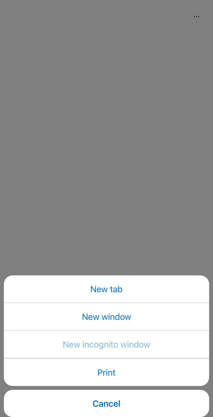
```tsx
import { ClipboardTextIcon, CopyIcon, ScissorsIcon, TrashIcon } from "phosphor-react-native"
import { ActionBar, ActionBarContent, ActionBarItem, ActionBarLabel, ActionBarMenu, ActionBarSeparator, ActionBarTrigger } from "@/components/patterns/action-bar"
import { Icon } from "@/components/ui/icon"
import { Text } from "@/components/ui/text"
function FileMenu({ defaultOpen }: { defaultOpen?: boolean }) {
return (
FileNew tabNew windowNew incognito windowPrint
)
}
function EditMenu({ withIcons = false }: { withIcons?: boolean }) {
return (
Edit
{withIcons ? : null}
Cut
{withIcons ? : null}
Copy
{withIcons ? : null}
Paste
{withIcons ? : null}
Delete
)
}
function ViewMenu() {
return (
ViewAppearanceZoom inZoom outActual size
)
}
export function ActionBarOpenByDefaultExample() {
return (
)
}
```
```swift
import EsuissUI
import PhosphorSwift
import SwiftUI
struct ActionBarOpenFileDemo: View {
@State private var file = true
var body: some View {
ActionBar {
ActionBarFileMenu(isPresented: $file)
ActionBarEditMenu()
ActionBarViewMenu()
}
}
}
struct ActionBarFileMenu: View {
var isPresented: Binding?
var body: some View {
ActionBarMenu("File", isPresented: isPresented) {
ActionBarItem("New tab") {}
ActionBarItem("New window") {}
ActionBarItem("New incognito window") {}.disabled(true)
ActionBarSeparator()
ActionBarItem("Print") {}
}
}
}
struct ActionBarEditMenu: View {
var withIcons = false
var body: some View {
ActionBarMenu("Edit") {
if withIcons {
ActionBarItem("Cut", icon: Ph.scissors.regular) {}
ActionBarItem("Copy", icon: Ph.copy.regular) {}
ActionBarItem("Paste", icon: Ph.clipboardText.regular) {}
ActionBarSeparator()
ActionBarItem("Delete", icon: Ph.trash.regular, variant: .destructive) {}
} else {
ActionBarItem("Cut") {}
ActionBarItem("Copy") {}
ActionBarItem("Paste") {}
ActionBarSeparator()
ActionBarItem("Delete", variant: .destructive) {}
}
}
}
}
struct ActionBarViewMenu: View {
var body: some View {
ActionBarMenu("View") {
ActionBarLabel("Appearance")
ActionBarItem("Zoom in") {}
ActionBarItem("Zoom out") {}
ActionBarItem("Actual size") {}
}
}
}
```
```kotlin
import androidx.compose.foundation.layout.fillMaxWidth
import androidx.compose.runtime.Composable
import androidx.compose.runtime.getValue
import androidx.compose.runtime.mutableStateOf
import androidx.compose.runtime.saveable.rememberSaveable
import androidx.compose.runtime.setValue
import androidx.compose.ui.Modifier
import com.esuiss.ui.patterns.ActionBar
@Composable
fun ActionBarOpenByDefaultExample() {
ActionBarDemo(defaultOpen = true, fileOpen = true)
}
@Composable
fun ActionBarDemo(
defaultOpen: Boolean = false,
fileOpen: Boolean = false,
withIcons: Boolean = false,
view: Boolean = true,
dismissible: Boolean = true,
floating: Boolean = false,
moreLabel: String = "More actions",
cancelLabel: String = "Cancel",
) {
var open by rememberSaveable { mutableStateOf(defaultOpen) }
ActionBar(
open = open,
onOpenChange = { open = it },
modifier = Modifier.fillMaxWidth(),
dismissible = dismissible,
floating = floating,
moreLabel = moreLabel,
cancelLabel = cancelLabel,
) {
actionBarFileMenu(fileOpen)
actionBarEditMenu(withIcons)
if (view) actionBarViewMenu()
}
}
```
`ActionBar` groups several `ActionBarMenu`s, such as File, Edit and View, behind one ghost icon `Button`. Pressing it opens a `Drawer` that lists each menu's trigger as a row with a chevron.
Choosing a row closes the drawer and opens that menu's items in an `AlertSheet`, with a Cancel button appended. Use it for toolbar-style command groups that need to fit on a phone screen.
## Installation
**React Native**
```bash title="Terminal"
npx shadcn@latest add @esuiss-rn/action-bar
```
See [Installation](https://ui.suiss.app/docs/installation) for the `components.json` setup. Or use the suiss/ui CLI:
```bash title="Terminal"
npx @esuiss/ui@latest add action-bar
```
**SwiftUI**
```bash title="Terminal"
npx @esuiss/ui@latest add action-bar --platform swift
```
**Jetpack Compose**
```bash title="Terminal"
npx @esuiss/ui@latest add action-bar --platform kotlin
```
The CLI also adds what it builds on: [Alert Sheet](https://ui.suiss.app/docs/components/alert-sheet), [Button](https://ui.suiss.app/docs/components/button), [Drawer](https://ui.suiss.app/docs/components/drawer), [Icon](https://ui.suiss.app/docs/components/icon), [Text](https://ui.suiss.app/docs/components/text).
### Manual
**React Native**
**Uniwind**
1. Install the dependencies:
```bash title="Terminal"
npx expo install cn phosphor-react-native react-native-svg
```
2. Add the pieces it builds on: [Alert Sheet](https://ui.suiss.app/docs/components/alert-sheet), [Button](https://ui.suiss.app/docs/components/button), [Drawer](https://ui.suiss.app/docs/components/drawer), [Icon](https://ui.suiss.app/docs/components/icon), [Text](https://ui.suiss.app/docs/components/text).
3. Copy the source into `components/patterns/action-bar.tsx`:
```tsx title="uniwind/components/patterns/action-bar.tsx"
import { cn } from "cn"
import { CaretRightIcon, DotsThreeIcon } from "phosphor-react-native"
import * as React from "react"
import { I18nManager, Pressable, View, type ViewProps } from "react-native"
import {
AlertSheet,
AlertSheetAction,
AlertSheetCancel,
AlertSheetContent,
AlertSheetGroup,
AlertSheetHeader,
AlertSheetTitle,
} from "@/components/ui/alert-sheet"
import { Button } from "@/components/ui/button"
import { Drawer, DrawerContent, DrawerTrigger } from "@/components/ui/drawer"
import { Icon } from "@/components/ui/icon"
import { Text, TextClassContext } from "@/components/ui/text"
type ActionBarContextProps = {
dismissible: boolean
cancelLabel: string
active: number | null
showMenu: (index: number) => void
hideMenu: () => void
}
type ActionBarMenuContextProps = {
index: number
part: "row" | "sheet"
onOpen?: () => void
}
const ActionBarContext = React.createContext(null)
const ActionBarMenuContext =
React.createContext(null)
function useActionBar() {
const context = React.useContext(ActionBarContext)
if (!context) {
throw new Error("useActionBar must be used within an ")
}
return context
}
function ActionBar({
open: openProp,
defaultOpen = false,
onOpenChange,
dismissible = true,
floating,
moreLabel = "More actions",
cancelLabel = "Cancel",
className,
children,
...props
}: ViewProps & {
open?: boolean
defaultOpen?: boolean
onOpenChange?: (open: boolean) => void
dismissible?: boolean
floating?: boolean
moreLabel?: string
cancelLabel?: string
}) {
const [uncontrolledOpen, setUncontrolledOpen] = React.useState(defaultOpen)
const open = openProp ?? uncontrolledOpen
const [active, setActive] = React.useState(null)
const setOpen = React.useCallback(
(next: boolean) => {
if (openProp === undefined) setUncontrolledOpen(next)
onOpenChange?.(next)
},
[openProp, onOpenChange]
)
const contextValue = React.useMemo(
() => ({
dismissible,
cancelLabel,
active,
showMenu: (index) => {
setOpen(false)
setActive(index)
},
hideMenu: () => setActive(null),
}),
[dismissible, cancelLabel, active, setOpen]
)
const menus = (part: ActionBarMenuContextProps["part"]) =>
React.Children.map(children, (child, index) => (
{child}
))
return (
}
>
{menus("row")}
{menus("sheet")}
)
}
function ActionBarMenu({
open,
defaultOpen,
onOpenChange,
children,
}: {
open?: boolean
defaultOpen?: boolean
onOpenChange?: (open: boolean) => void
children?: React.ReactNode
}) {
const { dismissible, active, showMenu, hideMenu } = useActionBar()
const menu = React.useContext(ActionBarMenuContext)
const sheet = menu?.part === "sheet"
const openedByDefault = React.useRef(false)
React.useEffect(() => {
if (!sheet || !menu || !defaultOpen || openedByDefault.current) return
openedByDefault.current = true
showMenu(menu.index)
}, [sheet, menu, defaultOpen, showMenu])
if (!menu) return null
if (menu.part === "row") {
return (
onOpenChange?.(true) }}
>
0 && "border-t border-border")}
>
{children}
)
}
return (
{
if (!next) hideMenu()
onOpenChange?.(next)
}}
dismissible={dismissible}
>
{children}
)
}
function ActionBarTrigger({
className,
disabled,
children,
onPress,
accessibilityState,
...props
}: Omit, "children"> & {
children?: React.ReactNode
}) {
const { showMenu } = useActionBar()
const menu = React.useContext(ActionBarMenuContext)
if (!menu || menu.part === "sheet") return null
return (
{
onPress?.(event)
showMenu(menu.index)
menu.onOpen?.()
}}
className={cn(
"min-h-11 w-full flex-row items-center justify-between gap-6 py-2.75 pe-4",
className
)}
{...props}
>
{typeof children === "string" || typeof children === "number" ? (
{children}
) : (
children
)}
)
}
function ActionBarContent({
children,
...props
}: React.ComponentProps) {
const { cancelLabel } = useActionBar()
const menu = React.useContext(ActionBarMenuContext)
if (menu?.part === "row") return null
return (
{children}{cancelLabel}
)
}
function ActionBarLabel(props: React.ComponentProps) {
return (
)
}
function ActionBarItem(props: React.ComponentProps) {
return
}
function ActionBarSeparator(_props: { className?: string }) {
return null
}
export {
ActionBar,
ActionBarContent,
ActionBarItem,
ActionBarLabel,
ActionBarMenu,
ActionBarSeparator,
ActionBarTrigger,
}
```
4. Update the import paths to match your project.
**NativeWind**
1. Install the dependencies:
```bash title="Terminal"
npx expo install cn phosphor-react-native react-native-svg
```
2. Add the pieces it builds on: [Alert Sheet](https://ui.suiss.app/docs/components/alert-sheet), [Button](https://ui.suiss.app/docs/components/button), [Drawer](https://ui.suiss.app/docs/components/drawer), [Icon](https://ui.suiss.app/docs/components/icon), [Text](https://ui.suiss.app/docs/components/text).
3. Copy the source into `components/patterns/action-bar.tsx`:
```tsx title="nativewind/components/patterns/action-bar.tsx"
import { cn } from "cn"
import { CaretRightIcon, DotsThreeIcon } from "phosphor-react-native"
import * as React from "react"
import { I18nManager, Pressable, View, type ViewProps } from "react-native"
import {
AlertSheet,
AlertSheetAction,
AlertSheetCancel,
AlertSheetContent,
AlertSheetGroup,
AlertSheetHeader,
AlertSheetTitle,
} from "@/components/ui/alert-sheet"
import { Button } from "@/components/ui/button"
import { Drawer, DrawerContent, DrawerTrigger } from "@/components/ui/drawer"
import { Icon } from "@/components/ui/icon"
import { Text, TextClassContext } from "@/components/ui/text"
type ActionBarContextProps = {
dismissible: boolean
cancelLabel: string
active: number | null
showMenu: (index: number) => void
hideMenu: () => void
}
type ActionBarMenuContextProps = {
index: number
part: "row" | "sheet"
onOpen?: () => void
}
const ActionBarContext = React.createContext(null)
const ActionBarMenuContext =
React.createContext(null)
function useActionBar() {
const context = React.useContext(ActionBarContext)
if (!context) {
throw new Error("useActionBar must be used within an ")
}
return context
}
function ActionBar({
open: openProp,
defaultOpen = false,
onOpenChange,
dismissible = true,
floating,
moreLabel = "More actions",
cancelLabel = "Cancel",
className,
children,
...props
}: ViewProps & {
open?: boolean
defaultOpen?: boolean
onOpenChange?: (open: boolean) => void
dismissible?: boolean
floating?: boolean
moreLabel?: string
cancelLabel?: string
}) {
const [uncontrolledOpen, setUncontrolledOpen] = React.useState(defaultOpen)
const open = openProp ?? uncontrolledOpen
const [active, setActive] = React.useState(null)
const setOpen = React.useCallback(
(next: boolean) => {
if (openProp === undefined) setUncontrolledOpen(next)
onOpenChange?.(next)
},
[openProp, onOpenChange]
)
const contextValue = React.useMemo(
() => ({
dismissible,
cancelLabel,
active,
showMenu: (index) => {
setOpen(false)
setActive(index)
},
hideMenu: () => setActive(null),
}),
[dismissible, cancelLabel, active, setOpen]
)
const menus = (part: ActionBarMenuContextProps["part"]) =>
React.Children.map(children, (child, index) => (
{child}
))
return (
}
>
{menus("row")}
{menus("sheet")}
)
}
function ActionBarMenu({
open,
defaultOpen,
onOpenChange,
children,
}: {
open?: boolean
defaultOpen?: boolean
onOpenChange?: (open: boolean) => void
children?: React.ReactNode
}) {
const { dismissible, active, showMenu, hideMenu } = useActionBar()
const menu = React.useContext(ActionBarMenuContext)
const sheet = menu?.part === "sheet"
const openedByDefault = React.useRef(false)
React.useEffect(() => {
if (!sheet || !menu || !defaultOpen || openedByDefault.current) return
openedByDefault.current = true
showMenu(menu.index)
}, [sheet, menu, defaultOpen, showMenu])
if (!menu) return null
if (menu.part === "row") {
return (
onOpenChange?.(true) }}
>
0 && "border-t border-border")}
>
{children}
)
}
return (
{
if (!next) hideMenu()
onOpenChange?.(next)
}}
dismissible={dismissible}
>
{children}
)
}
function ActionBarTrigger({
className,
disabled,
children,
onPress,
accessibilityState,
...props
}: Omit, "children"> & {
children?: React.ReactNode
}) {
const { showMenu } = useActionBar()
const menu = React.useContext(ActionBarMenuContext)
if (!menu || menu.part === "sheet") return null
return (
{
onPress?.(event)
showMenu(menu.index)
menu.onOpen?.()
}}
className={cn(
"min-h-11 w-full flex-row items-center justify-between gap-6 py-[0.6875rem] pe-4",
className
)}
{...props}
>
{typeof children === "string" || typeof children === "number" ? (
{children}
) : (
children
)}
)
}
function ActionBarContent({
children,
...props
}: React.ComponentProps) {
const { cancelLabel } = useActionBar()
const menu = React.useContext(ActionBarMenuContext)
if (menu?.part === "row") return null
return (
{children}{cancelLabel}
)
}
function ActionBarLabel(props: React.ComponentProps) {
return (
)
}
function ActionBarItem(props: React.ComponentProps) {
return
}
function ActionBarSeparator(_props: { className?: string }) {
return null
}
export {
ActionBar,
ActionBarContent,
ActionBarItem,
ActionBarLabel,
ActionBarMenu,
ActionBarSeparator,
ActionBarTrigger,
}
```
4. Update the import paths to match your project.
**StyleSheet**
1. Install the dependencies:
```bash title="Terminal"
npx expo install phosphor-react-native react-native-svg
```
2. Add the pieces it builds on: [Alert Sheet](https://ui.suiss.app/docs/components/alert-sheet), [Button](https://ui.suiss.app/docs/components/button), [Drawer](https://ui.suiss.app/docs/components/drawer), [Icon](https://ui.suiss.app/docs/components/icon), [Text](https://ui.suiss.app/docs/components/text).
3. Copy the source into `components/patterns/action-bar.tsx`:
```tsx title="stylesheet/components/patterns/action-bar.tsx"
import { CaretRightIcon, DotsThreeIcon } from "phosphor-react-native"
import * as React from "react"
import {
I18nManager,
Pressable,
type StyleProp,
StyleSheet,
View,
type ViewProps,
type ViewStyle,
} from "react-native"
import {
AlertSheet,
AlertSheetAction,
AlertSheetCancel,
AlertSheetContent,
AlertSheetGroup,
AlertSheetHeader,
AlertSheetTitle,
} from "@/components/ui/alert-sheet"
import { Button } from "@/components/ui/button"
import { Drawer, DrawerContent, DrawerTrigger } from "@/components/ui/drawer"
import { Icon } from "@/components/ui/icon"
import { Text, TextStyleContext } from "@/components/ui/text"
import { fontSize, radius, useTheme } from "@/components/ui/theme"
type ActionBarContextProps = {
dismissible: boolean
cancelLabel: string
active: number | null
showMenu: (index: number) => void
hideMenu: () => void
}
type ActionBarMenuContextProps = {
index: number
part: "row" | "sheet"
onOpen?: () => void
}
const styles = StyleSheet.create({
root: {
flexDirection: "row",
alignItems: "center",
justifyContent: "flex-end",
},
docked: { borderTopLeftRadius: 0, borderTopRightRadius: 0 },
rows: { margin: 16, overflow: "hidden", borderRadius: radius["2xl"] },
row: { marginStart: 16 },
trigger: {
minHeight: 44,
width: "100%",
flexDirection: "row",
alignItems: "center",
justifyContent: "space-between",
gap: 24,
paddingVertical: 11,
paddingEnd: 16,
},
triggerText: { flex: 1 },
})
const ActionBarContext = React.createContext(null)
const ActionBarMenuContext =
React.createContext(null)
function useActionBar() {
const context = React.useContext(ActionBarContext)
if (!context) {
throw new Error("useActionBar must be used within an ")
}
return context
}
function ActionBar({
open: openProp,
defaultOpen = false,
onOpenChange,
dismissible = true,
floating,
moreLabel = "More actions",
cancelLabel = "Cancel",
style,
children,
...props
}: ViewProps & {
open?: boolean
defaultOpen?: boolean
onOpenChange?: (open: boolean) => void
dismissible?: boolean
floating?: boolean
moreLabel?: string
cancelLabel?: string
}) {
const { colors } = useTheme()
const [uncontrolledOpen, setUncontrolledOpen] = React.useState(defaultOpen)
const open = openProp ?? uncontrolledOpen
const [active, setActive] = React.useState(null)
const setOpen = React.useCallback(
(next: boolean) => {
if (openProp === undefined) setUncontrolledOpen(next)
onOpenChange?.(next)
},
[openProp, onOpenChange]
)
const contextValue = React.useMemo(
() => ({
dismissible,
cancelLabel,
active,
showMenu: (index) => {
setOpen(false)
setActive(index)
},
hideMenu: () => setActive(null),
}),
[dismissible, cancelLabel, active, setOpen]
)
const menus = (part: ActionBarMenuContextProps["part"]) =>
React.Children.map(children, (child, index) => (
{child}
))
return (
}
>
{menus("row")}
{menus("sheet")}
)
}
function ActionBarMenu({
open,
defaultOpen,
onOpenChange,
children,
}: {
open?: boolean
defaultOpen?: boolean
onOpenChange?: (open: boolean) => void
children?: React.ReactNode
}) {
const { colors } = useTheme()
const { dismissible, active, showMenu, hideMenu } = useActionBar()
const menu = React.useContext(ActionBarMenuContext)
const sheet = menu?.part === "sheet"
const openedByDefault = React.useRef(false)
React.useEffect(() => {
if (!sheet || !menu || !defaultOpen || openedByDefault.current) return
openedByDefault.current = true
showMenu(menu.index)
}, [sheet, menu, defaultOpen, showMenu])
if (!menu) return null
if (menu.part === "row") {
return (
onOpenChange?.(true) }}
>
0 && {
borderTopWidth: 1,
borderTopColor: colors.border,
},
]}
>
{children}
)
}
return (
{
if (!next) hideMenu()
onOpenChange?.(next)
}}
dismissible={dismissible}
>
{children}
)
}
function ActionBarTrigger({
style,
disabled,
children,
onPress,
accessibilityState,
...props
}: Omit, "children"> & {
children?: React.ReactNode
}) {
const { colors } = useTheme()
const { showMenu } = useActionBar()
const menu = React.useContext(ActionBarMenuContext)
if (!menu || menu.part === "sheet") return null
return (
{
onPress?.(event)
showMenu(menu.index)
menu.onOpen?.()
}}
style={(state): StyleProp => [
styles.trigger,
disabled && { opacity: 0.5 },
typeof style === "function" ? style(state) : style,
]}
{...props}
>
{typeof children === "string" || typeof children === "number" ? (
{children}
) : (
children
)}
)
}
function ActionBarContent({
children,
...props
}: React.ComponentProps) {
const { cancelLabel } = useActionBar()
const menu = React.useContext(ActionBarMenuContext)
if (menu?.part === "row") return null
return (
{children}{cancelLabel}
)
}
function ActionBarLabel(props: React.ComponentProps) {
return (
)
}
function ActionBarItem(props: React.ComponentProps) {
return
}
function ActionBarSeparator(_props: { style?: StyleProp }) {
return null
}
export {
ActionBar,
ActionBarContent,
ActionBarItem,
ActionBarLabel,
ActionBarMenu,
ActionBarSeparator,
ActionBarTrigger,
}
```
4. Update the import paths to match your project.
**SwiftUI**
1. Target iOS 17 or later.
2. Add the Swift package to your app:
```swift title="Package.swift"
.package(url: "https://github.com/phosphor-icons/swift", from: "2.1.0")
```
3. Copy the theme files every view uses:
- `swift/Theme/Theme.swift`: [source](https://github.com/e-suiss/ui/blob/main/packages/mobile/swiftui/Sources/EsuissUI/Theme/Theme.swift)
- `swift/Theme/Tokens.swift`: [source](https://github.com/e-suiss/ui/blob/main/packages/mobile/swiftui/Sources/EsuissUI/Theme/Tokens.swift)
4. Copy the source and every file it uses:
```swift title="swift/Patterns/ActionBar.swift"
import PhosphorSwift
import SwiftUI
enum ActionBarPart: Sendable {
case row, sheet, menu
}
struct ActionBarContext {
var part: ActionBarPart
var dismissible: Bool
var cancelLabel: LocalizedStringKey
var open: (@escaping () -> Void) -> Void
var present: (AnyView) -> Void
}
extension EnvironmentValues {
@Entry var actionBar: ActionBarContext?
}
public struct ActionBar: View {
let external: Binding?
let dismissible: Bool
let moreLabel: LocalizedStringKey
let cancelLabel: LocalizedStringKey
let content: Content
@State private var local = false
@State private var pending: (() -> Void)?
@State private var presented: AnyView?
@CompactLayout private var compact
public init(
isPresented: Binding? = nil,
dismissible: Bool = true,
moreLabel: LocalizedStringKey = "More actions",
cancelLabel: LocalizedStringKey = "Cancel",
@ViewBuilder content: () -> Content
) {
external = isPresented
self.dismissible = dismissible
self.moreLabel = moreLabel
self.cancelLabel = cancelLabel
self.content = content()
}
private func context(_ part: ActionBarPart, drawer: Binding) -> ActionBarContext {
ActionBarContext(
part: part,
dismissible: dismissible,
cancelLabel: cancelLabel,
open: { action in
pending = action
drawer.wrappedValue = false
},
present: { view in presented = view }
)
}
public var body: some View {
let drawer = external ?? $local
if compact {
Button {
drawer.wrappedValue = true
} label: {
Ph.dotsThree.bold.frame(width: 16, height: 16)
}
.buttonStyle(.variant(.ghost, size: .icon))
.accessibilityLabel(Text(moreLabel))
.frame(maxWidth: .infinity, alignment: .trailing)
.drawer(isPresented: drawer, onDismiss: {
let action = pending
pending = nil
action?()
}) {
DrawerContent {
ActionBarRows {
content.environment(\.actionBar, context(.row, drawer: drawer))
}
.accessibilityElement(children: .contain)
.accessibilityLabel(Text(moreLabel))
}
.environment(\.patternCompact, true)
}
.background {
content
.environment(\.actionBar, context(.sheet, drawer: drawer))
.frame(width: 0, height: 0)
.hidden()
}
.alertSheet(
isPresented: Binding(
get: { presented != nil },
set: { if !$0 { presented = nil } }
),
dismissible: dismissible
) {
presented
}
} else {
HStack(spacing: 4) {
content.environment(\.actionBar, context(.menu, drawer: drawer))
}
}
}
}
struct ActionBarRows: View {
@ViewBuilder let content: () -> Content
var body: some View {
SeparatedStack {
content()
}
.background(EsuissColor.border)
.overlay(alignment: .leading) {
EsuissColor.muted.frame(width: 16)
}
.clipShape(RoundedRectangle(cornerRadius: Radius.xl2, style: .continuous))
.padding(16)
}
}
public struct ActionBarMenu: View {
let external: Binding?
let content: () -> Content
let label: Label
@Environment(\.actionBar) private var bar
@Environment(\.isEnabled) private var isEnabled
public init(
isPresented: Binding? = nil,
@ViewBuilder content: @escaping () -> Content,
@ViewBuilder label: () -> Label
) {
external = isPresented
self.content = content
self.label = label()
}
public var body: some View {
switch bar?.part {
case .row:
row
case .sheet:
if let external, let bar {
let content = content
Color.clear
.frame(width: 0, height: 0)
.alertSheet(isPresented: external, dismissible: bar.dismissible) {
ActionSheetBody(cancelLabel: bar.cancelLabel, content: content)
}
}
case .menu, nil:
DropdownMenu(isPresented: external, content: { content().environment(\.actionListMode, .menu) }) {
label
}
.buttonStyle(.variant(.ghost, size: .sm))
}
}
private var row: some View {
Button {
guard let bar else { return }
let external = external
let body = ActionSheetBody(cancelLabel: bar.cancelLabel, content: content)
bar.open {
if let external {
external.wrappedValue = true
} else {
bar.present(AnyView(body))
}
}
} label: {
HStack(spacing: 24) {
label
.frame(maxWidth: .infinity, alignment: .leading)
Ph.caretRight.regular
.frame(width: 16, height: 16)
.foregroundStyle(EsuissColor.mutedForeground)
.flipsForRightToLeftLayoutDirection(true)
}
.scaledFont(.base)
.foregroundStyle(EsuissColor.foreground)
.opacity(isEnabled ? 1 : 0.5)
.padding(.vertical, 11)
.padding(.trailing, 16)
.frame(minHeight: 44)
.padding(.leading, 16)
.contentShape(Rectangle())
}
.buttonStyle(.plain)
.background(EsuissColor.muted)
.accessibilityHint(Text("Shows actions"))
}
}
extension ActionBarMenu where Label == Text {
public init(
_ title: LocalizedStringKey,
isPresented: Binding? = nil,
@ViewBuilder content: @escaping () -> Content
) {
self.init(isPresented: isPresented, content: content) { Text(title) }
}
}
```
- `swift/Components/AlertSheet.swift`: see [Alert Sheet](https://ui.suiss.app/docs/components/alert-sheet.md)
- `swift/Components/Button.swift`: see [Button](https://ui.suiss.app/docs/components/button.md)
- `swift/Components/ButtonGroup.swift`: see [Button Group](https://ui.suiss.app/docs/components/button-group.md)
- `swift/Components/Dialog.swift`: see [Dialog](https://ui.suiss.app/docs/components/dialog.md)
- `swift/Components/Drawer.swift`: see [Drawer](https://ui.suiss.app/docs/components/drawer.md)
- `swift/Components/DropdownMenu.swift`: see [Dropdown Menu](https://ui.suiss.app/docs/components/dropdown-menu.md)
- `swift/Components/Field.swift`: see [Field](https://ui.suiss.app/docs/components/field.md)
- `swift/Components/Overlay.swift`: [source](https://github.com/e-suiss/ui/blob/main/packages/mobile/swiftui/Sources/EsuissUI/Components/Overlay.swift)
- `swift/Components/Select.swift`: see [Select](https://ui.suiss.app/docs/components/select.md)
- `swift/Components/Separator.swift`: see [Separator](https://ui.suiss.app/docs/components/separator.md)
- `swift/Components/Sheet.swift`: see [Sheet](https://ui.suiss.app/docs/components/sheet.md)
- `swift/Components/TextVariant.swift`: [source](https://github.com/e-suiss/ui/blob/main/packages/mobile/swiftui/Sources/EsuissUI/Components/TextVariant.swift)
- `swift/Patterns/ActionList.swift`: [source](https://github.com/e-suiss/ui/blob/main/packages/mobile/swiftui/Sources/EsuissUI/Patterns/ActionList.swift)
- `swift/Patterns/Adaptive.swift`: [source](https://github.com/e-suiss/ui/blob/main/packages/mobile/swiftui/Sources/EsuissUI/Patterns/Adaptive.swift)
5. Add the files to your app target.
**Jetpack Compose**
1. Set `minSdk` to 24 or higher and add the dependencies:
```kotlin title="build.gradle.kts"
implementation(platform("androidx.compose:compose-bom:2026.09.00"))
implementation("androidx.compose.foundation:foundation")
implementation("androidx.compose.ui:ui")
implementation("com.adamglin:phosphor-icon-android:1.0.0")
```
2. Copy the theme files every view uses:
- `kotlin/theme/Theme.kt`: [source](https://github.com/e-suiss/ui/blob/main/packages/mobile/kotlin/ui/src/main/kotlin/com/esuiss/ui/theme/Theme.kt)
- `kotlin/theme/Tokens.kt`: [source](https://github.com/e-suiss/ui/blob/main/packages/mobile/kotlin/ui/src/main/kotlin/com/esuiss/ui/theme/Tokens.kt)
3. Copy the source and every file it uses:
```kt title="kotlin/patterns/ActionBar.kt"
package com.esuiss.ui.patterns
import androidx.compose.foundation.background
import androidx.compose.foundation.clickable
import androidx.compose.foundation.interaction.MutableInteractionSource
import androidx.compose.foundation.layout.Arrangement
import androidx.compose.foundation.layout.Column
import androidx.compose.foundation.layout.Row
import androidx.compose.foundation.layout.fillMaxWidth
import androidx.compose.foundation.layout.heightIn
import androidx.compose.foundation.layout.padding
import androidx.compose.foundation.shape.RoundedCornerShape
import androidx.compose.foundation.text.BasicText
import androidx.compose.runtime.Composable
import androidx.compose.runtime.CompositionLocalProvider
import androidx.compose.runtime.LaunchedEffect
import androidx.compose.runtime.getValue
import androidx.compose.runtime.mutableStateOf
import androidx.compose.runtime.remember
import androidx.compose.runtime.setValue
import androidx.compose.ui.Alignment
import androidx.compose.ui.Modifier
import androidx.compose.ui.draw.clip
import androidx.compose.ui.draw.drawBehind
import androidx.compose.ui.geometry.Offset
import androidx.compose.ui.geometry.Size
import androidx.compose.ui.graphics.graphicsLayer
import androidx.compose.ui.graphics.vector.ImageVector
import androidx.compose.ui.platform.LocalLayoutDirection
import androidx.compose.ui.semantics.Role
import androidx.compose.ui.semantics.contentDescription
import androidx.compose.ui.semantics.semantics
import androidx.compose.ui.text.style.TextOverflow
import androidx.compose.ui.unit.LayoutDirection
import androidx.compose.ui.unit.dp
import com.adamglin.PhosphorIcons
import com.adamglin.phosphoricons.Bold
import com.adamglin.phosphoricons.Regular
import com.adamglin.phosphoricons.bold.DotsThree
import com.adamglin.phosphoricons.regular.CaretRight
import com.esuiss.ui.components.AlertSheet
import com.esuiss.ui.components.AlertSheetAction
import com.esuiss.ui.components.AlertSheetCancel
import com.esuiss.ui.components.AlertSheetGroup
import com.esuiss.ui.components.Button
import com.esuiss.ui.components.ButtonSize
import com.esuiss.ui.components.ButtonVariant
import com.esuiss.ui.components.Drawer
import com.esuiss.ui.components.Icon
import com.esuiss.ui.components.LocalDrawerSquareTop
import com.esuiss.ui.components.MenuItemVariant
import com.esuiss.ui.components.RegisterPaneTitle
import com.esuiss.ui.theme.EsuissTheme
import com.esuiss.ui.theme.Radius
import com.esuiss.ui.theme.Typography
class ActionBarScope internal constructor() {
internal val menus = mutableListOf()
fun ActionBarMenu(
open: Boolean? = null,
onOpenChange: (Boolean) -> Unit = {},
defaultOpen: Boolean = false,
content: ActionBarMenuScope.() -> Unit,
) {
menus += ActionBarMenuScope(open, onOpenChange, defaultOpen).apply(content)
}
}
class ActionBarMenuScope internal constructor(
internal val open: Boolean?,
internal val onOpenChange: (Boolean) -> Unit,
internal val defaultOpen: Boolean,
) {
internal var trigger: String = ""
internal var triggerEnabled: Boolean = true
internal var contentModifier: Modifier = Modifier
internal var content: (@Composable () -> Unit)? = null
fun ActionBarTrigger(text: String, enabled: Boolean = true) {
trigger = text
triggerEnabled = enabled
}
fun ActionBarContent(modifier: Modifier = Modifier, content: @Composable () -> Unit) {
contentModifier = modifier
this.content = content
}
}
@Composable
fun ActionBar(
open: Boolean,
onOpenChange: (Boolean) -> Unit,
modifier: Modifier = Modifier,
dismissible: Boolean = true,
floating: Boolean = false,
moreLabel: String = "More actions",
cancelLabel: String = "Cancel",
content: ActionBarScope.() -> Unit,
) {
val menus = ActionBarScope().apply(content).menus
var active by remember { mutableStateOf(null) }
val defaultIndex = menus.indexOfFirst { it.defaultOpen }
LaunchedEffect(Unit) {
if (defaultIndex >= 0) active = defaultIndex
}
val colors = EsuissTheme.colors
Row(
modifier = modifier,
horizontalArrangement = Arrangement.End,
verticalAlignment = Alignment.CenterVertically,
) {
Button(
onClick = { onOpenChange(true) },
modifier = Modifier.semantics { contentDescription = moreLabel },
variant = ButtonVariant.Ghost,
size = ButtonSize.Icon,
) {
Icon(PhosphorIcons.Bold.DotsThree, contentDescription = null)
}
}
CompositionLocalProvider(LocalDrawerSquareTop provides !floating) {
Drawer(open = open, onOpenChange = onOpenChange, floating = floating) {
RegisterPaneTitle(moreLabel)
val shape = RoundedCornerShape(Radius.xl2)
Column(
modifier = Modifier
.fillMaxWidth()
.padding(16.dp)
.clip(shape)
.background(colors.muted, shape),
) {
menus.forEachIndexed { index, menu ->
ActionBarRow(
text = menu.trigger,
enabled = menu.triggerEnabled,
divided = index > 0,
onClick = {
onOpenChange(false)
active = index
menu.onOpenChange(true)
},
)
}
}
}
}
menus.forEachIndexed { index, menu ->
AlertSheet(
open = menu.open ?: (active == index),
onOpenChange = { next ->
if (!next) active = null
menu.onOpenChange(next)
},
modifier = menu.contentModifier,
dismissible = dismissible,
) {
AlertSheetGroup { menu.content?.invoke() }
AlertSheetCancel(cancelLabel)
}
}
}
@Composable
private fun ActionBarRow(
text: String,
enabled: Boolean,
divided: Boolean,
onClick: () -> Unit,
) {
val colors = EsuissTheme.colors
val rtl = LocalLayoutDirection.current == LayoutDirection.Rtl
Row(
modifier = Modifier
.fillMaxWidth()
.padding(start = 16.dp)
.drawBehind {
if (divided) drawRect(colors.border, Offset.Zero, Size(size.width, 1.dp.toPx()))
}
.heightIn(min = 44.dp)
.clickable(
interactionSource = remember { MutableInteractionSource() },
indication = null,
enabled = enabled,
role = Role.Button,
onClick = onClick,
)
.padding(top = 11.dp, bottom = 11.dp, end = 16.dp),
horizontalArrangement = Arrangement.spacedBy(24.dp),
verticalAlignment = Alignment.CenterVertically,
) {
BasicText(
text,
modifier = Modifier.weight(1f),
style = Typography.base.copy(color = colors.foreground),
maxLines = 1,
overflow = TextOverflow.Ellipsis,
)
Icon(
PhosphorIcons.Regular.CaretRight,
contentDescription = null,
modifier = Modifier.graphicsLayer { scaleX = if (rtl) -1f else 1f },
size = 16.dp,
tint = colors.mutedForeground,
)
}
}
@Composable
fun ActionBarLabel(text: String, modifier: Modifier = Modifier) {
SheetMenuLabel(text, modifier)
}
@Composable
fun ActionBarItem(
text: String,
onClick: () -> Unit,
modifier: Modifier = Modifier,
variant: MenuItemVariant = MenuItemVariant.Default,
enabled: Boolean = true,
icon: ImageVector? = null,
) {
AlertSheetAction(text, onClick, modifier, variant.toSheetVariant(), enabled, icon)
}
@Composable
fun ActionBarSeparator() {
}
```
- `kotlin/components/AlertSheet.kt`: see [Alert Sheet](https://ui.suiss.app/docs/components/alert-sheet.md)
- `kotlin/components/Button.kt`: see [Button](https://ui.suiss.app/docs/components/button.md)
- `kotlin/components/ButtonGroup.kt`: see [Button Group](https://ui.suiss.app/docs/components/button-group.md)
- `kotlin/components/Checkbox.kt`: see [Checkbox](https://ui.suiss.app/docs/components/checkbox.md)
- `kotlin/components/Content.kt`: [source](https://github.com/e-suiss/ui/blob/main/packages/mobile/kotlin/ui/src/main/kotlin/com/esuiss/ui/components/Content.kt)
- `kotlin/components/Drawer.kt`: see [Drawer](https://ui.suiss.app/docs/components/drawer.md)
- `kotlin/components/DropdownMenu.kt`: see [Dropdown Menu](https://ui.suiss.app/docs/components/dropdown-menu.md)
- `kotlin/components/Field.kt`: see [Field](https://ui.suiss.app/docs/components/field.md)
- `kotlin/components/FormSupport.kt`: [source](https://github.com/e-suiss/ui/blob/main/packages/mobile/kotlin/ui/src/main/kotlin/com/esuiss/ui/components/FormSupport.kt)
- `kotlin/components/Haptics.kt`: see [Haptics](https://ui.suiss.app/docs/components/haptics.md)
- `kotlin/components/Icon.kt`: see [Icon](https://ui.suiss.app/docs/components/icon.md)
- `kotlin/components/Label.kt`: see [Label](https://ui.suiss.app/docs/components/label.md)
- `kotlin/components/Overlay.kt`: [source](https://github.com/e-suiss/ui/blob/main/packages/mobile/kotlin/ui/src/main/kotlin/com/esuiss/ui/components/Overlay.kt)
- `kotlin/components/Separator.kt`: see [Separator](https://ui.suiss.app/docs/components/separator.md)
- `kotlin/patterns/ActionList.kt`: [source](https://github.com/e-suiss/ui/blob/main/packages/mobile/kotlin/ui/src/main/kotlin/com/esuiss/ui/patterns/ActionList.kt)
4. Update the `com.esuiss.ui` package names to match your project.
## Usage
```tsx
import { ActionBar, ActionBarMenu, ActionBarTrigger, ActionBarContent, ActionBarLabel, ActionBarItem, ActionBarSeparator } from "@/components/patterns/action-bar"
```
```tsx
```
Each child of `ActionBar` should be an `ActionBarMenu` containing one `ActionBarTrigger` and one `ActionBarContent`. The bar renders every child twice, once as a drawer row and once as a sheet, and pairs them by child index.
`open`, `defaultOpen` and `onOpenChange` on `ActionBar` control the drawer. `ActionBarMenu` takes its own `open`, `defaultOpen` and `onOpenChange` for its sheet. A string child of `ActionBarTrigger` is wrapped in `Text`.
## Examples
### Default
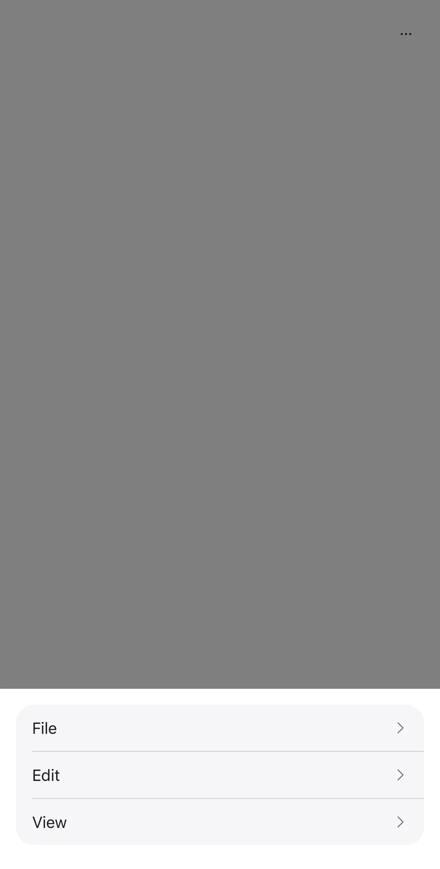
```tsx
import { ClipboardTextIcon, CopyIcon, ScissorsIcon, TrashIcon } from "phosphor-react-native"
import { ActionBar, ActionBarContent, ActionBarItem, ActionBarLabel, ActionBarMenu, ActionBarSeparator, ActionBarTrigger } from "@/components/patterns/action-bar"
import { Icon } from "@/components/ui/icon"
import { Text } from "@/components/ui/text"
function FileMenu({ defaultOpen }: { defaultOpen?: boolean }) {
return (
FileNew tabNew windowNew incognito windowPrint
)
}
function EditMenu({ withIcons = false }: { withIcons?: boolean }) {
return (
Edit
{withIcons ? : null}
Cut
{withIcons ? : null}
Copy
{withIcons ? : null}
Paste
{withIcons ? : null}
Delete
)
}
function ViewMenu() {
return (
ViewAppearanceZoom inZoom outActual size
)
}
export function ActionBarExample() {
return (
)
}
```
```swift
import EsuissUI
import PhosphorSwift
import SwiftUI
struct ActionBarExample: View {
var body: some View {
ActionBarDemo {
ActionBarFileMenu()
ActionBarEditMenu()
ActionBarViewMenu()
}
}
}
struct ActionBarDemo: View {
var dismissible = true
var moreLabel: LocalizedStringKey = "More actions"
var cancelLabel: LocalizedStringKey = "Cancel"
let content: Content
@State private var open: Bool
init(
open: Bool = false,
dismissible: Bool = true,
moreLabel: LocalizedStringKey = "More actions",
cancelLabel: LocalizedStringKey = "Cancel",
@ViewBuilder content: () -> Content
) {
_open = State(initialValue: open)
self.dismissible = dismissible
self.moreLabel = moreLabel
self.cancelLabel = cancelLabel
self.content = content()
}
var body: some View {
ActionBar(isPresented: $open, dismissible: dismissible, moreLabel: moreLabel, cancelLabel: cancelLabel) {
content
}
}
}
struct ActionBarFileMenu: View {
var isPresented: Binding?
var body: some View {
ActionBarMenu("File", isPresented: isPresented) {
ActionBarItem("New tab") {}
ActionBarItem("New window") {}
ActionBarItem("New incognito window") {}.disabled(true)
ActionBarSeparator()
ActionBarItem("Print") {}
}
}
}
struct ActionBarEditMenu: View {
var withIcons = false
var body: some View {
ActionBarMenu("Edit") {
if withIcons {
ActionBarItem("Cut", icon: Ph.scissors.regular) {}
ActionBarItem("Copy", icon: Ph.copy.regular) {}
ActionBarItem("Paste", icon: Ph.clipboardText.regular) {}
ActionBarSeparator()
ActionBarItem("Delete", icon: Ph.trash.regular, variant: .destructive) {}
} else {
ActionBarItem("Cut") {}
ActionBarItem("Copy") {}
ActionBarItem("Paste") {}
ActionBarSeparator()
ActionBarItem("Delete", variant: .destructive) {}
}
}
}
}
struct ActionBarViewMenu: View {
var body: some View {
ActionBarMenu("View") {
ActionBarLabel("Appearance")
ActionBarItem("Zoom in") {}
ActionBarItem("Zoom out") {}
ActionBarItem("Actual size") {}
}
}
}
```
```kotlin
import androidx.compose.foundation.layout.fillMaxWidth
import androidx.compose.runtime.Composable
import androidx.compose.runtime.getValue
import androidx.compose.runtime.mutableStateOf
import androidx.compose.runtime.saveable.rememberSaveable
import androidx.compose.runtime.setValue
import androidx.compose.ui.Modifier
import com.esuiss.ui.patterns.ActionBar
@Composable
fun ActionBarDemo(
defaultOpen: Boolean = false,
fileOpen: Boolean = false,
withIcons: Boolean = false,
view: Boolean = true,
dismissible: Boolean = true,
floating: Boolean = false,
moreLabel: String = "More actions",
cancelLabel: String = "Cancel",
) {
var open by rememberSaveable { mutableStateOf(defaultOpen) }
ActionBar(
open = open,
onOpenChange = { open = it },
modifier = Modifier.fillMaxWidth(),
dismissible = dismissible,
floating = floating,
moreLabel = moreLabel,
cancelLabel = cancelLabel,
) {
actionBarFileMenu(fileOpen)
actionBarEditMenu(withIcons)
if (view) actionBarViewMenu()
}
}
```
### Overflow
Opens the More actions drawer on first render.
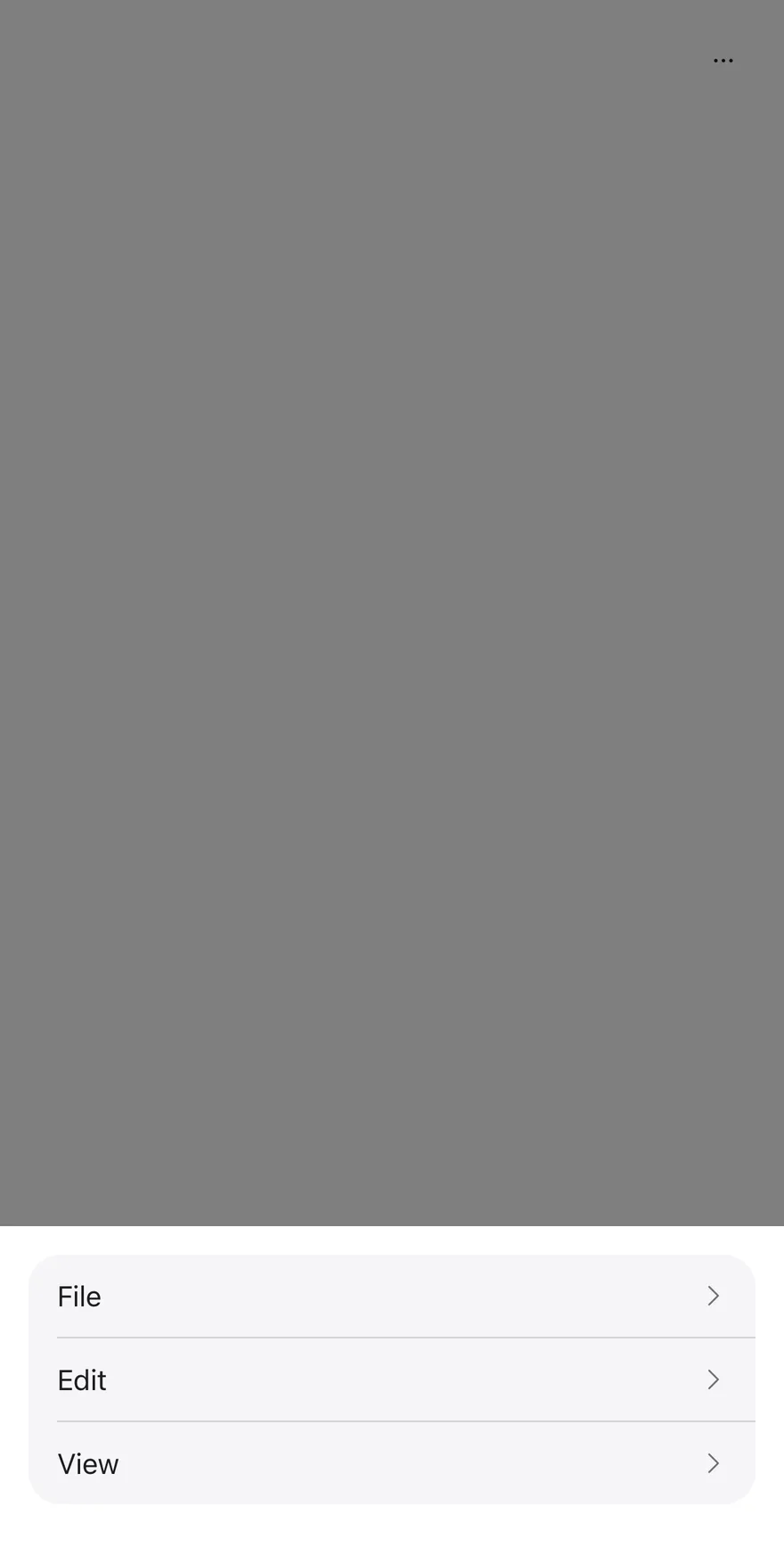
```tsx
import { ClipboardTextIcon, CopyIcon, ScissorsIcon, TrashIcon } from "phosphor-react-native"
import { ActionBar, ActionBarContent, ActionBarItem, ActionBarLabel, ActionBarMenu, ActionBarSeparator, ActionBarTrigger } from "@/components/patterns/action-bar"
import { Icon } from "@/components/ui/icon"
import { Text } from "@/components/ui/text"
function FileMenu({ defaultOpen }: { defaultOpen?: boolean }) {
return (
FileNew tabNew windowNew incognito windowPrint
)
}
function EditMenu({ withIcons = false }: { withIcons?: boolean }) {
return (
Edit
{withIcons ? : null}
Cut
{withIcons ? : null}
Copy
{withIcons ? : null}
Paste
{withIcons ? : null}
Delete
)
}
function ViewMenu() {
return (
ViewAppearanceZoom inZoom outActual size
)
}
export function ActionBarOverflowExample() {
return (
)
}
```
```swift
import EsuissUI
import PhosphorSwift
import SwiftUI
struct ActionBarOverflowExample: View {
var body: some View {
ActionBarDemo(open: true) {
ActionBarFileMenu()
ActionBarEditMenu()
ActionBarViewMenu()
}
}
}
struct ActionBarDemo: View {
var dismissible = true
var moreLabel: LocalizedStringKey = "More actions"
var cancelLabel: LocalizedStringKey = "Cancel"
let content: Content
@State private var open: Bool
init(
open: Bool = false,
dismissible: Bool = true,
moreLabel: LocalizedStringKey = "More actions",
cancelLabel: LocalizedStringKey = "Cancel",
@ViewBuilder content: () -> Content
) {
_open = State(initialValue: open)
self.dismissible = dismissible
self.moreLabel = moreLabel
self.cancelLabel = cancelLabel
self.content = content()
}
var body: some View {
ActionBar(isPresented: $open, dismissible: dismissible, moreLabel: moreLabel, cancelLabel: cancelLabel) {
content
}
}
}
struct ActionBarFileMenu: View {
var isPresented: Binding?
var body: some View {
ActionBarMenu("File", isPresented: isPresented) {
ActionBarItem("New tab") {}
ActionBarItem("New window") {}
ActionBarItem("New incognito window") {}.disabled(true)
ActionBarSeparator()
ActionBarItem("Print") {}
}
}
}
struct ActionBarEditMenu: View {
var withIcons = false
var body: some View {
ActionBarMenu("Edit") {
if withIcons {
ActionBarItem("Cut", icon: Ph.scissors.regular) {}
ActionBarItem("Copy", icon: Ph.copy.regular) {}
ActionBarItem("Paste", icon: Ph.clipboardText.regular) {}
ActionBarSeparator()
ActionBarItem("Delete", icon: Ph.trash.regular, variant: .destructive) {}
} else {
ActionBarItem("Cut") {}
ActionBarItem("Copy") {}
ActionBarItem("Paste") {}
ActionBarSeparator()
ActionBarItem("Delete", variant: .destructive) {}
}
}
}
}
struct ActionBarViewMenu: View {
var body: some View {
ActionBarMenu("View") {
ActionBarLabel("Appearance")
ActionBarItem("Zoom in") {}
ActionBarItem("Zoom out") {}
ActionBarItem("Actual size") {}
}
}
}
```
```kotlin
import androidx.compose.foundation.layout.fillMaxWidth
import androidx.compose.runtime.Composable
import androidx.compose.runtime.getValue
import androidx.compose.runtime.mutableStateOf
import androidx.compose.runtime.saveable.rememberSaveable
import androidx.compose.runtime.setValue
import androidx.compose.ui.Modifier
import com.esuiss.ui.patterns.ActionBar
@Composable
fun ActionBarOverflowExample() {
ActionBarDemo(defaultOpen = true)
}
@Composable
fun ActionBarDemo(
defaultOpen: Boolean = false,
fileOpen: Boolean = false,
withIcons: Boolean = false,
view: Boolean = true,
dismissible: Boolean = true,
floating: Boolean = false,
moreLabel: String = "More actions",
cancelLabel: String = "Cancel",
) {
var open by rememberSaveable { mutableStateOf(defaultOpen) }
ActionBar(
open = open,
onOpenChange = { open = it },
modifier = Modifier.fillMaxWidth(),
dismissible = dismissible,
floating = floating,
moreLabel = moreLabel,
cancelLabel = cancelLabel,
) {
actionBarFileMenu(fileOpen)
actionBarEditMenu(withIcons)
if (view) actionBarViewMenu()
}
}
```
### With icons
Places an icon before each item in the Edit menu.
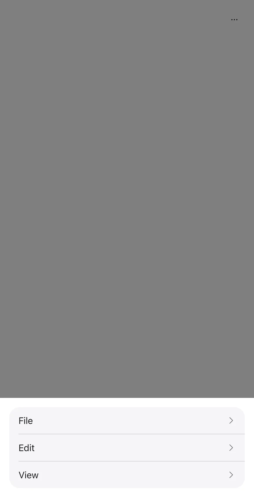
```tsx
import { ClipboardTextIcon, CopyIcon, ScissorsIcon, TrashIcon } from "phosphor-react-native"
import { ActionBar, ActionBarContent, ActionBarItem, ActionBarLabel, ActionBarMenu, ActionBarSeparator, ActionBarTrigger } from "@/components/patterns/action-bar"
import { Icon } from "@/components/ui/icon"
import { Text } from "@/components/ui/text"
function FileMenu({ defaultOpen }: { defaultOpen?: boolean }) {
return (
FileNew tabNew windowNew incognito windowPrint
)
}
function EditMenu({ withIcons = false }: { withIcons?: boolean }) {
return (
Edit
{withIcons ? : null}
Cut
{withIcons ? : null}
Copy
{withIcons ? : null}
Paste
{withIcons ? : null}
Delete
)
}
function ViewMenu() {
return (
ViewAppearanceZoom inZoom outActual size
)
}
export function ActionBarWithIconsExample() {
return (
)
}
```
```swift
import EsuissUI
import PhosphorSwift
import SwiftUI
struct ActionBarWithIconsExample: View {
var body: some View {
ActionBarDemo {
ActionBarFileMenu()
ActionBarEditMenu(withIcons: true)
ActionBarViewMenu()
}
}
}
struct ActionBarDemo: View {
var dismissible = true
var moreLabel: LocalizedStringKey = "More actions"
var cancelLabel: LocalizedStringKey = "Cancel"
let content: Content
@State private var open: Bool
init(
open: Bool = false,
dismissible: Bool = true,
moreLabel: LocalizedStringKey = "More actions",
cancelLabel: LocalizedStringKey = "Cancel",
@ViewBuilder content: () -> Content
) {
_open = State(initialValue: open)
self.dismissible = dismissible
self.moreLabel = moreLabel
self.cancelLabel = cancelLabel
self.content = content()
}
var body: some View {
ActionBar(isPresented: $open, dismissible: dismissible, moreLabel: moreLabel, cancelLabel: cancelLabel) {
content
}
}
}
struct ActionBarFileMenu: View {
var isPresented: Binding?
var body: some View {
ActionBarMenu("File", isPresented: isPresented) {
ActionBarItem("New tab") {}
ActionBarItem("New window") {}
ActionBarItem("New incognito window") {}.disabled(true)
ActionBarSeparator()
ActionBarItem("Print") {}
}
}
}
struct ActionBarEditMenu: View {
var withIcons = false
var body: some View {
ActionBarMenu("Edit") {
if withIcons {
ActionBarItem("Cut", icon: Ph.scissors.regular) {}
ActionBarItem("Copy", icon: Ph.copy.regular) {}
ActionBarItem("Paste", icon: Ph.clipboardText.regular) {}
ActionBarSeparator()
ActionBarItem("Delete", icon: Ph.trash.regular, variant: .destructive) {}
} else {
ActionBarItem("Cut") {}
ActionBarItem("Copy") {}
ActionBarItem("Paste") {}
ActionBarSeparator()
ActionBarItem("Delete", variant: .destructive) {}
}
}
}
}
struct ActionBarViewMenu: View {
var body: some View {
ActionBarMenu("View") {
ActionBarLabel("Appearance")
ActionBarItem("Zoom in") {}
ActionBarItem("Zoom out") {}
ActionBarItem("Actual size") {}
}
}
}
```
```kotlin
import androidx.compose.foundation.layout.fillMaxWidth
import androidx.compose.runtime.Composable
import androidx.compose.runtime.getValue
import androidx.compose.runtime.mutableStateOf
import androidx.compose.runtime.saveable.rememberSaveable
import androidx.compose.runtime.setValue
import androidx.compose.ui.Modifier
import com.esuiss.ui.patterns.ActionBar
@Composable
fun ActionBarWithIconsExample() {
ActionBarDemo(withIcons = true)
}
@Composable
fun ActionBarDemo(
defaultOpen: Boolean = false,
fileOpen: Boolean = false,
withIcons: Boolean = false,
view: Boolean = true,
dismissible: Boolean = true,
floating: Boolean = false,
moreLabel: String = "More actions",
cancelLabel: String = "Cancel",
) {
var open by rememberSaveable { mutableStateOf(defaultOpen) }
ActionBar(
open = open,
onOpenChange = { open = it },
modifier = Modifier.fillMaxWidth(),
dismissible = dismissible,
floating = floating,
moreLabel = moreLabel,
cancelLabel = cancelLabel,
) {
actionBarFileMenu(fileOpen)
actionBarEditMenu(withIcons)
if (view) actionBarViewMenu()
}
}
```
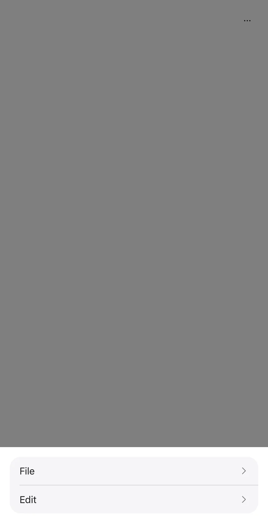
### Not dismissible
Sets `dismissible` to `false`, so sheets close only through an action or Cancel.
```tsx
import { ClipboardTextIcon, CopyIcon, ScissorsIcon, TrashIcon } from "phosphor-react-native"
import { ActionBar, ActionBarContent, ActionBarItem, ActionBarMenu, ActionBarSeparator, ActionBarTrigger } from "@/components/patterns/action-bar"
import { Icon } from "@/components/ui/icon"
import { Text } from "@/components/ui/text"
function FileMenu({ defaultOpen }: { defaultOpen?: boolean }) {
return (
FileNew tabNew windowNew incognito windowPrint
)
}
function EditMenu({ withIcons = false }: { withIcons?: boolean }) {
return (
Edit
{withIcons ? : null}
Cut
{withIcons ? : null}
Copy
{withIcons ? : null}
Paste
{withIcons ? : null}
Delete
)
}
export function ActionBarNotDismissibleExample() {
return (
)
}
```
```swift
import EsuissUI
import PhosphorSwift
import SwiftUI
struct ActionBarNotDismissibleExample: View {
var body: some View {
ActionBarDemo(dismissible: false) {
ActionBarFileMenu()
ActionBarEditMenu()
}
}
}
struct ActionBarDemo: View {
var dismissible = true
var moreLabel: LocalizedStringKey = "More actions"
var cancelLabel: LocalizedStringKey = "Cancel"
let content: Content
@State private var open: Bool
init(
open: Bool = false,
dismissible: Bool = true,
moreLabel: LocalizedStringKey = "More actions",
cancelLabel: LocalizedStringKey = "Cancel",
@ViewBuilder content: () -> Content
) {
_open = State(initialValue: open)
self.dismissible = dismissible
self.moreLabel = moreLabel
self.cancelLabel = cancelLabel
self.content = content()
}
var body: some View {
ActionBar(isPresented: $open, dismissible: dismissible, moreLabel: moreLabel, cancelLabel: cancelLabel) {
content
}
}
}
struct ActionBarFileMenu: View {
var isPresented: Binding?
var body: some View {
ActionBarMenu("File", isPresented: isPresented) {
ActionBarItem("New tab") {}
ActionBarItem("New window") {}
ActionBarItem("New incognito window") {}.disabled(true)
ActionBarSeparator()
ActionBarItem("Print") {}
}
}
}
struct ActionBarEditMenu: View {
var withIcons = false
var body: some View {
ActionBarMenu("Edit") {
if withIcons {
ActionBarItem("Cut", icon: Ph.scissors.regular) {}
ActionBarItem("Copy", icon: Ph.copy.regular) {}
ActionBarItem("Paste", icon: Ph.clipboardText.regular) {}
ActionBarSeparator()
ActionBarItem("Delete", icon: Ph.trash.regular, variant: .destructive) {}
} else {
ActionBarItem("Cut") {}
ActionBarItem("Copy") {}
ActionBarItem("Paste") {}
ActionBarSeparator()
ActionBarItem("Delete", variant: .destructive) {}
}
}
}
}
```
```kotlin
import androidx.compose.foundation.layout.fillMaxWidth
import androidx.compose.runtime.Composable
import androidx.compose.runtime.getValue
import androidx.compose.runtime.mutableStateOf
import androidx.compose.runtime.saveable.rememberSaveable
import androidx.compose.runtime.setValue
import androidx.compose.ui.Modifier
import com.esuiss.ui.patterns.ActionBar
@Composable
fun ActionBarNotDismissibleExample() {
ActionBarDemo(dismissible = false, view = false)
}
@Composable
fun ActionBarDemo(
defaultOpen: Boolean = false,
fileOpen: Boolean = false,
withIcons: Boolean = false,
view: Boolean = true,
dismissible: Boolean = true,
floating: Boolean = false,
moreLabel: String = "More actions",
cancelLabel: String = "Cancel",
) {
var open by rememberSaveable { mutableStateOf(defaultOpen) }
ActionBar(
open = open,
onOpenChange = { open = it },
modifier = Modifier.fillMaxWidth(),
dismissible = dismissible,
floating = floating,
moreLabel = moreLabel,
cancelLabel = cancelLabel,
) {
actionBarFileMenu(fileOpen)
actionBarEditMenu(withIcons)
if (view) actionBarViewMenu()
}
}
```
### Custom labels
Renames the More actions button and the Cancel button with `moreLabel` and `cancelLabel`.
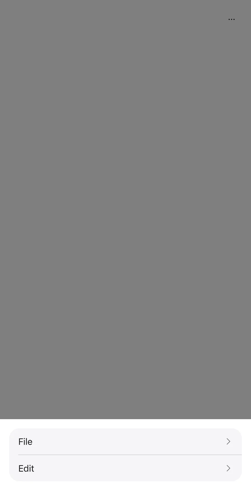
```tsx
import { ClipboardTextIcon, CopyIcon, ScissorsIcon, TrashIcon } from "phosphor-react-native"
import { ActionBar, ActionBarContent, ActionBarItem, ActionBarMenu, ActionBarSeparator, ActionBarTrigger } from "@/components/patterns/action-bar"
import { Icon } from "@/components/ui/icon"
import { Text } from "@/components/ui/text"
function FileMenu({ defaultOpen }: { defaultOpen?: boolean }) {
return (
FileNew tabNew windowNew incognito windowPrint
)
}
function EditMenu({ withIcons = false }: { withIcons?: boolean }) {
return (
Edit
{withIcons ? : null}
Cut
{withIcons ? : null}
Copy
{withIcons ? : null}
Paste
{withIcons ? : null}
Delete
)
}
export function ActionBarCustomLabelsExample() {
return (
)
}
```
```swift
import EsuissUI
import PhosphorSwift
import SwiftUI
struct ActionBarCustomLabelsExample: View {
var body: some View {
ActionBarDemo(moreLabel: "Document actions", cancelLabel: "Close") {
ActionBarFileMenu()
ActionBarEditMenu()
}
}
}
struct ActionBarDemo: View {
var dismissible = true
var moreLabel: LocalizedStringKey = "More actions"
var cancelLabel: LocalizedStringKey = "Cancel"
let content: Content
@State private var open: Bool
init(
open: Bool = false,
dismissible: Bool = true,
moreLabel: LocalizedStringKey = "More actions",
cancelLabel: LocalizedStringKey = "Cancel",
@ViewBuilder content: () -> Content
) {
_open = State(initialValue: open)
self.dismissible = dismissible
self.moreLabel = moreLabel
self.cancelLabel = cancelLabel
self.content = content()
}
var body: some View {
ActionBar(isPresented: $open, dismissible: dismissible, moreLabel: moreLabel, cancelLabel: cancelLabel) {
content
}
}
}
struct ActionBarFileMenu: View {
var isPresented: Binding?
var body: some View {
ActionBarMenu("File", isPresented: isPresented) {
ActionBarItem("New tab") {}
ActionBarItem("New window") {}
ActionBarItem("New incognito window") {}.disabled(true)
ActionBarSeparator()
ActionBarItem("Print") {}
}
}
}
struct ActionBarEditMenu: View {
var withIcons = false
var body: some View {
ActionBarMenu("Edit") {
if withIcons {
ActionBarItem("Cut", icon: Ph.scissors.regular) {}
ActionBarItem("Copy", icon: Ph.copy.regular) {}
ActionBarItem("Paste", icon: Ph.clipboardText.regular) {}
ActionBarSeparator()
ActionBarItem("Delete", icon: Ph.trash.regular, variant: .destructive) {}
} else {
ActionBarItem("Cut") {}
ActionBarItem("Copy") {}
ActionBarItem("Paste") {}
ActionBarSeparator()
ActionBarItem("Delete", variant: .destructive) {}
}
}
}
}
```
```kotlin
import androidx.compose.foundation.layout.fillMaxWidth
import androidx.compose.runtime.Composable
import androidx.compose.runtime.getValue
import androidx.compose.runtime.mutableStateOf
import androidx.compose.runtime.saveable.rememberSaveable
import androidx.compose.runtime.setValue
import androidx.compose.ui.Modifier
import com.esuiss.ui.patterns.ActionBar
@Composable
fun ActionBarCustomLabelsExample() {
ActionBarDemo(view = false, moreLabel = "Document actions", cancelLabel = "Close")
}
@Composable
fun ActionBarDemo(
defaultOpen: Boolean = false,
fileOpen: Boolean = false,
withIcons: Boolean = false,
view: Boolean = true,
dismissible: Boolean = true,
floating: Boolean = false,
moreLabel: String = "More actions",
cancelLabel: String = "Cancel",
) {
var open by rememberSaveable { mutableStateOf(defaultOpen) }
ActionBar(
open = open,
onOpenChange = { open = it },
modifier = Modifier.fillMaxWidth(),
dismissible = dismissible,
floating = floating,
moreLabel = moreLabel,
cancelLabel = cancelLabel,
) {
actionBarFileMenu(fileOpen)
actionBarEditMenu(withIcons)
if (view) actionBarViewMenu()
}
}
```
**React Native, Jetpack Compose**
### Floating
Detaches the drawer from the screen edges with `floating`.
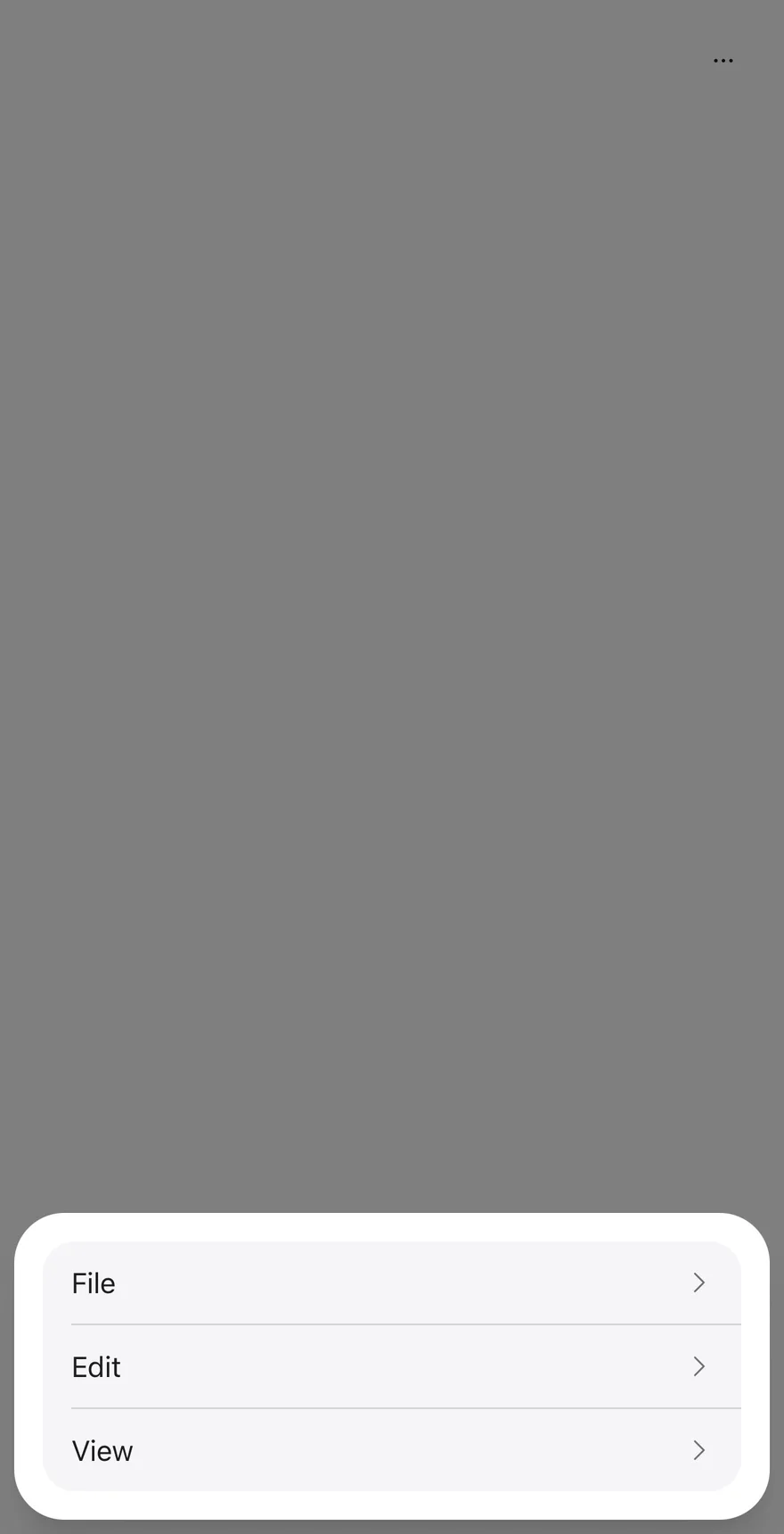
```tsx
import { ClipboardTextIcon, CopyIcon, ScissorsIcon, TrashIcon } from "phosphor-react-native"
import { ActionBar, ActionBarContent, ActionBarItem, ActionBarLabel, ActionBarMenu, ActionBarSeparator, ActionBarTrigger } from "@/components/patterns/action-bar"
import { Icon } from "@/components/ui/icon"
import { Text } from "@/components/ui/text"
function FileMenu({ defaultOpen }: { defaultOpen?: boolean }) {
return (
FileNew tabNew windowNew incognito windowPrint
)
}
function EditMenu({ withIcons = false }: { withIcons?: boolean }) {
return (
Edit
{withIcons ? : null}
Cut
{withIcons ? : null}
Copy
{withIcons ? : null}
Paste
{withIcons ? : null}
Delete
)
}
function ViewMenu() {
return (
ViewAppearanceZoom inZoom outActual size
)
}
export function ActionBarFloatingExample() {
return (
)
}
```
```kotlin
import androidx.compose.foundation.layout.fillMaxWidth
import androidx.compose.runtime.Composable
import androidx.compose.runtime.getValue
import androidx.compose.runtime.mutableStateOf
import androidx.compose.runtime.saveable.rememberSaveable
import androidx.compose.runtime.setValue
import androidx.compose.ui.Modifier
import com.esuiss.ui.patterns.ActionBar
@Composable
fun ActionBarFloatingExample() {
ActionBarDemo(defaultOpen = true, floating = true)
}
@Composable
fun ActionBarDemo(
defaultOpen: Boolean = false,
fileOpen: Boolean = false,
withIcons: Boolean = false,
view: Boolean = true,
dismissible: Boolean = true,
floating: Boolean = false,
moreLabel: String = "More actions",
cancelLabel: String = "Cancel",
) {
var open by rememberSaveable { mutableStateOf(defaultOpen) }
ActionBar(
open = open,
onOpenChange = { open = it },
modifier = Modifier.fillMaxWidth(),
dismissible = dismissible,
floating = floating,
moreLabel = moreLabel,
cancelLabel = cancelLabel,
) {
actionBarFileMenu(fileOpen)
actionBarEditMenu(withIcons)
if (view) actionBarViewMenu()
}
}
```
## API Reference
### ActionBar
The root that renders the More actions button, its drawer and each menu's sheet.
| Prop | Type | Default | Description |
| --- | --- | --- | --- |
| `open` | `boolean` | - | Controls whether the More actions drawer is open. |
| `defaultOpen` | `boolean` | `false` | Whether the drawer starts open when uncontrolled. |
| `onOpenChange` | `(open: boolean) => void` | - | Called when the drawer opens or closes. |
| `dismissible` | `boolean` | `true` | When `false`, sheets ignore outside presses and close only through an action or Cancel. Defaults to `true`. |
| `floating` | `boolean` | - | Insets the drawer from the screen edges. |
| `moreLabel` | `string` | `"More actions"` | Accessibility label of the More actions button and drawer. Defaults to `More actions`. |
| `cancelLabel` | `string` | `"Cancel"` | Text of the Cancel button in each sheet. Defaults to `Cancel`. |
Also accepts the props of `ViewProps`.
### ActionBarMenu
One menu; a row in the drawer and an `AlertSheet` for its items.
| Prop | Type | Default | Description |
| --- | --- | --- | --- |
| `open` | `boolean` | - | Controls whether this menu's sheet is open. |
| `defaultOpen` | `boolean` | - | Opens this menu's sheet on first render. |
| `onOpenChange` | `(open: boolean) => void` | - | Called when this menu's sheet opens or closes. |
| `children` | `React.ReactNode` | - | |
### ActionBarTrigger
The drawer row that opens the menu's sheet, with a trailing chevron.
| Prop | Type | Default | Description |
| --- | --- | --- | --- |
| `children` | `React.ReactNode` | - | |
Also accepts the props of `React.ComponentProps`.
### ActionBarContent
The menu's items in an `AlertSheetContent`, followed by a Cancel button.
Also accepts the props of `React.ComponentProps`.
### ActionBarLabel
A title shown at the top of the sheet.
Also accepts the props of `React.ComponentProps`.
### ActionBarItem
An actionable entry, rendered as an `AlertSheetAction`.
Also accepts the props of `React.ComponentProps`.
### ActionBarSeparator
Kept for API parity; renders nothing.
| Prop | Type | Default | Description |
| --- | --- | --- | --- |
| `className` | `string` | - | |
## Accessibility
- The More actions button and the drawer are labelled by `moreLabel`.
- Each drawer row has the `button` role and exposes its disabled state.
- The chevron flips in right-to-left layouts.
## Notes
- Rows sit on `bg-muted` with `border-border` dividers; disabled rows use `opacity-50`.
- Without `floating`, the drawer's top corners are square.