# Top Banner
Short banners that slide in from the top of the screen, queue one at a time and can be swiped up to dismiss.
Top Banner is an open-source interaction from suiss/ui for React Native, SwiftUI and Jetpack Compose. The @esuiss/ui CLI copies its source into your project, so you own the code.
Source: https://ui.suiss.app/docs/interactions/top-banner
**React Native, SwiftUI, Jetpack Compose**
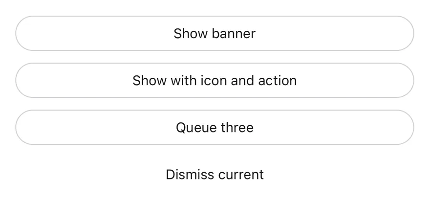
```tsx
import { WifiSlashIcon } from "phosphor-react-native"
import * as React from "react"
import { View } from "react-native"
import { TopBannerProvider, useTopBanner } from "@/components/interactions/top-banner"
import { Button } from "@/components/ui/button"
import { Text } from "@/components/ui/text"
function Triggers() {
const { show, dismiss } = useTopBanner()
const [log, setLog] = React.useState("")
return (
{log}
)
}
export function TopBannerExample() {
return (
)
}
```
```swift
import EsuissUI
import PhosphorSwift
import SwiftUI
struct TopBannerExample: View {
var body: some View {
TopBannerStage(timeout: .seconds(4))
}
}
struct TopBannerStage: View {
var timeout: Duration = .seconds(600)
var onMount: (@MainActor (TopBannerManager) -> Void)?
@State private var manager = TopBannerManager()
@State private var shown = false
init(timeout: Duration = .seconds(600), onMount: (@MainActor (TopBannerManager) -> Void)? = nil) {
self.timeout = timeout
self.onMount = onMount
}
var body: some View {
TopBannerTriggers(manager: manager)
.frame(maxHeight: .infinity, alignment: .top)
.containerRelativeFrame(.vertical) { height, _ in height - 32 }
.topBanner(manager, timeout: timeout)
.onAppear {
guard !shown else { return }
shown = true
manager.timeout = timeout
onMount?(manager)
}
}
}
struct TopBannerTriggers: View {
let manager: TopBannerManager
@State private var log = ""
var body: some View {
VStack(spacing: 12) {
Button {
manager.show("Message sent", description: "Alex will see it the next time they open the app.")
} label: {
Text("Show banner").frame(maxWidth: .infinity)
}
.buttonStyle(.variant(.outline))
Button {
manager.show(
"You are offline",
description: "Changes will sync when you reconnect.",
icon: Ph.wifiSlash.regular,
action: TopBannerAction("Retry") { log = "Retry pressed" }
)
} label: {
Text("Show with icon and action").frame(maxWidth: .infinity)
}
.buttonStyle(.variant(.outline))
Button {
manager.show("First of three")
manager.show("Second of three")
manager.show("Third of three")
} label: {
Text("Queue three").frame(maxWidth: .infinity)
}
.buttonStyle(.variant(.outline))
Button {
manager.dismiss()
} label: {
Text("Dismiss current").frame(maxWidth: .infinity)
}
.buttonStyle(.variant(.ghost))
Text(verbatim: log)
.textStyle(.sm)
.foregroundStyle(EsuissColor.mutedForeground)
.frame(maxWidth: .infinity, alignment: .leading)
.accessibilityAddTraits(.updatesFrequently)
}
}
}
```
```kotlin
import androidx.compose.foundation.layout.Arrangement
import androidx.compose.foundation.layout.Column
import androidx.compose.foundation.layout.fillMaxWidth
import androidx.compose.runtime.Composable
import androidx.compose.runtime.LaunchedEffect
import androidx.compose.runtime.getValue
import androidx.compose.runtime.mutableStateOf
import androidx.compose.runtime.saveable.rememberSaveable
import androidx.compose.runtime.setValue
import androidx.compose.ui.Modifier
import androidx.compose.ui.semantics.LiveRegionMode
import androidx.compose.ui.semantics.liveRegion
import androidx.compose.ui.semantics.semantics
import androidx.compose.ui.unit.dp
import com.adamglin.PhosphorIcons
import com.adamglin.phosphoricons.Regular
import com.adamglin.phosphoricons.regular.WifiSlash
import com.esuiss.ui.components.Button
import com.esuiss.ui.components.ButtonVariant
import com.esuiss.ui.components.Text
import com.esuiss.ui.interactions.TopBannerAction
import com.esuiss.ui.interactions.TopBannerProvider
import com.esuiss.ui.interactions.TopBannerState
import com.esuiss.ui.interactions.rememberTopBannerState
import com.esuiss.ui.theme.EsuissTheme
import com.esuiss.ui.theme.Typography
@Composable
fun TopBannerExample() {
TopBannerDemo(timeout = 4000L)
}
@Composable
fun TopBannerDemo(timeout: Long = 600000L, onMount: (TopBannerState.() -> Unit)? = null) {
val state = rememberTopBannerState(defaultTimeoutMillis = timeout)
var shown by rememberSaveable { mutableStateOf(false) }
LaunchedEffect(Unit) {
if (shown || onMount == null) return@LaunchedEffect
shown = true
state.onMount()
}
TopBannerProvider(state) {
TopBannerTriggers(state)
}
}
@Composable
fun TopBannerTriggers(state: TopBannerState) {
var log by rememberSaveable { mutableStateOf("") }
val fill = Modifier.fillMaxWidth()
Column(Modifier.fillMaxWidth(), verticalArrangement = Arrangement.spacedBy(12.dp)) {
Button(
"Show banner",
onClick = { state.show("Message sent", description = "Alex will see it the next time they open the app.") },
modifier = fill,
variant = ButtonVariant.Outline,
)
Button(
"Show with icon and action",
onClick = {
state.show(
"You are offline",
description = "Changes will sync when you reconnect.",
icon = PhosphorIcons.Regular.WifiSlash,
action = TopBannerAction("Retry") { log = "Retry pressed" },
)
},
modifier = fill,
variant = ButtonVariant.Outline,
)
Button(
"Queue three",
onClick = {
state.show("First of three")
state.show("Second of three")
state.show("Third of three")
},
modifier = fill,
variant = ButtonVariant.Outline,
)
Button("Dismiss current", onClick = { state.dismiss() }, modifier = fill, variant = ButtonVariant.Ghost)
Text(
log,
modifier = Modifier.semantics { liveRegion = LiveRegionMode.Polite },
style = Typography.sm.copy(color = EsuissTheme.colors.mutedForeground),
)
}
}
```
`TopBannerProvider` shows banners requested with `show` from `useTopBanner`. Each banner slides down below the top safe area with a title, an optional description, icon and action button, and hides after 4 seconds by default.
Banners queue and appear one at a time, with a short pause between them. Swiping a banner up past a small distance, or flicking it up, dismisses it; dragging pauses the timer. Use it for brief confirmations and status updates, such as a copied link or a restored connection.
## Installation
**React Native**
```bash title="Terminal"
npx shadcn@latest add @esuiss-rn/top-banner
```
See [Installation](https://ui.suiss.app/docs/installation) for the `components.json` setup. Or use the suiss/ui CLI:
```bash title="Terminal"
npx @esuiss/ui@latest add top-banner
```
**SwiftUI**
```bash title="Terminal"
npx @esuiss/ui@latest add top-banner --platform swift
```
**Jetpack Compose**
```bash title="Terminal"
npx @esuiss/ui@latest add top-banner --platform kotlin
```
The CLI also adds what it builds on: [Button](https://ui.suiss.app/docs/components/button), [Icon](https://ui.suiss.app/docs/components/icon), [Text](https://ui.suiss.app/docs/components/text). On React Native it also adds the animated view `components/ui/animated-view.tsx`.
### Manual
**React Native**
**Uniwind**
1. Install the dependencies:
```bash title="Terminal"
npx expo install cn phosphor-react-native react-native-gesture-handler react-native-reanimated react-native-safe-area-context react-native-svg react-native-worklets
```
2. Add the pieces it builds on: [Button](https://ui.suiss.app/docs/components/button), [Icon](https://ui.suiss.app/docs/components/icon), [Text](https://ui.suiss.app/docs/components/text), and the primitives `components/primitives/portal.tsx`, and the animated view `components/ui/animated-view.tsx` from the next step.
3. Copy the animated view into `components/ui/animated-view.tsx`:
- `uniwind/components/ui/animated-view.tsx`: [source](https://github.com/e-suiss/ui/blob/main/packages/mobile/uniwind/components/ui/animated-view.tsx)
4. Copy the source into `components/interactions/top-banner.tsx`:
```tsx title="uniwind/components/interactions/top-banner.tsx"
import { cn } from "cn"
import type { Icon as PhosphorIcon } from "phosphor-react-native"
import * as React from "react"
import { AccessibilityInfo, useWindowDimensions, View } from "react-native"
import { Gesture, GestureDetector } from "react-native-gesture-handler"
import {
Easing,
Keyframe,
ReduceMotion,
runOnJS,
useAnimatedStyle,
useSharedValue,
withSpring,
withTiming,
} from "react-native-reanimated"
import { useSafeAreaInsets } from "react-native-safe-area-context"
import { Portal } from "@/components/primitives/portal"
import { AnimatedView } from "@/components/ui/animated-view"
import { Button } from "@/components/ui/button"
import { Icon } from "@/components/ui/icon"
import { Text } from "@/components/ui/text"
type TopBannerOptions = {
title: React.ReactNode
description?: React.ReactNode
icon?: PhosphorIcon
action?: { label: React.ReactNode; onPress: () => void }
timeout?: number
}
type TopBannerEntry = TopBannerOptions & { id: number }
type TopBannerContextProps = {
show: (options: TopBannerOptions) => number
dismiss: (id?: number) => void
}
const TopBannerContext = React.createContext(null)
function useTopBanner() {
const context = React.useContext(TopBannerContext)
if (!context) {
throw new Error("useTopBanner must be used within a ")
}
return context
}
const MAX_WIDTH = 384
const GAP = 300
const EASING = Easing.bezier(0.32, 0.72, 0, 1)
const ENTERING = new Keyframe({
0: { opacity: 0, transform: [{ translateY: -80 }, { scale: 0.95 }] },
100: {
opacity: 1,
transform: [{ translateY: 0 }, { scale: 1 }],
easing: EASING,
},
})
.duration(400)
.reduceMotion(ReduceMotion.System)
const EXITING = new Keyframe({
0: { opacity: 1, transform: [{ translateY: 0 }, { scale: 1 }] },
100: {
opacity: 0,
transform: [{ translateY: -80 }, { scale: 0.95 }],
easing: EASING,
},
})
.duration(300)
.reduceMotion(ReduceMotion.System)
let nextId = 0
function wrapText(children: React.ReactNode, className: string) {
if (typeof children === "string" || typeof children === "number") {
return {children}
}
return children
}
function TopBannerView({
entry,
top,
inset,
swiped,
className,
onSwipe,
onPause,
onDismiss,
}: {
entry: TopBannerEntry
top: number
inset: number
swiped: boolean
className?: string
onSwipe: () => void
onPause: (paused: boolean) => void
onDismiss: () => void
}) {
const translateY = useSharedValue(0)
const height = useSharedValue(0)
const gesture = React.useMemo(
() =>
Gesture.Pan()
.activeOffsetY([-8, 8])
.onStart(() => {
runOnJS(onPause)(true)
})
.onUpdate((event) => {
translateY.value =
event.translationY < 0
? event.translationY
: event.translationY * 0.2
})
.onEnd((event) => {
if (event.translationY < -32 || event.velocityY < -500) {
translateY.value = withTiming(
-(height.value + top + 16),
{ duration: 200, easing: EASING },
(finished) => {
if (finished) runOnJS(onSwipe)()
}
)
return
}
translateY.value = withSpring(0, { damping: 20, stiffness: 240 })
runOnJS(onPause)(false)
}),
[translateY, height, top, onSwipe, onPause]
)
const animatedStyle = useAnimatedStyle(() => ({
transform: [{ translateY: translateY.value }],
}))
return (
{
if (event.nativeEvent.actionName === "dismiss") onDismiss()
}}
onLayout={(event) => {
height.value = event.nativeEvent.layout.height
}}
className={cn(
"w-full flex-row items-center gap-3 rounded-2xl border border-border bg-card p-3.5 shadow-xl dark:bg-muted",
className
)}
style={animatedStyle}
>
{entry.icon ? (
) : null}
{wrapText(entry.title, "text-sm font-semibold")}
{entry.description !== undefined
? wrapText(entry.description, "text-sm text-muted-foreground")
: null}
{entry.action ? (
) : null}
)
}
function TopBannerProvider({
timeout = 4000,
className,
portalHost,
children,
}: {
timeout?: number
className?: string
portalHost?: string
children?: React.ReactNode
}) {
const [queue, setQueue] = React.useState([])
const [ready, setReady] = React.useState(true)
const [paused, setPaused] = React.useState(false)
const [swipedId, setSwipedId] = React.useState(null)
const insets = useSafeAreaInsets()
const { width } = useWindowDimensions()
const inset = Math.max(16, (width - MAX_WIDTH) / 2)
const top = insets.top + 8
const id = React.useId()
const current = ready ? queue[0] : undefined
const show = React.useCallback((options: TopBannerOptions) => {
nextId += 1
const entry = { ...options, id: nextId }
setQueue((items) => [...items, entry])
return entry.id
}, [])
const queueRef = React.useRef(queue)
queueRef.current = queue
const dismiss = React.useCallback((entryId?: number) => {
const first = queueRef.current[0]?.id
const target = entryId ?? first
if (target === undefined) return
if (target === first) {
setReady(false)
setPaused(false)
}
setQueue((items) => items.filter((item) => item.id !== target))
}, [])
React.useEffect(() => {
if (ready) return
const timer = setTimeout(() => setReady(true), GAP)
return () => clearTimeout(timer)
}, [ready])
React.useEffect(() => {
if (!current) return
if (typeof current.title === "string") {
AccessibilityInfo.announceForAccessibility(current.title)
}
}, [current])
React.useEffect(() => {
if (!current || paused) return
const duration = current.timeout ?? timeout
if (!Number.isFinite(duration) || duration <= 0) return
const timer = setTimeout(() => dismiss(current.id), duration)
return () => clearTimeout(timer)
}, [current, paused, timeout, dismiss])
React.useEffect(() => {
if (swipedId === null) return
dismiss(swipedId)
setSwipedId(null)
}, [swipedId, dismiss])
const contextValue = React.useMemo(() => ({ show, dismiss }), [show, dismiss])
return (
{children}
{current ? (
setSwipedId(current.id)}
onPause={setPaused}
onDismiss={() => dismiss(current.id)}
/>
) : null}
)
}
export { TopBannerProvider, useTopBanner }
```
5. Update the import paths to match your project.
**NativeWind**
1. Install the dependencies:
```bash title="Terminal"
npx expo install cn phosphor-react-native react-native-gesture-handler react-native-reanimated react-native-safe-area-context react-native-svg react-native-worklets
```
2. Add the pieces it builds on: [Button](https://ui.suiss.app/docs/components/button), [Icon](https://ui.suiss.app/docs/components/icon), [Text](https://ui.suiss.app/docs/components/text), and the primitives `components/primitives/portal.tsx`, and the animated view `components/ui/animated-view.tsx` from the next step.
3. Copy the animated view into `components/ui/animated-view.tsx`:
- `nativewind/components/ui/animated-view.tsx`: [source](https://github.com/e-suiss/ui/blob/main/packages/mobile/nativewind/components/ui/animated-view.tsx)
4. Copy the source into `components/interactions/top-banner.tsx`:
```tsx title="nativewind/components/interactions/top-banner.tsx"
import { cn } from "cn"
import type { Icon as PhosphorIcon } from "phosphor-react-native"
import * as React from "react"
import { AccessibilityInfo, useWindowDimensions, View } from "react-native"
import { Gesture, GestureDetector } from "react-native-gesture-handler"
import {
Easing,
Keyframe,
ReduceMotion,
runOnJS,
useAnimatedStyle,
useSharedValue,
withSpring,
withTiming,
} from "react-native-reanimated"
import { useSafeAreaInsets } from "react-native-safe-area-context"
import { Portal } from "@/components/primitives/portal"
import { AnimatedView } from "@/components/ui/animated-view"
import { Button } from "@/components/ui/button"
import { Icon } from "@/components/ui/icon"
import { Text } from "@/components/ui/text"
type TopBannerOptions = {
title: React.ReactNode
description?: React.ReactNode
icon?: PhosphorIcon
action?: { label: React.ReactNode; onPress: () => void }
timeout?: number
}
type TopBannerEntry = TopBannerOptions & { id: number }
type TopBannerContextProps = {
show: (options: TopBannerOptions) => number
dismiss: (id?: number) => void
}
const TopBannerContext = React.createContext(null)
function useTopBanner() {
const context = React.useContext(TopBannerContext)
if (!context) {
throw new Error("useTopBanner must be used within a ")
}
return context
}
const MAX_WIDTH = 384
const GAP = 300
const EASING = Easing.bezier(0.32, 0.72, 0, 1)
const ENTERING = new Keyframe({
0: { opacity: 0, transform: [{ translateY: -80 }, { scale: 0.95 }] },
100: {
opacity: 1,
transform: [{ translateY: 0 }, { scale: 1 }],
easing: EASING,
},
})
.duration(400)
.reduceMotion(ReduceMotion.System)
const EXITING = new Keyframe({
0: { opacity: 1, transform: [{ translateY: 0 }, { scale: 1 }] },
100: {
opacity: 0,
transform: [{ translateY: -80 }, { scale: 0.95 }],
easing: EASING,
},
})
.duration(300)
.reduceMotion(ReduceMotion.System)
let nextId = 0
function wrapText(children: React.ReactNode, className: string) {
if (typeof children === "string" || typeof children === "number") {
return {children}
}
return children
}
function TopBannerView({
entry,
top,
inset,
swiped,
className,
onSwipe,
onPause,
onDismiss,
}: {
entry: TopBannerEntry
top: number
inset: number
swiped: boolean
className?: string
onSwipe: () => void
onPause: (paused: boolean) => void
onDismiss: () => void
}) {
const translateY = useSharedValue(0)
const height = useSharedValue(0)
const gesture = React.useMemo(
() =>
Gesture.Pan()
.activeOffsetY([-8, 8])
.onStart(() => {
runOnJS(onPause)(true)
})
.onUpdate((event) => {
translateY.value =
event.translationY < 0
? event.translationY
: event.translationY * 0.2
})
.onEnd((event) => {
if (event.translationY < -32 || event.velocityY < -500) {
translateY.value = withTiming(
-(height.value + top + 16),
{ duration: 200, easing: EASING },
(finished) => {
if (finished) runOnJS(onSwipe)()
}
)
return
}
translateY.value = withSpring(0, { damping: 20, stiffness: 240 })
runOnJS(onPause)(false)
}),
[translateY, height, top, onSwipe, onPause]
)
const animatedStyle = useAnimatedStyle(() => ({
transform: [{ translateY: translateY.value }],
}))
return (
{
if (event.nativeEvent.actionName === "dismiss") onDismiss()
}}
onLayout={(event) => {
height.value = event.nativeEvent.layout.height
}}
className={cn(
"w-full flex-row items-center gap-3 rounded-2xl border border-border bg-card p-3.5 shadow-xl dark:bg-muted",
className
)}
style={animatedStyle}
>
{entry.icon ? (
) : null}
{wrapText(entry.title, "text-sm font-semibold")}
{entry.description !== undefined
? wrapText(entry.description, "text-sm text-muted-foreground")
: null}
{entry.action ? (
) : null}
)
}
function TopBannerProvider({
timeout = 4000,
className,
portalHost,
children,
}: {
timeout?: number
className?: string
portalHost?: string
children?: React.ReactNode
}) {
const [queue, setQueue] = React.useState([])
const [ready, setReady] = React.useState(true)
const [paused, setPaused] = React.useState(false)
const [swipedId, setSwipedId] = React.useState(null)
const insets = useSafeAreaInsets()
const { width } = useWindowDimensions()
const inset = Math.max(16, (width - MAX_WIDTH) / 2)
const top = insets.top + 8
const id = React.useId()
const current = ready ? queue[0] : undefined
const show = React.useCallback((options: TopBannerOptions) => {
nextId += 1
const entry = { ...options, id: nextId }
setQueue((items) => [...items, entry])
return entry.id
}, [])
const queueRef = React.useRef(queue)
queueRef.current = queue
const dismiss = React.useCallback((entryId?: number) => {
const first = queueRef.current[0]?.id
const target = entryId ?? first
if (target === undefined) return
if (target === first) {
setReady(false)
setPaused(false)
}
setQueue((items) => items.filter((item) => item.id !== target))
}, [])
React.useEffect(() => {
if (ready) return
const timer = setTimeout(() => setReady(true), GAP)
return () => clearTimeout(timer)
}, [ready])
React.useEffect(() => {
if (!current) return
if (typeof current.title === "string") {
AccessibilityInfo.announceForAccessibility(current.title)
}
}, [current])
React.useEffect(() => {
if (!current || paused) return
const duration = current.timeout ?? timeout
if (!Number.isFinite(duration) || duration <= 0) return
const timer = setTimeout(() => dismiss(current.id), duration)
return () => clearTimeout(timer)
}, [current, paused, timeout, dismiss])
React.useEffect(() => {
if (swipedId === null) return
dismiss(swipedId)
setSwipedId(null)
}, [swipedId, dismiss])
const contextValue = React.useMemo(() => ({ show, dismiss }), [show, dismiss])
return (
{children}
{current ? (
setSwipedId(current.id)}
onPause={setPaused}
onDismiss={() => dismiss(current.id)}
/>
) : null}
)
}
export { TopBannerProvider, useTopBanner }
```
5. Update the import paths to match your project.
**StyleSheet**
1. Install the dependencies:
```bash title="Terminal"
npx expo install phosphor-react-native react-native-gesture-handler react-native-reanimated react-native-safe-area-context react-native-svg react-native-worklets
```
2. Add the pieces it builds on: [Button](https://ui.suiss.app/docs/components/button), [Icon](https://ui.suiss.app/docs/components/icon), [Text](https://ui.suiss.app/docs/components/text), and the primitives `components/primitives/portal.tsx`, and the animated view `components/ui/animated-view.tsx` from the next step.
3. Copy the animated view into `components/ui/animated-view.tsx`:
- `stylesheet/components/ui/animated-view.tsx`: [source](https://github.com/e-suiss/ui/blob/main/packages/mobile/stylesheet/components/ui/animated-view.tsx)
4. Copy the source into `components/interactions/top-banner.tsx`:
```tsx title="stylesheet/components/interactions/top-banner.tsx"
import type { Icon as PhosphorIcon } from "phosphor-react-native"
import * as React from "react"
import {
AccessibilityInfo,
type StyleProp,
StyleSheet,
type TextStyle,
useWindowDimensions,
View,
type ViewStyle,
} from "react-native"
import { Gesture, GestureDetector } from "react-native-gesture-handler"
import {
Easing,
Keyframe,
ReduceMotion,
runOnJS,
useAnimatedStyle,
useSharedValue,
withSpring,
withTiming,
} from "react-native-reanimated"
import { useSafeAreaInsets } from "react-native-safe-area-context"
import { Portal } from "@/components/primitives/portal"
import { AnimatedView } from "@/components/ui/animated-view"
import { Button } from "@/components/ui/button"
import { Icon } from "@/components/ui/icon"
import { Text } from "@/components/ui/text"
import { fontSize, radius, shadow, useTheme } from "@/components/ui/theme"
type TopBannerOptions = {
title: React.ReactNode
description?: React.ReactNode
icon?: PhosphorIcon
action?: { label: React.ReactNode; onPress: () => void }
timeout?: number
}
type TopBannerEntry = TopBannerOptions & { id: number }
type TopBannerContextProps = {
show: (options: TopBannerOptions) => number
dismiss: (id?: number) => void
}
const TopBannerContext = React.createContext(null)
function useTopBanner() {
const context = React.useContext(TopBannerContext)
if (!context) {
throw new Error("useTopBanner must be used within a ")
}
return context
}
const MAX_WIDTH = 384
const GAP = 300
const EASING = Easing.bezier(0.32, 0.72, 0, 1)
const ENTERING = new Keyframe({
0: { opacity: 0, transform: [{ translateY: -80 }, { scale: 0.95 }] },
100: {
opacity: 1,
transform: [{ translateY: 0 }, { scale: 1 }],
easing: EASING,
},
})
.duration(400)
.reduceMotion(ReduceMotion.System)
const EXITING = new Keyframe({
0: { opacity: 1, transform: [{ translateY: 0 }, { scale: 1 }] },
100: {
opacity: 0,
transform: [{ translateY: -80 }, { scale: 0.95 }],
easing: EASING,
},
})
.duration(300)
.reduceMotion(ReduceMotion.System)
let nextId = 0
const styles = StyleSheet.create({
frame: { position: "absolute", zIndex: 50 },
banner: {
width: "100%",
flexDirection: "row",
alignItems: "center",
gap: 12,
borderRadius: radius["2xl"],
borderWidth: 1,
padding: 14,
...shadow.xl,
},
icon: { flexShrink: 0 },
body: { minWidth: 0, flex: 1, gap: 2 },
title: { ...fontSize.sm, fontWeight: "600" },
description: { ...fontSize.sm },
action: { fontWeight: "600" },
})
function wrapText(children: React.ReactNode, style: TextStyle) {
if (typeof children === "string" || typeof children === "number") {
return {children}
}
return children
}
function TopBannerView({
entry,
top,
inset,
swiped,
style,
onSwipe,
onPause,
onDismiss,
}: {
entry: TopBannerEntry
top: number
inset: number
swiped: boolean
style?: StyleProp
onSwipe: () => void
onPause: (paused: boolean) => void
onDismiss: () => void
}) {
const { colors, isDark } = useTheme()
const translateY = useSharedValue(0)
const height = useSharedValue(0)
const gesture = React.useMemo(
() =>
Gesture.Pan()
.activeOffsetY([-8, 8])
.onStart(() => {
runOnJS(onPause)(true)
})
.onUpdate((event) => {
translateY.value =
event.translationY < 0
? event.translationY
: event.translationY * 0.2
})
.onEnd((event) => {
if (event.translationY < -32 || event.velocityY < -500) {
translateY.value = withTiming(
-(height.value + top + 16),
{ duration: 200, easing: EASING },
(finished) => {
if (finished) runOnJS(onSwipe)()
}
)
return
}
translateY.value = withSpring(0, { damping: 20, stiffness: 240 })
runOnJS(onPause)(false)
}),
[translateY, height, top, onSwipe, onPause]
)
const animatedStyle = useAnimatedStyle(() => ({
transform: [{ translateY: translateY.value }],
}))
return (
{
if (event.nativeEvent.actionName === "dismiss") onDismiss()
}}
onLayout={(event) => {
height.value = event.nativeEvent.layout.height
}}
style={[
styles.banner,
{
borderColor: colors.border,
backgroundColor: isDark ? colors.muted : colors.card,
},
style,
animatedStyle,
]}
>
{entry.icon ? (
) : null}
{wrapText(entry.title, styles.title)}
{entry.description !== undefined
? wrapText(entry.description, {
...styles.description,
color: colors.mutedForeground,
})
: null}
{entry.action ? (
) : null}
)
}
function TopBannerProvider({
timeout = 4000,
style,
portalHost,
children,
}: {
timeout?: number
style?: StyleProp
portalHost?: string
children?: React.ReactNode
}) {
const [queue, setQueue] = React.useState([])
const [ready, setReady] = React.useState(true)
const [paused, setPaused] = React.useState(false)
const [swipedId, setSwipedId] = React.useState(null)
const insets = useSafeAreaInsets()
const { width } = useWindowDimensions()
const inset = Math.max(16, (width - MAX_WIDTH) / 2)
const top = insets.top + 8
const id = React.useId()
const current = ready ? queue[0] : undefined
const show = React.useCallback((options: TopBannerOptions) => {
nextId += 1
const entry = { ...options, id: nextId }
setQueue((items) => [...items, entry])
return entry.id
}, [])
const queueRef = React.useRef(queue)
queueRef.current = queue
const dismiss = React.useCallback((entryId?: number) => {
const first = queueRef.current[0]?.id
const target = entryId ?? first
if (target === undefined) return
if (target === first) {
setReady(false)
setPaused(false)
}
setQueue((items) => items.filter((item) => item.id !== target))
}, [])
React.useEffect(() => {
if (ready) return
const timer = setTimeout(() => setReady(true), GAP)
return () => clearTimeout(timer)
}, [ready])
React.useEffect(() => {
if (!current) return
if (typeof current.title === "string") {
AccessibilityInfo.announceForAccessibility(current.title)
}
}, [current])
React.useEffect(() => {
if (!current || paused) return
const duration = current.timeout ?? timeout
if (!Number.isFinite(duration) || duration <= 0) return
const timer = setTimeout(() => dismiss(current.id), duration)
return () => clearTimeout(timer)
}, [current, paused, timeout, dismiss])
React.useEffect(() => {
if (swipedId === null) return
dismiss(swipedId)
setSwipedId(null)
}, [swipedId, dismiss])
const contextValue = React.useMemo(() => ({ show, dismiss }), [show, dismiss])
return (
{children}
{current ? (
setSwipedId(current.id)}
onPause={setPaused}
onDismiss={() => dismiss(current.id)}
/>
) : null}
)
}
export { TopBannerProvider, useTopBanner }
```
5. Update the import paths to match your project.
**SwiftUI**
1. Target iOS 17 or later.
2. Add the Swift package to your app:
```swift title="Package.swift"
.package(url: "https://github.com/phosphor-icons/swift", from: "2.1.0")
```
3. Copy the theme files every view uses:
- `swift/Theme/Theme.swift`: [source](https://github.com/e-suiss/ui/blob/main/packages/mobile/swiftui/Sources/EsuissUI/Theme/Theme.swift)
- `swift/Theme/Tokens.swift`: [source](https://github.com/e-suiss/ui/blob/main/packages/mobile/swiftui/Sources/EsuissUI/Theme/Tokens.swift)
4. Copy the source and every file it uses:
```swift title="swift/Interactions/TopBanner.swift"
import Observation
import PhosphorSwift
import SwiftUI
public struct TopBannerAction: Sendable {
public let title: LocalizedStringResource
public let action: @MainActor @Sendable () -> Void
public init(_ title: LocalizedStringResource, action: @escaping @MainActor @Sendable () -> Void) {
self.title = title
self.action = action
}
}
public struct TopBannerItem: Identifiable, @unchecked Sendable {
public let id: UUID
public let title: LocalizedStringResource
public let description: LocalizedStringResource?
public let icon: Image?
public let action: TopBannerAction?
public let duration: Duration?
}
@Observable
public final class TopBannerManager: @unchecked Sendable {
public static let shared = TopBannerManager()
public private(set) var queue: [TopBannerItem] = []
public var timeout: Duration = .seconds(4)
@ObservationIgnored private var timer: Task?
@ObservationIgnored private var scheduled: UUID?
public init() {}
public var current: TopBannerItem? { queue.first }
@MainActor @discardableResult
public func show(
_ title: LocalizedStringResource,
description: LocalizedStringResource? = nil,
icon: Image? = nil,
action: TopBannerAction? = nil,
duration: Duration? = nil
) -> UUID {
let item = TopBannerItem(
id: UUID(),
title: title,
description: description,
icon: icon,
action: action,
duration: duration
)
queue.append(item)
advance()
return item.id
}
@MainActor
public func dismiss(_ id: UUID? = nil) {
guard let target = id ?? queue.first?.id else { return }
queue.removeAll { $0.id == target }
advance()
}
@MainActor
public func dismissAll() {
queue.removeAll()
advance()
}
@MainActor
private func advance() {
guard let item = queue.first else {
timer?.cancel()
timer = nil
scheduled = nil
return
}
guard scheduled != item.id else { return }
timer?.cancel()
scheduled = item.id
let title = String(localized: item.title)
let detail = item.description.map { String(localized: $0) }
AccessibilityNotification.Announcement([title, detail].compactMap { $0 }.joined(separator: ". ")).post()
let wait = item.duration ?? timeout
timer = Task { @MainActor [weak self] in
try? await Task.sleep(for: wait)
guard !Task.isCancelled, let self, self.queue.first?.id == item.id else { return }
self.dismiss(item.id)
}
}
}
extension EnvironmentValues {
@Entry public var topBannerManager: TopBannerManager = .shared
}
extension View {
public func topBanner(_ manager: TopBannerManager = .shared, timeout: Duration = .seconds(4)) -> some View {
overlay(alignment: .top) {
TopBannerRegion(manager: manager)
}
.environment(\.topBannerManager, manager)
.onAppear { manager.timeout = timeout }
.onChange(of: timeout) { _, value in manager.timeout = value }
}
}
struct TopBannerRegion: View {
let manager: TopBannerManager
@Environment(\.accessibilityReduceMotion) private var reduceMotion
var body: some View {
ZStack(alignment: .top) {
if let item = manager.current {
TopBannerCard(item: item) { manager.dismiss(item.id) }
.id(item.id)
.transition(reduceMotion ? .opacity : .move(edge: .top).combined(with: .opacity))
}
}
.animation(reduceMotion ? .linear(duration: 0.2) : .timingCurve(0.32, 0.72, 0, 1, duration: 0.4), value: manager.current?.id)
}
}
struct TopBannerCard: View {
let item: TopBannerItem
let onDismiss: () -> Void
@State private var drag: CGFloat = 0
@Environment(\.colorScheme) private var colorScheme
var body: some View {
let shape = RoundedRectangle(cornerRadius: Radius.xl2, style: .continuous)
let dark = colorScheme == .dark
HStack(spacing: 12) {
if let icon = item.icon {
icon
.frame(width: 20, height: 20)
.foregroundStyle(EsuissColor.primary)
.frame(width: 36, height: 36)
.background(Color.adaptive(light: EsuissColor.primary.opacity(0.1), dark: EsuissColor.primary.opacity(0.2)), in: Circle())
.accessibilityHidden(true)
}
VStack(alignment: .leading, spacing: 2) {
Text(item.title)
.scaledFont(.sm, weight: .semibold)
.foregroundStyle(EsuissColor.foreground)
if let description = item.description {
Text(description)
.scaledFont(.sm)
.foregroundStyle(EsuissColor.mutedForeground)
.lineLimit(3)
}
}
.lineLimit(2)
.fixedSize(horizontal: false, vertical: true)
.frame(maxWidth: .infinity, alignment: .leading)
if let action = item.action {
Button {
action.action()
onDismiss()
} label: {
Text(action.title)
}
.buttonStyle(.variant(.tinted, size: .sm))
}
}
.padding(.horizontal, 14)
.padding(.vertical, 12)
.frame(maxWidth: 512)
.background {
shape
.fill(EsuissColor.card)
.shadow(dark ? .lg : Shadow(color: .black.opacity(0.14), radius: 16, y: 8))
}
.overlay {
if !dark { shape.strokeBorder(EsuissColor.foreground.opacity(0.05)) }
}
.padding(.horizontal, 12)
.padding(.top, 4)
.offset(y: min(drag, 0) + max(drag, 0) / 6)
.gesture(
DragGesture(minimumDistance: 8)
.onChanged { value in
drag = value.translation.height
}
.onEnded { value in
if drag < -24 || value.predictedEndTranslation.height < -80 {
onDismiss()
} else {
withAnimation(.spring(duration: 0.3)) { drag = 0 }
}
}
)
.accessibilityElement(children: .contain)
.accessibilityAction(.escape, onDismiss)
.accessibilityAction(named: Text("Dismiss"), onDismiss)
}
}
```
- `swift/Components/Button.swift`: see [Button](https://ui.suiss.app/docs/components/button.md)
- `swift/Components/ButtonGroup.swift`: see [Button Group](https://ui.suiss.app/docs/components/button-group.md)
- `swift/Components/TextVariant.swift`: [source](https://github.com/e-suiss/ui/blob/main/packages/mobile/swiftui/Sources/EsuissUI/Components/TextVariant.swift)
5. Add the files to your app target.
**Jetpack Compose**
1. Set `minSdk` to 24 or higher and add the dependencies:
```kotlin title="build.gradle.kts"
implementation(platform("androidx.compose:compose-bom:2026.09.00"))
implementation("androidx.compose.foundation:foundation")
implementation("androidx.compose.ui:ui")
```
2. Copy the theme files every view uses:
- `kotlin/theme/Theme.kt`: [source](https://github.com/e-suiss/ui/blob/main/packages/mobile/kotlin/ui/src/main/kotlin/com/esuiss/ui/theme/Theme.kt)
- `kotlin/theme/Tokens.kt`: [source](https://github.com/e-suiss/ui/blob/main/packages/mobile/kotlin/ui/src/main/kotlin/com/esuiss/ui/theme/Tokens.kt)
3. Copy the source and every file it uses:
```kt title="kotlin/interactions/TopBanner.kt"
package com.esuiss.ui.interactions
import androidx.compose.animation.core.Animatable
import androidx.compose.animation.core.tween
import androidx.compose.foundation.background
import androidx.compose.foundation.border
import androidx.compose.foundation.gestures.Orientation
import androidx.compose.foundation.gestures.draggable
import androidx.compose.foundation.gestures.rememberDraggableState
import androidx.compose.foundation.layout.Arrangement
import androidx.compose.foundation.layout.Box
import androidx.compose.foundation.layout.Column
import androidx.compose.foundation.layout.Row
import androidx.compose.foundation.layout.WindowInsets
import androidx.compose.foundation.layout.padding
import androidx.compose.foundation.layout.size
import androidx.compose.foundation.layout.statusBars
import androidx.compose.foundation.layout.width
import androidx.compose.foundation.shape.CircleShape
import androidx.compose.foundation.shape.RoundedCornerShape
import androidx.compose.foundation.text.BasicText
import androidx.compose.runtime.Composable
import androidx.compose.runtime.Immutable
import androidx.compose.runtime.LaunchedEffect
import androidx.compose.runtime.Stable
import androidx.compose.runtime.getValue
import androidx.compose.runtime.key
import androidx.compose.runtime.mutableIntStateOf
import androidx.compose.runtime.mutableStateListOf
import androidx.compose.runtime.mutableStateOf
import androidx.compose.runtime.remember
import androidx.compose.runtime.rememberCoroutineScope
import androidx.compose.runtime.setValue
import androidx.compose.ui.Alignment
import androidx.compose.ui.Modifier
import androidx.compose.ui.graphics.graphicsLayer
import androidx.compose.ui.graphics.vector.ImageVector
import androidx.compose.ui.layout.onGloballyPositioned
import androidx.compose.ui.layout.onSizeChanged
import androidx.compose.ui.layout.positionOnScreen
import androidx.compose.ui.platform.LocalDensity
import androidx.compose.ui.platform.LocalWindowInfo
import androidx.compose.ui.semantics.LiveRegionMode
import androidx.compose.ui.semantics.dismiss
import androidx.compose.ui.semantics.liveRegion
import androidx.compose.ui.semantics.semantics
import androidx.compose.ui.text.font.FontWeight
import androidx.compose.ui.unit.Dp
import androidx.compose.ui.unit.IntOffset
import androidx.compose.ui.unit.IntRect
import androidx.compose.ui.unit.IntSize
import androidx.compose.ui.unit.LayoutDirection
import androidx.compose.ui.unit.dp
import androidx.compose.ui.window.Popup
import androidx.compose.ui.window.PopupPositionProvider
import androidx.compose.ui.window.PopupProperties
import com.esuiss.ui.components.Button
import com.esuiss.ui.components.ButtonSize
import com.esuiss.ui.components.ButtonVariant
import com.esuiss.ui.components.FormEasing
import com.esuiss.ui.components.Icon
import com.esuiss.ui.components.formReducedMotion
import com.esuiss.ui.theme.EsuissTheme
import com.esuiss.ui.theme.Radius
import com.esuiss.ui.theme.Shadows
import com.esuiss.ui.theme.Typography
import com.esuiss.ui.theme.shadow
import kotlinx.coroutines.delay
import kotlinx.coroutines.launch
private val TopBannerMaxWidth = 420.dp
class TopBannerAction(val label: String, val onClick: () -> Unit)
@Immutable
internal class TopBannerEntry(
val id: Long,
val title: String,
val description: String?,
val icon: ImageVector?,
val action: TopBannerAction?,
val timeoutMillis: Long,
)
@Stable
class TopBannerState internal constructor(private val defaultTimeoutMillis: Long) {
private var nextId = 0L
private val queue = mutableStateListOf()
internal var leaving by mutableStateOf(false)
internal val current: TopBannerEntry?
get() = queue.firstOrNull()
fun show(
title: String,
description: String? = null,
icon: ImageVector? = null,
action: TopBannerAction? = null,
timeoutMillis: Long = defaultTimeoutMillis,
): Long {
nextId += 1
queue.add(TopBannerEntry(nextId, title, description, icon, action, timeoutMillis))
return nextId
}
fun dismiss() {
if (queue.isNotEmpty()) leaving = true
}
internal fun removeCurrent() {
if (queue.isNotEmpty()) queue.removeAt(0)
leaving = false
}
}
@Composable
fun rememberTopBannerState(defaultTimeoutMillis: Long = 4000): TopBannerState =
remember { TopBannerState(defaultTimeoutMillis) }
private class TopBannerPosition : PopupPositionProvider {
override fun calculatePosition(
anchorBounds: IntRect,
windowSize: IntSize,
layoutDirection: LayoutDirection,
popupContentSize: IntSize,
): IntOffset = IntOffset((windowSize.width - popupContentSize.width) / 2, 0)
}
@Composable
fun TopBannerProvider(
state: TopBannerState,
modifier: Modifier = Modifier,
content: @Composable () -> Unit,
) {
content()
val entry = state.current ?: return
val density = LocalDensity.current
val top = WindowInsets.statusBars.getTop(density)
val container = LocalWindowInfo.current.containerSize
val available = with(density) { container.width.toDp() } - 32.dp
val width = if (container.width > 0 && available < TopBannerMaxWidth) available else TopBannerMaxWidth
val provider = remember { TopBannerPosition() }
Popup(
popupPositionProvider = provider,
properties = PopupProperties(focusable = false, dismissOnBackPress = false, dismissOnClickOutside = false),
) {
key(entry.id) {
TopBannerCard(
entry = entry,
state = state,
topInset = with(density) { top.toDp() },
width = width,
modifier = modifier,
)
}
}
}
@Composable
private fun TopBannerCard(
entry: TopBannerEntry,
state: TopBannerState,
topInset: Dp,
width: Dp,
modifier: Modifier,
) {
val colors = EsuissTheme.colors
val density = LocalDensity.current
val scope = rememberCoroutineScope()
val reduced = formReducedMotion()
var height by remember { mutableIntStateOf(0) }
val travel = remember { Animatable(1f) }
val drag = remember { Animatable(0f) }
val gap = with(density) { 8.dp.toPx() }
LaunchedEffect(Unit) {
travel.animateTo(0f, tween(if (reduced) 0 else 400, easing = FormEasing))
}
var holding by remember { mutableStateOf(false) }
LaunchedEffect(entry.id, entry.timeoutMillis, holding) {
if (entry.timeoutMillis <= 0 || holding) return@LaunchedEffect
delay(entry.timeoutMillis)
state.dismiss()
}
LaunchedEffect(state.leaving) {
if (!state.leaving) return@LaunchedEffect
travel.animateTo(1f, tween(if (reduced) 0 else 250, easing = FormEasing))
state.removeCurrent()
}
val dragState = rememberDraggableState { delta ->
scope.launch { drag.snapTo((drag.value + delta).coerceAtMost(with(density) { 12.dp.toPx() })) }
}
val shape = RoundedCornerShape(Radius.xl2)
var origin by remember { mutableStateOf(null) }
val inset = origin?.let { with(density) { (topInset.toPx() - it).coerceAtLeast(0f).toDp() } } ?: topInset
Box(
modifier = Modifier
.onGloballyPositioned { origin = it.positionOnScreen().y }
.padding(top = inset + 8.dp, start = 16.dp, end = 16.dp, bottom = 24.dp),
) {
Row(
modifier = modifier
.width(width)
.onSizeChanged { height = it.height }
.graphicsLayer {
translationY = -travel.value * (height + gap + inset.toPx()) + drag.value
alpha = if (reduced) 1f - travel.value else 1f
}
.shadow(Shadows.lg, shape)
.background(colors.card, shape)
.border(1.dp, colors.foreground.copy(alpha = if (colors.isDark) 0.1f else 0.05f), shape)
.draggable(
state = dragState,
orientation = Orientation.Vertical,
onDragStarted = { holding = true },
onDragStopped = { velocity ->
holding = false
if (drag.value < -with(density) { 32.dp.toPx() } || velocity < -1000f) {
state.dismiss()
} else {
drag.animateTo(0f, tween(200))
}
},
)
.semantics {
liveRegion = LiveRegionMode.Polite
dismiss {
state.dismiss()
true
}
}
.padding(start = 14.dp, end = 14.dp, top = 12.dp, bottom = 12.dp),
horizontalArrangement = Arrangement.spacedBy(12.dp),
verticalAlignment = Alignment.CenterVertically,
) {
if (entry.icon != null) {
Box(
modifier = Modifier
.size(36.dp)
.background(colors.primary.copy(alpha = if (colors.isDark) 0.2f else 0.1f), CircleShape),
contentAlignment = Alignment.Center,
) {
Icon(entry.icon, contentDescription = null, size = 20.dp, tint = colors.primary)
}
}
Column(modifier = Modifier.weight(1f), verticalArrangement = Arrangement.spacedBy(2.dp)) {
BasicText(entry.title, style = Typography.sm.copy(color = colors.foreground, fontWeight = FontWeight.SemiBold))
if (entry.description != null) {
BasicText(entry.description, style = Typography.sm.copy(color = colors.mutedForeground))
}
}
if (entry.action != null) {
Button(
text = entry.action.label,
onClick = {
entry.action.onClick()
state.dismiss()
},
variant = ButtonVariant.Tinted,
size = ButtonSize.Sm,
)
}
}
}
}
```
- `kotlin/components/Button.kt`: see [Button](https://ui.suiss.app/docs/components/button.md)
- `kotlin/components/ButtonGroup.kt`: see [Button Group](https://ui.suiss.app/docs/components/button-group.md)
- `kotlin/components/Content.kt`: [source](https://github.com/e-suiss/ui/blob/main/packages/mobile/kotlin/ui/src/main/kotlin/com/esuiss/ui/components/Content.kt)
- `kotlin/components/FormSupport.kt`: [source](https://github.com/e-suiss/ui/blob/main/packages/mobile/kotlin/ui/src/main/kotlin/com/esuiss/ui/components/FormSupport.kt)
- `kotlin/components/Icon.kt`: see [Icon](https://ui.suiss.app/docs/components/icon.md)
4. Update the `com.esuiss.ui` package names to match your project.
## Usage
```tsx
import { TopBannerProvider } from "@/components/interactions/top-banner"
```
```tsx
```
Wrap the app in `TopBannerProvider`, then call `show({ title, description?, icon?, action?, timeout? })` from `useTopBanner`. `show` returns an id that you can pass to `dismiss`; calling `dismiss()` with no id dismisses the current banner.
`icon` is a Phosphor icon component. `action` is `{ label, onPress }`; pressing it runs `onPress` and dismisses the banner. Pass a `timeout` of `0` or `Infinity` to keep a banner until dismissed.
## Examples
### Showing
A banner with a title and description, shown on mount.
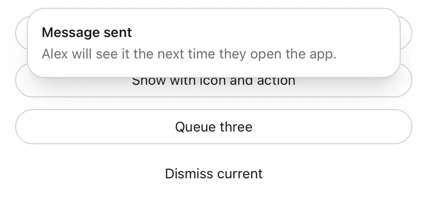
```tsx
import { WifiSlashIcon } from "phosphor-react-native"
import * as React from "react"
import { View } from "react-native"
import { TopBannerProvider, useTopBanner } from "@/components/interactions/top-banner"
import { Button } from "@/components/ui/button"
import { Text } from "@/components/ui/text"
function Triggers() {
const { show, dismiss } = useTopBanner()
const [log, setLog] = React.useState("")
return (
{log}
)
}
function ShowOnMount({
options,
}: {
options: Parameters["show"]>[0]
}) {
const { show } = useTopBanner()
const shownRef = React.useRef(false)
const optionsRef = React.useRef(options)
React.useEffect(() => {
if (shownRef.current) return
shownRef.current = true
show(optionsRef.current)
}, [show])
return
}
export function TopBannerShowingExample() {
return (
)
}
```
```swift
import EsuissUI
import PhosphorSwift
import SwiftUI
struct TopBannerShowingExample: View {
var body: some View {
TopBannerStage { manager in
manager.show("Message sent", description: "Alex will see it the next time they open the app.")
}
}
}
struct TopBannerStage: View {
var timeout: Duration = .seconds(600)
var onMount: (@MainActor (TopBannerManager) -> Void)?
@State private var manager = TopBannerManager()
@State private var shown = false
init(timeout: Duration = .seconds(600), onMount: (@MainActor (TopBannerManager) -> Void)? = nil) {
self.timeout = timeout
self.onMount = onMount
}
var body: some View {
TopBannerTriggers(manager: manager)
.frame(maxHeight: .infinity, alignment: .top)
.containerRelativeFrame(.vertical) { height, _ in height - 32 }
.topBanner(manager, timeout: timeout)
.onAppear {
guard !shown else { return }
shown = true
manager.timeout = timeout
onMount?(manager)
}
}
}
struct TopBannerTriggers: View {
let manager: TopBannerManager
@State private var log = ""
var body: some View {
VStack(spacing: 12) {
Button {
manager.show("Message sent", description: "Alex will see it the next time they open the app.")
} label: {
Text("Show banner").frame(maxWidth: .infinity)
}
.buttonStyle(.variant(.outline))
Button {
manager.show(
"You are offline",
description: "Changes will sync when you reconnect.",
icon: Ph.wifiSlash.regular,
action: TopBannerAction("Retry") { log = "Retry pressed" }
)
} label: {
Text("Show with icon and action").frame(maxWidth: .infinity)
}
.buttonStyle(.variant(.outline))
Button {
manager.show("First of three")
manager.show("Second of three")
manager.show("Third of three")
} label: {
Text("Queue three").frame(maxWidth: .infinity)
}
.buttonStyle(.variant(.outline))
Button {
manager.dismiss()
} label: {
Text("Dismiss current").frame(maxWidth: .infinity)
}
.buttonStyle(.variant(.ghost))
Text(verbatim: log)
.textStyle(.sm)
.foregroundStyle(EsuissColor.mutedForeground)
.frame(maxWidth: .infinity, alignment: .leading)
.accessibilityAddTraits(.updatesFrequently)
}
}
}
```
```kotlin
import androidx.compose.foundation.layout.Arrangement
import androidx.compose.foundation.layout.Column
import androidx.compose.foundation.layout.fillMaxWidth
import androidx.compose.runtime.Composable
import androidx.compose.runtime.LaunchedEffect
import androidx.compose.runtime.getValue
import androidx.compose.runtime.mutableStateOf
import androidx.compose.runtime.saveable.rememberSaveable
import androidx.compose.runtime.setValue
import androidx.compose.ui.Modifier
import androidx.compose.ui.semantics.LiveRegionMode
import androidx.compose.ui.semantics.liveRegion
import androidx.compose.ui.semantics.semantics
import androidx.compose.ui.unit.dp
import com.adamglin.PhosphorIcons
import com.adamglin.phosphoricons.Regular
import com.adamglin.phosphoricons.regular.WifiSlash
import com.esuiss.ui.components.Button
import com.esuiss.ui.components.ButtonVariant
import com.esuiss.ui.components.Text
import com.esuiss.ui.interactions.TopBannerAction
import com.esuiss.ui.interactions.TopBannerProvider
import com.esuiss.ui.interactions.TopBannerState
import com.esuiss.ui.interactions.rememberTopBannerState
import com.esuiss.ui.theme.EsuissTheme
import com.esuiss.ui.theme.Typography
@Composable
fun TopBannerShowingExample() {
TopBannerDemo { show("Message sent", description = "Alex will see it the next time they open the app.") }
}
@Composable
fun TopBannerDemo(timeout: Long = 600000L, onMount: (TopBannerState.() -> Unit)? = null) {
val state = rememberTopBannerState(defaultTimeoutMillis = timeout)
var shown by rememberSaveable { mutableStateOf(false) }
LaunchedEffect(Unit) {
if (shown || onMount == null) return@LaunchedEffect
shown = true
state.onMount()
}
TopBannerProvider(state) {
TopBannerTriggers(state)
}
}
@Composable
fun TopBannerTriggers(state: TopBannerState) {
var log by rememberSaveable { mutableStateOf("") }
val fill = Modifier.fillMaxWidth()
Column(Modifier.fillMaxWidth(), verticalArrangement = Arrangement.spacedBy(12.dp)) {
Button(
"Show banner",
onClick = { state.show("Message sent", description = "Alex will see it the next time they open the app.") },
modifier = fill,
variant = ButtonVariant.Outline,
)
Button(
"Show with icon and action",
onClick = {
state.show(
"You are offline",
description = "Changes will sync when you reconnect.",
icon = PhosphorIcons.Regular.WifiSlash,
action = TopBannerAction("Retry") { log = "Retry pressed" },
)
},
modifier = fill,
variant = ButtonVariant.Outline,
)
Button(
"Queue three",
onClick = {
state.show("First of three")
state.show("Second of three")
state.show("Third of three")
},
modifier = fill,
variant = ButtonVariant.Outline,
)
Button("Dismiss current", onClick = { state.dismiss() }, modifier = fill, variant = ButtonVariant.Ghost)
Text(
log,
modifier = Modifier.semantics { liveRegion = LiveRegionMode.Polite },
style = Typography.sm.copy(color = EsuissTheme.colors.mutedForeground),
)
}
}
```
### With icon
A banner with a leading icon.
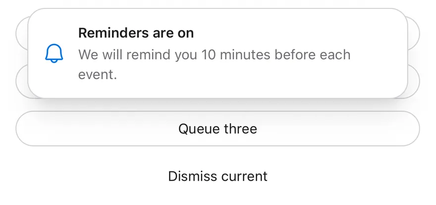
```tsx
import { BellIcon, WifiSlashIcon } from "phosphor-react-native"
import * as React from "react"
import { View } from "react-native"
import { TopBannerProvider, useTopBanner } from "@/components/interactions/top-banner"
import { Button } from "@/components/ui/button"
import { Text } from "@/components/ui/text"
function Triggers() {
const { show, dismiss } = useTopBanner()
const [log, setLog] = React.useState("")
return (
{log}
)
}
function ShowOnMount({
options,
}: {
options: Parameters["show"]>[0]
}) {
const { show } = useTopBanner()
const shownRef = React.useRef(false)
const optionsRef = React.useRef(options)
React.useEffect(() => {
if (shownRef.current) return
shownRef.current = true
show(optionsRef.current)
}, [show])
return
}
export function TopBannerWithIconExample() {
return (
)
}
```
```swift
import EsuissUI
import PhosphorSwift
import SwiftUI
struct TopBannerWithIconExample: View {
var body: some View {
TopBannerStage { manager in
manager.show(
"Reminders are on",
description: "We will remind you 10 minutes before each event.",
icon: Ph.bell.regular
)
}
}
}
struct TopBannerStage: View {
var timeout: Duration = .seconds(600)
var onMount: (@MainActor (TopBannerManager) -> Void)?
@State private var manager = TopBannerManager()
@State private var shown = false
init(timeout: Duration = .seconds(600), onMount: (@MainActor (TopBannerManager) -> Void)? = nil) {
self.timeout = timeout
self.onMount = onMount
}
var body: some View {
TopBannerTriggers(manager: manager)
.frame(maxHeight: .infinity, alignment: .top)
.containerRelativeFrame(.vertical) { height, _ in height - 32 }
.topBanner(manager, timeout: timeout)
.onAppear {
guard !shown else { return }
shown = true
manager.timeout = timeout
onMount?(manager)
}
}
}
struct TopBannerTriggers: View {
let manager: TopBannerManager
@State private var log = ""
var body: some View {
VStack(spacing: 12) {
Button {
manager.show("Message sent", description: "Alex will see it the next time they open the app.")
} label: {
Text("Show banner").frame(maxWidth: .infinity)
}
.buttonStyle(.variant(.outline))
Button {
manager.show(
"You are offline",
description: "Changes will sync when you reconnect.",
icon: Ph.wifiSlash.regular,
action: TopBannerAction("Retry") { log = "Retry pressed" }
)
} label: {
Text("Show with icon and action").frame(maxWidth: .infinity)
}
.buttonStyle(.variant(.outline))
Button {
manager.show("First of three")
manager.show("Second of three")
manager.show("Third of three")
} label: {
Text("Queue three").frame(maxWidth: .infinity)
}
.buttonStyle(.variant(.outline))
Button {
manager.dismiss()
} label: {
Text("Dismiss current").frame(maxWidth: .infinity)
}
.buttonStyle(.variant(.ghost))
Text(verbatim: log)
.textStyle(.sm)
.foregroundStyle(EsuissColor.mutedForeground)
.frame(maxWidth: .infinity, alignment: .leading)
.accessibilityAddTraits(.updatesFrequently)
}
}
}
```
```kotlin
import androidx.compose.foundation.layout.Arrangement
import androidx.compose.foundation.layout.Column
import androidx.compose.foundation.layout.fillMaxWidth
import androidx.compose.runtime.Composable
import androidx.compose.runtime.LaunchedEffect
import androidx.compose.runtime.getValue
import androidx.compose.runtime.mutableStateOf
import androidx.compose.runtime.saveable.rememberSaveable
import androidx.compose.runtime.setValue
import androidx.compose.ui.Modifier
import androidx.compose.ui.semantics.LiveRegionMode
import androidx.compose.ui.semantics.liveRegion
import androidx.compose.ui.semantics.semantics
import androidx.compose.ui.unit.dp
import com.adamglin.PhosphorIcons
import com.adamglin.phosphoricons.Regular
import com.adamglin.phosphoricons.regular.Bell
import com.adamglin.phosphoricons.regular.WifiSlash
import com.esuiss.ui.components.Button
import com.esuiss.ui.components.ButtonVariant
import com.esuiss.ui.components.Text
import com.esuiss.ui.interactions.TopBannerAction
import com.esuiss.ui.interactions.TopBannerProvider
import com.esuiss.ui.interactions.TopBannerState
import com.esuiss.ui.interactions.rememberTopBannerState
import com.esuiss.ui.theme.EsuissTheme
import com.esuiss.ui.theme.Typography
@Composable
fun TopBannerWithIconExample() {
TopBannerDemo {
show(
"Reminders are on",
description = "We will remind you 10 minutes before each event.",
icon = PhosphorIcons.Regular.Bell,
)
}
}
@Composable
fun TopBannerDemo(timeout: Long = 600000L, onMount: (TopBannerState.() -> Unit)? = null) {
val state = rememberTopBannerState(defaultTimeoutMillis = timeout)
var shown by rememberSaveable { mutableStateOf(false) }
LaunchedEffect(Unit) {
if (shown || onMount == null) return@LaunchedEffect
shown = true
state.onMount()
}
TopBannerProvider(state) {
TopBannerTriggers(state)
}
}
@Composable
fun TopBannerTriggers(state: TopBannerState) {
var log by rememberSaveable { mutableStateOf("") }
val fill = Modifier.fillMaxWidth()
Column(Modifier.fillMaxWidth(), verticalArrangement = Arrangement.spacedBy(12.dp)) {
Button(
"Show banner",
onClick = { state.show("Message sent", description = "Alex will see it the next time they open the app.") },
modifier = fill,
variant = ButtonVariant.Outline,
)
Button(
"Show with icon and action",
onClick = {
state.show(
"You are offline",
description = "Changes will sync when you reconnect.",
icon = PhosphorIcons.Regular.WifiSlash,
action = TopBannerAction("Retry") { log = "Retry pressed" },
)
},
modifier = fill,
variant = ButtonVariant.Outline,
)
Button(
"Queue three",
onClick = {
state.show("First of three")
state.show("Second of three")
state.show("Third of three")
},
modifier = fill,
variant = ButtonVariant.Outline,
)
Button("Dismiss current", onClick = { state.dismiss() }, modifier = fill, variant = ButtonVariant.Ghost)
Text(
log,
modifier = Modifier.semantics { liveRegion = LiveRegionMode.Polite },
style = Typography.sm.copy(color = EsuissTheme.colors.mutedForeground),
)
}
}
```
### With action
A banner with an action button.
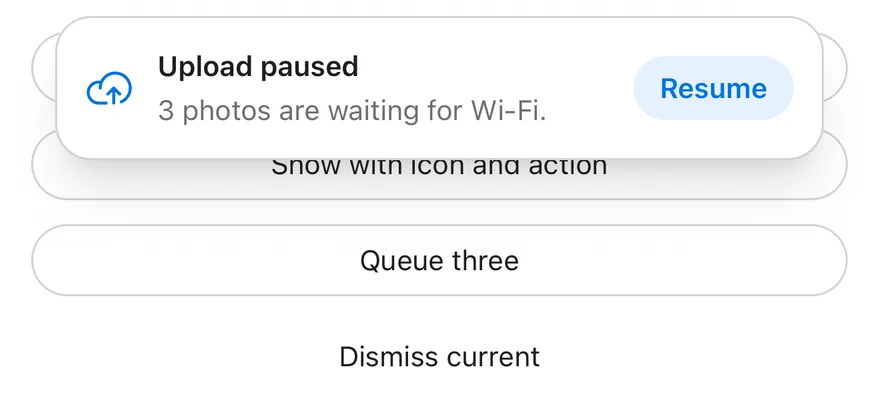
```tsx
import { CloudArrowUpIcon, WifiSlashIcon } from "phosphor-react-native"
import * as React from "react"
import { View } from "react-native"
import { TopBannerProvider, useTopBanner } from "@/components/interactions/top-banner"
import { Button } from "@/components/ui/button"
import { Text } from "@/components/ui/text"
function Triggers() {
const { show, dismiss } = useTopBanner()
const [log, setLog] = React.useState("")
return (
{log}
)
}
function ShowOnMount({
options,
}: {
options: Parameters["show"]>[0]
}) {
const { show } = useTopBanner()
const shownRef = React.useRef(false)
const optionsRef = React.useRef(options)
React.useEffect(() => {
if (shownRef.current) return
shownRef.current = true
show(optionsRef.current)
}, [show])
return
}
export function TopBannerWithActionExample() {
return (
undefined },
}}
/>
)
}
```
```swift
import EsuissUI
import PhosphorSwift
import SwiftUI
struct TopBannerWithActionExample: View {
var body: some View {
TopBannerStage { manager in
manager.show(
"Upload paused",
description: "3 photos are waiting for Wi-Fi.",
icon: Ph.cloudArrowUp.regular,
action: TopBannerAction("Resume") {}
)
}
}
}
struct TopBannerStage: View {
var timeout: Duration = .seconds(600)
var onMount: (@MainActor (TopBannerManager) -> Void)?
@State private var manager = TopBannerManager()
@State private var shown = false
init(timeout: Duration = .seconds(600), onMount: (@MainActor (TopBannerManager) -> Void)? = nil) {
self.timeout = timeout
self.onMount = onMount
}
var body: some View {
TopBannerTriggers(manager: manager)
.frame(maxHeight: .infinity, alignment: .top)
.containerRelativeFrame(.vertical) { height, _ in height - 32 }
.topBanner(manager, timeout: timeout)
.onAppear {
guard !shown else { return }
shown = true
manager.timeout = timeout
onMount?(manager)
}
}
}
struct TopBannerTriggers: View {
let manager: TopBannerManager
@State private var log = ""
var body: some View {
VStack(spacing: 12) {
Button {
manager.show("Message sent", description: "Alex will see it the next time they open the app.")
} label: {
Text("Show banner").frame(maxWidth: .infinity)
}
.buttonStyle(.variant(.outline))
Button {
manager.show(
"You are offline",
description: "Changes will sync when you reconnect.",
icon: Ph.wifiSlash.regular,
action: TopBannerAction("Retry") { log = "Retry pressed" }
)
} label: {
Text("Show with icon and action").frame(maxWidth: .infinity)
}
.buttonStyle(.variant(.outline))
Button {
manager.show("First of three")
manager.show("Second of three")
manager.show("Third of three")
} label: {
Text("Queue three").frame(maxWidth: .infinity)
}
.buttonStyle(.variant(.outline))
Button {
manager.dismiss()
} label: {
Text("Dismiss current").frame(maxWidth: .infinity)
}
.buttonStyle(.variant(.ghost))
Text(verbatim: log)
.textStyle(.sm)
.foregroundStyle(EsuissColor.mutedForeground)
.frame(maxWidth: .infinity, alignment: .leading)
.accessibilityAddTraits(.updatesFrequently)
}
}
}
```
```kotlin
import androidx.compose.foundation.layout.Arrangement
import androidx.compose.foundation.layout.Column
import androidx.compose.foundation.layout.fillMaxWidth
import androidx.compose.runtime.Composable
import androidx.compose.runtime.LaunchedEffect
import androidx.compose.runtime.getValue
import androidx.compose.runtime.mutableStateOf
import androidx.compose.runtime.saveable.rememberSaveable
import androidx.compose.runtime.setValue
import androidx.compose.ui.Modifier
import androidx.compose.ui.semantics.LiveRegionMode
import androidx.compose.ui.semantics.liveRegion
import androidx.compose.ui.semantics.semantics
import androidx.compose.ui.unit.dp
import com.adamglin.PhosphorIcons
import com.adamglin.phosphoricons.Regular
import com.adamglin.phosphoricons.regular.CloudArrowUp
import com.adamglin.phosphoricons.regular.WifiSlash
import com.esuiss.ui.components.Button
import com.esuiss.ui.components.ButtonVariant
import com.esuiss.ui.components.Text
import com.esuiss.ui.interactions.TopBannerAction
import com.esuiss.ui.interactions.TopBannerProvider
import com.esuiss.ui.interactions.TopBannerState
import com.esuiss.ui.interactions.rememberTopBannerState
import com.esuiss.ui.theme.EsuissTheme
import com.esuiss.ui.theme.Typography
@Composable
fun TopBannerWithActionExample() {
TopBannerDemo {
show(
"Upload paused",
description = "3 photos are waiting for Wi-Fi.",
icon = PhosphorIcons.Regular.CloudArrowUp,
action = TopBannerAction("Resume") {},
)
}
}
@Composable
fun TopBannerDemo(timeout: Long = 600000L, onMount: (TopBannerState.() -> Unit)? = null) {
val state = rememberTopBannerState(defaultTimeoutMillis = timeout)
var shown by rememberSaveable { mutableStateOf(false) }
LaunchedEffect(Unit) {
if (shown || onMount == null) return@LaunchedEffect
shown = true
state.onMount()
}
TopBannerProvider(state) {
TopBannerTriggers(state)
}
}
@Composable
fun TopBannerTriggers(state: TopBannerState) {
var log by rememberSaveable { mutableStateOf("") }
val fill = Modifier.fillMaxWidth()
Column(Modifier.fillMaxWidth(), verticalArrangement = Arrangement.spacedBy(12.dp)) {
Button(
"Show banner",
onClick = { state.show("Message sent", description = "Alex will see it the next time they open the app.") },
modifier = fill,
variant = ButtonVariant.Outline,
)
Button(
"Show with icon and action",
onClick = {
state.show(
"You are offline",
description = "Changes will sync when you reconnect.",
icon = PhosphorIcons.Regular.WifiSlash,
action = TopBannerAction("Retry") { log = "Retry pressed" },
)
},
modifier = fill,
variant = ButtonVariant.Outline,
)
Button(
"Queue three",
onClick = {
state.show("First of three")
state.show("Second of three")
state.show("Third of three")
},
modifier = fill,
variant = ButtonVariant.Outline,
)
Button("Dismiss current", onClick = { state.dismiss() }, modifier = fill, variant = ButtonVariant.Ghost)
Text(
log,
modifier = Modifier.semantics { liveRegion = LiveRegionMode.Polite },
style = Typography.sm.copy(color = EsuissTheme.colors.mutedForeground),
)
}
}
```
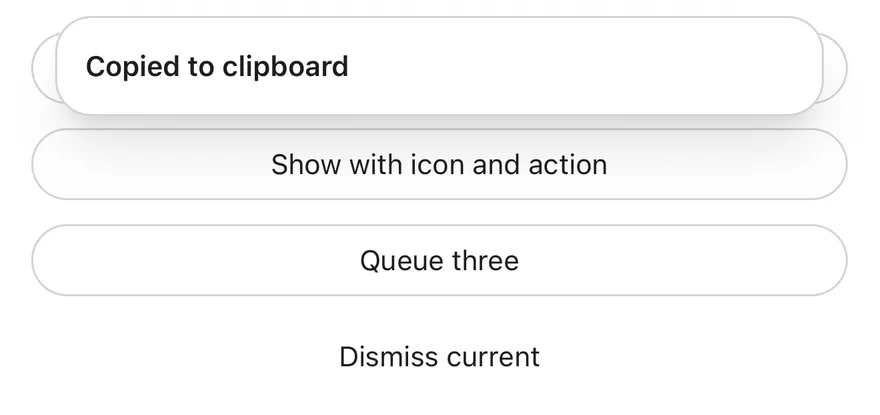
### Title only
A banner with only a title.
```tsx
import { WifiSlashIcon } from "phosphor-react-native"
import * as React from "react"
import { View } from "react-native"
import { TopBannerProvider, useTopBanner } from "@/components/interactions/top-banner"
import { Button } from "@/components/ui/button"
import { Text } from "@/components/ui/text"
function Triggers() {
const { show, dismiss } = useTopBanner()
const [log, setLog] = React.useState("")
return (
{log}
)
}
function ShowOnMount({
options,
}: {
options: Parameters["show"]>[0]
}) {
const { show } = useTopBanner()
const shownRef = React.useRef(false)
const optionsRef = React.useRef(options)
React.useEffect(() => {
if (shownRef.current) return
shownRef.current = true
show(optionsRef.current)
}, [show])
return
}
export function TopBannerTitleOnlyExample() {
return (
)
}
```
```swift
import EsuissUI
import PhosphorSwift
import SwiftUI
struct TopBannerTitleOnlyExample: View {
var body: some View {
TopBannerStage { manager in
manager.show("Copied to clipboard")
}
}
}
struct TopBannerStage: View {
var timeout: Duration = .seconds(600)
var onMount: (@MainActor (TopBannerManager) -> Void)?
@State private var manager = TopBannerManager()
@State private var shown = false
init(timeout: Duration = .seconds(600), onMount: (@MainActor (TopBannerManager) -> Void)? = nil) {
self.timeout = timeout
self.onMount = onMount
}
var body: some View {
TopBannerTriggers(manager: manager)
.frame(maxHeight: .infinity, alignment: .top)
.containerRelativeFrame(.vertical) { height, _ in height - 32 }
.topBanner(manager, timeout: timeout)
.onAppear {
guard !shown else { return }
shown = true
manager.timeout = timeout
onMount?(manager)
}
}
}
struct TopBannerTriggers: View {
let manager: TopBannerManager
@State private var log = ""
var body: some View {
VStack(spacing: 12) {
Button {
manager.show("Message sent", description: "Alex will see it the next time they open the app.")
} label: {
Text("Show banner").frame(maxWidth: .infinity)
}
.buttonStyle(.variant(.outline))
Button {
manager.show(
"You are offline",
description: "Changes will sync when you reconnect.",
icon: Ph.wifiSlash.regular,
action: TopBannerAction("Retry") { log = "Retry pressed" }
)
} label: {
Text("Show with icon and action").frame(maxWidth: .infinity)
}
.buttonStyle(.variant(.outline))
Button {
manager.show("First of three")
manager.show("Second of three")
manager.show("Third of three")
} label: {
Text("Queue three").frame(maxWidth: .infinity)
}
.buttonStyle(.variant(.outline))
Button {
manager.dismiss()
} label: {
Text("Dismiss current").frame(maxWidth: .infinity)
}
.buttonStyle(.variant(.ghost))
Text(verbatim: log)
.textStyle(.sm)
.foregroundStyle(EsuissColor.mutedForeground)
.frame(maxWidth: .infinity, alignment: .leading)
.accessibilityAddTraits(.updatesFrequently)
}
}
}
```
```kotlin
import androidx.compose.foundation.layout.Arrangement
import androidx.compose.foundation.layout.Column
import androidx.compose.foundation.layout.fillMaxWidth
import androidx.compose.runtime.Composable
import androidx.compose.runtime.LaunchedEffect
import androidx.compose.runtime.getValue
import androidx.compose.runtime.mutableStateOf
import androidx.compose.runtime.saveable.rememberSaveable
import androidx.compose.runtime.setValue
import androidx.compose.ui.Modifier
import androidx.compose.ui.semantics.LiveRegionMode
import androidx.compose.ui.semantics.liveRegion
import androidx.compose.ui.semantics.semantics
import androidx.compose.ui.unit.dp
import com.adamglin.PhosphorIcons
import com.adamglin.phosphoricons.Regular
import com.adamglin.phosphoricons.regular.WifiSlash
import com.esuiss.ui.components.Button
import com.esuiss.ui.components.ButtonVariant
import com.esuiss.ui.components.Text
import com.esuiss.ui.interactions.TopBannerAction
import com.esuiss.ui.interactions.TopBannerProvider
import com.esuiss.ui.interactions.TopBannerState
import com.esuiss.ui.interactions.rememberTopBannerState
import com.esuiss.ui.theme.EsuissTheme
import com.esuiss.ui.theme.Typography
@Composable
fun TopBannerTitleOnlyExample() {
TopBannerDemo { show("Copied to clipboard") }
}
@Composable
fun TopBannerDemo(timeout: Long = 600000L, onMount: (TopBannerState.() -> Unit)? = null) {
val state = rememberTopBannerState(defaultTimeoutMillis = timeout)
var shown by rememberSaveable { mutableStateOf(false) }
LaunchedEffect(Unit) {
if (shown || onMount == null) return@LaunchedEffect
shown = true
state.onMount()
}
TopBannerProvider(state) {
TopBannerTriggers(state)
}
}
@Composable
fun TopBannerTriggers(state: TopBannerState) {
var log by rememberSaveable { mutableStateOf("") }
val fill = Modifier.fillMaxWidth()
Column(Modifier.fillMaxWidth(), verticalArrangement = Arrangement.spacedBy(12.dp)) {
Button(
"Show banner",
onClick = { state.show("Message sent", description = "Alex will see it the next time they open the app.") },
modifier = fill,
variant = ButtonVariant.Outline,
)
Button(
"Show with icon and action",
onClick = {
state.show(
"You are offline",
description = "Changes will sync when you reconnect.",
icon = PhosphorIcons.Regular.WifiSlash,
action = TopBannerAction("Retry") { log = "Retry pressed" },
)
},
modifier = fill,
variant = ButtonVariant.Outline,
)
Button(
"Queue three",
onClick = {
state.show("First of three")
state.show("Second of three")
state.show("Third of three")
},
modifier = fill,
variant = ButtonVariant.Outline,
)
Button("Dismiss current", onClick = { state.dismiss() }, modifier = fill, variant = ButtonVariant.Ghost)
Text(
log,
modifier = Modifier.semantics { liveRegion = LiveRegionMode.Polite },
style = Typography.sm.copy(color = EsuissTheme.colors.mutedForeground),
)
}
}
```
## API Reference
### TopBannerProvider
Holds the banner queue and renders the current banner in a portal.
| Prop | Type | Default | Description |
| --- | --- | --- | --- |
| `timeout` | `number` | `4000` | Default time in milliseconds before a banner hides. Defaults to `4000`. |
| `className` | `string` | - | Classes for the banner card. |
| `portalHost` | `string` | - | Name of a portal host to render into. |
| `children` | `React.ReactNode` | - | |
## Accessibility
- The banner has the `alert` role and is a polite live region.
- A string title is announced when the banner appears.
- The banner has a `dismiss` accessibility action.
## Notes
- Banners are up to 384 points wide and centered.
- The card uses `bg-card`, or `bg-muted` in dark mode, with a `border-border` outline; the icon uses `text-primary`.
- Slide animations respect the system reduce motion setting.