()
let keyframes: Keyframe[] = []
let inset: CSSNumericValue[] = []
let height = 0
let range = ""
const update = () => {
if (!height) return
const position = Math.round(column.scrollTop / height)
const first = Math.floor(position - VISIBLE_ROWS - ANIMATED_BUFFER)
const last = Math.ceil(position + VISIBLE_ROWS + ANIMATED_BUFFER)
if (range === `${first}:${last}`) return
range = `${first}:${last}`
const items = getItems()
for (const [content, animation] of animations) {
const index = items.indexOf(content.parentElement as HTMLElement)
if (index >= first && index <= last) continue
animation.cancel()
animations.delete(content)
}
for (
let index = Math.max(first, 0);
index <= Math.min(last, items.length - 1);
index++
) {
const item = items[index]
if (!item) continue
const content = item.firstElementChild as HTMLElement | null
if (!content || animations.has(content)) continue
animations.set(
content,
content.animate(keyframes, {
timeline: new ViewTimeline({ subject: item, axis: "block", inset }),
fill: "both",
})
)
}
}
const rebuild = () => {
height = getItems()[0]?.offsetHeight ?? 0
range = ""
if (!height) return
keyframes = curveKeyframes(height)
const reach = (VISIBLE_ROWS - 0.5) * height - column.clientHeight / 2
inset = [CSS.px(-reach), CSS.px(-reach)]
for (const animation of animations.values()) animation.cancel()
animations.clear()
update()
}
updateRef.current = update
const observer = new ResizeObserver(rebuild)
observer.observe(column)
rebuild()
return () => {
observer.disconnect()
for (const animation of animations.values()) animation.cancel()
}
}, [itemCount, getItems, paint])
React.useEffect(() => {
const index = getIndex(value)
if (index === -1 || index === getCenteredIndex()) return
scrollTo(index, scrollBehavior())
}, [value, getIndex, getCenteredIndex, scrollTo])
React.useEffect(
() => () => {
cancelAnimationFrame(frameRef.current)
clearTimeout(settleRef.current)
},
[]
)
return (
{
columnRef.current = node
if (typeof ref === "function") return ref(node)
if (ref) ref.current = node
}}
data-slot="wheel-picker-column"
role="listbox"
tabIndex={0}
aria-activedescendant={
value === undefined ? undefined : getItemId(value)
}
onScroll={handleScroll}
onScrollEnd={settle}
onWheel={releaseTarget}
onTouchStart={releaseTarget}
onPointerDown={releaseTarget}
onClickCapture={handleClick}
onKeyDownCapture={handleKeyDown}
className={cn(
"no-scrollbar relative h-[calc(var(--wheel-picker-item-height)*6.75)] min-w-max snap-y snap-mandatory overflow-y-auto overscroll-contain rounded-lg py-[calc(var(--wheel-picker-item-height)*2.875)] outline-none focus-visible:ring-3 focus-visible:ring-ring/50",
className
)}
{...props}
>
{children}
)
}
function WheelPickerItem({
value,
disabled = false,
className,
children,
...props
}: React.ComponentProps<"div"> & { value: string; disabled?: boolean }) {
const { value: selectedValue, getItemId } = useWheelPickerColumn()
const selected = selectedValue === value
return (
{children}
)
}
export { WheelPicker, WheelPickerColumn, WheelPickerItem }
```
3. Update the import paths to match your project.
## Usage
```tsx
import { WheelPicker, WheelPickerColumn, WheelPickerItem } from "@/components/ui/wheel-picker"
```
```tsx
{fruits.map((fruit) => (
{fruit}
))}
```
Each column manages its own value. Use `defaultValue` on `WheelPickerColumn` for an uncontrolled column, or `value` with `onValueChange` to control it. Give every `WheelPickerItem` a unique string `value`; its children are the visible label.
Set `disabled` on items that can't be chosen. Scrolling skips past them to the nearest enabled item, and the keyboard steps over them.
## Examples
### Disabled items
Disables booked time slots so scrolling, keys and clicks skip them.
**Example**
```tsx
import {
WheelPicker,
WheelPickerColumn,
WheelPickerItem,
} from "@/components/ui/wheel-picker"
const slots = Array.from({ length: 11 }, (_, index) => {
const minutes = 18 * 60 + index * 30
return `${Math.floor(minutes / 60)}:${String(minutes % 60).padStart(2, "0")}`
})
const booked = new Set(["19:30", "20:00", "20:30"])
export default function WheelPickerDisabledItems() {
return (
{slots.map((slot) => (
{slot}
))}
)
}
```
### Date time
Combines controlled day, hour and minute columns into a date and time picker.
**Example**
```tsx
import * as React from "react"
import {
WheelPicker,
WheelPickerColumn,
WheelPickerItem,
} from "@/components/ui/wheel-picker"
function toDayValue(date: Date) {
return [
date.getFullYear(),
String(date.getMonth() + 1).padStart(2, "0"),
String(date.getDate()).padStart(2, "0"),
].join("-")
}
const today = new Date(2026, 9, 4)
const days = Array.from({ length: 15 }, (_, index) => {
const date = new Date(
today.getFullYear(),
today.getMonth(),
today.getDate() + index - 7
)
const label =
index === 7
? "Today"
: date.toLocaleDateString("en-US", {
weekday: "short",
month: "short",
day: "numeric",
})
return { value: toDayValue(date), label }
})
const hours = Array.from({ length: 24 }, (_, hour) =>
String(hour).padStart(2, "0")
)
const minutes = Array.from({ length: 12 }, (_, step) =>
String(step * 5).padStart(2, "0")
)
function DateTimeExample(props: React.ComponentProps) {
const [day, setDay] = React.useState(toDayValue(today))
const [hour, setHour] = React.useState("19")
const [minute, setMinute] = React.useState("30")
return (
{days.map(({ value, label }) => (
{label}
))}
{hours.map((value) => (
{value}
))}
{minutes.map((value) => (
{value}
))}
{day} {hour}:{minute}
)
}
export default function WheelPickerDateTime() {
return (
)
}
```
## API Reference
- `WheelPicker`
- `WheelPickerColumn`
- `WheelPickerItem`
### WheelPicker
The frame that holds the columns and draws the selection band.
Also accepts the props of `React.ComponentProps<"div">`.
### WheelPickerColumn
A scrolling, snapping wheel that holds one selected value.
| Prop | Type | Default | Description |
| --- | --- | --- | --- |
| `value` | `string` | - | The selected value, for controlled use. |
| `defaultValue` | `string` | - | The initial value when uncontrolled. |
| `onValueChange` | `(value: string) => void` | - | Called when the column settles on a new value. |
Also accepts the props of `React.ComponentProps<"div">`, `WheelPickerColumnProps`.
### WheelPickerItem
A single option in a column.
| Prop | Type | Default | Description |
| --- | --- | --- | --- |
| `value` | `string` | Required | The string value this item selects; it must be unique in its column. |
| `disabled` | `boolean` | `false` | Prevents the item from being selected. |
Also accepts the props of `React.ComponentProps<"div">`.
## Accessibility
- Each column has the `listbox` role and is focusable; name it with `aria-label`. Items are `option` elements with `aria-selected`, and the column points to the selected item with `aria-activedescendant`.
- With a column focused, the up and down arrow keys move to the previous or next enabled item, `Page Up` and `Page Down` move by five, and `Home` and `End` jump to the first and last enabled items.
- Disabled items set `aria-disabled` and ignore clicks.
- When reduced motion is preferred, the column scrolls to new values without smooth scrolling.
## Notes
- Row height comes from `--wheel-picker-item-height` (`--spacing(8)` by default), set on `WheelPicker`; the column shows about seven rows.
- The curve is driven by scroll-driven animations where `ViewTimeline` is supported, and by a scroll handler elsewhere.
- Parts carry `data-slot` attributes: `wheel-picker`, `wheel-picker-column` and `wheel-picker-item`. Items set `data-value`, `data-selected` and `data-disabled`.
- The selection band uses `bg-secondary`.
**React Native, SwiftUI, Jetpack Compose**
```tsx
import { View } from "react-native"
import { WheelPicker, WheelPickerColumn, WheelPickerItem } from "@/components/ui/wheel-picker"
const fruits = [
"Apple",
"Banana",
"Cherry",
"Grape",
"Lemon",
"Mango",
"Orange",
"Peach",
"Pear",
"Plum",
]
export function WheelPickerExample() {
return (
{fruits.map((fruit) => (
{fruit}
))}
)
}
```
```swift
import EsuissUI
import SwiftUI
struct WheelPickerExample: View {
var body: some View {
WheelPickerFrame {
FruitDemo()
}
}
}
struct WheelPickerFrame: View {
@ViewBuilder let content: () -> Content
@Environment(\.colorScheme) private var colorScheme
var body: some View {
let shape = RoundedRectangle(cornerRadius: Radius.xl2, style: .continuous)
content()
.padding(16)
.frame(width: 320)
.background(EsuissColor.card, in: shape)
.overlay {
shape.strokeBorder(EsuissColor.foreground.opacity(colorScheme == .dark ? 0.1 : 0.05))
}
.shadow(Shadow.md)
}
}
let wheelFruits = ["Apple", "Banana", "Cherry", "Grape", "Lemon", "Mango", "Orange", "Peach", "Pear", "Plum"]
struct FruitDemo: View {
@State private var fruit = "Lemon"
var body: some View {
WheelPicker {
WheelPickerColumn(selection: $fruit) {
ForEach(wheelFruits, id: \.self) { item in
WheelPickerItem(verbatim: item, value: item)
}
}
.accessibilityLabel(Text("Fruit"))
}
}
}
```
```kotlin
import androidx.compose.foundation.background
import androidx.compose.foundation.border
import androidx.compose.foundation.layout.Box
import androidx.compose.foundation.layout.fillMaxWidth
import androidx.compose.foundation.layout.padding
import androidx.compose.foundation.layout.width
import androidx.compose.foundation.shape.RoundedCornerShape
import androidx.compose.runtime.Composable
import androidx.compose.runtime.getValue
import androidx.compose.runtime.mutableStateOf
import androidx.compose.runtime.saveable.rememberSaveable
import androidx.compose.runtime.setValue
import androidx.compose.ui.Modifier
import androidx.compose.ui.unit.dp
import com.esuiss.ui.components.WheelPicker
import com.esuiss.ui.components.WheelPickerColumn
import com.esuiss.ui.theme.EsuissTheme
import com.esuiss.ui.theme.Radius
import com.esuiss.ui.theme.Shadows
import com.esuiss.ui.theme.shadow
@Composable
fun WheelPickerExample() {
WheelPickerFrame { WheelPickerFruits() }
}
val wheelPickerFruits = listOf(
"Apple",
"Banana",
"Cherry",
"Grape",
"Lemon",
"Mango",
"Orange",
"Peach",
"Pear",
"Plum",
)
@Composable
fun WheelPickerFrame(content: @Composable () -> Unit) {
val colors = EsuissTheme.colors
val shape = RoundedCornerShape(Radius.xl2)
Box(
Modifier
.width(320.dp)
.shadow(Shadows.md, shape)
.background(colors.card, shape)
.border(1.dp, colors.foreground.copy(alpha = if (colors.isDark) 0.1f else 0.05f), shape)
.padding(16.dp),
) {
content()
}
}
@Composable
fun WheelPickerFruits() {
var value by rememberSaveable { mutableStateOf("Lemon") }
WheelPicker(Modifier.fillMaxWidth()) {
WheelPickerColumn(value, { value = it }, label = "Fruit") {
wheelPickerFruits.forEach { WheelPickerItem(it, it) }
}
}
}
```
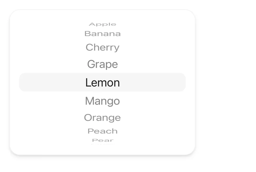
`WheelPicker` lays out one or more `WheelPickerColumn` components side by side behind a shared highlight band. Each column is a snapping `ScrollView`; items above and below the center are scaled, moved and faded with React Native `Animated` interpolations to look like a rotating wheel.
Use it for times, dates and other values picked from a short, ordered list, often in a sheet or popover.
## Installation
**React Native**
```bash title="Terminal"
npx shadcn@latest add @esuiss-rn/wheel-picker
```
See [Installation](https://ui.suiss.app/docs/installation) for the `components.json` setup. Or use the suiss/ui CLI:
```bash title="Terminal"
npx @esuiss/ui@latest add wheel-picker
```
**SwiftUI**
```bash title="Terminal"
npx @esuiss/ui@latest add wheel-picker --platform swift
```
**Jetpack Compose**
```bash title="Terminal"
npx @esuiss/ui@latest add wheel-picker --platform kotlin
```
The CLI also adds what it builds on: [Text](https://ui.suiss.app/docs/components/text).
### Manual
**React Native**
**Uniwind**
1. Install the dependencies:
```bash title="Terminal"
npx expo install cn
```
2. Add the pieces it builds on: [Text](https://ui.suiss.app/docs/components/text), and the primitives `components/primitives/use-render.tsx`, `components/primitives/wheel-picker.tsx`.
3. Copy the source into `components/ui/wheel-picker.tsx`:
```tsx title="uniwind/components/ui/wheel-picker.tsx"
import { cn } from "cn"
import type * as React from "react"
import { resolveClassName } from "@/components/primitives/use-render"
import * as WheelPickerPrimitive from "@/components/primitives/wheel-picker"
import { Text, TextClassContext } from "@/components/ui/text"
function WheelPicker({
className,
children,
...props
}: React.ComponentProps) {
return (
cn(
"relative flex-row items-stretch justify-center",
resolveClassName(className, state)
)
}
{...props}
>
{children}
)
}
function WheelPickerColumn({
className,
...props
}: React.ComponentProps) {
return (
cn("relative rounded-lg", resolveClassName(className, state))
}
{...props}
/>
)
}
function WheelPickerItem({
className,
children,
disabled = false,
...props
}: React.ComponentProps) {
return (
cn(
"flex-row items-center justify-center px-3",
resolveClassName(className, state)
)
}
{...props}
>
{typeof children === "string" || typeof children === "number" ? (
{children}
) : (
children
)}
)
}
export { WheelPicker, WheelPickerColumn, WheelPickerItem }
```
4. Update the import paths to match your project.
**NativeWind**
1. Install the dependencies:
```bash title="Terminal"
npx expo install cn
```
2. Add the pieces it builds on: [Text](https://ui.suiss.app/docs/components/text), and the primitives `components/primitives/use-render.tsx`, `components/primitives/wheel-picker.tsx`.
3. Copy the source into `components/ui/wheel-picker.tsx`:
```tsx title="nativewind/components/ui/wheel-picker.tsx"
import { cn } from "cn"
import type * as React from "react"
import { resolveClassName } from "@/components/primitives/use-render"
import * as WheelPickerPrimitive from "@/components/primitives/wheel-picker"
import { Text, TextClassContext } from "@/components/ui/text"
function WheelPicker({
className,
children,
...props
}: React.ComponentProps) {
return (
cn(
"relative flex-row items-stretch justify-center",
resolveClassName(className, state)
)
}
{...props}
>
{children}
)
}
function WheelPickerColumn({
className,
...props
}: React.ComponentProps) {
return (
cn("relative rounded-lg", resolveClassName(className, state))
}
{...props}
/>
)
}
function WheelPickerItem({
className,
children,
disabled = false,
...props
}: React.ComponentProps) {
return (
cn(
"flex-row items-center justify-center px-3",
resolveClassName(className, state)
)
}
{...props}
>
{typeof children === "string" || typeof children === "number" ? (
{children}
) : (
children
)}
)
}
export { WheelPicker, WheelPickerColumn, WheelPickerItem }
```
4. Update the import paths to match your project.
**StyleSheet**
1. Add the pieces it builds on: [Text](https://ui.suiss.app/docs/components/text), and the primitives `components/primitives/use-render.tsx`, `components/primitives/wheel-picker.tsx`.
2. Copy the source into `components/ui/wheel-picker.tsx`:
```tsx title="stylesheet/components/ui/wheel-picker.tsx"
import type * as React from "react"
import {
type StyleProp,
StyleSheet,
type TextStyle,
type ViewStyle,
} from "react-native"
import { resolveStyle } from "@/components/primitives/use-render"
import * as WheelPickerPrimitive from "@/components/primitives/wheel-picker"
import { Text, TextStyleContext } from "@/components/ui/text"
import { fontSize, radius, useTheme } from "@/components/ui/theme"
const styles = StyleSheet.create({
root: {
position: "relative",
flexDirection: "row",
alignItems: "stretch",
justifyContent: "center",
},
indicator: { borderRadius: radius.lg },
column: { position: "relative", borderRadius: radius.lg },
item: {
flexDirection: "row",
alignItems: "center",
justifyContent: "center",
paddingHorizontal: 12,
},
text: { ...fontSize.xl, fontVariant: ["tabular-nums"] },
})
function WheelPicker({
style,
children,
...props
}: React.ComponentProps) {
const { colors } = useTheme()
return (
[
styles.root,
resolveStyle(style, state) as StyleProp,
]}
{...props}
>
{children}
)
}
function WheelPickerColumn({
style,
...props
}: React.ComponentProps) {
return (
[
styles.column,
resolveStyle(style, state) as StyleProp,
]}
{...props}
/>
)
}
function WheelPickerItem({
style,
children,
disabled = false,
...props
}: React.ComponentProps) {
const { colors } = useTheme()
const textStyle: TextStyle = {
...styles.text,
color: disabled ? colors.mutedForeground : colors.foreground,
}
return (
[
styles.item,
resolveStyle(style, state) as StyleProp,
]}
{...props}
>
{typeof children === "string" || typeof children === "number" ? (
{children}
) : (
children
)}
)
}
export { WheelPicker, WheelPickerColumn, WheelPickerItem }
```
3. Update the import paths to match your project.
**SwiftUI**
1. Target iOS 17 or later.
2. Add the Swift package to your app:
```swift title="Package.swift"
.package(url: "https://github.com/phosphor-icons/swift", from: "2.1.0")
```
3. Copy the theme files every view uses:
- `swift/Theme/Theme.swift`: [source](https://github.com/e-suiss/ui/blob/main/packages/mobile/swiftui/Sources/EsuissUI/Theme/Theme.swift)
- `swift/Theme/Tokens.swift`: [source](https://github.com/e-suiss/ui/blob/main/packages/mobile/swiftui/Sources/EsuissUI/Theme/Tokens.swift)
4. Copy the source and every file it uses:
```swift title="swift/Components/WheelPicker.swift"
import SwiftUI
struct WheelPickerEntry: Equatable {
let value: AnyHashable
let disabled: Bool
let text: Text?
}
struct WheelPickerEntriesKey: PreferenceKey {
static var defaultValue: [WheelPickerEntry] { [] }
static func reduce(value: inout [WheelPickerEntry], nextValue: () -> [WheelPickerEntry]) {
value.append(contentsOf: nextValue())
}
}
struct WheelPickerColumnContext {
var alignment: Alignment
var select: @MainActor (AnyHashable) -> Void
}
extension EnvironmentValues {
@Entry var wheelPickerColumn: WheelPickerColumnContext?
@Entry var wheelPickerItemInset: CGFloat = 12
}
enum WheelPickerMetrics {
static let rowHeight: CGFloat = 32
static let height: CGFloat = rowHeight * 6.75
static let inset: CGFloat = (height - rowHeight) / 2
}
struct WheelPickerCurve: Equatable {
static let rowAngle = Double.pi / 10.5
static let maxAngle = Double.pi / 2
static let perspective = 1200.0
static let fadeAngle = 0.35
let offset: Double
let scaleX: Double
let scaleY: Double
let opacity: Double
init(distance: Double, height: Double) {
let radius = height / Self.rowAngle
let angle = min(max(distance * Self.rowAngle, -Self.maxAngle), Self.maxAngle)
let away = abs(distance)
let tone = away < 1 ? 1 - away * 0.45 : 0.55 - (away - 1) * 0.06
let fade = min(1, (Self.maxAngle - abs(angle)) / Self.fadeAngle)
let depth = Self.perspective / (Self.perspective + radius - radius * cos(angle))
offset = radius * sin(angle) - distance * height
scaleX = depth
scaleY = depth * cos(angle)
opacity = max(0, tone * fade)
}
}
enum WheelPickerNavigation {
static func enabled(_ disabled: [Bool], from index: Int, step: Int) -> Int? {
var current = index
while current >= 0 && current < disabled.count {
if !disabled[current] { return current }
current += step
}
return nil
}
static func nearestEnabled(_ disabled: [Bool], from index: Int) -> Int? {
for distance in 0..= 0 && before < disabled.count && !disabled[before] { return before }
let after = index + distance
if after >= 0 && after < disabled.count && !disabled[after] { return after }
}
return nil
}
static func centered(offset: CGFloat, count: Int) -> Int {
guard count > 0 else { return 0 }
let index = Int((offset / WheelPickerMetrics.rowHeight).rounded())
return min(max(index, 0), count - 1)
}
}
struct WheelPickerSnap: ScrollTargetBehavior {
let disabled: [Bool]
func updateTarget(_ target: inout ScrollTarget, context: TargetContext) {
let row = WheelPickerMetrics.rowHeight
guard !disabled.isEmpty else {
target.rect.origin.y = (target.rect.minY / row).rounded() * row
return
}
let index = WheelPickerNavigation.centered(offset: target.rect.minY, count: disabled.count)
let resolved = WheelPickerNavigation.nearestEnabled(disabled, from: index) ?? index
target.rect.origin.y = CGFloat(resolved) * row
}
}
public struct WheelPicker: View {
let spacing: CGFloat
let content: Content
public init(spacing: CGFloat = 0, @ViewBuilder content: () -> Content) {
self.spacing = spacing
self.content = content()
}
public var body: some View {
HStack(alignment: .center, spacing: spacing) {
content
}
.frame(maxWidth: .infinity)
.background {
RoundedRectangle(cornerRadius: Radius.lg, style: .continuous)
.fill(EsuissColor.secondary)
.frame(height: WheelPickerMetrics.rowHeight)
}
}
}
public struct WheelPickerColumn: View {
let selection: Binding
let alignment: HorizontalAlignment
let content: Content
@State private var entries: [WheelPickerEntry] = []
@State private var offset: CGFloat = 0
@State private var settling: Task?
@State private var ticks = 0
@Environment(\.accessibilityReduceMotion) private var reduceMotion
public init(
selection: Binding,
alignment: HorizontalAlignment = .center,
@ViewBuilder content: () -> Content
) {
self.selection = selection
self.alignment = alignment
self.content = content()
}
public var body: some View {
ScrollViewReader { proxy in
ScrollView(.vertical, showsIndicators: false) {
VStack(spacing: 0) {
content
}
.padding(.vertical, WheelPickerMetrics.inset)
.onGeometryChange(for: CGFloat.self) { geometry in
geometry.frame(in: .scrollView).minY
} action: { value in
offset = -value
scheduleSettle(proxy)
}
}
.scrollTargetBehavior(WheelPickerSnap(disabled: entries.map(\.disabled)))
.frame(height: WheelPickerMetrics.height)
.fixedSize(horizontal: true, vertical: false)
.clipShape(RoundedRectangle(cornerRadius: Radius.lg, style: .continuous))
.hapticFeedback(.selection, trigger: ticks)
.environment(\.wheelPickerColumn, WheelPickerColumnContext(
alignment: Alignment(horizontal: alignment, vertical: .center),
select: { value in
if let next = value.base as? Value { commit(next) }
}
))
.onPreferenceChange(WheelPickerEntriesKey.self) { value in
entries = value
}
.onAppear {
proxy.scrollTo(selection.wrappedValue, anchor: .center)
}
.onChange(of: selection.wrappedValue) { _, value in
guard centeredValue != AnyHashable(value) else { return }
scroll(proxy, to: value)
}
.accessibilityElement(children: .ignore)
.accessibilityValue(entries.first { $0.value == AnyHashable(selection.wrappedValue) }?.text ?? Text(verbatim: String(describing: selection.wrappedValue)))
.accessibilityAdjustableAction { direction in
let disabled = entries.map(\.disabled)
guard let current = entries.firstIndex(where: { $0.value == AnyHashable(selection.wrappedValue) }) else { return }
let target: Int?
switch direction {
case .increment: target = WheelPickerNavigation.enabled(disabled, from: current + 1, step: 1)
case .decrement: target = WheelPickerNavigation.enabled(disabled, from: current - 1, step: -1)
@unknown default: target = nil
}
if let target, let next = entries[target].value.base as? Value { commit(next) }
}
}
}
private var centeredValue: AnyHashable? {
guard !entries.isEmpty else { return nil }
return entries[WheelPickerNavigation.centered(offset: offset, count: entries.count)].value
}
private func commit(_ value: Value) {
if selection.wrappedValue != value {
selection.wrappedValue = value
ticks += 1
}
}
private func scroll(_ proxy: ScrollViewProxy, to value: Value) {
if reduceMotion {
proxy.scrollTo(value, anchor: .center)
} else {
withAnimation(.timingCurve(0.32, 0.72, 0, 1, duration: 0.3)) {
proxy.scrollTo(value, anchor: .center)
}
}
}
private func scheduleSettle(_ proxy: ScrollViewProxy) {
settling?.cancel()
settling = Task { @MainActor in
try? await Task.sleep(for: .milliseconds(150))
guard !Task.isCancelled else { return }
settle(proxy)
}
}
private func settle(_ proxy: ScrollViewProxy) {
guard !entries.isEmpty else { return }
let centered = WheelPickerNavigation.centered(offset: offset, count: entries.count)
guard let index = WheelPickerNavigation.nearestEnabled(entries.map(\.disabled), from: centered),
let next = entries[index].value.base as? Value
else { return }
if index != centered { scroll(proxy, to: next) }
commit(next)
}
}
public struct WheelPickerItem: View {
let value: Value
let text: Text?
let label: Label
@Environment(\.wheelPickerColumn) private var column
@Environment(\.wheelPickerItemInset) private var inset
@Environment(\.isEnabled) private var isEnabled
public init(value: Value, @ViewBuilder label: () -> Label) {
self.value = value
text = nil
self.label = label()
}
init(value: Value, text: Text, label: Label) {
self.value = value
self.text = text
self.label = label
}
public var body: some View {
label
.scaledFont(TextStyle.xl)
.monospacedDigit()
.lineLimit(1)
.fixedSize()
.foregroundStyle(isEnabled ? EsuissColor.foreground : EsuissColor.mutedForeground)
.visualEffect { content, geometry in
let row = Double(WheelPickerMetrics.rowHeight)
let center = Double(WheelPickerMetrics.height) / 2
let distance = (Double(geometry.frame(in: .scrollView).midY) - center) / row
let curve = WheelPickerCurve(distance: distance, height: row)
return content
.scaleEffect(x: curve.scaleX, y: curve.scaleY)
.offset(y: curve.offset)
.opacity(curve.opacity)
}
.padding(.horizontal, inset)
.frame(maxWidth: .infinity, alignment: column?.alignment ?? .center)
.frame(height: WheelPickerMetrics.rowHeight)
.contentShape(Rectangle())
.onTapGesture {
if isEnabled { column?.select(AnyHashable(value)) }
}
.id(value)
.preference(key: WheelPickerEntriesKey.self, value: [WheelPickerEntry(value: AnyHashable(value), disabled: !isEnabled, text: text)])
}
}
extension WheelPickerItem where Label == Text {
public init(_ title: LocalizedStringKey, value: Value) {
self.init(value: value, text: Text(title), label: Text(title))
}
public init(verbatim title: String, value: Value) {
self.init(value: value, text: Text(verbatim: title), label: Text(verbatim: title))
}
}
```
- `swift/Components/Button.swift`: see [Button](https://ui.suiss.app/docs/components/button.md)
- `swift/Components/ButtonGroup.swift`: see [Button Group](https://ui.suiss.app/docs/components/button-group.md)
- `swift/Components/DropdownMenu.swift`: see [Dropdown Menu](https://ui.suiss.app/docs/components/dropdown-menu.md)
- `swift/Components/Field.swift`: see [Field](https://ui.suiss.app/docs/components/field.md)
- `swift/Components/Haptics.swift`: see [Haptics](https://ui.suiss.app/docs/components/haptics.md)
- `swift/Components/Overlay.swift`: [source](https://github.com/e-suiss/ui/blob/main/packages/mobile/swiftui/Sources/EsuissUI/Components/Overlay.swift)
- `swift/Components/Select.swift`: see [Select](https://ui.suiss.app/docs/components/select.md)
- `swift/Components/Separator.swift`: see [Separator](https://ui.suiss.app/docs/components/separator.md)
- `swift/Components/TextVariant.swift`: [source](https://github.com/e-suiss/ui/blob/main/packages/mobile/swiftui/Sources/EsuissUI/Components/TextVariant.swift)
5. Add the files to your app target.
**Jetpack Compose**
1. Set `minSdk` to 24 or higher and add the dependencies:
```kotlin title="build.gradle.kts"
implementation(platform("androidx.compose:compose-bom:2026.09.00"))
implementation("androidx.compose.foundation:foundation")
implementation("androidx.compose.ui:ui")
```
2. Copy the theme files every view uses:
- `kotlin/theme/Theme.kt`: [source](https://github.com/e-suiss/ui/blob/main/packages/mobile/kotlin/ui/src/main/kotlin/com/esuiss/ui/theme/Theme.kt)
- `kotlin/theme/Tokens.kt`: [source](https://github.com/e-suiss/ui/blob/main/packages/mobile/kotlin/ui/src/main/kotlin/com/esuiss/ui/theme/Tokens.kt)
3. Copy the source and every file it uses:
```kt title="kotlin/components/WheelPicker.kt"
package com.esuiss.ui.components
import androidx.compose.foundation.background
import androidx.compose.foundation.clickable
import androidx.compose.foundation.gestures.snapping.SnapPosition
import androidx.compose.foundation.gestures.snapping.rememberSnapFlingBehavior
import androidx.compose.foundation.layout.Arrangement
import androidx.compose.foundation.layout.Box
import androidx.compose.foundation.layout.PaddingValues
import androidx.compose.foundation.layout.Row
import androidx.compose.foundation.layout.RowScope
import androidx.compose.foundation.layout.fillMaxWidth
import androidx.compose.foundation.layout.height
import androidx.compose.foundation.layout.padding
import androidx.compose.foundation.layout.wrapContentWidth
import androidx.compose.foundation.lazy.LazyColumn
import androidx.compose.foundation.lazy.LazyListState
import androidx.compose.foundation.lazy.itemsIndexed
import androidx.compose.foundation.lazy.rememberLazyListState
import androidx.compose.foundation.shape.RoundedCornerShape
import androidx.compose.foundation.text.BasicText
import androidx.compose.runtime.Composable
import androidx.compose.runtime.CompositionLocalProvider
import androidx.compose.runtime.Immutable
import androidx.compose.runtime.LaunchedEffect
import androidx.compose.runtime.getValue
import androidx.compose.runtime.remember
import androidx.compose.runtime.rememberUpdatedState
import androidx.compose.runtime.snapshotFlow
import androidx.compose.ui.Alignment
import androidx.compose.ui.Modifier
import androidx.compose.ui.draw.clip
import androidx.compose.ui.graphics.graphicsLayer
import androidx.compose.ui.layout.Layout
import androidx.compose.ui.semantics.ProgressBarRangeInfo
import androidx.compose.ui.semantics.clearAndSetSemantics
import androidx.compose.ui.semantics.contentDescription
import androidx.compose.ui.semantics.progressBarRangeInfo
import androidx.compose.ui.semantics.setProgress
import androidx.compose.ui.semantics.stateDescription
import androidx.compose.ui.unit.Dp
import androidx.compose.ui.unit.dp
import com.esuiss.ui.theme.EsuissTheme
import com.esuiss.ui.theme.Radius
import com.esuiss.ui.theme.Typography
import kotlin.math.PI
import kotlin.math.abs
import kotlin.math.cos
import kotlin.math.max
import kotlin.math.min
import kotlin.math.roundToInt
import kotlin.math.sin
import kotlinx.coroutines.flow.drop
import kotlinx.coroutines.flow.filter
private val WheelItemHeight = 32.dp
private const val RowAngle = (PI / 10.5).toFloat()
private const val MaxAngle = (PI / 2).toFloat()
private const val Perspective = 1200f
private const val FadeAngle = 0.35f
@Immutable
private class WheelEntry(
val value: String,
val text: String?,
val enabled: Boolean,
val content: @Composable () -> Unit,
)
interface WheelPickerColumnScope {
fun WheelPickerItem(value: String, enabled: Boolean = true, content: @Composable () -> Unit)
fun WheelPickerItem(value: String, text: String, enabled: Boolean = true)
}
private class WheelPickerColumnScopeImpl : WheelPickerColumnScope {
val entries = mutableListOf()
override fun WheelPickerItem(value: String, enabled: Boolean, content: @Composable () -> Unit) {
entries += WheelEntry(value, null, enabled, content)
}
override fun WheelPickerItem(value: String, text: String, enabled: Boolean) {
entries += WheelEntry(value, text, enabled) {
BasicText(text, style = LocalContentStyle.current, maxLines = 1, softWrap = false)
}
}
}
@Composable
fun WheelPicker(
modifier: Modifier = Modifier,
horizontalArrangement: Arrangement.Horizontal = Arrangement.Center,
content: @Composable RowScope.() -> Unit,
) {
Box(modifier = modifier, contentAlignment = Alignment.Center) {
Box(
modifier = Modifier
.fillMaxWidth()
.height(WheelItemHeight)
.background(EsuissTheme.colors.secondary, RoundedCornerShape(Radius.lg)),
)
Row(
horizontalArrangement = horizontalArrangement,
verticalAlignment = Alignment.CenterVertically,
content = content,
)
}
}
@Composable
fun WheelPickerColumn(
value: String?,
onValueChange: (String) -> Unit,
modifier: Modifier = Modifier,
label: String? = null,
horizontalAlignment: Alignment.Horizontal = Alignment.CenterHorizontally,
itemPadding: Dp = 12.dp,
content: WheelPickerColumnScope.() -> Unit,
) {
val colors = EsuissTheme.colors
val entries = WheelPickerColumnScopeImpl().apply(content).entries.toList()
val selectedIndex = entries.indexOfFirst { it.value == value }
val state = rememberLazyListState(initialFirstVisibleItemIndex = selectedIndex.coerceAtLeast(0))
val fling = rememberSnapFlingBehavior(state, SnapPosition.Center)
val reducedMotion = formReducedMotion()
val currentValue by rememberUpdatedState(value)
val currentEntries by rememberUpdatedState(entries)
val haptics = rememberHaptics()
val select: (String) -> Unit = {
if (it != value) haptics.selection()
onValueChange(it)
}
val currentOnValueChange by rememberUpdatedState(select)
LaunchedEffect(state) {
snapshotFlow { state.isScrollInProgress }
.drop(1)
.filter { !it }
.collect {
val list = currentEntries
if (list.isEmpty()) return@collect
val centered = state.wheelPosition().roundToInt().coerceIn(0, list.lastIndex)
val index = nearestEnabledIndex(list, centered)
if (index < 0) return@collect
if (index != centered) {
if (reducedMotion) state.scrollToItem(index) else state.animateScrollToItem(index)
}
if (list[index].value != currentValue) currentOnValueChange(list[index].value)
}
}
LaunchedEffect(value, entries.size) {
if (selectedIndex < 0 || state.isScrollInProgress) return@LaunchedEffect
if (state.layoutInfo.visibleItemsInfo.isEmpty()) {
state.scrollToItem(selectedIndex)
return@LaunchedEffect
}
if (selectedIndex == state.wheelPosition().roundToInt()) return@LaunchedEffect
if (reducedMotion) state.scrollToItem(selectedIndex) else state.animateScrollToItem(selectedIndex)
}
val itemStyle = Typography.xl.copy(fontFeatureSettings = "tnum")
Box(modifier = modifier.height(WheelItemHeight * 6.75f)) {
Layout(
content = {
entries.forEach { entry ->
Box(Modifier.padding(horizontal = itemPadding)) {
CompositionLocalProvider(LocalContentStyle provides itemStyle) { entry.content() }
}
}
},
) { measurables, constraints ->
val width = measurables.maxOfOrNull { it.maxIntrinsicWidth(WheelItemHeight.roundToPx()) } ?: 0
layout(width.coerceIn(constraints.minWidth, constraints.maxWidth), 0) {}
}
LazyColumn(
state = state,
flingBehavior = fling,
contentPadding = PaddingValues(vertical = WheelItemHeight * 2.875f),
horizontalAlignment = horizontalAlignment,
modifier = Modifier
.matchParentSize()
.clip(RoundedCornerShape(Radius.lg))
.clearAndSetSemantics {
if (label != null) contentDescription = label
if (selectedIndex >= 0) {
stateDescription = entries[selectedIndex].text ?: entries[selectedIndex].value
}
if (entries.isNotEmpty()) {
val last = entries.lastIndex
progressBarRangeInfo = ProgressBarRangeInfo(
selectedIndex.coerceAtLeast(0).toFloat(),
0f..last.toFloat().coerceAtLeast(1f),
max(0, last - 1),
)
setProgress { target ->
val current = selectedIndex.coerceAtLeast(0)
val wanted = target.roundToInt().coerceIn(0, last)
val index = when {
wanted > current -> enabledIndex(entries, wanted, 1)
wanted < current -> enabledIndex(entries, wanted, -1)
else -> -1
}
if (index >= 0) select(entries[index].value)
index >= 0
}
}
},
) {
itemsIndexed(entries, key = { _, entry -> entry.value }) { index, entry ->
Box(
modifier = Modifier
.height(WheelItemHeight)
.fillMaxWidth()
.clickable(interactionSource = null, indication = null, enabled = entry.enabled) {
select(entry.value)
}
.padding(horizontal = itemPadding),
contentAlignment = Alignment.CenterStart,
) {
Box(
modifier = Modifier
.align(Alignment.Center)
.fillMaxWidth()
.wrapContentWidth(horizontalAlignment, unbounded = true)
.graphicsLayer {
val distance = index - state.wheelPosition()
val height = WheelItemHeight.value
val radius = height / RowAngle
val angle = (distance * RowAngle).coerceIn(-MaxAngle, MaxAngle)
val offset = abs(distance)
val tone = if (offset < 1f) 1f - offset * 0.45f else 0.55f - (offset - 1f) * 0.06f
val fade = min(1f, (MaxAngle - abs(angle)) / FadeAngle)
val depth = Perspective / (Perspective + radius - radius * cos(angle))
translationY = (radius * sin(angle) - distance * height) * density
scaleX = depth
scaleY = depth * cos(angle)
alpha = max(0f, tone * fade)
},
) {
CompositionLocalProvider(
LocalContentStyle provides itemStyle.copy(
color = if (entry.enabled) colors.foreground else colors.mutedForeground,
),
LocalContentColor provides if (entry.enabled) colors.foreground else colors.mutedForeground,
) {
entry.content()
}
}
}
}
}
}
}
private fun LazyListState.wheelPosition(): Float {
val info = layoutInfo
val first = info.visibleItemsInfo.firstOrNull() ?: return firstVisibleItemIndex.toFloat()
if (first.size == 0) return first.index.toFloat()
val center = (info.viewportStartOffset + info.viewportEndOffset) / 2f
return first.index - (first.offset - center) / first.size - 0.5f
}
private fun enabledIndex(entries: List, from: Int, step: Int): Int {
var index = from
while (index >= 0 && index < entries.size) {
if (entries[index].enabled) return index
index += step
}
return -1
}
private fun nearestEnabledIndex(entries: List, from: Int): Int {
for (distance in entries.indices) {
if (entries.getOrNull(from - distance)?.enabled == true) return from - distance
if (entries.getOrNull(from + distance)?.enabled == true) return from + distance
}
return -1
}
```
- `kotlin/components/Content.kt`: [source](https://github.com/e-suiss/ui/blob/main/packages/mobile/kotlin/ui/src/main/kotlin/com/esuiss/ui/components/Content.kt)
- `kotlin/components/FormSupport.kt`: [source](https://github.com/e-suiss/ui/blob/main/packages/mobile/kotlin/ui/src/main/kotlin/com/esuiss/ui/components/FormSupport.kt)
- `kotlin/components/Haptics.kt`: see [Haptics](https://ui.suiss.app/docs/components/haptics.md)
4. Update the `com.esuiss.ui` package names to match your project.
## Usage
```tsx
import { WheelPicker, WheelPickerColumn, WheelPickerItem } from "@/components/ui/wheel-picker"
```
```tsx
{fruits.map((fruit) => (
{fruit}
))}
```
Give each column a `defaultValue`, or `value` with `onValueChange`, and fill it with `WheelPickerItem` components that each have a unique `value`. Plain string or number children are wrapped in single-line `Text`.
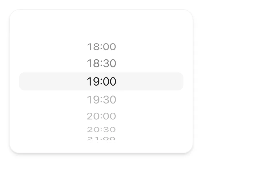
The value is set when scrolling settles or when an item is pressed. Disabled items are skipped: if the wheel stops on one, it moves to the nearest enabled item.
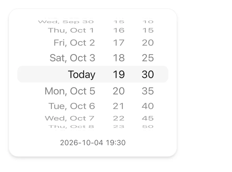
Combine several columns for compound values such as day, hour and minute, and use `className` on columns and items to control width and alignment. Set `itemHeight` on `WheelPicker` to change the row height.
## Examples
### Disabled items
A time list where booked slots are disabled and skipped.
```tsx
import { View } from "react-native"
import { WheelPicker, WheelPickerColumn, WheelPickerItem } from "@/components/ui/wheel-picker"
const slots = Array.from({ length: 11 }, (_, index) => {
const minutes = 18 * 60 + index * 30
return `${Math.floor(minutes / 60)}:${String(minutes % 60).padStart(2, "0")}`
})
const booked = new Set(["19:30", "20:00", "20:30"])
const minutes = Array.from({ length: 12 }, (_, step) =>
String(step * 5).padStart(2, "0")
)
export function WheelPickerDisabledItemsExample() {
return (
{slots.map((slot) => (
{slot}
))}
)
}
```
```swift
import EsuissUI
import SwiftUI
struct WheelPickerDisabledItemsExample: View {
var body: some View {
WheelPickerFrame {
SlotsDemo()
}
}
}
struct WheelPickerFrame: View {
@ViewBuilder let content: () -> Content
@Environment(\.colorScheme) private var colorScheme
var body: some View {
let shape = RoundedRectangle(cornerRadius: Radius.xl2, style: .continuous)
content()
.padding(16)
.frame(width: 320)
.background(EsuissColor.card, in: shape)
.overlay {
shape.strokeBorder(EsuissColor.foreground.opacity(colorScheme == .dark ? 0.1 : 0.05))
}
.shadow(Shadow.md)
}
}
let wheelSlots: [String] = (0..<11).map { index in
let minutes = 18 * 60 + index * 30
return String(format: "%d:%02d", minutes / 60, minutes % 60)
}
let wheelBooked: Set = ["19:30", "20:00", "20:30"]
struct SlotsDemo: View {
@State private var slot = "19:00"
var body: some View {
WheelPicker {
WheelPickerColumn(selection: $slot) {
ForEach(wheelSlots, id: \.self) { item in
WheelPickerItem(verbatim: item, value: item)
.disabled(wheelBooked.contains(item))
}
}
.accessibilityLabel(Text("Reservation time"))
}
}
}
```
```kotlin
import androidx.compose.foundation.background
import androidx.compose.foundation.border
import androidx.compose.foundation.layout.Box
import androidx.compose.foundation.layout.fillMaxWidth
import androidx.compose.foundation.layout.padding
import androidx.compose.foundation.layout.width
import androidx.compose.foundation.shape.RoundedCornerShape
import androidx.compose.runtime.Composable
import androidx.compose.runtime.getValue
import androidx.compose.runtime.mutableStateOf
import androidx.compose.runtime.saveable.rememberSaveable
import androidx.compose.runtime.setValue
import androidx.compose.ui.Modifier
import androidx.compose.ui.unit.dp
import com.esuiss.ui.components.WheelPicker
import com.esuiss.ui.components.WheelPickerColumn
import com.esuiss.ui.theme.EsuissTheme
import com.esuiss.ui.theme.Radius
import com.esuiss.ui.theme.Shadows
import com.esuiss.ui.theme.shadow
@Composable
fun WheelPickerDisabledItemsExample() {
WheelPickerFrame { WheelPickerDisabledItems() }
}
val wheelPickerSlots = List(11) { index ->
val minutes = 18 * 60 + index * 30
"${minutes / 60}:${(minutes % 60).toString().padStart(2, '0')}"
}
val wheelPickerBooked = setOf("19:30", "20:00", "20:30")
@Composable
fun WheelPickerFrame(content: @Composable () -> Unit) {
val colors = EsuissTheme.colors
val shape = RoundedCornerShape(Radius.xl2)
Box(
Modifier
.width(320.dp)
.shadow(Shadows.md, shape)
.background(colors.card, shape)
.border(1.dp, colors.foreground.copy(alpha = if (colors.isDark) 0.1f else 0.05f), shape)
.padding(16.dp),
) {
content()
}
}
@Composable
fun WheelPickerDisabledItems() {
var value by rememberSaveable { mutableStateOf("19:00") }
WheelPicker(Modifier.fillMaxWidth()) {
WheelPickerColumn(value, { value = it }, label = "Reservation time") {
wheelPickerSlots.forEach { WheelPickerItem(it, it, enabled = it !in wheelPickerBooked) }
}
}
}
```
### Date time
Controlled day, hour and minute columns combined into one value.
```tsx
import * as React from "react"
import { View } from "react-native"
import { Text } from "@/components/ui/text"
import { WheelPicker, WheelPickerColumn, WheelPickerItem } from "@/components/ui/wheel-picker"
function toDayValue(date: Date) {
return [
date.getFullYear(),
String(date.getMonth() + 1).padStart(2, "0"),
String(date.getDate()).padStart(2, "0"),
].join("-")
}
const today = new Date(2026, 9, 4)
const days = Array.from({ length: 15 }, (_, index) => {
const date = new Date(
today.getFullYear(),
today.getMonth(),
today.getDate() + index - 7
)
const label =
index === 7
? "Today"
: date.toLocaleDateString("en-US", {
weekday: "short",
month: "short",
day: "numeric",
})
return { value: toDayValue(date), label }
})
const hours = Array.from({ length: 24 }, (_, hour) =>
String(hour).padStart(2, "0")
)
const minutes = Array.from({ length: 12 }, (_, step) =>
String(step * 5).padStart(2, "0")
)
function DateTimeExample() {
const [day, setDay] = React.useState(toDayValue(today))
const [hour, setHour] = React.useState("19")
const [minute, setMinute] = React.useState("30")
return (
{days.map(({ value, label }) => (
{label}
))}
{hours.map((value) => (
{value}
))}
{minutes.map((value) => (
{value}
))}
{day} {hour}:{minute}
)
}
export function WheelPickerDateTimeExample() {
return (
)
}
```
```swift
import EsuissUI
import SwiftUI
struct WheelPickerDateTimeExample: View {
var body: some View {
WheelPickerFrame {
DateTimeDemo()
}
}
}
struct WheelPickerFrame: View {
@ViewBuilder let content: () -> Content
@Environment(\.colorScheme) private var colorScheme
var body: some View {
let shape = RoundedRectangle(cornerRadius: Radius.xl2, style: .continuous)
content()
.padding(16)
.frame(width: 320)
.background(EsuissColor.card, in: shape)
.overlay {
shape.strokeBorder(EsuissColor.foreground.opacity(colorScheme == .dark ? 0.1 : 0.05))
}
.shadow(Shadow.md)
}
}
struct WheelDay {
let value: String
let label: String
}
let wheelDays: [WheelDay] = {
var calendar = Calendar(identifier: .gregorian)
calendar.timeZone = TimeZone(identifier: "UTC") ?? .current
let today = calendar.date(from: DateComponents(year: 2026, month: 10, day: 4)) ?? .now
let label = Date.FormatStyle(timeZone: calendar.timeZone)
.weekday(.abbreviated)
.month(.abbreviated)
.day()
.locale(Locale(identifier: "en_US"))
return (0..<15).map { index in
let date = calendar.date(byAdding: .day, value: index - 7, to: today) ?? today
let parts = calendar.dateComponents([.year, .month, .day], from: date)
let value = String(format: "%04d-%02d-%02d", parts.year ?? 0, parts.month ?? 0, parts.day ?? 0)
return WheelDay(value: value, label: index == 7 ? "Today" : date.formatted(label))
}
}()
let wheelHours = (0..<24).map { String(format: "%02d", $0) }
let wheelMinutes = (0..<12).map { String(format: "%02d", $0 * 5) }
struct DateTimeDemo: View {
@State private var day = "2026-10-04"
@State private var hour = "19"
@State private var minute = "30"
var body: some View {
VStack(spacing: 12) {
WheelPicker {
WheelPickerColumn(selection: $day, alignment: .trailing) {
ForEach(wheelDays, id: \.value) { item in
WheelPickerItem(verbatim: item.label, value: item.value)
}
}
.frame(minWidth: 150, maxWidth: .infinity, alignment: .trailing)
.accessibilityLabel(Text("Day"))
WheelPickerColumn(selection: $hour) {
ForEach(wheelHours, id: \.self) { item in
WheelPickerItem(verbatim: item, value: item)
}
}
.accessibilityLabel(Text("Hour"))
WheelPickerColumn(selection: $minute, alignment: .leading) {
ForEach(wheelMinutes, id: \.self) { item in
WheelPickerItem(verbatim: item, value: item)
}
}
.frame(maxWidth: .infinity, alignment: .leading)
.accessibilityLabel(Text("Minute"))
}
Text(verbatim: "\(day) \(hour):\(minute)")
.textStyle(.sm)
.monospacedDigit()
.foregroundStyle(EsuissColor.mutedForeground)
.multilineTextAlignment(.center)
.frame(maxWidth: .infinity)
}
}
}
```
```kotlin
import androidx.compose.foundation.background
import androidx.compose.foundation.border
import androidx.compose.foundation.layout.Arrangement
import androidx.compose.foundation.layout.Box
import androidx.compose.foundation.layout.Column
import androidx.compose.foundation.layout.fillMaxWidth
import androidx.compose.foundation.layout.padding
import androidx.compose.foundation.layout.width
import androidx.compose.foundation.shape.RoundedCornerShape
import androidx.compose.runtime.Composable
import androidx.compose.runtime.getValue
import androidx.compose.runtime.mutableStateOf
import androidx.compose.runtime.saveable.rememberSaveable
import androidx.compose.runtime.setValue
import androidx.compose.ui.Alignment
import androidx.compose.ui.Modifier
import androidx.compose.ui.text.style.TextAlign
import androidx.compose.ui.unit.dp
import com.esuiss.ui.components.Text
import com.esuiss.ui.components.WheelPicker
import com.esuiss.ui.components.WheelPickerColumn
import com.esuiss.ui.theme.EsuissTheme
import com.esuiss.ui.theme.Radius
import com.esuiss.ui.theme.Shadows
import com.esuiss.ui.theme.Typography
import com.esuiss.ui.theme.shadow
import java.text.SimpleDateFormat
import java.util.Calendar
import java.util.Locale
@Composable
fun WheelPickerDateTimeExample() {
WheelPickerFrame { WheelPickerDateTime() }
}
class WheelPickerDay(val value: String, val label: String)
val wheelPickerDays: List = run {
val format = SimpleDateFormat("EEE, MMM d", Locale.US)
val key = SimpleDateFormat("yyyy-MM-dd", Locale.US)
List(15) { index ->
val calendar = Calendar.getInstance(Locale.US)
calendar.clear()
calendar.set(2026, Calendar.OCTOBER, 4 + index - 7)
WheelPickerDay(key.format(calendar.time), if (index == 7) "Today" else format.format(calendar.time))
}
}
val wheelPickerHours = List(24) { it.toString().padStart(2, '0') }
val wheelPickerMinutes = List(12) { (it * 5).toString().padStart(2, '0') }
@Composable
fun WheelPickerFrame(content: @Composable () -> Unit) {
val colors = EsuissTheme.colors
val shape = RoundedCornerShape(Radius.xl2)
Box(
Modifier
.width(320.dp)
.shadow(Shadows.md, shape)
.background(colors.card, shape)
.border(1.dp, colors.foreground.copy(alpha = if (colors.isDark) 0.1f else 0.05f), shape)
.padding(16.dp),
) {
content()
}
}
@Composable
fun WheelPickerDateTime() {
var day by rememberSaveable { mutableStateOf(wheelPickerDays[7].value) }
var hour by rememberSaveable { mutableStateOf("19") }
var minute by rememberSaveable { mutableStateOf("30") }
Column(Modifier.fillMaxWidth(), verticalArrangement = Arrangement.spacedBy(12.dp)) {
WheelPicker(Modifier.fillMaxWidth()) {
WheelPickerColumn(
day,
{ day = it },
Modifier.weight(1.6f),
label = "Day",
horizontalAlignment = Alignment.End,
) {
wheelPickerDays.forEach { WheelPickerItem(it.value, it.label) }
}
WheelPickerColumn(hour, { hour = it }, label = "Hour") {
wheelPickerHours.forEach { WheelPickerItem(it, it) }
}
WheelPickerColumn(
minute,
{ minute = it },
Modifier.weight(1f),
label = "Minute",
horizontalAlignment = Alignment.Start,
) {
wheelPickerMinutes.forEach { WheelPickerItem(it, it) }
}
}
Text(
"$day $hour:$minute",
modifier = Modifier.fillMaxWidth(),
style = Typography.sm.copy(fontFeatureSettings = "tnum"),
color = EsuissTheme.colors.mutedForeground,
textAlign = TextAlign.Center,
)
}
}
```
## API Reference
### WheelPicker
Root row of columns with the selection highlight.
Also accepts the props of `React.ComponentProps`.
### WheelPickerColumn
Snapping scroll column that holds one value.
Also accepts the props of `React.ComponentProps`.
### WheelPickerItem
Single row in a column.
Also accepts the props of `React.ComponentProps`.
## Accessibility
- Each column has the `adjustable` role and announces the selected item's label as its value.
- VoiceOver and TalkBack users swipe up or down to move to the next or previous enabled item.
- Give each column an `accessibilityLabel`, such as `Hour` or `Minute`.
- The highlight band is hidden from screen readers.
## Notes
- A selection haptic plays when the value changes, if a haptics adapter is provided through the haptics context.
- The highlight uses `bg-secondary`; items use `text-xl text-foreground` with tabular numbers and `text-muted-foreground` when disabled.
- Light and dark colors follow the system appearance.