) {
const context = React.useContext(ToggleGroupContext)
return (
{children}
)
}
export { ToggleGroup, ToggleGroupItem }
```
4. Update the import paths to match your project.
## Usage
```tsx
import { ToggleGroup, ToggleGroupItem } from "@/components/ui/toggle-group"
```
```tsx
```
The group's value is an array of item values. Use `defaultValue` for an uncontrolled group, or `value` with `onValueChange` to control it. Set `multiple` to let several items be pressed at once; without it, pressing an item releases the others.
Set `variant` and `size` on `ToggleGroup`; items take these from the group. Use `spacing={0}` with the `outline` variant to join items into one bordered bar.
## Examples
### Outline
Uses the `outline` variant with spaced items.
**Example**
```tsx
import {
TextBIcon,
TextItalicIcon,
TextUnderlineIcon,
} from "@phosphor-icons/react"
import { ToggleGroup, ToggleGroupItem } from "@/components/ui/toggle-group"
export default function ToggleGroupOutline() {
return (
)
}
```
### Attached
Joins outline items into one bar with `spacing={0}`.
**Example**
```tsx
import {
TextBIcon,
TextItalicIcon,
TextUnderlineIcon,
} from "@phosphor-icons/react"
import { ToggleGroup, ToggleGroupItem } from "@/components/ui/toggle-group"
export default function ToggleGroupAttached() {
return (
)
}
```
### Sizes
Compares the `sm`, `default` and `lg` sizes.
**Example**
```tsx
import {
TextBIcon,
TextItalicIcon,
TextUnderlineIcon,
} from "@phosphor-icons/react"
import { ToggleGroup, ToggleGroupItem } from "@/components/ui/toggle-group"
export default function ToggleGroupSizes() {
return (
{(["sm", "default", "lg"] as const).map((size) => (
))}
)
}
```
### Segmented
Shows a single-choice segmented control with a sliding pill.
**Example**
```tsx
import { ToggleGroup, ToggleGroupItem } from "@/components/ui/toggle-group"
export default function ToggleGroupSegmented() {
return (
Day
Week
Month
Year
)
}
```
### Segmented vertical
Stacks a segmented control vertically.
**Example**
```tsx
import { ToggleGroup, ToggleGroupItem } from "@/components/ui/toggle-group"
export default function ToggleGroupSegmentedVertical() {
return (
Day
Week
Month
Year
)
}
```
### Segmented multiple
Uses a segmented control that allows several pressed items.
**Example**
```tsx
import {
TextBIcon,
TextItalicIcon,
TextUnderlineIcon,
} from "@phosphor-icons/react"
import { ToggleGroup, ToggleGroupItem } from "@/components/ui/toggle-group"
export default function ToggleGroupSegmentedMultiple() {
return (
)
}
```
### Segmented sizes
Compares segmented controls in each size.
**Example**
```tsx
import { ToggleGroup, ToggleGroupItem } from "@/components/ui/toggle-group"
export default function ToggleGroupSegmentedSizes() {
return (
{(["sm", "default", "lg"] as const).map((size) => (
Day
Week
Month
))}
)
}
```
### Single selection
Allows only one pressed item in an outline group.
**Example**
```tsx
import {
TextAlignCenterIcon,
TextAlignLeftIcon,
TextAlignRightIcon,
} from "@phosphor-icons/react"
import { ToggleGroup, ToggleGroupItem } from "@/components/ui/toggle-group"
export default function ToggleGroupSingleSelection() {
return (
)
}
```
### Vertical
Stacks attached outline items vertically.
**Example**
```tsx
import {
TextBIcon,
TextItalicIcon,
TextUnderlineIcon,
} from "@phosphor-icons/react"
import { ToggleGroup, ToggleGroupItem } from "@/components/ui/toggle-group"
export default function ToggleGroupVertical() {
return (
)
}
```
### Disabled
Disables every item in the group.
**Example**
```tsx
import {
TextBIcon,
TextItalicIcon,
TextUnderlineIcon,
} from "@phosphor-icons/react"
import { ToggleGroup, ToggleGroupItem } from "@/components/ui/toggle-group"
export default function ToggleGroupDisabled() {
return (
)
}
```
## API Reference
- `ToggleGroup`
- `ToggleGroupItem`
### ToggleGroup
The container that holds the pressed values and shared styles.
| Prop | Type | Default | Description |
| --- | --- | --- | --- |
| `spacing` | `number` | `2` | Sets the gap between items on the spacing scale; `0` attaches them, or makes a segmented control with the `default` variant. |
| `orientation` | `"horizontal" \| "vertical"` | `"horizontal"` | Lays items out in a row or a column, and sets which arrow keys move focus. |
Also accepts the props of the primitive part it wraps.
### ToggleGroupItem
A toggle button within the group, identified by its `value`.
Also accepts the props of the primitive part it wraps.
## Accessibility
- The group has the `group` role; name it with `aria-label`.
- Each item is a `button` with `aria-pressed`. Icon-only items need an `aria-label`.
- Arrow keys move focus between items: left and right in a horizontal group, up and down in a vertical one. `Space` toggles the focused item.
- `disabled` on the group disables every item.
## Notes
- The segmented indicator appears only when exactly one item is pressed. Its position is set through `--active-toggle-left`, `--active-toggle-top`, `--active-toggle-width` and `--active-toggle-height`.
- `variant` and `size` set on a `ToggleGroupItem` are overridden by the group's values.
- The group sets `data-variant`, `data-size`, `data-spacing` and `data-orientation`; parts use the `toggle-group`, `toggle-group-item` and `toggle-group-indicator` slots.
- The segmented track uses `bg-secondary` and the pill uses `bg-card`. Its animation is removed when reduced motion is preferred.
**React Native, SwiftUI, Jetpack Compose**
```tsx
import { TextBIcon, TextItalicIcon, TextUnderlineIcon } from "phosphor-react-native"
import * as React from "react"
import { ToggleGroup, ToggleGroupIcon, ToggleGroupItem } from "@/components/ui/toggle-group"
type GroupProps = Omit<
React.ComponentProps,
"value" | "onValueChange" | "children"
>
function FormattingDemo({
initial = ["bold"],
...props
}: GroupProps & { initial?: string[] }) {
const [value, setValue] = React.useState(initial)
return (
)
}
export function ToggleGroupExample() {
return (
)
}
```
```swift
import EsuissUI
import PhosphorSwift
import SwiftUI
struct FormattingDemo: View {
let variant: ToggleVariant
let size: ToggleSize
let spacing: Int
let orientation: Axis
@State private var value: Set
init(
initial: Set = ["bold"],
variant: ToggleVariant = .default,
size: ToggleSize = .default,
spacing: Int = 2,
orientation: Axis = .horizontal
) {
self.variant = variant
self.size = size
self.spacing = spacing
self.orientation = orientation
_value = State(initialValue: initial)
}
var body: some View {
ToggleGroup(selection: $value, variant: variant, size: size, spacing: spacing, orientation: orientation) {
ToggleGroupItem(value: "bold") {
Ph.textB.regular.frame(width: 16, height: 16)
}
.accessibilityLabel(Text("Toggle bold"))
ToggleGroupItem(value: "italic") {
Ph.textItalic.regular.frame(width: 16, height: 16)
}
.accessibilityLabel(Text("Toggle italic"))
ToggleGroupItem(value: "underline") {
Ph.textUnderline.regular.frame(width: 16, height: 16)
}
.accessibilityLabel(Text("Toggle underline"))
}
}
}
```
```kotlin
import androidx.compose.foundation.gestures.Orientation
import androidx.compose.runtime.Composable
import androidx.compose.runtime.getValue
import androidx.compose.runtime.mutableStateOf
import androidx.compose.runtime.saveable.rememberSaveable
import androidx.compose.runtime.setValue
import androidx.compose.ui.Modifier
import androidx.compose.ui.graphics.vector.ImageVector
import androidx.compose.ui.semantics.contentDescription
import androidx.compose.ui.semantics.semantics
import com.adamglin.PhosphorIcons
import com.adamglin.phosphoricons.Regular
import com.adamglin.phosphoricons.regular.TextB
import com.adamglin.phosphoricons.regular.TextItalic
import com.adamglin.phosphoricons.regular.TextUnderline
import com.esuiss.ui.components.Icon
import com.esuiss.ui.components.ToggleGroup
import com.esuiss.ui.components.ToggleGroupItem
import com.esuiss.ui.components.ToggleSize
import com.esuiss.ui.components.ToggleVariant
@Composable
fun ToggleGroupIconItem(value: String, label: String, icon: ImageVector) {
ToggleGroupItem(value, Modifier.semantics { contentDescription = label }) {
Icon(icon, contentDescription = null)
}
}
@Composable
fun ToggleGroupFormatting(
variant: ToggleVariant = ToggleVariant.Default,
size: ToggleSize = ToggleSize.Default,
spacing: Int = 2,
orientation: Orientation = Orientation.Horizontal,
enabled: Boolean = true,
initial: Set = setOf("bold"),
) {
var values by rememberSaveable { mutableStateOf(initial.toList()) }
ToggleGroup(
values = values.toSet(),
onValuesChange = { values = it.toList() },
variant = variant,
size = size,
spacing = spacing,
orientation = orientation,
enabled = enabled,
) {
ToggleGroupIconItem("bold", "Toggle bold", PhosphorIcons.Regular.TextB)
ToggleGroupIconItem("italic", "Toggle italic", PhosphorIcons.Regular.TextItalic)
ToggleGroupIconItem("underline", "Toggle underline", PhosphorIcons.Regular.TextUnderline)
}
}
```
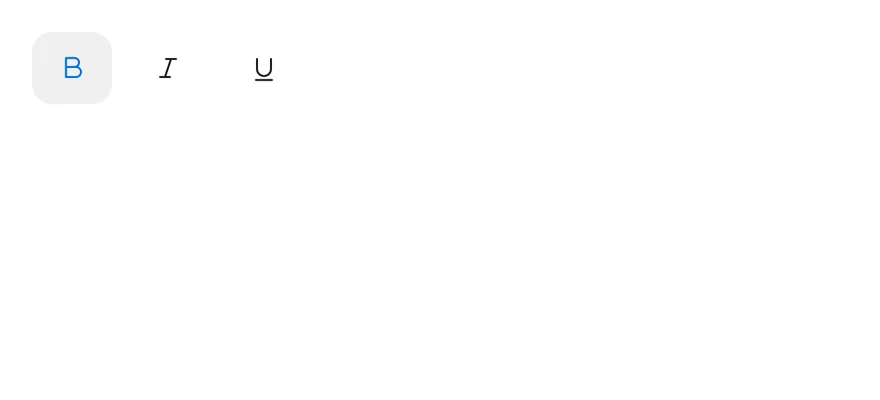
`ToggleGroup` is built on the toggle group primitive and lays out `ToggleGroupItem` toggles in a row or a column. Items take the same `variant` and `size` styles as Toggle. The `spacing` prop sets the gap between items in steps of 4 points.
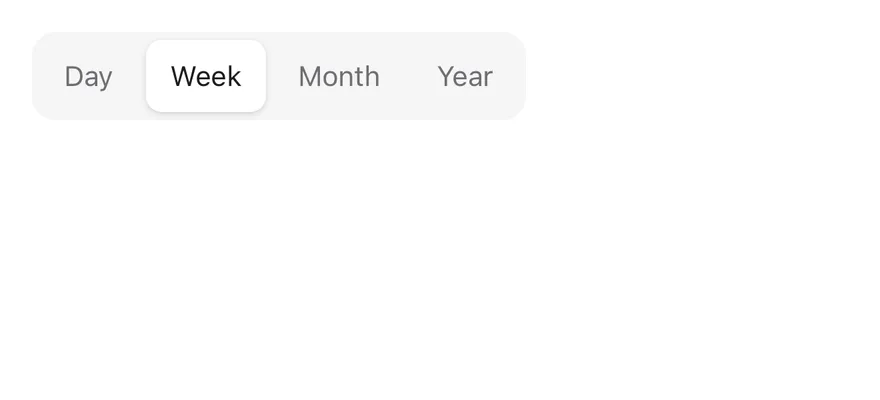
With `spacing={0}`, the group changes shape: the `default` variant becomes a segmented control on a `bg-secondary` track, and the `outline` variant joins items into one bordered strip. In a single-selection segmented control, the selected item is marked by a raised indicator that slides to the new item when the selection changes, like Tabs. In a `multiple` segmented control, each pressed item is raised on its own. Use the segmented style for switching views and the spaced style for toolbars.
## Installation
**React Native**
```bash title="Terminal"
npx shadcn@latest add @esuiss-rn/toggle-group
```
See [Installation](https://ui.suiss.app/docs/installation) for the `components.json` setup. Or use the suiss/ui CLI:
```bash title="Terminal"
npx @esuiss/ui@latest add toggle-group
```
**SwiftUI**
```bash title="Terminal"
npx @esuiss/ui@latest add toggle-group --platform swift
```
**Jetpack Compose**
```bash title="Terminal"
npx @esuiss/ui@latest add toggle-group --platform kotlin
```
The CLI also adds what it builds on: [Icon](https://ui.suiss.app/docs/components/icon), [Text](https://ui.suiss.app/docs/components/text), [Toggle](https://ui.suiss.app/docs/components/toggle).
### Manual
**React Native**
**Uniwind**
1. Install the dependencies:
```bash title="Terminal"
npx expo install class-variance-authority cn react-native-reanimated react-native-worklets
```
2. Add the pieces it builds on: [Icon](https://ui.suiss.app/docs/components/icon), [Text](https://ui.suiss.app/docs/components/text), [Toggle](https://ui.suiss.app/docs/components/toggle), and the primitives `components/primitives/toggle.tsx`, `components/primitives/toggle-group.tsx`, `components/primitives/types.tsx`, `components/primitives/use-render.tsx`.
3. Copy the source into `components/ui/toggle-group.tsx`:
```tsx title="uniwind/components/ui/toggle-group.tsx"
import type { VariantProps } from "class-variance-authority"
import { cn } from "cn"
import * as React from "react"
import { Pressable } from "react-native"
import Animated, {
Easing,
LinearTransition,
ReduceMotion,
} from "react-native-reanimated"
import {
Toggle as TogglePrimitive,
type ToggleState,
} from "@/components/primitives/toggle"
import {
ToggleGroupIndicator as ToggleGroupIndicatorPrimitive,
ToggleGroup as ToggleGroupPrimitive,
useToggleGroupContext,
} from "@/components/primitives/toggle-group"
import type { Orientation } from "@/components/primitives/types"
import { resolveClassName } from "@/components/primitives/use-render"
import { Icon } from "@/components/ui/icon"
import { TextClassContext } from "@/components/ui/text"
import {
toggleStateClassName,
toggleTextClassName,
toggleVariants,
} from "@/components/ui/toggle"
type ToggleGroupContextValue = VariantProps & {
spacing: number
orientation: Orientation
}
const ToggleGroupContext = React.createContext({
variant: "default",
size: "default",
spacing: 2,
orientation: "horizontal",
})
const ItemPositionContext = React.createContext({ first: true, last: true })
const INDICATOR_TRANSITION = LinearTransition.duration(300)
.easing(Easing.bezier(0.32, 0.72, 0, 1))
.reduceMotion(ReduceMotion.System)
const SEGMENTED_SELECTED_CLASS_NAME = "bg-card shadow-sm dark:bg-border"
function ToggleGroupIndicator() {
return (
}
/>
)
}
function ToggleGroup({
className,
style,
variant = "default",
size = "default",
spacing = 2,
orientation = "horizontal",
multiple,
children,
...props
}: React.ComponentProps &
VariantProps & {
spacing?: number
}) {
const segmented = spacing === 0 && variant === "default"
const items = React.Children.toArray(children)
const context = React.useMemo(
() => ({ variant, size, spacing, orientation }),
[variant, size, spacing, orientation]
)
return (
cn(
"relative flex-row items-center self-start",
orientation === "vertical" && "flex-col items-stretch",
spacing === 0 && variant === "outline" && "rounded-lg",
segmented && "rounded-xl bg-secondary p-1",
resolveClassName(className, state)
)
}
style={(state) => [
{ gap: segmented ? 4 : spacing * 4 },
typeof style === "function" ? style(state) : style,
]}
{...props}
>
{segmented && !multiple ? : null}
{items.map((child, index) => (
{child}
))}
)
}
function itemClassName(
context: ToggleGroupContextValue,
position: { first: boolean; last: boolean },
state: ToggleState,
multiple: boolean
) {
const vertical = context.orientation === "vertical"
if (context.spacing === 0 && context.variant === "default") {
return cn(
"rounded-md px-3",
state.pressed && multiple && SEGMENTED_SELECTED_CLASS_NAME,
state.disabled && "opacity-50"
)
}
return cn(
toggleStateClassName(state),
context.spacing === 0 &&
cn(
"rounded-none",
vertical
? cn(
position.first && "rounded-t-xl",
position.last && "rounded-b-xl"
)
: cn(
position.first && "rounded-l-lg",
position.last && "rounded-r-lg"
),
context.variant === "outline" &&
!position.first &&
(vertical ? "border-t-0" : "border-l-0")
)
)
}
function itemTextClassName(
context: ToggleGroupContextValue,
state: ToggleState
) {
if (context.spacing === 0 && context.variant === "default") {
return cn(
"text-sm",
state.pressed ? "text-card-foreground" : "text-muted-foreground"
)
}
return toggleTextClassName(state)
}
function ToggleGroupItem({
className,
children,
variant,
size,
...props
}: React.ComponentProps &
VariantProps) {
const context = React.useContext(ToggleGroupContext)
const position = React.useContext(ItemPositionContext)
const multiple = useToggleGroupContext()?.multiple ?? false
const resolved = {
...context,
variant: context.variant || variant,
size: context.size || size,
}
return (
cn(
"shrink-0",
toggleVariants({ variant: resolved.variant, size: resolved.size }),
itemClassName(resolved, position, state, multiple),
resolveClassName(className, state)
)
}
render={(renderProps, state) => (
)}
{...props}
>
{children}
)
}
function ToggleGroupIcon({
className,
...props
}: React.ComponentProps) {
return
}
export { ToggleGroup, ToggleGroupIcon, ToggleGroupItem }
```
4. Update the import paths to match your project.
**NativeWind**
1. Install the dependencies:
```bash title="Terminal"
npx expo install class-variance-authority cn react-native-reanimated react-native-worklets
```
2. Add the pieces it builds on: [Icon](https://ui.suiss.app/docs/components/icon), [Text](https://ui.suiss.app/docs/components/text), [Toggle](https://ui.suiss.app/docs/components/toggle), and the primitives `components/primitives/toggle.tsx`, `components/primitives/toggle-group.tsx`, `components/primitives/types.tsx`, `components/primitives/use-render.tsx`.
3. Copy the source into `components/ui/toggle-group.tsx`:
```tsx title="nativewind/components/ui/toggle-group.tsx"
import type { VariantProps } from "class-variance-authority"
import { cn } from "cn"
import * as React from "react"
import { Pressable } from "react-native"
import Animated, {
Easing,
LinearTransition,
ReduceMotion,
} from "react-native-reanimated"
import {
Toggle as TogglePrimitive,
type ToggleState,
} from "@/components/primitives/toggle"
import {
ToggleGroupIndicator as ToggleGroupIndicatorPrimitive,
ToggleGroup as ToggleGroupPrimitive,
useToggleGroupContext,
} from "@/components/primitives/toggle-group"
import type { Orientation } from "@/components/primitives/types"
import { resolveClassName } from "@/components/primitives/use-render"
import { Icon } from "@/components/ui/icon"
import { TextClassContext } from "@/components/ui/text"
import {
toggleStateClassName,
toggleTextClassName,
toggleVariants,
} from "@/components/ui/toggle"
type ToggleGroupContextValue = VariantProps & {
spacing: number
orientation: Orientation
}
const ToggleGroupContext = React.createContext({
variant: "default",
size: "default",
spacing: 2,
orientation: "horizontal",
})
const ItemPositionContext = React.createContext({ first: true, last: true })
const INDICATOR_TRANSITION = LinearTransition.duration(300)
.easing(Easing.bezier(0.32, 0.72, 0, 1))
.reduceMotion(ReduceMotion.System)
const SEGMENTED_SELECTED_CLASS_NAME = "bg-card shadow dark:bg-border"
function ToggleGroupIndicator() {
return (
}
/>
)
}
function ToggleGroup({
className,
style,
variant = "default",
size = "default",
spacing = 2,
orientation = "horizontal",
multiple,
children,
...props
}: React.ComponentProps &
VariantProps & {
spacing?: number
}) {
const segmented = spacing === 0 && variant === "default"
const items = React.Children.toArray(children)
const context = React.useMemo(
() => ({ variant, size, spacing, orientation }),
[variant, size, spacing, orientation]
)
return (
cn(
"relative flex-row items-center self-start",
orientation === "vertical" && "flex-col items-stretch",
spacing === 0 && variant === "outline" && "rounded-lg",
segmented && "rounded-xl bg-secondary p-1",
resolveClassName(className, state)
)
}
style={(state) => [
{ gap: segmented ? 4 : spacing * 4 },
typeof style === "function" ? style(state) : style,
]}
{...props}
>
{segmented && !multiple ? : null}
{items.map((child, index) => (
{child}
))}
)
}
function itemClassName(
context: ToggleGroupContextValue,
position: { first: boolean; last: boolean },
state: ToggleState,
multiple: boolean
) {
const vertical = context.orientation === "vertical"
if (context.spacing === 0 && context.variant === "default") {
return cn(
"rounded-md px-3",
state.pressed && multiple && SEGMENTED_SELECTED_CLASS_NAME,
state.disabled && "opacity-50"
)
}
return cn(
toggleStateClassName(state),
context.spacing === 0 &&
cn(
"rounded-none",
vertical
? cn(
position.first && "rounded-t-xl",
position.last && "rounded-b-xl"
)
: cn(
position.first && "rounded-l-lg",
position.last && "rounded-r-lg"
),
context.variant === "outline" &&
!position.first &&
(vertical ? "border-t-0" : "border-l-0")
)
)
}
function itemTextClassName(
context: ToggleGroupContextValue,
state: ToggleState
) {
if (context.spacing === 0 && context.variant === "default") {
return cn(
"text-sm",
state.pressed ? "text-card-foreground" : "text-muted-foreground"
)
}
return toggleTextClassName(state)
}
function ToggleGroupItem({
className,
children,
variant,
size,
...props
}: React.ComponentProps &
VariantProps) {
const context = React.useContext(ToggleGroupContext)
const position = React.useContext(ItemPositionContext)
const multiple = useToggleGroupContext()?.multiple ?? false
const resolved = {
...context,
variant: context.variant || variant,
size: context.size || size,
}
return (
cn(
"shrink-0",
toggleVariants({ variant: resolved.variant, size: resolved.size }),
itemClassName(resolved, position, state, multiple),
resolveClassName(className, state)
)
}
render={(renderProps, state) => (
)}
{...props}
>
{children}
)
}
function ToggleGroupIcon({
className,
...props
}: React.ComponentProps) {
return
}
export { ToggleGroup, ToggleGroupIcon, ToggleGroupItem }
```
4. Update the import paths to match your project.
**StyleSheet**
1. Install the dependencies:
```bash title="Terminal"
npx expo install react-native-reanimated react-native-worklets
```
2. Add the pieces it builds on: [Icon](https://ui.suiss.app/docs/components/icon), [Text](https://ui.suiss.app/docs/components/text), [Toggle](https://ui.suiss.app/docs/components/toggle), and the primitives `components/primitives/toggle.tsx`, `components/primitives/toggle-group.tsx`, `components/primitives/types.tsx`, `components/primitives/use-render.tsx`.
3. Copy the source into `components/ui/toggle-group.tsx`:
```tsx title="stylesheet/components/ui/toggle-group.tsx"
import * as React from "react"
import {
Pressable,
type StyleProp,
StyleSheet,
type TextStyle,
type ViewStyle,
} from "react-native"
import Animated, {
Easing,
LinearTransition,
ReduceMotion,
} from "react-native-reanimated"
import {
Toggle as TogglePrimitive,
type ToggleState,
} from "@/components/primitives/toggle"
import {
ToggleGroupIndicator as ToggleGroupIndicatorPrimitive,
ToggleGroup as ToggleGroupPrimitive,
useToggleGroupContext,
} from "@/components/primitives/toggle-group"
import type { Orientation } from "@/components/primitives/types"
import { resolveStyle } from "@/components/primitives/use-render"
import { Icon } from "@/components/ui/icon"
import { TextStyleContext } from "@/components/ui/text"
import {
fontSize,
radius,
shadow,
type ThemeColors,
useTheme,
} from "@/components/ui/theme"
import {
type ToggleVariantProps,
toggleStyle,
toggleTextStyle,
} from "@/components/ui/toggle"
type ToggleGroupContextValue = ToggleVariantProps & {
spacing: number
orientation: Orientation
}
const ToggleGroupContext = React.createContext({
variant: "default",
size: "default",
spacing: 2,
orientation: "horizontal",
})
const ItemPositionContext = React.createContext({ first: true, last: true })
const INDICATOR_TRANSITION = LinearTransition.duration(300)
.easing(Easing.bezier(0.32, 0.72, 0, 1))
.reduceMotion(ReduceMotion.System)
const styles = StyleSheet.create({
root: {
position: "relative",
flexDirection: "row",
alignItems: "center",
alignSelf: "flex-start",
},
vertical: { flexDirection: "column", alignItems: "stretch" },
attached: { borderRadius: radius.lg },
item: { flexShrink: 0 },
segmentedItem: { borderRadius: radius.md, paddingHorizontal: 12 },
indicator: { borderRadius: radius.md },
icon: { flexShrink: 0 },
})
function segmentedSelectedStyle(
colors: ThemeColors,
isDark: boolean
): StyleProp {
return [{ backgroundColor: isDark ? colors.border : colors.card }, shadow.sm]
}
function ToggleGroupIndicator() {
const { colors, isDark } = useTheme()
return (
}
/>
)
}
function ToggleGroup({
style,
variant = "default",
size = "default",
spacing = 2,
orientation = "horizontal",
multiple,
children,
...props
}: React.ComponentProps &
ToggleVariantProps & {
spacing?: number
}) {
const { colors } = useTheme()
const segmented = spacing === 0 && variant === "default"
const items = React.Children.toArray(children)
const context = React.useMemo(
() => ({ variant, size, spacing, orientation }),
[variant, size, spacing, orientation]
)
return (
[
styles.root,
orientation === "vertical" && styles.vertical,
{ gap: segmented ? 4 : spacing * 4 },
spacing === 0 && variant === "outline" && styles.attached,
segmented && {
borderRadius: radius.xl,
backgroundColor: colors.secondary,
padding: 4,
},
typeof style === "function" ? style(state) : style,
]}
{...props}
>
{segmented && !multiple ? : null}
{items.map((child, index) => (
{child}
))}
)
}
function attachedStyle(
context: ToggleGroupContextValue,
position: { first: boolean; last: boolean }
): ViewStyle {
const vertical = context.orientation === "vertical"
const edge = vertical ? radius.xl : radius.lg
const firstCorners = vertical
? { borderTopLeftRadius: edge, borderTopRightRadius: edge }
: { borderTopLeftRadius: edge, borderBottomLeftRadius: edge }
const lastCorners = vertical
? { borderBottomLeftRadius: edge, borderBottomRightRadius: edge }
: { borderTopRightRadius: edge, borderBottomRightRadius: edge }
const collapsedBorder = vertical
? { borderTopWidth: 0 }
: { borderLeftWidth: 0 }
return {
borderRadius: 0,
...(position.first && firstCorners),
...(position.last && lastCorners),
...(context.variant === "outline" && !position.first && collapsedBorder),
}
}
function itemStyle(
context: ToggleGroupContextValue,
position: { first: boolean; last: boolean },
colors: ThemeColors,
isDark: boolean,
state: ToggleState,
pressing: boolean,
multiple: boolean
): StyleProp {
if (context.spacing === 0 && context.variant === "default") {
return [
toggleStyle(context, colors, { ...state, pressed: false }, false),
styles.segmentedItem,
state.pressed && multiple && segmentedSelectedStyle(colors, isDark),
]
}
return [
toggleStyle(context, colors, state, pressing),
context.spacing === 0 && attachedStyle(context, position),
]
}
function itemTextStyle(
context: ToggleGroupContextValue,
colors: ThemeColors,
state: ToggleState
): TextStyle {
if (context.spacing === 0 && context.variant === "default") {
const color = state.pressed ? colors.foreground : colors.mutedForeground
return { ...fontSize.sm, color }
}
return toggleTextStyle(colors, state)
}
function ToggleGroupItem({
style,
children,
variant,
size,
...props
}: React.ComponentProps & ToggleVariantProps) {
const context = React.useContext(ToggleGroupContext)
const position = React.useContext(ItemPositionContext)
const { colors, isDark } = useTheme()
const multiple = useToggleGroupContext()?.multiple ?? false
const resolved = {
...context,
variant: context.variant || variant,
size: context.size || size,
}
return (
(
[
itemStyle(
resolved,
position,
colors,
isDark,
state,
pressed,
multiple
),
styles.item,
resolveStyle(style, state) as StyleProp,
]}
/>
)}
>
{children}
)
}
function ToggleGroupIcon({
style,
size = 16,
...props
}: React.ComponentProps) {
return
}
export { ToggleGroup, ToggleGroupIcon, ToggleGroupItem }
```
4. Update the import paths to match your project.
**SwiftUI**
1. Target iOS 17 or later.
2. Add the Swift package to your app:
```swift title="Package.swift"
.package(url: "https://github.com/phosphor-icons/swift", from: "2.1.0")
```
3. Copy the theme files every view uses:
- `swift/Theme/Theme.swift`: [source](https://github.com/e-suiss/ui/blob/main/packages/mobile/swiftui/Sources/EsuissUI/Theme/Theme.swift)
- `swift/Theme/Tokens.swift`: [source](https://github.com/e-suiss/ui/blob/main/packages/mobile/swiftui/Sources/EsuissUI/Theme/Tokens.swift)
4. Copy the source and every file it uses:
```swift title="swift/Components/ToggleGroup.swift"
import SwiftUI
struct ToggleGroupContext {
var variant: ToggleVariant
var size: ToggleSize
var spacing: Int
var orientation: Axis
var namespace: Namespace.ID
var multiple: Bool
var isSelected: (AnyHashable) -> Bool
var toggle: (AnyHashable) -> Void
var segmented: Bool { spacing == 0 && variant == .default }
var attached: Bool { spacing == 0 && variant == .outline }
}
extension EnvironmentValues {
@Entry var toggleGroup: ToggleGroupContext?
}
public struct ToggleGroup: View {
let variant: ToggleVariant
let size: ToggleSize
let spacing: Int
let orientation: Axis
let multiple: Bool
let isSelected: (Value) -> Bool
let toggle: (Value) -> Void
let content: Content
@Namespace private var namespace
@Environment(\.accessibilityReduceMotion) private var reduceMotion
public init(
selection: Binding,
variant: ToggleVariant = .default,
size: ToggleSize = .default,
spacing: Int = 2,
orientation: Axis = .horizontal,
@ViewBuilder content: () -> Content
) {
self.variant = variant
self.size = size
self.spacing = spacing
self.orientation = orientation
multiple = false
isSelected = { selection.wrappedValue == $0 }
toggle = { value in
selection.wrappedValue = selection.wrappedValue == value ? nil : value
}
self.content = content()
}
public init(
selection: Binding>,
variant: ToggleVariant = .default,
size: ToggleSize = .default,
spacing: Int = 2,
orientation: Axis = .horizontal,
@ViewBuilder content: () -> Content
) {
self.variant = variant
self.size = size
self.spacing = spacing
self.orientation = orientation
multiple = true
isSelected = { selection.wrappedValue.contains($0) }
toggle = { value in
if selection.wrappedValue.contains(value) {
selection.wrappedValue.remove(value)
} else {
selection.wrappedValue.insert(value)
}
}
self.content = content()
}
public var body: some View {
let context = ToggleGroupContext(
variant: variant,
size: size,
spacing: spacing,
orientation: orientation,
namespace: namespace,
multiple: multiple,
isSelected: { value in (value.base as? Value).map(isSelected) ?? false },
toggle: { value in
guard let value = value.base as? Value else { return }
if reduceMotion {
toggle(value)
} else {
withAnimation(.timingCurve(0.32, 0.72, 0, 1, duration: 0.3)) { toggle(value) }
}
}
)
container
.environment(\.toggleGroup, context)
.accessibilityElement(children: .contain)
}
private var segmented: Bool { spacing == 0 && variant == .default }
private var attached: Bool { spacing == 0 && variant == .outline }
private var gap: CGFloat {
segmented ? 4 : CGFloat(spacing) * 4
}
@ViewBuilder private var stack: some View {
switch orientation {
case .horizontal:
HStack(spacing: gap) { content }
case .vertical:
VStack(alignment: .leading, spacing: gap) { content }
}
}
@ViewBuilder private var container: some View {
if segmented {
let shape = RoundedRectangle(cornerRadius: Radius.xl, style: .continuous)
stack
.padding(4)
.background(EsuissColor.secondary, in: shape)
} else if attached {
let shape = RoundedRectangle(cornerRadius: orientation == .vertical ? Radius.xl : Radius.lg, style: .continuous)
stack
.padding(1)
.clipShape(shape)
.overlay {
shape.stroke(EsuissColor.border, lineWidth: 1).padding(0.5)
}
} else {
stack
}
}
}
public struct ToggleGroupItem: View {
let value: Value
let label: Label
@Environment(\.toggleGroup) private var group
@Environment(\.isEnabled) private var isEnabled
@Environment(\.colorScheme) private var colorScheme
public init(value: Value, @ViewBuilder label: () -> Label) {
self.value = value
self.label = label()
}
public var body: some View {
let isOn = group?.isSelected(AnyHashable(value)) ?? false
HapticButton(style: PressReader { pressed in
item(isOn: isOn, pressed: pressed)
}) {
guard let group else { return false }
group.toggle(AnyHashable(value))
return true
}
.accessibilityAddTraits(isOn ? .isSelected : [])
}
@ViewBuilder private func item(isOn: Bool, pressed: Bool) -> some View {
let variant = group?.variant ?? .default
let size = group?.size ?? .default
if let group, group.segmented {
let shape = RoundedRectangle(cornerRadius: Radius.md, style: .continuous)
label
.labelStyle(ButtonLabelStyle(spacing: 4, iconSize: 16))
.scaledFont(.sm)
.lineLimit(1)
.foregroundStyle(isOn ? EsuissColor.cardForeground : EsuissColor.mutedForeground)
.padding(.horizontal, 12)
.frame(minWidth: size.height, minHeight: size.height)
.frame(maxWidth: group.orientation == .vertical ? .infinity : nil)
.background {
if isOn {
shape
.fill(colorScheme == .dark ? EsuissColor.border : EsuissColor.card)
.shadow(.thumb)
.matchedGeometryEffect(id: group.multiple ? AnyHashable(value) : AnyHashable("indicator"), in: group.namespace)
}
}
.opacity(isEnabled ? (pressed ? 0.8 : 1) : 0.5)
.contentShape(shape)
} else if let group, group.attached {
ToggleSurface(
isOn: isOn,
pressed: pressed,
variant: variant,
size: size,
shape: AnyShape(Rectangle()),
bordered: false
) {
label
}
.frame(maxWidth: group.orientation == .vertical ? .infinity : nil)
.overlay(alignment: group.orientation == .vertical ? .top : .leading) {
if group.orientation == .vertical {
EsuissColor.border.frame(height: 1).offset(y: -1)
} else {
EsuissColor.border.frame(width: 1).offset(x: -1)
}
}
} else {
ToggleSurface(isOn: isOn, pressed: pressed, variant: variant, size: size) {
label
}
.frame(maxWidth: group?.orientation == .vertical ? .infinity : nil)
}
}
}
extension ToggleGroupItem where Label == Text {
public init(_ title: LocalizedStringKey, value: Value) {
self.init(value: value) { Text(title) }
}
}
```
- `swift/Components/Button.swift`: see [Button](https://ui.suiss.app/docs/components/button.md)
- `swift/Components/ButtonGroup.swift`: see [Button Group](https://ui.suiss.app/docs/components/button-group.md)
- `swift/Components/Checkbox.swift`: see [Checkbox](https://ui.suiss.app/docs/components/checkbox.md)
- `swift/Components/Field.swift`: see [Field](https://ui.suiss.app/docs/components/field.md)
- `swift/Components/Haptics.swift`: see [Haptics](https://ui.suiss.app/docs/components/haptics.md)
- `swift/Components/Separator.swift`: see [Separator](https://ui.suiss.app/docs/components/separator.md)
- `swift/Components/TextVariant.swift`: [source](https://github.com/e-suiss/ui/blob/main/packages/mobile/swiftui/Sources/EsuissUI/Components/TextVariant.swift)
- `swift/Components/Toggle.swift`: see [Toggle](https://ui.suiss.app/docs/components/toggle.md)
5. Add the files to your app target.
**Jetpack Compose**
1. Set `minSdk` to 24 or higher and add the dependencies:
```kotlin title="build.gradle.kts"
implementation(platform("androidx.compose:compose-bom:2026.09.00"))
implementation("androidx.compose.foundation:foundation")
implementation("androidx.compose.ui:ui")
implementation("com.adamglin:phosphor-icon-android:1.0.0")
```
2. Copy the theme files every view uses:
- `kotlin/theme/Theme.kt`: [source](https://github.com/e-suiss/ui/blob/main/packages/mobile/kotlin/ui/src/main/kotlin/com/esuiss/ui/theme/Theme.kt)
- `kotlin/theme/Tokens.kt`: [source](https://github.com/e-suiss/ui/blob/main/packages/mobile/kotlin/ui/src/main/kotlin/com/esuiss/ui/theme/Tokens.kt)
3. Copy the source and every file it uses:
```kt title="kotlin/components/ToggleGroup.kt"
package com.esuiss.ui.components
import androidx.compose.animation.core.Animatable
import androidx.compose.animation.core.CubicBezierEasing
import androidx.compose.animation.core.tween
import androidx.compose.foundation.background
import androidx.compose.foundation.border
import androidx.compose.foundation.gestures.Orientation
import androidx.compose.foundation.interaction.MutableInteractionSource
import androidx.compose.foundation.interaction.collectIsPressedAsState
import androidx.compose.foundation.layout.Arrangement
import androidx.compose.foundation.layout.Box
import androidx.compose.foundation.layout.Column
import androidx.compose.foundation.layout.IntrinsicSize
import androidx.compose.foundation.layout.Row
import androidx.compose.foundation.layout.RowScope
import androidx.compose.foundation.layout.fillMaxWidth
import androidx.compose.foundation.layout.offset
import androidx.compose.foundation.layout.padding
import androidx.compose.foundation.layout.size
import androidx.compose.foundation.layout.width
import androidx.compose.foundation.selection.selectableGroup
import androidx.compose.foundation.shape.RoundedCornerShape
import androidx.compose.foundation.text.BasicText
import androidx.compose.runtime.Composable
import androidx.compose.runtime.CompositionLocalProvider
import androidx.compose.runtime.DisposableEffect
import androidx.compose.runtime.LaunchedEffect
import androidx.compose.runtime.SideEffect
import androidx.compose.runtime.getValue
import androidx.compose.runtime.mutableStateMapOf
import androidx.compose.runtime.remember
import androidx.compose.runtime.staticCompositionLocalOf
import androidx.compose.ui.Alignment
import androidx.compose.ui.Modifier
import androidx.compose.ui.draw.clip
import androidx.compose.ui.geometry.Rect
import androidx.compose.ui.graphics.Color
import androidx.compose.ui.graphics.RectangleShape
import androidx.compose.ui.layout.boundsInParent
import androidx.compose.ui.layout.onPlaced
import androidx.compose.ui.platform.LocalDensity
import androidx.compose.ui.unit.Dp
import androidx.compose.ui.unit.IntOffset
import androidx.compose.ui.unit.dp
import com.esuiss.ui.theme.EsuissTheme
import com.esuiss.ui.theme.Radius
import com.esuiss.ui.theme.shadow
import kotlin.math.roundToInt
import kotlinx.coroutines.launch
private val IndicatorEasing = CubicBezierEasing(0.32f, 0.72f, 0f, 1f)
private class ToggleGroupIndicator {
val bounds = mutableStateMapOf()
val active = mutableStateMapOf()
}
private class ToggleGroupState(
val isSelected: (String) -> Boolean,
val toggle: (String) -> Unit,
val variant: ToggleVariant,
val size: ToggleSize,
val spacing: Int,
val orientation: Orientation,
val enabled: Boolean,
val multiple: Boolean,
val selected: String? = null,
val indicator: ToggleGroupIndicator? = null,
) {
val segmented: Boolean get() = spacing == 0 && variant == ToggleVariant.Default
val attached: Boolean get() = spacing == 0 && variant == ToggleVariant.Outline
}
private val LocalToggleGroupState = staticCompositionLocalOf { null }
@Composable
fun ToggleGroup(
value: String?,
onValueChange: (String?) -> Unit,
modifier: Modifier = Modifier,
variant: ToggleVariant = ToggleVariant.Default,
size: ToggleSize = ToggleSize.Default,
spacing: Int = 2,
orientation: Orientation = Orientation.Horizontal,
enabled: Boolean = true,
content: @Composable () -> Unit,
) {
val indicator = remember { ToggleGroupIndicator() }
val state = ToggleGroupState(
isSelected = { it == value },
toggle = { onValueChange(if (it == value) null else it) },
variant = variant,
size = size,
spacing = spacing,
orientation = orientation,
enabled = enabled,
multiple = false,
selected = value,
indicator = if (spacing == 0 && variant == ToggleVariant.Default) indicator else null,
)
ToggleGroupLayout(state, modifier, content)
}
@Composable
fun ToggleGroup(
values: Set,
onValuesChange: (Set) -> Unit,
modifier: Modifier = Modifier,
variant: ToggleVariant = ToggleVariant.Default,
size: ToggleSize = ToggleSize.Default,
spacing: Int = 2,
orientation: Orientation = Orientation.Horizontal,
enabled: Boolean = true,
content: @Composable () -> Unit,
) {
val state = ToggleGroupState(
isSelected = { it in values },
toggle = { onValuesChange(if (it in values) values - it else values + it) },
variant = variant,
size = size,
spacing = spacing,
orientation = orientation,
enabled = enabled,
multiple = true,
)
ToggleGroupLayout(state, modifier, content)
}
@Composable
private fun ToggleGroupLayout(
state: ToggleGroupState,
modifier: Modifier,
content: @Composable () -> Unit,
) {
val colors = EsuissTheme.colors
val vertical = state.orientation == Orientation.Vertical
val base = modifier.then(if (state.multiple) Modifier else Modifier.selectableGroup())
CompositionLocalProvider(LocalToggleGroupState provides state) {
if (state.attached) {
val shape = RoundedCornerShape(if (vertical) Radius.xl else Radius.lg)
FormDividedStack(
orientation = state.orientation,
dividerColor = colors.border,
modifier = base.clip(shape).border(1.dp, colors.border, shape),
content = content,
)
} else {
val gap = if (state.segmented) 4.dp else (state.spacing * 4).dp
val container = if (state.segmented) {
val shape = RoundedCornerShape(Radius.xl)
base.clip(shape).background(colors.secondary, shape).padding(4.dp)
} else {
base
}
val indicator = state.indicator
if (indicator != null) {
Box(modifier = if (vertical) container.width(IntrinsicSize.Max) else container) {
if (state.enabled) ToggleGroupIndicatorLayer(indicator, state.selected)
ToggleGroupStack(vertical, gap, if (vertical) Modifier.fillMaxWidth() else Modifier, content)
}
} else {
ToggleGroupStack(vertical, gap, if (vertical) container.width(IntrinsicSize.Max) else container, content)
}
}
}
}
@Composable
private fun ToggleGroupStack(
vertical: Boolean,
gap: Dp,
modifier: Modifier,
content: @Composable () -> Unit,
) {
if (vertical) {
Column(
modifier = modifier,
verticalArrangement = Arrangement.spacedBy(gap),
) {
content()
}
} else {
Row(
modifier = modifier,
horizontalArrangement = Arrangement.spacedBy(gap),
verticalAlignment = Alignment.CenterVertically,
) {
content()
}
}
}
@Composable
private fun ToggleGroupIndicatorLayer(indicator: ToggleGroupIndicator, selected: String?) {
val colors = EsuissTheme.colors
val density = LocalDensity.current
val reduced = formReducedMotion()
val target = selected?.takeIf { indicator.active[it] != false }?.let { indicator.bounds[it] } ?: return
val left = remember { Animatable(target.left) }
val top = remember { Animatable(target.top) }
val width = remember { Animatable(target.width) }
val height = remember { Animatable(target.height) }
LaunchedEffect(target) {
if (reduced) {
left.snapTo(target.left)
top.snapTo(target.top)
width.snapTo(target.width)
height.snapTo(target.height)
} else {
val spec = tween(300, easing = IndicatorEasing)
launch { left.animateTo(target.left, spec) }
launch { top.animateTo(target.top, spec) }
launch { width.animateTo(target.width, spec) }
launch { height.animateTo(target.height, spec) }
}
}
val shape = RoundedCornerShape(Radius.md)
Box(
modifier = Modifier
.offset { IntOffset(left.value.roundToInt(), top.value.roundToInt()) }
.size(with(density) { width.value.toDp() }, with(density) { height.value.toDp() })
.shadow(FormShadowSm, shape)
.background(if (colors.isDark) colors.border else colors.card, shape),
)
}
@Composable
fun ToggleGroupItem(
value: String,
modifier: Modifier = Modifier,
enabled: Boolean = true,
interactionSource: MutableInteractionSource? = null,
content: @Composable RowScope.() -> Unit,
) {
val colors = EsuissTheme.colors
val group = LocalToggleGroupState.current ?: return
val source = interactionSource ?: remember { MutableInteractionSource() }
val touching by source.collectIsPressedAsState()
val haptics = rememberHaptics()
val on = group.isSelected(value)
val active = enabled && group.enabled
val fill = if (group.orientation == Orientation.Vertical) Modifier.fillMaxWidth() else Modifier
val semantics = modifier
.then(fill)
.toggleSemantics(on, active, source, group.multiple) {
if (group.multiple) haptics.toggle(!on) else haptics.selection()
group.toggle(value)
}
val indicator = group.indicator
if (indicator != null) {
SideEffect { indicator.active[value] = active }
DisposableEffect(indicator, value) {
onDispose {
indicator.bounds.remove(value)
indicator.active.remove(value)
}
}
}
val sliding = indicator != null && on && active
when {
group.segmented -> {
val shape = RoundedCornerShape(Radius.md)
val background = when {
!on || sliding -> Color.Transparent
colors.isDark -> colors.border
else -> colors.card
}
val foreground = if (on) colors.cardForeground else colors.mutedForeground
val placed = if (indicator != null) {
semantics.onPlaced { indicator.bounds[value] = it.boundsInParent() }
} else {
semantics
}
ToggleSurface(
modifier = placed.then(if (on && active && !sliding) Modifier.shadow(FormShadowSm, shape) else Modifier),
size = group.size,
shape = shape,
outlined = false,
background = background,
foreground = foreground,
scaled = false,
alpha = if (active) 1f else 0.5f,
horizontalPadding = 12.dp,
content = content,
)
}
else -> ToggleSurface(
modifier = semantics,
size = group.size,
shape = if (group.attached) RectangleShape else RoundedCornerShape(Radius.lg),
outlined = !group.attached && group.variant == ToggleVariant.Outline,
background = toggleBackground(colors, on),
foreground = toggleForeground(colors, on),
scaled = touching && active,
alpha = toggleAlpha(active, touching),
content = content,
)
}
}
@Composable
fun ToggleGroupItem(
text: String,
value: String,
modifier: Modifier = Modifier,
enabled: Boolean = true,
) {
ToggleGroupItem(value, modifier, enabled) {
BasicText(text, style = LocalContentStyle.current, maxLines = 1)
}
}
```
- `kotlin/components/Checkbox.kt`: see [Checkbox](https://ui.suiss.app/docs/components/checkbox.md)
- `kotlin/components/Content.kt`: [source](https://github.com/e-suiss/ui/blob/main/packages/mobile/kotlin/ui/src/main/kotlin/com/esuiss/ui/components/Content.kt)
- `kotlin/components/Field.kt`: see [Field](https://ui.suiss.app/docs/components/field.md)
- `kotlin/components/FormSupport.kt`: [source](https://github.com/e-suiss/ui/blob/main/packages/mobile/kotlin/ui/src/main/kotlin/com/esuiss/ui/components/FormSupport.kt)
- `kotlin/components/Haptics.kt`: see [Haptics](https://ui.suiss.app/docs/components/haptics.md)
- `kotlin/components/Icon.kt`: see [Icon](https://ui.suiss.app/docs/components/icon.md)
- `kotlin/components/Label.kt`: see [Label](https://ui.suiss.app/docs/components/label.md)
- `kotlin/components/Separator.kt`: see [Separator](https://ui.suiss.app/docs/components/separator.md)
- `kotlin/components/Toggle.kt`: see [Toggle](https://ui.suiss.app/docs/components/toggle.md)
4. Update the `com.esuiss.ui` package names to match your project.
## Usage
```tsx
import { ToggleGroup, ToggleGroupItem, ToggleGroupIcon } from "@/components/ui/toggle-group"
```
```tsx
```
The value is always an array of strings. Use `value` and `onValueChange` for controlled use, or `defaultValue`. Set `multiple` to allow more than one pressed item; without it, pressing an item replaces the selection.
Give each `ToggleGroupItem` a `value`. Put icons in a `ToggleGroupIcon`, which sizes them to 16 points, and give icon-only items an `accessibilityLabel`. `orientation` switches between a row and a column, and `disabled` on the group turns off every item.
## Examples
### Outline
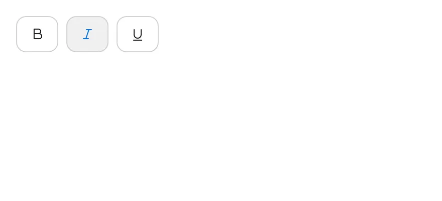
The `outline` variant.
```tsx
import { TextBIcon, TextItalicIcon, TextUnderlineIcon } from "phosphor-react-native"
import * as React from "react"
import { ToggleGroup, ToggleGroupIcon, ToggleGroupItem } from "@/components/ui/toggle-group"
type GroupProps = Omit<
React.ComponentProps,
"value" | "onValueChange" | "children"
>
function FormattingDemo({
initial = ["bold"],
...props
}: GroupProps & { initial?: string[] }) {
const [value, setValue] = React.useState(initial)
return (
)
}
export function ToggleGroupOutlineExample() {
return (
)
}
```
```swift
import EsuissUI
import PhosphorSwift
import SwiftUI
struct ToggleGroupOutlineExample: View {
var body: some View {
FormattingDemo(initial: ["italic"], variant: .outline)
}
}
struct FormattingDemo: View {
let variant: ToggleVariant
let size: ToggleSize
let spacing: Int
let orientation: Axis
@State private var value: Set
init(
initial: Set = ["bold"],
variant: ToggleVariant = .default,
size: ToggleSize = .default,
spacing: Int = 2,
orientation: Axis = .horizontal
) {
self.variant = variant
self.size = size
self.spacing = spacing
self.orientation = orientation
_value = State(initialValue: initial)
}
var body: some View {
ToggleGroup(selection: $value, variant: variant, size: size, spacing: spacing, orientation: orientation) {
ToggleGroupItem(value: "bold") {
Ph.textB.regular.frame(width: 16, height: 16)
}
.accessibilityLabel(Text("Toggle bold"))
ToggleGroupItem(value: "italic") {
Ph.textItalic.regular.frame(width: 16, height: 16)
}
.accessibilityLabel(Text("Toggle italic"))
ToggleGroupItem(value: "underline") {
Ph.textUnderline.regular.frame(width: 16, height: 16)
}
.accessibilityLabel(Text("Toggle underline"))
}
}
}
```
```kotlin
import androidx.compose.foundation.gestures.Orientation
import androidx.compose.runtime.Composable
import androidx.compose.runtime.getValue
import androidx.compose.runtime.mutableStateOf
import androidx.compose.runtime.saveable.rememberSaveable
import androidx.compose.runtime.setValue
import androidx.compose.ui.Modifier
import androidx.compose.ui.graphics.vector.ImageVector
import androidx.compose.ui.semantics.contentDescription
import androidx.compose.ui.semantics.semantics
import com.adamglin.PhosphorIcons
import com.adamglin.phosphoricons.Regular
import com.adamglin.phosphoricons.regular.TextB
import com.adamglin.phosphoricons.regular.TextItalic
import com.adamglin.phosphoricons.regular.TextUnderline
import com.esuiss.ui.components.Icon
import com.esuiss.ui.components.ToggleGroup
import com.esuiss.ui.components.ToggleGroupItem
import com.esuiss.ui.components.ToggleSize
import com.esuiss.ui.components.ToggleVariant
@Composable
fun ToggleGroupOutlineExample() {
ToggleGroupFormatting(variant = ToggleVariant.Outline, initial = setOf("italic"))
}
@Composable
fun ToggleGroupIconItem(value: String, label: String, icon: ImageVector) {
ToggleGroupItem(value, Modifier.semantics { contentDescription = label }) {
Icon(icon, contentDescription = null)
}
}
@Composable
fun ToggleGroupFormatting(
variant: ToggleVariant = ToggleVariant.Default,
size: ToggleSize = ToggleSize.Default,
spacing: Int = 2,
orientation: Orientation = Orientation.Horizontal,
enabled: Boolean = true,
initial: Set = setOf("bold"),
) {
var values by rememberSaveable { mutableStateOf(initial.toList()) }
ToggleGroup(
values = values.toSet(),
onValuesChange = { values = it.toList() },
variant = variant,
size = size,
spacing = spacing,
orientation = orientation,
enabled = enabled,
) {
ToggleGroupIconItem("bold", "Toggle bold", PhosphorIcons.Regular.TextB)
ToggleGroupIconItem("italic", "Toggle italic", PhosphorIcons.Regular.TextItalic)
ToggleGroupIconItem("underline", "Toggle underline", PhosphorIcons.Regular.TextUnderline)
}
}
```
### Attached
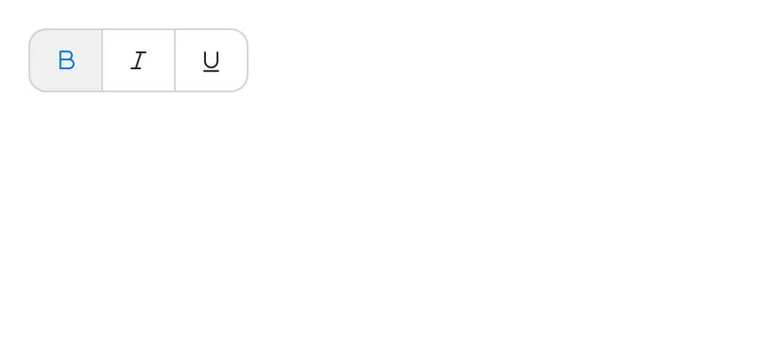
Outlined items joined into one strip with `spacing={0}`.
```tsx
import { TextBIcon, TextItalicIcon, TextUnderlineIcon } from "phosphor-react-native"
import * as React from "react"
import { ToggleGroup, ToggleGroupIcon, ToggleGroupItem } from "@/components/ui/toggle-group"
type GroupProps = Omit<
React.ComponentProps,
"value" | "onValueChange" | "children"
>
function FormattingDemo({
initial = ["bold"],
...props
}: GroupProps & { initial?: string[] }) {
const [value, setValue] = React.useState(initial)
return (
)
}
export function ToggleGroupAttachedExample() {
return (
)
}
```
```swift
import EsuissUI
import PhosphorSwift
import SwiftUI
struct ToggleGroupAttachedExample: View {
var body: some View {
FormattingDemo(variant: .outline, spacing: 0)
}
}
struct FormattingDemo: View {
let variant: ToggleVariant
let size: ToggleSize
let spacing: Int
let orientation: Axis
@State private var value: Set
init(
initial: Set = ["bold"],
variant: ToggleVariant = .default,
size: ToggleSize = .default,
spacing: Int = 2,
orientation: Axis = .horizontal
) {
self.variant = variant
self.size = size
self.spacing = spacing
self.orientation = orientation
_value = State(initialValue: initial)
}
var body: some View {
ToggleGroup(selection: $value, variant: variant, size: size, spacing: spacing, orientation: orientation) {
ToggleGroupItem(value: "bold") {
Ph.textB.regular.frame(width: 16, height: 16)
}
.accessibilityLabel(Text("Toggle bold"))
ToggleGroupItem(value: "italic") {
Ph.textItalic.regular.frame(width: 16, height: 16)
}
.accessibilityLabel(Text("Toggle italic"))
ToggleGroupItem(value: "underline") {
Ph.textUnderline.regular.frame(width: 16, height: 16)
}
.accessibilityLabel(Text("Toggle underline"))
}
}
}
```
```kotlin
import androidx.compose.foundation.gestures.Orientation
import androidx.compose.runtime.Composable
import androidx.compose.runtime.getValue
import androidx.compose.runtime.mutableStateOf
import androidx.compose.runtime.saveable.rememberSaveable
import androidx.compose.runtime.setValue
import androidx.compose.ui.Modifier
import androidx.compose.ui.graphics.vector.ImageVector
import androidx.compose.ui.semantics.contentDescription
import androidx.compose.ui.semantics.semantics
import com.adamglin.PhosphorIcons
import com.adamglin.phosphoricons.Regular
import com.adamglin.phosphoricons.regular.TextB
import com.adamglin.phosphoricons.regular.TextItalic
import com.adamglin.phosphoricons.regular.TextUnderline
import com.esuiss.ui.components.Icon
import com.esuiss.ui.components.ToggleGroup
import com.esuiss.ui.components.ToggleGroupItem
import com.esuiss.ui.components.ToggleSize
import com.esuiss.ui.components.ToggleVariant
@Composable
fun ToggleGroupAttachedExample() {
ToggleGroupFormatting(variant = ToggleVariant.Outline, spacing = 0)
}
@Composable
fun ToggleGroupIconItem(value: String, label: String, icon: ImageVector) {
ToggleGroupItem(value, Modifier.semantics { contentDescription = label }) {
Icon(icon, contentDescription = null)
}
}
@Composable
fun ToggleGroupFormatting(
variant: ToggleVariant = ToggleVariant.Default,
size: ToggleSize = ToggleSize.Default,
spacing: Int = 2,
orientation: Orientation = Orientation.Horizontal,
enabled: Boolean = true,
initial: Set = setOf("bold"),
) {
var values by rememberSaveable { mutableStateOf(initial.toList()) }
ToggleGroup(
values = values.toSet(),
onValuesChange = { values = it.toList() },
variant = variant,
size = size,
spacing = spacing,
orientation = orientation,
enabled = enabled,
) {
ToggleGroupIconItem("bold", "Toggle bold", PhosphorIcons.Regular.TextB)
ToggleGroupIconItem("italic", "Toggle italic", PhosphorIcons.Regular.TextItalic)
ToggleGroupIconItem("underline", "Toggle underline", PhosphorIcons.Regular.TextUnderline)
}
}
```
### Sizes
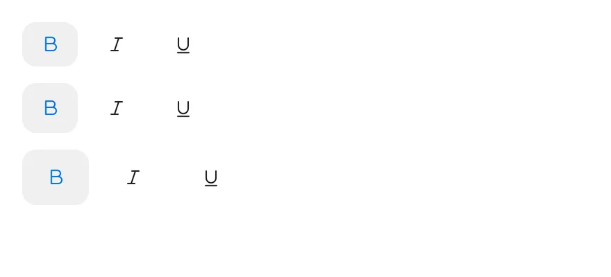
The `sm`, `default` and `lg` sizes.
```tsx
import { TextBIcon, TextItalicIcon, TextUnderlineIcon } from "phosphor-react-native"
import * as React from "react"
import { View } from "react-native"
import { ToggleGroup, ToggleGroupIcon, ToggleGroupItem } from "@/components/ui/toggle-group"
type GroupProps = Omit<
React.ComponentProps,
"value" | "onValueChange" | "children"
>
function FormattingDemo({
initial = ["bold"],
...props
}: GroupProps & { initial?: string[] }) {
const [value, setValue] = React.useState(initial)
return (
)
}
export function ToggleGroupSizesExample() {
return (
)
}
```
```swift
import EsuissUI
import PhosphorSwift
import SwiftUI
struct ToggleGroupSizesExample: View {
var body: some View {
VStack(alignment: .leading, spacing: 12) {
FormattingDemo(size: .sm)
FormattingDemo()
FormattingDemo(size: .lg)
}
}
}
struct FormattingDemo: View {
let variant: ToggleVariant
let size: ToggleSize
let spacing: Int
let orientation: Axis
@State private var value: Set
init(
initial: Set = ["bold"],
variant: ToggleVariant = .default,
size: ToggleSize = .default,
spacing: Int = 2,
orientation: Axis = .horizontal
) {
self.variant = variant
self.size = size
self.spacing = spacing
self.orientation = orientation
_value = State(initialValue: initial)
}
var body: some View {
ToggleGroup(selection: $value, variant: variant, size: size, spacing: spacing, orientation: orientation) {
ToggleGroupItem(value: "bold") {
Ph.textB.regular.frame(width: 16, height: 16)
}
.accessibilityLabel(Text("Toggle bold"))
ToggleGroupItem(value: "italic") {
Ph.textItalic.regular.frame(width: 16, height: 16)
}
.accessibilityLabel(Text("Toggle italic"))
ToggleGroupItem(value: "underline") {
Ph.textUnderline.regular.frame(width: 16, height: 16)
}
.accessibilityLabel(Text("Toggle underline"))
}
}
}
```
```kotlin
import androidx.compose.foundation.gestures.Orientation
import androidx.compose.foundation.layout.Arrangement
import androidx.compose.foundation.layout.Column
import androidx.compose.runtime.Composable
import androidx.compose.runtime.getValue
import androidx.compose.runtime.mutableStateOf
import androidx.compose.runtime.saveable.rememberSaveable
import androidx.compose.runtime.setValue
import androidx.compose.ui.Modifier
import androidx.compose.ui.graphics.vector.ImageVector
import androidx.compose.ui.semantics.contentDescription
import androidx.compose.ui.semantics.semantics
import androidx.compose.ui.unit.dp
import com.adamglin.PhosphorIcons
import com.adamglin.phosphoricons.Regular
import com.adamglin.phosphoricons.regular.TextB
import com.adamglin.phosphoricons.regular.TextItalic
import com.adamglin.phosphoricons.regular.TextUnderline
import com.esuiss.ui.components.Icon
import com.esuiss.ui.components.ToggleGroup
import com.esuiss.ui.components.ToggleGroupItem
import com.esuiss.ui.components.ToggleSize
import com.esuiss.ui.components.ToggleVariant
@Composable
fun ToggleGroupIconItem(value: String, label: String, icon: ImageVector) {
ToggleGroupItem(value, Modifier.semantics { contentDescription = label }) {
Icon(icon, contentDescription = null)
}
}
@Composable
fun ToggleGroupFormatting(
variant: ToggleVariant = ToggleVariant.Default,
size: ToggleSize = ToggleSize.Default,
spacing: Int = 2,
orientation: Orientation = Orientation.Horizontal,
enabled: Boolean = true,
initial: Set = setOf("bold"),
) {
var values by rememberSaveable { mutableStateOf(initial.toList()) }
ToggleGroup(
values = values.toSet(),
onValuesChange = { values = it.toList() },
variant = variant,
size = size,
spacing = spacing,
orientation = orientation,
enabled = enabled,
) {
ToggleGroupIconItem("bold", "Toggle bold", PhosphorIcons.Regular.TextB)
ToggleGroupIconItem("italic", "Toggle italic", PhosphorIcons.Regular.TextItalic)
ToggleGroupIconItem("underline", "Toggle underline", PhosphorIcons.Regular.TextUnderline)
}
}
@Composable
fun ToggleGroupSizes() {
Column(verticalArrangement = Arrangement.spacedBy(12.dp)) {
ToggleGroupFormatting(size = ToggleSize.Sm)
ToggleGroupFormatting()
ToggleGroupFormatting(size = ToggleSize.Lg)
}
}
```
### Segmented
A single-selection segmented control for calendar views.
```tsx
import * as React from "react"
import { Text } from "@/components/ui/text"
import { ToggleGroup, ToggleGroupItem } from "@/components/ui/toggle-group"
type GroupProps = Omit<
React.ComponentProps,
"value" | "onValueChange" | "children"
>
const views = ["day", "week", "month", "year"]
function SegmentedDemo({
items = views,
...props
}: GroupProps & { items?: string[] }) {
const [value, setValue] = React.useState(["week"])
return (
{items.map((item) => (
{item}
))}
)
}
export function ToggleGroupSegmentedExample() {
return (
)
}
```
```swift
import EsuissUI
import SwiftUI
let segmentedViews = ["Day", "Week", "Month", "Year"]
struct SegmentedDemo: View {
var items: [String] = segmentedViews
var size: ToggleSize = .default
var orientation: Axis = .horizontal
@State private var value: String? = "Week"
var body: some View {
ToggleGroup(selection: $value, size: size, spacing: 0, orientation: orientation) {
ForEach(items, id: \.self) { item in
ToggleGroupItem(value: item) {
Text(verbatim: item)
}
}
}
.accessibilityLabel(Text("Calendar view"))
}
}
```
```kotlin
import androidx.compose.foundation.gestures.Orientation
import androidx.compose.runtime.Composable
import androidx.compose.runtime.getValue
import androidx.compose.runtime.mutableStateOf
import androidx.compose.runtime.saveable.rememberSaveable
import androidx.compose.runtime.setValue
import androidx.compose.ui.Modifier
import androidx.compose.ui.semantics.contentDescription
import androidx.compose.ui.semantics.semantics
import com.esuiss.ui.components.ToggleGroup
import com.esuiss.ui.components.ToggleGroupItem
import com.esuiss.ui.components.ToggleSize
val toggleGroupViews = listOf("day", "week", "month", "year")
@Composable
fun ToggleGroupSegmented(
items: List = toggleGroupViews,
size: ToggleSize = ToggleSize.Default,
orientation: Orientation = Orientation.Horizontal,
) {
var value by rememberSaveable { mutableStateOf("week") }
ToggleGroup(
value = value,
onValueChange = { value = it },
modifier = Modifier.semantics { contentDescription = "Calendar view" },
size = size,
spacing = 0,
orientation = orientation,
) {
items.forEach { item ->
ToggleGroupItem(item.replaceFirstChar { it.uppercaseChar() }, value = item)
}
}
}
```
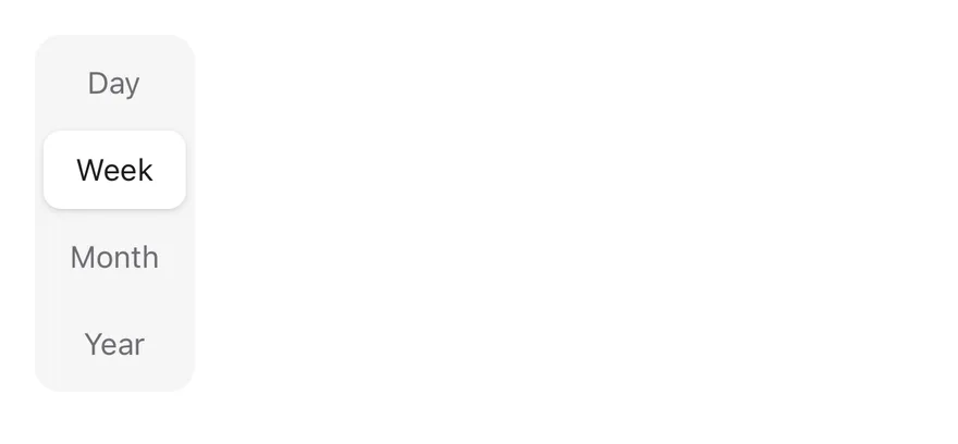
### Segmented vertical
The segmented control in a vertical orientation.
```tsx
import * as React from "react"
import { Text } from "@/components/ui/text"
import { ToggleGroup, ToggleGroupItem } from "@/components/ui/toggle-group"
type GroupProps = Omit<
React.ComponentProps,
"value" | "onValueChange" | "children"
>
const views = ["day", "week", "month", "year"]
function SegmentedDemo({
items = views,
...props
}: GroupProps & { items?: string[] }) {
const [value, setValue] = React.useState(["week"])
return (
{items.map((item) => (
{item}
))}
)
}
export function ToggleGroupSegmentedVerticalExample() {
return (
)
}
```
```swift
import EsuissUI
import SwiftUI
struct ToggleGroupSegmentedVerticalExample: View {
var body: some View {
SegmentedDemo(orientation: .vertical)
.fixedSize(horizontal: true, vertical: false)
}
}
let segmentedViews = ["Day", "Week", "Month", "Year"]
struct SegmentedDemo: View {
var items: [String] = segmentedViews
var size: ToggleSize = .default
var orientation: Axis = .horizontal
@State private var value: String? = "Week"
var body: some View {
ToggleGroup(selection: $value, size: size, spacing: 0, orientation: orientation) {
ForEach(items, id: \.self) { item in
ToggleGroupItem(value: item) {
Text(verbatim: item)
}
}
}
.accessibilityLabel(Text("Calendar view"))
}
}
```
```kotlin
import androidx.compose.foundation.gestures.Orientation
import androidx.compose.runtime.Composable
import androidx.compose.runtime.getValue
import androidx.compose.runtime.mutableStateOf
import androidx.compose.runtime.saveable.rememberSaveable
import androidx.compose.runtime.setValue
import androidx.compose.ui.Modifier
import androidx.compose.ui.semantics.contentDescription
import androidx.compose.ui.semantics.semantics
import com.esuiss.ui.components.ToggleGroup
import com.esuiss.ui.components.ToggleGroupItem
import com.esuiss.ui.components.ToggleSize
@Composable
fun ToggleGroupSegmentedVerticalExample() {
ToggleGroupSegmented(orientation = Orientation.Vertical)
}
val toggleGroupViews = listOf("day", "week", "month", "year")
@Composable
fun ToggleGroupSegmented(
items: List = toggleGroupViews,
size: ToggleSize = ToggleSize.Default,
orientation: Orientation = Orientation.Horizontal,
) {
var value by rememberSaveable { mutableStateOf("week") }
ToggleGroup(
value = value,
onValueChange = { value = it },
modifier = Modifier.semantics { contentDescription = "Calendar view" },
size = size,
spacing = 0,
orientation = orientation,
) {
items.forEach { item ->
ToggleGroupItem(item.replaceFirstChar { it.uppercaseChar() }, value = item)
}
}
}
```
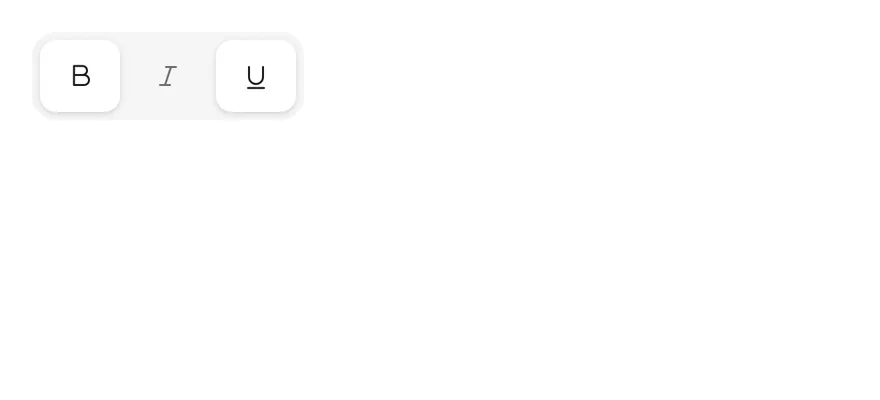
### Segmented multiple
A segmented control that allows several selected items.
```tsx
import { TextBIcon, TextItalicIcon, TextUnderlineIcon } from "phosphor-react-native"
import * as React from "react"
import { ToggleGroup, ToggleGroupIcon, ToggleGroupItem } from "@/components/ui/toggle-group"
type GroupProps = Omit<
React.ComponentProps,
"value" | "onValueChange" | "children"
>
function FormattingDemo({
initial = ["bold"],
...props
}: GroupProps & { initial?: string[] }) {
const [value, setValue] = React.useState(initial)
return (
)
}
export function ToggleGroupSegmentedMultipleExample() {
return (
)
}
```
```swift
import EsuissUI
import PhosphorSwift
import SwiftUI
struct ToggleGroupSegmentedMultipleExample: View {
var body: some View {
FormattingDemo(initial: ["bold", "underline"], spacing: 0)
}
}
struct FormattingDemo: View {
let variant: ToggleVariant
let size: ToggleSize
let spacing: Int
let orientation: Axis
@State private var value: Set
init(
initial: Set = ["bold"],
variant: ToggleVariant = .default,
size: ToggleSize = .default,
spacing: Int = 2,
orientation: Axis = .horizontal
) {
self.variant = variant
self.size = size
self.spacing = spacing
self.orientation = orientation
_value = State(initialValue: initial)
}
var body: some View {
ToggleGroup(selection: $value, variant: variant, size: size, spacing: spacing, orientation: orientation) {
ToggleGroupItem(value: "bold") {
Ph.textB.regular.frame(width: 16, height: 16)
}
.accessibilityLabel(Text("Toggle bold"))
ToggleGroupItem(value: "italic") {
Ph.textItalic.regular.frame(width: 16, height: 16)
}
.accessibilityLabel(Text("Toggle italic"))
ToggleGroupItem(value: "underline") {
Ph.textUnderline.regular.frame(width: 16, height: 16)
}
.accessibilityLabel(Text("Toggle underline"))
}
}
}
```
```kotlin
import androidx.compose.foundation.gestures.Orientation
import androidx.compose.runtime.Composable
import androidx.compose.runtime.getValue
import androidx.compose.runtime.mutableStateOf
import androidx.compose.runtime.saveable.rememberSaveable
import androidx.compose.runtime.setValue
import androidx.compose.ui.Modifier
import androidx.compose.ui.graphics.vector.ImageVector
import androidx.compose.ui.semantics.contentDescription
import androidx.compose.ui.semantics.semantics
import com.adamglin.PhosphorIcons
import com.adamglin.phosphoricons.Regular
import com.adamglin.phosphoricons.regular.TextB
import com.adamglin.phosphoricons.regular.TextItalic
import com.adamglin.phosphoricons.regular.TextUnderline
import com.esuiss.ui.components.Icon
import com.esuiss.ui.components.ToggleGroup
import com.esuiss.ui.components.ToggleGroupItem
import com.esuiss.ui.components.ToggleSize
import com.esuiss.ui.components.ToggleVariant
@Composable
fun ToggleGroupSegmentedMultipleExample() {
ToggleGroupFormatting(spacing = 0, initial = setOf("bold", "underline"))
}
@Composable
fun ToggleGroupIconItem(value: String, label: String, icon: ImageVector) {
ToggleGroupItem(value, Modifier.semantics { contentDescription = label }) {
Icon(icon, contentDescription = null)
}
}
@Composable
fun ToggleGroupFormatting(
variant: ToggleVariant = ToggleVariant.Default,
size: ToggleSize = ToggleSize.Default,
spacing: Int = 2,
orientation: Orientation = Orientation.Horizontal,
enabled: Boolean = true,
initial: Set = setOf("bold"),
) {
var values by rememberSaveable { mutableStateOf(initial.toList()) }
ToggleGroup(
values = values.toSet(),
onValuesChange = { values = it.toList() },
variant = variant,
size = size,
spacing = spacing,
orientation = orientation,
enabled = enabled,
) {
ToggleGroupIconItem("bold", "Toggle bold", PhosphorIcons.Regular.TextB)
ToggleGroupIconItem("italic", "Toggle italic", PhosphorIcons.Regular.TextItalic)
ToggleGroupIconItem("underline", "Toggle underline", PhosphorIcons.Regular.TextUnderline)
}
}
```
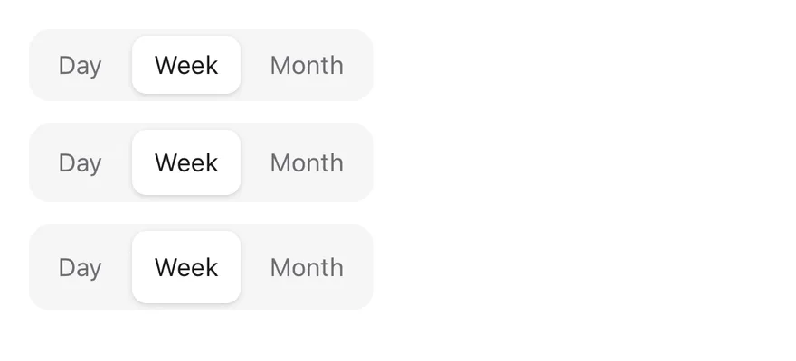
### Segmented sizes
Segmented controls at each size.
```tsx
import * as React from "react"
import { View } from "react-native"
import { Text } from "@/components/ui/text"
import { ToggleGroup, ToggleGroupItem } from "@/components/ui/toggle-group"
type GroupProps = Omit<
React.ComponentProps,
"value" | "onValueChange" | "children"
>
const views = ["day", "week", "month", "year"]
function SegmentedDemo({
items = views,
...props
}: GroupProps & { items?: string[] }) {
const [value, setValue] = React.useState(["week"])
return (
{items.map((item) => (
{item}
))}
)
}
export function ToggleGroupSegmentedSizesExample() {
return (
)
}
```
```swift
import EsuissUI
import SwiftUI
struct ToggleGroupSegmentedSizesExample: View {
var body: some View {
VStack(alignment: .leading, spacing: 12) {
SegmentedDemo(items: Array(segmentedViews.prefix(3)), size: .sm)
SegmentedDemo(items: Array(segmentedViews.prefix(3)))
SegmentedDemo(items: Array(segmentedViews.prefix(3)), size: .lg)
}
}
}
let segmentedViews = ["Day", "Week", "Month", "Year"]
struct SegmentedDemo: View {
var items: [String] = segmentedViews
var size: ToggleSize = .default
var orientation: Axis = .horizontal
@State private var value: String? = "Week"
var body: some View {
ToggleGroup(selection: $value, size: size, spacing: 0, orientation: orientation) {
ForEach(items, id: \.self) { item in
ToggleGroupItem(value: item) {
Text(verbatim: item)
}
}
}
.accessibilityLabel(Text("Calendar view"))
}
}
```
```kotlin
import androidx.compose.foundation.gestures.Orientation
import androidx.compose.foundation.layout.Arrangement
import androidx.compose.foundation.layout.Column
import androidx.compose.runtime.Composable
import androidx.compose.runtime.getValue
import androidx.compose.runtime.mutableStateOf
import androidx.compose.runtime.saveable.rememberSaveable
import androidx.compose.runtime.setValue
import androidx.compose.ui.Modifier
import androidx.compose.ui.semantics.contentDescription
import androidx.compose.ui.semantics.semantics
import androidx.compose.ui.unit.dp
import com.esuiss.ui.components.ToggleGroup
import com.esuiss.ui.components.ToggleGroupItem
import com.esuiss.ui.components.ToggleSize
val toggleGroupViews = listOf("day", "week", "month", "year")
@Composable
fun ToggleGroupSegmented(
items: List = toggleGroupViews,
size: ToggleSize = ToggleSize.Default,
orientation: Orientation = Orientation.Horizontal,
) {
var value by rememberSaveable { mutableStateOf("week") }
ToggleGroup(
value = value,
onValueChange = { value = it },
modifier = Modifier.semantics { contentDescription = "Calendar view" },
size = size,
spacing = 0,
orientation = orientation,
) {
items.forEach { item ->
ToggleGroupItem(item.replaceFirstChar { it.uppercaseChar() }, value = item)
}
}
}
@Composable
fun ToggleGroupSegmentedSizes() {
val items = toggleGroupViews.take(3)
Column(verticalArrangement = Arrangement.spacedBy(12.dp)) {
ToggleGroupSegmented(items, ToggleSize.Sm)
ToggleGroupSegmented(items)
ToggleGroupSegmented(items, ToggleSize.Lg)
}
}
```
### Single selection
Outlined alignment options where only one item can be pressed.
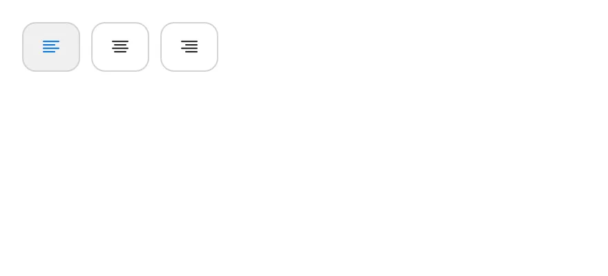
```tsx
import { TextAlignCenterIcon, TextAlignLeftIcon, TextAlignRightIcon } from "phosphor-react-native"
import * as React from "react"
import { ToggleGroup, ToggleGroupIcon, ToggleGroupItem } from "@/components/ui/toggle-group"
function AlignmentDemo() {
const [value, setValue] = React.useState(["left"])
return (
)
}
export function ToggleGroupSingleSelectionExample() {
return (
)
}
```
```swift
import EsuissUI
import PhosphorSwift
import SwiftUI
struct AlignmentDemo: View {
@State private var value: String? = "left"
var body: some View {
ToggleGroup(selection: $value, variant: .outline) {
ToggleGroupItem(value: "left") {
Ph.textAlignLeft.regular.frame(width: 16, height: 16)
}
.accessibilityLabel(Text("Align left"))
ToggleGroupItem(value: "center") {
Ph.textAlignCenter.regular.frame(width: 16, height: 16)
}
.accessibilityLabel(Text("Align center"))
ToggleGroupItem(value: "right") {
Ph.textAlignRight.regular.frame(width: 16, height: 16)
}
.accessibilityLabel(Text("Align right"))
}
}
}
```
```kotlin
import androidx.compose.runtime.Composable
import androidx.compose.runtime.getValue
import androidx.compose.runtime.mutableStateOf
import androidx.compose.runtime.saveable.rememberSaveable
import androidx.compose.runtime.setValue
import androidx.compose.ui.Modifier
import androidx.compose.ui.graphics.vector.ImageVector
import androidx.compose.ui.semantics.contentDescription
import androidx.compose.ui.semantics.semantics
import com.adamglin.PhosphorIcons
import com.adamglin.phosphoricons.Regular
import com.adamglin.phosphoricons.regular.TextAlignCenter
import com.adamglin.phosphoricons.regular.TextAlignLeft
import com.adamglin.phosphoricons.regular.TextAlignRight
import com.esuiss.ui.components.Icon
import com.esuiss.ui.components.ToggleGroup
import com.esuiss.ui.components.ToggleGroupItem
import com.esuiss.ui.components.ToggleVariant
@Composable
fun ToggleGroupIconItem(value: String, label: String, icon: ImageVector) {
ToggleGroupItem(value, Modifier.semantics { contentDescription = label }) {
Icon(icon, contentDescription = null)
}
}
@Composable
fun ToggleGroupAlignment() {
var value by rememberSaveable { mutableStateOf("left") }
ToggleGroup(value = value, onValueChange = { value = it }, variant = ToggleVariant.Outline) {
ToggleGroupIconItem("left", "Align left", PhosphorIcons.Regular.TextAlignLeft)
ToggleGroupIconItem("center", "Align center", PhosphorIcons.Regular.TextAlignCenter)
ToggleGroupIconItem("right", "Align right", PhosphorIcons.Regular.TextAlignRight)
}
}
```
### Vertical
Joined outline items stacked in a column.
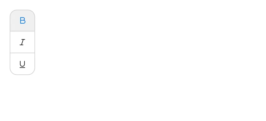
```tsx
import { TextBIcon, TextItalicIcon, TextUnderlineIcon } from "phosphor-react-native"
import * as React from "react"
import { ToggleGroup, ToggleGroupIcon, ToggleGroupItem } from "@/components/ui/toggle-group"
type GroupProps = Omit<
React.ComponentProps,
"value" | "onValueChange" | "children"
>
function FormattingDemo({
initial = ["bold"],
...props
}: GroupProps & { initial?: string[] }) {
const [value, setValue] = React.useState(initial)
return (
)
}
export function ToggleGroupVerticalExample() {
return (
)
}
```
```swift
import EsuissUI
import PhosphorSwift
import SwiftUI
struct ToggleGroupVerticalExample: View {
var body: some View {
FormattingDemo(variant: .outline, spacing: 0, orientation: .vertical)
.fixedSize(horizontal: true, vertical: false)
}
}
struct FormattingDemo: View {
let variant: ToggleVariant
let size: ToggleSize
let spacing: Int
let orientation: Axis
@State private var value: Set
init(
initial: Set = ["bold"],
variant: ToggleVariant = .default,
size: ToggleSize = .default,
spacing: Int = 2,
orientation: Axis = .horizontal
) {
self.variant = variant
self.size = size
self.spacing = spacing
self.orientation = orientation
_value = State(initialValue: initial)
}
var body: some View {
ToggleGroup(selection: $value, variant: variant, size: size, spacing: spacing, orientation: orientation) {
ToggleGroupItem(value: "bold") {
Ph.textB.regular.frame(width: 16, height: 16)
}
.accessibilityLabel(Text("Toggle bold"))
ToggleGroupItem(value: "italic") {
Ph.textItalic.regular.frame(width: 16, height: 16)
}
.accessibilityLabel(Text("Toggle italic"))
ToggleGroupItem(value: "underline") {
Ph.textUnderline.regular.frame(width: 16, height: 16)
}
.accessibilityLabel(Text("Toggle underline"))
}
}
}
```
```kotlin
import androidx.compose.foundation.gestures.Orientation
import androidx.compose.runtime.Composable
import androidx.compose.runtime.getValue
import androidx.compose.runtime.mutableStateOf
import androidx.compose.runtime.saveable.rememberSaveable
import androidx.compose.runtime.setValue
import androidx.compose.ui.Modifier
import androidx.compose.ui.graphics.vector.ImageVector
import androidx.compose.ui.semantics.contentDescription
import androidx.compose.ui.semantics.semantics
import com.adamglin.PhosphorIcons
import com.adamglin.phosphoricons.Regular
import com.adamglin.phosphoricons.regular.TextB
import com.adamglin.phosphoricons.regular.TextItalic
import com.adamglin.phosphoricons.regular.TextUnderline
import com.esuiss.ui.components.Icon
import com.esuiss.ui.components.ToggleGroup
import com.esuiss.ui.components.ToggleGroupItem
import com.esuiss.ui.components.ToggleSize
import com.esuiss.ui.components.ToggleVariant
@Composable
fun ToggleGroupVerticalExample() {
ToggleGroupFormatting(variant = ToggleVariant.Outline, spacing = 0, orientation = Orientation.Vertical)
}
@Composable
fun ToggleGroupIconItem(value: String, label: String, icon: ImageVector) {
ToggleGroupItem(value, Modifier.semantics { contentDescription = label }) {
Icon(icon, contentDescription = null)
}
}
@Composable
fun ToggleGroupFormatting(
variant: ToggleVariant = ToggleVariant.Default,
size: ToggleSize = ToggleSize.Default,
spacing: Int = 2,
orientation: Orientation = Orientation.Horizontal,
enabled: Boolean = true,
initial: Set = setOf("bold"),
) {
var values by rememberSaveable { mutableStateOf(initial.toList()) }
ToggleGroup(
values = values.toSet(),
onValuesChange = { values = it.toList() },
variant = variant,
size = size,
spacing = spacing,
orientation = orientation,
enabled = enabled,
) {
ToggleGroupIconItem("bold", "Toggle bold", PhosphorIcons.Regular.TextB)
ToggleGroupIconItem("italic", "Toggle italic", PhosphorIcons.Regular.TextItalic)
ToggleGroupIconItem("underline", "Toggle underline", PhosphorIcons.Regular.TextUnderline)
}
}
```
### Disabled
A disabled group.
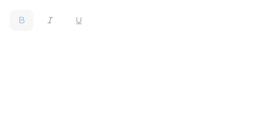
```tsx
import { TextBIcon, TextItalicIcon, TextUnderlineIcon } from "phosphor-react-native"
import * as React from "react"
import { ToggleGroup, ToggleGroupIcon, ToggleGroupItem } from "@/components/ui/toggle-group"
type GroupProps = Omit<
React.ComponentProps,
"value" | "onValueChange" | "children"
>
function FormattingDemo({
initial = ["bold"],
...props
}: GroupProps & { initial?: string[] }) {
const [value, setValue] = React.useState(initial)
return (
)
}
export function ToggleGroupDisabledExample() {
return (
)
}
```
```swift
import EsuissUI
import PhosphorSwift
import SwiftUI
struct ToggleGroupDisabledExample: View {
var body: some View {
FormattingDemo()
.disabled(true)
}
}
struct FormattingDemo: View {
let variant: ToggleVariant
let size: ToggleSize
let spacing: Int
let orientation: Axis
@State private var value: Set
init(
initial: Set = ["bold"],
variant: ToggleVariant = .default,
size: ToggleSize = .default,
spacing: Int = 2,
orientation: Axis = .horizontal
) {
self.variant = variant
self.size = size
self.spacing = spacing
self.orientation = orientation
_value = State(initialValue: initial)
}
var body: some View {
ToggleGroup(selection: $value, variant: variant, size: size, spacing: spacing, orientation: orientation) {
ToggleGroupItem(value: "bold") {
Ph.textB.regular.frame(width: 16, height: 16)
}
.accessibilityLabel(Text("Toggle bold"))
ToggleGroupItem(value: "italic") {
Ph.textItalic.regular.frame(width: 16, height: 16)
}
.accessibilityLabel(Text("Toggle italic"))
ToggleGroupItem(value: "underline") {
Ph.textUnderline.regular.frame(width: 16, height: 16)
}
.accessibilityLabel(Text("Toggle underline"))
}
}
}
```
```kotlin
import androidx.compose.foundation.gestures.Orientation
import androidx.compose.runtime.Composable
import androidx.compose.runtime.getValue
import androidx.compose.runtime.mutableStateOf
import androidx.compose.runtime.saveable.rememberSaveable
import androidx.compose.runtime.setValue
import androidx.compose.ui.Modifier
import androidx.compose.ui.graphics.vector.ImageVector
import androidx.compose.ui.semantics.contentDescription
import androidx.compose.ui.semantics.semantics
import com.adamglin.PhosphorIcons
import com.adamglin.phosphoricons.Regular
import com.adamglin.phosphoricons.regular.TextB
import com.adamglin.phosphoricons.regular.TextItalic
import com.adamglin.phosphoricons.regular.TextUnderline
import com.esuiss.ui.components.Icon
import com.esuiss.ui.components.ToggleGroup
import com.esuiss.ui.components.ToggleGroupItem
import com.esuiss.ui.components.ToggleSize
import com.esuiss.ui.components.ToggleVariant
@Composable
fun ToggleGroupDisabledExample() {
ToggleGroupFormatting(enabled = false)
}
@Composable
fun ToggleGroupIconItem(value: String, label: String, icon: ImageVector) {
ToggleGroupItem(value, Modifier.semantics { contentDescription = label }) {
Icon(icon, contentDescription = null)
}
}
@Composable
fun ToggleGroupFormatting(
variant: ToggleVariant = ToggleVariant.Default,
size: ToggleSize = ToggleSize.Default,
spacing: Int = 2,
orientation: Orientation = Orientation.Horizontal,
enabled: Boolean = true,
initial: Set = setOf("bold"),
) {
var values by rememberSaveable { mutableStateOf(initial.toList()) }
ToggleGroup(
values = values.toSet(),
onValuesChange = { values = it.toList() },
variant = variant,
size = size,
spacing = spacing,
orientation = orientation,
enabled = enabled,
) {
ToggleGroupIconItem("bold", "Toggle bold", PhosphorIcons.Regular.TextB)
ToggleGroupIconItem("italic", "Toggle italic", PhosphorIcons.Regular.TextItalic)
ToggleGroupIconItem("underline", "Toggle underline", PhosphorIcons.Regular.TextUnderline)
}
}
```
## API Reference
### ToggleGroup
Container that holds the shared value.
| Prop | Type | Default | Description |
| --- | --- | --- | --- |
| `spacing` | `number` | `2` | Gap between items in steps of 4 points. `0` joins the items. Defaults to `2`. |
Also accepts the props of `React.ComponentProps`.
### ToggleGroupItem
One toggle in the group.
Also accepts the props of `React.ComponentProps`.
### ToggleGroupIcon
Icon sized for a toggle group item.
Also accepts the props of `React.ComponentProps`.
## Accessibility
- A single-selection group has the `radiogroup` role and its items have the `radio` role.
- A `multiple` group has the `group` role and its items have the `togglebutton` role.
- Items report checked and disabled states to VoiceOver and TalkBack.
- The sliding segmented indicator is hidden from VoiceOver and TalkBack.
- Icon-only items need an `accessibilityLabel`; label the group itself with `accessibilityLabel` when its purpose is not clear from context.
## Notes
- Pressed items use `bg-accent` and `text-primary`; the segmented indicator and pressed segmented items use `bg-card` with a small shadow in light mode and `bg-border` in dark mode.
- The indicator slides over 300 ms and respects the system reduce motion setting. It is hidden when the selected item is disabled.
- Colors follow the system appearance.