# Toast
Brief, stacked notifications that appear at the bottom of the screen and dismiss themselves.
Toast is an open-source component from suiss/ui for React, React Native, SwiftUI and Jetpack Compose. The @esuiss/ui CLI copies its source into your project, so you own the code.
Source: https://ui.suiss.app/docs/components/toast
**React**
**Example**
```tsx
import { Button } from "@/components/ui/button"
import {
createToastManager,
Toaster,
useToastManager,
} from "@/components/ui/toast"
const toastManager = createToastManager()
function DefaultExample() {
const toast = useToastManager()
return (
)
}
export default function ToastDemo() {
return (
)
}
```
Toasts are built on the Base UI Toast primitive. `Toaster` is the ready-made setup: it combines `ToastProvider`, `ToastPortal` and `ToastViewport`, and renders each queued toast as a `Toast` with a `ToastContent` row holding a status icon, `ToastTitle`, `ToastDescription`, `ToastAction` and `ToastClose`.
New toasts stack at the bottom of the screen, with older ones scaled down behind, and expand into a list on hover or focus. A toast's `type` adds a colored icon: `success`, `info`, `warning` or `error`, or a progress ring for `loading`. Use toasts for short confirmations and background results; for messages that need a decision, use `AlertDialog`.
## Installation
### CLI
```bash title="Terminal"
npx shadcn@latest add @esuiss/toast
```
Works in any project with a `components.json`. See [Installation](https://ui.suiss.app/docs/installation#add-components) for the one-line registry setup. Or use the suiss/ui CLI:
```bash title="Terminal"
npx @esuiss/ui@latest add toast
```
### Manual
1. Install the dependencies and add the [`cn` helper](https://ui.suiss.app/docs/installation#the-cn-helper):
```bash title="Terminal"
npm install @base-ui/react @phosphor-icons/react
```
2. Add the pieces it builds on: [Button](https://ui.suiss.app/docs/components/button).
3. Copy the source into `components/ui/toast.tsx`:
```tsx title="components/ui/toast.tsx"
"use client"
import { Toast as ToastPrimitive } from "@base-ui/react/toast"
import {
CheckCircleIcon,
InfoIcon,
WarningIcon,
XCircleIcon,
XIcon,
} from "@phosphor-icons/react"
import * as React from "react"
import { Button } from "@/components/ui/button"
import { cn } from "@/lib/utils"
const toast = ToastPrimitive.createToastManager()
function ToastProvider({ ...props }: ToastPrimitive.Provider.Props) {
return
}
function ToastPortal({ ...props }: ToastPrimitive.Portal.Props) {
return
}
function ToastViewport({ className, ...props }: ToastPrimitive.Viewport.Props) {
return (
)
}
function Toast({ className, ...props }: ToastPrimitive.Root.Props) {
return (
)
}
function ToastContent({ className, ...props }: ToastPrimitive.Content.Props) {
return (
)
}
function ToastTitle({ className, ...props }: ToastPrimitive.Title.Props) {
return (
)
}
function ToastDescription({
className,
...props
}: ToastPrimitive.Description.Props) {
return (
)
}
function ToastAction({
className,
render = ,
...props
}: ToastPrimitive.Action.Props) {
return (
)
}
function ToastClose({
className,
children,
render = ,
...props
}: ToastPrimitive.Close.Props) {
return (
{children ?? (
)}
)
}
function ToastIcon({ type }: { type: string | undefined }) {
const ring = React.useRef(null)
const [tracked, setTracked] = React.useState(type === "loading")
if (type === "loading" && !tracked) setTracked(true)
React.useLayoutEffect(() => {
const circle = ring.current
if (!circle) return
const still = window.matchMedia("(prefers-reduced-motion: reduce)").matches
if (type !== "loading") {
circle.animate([{ strokeDasharray: "100 100" }], {
duration: still ? 0 : 280,
easing: "cubic-bezier(0.3, 0, 0.2, 1)",
fill: "forwards",
})
return
}
if (still) {
circle.style.strokeDasharray = "30 100"
return
}
const progress = circle.animate(
[{ strokeDasharray: "0 100" }, { strokeDasharray: "94 100" }],
{
duration: 12000,
easing: "cubic-bezier(0.1, 0.75, 0.25, 1)",
fill: "forwards",
}
)
return () => {
circle.style.strokeDasharray = getComputedStyle(circle).strokeDasharray
progress.cancel()
}
}, [type])
let icon: React.ReactNode = null
if (type === "success") {
icon = (
)
}
if (type === "info") {
icon = (
)
}
if (type === "warning") {
icon = (
)
}
if (type === "error") {
icon = (
)
}
const badge = icon && (
{icon}
)
if (!tracked) return badge ?? null
return (
{type !== "loading" && badge}
)
}
function ToastList() {
const { toasts } = ToastPrimitive.useToastManager()
return toasts.map((toastItem) => (
))
}
function Toaster({
children,
toastManager = toast,
...props
}: ToastPrimitive.Provider.Props) {
return (
{children}
)
}
const createToastManager = ToastPrimitive.createToastManager
const useToastManager = ToastPrimitive.useToastManager
export {
createToastManager,
Toast,
ToastAction,
ToastClose,
ToastContent,
ToastDescription,
Toaster,
ToastPortal,
ToastProvider,
ToastTitle,
ToastViewport,
toast,
useToastManager,
}
```
4. Update the import paths to match your project.
## Usage
```tsx
import { ToastProvider, ToastPortal, ToastViewport, Toast, ToastContent, ToastTitle, ToastDescription, ToastAction, ToastClose, Toaster } from "@/components/ui/toast"
```
```tsx
```
Render `Toaster` once near the root of your app, wrapping the content that shows toasts. Call `toast.add({ title, description, type })` from anywhere, or read the manager inside the tree with `useToastManager()`. `add` returns an id that you can pass to `close`; `close()` with no id closes every toast.
Pass `actionProps` to show a `ToastAction` button, and `timeout` in milliseconds to change how long a toast stays; `0` keeps it until it's closed. `toast.promise(promise, { loading, success, error })` shows a loading toast that turns into the success or error toast when the promise settles.
`Toaster` uses the shared `toast` manager by default. Pass `toastManager` to use one created with `createToastManager()` instead. Use the individual parts only to build a custom toast list.
## Examples
### Types
Shows each toast `type` with its icon and color.
**Example**
```tsx
import { Button } from "@/components/ui/button"
import {
createToastManager,
Toaster,
useToastManager,
} from "@/components/ui/toast"
const toastManager = createToastManager()
function TypesExample() {
const toast = useToastManager()
return (
)
}
export default function ToastTypes() {
return (
)
}
```
### Title only
Shows a toast with a title and no description.
**Example**
```tsx
import { Button } from "@/components/ui/button"
import {
createToastManager,
Toaster,
useToastManager,
} from "@/components/ui/toast"
const toastManager = createToastManager()
function TitleOnlyExample() {
const toast = useToastManager()
return (
)
}
export default function ToastTitleOnly() {
return (
)
}
```
### With action
Adds an `Undo` action button that closes the toast.
**Example**
```tsx
import { Button } from "@/components/ui/button"
import {
createToastManager,
Toaster,
useToastManager,
} from "@/components/ui/toast"
const toastManager = createToastManager()
function WithActionExample() {
const toast = useToastManager()
return (
)
}
export default function ToastWithAction() {
return (
)
}
```
### Timeout
Compares a short `timeout` with a persistent toast that stays until closed.
**Example**
```tsx
import { Button } from "@/components/ui/button"
import {
createToastManager,
Toaster,
useToastManager,
} from "@/components/ui/toast"
const toastManager = createToastManager()
function TimeoutExample() {
const toast = useToastManager()
return (
)
}
export default function ToastTimeout() {
return (
)
}
```
### Promise toast
Uses `toast.promise` to move from loading to success.
**Example**
```tsx
import { Button } from "@/components/ui/button"
import {
createToastManager,
Toaster,
useToastManager,
} from "@/components/ui/toast"
function wait(ms: number) {
return new Promise((resolve) => setTimeout(resolve, ms))
}
const toastManager = createToastManager()
function PromiseExample({ fail = false }: { fail?: boolean }) {
const toast = useToastManager()
return (
)
}
export default function ToastPromiseToast() {
return (
)
}
```
### Promise rejected
Uses `toast.promise` to move from loading to an error when the promise rejects.
**Example**
```tsx
import { Button } from "@/components/ui/button"
import {
createToastManager,
Toaster,
useToastManager,
} from "@/components/ui/toast"
function wait(ms: number) {
return new Promise((resolve) => setTimeout(resolve, ms))
}
const toastManager = createToastManager()
function PromiseExample({ fail = false }: { fail?: boolean }) {
const toast = useToastManager()
return (
)
}
export default function ToastPromiseRejected() {
return (
)
}
```
## API Reference
### ToastProvider
Provides a toast manager to the parts inside it.
Also accepts the props of `ToastPrimitive.Provider.Props`.
### ToastPortal
Renders the viewport into a portal.
Also accepts the props of `ToastPrimitive.Portal.Props`.
### ToastViewport
The fixed region at the bottom of the screen that holds the stack.
Also accepts the props of `ToastPrimitive.Viewport.Props`.
### Toast
A single toast in the stack, positioned and animated by its index.
Also accepts the props of `ToastPrimitive.Root.Props`.
### ToastContent
The row that lays out a toast's icon, text and buttons.
Also accepts the props of `ToastPrimitive.Content.Props`.
### ToastTitle
The toast's title, which names it.
Also accepts the props of `ToastPrimitive.Title.Props`.
### ToastDescription
Supporting text, which describes the toast.
Also accepts the props of `ToastPrimitive.Description.Props`.
### ToastAction
An optional action button, rendered as a small outline `Button`.
Also accepts the props of `ToastPrimitive.Action.Props`.
### ToastClose
An icon button that dismisses the toast.
Also accepts the props of `ToastPrimitive.Close.Props`.
### Toaster
The complete setup: provider, portal, viewport and the rendered toasts.
Also accepts the props of `ToastPrimitive.Provider.Props`.
## Accessibility
- The viewport is a `region` landmark named `Notifications`.
- Each toast has the `dialog` role, named by its title and described by its description.
- `ToastClose` has the accessible name `Close toast`.
- Prefer an action that can also be reached elsewhere, since toasts dismiss themselves after their timeout.
## Notes
- On small screens the stack is centered at the bottom, inset from the edges and up to `max-w-sm` wide; from the `sm` breakpoint it sits in the bottom end corner, up to `max-w-sm` wide.
- Toasts can be swiped away; the exit animation follows the swipe direction.
- Parts carry `data-slot` attributes such as `toast-viewport`, `toast`, `toast-content`, `toast-icon` and `toast-close`.
- Status icons are solid circles filled with `fill-green-500`, `fill-primary`, `fill-orange-500` and `fill-destructive`, with a white glyph (`text-primary-foreground` on the info icon); the loading ring uses `stroke-primary`. The ring's progress animation is removed when reduced motion is preferred.
**React Native, SwiftUI, Jetpack Compose**
**React Native**
```tsx
import { View } from "react-native"
import { Button } from "@/components/ui/button"
import { Text } from "@/components/ui/text"
import { Toaster, toast } from "@/components/ui/toast"
function wait(ms: number) {
return new Promise((resolve) => setTimeout(resolve, ms))
}
function Examples() {
return (
)
}
export function ToastExample() {
return (
)
}
```
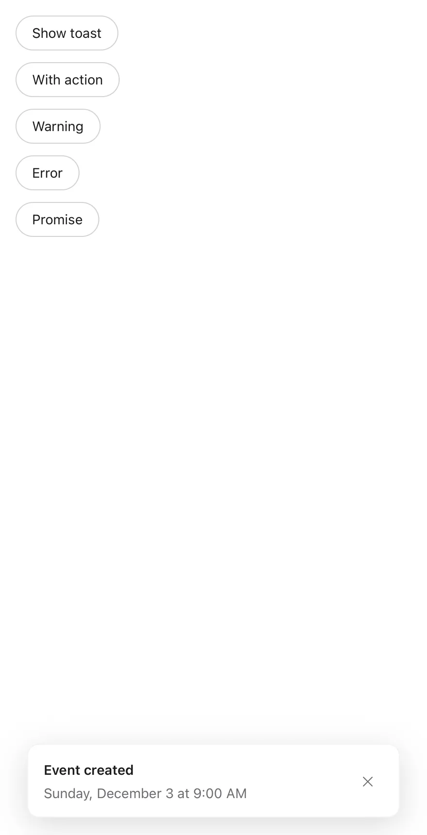
`Toaster` wraps your app in a toast provider and renders the queue into a full-screen viewport. Each toast slides in from the bottom edge, fades out downward, and is capped at 384 points wide.
**React Native**
The viewport renders through a portal. On iOS it sits inside a `FullWindowOverlay` from `react-native-screens`, so toasts appear above native modals. Each toast is a Reanimated view.
Visible toasts stack with a small peek and shrink behind the frontmost one. Touching the stack expands it; it collapses again three seconds after the touch ends. Each toast shows an icon for its `type` (`success`, `info`, `warning`, `error`, or a spinner for `loading`), a title, a description, an optional action button and a close button.
## Installation
**React Native**
```bash title="Terminal"
npx shadcn@latest add @esuiss-rn/toast
```
See [Installation](https://ui.suiss.app/docs/installation) for the `components.json` setup. Or use the suiss/ui CLI:
```bash title="Terminal"
npx @esuiss/ui@latest add toast
```
**SwiftUI**
```bash title="Terminal"
npx @esuiss/ui@latest add toast --platform swift
```
**Jetpack Compose**
```bash title="Terminal"
npx @esuiss/ui@latest add toast --platform kotlin
```
The CLI also adds what it builds on: [Button](https://ui.suiss.app/docs/components/button), [Icon](https://ui.suiss.app/docs/components/icon), [Text](https://ui.suiss.app/docs/components/text). On React Native it also adds the animated view `components/ui/animated-view.tsx`.
### Manual
**React Native**
**Uniwind**
1. Install the dependencies:
```bash title="Terminal"
npx expo install cn phosphor-react-native react-native-reanimated react-native-safe-area-context react-native-screens react-native-svg react-native-worklets
```
2. Add the pieces it builds on: [Button](https://ui.suiss.app/docs/components/button), [Icon](https://ui.suiss.app/docs/components/icon), [Text](https://ui.suiss.app/docs/components/text), and the primitives `components/primitives/toast.tsx`, `components/primitives/use-render.tsx`, and the animated view `components/ui/animated-view.tsx` from the next step.
3. Copy the animated view into `components/ui/animated-view.tsx`:
- `uniwind/components/ui/animated-view.tsx`: [source](https://github.com/e-suiss/ui/blob/main/packages/mobile/uniwind/components/ui/animated-view.tsx)
4. Copy the source into `components/ui/toast.tsx`:
```tsx title="uniwind/components/ui/toast.tsx"
import { cn } from "cn"
import { CheckIcon, ExclamationMarkIcon, XIcon } from "phosphor-react-native"
import * as React from "react"
import {
ActivityIndicator,
Platform,
useWindowDimensions,
View,
} from "react-native"
import {
FadeOutDown,
ReduceMotion,
SlideInDown,
useAnimatedStyle,
withTiming,
} from "react-native-reanimated"
import { useSafeAreaInsets } from "react-native-safe-area-context"
import { FullWindowOverlay as RNFullWindowOverlay } from "react-native-screens"
import * as ToastPrimitive from "@/components/primitives/toast"
import { resolveClassName } from "@/components/primitives/use-render"
import { AnimatedView } from "@/components/ui/animated-view"
import { Button } from "@/components/ui/button"
import { Icon } from "@/components/ui/icon"
import { Text } from "@/components/ui/text"
const toast = ToastPrimitive.createToastManager()
const FullWindowOverlay =
Platform.OS === "ios" ? RNFullWindowOverlay : React.Fragment
const GAP = 12
const PEEK = 12
const MAX_WIDTH = 384
const TIMING = { duration: 450, reduceMotion: ReduceMotion.System }
function ToastProvider(props: ToastPrimitive.ProviderProps) {
return
}
function ToastPortal(props: ToastPrimitive.PortalProps) {
return
}
function ToastViewport({
className,
...props
}: React.ComponentProps) {
return (
cn(
"absolute top-0 right-0 bottom-0 left-0 z-50",
resolveClassName(className, state)
)
}
{...props}
/>
)
}
function Toast({
className,
style,
toast: toastItem,
...props
}: React.ComponentProps) {
const position = ToastPrimitive.useToastPosition(toastItem.id)
const insets = useSafeAreaInsets()
const { width } = useWindowDimensions()
const inset = Math.max(16, (width - MAX_WIDTH) / 2)
const index = position.visibleIndex
const expanded = position.expanded
const scale = expanded ? 1 : Math.max(0, 1 - index * 0.1)
const front = position.frontmostHeight
const translateY = expanded
? -(position.offsetY + index * GAP)
: -(index * PEEK) - (1 - scale) * front
const measured = position.height > 0 ? position.height : undefined
const height = !expanded && index > 0 && front > 0 ? front : measured
const hidden = position.limited
const stackStyle = useAnimatedStyle(
() => ({
opacity: withTiming(hidden ? 0 : 1, TIMING),
transform: [
{ translateY: withTiming(translateY, TIMING) },
{ scale: withTiming(scale, TIMING) },
],
}),
[hidden, translateY, scale]
)
const heightStyle = useAnimatedStyle(
() =>
height === undefined
? {}
: {
height: withTiming(height, {
duration: 150,
reduceMotion: ReduceMotion.System,
}),
},
[height]
)
return (
cn(
"w-full rounded-xl border border-foreground/5 bg-popover shadow-[0_8px_32px_rgba(0,0,0,0.14)] dark:border-transparent dark:shadow-lg",
resolveClassName(className, state)
)
}
style={(state) => [
heightStyle,
typeof style === "function" ? style(state) : style,
]}
{...props}
/>
)
}
function ToastContent({
className,
...props
}: React.ComponentProps) {
const { behind } = ToastPrimitive.useToastRootContext("ToastContent")
const fadeStyle = useAnimatedStyle(
() => ({
opacity: withTiming(behind ? 0 : 1, {
duration: 250,
reduceMotion: ReduceMotion.System,
}),
}),
[behind]
)
return (
}
className={(state) =>
cn(
"flex-row items-center gap-3 p-4",
resolveClassName(className, state)
)
}
{...props}
/>
)
}
function ToastTitle({
className,
...props
}: React.ComponentProps) {
return (
cn(
"text-sm font-semibold text-foreground",
resolveClassName(className, state)
)
}
{...props}
/>
)
}
function ToastDescription({
className,
...props
}: React.ComponentProps) {
return (
cn("text-sm text-muted-foreground", resolveClassName(className, state))
}
{...props}
/>
)
}
function ToastAction({
className,
children,
render = ,
...props
}: React.ComponentProps) {
const { toast: toastItem } = ToastPrimitive.useToastRootContext("ToastAction")
const content = children ?? toastItem.actionProps?.children
if (content == null || content === false) return null
return (
cn("shrink-0", resolveClassName(className, state))}
{...props}
>
{typeof content === "string" || typeof content === "number" ? (
{content}
) : (
content
)}
)
}
function ToastClose({
className,
children,
render = ,
...props
}: React.ComponentProps) {
return (
cn("shrink-0", resolveClassName(className, state))}
{...props}
>
{children ?? }
)
}
function toastIcon(type: string | undefined) {
if (type === "success") return CheckIcon
if (type === "error") return XIcon
return ExclamationMarkIcon
}
const TINT: Record = {
success: "bg-green-500",
info: "bg-primary",
warning: "bg-orange-500",
error: "bg-destructive",
}
function ToastIcon({ type }: { type: string | undefined }) {
if (type === "loading") {
return (
)
}
const tint = type ? TINT[type] : undefined
if (!tint) return null
const IconComponent = toastIcon(type)
return (
)
}
function ToastList() {
const { toasts } = ToastPrimitive.useToastManager()
return toasts.map((toastItem) => (
))
}
function Toaster({
children,
toastManager = toast,
portalHost,
...props
}: ToastPrimitive.ProviderProps & { portalHost?: string }) {
return (
{children}
)
}
const createToastManager = ToastPrimitive.createToastManager
const useToastManager = ToastPrimitive.useToastManager
export {
createToastManager,
Toast,
ToastAction,
ToastClose,
ToastContent,
ToastDescription,
Toaster,
ToastPortal,
ToastProvider,
ToastTitle,
ToastViewport,
toast,
useToastManager,
}
```
5. Update the import paths to match your project.
**NativeWind**
1. Install the dependencies:
```bash title="Terminal"
npx expo install cn nativewind phosphor-react-native react-native-reanimated react-native-safe-area-context react-native-screens react-native-svg react-native-worklets
```
2. Add the pieces it builds on: [Button](https://ui.suiss.app/docs/components/button), [Icon](https://ui.suiss.app/docs/components/icon), [Text](https://ui.suiss.app/docs/components/text), and the primitives `components/primitives/toast.tsx`, `components/primitives/use-render.tsx`, and the animated view `components/ui/animated-view.tsx` from the next step.
3. Copy the animated view into `components/ui/animated-view.tsx`:
- `nativewind/components/ui/animated-view.tsx`: [source](https://github.com/e-suiss/ui/blob/main/packages/mobile/nativewind/components/ui/animated-view.tsx)
4. Copy the source into `components/ui/toast.tsx`:
```tsx title="nativewind/components/ui/toast.tsx"
import { cn } from "cn"
import { cssInterop } from "nativewind"
import { CheckIcon, ExclamationMarkIcon, XIcon } from "phosphor-react-native"
import * as React from "react"
import {
ActivityIndicator,
Platform,
useWindowDimensions,
View,
} from "react-native"
import {
FadeOutDown,
ReduceMotion,
SlideInDown,
useAnimatedStyle,
withTiming,
} from "react-native-reanimated"
import { useSafeAreaInsets } from "react-native-safe-area-context"
import { FullWindowOverlay as RNFullWindowOverlay } from "react-native-screens"
import * as ToastPrimitive from "@/components/primitives/toast"
import { resolveClassName } from "@/components/primitives/use-render"
import { AnimatedView } from "@/components/ui/animated-view"
import { Button } from "@/components/ui/button"
import { Icon } from "@/components/ui/icon"
import { Text } from "@/components/ui/text"
cssInterop(ActivityIndicator, {
className: { target: "style", nativeStyleToProp: { color: true } },
})
const toast = ToastPrimitive.createToastManager()
const FullWindowOverlay =
Platform.OS === "ios" ? RNFullWindowOverlay : React.Fragment
const GAP = 12
const PEEK = 12
const MAX_WIDTH = 384
const TIMING = { duration: 450, reduceMotion: ReduceMotion.System }
function ToastProvider(props: ToastPrimitive.ProviderProps) {
return
}
function ToastPortal(props: ToastPrimitive.PortalProps) {
return
}
function ToastViewport({
className,
...props
}: React.ComponentProps) {
return (
cn(
"absolute top-0 right-0 bottom-0 left-0 z-50",
resolveClassName(className, state)
)
}
{...props}
/>
)
}
function Toast({
className,
style,
toast: toastItem,
...props
}: React.ComponentProps) {
const position = ToastPrimitive.useToastPosition(toastItem.id)
const insets = useSafeAreaInsets()
const { width } = useWindowDimensions()
const inset = Math.max(16, (width - MAX_WIDTH) / 2)
const index = position.visibleIndex
const expanded = position.expanded
const scale = expanded ? 1 : Math.max(0, 1 - index * 0.1)
const front = position.frontmostHeight
const translateY = expanded
? -(position.offsetY + index * GAP)
: -(index * PEEK) - (1 - scale) * front
const measured = position.height > 0 ? position.height : undefined
const height = !expanded && index > 0 && front > 0 ? front : measured
const hidden = position.limited
const stackStyle = useAnimatedStyle(
() => ({
opacity: withTiming(hidden ? 0 : 1, TIMING),
transform: [
{ translateY: withTiming(translateY, TIMING) },
{ scale: withTiming(scale, TIMING) },
],
}),
[hidden, translateY, scale]
)
const heightStyle = useAnimatedStyle(
() =>
height === undefined
? {}
: {
height: withTiming(height, {
duration: 150,
reduceMotion: ReduceMotion.System,
}),
},
[height]
)
return (
cn(
"w-full rounded-xl border border-foreground-5 bg-popover shadow-[0_8px_32px_rgba(0,0,0,0.14)] dark:border-transparent dark:shadow-lg",
resolveClassName(className, state)
)
}
style={(state) => [
heightStyle,
typeof style === "function" ? style(state) : style,
]}
{...props}
/>
)
}
function ToastContent({
className,
...props
}: React.ComponentProps) {
const { behind } = ToastPrimitive.useToastRootContext("ToastContent")
const fadeStyle = useAnimatedStyle(
() => ({
opacity: withTiming(behind ? 0 : 1, {
duration: 250,
reduceMotion: ReduceMotion.System,
}),
}),
[behind]
)
return (
}
className={(state) =>
cn(
"flex-row items-center gap-3 p-4",
resolveClassName(className, state)
)
}
{...props}
/>
)
}
function ToastTitle({
className,
...props
}: React.ComponentProps) {
return (
cn(
"text-sm font-semibold text-foreground",
resolveClassName(className, state)
)
}
{...props}
/>
)
}
function ToastDescription({
className,
...props
}: React.ComponentProps) {
return (
cn("text-sm text-muted-foreground", resolveClassName(className, state))
}
{...props}
/>
)
}
function ToastAction({
className,
children,
render = ,
...props
}: React.ComponentProps) {
const { toast: toastItem } = ToastPrimitive.useToastRootContext("ToastAction")
const content = children ?? toastItem.actionProps?.children
if (content == null || content === false) return null
return (
cn("shrink-0", resolveClassName(className, state))}
{...props}
>
{typeof content === "string" || typeof content === "number" ? (
{content}
) : (
content
)}
)
}
function ToastClose({
className,
children,
render = ,
...props
}: React.ComponentProps) {
return (
cn("shrink-0", resolveClassName(className, state))}
{...props}
>
{children ?? }
)
}
function toastIcon(type: string | undefined) {
if (type === "success") return CheckIcon
if (type === "error") return XIcon
return ExclamationMarkIcon
}
const TINT: Record = {
success: "bg-green-500",
info: "bg-primary",
warning: "bg-orange-500",
error: "bg-destructive",
}
function ToastIcon({ type }: { type: string | undefined }) {
if (type === "loading") {
return (
)
}
const tint = type ? TINT[type] : undefined
if (!tint) return null
const IconComponent = toastIcon(type)
return (
)
}
function ToastList() {
const { toasts } = ToastPrimitive.useToastManager()
return toasts.map((toastItem) => (
))
}
function Toaster({
children,
toastManager = toast,
portalHost,
...props
}: ToastPrimitive.ProviderProps & { portalHost?: string }) {
return (
{children}
)
}
const createToastManager = ToastPrimitive.createToastManager
const useToastManager = ToastPrimitive.useToastManager
export {
createToastManager,
Toast,
ToastAction,
ToastClose,
ToastContent,
ToastDescription,
Toaster,
ToastPortal,
ToastProvider,
ToastTitle,
ToastViewport,
toast,
useToastManager,
}
```
5. Update the import paths to match your project.
**StyleSheet**
1. Install the dependencies:
```bash title="Terminal"
npx expo install phosphor-react-native react-native-reanimated react-native-safe-area-context react-native-screens react-native-svg react-native-worklets
```
2. Add the pieces it builds on: [Button](https://ui.suiss.app/docs/components/button), [Icon](https://ui.suiss.app/docs/components/icon), [Text](https://ui.suiss.app/docs/components/text), and the primitives `components/primitives/toast.tsx`, `components/primitives/use-render.tsx`, and the animated view `components/ui/animated-view.tsx` from the next step.
3. Copy the animated view into `components/ui/animated-view.tsx`:
- `stylesheet/components/ui/animated-view.tsx`: [source](https://github.com/e-suiss/ui/blob/main/packages/mobile/stylesheet/components/ui/animated-view.tsx)
4. Copy the source into `components/ui/toast.tsx`:
```tsx title="stylesheet/components/ui/toast.tsx"
import { CheckIcon, ExclamationMarkIcon, XIcon } from "phosphor-react-native"
import * as React from "react"
import {
ActivityIndicator,
Platform,
StyleSheet,
useWindowDimensions,
View,
} from "react-native"
import {
FadeOutDown,
ReduceMotion,
SlideInDown,
useAnimatedStyle,
withTiming,
} from "react-native-reanimated"
import { useSafeAreaInsets } from "react-native-safe-area-context"
import { FullWindowOverlay as RNFullWindowOverlay } from "react-native-screens"
import * as ToastPrimitive from "@/components/primitives/toast"
import { AnimatedView } from "@/components/ui/animated-view"
import { Button } from "@/components/ui/button"
import { Icon } from "@/components/ui/icon"
import { Text } from "@/components/ui/text"
import {
fontSize,
palette,
radius,
shadow,
type ThemeColors,
useTheme,
} from "@/components/ui/theme"
const toast = ToastPrimitive.createToastManager()
const FullWindowOverlay =
Platform.OS === "ios" ? RNFullWindowOverlay : React.Fragment
const GAP = 12
const PEEK = 12
const MAX_WIDTH = 384
const TIMING = { duration: 450, reduceMotion: ReduceMotion.System }
const styles = StyleSheet.create({
viewport: { ...StyleSheet.absoluteFill, zIndex: 50 },
stack: { transformOrigin: "bottom", pointerEvents: "box-none" },
root: {
width: "100%",
borderRadius: radius.xl,
borderWidth: 1,
},
rootShadow: { boxShadow: "0 8px 32px rgba(0, 0, 0, 0.14)" },
content: {
flexDirection: "row",
alignItems: "center",
gap: 12,
padding: 16,
},
text: { minWidth: 0, flex: 1, gap: 4 },
title: { ...fontSize.sm, fontWeight: "600" },
description: { ...fontSize.sm },
shrink: { flexShrink: 0 },
icon: {
width: 32,
height: 32,
flexShrink: 0,
alignItems: "center",
justifyContent: "center",
borderRadius: radius.full,
},
flipped: { transform: [{ rotate: "180deg" }] },
})
function withAlpha(hex: string, alpha: number) {
const value = Number.parseInt(hex.slice(1), 16)
return `rgba(${(value >> 16) & 255}, ${(value >> 8) & 255}, ${value & 255}, ${alpha})`
}
function ToastProvider(props: ToastPrimitive.ProviderProps) {
return
}
function ToastPortal(props: ToastPrimitive.PortalProps) {
return
}
function ToastViewport({
style,
...props
}: React.ComponentProps) {
return (
[
styles.viewport,
typeof style === "function" ? style(state) : style,
]}
{...props}
/>
)
}
function Toast({
style,
toast: toastItem,
...props
}: React.ComponentProps) {
const { colors, isDark } = useTheme()
const position = ToastPrimitive.useToastPosition(toastItem.id)
const insets = useSafeAreaInsets()
const { width } = useWindowDimensions()
const inset = Math.max(16, (width - MAX_WIDTH) / 2)
const index = position.visibleIndex
const expanded = position.expanded
const scale = expanded ? 1 : Math.max(0, 1 - index * 0.1)
const front = position.frontmostHeight
const translateY = expanded
? -(position.offsetY + index * GAP)
: -(index * PEEK) - (1 - scale) * front
let height = position.height > 0 ? position.height : undefined
if (!expanded && index > 0 && front > 0) height = front
const hidden = position.limited
const stackStyle = useAnimatedStyle(
() => ({
opacity: withTiming(hidden ? 0 : 1, TIMING),
transform: [
{ translateY: withTiming(translateY, TIMING) },
{ scale: withTiming(scale, TIMING) },
],
}),
[hidden, translateY, scale]
)
const heightStyle = useAnimatedStyle(
() =>
height === undefined
? {}
: {
height: withTiming(height, {
duration: 150,
reduceMotion: ReduceMotion.System,
}),
},
[height]
)
return (
[
styles.root,
{
backgroundColor: colors.popover,
borderColor: isDark
? "transparent"
: withAlpha(colors.foreground, 0.05),
},
isDark ? shadow.lg : styles.rootShadow,
heightStyle,
typeof style === "function" ? style(state) : style,
]}
{...props}
/>
)
}
function ToastContent({
style,
...props
}: React.ComponentProps) {
const { behind } = ToastPrimitive.useToastRootContext("ToastContent")
const fadeStyle = useAnimatedStyle(
() => ({
opacity: withTiming(behind ? 0 : 1, {
duration: 250,
reduceMotion: ReduceMotion.System,
}),
}),
[behind]
)
return (
}
style={(state) => [
styles.content,
typeof style === "function" ? style(state) : style,
]}
{...props}
/>
)
}
function ToastTitle({
style,
...props
}: React.ComponentProps) {
const { colors } = useTheme()
return (
[
styles.title,
{ color: colors.foreground },
typeof style === "function" ? style(state) : style,
]}
{...props}
/>
)
}
function ToastDescription({
style,
...props
}: React.ComponentProps) {
const { colors } = useTheme()
return (
[
styles.description,
{ color: colors.mutedForeground },
typeof style === "function" ? style(state) : style,
]}
{...props}
/>
)
}
function ToastAction({
style,
children,
render = ,
...props
}: React.ComponentProps) {
const { toast: toastItem } = ToastPrimitive.useToastRootContext("ToastAction")
const content = children ?? toastItem.actionProps?.children
if (content == null || content === false) return null
return (
[
styles.shrink,
typeof style === "function" ? style(state) : style,
]}
{...props}
>
{typeof content === "string" || typeof content === "number" ? (
{content}
) : (
content
)}
)
}
function ToastClose({
style,
children,
render = ,
...props
}: React.ComponentProps) {
const { colors } = useTheme()
return (
[
styles.shrink,
typeof style === "function" ? style(state) : style,
]}
{...props}
>
{children ?? }
)
}
function toastTint(type: string | undefined, colors: ThemeColors) {
if (type === "success") return palette.green500
if (type === "info") return colors.primary
if (type === "warning") return palette.orange500
if (type === "error") return colors.destructive
return
}
function toastIcon(type: string | undefined) {
if (type === "success") return CheckIcon
if (type === "error") return XIcon
return ExclamationMarkIcon
}
function ToastIcon({ type }: { type: string | undefined }) {
const { colors } = useTheme()
if (type === "loading") {
return (
)
}
const tint = toastTint(type, colors)
if (!tint) return null
const IconComponent = toastIcon(type)
return (
)
}
function ToastList() {
const { toasts } = ToastPrimitive.useToastManager()
return toasts.map((toastItem) => (
))
}
function Toaster({
children,
toastManager = toast,
portalHost,
...props
}: ToastPrimitive.ProviderProps & { portalHost?: string }) {
return (
{children}
)
}
const createToastManager = ToastPrimitive.createToastManager
const useToastManager = ToastPrimitive.useToastManager
export {
createToastManager,
Toast,
ToastAction,
ToastClose,
ToastContent,
ToastDescription,
Toaster,
ToastPortal,
ToastProvider,
ToastTitle,
ToastViewport,
toast,
useToastManager,
}
```
5. Update the import paths to match your project.
**SwiftUI**
1. Target iOS 17 or later.
2. Add the Swift package to your app:
```swift title="Package.swift"
.package(url: "https://github.com/phosphor-icons/swift", from: "2.1.0")
```
3. Copy the theme files every view uses:
- `swift/Theme/Theme.swift`: [source](https://github.com/e-suiss/ui/blob/main/packages/mobile/swiftui/Sources/EsuissUI/Theme/Theme.swift)
- `swift/Theme/Tokens.swift`: [source](https://github.com/e-suiss/ui/blob/main/packages/mobile/swiftui/Sources/EsuissUI/Theme/Tokens.swift)
4. Copy the source and every file it uses:
```swift title="swift/Components/Toast.swift"
import Observation
import PhosphorSwift
import SwiftUI
public enum ToastType: CaseIterable, Sendable {
case `default`, success, info, warning, error, loading
}
public struct ToastAction: Sendable {
public let title: LocalizedStringResource
public let action: @MainActor @Sendable () -> Void
public init(_ title: LocalizedStringResource, action: @escaping @MainActor @Sendable () -> Void) {
self.title = title
self.action = action
}
}
public struct ToastItem: Identifiable, Sendable {
public let id: UUID
public var type: ToastType
public var title: LocalizedStringResource
public var description: LocalizedStringResource?
public var action: ToastAction?
public var duration: Duration?
}
@MainActor @Observable
public final class ToastManager {
public nonisolated static let shared = ToastManager()
public private(set) var toasts: [ToastItem] = []
public var limit = 3
@ObservationIgnored private var timers: [UUID: Task] = [:]
public nonisolated init() {}
@discardableResult
public func show(
_ title: LocalizedStringResource,
description: LocalizedStringResource? = nil,
type: ToastType = .default,
action: ToastAction? = nil,
duration: Duration? = .seconds(5)
) -> UUID {
let item = ToastItem(
id: UUID(),
type: type,
title: title,
description: description,
action: action,
duration: type == .loading ? nil : duration
)
toasts.append(item)
schedule(item)
announce(item)
return item.id
}
@discardableResult
public func success(_ title: LocalizedStringResource, description: LocalizedStringResource? = nil, action: ToastAction? = nil) -> UUID {
show(title, description: description, type: .success, action: action)
}
@discardableResult
public func info(_ title: LocalizedStringResource, description: LocalizedStringResource? = nil, action: ToastAction? = nil) -> UUID {
show(title, description: description, type: .info, action: action)
}
@discardableResult
public func warning(_ title: LocalizedStringResource, description: LocalizedStringResource? = nil, action: ToastAction? = nil) -> UUID {
show(title, description: description, type: .warning, action: action)
}
@discardableResult
public func error(_ title: LocalizedStringResource, description: LocalizedStringResource? = nil, action: ToastAction? = nil) -> UUID {
show(title, description: description, type: .error, action: action)
}
@discardableResult
public func loading(_ title: LocalizedStringResource, description: LocalizedStringResource? = nil) -> UUID {
show(title, description: description, type: .loading)
}
public func update(
_ id: UUID,
title: LocalizedStringResource? = nil,
description: LocalizedStringResource? = nil,
type: ToastType? = nil,
duration: Duration? = .seconds(5)
) {
guard let index = toasts.firstIndex(where: { $0.id == id }) else { return }
if let title { toasts[index].title = title }
if let description { toasts[index].description = description }
if let type { toasts[index].type = type }
toasts[index].duration = toasts[index].type == .loading ? nil : duration
schedule(toasts[index])
announce(toasts[index])
}
public func dismiss(_ id: UUID) {
timers[id]?.cancel()
timers[id] = nil
toasts.removeAll { $0.id == id }
}
public func dismissAll() {
timers.values.forEach { $0.cancel() }
timers.removeAll()
toasts.removeAll()
}
private func schedule(_ item: ToastItem) {
timers[item.id]?.cancel()
guard let duration = item.duration else {
timers[item.id] = nil
return
}
let id = item.id
timers[id] = Task { @MainActor [weak self] in
try? await Task.sleep(for: duration)
guard !Task.isCancelled else { return }
withAnimation(.easeOut(duration: 0.25)) { self?.dismiss(id) }
}
}
private func announce(_ item: ToastItem) {
var text = String(localized: item.title)
if let description = item.description {
text += ". " + String(localized: description)
}
AccessibilityNotification.Announcement(text).post()
}
}
extension EnvironmentValues {
@Entry public var toastManager: ToastManager = .shared
}
extension View {
public func toaster(_ manager: ToastManager = .shared) -> some View {
overlay(alignment: .bottom) {
ToastStack(manager: manager)
}
.environment(\.toastManager, manager)
}
}
struct ToastStack: View {
let manager: ToastManager
@State private var expanded = false
@State private var heights: [UUID: CGFloat] = [:]
@Environment(\.accessibilityReduceMotion) private var reduceMotion
var body: some View {
let ordered = Array(manager.toasts.reversed())
let front = ordered.first.flatMap { heights[$0.id] } ?? 0
GeometryReader { proxy in
let inset = max(16, (proxy.size.width - 384) / 2)
ZStack(alignment: .bottom) {
ForEach(Array(ordered.enumerated()), id: \.element.id) { index, item in
let scale = expanded ? 1 : max(0, 1 - CGFloat(index) * 0.1)
let offset = expanded
? -(ordered.prefix(index).reduce(0) { $0 + (heights[$1.id] ?? 0) } + CGFloat(index) * 12)
: -(CGFloat(index) * 12) - (1 - scale) * front
let behind = !expanded && index > 0
ToastCard(item: item, behind: behind) {
withAnimation(.easeOut(duration: 0.25)) { manager.dismiss(item.id) }
}
.onGeometryChange(for: CGFloat.self) { $0.size.height } action: { value in
if !behind { heights[item.id] = value }
}
.frame(height: behind && front > 0 ? front : nil, alignment: .top)
.clipped()
.scaleEffect(scale, anchor: .bottom)
.offset(y: offset)
.opacity(index >= manager.limit ? 0 : 1)
.allowsHitTesting(index < manager.limit)
.accessibilityHidden(index >= manager.limit)
.zIndex(Double(-index))
.transition(reduceMotion ? .opacity : .move(edge: .bottom).combined(with: .opacity))
}
}
.padding(.horizontal, inset)
.padding(.bottom, 16)
.frame(width: proxy.size.width, height: proxy.size.height, alignment: .bottom)
}
.frame(height: stackHeight(ordered: ordered, front: front))
.animation(reduceMotion ? .linear(duration: 0.2) : .smooth(duration: 0.45), value: manager.toasts.map(\.id))
.animation(reduceMotion ? .linear(duration: 0.2) : .smooth(duration: 0.45), value: expanded)
.contentShape(Rectangle())
.onTapGesture {
if ordered.count > 1 { expanded.toggle() }
}
.onChange(of: manager.toasts.count) { _, count in
if count < 2 { expanded = false }
}
}
private func stackHeight(ordered: [ToastItem], front: CGFloat) -> CGFloat {
guard !ordered.isEmpty else { return 0 }
let shown = ordered.prefix(manager.limit)
if expanded {
return shown.reduce(0) { $0 + (heights[$1.id] ?? 0) } + CGFloat(shown.count - 1) * 12 + 16
}
return front + CGFloat(shown.count - 1) * 12 + 16
}
}
struct ToastCard: View {
let item: ToastItem
var behind = false
let onDismiss: () -> Void
@State private var drag: CGFloat = 0
@Environment(\.colorScheme) private var colorScheme
var body: some View {
let shape = RoundedRectangle(cornerRadius: Radius.xl, style: .continuous)
let dark = colorScheme == .dark
HStack(spacing: 12) {
ToastIcon(type: item.type)
VStack(alignment: .leading, spacing: 4) {
Text(item.title)
.scaledFont(TextStyle.sm, weight: .semibold)
.foregroundStyle(EsuissColor.foreground)
if let description = item.description {
Text(description)
.scaledFont(TextStyle.sm)
.foregroundStyle(EsuissColor.mutedForeground)
}
}
.fixedSize(horizontal: false, vertical: true)
.frame(maxWidth: .infinity, alignment: .leading)
if let action = item.action {
Button {
action.action()
onDismiss()
} label: {
Text(action.title)
}
.buttonStyle(.variant(.outline, size: .sm))
}
Button(action: onDismiss) {
Ph.x.regular
.frame(width: 16, height: 16)
.foregroundStyle(EsuissColor.mutedForeground)
}
.buttonStyle(.variant(.ghost, size: .iconSm))
.accessibilityLabel(Text("Close toast"))
}
.padding(16)
.opacity(behind ? 0 : 1)
.frame(maxWidth: .infinity)
.background {
shape
.fill(EsuissColor.popover)
.shadow(dark ? .lg : Shadow(color: .black.opacity(0.14), radius: 16, y: 8))
}
.overlay {
if !dark { shape.strokeBorder(EsuissColor.foreground.opacity(0.05)) }
}
.offset(y: drag)
.gesture(
DragGesture(minimumDistance: 8)
.onChanged { value in
drag = max(0, value.translation.height)
}
.onEnded { value in
if drag > 48 || value.predictedEndTranslation.height > 160 {
onDismiss()
} else {
withAnimation(.spring(duration: 0.3)) { drag = 0 }
}
}
)
.accessibilityElement(children: .contain)
.accessibilityHidden(behind)
.accessibilityAction(.escape, onDismiss)
}
}
private struct ToastIcon: View {
let type: ToastType
var body: some View {
switch type {
case .default:
EmptyView()
case .loading:
ProgressView()
.tint(EsuissColor.primary)
.frame(width: 32, height: 32)
.accessibilityHidden(true)
case .success, .info, .warning, .error:
icon
.frame(width: 16, height: 16)
.rotationEffect(.degrees(type == .info ? 180 : 0))
.foregroundStyle(EsuissColor.background)
.frame(width: 32, height: 32)
.background(tint, in: Circle())
.accessibilityHidden(true)
}
}
private var icon: Image {
switch type {
case .success: Ph.check.bold
case .error: Ph.x.bold
default: Ph.exclamationMark.bold
}
}
private var tint: Color {
switch type {
case .success: Color.adaptive(light: Palette.green600, dark: Palette.green400)
case .info: EsuissColor.primary
case .warning: Color.adaptive(light: Palette.amber600, dark: Palette.amber400)
default: EsuissColor.destructive
}
}
}
```
- `swift/Components/Button.swift`: see [Button](https://ui.suiss.app/docs/components/button.md)
- `swift/Components/ButtonGroup.swift`: see [Button Group](https://ui.suiss.app/docs/components/button-group.md)
- `swift/Components/TextVariant.swift`: [source](https://github.com/e-suiss/ui/blob/main/packages/mobile/swiftui/Sources/EsuissUI/Components/TextVariant.swift)
5. Add the files to your app target.
**Jetpack Compose**
1. Set `minSdk` to 24 or higher and add the dependencies:
```kotlin title="build.gradle.kts"
implementation(platform("androidx.compose:compose-bom:2026.09.00"))
implementation("androidx.compose.foundation:foundation")
implementation("androidx.compose.ui:ui")
implementation("com.adamglin:phosphor-icon-android:1.0.0")
```
2. Copy the theme files every view uses:
- `kotlin/theme/Theme.kt`: [source](https://github.com/e-suiss/ui/blob/main/packages/mobile/kotlin/ui/src/main/kotlin/com/esuiss/ui/theme/Theme.kt)
- `kotlin/theme/Tokens.kt`: [source](https://github.com/e-suiss/ui/blob/main/packages/mobile/kotlin/ui/src/main/kotlin/com/esuiss/ui/theme/Tokens.kt)
3. Copy the source and every file it uses:
```kt title="kotlin/components/Toast.kt"
package com.esuiss.ui.components
import androidx.compose.animation.core.Animatable
import androidx.compose.animation.core.LinearEasing
import androidx.compose.animation.core.RepeatMode
import androidx.compose.animation.core.VectorConverter
import androidx.compose.animation.core.animateDpAsState
import androidx.compose.animation.core.animateFloat
import androidx.compose.animation.core.animateFloatAsState
import androidx.compose.animation.core.infiniteRepeatable
import androidx.compose.animation.core.rememberInfiniteTransition
import androidx.compose.animation.core.tween
import androidx.compose.foundation.background
import androidx.compose.foundation.border
import androidx.compose.foundation.gestures.detectDragGestures
import androidx.compose.foundation.gestures.detectTapGestures
import androidx.compose.foundation.layout.Arrangement
import androidx.compose.foundation.layout.Box
import androidx.compose.foundation.layout.Column
import androidx.compose.foundation.layout.Row
import androidx.compose.foundation.layout.WindowInsets
import androidx.compose.foundation.layout.fillMaxWidth
import androidx.compose.foundation.layout.height
import androidx.compose.foundation.layout.ime
import androidx.compose.foundation.layout.navigationBars
import androidx.compose.foundation.layout.padding
import androidx.compose.foundation.layout.size
import androidx.compose.foundation.layout.width
import androidx.compose.foundation.layout.wrapContentHeight
import androidx.compose.foundation.shape.CircleShape
import androidx.compose.foundation.shape.RoundedCornerShape
import androidx.compose.foundation.text.BasicText
import androidx.compose.runtime.Composable
import androidx.compose.runtime.Immutable
import androidx.compose.runtime.LaunchedEffect
import androidx.compose.runtime.Stable
import androidx.compose.runtime.getValue
import androidx.compose.runtime.key
import androidx.compose.runtime.mutableIntStateOf
import androidx.compose.runtime.mutableLongStateOf
import androidx.compose.runtime.mutableStateListOf
import androidx.compose.runtime.mutableStateMapOf
import androidx.compose.runtime.mutableStateOf
import androidx.compose.runtime.remember
import androidx.compose.runtime.rememberUpdatedState
import androidx.compose.runtime.rememberCoroutineScope
import androidx.compose.runtime.setValue
import androidx.compose.ui.Alignment
import androidx.compose.ui.Modifier
import androidx.compose.ui.draw.clip
import androidx.compose.ui.draw.rotate
import androidx.compose.ui.geometry.Offset
import androidx.compose.ui.graphics.Color
import androidx.compose.ui.graphics.TransformOrigin
import androidx.compose.ui.graphics.graphicsLayer
import androidx.compose.ui.input.pointer.pointerInput
import androidx.compose.ui.layout.onSizeChanged
import androidx.compose.ui.platform.LocalDensity
import androidx.compose.ui.platform.LocalWindowInfo
import androidx.compose.ui.semantics.LiveRegionMode
import androidx.compose.ui.semantics.clearAndSetSemantics
import androidx.compose.ui.semantics.dismiss
import androidx.compose.ui.semantics.liveRegion
import androidx.compose.ui.semantics.semantics
import androidx.compose.ui.text.font.FontWeight
import androidx.compose.ui.unit.Dp
import androidx.compose.ui.unit.IntOffset
import androidx.compose.ui.unit.IntRect
import androidx.compose.ui.unit.IntSize
import androidx.compose.ui.unit.LayoutDirection
import androidx.compose.ui.unit.dp
import androidx.compose.ui.zIndex
import androidx.compose.ui.window.Popup
import androidx.compose.ui.window.PopupPositionProvider
import androidx.compose.ui.window.PopupProperties
import com.adamglin.PhosphorIcons
import com.adamglin.phosphoricons.Bold
import com.adamglin.phosphoricons.Regular
import com.adamglin.phosphoricons.bold.Check
import com.adamglin.phosphoricons.bold.ExclamationMark
import com.adamglin.phosphoricons.bold.X
import com.adamglin.phosphoricons.regular.CircleNotch
import com.adamglin.phosphoricons.regular.X
import com.esuiss.ui.theme.EsuissTheme
import com.esuiss.ui.theme.Palette
import com.esuiss.ui.theme.Radius
import com.esuiss.ui.theme.Shadow
import com.esuiss.ui.theme.Shadows
import com.esuiss.ui.theme.Typography
import com.esuiss.ui.theme.shadow
import kotlin.math.abs
import kotlin.math.max
import kotlin.math.roundToInt
import kotlinx.coroutines.delay
import kotlinx.coroutines.launch
enum class ToastType { Default, Success, Info, Warning, Error, Loading }
@Immutable
class ToastAction(val label: String, val onClick: () -> Unit)
@Stable
class ToastData internal constructor(
val id: Long,
title: String,
description: String?,
type: ToastType,
action: ToastAction?,
durationMillis: Long,
) {
var title by mutableStateOf(title)
internal set
var description by mutableStateOf(description)
internal set
var type by mutableStateOf(type)
internal set
var action by mutableStateOf(action)
internal set
var durationMillis by mutableLongStateOf(durationMillis)
internal set
internal var dismissed by mutableStateOf(false)
}
@Stable
class ToastState(
val limit: Int = 3,
val defaultDurationMillis: Long = 5000,
) {
private val items = mutableStateListOf()
private var nextId = 0L
val toasts: List
get() = items
fun show(
title: String,
description: String? = null,
type: ToastType = ToastType.Default,
action: ToastAction? = null,
durationMillis: Long = if (type == ToastType.Loading) 0 else defaultDurationMillis,
): Long {
nextId += 1
items.add(0, ToastData(nextId, title, description, type, action, durationMillis))
return nextId
}
fun success(title: String, description: String? = null, action: ToastAction? = null): Long =
show(title, description, ToastType.Success, action)
fun info(title: String, description: String? = null, action: ToastAction? = null): Long =
show(title, description, ToastType.Info, action)
fun warning(title: String, description: String? = null, action: ToastAction? = null): Long =
show(title, description, ToastType.Warning, action)
fun error(title: String, description: String? = null, action: ToastAction? = null): Long =
show(title, description, ToastType.Error, action)
fun loading(title: String, description: String? = null): Long =
show(title, description, ToastType.Loading)
fun update(
id: Long,
title: String? = null,
description: String? = null,
type: ToastType? = null,
action: ToastAction? = null,
durationMillis: Long? = null,
) {
val toast = items.firstOrNull { it.id == id } ?: return
if (title != null) toast.title = title
if (description != null) toast.description = description
if (action != null) toast.action = action
if (type != null) {
toast.type = type
if (durationMillis == null && type != ToastType.Loading && toast.durationMillis == 0L) {
toast.durationMillis = defaultDurationMillis
}
}
if (durationMillis != null) toast.durationMillis = durationMillis
}
fun dismiss(id: Long) {
items.firstOrNull { it.id == id }?.dismissed = true
}
fun dismissAll() {
items.forEach { it.dismissed = true }
}
internal fun remove(id: Long) {
items.removeAll { it.id == id }
}
}
@Composable
fun rememberToastState(limit: Int = 3, defaultDurationMillis: Long = 5000): ToastState =
remember { ToastState(limit, defaultDurationMillis) }
private val ToastGap = 12.dp
private val ToastPeek = 12.dp
private val ToastMaxWidth = 384.dp
private val ToastShadow = Shadow(0.dp, 8.dp, 32.dp, Color.Black.copy(alpha = 0.14f))
private class ToasterPositionProvider(private val bottomLimit: Int) : PopupPositionProvider {
override fun calculatePosition(
anchorBounds: IntRect,
windowSize: IntSize,
layoutDirection: LayoutDirection,
popupContentSize: IntSize,
): IntOffset {
val bottom = minOf(anchorBounds.bottom, bottomLimit)
val x = anchorBounds.left + (anchorBounds.width - popupContentSize.width) / 2
return IntOffset(x, bottom - popupContentSize.height)
}
}
@Composable
fun Toaster(
state: ToastState,
modifier: Modifier = Modifier,
content: @Composable () -> Unit = {},
) {
val density = LocalDensity.current
var anchorWidth by remember { mutableIntStateOf(0) }
Box(modifier = modifier.onSizeChanged { anchorWidth = it.width }) {
content()
if (state.toasts.isNotEmpty() && anchorWidth > 0) {
val containerHeight = LocalWindowInfo.current.containerSize.height
val covered = max(WindowInsets.navigationBars.getBottom(density), WindowInsets.ime.getBottom(density))
val bottomLimit = if (containerHeight > 0) containerHeight - covered else Int.MAX_VALUE
val provider = remember(bottomLimit) { ToasterPositionProvider(bottomLimit) }
val available = with(density) { anchorWidth.toDp() } - 32.dp
val width = if (available < ToastMaxWidth) available else ToastMaxWidth
Popup(
popupPositionProvider = provider,
properties = PopupProperties(
focusable = false,
dismissOnBackPress = false,
dismissOnClickOutside = false,
),
) {
ToastStack(state, width)
}
}
}
}
@Composable
private fun ToastStack(state: ToastState, width: Dp) {
val density = LocalDensity.current
val heights = remember { mutableStateMapOf() }
var expanded by remember { mutableStateOf(false) }
val active = state.toasts.filter { !it.dismissed }
if (active.size <= 1 && expanded) expanded = false
val visible = active.take(state.limit)
val gap = with(density) { ToastGap.roundToPx() }
val peek = with(density) { ToastPeek.roundToPx() }
val front = visible.firstOrNull()?.let { heights[it.id] } ?: 0
val target = when {
visible.isEmpty() -> 0
expanded -> visible.sumOf { heights[it.id] ?: 0 } + gap * (visible.size - 1)
else -> front + peek * (visible.size - 1)
}
val targetDp = with(density) { target.toDp() }
val animated by animateDpAsState(targetDp, tween(450), label = "stack")
val stackHeight = if (animated > targetDp) animated else targetDp
Box(
modifier = Modifier
.width(width + 32.dp)
.padding(start = 16.dp, end = 16.dp, top = 24.dp, bottom = 16.dp)
.height(stackHeight),
contentAlignment = Alignment.BottomCenter,
) {
state.toasts.forEach { toast ->
val index = active.indexOf(toast).let { if (it < 0) 0 else it }
val offsetY = active.take(index).sumOf { heights[it.id] ?: 0 }
key(toast.id) {
ToastItem(
toast = toast,
index = index,
expanded = expanded,
frontHeight = front,
offsetY = offsetY,
hidden = index >= state.limit,
gap = gap,
peek = peek,
onHeight = { heights[toast.id] = it },
onDismiss = { state.dismiss(toast.id) },
onRemoved = {
heights.remove(toast.id)
state.remove(toast.id)
},
onToggle = { if (active.size > 1) expanded = !expanded },
)
}
}
}
}
@Composable
private fun ToastItem(
toast: ToastData,
index: Int,
expanded: Boolean,
frontHeight: Int,
offsetY: Int,
hidden: Boolean,
gap: Int,
peek: Int,
onHeight: (Int) -> Unit,
onDismiss: () -> Unit,
onRemoved: () -> Unit,
onToggle: () -> Unit,
) {
val colors = EsuissTheme.colors
val density = LocalDensity.current
val scope = rememberCoroutineScope()
var natural by remember { mutableIntStateOf(0) }
val scale = if (expanded) 1f else max(0f, 1f - index * 0.1f)
val translate = if (expanded) {
-(offsetY + index * gap).toFloat()
} else {
-(index * peek).toFloat() - (1f - scale) * frontHeight
}
val spec = tween(450)
val animatedTranslate by animateFloatAsState(translate, spec, label = "translate")
val animatedScale by animateFloatAsState(scale, spec, label = "scale")
val animatedAlpha by animateFloatAsState(if (hidden) 0f else 1f, spec, label = "alpha")
val behind = !expanded && index > 0
val contentAlpha by animateFloatAsState(if (behind) 0f else 1f, tween(250), label = "content")
val enter = remember { Animatable(1f) }
val exit = remember { Animatable(0f) }
val drag = remember { Animatable(Offset.Zero, Offset.VectorConverter) }
val currentOnDismiss by rememberUpdatedState(onDismiss)
val currentOnToggle by rememberUpdatedState(onToggle)
LaunchedEffect(Unit) {
enter.animateTo(0f, tween(450))
}
LaunchedEffect(toast.dismissed) {
if (toast.dismissed) {
exit.animateTo(1f, tween(250))
onRemoved()
}
}
LaunchedEffect(toast.id, toast.type, toast.durationMillis, expanded, toast.dismissed) {
if (!toast.dismissed && !expanded && toast.type != ToastType.Loading && toast.durationMillis > 0) {
delay(toast.durationMillis)
onDismiss()
}
}
val forced = behind && frontHeight > 0
val shape = RoundedCornerShape(Radius.xl)
val liveMode = if (toast.type == ToastType.Error) LiveRegionMode.Assertive else LiveRegionMode.Polite
val slideDistance = with(density) { 16.dp.toPx() }
Box(
modifier = Modifier
.zIndex(1000f - index)
.fillMaxWidth()
.graphicsLayer {
val height = if (natural > 0) natural.toFloat() else size.height
translationY = animatedTranslate + enter.value * (height + slideDistance) +
exit.value * slideDistance + drag.value.y
translationX = drag.value.x
scaleX = animatedScale
scaleY = animatedScale
transformOrigin = TransformOrigin(0.5f, 1f)
alpha = animatedAlpha * (1f - exit.value)
}
.then(if (forced) Modifier.height(with(density) { frontHeight.toDp() }) else Modifier)
.then(if (colors.isDark) Modifier.shadow(Shadows.lg, shape) else Modifier.shadow(ToastShadow, shape))
.clip(shape)
.background(colors.popover, shape)
.border(1.dp, if (colors.isDark) Color.Transparent else colors.foreground.copy(alpha = 0.05f), shape)
.semantics {
liveRegion = liveMode
dismiss {
onDismiss()
true
}
}
.pointerInput(toast.id) {
detectTapGestures { currentOnToggle() }
}
.pointerInput(toast.id) {
val threshold = 48.dp.toPx()
detectDragGestures(
onDragEnd = {
val value = drag.value
if (abs(value.x) > threshold * 2 || value.y > threshold) {
currentOnDismiss()
} else {
scope.launch { drag.animateTo(Offset.Zero, tween(200)) }
}
},
onDragCancel = { scope.launch { drag.animateTo(Offset.Zero, tween(200)) } },
) { change, amount ->
change.consume()
val next = drag.value + amount
scope.launch { drag.snapTo(Offset(next.x, max(next.y, -8.dp.toPx()))) }
}
},
) {
Row(
modifier = Modifier
.fillMaxWidth()
.wrapContentHeight(Alignment.Top, unbounded = true)
.onSizeChanged {
natural = it.height
onHeight(it.height)
}
.graphicsLayer { alpha = contentAlpha }
.padding(16.dp),
horizontalArrangement = Arrangement.spacedBy(12.dp),
verticalAlignment = Alignment.CenterVertically,
) {
ToastIcon(toast.type)
Column(modifier = Modifier.weight(1f), verticalArrangement = Arrangement.spacedBy(4.dp)) {
BasicText(toast.title, style = Typography.sm.copy(color = colors.foreground, fontWeight = FontWeight.SemiBold))
toast.description?.let {
BasicText(it, style = Typography.sm.copy(color = colors.mutedForeground))
}
}
toast.action?.let { action ->
Button(
text = action.label,
onClick = {
action.onClick()
onDismiss()
},
variant = ButtonVariant.Outline,
size = ButtonSize.Sm,
)
}
Button(onClick = onDismiss, variant = ButtonVariant.Ghost, size = ButtonSize.IconSm) {
Icon(PhosphorIcons.Regular.X, contentDescription = "Close toast", size = 16.dp, tint = colors.mutedForeground)
}
}
}
}
@Composable
private fun ToastIcon(type: ToastType) {
val colors = EsuissTheme.colors
if (type == ToastType.Loading) {
val transition = rememberInfiniteTransition(label = "spinner")
val rotation by transition.animateFloat(
initialValue = 0f,
targetValue = 360f,
animationSpec = infiniteRepeatable(tween(800, easing = LinearEasing), RepeatMode.Restart),
label = "rotation",
)
Box(modifier = Modifier.size(32.dp).clearAndSetSemantics {}, contentAlignment = Alignment.Center) {
Icon(PhosphorIcons.Regular.CircleNotch, contentDescription = null, modifier = Modifier.rotate(rotation), size = 20.dp, tint = colors.primary)
}
return
}
val tint = when (type) {
ToastType.Success -> Palette.green500
ToastType.Info -> colors.primary
ToastType.Warning -> Palette.orange500
ToastType.Error -> colors.destructive
else -> return
}
val icon = when (type) {
ToastType.Success -> PhosphorIcons.Bold.Check
ToastType.Error -> PhosphorIcons.Bold.X
else -> PhosphorIcons.Bold.ExclamationMark
}
Box(
modifier = Modifier
.size(32.dp)
.background(tint, CircleShape)
.clearAndSetSemantics {},
contentAlignment = Alignment.Center,
) {
Icon(
icon,
contentDescription = null,
modifier = if (type == ToastType.Info) Modifier.rotate(180f) else Modifier,
size = 16.dp,
tint = colors.background,
)
}
}
```
- `kotlin/components/Button.kt`: see [Button](https://ui.suiss.app/docs/components/button.md)
- `kotlin/components/ButtonGroup.kt`: see [Button Group](https://ui.suiss.app/docs/components/button-group.md)
- `kotlin/components/Content.kt`: [source](https://github.com/e-suiss/ui/blob/main/packages/mobile/kotlin/ui/src/main/kotlin/com/esuiss/ui/components/Content.kt)
- `kotlin/components/Icon.kt`: see [Icon](https://ui.suiss.app/docs/components/icon.md)
4. Update the `com.esuiss.ui` package names to match your project.
## Usage
```tsx
import { ToastProvider, ToastPortal, ToastViewport, Toast, ToastContent, ToastTitle, ToastDescription, ToastAction, ToastClose, Toaster } from "@/components/ui/toast"
```
```tsx
```
Render `Toaster` once near the root, then call the exported `toast` manager from anywhere: `toast.add({ title, description, type })` returns an id, `toast.update(id, updates)` changes a toast, and `toast.close(id)` removes it (or all toasts when called without an id).
`toast.promise(promise, { loading, success, error })` shows a loading toast and replaces it with the success or error state when the promise settles.
Pass `actionProps` (for example `{ children: "Undo", onPress }`) to show an action button. Set `priority: "high"` for urgent messages and `timeout` to override the provider default; `loading` toasts stay until updated.
Use `createToastManager` to create a separate manager and pass it to `Toaster` as `toastManager`, and `useToastManager` to read the current toasts and actions inside the provider. The lower-level parts are exported for building a custom toast layout.
## Examples
**React Native**
### Show on load
Shows a success toast as soon as the screen mounts.
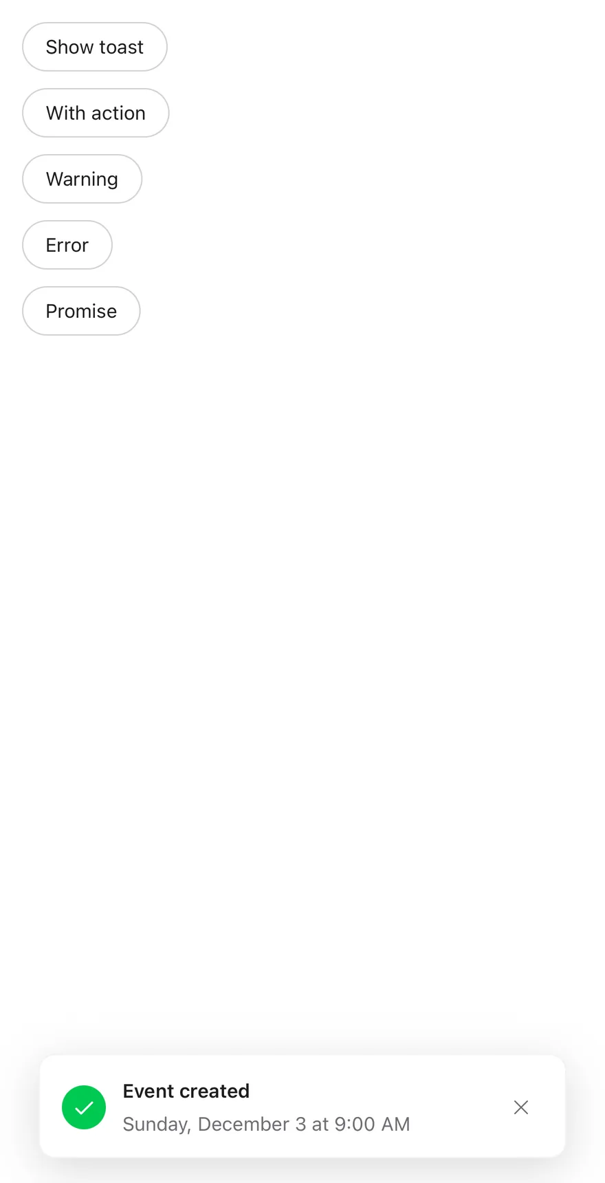
```tsx
import * as React from "react"
import { View } from "react-native"
import { Button } from "@/components/ui/button"
import { Text } from "@/components/ui/text"
import { Toaster, toast } from "@/components/ui/toast"
function wait(ms: number) {
return new Promise((resolve) => setTimeout(resolve, ms))
}
function ShowOnMount() {
React.useEffect(() => {
const id = toast.add({
title: "Event created",
description: "Sunday, December 3 at 9:00 AM",
type: "success",
})
return () => toast.close(id)
}, [])
return null
}
function Examples() {
return (
)
}
export function ToastShowOnLoadExample() {
return (
)
}
```
## API Reference
### ToastProvider
Holds the toast queue, default timeout and visible limit.
Also accepts the props of `ToastPrimitive.ProviderProps`.
### ToastPortal
Renders its children into a portal host.
Also accepts the props of `ToastPrimitive.PortalProps`.
### ToastViewport
Full-screen layer that holds the stack and expands it on touch.
Also accepts the props of `React.ComponentProps`.
### Toast
One animated, swipeable toast in the stack.
Also accepts the props of `React.ComponentProps`.
### ToastContent
Row layout for the icon, text, action and close button.
Also accepts the props of `React.ComponentProps`.
### ToastTitle
The toast title, read from the toast object.
Also accepts the props of `React.ComponentProps`.
### ToastDescription
Secondary text under the title.
Also accepts the props of `React.ComponentProps`.
### ToastAction
Outline button rendered from `actionProps`.
Also accepts the props of `React.ComponentProps`.
### ToastClose
Icon button that dismisses the toast.
Also accepts the props of `React.ComponentProps`.
### Toaster
Provider, portal and viewport that render the default toast list.
| Prop | Type | Default | Description |
| --- | --- | --- | --- |
| `portalHost` | `string` | - | Name of the portal host to render into. |
Also accepts the props of `ToastPrimitive.ProviderProps`.
## Accessibility
- Each toast has the `alert` role and a live region that is `polite`, or `assertive` for `priority: "high"`.
- New toasts are announced with their title and description; high-priority announcements are not queued.
- A `dismiss` accessibility action and the escape gesture close the toast.
- Toasts stacked behind the front one are hidden from VoiceOver and TalkBack.
- The close button has the label "Close toast" and the type icon is hidden from assistive technology.
- Animations respect the system reduce motion setting.
## Notes
- Uses `bg-popover`, `text-foreground`, `text-muted-foreground` and tint tokens `bg-green-500`, `bg-primary`, `bg-orange-500` and `bg-destructive` for the icons.
- Light and dark colors follow the system appearance; dark mode drops the border.
- Toasts respect the bottom safe area inset.
- `FullWindowOverlay` is used on iOS only; Android renders the viewport directly.