# Textarea
A multi-line text field that grows with its content, with an optional resize handle.
Textarea is an open-source component from suiss/ui for React, React Native, SwiftUI and Jetpack Compose. The @esuiss/ui CLI copies its source into your project, so you own the code.
Source: https://ui.suiss.app/docs/components/textarea
**React**
**Example**
```tsx
import { Textarea } from "@/components/ui/textarea"
export default function TextareaDemo() {
return (
)
}
```
`Textarea` renders a native `textarea` styled to match the other form controls. By default it uses `field-sizing: content`, so it grows as people type, starting at a minimum height of `4rem`.
Set `resizable` to give it a fixed height and a custom handle that people drag to resize it vertically. Use `Textarea` for free-form text such as messages or notes; for a single line, use `Input`.
## Installation
### CLI
```bash title="Terminal"
npx shadcn@latest add @esuiss/textarea
```
Works in any project with a `components.json`. See [Installation](https://ui.suiss.app/docs/installation#add-components) for the one-line registry setup. Or use the suiss/ui CLI:
```bash title="Terminal"
npx @esuiss/ui@latest add textarea
```
### Manual
1. Add the [`cn` helper](https://ui.suiss.app/docs/installation#the-cn-helper).
2. Copy the source into `components/ui/textarea.tsx`:
```tsx title="components/ui/textarea.tsx"
"use client"
import type * as React from "react"
import { cn } from "@/lib/utils"
function TextareaHandle({ placement }: { placement: "inside" | "outside" }) {
function startResize(event: React.PointerEvent) {
const handle = event.currentTarget
const textarea = handle.parentElement?.querySelector(
"[data-slot=textarea]"
)
if (!textarea || event.button !== 0) return
event.preventDefault()
handle.setPointerCapture(event.pointerId)
handle.dataset.dragging = ""
const startY = event.clientY
const startHeight = textarea.offsetHeight
const minHeight =
Number.parseFloat(getComputedStyle(textarea).minHeight) || 0
const move = (moveEvent: PointerEvent) => {
const height = startHeight + moveEvent.clientY - startY
textarea.style.height = `${Math.max(minHeight, height)}px`
}
const end = () => {
delete handle.dataset.dragging
handle.removeEventListener("pointermove", move)
handle.removeEventListener("pointerup", end)
handle.removeEventListener("pointercancel", end)
}
handle.addEventListener("pointermove", move)
handle.addEventListener("pointerup", end)
handle.addEventListener("pointercancel", end)
}
function resetSize(event: React.MouseEvent) {
event.currentTarget.parentElement
?.querySelector("[data-slot=textarea]")
?.style.removeProperty("height")
}
return (
)
}
function Textarea({
className,
resizable,
...props
}: React.ComponentProps<"textarea"> & {
resizable?: "inside" | "outside"
}) {
const textarea = (
)
if (!resizable) return textarea
return (
{textarea}
)
}
export { Textarea }
```
3. Update the import paths to match your project.
## Usage
```tsx
import { Textarea } from "@/components/ui/textarea"
```
```tsx
```
`Textarea` passes its props to the native element, so use `value` with `onChange` to control it, or `defaultValue` for an uncontrolled field. Pair it with a `Label` through `htmlFor` and `id`, and link hint text with `aria-describedby`.
With `resizable`, the textarea and its handle are wrapped in a relative container. Double-click the handle to reset the height.
## Examples
### With value
Starts with a default value.
**Example**
```tsx
import { Textarea } from "@/components/ui/textarea"
export default function TextareaWithValue() {
return (
)
}
```
### With label
Names the textarea with a `Label`.
**Example**
```tsx
import { Label } from "@/components/ui/label"
import { Textarea } from "@/components/ui/textarea"
export default function TextareaWithLabel() {
return (
)
}
```
### Resizable
Adds a resize handle inside the bottom corner of the field.
**Example**
```tsx
import * as React from "react"
import { Label } from "@/components/ui/label"
import { Textarea } from "@/components/ui/textarea"
function ResizableExample({
resizable,
...props
}: React.ComponentProps) {
const ref = React.useRef(null)
const [rows, setRows] = React.useState(0)
React.useEffect(() => {
const area = ref.current
if (!area) return
const measure = () => {
const style = getComputedStyle(area)
const padding =
Number.parseFloat(style.paddingTop) +
Number.parseFloat(style.paddingBottom)
const line = Number.parseFloat(style.lineHeight)
setRows(Math.floor((area.clientHeight - padding) / line))
}
measure()
const observer = new ResizeObserver(measure)
observer.observe(area)
return () => observer.disconnect()
}, [])
return (
{rows} rows
Drag the bottom corner to resize. Double-click it to reset.
)
}
const campaign =
"Weekend sale on every grill. 15% off Saturday and Sunday from 12:00 to 16:00, including delivery orders."
export default function TextareaResizable() {
return (
)
}
```
### Resizable outside
Places the resize handle just outside the bottom corner of the field.
**Example**
```tsx
import * as React from "react"
import { Label } from "@/components/ui/label"
import { Textarea } from "@/components/ui/textarea"
function ResizableExample({
resizable,
...props
}: React.ComponentProps) {
const ref = React.useRef(null)
const [rows, setRows] = React.useState(0)
React.useEffect(() => {
const area = ref.current
if (!area) return
const measure = () => {
const style = getComputedStyle(area)
const padding =
Number.parseFloat(style.paddingTop) +
Number.parseFloat(style.paddingBottom)
const line = Number.parseFloat(style.lineHeight)
setRows(Math.floor((area.clientHeight - padding) / line))
}
measure()
const observer = new ResizeObserver(measure)
observer.observe(area)
return () => observer.disconnect()
}, [])
return (
{rows} rows
Drag the bottom corner to resize. Double-click it to reset.
)
}
const campaign =
"Weekend sale on every grill. 15% off Saturday and Sunday from 12:00 to 16:00, including delivery orders."
export default function TextareaResizableOutside() {
return (
)
}
```
### Disabled
Disables the textarea so it can't be edited.
**Example**
```tsx
import { Textarea } from "@/components/ui/textarea"
export default function TextareaDisabled() {
return (
)
}
```
### Invalid
Marks the textarea with `aria-invalid` to show an error state.
**Example**
```tsx
import { Textarea } from "@/components/ui/textarea"
export default function TextareaInvalid() {
return (
)
}
```
## API Reference
### Textarea
The multi-line text field, with an optional resize handle.
| Prop | Type | Default | Description |
| --- | --- | --- | --- |
| `resizable` | `"inside" \| "outside"` | - | Adds a vertical resize handle, placed `inside` or `outside` the field's bottom corner, and turns off automatic growth. |
Also accepts the props of `React.ComponentProps<"textarea">`.
## Accessibility
- Renders a native `textarea` with the `textbox` role. Name it with a `Label` or `aria-label`.
- The resize handle is hidden from assistive technologies and works with a pointer only.
- An invalid field is exposed through `aria-invalid`.
## Notes
- Uses `data-slot="textarea"` and sets `data-resizable` when resizable; the wrapper and handle use `textarea-container` and `textarea-handle`.
- A resizable textarea starts at a minimum height of `6rem`, and dragging never shrinks it below its minimum height.
- The handle is hidden while the textarea is disabled, and mirrors in right-to-left layouts.
- The caret uses the `primary` color; invalid fields use the `destructive` color.
**React Native, SwiftUI, Jetpack Compose**
```tsx
import { Textarea } from "@/components/ui/textarea"
export function TextareaExample() {
return (
)
}
```
```swift
import EsuissUI
import SwiftUI
struct TextareaDemo: View {
let placeholder: LocalizedStringKey
@State private var text: String
init(initial: String = "", placeholder: LocalizedStringKey = "Type your message here.") {
self.placeholder = placeholder
_text = State(initialValue: initial)
}
var body: some View {
TextField(placeholder, text: $text, axis: .vertical)
.textFieldStyle(.textarea)
.frame(maxWidth: .infinity)
}
}
```
```kotlin
import androidx.compose.foundation.layout.fillMaxWidth
import androidx.compose.runtime.Composable
import androidx.compose.runtime.getValue
import androidx.compose.runtime.mutableStateOf
import androidx.compose.runtime.saveable.rememberSaveable
import androidx.compose.runtime.setValue
import androidx.compose.ui.Modifier
import com.esuiss.ui.components.Textarea
@Composable
fun TextareaDemo(
initial: String = "",
placeholder: String = "Type your message here.",
enabled: Boolean = true,
) {
var value by rememberSaveable { mutableStateOf(initial) }
Textarea(value, { value = it }, Modifier.fillMaxWidth(), enabled = enabled, placeholder = placeholder)
}
```
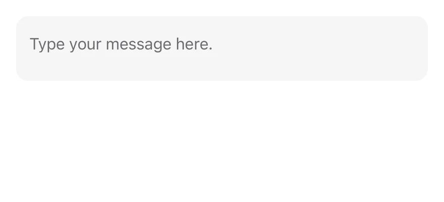
`Textarea` is the multi-line version of `Input`. It wraps a `TextInput` through the same field control primitive, defaults to `multiline` with `numberOfLines={8}`, aligns text to the top and has a minimum height. It shows a focus border while editing, a destructive border and tint when invalid, and 50% opacity when disabled.
## Installation
**React Native**
```bash title="Terminal"
npx shadcn@latest add @esuiss-rn/textarea
```
See [Installation](https://ui.suiss.app/docs/installation) for the `components.json` setup. Or use the suiss/ui CLI:
```bash title="Terminal"
npx @esuiss/ui@latest add textarea
```
**SwiftUI**
```bash title="Terminal"
npx @esuiss/ui@latest add textarea --platform swift
```
**Jetpack Compose**
```bash title="Terminal"
npx @esuiss/ui@latest add textarea --platform kotlin
```
### Manual
**React Native**
**Uniwind**
1. Install the dependencies:
```bash title="Terminal"
npx expo install cn
```
2. Add the pieces it builds on: the primitives `components/primitives/input.tsx`, `components/primitives/use-render.tsx`.
3. Copy the source into `components/ui/textarea.tsx`:
```tsx title="uniwind/components/ui/textarea.tsx"
import { cn } from "cn"
import * as InputPrimitive from "@/components/primitives/input"
import { resolveClassName } from "@/components/primitives/use-render"
function Textarea({
className,
multiline = true,
numberOfLines = 8,
...props
}: React.ComponentProps) {
return (
cn(
"min-h-16 w-full flex-row rounded-xl border border-transparent bg-secondary px-3 py-3 text-base text-secondary-foreground",
state.focused && "border-ring ring-3 ring-ring/50",
state.invalid &&
"border-destructive bg-destructive/5 dark:bg-destructive/10",
state.disabled && "opacity-50",
resolveClassName(className, state)
)
}
multiline={multiline}
numberOfLines={numberOfLines}
textAlignVertical="top"
placeholderTextColorClassName="accent-muted-foreground"
cursorColorClassName="accent-primary"
selectionColorClassName="accent-primary"
{...props}
/>
)
}
export { Textarea }
```
4. Update the import paths to match your project.
**NativeWind**
1. Install the dependencies:
```bash title="Terminal"
npx expo install cn nativewind
```
2. Add the pieces it builds on: the primitives `components/primitives/input.tsx`, `components/primitives/use-render.tsx`.
3. Copy the source into `components/ui/textarea.tsx`:
```tsx title="nativewind/components/ui/textarea.tsx"
import { cn } from "cn"
import { cssInterop } from "nativewind"
import { TextInput } from "react-native"
import * as InputPrimitive from "@/components/primitives/input"
import { resolveClassName } from "@/components/primitives/use-render"
declare module "react-native" {
interface TextInputProps {
cursorColorClassName?: string
selectionColorClassName?: string
}
}
cssInterop(TextInput, {
className: { target: "style", nativeStyleToProp: { textAlign: true } },
placeholderClassName: {
target: false,
nativeStyleToProp: { color: "placeholderTextColor" },
},
cursorColorClassName: {
target: false,
nativeStyleToProp: { color: "cursorColor" },
},
selectionColorClassName: {
target: false,
nativeStyleToProp: { color: "selectionColor" },
},
})
function Textarea({
className,
multiline = true,
numberOfLines = 8,
...props
}: React.ComponentProps) {
return (
cn(
"min-h-16 w-full flex-row rounded-xl border border-transparent bg-secondary px-3 py-3 text-base text-secondary-foreground",
state.focused && "border-ring ring ring-ring-50",
state.invalid &&
"border-destructive bg-destructive-5 dark:bg-destructive-10",
state.disabled && "opacity-50",
resolveClassName(className, state)
)
}
multiline={multiline}
numberOfLines={numberOfLines}
textAlignVertical="top"
placeholderClassName="text-muted-foreground"
cursorColorClassName="text-primary"
selectionColorClassName="text-primary"
{...props}
/>
)
}
export { Textarea }
```
4. Update the import paths to match your project.
**StyleSheet**
1. Add the pieces it builds on: the primitives `components/primitives/input.tsx`, `components/primitives/use-render.tsx`.
2. Copy the source into `components/ui/textarea.tsx`:
```tsx title="stylesheet/components/ui/textarea.tsx"
import { StyleSheet } from "react-native"
import * as InputPrimitive from "@/components/primitives/input"
import { fontSize, radius, useTheme } from "@/components/ui/theme"
function withAlpha(color: string, alpha: number) {
if (!color.startsWith("#") || color.length !== 7) return color
const r = Number.parseInt(color.slice(1, 3), 16)
const g = Number.parseInt(color.slice(3, 5), 16)
const b = Number.parseInt(color.slice(5, 7), 16)
return `rgba(${r}, ${g}, ${b}, ${alpha})`
}
const styles = StyleSheet.create({
root: {
...fontSize.base,
minHeight: 64,
width: "100%",
flexDirection: "row",
borderRadius: radius.xl,
borderWidth: 1,
borderColor: "transparent",
paddingHorizontal: 12,
paddingVertical: 12,
},
})
function Textarea({
style,
multiline = true,
numberOfLines = 8,
...props
}: React.ComponentProps) {
const { colors, isDark } = useTheme()
return (
[
styles.root,
{ backgroundColor: colors.secondary, color: colors.foreground },
state.focused && { borderColor: colors.ring },
state.invalid && {
borderColor: colors.destructive,
backgroundColor: withAlpha(colors.destructive, isDark ? 0.1 : 0.05),
},
state.disabled && { opacity: 0.5 },
typeof style === "function" ? style(state) : style,
]}
multiline={multiline}
numberOfLines={numberOfLines}
textAlignVertical="top"
placeholderTextColor={colors.mutedForeground}
cursorColor={colors.primary}
selectionColor={colors.primary}
{...props}
/>
)
}
export { Textarea }
```
3. Update the import paths to match your project.
**SwiftUI**
1. Target iOS 17 or later.
2. Copy the theme files every view uses:
- `swift/Theme/Theme.swift`: [source](https://github.com/e-suiss/ui/blob/main/packages/mobile/swiftui/Sources/EsuissUI/Theme/Theme.swift)
- `swift/Theme/Tokens.swift`: [source](https://github.com/e-suiss/ui/blob/main/packages/mobile/swiftui/Sources/EsuissUI/Theme/Tokens.swift)
3. Copy the source and every file it uses:
```swift title="swift/Components/Textarea.swift"
import SwiftUI
public struct TextareaStyle: TextFieldStyle {
public init() {}
public func _body(configuration: TextField) -> some View {
configuration
.lineLimit(1...8)
.modifier(InputField(
radius: Radius.xl,
horizontalPadding: 12,
verticalPadding: 12,
minHeight: 64,
textStyle: .base,
alignment: .topLeading
))
}
}
extension TextFieldStyle where Self == TextareaStyle {
public static var textarea: TextareaStyle { TextareaStyle() }
}
```
- `swift/Components/Button.swift`: see [Button](https://ui.suiss.app/docs/components/button.md)
- `swift/Components/ButtonGroup.swift`: see [Button Group](https://ui.suiss.app/docs/components/button-group.md)
- `swift/Components/Field.swift`: see [Field](https://ui.suiss.app/docs/components/field.md)
- `swift/Components/Input.swift`: see [Input](https://ui.suiss.app/docs/components/input.md)
- `swift/Components/Separator.swift`: see [Separator](https://ui.suiss.app/docs/components/separator.md)
- `swift/Components/TextVariant.swift`: [source](https://github.com/e-suiss/ui/blob/main/packages/mobile/swiftui/Sources/EsuissUI/Components/TextVariant.swift)
4. Add the files to your app target.
**Jetpack Compose**
1. Set `minSdk` to 24 or higher and add the dependencies:
```kotlin title="build.gradle.kts"
implementation(platform("androidx.compose:compose-bom:2026.09.00"))
implementation("androidx.compose.foundation:foundation")
implementation("androidx.compose.ui:ui")
```
2. Copy the theme files every view uses:
- `kotlin/theme/Theme.kt`: [source](https://github.com/e-suiss/ui/blob/main/packages/mobile/kotlin/ui/src/main/kotlin/com/esuiss/ui/theme/Theme.kt)
- `kotlin/theme/Tokens.kt`: [source](https://github.com/e-suiss/ui/blob/main/packages/mobile/kotlin/ui/src/main/kotlin/com/esuiss/ui/theme/Tokens.kt)
3. Copy the source and every file it uses:
```kt title="kotlin/components/Textarea.kt"
package com.esuiss.ui.components
import androidx.compose.foundation.interaction.MutableInteractionSource
import androidx.compose.foundation.interaction.collectIsFocusedAsState
import androidx.compose.foundation.layout.Box
import androidx.compose.foundation.layout.fillMaxWidth
import androidx.compose.foundation.layout.heightIn
import androidx.compose.foundation.layout.padding
import androidx.compose.foundation.shape.RoundedCornerShape
import androidx.compose.foundation.text.BasicText
import androidx.compose.foundation.text.BasicTextField
import androidx.compose.foundation.text.KeyboardActions
import androidx.compose.foundation.text.KeyboardOptions
import androidx.compose.foundation.text.selection.LocalTextSelectionColors
import androidx.compose.runtime.Composable
import androidx.compose.runtime.CompositionLocalProvider
import androidx.compose.runtime.getValue
import androidx.compose.runtime.remember
import androidx.compose.ui.Alignment
import androidx.compose.ui.Modifier
import androidx.compose.ui.graphics.SolidColor
import androidx.compose.ui.semantics.error
import androidx.compose.ui.semantics.semantics
import androidx.compose.ui.unit.dp
import com.esuiss.ui.theme.EsuissTheme
import com.esuiss.ui.theme.Radius
import com.esuiss.ui.theme.Typography
@Composable
fun Textarea(
value: String,
onValueChange: (String) -> Unit,
modifier: Modifier = Modifier,
enabled: Boolean = LocalFieldState.current.enabled,
readOnly: Boolean = false,
invalid: Boolean = LocalFieldState.current.invalid,
placeholder: String? = null,
minLines: Int = 1,
maxLines: Int = Int.MAX_VALUE,
keyboardOptions: KeyboardOptions = KeyboardOptions.Default,
keyboardActions: KeyboardActions = KeyboardActions.Default,
interactionSource: MutableInteractionSource? = null,
) {
val colors = EsuissTheme.colors
val source = interactionSource ?: remember { MutableInteractionSource() }
val focused by source.collectIsFocusedAsState()
val shape = RoundedCornerShape(Radius.xl)
val textStyle = Typography.base.copy(color = colors.foreground)
CompositionLocalProvider(LocalTextSelectionColors provides formSelectionColors(colors)) {
BasicTextField(
value = value,
onValueChange = onValueChange,
modifier = modifier
.fillMaxWidth()
.heightIn(min = 64.dp)
.formInputSurface(colors, shape, focused, invalid, enabled)
.then(if (invalid) Modifier.semantics { error("Invalid") } else Modifier),
enabled = enabled,
readOnly = readOnly,
textStyle = textStyle,
keyboardOptions = keyboardOptions,
keyboardActions = keyboardActions,
singleLine = false,
minLines = minLines,
maxLines = maxLines,
interactionSource = source,
cursorBrush = SolidColor(colors.primary),
decorationBox = { inner ->
Box(
modifier = Modifier.padding(12.dp),
contentAlignment = Alignment.TopStart,
) {
if (value.isEmpty() && placeholder != null) {
BasicText(
placeholder,
style = textStyle.copy(color = colors.mutedForeground),
)
}
inner()
}
},
)
}
}
```
- `kotlin/components/Content.kt`: [source](https://github.com/e-suiss/ui/blob/main/packages/mobile/kotlin/ui/src/main/kotlin/com/esuiss/ui/components/Content.kt)
- `kotlin/components/Field.kt`: see [Field](https://ui.suiss.app/docs/components/field.md)
- `kotlin/components/FormSupport.kt`: [source](https://github.com/e-suiss/ui/blob/main/packages/mobile/kotlin/ui/src/main/kotlin/com/esuiss/ui/components/FormSupport.kt)
- `kotlin/components/Label.kt`: see [Label](https://ui.suiss.app/docs/components/label.md)
- `kotlin/components/Separator.kt`: see [Separator](https://ui.suiss.app/docs/components/separator.md)
4. Update the `com.esuiss.ui` package names to match your project.
## Usage
```tsx
import { Textarea } from "@/components/ui/textarea"
```
```tsx
```
Use it for comments, messages and other free-form text. Use `Input` for single-line values.
The value works controlled with `value` and `onValueChange(value, details)`, or uncontrolled with `defaultValue`. Inside a `Field`, the textarea picks up the field's label, description, invalid and disabled state.
Override `numberOfLines` or set a height through `className` to change the visible size.
## Examples
### With value
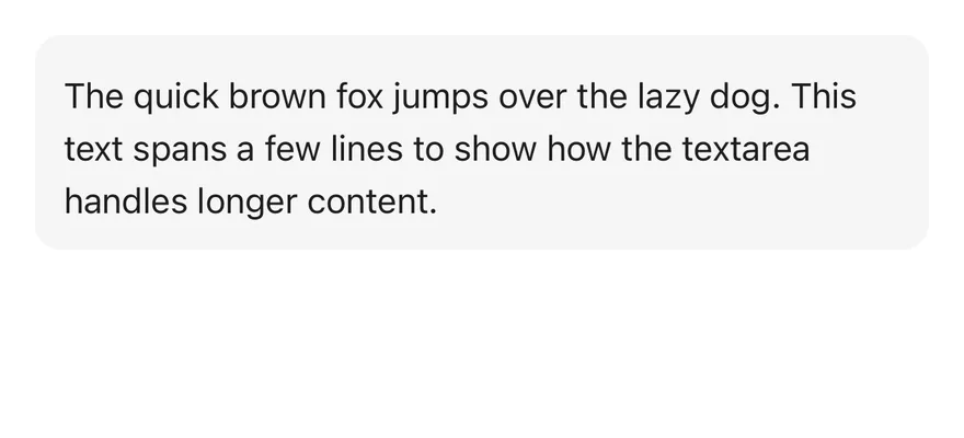
A textarea that starts with a `defaultValue`.
```tsx
import { Textarea } from "@/components/ui/textarea"
export function TextareaWithValueExample() {
return (
)
}
```
```swift
import EsuissUI
import SwiftUI
struct TextareaWithValueExample: View {
var body: some View {
TextareaDemo(initial: "The quick brown fox jumps over the lazy dog. This text spans a few lines to show how the textarea handles longer content.")
}
}
struct TextareaDemo: View {
let placeholder: LocalizedStringKey
@State private var text: String
init(initial: String = "", placeholder: LocalizedStringKey = "Type your message here.") {
self.placeholder = placeholder
_text = State(initialValue: initial)
}
var body: some View {
TextField(placeholder, text: $text, axis: .vertical)
.textFieldStyle(.textarea)
.frame(maxWidth: .infinity)
}
}
```
```kotlin
import androidx.compose.foundation.layout.fillMaxWidth
import androidx.compose.runtime.Composable
import androidx.compose.runtime.getValue
import androidx.compose.runtime.mutableStateOf
import androidx.compose.runtime.saveable.rememberSaveable
import androidx.compose.runtime.setValue
import androidx.compose.ui.Modifier
import com.esuiss.ui.components.Textarea
@Composable
fun TextareaWithValueExample() {
TextareaDemo(
initial = "The quick brown fox jumps over the lazy dog. This text spans a few lines to show how the textarea handles longer content.",
)
}
@Composable
fun TextareaDemo(
initial: String = "",
placeholder: String = "Type your message here.",
enabled: Boolean = true,
) {
var value by rememberSaveable { mutableStateOf(initial) }
Textarea(value, { value = it }, Modifier.fillMaxWidth(), enabled = enabled, placeholder = placeholder)
}
```
### With label
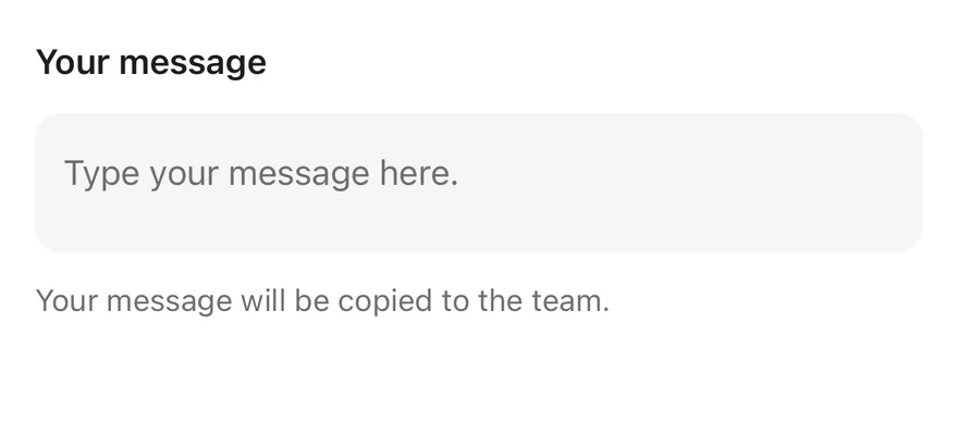
A textarea inside a `Field` with a label and description.
```tsx
import { Field, FieldDescription, FieldLabel } from "@/components/ui/field"
import { Textarea } from "@/components/ui/textarea"
export function TextareaWithLabelExample() {
return (
Your message
Your message will be copied to the team.
)
}
```
```swift
import EsuissUI
import SwiftUI
struct TextareaWithLabelExample: View {
var body: some View {
Field {
FieldLabel("Your message")
TextareaDemo()
FieldDescription("Your message will be copied to the team.")
}
}
}
struct TextareaDemo: View {
let placeholder: LocalizedStringKey
@State private var text: String
init(initial: String = "", placeholder: LocalizedStringKey = "Type your message here.") {
self.placeholder = placeholder
_text = State(initialValue: initial)
}
var body: some View {
TextField(placeholder, text: $text, axis: .vertical)
.textFieldStyle(.textarea)
.frame(maxWidth: .infinity)
}
}
```
```kotlin
import androidx.compose.foundation.layout.fillMaxWidth
import androidx.compose.runtime.Composable
import androidx.compose.runtime.getValue
import androidx.compose.runtime.mutableStateOf
import androidx.compose.runtime.saveable.rememberSaveable
import androidx.compose.runtime.setValue
import androidx.compose.ui.Modifier
import com.esuiss.ui.components.Field
import com.esuiss.ui.components.FieldDescription
import com.esuiss.ui.components.FieldLabel
import com.esuiss.ui.components.Textarea
@Composable
fun TextareaDemo(
initial: String = "",
placeholder: String = "Type your message here.",
enabled: Boolean = true,
) {
var value by rememberSaveable { mutableStateOf(initial) }
Textarea(value, { value = it }, Modifier.fillMaxWidth(), enabled = enabled, placeholder = placeholder)
}
@Composable
fun TextareaWithLabel() {
Field(Modifier.fillMaxWidth()) {
FieldLabel("Your message")
TextareaDemo()
FieldDescription("Your message will be copied to the team.")
}
}
```
### Disabled
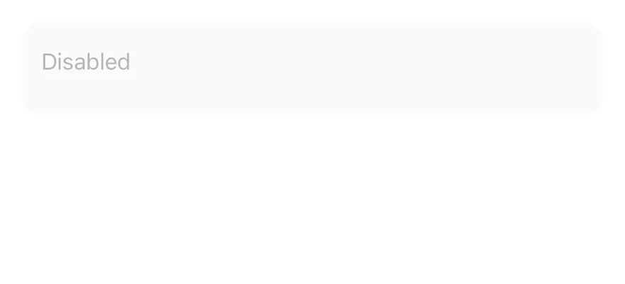
A disabled textarea.
```tsx
import { Textarea } from "@/components/ui/textarea"
export function TextareaDisabledExample() {
return (
)
}
```
```swift
import EsuissUI
import SwiftUI
struct TextareaDisabledExample: View {
var body: some View {
TextareaDemo(placeholder: "Disabled")
.disabled(true)
}
}
struct TextareaDemo: View {
let placeholder: LocalizedStringKey
@State private var text: String
init(initial: String = "", placeholder: LocalizedStringKey = "Type your message here.") {
self.placeholder = placeholder
_text = State(initialValue: initial)
}
var body: some View {
TextField(placeholder, text: $text, axis: .vertical)
.textFieldStyle(.textarea)
.frame(maxWidth: .infinity)
}
}
```
```kotlin
import androidx.compose.foundation.layout.fillMaxWidth
import androidx.compose.runtime.Composable
import androidx.compose.runtime.getValue
import androidx.compose.runtime.mutableStateOf
import androidx.compose.runtime.saveable.rememberSaveable
import androidx.compose.runtime.setValue
import androidx.compose.ui.Modifier
import com.esuiss.ui.components.Textarea
@Composable
fun TextareaDisabledExample() {
TextareaDemo(placeholder = "Disabled", enabled = false)
}
@Composable
fun TextareaDemo(
initial: String = "",
placeholder: String = "Type your message here.",
enabled: Boolean = true,
) {
var value by rememberSaveable { mutableStateOf(initial) }
Textarea(value, { value = it }, Modifier.fillMaxWidth(), enabled = enabled, placeholder = placeholder)
}
```
### Invalid
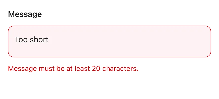
A textarea inside an invalid `Field` with an error message.
```tsx
import { Field, FieldError, FieldLabel } from "@/components/ui/field"
import { Textarea } from "@/components/ui/textarea"
export function TextareaInvalidExample() {
return (
MessageMessage must be at least 20 characters.
)
}
```
```swift
import EsuissUI
import SwiftUI
struct TextareaInvalidExample: View {
var body: some View {
Field(invalid: true) {
FieldLabel("Message")
TextareaDemo(initial: "Too short")
FieldError("Message must be at least 20 characters.")
}
}
}
struct TextareaDemo: View {
let placeholder: LocalizedStringKey
@State private var text: String
init(initial: String = "", placeholder: LocalizedStringKey = "Type your message here.") {
self.placeholder = placeholder
_text = State(initialValue: initial)
}
var body: some View {
TextField(placeholder, text: $text, axis: .vertical)
.textFieldStyle(.textarea)
.frame(maxWidth: .infinity)
}
}
```
```kotlin
import androidx.compose.foundation.layout.fillMaxWidth
import androidx.compose.runtime.Composable
import androidx.compose.runtime.getValue
import androidx.compose.runtime.mutableStateOf
import androidx.compose.runtime.saveable.rememberSaveable
import androidx.compose.runtime.setValue
import androidx.compose.ui.Modifier
import com.esuiss.ui.components.Field
import com.esuiss.ui.components.FieldError
import com.esuiss.ui.components.FieldLabel
import com.esuiss.ui.components.Textarea
@Composable
fun TextareaDemo(
initial: String = "",
placeholder: String = "Type your message here.",
enabled: Boolean = true,
) {
var value by rememberSaveable { mutableStateOf(initial) }
Textarea(value, { value = it }, Modifier.fillMaxWidth(), enabled = enabled, placeholder = placeholder)
}
@Composable
fun TextareaInvalid() {
Field(Modifier.fillMaxWidth(), invalid = true) {
FieldLabel("Message")
TextareaDemo(initial = "Too short")
FieldError("Message must be at least 20 characters.")
}
}
```
## API Reference
### Textarea
Also accepts the props of `React.ComponentProps`.
## Accessibility
- Inside a `Field`, the textarea gets the field label as `accessibilityLabel` and the description as `accessibilityHint`.
- `disabled` is set in `accessibilityState` and makes the textarea non-editable.
- Outside a `Field`, give it an `accessibilityLabel`.
## Notes
- Uses the `bg-secondary`, `border-ring` and `border-destructive` tokens, with `opacity-50` when disabled.
- In Uniwind and NativeWind, a focused field also draws the `ring-3 ring-ring/50` focus ring.
- Placeholder, cursor and selection colors come from the `muted-foreground` and `primary` tokens.
- Light and dark colors follow the system appearance.