# Tabs

A set of tabs that switches between panels of related content in the same place.

Tabs is an open-source component from suiss/ui for React, React Native, SwiftUI and Jetpack Compose. The @esuiss/ui CLI copies its source into your project, so you own the code.

Source: https://ui.suiss.app/docs/components/tabs

**React**

**Example**

```tsx
import { Tabs, TabsContent, TabsList, TabsTrigger } from "@/components/ui/tabs"

const tabs = [
  {
    value: "account",
    label: "Account",
    content: "Update your name, email address, and profile photo.",
  },
  {
    value: "notifications",
    label: "Notifications",
    content: "Choose which updates you receive by email and push.",
  },
  {
    value: "settings",
    label: "Settings",
    content: "Manage language, time zone, and privacy preferences.",
  },
] as const

export default function TabsDemo() {
  return (
    <div className="w-full max-w-96">
      <Tabs defaultValue="account" orientation="horizontal">
        <TabsList variant="default">
          {tabs.map((tab) => (
            <TabsTrigger key={tab.value} value={tab.value}>
              {tab.label}
            </TabsTrigger>
          ))}
        </TabsList>
        {tabs.map((tab) => (
          <TabsContent
            key={tab.value}
            value={tab.value}
            className="text-muted-foreground"
          >
            {tab.content}
          </TabsContent>
        ))}
      </Tabs>
    </div>
  )
}
```

`Tabs` wraps the tabs primitive of the chosen base. `TabsList` holds the `TabsTrigger` buttons, and each `TabsContent` panel is shown when its `value` matches the selected tab. An indicator slides to the active tab: a raised pill in the `default` variant, or an underline in the `line` variant.

When there are more tabs than fit, the list scrolls horizontally and keeps the active tab in view. On small screens, a horizontal list bleeds to the edges of its scroll container. Use `Tabs` to switch views within a page. For app-level navigation, use `TabBar` or `Sidebar`; for a compact single-choice control, consider a segmented `ToggleGroup`.

## Installation

### CLI

```bash title="Terminal"
npx shadcn@latest add @esuiss/tabs
```

Works in any project with a `components.json`. See [Installation](https://ui.suiss.app/docs/installation#add-components) for the one-line registry setup. Or use the suiss/ui CLI:

```bash title="Terminal"
npx @esuiss/ui@latest add tabs
```

### Manual

1. Install the dependencies and add the [`cn` helper](https://ui.suiss.app/docs/installation#the-cn-helper):

```bash title="Terminal"
npm install @base-ui/react class-variance-authority
```

2. Copy the source into `components/ui/tabs.tsx`:

```tsx title="components/ui/tabs.tsx"
"use client"

import { Tabs as TabsPrimitive } from "@base-ui/react/tabs"
import { cva, type VariantProps } from "class-variance-authority"
import * as React from "react"
import { cn } from "@/lib/utils"

function Tabs({
  className,
  orientation = "horizontal",
  ...props
}: TabsPrimitive.Root.Props) {
  return (
    <TabsPrimitive.Root
      data-slot="tabs"
      orientation={orientation}
      data-orientation={orientation}
      className={cn(
        "group/tabs flex gap-2 data-horizontal:flex-col",
        className
      )}
      {...props}
    />
  )
}

const tabsListVariants = cva(
  "group/tabs-list inline-flex w-fit shrink-0 items-center justify-center gap-1 rounded-xl p-1 text-muted-foreground group-data-horizontal/tabs:h-9 group-data-vertical/tabs:h-fit group-data-vertical/tabs:flex-col data-[variant=line]:rounded-none data-[variant=line]:p-0.5 group-data-horizontal/tabs:data-[variant=line]:h-9 group-data-horizontal/tabs:data-[variant=line]:pb-1.75",
  {
    variants: {
      variant: {
        default: "bg-secondary",
        line: "gap-1 bg-transparent",
      },
    },
    defaultVariants: {
      variant: "default",
    },
  }
)

function TabsList({
  className,
  variant = "default",
  children,
  ref: forwardedRef,
  ...props
}: TabsPrimitive.List.Props & VariantProps<typeof tabsListVariants>) {
  const ref = React.useRef<HTMLDivElement>(null)

  React.useEffect(() => {
    const list = ref.current
    if (!list) return
    const reveal = () => {
      const active = list.querySelector<HTMLElement>(
        "[data-slot=tabs-trigger][data-active]"
      )
      const first = list.querySelector<HTMLElement>("[data-slot=tabs-trigger]")
      if (!active || !first || list.clientWidth === 0) return
      const style = getComputedStyle(list)
      const padStart = Number.parseFloat(style.paddingInlineStart) || 0
      const padEnd = Number.parseFloat(style.paddingInlineEnd) || 0
      const inset = first.offsetLeft - padStart
      const left = active.offsetLeft - first.offsetLeft
      const right =
        active.offsetLeft +
        active.offsetWidth +
        inset +
        padEnd -
        list.clientWidth
      if (left < list.scrollLeft) {
        list.scrollTo({ left, behavior })
      } else if (right > list.scrollLeft) {
        list.scrollTo({ left: right, behavior })
      }
    }
    let behavior: ScrollBehavior = "instant"
    reveal()
    behavior = window.matchMedia("(prefers-reduced-motion: reduce)").matches
      ? "instant"
      : "smooth"
    const observer = new MutationObserver(reveal)
    observer.observe(list, {
      subtree: true,
      attributeFilter: ["data-active"],
    })
    return () => observer.disconnect()
  }, [])

  React.useLayoutEffect(() => {
    const list = ref.current
    const parent = list?.parentElement
    if (!list || !parent) return
    const boundary = () => {
      for (let node = parent.parentElement; node; node = node.parentElement) {
        if (node === document.body || node === document.documentElement) break
        if (getComputedStyle(node).overflowX === "visible") continue
        const rect = node.getBoundingClientRect()
        const start = rect.left + node.clientLeft
        return { start, end: start + node.clientWidth }
      }
      return { start: 0, end: document.documentElement.clientWidth }
    }
    const measure = () => {
      const rect = parent.getBoundingClientRect()
      const edge = boundary()
      const rtl = getComputedStyle(list).direction === "rtl"
      const left = Math.max(0, rect.left - edge.start)
      const right = Math.max(0, edge.end - rect.right)
      list.style.setProperty(
        "--tabs-list-bleed-start",
        `${rtl ? right : left}px`
      )
      list.style.setProperty("--tabs-list-bleed-end", `${rtl ? left : right}px`)
    }
    measure()
    const observer = new ResizeObserver(measure)
    observer.observe(parent)
    window.addEventListener("resize", measure)
    return () => {
      observer.disconnect()
      window.removeEventListener("resize", measure)
    }
  }, [])

  return (
    <TabsPrimitive.List
      ref={(node) => {
        ref.current = node
        if (typeof forwardedRef === "function") return forwardedRef(node)
        if (forwardedRef) forwardedRef.current = node
      }}
      data-slot="tabs-list"
      data-variant={variant}
      className="no-scrollbar relative flex max-w-full overflow-x-auto overscroll-x-contain group-data-vertical/tabs:w-fit group-data-horizontal/tabs:data-[variant=line]:-mb-1.25 max-md:group-data-horizontal/tabs:-ms-(--tabs-list-bleed-start) max-md:group-data-horizontal/tabs:-me-(--tabs-list-bleed-end) max-md:group-data-horizontal/tabs:max-w-[calc(100%+var(--tabs-list-bleed-start,0px)+var(--tabs-list-bleed-end,0px))] max-md:group-data-horizontal/tabs:ps-(--tabs-list-bleed-start) max-md:group-data-horizontal/tabs:pe-(--tabs-list-bleed-end)"
      {...props}
    >
      <TabsPrimitive.Indicator
        data-slot="tabs-indicator"
        data-variant={variant}
        renderBeforeHydration
        className="pointer-events-none absolute top-(--active-tab-top) left-(--active-tab-left) h-(--active-tab-height) w-(--active-tab-width) rounded-md bg-card shadow-sm transition-[left,top,width,height] duration-300 ease-[cubic-bezier(0.32,0.72,0,1)] data-[variant=line]:rounded-none data-[variant=line]:bg-foreground data-[variant=line]:shadow-none group-data-horizontal/tabs:data-[variant=line]:top-[calc(var(--active-tab-top)+var(--active-tab-height)+(--spacing(0.75)))] group-data-horizontal/tabs:data-[variant=line]:h-0.5 group-data-vertical/tabs:data-[variant=line]:left-[calc(var(--active-tab-left)+var(--active-tab-width)+(--spacing(0.5)))] group-data-vertical/tabs:data-[variant=line]:w-0.5 motion-reduce:transition-none dark:bg-border dark:data-[variant=line]:bg-foreground"
      />
      <div
        data-slot="tabs-list-content"
        data-variant={variant}
        className={cn(tabsListVariants({ variant }), className)}
      >
        {children}
      </div>
    </TabsPrimitive.List>
  )
}

function TabsTrigger({ className, ...props }: TabsPrimitive.Tab.Props) {
  return (
    <TabsPrimitive.Tab
      data-slot="tabs-trigger"
      className={cn(
        "relative inline-flex flex-1 group-data-horizontal/tabs:h-full group-data-[variant=line]/tabs-list:h-[calc(100%-1px)] items-center justify-center gap-2 rounded-md border border-transparent! px-3 py-1 text-sm whitespace-nowrap text-muted-foreground transition-colors group-data-vertical/tabs:w-full group-data-vertical/tabs:justify-start group-data-vertical/tabs:h-9 group-data-vertical/tabs:flex-none group-data-vertical/tabs:px-3 hover:text-foreground focus-visible:border-ring focus-visible:ring-3 focus-visible:ring-ring/50 disabled:pointer-events-none has-data-[icon=inline-end]:pe-2 has-data-[icon=inline-start]:ps-2 aria-disabled:pointer-events-none [&_svg]:pointer-events-none [&_svg]:shrink-0 [&_svg:not([class*='size-'])]:size-4 aria-disabled:opacity-50 disabled:opacity-50",
        "data-active:text-foreground",
        className
      )}
      {...props}
    />
  )
}

function TabsContent({ className, ...props }: TabsPrimitive.Panel.Props) {
  return (
    <TabsPrimitive.Panel
      data-slot="tabs-content"
      className={cn(
        "flex-1 rounded-lg text-base outline-none focus-visible:ring-3 focus-visible:ring-ring/50",
        className
      )}
      {...props}
    />
  )
}

export { Tabs, TabsContent, TabsList, TabsTrigger }
```

3. Update the import paths to match your project.

## Usage

```tsx
import { Tabs, TabsList, TabsTrigger, TabsContent } from "@/components/ui/tabs"
```

```tsx
<Tabs defaultValue="account" orientation="horizontal">
  <TabsList variant="default">
    {tabs.map((tab) => (
      <TabsTrigger key={tab.value} value={tab.value}>
        {tab.label}
      </TabsTrigger>
    ))}
  </TabsList>
  {tabs.map((tab) => (
    <TabsContent
      key={tab.value}
      value={tab.value}
      className="text-muted-foreground"
    >
      {tab.content}
    </TabsContent>
  ))}
</Tabs>
```

Use `defaultValue` on `Tabs` for an uncontrolled set, or `value` with `onValueChange` to control it. Give each `TabsTrigger` and its `TabsContent` the same `value`. Set `orientation="vertical"` on `Tabs` to stack the triggers beside the panel.

## Examples

### Line

Uses the `line` variant, which underlines the active tab.

**Example**

```tsx
import { Tabs, TabsContent, TabsList, TabsTrigger } from "@/components/ui/tabs"

const tabs = [
  {
    value: "account",
    label: "Account",
    content: "Update your name, email address, and profile photo.",
  },
  {
    value: "notifications",
    label: "Notifications",
    content: "Choose which updates you receive by email and push.",
  },
  {
    value: "settings",
    label: "Settings",
    content: "Manage language, time zone, and privacy preferences.",
  },
] as const

export default function TabsLine() {
  return (
    <div className="w-full max-w-96">
      <Tabs defaultValue="account" orientation="horizontal">
        <TabsList variant="line">
          {tabs.map((tab) => (
            <TabsTrigger key={tab.value} value={tab.value}>
              {tab.label}
            </TabsTrigger>
          ))}
        </TabsList>
        {tabs.map((tab) => (
          <TabsContent
            key={tab.value}
            value={tab.value}
            className="text-muted-foreground"
          >
            {tab.content}
          </TabsContent>
        ))}
      </Tabs>
    </div>
  )
}
```

### Vertical

Stacks the tabs vertically beside the panel.

**Example**

```tsx
import { Tabs, TabsContent, TabsList, TabsTrigger } from "@/components/ui/tabs"

const tabs = [
  {
    value: "account",
    label: "Account",
    content: "Update your name, email address, and profile photo.",
  },
  {
    value: "notifications",
    label: "Notifications",
    content: "Choose which updates you receive by email and push.",
  },
  {
    value: "settings",
    label: "Settings",
    content: "Manage language, time zone, and privacy preferences.",
  },
] as const

export default function TabsVertical() {
  return (
    <div className="w-full max-w-96">
      <Tabs defaultValue="account" orientation="vertical">
        <TabsList variant="default">
          {tabs.map((tab) => (
            <TabsTrigger key={tab.value} value={tab.value}>
              {tab.label}
            </TabsTrigger>
          ))}
        </TabsList>
        {tabs.map((tab) => (
          <TabsContent
            key={tab.value}
            value={tab.value}
            className="text-muted-foreground"
          >
            {tab.content}
          </TabsContent>
        ))}
      </Tabs>
    </div>
  )
}
```

### With icons

Places an icon before each tab's label.

**Example**

```tsx
import { BellIcon, GearIcon, UserIcon } from "@phosphor-icons/react"
import { Tabs, TabsContent, TabsList, TabsTrigger } from "@/components/ui/tabs"

const tabs = [
  {
    value: "account",
    label: "Account",
    icon: (
      <UserIcon data-icon="inline-start" />
    ),
    content: "Update your name, email address, and profile photo.",
  },
  {
    value: "notifications",
    label: "Notifications",
    icon: (
      <BellIcon data-icon="inline-start" />
    ),
    content: "Choose which updates you receive by email and push.",
  },
  {
    value: "settings",
    label: "Settings",
    icon: (
      <GearIcon data-icon="inline-start" />
    ),
    content: "Manage language, time zone, and privacy preferences.",
  },
] as const

export default function TabsWithIcons() {
  return (
    <div className="w-full max-w-96">
      <Tabs defaultValue="account" orientation="horizontal">
        <TabsList variant="default">
          {tabs.map((tab) => (
            <TabsTrigger key={tab.value} value={tab.value}>
              {tab.icon}
              {tab.label}
            </TabsTrigger>
          ))}
        </TabsList>
        {tabs.map((tab) => (
          <TabsContent
            key={tab.value}
            value={tab.value}
            className="text-muted-foreground"
          >
            {tab.content}
          </TabsContent>
        ))}
      </Tabs>
    </div>
  )
}
```

### Disabled tab

Disables one tab so it can't be selected.

**Example**

```tsx
import { Tabs, TabsContent, TabsList, TabsTrigger } from "@/components/ui/tabs"

const tabs = [
  {
    value: "account",
    label: "Account",
    content: "Update your name, email address, and profile photo.",
  },
  {
    value: "notifications",
    label: "Notifications",
    content: "Choose which updates you receive by email and push.",
  },
  {
    value: "settings",
    label: "Settings",
    content: "Manage language, time zone, and privacy preferences.",
  },
] as const

export default function TabsDisabledTab() {
  return (
    <div className="w-full max-w-96">
      <Tabs defaultValue="account" orientation="horizontal">
        <TabsList variant="default">
          <TabsTrigger value="account">Account</TabsTrigger>
          <TabsTrigger value="notifications">Notifications</TabsTrigger>
          <TabsTrigger value="billing" disabled>
            Billing
          </TabsTrigger>
        </TabsList>
        <TabsContent value="account" className="text-muted-foreground">
          {tabs[0].content}
        </TabsContent>
        <TabsContent value="notifications" className="text-muted-foreground">
          {tabs[1].content}
        </TabsContent>
      </Tabs>
    </div>
  )
}
```

### Many tabs

Holds more tabs than fit, so the list scrolls.

**Example**

```tsx
import { Tabs, TabsContent, TabsList, TabsTrigger } from "@/components/ui/tabs"

const settings = [
  { value: "general", label: "General" },
  { value: "account", label: "Account" },
  { value: "notifications", label: "Notifications" },
  { value: "privacy", label: "Privacy" },
  { value: "appearance", label: "Appearance" },
  { value: "language", label: "Language" },
  { value: "billing", label: "Billing" },
]

export default function TabsManyTabs() {
  return (
    <div className="w-full">
      <Tabs
        orientation="horizontal"
        defaultValue="general"
        className="w-full max-w-3xl"
      >
        <TabsList variant="default">
          {settings.map((tab) => (
            <TabsTrigger key={tab.value} value={tab.value}>
              {tab.label}
            </TabsTrigger>
          ))}
        </TabsList>
        {settings.map((tab) => (
          <TabsContent key={tab.value} value={tab.value}>
            <p className="text-muted-foreground">{tab.label} settings</p>
          </TabsContent>
        ))}
      </Tabs>
    </div>
  )
}
```

### Many tabs line

Combines a scrolling list with the `line` variant.

**Example**

```tsx
import { Tabs, TabsContent, TabsList, TabsTrigger } from "@/components/ui/tabs"

const settings = [
  { value: "general", label: "General" },
  { value: "account", label: "Account" },
  { value: "notifications", label: "Notifications" },
  { value: "privacy", label: "Privacy" },
  { value: "appearance", label: "Appearance" },
  { value: "language", label: "Language" },
  { value: "billing", label: "Billing" },
]

export default function TabsManyTabsLine() {
  return (
    <div className="w-full">
      <Tabs
        orientation="horizontal"
        defaultValue="general"
        className="w-full max-w-3xl"
      >
        <TabsList variant="line">
          {settings.map((tab) => (
            <TabsTrigger key={tab.value} value={tab.value}>
              {tab.label}
            </TabsTrigger>
          ))}
        </TabsList>
        {settings.map((tab) => (
          <TabsContent key={tab.value} value={tab.value}>
            <p className="text-muted-foreground">{tab.label} settings</p>
          </TabsContent>
        ))}
      </Tabs>
    </div>
  )
}
```

## API Reference

- `Tabs`
- `TabsList`
  - `TabsTrigger`
- `TabsContent`

### Tabs

The root that holds the selected value and orientation.

Also accepts the props of the primitive part it wraps.

### TabsList

The row or column of tabs, with the sliding indicator.

| Prop | Type | Default | Description |
| --- | --- | --- | --- |
| `variant` | `"default" \| "line"` | `"default"` | Chooses a filled `default` list with a raised pill, or a `line` list with an underline. |

Also accepts the props of the primitive part it wraps.

### TabsTrigger

A tab that selects its panel.

Also accepts the props of the primitive part it wraps.

### TabsContent

The panel shown when its tab is selected.

Also accepts the props of the primitive part it wraps.

## Accessibility

- The list has the `tablist` role with `aria-orientation`; triggers are `tab` elements with `aria-selected`, and panels are `tabpanel` elements.
- Arrow keys move focus between tabs, wrapping at the ends; `Enter` or `Space` selects the focused tab. Vertical tabs use the up and down arrow keys.
- `Home` and `End` move focus to the first and last tabs.
- Disabled tabs set `aria-disabled` and can't be selected by click or keyboard.

## Notes

- Parts carry `data-slot` attributes: `tabs`, `tabs-list`, `tabs-list-content`, `tabs-indicator`, `tabs-trigger` and `tabs-content`. The list and indicator set `data-variant`, and the active trigger sets `data-active`.
- The edge bleed on small screens is set through the `--tabs-list-bleed-start` and `--tabs-list-bleed-end` properties, which the list measures itself.
- `className` on `TabsList` styles the inner `tabs-list-content` element, not the scrolling list.
- Indicator and scroll animations are removed when reduced motion is preferred.

**React Native, SwiftUI, Jetpack Compose**
![Preview](https://ui.suiss.app/previews/components-tabs--default.light.webp)

```tsx
import * as React from "react"
import { View } from "react-native"
import { Button } from "@/components/ui/button"
import { Card, CardContent, CardDescription, CardFooter, CardHeader, CardTitle } from "@/components/ui/card"
import { Input } from "@/components/ui/input"
import { Label } from "@/components/ui/label"
import { Tabs, TabsContent, TabsList, TabsTrigger } from "@/components/ui/tabs"
import { Text } from "@/components/ui/text"

function TabsDemo() {
  const [value, setValue] = React.useState("account")
  return (
    <Tabs value={value} onValueChange={setValue} className="w-full">
      <TabsList>
        <TabsTrigger value="account">
          <Text>Account</Text>
        </TabsTrigger>
        <TabsTrigger value="password">
          <Text>Password</Text>
        </TabsTrigger>
      </TabsList>
      <TabsContent value="account">
        <Card>
          <CardHeader>
            <CardTitle>Account</CardTitle>
            <CardDescription>
              Make changes to your account here.
            </CardDescription>
          </CardHeader>
          <CardContent className="gap-4">
            <View className="gap-2">
              <Label nativeID="tabs-name">Name</Label>
              <Input
                accessibilityLabelledBy="tabs-name"
                defaultValue="Pedro Duarte"
              />
            </View>
            <View className="gap-2">
              <Label nativeID="tabs-username">Username</Label>
              <Input
                accessibilityLabelledBy="tabs-username"
                defaultValue="@peduarte"
                autoCapitalize="none"
              />
            </View>
          </CardContent>
          <CardFooter>
            <Button>
              <Text>Save changes</Text>
            </Button>
          </CardFooter>
        </Card>
      </TabsContent>
      <TabsContent value="password">
        <Card>
          <CardHeader>
            <CardTitle>Password</CardTitle>
            <CardDescription>
              Change your password here. You will be logged out after saving.
            </CardDescription>
          </CardHeader>
          <CardContent className="gap-4">
            <View className="gap-2">
              <Label nativeID="tabs-current">Current password</Label>
              <Input accessibilityLabelledBy="tabs-current" secureTextEntry />
            </View>
            <View className="gap-2">
              <Label nativeID="tabs-new">New password</Label>
              <Input accessibilityLabelledBy="tabs-new" secureTextEntry />
            </View>
          </CardContent>
          <CardFooter>
            <Button>
              <Text>Save password</Text>
            </Button>
          </CardFooter>
        </Card>
      </TabsContent>
    </Tabs>
  )
}

export function TabsExample() {
  return (
    <TabsDemo />
  )
}
```

```swift
import EsuissUI
import SwiftUI

struct TabsDemo: View {
  @State private var value = "account"
  @State private var name = "Pedro Duarte"
  @State private var username = "@peduarte"
  @State private var current = ""
  @State private var next = ""

  var body: some View {
    Tabs(selection: $value) {
      TabsList {
        TabsTrigger("Account", value: "account")
        TabsTrigger("Password", value: "password")
      }
      TabsContent(value: "account") {
        Card {
          CardHeader("Account", description: "Make changes to your account here.")
          CardContent {
            VStack(alignment: .leading, spacing: 16) {
              TabsLabeledField(label: "Name") {
                TextField("Name", text: $name).textFieldStyle(.input)
              }
              TabsLabeledField(label: "Username") {
                TextField("Username", text: $username)
                  .textFieldStyle(.input)
                  .textInputAutocapitalization(.never)
              }
            }
          }
          CardFooter {
            Button("Save changes") {}.buttonStyle(.variant())
          }
        }
      }
      TabsContent(value: "password") {
        Card {
          CardHeader("Password", description: "Change your password here. You will be logged out after saving.")
          CardContent {
            VStack(alignment: .leading, spacing: 16) {
              TabsLabeledField(label: "Current password") {
                SecureField("Current password", text: $current).textFieldStyle(.input)
              }
              TabsLabeledField(label: "New password") {
                SecureField("New password", text: $next).textFieldStyle(.input)
              }
            }
          }
          CardFooter {
            Button("Save password") {}.buttonStyle(.variant())
          }
        }
      }
    }
    .frame(maxWidth: .infinity)
  }
}

struct TabsLabeledField<Content: View>: View {
  let label: LocalizedStringKey
  @ViewBuilder let content: () -> Content

  var body: some View {
    VStack(alignment: .leading, spacing: 8) {
      FieldLabel(label)
        .accessibilityHidden(true)
      content()
        .frame(maxWidth: .infinity)
    }
  }
}
```

```kotlin
import androidx.compose.foundation.layout.Arrangement
import androidx.compose.foundation.layout.Column
import androidx.compose.foundation.layout.fillMaxWidth
import androidx.compose.foundation.text.KeyboardOptions
import androidx.compose.runtime.Composable
import androidx.compose.runtime.getValue
import androidx.compose.runtime.mutableStateOf
import androidx.compose.runtime.saveable.rememberSaveable
import androidx.compose.runtime.setValue
import androidx.compose.ui.Modifier
import androidx.compose.ui.semantics.contentDescription
import androidx.compose.ui.semantics.semantics
import androidx.compose.ui.text.input.KeyboardCapitalization
import androidx.compose.ui.text.input.KeyboardType
import androidx.compose.ui.text.input.PasswordVisualTransformation
import androidx.compose.ui.text.input.VisualTransformation
import androidx.compose.ui.unit.dp
import com.esuiss.ui.components.Button
import com.esuiss.ui.components.Card
import com.esuiss.ui.components.CardContent
import com.esuiss.ui.components.CardFooter
import com.esuiss.ui.components.CardHeader
import com.esuiss.ui.components.Input
import com.esuiss.ui.components.Label
import com.esuiss.ui.components.Tabs
import com.esuiss.ui.components.TabsContent
import com.esuiss.ui.components.TabsList
import com.esuiss.ui.components.TabsTrigger

@Composable
fun TabsField(label: String, initial: String, password: Boolean = false, capitalize: Boolean = true) {
    var value by rememberSaveable(label) { mutableStateOf(initial) }
    Column(verticalArrangement = Arrangement.spacedBy(8.dp)) {
        Label(label)
        Input(
            value,
            { value = it },
            Modifier.semantics { contentDescription = label },
            keyboardOptions = when {
                password -> KeyboardOptions(keyboardType = KeyboardType.Password)
                capitalize -> KeyboardOptions.Default
                else -> KeyboardOptions(capitalization = KeyboardCapitalization.None, autoCorrectEnabled = false)
            },
            visualTransformation = if (password) PasswordVisualTransformation() else VisualTransformation.None,
        )
    }
}

@Composable
fun TabsDemo() {
    var value by rememberSaveable { mutableStateOf("account") }
    Tabs(value, { value = it }, Modifier.fillMaxWidth()) {
        TabsList {
            TabsTrigger("account", "Account")
            TabsTrigger("password", "Password")
        }
        TabsContent("account") {
            Card(Modifier.fillMaxWidth()) {
                CardHeader("Account", description = "Make changes to your account here.")
                CardContent {
                    Column(verticalArrangement = Arrangement.spacedBy(16.dp)) {
                        TabsField("Name", "Pedro Duarte")
                        TabsField("Username", "@peduarte", capitalize = false)
                    }
                }
                CardFooter {
                    Button("Save changes", onClick = {})
                }
            }
        }
        TabsContent("password") {
            Card(Modifier.fillMaxWidth()) {
                CardHeader("Password", description = "Change your password here. You will be logged out after saving.")
                CardContent {
                    Column(verticalArrangement = Arrangement.spacedBy(16.dp)) {
                        TabsField("Current password", "", password = true)
                        TabsField("New password", "", password = true)
                    }
                }
                CardFooter {
                    Button("Save password", onClick = {})
                }
            }
        }
    }
}
```

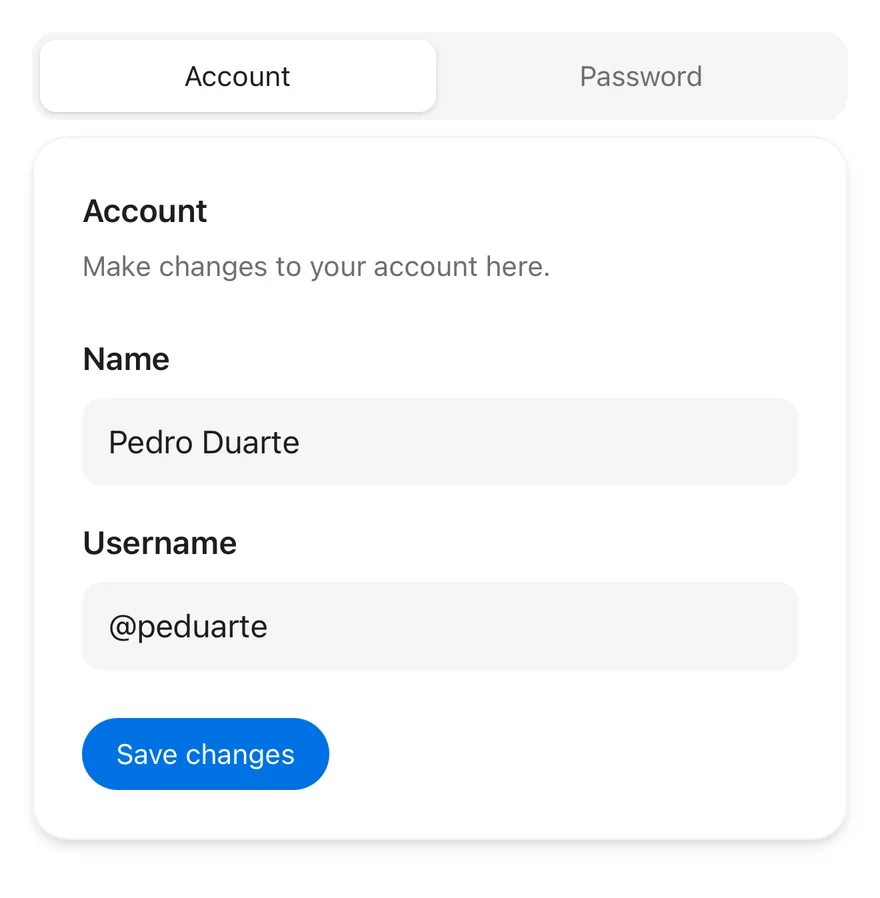
`Tabs` groups a `TabsList` of `TabsTrigger` buttons with matching `TabsContent` panels. The active tab is marked by an indicator that slides between tabs with a Reanimated layout transition.

`TabsList` has two variants: `default`, a segmented control with a raised indicator on a filled track, and `line`, a transparent list with a thin underline. Both work in horizontal and vertical orientation.

## Installation

**React Native**

```bash title="Terminal"
npx shadcn@latest add @esuiss-rn/tabs
```

See [Installation](https://ui.suiss.app/docs/installation) for the `components.json` setup. Or use the suiss/ui CLI:

```bash title="Terminal"
npx @esuiss/ui@latest add tabs
```

**SwiftUI**

```bash title="Terminal"
npx @esuiss/ui@latest add tabs --platform swift
```

**Jetpack Compose**

```bash title="Terminal"
npx @esuiss/ui@latest add tabs --platform kotlin
```

The CLI also adds what it builds on: [Text](https://ui.suiss.app/docs/components/text).

### Manual

**React Native**

**Uniwind**

1. Install the dependencies:

```bash title="Terminal"
npx expo install class-variance-authority cn react-native-reanimated react-native-worklets
```

2. Add the pieces it builds on: [Text](https://ui.suiss.app/docs/components/text), and the primitives `components/primitives/tabs.tsx`, `components/primitives/use-render.tsx`.

3. Copy the source into `components/ui/tabs.tsx`:

```tsx title="uniwind/components/ui/tabs.tsx"
import { cva, type VariantProps } from "class-variance-authority"
import { cn } from "cn"
import * as React from "react"
import Animated, {
  Easing,
  LinearTransition,
  ReduceMotion,
} from "react-native-reanimated"
import * as TabsPrimitive from "@/components/primitives/tabs"
import { resolveClassName } from "@/components/primitives/use-render"
import { TextClassContext } from "@/components/ui/text"

type TabsListVariant = NonNullable<
  VariantProps<typeof tabsListVariants>["variant"]
>

const TabsListContext = React.createContext<TabsListVariant>("default")

const INDICATOR_TRANSITION = LinearTransition.duration(300)
  .easing(Easing.bezier(0.32, 0.72, 0, 1))
  .reduceMotion(ReduceMotion.System)

function Tabs({
  className,
  ...props
}: React.ComponentProps<typeof TabsPrimitive.Root>) {
  return (
    <TabsPrimitive.Root
      className={(state) =>
        cn(
          "gap-2",
          state.orientation === "vertical" ? "flex-row" : "flex-col",
          resolveClassName(className, state)
        )
      }
      {...props}
    />
  )
}

const tabsListVariants = cva(
  "relative shrink-0 flex-row items-center justify-center gap-1 self-start",
  {
    variants: {
      variant: {
        default: "rounded-xl bg-secondary p-1",
        line: "bg-transparent p-0.5",
      },
    },
    defaultVariants: {
      variant: "default",
    },
  }
)

function TabsIndicator({ variant }: { variant: TabsListVariant }) {
  return (
    <TabsPrimitive.Indicator
      className={cn(
        variant === "line"
          ? "bg-foreground"
          : "rounded-md bg-card shadow-sm dark:bg-border"
      )}
      style={(state) => {
        if (variant !== "line") return undefined
        const position = state.activeTabPosition
        const size = state.activeTabSize
        if (!position || !size) return undefined
        return state.orientation === "vertical"
          ? { left: position.left + size.width + 2, width: 2 }
          : { top: position.top + size.height + 3, height: 2 }
      }}
      render={<Animated.View layout={INDICATOR_TRANSITION} />}
    />
  )
}

function TabsList({
  className,
  variant = "default",
  children,
  ...props
}: React.ComponentProps<typeof TabsPrimitive.List> &
  VariantProps<typeof tabsListVariants>) {
  const resolved = variant ?? "default"
  return (
    <TabsListContext.Provider value={resolved}>
      <TabsPrimitive.List
        className={(state) =>
          cn(
            tabsListVariants({ variant: resolved }),
            state.orientation === "vertical" && "flex-col items-stretch",
            state.orientation !== "vertical" &&
              resolved === "line" &&
              "h-10.25 pb-1.75",
            state.orientation !== "vertical" && resolved !== "line" && "h-11",
            resolveClassName(className, state)
          )
        }
        {...props}
      >
        <TabsIndicator variant={resolved} />
        {children}
      </TabsPrimitive.List>
    </TabsListContext.Provider>
  )
}

function TabsTrigger({
  className,
  disabled,
  ...props
}: React.ComponentProps<typeof TabsPrimitive.Tab>) {
  const { value, orientation } = TabsPrimitive.useRootContext()
  const active = value === props.value
  return (
    <TextClassContext.Provider
      value={cn(
        "text-sm",
        disabled && "opacity-50",
        !disabled && active && "text-foreground",
        !(disabled || active) && "text-muted-foreground"
      )}
    >
      <TabsPrimitive.Tab
        disabled={disabled}
        className={(state) =>
          cn(
            "flex-row items-center justify-center gap-2 rounded-md px-3 py-1",
            orientation === "vertical"
              ? "h-9 w-full justify-start"
              : "h-full flex-1",
            resolveClassName(className, state)
          )
        }
        {...props}
      />
    </TextClassContext.Provider>
  )
}

function TabsContent({
  className,
  ...props
}: React.ComponentProps<typeof TabsPrimitive.Panel>) {
  return (
    <TabsPrimitive.Panel
      className={(state) => cn("grow", resolveClassName(className, state))}
      {...props}
    />
  )
}

export { Tabs, TabsContent, TabsList, TabsTrigger, tabsListVariants }
```

4. Update the import paths to match your project.

**NativeWind**

1. Install the dependencies:

```bash title="Terminal"
npx expo install class-variance-authority cn react-native-reanimated react-native-worklets
```

2. Add the pieces it builds on: [Text](https://ui.suiss.app/docs/components/text), and the primitives `components/primitives/tabs.tsx`, `components/primitives/use-render.tsx`.

3. Copy the source into `components/ui/tabs.tsx`:

```tsx title="nativewind/components/ui/tabs.tsx"
import { cva, type VariantProps } from "class-variance-authority"
import { cn } from "cn"
import * as React from "react"
import Animated, {
  Easing,
  LinearTransition,
  ReduceMotion,
} from "react-native-reanimated"
import * as TabsPrimitive from "@/components/primitives/tabs"
import { resolveClassName } from "@/components/primitives/use-render"
import { TextClassContext } from "@/components/ui/text"

type TabsListVariant = NonNullable<
  VariantProps<typeof tabsListVariants>["variant"]
>

const TabsListContext = React.createContext<TabsListVariant>("default")

const INDICATOR_TRANSITION = LinearTransition.duration(300)
  .easing(Easing.bezier(0.32, 0.72, 0, 1))
  .reduceMotion(ReduceMotion.System)

function Tabs({
  className,
  ...props
}: React.ComponentProps<typeof TabsPrimitive.Root>) {
  return (
    <TabsPrimitive.Root
      className={(state) =>
        cn(
          "gap-2",
          state.orientation === "vertical" ? "flex-row" : "flex-col",
          resolveClassName(className, state)
        )
      }
      {...props}
    />
  )
}

const tabsListVariants = cva(
  "relative shrink-0 flex-row items-center justify-center gap-1 self-start",
  {
    variants: {
      variant: {
        default: "rounded-xl bg-secondary p-1",
        line: "bg-transparent p-0.5",
      },
    },
    defaultVariants: {
      variant: "default",
    },
  }
)

function TabsIndicator({ variant }: { variant: TabsListVariant }) {
  return (
    <TabsPrimitive.Indicator
      className={cn(
        variant === "line"
          ? "bg-foreground"
          : "rounded-md bg-card shadow dark:bg-border"
      )}
      style={(state) => {
        if (variant !== "line") return undefined
        const position = state.activeTabPosition
        const size = state.activeTabSize
        if (!position || !size) return undefined
        return state.orientation === "vertical"
          ? { left: position.left + size.width + 2, width: 2 }
          : { top: position.top + size.height + 3, height: 2 }
      }}
      render={<Animated.View layout={INDICATOR_TRANSITION} />}
    />
  )
}

function TabsList({
  className,
  variant = "default",
  children,
  ...props
}: React.ComponentProps<typeof TabsPrimitive.List> &
  VariantProps<typeof tabsListVariants>) {
  const resolved = variant ?? "default"
  return (
    <TabsListContext.Provider value={resolved}>
      <TabsPrimitive.List
        className={(state) =>
          cn(
            tabsListVariants({ variant: resolved }),
            state.orientation === "vertical" && "flex-col items-stretch",
            state.orientation !== "vertical" &&
              resolved === "line" &&
              "h-[2.5625rem] pb-[0.4375rem]",
            state.orientation !== "vertical" && resolved !== "line" && "h-11",
            resolveClassName(className, state)
          )
        }
        {...props}
      >
        <TabsIndicator variant={resolved} />
        {children}
      </TabsPrimitive.List>
    </TabsListContext.Provider>
  )
}

function TabsTrigger({
  className,
  disabled,
  ...props
}: React.ComponentProps<typeof TabsPrimitive.Tab>) {
  const { value, orientation } = TabsPrimitive.useRootContext()
  const active = value === props.value
  return (
    <TextClassContext.Provider
      value={cn(
        "text-sm",
        disabled && "opacity-50",
        !disabled && active && "text-foreground",
        !(disabled || active) && "text-muted-foreground"
      )}
    >
      <TabsPrimitive.Tab
        disabled={disabled}
        className={(state) =>
          cn(
            "flex-row items-center justify-center gap-2 rounded-md px-3 py-1",
            orientation === "vertical"
              ? "h-9 w-full justify-start"
              : "h-full flex-1",
            resolveClassName(className, state)
          )
        }
        {...props}
      />
    </TextClassContext.Provider>
  )
}

function TabsContent({
  className,
  ...props
}: React.ComponentProps<typeof TabsPrimitive.Panel>) {
  return (
    <TabsPrimitive.Panel
      className={(state) => cn("grow", resolveClassName(className, state))}
      {...props}
    />
  )
}

export { Tabs, TabsContent, TabsList, TabsTrigger, tabsListVariants }
```

4. Update the import paths to match your project.

**StyleSheet**

1. Install the dependencies:

```bash title="Terminal"
npx expo install react-native-reanimated react-native-worklets
```

2. Add the pieces it builds on: [Text](https://ui.suiss.app/docs/components/text), and the primitives `components/primitives/tabs.tsx`, `components/primitives/use-render.tsx`.

3. Copy the source into `components/ui/tabs.tsx`:

```tsx title="stylesheet/components/ui/tabs.tsx"
import * as React from "react"
import { StyleSheet } from "react-native"
import Animated, {
  Easing,
  LinearTransition,
  ReduceMotion,
} from "react-native-reanimated"
import * as TabsPrimitive from "@/components/primitives/tabs"
import { TextStyleContext } from "@/components/ui/text"
import { fontSize, radius, shadow, useTheme } from "@/components/ui/theme"

type TabsListVariant = "default" | "line"

const TabsListContext = React.createContext<TabsListVariant>("default")

const INDICATOR_TRANSITION = LinearTransition.duration(300)
  .easing(Easing.bezier(0.32, 0.72, 0, 1))
  .reduceMotion(ReduceMotion.System)

const styles = StyleSheet.create({
  root: { gap: 8 },
  rootHorizontal: { flexDirection: "column" },
  rootVertical: { flexDirection: "row" },
  list: {
    position: "relative",
    flexShrink: 0,
    flexDirection: "row",
    alignItems: "center",
    justifyContent: "center",
    alignSelf: "flex-start",
    gap: 4,
  },
  listDefault: { borderRadius: radius.xl, padding: 4, height: 44 },
  listLine: { padding: 2, height: 41, paddingBottom: 7 },
  listVertical: {
    height: "auto",
    flexDirection: "column",
    alignItems: "stretch",
  },
  indicatorDefault: { borderRadius: radius.md, ...shadow.sm },
  trigger: {
    flexDirection: "row",
    alignItems: "center",
    justifyContent: "center",
    gap: 8,
    borderRadius: radius.md,
    paddingHorizontal: 12,
    paddingVertical: 4,
  },
  triggerHorizontal: { height: "100%", flexGrow: 1, flexShrink: 1 },
  triggerVertical: { height: 36, width: "100%", justifyContent: "flex-start" },
  content: { flexGrow: 1 },
})

function Tabs({
  style,
  ...props
}: React.ComponentProps<typeof TabsPrimitive.Root>) {
  return (
    <TabsPrimitive.Root
      style={(state) => [
        styles.root,
        state.orientation === "vertical"
          ? styles.rootVertical
          : styles.rootHorizontal,
        typeof style === "function" ? style(state) : style,
      ]}
      {...props}
    />
  )
}

function TabsIndicator({ variant }: { variant: TabsListVariant }) {
  const { colors, isDark } = useTheme()
  return (
    <TabsPrimitive.Indicator
      style={(state) => {
        if (variant !== "line") {
          return [
            styles.indicatorDefault,
            {
              backgroundColor: isDark ? colors.border : colors.card,
            },
          ]
        }
        const position = state.activeTabPosition
        const size = state.activeTabSize
        if (!position || !size) return { backgroundColor: colors.foreground }
        return [
          { backgroundColor: colors.foreground },
          state.orientation === "vertical"
            ? { left: position.left + size.width + 2, width: 2 }
            : { top: position.top + size.height + 3, height: 2 },
        ]
      }}
      render={<Animated.View layout={INDICATOR_TRANSITION} />}
    />
  )
}

function TabsList({
  style,
  variant = "default",
  children,
  ...props
}: React.ComponentProps<typeof TabsPrimitive.List> & {
  variant?: TabsListVariant
}) {
  const { colors } = useTheme()
  return (
    <TabsListContext.Provider value={variant}>
      <TabsPrimitive.List
        style={(state) => [
          styles.list,
          variant === "line"
            ? styles.listLine
            : [styles.listDefault, { backgroundColor: colors.secondary }],
          state.orientation === "vertical" && styles.listVertical,
          typeof style === "function" ? style(state) : style,
        ]}
        {...props}
      >
        <TabsIndicator variant={variant} />
        {children}
      </TabsPrimitive.List>
    </TabsListContext.Provider>
  )
}

function TabsTrigger({
  style,
  disabled,
  ...props
}: React.ComponentProps<typeof TabsPrimitive.Tab>) {
  const { value, orientation } = TabsPrimitive.useRootContext()
  const { colors } = useTheme()
  const active = value === props.value
  const color = active ? colors.foreground : colors.mutedForeground
  return (
    <TextStyleContext.Provider
      value={{
        ...fontSize.sm,
        color,
      }}
    >
      <TabsPrimitive.Tab
        disabled={disabled}
        style={(state) => [
          styles.trigger,
          orientation === "vertical"
            ? styles.triggerVertical
            : styles.triggerHorizontal,
          disabled && { opacity: 0.5 },
          typeof style === "function" ? style(state) : style,
        ]}
        {...props}
      />
    </TextStyleContext.Provider>
  )
}

function TabsContent({
  style,
  ...props
}: React.ComponentProps<typeof TabsPrimitive.Panel>) {
  return (
    <TabsPrimitive.Panel
      style={(state) => [
        styles.content,
        typeof style === "function" ? style(state) : style,
      ]}
      {...props}
    />
  )
}

export type { TabsListVariant }
export { Tabs, TabsContent, TabsList, TabsTrigger }
```

4. Update the import paths to match your project.

**SwiftUI**

1. Target iOS 17 or later.

2. Add the Swift package to your app:

```swift title="Package.swift"
.package(url: "https://github.com/phosphor-icons/swift", from: "2.1.0")
```

3. Copy the theme files every view uses:

- `swift/Theme/Theme.swift`: [source](https://github.com/e-suiss/ui/blob/main/packages/mobile/swiftui/Sources/EsuissUI/Theme/Theme.swift)

- `swift/Theme/Tokens.swift`: [source](https://github.com/e-suiss/ui/blob/main/packages/mobile/swiftui/Sources/EsuissUI/Theme/Tokens.swift)

4. Copy the source and every file it uses:

```swift title="swift/Components/Tabs.swift"
import SwiftUI

public struct Tabs<Content: View>: View {
  let selection: Binding<AnyHashable>
  let orientation: Axis
  let content: Content

  @Environment(\.accessibilityReduceMotion) private var reduceMotion

  public init<Value: Hashable & Sendable>(
    selection: Binding<Value>,
    orientation: Axis = .horizontal,
    @ViewBuilder content: () -> Content
  ) {
    self.selection = Binding(
      get: { AnyHashable(selection.wrappedValue) },
      set: { value in
        if let value = value.base as? Value {
          selection.wrappedValue = value
        }
      }
    )
    self.orientation = orientation
    self.content = content()
  }

  public var body: some View {
    let binding = selection
    let animation: Animation? = reduceMotion ? nil : .timingCurve(0.32, 0.72, 0, 1, duration: 0.3)
    let context = TabsContext(
      selected: binding.wrappedValue,
      orientation: orientation,
      select: { value in
        withAnimation(animation) { binding.wrappedValue = value }
      }
    )
    Group {
      if orientation == .vertical {
        HStack(alignment: .top, spacing: 8) { content }
      } else {
        VStack(alignment: .leading, spacing: 8) { content }
      }
    }
    .environment(\.tabs, context)
  }
}

struct TabsContext: @unchecked Sendable {
  var selected: AnyHashable?
  var orientation: Axis = .horizontal
  var select: @MainActor @Sendable (AnyHashable) -> Void = { _ in }
}

extension EnvironmentValues {
  @Entry var tabs = TabsContext()
  @Entry var tabsListVariant: TabsListVariant = .default
  @Entry var tabsIndicator: Namespace.ID? = nil
}

public enum TabsListVariant: CaseIterable, Sendable {
  case `default`, line
}

public struct TabsList<Content: View>: View {
  public typealias Variant = TabsListVariant

  let variant: Variant
  let content: Content

  @Namespace private var namespace
  @Environment(\.tabs) private var tabs

  public init(variant: Variant = .default, @ViewBuilder content: () -> Content) {
    self.variant = variant
    self.content = content()
  }

  public var body: some View {
    let vertical = tabs.orientation == .vertical
    Group {
      if vertical {
        VStack(alignment: .leading, spacing: 4) { content }
          .fixedSize(horizontal: true, vertical: false)
      } else {
        HStack(spacing: 4) { content }
          .frame(height: variant == .line ? 32 : 36)
      }
    }
    .padding(variant == .line ? 2 : 4)
    .padding(variant == .line && !vertical ? .bottom : [], 5)
    .padding(variant == .line && vertical ? .trailing : [], 5)
    .background {
      if variant == .default {
        RoundedRectangle(cornerRadius: Radius.xl, style: .continuous).fill(EsuissColor.secondary)
      }
    }
    .environment(\.tabsListVariant, variant)
    .environment(\.tabsIndicator, namespace)
    .accessibilityElement(children: .contain)
  }
}

public struct TabsTrigger<Label: View>: View {
  let value: AnyHashable
  let label: Label

  @Environment(\.tabs) private var tabs
  @Environment(\.tabsListVariant) private var variant
  @Environment(\.tabsIndicator) private var namespace
  @Environment(\.isEnabled) private var isEnabled
  @Environment(\.colorScheme) private var colorScheme

  public init<Value: Hashable & Sendable>(value: Value, @ViewBuilder label: () -> Label) {
    self.value = AnyHashable(value)
    self.label = label()
  }

  public var body: some View {
    let active = tabs.selected == value
    let vertical = tabs.orientation == .vertical
    Button {
      tabs.select(value)
    } label: {
      label
        .labelStyle(ButtonLabelStyle(spacing: 8, iconSize: 16))
        .scaledFont(TextStyle.sm)
        .lineLimit(1)
        .foregroundStyle(active ? EsuissColor.foreground : EsuissColor.mutedForeground)
        .opacity(isEnabled ? 1 : 0.5)
        .padding(.horizontal, 12)
        .padding(.vertical, 4)
        .frame(maxWidth: vertical ? .infinity : nil, alignment: vertical ? .leading : .center)
        .frame(height: vertical ? 36 : nil)
        .frame(maxHeight: vertical ? nil : .infinity)
        .contentShape(Rectangle())
    }
    .buttonStyle(TabsTriggerStyle())
    .background(alignment: vertical ? .trailing : .bottom) {
      if active, let namespace {
        indicator
          .matchedGeometryEffect(id: "indicator", in: namespace)
      }
    }
    .accessibilityAddTraits(active ? .isSelected : [])
  }

  @ViewBuilder private var indicator: some View {
    let vertical = tabs.orientation == .vertical
    if variant == .line {
      Rectangle()
        .fill(EsuissColor.foreground)
        .frame(width: vertical ? 2 : nil, height: vertical ? nil : 2)
        .offset(x: vertical ? 4 : 0, y: vertical ? 0 : 5)
    } else {
      RoundedRectangle(cornerRadius: Radius.md, style: .continuous)
        .fill(colorScheme == .dark ? EsuissColor.border : EsuissColor.card)
        .shadow(color: .black.opacity(colorScheme == .dark ? 0 : 0.08), radius: 1.5, y: 1)
    }
  }
}

extension TabsTrigger where Label == Text {
  public init<Value: Hashable & Sendable>(_ title: LocalizedStringKey, value: Value) {
    self.init(value: value) { Text(title) }
  }
}

private struct TabsTriggerStyle: ButtonStyle {
  func makeBody(configuration: Configuration) -> some View {
    configuration.label
      .opacity(configuration.isPressed ? 0.8 : 1)
  }
}

public struct TabsContent<Content: View>: View {
  let value: AnyHashable
  let content: Content

  @Environment(\.tabs) private var tabs

  public init<Value: Hashable & Sendable>(value: Value, @ViewBuilder content: () -> Content) {
    self.value = AnyHashable(value)
    self.content = content()
  }

  public var body: some View {
    if tabs.selected == value {
      content
        .frame(maxWidth: .infinity, alignment: .topLeading)
    }
  }
}
```

- `swift/Components/Button.swift`: see [Button](https://ui.suiss.app/docs/components/button.md)

- `swift/Components/ButtonGroup.swift`: see [Button Group](https://ui.suiss.app/docs/components/button-group.md)

- `swift/Components/DropdownMenu.swift`: see [Dropdown Menu](https://ui.suiss.app/docs/components/dropdown-menu.md)

- `swift/Components/Field.swift`: see [Field](https://ui.suiss.app/docs/components/field.md)

- `swift/Components/Overlay.swift`: [source](https://github.com/e-suiss/ui/blob/main/packages/mobile/swiftui/Sources/EsuissUI/Components/Overlay.swift)

- `swift/Components/Select.swift`: see [Select](https://ui.suiss.app/docs/components/select.md)

- `swift/Components/Separator.swift`: see [Separator](https://ui.suiss.app/docs/components/separator.md)

- `swift/Components/TextVariant.swift`: [source](https://github.com/e-suiss/ui/blob/main/packages/mobile/swiftui/Sources/EsuissUI/Components/TextVariant.swift)

5. Add the files to your app target.

**Jetpack Compose**

1. Set `minSdk` to 24 or higher and add the dependencies:

```kotlin title="build.gradle.kts"
implementation(platform("androidx.compose:compose-bom:2026.09.00"))
implementation("androidx.compose.foundation:foundation")
implementation("androidx.compose.ui:ui")
```

2. Copy the theme files every view uses:

- `kotlin/theme/Theme.kt`: [source](https://github.com/e-suiss/ui/blob/main/packages/mobile/kotlin/ui/src/main/kotlin/com/esuiss/ui/theme/Theme.kt)

- `kotlin/theme/Tokens.kt`: [source](https://github.com/e-suiss/ui/blob/main/packages/mobile/kotlin/ui/src/main/kotlin/com/esuiss/ui/theme/Tokens.kt)

3. Copy the source and every file it uses:

```kt title="kotlin/components/Tabs.kt"
package com.esuiss.ui.components

import androidx.compose.animation.core.Animatable
import androidx.compose.animation.core.CubicBezierEasing
import androidx.compose.animation.core.tween
import androidx.compose.foundation.background
import androidx.compose.foundation.interaction.MutableInteractionSource
import androidx.compose.foundation.layout.Arrangement
import androidx.compose.foundation.layout.Box
import androidx.compose.foundation.layout.Column
import androidx.compose.foundation.layout.ColumnScope
import androidx.compose.foundation.layout.IntrinsicSize
import androidx.compose.foundation.layout.Row
import androidx.compose.foundation.layout.RowScope
import androidx.compose.foundation.layout.fillMaxHeight
import androidx.compose.foundation.layout.fillMaxWidth
import androidx.compose.foundation.layout.height
import androidx.compose.foundation.layout.offset
import androidx.compose.foundation.layout.padding
import androidx.compose.foundation.layout.size
import androidx.compose.foundation.layout.width
import androidx.compose.foundation.selection.selectable
import androidx.compose.foundation.selection.selectableGroup
import androidx.compose.foundation.shape.RoundedCornerShape
import androidx.compose.foundation.text.BasicText
import androidx.compose.runtime.Composable
import androidx.compose.runtime.CompositionLocalProvider
import androidx.compose.runtime.LaunchedEffect
import androidx.compose.runtime.Stable
import androidx.compose.runtime.getValue
import androidx.compose.runtime.mutableStateMapOf
import androidx.compose.runtime.mutableStateOf
import androidx.compose.runtime.remember
import androidx.compose.runtime.setValue
import androidx.compose.runtime.staticCompositionLocalOf
import androidx.compose.ui.Alignment
import androidx.compose.ui.Modifier
import androidx.compose.ui.draw.alpha
import androidx.compose.ui.geometry.Rect
import androidx.compose.ui.layout.boundsInParent
import androidx.compose.ui.layout.onPlaced
import androidx.compose.ui.platform.LocalDensity
import androidx.compose.ui.semantics.Role
import androidx.compose.ui.unit.IntOffset
import androidx.compose.ui.unit.dp
import com.esuiss.ui.theme.EsuissTheme
import com.esuiss.ui.theme.Radius
import com.esuiss.ui.theme.Shadows
import com.esuiss.ui.theme.Typography
import com.esuiss.ui.theme.shadow
import kotlin.math.roundToInt
import kotlinx.coroutines.launch

enum class TabsListVariant { Default, Line }

private val IndicatorEasing = CubicBezierEasing(0.32f, 0.72f, 0f, 1f)

@Stable
private class TabsState(selected: String, onSelectedChange: (String) -> Unit) {
    var selected by mutableStateOf(selected)
    var onSelectedChange by mutableStateOf(onSelectedChange)
    val bounds = mutableStateMapOf<String, Rect>()
}

private val LocalTabs = staticCompositionLocalOf<TabsState?> { null }

private val LocalTabsVariant = staticCompositionLocalOf { TabsListVariant.Default }

@Composable
fun Tabs(
    selected: String,
    onSelectedChange: (String) -> Unit,
    modifier: Modifier = Modifier,
    content: @Composable ColumnScope.() -> Unit,
) {
    val state = remember { TabsState(selected, onSelectedChange) }
    state.selected = selected
    state.onSelectedChange = onSelectedChange
    CompositionLocalProvider(LocalTabs provides state) {
        Column(modifier = modifier, verticalArrangement = Arrangement.spacedBy(8.dp), content = content)
    }
}

@Composable
fun TabsList(
    modifier: Modifier = Modifier,
    variant: TabsListVariant = TabsListVariant.Default,
    content: @Composable RowScope.() -> Unit,
) {
    val state = LocalTabs.current ?: error("TabsList must be used within Tabs.")
    val colors = EsuissTheme.colors
    val line = variant == TabsListVariant.Line
    val listShape = RoundedCornerShape(Radius.xl)
    Box(
        modifier = modifier
            .width(IntrinsicSize.Max)
            .height(if (line) 41.dp else 44.dp)
            .then(if (line) Modifier else Modifier.background(colors.secondary, listShape))
            .padding(if (line) 2.dp else 4.dp)
            .then(if (line) Modifier.padding(bottom = 5.dp) else Modifier),
    ) {
        TabsIndicator(state, variant)
        CompositionLocalProvider(LocalTabsVariant provides variant) {
            Row(
                modifier = Modifier.fillMaxWidth().fillMaxHeight().selectableGroup(),
                horizontalArrangement = Arrangement.spacedBy(4.dp),
                verticalAlignment = Alignment.CenterVertically,
                content = content,
            )
        }
    }
}

@Composable
private fun TabsIndicator(state: TabsState, variant: TabsListVariant) {
    val colors = EsuissTheme.colors
    val density = LocalDensity.current
    val target = state.bounds[state.selected] ?: return
    val left = remember { Animatable(target.left) }
    val width = remember { Animatable(target.width) }
    LaunchedEffect(target) {
        val spec = tween<Float>(300, easing = IndicatorEasing)
        launch { left.animateTo(target.left, spec) }
        launch { width.animateTo(target.width, spec) }
    }
    val shape = RoundedCornerShape(Radius.md)
    if (variant == TabsListVariant.Line) {
        Box(
            modifier = Modifier
                .offset { IntOffset(left.value.roundToInt(), (target.bottom + with(density) { 3.dp.toPx() }).roundToInt()) }
                .size(with(density) { width.value.toDp() }, 2.dp)
                .background(colors.foreground),
        )
    } else {
        Box(
            modifier = Modifier
                .offset { IntOffset(left.value.roundToInt(), target.top.roundToInt()) }
                .size(with(density) { width.value.toDp() }, with(density) { target.height.toDp() })
                .shadow(Shadows.md, shape)
                .background(if (colors.isDark) colors.border else colors.card, shape),
        )
    }
}

@Composable
fun RowScope.TabsTrigger(
    value: String,
    text: String,
    modifier: Modifier = Modifier,
    enabled: Boolean = true,
) {
    TabsTrigger(value, modifier, enabled) {
        BasicText(text, style = LocalContentStyle.current, maxLines = 1)
    }
}

@Composable
fun RowScope.TabsTrigger(
    value: String,
    modifier: Modifier = Modifier,
    enabled: Boolean = true,
    content: @Composable RowScope.() -> Unit,
) {
    val state = LocalTabs.current ?: error("TabsTrigger must be used within Tabs.")
    val colors = EsuissTheme.colors
    val active = state.selected == value
    val foreground = if (active) colors.foreground else colors.mutedForeground
    Row(
        modifier = modifier
            .weight(1f)
            .fillMaxHeight()
            .alpha(if (enabled) 1f else 0.5f)
            .onPlaced { state.bounds[value] = it.boundsInParent() }
            .selectable(
                selected = active,
                enabled = enabled,
                role = Role.Tab,
                interactionSource = remember { MutableInteractionSource() },
                indication = null,
                onClick = { state.onSelectedChange(value) },
            )
            .padding(horizontal = 12.dp, vertical = 4.dp),
        horizontalArrangement = Arrangement.spacedBy(8.dp, Alignment.CenterHorizontally),
        verticalAlignment = Alignment.CenterVertically,
    ) {
        CompositionLocalProvider(
            LocalContentStyle provides Typography.sm.copy(color = foreground),
            LocalContentColor provides foreground,
            LocalIconSize provides 16.dp,
        ) {
            content()
        }
    }
}

@Composable
fun TabsContent(
    value: String,
    modifier: Modifier = Modifier,
    content: @Composable ColumnScope.() -> Unit,
) {
    val state = LocalTabs.current ?: error("TabsContent must be used within Tabs.")
    if (state.selected != value) return
    Column(modifier = modifier, content = content)
}
```

- `kotlin/components/Content.kt`: [source](https://github.com/e-suiss/ui/blob/main/packages/mobile/kotlin/ui/src/main/kotlin/com/esuiss/ui/components/Content.kt)

4. Update the `com.esuiss.ui` package names to match your project.

## Usage

```tsx
import { Tabs, TabsList, TabsTrigger, TabsContent } from "@/components/ui/tabs"
```

```tsx
<TabsDemo />
```

Give each `TabsTrigger` and its `TabsContent` the same `value`. Use `defaultValue` for an uncontrolled tab set, or `value` with `onValueChange` to control it.

Set `orientation="vertical"` on `Tabs` to stack the list beside the panels. Put an `Icon` next to the `Text` in a trigger for icon tabs.

Inactive panels are unmounted unless you set `keepMounted` on `TabsContent`. `tabsListVariants` is exported for reuse.

## Examples

### With icons

Tabs with an icon beside each label.

![Preview](https://ui.suiss.app/previews/components-tabs--with-icons.light.webp)

```tsx
import { GearIcon, UserIcon } from "phosphor-react-native"
import * as React from "react"
import { Icon } from "@/components/ui/icon"
import { Tabs, TabsContent, TabsList, TabsTrigger } from "@/components/ui/tabs"
import { Text } from "@/components/ui/text"

type ListVariant = "default" | "line"

function WithIconsDemo({ variant }: { variant?: ListVariant }) {
  const [value, setValue] = React.useState("profile")
  return (
    <Tabs value={value} onValueChange={setValue}>
      <TabsList variant={variant}>
        <TabsTrigger value="profile">
          <Icon as={UserIcon} className="size-4" />
          <Text>Profile</Text>
        </TabsTrigger>
        <TabsTrigger value="settings">
          <Icon as={GearIcon} className="size-4" />
          <Text>Settings</Text>
        </TabsTrigger>
      </TabsList>
      <TabsContent value="profile">
        <Text className="text-sm text-muted-foreground">
          Your public profile information.
        </Text>
      </TabsContent>
      <TabsContent value="settings">
        <Text className="text-sm text-muted-foreground">
          Manage your preferences.
        </Text>
      </TabsContent>
    </Tabs>
  )
}

export function TabsWithIconsExample() {
  return (
    <WithIconsDemo />
  )
}
```

```swift
import EsuissUI
import PhosphorSwift
import SwiftUI

struct TabsPanelText: View {
  let text: LocalizedStringKey

  var body: some View {
    Text(text)
      .textStyle(.sm)
      .foregroundStyle(EsuissColor.mutedForeground)
  }
}

struct TabsWithIconsDemo: View {
  var variant: TabsListVariant = .default

  @State private var value = "profile"

  var body: some View {
    Tabs(selection: $value) {
      TabsList(variant: variant) {
        TabsTrigger(value: "profile") {
          Label {
            Text("Profile")
          } icon: {
            Ph.user.regular
          }
        }
        TabsTrigger(value: "settings") {
          Label {
            Text("Settings")
          } icon: {
            Ph.gear.regular
          }
        }
      }
      TabsContent(value: "profile") {
        TabsPanelText(text: "Your public profile information.")
      }
      TabsContent(value: "settings") {
        TabsPanelText(text: "Manage your preferences.")
      }
    }
    .frame(maxWidth: .infinity)
  }
}
```

```kotlin
import androidx.compose.runtime.Composable
import androidx.compose.runtime.getValue
import androidx.compose.runtime.mutableStateOf
import androidx.compose.runtime.saveable.rememberSaveable
import androidx.compose.runtime.setValue
import androidx.compose.ui.semantics.contentDescription
import androidx.compose.ui.unit.dp
import com.adamglin.PhosphorIcons
import com.adamglin.phosphoricons.Regular
import com.adamglin.phosphoricons.regular.Gear
import com.adamglin.phosphoricons.regular.User
import com.esuiss.ui.components.Icon
import com.esuiss.ui.components.Tabs
import com.esuiss.ui.components.TabsContent
import com.esuiss.ui.components.TabsList
import com.esuiss.ui.components.TabsListVariant
import com.esuiss.ui.components.TabsTrigger
import com.esuiss.ui.components.Text
import com.esuiss.ui.theme.EsuissTheme
import com.esuiss.ui.theme.Typography

@Composable
fun TabsWithIconsExample() {
    TabsWithIcons(TabsListVariant.Default)
}

@Composable
fun TabsSecondaryText(text: String) {
    Text(text, style = Typography.sm, color = EsuissTheme.colors.mutedForeground)
}

@Composable
fun TabsWithIcons(variant: TabsListVariant) {
    var value by rememberSaveable { mutableStateOf("profile") }
    Tabs(value, { value = it }) {
        TabsList(variant = variant) {
            TabsTrigger("profile") {
                Icon(PhosphorIcons.Regular.User, contentDescription = null, size = 16.dp)
                Text("Profile")
            }
            TabsTrigger("settings") {
                Icon(PhosphorIcons.Regular.Gear, contentDescription = null, size = 16.dp)
                Text("Settings")
            }
        }
        TabsContent("profile") { TabsSecondaryText("Your public profile information.") }
        TabsContent("settings") { TabsSecondaryText("Manage your preferences.") }
    }
}
```

### Disabled tab

A tab set with one disabled tab.

![Preview](https://ui.suiss.app/previews/components-tabs--disabled-tab.light.webp)

```tsx
import * as React from "react"
import { Tabs, TabsContent, TabsList, TabsTrigger } from "@/components/ui/tabs"
import { Text } from "@/components/ui/text"

type ListVariant = "default" | "line"

function DisabledTabDemo({ variant }: { variant?: ListVariant }) {
  const [value, setValue] = React.useState("overview")
  return (
    <Tabs value={value} onValueChange={setValue}>
      <TabsList variant={variant}>
        <TabsTrigger value="overview">
          <Text>Overview</Text>
        </TabsTrigger>
        <TabsTrigger value="analytics">
          <Text>Analytics</Text>
        </TabsTrigger>
        <TabsTrigger value="reports" disabled>
          <Text>Reports</Text>
        </TabsTrigger>
      </TabsList>
      <TabsContent value="overview">
        <Text className="text-sm text-muted-foreground">
          A summary of your activity.
        </Text>
      </TabsContent>
      <TabsContent value="analytics">
        <Text className="text-sm text-muted-foreground">
          Detailed metrics and trends.
        </Text>
      </TabsContent>
    </Tabs>
  )
}

export function TabsDisabledTabExample() {
  return (
    <DisabledTabDemo />
  )
}
```

```swift
import EsuissUI
import SwiftUI

struct TabsPanelText: View {
  let text: LocalizedStringKey

  var body: some View {
    Text(text)
      .textStyle(.sm)
      .foregroundStyle(EsuissColor.mutedForeground)
  }
}

struct TabsDisabledDemo: View {
  var variant: TabsListVariant = .default

  @State private var value = "overview"

  var body: some View {
    Tabs(selection: $value) {
      TabsList(variant: variant) {
        TabsTrigger("Overview", value: "overview")
        TabsTrigger("Analytics", value: "analytics")
        TabsTrigger("Reports", value: "reports")
          .disabled(true)
      }
      TabsContent(value: "overview") {
        TabsPanelText(text: "A summary of your activity.")
      }
      TabsContent(value: "analytics") {
        TabsPanelText(text: "Detailed metrics and trends.")
      }
    }
    .frame(maxWidth: .infinity)
  }
}
```

```kotlin
import androidx.compose.runtime.Composable
import androidx.compose.runtime.getValue
import androidx.compose.runtime.mutableStateOf
import androidx.compose.runtime.saveable.rememberSaveable
import androidx.compose.runtime.setValue
import com.esuiss.ui.components.Tabs
import com.esuiss.ui.components.TabsContent
import com.esuiss.ui.components.TabsList
import com.esuiss.ui.components.TabsListVariant
import com.esuiss.ui.components.TabsTrigger
import com.esuiss.ui.components.Text
import com.esuiss.ui.theme.EsuissTheme
import com.esuiss.ui.theme.Typography

@Composable
fun TabsDisabledTabExample() {
    TabsDisabledTab(TabsListVariant.Default)
}

@Composable
fun TabsSecondaryText(text: String) {
    Text(text, style = Typography.sm, color = EsuissTheme.colors.mutedForeground)
}

@Composable
fun TabsDisabledTab(variant: TabsListVariant) {
    var value by rememberSaveable { mutableStateOf("overview") }
    Tabs(value, { value = it }) {
        TabsList(variant = variant) {
            TabsTrigger("overview", "Overview")
            TabsTrigger("analytics", "Analytics")
            TabsTrigger("reports", "Reports", enabled = false)
        }
        TabsContent("overview") { TabsSecondaryText("A summary of your activity.") }
        TabsContent("analytics") { TabsSecondaryText("Detailed metrics and trends.") }
    }
}
```

### Line

The `line` variant with an underline indicator.

![Preview](https://ui.suiss.app/previews/components-tabs--line.light.webp)

```tsx
import * as React from "react"
import { Tabs, TabsContent, TabsList, TabsTrigger } from "@/components/ui/tabs"
import { Text } from "@/components/ui/text"

type ListVariant = "default" | "line"

function SectionsDemo({
  variant,
  orientation,
}: {
  variant?: ListVariant
  orientation?: "horizontal" | "vertical"
}) {
  const [value, setValue] = React.useState("overview")
  return (
    <Tabs value={value} onValueChange={setValue} orientation={orientation}>
      <TabsList variant={variant}>
        <TabsTrigger value="overview">
          <Text>Overview</Text>
        </TabsTrigger>
        <TabsTrigger value="analytics">
          <Text>Analytics</Text>
        </TabsTrigger>
        <TabsTrigger value="reports">
          <Text>Reports</Text>
        </TabsTrigger>
      </TabsList>
      <TabsContent value="overview">
        <Text className="text-sm text-muted-foreground">
          A summary of your activity.
        </Text>
      </TabsContent>
      <TabsContent value="analytics">
        <Text className="text-sm text-muted-foreground">
          Detailed metrics and trends.
        </Text>
      </TabsContent>
      <TabsContent value="reports">
        <Text className="text-sm text-muted-foreground">
          Exported reports and schedules.
        </Text>
      </TabsContent>
    </Tabs>
  )
}

export function TabsLineExample() {
  return (
    <SectionsDemo variant="line" />
  )
}
```

```swift
import EsuissUI
import SwiftUI

struct TabsLineExample: View {
  var body: some View {
    TabsSectionsDemo(variant: .line)
  }
}

struct TabsPanelText: View {
  let text: LocalizedStringKey

  var body: some View {
    Text(text)
      .textStyle(.sm)
      .foregroundStyle(EsuissColor.mutedForeground)
  }
}

struct TabsSectionsDemo: View {
  var variant: TabsListVariant = .default
  var orientation: Axis = .horizontal

  @State private var value = "overview"

  var body: some View {
    Tabs(selection: $value, orientation: orientation) {
      TabsList(variant: variant) {
        TabsTrigger("Overview", value: "overview")
        TabsTrigger("Analytics", value: "analytics")
        TabsTrigger("Reports", value: "reports")
      }
      TabsContent(value: "overview") {
        TabsPanelText(text: "A summary of your activity.")
      }
      TabsContent(value: "analytics") {
        TabsPanelText(text: "Detailed metrics and trends.")
      }
      TabsContent(value: "reports") {
        TabsPanelText(text: "Exported reports and schedules.")
      }
    }
    .frame(maxWidth: .infinity)
  }
}
```

```kotlin
import androidx.compose.runtime.Composable
import androidx.compose.runtime.getValue
import androidx.compose.runtime.mutableStateOf
import androidx.compose.runtime.saveable.rememberSaveable
import androidx.compose.runtime.setValue
import com.esuiss.ui.components.Tabs
import com.esuiss.ui.components.TabsContent
import com.esuiss.ui.components.TabsList
import com.esuiss.ui.components.TabsListVariant
import com.esuiss.ui.components.TabsTrigger
import com.esuiss.ui.components.Text
import com.esuiss.ui.theme.EsuissTheme
import com.esuiss.ui.theme.Typography

@Composable
fun TabsLineExample() {
    TabsSections(TabsListVariant.Line)
}

@Composable
fun TabsSecondaryText(text: String) {
    Text(text, style = Typography.sm, color = EsuissTheme.colors.mutedForeground)
}

@Composable
fun TabsSections(variant: TabsListVariant) {
    var value by rememberSaveable { mutableStateOf("overview") }
    Tabs(value, { value = it }) {
        TabsList(variant = variant) {
            TabsTrigger("overview", "Overview")
            TabsTrigger("analytics", "Analytics")
            TabsTrigger("reports", "Reports")
        }
        TabsContent("overview") { TabsSecondaryText("A summary of your activity.") }
        TabsContent("analytics") { TabsSecondaryText("Detailed metrics and trends.") }
        TabsContent("reports") { TabsSecondaryText("Exported reports and schedules.") }
    }
}
```

**React Native, SwiftUI**

### Vertical

A vertical tab list next to its panels.

![Preview](https://ui.suiss.app/previews/components-tabs--vertical.light.webp)

```tsx
import * as React from "react"
import { Tabs, TabsContent, TabsList, TabsTrigger } from "@/components/ui/tabs"
import { Text } from "@/components/ui/text"

type ListVariant = "default" | "line"

function SectionsDemo({
  variant,
  orientation,
}: {
  variant?: ListVariant
  orientation?: "horizontal" | "vertical"
}) {
  const [value, setValue] = React.useState("overview")
  return (
    <Tabs value={value} onValueChange={setValue} orientation={orientation}>
      <TabsList variant={variant}>
        <TabsTrigger value="overview">
          <Text>Overview</Text>
        </TabsTrigger>
        <TabsTrigger value="analytics">
          <Text>Analytics</Text>
        </TabsTrigger>
        <TabsTrigger value="reports">
          <Text>Reports</Text>
        </TabsTrigger>
      </TabsList>
      <TabsContent value="overview">
        <Text className="text-sm text-muted-foreground">
          A summary of your activity.
        </Text>
      </TabsContent>
      <TabsContent value="analytics">
        <Text className="text-sm text-muted-foreground">
          Detailed metrics and trends.
        </Text>
      </TabsContent>
      <TabsContent value="reports">
        <Text className="text-sm text-muted-foreground">
          Exported reports and schedules.
        </Text>
      </TabsContent>
    </Tabs>
  )
}

export function TabsVerticalExample() {
  return (
    <SectionsDemo orientation="vertical" />
  )
}
```

```swift
import EsuissUI
import SwiftUI

struct TabsVerticalExample: View {
  var body: some View {
    TabsSectionsDemo(orientation: .vertical)
  }
}

struct TabsPanelText: View {
  let text: LocalizedStringKey

  var body: some View {
    Text(text)
      .textStyle(.sm)
      .foregroundStyle(EsuissColor.mutedForeground)
  }
}

struct TabsSectionsDemo: View {
  var variant: TabsListVariant = .default
  var orientation: Axis = .horizontal

  @State private var value = "overview"

  var body: some View {
    Tabs(selection: $value, orientation: orientation) {
      TabsList(variant: variant) {
        TabsTrigger("Overview", value: "overview")
        TabsTrigger("Analytics", value: "analytics")
        TabsTrigger("Reports", value: "reports")
      }
      TabsContent(value: "overview") {
        TabsPanelText(text: "A summary of your activity.")
      }
      TabsContent(value: "analytics") {
        TabsPanelText(text: "Detailed metrics and trends.")
      }
      TabsContent(value: "reports") {
        TabsPanelText(text: "Exported reports and schedules.")
      }
    }
    .frame(maxWidth: .infinity)
  }
}
```

**React Native, SwiftUI**

### Vertical line

A vertical `line` list with a side indicator.

![Preview](https://ui.suiss.app/previews/components-tabs--vertical-line.light.webp)

```tsx
import * as React from "react"
import { Tabs, TabsContent, TabsList, TabsTrigger } from "@/components/ui/tabs"
import { Text } from "@/components/ui/text"

type ListVariant = "default" | "line"

function SectionsDemo({
  variant,
  orientation,
}: {
  variant?: ListVariant
  orientation?: "horizontal" | "vertical"
}) {
  const [value, setValue] = React.useState("overview")
  return (
    <Tabs value={value} onValueChange={setValue} orientation={orientation}>
      <TabsList variant={variant}>
        <TabsTrigger value="overview">
          <Text>Overview</Text>
        </TabsTrigger>
        <TabsTrigger value="analytics">
          <Text>Analytics</Text>
        </TabsTrigger>
        <TabsTrigger value="reports">
          <Text>Reports</Text>
        </TabsTrigger>
      </TabsList>
      <TabsContent value="overview">
        <Text className="text-sm text-muted-foreground">
          A summary of your activity.
        </Text>
      </TabsContent>
      <TabsContent value="analytics">
        <Text className="text-sm text-muted-foreground">
          Detailed metrics and trends.
        </Text>
      </TabsContent>
      <TabsContent value="reports">
        <Text className="text-sm text-muted-foreground">
          Exported reports and schedules.
        </Text>
      </TabsContent>
    </Tabs>
  )
}

export function TabsVerticalLineExample() {
  return (
    <SectionsDemo variant="line" orientation="vertical" />
  )
}
```

```swift
import EsuissUI
import SwiftUI

struct TabsVerticalLineExample: View {
  var body: some View {
    TabsSectionsDemo(variant: .line, orientation: .vertical)
  }
}

struct TabsPanelText: View {
  let text: LocalizedStringKey

  var body: some View {
    Text(text)
      .textStyle(.sm)
      .foregroundStyle(EsuissColor.mutedForeground)
  }
}

struct TabsSectionsDemo: View {
  var variant: TabsListVariant = .default
  var orientation: Axis = .horizontal

  @State private var value = "overview"

  var body: some View {
    Tabs(selection: $value, orientation: orientation) {
      TabsList(variant: variant) {
        TabsTrigger("Overview", value: "overview")
        TabsTrigger("Analytics", value: "analytics")
        TabsTrigger("Reports", value: "reports")
      }
      TabsContent(value: "overview") {
        TabsPanelText(text: "A summary of your activity.")
      }
      TabsContent(value: "analytics") {
        TabsPanelText(text: "Detailed metrics and trends.")
      }
      TabsContent(value: "reports") {
        TabsPanelText(text: "Exported reports and schedules.")
      }
    }
    .frame(maxWidth: .infinity)
  }
}
```

### With icons line

Icon tabs in the `line` variant.

![Preview](https://ui.suiss.app/previews/components-tabs--with-icons-line.light.webp)

```tsx
import { GearIcon, UserIcon } from "phosphor-react-native"
import * as React from "react"
import { Icon } from "@/components/ui/icon"
import { Tabs, TabsContent, TabsList, TabsTrigger } from "@/components/ui/tabs"
import { Text } from "@/components/ui/text"

type ListVariant = "default" | "line"

function WithIconsDemo({ variant }: { variant?: ListVariant }) {
  const [value, setValue] = React.useState("profile")
  return (
    <Tabs value={value} onValueChange={setValue}>
      <TabsList variant={variant}>
        <TabsTrigger value="profile">
          <Icon as={UserIcon} className="size-4" />
          <Text>Profile</Text>
        </TabsTrigger>
        <TabsTrigger value="settings">
          <Icon as={GearIcon} className="size-4" />
          <Text>Settings</Text>
        </TabsTrigger>
      </TabsList>
      <TabsContent value="profile">
        <Text className="text-sm text-muted-foreground">
          Your public profile information.
        </Text>
      </TabsContent>
      <TabsContent value="settings">
        <Text className="text-sm text-muted-foreground">
          Manage your preferences.
        </Text>
      </TabsContent>
    </Tabs>
  )
}

export function TabsWithIconsLineExample() {
  return (
    <WithIconsDemo variant="line" />
  )
}
```

```swift
import EsuissUI
import PhosphorSwift
import SwiftUI

struct TabsWithIconsLineExample: View {
  var body: some View {
    TabsWithIconsDemo(variant: .line)
  }
}

struct TabsPanelText: View {
  let text: LocalizedStringKey

  var body: some View {
    Text(text)
      .textStyle(.sm)
      .foregroundStyle(EsuissColor.mutedForeground)
  }
}

struct TabsWithIconsDemo: View {
  var variant: TabsListVariant = .default

  @State private var value = "profile"

  var body: some View {
    Tabs(selection: $value) {
      TabsList(variant: variant) {
        TabsTrigger(value: "profile") {
          Label {
            Text("Profile")
          } icon: {
            Ph.user.regular
          }
        }
        TabsTrigger(value: "settings") {
          Label {
            Text("Settings")
          } icon: {
            Ph.gear.regular
          }
        }
      }
      TabsContent(value: "profile") {
        TabsPanelText(text: "Your public profile information.")
      }
      TabsContent(value: "settings") {
        TabsPanelText(text: "Manage your preferences.")
      }
    }
    .frame(maxWidth: .infinity)
  }
}
```

```kotlin
import androidx.compose.runtime.Composable
import androidx.compose.runtime.getValue
import androidx.compose.runtime.mutableStateOf
import androidx.compose.runtime.saveable.rememberSaveable
import androidx.compose.runtime.setValue
import androidx.compose.ui.semantics.contentDescription
import androidx.compose.ui.unit.dp
import com.adamglin.PhosphorIcons
import com.adamglin.phosphoricons.Regular
import com.adamglin.phosphoricons.regular.Gear
import com.adamglin.phosphoricons.regular.User
import com.esuiss.ui.components.Icon
import com.esuiss.ui.components.Tabs
import com.esuiss.ui.components.TabsContent
import com.esuiss.ui.components.TabsList
import com.esuiss.ui.components.TabsListVariant
import com.esuiss.ui.components.TabsTrigger
import com.esuiss.ui.components.Text
import com.esuiss.ui.theme.EsuissTheme
import com.esuiss.ui.theme.Typography

@Composable
fun TabsWithIconsLineExample() {
    TabsWithIcons(TabsListVariant.Line)
}

@Composable
fun TabsSecondaryText(text: String) {
    Text(text, style = Typography.sm, color = EsuissTheme.colors.mutedForeground)
}

@Composable
fun TabsWithIcons(variant: TabsListVariant) {
    var value by rememberSaveable { mutableStateOf("profile") }
    Tabs(value, { value = it }) {
        TabsList(variant = variant) {
            TabsTrigger("profile") {
                Icon(PhosphorIcons.Regular.User, contentDescription = null, size = 16.dp)
                Text("Profile")
            }
            TabsTrigger("settings") {
                Icon(PhosphorIcons.Regular.Gear, contentDescription = null, size = 16.dp)
                Text("Settings")
            }
        }
        TabsContent("profile") { TabsSecondaryText("Your public profile information.") }
        TabsContent("settings") { TabsSecondaryText("Manage your preferences.") }
    }
}
```

### Disabled tab line

A disabled tab in the `line` variant.

![Preview](https://ui.suiss.app/previews/components-tabs--disabled-tab-line.light.webp)

```tsx
import * as React from "react"
import { Tabs, TabsContent, TabsList, TabsTrigger } from "@/components/ui/tabs"
import { Text } from "@/components/ui/text"

type ListVariant = "default" | "line"

function DisabledTabDemo({ variant }: { variant?: ListVariant }) {
  const [value, setValue] = React.useState("overview")
  return (
    <Tabs value={value} onValueChange={setValue}>
      <TabsList variant={variant}>
        <TabsTrigger value="overview">
          <Text>Overview</Text>
        </TabsTrigger>
        <TabsTrigger value="analytics">
          <Text>Analytics</Text>
        </TabsTrigger>
        <TabsTrigger value="reports" disabled>
          <Text>Reports</Text>
        </TabsTrigger>
      </TabsList>
      <TabsContent value="overview">
        <Text className="text-sm text-muted-foreground">
          A summary of your activity.
        </Text>
      </TabsContent>
      <TabsContent value="analytics">
        <Text className="text-sm text-muted-foreground">
          Detailed metrics and trends.
        </Text>
      </TabsContent>
    </Tabs>
  )
}

export function TabsDisabledTabLineExample() {
  return (
    <DisabledTabDemo variant="line" />
  )
}
```

```swift
import EsuissUI
import SwiftUI

struct TabsDisabledTabLineExample: View {
  var body: some View {
    TabsDisabledDemo(variant: .line)
  }
}

struct TabsPanelText: View {
  let text: LocalizedStringKey

  var body: some View {
    Text(text)
      .textStyle(.sm)
      .foregroundStyle(EsuissColor.mutedForeground)
  }
}

struct TabsDisabledDemo: View {
  var variant: TabsListVariant = .default

  @State private var value = "overview"

  var body: some View {
    Tabs(selection: $value) {
      TabsList(variant: variant) {
        TabsTrigger("Overview", value: "overview")
        TabsTrigger("Analytics", value: "analytics")
        TabsTrigger("Reports", value: "reports")
          .disabled(true)
      }
      TabsContent(value: "overview") {
        TabsPanelText(text: "A summary of your activity.")
      }
      TabsContent(value: "analytics") {
        TabsPanelText(text: "Detailed metrics and trends.")
      }
    }
    .frame(maxWidth: .infinity)
  }
}
```

```kotlin
import androidx.compose.runtime.Composable
import androidx.compose.runtime.getValue
import androidx.compose.runtime.mutableStateOf
import androidx.compose.runtime.saveable.rememberSaveable
import androidx.compose.runtime.setValue
import com.esuiss.ui.components.Tabs
import com.esuiss.ui.components.TabsContent
import com.esuiss.ui.components.TabsList
import com.esuiss.ui.components.TabsListVariant
import com.esuiss.ui.components.TabsTrigger
import com.esuiss.ui.components.Text
import com.esuiss.ui.theme.EsuissTheme
import com.esuiss.ui.theme.Typography

@Composable
fun TabsDisabledTabLineExample() {
    TabsDisabledTab(TabsListVariant.Line)
}

@Composable
fun TabsSecondaryText(text: String) {
    Text(text, style = Typography.sm, color = EsuissTheme.colors.mutedForeground)
}

@Composable
fun TabsDisabledTab(variant: TabsListVariant) {
    var value by rememberSaveable { mutableStateOf("overview") }
    Tabs(value, { value = it }) {
        TabsList(variant = variant) {
            TabsTrigger("overview", "Overview")
            TabsTrigger("analytics", "Analytics")
            TabsTrigger("reports", "Reports", enabled = false)
        }
        TabsContent("overview") { TabsSecondaryText("A summary of your activity.") }
        TabsContent("analytics") { TabsSecondaryText("Detailed metrics and trends.") }
    }
}
```

## API Reference

### Tabs

Root that holds the active value and orientation.

Also accepts the props of `React.ComponentProps<typeof TabsPrimitive.Root>`.

### TabsList

Row or column of triggers with the animated indicator.

| Prop | Type | Default | Description |
| --- | --- | --- | --- |
| `variant` | `"default" \| "line"` | `"default"` | `default` for a filled segmented track, or `line` for an underline. |

Also accepts the props of `React.ComponentProps<typeof TabsPrimitive.List>`.

### TabsTrigger

Pressable tab that activates its panel.

Also accepts the props of `React.ComponentProps<typeof TabsPrimitive.Tab>`.

### TabsContent

Panel shown when its value is active.

Also accepts the props of `React.ComponentProps<typeof TabsPrimitive.Panel>`.

## Accessibility

- `TabsList` has the `tablist` role and each trigger has the `tab` role.
- Triggers report `selected` and `disabled` in their accessibility state, so VoiceOver and TalkBack announce the current tab.
- Hidden panels kept with `keepMounted` are removed from the accessibility tree.
- The indicator animation follows the system reduce motion setting.

## Notes

- The `default` track uses `bg-secondary` with a `bg-card` indicator (`bg-border` in dark mode); the `line` indicator uses `bg-foreground`.
- Labels use `text-foreground` when active, `text-muted-foreground` when inactive and `opacity-50` when disabled.
- Light and dark colors follow the system appearance.

