{
ref.current = node
if (typeof forwardedRef === "function") return forwardedRef(node)
if (forwardedRef) forwardedRef.current = node
}}
data-slot="tab-bar-list"
inert={open || undefined}
className={cn(
"relative col-start-1 row-start-2 flex min-w-0 gap-1 overflow-hidden rounded-full transition-[opacity,visibility] duration-300 ease-[cubic-bezier(0.32,0.72,0,1)] group-data-open/tab-bar:duration-100 group-data-open/tab-bar:pointer-events-none group-data-open/tab-bar:invisible group-data-open/tab-bar:opacity-0 group-has-[[data-slot=tab-bar-trigger]:not([data-idle])]/tab-bar:me-1 motion-reduce:transition-none",
className
)}
{...props}
>
{items.map((item, index) =>
index < visibleCount
? item
: React.cloneElement(
item as React.ReactElement,
{
"data-overflow": "",
"aria-hidden": true,
tabIndex: -1,
} as object
)
)}
)
}
function TabBarItem({
render,
isActive = false,
className,
...props
}: useRender.ComponentProps<"button"> &
React.ComponentProps<"button"> & {
isActive?: boolean
}) {
const inOverflow = React.useContext(TabBarOverflowContext)
const { setOpen } = useTabBar()
return useRender({
defaultTagName: "button",
props: mergeProps<"button">(
{
type: render ? undefined : "button",
"aria-current": isActive ? "page" : undefined,
onClick: inOverflow ? () => setOpen(false) : undefined,
className: cn(
inOverflow
? cn(tabBarLinkClassName, "text-start")
: cn(
buttonVariants({ variant: "ghost" }),
"shrink-0 font-medium text-muted-foreground transition-[color,background-color] duration-200 data-active:bg-secondary data-active:text-primary data-overflow:invisible data-overflow:absolute group-data-overflowing/tab-bar:flex-1 disabled:opacity-50"
),
className
),
},
props
),
render,
state: {
slot: inOverflow ? "tab-bar-link" : "tab-bar-item",
active: isActive,
},
})
}
function TabBarTrigger({
className,
children,
onClick,
ref,
...props
}: React.ComponentProps) {
const { open, setOpen, contentId, triggerRef, overflow, hasSections } =
useTabBar()
const idle = !open && overflow.length === 0 && !hasSections
return (
{
triggerRef.current = node
if (typeof ref === "function") return ref(node)
if (ref) ref.current = node
}}
data-slot="tab-bar-trigger"
data-idle={idle ? "" : undefined}
aria-hidden={idle || undefined}
tabIndex={idle ? -1 : undefined}
aria-expanded={open}
aria-controls={contentId}
variant="secondary"
className={cn(
"col-start-2 row-start-2 w-auto justify-self-end gap-2 data-idle:pointer-events-none data-idle:invisible data-idle:absolute transition-[width,color] duration-400 ease-[cubic-bezier(0.32,0.72,0,1)] group-data-open/tab-bar:duration-650 group-data-open/tab-bar:ease-(--tab-bar-spring) [interpolate-size:allow-keywords] group-data-open/tab-bar:w-[calc(var(--tab-bar-width,auto)-(--spacing(2)))] max-w-[calc(var(--tab-bar-width,100vw)-(--spacing(2)))] motion-reduce:transition-none text-muted-foreground hover:text-foreground",
className
)}
onClick={(event) => {
onClick?.(event)
if (!event.defaultPrevented) setOpen(!open)
}}
{...props}
>
{children}
)
}
function TabBarContent({
className,
children,
...props
}: React.ComponentProps<"div">) {
const { open, present, contentId, overflow, setHasSections } = useTabBar()
const hasSections = React.Children.toArray(children).length > 0
const [settled, setSettled] = React.useState(false)
React.useEffect(() => {
if (!open) {
setSettled(false)
return
}
if (window.matchMedia("(prefers-reduced-motion: reduce)").matches) {
setSettled(true)
}
}, [open])
React.useEffect(() => {
setHasSections(hasSections)
return () => setHasSections(false)
}, [hasSections, setHasSections])
if (!present) return null
return (
{
if (event.target === event.currentTarget && open) setSettled(true)
}}
className={cn(
"col-span-2 row-start-1 mb-1 grid h-auto max-h-full self-end [interpolate-size:allow-keywords] min-h-0 w-full overflow-hidden overscroll-contain data-settled:overflow-y-auto grid-cols-[repeat(auto-fit,minmax(8rem,1fr))] gap-x-4 gap-y-5 px-3 py-3 transition-[height,opacity,margin,padding] duration-650 ease-(--tab-bar-spring) data-closing:duration-400 data-closing:ease-[cubic-bezier(0.32,0.72,0,1)] starting:mb-0 starting:h-0 starting:py-0 starting:opacity-0 data-closing:mb-0 data-closing:h-0 data-closing:py-0 data-closing:opacity-0 *:transition-[opacity,filter,scale] *:delay-100 *:duration-450 *:ease-[cubic-bezier(0.32,0.72,0,1)] *:starting:scale-95 *:starting:opacity-0 *:starting:blur-sm data-closing:*:scale-95 data-closing:*:opacity-0 data-closing:*:blur-sm data-closing:*:delay-0 data-closing:*:duration-150 motion-reduce:transition-none motion-reduce:*:transition-none md:px-4",
className
)}
{...props}
>
{overflow.length > 0 && (
{overflow}
)}
{children}
)
}
function TabBarSection({ className, ...props }: React.ComponentProps<"div">) {
return (
)
}
function TabBarSectionTitle({
className,
...props
}: React.ComponentProps<"div">) {
return (
)
}
function TabBarLink({
render,
isActive = false,
className,
...props
}: useRender.ComponentProps<"a"> &
React.ComponentProps<"a"> & {
isActive?: boolean
}) {
const { setOpen } = useTabBar()
return useRender({
defaultTagName: "a",
props: mergeProps<"a">(
{
"aria-current": isActive ? "page" : undefined,
onClick: () => setOpen(false),
className: cn(tabBarLinkClassName, className),
},
props
),
render,
state: {
slot: "tab-bar-link",
active: isActive,
},
})
}
export {
TabBar,
TabBarContent,
TabBarItem,
TabBarLink,
TabBarList,
TabBarSection,
TabBarSectionTitle,
TabBarTrigger,
useTabBar,
}
```
4. Update the import paths to match your project.
## Usage
```tsx
import { TabBar, TabBarList, TabBarItem, TabBarTrigger, TabBarContent, TabBarSection, TabBarSectionTitle, TabBarLink } from "@/components/ui/tab-bar"
```
```tsx
{items.map((item) => (
setValue(item)}
>
{item}
))}
{withSections &&
sections.map((section) => (
{section.title}
{section.links.map((link) => (
setValue(link)}
>
{link}
))}
))}
More
)
}
function Backdrop() {
return (
{Array.from({ length: 16 }, (_, index) => `Card ${index + 1}`).map(
(card) => (
{card}
)
)}
)
}
```
### Fits without more
Hides the More button because every item fits and there are no sections.
**Example**
```tsx
import * as React from "react"
import {
TabBar,
TabBarContent,
TabBarItem,
TabBarLink,
TabBarList,
TabBarSection,
TabBarSectionTitle,
TabBarTrigger,
} from "@/components/ui/tab-bar"
const defaultItems = ["Home", "Nominees", "Directory", "Collections"]
const sections = [
{ title: "Awards", links: ["Winners", "Site of the Day", "Nominees"] },
{ title: "Inspiration", links: ["Collections", "Elements", "Resources"] },
{ title: "Directory", links: ["Professionals", "Agencies", "Freelancers"] },
{ title: "Market", links: ["Jobs", "New Events", "Products"] },
]
function TabBarExample({
defaultOpen,
items = defaultItems,
withSections = true,
}: {
defaultOpen?: boolean
items?: string[]
withSections?: boolean
}) {
const [value, setValue] = React.useState("Home")
return (
{items.map((item) => (
setValue(item)}
>
{item}
))}
{withSections &&
sections.map((section) => (
{section.title}
{section.links.map((link) => (
setValue(link)}
>
{link}
))}
))}
More
)
}
function Backdrop() {
return (
{Array.from({ length: 16 }, (_, index) => `Card ${index + 1}`).map(
(card) => (
{card}
)
)}
)
}
```
### Overflow into more
Holds more items than fit, so the extra items move behind More.
**Example**
```tsx
import * as React from "react"
import {
TabBar,
TabBarContent,
TabBarItem,
TabBarLink,
TabBarList,
TabBarSection,
TabBarSectionTitle,
TabBarTrigger,
} from "@/components/ui/tab-bar"
const defaultItems = ["Home", "Nominees", "Directory", "Collections"]
const manyItems = [...defaultItems, "Market", "Academy", "Conferences"]
const sections = [
{ title: "Awards", links: ["Winners", "Site of the Day", "Nominees"] },
{ title: "Inspiration", links: ["Collections", "Elements", "Resources"] },
{ title: "Directory", links: ["Professionals", "Agencies", "Freelancers"] },
{ title: "Market", links: ["Jobs", "New Events", "Products"] },
]
function TabBarExample({
defaultOpen,
items = defaultItems,
withSections = true,
}: {
defaultOpen?: boolean
items?: string[]
withSections?: boolean
}) {
const [value, setValue] = React.useState("Home")
return (
{items.map((item) => (
setValue(item)}
>
{item}
))}
{withSections &&
sections.map((section) => (
{section.title}
{section.links.map((link) => (
setValue(link)}
>
{link}
))}
))}
More
)
}
function Backdrop() {
return (
{Array.from({ length: 16 }, (_, index) => `Card ${index + 1}`).map(
(card) => (
{card}
)
)}
)
}
```
### Links
Renders each item as a link, with the active one marked as the current page.
**Example**
```tsx
import {
TabBar,
TabBarContent,
TabBarItem,
TabBarList,
TabBarTrigger,
} from "@/components/ui/tab-bar"
const defaultItems = ["Home", "Nominees", "Directory", "Collections"]
function Backdrop() {
return (
{Array.from({ length: 16 }, (_, index) => `Card ${index + 1}`).map(
(card) => (
{card}
)
)}
{defaultItems.map((item, index) => (
More
)
}
```
### Disabled item
Disables one item in the list.
**Example**
```tsx
import {
TabBar,
TabBarContent,
TabBarItem,
TabBarList,
TabBarTrigger,
} from "@/components/ui/tab-bar"
function Backdrop() {
return (
{Array.from({ length: 16 }, (_, index) => `Card ${index + 1}`).map(
(card) => (
{card}
)
)}
Home
Nominees
Directory
More
)
}
```
## API Reference
- `TabBar`
- `TabBarList`
- `TabBarItem`
- `TabBarContent`
- `TabBarTrigger`
### TabBar
The floating `nav` container that holds the open state.
| Prop | Type | Default | Description |
| --- | --- | --- | --- |
| `open` | `boolean` | - | Whether the More panel is open, for controlled use. |
| `defaultOpen` | `boolean` | `false` | Whether the More panel starts open when uncontrolled. |
| `onOpenChange` | `(open: boolean) => void` | - | Called when the More panel opens or closes. |
Also accepts the props of `React.ComponentProps<"nav">`, `TabBarProps`.
### TabBarList
The row of primary items; items that don't fit move into the content.
Also accepts the props of `React.ComponentProps<"div">`.
### TabBarItem
A primary destination in the list, rendered as a button by default.
| Prop | Type | Default | Description |
| --- | --- | --- | --- |
| `isActive` | `boolean` | `false` | Marks the item as the current page with `aria-current="page"`. |
Also accepts the props of `useRender.ComponentProps<"button">`, `React.ComponentProps<"button">`.
### TabBarTrigger
The More button that expands and collapses the content.
Also accepts the props of `React.ComponentProps`.
### TabBarContent
The expandable area above the list that holds overflowed items and sections.
Also accepts the props of `React.ComponentProps<"div">`.
### TabBarSection
A column of related links in the content.
Also accepts the props of `React.ComponentProps<"div">`.
### TabBarSectionTitle
The heading of a section, marked with a small dot.
Also accepts the props of `React.ComponentProps<"div">`.
### TabBarLink
A link inside a section that closes the bar when chosen.
| Prop | Type | Default | Description |
| --- | --- | --- | --- |
| `isActive` | `boolean` | `false` | Marks the link as the current page with `aria-current="page"`. |
Also accepts the props of `useRender.ComponentProps<"a">`, `React.ComponentProps<"a">`.
## Accessibility
- `TabBar` is a `navigation` landmark; name it with `aria-label`.
- Active items and links set `aria-current="page"`.
- The More button sets `aria-expanded` and `aria-controls` to point to the content.
- `Escape` closes the open bar and returns focus to the More button. A pointer press outside the bar also closes it.
- While open, the list is `inert`. Items moved into the overflow are hidden from assistive technologies and removed from the tab order in the list, and appear as links in the content instead.
- When the More button isn't needed, it's hidden and removed from the tab order.
## Notes
- `TabBar` sets `data-open`, `data-overflowing` and `data-sections` for styling. The trigger sets `data-idle` when it's hidden, and items and links set `data-active`.
- Parts carry `data-slot` attributes such as `tab-bar`, `tab-bar-list`, `tab-bar-item`, `tab-bar-trigger` and `tab-bar-content`.
- The bar sits above the safe-area inset at the bottom of the screen and uses a `card` background with a thin border and a shadow. The active item gets a `secondary` fill and `primary` text.
- Animations are removed when reduced motion is preferred.
- `useTabBar` throws if it's used outside a `TabBar`.
**React Native, SwiftUI, Jetpack Compose**
```tsx
import { ChatCircleIcon, HouseIcon, MagnifyingGlassIcon, UserIcon } from "phosphor-react-native"
import * as React from "react"
import { View } from "react-native"
import { TabBar, TabBarItem, TabBarList } from "@/components/ui/tab-bar"
import { Text } from "@/components/ui/text"
const items = [
{ value: "home", label: "Home", icon: HouseIcon },
{ value: "search", label: "Search", icon: MagnifyingGlassIcon },
{ value: "messages", label: "Messages", icon: ChatCircleIcon, badge: 3 },
{ value: "profile", label: "Profile", icon: UserIcon, badge: true },
]
function Page({
title,
children,
}: {
title: string
children: React.ReactNode
}) {
return (
{title}
Tap a tab to switch screens.
{children}
)
}
function TabBarExample({
badges = true,
disabled,
}: {
badges?: boolean
disabled?: string
}) {
const [value, setValue] = React.useState("home")
const current = items.find((item) => item.value === value)
return (
{items.map((item) => (
{item.label}
))}
)
}
export function TabBarExampleDemo() {
return (
: View {
let title: String
@ViewBuilder let bar: () -> Bar
var body: some View {
VStack(spacing: 0) {
VStack(alignment: .leading, spacing: 8) {
Text(verbatim: title).textVariant(.h3)
Text("Tap a tab to switch screens.").textVariant(.muted)
}
.padding(16)
.frame(maxWidth: .infinity, maxHeight: .infinity, alignment: .topLeading)
bar()
}
.background(EsuissColor.background.ignoresSafeArea())
}
}
struct TabBarExample: View {
var badges = true
var disabled: String?
@State private var value = "home"
var body: some View {
TabBarPage(title: tabBarEntries.first { $0.value == value }?.label ?? "") {
TabBar(selection: $value) {
ForEach(tabBarEntries, id: \.value) { item in
TabBarItem(
verbatim: item.label,
value: item.value,
icon: item.icon,
activeIcon: item.activeIcon,
badge: badges ? item.badge : nil
)
.disabled(item.value == disabled)
}
}
}
}
}
```
```kotlin
import androidx.compose.foundation.layout.Arrangement
import androidx.compose.foundation.layout.Column
import androidx.compose.foundation.layout.fillMaxSize
import androidx.compose.foundation.layout.fillMaxWidth
import androidx.compose.foundation.layout.padding
import androidx.compose.runtime.Composable
import androidx.compose.runtime.getValue
import androidx.compose.runtime.mutableStateOf
import androidx.compose.runtime.saveable.rememberSaveable
import androidx.compose.runtime.setValue
import androidx.compose.ui.Modifier
import androidx.compose.ui.graphics.vector.ImageVector
import androidx.compose.ui.unit.dp
import com.adamglin.PhosphorIcons
import com.adamglin.phosphoricons.Fill
import com.adamglin.phosphoricons.Regular
import com.adamglin.phosphoricons.fill.ChatCircle
import com.adamglin.phosphoricons.fill.House
import com.adamglin.phosphoricons.fill.MagnifyingGlass
import com.adamglin.phosphoricons.fill.User
import com.adamglin.phosphoricons.regular.ChatCircle
import com.adamglin.phosphoricons.regular.House
import com.adamglin.phosphoricons.regular.MagnifyingGlass
import com.adamglin.phosphoricons.regular.User
import com.esuiss.ui.components.Screen
import com.esuiss.ui.components.ScreenEdge
import com.esuiss.ui.components.TabBar
import com.esuiss.ui.components.TabBarItem
import com.esuiss.ui.components.Text
import com.esuiss.ui.components.TextVariant
class TabBarEntry(val value: String, val label: String, val icon: ImageVector, val selectedIcon: ImageVector, val badge: String? = null)
val tabBarEntries = listOf(
TabBarEntry("home", "Home", PhosphorIcons.Regular.House, PhosphorIcons.Fill.House),
TabBarEntry("search", "Search", PhosphorIcons.Regular.MagnifyingGlass, PhosphorIcons.Fill.MagnifyingGlass),
TabBarEntry("messages", "Messages", PhosphorIcons.Regular.ChatCircle, PhosphorIcons.Fill.ChatCircle, "3"),
TabBarEntry("profile", "Profile", PhosphorIcons.Regular.User, PhosphorIcons.Fill.User, ""),
)
@Composable
fun TabBarPage(title: String, bar: @Composable () -> Unit) {
Screen(edges = setOf(ScreenEdge.Top, ScreenEdge.Left, ScreenEdge.Right)) {
Column(Modifier.fillMaxSize()) {
Column(
Modifier.weight(1f).fillMaxWidth().padding(16.dp),
verticalArrangement = Arrangement.spacedBy(8.dp),
) {
Text(title, variant = TextVariant.H3)
Text("Tap a tab to switch screens.", variant = TextVariant.Muted)
}
bar()
}
}
}
@Composable
fun TabBarExample(badges: Boolean = true, disabled: String? = null) {
var value by rememberSaveable { mutableStateOf("home") }
val current = tabBarEntries.firstOrNull { it.value == value }
TabBarPage(current?.label ?: "") {
TabBar(value = value, onValueChange = { value = it }) {
tabBarEntries.forEach { entry ->
TabBarItem(
value = entry.value,
label = entry.label,
icon = entry.icon,
selectedIcon = entry.selectedIcon,
badge = if (badges) entry.badge else null,
enabled = entry.value != disabled,
)
}
}
}
}
```
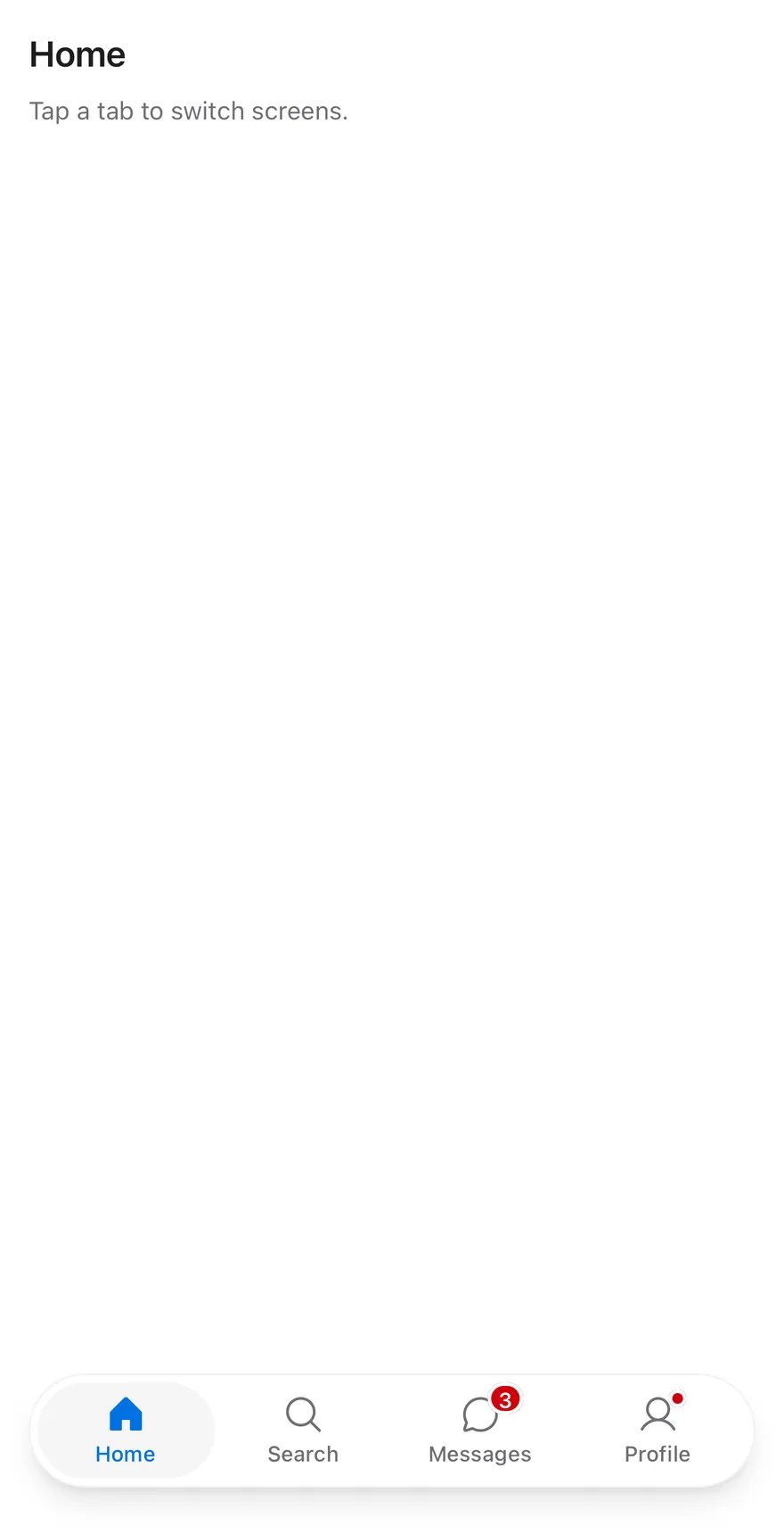
`TabBar` is built on the tabs primitive and sits at the bottom of a screen. `TabBarList` is a rounded capsule with a shadow, inset from the screen edges, so the bar floats above the page. The root adds bottom padding for the safe area, minus any inset an enclosing `Screen` already handles, and never less than 12 points. `TabBarItem` stacks an icon over a short label; the active tab sits on a `bg-secondary` pill and uses `text-primary` and a filled icon weight.
Use it for switching between the top-level sections of an app. For switching views within a screen, use Tabs.
## Installation
**React Native**
```bash title="Terminal"
npx shadcn@latest add @esuiss-rn/tab-bar
```
See [Installation](https://ui.suiss.app/docs/installation) for the `components.json` setup. Or use the suiss/ui CLI:
```bash title="Terminal"
npx @esuiss/ui@latest add tab-bar
```
**SwiftUI**
```bash title="Terminal"
npx @esuiss/ui@latest add tab-bar --platform swift
```
**Jetpack Compose**
```bash title="Terminal"
npx @esuiss/ui@latest add tab-bar --platform kotlin
```
The CLI also adds what it builds on: [Icon](https://ui.suiss.app/docs/components/icon), [Screen](https://ui.suiss.app/docs/components/screen), [Text](https://ui.suiss.app/docs/components/text).
### Manual
**React Native**
**Uniwind**
1. Install the dependencies:
```bash title="Terminal"
npx expo install cn phosphor-react-native react-native-safe-area-context react-native-svg
```
2. Add the pieces it builds on: [Icon](https://ui.suiss.app/docs/components/icon), [Screen](https://ui.suiss.app/docs/components/screen), [Text](https://ui.suiss.app/docs/components/text), and the primitives `components/primitives/haptics.tsx`, `components/primitives/tabs.tsx`, `components/primitives/use-render.tsx`.
3. Copy the source into `components/ui/tab-bar.tsx`:
```tsx title="uniwind/components/ui/tab-bar.tsx"
import { cn } from "cn"
import type { Icon as PhosphorIcon } from "phosphor-react-native"
import * as React from "react"
import { Pressable, View } from "react-native"
import { useSafeAreaInsets } from "react-native-safe-area-context"
import { useHaptics } from "@/components/primitives/haptics"
import * as TabsPrimitive from "@/components/primitives/tabs"
import { resolveClassName } from "@/components/primitives/use-render"
import { Icon } from "@/components/ui/icon"
import { ScreenContext } from "@/components/ui/screen"
import { Text, TextClassContext } from "@/components/ui/text"
type TabBarBadgeValue = number | string | boolean
function badgeText(badge: TabBarBadgeValue | undefined) {
if (badge === undefined || badge === false || badge === true) return undefined
if (typeof badge === "number") {
if (badge <= 0) return undefined
return badge > 99 ? "99+" : String(badge)
}
return badge.length > 0 ? badge : undefined
}
function TabBar({
onValueChange,
className,
style,
...props
}: React.ComponentProps) {
const haptics = useHaptics()
const insets = useSafeAreaInsets()
const screen = React.useContext(ScreenContext)
const consumed = screen?.edges.includes("bottom") ? insets.bottom : 0
const paddingBottom = Math.max(12, insets.bottom - consumed - 8)
return (
cn("px-4 pt-2", resolveClassName(className, state))}
style={(state) => [
{ paddingBottom },
typeof style === "function" ? style(state) : style,
]}
onValueChange={(value, details) => {
onValueChange?.(value, details)
if (!details.isCanceled) haptics.selection()
}}
{...props}
/>
)
}
function TabBarList({
className,
...props
}: React.ComponentProps) {
return (
cn(
"flex-row rounded-full border border-foreground/5 bg-card p-1 shadow-lg dark:border-foreground/10",
resolveClassName(className, state)
)
}
{...props}
/>
)
}
function TabBarBadge({ badge }: { badge: TabBarBadgeValue }) {
const text = badgeText(badge)
if (badge === true) {
return (
{text}
)
}
function TabBarItem({
icon,
badge,
className,
children,
...props
}: React.ComponentProps & {
icon?: PhosphorIcon
badge?: TabBarBadgeValue
}) {
const text = badgeText(badge)
return (
cn(
"flex-1 items-center justify-center gap-0.5 rounded-full py-1.5 active:opacity-80",
state.active && "bg-secondary",
resolveClassName(className, state)
)
}
accessibilityValue={text === undefined ? undefined : { text }}
render={(renderProps, state) => (
{icon || badge !== undefined ? (
{icon ? (
) : null}
{typeof children === "string" || typeof children === "number" ? (
{children}
) : (
children
)}
)}
{...props}
/>
)
}
export type { TabBarBadgeValue }
export { TabBar, TabBarItem, TabBarList }
```
4. Update the import paths to match your project.
**NativeWind**
1. Install the dependencies:
```bash title="Terminal"
npx expo install cn phosphor-react-native react-native-safe-area-context react-native-svg
```
2. Add the pieces it builds on: [Icon](https://ui.suiss.app/docs/components/icon), [Screen](https://ui.suiss.app/docs/components/screen), [Text](https://ui.suiss.app/docs/components/text), and the primitives `components/primitives/haptics.tsx`, `components/primitives/tabs.tsx`, `components/primitives/use-render.tsx`.
3. Copy the source into `components/ui/tab-bar.tsx`:
```tsx title="nativewind/components/ui/tab-bar.tsx"
import { cn } from "cn"
import type { Icon as PhosphorIcon } from "phosphor-react-native"
import * as React from "react"
import { Pressable, View } from "react-native"
import { useSafeAreaInsets } from "react-native-safe-area-context"
import { useHaptics } from "@/components/primitives/haptics"
import * as TabsPrimitive from "@/components/primitives/tabs"
import { resolveClassName } from "@/components/primitives/use-render"
import { Icon } from "@/components/ui/icon"
import { ScreenContext } from "@/components/ui/screen"
import { Text, TextClassContext } from "@/components/ui/text"
type TabBarBadgeValue = number | string | boolean
function badgeText(badge: TabBarBadgeValue | undefined) {
if (badge === undefined || badge === false || badge === true) return undefined
if (typeof badge === "number") {
if (badge <= 0) return undefined
return badge > 99 ? "99+" : String(badge)
}
return badge.length > 0 ? badge : undefined
}
function TabBar({
onValueChange,
className,
style,
...props
}: React.ComponentProps) {
const haptics = useHaptics()
const insets = useSafeAreaInsets()
const screen = React.useContext(ScreenContext)
const consumed = screen?.edges.includes("bottom") ? insets.bottom : 0
const paddingBottom = Math.max(12, insets.bottom - consumed - 8)
return (
cn("px-4 pt-2", resolveClassName(className, state))}
style={(state) => [
{ paddingBottom },
typeof style === "function" ? style(state) : style,
]}
onValueChange={(value, details) => {
onValueChange?.(value, details)
if (!details.isCanceled) haptics.selection()
}}
{...props}
/>
)
}
function TabBarList({
className,
...props
}: React.ComponentProps) {
return (
cn(
"flex-row rounded-full border border-foreground-5 bg-card p-1 shadow-lg dark:border-foreground-10",
resolveClassName(className, state)
)
}
{...props}
/>
)
}
function TabBarBadge({ badge }: { badge: TabBarBadgeValue }) {
const text = badgeText(badge)
if (badge === true) {
return (
{text}
)
}
function TabBarItem({
icon,
badge,
className,
children,
...props
}: React.ComponentProps & {
icon?: PhosphorIcon
badge?: TabBarBadgeValue
}) {
const text = badgeText(badge)
return (
cn(
"flex-1 items-center justify-center gap-0.5 rounded-full py-1.5 active:opacity-80",
state.active && "bg-secondary",
resolveClassName(className, state)
)
}
accessibilityValue={text === undefined ? undefined : { text }}
render={(renderProps, state) => (
{icon || badge !== undefined ? (
{icon ? (
) : null}
{typeof children === "string" || typeof children === "number" ? (
{children}
) : (
children
)}
)}
{...props}
/>
)
}
export type { TabBarBadgeValue }
export { TabBar, TabBarItem, TabBarList }
```
4. Update the import paths to match your project.
**StyleSheet**
1. Install the dependencies:
```bash title="Terminal"
npx expo install phosphor-react-native react-native-safe-area-context react-native-svg
```
2. Add the pieces it builds on: [Icon](https://ui.suiss.app/docs/components/icon), [Screen](https://ui.suiss.app/docs/components/screen), [Text](https://ui.suiss.app/docs/components/text), and the primitives `components/primitives/haptics.tsx`, `components/primitives/tabs.tsx`, `components/primitives/use-render.tsx`.
3. Copy the source into `components/ui/tab-bar.tsx`:
```tsx title="stylesheet/components/ui/tab-bar.tsx"
import type { Icon as PhosphorIcon } from "phosphor-react-native"
import * as React from "react"
import { Pressable, StyleSheet, View, type ViewStyle } from "react-native"
import { useSafeAreaInsets } from "react-native-safe-area-context"
import { useHaptics } from "@/components/primitives/haptics"
import * as TabsPrimitive from "@/components/primitives/tabs"
import { resolveStyle } from "@/components/primitives/use-render"
import { Icon } from "@/components/ui/icon"
import { ScreenContext } from "@/components/ui/screen"
import { Text, TextStyleContext } from "@/components/ui/text"
import { fontSize, radius, shadow, useTheme } from "@/components/ui/theme"
type TabBarBadgeValue = number | string | boolean
const styles = StyleSheet.create({
root: { paddingHorizontal: 16, paddingTop: 8 },
list: {
flexDirection: "row",
borderRadius: radius.full,
borderWidth: 1,
padding: 4,
...shadow.lg,
},
item: {
flex: 1,
alignItems: "center",
justifyContent: "center",
gap: 2,
borderRadius: radius.full,
paddingVertical: 6,
},
label: { ...fontSize.xs, fontWeight: "500" },
iconWrap: { position: "relative" },
dot: {
position: "absolute",
top: -2,
end: -4,
width: 10,
height: 10,
borderRadius: radius.full,
borderWidth: 2,
},
badge: {
position: "absolute",
top: -6,
end: -12,
height: 18,
minWidth: 18,
alignItems: "center",
justifyContent: "center",
borderRadius: radius.full,
borderWidth: 2,
paddingHorizontal: 4,
},
badgeText: { ...fontSize.xs, fontWeight: "600" },
})
function withAlpha(hex: string, alpha: number) {
const value = Number.parseInt(hex.slice(1), 16)
return `rgba(${(value >> 16) & 255}, ${(value >> 8) & 255}, ${value & 255}, ${alpha})`
}
function badgeText(badge: TabBarBadgeValue | undefined) {
if (badge === undefined || badge === false || badge === true) return undefined
if (typeof badge === "number") {
if (badge <= 0) return undefined
return badge > 99 ? "99+" : String(badge)
}
return badge.length > 0 ? badge : undefined
}
function TabBar({
onValueChange,
style,
...props
}: React.ComponentProps) {
const haptics = useHaptics()
const insets = useSafeAreaInsets()
const screen = React.useContext(ScreenContext)
const consumed = screen?.edges.includes("bottom") ? insets.bottom : 0
const paddingBottom = Math.max(12, insets.bottom - consumed - 8)
return (
[
styles.root,
{ paddingBottom },
resolveStyle(style, state) as ViewStyle,
]}
onValueChange={(value, details) => {
onValueChange?.(value, details)
if (!details.isCanceled) haptics.selection()
}}
{...props}
/>
)
}
function TabBarList({
style,
...props
}: React.ComponentProps) {
const { colors, isDark } = useTheme()
return (
[
styles.list,
{
borderColor: withAlpha(colors.foreground, isDark ? 0.1 : 0.05),
backgroundColor: colors.card,
},
resolveStyle(style, state) as ViewStyle,
]}
{...props}
/>
)
}
function TabBarBadge({ badge }: { badge: TabBarBadgeValue }) {
const { colors } = useTheme()
const text = badgeText(badge)
if (badge === true) {
return (
{text}
)
}
function TabBarItem({
icon,
badge,
style,
children,
...props
}: React.ComponentProps & {
icon?: PhosphorIcon
badge?: TabBarBadgeValue
}) {
const { colors } = useTheme()
const text = badgeText(badge)
return (
[
styles.item,
state.active && { backgroundColor: colors.secondary },
state.disabled && { opacity: 0.5 },
resolveStyle(style, state) as ViewStyle,
]}
accessibilityValue={text === undefined ? undefined : { text }}
render={(renderProps, state) => {
let color = colors.mutedForeground
if (state.active) color = colors.primary
const { style: baseStyle, ...rest } = renderProps
return (
[baseStyle, pressed && { opacity: 0.8 }]}
>
{icon || badge !== undefined ? (
{icon ? (
) : null}
{typeof children === "string" || typeof children === "number" ? (
{children}
) : (
children
)}
)
}}
{...props}
/>
)
}
export type { TabBarBadgeValue }
export { TabBar, TabBarItem, TabBarList }
```
4. Update the import paths to match your project.
**SwiftUI**
1. Target iOS 17 or later.
2. Add the Swift package to your app:
```swift title="Package.swift"
.package(url: "https://github.com/phosphor-icons/swift", from: "2.1.0")
```
3. Copy the theme files every view uses:
- `swift/Theme/Theme.swift`: [source](https://github.com/e-suiss/ui/blob/main/packages/mobile/swiftui/Sources/EsuissUI/Theme/Theme.swift)
- `swift/Theme/Tokens.swift`: [source](https://github.com/e-suiss/ui/blob/main/packages/mobile/swiftui/Sources/EsuissUI/Theme/Tokens.swift)
4. Copy the source and every file it uses:
```swift title="swift/Components/TabBar.swift"
import SwiftUI
public enum TabBarBadge: Equatable, Sendable, ExpressibleByIntegerLiteral, ExpressibleByStringLiteral {
case dot
case count(Int)
case text(String)
public init(integerLiteral value: Int) {
self = .count(value)
}
public init(stringLiteral value: String) {
self = .text(value)
}
var label: String? {
switch self {
case .dot: nil
case .count(let value): value > 99 ? "99+" : "\(value)"
case .text(let value): value
}
}
var isVisible: Bool {
switch self {
case .dot: true
case .count(let value): value > 0
case .text(let value): !value.isEmpty
}
}
}
struct TabBarContext: @unchecked Sendable {
var selected: AnyHashable?
var namespace: Namespace.ID?
var select: @MainActor @Sendable (AnyHashable) -> Void = { _ in }
}
extension EnvironmentValues {
@Entry var tabBar = TabBarContext()
}
public struct TabBar: View {
let selection: Binding
let content: Content
@Namespace private var namespace
@State private var bottomInset: CGFloat = 0
@Environment(\.colorScheme) private var colorScheme
@Environment(\.accessibilityReduceMotion) private var reduceMotion
public init(
selection: Binding,
@ViewBuilder content: () -> Content
) {
self.selection = Binding(
get: { AnyHashable(selection.wrappedValue) },
set: { value in
if let value = value.base as? Value {
selection.wrappedValue = value
}
}
)
self.content = content()
}
public var body: some View {
let binding = selection
let context = TabBarContext(selected: binding.wrappedValue, namespace: namespace) { value in
if binding.wrappedValue != value { binding.wrappedValue = value }
}
HStack(alignment: .top, spacing: 0) {
content
}
.padding(4)
.background {
Capsule()
.fill(EsuissColor.card)
.shadow(.lg)
}
.overlay {
Capsule().strokeBorder(EsuissColor.foreground.opacity(colorScheme == .dark ? 0.1 : 0.05))
}
.animation(reduceMotion ? nil : .spring(duration: 0.3, bounce: 0.15), value: binding.wrappedValue)
.padding(.horizontal, 16)
.padding(.top, 8)
.padding(.bottom, max(12, bottomInset - 8))
.frame(maxWidth: .infinity)
.ignoresSafeArea(.container, edges: .bottom)
.background {
Color.clear
.onGeometryChange(for: CGFloat.self) { $0.safeAreaInsets.bottom.rounded() } action: { bottomInset = $0 }
}
.environment(\.tabBar, context)
.hapticFeedback(.selection, trigger: binding.wrappedValue)
.accessibilityElement(children: .contain)
.accessibilityAddTraits(.isTabBar)
}
}
public struct TabBarItem: View {
let value: AnyHashable
let title: Text
let icon: Image
let activeIcon: Image?
let badge: TabBarBadge?
@Environment(\.tabBar) private var tabBar
@Environment(\.isEnabled) private var isEnabled
public init(
_ title: LocalizedStringKey,
value: Value,
icon: Image,
activeIcon: Image? = nil,
badge: TabBarBadge? = nil
) {
self.value = AnyHashable(value)
self.title = Text(title)
self.icon = icon
self.activeIcon = activeIcon
self.badge = badge
}
public init(
verbatim title: String,
value: Value,
icon: Image,
activeIcon: Image? = nil,
badge: TabBarBadge? = nil
) {
self.value = AnyHashable(value)
self.title = Text(verbatim: title)
self.icon = icon
self.activeIcon = activeIcon
self.badge = badge
}
public var body: some View {
let active = tabBar.selected == value
Button {
tabBar.select(value)
} label: {
VStack(spacing: 2) {
(active ? activeIcon ?? icon : icon)
.resizable()
.scaledToFit()
.frame(width: 24, height: 24)
.overlay(alignment: .topLeading) {
if let badge, badge.isVisible {
TabBarBadgeView(badge: badge)
.offset(x: badge.label == nil ? 16 : 14, y: badge.label == nil ? -1 : -6)
}
}
title
.scaledFont(.xs, weight: .medium)
.lineLimit(1)
}
.foregroundStyle(active ? EsuissColor.primary : EsuissColor.mutedForeground)
.opacity(isEnabled ? 1 : 0.5)
.padding(.vertical, 6)
.frame(maxWidth: .infinity)
.contentShape(Capsule())
}
.buttonStyle(TabBarItemStyle())
.background {
if active, let namespace = tabBar.namespace {
Capsule()
.fill(EsuissColor.secondary)
.matchedGeometryEffect(id: "active", in: namespace)
}
}
.accessibilityElement(children: .ignore)
.accessibilityLabel(title)
.accessibilityValue(badgeValue)
.accessibilityAddTraits(active ? [.isSelected, .isButton] : .isButton)
}
private var badgeValue: Text {
guard let badge, badge.isVisible else { return Text(verbatim: "") }
switch badge {
case .dot: return Text("New")
case .count(let value): return Text("\(value) new")
case .text(let value): return Text(verbatim: value)
}
}
}
private struct TabBarItemStyle: ButtonStyle {
func makeBody(configuration: Configuration) -> some View {
configuration.label
.opacity(configuration.isPressed ? 0.8 : 1)
}
}
private struct TabBarBadgeView: View {
let badge: TabBarBadge
var body: some View {
Group {
if let label = badge.label {
Text(verbatim: label)
.scaledFont(TextStyle.xs, weight: .semibold)
.monospacedDigit()
.foregroundStyle(EsuissColor.primaryForeground)
.padding(.horizontal, 5)
.frame(minWidth: 18, minHeight: 18)
.background(EsuissColor.destructive, in: Capsule())
} else {
Circle()
.fill(EsuissColor.destructive)
.frame(width: 10, height: 10)
}
}
.background(Capsule().fill(EsuissColor.card).padding(-2))
.fixedSize()
.accessibilityHidden(true)
}
}
```
- `swift/Components/Button.swift`: see [Button](https://ui.suiss.app/docs/components/button.md)
- `swift/Components/ButtonGroup.swift`: see [Button Group](https://ui.suiss.app/docs/components/button-group.md)
- `swift/Components/DropdownMenu.swift`: see [Dropdown Menu](https://ui.suiss.app/docs/components/dropdown-menu.md)
- `swift/Components/Field.swift`: see [Field](https://ui.suiss.app/docs/components/field.md)
- `swift/Components/Haptics.swift`: see [Haptics](https://ui.suiss.app/docs/components/haptics.md)
- `swift/Components/Overlay.swift`: [source](https://github.com/e-suiss/ui/blob/main/packages/mobile/swiftui/Sources/EsuissUI/Components/Overlay.swift)
- `swift/Components/Select.swift`: see [Select](https://ui.suiss.app/docs/components/select.md)
- `swift/Components/Separator.swift`: see [Separator](https://ui.suiss.app/docs/components/separator.md)
- `swift/Components/TextVariant.swift`: [source](https://github.com/e-suiss/ui/blob/main/packages/mobile/swiftui/Sources/EsuissUI/Components/TextVariant.swift)
5. Add the files to your app target.
**Jetpack Compose**
1. Set `minSdk` to 24 or higher and add the dependencies:
```kotlin title="build.gradle.kts"
implementation(platform("androidx.compose:compose-bom:2026.09.00"))
implementation("androidx.compose.foundation:foundation")
implementation("androidx.compose.ui:ui")
implementation("com.adamglin:phosphor-icon-android:1.0.0")
```
2. Copy the theme files every view uses:
- `kotlin/theme/Theme.kt`: [source](https://github.com/e-suiss/ui/blob/main/packages/mobile/kotlin/ui/src/main/kotlin/com/esuiss/ui/theme/Theme.kt)
- `kotlin/theme/Tokens.kt`: [source](https://github.com/e-suiss/ui/blob/main/packages/mobile/kotlin/ui/src/main/kotlin/com/esuiss/ui/theme/Tokens.kt)
3. Copy the source and every file it uses:
```kt title="kotlin/components/TabBar.kt"
package com.esuiss.ui.components
import androidx.compose.animation.core.Animatable
import androidx.compose.animation.core.Spring
import androidx.compose.animation.core.spring
import androidx.compose.foundation.background
import androidx.compose.foundation.border
import androidx.compose.foundation.interaction.MutableInteractionSource
import androidx.compose.foundation.interaction.collectIsPressedAsState
import androidx.compose.foundation.layout.Arrangement
import androidx.compose.foundation.layout.Box
import androidx.compose.foundation.layout.Column
import androidx.compose.foundation.layout.Row
import androidx.compose.foundation.layout.RowScope
import androidx.compose.foundation.layout.WindowInsets
import androidx.compose.foundation.layout.WindowInsetsSides
import androidx.compose.foundation.layout.exclude
import androidx.compose.foundation.layout.fillMaxWidth
import androidx.compose.foundation.layout.heightIn
import androidx.compose.foundation.layout.offset
import androidx.compose.foundation.layout.onConsumedWindowInsetsChanged
import androidx.compose.foundation.layout.only
import androidx.compose.foundation.layout.padding
import androidx.compose.foundation.layout.safeDrawing
import androidx.compose.foundation.layout.size
import androidx.compose.foundation.layout.widthIn
import androidx.compose.foundation.layout.windowInsetsPadding
import androidx.compose.foundation.selection.selectable
import androidx.compose.foundation.selection.selectableGroup
import androidx.compose.foundation.shape.CircleShape
import androidx.compose.foundation.text.BasicText
import androidx.compose.runtime.Composable
import androidx.compose.runtime.CompositionLocalProvider
import androidx.compose.runtime.Immutable
import androidx.compose.runtime.LaunchedEffect
import androidx.compose.runtime.DisposableEffect
import androidx.compose.runtime.getValue
import androidx.compose.runtime.mutableStateOf
import androidx.compose.runtime.remember
import androidx.compose.runtime.setValue
import androidx.compose.runtime.Stable
import androidx.compose.runtime.mutableStateMapOf
import androidx.compose.runtime.staticCompositionLocalOf
import androidx.compose.ui.Alignment
import androidx.compose.ui.Modifier
import androidx.compose.ui.draw.alpha
import androidx.compose.ui.draw.clip
import androidx.compose.ui.draw.drawBehind
import androidx.compose.ui.geometry.CornerRadius
import androidx.compose.ui.geometry.Offset
import androidx.compose.ui.geometry.Size
import androidx.compose.ui.graphics.vector.ImageVector
import androidx.compose.ui.layout.onPlaced
import androidx.compose.ui.layout.positionInParent
import androidx.compose.ui.platform.LocalDensity
import androidx.compose.ui.semantics.Role
import androidx.compose.ui.text.font.FontWeight
import androidx.compose.ui.text.style.TextAlign
import androidx.compose.ui.text.style.TextOverflow
import androidx.compose.ui.unit.coerceAtLeast
import androidx.compose.ui.unit.dp
import com.esuiss.ui.theme.EsuissTheme
import com.esuiss.ui.theme.Typography
import kotlinx.coroutines.launch
@Immutable
private class TabBarIndicator(val x: Float, val y: Float, val width: Float, val height: Float)
@Stable
private class TabBarLayout {
val items = mutableStateMapOf()
}
@Immutable
private class TabBarContext(
val value: String,
val onValueChange: (String) -> Unit,
val layout: TabBarLayout,
)
private val LocalTabBar = staticCompositionLocalOf { null }
@Composable
fun TabBar(
value: String,
onValueChange: (String) -> Unit,
modifier: Modifier = Modifier,
content: @Composable RowScope.() -> Unit,
) {
val colors = EsuissTheme.colors
val density = LocalDensity.current
var consumed by remember { mutableStateOf(WindowInsets(0, 0, 0, 0)) }
val remaining = with(density) { WindowInsets.safeDrawing.exclude(consumed).getBottom(density).toDp() }
val bottom = (remaining - 8.dp).coerceAtLeast(12.dp)
val layout = remember { TabBarLayout() }
val x = remember { Animatable(0f) }
val width = remember { Animatable(0f) }
var placed by remember { mutableStateOf(false) }
val target = layout.items[value]
LaunchedEffect(target?.x, target?.width) {
if (target == null) return@LaunchedEffect
if (!placed) {
x.snapTo(target.x)
width.snapTo(target.width)
placed = true
return@LaunchedEffect
}
val motion = spring(dampingRatio = 0.85f, stiffness = Spring.StiffnessMediumLow)
launch { x.animateTo(target.x, motion) }
launch { width.animateTo(target.width, motion) }
}
CompositionLocalProvider(LocalTabBar provides TabBarContext(value, onValueChange, layout)) {
Column(
modifier = modifier
.fillMaxWidth()
.onConsumedWindowInsetsChanged { consumed = it }
.windowInsetsPadding(WindowInsets.safeDrawing.only(WindowInsetsSides.Horizontal))
.padding(start = 16.dp, end = 16.dp, top = 8.dp, bottom = bottom),
) {
Row(
modifier = Modifier
.fillMaxWidth()
.raisedSurface(colors, CircleShape)
.padding(4.dp)
.drawBehind {
val current = layout.items[value]
if (placed && current != null) {
drawRoundRect(
color = colors.secondary,
topLeft = Offset(x.value, current.y),
size = Size(width.value, current.height),
cornerRadius = CornerRadius(current.height / 2f),
)
}
}
.selectableGroup(),
verticalAlignment = Alignment.CenterVertically,
content = content,
)
}
}
}
@Composable
fun RowScope.TabBarItem(
value: String,
label: String,
icon: ImageVector,
modifier: Modifier = Modifier,
selectedIcon: ImageVector? = null,
badge: String? = null,
enabled: Boolean = true,
) {
val context = checkNotNull(LocalTabBar.current) { "TabBarItem must be used within a TabBar" }
val colors = EsuissTheme.colors
val haptics = rememberHaptics()
val selected = context.value == value
val interaction = remember { MutableInteractionSource() }
val pressed by interaction.collectIsPressedAsState()
val foreground = if (selected) colors.primary else colors.mutedForeground
DisposableEffect(context.layout, value) {
onDispose { context.layout.items.remove(value) }
}
Column(
modifier = modifier
.weight(1f)
.onPlaced { coordinates ->
val position = coordinates.positionInParent()
val next = TabBarIndicator(position.x, position.y, coordinates.size.width.toFloat(), coordinates.size.height.toFloat())
val previous = context.layout.items[value]
if (previous == null || previous.x != next.x || previous.y != next.y || previous.width != next.width || previous.height != next.height) {
context.layout.items[value] = next
}
}
.alpha(
when {
!enabled -> 0.5f
pressed -> 0.8f
else -> 1f
},
)
.clip(CircleShape)
.selectable(
selected = selected,
interactionSource = interaction,
indication = null,
enabled = enabled,
role = Role.Tab,
) {
if (!selected) haptics.selection()
context.onValueChange(value)
}
.padding(vertical = 6.dp),
horizontalAlignment = Alignment.CenterHorizontally,
verticalArrangement = Arrangement.spacedBy(2.dp, Alignment.CenterVertically),
) {
Box {
Icon(if (selected && selectedIcon != null) selectedIcon else icon, contentDescription = null, size = 24.dp, tint = foreground)
if (badge != null) TabBarBadge(badge, Modifier.align(Alignment.TopStart).offset(x = if (badge.isEmpty()) 18.dp else 14.dp, y = (-4).dp))
}
BasicText(
label,
style = Typography.xs.copy(color = foreground, fontWeight = FontWeight.Medium, textAlign = TextAlign.Center),
maxLines = 1,
overflow = TextOverflow.Ellipsis,
)
}
}
@Composable
private fun TabBarBadge(text: String, modifier: Modifier) {
val colors = EsuissTheme.colors
if (text.isEmpty()) {
Box(
modifier = modifier
.size(10.dp)
.clip(CircleShape)
.background(colors.destructive, CircleShape)
.border(2.dp, colors.card, CircleShape),
)
return
}
Box(
modifier = modifier
.heightIn(min = 18.dp)
.widthIn(min = 18.dp)
.clip(CircleShape)
.background(colors.destructive, CircleShape)
.border(2.dp, colors.card, CircleShape)
.padding(horizontal = 5.dp),
contentAlignment = Alignment.Center,
) {
BasicText(
text,
style = Typography.xs.copy(color = colors.primaryForeground, fontWeight = FontWeight.SemiBold, textAlign = TextAlign.Center),
maxLines = 1,
)
}
}
```
- `kotlin/components/Button.kt`: see [Button](https://ui.suiss.app/docs/components/button.md)
- `kotlin/components/ButtonGroup.kt`: see [Button Group](https://ui.suiss.app/docs/components/button-group.md)
- `kotlin/components/Content.kt`: [source](https://github.com/e-suiss/ui/blob/main/packages/mobile/kotlin/ui/src/main/kotlin/com/esuiss/ui/components/Content.kt)
- `kotlin/components/Haptics.kt`: see [Haptics](https://ui.suiss.app/docs/components/haptics.md)
- `kotlin/components/Icon.kt`: see [Icon](https://ui.suiss.app/docs/components/icon.md)
- `kotlin/components/Overlay.kt`: [source](https://github.com/e-suiss/ui/blob/main/packages/mobile/kotlin/ui/src/main/kotlin/com/esuiss/ui/components/Overlay.kt)
4. Update the `com.esuiss.ui` package names to match your project.
## Usage
```tsx
import { TabBar, TabBarList, TabBarItem } from "@/components/ui/tab-bar"
```
```tsx
{title}
Tap a tab to switch screens.
{children}
)
}
function TabBarExample({
badges = true,
disabled,
}: {
badges?: boolean
disabled?: string
}) {
const [value, setValue] = React.useState("home")
const current = items.find((item) => item.value === value)
return (
{items.map((item) => (
{item.label}
))}
)
}
export function TabBarWithoutBadgesExample() {
return (
: View {
let title: String
@ViewBuilder let bar: () -> Bar
var body: some View {
VStack(spacing: 0) {
VStack(alignment: .leading, spacing: 8) {
Text(verbatim: title).textVariant(.h3)
Text("Tap a tab to switch screens.").textVariant(.muted)
}
.padding(16)
.frame(maxWidth: .infinity, maxHeight: .infinity, alignment: .topLeading)
bar()
}
.background(EsuissColor.background.ignoresSafeArea())
}
}
struct TabBarExample: View {
var badges = true
var disabled: String?
@State private var value = "home"
var body: some View {
TabBarPage(title: tabBarEntries.first { $0.value == value }?.label ?? "") {
TabBar(selection: $value) {
ForEach(tabBarEntries, id: \.value) { item in
TabBarItem(
verbatim: item.label,
value: item.value,
icon: item.icon,
activeIcon: item.activeIcon,
badge: badges ? item.badge : nil
)
.disabled(item.value == disabled)
}
}
}
}
}
```
```kotlin
import androidx.compose.foundation.layout.Arrangement
import androidx.compose.foundation.layout.Column
import androidx.compose.foundation.layout.fillMaxSize
import androidx.compose.foundation.layout.fillMaxWidth
import androidx.compose.foundation.layout.padding
import androidx.compose.runtime.Composable
import androidx.compose.runtime.getValue
import androidx.compose.runtime.mutableStateOf
import androidx.compose.runtime.saveable.rememberSaveable
import androidx.compose.runtime.setValue
import androidx.compose.ui.Modifier
import androidx.compose.ui.graphics.vector.ImageVector
import androidx.compose.ui.unit.dp
import com.adamglin.PhosphorIcons
import com.adamglin.phosphoricons.Fill
import com.adamglin.phosphoricons.Regular
import com.adamglin.phosphoricons.fill.ChatCircle
import com.adamglin.phosphoricons.fill.House
import com.adamglin.phosphoricons.fill.MagnifyingGlass
import com.adamglin.phosphoricons.fill.User
import com.adamglin.phosphoricons.regular.ChatCircle
import com.adamglin.phosphoricons.regular.House
import com.adamglin.phosphoricons.regular.MagnifyingGlass
import com.adamglin.phosphoricons.regular.User
import com.esuiss.ui.components.Screen
import com.esuiss.ui.components.ScreenEdge
import com.esuiss.ui.components.TabBar
import com.esuiss.ui.components.TabBarItem
import com.esuiss.ui.components.Text
import com.esuiss.ui.components.TextVariant
@Composable
fun TabBarWithoutBadgesExample() {
TabBarExample(badges = false)
}
class TabBarEntry(val value: String, val label: String, val icon: ImageVector, val selectedIcon: ImageVector, val badge: String? = null)
val tabBarEntries = listOf(
TabBarEntry("home", "Home", PhosphorIcons.Regular.House, PhosphorIcons.Fill.House),
TabBarEntry("search", "Search", PhosphorIcons.Regular.MagnifyingGlass, PhosphorIcons.Fill.MagnifyingGlass),
TabBarEntry("messages", "Messages", PhosphorIcons.Regular.ChatCircle, PhosphorIcons.Fill.ChatCircle, "3"),
TabBarEntry("profile", "Profile", PhosphorIcons.Regular.User, PhosphorIcons.Fill.User, ""),
)
@Composable
fun TabBarPage(title: String, bar: @Composable () -> Unit) {
Screen(edges = setOf(ScreenEdge.Top, ScreenEdge.Left, ScreenEdge.Right)) {
Column(Modifier.fillMaxSize()) {
Column(
Modifier.weight(1f).fillMaxWidth().padding(16.dp),
verticalArrangement = Arrangement.spacedBy(8.dp),
) {
Text(title, variant = TextVariant.H3)
Text("Tap a tab to switch screens.", variant = TextVariant.Muted)
}
bar()
}
}
}
@Composable
fun TabBarExample(badges: Boolean = true, disabled: String? = null) {
var value by rememberSaveable { mutableStateOf("home") }
val current = tabBarEntries.firstOrNull { it.value == value }
TabBarPage(current?.label ?: "") {
TabBar(value = value, onValueChange = { value = it }) {
tabBarEntries.forEach { entry ->
TabBarItem(
value = entry.value,
label = entry.label,
icon = entry.icon,
selectedIcon = entry.selectedIcon,
badge = if (badges) entry.badge else null,
enabled = entry.value != disabled,
)
}
}
}
}
```
### Large badge
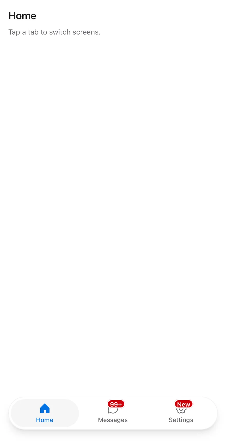
A count above 99 shown as `99+` and a text badge.
```tsx
import { ChatCircleIcon, GearSixIcon, HouseIcon } from "phosphor-react-native"
import * as React from "react"
import { View } from "react-native"
import { TabBar, TabBarItem, TabBarList } from "@/components/ui/tab-bar"
import { Text } from "@/components/ui/text"
function Page({
title,
children,
}: {
title: string
children: React.ReactNode
}) {
return (
{title}
Tap a tab to switch screens.
{children}
)
}
export function TabBarLargeBadgeExample() {
return (
Home
Messages
Settings
)
}
```
```swift
import EsuissUI
import PhosphorSwift
import SwiftUI
struct TabBarPage: View {
let title: String
@ViewBuilder let bar: () -> Bar
var body: some View {
VStack(spacing: 0) {
VStack(alignment: .leading, spacing: 8) {
Text(verbatim: title).textVariant(.h3)
Text("Tap a tab to switch screens.").textVariant(.muted)
}
.padding(16)
.frame(maxWidth: .infinity, maxHeight: .infinity, alignment: .topLeading)
bar()
}
.background(EsuissColor.background.ignoresSafeArea())
}
}
struct LargeBadgeDemo: View {
@State private var value = "home"
var body: some View {
TabBarPage(title: "Home") {
TabBar(selection: $value) {
TabBarItem("Home", value: "home", icon: Ph.house.regular, activeIcon: Ph.house.fill)
TabBarItem("Messages", value: "messages", icon: Ph.chatCircle.regular, activeIcon: Ph.chatCircle.fill, badge: 128)
TabBarItem("Settings", value: "settings", icon: Ph.gearSix.regular, activeIcon: Ph.gearSix.fill, badge: "New")
}
}
}
}
```
```kotlin
import androidx.compose.foundation.layout.Arrangement
import androidx.compose.foundation.layout.Column
import androidx.compose.foundation.layout.fillMaxSize
import androidx.compose.foundation.layout.fillMaxWidth
import androidx.compose.foundation.layout.padding
import androidx.compose.runtime.Composable
import androidx.compose.runtime.getValue
import androidx.compose.runtime.mutableStateOf
import androidx.compose.runtime.saveable.rememberSaveable
import androidx.compose.runtime.setValue
import androidx.compose.ui.Modifier
import androidx.compose.ui.unit.dp
import com.adamglin.PhosphorIcons
import com.adamglin.phosphoricons.Fill
import com.adamglin.phosphoricons.Regular
import com.adamglin.phosphoricons.fill.ChatCircle
import com.adamglin.phosphoricons.fill.GearSix
import com.adamglin.phosphoricons.fill.House
import com.adamglin.phosphoricons.regular.ChatCircle
import com.adamglin.phosphoricons.regular.GearSix
import com.adamglin.phosphoricons.regular.House
import com.esuiss.ui.components.Screen
import com.esuiss.ui.components.ScreenEdge
import com.esuiss.ui.components.TabBar
import com.esuiss.ui.components.TabBarItem
import com.esuiss.ui.components.Text
import com.esuiss.ui.components.TextVariant
@Composable
fun TabBarPage(title: String, bar: @Composable () -> Unit) {
Screen(edges = setOf(ScreenEdge.Top, ScreenEdge.Left, ScreenEdge.Right)) {
Column(Modifier.fillMaxSize()) {
Column(
Modifier.weight(1f).fillMaxWidth().padding(16.dp),
verticalArrangement = Arrangement.spacedBy(8.dp),
) {
Text(title, variant = TextVariant.H3)
Text("Tap a tab to switch screens.", variant = TextVariant.Muted)
}
bar()
}
}
}
@Composable
fun TabBarLargeBadge() {
var value by rememberSaveable { mutableStateOf("home") }
TabBarPage("Home") {
TabBar(value = value, onValueChange = { value = it }) {
TabBarItem(value = "home", label = "Home", icon = PhosphorIcons.Regular.House, selectedIcon = PhosphorIcons.Fill.House)
TabBarItem(value = "messages", label = "Messages", icon = PhosphorIcons.Regular.ChatCircle, selectedIcon = PhosphorIcons.Fill.ChatCircle, badge = "128")
TabBarItem(value = "settings", label = "Settings", icon = PhosphorIcons.Regular.GearSix, selectedIcon = PhosphorIcons.Fill.GearSix, badge = "New")
}
}
}
```
### Disabled item
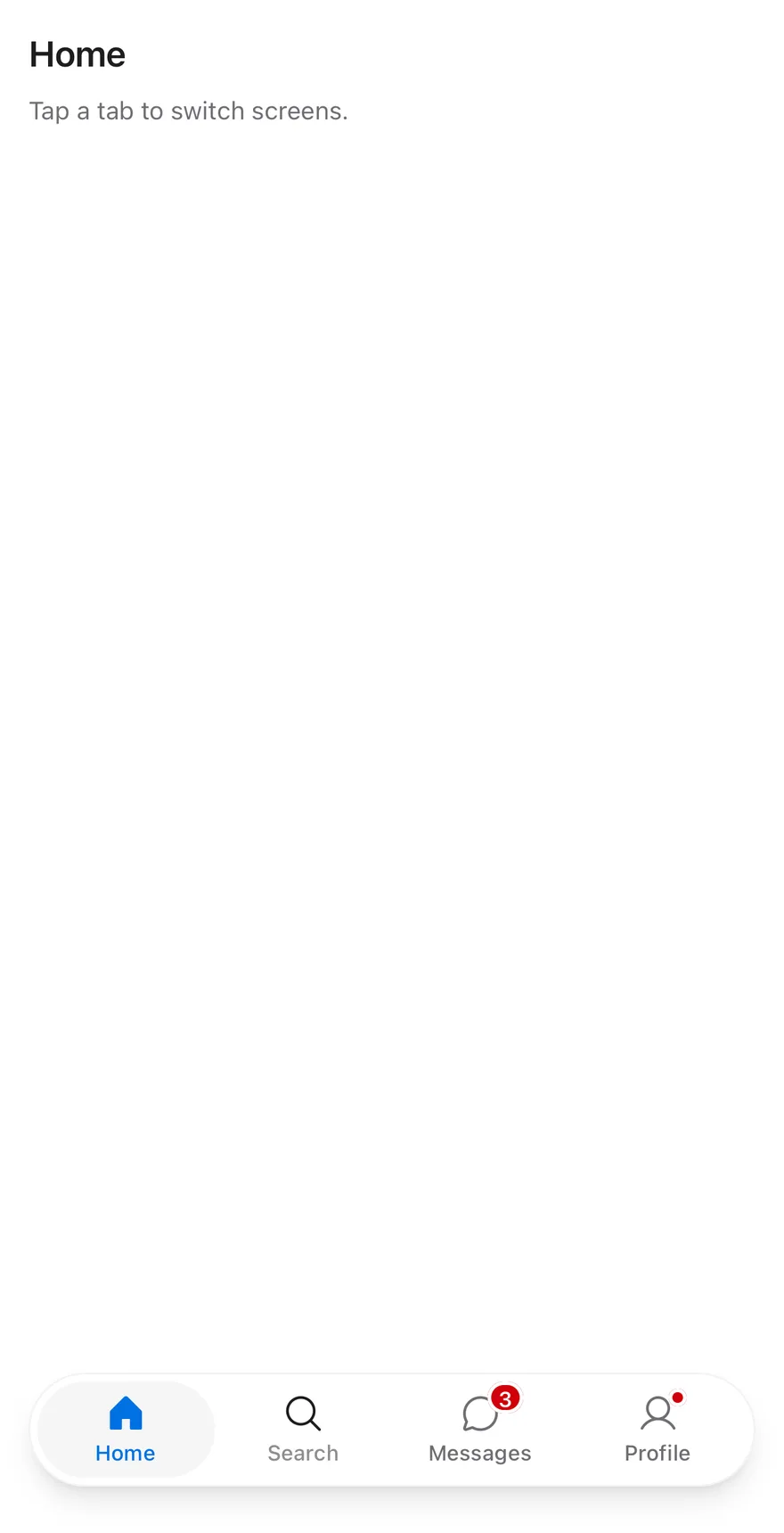
A tab bar with one disabled tab.
```tsx
import { ChatCircleIcon, HouseIcon, MagnifyingGlassIcon, UserIcon } from "phosphor-react-native"
import * as React from "react"
import { View } from "react-native"
import { TabBar, TabBarItem, TabBarList } from "@/components/ui/tab-bar"
import { Text } from "@/components/ui/text"
const items = [
{ value: "home", label: "Home", icon: HouseIcon },
{ value: "search", label: "Search", icon: MagnifyingGlassIcon },
{ value: "messages", label: "Messages", icon: ChatCircleIcon, badge: 3 },
{ value: "profile", label: "Profile", icon: UserIcon, badge: true },
]
function Page({
title,
children,
}: {
title: string
children: React.ReactNode
}) {
return (
{title}
Tap a tab to switch screens.
{children}
)
}
function TabBarExample({
badges = true,
disabled,
}: {
badges?: boolean
disabled?: string
}) {
const [value, setValue] = React.useState("home")
const current = items.find((item) => item.value === value)
return (
{items.map((item) => (
{item.label}
))}
)
}
export function TabBarDisabledItemExample() {
return (
: View {
let title: String
@ViewBuilder let bar: () -> Bar
var body: some View {
VStack(spacing: 0) {
VStack(alignment: .leading, spacing: 8) {
Text(verbatim: title).textVariant(.h3)
Text("Tap a tab to switch screens.").textVariant(.muted)
}
.padding(16)
.frame(maxWidth: .infinity, maxHeight: .infinity, alignment: .topLeading)
bar()
}
.background(EsuissColor.background.ignoresSafeArea())
}
}
struct TabBarExample: View {
var badges = true
var disabled: String?
@State private var value = "home"
var body: some View {
TabBarPage(title: tabBarEntries.first { $0.value == value }?.label ?? "") {
TabBar(selection: $value) {
ForEach(tabBarEntries, id: \.value) { item in
TabBarItem(
verbatim: item.label,
value: item.value,
icon: item.icon,
activeIcon: item.activeIcon,
badge: badges ? item.badge : nil
)
.disabled(item.value == disabled)
}
}
}
}
}
```
```kotlin
import androidx.compose.foundation.layout.Arrangement
import androidx.compose.foundation.layout.Column
import androidx.compose.foundation.layout.fillMaxSize
import androidx.compose.foundation.layout.fillMaxWidth
import androidx.compose.foundation.layout.padding
import androidx.compose.runtime.Composable
import androidx.compose.runtime.getValue
import androidx.compose.runtime.mutableStateOf
import androidx.compose.runtime.saveable.rememberSaveable
import androidx.compose.runtime.setValue
import androidx.compose.ui.Modifier
import androidx.compose.ui.graphics.vector.ImageVector
import androidx.compose.ui.unit.dp
import com.adamglin.PhosphorIcons
import com.adamglin.phosphoricons.Fill
import com.adamglin.phosphoricons.Regular
import com.adamglin.phosphoricons.fill.ChatCircle
import com.adamglin.phosphoricons.fill.House
import com.adamglin.phosphoricons.fill.MagnifyingGlass
import com.adamglin.phosphoricons.fill.User
import com.adamglin.phosphoricons.regular.ChatCircle
import com.adamglin.phosphoricons.regular.House
import com.adamglin.phosphoricons.regular.MagnifyingGlass
import com.adamglin.phosphoricons.regular.User
import com.esuiss.ui.components.Screen
import com.esuiss.ui.components.ScreenEdge
import com.esuiss.ui.components.TabBar
import com.esuiss.ui.components.TabBarItem
import com.esuiss.ui.components.Text
import com.esuiss.ui.components.TextVariant
@Composable
fun TabBarDisabledItemExample() {
TabBarExample(disabled = "search")
}
class TabBarEntry(val value: String, val label: String, val icon: ImageVector, val selectedIcon: ImageVector, val badge: String? = null)
val tabBarEntries = listOf(
TabBarEntry("home", "Home", PhosphorIcons.Regular.House, PhosphorIcons.Fill.House),
TabBarEntry("search", "Search", PhosphorIcons.Regular.MagnifyingGlass, PhosphorIcons.Fill.MagnifyingGlass),
TabBarEntry("messages", "Messages", PhosphorIcons.Regular.ChatCircle, PhosphorIcons.Fill.ChatCircle, "3"),
TabBarEntry("profile", "Profile", PhosphorIcons.Regular.User, PhosphorIcons.Fill.User, ""),
)
@Composable
fun TabBarPage(title: String, bar: @Composable () -> Unit) {
Screen(edges = setOf(ScreenEdge.Top, ScreenEdge.Left, ScreenEdge.Right)) {
Column(Modifier.fillMaxSize()) {
Column(
Modifier.weight(1f).fillMaxWidth().padding(16.dp),
verticalArrangement = Arrangement.spacedBy(8.dp),
) {
Text(title, variant = TextVariant.H3)
Text("Tap a tab to switch screens.", variant = TextVariant.Muted)
}
bar()
}
}
}
@Composable
fun TabBarExample(badges: Boolean = true, disabled: String? = null) {
var value by rememberSaveable { mutableStateOf("home") }
val current = tabBarEntries.firstOrNull { it.value == value }
TabBarPage(current?.label ?: "") {
TabBar(value = value, onValueChange = { value = it }) {
tabBarEntries.forEach { entry ->
TabBarItem(
value = entry.value,
label = entry.label,
icon = entry.icon,
selectedIcon = entry.selectedIcon,
badge = if (badges) entry.badge else null,
enabled = entry.value != disabled,
)
}
}
}
}
```
## API Reference
### TabBar
Root that holds the active tab, the side inset and the safe area padding.
Also accepts the props of `React.ComponentProps`.
### TabBarList
Capsule that holds the tabs.
Also accepts the props of `React.ComponentProps`.
### TabBarItem
One tab with an icon, a label and an optional badge.
| Prop | Type | Default | Description |
| --- | --- | --- | --- |
| `icon` | `PhosphorIcon` | - | Phosphor icon shown above the label. Uses the fill weight when active. |
| `badge` | `TabBarBadgeValue` | - | Number, text or `true` for a dot, shown on the icon's corner. |
Also accepts the props of `React.ComponentProps`.
## Accessibility
- The list has the `tablist` role and each item has the `tab` role, with selected and disabled states.
- A badge with a count or text is exposed as the tab's accessibility value, so VoiceOver and TalkBack read it after the label.
- A dot badge is visual only and is not announced.
## Notes
- The capsule uses `bg-card` with a `border-foreground/5` border (`border-foreground/10` in dark mode) and a large shadow. The active tab uses `bg-secondary` and `text-primary`, and badges use `bg-destructive`; colors follow the system appearance.
- The bottom padding is the remaining safe area inset minus 8 points, and never less than 12 points.