# Slider
A track with one or more draggable thumbs for choosing a value or range.
Slider is an open-source component from suiss/ui for React, React Native, SwiftUI and Jetpack Compose. The @esuiss/ui CLI copies its source into your project, so you own the code.
Source: https://ui.suiss.app/docs/components/slider
**React**
**Example**
```tsx
import { Slider } from "@/components/ui/slider"
export default function SliderDemo() {
return (
)
}
```
`Slider` wraps the slider primitive of the chosen base in a single component. It renders the track, the filled range and one thumb per value. The thumb is a wide capsule that stretches while it's dragged or pressed.
Use a slider when an approximate value within a range matters more than a precise number, such as volume or brightness. For exact numbers, use a number field or `Input`.
## Installation
### CLI
```bash title="Terminal"
npx shadcn@latest add @esuiss/slider
```
Works in any project with a `components.json`. See [Installation](https://ui.suiss.app/docs/installation#add-components) for the one-line registry setup. Or use the suiss/ui CLI:
```bash title="Terminal"
npx @esuiss/ui@latest add slider
```
### Manual
1. Install the dependencies and add the [`cn` helper](https://ui.suiss.app/docs/installation#the-cn-helper):
```bash title="Terminal"
npm install @base-ui/react
```
2. Copy the source into `components/ui/slider.tsx`:
```tsx title="components/ui/slider.tsx"
import { Slider as SliderPrimitive } from "@base-ui/react/slider"
import { cn } from "@/lib/utils"
function thumbCount(
value: SliderPrimitive.Root.Props["value"],
defaultValue: SliderPrimitive.Root.Props["defaultValue"]
) {
if (Array.isArray(value)) return value.length
if (Array.isArray(defaultValue)) return defaultValue.length
return 1
}
function Slider({
className,
defaultValue,
value,
min = 0,
max = 100,
"aria-label": ariaLabel,
"aria-labelledby": ariaLabelledby,
...props
}: SliderPrimitive.Root.Props) {
return (
{Array.from({ length: thumbCount(value, defaultValue) }, (_, index) => (
))}
)
}
export { Slider }
```
3. Update the import paths to match your project.
## Usage
```tsx
import { Slider } from "@/components/ui/slider"
```
```tsx
```
Pass `defaultValue` or `value` as an array: one number for a single thumb, two for a range. `min` defaults to `0` and `max` to `100`; use `step` to snap to increments. Use `onValueChange` with `value` to control it, and set `orientation="vertical"` for a vertical slider.
## Examples
### Range
Uses two values to select a range with two thumbs.
**Example**
```tsx
import { Slider } from "@/components/ui/slider"
export default function SliderRange() {
return (
)
}
```
### Steps
Moves in increments of 10.
**Example**
```tsx
import { Slider } from "@/components/ui/slider"
export default function SliderSteps() {
return (
)
}
```
### Vertical
Runs vertically.
**Example**
```tsx
import { Slider } from "@/components/ui/slider"
export default function SliderVertical() {
return (
)
}
```
### Disabled
Disables interaction and removes the thumb from the tab order.
**Example**
```tsx
import { Slider } from "@/components/ui/slider"
export default function SliderDisabled() {
return (
)
}
```
## API Reference
### Slider
The complete slider: track, filled range and thumbs.
Also accepts the props of the primitive part it wraps.
## Accessibility
- Each thumb has the `slider` role with `aria-valuenow` and `aria-orientation`.
- `aria-label` and `aria-labelledby` on `Slider` are passed to every thumb, so each thumb is named.
- Arrow keys move the focused thumb by one step; `Home` and `End` jump to the minimum and maximum. Vertical sliders use the up and down arrow keys.
- In a range, `Tab` moves between thumbs, and each thumb moves independently.
- A disabled slider can't be focused.
## Notes
- If neither `value` nor `defaultValue` is an array, the slider renders two thumbs. Always pass an array.
- Parts carry `data-slot` attributes: `slider`, `slider-track`, `slider-range` and `slider-thumb`.
- The range uses `bg-primary`, the track uses `bg-border`, and disabled sliders are dimmed with `opacity-50`.
- Thumbs use `thumbAlignment="edge"`, so they stay inside the track at both ends.
**React Native, SwiftUI, Jetpack Compose**

```tsx
import { Slider } from "@/components/ui/slider"
export function SliderExample() {
return (
)
}
```
```swift
import EsuissUI
import SwiftUI
struct SliderExample: View {
var body: some View {
SliderDemo(initial: 50)
}
}
struct SliderDemo: View {
var bounds: ClosedRange = 0...100
var step: Double = 1
@State private var value: Double
init(initial: Double, bounds: ClosedRange = 0...100, step: Double = 1) {
self.bounds = bounds
self.step = step
_value = State(initialValue: initial)
}
var body: some View {
ValueSlider(value: $value, in: bounds, step: step)
.accessibilityLabel(Text("Volume"))
.frame(maxWidth: .infinity)
}
}
```
```kotlin
import androidx.compose.foundation.layout.fillMaxWidth
import androidx.compose.runtime.Composable
import androidx.compose.runtime.getValue
import androidx.compose.runtime.mutableFloatStateOf
import androidx.compose.runtime.saveable.rememberSaveable
import androidx.compose.runtime.setValue
import androidx.compose.ui.Modifier
import com.esuiss.ui.components.Slider
@Composable
fun SliderExample() {
SliderUncontrolled(50f)
}
@Composable
fun SliderUncontrolled(
initial: Float,
valueRange: ClosedFloatingPointRange = 0f..100f,
step: Float = 1f,
enabled: Boolean = true,
) {
var value by rememberSaveable { mutableFloatStateOf(initial) }
Slider(
value,
{ value = it },
Modifier.fillMaxWidth(),
enabled = enabled,
valueRange = valueRange,
step = step,
contentDescription = "Volume",
)
}
```
`Slider` renders a thin track, a filled indicator and one thumb per value. Pass a number for a single value, or an array for a range or several thumbs. The active thumb widens while it is dragged. It works horizontally or vertically.
Thumbs are aligned to the edges of the track, so they stay within it at `min` and `max`.
## Installation
**React Native**
```bash title="Terminal"
npx shadcn@latest add @esuiss-rn/slider
```
See [Installation](https://ui.suiss.app/docs/installation) for the `components.json` setup. Or use the suiss/ui CLI:
```bash title="Terminal"
npx @esuiss/ui@latest add slider
```
**SwiftUI**
```bash title="Terminal"
npx @esuiss/ui@latest add slider --platform swift
```
**Jetpack Compose**
```bash title="Terminal"
npx @esuiss/ui@latest add slider --platform kotlin
```
### Manual
**React Native**
**Uniwind**
1. Install the dependencies:
```bash title="Terminal"
npx expo install cn
```
2. Add the pieces it builds on: the primitives `components/primitives/slider.tsx`, `components/primitives/use-render.tsx`.
3. Copy the source into `components/ui/slider.tsx`:
```tsx title="uniwind/components/ui/slider.tsx"
import { cn } from "cn"
import * as SliderPrimitive from "@/components/primitives/slider"
import { resolveClassName } from "@/components/primitives/use-render"
const THUMB_SIZE = {
vertical: { active: "h-9 w-5", idle: "h-8 w-5" },
horizontal: { active: "h-5 w-9", idle: "h-5 w-8" },
}
function thumbIndexes(
value: SliderPrimitive.SliderValue | undefined,
defaultValue: SliderPrimitive.SliderValue | undefined
) {
const source = Array.isArray(value) ? value : defaultValue
const count = Array.isArray(source) ? source.length : 1
return Array.from({ length: count }, (_, index) => index)
}
function Slider<
Value extends SliderPrimitive.SliderValue = SliderPrimitive.SliderValue,
>({
className,
defaultValue,
value,
min = 0,
max = 100,
accessibilityLabel,
...props
}: SliderPrimitive.RootProps) {
return (
cn(
state.orientation === "vertical" ? "h-full" : "w-full",
state.disabled && "opacity-50",
resolveClassName(className, state)
)
}
defaultValue={defaultValue}
value={value}
min={min}
max={max}
thumbAlignment="edge"
{...props}
>
cn(
"relative items-center justify-center",
state.orientation === "vertical"
? "h-full min-h-40 w-8 flex-col"
: "h-8 w-full flex-row"
)
}
>
cn(
"relative grow overflow-hidden rounded-full bg-border",
state.orientation === "vertical" ? "h-full w-1" : "h-1 w-full"
)
}
>
{thumbIndexes(value, defaultValue).map((index) => (
accessibilityLabel : undefined
}
className={(state) =>
cn(
"rounded-full border border-foreground/10 bg-background shadow-md dark:bg-foreground",
THUMB_SIZE[
state.orientation === "vertical" ? "vertical" : "horizontal"
][state.dragging && state.active ? "active" : "idle"],
state.disabled && "shadow-none"
)
}
/>
))}
)
}
export { Slider }
```
4. Update the import paths to match your project.
**NativeWind**
1. Install the dependencies:
```bash title="Terminal"
npx expo install cn
```
2. Add the pieces it builds on: the primitives `components/primitives/slider.tsx`, `components/primitives/use-render.tsx`.
3. Copy the source into `components/ui/slider.tsx`:
```tsx title="nativewind/components/ui/slider.tsx"
import { cn } from "cn"
import * as SliderPrimitive from "@/components/primitives/slider"
import { resolveClassName } from "@/components/primitives/use-render"
const THUMB_SIZE = {
vertical: { active: "h-9 w-5", idle: "h-8 w-5" },
horizontal: { active: "h-5 w-9", idle: "h-5 w-8" },
}
function thumbIndexes(
value: SliderPrimitive.SliderValue | undefined,
defaultValue: SliderPrimitive.SliderValue | undefined
) {
const source = Array.isArray(value) ? value : defaultValue
const count = Array.isArray(source) ? source.length : 1
return Array.from({ length: count }, (_, index) => index)
}
function Slider<
Value extends SliderPrimitive.SliderValue = SliderPrimitive.SliderValue,
>({
className,
defaultValue,
value,
min = 0,
max = 100,
accessibilityLabel,
...props
}: SliderPrimitive.RootProps) {
return (
cn(
state.orientation === "vertical" ? "h-full" : "w-full",
state.disabled && "opacity-50",
resolveClassName(className, state)
)
}
defaultValue={defaultValue}
value={value}
min={min}
max={max}
thumbAlignment="edge"
{...props}
>
cn(
"relative items-center justify-center",
state.orientation === "vertical"
? "h-full min-h-40 w-8 flex-col"
: "h-8 w-full flex-row"
)
}
>
cn(
"relative grow overflow-hidden rounded-full bg-border",
state.orientation === "vertical" ? "h-full w-1" : "h-1 w-full"
)
}
>
{thumbIndexes(value, defaultValue).map((index) => (
accessibilityLabel : undefined
}
className={(state) =>
cn(
"rounded-full border border-foreground-10 bg-background shadow-md dark:bg-foreground",
THUMB_SIZE[
state.orientation === "vertical" ? "vertical" : "horizontal"
][state.dragging && state.active ? "active" : "idle"],
state.disabled && "shadow-none"
)
}
/>
))}
)
}
export { Slider }
```
4. Update the import paths to match your project.
**StyleSheet**
1. Add the pieces it builds on: the primitives `components/primitives/slider.tsx`, `components/primitives/use-render.tsx`.
2. Copy the source into `components/ui/slider.tsx`:
```tsx title="stylesheet/components/ui/slider.tsx"
import { StyleSheet, type ViewStyle } from "react-native"
import * as SliderPrimitive from "@/components/primitives/slider"
import { shadow, useTheme } from "@/components/ui/theme"
const styles = StyleSheet.create({
rootHorizontal: { width: "100%" },
rootVertical: { height: "100%" },
controlHorizontal: {
position: "relative",
height: 32,
width: "100%",
flexDirection: "row",
alignItems: "center",
justifyContent: "center",
},
controlVertical: {
position: "relative",
height: "100%",
minHeight: 160,
width: 32,
flexDirection: "column",
alignItems: "center",
justifyContent: "center",
},
track: {
position: "relative",
flexGrow: 1,
overflow: "hidden",
borderRadius: 9999,
},
trackHorizontal: { height: 4, width: "100%" },
trackVertical: { height: "100%", width: 4 },
indicator: { borderRadius: 9999 },
thumb: {
borderRadius: 9999,
borderWidth: 1,
...shadow.md,
},
thumbHorizontal: { height: 20, width: 32 },
thumbHorizontalActive: { height: 20, width: 36 },
thumbVertical: { height: 32, width: 20 },
thumbVerticalActive: { height: 36, width: 20 },
thumbDisabled: { boxShadow: [] },
})
function thumbIndexes(
value: SliderPrimitive.SliderValue | undefined,
defaultValue: SliderPrimitive.SliderValue | undefined
) {
const source = Array.isArray(value) ? value : defaultValue
const count = Array.isArray(source) ? source.length : 1
return Array.from({ length: count }, (_, index) => index)
}
function Slider<
Value extends SliderPrimitive.SliderValue = SliderPrimitive.SliderValue,
>({
style,
defaultValue,
value,
min = 0,
max = 100,
accessibilityLabel,
...props
}: SliderPrimitive.RootProps) {
const { colors, isDark } = useTheme()
return (
[
state.orientation === "vertical"
? styles.rootVertical
: styles.rootHorizontal,
state.disabled && { opacity: 0.5 },
typeof style === "function" ? style(state) : style,
]}
defaultValue={defaultValue}
value={value}
min={min}
max={max}
thumbAlignment="edge"
{...props}
>
state.orientation === "vertical"
? styles.controlVertical
: styles.controlHorizontal
}
>
[
styles.track,
state.orientation === "vertical"
? styles.trackVertical
: styles.trackHorizontal,
{ backgroundColor: colors.border },
]}
>
{thumbIndexes(value, defaultValue).map((index) => (
accessibilityLabel : undefined
}
style={(state) => {
const expanded = state.dragging && state.active
let size: ViewStyle = expanded
? styles.thumbHorizontalActive
: styles.thumbHorizontal
if (state.orientation === "vertical") {
size = expanded
? styles.thumbVerticalActive
: styles.thumbVertical
}
return [
styles.thumb,
size,
{
backgroundColor: isDark
? colors.foreground
: colors.background,
borderColor: `${colors.foreground}1a`,
},
state.disabled && styles.thumbDisabled,
]
}}
/>
))}
)
}
export { Slider }
```
3. Update the import paths to match your project.
**SwiftUI**
1. Target iOS 17 or later.
2. Copy the theme files every view uses:
- `swift/Theme/Theme.swift`: [source](https://github.com/e-suiss/ui/blob/main/packages/mobile/swiftui/Sources/EsuissUI/Theme/Theme.swift)
- `swift/Theme/Tokens.swift`: [source](https://github.com/e-suiss/ui/blob/main/packages/mobile/swiftui/Sources/EsuissUI/Theme/Tokens.swift)
3. Copy the source and every file it uses:
```swift title="swift/Components/Slider.swift"
import SwiftUI
public struct ValueSlider: View where Value.Stride: BinaryFloatingPoint {
@Binding var value: Value
let bounds: ClosedRange
let step: Value.Stride?
let onEditingChanged: (Bool) -> Void
public init(
value: Binding,
in bounds: ClosedRange = 0...1,
step: Value.Stride? = nil,
onEditingChanged: @escaping (Bool) -> Void = { _ in }
) {
_value = value
self.bounds = bounds
self.step = step
self.onEditingChanged = onEditingChanged
}
private var stepValue: Double? {
guard let step else { return nil }
return Double(step)
}
public var body: some View {
SliderTrack(
values: [Double(value)],
bounds: Double(bounds.lowerBound)...Double(bounds.upperBound),
step: stepValue,
onEditingChanged: onEditingChanged
) { _, newValue in
value = Value(newValue)
}
}
}
public struct RangeSlider: View where Value.Stride: BinaryFloatingPoint {
@Binding var value: ClosedRange
let bounds: ClosedRange
let step: Value.Stride?
let onEditingChanged: (Bool) -> Void
public init(
value: Binding>,
in bounds: ClosedRange = 0...1,
step: Value.Stride? = nil,
onEditingChanged: @escaping (Bool) -> Void = { _ in }
) {
_value = value
self.bounds = bounds
self.step = step
self.onEditingChanged = onEditingChanged
}
private var stepValue: Double? {
guard let step else { return nil }
return Double(step)
}
public var body: some View {
SliderTrack(
values: [Double(value.lowerBound), Double(value.upperBound)],
bounds: Double(bounds.lowerBound)...Double(bounds.upperBound),
step: stepValue,
onEditingChanged: onEditingChanged
) { index, newValue in
let updated = Value(newValue)
if index == 0 {
value = min(updated, value.upperBound)...value.upperBound
} else {
value = value.lowerBound...max(updated, value.lowerBound)
}
}
}
}
private struct SliderTrack: View {
let values: [Double]
let bounds: ClosedRange
let step: Double?
let onEditingChanged: (Bool) -> Void
let update: (Int, Double) -> Void
@Environment(\.isEnabled) private var isEnabled
@Environment(\.colorScheme) private var colorScheme
@Environment(\.accessibilityReduceMotion) private var reduceMotion
@State private var active: Int?
@State private var ticks = 0
private let thumbWidth: CGFloat = 32
private let thumbHeight: CGFloat = 20
init(
values: [Double],
bounds: ClosedRange,
step: Double?,
onEditingChanged: @escaping (Bool) -> Void,
update: @escaping (Int, Double) -> Void
) {
self.values = values
self.bounds = bounds
self.step = step
self.onEditingChanged = onEditingChanged
self.update = update
}
var body: some View {
GeometryReader { proxy in
let travel = max(0, proxy.size.width - thumbWidth)
let centers = values.map { thumbWidth / 2 + travel * fraction($0) }
let start = values.count > 1 ? centers[0] : 0
let end = centers.last ?? 0
ZStack(alignment: .leading) {
Capsule()
.fill(EsuissColor.border)
.frame(height: 4)
.overlay(alignment: .leading) {
Rectangle()
.fill(EsuissColor.primary)
.frame(width: max(0, end - start))
.offset(x: start)
}
.clipShape(Capsule())
ForEach(values.indices, id: \.self) { index in
thumb(dragging: active == index)
.position(x: centers[index], y: proxy.size.height / 2)
.accessibilityElement()
.accessibilityLabel(index == 0 ? Text("Minimum") : Text("Maximum"))
.accessibilityValue(Text(format(values[index])))
.accessibilityAdjustableAction { adjust(index, $0) }
}
}
.frame(maxHeight: .infinity)
.opacity(isEnabled ? 1 : 0.5)
.contentShape(Rectangle())
.gesture(
DragGesture(minimumDistance: 0)
.onChanged { gesture in
let index = active ?? nearest(to: gesture.startLocation.x, centers: centers)
if active == nil {
withAnimation(reduceMotion ? nil : .timingCurve(0.32, 0.72, 0, 1, duration: 0.2)) {
active = index
}
onEditingChanged(true)
}
let ratio = travel > 0 ? (gesture.location.x - thumbWidth / 2) / travel : 0
change(index, clamp(bounds.lowerBound + Double(ratio) * (bounds.upperBound - bounds.lowerBound)))
}
.onEnded { _ in
withAnimation(reduceMotion ? nil : .timingCurve(0.32, 0.72, 0, 1, duration: 0.2)) {
active = nil
}
onEditingChanged(false)
}
)
}
.frame(height: 32)
.hapticFeedback(.selection, trigger: ticks)
.accessibilityElement(children: values.count > 1 ? .contain : .ignore)
.accessibilityValue(values.count > 1 ? Text(verbatim: "") : Text(format(values.first ?? 0)))
.accessibilityAdjustableAction { direction in
if values.count == 1 { adjust(0, direction) }
}
}
private func adjust(_ index: Int, _ direction: AccessibilityAdjustmentDirection) {
let delta = step ?? (bounds.upperBound - bounds.lowerBound) / 10
let next = direction == .increment ? values[index] + delta : values[index] - delta
change(index, clamp(next))
}
private func change(_ index: Int, _ value: Double) {
var next = value
if values.count > 1 {
next = index == 0 ? min(next, values[1]) : max(next, values[0])
}
let before = HapticMoments.step(values[index], bounds: bounds, step: step)
let after = HapticMoments.step(next, bounds: bounds, step: step)
update(index, next)
if before != after { ticks += 1 }
}
private func thumb(dragging: Bool) -> some View {
Capsule()
.fill(colorScheme == .dark ? EsuissColor.foreground : EsuissColor.background)
.overlay {
Capsule().strokeBorder(EsuissColor.foreground.opacity(0.1), lineWidth: 1)
}
.frame(width: dragging ? thumbWidth + 4 : thumbWidth, height: thumbHeight)
.shadow(isEnabled ? .md : Shadow(color: .clear, radius: 0))
}
private func fraction(_ value: Double) -> CGFloat {
let span = bounds.upperBound - bounds.lowerBound
guard span > 0 else { return 0 }
return CGFloat(min(max((value - bounds.lowerBound) / span, 0), 1))
}
private func clamp(_ value: Double) -> Double {
var result = min(max(value, bounds.lowerBound), bounds.upperBound)
if let step, step > 0 {
result = bounds.lowerBound + ((result - bounds.lowerBound) / step).rounded() * step
result = min(result, bounds.upperBound)
}
return result
}
private func nearest(to x: CGFloat, centers: [CGFloat]) -> Int {
guard centers.count > 1 else { return 0 }
if centers[0] == centers[1] {
return x < centers[0] ? 0 : 1
}
return abs(x - centers[0]) <= abs(x - centers[1]) ? 0 : 1
}
private func format(_ value: Double) -> String {
value.formatted(.number.precision(.fractionLength(0...2)))
}
}
```
- `swift/Components/Haptics.swift`: see [Haptics](https://ui.suiss.app/docs/components/haptics.md)
4. Add the files to your app target.
**Jetpack Compose**
1. Set `minSdk` to 24 or higher and add the dependencies:
```kotlin title="build.gradle.kts"
implementation(platform("androidx.compose:compose-bom:2026.09.00"))
implementation("androidx.compose.foundation:foundation")
implementation("androidx.compose.ui:ui")
```
2. Copy the theme files every view uses:
- `kotlin/theme/Theme.kt`: [source](https://github.com/e-suiss/ui/blob/main/packages/mobile/kotlin/ui/src/main/kotlin/com/esuiss/ui/theme/Theme.kt)
- `kotlin/theme/Tokens.kt`: [source](https://github.com/e-suiss/ui/blob/main/packages/mobile/kotlin/ui/src/main/kotlin/com/esuiss/ui/theme/Tokens.kt)
3. Copy the source and every file it uses:
```kt title="kotlin/components/Slider.kt"
package com.esuiss.ui.components
import androidx.compose.animation.core.animateDpAsState
import androidx.compose.animation.core.tween
import androidx.compose.foundation.background
import androidx.compose.foundation.border
import androidx.compose.foundation.gestures.awaitEachGesture
import androidx.compose.foundation.gestures.awaitFirstDown
import androidx.compose.foundation.gestures.awaitHorizontalTouchSlopOrCancellation
import androidx.compose.foundation.gestures.horizontalDrag
import androidx.compose.foundation.layout.Box
import androidx.compose.foundation.layout.fillMaxWidth
import androidx.compose.foundation.layout.height
import androidx.compose.foundation.layout.size
import androidx.compose.foundation.shape.CircleShape
import androidx.compose.runtime.Composable
import androidx.compose.runtime.getValue
import androidx.compose.runtime.mutableIntStateOf
import androidx.compose.runtime.remember
import androidx.compose.runtime.rememberUpdatedState
import androidx.compose.runtime.setValue
import androidx.compose.ui.Modifier
import androidx.compose.ui.draw.alpha
import androidx.compose.ui.draw.clip
import androidx.compose.ui.draw.drawBehind
import androidx.compose.ui.geometry.Offset
import androidx.compose.ui.geometry.Size
import androidx.compose.ui.hapticfeedback.HapticFeedbackType
import androidx.compose.ui.input.pointer.changedToUp
import androidx.compose.ui.input.pointer.pointerInput
import androidx.compose.ui.layout.Layout
import androidx.compose.ui.platform.LocalLayoutDirection
import androidx.compose.ui.semantics.ProgressBarRangeInfo
import androidx.compose.ui.semantics.contentDescription
import androidx.compose.ui.semantics.disabled
import androidx.compose.ui.semantics.progressBarRangeInfo
import androidx.compose.ui.semantics.semantics
import androidx.compose.ui.semantics.setProgress
import androidx.compose.ui.unit.Constraints
import androidx.compose.ui.unit.Dp
import androidx.compose.ui.unit.LayoutDirection
import androidx.compose.ui.unit.constrainHeight
import androidx.compose.ui.unit.dp
import com.esuiss.ui.theme.EsuissTheme
import com.esuiss.ui.theme.Shadows
import com.esuiss.ui.theme.shadow
import kotlin.math.abs
import kotlin.math.roundToInt
@Composable
fun Slider(
value: Float,
onValueChange: (Float) -> Unit,
modifier: Modifier = Modifier,
enabled: Boolean = LocalFieldState.current.enabled,
valueRange: ClosedFloatingPointRange = 0f..100f,
step: Float = 1f,
onValueChangeFinished: (() -> Unit)? = null,
contentDescription: String? = null,
) {
SliderLayout(
values = listOf(value),
onValuesChange = { onValueChange(it[0]) },
modifier = modifier,
enabled = enabled,
valueRange = valueRange,
step = step,
onValueChangeFinished = onValueChangeFinished,
contentDescription = contentDescription,
)
}
@Composable
fun RangeSlider(
value: ClosedFloatingPointRange,
onValueChange: (ClosedFloatingPointRange) -> Unit,
modifier: Modifier = Modifier,
enabled: Boolean = LocalFieldState.current.enabled,
valueRange: ClosedFloatingPointRange = 0f..100f,
step: Float = 1f,
onValueChangeFinished: (() -> Unit)? = null,
contentDescription: String? = null,
) {
SliderLayout(
values = listOf(value.start, value.endInclusive),
onValuesChange = { onValueChange(it[0]..it[1]) },
modifier = modifier,
enabled = enabled,
valueRange = valueRange,
step = step,
onValueChangeFinished = onValueChangeFinished,
contentDescription = contentDescription,
)
}
@Composable
private fun SliderLayout(
values: List,
onValuesChange: (List) -> Unit,
modifier: Modifier,
enabled: Boolean,
valueRange: ClosedFloatingPointRange,
step: Float,
onValueChangeFinished: (() -> Unit)?,
contentDescription: String?,
) {
val colors = EsuissTheme.colors
val rtl = LocalLayoutDirection.current == LayoutDirection.Rtl
val start = valueRange.start
val span = valueRange.endInclusive - valueRange.start
val currentValues by rememberUpdatedState(values)
val currentOnChange by rememberUpdatedState(onValuesChange)
val currentOnFinished by rememberUpdatedState(onValueChangeFinished)
val currentHaptics by rememberUpdatedState(rememberHaptics())
var activeThumb by remember { mutableIntStateOf(-1) }
fun snap(raw: Float): Float {
val clamped = raw.coerceIn(valueRange)
if (step <= 0f) return clamped
return (start + ((clamped - start) / step).roundToInt() * step).coerceIn(valueRange)
}
fun fractionOf(value: Float): Float = if (span <= 0f) 0f else ((value - start) / span).coerceIn(0f, 1f)
fun update(index: Int, raw: Float): Boolean {
val next = currentValues.toMutableList()
var value = snap(raw)
if (next.size == 2) {
value = if (index == 0) value.coerceAtMost(next[1]) else value.coerceAtLeast(next[0])
}
next[index] = value
if (next != currentValues) {
if (step > 0f) currentHaptics.perform(HapticFeedbackType.SegmentFrequentTick)
currentOnChange(next)
}
return true
}
val thumbWidth = 32.dp
val gesture = if (enabled) {
Modifier.pointerInput(valueRange, step, rtl) {
val thumb = thumbWidth.toPx()
fun valueAt(x: Float): Float {
val usable = (size.width - thumb).coerceAtLeast(1f)
var fraction = ((x - thumb / 2f) / usable).coerceIn(0f, 1f)
if (rtl) fraction = 1f - fraction
return start + fraction * span
}
fun pick(target: Float): Int {
val list = currentValues
if (list.size == 1) return 0
val first = abs(list[0] - target)
val second = abs(list[1] - target)
return when {
first < second -> 0
second < first -> 1
target > list[1] -> 1
else -> 0
}
}
awaitEachGesture {
val down = awaitFirstDown(requireUnconsumed = false)
val index = pick(valueAt(down.position.x))
activeThumb = index
try {
val slop = awaitHorizontalTouchSlopOrCancellation(down.id) { change, _ -> change.consume() }
if (slop != null) {
update(index, valueAt(slop.position.x))
horizontalDrag(slop.id) { change ->
update(index, valueAt(change.position.x))
change.consume()
}
currentOnFinished?.invoke()
} else {
val up = currentEvent.changes.firstOrNull { it.id == down.id }
if (up != null && up.changedToUp() && !up.isConsumed) {
update(index, valueAt(up.position.x))
up.consume()
currentOnFinished?.invoke()
}
}
} finally {
activeThumb = -1
}
}
}
} else {
Modifier
}
val fractions = values.map { fractionOf(it) }
val stepCount = if (step > 0f && span > 0f) ((span / step).roundToInt() - 1).coerceAtLeast(0) else 0
Layout(
content = {
Box(
Modifier
.fillMaxWidth()
.height(4.dp)
.clip(CircleShape)
.background(colors.border)
.drawBehind {
val thumb = thumbWidth.toPx()
val usable = size.width - thumb
val centers = fractions.map { thumb / 2f + it * usable }
val from = if (centers.size == 1) 0f else centers[0]
val to = centers.last()
val left = if (rtl) size.width - to else from
val right = if (rtl) size.width - from else to
drawRect(
colors.primary,
Offset(left, 0f),
Size((right - left).coerceAtLeast(0f), size.height),
)
},
)
values.forEachIndexed { index, value ->
SliderThumb(
value = value,
valueRange = valueRange,
stepCount = stepCount,
enabled = enabled,
dragging = activeThumb == index,
contentDescription = contentDescription,
onSetProgress = {
update(index, it)
currentOnFinished?.invoke()
},
)
}
},
modifier = modifier
.then(gesture)
.formTouchTarget()
.fillMaxWidth()
.height(32.dp)
.alpha(if (enabled) 1f else 0.5f),
) { measurables, constraints ->
val width = if (constraints.hasBoundedWidth) constraints.maxWidth else 200.dp.roundToPx()
val height = constraints.constrainHeight(32.dp.roundToPx())
val track = measurables[0].measure(Constraints.fixed(width, 4.dp.roundToPx()))
val thumbs = measurables.drop(1).map { it.measure(Constraints()) }
val thumb = thumbWidth.toPx()
layout(width, height) {
track.place(0, (height - track.height) / 2)
thumbs.forEachIndexed { index, placeable ->
val center = thumb / 2f + fractions[index] * (width - thumb)
val x = if (rtl) width - center else center
placeable.place((x - placeable.width / 2f).roundToInt(), (height - placeable.height) / 2)
}
}
}
}
@Composable
private fun SliderThumb(
value: Float,
valueRange: ClosedFloatingPointRange,
stepCount: Int,
enabled: Boolean,
dragging: Boolean,
contentDescription: String?,
onSetProgress: (Float) -> Unit,
) {
val colors = EsuissTheme.colors
val width by animateDpAsState(
if (dragging && enabled) 36.dp else 32.dp,
tween(200, easing = FormEasing),
label = "thumb",
)
Box(
Modifier
.semantics {
if (contentDescription != null) this.contentDescription = contentDescription
progressBarRangeInfo = ProgressBarRangeInfo(value, valueRange, stepCount)
if (enabled) {
setProgress { target ->
onSetProgress(target)
true
}
} else {
disabled()
}
}
.size(width, 20.dp)
.then(if (enabled) Modifier.shadow(Shadows.md, CircleShape) else Modifier)
.background(if (colors.isDark) colors.foreground else colors.background, CircleShape)
.border(1.dp, colors.foreground.copy(alpha = 0.1f), CircleShape),
)
}
```
- `kotlin/components/Content.kt`: [source](https://github.com/e-suiss/ui/blob/main/packages/mobile/kotlin/ui/src/main/kotlin/com/esuiss/ui/components/Content.kt)
- `kotlin/components/Field.kt`: see [Field](https://ui.suiss.app/docs/components/field.md)
- `kotlin/components/FormSupport.kt`: [source](https://github.com/e-suiss/ui/blob/main/packages/mobile/kotlin/ui/src/main/kotlin/com/esuiss/ui/components/FormSupport.kt)
- `kotlin/components/Haptics.kt`: see [Haptics](https://ui.suiss.app/docs/components/haptics.md)
- `kotlin/components/Label.kt`: see [Label](https://ui.suiss.app/docs/components/label.md)
- `kotlin/components/Separator.kt`: see [Separator](https://ui.suiss.app/docs/components/separator.md)
4. Update the `com.esuiss.ui` package names to match your project.
## Usage
```tsx
import { Slider } from "@/components/ui/slider"
```
```tsx
```
Use `defaultValue` for an uncontrolled slider, or `value` with `onValueChange` to control it. `onValueCommitted` runs when a drag or track press ends, which suits saving or fetching.
Set `min`, `max` and `step` to define the range; `min` defaults to `0` and `max` to `100`. For ranges, `minStepsBetweenValues` keeps thumbs apart and `thumbCollisionBehavior` decides whether thumbs `push` each other, `swap`, or stop (`none`).
The number of thumbs comes from the array length of `value` or `defaultValue`.
## Examples
### Controlled
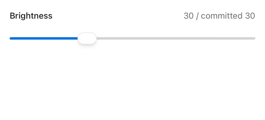
A controlled slider that shows the live and committed values.
```tsx
import * as React from "react"
import { View } from "react-native"
import { Slider } from "@/components/ui/slider"
import { Text } from "@/components/ui/text"
function ControlledDemo() {
const [value, setValue] = React.useState(30)
const [committed, setCommitted] = React.useState(30)
return (
Brightness
{value} / committed {committed}
setValue(next)}
onValueCommitted={(next) => setCommitted(next)}
accessibilityLabel="Brightness"
/>
)
}
export function SliderControlledExample() {
return (
)
}
```
```swift
import EsuissUI
import SwiftUI
struct SliderControlledDemo: View {
@State private var value: Double = 30
@State private var committed: Double = 30
var body: some View {
VStack(alignment: .leading, spacing: 12) {
HStack {
Text("Brightness")
.textStyle(.sm, weight: .medium)
.foregroundStyle(EsuissColor.foreground)
Spacer()
Text(verbatim: "\(Int(value)) / committed \(Int(committed))")
.textStyle(.sm)
.foregroundStyle(EsuissColor.mutedForeground)
}
ValueSlider(value: $value, in: 0...100, step: 1) { editing in
if !editing { committed = value }
}
.accessibilityLabel(Text("Brightness"))
}
.frame(maxWidth: .infinity, alignment: .leading)
}
}
```
```kotlin
import androidx.compose.foundation.layout.Arrangement
import androidx.compose.foundation.layout.Column
import androidx.compose.foundation.layout.Row
import androidx.compose.foundation.layout.fillMaxWidth
import androidx.compose.runtime.Composable
import androidx.compose.runtime.getValue
import androidx.compose.runtime.mutableFloatStateOf
import androidx.compose.runtime.saveable.rememberSaveable
import androidx.compose.runtime.setValue
import androidx.compose.ui.Alignment
import androidx.compose.ui.Modifier
import androidx.compose.ui.text.font.FontWeight
import androidx.compose.ui.unit.dp
import com.esuiss.ui.components.Slider
import com.esuiss.ui.components.Text
import com.esuiss.ui.theme.EsuissTheme
import com.esuiss.ui.theme.Typography
import kotlin.math.roundToInt
@Composable
fun SliderHeader(title: String, detail: String) {
Row(Modifier.fillMaxWidth(), horizontalArrangement = Arrangement.SpaceBetween, verticalAlignment = Alignment.CenterVertically) {
Text(title, style = Typography.sm.copy(fontWeight = FontWeight.Medium))
Text(detail, style = Typography.sm, color = EsuissTheme.colors.mutedForeground)
}
}
@Composable
fun SliderControlled() {
var value by rememberSaveable { mutableFloatStateOf(30f) }
var committed by rememberSaveable { mutableFloatStateOf(30f) }
Column(Modifier.fillMaxWidth(), verticalArrangement = Arrangement.spacedBy(12.dp)) {
SliderHeader("Brightness", "${value.roundToInt()} / committed ${committed.roundToInt()}")
Slider(
value,
{ value = it },
Modifier.fillMaxWidth(),
onValueChangeFinished = { committed = value },
contentDescription = "Brightness",
)
}
}
```
### Range
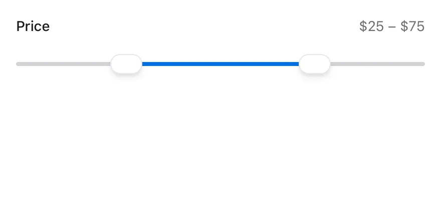
A two-thumb price range with a step and a minimum gap.
```tsx
import * as React from "react"
import { View } from "react-native"
import { Slider } from "@/components/ui/slider"
import { Text } from "@/components/ui/text"
function RangeDemo() {
const [value, setValue] = React.useState([25, 75])
return (
Price
${value[0]} – ${value[1]}
)
}
export function SliderRangeExample() {
return (
)
}
```
```swift
import EsuissUI
import SwiftUI
struct SliderRangeDemo: View {
@State private var value: ClosedRange = 25...75
var body: some View {
VStack(alignment: .leading, spacing: 12) {
HStack {
Text("Price")
.textStyle(.sm, weight: .medium)
.foregroundStyle(EsuissColor.foreground)
Spacer()
Text(verbatim: "$\(Int(value.lowerBound)) – $\(Int(value.upperBound))")
.textStyle(.sm)
.foregroundStyle(EsuissColor.mutedForeground)
}
RangeSlider(value: $value, in: 0...100, step: 5)
.accessibilityLabel(Text("Price"))
}
.frame(maxWidth: .infinity, alignment: .leading)
}
}
```
```kotlin
import androidx.compose.foundation.layout.Arrangement
import androidx.compose.foundation.layout.Column
import androidx.compose.foundation.layout.Row
import androidx.compose.foundation.layout.fillMaxWidth
import androidx.compose.runtime.Composable
import androidx.compose.runtime.getValue
import androidx.compose.runtime.mutableFloatStateOf
import androidx.compose.runtime.saveable.rememberSaveable
import androidx.compose.runtime.setValue
import androidx.compose.ui.Alignment
import androidx.compose.ui.Modifier
import androidx.compose.ui.text.font.FontWeight
import androidx.compose.ui.unit.dp
import com.esuiss.ui.components.RangeSlider
import com.esuiss.ui.components.Text
import com.esuiss.ui.theme.EsuissTheme
import com.esuiss.ui.theme.Typography
import kotlin.math.roundToInt
@Composable
fun SliderHeader(title: String, detail: String) {
Row(Modifier.fillMaxWidth(), horizontalArrangement = Arrangement.SpaceBetween, verticalAlignment = Alignment.CenterVertically) {
Text(title, style = Typography.sm.copy(fontWeight = FontWeight.Medium))
Text(detail, style = Typography.sm, color = EsuissTheme.colors.mutedForeground)
}
}
@Composable
fun SliderRange() {
var start by rememberSaveable { mutableFloatStateOf(25f) }
var end by rememberSaveable { mutableFloatStateOf(75f) }
Column(Modifier.fillMaxWidth(), verticalArrangement = Arrangement.spacedBy(12.dp)) {
SliderHeader("Price", "$${start.roundToInt()} – $${end.roundToInt()}")
RangeSlider(
start..end,
{
start = it.start
end = it.endInclusive
},
Modifier.fillMaxWidth(),
step = 5f,
contentDescription = "Price",
)
}
}
```
**React Native**
### Multiple thumbs
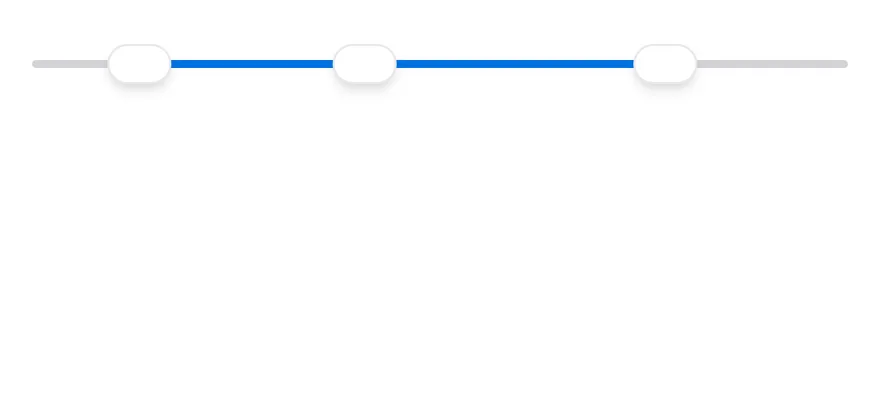
Three thumbs that swap when they cross.
```tsx
import { Slider } from "@/components/ui/slider"
export function SliderMultipleThumbsExample() {
return (
)
}
```
### Step
A slider that moves in decimal steps.

```tsx
import { Slider } from "@/components/ui/slider"
export function SliderStepExample() {
return (
)
}
```
```swift
import EsuissUI
import SwiftUI
struct SliderStepExample: View {
var body: some View {
SliderDemo(initial: 0.5, bounds: 0...1, step: 0.1)
}
}
struct SliderDemo: View {
var bounds: ClosedRange = 0...100
var step: Double = 1
@State private var value: Double
init(initial: Double, bounds: ClosedRange = 0...100, step: Double = 1) {
self.bounds = bounds
self.step = step
_value = State(initialValue: initial)
}
var body: some View {
ValueSlider(value: $value, in: bounds, step: step)
.accessibilityLabel(Text("Volume"))
.frame(maxWidth: .infinity)
}
}
```
```kotlin
import androidx.compose.foundation.layout.fillMaxWidth
import androidx.compose.runtime.Composable
import androidx.compose.runtime.getValue
import androidx.compose.runtime.mutableFloatStateOf
import androidx.compose.runtime.saveable.rememberSaveable
import androidx.compose.runtime.setValue
import androidx.compose.ui.Modifier
import com.esuiss.ui.components.Slider
@Composable
fun SliderStepExample() {
SliderUncontrolled(0.5f, valueRange = 0f..1f, step = 0.1f)
}
@Composable
fun SliderUncontrolled(
initial: Float,
valueRange: ClosedFloatingPointRange = 0f..100f,
step: Float = 1f,
enabled: Boolean = true,
) {
var value by rememberSaveable { mutableFloatStateOf(initial) }
Slider(
value,
{ value = it },
Modifier.fillMaxWidth(),
enabled = enabled,
valueRange = valueRange,
step = step,
contentDescription = "Volume",
)
}
```
**React Native**
### Vertical
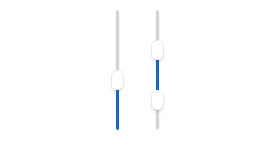
Single and range sliders in vertical orientation.
```tsx
import { View } from "react-native"
import { Slider } from "@/components/ui/slider"
export function SliderVerticalExample() {
return (
)
}
```
### Disabled
A disabled slider with muted colors.

```tsx
import { Slider } from "@/components/ui/slider"
export function SliderDisabledExample() {
return (
)
}
```
```swift
import EsuissUI
import SwiftUI
struct SliderDisabledExample: View {
var body: some View {
SliderDemo(initial: 40)
.disabled(true)
}
}
struct SliderDemo: View {
var bounds: ClosedRange = 0...100
var step: Double = 1
@State private var value: Double
init(initial: Double, bounds: ClosedRange = 0...100, step: Double = 1) {
self.bounds = bounds
self.step = step
_value = State(initialValue: initial)
}
var body: some View {
ValueSlider(value: $value, in: bounds, step: step)
.accessibilityLabel(Text("Volume"))
.frame(maxWidth: .infinity)
}
}
```
```kotlin
import androidx.compose.foundation.layout.fillMaxWidth
import androidx.compose.runtime.Composable
import androidx.compose.runtime.getValue
import androidx.compose.runtime.mutableFloatStateOf
import androidx.compose.runtime.saveable.rememberSaveable
import androidx.compose.runtime.setValue
import androidx.compose.ui.Modifier
import com.esuiss.ui.components.Slider
@Composable
fun SliderDisabledExample() {
SliderUncontrolled(40f, enabled = false)
}
@Composable
fun SliderUncontrolled(
initial: Float,
valueRange: ClosedFloatingPointRange = 0f..100f,
step: Float = 1f,
enabled: Boolean = true,
) {
var value by rememberSaveable { mutableFloatStateOf(initial) }
Slider(
value,
{ value = it },
Modifier.fillMaxWidth(),
enabled = enabled,
valueRange = valueRange,
step = step,
contentDescription = "Volume",
)
}
```
## API Reference
### Slider
Also accepts the props of `SliderPrimitive.RootProps`.
## Accessibility
- Each thumb has the `adjustable` role with its min, max and current value, so VoiceOver and TalkBack users can swipe up or down to change it.
- `accessibilityLabel` on `Slider` is passed to every thumb; set it, since the slider has no visible label.
- Disabled thumbs report `disabled` in their accessibility state.
## Notes
- The track uses `bg-border` and the indicator `bg-primary`, and the slider is shown at `opacity-50` when disabled.
- Thumbs use `bg-background` with a shadow, or `bg-foreground` in dark mode.
- Light and dark colors follow the system appearance.