# Separator
A thin line that visually divides content, horizontally or vertically.
Separator is an open-source component from suiss/ui for React, React Native, SwiftUI and Jetpack Compose. The @esuiss/ui CLI copies its source into your project, so you own the code.
Source: https://ui.suiss.app/docs/components/separator
**React**
**Example**
```tsx
import { Separator } from "@/components/ui/separator"
export default function SeparatorDemo() {
return (
Account settings
Manage your profile and preferences.
ProfileBillingSecurity
)
}
```
`Separator` wraps the separator primitive of the chosen base. It draws a 1px line in the `border` color: full width when horizontal, and stretched to the container's height when vertical.
Use it between groups of content or between inline items. Inside menus and selects, use the dedicated separator part of that component instead.
## Installation
### CLI
```bash title="Terminal"
npx shadcn@latest add @esuiss/separator
```
Works in any project with a `components.json`. See [Installation](https://ui.suiss.app/docs/installation#add-components) for the one-line registry setup. Or use the suiss/ui CLI:
```bash title="Terminal"
npx @esuiss/ui@latest add separator
```
### Manual
1. Install the dependencies and add the [`cn` helper](https://ui.suiss.app/docs/installation#the-cn-helper):
```bash title="Terminal"
npm install @base-ui/react
```
2. Copy the source into `components/ui/separator.tsx`:
```tsx title="components/ui/separator.tsx"
"use client"
import { Separator as SeparatorPrimitive } from "@base-ui/react/separator"
import { cn } from "@/lib/utils"
function Separator({
className,
orientation = "horizontal",
...props
}: SeparatorPrimitive.Props) {
return (
)
}
export { Separator }
```
3. Update the import paths to match your project.
## Usage
```tsx
import { Separator } from "@/components/ui/separator"
```
```tsx
Account settings
Manage your profile and preferences.
ProfileBillingSecurity
```
`orientation` defaults to `horizontal`. Set `orientation="vertical"` inside a flex row; the line stretches to the row's height, so give the row a height.
## Examples
### Horizontal
Divides two stacked lines of text.
**Example**
```tsx
import { Separator } from "@/components/ui/separator"
export default function SeparatorHorizontal() {
return (
Recent activityArchived items
)
}
```
### Vertical
Divides inline links in a row.
**Example**
```tsx
import { Separator } from "@/components/ui/separator"
export default function SeparatorVertical() {
return (
DocsBlogChangelog
)
}
```
## API Reference
### Separator
Draws the dividing line.
Also accepts the props of the primitive part it wraps.
## Accessibility
- Renders with the `separator` role and an `aria-orientation` that matches `orientation`.
## Notes
- Uses `data-slot="separator"`, and the primitive's orientation attributes set its size.
- The color comes from the `bg-border` token.
**React Native, SwiftUI, Jetpack Compose**
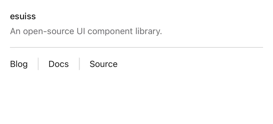
```tsx
import { View } from "react-native"
import { Separator } from "@/components/ui/separator"
import { Text } from "@/components/ui/text"
export function SeparatorExample() {
return (
suissAn open-source UI component library.BlogDocsSource
)
}
```
```swift
import EsuissUI
import SwiftUI
struct SeparatorExample: View {
var body: some View {
VStack(alignment: .leading, spacing: 0) {
VStack(alignment: .leading, spacing: 4) {
Text(verbatim: "suiss")
.textStyle(.sm, weight: .medium)
.foregroundStyle(EsuissColor.foreground)
Text("An open-source UI component library.")
.textVariant(.muted)
}
Separator()
.padding(.vertical, 16)
HStack(spacing: 16) {
SeparatorText("Blog")
Separator(.vertical)
SeparatorText("Docs")
Separator(.vertical)
SeparatorText("Source")
}
.frame(height: 20)
}
.frame(maxWidth: .infinity, alignment: .leading)
}
}
struct SeparatorText: View {
let title: LocalizedStringKey
init(_ title: LocalizedStringKey) {
self.title = title
}
var body: some View {
Text(title)
.textStyle(.sm)
.foregroundStyle(EsuissColor.foreground)
}
}
```
```kotlin
import androidx.compose.foundation.gestures.Orientation
import androidx.compose.foundation.layout.Arrangement
import androidx.compose.foundation.layout.Column
import androidx.compose.foundation.layout.Row
import androidx.compose.foundation.layout.fillMaxWidth
import androidx.compose.foundation.layout.height
import androidx.compose.foundation.layout.padding
import androidx.compose.runtime.Composable
import androidx.compose.ui.Alignment
import androidx.compose.ui.Modifier
import androidx.compose.ui.text.font.FontWeight
import androidx.compose.ui.unit.dp
import com.esuiss.ui.components.Separator
import com.esuiss.ui.components.Text
import com.esuiss.ui.components.TextVariant
import com.esuiss.ui.theme.Typography
@Composable
fun SeparatorVerticalRow(labels: List, height: Int) {
Row(
modifier = Modifier.height(height.dp),
horizontalArrangement = Arrangement.spacedBy(16.dp),
verticalAlignment = Alignment.CenterVertically,
) {
labels.forEachIndexed { index, label ->
if (index > 0) Separator(orientation = Orientation.Vertical)
Text(label, style = Typography.sm)
}
}
}
@Composable
fun SeparatorDefault() {
Column(Modifier.fillMaxWidth()) {
Column(verticalArrangement = Arrangement.spacedBy(4.dp)) {
Text("esuiss", style = Typography.sm.copy(fontWeight = FontWeight.Medium))
Text("An open-source UI component library.", variant = TextVariant.Muted)
}
Separator(Modifier.padding(vertical = 16.dp))
SeparatorVerticalRow(listOf("Blog", "Docs", "Source"), 20)
}
}
```
`Separator` is a `View` drawn as a one-pixel line. Horizontal separators fill the width of their container; vertical separators stretch to the height of a row.
## Installation
**React Native**
```bash title="Terminal"
npx shadcn@latest add @esuiss-rn/separator
```
See [Installation](https://ui.suiss.app/docs/installation) for the `components.json` setup. Or use the suiss/ui CLI:
```bash title="Terminal"
npx @esuiss/ui@latest add separator
```
**SwiftUI**
```bash title="Terminal"
npx @esuiss/ui@latest add separator --platform swift
```
**Jetpack Compose**
```bash title="Terminal"
npx @esuiss/ui@latest add separator --platform kotlin
```
### Manual
**React Native**
**Uniwind**
1. Install the dependencies:
```bash title="Terminal"
npx expo install cn
```
2. Add the pieces it builds on: the primitives `components/primitives/separator.tsx`, `components/primitives/use-render.tsx`.
3. Copy the source into `components/ui/separator.tsx`:
```tsx title="uniwind/components/ui/separator.tsx"
import { cn } from "cn"
import { Separator as SeparatorPrimitive } from "@/components/primitives/separator"
import { resolveClassName } from "@/components/primitives/use-render"
function Separator({
className,
...props
}: React.ComponentProps) {
return (
cn(
"shrink-0 bg-border",
state.orientation === "horizontal"
? "h-px w-full"
: "w-px self-stretch",
resolveClassName(className, state)
)
}
{...props}
/>
)
}
export { Separator }
```
4. Update the import paths to match your project.
**NativeWind**
1. Install the dependencies:
```bash title="Terminal"
npx expo install cn
```
2. Add the pieces it builds on: the primitives `components/primitives/separator.tsx`, `components/primitives/use-render.tsx`.
3. Copy the source into `components/ui/separator.tsx`:
```tsx title="nativewind/components/ui/separator.tsx"
import { cn } from "cn"
import { Separator as SeparatorPrimitive } from "@/components/primitives/separator"
import { resolveClassName } from "@/components/primitives/use-render"
function Separator({
className,
...props
}: React.ComponentProps) {
return (
cn(
"shrink-0 bg-border",
state.orientation === "horizontal"
? "h-px w-full"
: "w-px self-stretch",
resolveClassName(className, state)
)
}
{...props}
/>
)
}
export { Separator }
```
4. Update the import paths to match your project.
**StyleSheet**
1. Add the pieces it builds on: the primitives `components/primitives/separator.tsx`, `components/primitives/use-render.tsx`.
2. Copy the source into `components/ui/separator.tsx`:
```tsx title="stylesheet/components/ui/separator.tsx"
import { StyleSheet } from "react-native"
import { Separator as SeparatorPrimitive } from "@/components/primitives/separator"
import { useTheme } from "@/components/ui/theme"
const styles = StyleSheet.create({
root: { flexShrink: 0 },
horizontal: { height: 1, width: "100%" },
vertical: { width: 1, alignSelf: "stretch" },
})
function Separator({
style,
...props
}: React.ComponentProps) {
const { colors } = useTheme()
return (
[
styles.root,
{ backgroundColor: colors.border },
state.orientation === "horizontal"
? styles.horizontal
: styles.vertical,
typeof style === "function" ? style(state) : style,
]}
{...props}
/>
)
}
export { Separator }
```
3. Update the import paths to match your project.
**SwiftUI**
1. Target iOS 17 or later.
2. Copy the theme files every view uses:
- `swift/Theme/Theme.swift`: [source](https://github.com/e-suiss/ui/blob/main/packages/mobile/swiftui/Sources/EsuissUI/Theme/Theme.swift)
- `swift/Theme/Tokens.swift`: [source](https://github.com/e-suiss/ui/blob/main/packages/mobile/swiftui/Sources/EsuissUI/Theme/Tokens.swift)
3. Copy the source:
```swift title="swift/Components/Separator.swift"
import SwiftUI
public struct Separator: View {
let orientation: Axis
public init(_ orientation: Axis = .horizontal) {
self.orientation = orientation
}
public var body: some View {
Rectangle()
.fill(EsuissColor.border)
.frame(width: orientation == .vertical ? 1 : nil, height: orientation == .horizontal ? 1 : nil)
.frame(maxWidth: orientation == .horizontal ? .infinity : nil, maxHeight: orientation == .vertical ? .infinity : nil)
.accessibilityHidden(true)
}
}
```
4. Add the files to your app target.
**Jetpack Compose**
1. Set `minSdk` to 24 or higher and add the dependencies:
```kotlin title="build.gradle.kts"
implementation(platform("androidx.compose:compose-bom:2026.09.00"))
implementation("androidx.compose.foundation:foundation")
implementation("androidx.compose.ui:ui")
```
2. Copy the theme files every view uses:
- `kotlin/theme/Theme.kt`: [source](https://github.com/e-suiss/ui/blob/main/packages/mobile/kotlin/ui/src/main/kotlin/com/esuiss/ui/theme/Theme.kt)
- `kotlin/theme/Tokens.kt`: [source](https://github.com/e-suiss/ui/blob/main/packages/mobile/kotlin/ui/src/main/kotlin/com/esuiss/ui/theme/Tokens.kt)
3. Copy the source:
```kt title="kotlin/components/Separator.kt"
package com.esuiss.ui.components
import androidx.compose.foundation.background
import androidx.compose.foundation.gestures.Orientation
import androidx.compose.foundation.layout.Box
import androidx.compose.foundation.layout.fillMaxHeight
import androidx.compose.foundation.layout.fillMaxWidth
import androidx.compose.foundation.layout.height
import androidx.compose.foundation.layout.width
import androidx.compose.runtime.Composable
import androidx.compose.ui.Modifier
import androidx.compose.ui.unit.dp
import com.esuiss.ui.theme.EsuissTheme
@Composable
fun Separator(
modifier: Modifier = Modifier,
orientation: Orientation = Orientation.Horizontal,
) {
val sizing = if (orientation == Orientation.Horizontal) {
Modifier.fillMaxWidth().height(1.dp)
} else {
Modifier.fillMaxHeight().width(1.dp)
}
Box(modifier.then(sizing).background(EsuissTheme.colors.border))
}
```
4. Update the `com.esuiss.ui` package names to match your project.
## Usage
```tsx
import { Separator } from "@/components/ui/separator"
```
```tsx
esuissAn open-source UI component library.BlogDocsSource
```
Use the default `horizontal` orientation between stacked blocks, and `orientation="vertical"` between items in a row. Add spacing with `className`, such as `my-4`.
## Examples
### Horizontal
A horizontal separator between two lines of text.
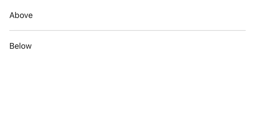
```tsx
import { View } from "react-native"
import { Separator } from "@/components/ui/separator"
import { Text } from "@/components/ui/text"
export function SeparatorHorizontalExample() {
return (
AboveBelow
)
}
```
```swift
import EsuissUI
import SwiftUI
struct SeparatorHorizontalExample: View {
var body: some View {
VStack(alignment: .leading, spacing: 16) {
SeparatorText("Above")
Separator()
SeparatorText("Below")
}
.frame(maxWidth: .infinity, alignment: .leading)
}
}
struct SeparatorText: View {
let title: LocalizedStringKey
init(_ title: LocalizedStringKey) {
self.title = title
}
var body: some View {
Text(title)
.textStyle(.sm)
.foregroundStyle(EsuissColor.foreground)
}
}
```
```kotlin
import androidx.compose.foundation.layout.Arrangement
import androidx.compose.foundation.layout.Column
import androidx.compose.foundation.layout.fillMaxWidth
import androidx.compose.runtime.Composable
import androidx.compose.ui.Modifier
import androidx.compose.ui.unit.dp
import com.esuiss.ui.components.Separator
import com.esuiss.ui.components.Text
import com.esuiss.ui.theme.Typography
@Composable
fun SeparatorHorizontal() {
Column(Modifier.fillMaxWidth(), verticalArrangement = Arrangement.spacedBy(16.dp)) {
Text("Above", style = Typography.sm)
Separator()
Text("Below", style = Typography.sm)
}
}
```
### Vertical
A vertical separator between two items in a row.

```tsx
import { View } from "react-native"
import { Separator } from "@/components/ui/separator"
import { Text } from "@/components/ui/text"
export function SeparatorVerticalExample() {
return (
LeftRight
)
}
```
```swift
import EsuissUI
import SwiftUI
struct SeparatorVerticalExample: View {
var body: some View {
HStack(spacing: 16) {
SeparatorText("Left")
Separator(.vertical)
SeparatorText("Right")
}
.frame(height: 24)
}
}
struct SeparatorText: View {
let title: LocalizedStringKey
init(_ title: LocalizedStringKey) {
self.title = title
}
var body: some View {
Text(title)
.textStyle(.sm)
.foregroundStyle(EsuissColor.foreground)
}
}
```
```kotlin
import androidx.compose.foundation.gestures.Orientation
import androidx.compose.foundation.layout.Arrangement
import androidx.compose.foundation.layout.Row
import androidx.compose.foundation.layout.height
import androidx.compose.runtime.Composable
import androidx.compose.ui.Alignment
import androidx.compose.ui.Modifier
import androidx.compose.ui.unit.dp
import com.esuiss.ui.components.Separator
import com.esuiss.ui.components.Text
import com.esuiss.ui.theme.Typography
@Composable
fun SeparatorVerticalExample() {
SeparatorVerticalRow(listOf("Left", "Right"), 24)
}
@Composable
fun SeparatorVerticalRow(labels: List, height: Int) {
Row(
modifier = Modifier.height(height.dp),
horizontalArrangement = Arrangement.spacedBy(16.dp),
verticalAlignment = Alignment.CenterVertically,
) {
labels.forEachIndexed { index, label ->
if (index > 0) Separator(orientation = Orientation.Vertical)
Text(label, style = Typography.sm)
}
}
}
```
## API Reference
### Separator
Also accepts the props of `React.ComponentProps`.
## Accessibility
- The separator is decorative and hidden from VoiceOver and TalkBack.
## Notes
- Uses the `bg-border` token.
- Light and dark colors follow the system appearance.