# Select
A button that opens a list of options so people can pick one value.
Select is an open-source component from suiss/ui for React, React Native, SwiftUI and Jetpack Compose. The @esuiss/ui CLI copies its source into your project, so you own the code.
Source: https://ui.suiss.app/docs/components/select
**React**
**Example**
```tsx
import {
Select,
SelectContent,
SelectGroup,
SelectItem,
SelectTrigger,
SelectValue,
} from "@/components/ui/select"
const fruits = [
{ value: "apple", label: "Apple" },
{ value: "banana", label: "Banana" },
{ value: "blueberry", label: "Blueberry" },
{ value: "grapes", label: "Grapes" },
{ value: "pineapple", label: "Pineapple" },
]
export default function SelectDemo() {
return (
)
}
```
`Select` wraps the select primitive of the chosen base. `SelectTrigger` shows the current choice through `SelectValue` and a chevron icon; `SelectContent` renders the popup in a portal, positioned against the trigger, and holds `SelectItem` options. Use `SelectGroup` with a `SelectLabel` to title a set of options, and `SelectSeparator` to divide groups.
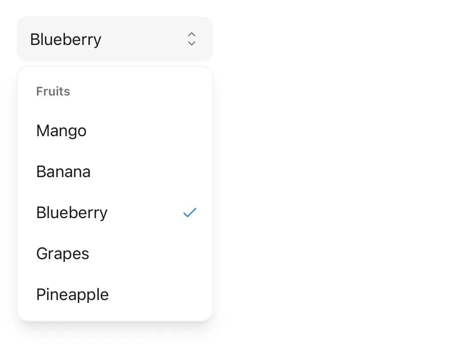
A highlight pill slides between options as the highlighted item changes, and the selected item shows a check mark. Use `Select` when people choose one value from a fixed list. For a few always-visible options, consider `ToggleGroup` or `RadioGroup`.
## Installation
### CLI
```bash title="Terminal"
npx shadcn@latest add @esuiss/select
```
Works in any project with a `components.json`. See [Installation](https://ui.suiss.app/docs/installation#add-components) for the one-line registry setup. Or use the suiss/ui CLI:
```bash title="Terminal"
npx @esuiss/ui@latest add select
```
### Manual
1. Install the dependencies and add the [`cn` helper](https://ui.suiss.app/docs/installation#the-cn-helper):
```bash title="Terminal"
npm install @base-ui/react @phosphor-icons/react
```
2. Copy the source into `components/ui/select.tsx`:
```tsx title="components/ui/select.tsx"
"use client"
import { Select as SelectPrimitive } from "@base-ui/react/select"
import {
CaretDownIcon,
CaretUpDownIcon,
CaretUpIcon,
CheckIcon,
} from "@phosphor-icons/react"
import type * as React from "react"
import { cn } from "@/lib/utils"
const Select = SelectPrimitive.Root
function trackHighlight(list: HTMLDivElement | null) {
const indicator = list?.querySelector(
"[data-slot=select-highlight]"
)
if (!list || !indicator) return
const update = () => {
const item = list.querySelector(
"[data-slot=select-item][data-highlighted]"
)
if (!item) {
delete indicator.dataset.visible
return
}
const instant = !("visible" in indicator.dataset)
if (instant) indicator.dataset.instant = ""
indicator.style.top = `${item.offsetTop}px`
indicator.style.left = `${item.offsetLeft}px`
indicator.style.width = `${item.offsetWidth}px`
indicator.style.height = `${item.offsetHeight}px`
indicator.dataset.visible = ""
if (instant) {
void indicator.offsetHeight
delete indicator.dataset.instant
}
}
update()
const observer = new MutationObserver(update)
observer.observe(list, {
subtree: true,
attributeFilter: ["data-highlighted"],
})
return () => observer.disconnect()
}
function SelectGroup({ className, ...props }: SelectPrimitive.Group.Props) {
return (
)
}
function SelectValue({ className, ...props }: SelectPrimitive.Value.Props) {
return (
)
}
function SelectTrigger({
className,
size = "default",
children,
...props
}: SelectPrimitive.Trigger.Props & {
size?: "sm" | "default"
}) {
return (
{children}
}
/>
)
}
function SelectContent({
className,
children,
side = "bottom",
sideOffset = 4,
align = "center",
alignOffset = 0,
alignItemWithTrigger = false,
...props
}: SelectPrimitive.Popup.Props &
Pick<
SelectPrimitive.Positioner.Props,
"align" | "alignOffset" | "side" | "sideOffset" | "alignItemWithTrigger"
>) {
return (
{children}
)
}
function SelectLabel({
className,
...props
}: SelectPrimitive.GroupLabel.Props) {
return (
)
}
function SelectItem({
className,
children,
...props
}: SelectPrimitive.Item.Props) {
return (
{children}
}
>
)
}
function SelectSeparator({
className,
...props
}: SelectPrimitive.Separator.Props) {
return (
)
}
function SelectScrollUpButton({
className,
...props
}: React.ComponentProps) {
return (
)
}
function SelectScrollDownButton({
className,
...props
}: React.ComponentProps) {
return (
)
}
export {
Select,
SelectContent,
SelectGroup,
SelectItem,
SelectLabel,
SelectScrollDownButton,
SelectScrollUpButton,
SelectSeparator,
SelectTrigger,
SelectValue,
}
```
3. Update the import paths to match your project.
## Usage
```tsx
import { SelectGroup, SelectValue, SelectTrigger, SelectContent, SelectLabel, SelectItem, SelectSeparator, SelectScrollUpButton, SelectScrollDownButton } from "@/components/ui/select"
```
```tsx
```
Pass `items` to `Select` as `{ value, label }` pairs so `SelectValue` can show the label for the chosen value, even before the popup opens. Use `defaultValue` for an uncontrolled select, or `value` with `onValueChange` to control it. `SelectValue` shows its `placeholder` until a value is chosen.
`SelectContent` opens below the trigger by default. It accepts the positioner props `side`, `sideOffset`, `align`, `alignOffset` and `alignItemWithTrigger`.
## Examples
### Open
Renders the popup open on mount with a value already selected.
**Example**
```tsx
import {
Select,
SelectContent,
SelectGroup,
SelectItem,
SelectTrigger,
SelectValue,
} from "@/components/ui/select"
const fruits = [
{ value: "apple", label: "Apple" },
{ value: "banana", label: "Banana" },
{ value: "blueberry", label: "Blueberry" },
{ value: "grapes", label: "Grapes" },
{ value: "pineapple", label: "Pineapple" },
]
export default function SelectOpen() {
return (
)
}
```
### With value
Starts with a default value, so the trigger shows its label.
**Example**
```tsx
import {
Select,
SelectContent,
SelectGroup,
SelectItem,
SelectTrigger,
SelectValue,
} from "@/components/ui/select"
const fruits = [
{ value: "apple", label: "Apple" },
{ value: "banana", label: "Banana" },
{ value: "blueberry", label: "Blueberry" },
{ value: "grapes", label: "Grapes" },
{ value: "pineapple", label: "Pineapple" },
]
export default function SelectWithValue() {
return (
)
}
```
### Small
Uses the compact `sm` trigger size.
**Example**
```tsx
import {
Select,
SelectContent,
SelectItem,
SelectTrigger,
SelectValue,
} from "@/components/ui/select"
const fruits = [
{ value: "apple", label: "Apple" },
{ value: "banana", label: "Banana" },
{ value: "blueberry", label: "Blueberry" },
{ value: "grapes", label: "Grapes" },
{ value: "pineapple", label: "Pineapple" },
]
export default function SelectSmall() {
return (
)
}
```
### Grouped
Splits options into labelled groups with a separator between them.
**Example**
```tsx
import { Fragment } from "react"
import {
Select,
SelectContent,
SelectGroup,
SelectItem,
SelectLabel,
SelectSeparator,
SelectTrigger,
SelectValue,
} from "@/components/ui/select"
const timezones = [
{
label: "North America",
items: [
{ value: "est", label: "Eastern Time" },
{ value: "cst", label: "Central Time" },
{ value: "pst", label: "Pacific Time" },
],
},
{
label: "Europe",
items: [
{ value: "gmt", label: "Greenwich Mean Time" },
{ value: "cet", label: "Central European Time" },
{ value: "eet", label: "Eastern European Time" },
],
},
]
export default function SelectGrouped() {
return (
)
}
```
### With icons
Places an icon before each option's label.
**Example**
```tsx
import { GlobeIcon, MoonIcon, SunIcon } from "@phosphor-icons/react"
import {
Select,
SelectContent,
SelectItem,
SelectTrigger,
SelectValue,
} from "@/components/ui/select"
const themes = [
{
value: "light",
label: "Light",
icon: (
),
},
{
value: "dark",
label: "Dark",
icon: (
),
},
{
value: "system",
label: "System",
icon: (
),
},
]
export default function SelectWithIcons() {
return (
)
}
```
### Disabled
Disables the select so it can't be opened.
**Example**
```tsx
import {
Select,
SelectContent,
SelectGroup,
SelectItem,
SelectTrigger,
SelectValue,
} from "@/components/ui/select"
const fruits = [
{ value: "apple", label: "Apple" },
{ value: "banana", label: "Banana" },
{ value: "blueberry", label: "Blueberry" },
{ value: "grapes", label: "Grapes" },
{ value: "pineapple", label: "Pineapple" },
]
export default function SelectDisabled() {
return (
)
}
```
### Invalid
Marks the trigger with `aria-invalid` to show an error state.
**Example**
```tsx
import {
Select,
SelectContent,
SelectItem,
SelectTrigger,
SelectValue,
} from "@/components/ui/select"
const fruits = [
{ value: "apple", label: "Apple" },
{ value: "banana", label: "Banana" },
{ value: "blueberry", label: "Blueberry" },
{ value: "grapes", label: "Grapes" },
{ value: "pineapple", label: "Pineapple" },
]
export default function SelectInvalid() {
return (
)
}
```
## API Reference
- `Select`
- `SelectTrigger`
- `SelectValue`
- `SelectContent`
- `SelectGroup`
- `SelectItem`
- `SelectLabel`
- `SelectItem`
- `SelectSeparator`
### Select
The root that holds the selected value and the open state.
Also accepts the props of the primitive part it wraps.
### SelectGroup
Groups related options; label it with a `SelectLabel`.
Also accepts the props of the primitive part it wraps.
### SelectValue
Shows the selected option's label, or the placeholder, inside the trigger.
Also accepts the props of the primitive part it wraps.
### SelectTrigger
The button that opens the popup and displays the current value.
| Prop | Type | Default | Description |
| --- | --- | --- | --- |
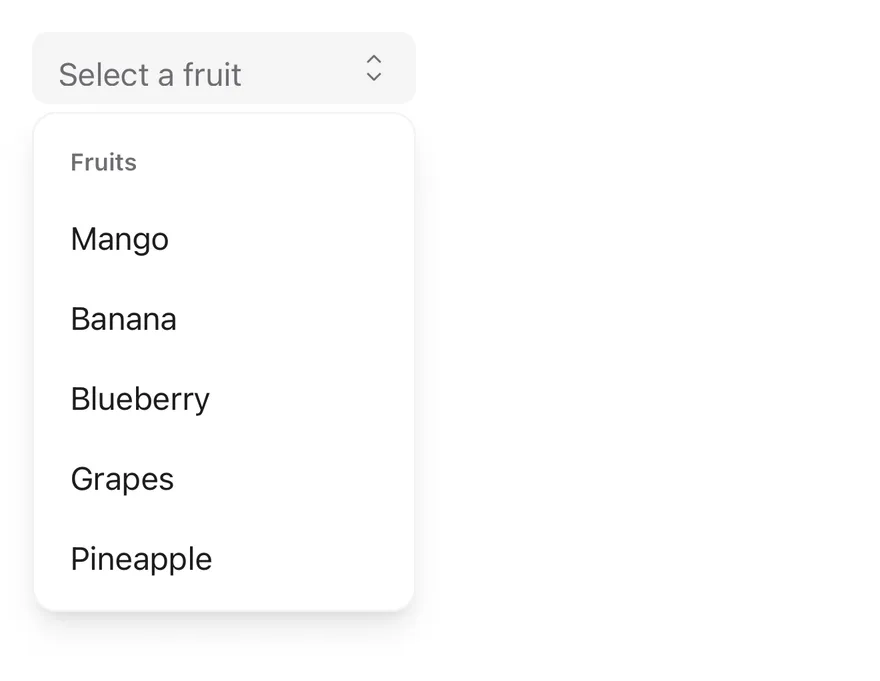
| `size` | `"sm" \| "default"` | `"default"` | Sets the trigger height: `default` is 44px tall, `sm` is 36px with smaller corners. |
Also accepts the props of the primitive part it wraps.
### SelectContent
The positioned popup that holds the option list and scroll arrows.
Also accepts the props of the primitive parts it wraps.
### SelectLabel
A heading that names a `SelectGroup`.
Also accepts the props of the primitive part it wraps.
### SelectItem
A selectable option, with a check mark when selected.
Also accepts the props of the primitive part it wraps.
### SelectSeparator
A thin line that divides groups of options.
Also accepts the props of the primitive part it wraps.
### SelectScrollUpButton
An arrow that scrolls the list up when it overflows; rendered by `SelectContent`.
Also accepts the props of `React.ComponentProps`.
### SelectScrollDownButton
An arrow that scrolls the list down when it overflows; rendered by `SelectContent`.
Also accepts the props of `React.ComponentProps`.
## Accessibility
- The trigger has the `combobox` role and the popup list has the `listbox` role; each item is an `option` with `aria-selected` on the chosen one.
- Give the trigger an accessible name, such as `aria-label` or an associated label.
- When the popup opens, focus moves to the selected option. Arrow keys move between options and `Enter` selects.
- `Escape` closes the popup without changing the value, and focus returns to the trigger.
- A `SelectGroup` with a `SelectLabel` is exposed as a named `group`.
## Notes
- Parts carry `data-slot` attributes such as `select-trigger`, `select-content`, `select-item` and `select-highlight`.
- The trigger sets `data-size`, and styles `data-placeholder`, `aria-invalid` and `disabled` states. Invalid triggers use the `destructive` color.
- The popup uses `bg-popover`, the highlight uses `bg-accent text-accent-foreground`, and the check mark uses `text-primary`.
- The highlight animation is turned off when reduced motion is preferred.
**React Native, SwiftUI, Jetpack Compose**
**React Native**
```tsx
import * as React from "react"
import { type Option, Select, SelectContent, SelectGroup, SelectItem, SelectLabel, SelectTrigger, SelectValue } from "@/components/ui/select"
const fruits: Option[] = [
{ value: "mango", label: "Mango" },
{ value: "banana", label: "Banana" },
{ value: "blueberry", label: "Blueberry" },
{ value: "grapes", label: "Grapes" },
{ value: "pineapple", label: "Pineapple" },
]
function SelectDemo({
initial,
size,
disabled = false,
invalid = false,
labelledBy,
defaultOpen,
}: {
initial?: Option
size?: "default" | "sm"
disabled?: boolean
invalid?: boolean
labelledBy?: string
defaultOpen?: boolean
}) {
const [value, setValue] = React.useState(
initial?.value ?? null
)
return (
)
}
export function SelectOpenByDefaultExample() {
return (
)
}
```
`Select` is built on the select primitive. `SelectTrigger` is a pressable field with the `combobox` role and an up-down caret. `SelectContent` renders in a portal, positioned next to the trigger, and fades in and out with Reanimated. The list matches the trigger width.
The trigger comes in two sizes, `default` and `sm`. Use Select for picking one value from a short list; for a list that needs searching, use Combobox.
## Installation
**React Native**
```bash title="Terminal"
npx shadcn@latest add @esuiss-rn/select
```
See [Installation](https://ui.suiss.app/docs/installation) for the `components.json` setup. Or use the suiss/ui CLI:
```bash title="Terminal"
npx @esuiss/ui@latest add select
```
**SwiftUI**
```bash title="Terminal"
npx @esuiss/ui@latest add select --platform swift
```
**Jetpack Compose**
```bash title="Terminal"
npx @esuiss/ui@latest add select --platform kotlin
```
The CLI also adds what it builds on: [Icon](https://ui.suiss.app/docs/components/icon), [Text](https://ui.suiss.app/docs/components/text). On React Native it also adds the animated view `components/ui/animated-view.tsx`.
### Manual
**React Native**
**Uniwind**
1. Install the dependencies:
```bash title="Terminal"
npx expo install cn phosphor-react-native react-native-reanimated react-native-screens react-native-svg react-native-worklets
```
2. Add the pieces it builds on: [Icon](https://ui.suiss.app/docs/components/icon), [Text](https://ui.suiss.app/docs/components/text), and the primitives `components/primitives/field.tsx`, `components/primitives/positioner.tsx`, `components/primitives/select.tsx`, `components/primitives/use-render.tsx`, and the animated view `components/ui/animated-view.tsx` from the next step.
3. Copy the animated view into `components/ui/animated-view.tsx`:
- `uniwind/components/ui/animated-view.tsx`: [source](https://github.com/e-suiss/ui/blob/main/packages/mobile/uniwind/components/ui/animated-view.tsx)
4. Copy the source into `components/ui/select.tsx`:
```tsx title="uniwind/components/ui/select.tsx"
import { cn } from "cn"
import { CaretUpDownIcon, CheckIcon } from "phosphor-react-native"
import * as React from "react"
import { Platform, type StyleProp, type ViewStyle } from "react-native"
import { FadeIn, FadeOut, ReduceMotion } from "react-native-reanimated"
import { FullWindowOverlay as RNFullWindowOverlay } from "react-native-screens"
import { useFieldRootContext } from "@/components/primitives/field"
import { useOptionalPositionerContext } from "@/components/primitives/positioner"
import * as SelectPrimitive from "@/components/primitives/select"
import {
resolveClassName,
resolveStyle,
} from "@/components/primitives/use-render"
import { AnimatedView } from "@/components/ui/animated-view"
import { Icon } from "@/components/ui/icon"
import { TextClassContext } from "@/components/ui/text"
interface Option {
value: string
label: string
}
const Select = SelectPrimitive.Root
function SelectGroup({
className,
...props
}: React.ComponentProps) {
return (
cn("p-1.5", resolveClassName(className, state))}
{...props}
/>
)
}
function SelectValue({
className,
...props
}: React.ComponentProps) {
return (
cn(
"flex-1 text-left text-base text-foreground",
state.placeholder && "text-muted-foreground",
resolveClassName(className, state)
)
}
{...props}
/>
)
}
function SelectTrigger({
className,
children,
size = "default",
invalid,
...props
}: React.ComponentProps & {
children?: React.ReactNode
size?: "default" | "sm"
invalid?: boolean
}) {
const field = useFieldRootContext()
const isInvalid = invalid ?? field.state.invalid
return (
cn(
"h-11 flex-row items-center justify-between gap-1.5 self-start rounded-lg border border-transparent bg-secondary px-3 py-2",
size === "sm" && "h-9 rounded-md",
isInvalid &&
"border-destructive bg-destructive/5 dark:bg-destructive/10",
state.disabled && "opacity-50",
resolveClassName(className, state)
)
}
{...props}
>
{children}
)
}
const FullWindowOverlay =
Platform.OS === "ios" ? RNFullWindowOverlay : React.Fragment
type PositionerProps = React.ComponentProps
function ContentPopup({
className,
style,
children,
...props
}: React.ComponentProps) {
const positioner = useOptionalPositionerContext()
const width = positioner?.anchorWidth || undefined
return (
cn(
"relative min-w-36 overflow-hidden rounded-xl border border-foreground/5 bg-popover shadow-lg dark:border-foreground/10",
resolveClassName(className, state)
)
}
style={(state) => [
{ width },
resolveStyle(style, state) as StyleProp,
]}
{...props}
>
{children}
)
}
function SelectContent({
side = "bottom",
sideOffset = 4,
align = "center",
alignOffset = 0,
portalHost,
...props
}: React.ComponentProps &
Pick & {
portalHost?: string
}) {
return (
)
}
function SelectLabel({
className,
...props
}: React.ComponentProps) {
return (
cn(
"px-3 py-2.5 text-xs font-semibold text-muted-foreground",
resolveClassName(className, state)
)
}
{...props}
/>
)
}
function SelectItem({
className,
children,
...props
}: Omit, "children"> & {
children?: React.ReactNode
}) {
return (
cn(
"relative w-full flex-row items-center gap-2.5 rounded-md py-2 pr-8 pl-3",
state.highlighted && "opacity-80",
state.disabled && "opacity-50",
resolveClassName(className, state)
)
}
{...props}
>
{children}
)
}
function SelectSeparator({
className,
...props
}: React.ComponentProps) {
return (
cn("my-1.5 h-px bg-border", resolveClassName(className, state))
}
{...props}
/>
)
}
export {
type Option,
Select,
SelectContent,
SelectGroup,
SelectItem,
SelectLabel,
SelectSeparator,
SelectTrigger,
SelectValue,
}
```
5. Update the import paths to match your project.
**NativeWind**
1. Install the dependencies:
```bash title="Terminal"
npx expo install cn phosphor-react-native react-native-reanimated react-native-screens react-native-svg react-native-worklets
```
2. Add the pieces it builds on: [Icon](https://ui.suiss.app/docs/components/icon), [Text](https://ui.suiss.app/docs/components/text), and the primitives `components/primitives/field.tsx`, `components/primitives/positioner.tsx`, `components/primitives/select.tsx`, `components/primitives/use-render.tsx`, and the animated view `components/ui/animated-view.tsx` from the next step.
3. Copy the animated view into `components/ui/animated-view.tsx`:
- `nativewind/components/ui/animated-view.tsx`: [source](https://github.com/e-suiss/ui/blob/main/packages/mobile/nativewind/components/ui/animated-view.tsx)
4. Copy the source into `components/ui/select.tsx`:
```tsx title="nativewind/components/ui/select.tsx"
import { cn } from "cn"
import { CaretUpDownIcon, CheckIcon } from "phosphor-react-native"
import * as React from "react"
import { Platform, type StyleProp, type ViewStyle } from "react-native"
import { FadeIn, FadeOut, ReduceMotion } from "react-native-reanimated"
import { FullWindowOverlay as RNFullWindowOverlay } from "react-native-screens"
import { useFieldRootContext } from "@/components/primitives/field"
import { useOptionalPositionerContext } from "@/components/primitives/positioner"
import * as SelectPrimitive from "@/components/primitives/select"
import {
resolveClassName,
resolveStyle,
} from "@/components/primitives/use-render"
import { AnimatedView } from "@/components/ui/animated-view"
import { Icon } from "@/components/ui/icon"
import { TextClassContext } from "@/components/ui/text"
interface Option {
value: string
label: string
}
const Select = SelectPrimitive.Root
function SelectGroup({
className,
...props
}: React.ComponentProps) {
return (
cn("p-1.5", resolveClassName(className, state))}
{...props}
/>
)
}
function SelectValue({
className,
...props
}: React.ComponentProps) {
return (
cn(
"flex-1 text-left text-base text-foreground",
state.placeholder && "text-muted-foreground",
resolveClassName(className, state)
)
}
{...props}
/>
)
}
function SelectTrigger({
className,
children,
size = "default",
invalid,
...props
}: React.ComponentProps & {
children?: React.ReactNode
size?: "default" | "sm"
invalid?: boolean
}) {
const field = useFieldRootContext()
const isInvalid = invalid ?? field.state.invalid
return (
cn(
"h-11 flex-row items-center justify-between gap-1.5 self-start rounded-lg border border-transparent bg-secondary px-3 py-2",
size === "sm" && "h-9 rounded-md",
isInvalid &&
"border-destructive bg-destructive-5 dark:bg-destructive-10",
state.disabled && "opacity-50",
resolveClassName(className, state)
)
}
{...props}
>
{children}
)
}
const FullWindowOverlay =
Platform.OS === "ios" ? RNFullWindowOverlay : React.Fragment
type PositionerProps = React.ComponentProps
function ContentPopup({
className,
style,
children,
...props
}: React.ComponentProps) {
const positioner = useOptionalPositionerContext()
const width = positioner?.anchorWidth || undefined
return (
cn(
"relative min-w-36 overflow-hidden rounded-xl border border-foreground-5 bg-popover shadow-lg dark:border-foreground-10",
resolveClassName(className, state)
)
}
style={(state) => [
{ width },
resolveStyle(style, state) as StyleProp,
]}
{...props}
>
{children}
)
}
function SelectContent({
side = "bottom",
sideOffset = 4,
align = "center",
alignOffset = 0,
portalHost,
...props
}: React.ComponentProps &
Pick & {
portalHost?: string
}) {
return (
)
}
function SelectLabel({
className,
...props
}: React.ComponentProps) {
return (
cn(
"px-3 py-2.5 text-xs font-semibold text-muted-foreground",
resolveClassName(className, state)
)
}
{...props}
/>
)
}
function SelectItem({
className,
children,
...props
}: Omit, "children"> & {
children?: React.ReactNode
}) {
return (
cn(
"relative w-full flex-row items-center gap-2.5 rounded-md py-2 pr-8 pl-3",
state.highlighted && "opacity-80",
state.disabled && "opacity-50",
resolveClassName(className, state)
)
}
{...props}
>
{children}
)
}
function SelectSeparator({
className,
...props
}: React.ComponentProps) {
return (
cn("my-1.5 h-px bg-border", resolveClassName(className, state))
}
{...props}
/>
)
}
export {
type Option,
Select,
SelectContent,
SelectGroup,
SelectItem,
SelectLabel,
SelectSeparator,
SelectTrigger,
SelectValue,
}
```
5. Update the import paths to match your project.
**StyleSheet**
1. Install the dependencies:
```bash title="Terminal"
npx expo install phosphor-react-native react-native-reanimated react-native-screens react-native-svg react-native-worklets
```
2. Add the pieces it builds on: [Icon](https://ui.suiss.app/docs/components/icon), [Text](https://ui.suiss.app/docs/components/text), and the primitives `components/primitives/field.tsx`, `components/primitives/positioner.tsx`, `components/primitives/select.tsx`, `components/primitives/use-render.tsx`, and the animated view `components/ui/animated-view.tsx` from the next step.
3. Copy the animated view into `components/ui/animated-view.tsx`:
- `stylesheet/components/ui/animated-view.tsx`: [source](https://github.com/e-suiss/ui/blob/main/packages/mobile/stylesheet/components/ui/animated-view.tsx)
4. Copy the source into `components/ui/select.tsx`:
```tsx title="stylesheet/components/ui/select.tsx"
import { CaretUpDownIcon, CheckIcon } from "phosphor-react-native"
import * as React from "react"
import {
Platform,
type StyleProp,
StyleSheet,
type TextStyle,
type ViewStyle,
} from "react-native"
import { FadeIn, FadeOut, ReduceMotion } from "react-native-reanimated"
import { FullWindowOverlay as RNFullWindowOverlay } from "react-native-screens"
import { useFieldRootContext } from "@/components/primitives/field"
import { useOptionalPositionerContext } from "@/components/primitives/positioner"
import * as SelectPrimitive from "@/components/primitives/select"
import { resolveStyle } from "@/components/primitives/use-render"
import { AnimatedView } from "@/components/ui/animated-view"
import { Icon } from "@/components/ui/icon"
import { TextStyleContext } from "@/components/ui/text"
import { fontSize, radius, shadow, useTheme } from "@/components/ui/theme"
interface Option {
value: string
label: string
}
const Select = SelectPrimitive.Root
const FullWindowOverlay =
Platform.OS === "ios" ? RNFullWindowOverlay : React.Fragment
const styles = StyleSheet.create({
group: { padding: 6 },
value: { flex: 1, textAlign: "left", ...fontSize.base },
trigger: {
height: 44,
flexDirection: "row",
alignItems: "center",
justifyContent: "space-between",
alignSelf: "flex-start",
gap: 6,
borderRadius: radius.lg,
borderWidth: 1,
borderColor: "transparent",
paddingHorizontal: 12,
paddingVertical: 8,
},
triggerSm: { height: 36, borderRadius: radius.md },
content: {
position: "relative",
minWidth: 144,
overflow: "hidden",
borderRadius: radius.xl,
borderWidth: 1,
...shadow.lg,
},
list: { position: "relative", width: "100%" },
label: {
paddingHorizontal: 12,
paddingVertical: 10,
...fontSize.xs,
fontWeight: "600",
},
item: {
position: "relative",
width: "100%",
flexDirection: "row",
alignItems: "center",
gap: 10,
borderRadius: radius.md,
paddingVertical: 8,
paddingRight: 32,
paddingLeft: 12,
},
indicator: {
position: "absolute",
right: 8,
width: 16,
height: 16,
alignItems: "center",
justifyContent: "center",
},
indicatorIcon: { flexShrink: 0 },
itemText: { flex: 1, ...fontSize.base, userSelect: "none" },
separator: { marginVertical: 6, height: 1 },
})
function SelectGroup({
style,
...props
}: React.ComponentProps) {
return (
[
styles.group,
resolveStyle(style, state) as StyleProp,
]}
{...props}
/>
)
}
function SelectValue({
style,
...props
}: React.ComponentProps) {
const { colors } = useTheme()
return (
{
const color = state.placeholder
? colors.mutedForeground
: colors.foreground
return [
styles.value,
{ color },
resolveStyle(style, state) as StyleProp,
]
}}
{...props}
/>
)
}
function SelectTrigger({
style,
children,
size = "default",
invalid,
...props
}: React.ComponentProps & {
children?: React.ReactNode
size?: "default" | "sm"
invalid?: boolean
}) {
const { colors, isDark } = useTheme()
const field = useFieldRootContext()
const isInvalid = invalid ?? field.state.invalid
return (
[
styles.trigger,
{ backgroundColor: colors.secondary },
size === "sm" && styles.triggerSm,
isInvalid && {
borderColor: colors.destructive,
backgroundColor: `${colors.destructive}${isDark ? "1a" : "0d"}`,
},
state.disabled && { opacity: 0.5 },
resolveStyle(style, state) as StyleProp,
]}
{...props}
>
{children}
)
}
type PositionerProps = React.ComponentProps
function ContentPopup({
style,
children,
...props
}: React.ComponentProps) {
const { colors, isDark } = useTheme()
const positioner = useOptionalPositionerContext()
const width = positioner?.anchorWidth || undefined
return (
[
styles.content,
{
width,
borderColor: `${colors.foreground}${isDark ? "1a" : "0d"}`,
backgroundColor: colors.popover,
},
resolveStyle(style, state) as StyleProp,
]}
{...props}
>
{children}
)
}
function SelectContent({
side = "bottom",
sideOffset = 4,
align = "center",
alignOffset = 0,
portalHost,
...props
}: React.ComponentProps &
Pick & {
portalHost?: string
}) {
const { colors } = useTheme()
return (
)
}
function SelectLabel({
style,
...props
}: React.ComponentProps) {
const { colors } = useTheme()
return (
[
styles.label,
{ color: colors.mutedForeground },
resolveStyle(style, state) as StyleProp,
]}
{...props}
/>
)
}
function SelectItem({
style,
children,
...props
}: Omit, "children"> & {
children?: React.ReactNode
}) {
const { colors } = useTheme()
return (
[
styles.item,
state.highlighted && { opacity: 0.8 },
state.disabled && { opacity: 0.5 },
resolveStyle(style, state) as StyleProp,
]}
{...props}
>
{children}
)
}
function SelectSeparator({
style,
...props
}: React.ComponentProps) {
const { colors } = useTheme()
return (
[
styles.separator,
{ backgroundColor: colors.border },
resolveStyle(style, state) as StyleProp,
]}
{...props}
/>
)
}
export {
type Option,
Select,
SelectContent,
SelectGroup,
SelectItem,
SelectLabel,
SelectSeparator,
SelectTrigger,
SelectValue,
}
```
5. Update the import paths to match your project.
**SwiftUI**
1. Target iOS 17 or later.
2. Add the Swift package to your app:
```swift title="Package.swift"
.package(url: "https://github.com/phosphor-icons/swift", from: "2.1.0")
```
3. Copy the theme files every view uses:
- `swift/Theme/Theme.swift`: [source](https://github.com/e-suiss/ui/blob/main/packages/mobile/swiftui/Sources/EsuissUI/Theme/Theme.swift)
- `swift/Theme/Tokens.swift`: [source](https://github.com/e-suiss/ui/blob/main/packages/mobile/swiftui/Sources/EsuissUI/Theme/Tokens.swift)
4. Copy the source and every file it uses:
```swift title="swift/Components/Select.swift"
import PhosphorSwift
import SwiftUI
struct SelectContext: @unchecked Sendable {
var selected: AnyHashable?
var registering = false
var select: @MainActor @Sendable (AnyHashable) -> Void = { _ in }
}
extension EnvironmentValues {
@Entry var select = SelectContext()
}
struct SelectLabelsKey: PreferenceKey {
static var defaultValue: [AnyHashable: Text] { [:] }
static func reduce(value: inout [AnyHashable: Text], nextValue: () -> [AnyHashable: Text]) {
value.merge(nextValue()) { current, _ in current }
}
}
public enum SelectSize: CaseIterable, Sendable {
case `default`, sm
}
public struct SelectField: View {
public typealias Size = SelectSize
let selection: Binding
let placeholder: LocalizedStringKey
let size: Size
let content: () -> Content
@State private var open = false
@State private var labels: [AnyHashable: Text] = [:]
@Environment(\.isEnabled) private var isEnabled
@Environment(\.isInvalid) private var invalid
@Environment(\.colorScheme) private var colorScheme
public init(
selection: Binding,
placeholder: LocalizedStringKey = "Select",
size: Size = .default,
@ViewBuilder content: @escaping () -> Content
) {
self.selection = selection
self.placeholder = placeholder
self.size = size
self.content = content
}
public var body: some View {
let binding = selection
let current = binding.wrappedValue.map { AnyHashable($0) }
let valueText = current.flatMap { labels[$0] }
let context = SelectContext(
selected: current,
select: { value in
if let value = value.base as? Value { binding.wrappedValue = value }
}
)
ButtonGroupItem(radius: size == .sm ? Radius.md : Radius.lg) { shape in
Button {
open = true
} label: {
HStack(spacing: 6) {
(valueText ?? Text(placeholder))
.scaledFont(TextStyle.base)
.lineLimit(1)
.foregroundStyle(valueText == nil ? EsuissColor.mutedForeground : EsuissColor.foreground)
.frame(maxWidth: .infinity, alignment: .leading)
Ph.caretUpDown.regular
.frame(width: 16, height: 16)
.foregroundStyle(EsuissColor.mutedForeground)
.accessibilityHidden(true)
}
.padding(.horizontal, 12)
.frame(height: size == .sm ? 36 : 44)
.background(background, in: shape)
.overlay {
if invalid {
shape.strokeBorder(EsuissColor.destructive)
}
}
.contentShape(shape)
.opacity(isEnabled ? 1 : 0.5)
}
.buttonStyle(SelectTriggerStyle())
}
.accessibilityHint(Text("Shows options"))
.background {
VStack(spacing: 0) { content() }
.environment(\.select, SelectContext(registering: true))
.hidden()
.frame(width: 0, height: 0)
.clipped()
.accessibilityHidden(true)
.allowsHitTesting(false)
}
.onPreferenceChange(SelectLabelsKey.self) { value in
labels = value
}
.anchoredPopup(
isPresented: $open,
side: .bottom,
align: .center,
matchWidth: true,
minWidth: 144
) {
SelectPanel(content: content)
.environment(\.select, context)
}
}
private var background: Color {
if invalid { return EsuissColor.destructive.opacity(colorScheme == .dark ? 0.1 : 0.05) }
return EsuissColor.secondary
}
}
private struct SelectTriggerStyle: ButtonStyle {
func makeBody(configuration: Configuration) -> some View {
configuration.label.opacity(configuration.isPressed ? 0.8 : 1)
}
}
struct SelectPanel: View {
@ViewBuilder let content: () -> Content
var body: some View {
let stack = VStack(alignment: .leading, spacing: 0) {
content()
}
.padding(6)
ViewThatFits(in: .vertical) {
stack
ScrollView { stack }
}
.scaledFont(TextStyle.base)
.foregroundStyle(EsuissColor.foreground)
.popupSurface(radius: Radius.xl)
.accessibilityElement(children: .contain)
}
}
public struct SelectItem: View {
let value: AnyHashable
let title: Text
@Environment(\.select) private var select
@Environment(\.overlayDismiss) private var dismiss
public init(_ title: LocalizedStringKey, value: Value) {
self.value = AnyHashable(value)
self.title = Text(title)
}
public init(verbatim title: String, value: Value) {
self.value = AnyHashable(value)
self.title = Text(verbatim: title)
}
public var body: some View {
if select.registering {
Color.clear
.frame(width: 0, height: 0)
.preference(key: SelectLabelsKey.self, value: [value: title])
} else {
let selected = select.selected == value
Button {
select.select(value)
dismiss?()
} label: {
title
}
.buttonStyle(MenuRowStyle(trailing: 32))
.overlay(alignment: .trailing) {
if selected {
Ph.check.regular
.frame(width: 16, height: 16)
.foregroundStyle(EsuissColor.primary)
.padding(.trailing, 8)
.accessibilityHidden(true)
}
}
.accessibilityAddTraits(selected ? .isSelected : [])
}
}
}
public struct SelectGroup: View {
let content: Content
@Environment(\.select) private var select
public init(@ViewBuilder content: () -> Content) {
self.content = content()
}
public var body: some View {
VStack(alignment: .leading, spacing: 0) { content }
}
}
public struct SelectLabel: View {
let title: LocalizedStringKey
@Environment(\.select) private var select
public init(_ title: LocalizedStringKey) {
self.title = title
}
public var body: some View {
if !select.registering {
Text(title)
.scaledFont(TextStyle.xs, weight: .semibold)
.foregroundStyle(EsuissColor.mutedForeground)
.padding(.horizontal, 12)
.padding(.vertical, 10)
.frame(maxWidth: .infinity, alignment: .leading)
.accessibilityAddTraits(.isHeader)
}
}
}
public struct SelectSeparator: View {
@Environment(\.select) private var select
public init() {}
public var body: some View {
if !select.registering {
Rectangle()
.fill(EsuissColor.border)
.frame(height: 1)
.padding(.vertical, 6)
.padding(.horizontal, -6)
.accessibilityHidden(true)
}
}
}
```
- `swift/Components/Button.swift`: see [Button](https://ui.suiss.app/docs/components/button.md)
- `swift/Components/ButtonGroup.swift`: see [Button Group](https://ui.suiss.app/docs/components/button-group.md)
- `swift/Components/DropdownMenu.swift`: see [Dropdown Menu](https://ui.suiss.app/docs/components/dropdown-menu.md)
- `swift/Components/Field.swift`: see [Field](https://ui.suiss.app/docs/components/field.md)
- `swift/Components/Overlay.swift`: [source](https://github.com/e-suiss/ui/blob/main/packages/mobile/swiftui/Sources/EsuissUI/Components/Overlay.swift)
- `swift/Components/Separator.swift`: see [Separator](https://ui.suiss.app/docs/components/separator.md)
- `swift/Components/TextVariant.swift`: [source](https://github.com/e-suiss/ui/blob/main/packages/mobile/swiftui/Sources/EsuissUI/Components/TextVariant.swift)
5. Add the files to your app target.
**Jetpack Compose**
1. Set `minSdk` to 24 or higher and add the dependencies:
```kotlin title="build.gradle.kts"
implementation(platform("androidx.compose:compose-bom:2026.09.00"))
implementation("androidx.compose.foundation:foundation")
implementation("androidx.compose.ui:ui")
implementation("com.adamglin:phosphor-icon-android:1.0.0")
```
2. Copy the theme files every view uses:
- `kotlin/theme/Theme.kt`: [source](https://github.com/e-suiss/ui/blob/main/packages/mobile/kotlin/ui/src/main/kotlin/com/esuiss/ui/theme/Theme.kt)
- `kotlin/theme/Tokens.kt`: [source](https://github.com/e-suiss/ui/blob/main/packages/mobile/kotlin/ui/src/main/kotlin/com/esuiss/ui/theme/Tokens.kt)
3. Copy the source and every file it uses:
```kt title="kotlin/components/Select.kt"
package com.esuiss.ui.components
import androidx.compose.foundation.background
import androidx.compose.foundation.border
import androidx.compose.foundation.clickable
import androidx.compose.foundation.interaction.MutableInteractionSource
import androidx.compose.foundation.interaction.collectIsPressedAsState
import androidx.compose.foundation.layout.Arrangement
import androidx.compose.foundation.layout.Box
import androidx.compose.foundation.layout.Column
import androidx.compose.foundation.layout.ColumnScope
import androidx.compose.foundation.layout.IntrinsicSize
import androidx.compose.foundation.layout.Row
import androidx.compose.foundation.layout.fillMaxWidth
import androidx.compose.foundation.layout.height
import androidx.compose.foundation.layout.heightIn
import androidx.compose.foundation.layout.padding
import androidx.compose.foundation.layout.width
import androidx.compose.foundation.rememberScrollState
import androidx.compose.foundation.selection.selectable
import androidx.compose.foundation.shape.RoundedCornerShape
import androidx.compose.foundation.text.BasicText
import androidx.compose.foundation.verticalScroll
import androidx.compose.runtime.Composable
import androidx.compose.runtime.CompositionLocalProvider
import androidx.compose.runtime.DisposableEffect
import androidx.compose.runtime.Immutable
import androidx.compose.runtime.getValue
import androidx.compose.runtime.mutableStateMapOf
import androidx.compose.runtime.mutableStateOf
import androidx.compose.runtime.remember
import androidx.compose.runtime.setValue
import androidx.compose.runtime.snapshots.SnapshotStateMap
import androidx.compose.runtime.staticCompositionLocalOf
import androidx.compose.ui.Alignment
import androidx.compose.ui.Modifier
import androidx.compose.ui.draw.alpha
import androidx.compose.ui.draw.clip
import androidx.compose.ui.graphics.Color
import androidx.compose.ui.layout.Layout
import androidx.compose.ui.platform.LocalDensity
import androidx.compose.ui.semantics.Role
import androidx.compose.ui.semantics.heading
import androidx.compose.ui.semantics.semantics
import androidx.compose.ui.semantics.stateDescription
import androidx.compose.ui.text.font.FontWeight
import androidx.compose.ui.text.style.TextOverflow
import androidx.compose.ui.unit.Dp
import androidx.compose.ui.unit.dp
import androidx.compose.ui.unit.max
import com.adamglin.PhosphorIcons
import com.adamglin.phosphoricons.Regular
import com.adamglin.phosphoricons.regular.CaretUpDown
import com.adamglin.phosphoricons.regular.Check
import com.esuiss.ui.theme.Colors
import com.esuiss.ui.theme.EsuissTheme
import com.esuiss.ui.theme.Radius
import com.esuiss.ui.theme.Typography
enum class SelectSize(val height: Dp, val radius: Dp) {
Default(44.dp, Radius.lg),
Sm(36.dp, Radius.md),
}
@Immutable
class SelectOption(val value: String, val label: String, val enabled: Boolean = true)
@Immutable
private data class SelectContext(val value: String?, val onSelect: (String) -> Unit)
private val LocalSelect = staticCompositionLocalOf { SelectContext(null) {} }
private val LocalSelectLabels = staticCompositionLocalOf?> { null }
internal fun controlBackground(colors: Colors, invalid: Boolean): Color =
if (invalid) colors.destructive.copy(alpha = if (colors.isDark) 0.1f else 0.05f) else colors.secondary
@Composable
fun Select(
value: String?,
onValueChange: (String) -> Unit,
options: List,
modifier: Modifier = Modifier,
placeholder: String = "",
size: SelectSize = SelectSize.Default,
invalid: Boolean? = null,
enabled: Boolean = true,
side: PopupSide = PopupSide.Bottom,
align: PopupAlign = PopupAlign.Center,
sideOffset: Dp = 4.dp,
) {
Select(
value = value,
onValueChange = onValueChange,
displayValue = options.firstOrNull { it.value == value }?.label,
modifier = modifier,
placeholder = placeholder,
size = size,
invalid = invalid,
enabled = enabled,
side = side,
align = align,
sideOffset = sideOffset,
) {
SelectGroup {
options.forEach { SelectItem(it.value, it.label, enabled = it.enabled) }
}
}
}
@Composable
fun Select(
value: String?,
onValueChange: (String) -> Unit,
displayValue: String?,
modifier: Modifier = Modifier,
placeholder: String = "",
size: SelectSize = SelectSize.Default,
invalid: Boolean? = null,
enabled: Boolean = true,
side: PopupSide = PopupSide.Bottom,
align: PopupAlign = PopupAlign.Center,
sideOffset: Dp = 4.dp,
content: @Composable ColumnScope.() -> Unit,
) {
val colors = EsuissTheme.colors
val field = LocalFieldState.current
val isInvalid = invalid ?: field.invalid
val isEnabled = enabled && field.enabled
var expanded by remember { mutableStateOf(false) }
val item = rememberButtonGroupItem(LocalButtonGroup.current, RoundedCornerShape(size.radius))
val shape = item.shape
val labels = remember { mutableStateMapOf() }
val text = displayValue ?: value?.let { labels[it] ?: it }
val foreground = when {
text == null -> colors.mutedForeground
else -> colors.foreground
}
Box(modifier = modifier.then(item.modifier), propagateMinConstraints = true) {
if (displayValue == null) {
Layout(
content = {
CompositionLocalProvider(LocalSelectLabels provides labels) { Column(content = content) }
},
) { _, _ -> layout(0, 0) {} }
}
Row(
modifier = Modifier
.width(IntrinsicSize.Max)
.height(size.height)
.alpha(if (isEnabled) 1f else 0.5f)
.clip(shape)
.background(controlBackground(colors, isInvalid), shape)
.border(1.dp, if (isInvalid) colors.destructive else Color.Transparent, shape)
.semantics { stateDescription = if (expanded) "Expanded" else "Collapsed" }
.clickable(
interactionSource = remember { MutableInteractionSource() },
indication = null,
enabled = isEnabled,
role = Role.DropdownList,
onClick = { expanded = !expanded },
)
.padding(horizontal = 12.dp),
horizontalArrangement = Arrangement.spacedBy(6.dp),
verticalAlignment = Alignment.CenterVertically,
) {
BasicText(
text ?: placeholder,
modifier = Modifier.weight(1f),
style = Typography.base.copy(color = foreground),
maxLines = 1,
overflow = TextOverflow.Ellipsis,
)
Icon(PhosphorIcons.Regular.CaretUpDown, contentDescription = null, size = 16.dp, tint = colors.mutedForeground)
}
AnchoredPopup(
expanded = expanded,
onDismissRequest = { expanded = false },
side = side,
align = align,
sideOffset = sideOffset,
) { placement ->
val anchorWidth = with(LocalDensity.current) { placement.anchorWidth.toDp() }
CompositionLocalProvider(
LocalSelect provides SelectContext(value) {
onValueChange(it)
expanded = false
},
LocalContentStyle provides Typography.base.copy(color = colors.foreground),
LocalContentColor provides colors.foreground,
) {
Column(
modifier = Modifier
.width(max(anchorWidth, 144.dp))
.raisedSurface(colors, RoundedCornerShape(Radius.xl))
.verticalScroll(rememberScrollState()),
content = content,
)
}
}
}
}
@Composable
fun SelectGroup(
modifier: Modifier = Modifier,
content: @Composable ColumnScope.() -> Unit,
) {
Column(modifier = modifier.fillMaxWidth().padding(6.dp), content = content)
}
@Composable
fun SelectLabel(text: String, modifier: Modifier = Modifier) {
BasicText(
text,
modifier = modifier
.fillMaxWidth()
.semantics { heading() }
.padding(horizontal = 12.dp, vertical = 10.dp),
style = Typography.xs.copy(color = EsuissTheme.colors.mutedForeground, fontWeight = FontWeight.SemiBold),
)
}
@Composable
fun SelectItem(
value: String,
text: String,
modifier: Modifier = Modifier,
enabled: Boolean = true,
) {
val labels = LocalSelectLabels.current
if (labels != null) {
DisposableEffect(labels, value, text) {
labels[value] = text
onDispose { labels.remove(value) }
}
return
}
val colors = EsuissTheme.colors
val select = LocalSelect.current
val selected = select.value == value
val interaction = remember { MutableInteractionSource() }
val pressed by interaction.collectIsPressedAsState()
val shape = RoundedCornerShape(Radius.md)
Box(
modifier = modifier
.fillMaxWidth()
.heightIn(min = 44.dp)
.clip(shape)
.alpha(
when {
!enabled -> 0.5f
pressed -> 0.8f
else -> 1f
},
)
.selectable(
selected = selected,
interactionSource = interaction,
indication = null,
enabled = enabled,
role = Role.RadioButton,
onClick = { select.onSelect(value) },
)
.padding(start = 12.dp, end = 8.dp),
contentAlignment = Alignment.CenterStart,
) {
BasicText(
text,
modifier = Modifier.padding(end = 24.dp, top = 8.dp, bottom = 8.dp),
style = Typography.base.copy(color = colors.foreground),
maxLines = 1,
overflow = TextOverflow.Ellipsis,
)
if (selected) {
Icon(
PhosphorIcons.Regular.Check,
contentDescription = null,
modifier = Modifier.align(Alignment.CenterEnd),
size = 16.dp,
tint = colors.primary,
)
}
}
}
@Composable
fun SelectSeparator(modifier: Modifier = Modifier) {
Box(
modifier = modifier
.padding(vertical = 6.dp)
.fillMaxWidth()
.height(1.dp)
.background(EsuissTheme.colors.border),
)
}
```
- `kotlin/components/Button.kt`: see [Button](https://ui.suiss.app/docs/components/button.md)
- `kotlin/components/ButtonGroup.kt`: see [Button Group](https://ui.suiss.app/docs/components/button-group.md)
- `kotlin/components/Content.kt`: [source](https://github.com/e-suiss/ui/blob/main/packages/mobile/kotlin/ui/src/main/kotlin/com/esuiss/ui/components/Content.kt)
- `kotlin/components/Field.kt`: see [Field](https://ui.suiss.app/docs/components/field.md)
- `kotlin/components/FormSupport.kt`: [source](https://github.com/e-suiss/ui/blob/main/packages/mobile/kotlin/ui/src/main/kotlin/com/esuiss/ui/components/FormSupport.kt)
- `kotlin/components/Icon.kt`: see [Icon](https://ui.suiss.app/docs/components/icon.md)
- `kotlin/components/Label.kt`: see [Label](https://ui.suiss.app/docs/components/label.md)
- `kotlin/components/Overlay.kt`: [source](https://github.com/e-suiss/ui/blob/main/packages/mobile/kotlin/ui/src/main/kotlin/com/esuiss/ui/components/Overlay.kt)
- `kotlin/components/Separator.kt`: see [Separator](https://ui.suiss.app/docs/components/separator.md)
4. Update the `com.esuiss.ui` package names to match your project.
## Usage
```tsx
import { SelectGroup, SelectValue, SelectTrigger, SelectContent, SelectLabel, SelectItem, SelectSeparator } from "@/components/ui/select"
```
```tsx
```
Put a `SelectValue` inside `SelectTrigger`, and `SelectItem` entries inside `SelectContent`. Group items with `SelectGroup` and `SelectLabel`, and divide groups with `SelectSeparator`.
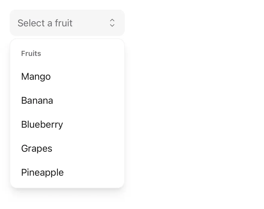
Control the value with `value` and `onValueChange` on `Select`, or start from `defaultValue`. Pass the full option list as `items` so `SelectValue` can show the label of the current value. `Select` also accepts `multiple`, `disabled`, `readOnly`, `open`, `defaultOpen` and `onOpenChange`.
Give each `SelectItem` a `value` and a `label`; the label is shown when no children are passed. `SelectValue` shows `placeholder` until a value is chosen. The `Option` type (`{ value, label }`) is also exported.
## Examples
### Default
```tsx
import * as React from "react"
import { type Option, Select, SelectContent, SelectGroup, SelectItem, SelectLabel, SelectTrigger, SelectValue } from "@/components/ui/select"
const fruits: Option[] = [
{ value: "mango", label: "Mango" },
{ value: "banana", label: "Banana" },
{ value: "blueberry", label: "Blueberry" },
{ value: "grapes", label: "Grapes" },
{ value: "pineapple", label: "Pineapple" },
]
function SelectDemo({
initial,
size,
disabled = false,
invalid = false,
labelledBy,
defaultOpen,
}: {
initial?: Option
size?: "default" | "sm"
disabled?: boolean
invalid?: boolean
labelledBy?: string
defaultOpen?: boolean
}) {
const [value, setValue] = React.useState(
initial?.value ?? null
)
return (
)
}
export function SelectExample() {
return (
)
}
```
```swift
import EsuissUI
import SwiftUI
struct SelectOption {
let value: String
let label: LocalizedStringKey
}
let selectFruits = [
SelectOption(value: "mango", label: "Mango"),
SelectOption(value: "banana", label: "Banana"),
SelectOption(value: "blueberry", label: "Blueberry"),
SelectOption(value: "grapes", label: "Grapes"),
SelectOption(value: "pineapple", label: "Pineapple"),
]
struct SelectDemo: View {
var size: SelectSize = .default
@State private var value: String?
init(initial: String? = nil, size: SelectSize = .default) {
self.size = size
_value = State(initialValue: initial)
}
var body: some View {
SelectField(selection: $value, placeholder: "Select a fruit", size: size) {
SelectGroup {
SelectLabel("Fruits")
ForEach(selectFruits, id: \.value) { fruit in
SelectItem(fruit.label, value: fruit.value)
}
}
}
.frame(width: 192)
}
}
```
```kotlin
import androidx.compose.foundation.layout.width
import androidx.compose.runtime.Composable
import androidx.compose.runtime.getValue
import androidx.compose.runtime.mutableStateOf
import androidx.compose.runtime.saveable.rememberSaveable
import androidx.compose.runtime.setValue
import androidx.compose.ui.Modifier
import androidx.compose.ui.semantics.contentDescription
import androidx.compose.ui.semantics.semantics
import androidx.compose.ui.unit.dp
import com.esuiss.ui.components.Select
import com.esuiss.ui.components.SelectGroup
import com.esuiss.ui.components.SelectItem
import com.esuiss.ui.components.SelectLabel
import com.esuiss.ui.components.SelectOption
import com.esuiss.ui.components.SelectSize
val selectFruits = listOf(
SelectOption("mango", "Mango"),
SelectOption("banana", "Banana"),
SelectOption("blueberry", "Blueberry"),
SelectOption("grapes", "Grapes"),
SelectOption("pineapple", "Pineapple"),
)
@Composable
fun SelectDemo(
initial: String? = null,
size: SelectSize = SelectSize.Default,
enabled: Boolean = true,
invalid: Boolean = false,
label: String? = null,
) {
var value by rememberSaveable { mutableStateOf(initial) }
Select(
value = value,
onValueChange = { value = it },
displayValue = selectFruits.firstOrNull { it.value == value }?.label,
modifier = Modifier
.width(192.dp)
.then(if (label != null) Modifier.semantics { contentDescription = label } else Modifier),
placeholder = "Select a fruit",
size = size,
invalid = invalid,
enabled = enabled,
) {
SelectGroup {
SelectLabel("Fruits")
selectFruits.forEach { SelectItem(it.value, it.label) }
}
}
}
```
### With value
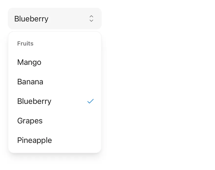
A select that starts with a chosen value.
```tsx
import * as React from "react"
import { type Option, Select, SelectContent, SelectGroup, SelectItem, SelectLabel, SelectTrigger, SelectValue } from "@/components/ui/select"
const fruits: Option[] = [
{ value: "mango", label: "Mango" },
{ value: "banana", label: "Banana" },
{ value: "blueberry", label: "Blueberry" },
{ value: "grapes", label: "Grapes" },
{ value: "pineapple", label: "Pineapple" },
]
function SelectDemo({
initial,
size,
disabled = false,
invalid = false,
labelledBy,
defaultOpen,
}: {
initial?: Option
size?: "default" | "sm"
disabled?: boolean
invalid?: boolean
labelledBy?: string
defaultOpen?: boolean
}) {
const [value, setValue] = React.useState(
initial?.value ?? null
)
return (
)
}
export function SelectWithValueExample() {
return (
)
}
```
```swift
import EsuissUI
import SwiftUI
struct SelectWithValueExample: View {
var body: some View {
SelectDemo(initial: "blueberry")
}
}
struct SelectOption {
let value: String
let label: LocalizedStringKey
}
let selectFruits = [
SelectOption(value: "mango", label: "Mango"),
SelectOption(value: "banana", label: "Banana"),
SelectOption(value: "blueberry", label: "Blueberry"),
SelectOption(value: "grapes", label: "Grapes"),
SelectOption(value: "pineapple", label: "Pineapple"),
]
struct SelectDemo: View {
var size: SelectSize = .default
@State private var value: String?
init(initial: String? = nil, size: SelectSize = .default) {
self.size = size
_value = State(initialValue: initial)
}
var body: some View {
SelectField(selection: $value, placeholder: "Select a fruit", size: size) {
SelectGroup {
SelectLabel("Fruits")
ForEach(selectFruits, id: \.value) { fruit in
SelectItem(fruit.label, value: fruit.value)
}
}
}
.frame(width: 192)
}
}
```
```kotlin
import androidx.compose.foundation.layout.width
import androidx.compose.runtime.Composable
import androidx.compose.runtime.getValue
import androidx.compose.runtime.mutableStateOf
import androidx.compose.runtime.saveable.rememberSaveable
import androidx.compose.runtime.setValue
import androidx.compose.ui.Modifier
import androidx.compose.ui.semantics.contentDescription
import androidx.compose.ui.semantics.semantics
import androidx.compose.ui.unit.dp
import com.esuiss.ui.components.Select
import com.esuiss.ui.components.SelectGroup
import com.esuiss.ui.components.SelectItem
import com.esuiss.ui.components.SelectLabel
import com.esuiss.ui.components.SelectOption
import com.esuiss.ui.components.SelectSize
@Composable
fun SelectWithValueExample() {
SelectDemo(initial = "blueberry")
}
val selectFruits = listOf(
SelectOption("mango", "Mango"),
SelectOption("banana", "Banana"),
SelectOption("blueberry", "Blueberry"),
SelectOption("grapes", "Grapes"),
SelectOption("pineapple", "Pineapple"),
)
@Composable
fun SelectDemo(
initial: String? = null,
size: SelectSize = SelectSize.Default,
enabled: Boolean = true,
invalid: Boolean = false,
label: String? = null,
) {
var value by rememberSaveable { mutableStateOf(initial) }
Select(
value = value,
onValueChange = { value = it },
displayValue = selectFruits.firstOrNull { it.value == value }?.label,
modifier = Modifier
.width(192.dp)
.then(if (label != null) Modifier.semantics { contentDescription = label } else Modifier),
placeholder = "Select a fruit",
size = size,
invalid = invalid,
enabled = enabled,
) {
SelectGroup {
SelectLabel("Fruits")
selectFruits.forEach { SelectItem(it.value, it.label) }
}
}
}
```
### Small
The `sm` trigger size.
```tsx
import * as React from "react"
import { type Option, Select, SelectContent, SelectGroup, SelectItem, SelectLabel, SelectTrigger, SelectValue } from "@/components/ui/select"
const fruits: Option[] = [
{ value: "mango", label: "Mango" },
{ value: "banana", label: "Banana" },
{ value: "blueberry", label: "Blueberry" },
{ value: "grapes", label: "Grapes" },
{ value: "pineapple", label: "Pineapple" },
]
function SelectDemo({
initial,
size,
disabled = false,
invalid = false,
labelledBy,
defaultOpen,
}: {
initial?: Option
size?: "default" | "sm"
disabled?: boolean
invalid?: boolean
labelledBy?: string
defaultOpen?: boolean
}) {
const [value, setValue] = React.useState(
initial?.value ?? null
)
return (
)
}
export function SelectSmallExample() {
return (
)
}
```
```swift
import EsuissUI
import SwiftUI
struct SelectSmallExample: View {
var body: some View {
SelectDemo(size: .sm)
}
}
struct SelectOption {
let value: String
let label: LocalizedStringKey
}
let selectFruits = [
SelectOption(value: "mango", label: "Mango"),
SelectOption(value: "banana", label: "Banana"),
SelectOption(value: "blueberry", label: "Blueberry"),
SelectOption(value: "grapes", label: "Grapes"),
SelectOption(value: "pineapple", label: "Pineapple"),
]
struct SelectDemo: View {
var size: SelectSize = .default
@State private var value: String?
init(initial: String? = nil, size: SelectSize = .default) {
self.size = size
_value = State(initialValue: initial)
}
var body: some View {
SelectField(selection: $value, placeholder: "Select a fruit", size: size) {
SelectGroup {
SelectLabel("Fruits")
ForEach(selectFruits, id: \.value) { fruit in
SelectItem(fruit.label, value: fruit.value)
}
}
}
.frame(width: 192)
}
}
```
```kotlin
import androidx.compose.foundation.layout.width
import androidx.compose.runtime.Composable
import androidx.compose.runtime.getValue
import androidx.compose.runtime.mutableStateOf
import androidx.compose.runtime.saveable.rememberSaveable
import androidx.compose.runtime.setValue
import androidx.compose.ui.Modifier
import androidx.compose.ui.semantics.contentDescription
import androidx.compose.ui.semantics.semantics
import androidx.compose.ui.unit.dp
import com.esuiss.ui.components.Select
import com.esuiss.ui.components.SelectGroup
import com.esuiss.ui.components.SelectItem
import com.esuiss.ui.components.SelectLabel
import com.esuiss.ui.components.SelectOption
import com.esuiss.ui.components.SelectSize
@Composable
fun SelectSmallExample() {
SelectDemo(size = SelectSize.Sm)
}
val selectFruits = listOf(
SelectOption("mango", "Mango"),
SelectOption("banana", "Banana"),
SelectOption("blueberry", "Blueberry"),
SelectOption("grapes", "Grapes"),
SelectOption("pineapple", "Pineapple"),
)
@Composable
fun SelectDemo(
initial: String? = null,
size: SelectSize = SelectSize.Default,
enabled: Boolean = true,
invalid: Boolean = false,
label: String? = null,
) {
var value by rememberSaveable { mutableStateOf(initial) }
Select(
value = value,
onValueChange = { value = it },
displayValue = selectFruits.firstOrNull { it.value == value }?.label,
modifier = Modifier
.width(192.dp)
.then(if (label != null) Modifier.semantics { contentDescription = label } else Modifier),
placeholder = "Select a fruit",
size = size,
invalid = invalid,
enabled = enabled,
) {
SelectGroup {
SelectLabel("Fruits")
selectFruits.forEach { SelectItem(it.value, it.label) }
}
}
}
```
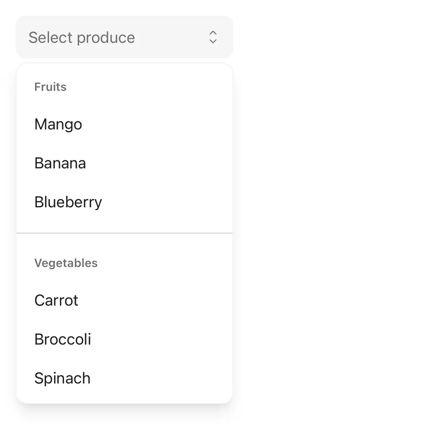
### Grouped
Two labeled groups divided by a separator.
```tsx
import * as React from "react"
import { type Option, Select, SelectContent, SelectGroup, SelectItem, SelectLabel, SelectSeparator, SelectTrigger, SelectValue } from "@/components/ui/select"
const fruits: Option[] = [
{ value: "mango", label: "Mango" },
{ value: "banana", label: "Banana" },
{ value: "blueberry", label: "Blueberry" },
{ value: "grapes", label: "Grapes" },
{ value: "pineapple", label: "Pineapple" },
]
const vegetables: Option[] = [
{ value: "carrot", label: "Carrot" },
{ value: "broccoli", label: "Broccoli" },
{ value: "spinach", label: "Spinach" },
]
function GroupedDemo() {
const [value, setValue] = React.useState(null)
return (
)
}
export function SelectGroupedExample() {
return (
)
}
```
```swift
import EsuissUI
import SwiftUI
struct SelectOption {
let value: String
let label: LocalizedStringKey
}
let selectFruits = [
SelectOption(value: "mango", label: "Mango"),
SelectOption(value: "banana", label: "Banana"),
SelectOption(value: "blueberry", label: "Blueberry"),
SelectOption(value: "grapes", label: "Grapes"),
SelectOption(value: "pineapple", label: "Pineapple"),
]
let selectVegetables = [
SelectOption(value: "carrot", label: "Carrot"),
SelectOption(value: "broccoli", label: "Broccoli"),
SelectOption(value: "spinach", label: "Spinach"),
]
struct SelectGroupedDemo: View {
@State private var value: String?
var body: some View {
SelectField(selection: $value, placeholder: "Select produce") {
SelectGroup {
SelectLabel("Fruits")
ForEach(selectFruits.prefix(3), id: \.value) { fruit in
SelectItem(fruit.label, value: fruit.value)
}
}
SelectSeparator()
SelectGroup {
SelectLabel("Vegetables")
ForEach(selectVegetables, id: \.value) { vegetable in
SelectItem(vegetable.label, value: vegetable.value)
}
}
}
.frame(width: 224)
}
}
```
```kotlin
import androidx.compose.foundation.layout.width
import androidx.compose.runtime.Composable
import androidx.compose.runtime.getValue
import androidx.compose.runtime.mutableStateOf
import androidx.compose.runtime.saveable.rememberSaveable
import androidx.compose.runtime.setValue
import androidx.compose.ui.Modifier
import androidx.compose.ui.unit.dp
import com.esuiss.ui.components.Select
import com.esuiss.ui.components.SelectGroup
import com.esuiss.ui.components.SelectItem
import com.esuiss.ui.components.SelectLabel
import com.esuiss.ui.components.SelectOption
import com.esuiss.ui.components.SelectSeparator
val selectFruits = listOf(
SelectOption("mango", "Mango"),
SelectOption("banana", "Banana"),
SelectOption("blueberry", "Blueberry"),
SelectOption("grapes", "Grapes"),
SelectOption("pineapple", "Pineapple"),
)
val selectVegetables = listOf(
SelectOption("carrot", "Carrot"),
SelectOption("broccoli", "Broccoli"),
SelectOption("spinach", "Spinach"),
)
@Composable
fun SelectGrouped() {
var value by rememberSaveable { mutableStateOf(null) }
val fruits = selectFruits.take(3)
Select(
value = value,
onValueChange = { value = it },
displayValue = (fruits + selectVegetables).firstOrNull { it.value == value }?.label,
modifier = Modifier.width(224.dp),
placeholder = "Select produce",
) {
SelectGroup {
SelectLabel("Fruits")
fruits.forEach { SelectItem(it.value, it.label) }
}
SelectSeparator()
SelectGroup {
SelectLabel("Vegetables")
selectVegetables.forEach { SelectItem(it.value, it.label) }
}
}
}
```
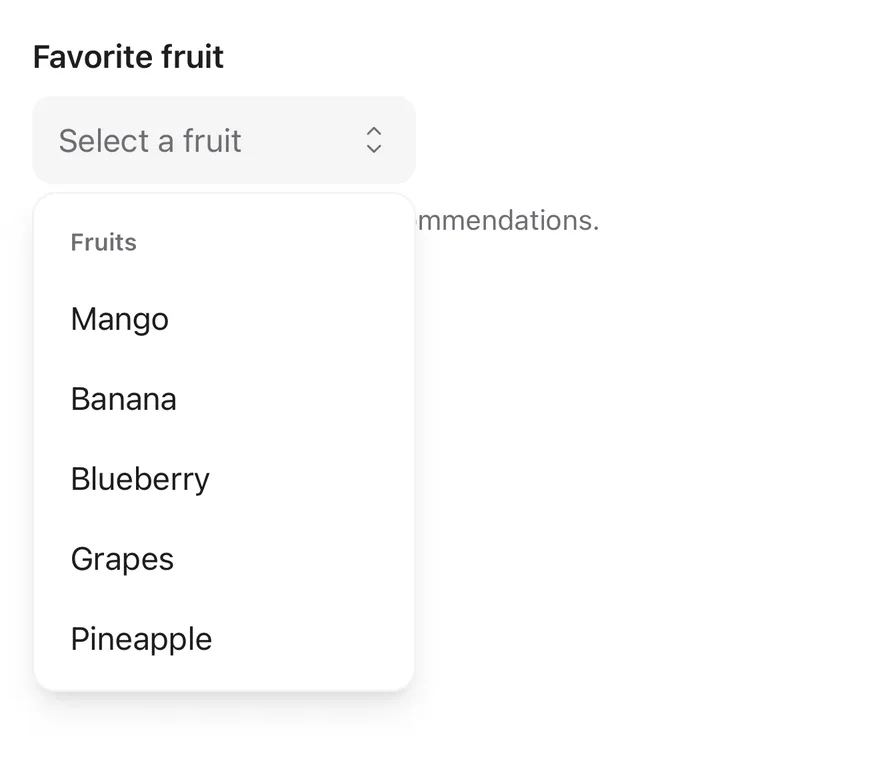
### With label
A select labeled by a `Label` through `accessibilityLabelledBy`, with helper text.
```tsx
import * as React from "react"
import { View } from "react-native"
import { Label } from "@/components/ui/label"
import { type Option, Select, SelectContent, SelectGroup, SelectItem, SelectLabel, SelectTrigger, SelectValue } from "@/components/ui/select"
import { Text } from "@/components/ui/text"
const fruits: Option[] = [
{ value: "mango", label: "Mango" },
{ value: "banana", label: "Banana" },
{ value: "blueberry", label: "Blueberry" },
{ value: "grapes", label: "Grapes" },
{ value: "pineapple", label: "Pineapple" },
]
function SelectDemo({
initial,
size,
disabled = false,
invalid = false,
labelledBy,
defaultOpen,
}: {
initial?: Option
size?: "default" | "sm"
disabled?: boolean
invalid?: boolean
labelledBy?: string
defaultOpen?: boolean
}) {
const [value, setValue] = React.useState(
initial?.value ?? null
)
return (
)
}
export function SelectWithLabelExample() {
return (
Used to personalize your recommendations.
)
}
```
```swift
import EsuissUI
import SwiftUI
struct SelectWithLabelExample: View {
var body: some View {
VStack(alignment: .leading, spacing: 8) {
FieldLabel("Favorite fruit")
.accessibilityHidden(true)
SelectDemo()
.accessibilityLabel(Text("Favorite fruit"))
Text("Used to personalize your recommendations.")
.textStyle(.sm)
.foregroundStyle(EsuissColor.mutedForeground)
}
.frame(maxWidth: .infinity, alignment: .leading)
}
}
struct SelectOption {
let value: String
let label: LocalizedStringKey
}
let selectFruits = [
SelectOption(value: "mango", label: "Mango"),
SelectOption(value: "banana", label: "Banana"),
SelectOption(value: "blueberry", label: "Blueberry"),
SelectOption(value: "grapes", label: "Grapes"),
SelectOption(value: "pineapple", label: "Pineapple"),
]
struct SelectDemo: View {
var size: SelectSize = .default
@State private var value: String?
init(initial: String? = nil, size: SelectSize = .default) {
self.size = size
_value = State(initialValue: initial)
}
var body: some View {
SelectField(selection: $value, placeholder: "Select a fruit", size: size) {
SelectGroup {
SelectLabel("Fruits")
ForEach(selectFruits, id: \.value) { fruit in
SelectItem(fruit.label, value: fruit.value)
}
}
}
.frame(width: 192)
}
}
```
```kotlin
import androidx.compose.foundation.layout.Arrangement
import androidx.compose.foundation.layout.Column
import androidx.compose.foundation.layout.width
import androidx.compose.runtime.Composable
import androidx.compose.runtime.getValue
import androidx.compose.runtime.mutableStateOf
import androidx.compose.runtime.saveable.rememberSaveable
import androidx.compose.runtime.setValue
import androidx.compose.ui.Modifier
import androidx.compose.ui.semantics.contentDescription
import androidx.compose.ui.semantics.semantics
import androidx.compose.ui.unit.dp
import com.esuiss.ui.components.Label
import com.esuiss.ui.components.Select
import com.esuiss.ui.components.SelectGroup
import com.esuiss.ui.components.SelectItem
import com.esuiss.ui.components.SelectLabel
import com.esuiss.ui.components.SelectOption
import com.esuiss.ui.components.SelectSize
import com.esuiss.ui.components.Text
import com.esuiss.ui.theme.EsuissTheme
import com.esuiss.ui.theme.Typography
val selectFruits = listOf(
SelectOption("mango", "Mango"),
SelectOption("banana", "Banana"),
SelectOption("blueberry", "Blueberry"),
SelectOption("grapes", "Grapes"),
SelectOption("pineapple", "Pineapple"),
)
@Composable
fun SelectDemo(
initial: String? = null,
size: SelectSize = SelectSize.Default,
enabled: Boolean = true,
invalid: Boolean = false,
label: String? = null,
) {
var value by rememberSaveable { mutableStateOf(initial) }
Select(
value = value,
onValueChange = { value = it },
displayValue = selectFruits.firstOrNull { it.value == value }?.label,
modifier = Modifier
.width(192.dp)
.then(if (label != null) Modifier.semantics { contentDescription = label } else Modifier),
placeholder = "Select a fruit",
size = size,
invalid = invalid,
enabled = enabled,
) {
SelectGroup {
SelectLabel("Fruits")
selectFruits.forEach { SelectItem(it.value, it.label) }
}
}
}
@Composable
fun SelectWithLabel() {
Column(verticalArrangement = Arrangement.spacedBy(8.dp)) {
Label("Favorite fruit")
SelectDemo(label = "Favorite fruit")
Text("Used to personalize your recommendations.", style = Typography.sm, color = EsuissTheme.colors.mutedForeground)
}
}
```
### Disabled
A disabled select with a value.

```tsx
import * as React from "react"
import { type Option, Select, SelectContent, SelectGroup, SelectItem, SelectLabel, SelectTrigger, SelectValue } from "@/components/ui/select"
const fruits: Option[] = [
{ value: "mango", label: "Mango" },
{ value: "banana", label: "Banana" },
{ value: "blueberry", label: "Blueberry" },
{ value: "grapes", label: "Grapes" },
{ value: "pineapple", label: "Pineapple" },
]
function SelectDemo({
initial,
size,
disabled = false,
invalid = false,
labelledBy,
defaultOpen,
}: {
initial?: Option
size?: "default" | "sm"
disabled?: boolean
invalid?: boolean
labelledBy?: string
defaultOpen?: boolean
}) {
const [value, setValue] = React.useState(
initial?.value ?? null
)
return (
)
}
export function SelectDisabledExample() {
return (
)
}
```
```swift
import EsuissUI
import SwiftUI
struct SelectDisabledExample: View {
var body: some View {
SelectDemo(initial: "mango")
.disabled(true)
}
}
struct SelectOption {
let value: String
let label: LocalizedStringKey
}
let selectFruits = [
SelectOption(value: "mango", label: "Mango"),
SelectOption(value: "banana", label: "Banana"),
SelectOption(value: "blueberry", label: "Blueberry"),
SelectOption(value: "grapes", label: "Grapes"),
SelectOption(value: "pineapple", label: "Pineapple"),
]
struct SelectDemo: View {
var size: SelectSize = .default
@State private var value: String?
init(initial: String? = nil, size: SelectSize = .default) {
self.size = size
_value = State(initialValue: initial)
}
var body: some View {
SelectField(selection: $value, placeholder: "Select a fruit", size: size) {
SelectGroup {
SelectLabel("Fruits")
ForEach(selectFruits, id: \.value) { fruit in
SelectItem(fruit.label, value: fruit.value)
}
}
}
.frame(width: 192)
}
}
```
```kotlin
import androidx.compose.foundation.layout.width
import androidx.compose.runtime.Composable
import androidx.compose.runtime.getValue
import androidx.compose.runtime.mutableStateOf
import androidx.compose.runtime.saveable.rememberSaveable
import androidx.compose.runtime.setValue
import androidx.compose.ui.Modifier
import androidx.compose.ui.semantics.contentDescription
import androidx.compose.ui.semantics.semantics
import androidx.compose.ui.unit.dp
import com.esuiss.ui.components.Select
import com.esuiss.ui.components.SelectGroup
import com.esuiss.ui.components.SelectItem
import com.esuiss.ui.components.SelectLabel
import com.esuiss.ui.components.SelectOption
import com.esuiss.ui.components.SelectSize
@Composable
fun SelectDisabledExample() {
SelectDemo(initial = "mango", enabled = false)
}
val selectFruits = listOf(
SelectOption("mango", "Mango"),
SelectOption("banana", "Banana"),
SelectOption("blueberry", "Blueberry"),
SelectOption("grapes", "Grapes"),
SelectOption("pineapple", "Pineapple"),
)
@Composable
fun SelectDemo(
initial: String? = null,
size: SelectSize = SelectSize.Default,
enabled: Boolean = true,
invalid: Boolean = false,
label: String? = null,
) {
var value by rememberSaveable { mutableStateOf(initial) }
Select(
value = value,
onValueChange = { value = it },
displayValue = selectFruits.firstOrNull { it.value == value }?.label,
modifier = Modifier
.width(192.dp)
.then(if (label != null) Modifier.semantics { contentDescription = label } else Modifier),
placeholder = "Select a fruit",
size = size,
invalid = invalid,
enabled = enabled,
) {
SelectGroup {
SelectLabel("Fruits")
selectFruits.forEach { SelectItem(it.value, it.label) }
}
}
}
```
### Invalid
The invalid state with an error message.
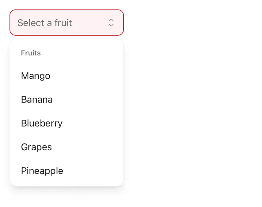
```tsx
import * as React from "react"
import { View } from "react-native"
import { type Option, Select, SelectContent, SelectGroup, SelectItem, SelectLabel, SelectTrigger, SelectValue } from "@/components/ui/select"
import { Text } from "@/components/ui/text"
const fruits: Option[] = [
{ value: "mango", label: "Mango" },
{ value: "banana", label: "Banana" },
{ value: "blueberry", label: "Blueberry" },
{ value: "grapes", label: "Grapes" },
{ value: "pineapple", label: "Pineapple" },
]
function SelectDemo({
initial,
size,
disabled = false,
invalid = false,
labelledBy,
defaultOpen,
}: {
initial?: Option
size?: "default" | "sm"
disabled?: boolean
invalid?: boolean
labelledBy?: string
defaultOpen?: boolean
}) {
const [value, setValue] = React.useState(
initial?.value ?? null
)
return (
)
}
export function SelectInvalidExample() {
return (
Please select a fruit.
)
}
```
```swift
import EsuissUI
import SwiftUI
struct SelectInvalidExample: View {
var body: some View {
VStack(alignment: .leading, spacing: 8) {
SelectDemo()
.invalid()
Text("Please select a fruit.")
.textStyle(.sm)
.foregroundStyle(EsuissColor.destructive)
}
.frame(maxWidth: .infinity, alignment: .leading)
}
}
struct SelectOption {
let value: String
let label: LocalizedStringKey
}
let selectFruits = [
SelectOption(value: "mango", label: "Mango"),
SelectOption(value: "banana", label: "Banana"),
SelectOption(value: "blueberry", label: "Blueberry"),
SelectOption(value: "grapes", label: "Grapes"),
SelectOption(value: "pineapple", label: "Pineapple"),
]
struct SelectDemo: View {
var size: SelectSize = .default
@State private var value: String?
init(initial: String? = nil, size: SelectSize = .default) {
self.size = size
_value = State(initialValue: initial)
}
var body: some View {
SelectField(selection: $value, placeholder: "Select a fruit", size: size) {
SelectGroup {
SelectLabel("Fruits")
ForEach(selectFruits, id: \.value) { fruit in
SelectItem(fruit.label, value: fruit.value)
}
}
}
.frame(width: 192)
}
}
```
```kotlin
import androidx.compose.foundation.layout.Arrangement
import androidx.compose.foundation.layout.Column
import androidx.compose.foundation.layout.width
import androidx.compose.runtime.Composable
import androidx.compose.runtime.getValue
import androidx.compose.runtime.mutableStateOf
import androidx.compose.runtime.saveable.rememberSaveable
import androidx.compose.runtime.setValue
import androidx.compose.ui.Modifier
import androidx.compose.ui.semantics.contentDescription
import androidx.compose.ui.semantics.semantics
import androidx.compose.ui.unit.dp
import com.esuiss.ui.components.Select
import com.esuiss.ui.components.SelectGroup
import com.esuiss.ui.components.SelectItem
import com.esuiss.ui.components.SelectLabel
import com.esuiss.ui.components.SelectOption
import com.esuiss.ui.components.SelectSize
import com.esuiss.ui.components.Text
import com.esuiss.ui.theme.EsuissTheme
import com.esuiss.ui.theme.Typography
val selectFruits = listOf(
SelectOption("mango", "Mango"),
SelectOption("banana", "Banana"),
SelectOption("blueberry", "Blueberry"),
SelectOption("grapes", "Grapes"),
SelectOption("pineapple", "Pineapple"),
)
@Composable
fun SelectDemo(
initial: String? = null,
size: SelectSize = SelectSize.Default,
enabled: Boolean = true,
invalid: Boolean = false,
label: String? = null,
) {
var value by rememberSaveable { mutableStateOf(initial) }
Select(
value = value,
onValueChange = { value = it },
displayValue = selectFruits.firstOrNull { it.value == value }?.label,
modifier = Modifier
.width(192.dp)
.then(if (label != null) Modifier.semantics { contentDescription = label } else Modifier),
placeholder = "Select a fruit",
size = size,
invalid = invalid,
enabled = enabled,
) {
SelectGroup {
SelectLabel("Fruits")
selectFruits.forEach { SelectItem(it.value, it.label) }
}
}
}
@Composable
fun SelectInvalid() {
Column(verticalArrangement = Arrangement.spacedBy(8.dp)) {
SelectDemo(invalid = true)
Text("Please select a fruit.", style = Typography.sm, color = EsuissTheme.colors.destructive)
}
}
```
## API Reference
### Select
The root that holds the selected value and the open state.
| Prop | Type | Default | Description |
| --- | --- | --- | --- |
| `items` | `SelectItems` | - | Value and label pairs used to show the selected label. |
| `value` | `Value \| Value[] \| null` | - | The selected value, for controlled use. |
| `defaultValue` | `Value \| Value[] \| null` | - | The initial value when uncontrolled. |
| `onValueChange` | `(value, details) => void` | - | Called when the selection changes. |
| `multiple` | `boolean` | `false` | Allows several values to be selected. |
| `open` | `boolean` | - | Whether the popup is open, for controlled use. |
| `defaultOpen` | `boolean` | `false` | Whether the popup starts open when uncontrolled. |
| `onOpenChange` | `(open: boolean, details) => void` | - | Called when the popup opens or closes. |
| `modal` | `boolean` | `true` | Blocks interaction with the rest of the screen while open. |
| `disabled` | `boolean` | `false` | Disables the select. |
| `readOnly` | `boolean` | `false` | Shows the value without allowing changes. |
### SelectGroup
Groups related items.
Also accepts the props of `React.ComponentProps`.
### SelectValue
Shows the selected label or the placeholder.
Also accepts the props of `React.ComponentProps`.
### SelectTrigger
Pressable field that opens the list.
| Prop | Type | Default | Description |
| --- | --- | --- | --- |
| `children` | `React.ReactNode` | - | |
| `size` | `"default" \| "sm"` | `"default"` | Trigger height: `default` or `sm`. |
| `invalid` | `boolean` | - | Shows the destructive border. Falls back to the invalid state of an enclosing field. |
Also accepts the props of `React.ComponentProps`.
### SelectContent
Floating list rendered in a portal.
| Prop | Type | Default | Description |
| --- | --- | --- | --- |
| `portalHost` | `string` | - | Name of the portal host to render into. |
Also accepts the props of `React.ComponentProps`, `PositionerProps`.
### SelectLabel
Heading for a group.
Also accepts the props of `React.ComponentProps`.
### SelectItem
One option, with a check mark when selected.
| Prop | Type | Default | Description |
| --- | --- | --- | --- |
| `children` | `React.ReactNode` | - | |
Also accepts the props of `React.ComponentProps`.
### SelectSeparator
Line between groups.
Also accepts the props of `React.ComponentProps`.
## Accessibility
- The trigger has the `combobox` role and reports its expanded and disabled states.
- The list has the `list` role; each item has the `option` role, uses its label as `accessibilityLabel` and reports selected and disabled states.
- Groups have the `group` role and are labeled by their `SelectLabel`.
- Label the trigger with `accessibilityLabelledBy` pointing at a `Label`'s `nativeID`, or with `accessibilityLabel`.
- The Android back button and the VoiceOver escape gesture close the list.
## Notes
- Uses `bg-secondary` for the trigger, `bg-popover` for the list and `text-primary` for the check mark; colors follow the system appearance.
- On iOS the list renders inside a `FullWindowOverlay` from `react-native-screens`, so it appears above native modals.