# Progress
A horizontal bar that shows the completion of a task.
Progress is an open-source component from suiss/ui for React, React Native, SwiftUI and Jetpack Compose. The @esuiss/ui CLI copies its source into your project, so you own the code.
Source: https://ui.suiss.app/docs/components/progress
**React**
**Example**
```tsx
import { Progress } from "@/components/ui/progress"
export default function ProgressDemo() {
return (
)
}
```
Progress wraps the progress primitive of the chosen base. `Progress` is the root and always renders a `ProgressTrack` containing a `ProgressIndicator` after its children. Add a `ProgressLabel` to name the bar and a `ProgressValue` to show the formatted value; they sit on one row above the track.
Use Progress for determinate or indeterminate task progress.
## Installation
### CLI
```bash title="Terminal"
npx shadcn@latest add @esuiss/progress
```
Works in any project with a `components.json`. See [Installation](https://ui.suiss.app/docs/installation#add-components) for the one-line registry setup. Or use the suiss/ui CLI:
```bash title="Terminal"
npx @esuiss/ui@latest add progress
```
### Manual
1. Install the dependencies and add the [`cn` helper](https://ui.suiss.app/docs/installation#the-cn-helper):
```bash title="Terminal"
npm install @base-ui/react
```
2. Copy the source into `components/ui/progress.tsx`:
```tsx title="components/ui/progress.tsx"
"use client"
import { Progress as ProgressPrimitive } from "@base-ui/react/progress"
import { cn } from "@/lib/utils"
function Progress({
className,
children,
value,
...props
}: ProgressPrimitive.Root.Props) {
return (
{children}
)
}
function ProgressTrack({ className, ...props }: ProgressPrimitive.Track.Props) {
return (
)
}
function ProgressIndicator({
className,
...props
}: ProgressPrimitive.Indicator.Props) {
return (
)
}
function ProgressLabel({ className, ...props }: ProgressPrimitive.Label.Props) {
return (
)
}
function ProgressValue({ className, ...props }: ProgressPrimitive.Value.Props) {
return (
)
}
export {
Progress,
ProgressIndicator,
ProgressLabel,
ProgressTrack,
ProgressValue,
}
```
3. Update the import paths to match your project.
## Usage
```tsx
import { Progress, ProgressTrack, ProgressIndicator, ProgressLabel, ProgressValue } from "@/components/ui/progress"
```
```tsx
```
Pass `value` as a number between `min` and `max` (by default `0` and `100`). Set `value={null}` for an indeterminate state when the amount of work is unknown.
The track and indicator are rendered for you, so `ProgressTrack` and `ProgressIndicator` are not needed inside `Progress` children. `ProgressValue` shows the formatted value, a percentage by default.
## Examples
### With label
A bar with a label and its current value shown above the track.
**Example**
```tsx
import {
Progress,
ProgressLabel,
ProgressValue,
} from "@/components/ui/progress"
export default function ProgressWithLabel() {
return (
)
}
```
### Complete
A labelled bar at `100`.
**Example**
```tsx
import {
Progress,
ProgressLabel,
ProgressValue,
} from "@/components/ui/progress"
export default function ProgressComplete() {
return (
)
}
```
### Indeterminate
A labelled bar with `value={null}` for work of unknown length.
**Example**
```tsx
import { Progress, ProgressLabel } from "@/components/ui/progress"
export default function ProgressIndeterminate() {
return (
)
}
```
## API Reference
- `Progress`
- `ProgressLabel`
- `ProgressValue`
### Progress
The root that holds the value and renders the track and indicator.
Also accepts the props of the primitive part it wraps.
### ProgressTrack
The full-width rail behind the indicator.
Also accepts the props of the primitive part it wraps.
### ProgressIndicator
The filled portion of the track that reflects the value.
Also accepts the props of the primitive part it wraps.
### ProgressLabel
Text that names the progress bar.
Also accepts the props of the primitive part it wraps.
### ProgressValue
The formatted current value, aligned to the end of the row.
Also accepts the props of the primitive part it wraps.
## Accessibility
- The root has the `progressbar` role with `aria-valuenow` reflecting the value.
- `ProgressLabel` provides the accessible name. Without it, pass `aria-label`.
- When `value` is `null`, `aria-valuenow` is omitted to signal an indeterminate state.
## Notes
- Styling hooks: `data-slot` values `progress`, `progress-track`, `progress-indicator`, `progress-label` and `progress-value`.
- The track uses `muted` and the indicator uses `primary`; the indicator animates width changes.
**React Native, SwiftUI, Jetpack Compose**

```tsx
import * as React from "react"
import { Progress } from "@/components/ui/progress"
function ProgressDemo() {
const [value, setValue] = React.useState(13)
React.useEffect(() => {
const timer = setTimeout(() => setValue(66), 500)
return () => clearTimeout(timer)
}, [])
return
}
export function ProgressExample() {
return (
)
}
```
```swift
import EsuissUI
import SwiftUI
struct ProgressDelayed: View {
@State private var value = 13.0
var body: some View {
ProgressView(value: value, total: 100)
.progressViewStyle(.bar)
.task {
try? await Task.sleep(for: .milliseconds(500))
value = 66
}
}
}
```
```kotlin
import androidx.compose.foundation.layout.fillMaxWidth
import androidx.compose.runtime.Composable
import androidx.compose.runtime.LaunchedEffect
import androidx.compose.runtime.getValue
import androidx.compose.runtime.mutableFloatStateOf
import androidx.compose.runtime.saveable.rememberSaveable
import androidx.compose.runtime.setValue
import androidx.compose.ui.Modifier
import com.esuiss.ui.components.Progress
import kotlinx.coroutines.delay
@Composable
fun ProgressDefault() {
var value by rememberSaveable { mutableFloatStateOf(13f) }
LaunchedEffect(Unit) {
delay(500)
value = 66f
}
Progress(value, Modifier.fillMaxWidth())
}
```
`Progress` renders a thin track with an indicator whose width follows `value`. The width animates with a Reanimated spring, clamped between 0 and 100 percent. Any children, such as `ProgressLabel` and `ProgressValue`, are placed in a row above the bar.
Use it for uploads, downloads and other tasks with a known amount of work.
## Installation
**React Native**
```bash title="Terminal"
npx shadcn@latest add @esuiss-rn/progress
```
See [Installation](https://ui.suiss.app/docs/installation) for the `components.json` setup. Or use the suiss/ui CLI:
```bash title="Terminal"
npx @esuiss/ui@latest add progress
```
**SwiftUI**
```bash title="Terminal"
npx @esuiss/ui@latest add progress --platform swift
```
**Jetpack Compose**
```bash title="Terminal"
npx @esuiss/ui@latest add progress --platform kotlin
```
### Manual
**React Native**
**Uniwind**
1. Install the dependencies:
```bash title="Terminal"
npx expo install cn react-native-reanimated react-native-worklets
```
2. Add the pieces it builds on: the primitives `components/primitives/progress.tsx`, `components/primitives/use-render.tsx`.
3. Copy the source into `components/ui/progress.tsx`:
```tsx title="uniwind/components/ui/progress.tsx"
import { cn } from "cn"
import * as React from "react"
import Animated, {
useAnimatedStyle,
useSharedValue,
withSpring,
} from "react-native-reanimated"
import * as ProgressPrimitive from "@/components/primitives/progress"
import { resolveClassName } from "@/components/primitives/use-render"
function Progress({
className,
children,
trackClassName,
indicatorClassName,
...props
}: React.ComponentProps & {
trackClassName?: string
indicatorClassName?: string
}) {
return (
cn(
"w-full flex-row flex-wrap gap-3",
resolveClassName(className, state)
)
}
{...props}
>
{children}
)
}
function ProgressTrack({
className,
...props
}: React.ComponentProps) {
return (
cn(
"relative h-1 w-full flex-row items-center overflow-hidden rounded-full bg-muted",
resolveClassName(className, state)
)
}
{...props}
/>
)
}
function ProgressIndicator({
className,
...props
}: Omit, "render">) {
const { percentage } = ProgressPrimitive.useRootContext()
const target = Math.min(Math.max(percentage ?? 0, 0), 100)
const progress = useSharedValue(target)
React.useEffect(() => {
progress.value = withSpring(target, { overshootClamping: true })
}, [progress, target])
const indicator = useAnimatedStyle(() => ({
width: `${progress.value}%`,
}))
return (
cn("h-full bg-primary", resolveClassName(className, state))
}
render={}
{...props}
/>
)
}
function ProgressLabel({
className,
...props
}: React.ComponentProps) {
return (
cn("text-sm text-foreground", resolveClassName(className, state))
}
{...props}
/>
)
}
function ProgressValue({
className,
...props
}: React.ComponentProps) {
return (
cn(
"ms-auto text-sm text-muted-foreground tabular-nums",
resolveClassName(className, state)
)
}
{...props}
/>
)
}
export {
Progress,
ProgressIndicator,
ProgressLabel,
ProgressTrack,
ProgressValue,
}
```
4. Update the import paths to match your project.
**NativeWind**
1. Install the dependencies:
```bash title="Terminal"
npx expo install cn react-native-reanimated react-native-worklets
```
2. Add the pieces it builds on: the primitives `components/primitives/progress.tsx`, `components/primitives/use-render.tsx`.
3. Copy the source into `components/ui/progress.tsx`:
```tsx title="nativewind/components/ui/progress.tsx"
import { cn } from "cn"
import * as React from "react"
import Animated, {
useAnimatedStyle,
useSharedValue,
withSpring,
} from "react-native-reanimated"
import * as ProgressPrimitive from "@/components/primitives/progress"
import { resolveClassName } from "@/components/primitives/use-render"
function Progress({
className,
children,
trackClassName,
indicatorClassName,
...props
}: React.ComponentProps & {
trackClassName?: string
indicatorClassName?: string
}) {
return (
cn(
"w-full flex-row flex-wrap gap-3",
resolveClassName(className, state)
)
}
{...props}
>
{children}
)
}
function ProgressTrack({
className,
...props
}: React.ComponentProps) {
return (
cn(
"relative h-1 w-full flex-row items-center overflow-hidden rounded-full bg-muted",
resolveClassName(className, state)
)
}
{...props}
/>
)
}
function ProgressIndicator({
className,
...props
}: Omit, "render">) {
const { percentage } = ProgressPrimitive.useRootContext()
const target = Math.min(Math.max(percentage ?? 0, 0), 100)
const progress = useSharedValue(target)
React.useEffect(() => {
progress.value = withSpring(target, { overshootClamping: true })
}, [progress, target])
const indicator = useAnimatedStyle(() => ({
width: `${progress.value}%`,
}))
return (
cn("h-full bg-primary", resolveClassName(className, state))
}
render={}
{...props}
/>
)
}
function ProgressLabel({
className,
...props
}: React.ComponentProps) {
return (
cn("text-sm text-foreground", resolveClassName(className, state))
}
{...props}
/>
)
}
function ProgressValue({
className,
...props
}: React.ComponentProps) {
return (
cn(
"ms-auto text-sm text-muted-foreground tabular-nums",
resolveClassName(className, state)
)
}
{...props}
/>
)
}
export {
Progress,
ProgressIndicator,
ProgressLabel,
ProgressTrack,
ProgressValue,
}
```
4. Update the import paths to match your project.
**StyleSheet**
1. Install the dependencies:
```bash title="Terminal"
npx expo install react-native-reanimated react-native-worklets
```
2. Add the pieces it builds on: the primitives `components/primitives/progress.tsx`, `components/primitives/use-render.tsx`.
3. Copy the source into `components/ui/progress.tsx`:
```tsx title="stylesheet/components/ui/progress.tsx"
import * as React from "react"
import { type StyleProp, StyleSheet, type ViewStyle } from "react-native"
import Animated, {
useAnimatedStyle,
useSharedValue,
withSpring,
} from "react-native-reanimated"
import * as ProgressPrimitive from "@/components/primitives/progress"
import { fontSize, radius, useTheme } from "@/components/ui/theme"
const styles = StyleSheet.create({
root: {
width: "100%",
flexDirection: "row",
flexWrap: "wrap",
gap: 12,
},
track: {
position: "relative",
height: 4,
width: "100%",
flexDirection: "row",
alignItems: "center",
overflow: "hidden",
borderRadius: radius.full,
},
indicator: { height: "100%" },
label: { ...fontSize.sm },
value: {
...fontSize.sm,
marginStart: "auto",
fontVariant: ["tabular-nums"],
},
})
function Progress({
style,
children,
trackStyle,
indicatorStyle,
...props
}: React.ComponentProps & {
trackStyle?: StyleProp
indicatorStyle?: StyleProp
}) {
return (
[
styles.root,
typeof style === "function" ? style(state) : style,
]}
{...props}
>
{children}
)
}
function ProgressTrack({
style,
...props
}: React.ComponentProps) {
const { colors } = useTheme()
return (
[
styles.track,
{ backgroundColor: colors.muted },
typeof style === "function" ? style(state) : style,
]}
{...props}
/>
)
}
function ProgressIndicator({
style,
...props
}: Omit, "render">) {
const { colors } = useTheme()
const { percentage } = ProgressPrimitive.useRootContext()
const target = Math.min(Math.max(percentage ?? 0, 0), 100)
const progress = useSharedValue(target)
React.useEffect(() => {
progress.value = withSpring(target, { overshootClamping: true })
}, [progress, target])
const indicator = useAnimatedStyle(() => ({
width: `${progress.value}%`,
}))
return (
[
styles.indicator,
{ backgroundColor: colors.primary },
typeof style === "function" ? style(state) : style,
]}
render={}
{...props}
/>
)
}
function ProgressLabel({
style,
...props
}: React.ComponentProps) {
const { colors } = useTheme()
return (
[
styles.label,
{ color: colors.foreground },
typeof style === "function" ? style(state) : style,
]}
{...props}
/>
)
}
function ProgressValue({
style,
...props
}: React.ComponentProps) {
const { colors } = useTheme()
return (
[
styles.value,
{ color: colors.mutedForeground },
typeof style === "function" ? style(state) : style,
]}
{...props}
/>
)
}
export {
Progress,
ProgressIndicator,
ProgressLabel,
ProgressTrack,
ProgressValue,
}
```
4. Update the import paths to match your project.
**SwiftUI**
1. Target iOS 17 or later.
2. Copy the theme files every view uses:
- `swift/Theme/Theme.swift`: [source](https://github.com/e-suiss/ui/blob/main/packages/mobile/swiftui/Sources/EsuissUI/Theme/Theme.swift)
- `swift/Theme/Tokens.swift`: [source](https://github.com/e-suiss/ui/blob/main/packages/mobile/swiftui/Sources/EsuissUI/Theme/Tokens.swift)
3. Copy the source and every file it uses:
```swift title="swift/Components/Progress.swift"
import SwiftUI
public struct BarProgressViewStyle: ProgressViewStyle {
public init() {}
public func makeBody(configuration: Configuration) -> some View {
BarProgress(configuration: configuration)
}
}
private struct BarProgress: View {
let configuration: ProgressViewStyleConfiguration
@Environment(\.accessibilityReduceMotion) private var reduceMotion
var body: some View {
let fraction = min(max(configuration.fractionCompleted ?? 0, 0), 1)
VStack(alignment: .leading, spacing: 12) {
HStack(alignment: .firstTextBaseline, spacing: 12) {
configuration.label
.foregroundStyle(EsuissColor.foreground)
Spacer(minLength: 0)
configuration.currentValueLabel
.monospacedDigit()
.foregroundStyle(EsuissColor.mutedForeground)
}
.scaledTextStyle(.sm)
Capsule()
.fill(EsuissColor.muted)
.frame(height: 4)
.overlay(alignment: .leading) {
GeometryReader { proxy in
Rectangle()
.fill(EsuissColor.primary)
.frame(width: proxy.size.width * fraction)
.animation(reduceMotion ? nil : .spring(response: 0.4, dampingFraction: 1), value: fraction)
}
}
.clipShape(Capsule())
}
.frame(maxWidth: .infinity, alignment: .leading)
}
}
extension ProgressViewStyle where Self == BarProgressViewStyle {
public static var bar: BarProgressViewStyle { BarProgressViewStyle() }
}
```
- `swift/Components/TextVariant.swift`: [source](https://github.com/e-suiss/ui/blob/main/packages/mobile/swiftui/Sources/EsuissUI/Components/TextVariant.swift)
4. Add the files to your app target.
**Jetpack Compose**
1. Set `minSdk` to 24 or higher and add the dependencies:
```kotlin title="build.gradle.kts"
implementation(platform("androidx.compose:compose-bom:2026.09.00"))
implementation("androidx.compose.foundation:foundation")
implementation("androidx.compose.ui:ui")
```
2. Copy the theme files every view uses:
- `kotlin/theme/Theme.kt`: [source](https://github.com/e-suiss/ui/blob/main/packages/mobile/kotlin/ui/src/main/kotlin/com/esuiss/ui/theme/Theme.kt)
- `kotlin/theme/Tokens.kt`: [source](https://github.com/e-suiss/ui/blob/main/packages/mobile/kotlin/ui/src/main/kotlin/com/esuiss/ui/theme/Tokens.kt)
3. Copy the source:
```kt title="kotlin/components/Progress.kt"
package com.esuiss.ui.components
import androidx.compose.animation.core.Spring
import androidx.compose.animation.core.animateFloatAsState
import androidx.compose.animation.core.spring
import androidx.compose.foundation.background
import androidx.compose.foundation.layout.Arrangement
import androidx.compose.foundation.layout.Box
import androidx.compose.foundation.layout.Column
import androidx.compose.foundation.layout.Row
import androidx.compose.foundation.layout.Spacer
import androidx.compose.foundation.layout.fillMaxHeight
import androidx.compose.foundation.layout.fillMaxWidth
import androidx.compose.foundation.layout.height
import androidx.compose.foundation.shape.CircleShape
import androidx.compose.foundation.text.BasicText
import androidx.compose.runtime.Composable
import androidx.compose.runtime.getValue
import androidx.compose.ui.Alignment
import androidx.compose.ui.Modifier
import androidx.compose.ui.draw.clip
import androidx.compose.ui.semantics.ProgressBarRangeInfo
import androidx.compose.ui.semantics.progressBarRangeInfo
import androidx.compose.ui.semantics.semantics
import androidx.compose.ui.unit.dp
import com.esuiss.ui.theme.EsuissTheme
import com.esuiss.ui.theme.Typography
import kotlin.math.roundToInt
@Composable
fun Progress(
value: Float?,
modifier: Modifier = Modifier,
max: Float = 100f,
label: String? = null,
showValue: Boolean = false,
) {
val colors = EsuissTheme.colors
val fraction = if (value == null || max <= 0f) 0f else (value / max).coerceIn(0f, 1f)
val animated by animateFloatAsState(
targetValue = fraction,
animationSpec = spring(dampingRatio = Spring.DampingRatioNoBouncy, stiffness = 100f),
label = "progress",
)
Column(
modifier = modifier
.fillMaxWidth()
.semantics(mergeDescendants = true) {
progressBarRangeInfo = if (value == null) {
ProgressBarRangeInfo.Indeterminate
} else {
ProgressBarRangeInfo(value.coerceIn(0f, max), 0f..max)
}
},
verticalArrangement = Arrangement.spacedBy(12.dp),
) {
if (label != null || showValue) {
Row(verticalAlignment = Alignment.CenterVertically) {
if (label != null) {
BasicText(label, style = Typography.sm.copy(color = colors.foreground))
}
Spacer(Modifier.weight(1f))
if (showValue && value != null) {
BasicText(
"${(fraction * 100).roundToInt()}%",
style = Typography.sm.copy(color = colors.mutedForeground, fontFeatureSettings = "tnum"),
)
}
}
}
Box(
Modifier
.fillMaxWidth()
.height(4.dp)
.clip(CircleShape)
.background(colors.muted),
) {
Box(
Modifier
.fillMaxHeight()
.fillMaxWidth(animated)
.background(colors.primary),
)
}
}
}
```
4. Update the `com.esuiss.ui` package names to match your project.
## Usage
```tsx
import { Progress, ProgressTrack, ProgressIndicator, ProgressLabel, ProgressValue } from "@/components/ui/progress"
```
```tsx
```
Set `value` between `min` and `max` (0 and 100 by default). Pass `null` when the progress is unknown.
Add a `ProgressLabel` and a `ProgressValue` as children to show a caption and the formatted value; the value is pushed to the end of the row. Format the value with `format` and `locale`.
Style the bar with `trackClassName` and `indicatorClassName`. `ProgressTrack` and `ProgressIndicator` are also exported for custom layouts.
## Examples
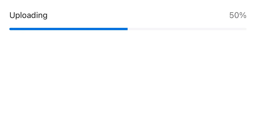
### With label
A bar with a label and a live percentage value.
```tsx
import * as React from "react"
import { Progress, ProgressLabel, ProgressValue } from "@/components/ui/progress"
function WithLabelDemo() {
const [value, setValue] = React.useState(0)
React.useEffect(() => {
const timer = setInterval(() => {
setValue((current) => (current >= 100 ? 0 : current + 10))
}, 600)
return () => clearInterval(timer)
}, [])
return (
)
}
export function ProgressWithLabelExample() {
return (
)
}
```
```swift
import EsuissUI
import SwiftUI
struct ProgressWithLabel: View {
@State private var value = 0
var body: some View {
ProgressView(value: Double(value), total: 100) {
Text("Uploading")
} currentValueLabel: {
Text(verbatim: "\(value)%")
}
.progressViewStyle(.bar)
.task {
while !Task.isCancelled {
try? await Task.sleep(for: .milliseconds(600))
value = value >= 100 ? 0 : value + 10
}
}
}
}
```
```kotlin
import androidx.compose.foundation.layout.fillMaxWidth
import androidx.compose.runtime.Composable
import androidx.compose.runtime.LaunchedEffect
import androidx.compose.runtime.getValue
import androidx.compose.runtime.mutableFloatStateOf
import androidx.compose.runtime.saveable.rememberSaveable
import androidx.compose.runtime.setValue
import androidx.compose.ui.Modifier
import com.esuiss.ui.components.Progress
import kotlinx.coroutines.delay
@Composable
fun ProgressWithLabel() {
var value by rememberSaveable { mutableFloatStateOf(0f) }
LaunchedEffect(Unit) {
while (true) {
delay(600)
value = if (value >= 100f) 0f else value + 10f
}
}
Progress(value, Modifier.fillMaxWidth(), label = "Uploading", showValue = true)
}
```
### Complete
A bar at 100 percent.

```tsx
import { Progress } from "@/components/ui/progress"
export function ProgressCompleteExample() {
return (
)
}
```
```swift
import EsuissUI
import SwiftUI
struct ProgressCompleteExample: View {
var body: some View {
ProgressView(value: 100, total: 100)
.progressViewStyle(.bar)
}
}
```
```kotlin
import androidx.compose.foundation.layout.fillMaxWidth
import androidx.compose.runtime.Composable
import androidx.compose.ui.Modifier
import com.esuiss.ui.components.Progress
@Composable
fun ProgressCompleteExample() {
Progress(100f, Modifier.fillMaxWidth())
}
```
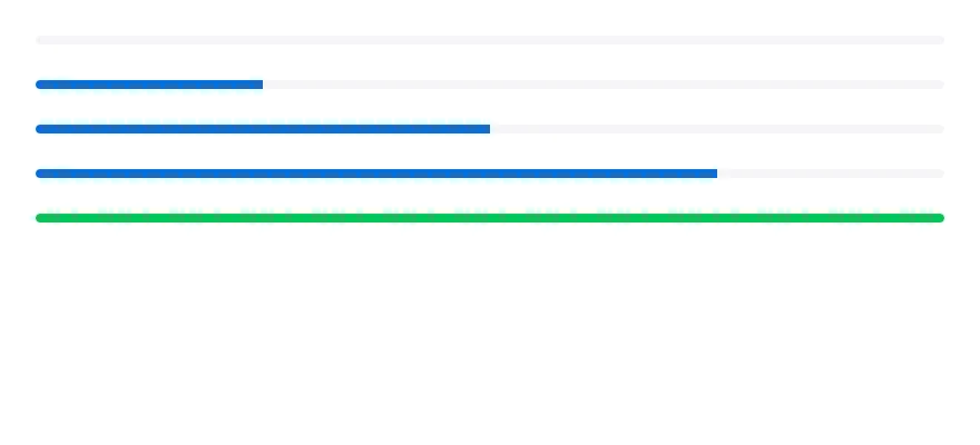
### Values
Bars at 0, 25, 50, 75 and 100 percent, the last with a custom indicator color.
```tsx
import { View } from "react-native"
import { Progress } from "@/components/ui/progress"
export function ProgressValuesExample() {
return (
)
}
```
```swift
import EsuissUI
import SwiftUI
struct ProgressValuesExample: View {
var body: some View {
VStack(spacing: 16) {
ForEach([0.0, 25, 50, 75, 100], id: \.self) { value in
ProgressView(value: value, total: 100)
.progressViewStyle(.bar)
}
}
.frame(maxWidth: .infinity)
}
}
```
```kotlin
import androidx.compose.foundation.layout.Arrangement
import androidx.compose.foundation.layout.Column
import androidx.compose.foundation.layout.fillMaxWidth
import androidx.compose.runtime.Composable
import androidx.compose.ui.Modifier
import androidx.compose.ui.unit.dp
import com.esuiss.ui.components.Progress
@Composable
fun ProgressValues() {
Column(Modifier.fillMaxWidth(), verticalArrangement = Arrangement.spacedBy(16.dp)) {
listOf(0f, 25f, 50f, 75f, 100f).forEach { Progress(it, Modifier.fillMaxWidth()) }
}
}
```
## API Reference
### Progress
Root that holds the value and renders the track and indicator.
| Prop | Type | Default | Description |
| --- | --- | --- | --- |
| `trackClassName` | `string` | - | Extra classes for the track. |
| `indicatorClassName` | `string` | - | Extra classes for the indicator. |
Also accepts the props of `React.ComponentProps`.
### ProgressTrack
Background bar.
Also accepts the props of `React.ComponentProps`.
### ProgressIndicator
Animated fill that shows the current value.
Also accepts the props of `React.ComponentProps`.
### ProgressLabel
Caption text above the bar.
Also accepts the props of `React.ComponentProps`.
### ProgressValue
Formatted value text, aligned to the end.
Also accepts the props of `React.ComponentProps`.
## Accessibility
- The root has the `progressbar` role and reports `min`, `max`, the current value and a value text, so VoiceOver and TalkBack announce the progress.
- Use `getAccessibilityValueText` to customize the announced text.
## Notes
- The track uses `bg-muted` and the indicator `bg-primary`.
- Label and value text use `text-foreground` and `text-muted-foreground`, with tabular numbers for the value.
- Light and dark colors follow the system appearance.