# Pin Pad
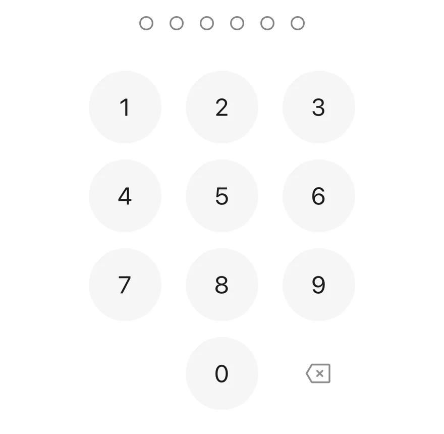
A passcode entry screen element with a row of dots and a numeric keypad.
Pin Pad is an open-source component from suiss/ui for React Native, SwiftUI and Jetpack Compose. The @esuiss/ui CLI copies its source into your project, so you own the code.
Source: https://ui.suiss.app/docs/components/pin-pad
**React Native, SwiftUI, Jetpack Compose**
```tsx
import { PinPad } from "@/components/ui/pin-pad"
export function PinPadExample() {
return (
)
}
```
```swift
import EsuissUI
import SwiftUI
struct PinPadDemo: View {
let length: Int
let error: Bool
let biometric: Bool
@State private var value: String
init(value: String = "", length: Int = 6, error: Bool = false, biometric: Bool = false) {
self.length = length
self.error = error
self.biometric = biometric
_value = State(initialValue: value)
}
var body: some View {
PinPad(value: $value, length: length, error: error, onBiometric: biometric ? {} : nil)
.frame(maxWidth: .infinity)
}
}
```
```kotlin
import androidx.compose.foundation.layout.Arrangement
import androidx.compose.foundation.layout.Column
import androidx.compose.foundation.layout.fillMaxWidth
import androidx.compose.runtime.Composable
import androidx.compose.ui.Alignment
import androidx.compose.ui.Modifier
import androidx.compose.ui.unit.dp
import com.esuiss.ui.components.PinPad
@Composable
fun PinPadExample() {
PinPadCentered { PinPad() }
}
@Composable
fun PinPadCentered(content: @Composable () -> Unit) {
Column(
modifier = Modifier.fillMaxWidth(),
horizontalAlignment = Alignment.CenterHorizontally,
verticalArrangement = Arrangement.spacedBy(24.dp),
) {
content()
}
}
```
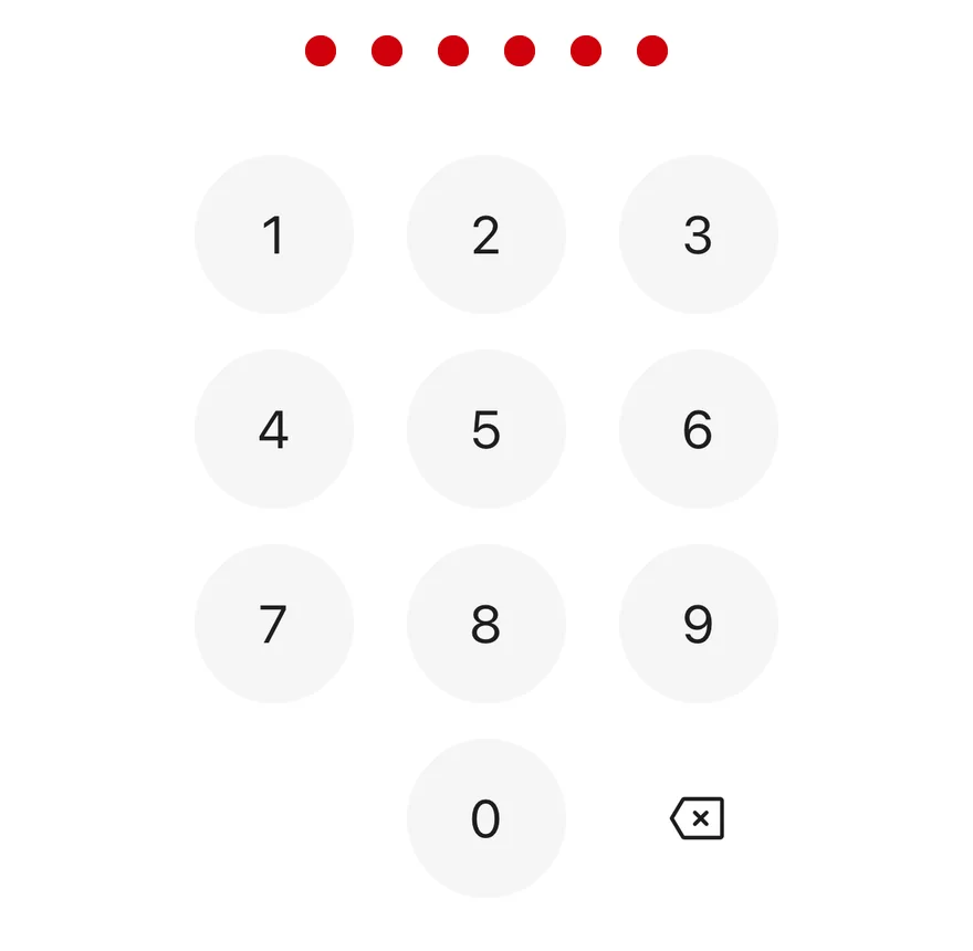
`PinPad` combines a row of dots that fill as digits are entered with a `Keypad` for input. The length is between 4 and 8 digits. Each key press plays a selection haptic, and switching to the error state turns the dots red, plays an error haptic and shakes the row with Reanimated. Haptics play when a haptics adapter is provided through `HapticsContext`.
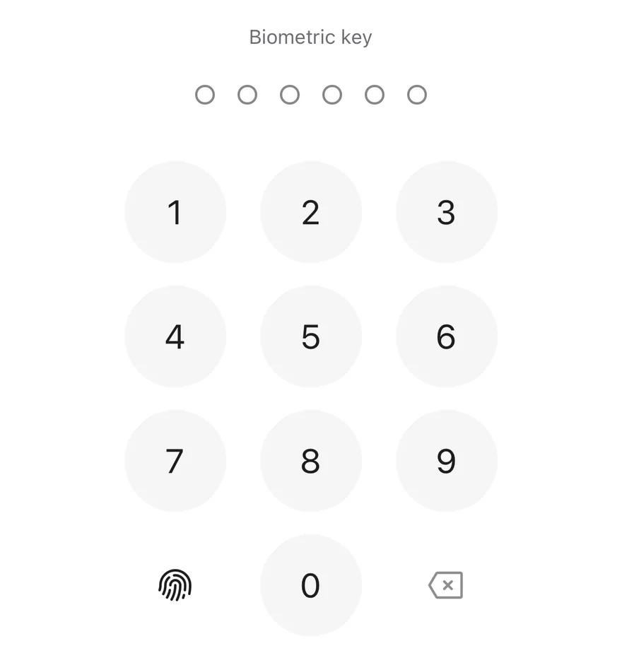
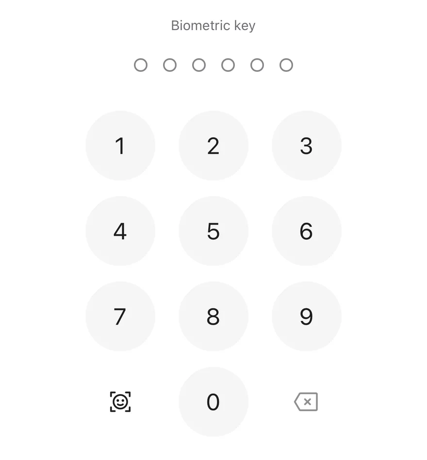
An optional biometric key appears in the bottom-left corner of the keypad when `onBiometric` is set, and the delete key is disabled while nothing is entered.
## Installation
**React Native**
```bash title="Terminal"
npx shadcn@latest add @esuiss-rn/pin-pad
```
See [Installation](https://ui.suiss.app/docs/installation) for the `components.json` setup. Or use the suiss/ui CLI:
```bash title="Terminal"
npx @esuiss/ui@latest add pin-pad
```
**SwiftUI**
```bash title="Terminal"
npx @esuiss/ui@latest add pin-pad --platform swift
```
**Jetpack Compose**
```bash title="Terminal"
npx @esuiss/ui@latest add pin-pad --platform kotlin
```
The CLI also adds what it builds on: [Keypad](https://ui.suiss.app/docs/components/keypad). On React Native it also adds the animated view `components/ui/animated-view.tsx`.
### Manual
**React Native**
**Uniwind**
1. Install the dependencies:
```bash title="Terminal"
npx expo install cn phosphor-react-native react-native-reanimated react-native-svg react-native-worklets
```
2. Add the pieces it builds on: [Keypad](https://ui.suiss.app/docs/components/keypad), and the primitives `components/primitives/haptics.tsx`, `components/primitives/hooks.tsx`, and the animated view `components/ui/animated-view.tsx` from the next step.
3. Copy the animated view into `components/ui/animated-view.tsx`:
- `uniwind/components/ui/animated-view.tsx`: [source](https://github.com/e-suiss/ui/blob/main/packages/mobile/uniwind/components/ui/animated-view.tsx)
4. Copy the source into `components/ui/pin-pad.tsx`:
```tsx title="uniwind/components/ui/pin-pad.tsx"
import { cn } from "cn"
import type { Icon as PhosphorIcon } from "phosphor-react-native"
import * as React from "react"
import { View } from "react-native"
import {
ReduceMotion,
useAnimatedStyle,
useSharedValue,
withSequence,
withTiming,
} from "react-native-reanimated"
import { useHaptics } from "@/components/primitives/haptics"
import { useEffectEvent } from "@/components/primitives/hooks"
import { AnimatedView } from "@/components/ui/animated-view"
import { Keypad, type KeypadKeyValue } from "@/components/ui/keypad"
const SHAKE_DURATION = 400
function clampLength(length: number) {
return Math.min(8, Math.max(4, Math.round(length)))
}
function defaultDotsLabel(entered: number, length: number) {
return `${entered} of ${length} entered`
}
function dotClassName(
error: boolean | undefined,
filled: boolean,
disabled: boolean | undefined
) {
if (error)
return filled ? "border-destructive bg-destructive" : "border-destructive"
if (filled) {
return disabled
? "border-border bg-border"
: "border-foreground bg-foreground"
}
return disabled ? "border-border" : "border-input"
}
function PinPad({
length: lengthProp = 6,
value: valueProp,
defaultValue = "",
onValueChange,
onComplete,
error = false,
disabled = false,
onBiometric,
biometricIcon,
biometricLabel,
deleteLabel,
dotsLabel = defaultDotsLabel,
className,
dotsClassName,
keypadClassName,
...props
}: React.ComponentProps & {
length?: number
value?: string
defaultValue?: string
onValueChange?: (value: string) => void
onComplete?: (value: string) => void
error?: boolean
disabled?: boolean
onBiometric?: () => void
biometricIcon?: PhosphorIcon
biometricLabel?: string
deleteLabel?: string
dotsLabel?: (entered: number, length: number) => string
dotsClassName?: string
keypadClassName?: string
}) {
const length = clampLength(lengthProp)
const haptics = useHaptics()
const [uncontrolled, setUncontrolled] = React.useState(() =>
defaultValue.replace(/\D/g, "").slice(0, length)
)
const isControlled = valueProp !== undefined
const value = (isControlled ? valueProp : uncontrolled).slice(0, length)
const valueRef = React.useRef(value)
valueRef.current = value
const offset = useSharedValue(0)
const wasError = React.useRef(error)
const commit = React.useCallback(
(next: string) => {
if (next === valueRef.current) return false
valueRef.current = next
if (!isControlled) setUncontrolled(next)
onValueChange?.(next)
return true
},
[isControlled, onValueChange]
)
const onError = useEffectEvent(() => {
haptics.notification("error")
const step = {
duration: SHAKE_DURATION / 6,
reduceMotion: ReduceMotion.System,
}
offset.value = withSequence(
withTiming(-12, step),
withTiming(10, step),
withTiming(-8, step),
withTiming(6, step),
withTiming(-3, step),
withTiming(0, step)
)
})
React.useEffect(() => {
const previous = wasError.current
wasError.current = error
if (!error || previous) return
onError()
}, [error, onError])
const shakeStyle = useAnimatedStyle(() => ({
transform: [{ translateX: offset.value }],
}))
const press = (key: KeypadKeyValue) => {
if (key === "biometric") {
onBiometric?.()
return
}
const current = valueRef.current
if (key === "delete") {
if (commit(current.slice(0, -1))) haptics.selection()
return
}
if (key === "decimal" || current.length >= length) return
const next = current + key
if (!commit(next)) return
haptics.selection()
if (next.length === length) onComplete?.(next)
}
return (
{Array.from({ length }, (_, position) => position).map((index) => {
const filled = index < value.length
return (
)
})}
)
}
export { PinPad }
```
5. Update the import paths to match your project.
**NativeWind**
1. Install the dependencies:
```bash title="Terminal"
npx expo install cn phosphor-react-native react-native-reanimated react-native-svg react-native-worklets
```
2. Add the pieces it builds on: [Keypad](https://ui.suiss.app/docs/components/keypad), and the primitives `components/primitives/haptics.tsx`, `components/primitives/hooks.tsx`, and the animated view `components/ui/animated-view.tsx` from the next step.
3. Copy the animated view into `components/ui/animated-view.tsx`:
- `nativewind/components/ui/animated-view.tsx`: [source](https://github.com/e-suiss/ui/blob/main/packages/mobile/nativewind/components/ui/animated-view.tsx)
4. Copy the source into `components/ui/pin-pad.tsx`:
```tsx title="nativewind/components/ui/pin-pad.tsx"
import { cn } from "cn"
import type { Icon as PhosphorIcon } from "phosphor-react-native"
import * as React from "react"
import { View } from "react-native"
import {
ReduceMotion,
useAnimatedStyle,
useSharedValue,
withSequence,
withTiming,
} from "react-native-reanimated"
import { useHaptics } from "@/components/primitives/haptics"
import { useEffectEvent } from "@/components/primitives/hooks"
import { AnimatedView } from "@/components/ui/animated-view"
import { Keypad, type KeypadKeyValue } from "@/components/ui/keypad"
const SHAKE_DURATION = 400
function clampLength(length: number) {
return Math.min(8, Math.max(4, Math.round(length)))
}
function defaultDotsLabel(entered: number, length: number) {
return `${entered} of ${length} entered`
}
function dotClassName(
error: boolean | undefined,
filled: boolean,
disabled: boolean | undefined
) {
if (error)
return filled ? "border-destructive bg-destructive" : "border-destructive"
if (filled) {
return disabled
? "border-border bg-border"
: "border-foreground bg-foreground"
}
return disabled ? "border-border" : "border-input"
}
function PinPad({
length: lengthProp = 6,
value: valueProp,
defaultValue = "",
onValueChange,
onComplete,
error = false,
disabled = false,
onBiometric,
biometricIcon,
biometricLabel,
deleteLabel,
dotsLabel = defaultDotsLabel,
className,
dotsClassName,
keypadClassName,
...props
}: React.ComponentProps & {
length?: number
value?: string
defaultValue?: string
onValueChange?: (value: string) => void
onComplete?: (value: string) => void
error?: boolean
disabled?: boolean
onBiometric?: () => void
biometricIcon?: PhosphorIcon
biometricLabel?: string
deleteLabel?: string
dotsLabel?: (entered: number, length: number) => string
dotsClassName?: string
keypadClassName?: string
}) {
const length = clampLength(lengthProp)
const haptics = useHaptics()
const [uncontrolled, setUncontrolled] = React.useState(() =>
defaultValue.replace(/\D/g, "").slice(0, length)
)
const isControlled = valueProp !== undefined
const value = (isControlled ? valueProp : uncontrolled).slice(0, length)
const valueRef = React.useRef(value)
valueRef.current = value
const offset = useSharedValue(0)
const wasError = React.useRef(error)
const commit = React.useCallback(
(next: string) => {
if (next === valueRef.current) return false
valueRef.current = next
if (!isControlled) setUncontrolled(next)
onValueChange?.(next)
return true
},
[isControlled, onValueChange]
)
const onError = useEffectEvent(() => {
haptics.notification("error")
const step = {
duration: SHAKE_DURATION / 6,
reduceMotion: ReduceMotion.System,
}
offset.value = withSequence(
withTiming(-12, step),
withTiming(10, step),
withTiming(-8, step),
withTiming(6, step),
withTiming(-3, step),
withTiming(0, step)
)
})
React.useEffect(() => {
const previous = wasError.current
wasError.current = error
if (!error || previous) return
onError()
}, [error, onError])
const shakeStyle = useAnimatedStyle(() => ({
transform: [{ translateX: offset.value }],
}))
const press = (key: KeypadKeyValue) => {
if (key === "biometric") {
onBiometric?.()
return
}
const current = valueRef.current
if (key === "delete") {
if (commit(current.slice(0, -1))) haptics.selection()
return
}
if (key === "decimal" || current.length >= length) return
const next = current + key
if (!commit(next)) return
haptics.selection()
if (next.length === length) onComplete?.(next)
}
return (
{Array.from({ length }, (_, position) => position).map((index) => {
const filled = index < value.length
return (
)
})}
)
}
export { PinPad }
```
5. Update the import paths to match your project.
**StyleSheet**
1. Install the dependencies:
```bash title="Terminal"
npx expo install phosphor-react-native react-native-reanimated react-native-svg react-native-worklets
```
2. Add the pieces it builds on: [Keypad](https://ui.suiss.app/docs/components/keypad), and the primitives `components/primitives/haptics.tsx`, `components/primitives/hooks.tsx`, and the animated view `components/ui/animated-view.tsx` from the next step.
3. Copy the animated view into `components/ui/animated-view.tsx`:
- `stylesheet/components/ui/animated-view.tsx`: [source](https://github.com/e-suiss/ui/blob/main/packages/mobile/stylesheet/components/ui/animated-view.tsx)
4. Copy the source into `components/ui/pin-pad.tsx`:
```tsx title="stylesheet/components/ui/pin-pad.tsx"
import type { Icon as PhosphorIcon } from "phosphor-react-native"
import * as React from "react"
import { type StyleProp, StyleSheet, View, type ViewStyle } from "react-native"
import {
ReduceMotion,
useAnimatedStyle,
useSharedValue,
withSequence,
withTiming,
} from "react-native-reanimated"
import { useHaptics } from "@/components/primitives/haptics"
import { useEffectEvent } from "@/components/primitives/hooks"
import { AnimatedView } from "@/components/ui/animated-view"
import { Keypad, type KeypadKeyValue } from "@/components/ui/keypad"
import { radius, useTheme } from "@/components/ui/theme"
const SHAKE_DURATION = 400
const styles = StyleSheet.create({
root: { alignItems: "center", gap: 40 },
dots: { flexDirection: "row", alignItems: "center", gap: 16 },
dot: {
width: 14,
height: 14,
borderRadius: radius.full,
borderWidth: 1.5,
},
})
function clampLength(length: number) {
return Math.min(8, Math.max(4, Math.round(length)))
}
function defaultDotsLabel(entered: number, length: number) {
return `${entered} of ${length} entered`
}
function PinPad({
length: lengthProp = 6,
value: valueProp,
defaultValue = "",
onValueChange,
onComplete,
error = false,
disabled = false,
onBiometric,
biometricIcon,
biometricLabel,
deleteLabel,
dotsLabel = defaultDotsLabel,
style,
dotsStyle,
keypadStyle,
...props
}: React.ComponentProps & {
length?: number
value?: string
defaultValue?: string
onValueChange?: (value: string) => void
onComplete?: (value: string) => void
error?: boolean
disabled?: boolean
onBiometric?: () => void
biometricIcon?: PhosphorIcon
biometricLabel?: string
deleteLabel?: string
dotsLabel?: (entered: number, length: number) => string
dotsStyle?: StyleProp
keypadStyle?: StyleProp
}) {
const { colors } = useTheme()
const length = clampLength(lengthProp)
const haptics = useHaptics()
const [uncontrolled, setUncontrolled] = React.useState(() =>
defaultValue.replace(/\D/g, "").slice(0, length)
)
const isControlled = valueProp !== undefined
const value = (isControlled ? valueProp : uncontrolled).slice(0, length)
const valueRef = React.useRef(value)
valueRef.current = value
const offset = useSharedValue(0)
const wasError = React.useRef(error)
const commit = React.useCallback(
(next: string) => {
if (next === valueRef.current) return false
valueRef.current = next
if (!isControlled) setUncontrolled(next)
onValueChange?.(next)
return true
},
[isControlled, onValueChange]
)
const onError = useEffectEvent(() => {
haptics.notification("error")
const step = {
duration: SHAKE_DURATION / 6,
reduceMotion: ReduceMotion.System,
}
offset.value = withSequence(
withTiming(-12, step),
withTiming(10, step),
withTiming(-8, step),
withTiming(6, step),
withTiming(-3, step),
withTiming(0, step)
)
})
React.useEffect(() => {
const previous = wasError.current
wasError.current = error
if (!error || previous) return
onError()
}, [error, onError])
const shakeStyle = useAnimatedStyle(() => ({
transform: [{ translateX: offset.value }],
}))
const press = (key: KeypadKeyValue) => {
if (key === "biometric") {
onBiometric?.()
return
}
const current = valueRef.current
if (key === "delete") {
if (commit(current.slice(0, -1))) haptics.selection()
return
}
if (key === "decimal" || current.length >= length) return
const next = current + key
if (!commit(next)) return
haptics.selection()
if (next.length === length) onComplete?.(next)
}
return (
{Array.from({ length }, (_, position) => position).map((index) => {
const filled = index < value.length
let color = filled ? colors.foreground : colors.input
if (error) color = colors.destructive
return (
)
})}
)
}
export { PinPad }
```
5. Update the import paths to match your project.
**SwiftUI**
1. Target iOS 17 or later.
2. Add the Swift package to your app:
```swift title="Package.swift"
.package(url: "https://github.com/phosphor-icons/swift", from: "2.1.0")
```
3. Copy the theme files every view uses:
- `swift/Theme/Theme.swift`: [source](https://github.com/e-suiss/ui/blob/main/packages/mobile/swiftui/Sources/EsuissUI/Theme/Theme.swift)
- `swift/Theme/Tokens.swift`: [source](https://github.com/e-suiss/ui/blob/main/packages/mobile/swiftui/Sources/EsuissUI/Theme/Tokens.swift)
4. Copy the source and every file it uses:
```swift title="swift/Components/PinPad.swift"
import PhosphorSwift
import SwiftUI
enum PinPadMath {
static func clamp(_ length: Int) -> Int {
min(max(length, 4), 8)
}
static func press(_ key: KeypadKey, value: String, length: Int) -> String? {
switch key {
case .digit(let digit):
guard value.count < length else { return nil }
return value + String(digit)
case .delete:
guard !value.isEmpty else { return nil }
return String(value.dropLast())
case .decimal, .biometric:
return nil
}
}
}
public struct PinPad: View {
@Binding var value: String
let length: Int
let error: Bool
let biometricIcon: Image
let biometricLabel: LocalizedStringKey
let deleteLabel: LocalizedStringKey
let onBiometric: (() -> Void)?
let onComplete: ((String) -> Void)?
@Environment(\.isEnabled) private var isEnabled
@State private var shakes = 0
public init(
value: Binding,
length: Int = 6,
error: Bool = false,
biometricIcon: Image = Ph.fingerprint.regular,
biometricLabel: LocalizedStringKey = "Use biometrics",
deleteLabel: LocalizedStringKey = "Delete",
onBiometric: (() -> Void)? = nil,
onComplete: ((String) -> Void)? = nil
) {
_value = value
self.length = PinPadMath.clamp(length)
self.error = error
self.biometricIcon = biometricIcon
self.biometricLabel = biometricLabel
self.deleteLabel = deleteLabel
self.onBiometric = onBiometric
self.onComplete = onComplete
}
public var body: some View {
let count = min(value.count, length)
VStack(spacing: 40) {
PinPadDots(count: count, length: length, error: error)
.shake(trigger: shakes)
Keypad(
accessory: onBiometric == nil ? .none : .biometric(biometricIcon, label: biometricLabel),
deleteLabel: deleteLabel,
canDelete: !value.isEmpty,
press: press
)
}
.onChange(of: error) { old, new in
if !old && new { shakes += 1 }
}
.hapticFeedback(.error, trigger: error) { old, new in !old && new }
}
private func press(_ key: KeypadKey) -> Bool {
guard isEnabled else { return false }
if key == .biometric {
onBiometric?()
return onBiometric != nil
}
guard let next = PinPadMath.press(key, value: value, length: length) else { return false }
value = next
if case .digit = key, next.count == length {
onComplete?(next)
}
return true
}
}
private struct PinPadDots: View {
let count: Int
let length: Int
let error: Bool
@Environment(\.isEnabled) private var isEnabled
var body: some View {
HStack(spacing: 16) {
ForEach(0.. Unit)? = null,
defaultValue: String = "",
length: Int = 6,
onComplete: ((String) -> Unit)? = null,
error: Boolean = false,
enabled: Boolean = true,
onBiometric: (() -> Unit)? = null,
biometricIcon: ImageVector = PhosphorIcons.Regular.Fingerprint,
biometricLabel: String = "Use biometrics",
deleteLabel: String = "Delete",
entryLabel: (entered: Int, length: Int) -> String = { entered, total -> "$entered of $total entered" },
) {
val size = length.coerceIn(4, 8)
var internal by remember { mutableStateOf(defaultValue.filter { it.isDigit() }.take(size)) }
val current = (value ?: internal).take(size)
val haptics = rememberHaptics()
val reduced = formReducedMotion()
val offset = remember { Animatable(0f) }
LaunchedEffect(error) {
if (error) {
haptics.perform(HapticFeedbackType.Reject)
if (!reduced) offset.shake()
}
}
val update: (String) -> Unit = { next ->
if (value == null) internal = next
onValueChange?.invoke(next)
}
Column(
modifier = modifier,
verticalArrangement = Arrangement.spacedBy(48.dp),
horizontalAlignment = Alignment.CenterHorizontally,
) {
Row(
modifier = Modifier
.graphicsLayer { translationX = offset.value.dp.toPx() }
.clearAndSetSemantics {
contentDescription = entryLabel(current.length, size)
liveRegion = LiveRegionMode.Polite
},
horizontalArrangement = Arrangement.spacedBy(16.dp),
verticalAlignment = Alignment.CenterVertically,
) {
repeat(size) { index -> PinPadDot(index < current.length, error, enabled) }
}
Keypad(
onKeyPress = { key ->
when (key) {
is KeypadKey.Digit -> if (current.length < size) {
val next = current + key.value
update(next)
if (next.length == size) onComplete?.invoke(next)
}
KeypadKey.Delete -> if (current.isNotEmpty()) update(current.dropLast(1))
KeypadKey.Biometric -> onBiometric?.invoke()
KeypadKey.Decimal -> Unit
}
},
accessory = if (onBiometric != null) KeypadAccessory.Biometric(biometricIcon, biometricLabel) else KeypadAccessory.None,
deleteLabel = deleteLabel,
enabled = enabled,
)
}
}
@Composable
private fun PinPadDot(filled: Boolean, error: Boolean, enabled: Boolean) {
val colors = EsuissTheme.colors
val target = when {
error -> colors.destructive
filled -> colors.foreground
else -> colors.mutedForeground
}
val color by animateColorAsState(target, tween(150, easing = FormEasing), label = "dot")
val fill by animateColorAsState(if (filled) target else Color.Transparent, tween(150, easing = FormEasing), label = "fill")
Box(
modifier = Modifier
.size(14.dp)
.alpha(if (enabled) 1f else 0.5f)
.background(fill, CircleShape)
.border(1.5.dp, color, CircleShape),
)
}
```
- `kotlin/components/Button.kt`: see [Button](https://ui.suiss.app/docs/components/button.md)
- `kotlin/components/ButtonGroup.kt`: see [Button Group](https://ui.suiss.app/docs/components/button-group.md)
- `kotlin/components/Content.kt`: [source](https://github.com/e-suiss/ui/blob/main/packages/mobile/kotlin/ui/src/main/kotlin/com/esuiss/ui/components/Content.kt)
- `kotlin/components/FormSupport.kt`: [source](https://github.com/e-suiss/ui/blob/main/packages/mobile/kotlin/ui/src/main/kotlin/com/esuiss/ui/components/FormSupport.kt)
- `kotlin/components/Haptics.kt`: see [Haptics](https://ui.suiss.app/docs/components/haptics.md)
- `kotlin/components/Icon.kt`: see [Icon](https://ui.suiss.app/docs/components/icon.md)
- `kotlin/components/Keypad.kt`: see [Keypad](https://ui.suiss.app/docs/components/keypad.md)
4. Update the `com.esuiss.ui` package names to match your project.
## Usage
```tsx
import { PinPad } from "@/components/ui/pin-pad"
```
```tsx
```
Use it uncontrolled with `defaultValue`, or controlled with `value` and `onValueChange`. `onComplete` fires with the full code once the last digit is entered; check the code there, set `error` when it is wrong and clear the value to let the user try again.
Pass `onBiometric` to show the biometric key, with `biometricIcon` and `biometricLabel` to match the method in use. Style the dots and keypad separately with `dotsClassName` and `keypadClassName`.
## Examples
### Filled
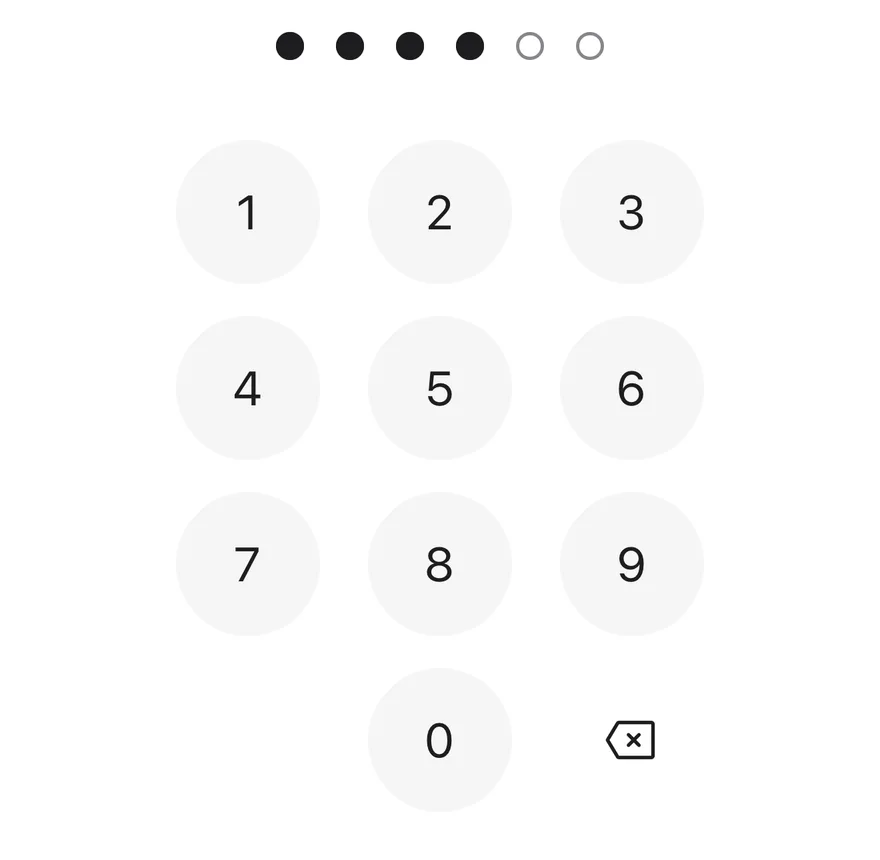
A pin pad with four of six digits entered.
```tsx
import { PinPad } from "@/components/ui/pin-pad"
export function PinPadFilledExample() {
return (
)
}
```
```swift
import EsuissUI
import SwiftUI
struct PinPadFilledExample: View {
var body: some View {
PinPadDemo(value: "1234")
}
}
struct PinPadDemo: View {
let length: Int
let error: Bool
let biometric: Bool
@State private var value: String
init(value: String = "", length: Int = 6, error: Bool = false, biometric: Bool = false) {
self.length = length
self.error = error
self.biometric = biometric
_value = State(initialValue: value)
}
var body: some View {
PinPad(value: $value, length: length, error: error, onBiometric: biometric ? {} : nil)
.frame(maxWidth: .infinity)
}
}
```
```kotlin
import androidx.compose.foundation.layout.Arrangement
import androidx.compose.foundation.layout.Column
import androidx.compose.foundation.layout.fillMaxWidth
import androidx.compose.runtime.Composable
import androidx.compose.ui.Alignment
import androidx.compose.ui.Modifier
import androidx.compose.ui.unit.dp
import com.esuiss.ui.components.PinPad
@Composable
fun PinPadFilledExample() {
PinPadCentered { PinPad(defaultValue = "1234") }
}
@Composable
fun PinPadCentered(content: @Composable () -> Unit) {
Column(
modifier = Modifier.fillMaxWidth(),
horizontalAlignment = Alignment.CenterHorizontally,
verticalArrangement = Arrangement.spacedBy(24.dp),
) {
content()
}
}
```
### Error
The error state with red dots.
```tsx
import { PinPad } from "@/components/ui/pin-pad"
export function PinPadErrorStateExample() {
return (
)
}
```
```swift
import EsuissUI
import SwiftUI
struct PinPadErrorStateExample: View {
var body: some View {
PinPadDemo(value: "654321", error: true)
}
}
struct PinPadDemo: View {
let length: Int
let error: Bool
let biometric: Bool
@State private var value: String
init(value: String = "", length: Int = 6, error: Bool = false, biometric: Bool = false) {
self.length = length
self.error = error
self.biometric = biometric
_value = State(initialValue: value)
}
var body: some View {
PinPad(value: $value, length: length, error: error, onBiometric: biometric ? {} : nil)
.frame(maxWidth: .infinity)
}
}
```
```kotlin
import androidx.compose.foundation.layout.Arrangement
import androidx.compose.foundation.layout.Column
import androidx.compose.foundation.layout.fillMaxWidth
import androidx.compose.runtime.Composable
import androidx.compose.ui.Alignment
import androidx.compose.ui.Modifier
import androidx.compose.ui.unit.dp
import com.esuiss.ui.components.PinPad
@Composable
fun PinPadErrorStateExample() {
PinPadCentered { PinPad(defaultValue = "654321", error = true) }
}
@Composable
fun PinPadCentered(content: @Composable () -> Unit) {
Column(
modifier = Modifier.fillMaxWidth(),
horizontalAlignment = Alignment.CenterHorizontally,
verticalArrangement = Arrangement.spacedBy(24.dp),
) {
content()
}
}
```
### Verify
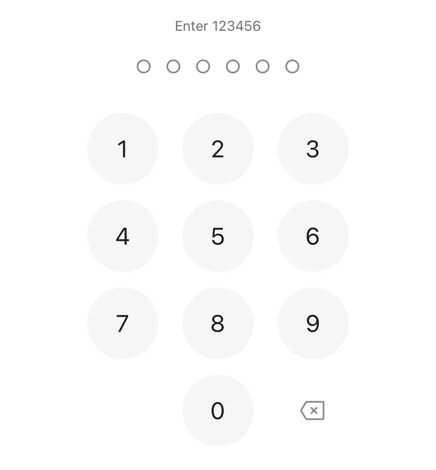
Checks the code on completion, shows an error for a wrong code and clears it.
```tsx
import * as React from "react"
import { View } from "react-native"
import { PinPad } from "@/components/ui/pin-pad"
import { Text } from "@/components/ui/text"
const PASSCODE = "123456"
function VerifyDemo() {
const [value, setValue] = React.useState("")
const [error, setError] = React.useState(false)
const [status, setStatus] = React.useState("Enter 123456")
return (
{status}
{
setValue(next)
if (next.length > 0) setError(false)
}}
onComplete={(code) => {
if (code === PASSCODE) {
setStatus("Unlocked")
} else {
setError(true)
setStatus("Wrong passcode. Try again.")
setTimeout(() => setValue(""), 600)
}
}}
/>
)
}
export function PinPadVerifyExample() {
return (
)
}
```
```swift
import EsuissUI
import SwiftUI
struct PinPadVerify: View {
private static let passcode = "123456"
@State private var value = ""
@State private var error = false
@State private var status = "Enter 123456"
var body: some View {
VStack(spacing: 24) {
Text(verbatim: status)
.textStyle(.sm)
.foregroundStyle(error ? EsuissColor.destructive : EsuissColor.mutedForeground)
.accessibilityAddTraits(.updatesFrequently)
PinPad(value: $value, error: error, onComplete: complete)
.onChange(of: value) { _, next in
if !next.isEmpty { error = false }
}
}
.frame(maxWidth: .infinity)
}
func complete(_ code: String) {
if code == Self.passcode {
status = "Unlocked"
} else {
error = true
status = "Wrong passcode. Try again."
Task {
try? await Task.sleep(for: .milliseconds(600))
value = ""
}
}
}
}
let passcode = "123456"
```
```kotlin
import androidx.compose.foundation.layout.Arrangement
import androidx.compose.foundation.layout.Column
import androidx.compose.foundation.layout.fillMaxWidth
import androidx.compose.runtime.Composable
import androidx.compose.runtime.getValue
import androidx.compose.runtime.mutableStateOf
import androidx.compose.runtime.rememberCoroutineScope
import androidx.compose.runtime.saveable.rememberSaveable
import androidx.compose.runtime.setValue
import androidx.compose.ui.Alignment
import androidx.compose.ui.Modifier
import androidx.compose.ui.semantics.LiveRegionMode
import androidx.compose.ui.semantics.liveRegion
import androidx.compose.ui.semantics.semantics
import androidx.compose.ui.unit.dp
import com.esuiss.ui.components.PinPad
import com.esuiss.ui.components.Text
import com.esuiss.ui.theme.EsuissTheme
import com.esuiss.ui.theme.Typography
import kotlinx.coroutines.delay
import kotlinx.coroutines.launch
@Composable
fun PinPadCentered(content: @Composable () -> Unit) {
Column(
modifier = Modifier.fillMaxWidth(),
horizontalAlignment = Alignment.CenterHorizontally,
verticalArrangement = Arrangement.spacedBy(24.dp),
) {
content()
}
}
@Composable
fun PinPadVerify() {
var value by rememberSaveable { mutableStateOf("") }
var error by rememberSaveable { mutableStateOf(false) }
var status by rememberSaveable { mutableStateOf("Enter 123456") }
val scope = rememberCoroutineScope()
val colors = EsuissTheme.colors
PinPadCentered {
Text(
status,
modifier = Modifier.semantics { liveRegion = LiveRegionMode.Polite },
style = Typography.sm,
color = if (error) colors.destructive else colors.mutedForeground,
)
PinPad(
value = value,
error = error,
onValueChange = { next ->
value = next
if (next.isNotEmpty()) error = false
},
onComplete = { code ->
if (code == PinPadPasscode) {
status = "Unlocked"
} else {
error = true
status = "Wrong passcode. Try again."
scope.launch {
delay(600)
value = ""
}
}
},
)
}
}
```
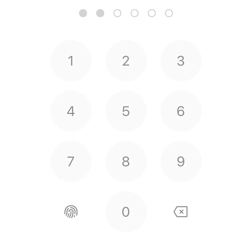
### Disabled
A disabled pin pad with a biometric key.
```tsx
import { PinPad } from "@/components/ui/pin-pad"
export function PinPadDisabledExample() {
return (
undefined} />
)
}
```
```swift
import EsuissUI
import SwiftUI
struct PinPadDisabledExample: View {
var body: some View {
PinPadDemo(value: "12", biometric: true)
.disabled(true)
}
}
struct PinPadDemo: View {
let length: Int
let error: Bool
let biometric: Bool
@State private var value: String
init(value: String = "", length: Int = 6, error: Bool = false, biometric: Bool = false) {
self.length = length
self.error = error
self.biometric = biometric
_value = State(initialValue: value)
}
var body: some View {
PinPad(value: $value, length: length, error: error, onBiometric: biometric ? {} : nil)
.frame(maxWidth: .infinity)
}
}
```
```kotlin
import androidx.compose.foundation.layout.Arrangement
import androidx.compose.foundation.layout.Column
import androidx.compose.foundation.layout.fillMaxWidth
import androidx.compose.runtime.Composable
import androidx.compose.ui.Alignment
import androidx.compose.ui.Modifier
import androidx.compose.ui.unit.dp
import com.esuiss.ui.components.PinPad
@Composable
fun PinPadDisabledExample() {
PinPadCentered { PinPad(defaultValue = "12", enabled = false, onBiometric = {}) }
}
@Composable
fun PinPadCentered(content: @Composable () -> Unit) {
Column(
modifier = Modifier.fillMaxWidth(),
horizontalAlignment = Alignment.CenterHorizontally,
verticalArrangement = Arrangement.spacedBy(24.dp),
) {
content()
}
}
```
### Biometric
A biometric key with the default fingerprint icon.
```tsx
import { ScanSmileyIcon } from "phosphor-react-native"
import * as React from "react"
import { View } from "react-native"
import { PinPad } from "@/components/ui/pin-pad"
import { Text } from "@/components/ui/text"
function BiometricDemo({ faceId = false }: { faceId?: boolean }) {
const [log, setLog] = React.useState(0)
return (
{log > 0 ? `Biometric requested (${log})` : "Biometric key"}
setLog((count) => count + 1)}
/>
)
}
export function PinPadBiometricExample() {
return (
)
}
```
```swift
import EsuissUI
import PhosphorSwift
import SwiftUI
struct PinPadBiometricExample: View {
var body: some View {
PinPadBiometric(faceID: false)
}
}
struct PinPadBiometric: View {
let faceID: Bool
@State private var value = ""
@State private var log = 0
var body: some View {
VStack(spacing: 24) {
Group {
if log > 0 {
Text(verbatim: "Biometric requested (\(log))")
} else {
Text("Biometric key")
}
}
.textStyle(.sm)
.foregroundStyle(EsuissColor.mutedForeground)
PinPad(
value: $value,
biometricIcon: faceID ? Ph.scanSmiley.regular : Ph.fingerprint.regular,
biometricLabel: faceID ? "Use Face ID" : "Use Touch ID",
onBiometric: { log += 1 }
)
}
.frame(maxWidth: .infinity)
}
}
```
```kotlin
import androidx.compose.foundation.layout.Arrangement
import androidx.compose.foundation.layout.Column
import androidx.compose.foundation.layout.fillMaxWidth
import androidx.compose.runtime.Composable
import androidx.compose.runtime.getValue
import androidx.compose.runtime.mutableIntStateOf
import androidx.compose.runtime.saveable.rememberSaveable
import androidx.compose.runtime.setValue
import androidx.compose.ui.Alignment
import androidx.compose.ui.Modifier
import androidx.compose.ui.unit.dp
import com.adamglin.PhosphorIcons
import com.adamglin.phosphoricons.Regular
import com.adamglin.phosphoricons.regular.Fingerprint
import com.adamglin.phosphoricons.regular.ScanSmiley
import com.esuiss.ui.components.PinPad
import com.esuiss.ui.components.Text
import com.esuiss.ui.theme.EsuissTheme
import com.esuiss.ui.theme.Typography
@Composable
fun PinPadBiometricExample() {
PinPadBiometric(faceId = false)
}
@Composable
fun PinPadCentered(content: @Composable () -> Unit) {
Column(
modifier = Modifier.fillMaxWidth(),
horizontalAlignment = Alignment.CenterHorizontally,
verticalArrangement = Arrangement.spacedBy(24.dp),
) {
content()
}
}
@Composable
fun PinPadBiometric(faceId: Boolean) {
var log by rememberSaveable { mutableIntStateOf(0) }
PinPadCentered {
Text(
if (log > 0) "Biometric requested ($log)" else "Biometric key",
style = Typography.sm,
color = EsuissTheme.colors.mutedForeground,
)
PinPad(
biometricIcon = if (faceId) PhosphorIcons.Regular.ScanSmiley else PhosphorIcons.Regular.Fingerprint,
biometricLabel = if (faceId) "Use Face ID" else "Use Touch ID",
onBiometric = { log += 1 },
)
}
}
```
### Face biometric
A biometric key with a face icon and a matching label.
```tsx
import { ScanSmileyIcon } from "phosphor-react-native"
import * as React from "react"
import { View } from "react-native"
import { PinPad } from "@/components/ui/pin-pad"
import { Text } from "@/components/ui/text"
function BiometricDemo({ faceId = false }: { faceId?: boolean }) {
const [log, setLog] = React.useState(0)
return (
{log > 0 ? `Biometric requested (${log})` : "Biometric key"}
setLog((count) => count + 1)}
/>
)
}
export function PinPadFaceBiometricExample() {
return (
)
}
```
```swift
import EsuissUI
import PhosphorSwift
import SwiftUI
struct PinPadFaceBiometricExample: View {
var body: some View {
PinPadBiometric(faceID: true)
}
}
struct PinPadBiometric: View {
let faceID: Bool
@State private var value = ""
@State private var log = 0
var body: some View {
VStack(spacing: 24) {
Group {
if log > 0 {
Text(verbatim: "Biometric requested (\(log))")
} else {
Text("Biometric key")
}
}
.textStyle(.sm)
.foregroundStyle(EsuissColor.mutedForeground)
PinPad(
value: $value,
biometricIcon: faceID ? Ph.scanSmiley.regular : Ph.fingerprint.regular,
biometricLabel: faceID ? "Use Face ID" : "Use Touch ID",
onBiometric: { log += 1 }
)
}
.frame(maxWidth: .infinity)
}
}
```
```kotlin
import androidx.compose.foundation.layout.Arrangement
import androidx.compose.foundation.layout.Column
import androidx.compose.foundation.layout.fillMaxWidth
import androidx.compose.runtime.Composable
import androidx.compose.runtime.getValue
import androidx.compose.runtime.mutableIntStateOf
import androidx.compose.runtime.saveable.rememberSaveable
import androidx.compose.runtime.setValue
import androidx.compose.ui.Alignment
import androidx.compose.ui.Modifier
import androidx.compose.ui.unit.dp
import com.adamglin.PhosphorIcons
import com.adamglin.phosphoricons.Regular
import com.adamglin.phosphoricons.regular.Fingerprint
import com.adamglin.phosphoricons.regular.ScanSmiley
import com.esuiss.ui.components.PinPad
import com.esuiss.ui.components.Text
import com.esuiss.ui.theme.EsuissTheme
import com.esuiss.ui.theme.Typography
@Composable
fun PinPadFaceBiometricExample() {
PinPadBiometric(faceId = true)
}
@Composable
fun PinPadCentered(content: @Composable () -> Unit) {
Column(
modifier = Modifier.fillMaxWidth(),
horizontalAlignment = Alignment.CenterHorizontally,
verticalArrangement = Arrangement.spacedBy(24.dp),
) {
content()
}
}
@Composable
fun PinPadBiometric(faceId: Boolean) {
var log by rememberSaveable { mutableIntStateOf(0) }
PinPadCentered {
Text(
if (log > 0) "Biometric requested ($log)" else "Biometric key",
style = Typography.sm,
color = EsuissTheme.colors.mutedForeground,
)
PinPad(
biometricIcon = if (faceId) PhosphorIcons.Regular.ScanSmiley else PhosphorIcons.Regular.Fingerprint,
biometricLabel = if (faceId) "Use Face ID" else "Use Touch ID",
onBiometric = { log += 1 },
)
}
}
```
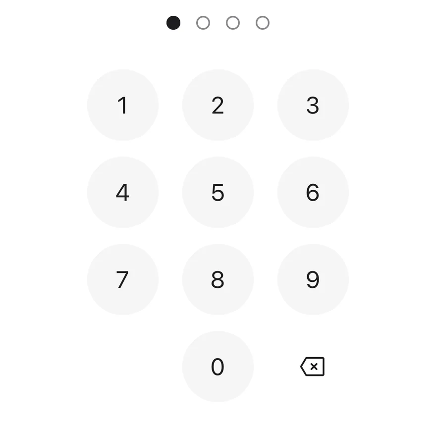
### Four digits
A four-digit code with `length={4}`.
```tsx
import { PinPad } from "@/components/ui/pin-pad"
export function PinPadFourDigitsExample() {
return (
)
}
```
```swift
import EsuissUI
import SwiftUI
struct PinPadFourDigitsExample: View {
var body: some View {
PinPadDemo(value: "1", length: 4)
}
}
struct PinPadDemo: View {
let length: Int
let error: Bool
let biometric: Bool
@State private var value: String
init(value: String = "", length: Int = 6, error: Bool = false, biometric: Bool = false) {
self.length = length
self.error = error
self.biometric = biometric
_value = State(initialValue: value)
}
var body: some View {
PinPad(value: $value, length: length, error: error, onBiometric: biometric ? {} : nil)
.frame(maxWidth: .infinity)
}
}
```
```kotlin
import androidx.compose.foundation.layout.Arrangement
import androidx.compose.foundation.layout.Column
import androidx.compose.foundation.layout.fillMaxWidth
import androidx.compose.runtime.Composable
import androidx.compose.ui.Alignment
import androidx.compose.ui.Modifier
import androidx.compose.ui.unit.dp
import com.esuiss.ui.components.PinPad
@Composable
fun PinPadFourDigitsExample() {
PinPadCentered { PinPad(defaultValue = "1", length = 4) }
}
@Composable
fun PinPadCentered(content: @Composable () -> Unit) {
Column(
modifier = Modifier.fillMaxWidth(),
horizontalAlignment = Alignment.CenterHorizontally,
verticalArrangement = Arrangement.spacedBy(24.dp),
) {
content()
}
}
```
## API Reference
### PinPad
| Prop | Type | Default | Description |
| --- | --- | --- | --- |
| `length` | `number` | `6` | Number of digits, clamped between 4 and 8. Defaults to `6`. |
| `value` | `string` | - | Entered digits for controlled use. |
| `defaultValue` | `string` | `""` | Initial digits for uncontrolled use. Non-digits are removed. |
| `onValueChange` | `(value: string) => void` | - | Called with the new value after each digit or deletion. |
| `onComplete` | `(value: string) => void` | - | Called with the full code when the last digit is entered. |
| `error` | `boolean` | `false` | Shows the error state. Turning it on shakes the dots and plays an error haptic. |
| `disabled` | `boolean` | `false` | Turns off the keypad and dims the dots. |
| `onBiometric` | `() => void` | - | Called when the biometric key is pressed. The key is shown only when this is set. |
| `biometricIcon` | `PhosphorIcon` | - | Icon for the biometric key. |
| `biometricLabel` | `string` | - | Accessibility label for the biometric key. |
| `deleteLabel` | `string` | - | Accessibility label for the delete key. |
| `dotsLabel` | `(entered: number, length: number) => string` | `defaultDotsLabel` | Builds the dots label from the entered count and the length. Defaults to "3 of 6 entered". |
| `dotsClassName` | `string` | - | Classes for the dots row. |
| `keypadClassName` | `string` | - | Classes for the keypad. |
Also accepts the props of `React.ComponentProps`.
## Accessibility
- The dots row is a single element labeled by `dotsLabel`, so screen readers hear progress without the digits.
- The row is a polite live region, so TalkBack announces progress as it changes.
- Keypad keys are buttons labeled with their digit; the delete and biometric keys use `deleteLabel` and `biometricLabel`.
- The shake animation respects the system reduce motion setting.
## Notes
- Uses `bg-foreground` for filled dots, `border-input` for empty ones and `bg-destructive` in the error state; colors follow the system appearance.