# Message
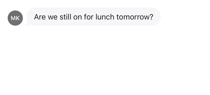
Lays out a single chat message with an optional avatar, header and footer.
Message is an open-source component from suiss/ui for React, React Native, SwiftUI and Jetpack Compose. The @esuiss/ui CLI copies its source into your project, so you own the code.
Source: https://ui.suiss.app/docs/components/message
**React**
**Example**
```tsx
import { Avatar, AvatarFallback } from "@/components/ui/avatar"
import { Bubble, BubbleContent } from "@/components/ui/bubble"
import { Message, MessageAvatar, MessageContent } from "@/components/ui/message"
export default function MessageDemo() {
return (
MK
Are we still on for lunch tomorrow?
)
}
```
`Message` arranges one message row: an optional `MessageAvatar` and a `MessageContent` column. Inside the content, place an optional `MessageHeader` (such as a sender name), one or more bubbles, and an optional `MessageFooter` (such as a timestamp or read receipt). Wrap consecutive messages in `MessageGroup` to stack them.
`Message` handles layout only. Pair it with Bubble for the message surface and with Message Scroller for a scrolling transcript.
## Installation
### CLI
```bash title="Terminal"
npx shadcn@latest add @esuiss/message
```
Works in any project with a `components.json`. See [Installation](https://ui.suiss.app/docs/installation#add-components) for the one-line registry setup. Or use the suiss/ui CLI:
```bash title="Terminal"
npx @esuiss/ui@latest add message
```
### Manual
1. Add the [`cn` helper](https://ui.suiss.app/docs/installation#the-cn-helper).
2. Copy the source into `components/ui/message.tsx`:
```tsx title="components/ui/message.tsx"
import type * as React from "react"
import { cn } from "@/lib/utils"
function MessageGroup({ className, ...props }: React.ComponentProps<"div">) {
return (
)
}
function Message({
className,
align = "start",
...props
}: React.ComponentProps<"div"> & { align?: "start" | "end" }) {
return (
)
}
function MessageAvatar({ className, ...props }: React.ComponentProps<"div">) {
return (
)
}
function MessageContent({ className, ...props }: React.ComponentProps<"div">) {
return (
)
}
function MessageHeader({ className, ...props }: React.ComponentProps<"div">) {
return (
)
}
function MessageFooter({ className, ...props }: React.ComponentProps<"div">) {
return (
)
}
export {
Message,
MessageAvatar,
MessageContent,
MessageFooter,
MessageGroup,
MessageHeader,
}
```
3. Update the import paths to match your project.
## Usage
```tsx
import { MessageGroup, Message, MessageAvatar, MessageContent, MessageHeader, MessageFooter } from "@/components/ui/message"
```
```tsx
MK
Are we still on for lunch tomorrow?
```
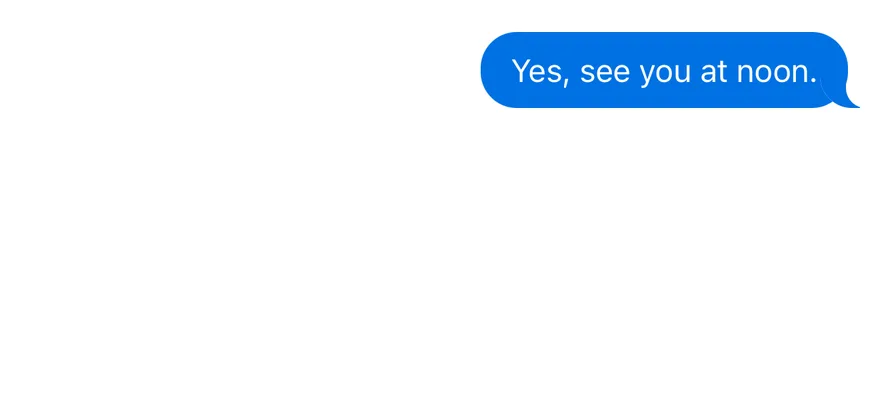
Set `align="end"` for messages sent by the current user. The row reverses, so the avatar moves to the end, and the content's children and the footer align to the end edge.
## Examples
### Align end
A message aligned to the end, as used for outgoing messages.
**Example**
```tsx
import { Bubble, BubbleContent } from "@/components/ui/bubble"
import { Message, MessageContent } from "@/components/ui/message"
export default function MessageAlignEnd() {
return (
Yes, see you at noon.
)
}
```
### With header and footer
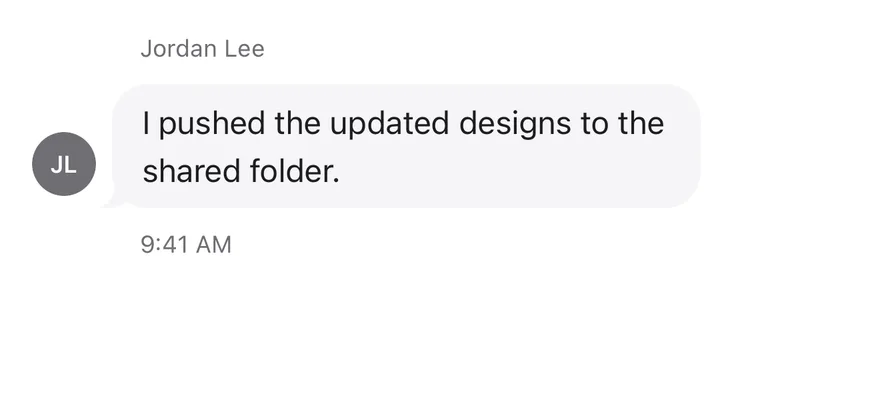
A message with a sender name above the bubble and a timestamp below it.
**Example**
```tsx
import { Avatar, AvatarFallback } from "@/components/ui/avatar"
import { Bubble, BubbleContent } from "@/components/ui/bubble"
import {
Message,
MessageAvatar,
MessageContent,
MessageFooter,
MessageHeader,
} from "@/components/ui/message"
export default function MessageWithHeaderAndFooter() {
return (
JL
Jordan Lee
I pushed the updated designs to the shared folder.
9:41 AM
)
}
```
### Conversation
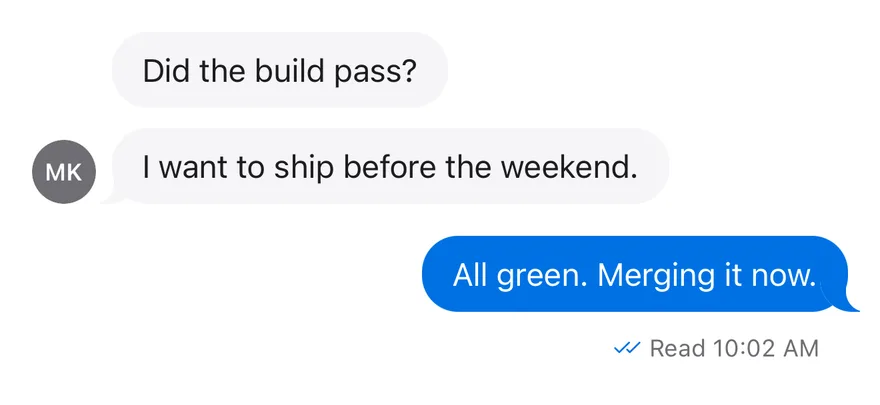
A `MessageGroup` with an incoming message of two bubbles and an outgoing reply.
**Example**
```tsx
import { Avatar, AvatarFallback } from "@/components/ui/avatar"
import { Bubble, BubbleContent } from "@/components/ui/bubble"
import {
Message,
MessageAvatar,
MessageContent,
MessageFooter,
MessageGroup,
} from "@/components/ui/message"
export default function MessageConversation() {
return (
MK
Did the build pass?
I want to ship before the weekend.
All green. Merging it now.
Read 10:02 AM
)
}
```
## API Reference
- `Message`
- `MessageAvatar`
- `MessageContent`
- `MessageHeader`
- `MessageFooter`
- `MessageGroup`
- `Message`
- `MessageAvatar`
- `MessageContent`
- `MessageFooter`
### MessageGroup
Stacks several messages vertically.
Also accepts the props of `React.ComponentProps<"div">`.
### Message
The row for one message that sets its alignment.
| Prop | Type | Default | Description |
| --- | --- | --- | --- |
| `align` | `"start" \| "end"` | `"start"` | Aligns the message to the `start` or `end` edge; `end` reverses the row for outgoing messages. |
Also accepts the props of `React.ComponentProps<"div">`.
### MessageAvatar
A round container for the sender's avatar, aligned to the bottom of the row.
Also accepts the props of `React.ComponentProps<"div">`.
### MessageContent
The column that holds the header, bubbles and footer.
Also accepts the props of `React.ComponentProps<"div">`.
### MessageHeader
Small secondary text above the bubbles, such as the sender name.
Also accepts the props of `React.ComponentProps<"div">`.
### MessageFooter
Small secondary text below the bubbles, such as a timestamp.
Also accepts the props of `React.ComponentProps<"div">`.
## Notes
- Styling hooks: `data-slot` values `message-group`, `message`, `message-avatar`, `message-content`, `message-header` and `message-footer`. `Message` also sets `data-align`.
- When a footer is present, the avatar shifts up to line up with the last bubble rather than the footer.
- Header and footer drop their horizontal padding when the message contains an element with `data-variant="ghost"`.
- Header and footer text uses the `muted-foreground` color; the avatar background uses `muted`.
**React Native, SwiftUI, Jetpack Compose**
```tsx
import { Avatar, AvatarFallback } from "@/components/ui/avatar"
import { Bubble, BubbleContent } from "@/components/ui/bubble"
import { Message, MessageAvatar, MessageContent } from "@/components/ui/message"
export function MessageExample() {
return (
MK
Are we still on for lunch tomorrow?
)
}
```
```swift
import EsuissUI
import SwiftUI
struct MessageExample: View {
var body: some View {
Message {
MessageAvatar {
Avatar { AvatarFallback("MK") }
}
MessageContent {
Bubble(variant: .muted) {
BubbleContent("Are we still on for lunch tomorrow?")
}
}
}
}
}
```
```kotlin
import androidx.compose.foundation.layout.fillMaxWidth
import androidx.compose.runtime.Composable
import androidx.compose.ui.Modifier
import com.esuiss.ui.components.Avatar
import com.esuiss.ui.components.AvatarFallback
import com.esuiss.ui.components.Bubble
import com.esuiss.ui.components.BubbleContent
import com.esuiss.ui.components.BubbleVariant
import com.esuiss.ui.components.Message
import com.esuiss.ui.components.MessageAvatar
import com.esuiss.ui.components.MessageContent
@Composable
fun MessageInitials(text: String) {
MessageAvatar {
Avatar(fallback = { AvatarFallback(text) })
}
}
@Composable
fun MessageDefault() {
Message(Modifier.fillMaxWidth()) {
MessageInitials("MK")
MessageContent {
Bubble(variant = BubbleVariant.Muted) {
BubbleContent("Are we still on for lunch tomorrow?")
}
}
}
}
```
`Message` is a horizontal `View` that places an avatar next to a column of bubbles. Its `align` prop puts the row on the leading (`start`) or trailing (`end`) side and passes the alignment to any `Bubble` inside through context.
`MessageGroup` stacks several messages into a conversation. `MessageHeader` and `MessageFooter` hold small secondary text, such as a sender name or a timestamp.
## Installation
**React Native**
```bash title="Terminal"
npx shadcn@latest add @esuiss-rn/message
```
See [Installation](https://ui.suiss.app/docs/installation) for the `components.json` setup. Or use the suiss/ui CLI:
```bash title="Terminal"
npx @esuiss/ui@latest add message
```
**SwiftUI**
```bash title="Terminal"
npx @esuiss/ui@latest add message --platform swift
```
**Jetpack Compose**
```bash title="Terminal"
npx @esuiss/ui@latest add message --platform kotlin
```
The CLI also adds what it builds on: [Bubble](https://ui.suiss.app/docs/components/bubble), [Icon](https://ui.suiss.app/docs/components/icon), [Text](https://ui.suiss.app/docs/components/text).
### Manual
**React Native**
**Uniwind**
1. Install the dependencies:
```bash title="Terminal"
npx expo install cn
```
2. Add the pieces it builds on: [Bubble](https://ui.suiss.app/docs/components/bubble), [Icon](https://ui.suiss.app/docs/components/icon), [Text](https://ui.suiss.app/docs/components/text).
3. Copy the source into `components/ui/message.tsx`:
```tsx title="uniwind/components/ui/message.tsx"
import { cn } from "cn"
import * as React from "react"
import { View, type ViewProps } from "react-native"
import { BubbleAlignContext, BubbleGroup } from "@/components/ui/bubble"
import { IconClassContext } from "@/components/ui/icon"
import { Text, TextClassContext } from "@/components/ui/text"
type MessageAlign = "start" | "end"
const MessageContext = React.createContext<{
align: MessageAlign
footer: boolean
}>({ align: "start", footer: false })
function wrapText(children: React.ReactNode) {
const output: React.ReactNode[] = []
let run: (string | number)[] = []
const flush = () => {
if (run.length === 0) return
output.push({run.join("")})
run = []
}
for (const child of React.Children.toArray(children)) {
if (typeof child === "string" || typeof child === "number") {
run.push(child)
} else {
flush()
output.push(child)
}
}
flush()
return output
}
function hasFooter(children: React.ReactNode) {
let found = false
React.Children.forEach(children, (child) => {
if (
!React.isValidElement<{ children?: React.ReactNode }>(child) ||
child.type !== MessageContent
) {
return
}
React.Children.forEach(child.props.children, (part) => {
if (React.isValidElement(part) && part.type === MessageFooter) {
found = true
}
})
})
return found
}
function MessageGroup({ className, ...props }: ViewProps) {
return
}
function Message({
className,
align = "start",
children,
...props
}: ViewProps & { align?: MessageAlign }) {
const footer = hasFooter(children)
const context = React.useMemo(() => ({ align, footer }), [align, footer])
return (
{children}
)
}
function MessageAvatar({ className, ...props }: ViewProps) {
const { footer } = React.useContext(MessageContext)
return (
)
}
function MessageContent({
className,
...props
}: React.ComponentProps) {
const { align } = React.useContext(MessageContext)
return (
)
}
function MessageHeader({ className, children, ...props }: ViewProps) {
return (
{wrapText(children)}
)
}
function MessageFooter({ className, children, ...props }: ViewProps) {
const { align } = React.useContext(MessageContext)
return (
{wrapText(children)}
)
}
export {
Message,
MessageAvatar,
MessageContent,
MessageFooter,
MessageGroup,
MessageHeader,
}
```
4. Update the import paths to match your project.
**NativeWind**
1. Install the dependencies:
```bash title="Terminal"
npx expo install cn
```
2. Add the pieces it builds on: [Bubble](https://ui.suiss.app/docs/components/bubble), [Icon](https://ui.suiss.app/docs/components/icon), [Text](https://ui.suiss.app/docs/components/text).
3. Copy the source into `components/ui/message.tsx`:
```tsx title="nativewind/components/ui/message.tsx"
import { cn } from "cn"
import * as React from "react"
import { View, type ViewProps } from "react-native"
import { BubbleAlignContext, BubbleGroup } from "@/components/ui/bubble"
import { IconClassContext } from "@/components/ui/icon"
import { Text, TextClassContext } from "@/components/ui/text"
type MessageAlign = "start" | "end"
const MessageContext = React.createContext<{
align: MessageAlign
footer: boolean
}>({ align: "start", footer: false })
function wrapText(children: React.ReactNode) {
const output: React.ReactNode[] = []
let run: (string | number)[] = []
const flush = () => {
if (run.length === 0) return
output.push({run.join("")})
run = []
}
for (const child of React.Children.toArray(children)) {
if (typeof child === "string" || typeof child === "number") {
run.push(child)
} else {
flush()
output.push(child)
}
}
flush()
return output
}
function hasFooter(children: React.ReactNode) {
let found = false
React.Children.forEach(children, (child) => {
if (
!React.isValidElement<{ children?: React.ReactNode }>(child) ||
child.type !== MessageContent
) {
return
}
React.Children.forEach(child.props.children, (part) => {
if (React.isValidElement(part) && part.type === MessageFooter) {
found = true
}
})
})
return found
}
function MessageGroup({ className, ...props }: ViewProps) {
return
}
function Message({
className,
align = "start",
children,
...props
}: ViewProps & { align?: MessageAlign }) {
const footer = hasFooter(children)
const context = React.useMemo(() => ({ align, footer }), [align, footer])
return (
{children}
)
}
function MessageAvatar({ className, ...props }: ViewProps) {
const { footer } = React.useContext(MessageContext)
return (
)
}
function MessageContent({
className,
...props
}: React.ComponentProps) {
const { align } = React.useContext(MessageContext)
return (
)
}
function MessageHeader({ className, children, ...props }: ViewProps) {
return (
{wrapText(children)}
)
}
function MessageFooter({ className, children, ...props }: ViewProps) {
const { align } = React.useContext(MessageContext)
return (
{wrapText(children)}
)
}
export {
Message,
MessageAvatar,
MessageContent,
MessageFooter,
MessageGroup,
MessageHeader,
}
```
4. Update the import paths to match your project.
**StyleSheet**
1. Add the pieces it builds on: [Bubble](https://ui.suiss.app/docs/components/bubble), [Icon](https://ui.suiss.app/docs/components/icon), [Text](https://ui.suiss.app/docs/components/text).
2. Copy the source into `components/ui/message.tsx`:
```tsx title="stylesheet/components/ui/message.tsx"
import * as React from "react"
import { StyleSheet, View, type ViewProps } from "react-native"
import { BubbleAlignContext, BubbleGroup } from "@/components/ui/bubble"
import { IconSizeContext } from "@/components/ui/icon"
import { Text, TextStyleContext } from "@/components/ui/text"
import { fontSize, radius, useTheme } from "@/components/ui/theme"
type MessageAlign = "start" | "end"
const MessageContext = React.createContext<{
align: MessageAlign
footer: boolean
}>({ align: "start", footer: false })
const styles = StyleSheet.create({
group: { minWidth: 0, flexDirection: "column", gap: 8 },
message: { position: "relative", width: "100%", minWidth: 0, gap: 8 },
avatar: {
minWidth: 32,
flexShrink: 0,
alignItems: "center",
justifyContent: "center",
alignSelf: "flex-end",
overflow: "hidden",
borderRadius: radius.full,
},
content: { minWidth: 0, flex: 1, gap: 10 },
meta: {
minWidth: 0,
maxWidth: "100%",
flexDirection: "row",
alignItems: "center",
paddingHorizontal: 14,
},
})
function wrapText(children: React.ReactNode) {
const output: React.ReactNode[] = []
let run: (string | number)[] = []
const flush = () => {
if (run.length === 0) return
output.push({run.join("")})
run = []
}
for (const child of React.Children.toArray(children)) {
if (typeof child === "string" || typeof child === "number") {
run.push(child)
} else {
flush()
output.push(child)
}
}
flush()
return output
}
function hasFooter(children: React.ReactNode) {
let found = false
React.Children.forEach(children, (child) => {
if (
!React.isValidElement<{ children?: React.ReactNode }>(child) ||
child.type !== MessageContent
) {
return
}
React.Children.forEach(child.props.children, (part) => {
if (React.isValidElement(part) && part.type === MessageFooter) {
found = true
}
})
})
return found
}
function MessageGroup({ style, ...props }: ViewProps) {
return
}
function Message({
style,
align = "start",
children,
...props
}: ViewProps & { align?: MessageAlign }) {
const footer = hasFooter(children)
const context = React.useMemo(() => ({ align, footer }), [align, footer])
return (
{children}
)
}
function MessageAvatar({ style, ...props }: ViewProps) {
const { colors } = useTheme()
const { footer } = React.useContext(MessageContext)
return (
)
}
function MessageContent({
style,
...props
}: React.ComponentProps) {
const { align } = React.useContext(MessageContext)
return (
)
}
function MessageMeta({
style,
children,
end,
...props
}: ViewProps & { end?: boolean }) {
const { colors } = useTheme()
return (
{wrapText(children)}
)
}
function MessageHeader(props: ViewProps) {
return
}
function MessageFooter(props: ViewProps) {
const { align } = React.useContext(MessageContext)
return
}
export {
Message,
MessageAvatar,
MessageContent,
MessageFooter,
MessageGroup,
MessageHeader,
}
```
3. Update the import paths to match your project.
**SwiftUI**
1. Target iOS 17 or later.
2. Copy the theme files every view uses:
- `swift/Theme/Theme.swift`: [source](https://github.com/e-suiss/ui/blob/main/packages/mobile/swiftui/Sources/EsuissUI/Theme/Theme.swift)
- `swift/Theme/Tokens.swift`: [source](https://github.com/e-suiss/ui/blob/main/packages/mobile/swiftui/Sources/EsuissUI/Theme/Tokens.swift)
3. Copy the source and every file it uses:
```swift title="swift/Components/Message.swift"
import SwiftUI
public typealias MessageAlign = BubbleAlign
struct MessageGhostKey: PreferenceKey {
static let defaultValue = false
static func reduce(value: inout Bool, nextValue: () -> Bool) {
value = value || nextValue()
}
}
struct MessageFooterKey: PreferenceKey {
static let defaultValue: CGFloat = 0
static func reduce(value: inout CGFloat, nextValue: () -> CGFloat) {
value = max(value, nextValue())
}
}
struct MessageAvatarKey: LayoutValueKey {
static let defaultValue = false
}
public struct MessageGroup: View {
let spacing: CGFloat
let content: Content
public init(spacing: CGFloat = 8, @ViewBuilder content: () -> Content) {
self.spacing = spacing
self.content = content()
}
public var body: some View {
VStack(alignment: .leading, spacing: spacing) {
content
}
.frame(maxWidth: .infinity, alignment: .leading)
}
}
public struct Message: View {
public typealias Align = MessageAlign
let align: Align
let content: Content
@State private var footer: CGFloat = 0
@State private var ghost = false
public init(align: Align = .start, @ViewBuilder content: () -> Content) {
self.align = align
self.content = content()
}
public var body: some View {
MessageLayout(align: align, lift: footer > 0 ? footer + 10 : 0) {
content
}
.environment(\.messageAlign, align)
.environment(\.messageGhost, ghost)
.onPreferenceChange(MessageFooterKey.self) { footer = $0 }
.onPreferenceChange(MessageGhostKey.self) { ghost = $0 }
.transformPreference(MessageFooterKey.self) { $0 = 0 }
.transformPreference(MessageGhostKey.self) { $0 = false }
.frame(maxWidth: .infinity)
.accessibilityElement(children: .contain)
}
}
public struct MessageAvatar: View {
let content: Content
public init(@ViewBuilder content: () -> Content) {
self.content = content()
}
public var body: some View {
content
.frame(minWidth: 32, minHeight: 32)
.background(EsuissColor.muted, in: Circle())
.clipShape(Circle())
.fixedSize()
.layoutValue(key: MessageAvatarKey.self, value: true)
}
}
public struct MessageContent: View {
let content: Content
@Environment(\.messageAlign) private var align
public init(@ViewBuilder content: () -> Content) {
self.content = content()
}
public var body: some View {
let end = align == .end
VStack(alignment: end ? .trailing : .leading, spacing: 10) {
content
}
.frame(maxWidth: .infinity, alignment: end ? .trailing : .leading)
.modifier(BubbleRunScope())
}
}
public struct MessageHeader: View {
let content: Content
@Environment(\.messageAlign) private var align
@Environment(\.messageGhost) private var ghost
public init(@ViewBuilder content: () -> Content) {
self.content = content()
}
public var body: some View {
HStack(spacing: 4) {
content
}
.scaledFont(.xs)
.lineLimit(1)
.foregroundStyle(EsuissColor.mutedForeground)
.padding(.horizontal, ghost ? 0 : 14)
.accessibilityElement(children: .combine)
}
}
extension MessageHeader where Content == Text {
public init(_ text: LocalizedStringKey) {
self.init { Text(text) }
}
public init(verbatim text: String) {
self.init { Text(verbatim: text) }
}
}
public struct MessageFooter: View {
let content: Content
@Environment(\.messageAlign) private var align
@Environment(\.messageGhost) private var ghost
public init(@ViewBuilder content: () -> Content) {
self.content = content()
}
public var body: some View {
HStack(spacing: 4) {
content
}
.scaledFont(.xs)
.lineLimit(1)
.foregroundStyle(EsuissColor.mutedForeground)
.padding(.horizontal, ghost ? 0 : 14)
.background {
GeometryReader { proxy in
Color.clear.preference(key: MessageFooterKey.self, value: proxy.size.height)
}
}
.accessibilityElement(children: .combine)
}
}
extension MessageFooter where Content == Text {
public init(_ text: LocalizedStringKey) {
self.init { Text(text) }
}
public init(verbatim text: String) {
self.init { Text(verbatim: text) }
}
}
struct MessageLayout: Layout {
let align: MessageAlign
let lift: CGFloat
private let spacing: CGFloat = 8
private func avatarWidth(_ subviews: Subviews) -> CGFloat {
subviews.filter { $0[MessageAvatarKey.self] }.map { $0.sizeThatFits(.unspecified).width }.max() ?? 0
}
private func remaining(_ proposal: ProposedViewSize, subviews: Subviews) -> CGFloat? {
let avatar = avatarWidth(subviews)
return proposal.width.map { max(0, $0 - (avatar > 0 ? avatar + spacing : 0)) }
}
func sizeThatFits(proposal: ProposedViewSize, subviews: Subviews, cache: inout ()) -> CGSize {
let width = remaining(proposal, subviews: subviews)
var height: CGFloat = 0
var contentWidth: CGFloat = 0
for subview in subviews {
if subview[MessageAvatarKey.self] {
height = max(height, subview.sizeThatFits(.unspecified).height)
} else {
let size = subview.sizeThatFits(ProposedViewSize(width: width, height: nil))
height = max(height, size.height)
contentWidth = max(contentWidth, size.width)
}
}
let avatar = avatarWidth(subviews)
return CGSize(width: proposal.width ?? contentWidth + (avatar > 0 ? avatar + spacing : 0), height: height)
}
func placeSubviews(in bounds: CGRect, proposal: ProposedViewSize, subviews: Subviews, cache: inout ()) {
let avatar = avatarWidth(subviews)
let offset = avatar > 0 ? avatar + spacing : 0
let width = max(0, bounds.width - offset)
for subview in subviews {
if subview[MessageAvatarKey.self] {
let size = subview.sizeThatFits(.unspecified)
let x = align == .end ? bounds.maxX - size.width : bounds.minX
let y = max(bounds.minY, bounds.maxY - size.height - lift)
subview.place(at: CGPoint(x: x, y: y), proposal: ProposedViewSize(size))
} else {
let x = align == .end ? bounds.minX : bounds.minX + offset
subview.place(at: CGPoint(x: x, y: bounds.minY), proposal: ProposedViewSize(width: width, height: nil))
}
}
}
}
extension EnvironmentValues {
@Entry var messageAlign: MessageAlign? = nil
@Entry var messageGhost = false
}
```
- `swift/Components/Bubble.swift`: see [Bubble](https://ui.suiss.app/docs/components/bubble.md)
- `swift/Components/KeyboardScrollView.swift`: see [Keyboard Scroll View](https://ui.suiss.app/docs/components/keyboard-scroll-view.md)
- `swift/Components/Screen.swift`: see [Screen](https://ui.suiss.app/docs/components/screen.md)
- `swift/Components/TextVariant.swift`: [source](https://github.com/e-suiss/ui/blob/main/packages/mobile/swiftui/Sources/EsuissUI/Components/TextVariant.swift)
4. Add the files to your app target.
**Jetpack Compose**
1. Set `minSdk` to 24 or higher and add the dependencies:
```kotlin title="build.gradle.kts"
implementation(platform("androidx.compose:compose-bom:2026.09.00"))
implementation("androidx.compose.foundation:foundation")
implementation("androidx.compose.ui:ui")
```
2. Copy the theme files every view uses:
- `kotlin/theme/Theme.kt`: [source](https://github.com/e-suiss/ui/blob/main/packages/mobile/kotlin/ui/src/main/kotlin/com/esuiss/ui/theme/Theme.kt)
- `kotlin/theme/Tokens.kt`: [source](https://github.com/e-suiss/ui/blob/main/packages/mobile/kotlin/ui/src/main/kotlin/com/esuiss/ui/theme/Tokens.kt)
3. Copy the source and every file it uses:
```kt title="kotlin/components/Message.kt"
package com.esuiss.ui.components
import androidx.compose.foundation.background
import androidx.compose.foundation.layout.Arrangement
import androidx.compose.foundation.layout.Box
import androidx.compose.foundation.layout.BoxScope
import androidx.compose.foundation.layout.Column
import androidx.compose.foundation.layout.ColumnScope
import androidx.compose.foundation.layout.Row
import androidx.compose.foundation.layout.RowScope
import androidx.compose.foundation.layout.fillMaxWidth
import androidx.compose.foundation.layout.padding
import androidx.compose.foundation.layout.widthIn
import androidx.compose.foundation.shape.CircleShape
import androidx.compose.foundation.text.BasicText
import androidx.compose.runtime.Composable
import androidx.compose.runtime.CompositionLocalProvider
import androidx.compose.runtime.DisposableEffect
import androidx.compose.runtime.Stable
import androidx.compose.runtime.getValue
import androidx.compose.runtime.mutableIntStateOf
import androidx.compose.runtime.remember
import androidx.compose.runtime.setValue
import androidx.compose.runtime.staticCompositionLocalOf
import androidx.compose.ui.Alignment
import androidx.compose.ui.Modifier
import androidx.compose.ui.draw.clip
import androidx.compose.ui.layout.Layout
import androidx.compose.ui.layout.layoutId
import androidx.compose.ui.layout.onSizeChanged
import androidx.compose.ui.text.style.TextOverflow
import androidx.compose.ui.unit.Constraints
import androidx.compose.ui.unit.constrainHeight
import androidx.compose.ui.unit.constrainWidth
import androidx.compose.ui.unit.dp
import com.esuiss.ui.theme.EsuissTheme
import com.esuiss.ui.theme.Typography
enum class MessageAlign { Start, End }
@Stable
internal class MessageState(val align: MessageAlign) {
var ghosts by mutableIntStateOf(0)
var footers by mutableIntStateOf(0)
var footerHeight by mutableIntStateOf(0)
}
private enum class MessageSlot { Avatar, Content }
internal val LocalMessage = staticCompositionLocalOf { null }
@Composable
fun MessageGroup(
modifier: Modifier = Modifier,
content: @Composable ColumnScope.() -> Unit,
) {
Column(
modifier = modifier.fillMaxWidth(),
verticalArrangement = Arrangement.spacedBy(8.dp),
content = content,
)
}
@Composable
fun Message(
modifier: Modifier = Modifier,
align: MessageAlign = MessageAlign.Start,
content: @Composable () -> Unit,
) {
val state = remember(align) { MessageState(align) }
val end = align == MessageAlign.End
CompositionLocalProvider(
LocalMessage provides state,
LocalBubbleAlign provides if (end) BubbleAlign.End else BubbleAlign.Start,
) {
Layout(content = content, modifier = modifier.fillMaxWidth()) { measurables, constraints ->
val gap = 8.dp.roundToPx()
val width = if (constraints.hasBoundedWidth) constraints.maxWidth else Constraints.Infinity
val fixed = measurables.filter { it.layoutId != MessageSlot.Content }
.associateWith { it.measure(Constraints(maxWidth = width, maxHeight = constraints.maxHeight)) }
val flexible = measurables.filter { it.layoutId == MessageSlot.Content }
val used = fixed.values.sumOf { it.width } + gap * (measurables.size - 1).coerceAtLeast(0)
val remaining = if (width == Constraints.Infinity) Constraints.Infinity else (width - used).coerceAtLeast(0)
val share = if (flexible.isEmpty() || remaining == Constraints.Infinity) remaining else remaining / flexible.size
val measured = flexible.associateWith {
it.measure(
if (share == Constraints.Infinity) {
Constraints(maxHeight = constraints.maxHeight)
} else {
Constraints(minWidth = share, maxWidth = share, maxHeight = constraints.maxHeight)
},
)
}
val placeables = measurables.map { fixed[it] ?: measured.getValue(it) }
val totalWidth = placeables.sumOf { it.width } + gap * (placeables.size - 1).coerceAtLeast(0)
val layoutWidth = constraints.constrainWidth(totalWidth)
val height = constraints.constrainHeight(placeables.maxOfOrNull { it.height } ?: 0)
val lift = if (state.footers > 0) state.footerHeight + 10.dp.roundToPx() else 0
layout(layoutWidth, height) {
var x = if (end) layoutWidth else 0
measurables.forEachIndexed { index, measurable ->
val placeable = placeables[index]
val y = if (measurable.layoutId == MessageSlot.Avatar) {
(height - placeable.height - lift).coerceAtLeast(0)
} else {
0
}
if (end) {
x -= placeable.width
placeable.placeRelative(x, y)
x -= gap
} else {
placeable.placeRelative(x, y)
x += placeable.width + gap
}
}
}
}
}
}
@Composable
fun MessageAvatar(
modifier: Modifier = Modifier,
content: @Composable BoxScope.() -> Unit,
) {
Box(
modifier = modifier
.layoutId(MessageSlot.Avatar)
.widthIn(min = 32.dp)
.clip(CircleShape)
.background(EsuissTheme.colors.muted, CircleShape),
contentAlignment = Alignment.Center,
content = content,
)
}
@Composable
fun MessageContent(
modifier: Modifier = Modifier,
content: @Composable () -> Unit,
) {
val message = LocalMessage.current
BubbleStack(
modifier = modifier.layoutId(MessageSlot.Content),
spacing = 10.dp,
alignEnd = message?.align == MessageAlign.End,
content = content,
)
}
@Composable
private fun MessageLine(
modifier: Modifier,
content: @Composable RowScope.() -> Unit,
) {
val colors = EsuissTheme.colors
val message = LocalMessage.current
Row(
modifier = modifier.padding(horizontal = if ((message?.ghosts ?: 0) > 0) 0.dp else 14.dp),
horizontalArrangement = Arrangement.spacedBy(4.dp),
verticalAlignment = Alignment.CenterVertically,
) {
CompositionLocalProvider(
LocalContentStyle provides Typography.xs.copy(color = colors.mutedForeground),
LocalContentColor provides colors.mutedForeground,
LocalIconSize provides 14.dp,
) {
content()
}
}
}
@Composable
fun MessageHeader(
modifier: Modifier = Modifier,
content: @Composable RowScope.() -> Unit,
) {
MessageLine(modifier, content)
}
@Composable
fun MessageHeader(text: String, modifier: Modifier = Modifier) {
MessageHeader(modifier) {
BasicText(text, style = LocalContentStyle.current, maxLines = 1, overflow = TextOverflow.Ellipsis)
}
}
@Composable
fun MessageFooter(
modifier: Modifier = Modifier,
content: @Composable RowScope.() -> Unit,
) {
val message = LocalMessage.current
if (message != null) {
DisposableEffect(message) {
message.footers += 1
onDispose {
message.footers -= 1
if (message.footers == 0) message.footerHeight = 0
}
}
}
MessageLine(
modifier.onSizeChanged { message?.footerHeight = it.height },
content,
)
}
@Composable
fun MessageFooter(text: String, modifier: Modifier = Modifier) {
MessageFooter(modifier) {
BasicText(text, style = LocalContentStyle.current, maxLines = 1, overflow = TextOverflow.Ellipsis)
}
}
```
- `kotlin/components/Avatar.kt`: see [Avatar](https://ui.suiss.app/docs/components/avatar.md)
- `kotlin/components/Bubble.kt`: see [Bubble](https://ui.suiss.app/docs/components/bubble.md)
- `kotlin/components/Button.kt`: see [Button](https://ui.suiss.app/docs/components/button.md)
- `kotlin/components/ButtonGroup.kt`: see [Button Group](https://ui.suiss.app/docs/components/button-group.md)
- `kotlin/components/Content.kt`: [source](https://github.com/e-suiss/ui/blob/main/packages/mobile/kotlin/ui/src/main/kotlin/com/esuiss/ui/components/Content.kt)
- `kotlin/components/Haptics.kt`: see [Haptics](https://ui.suiss.app/docs/components/haptics.md)
- `kotlin/components/Icon.kt`: see [Icon](https://ui.suiss.app/docs/components/icon.md)
- `kotlin/components/SignaturePad.kt`: see [Signature Pad](https://ui.suiss.app/docs/components/signature-pad.md)
4. Update the `com.esuiss.ui` package names to match your project.
## Usage
```tsx
import { MessageGroup, Message, MessageAvatar, MessageContent, MessageHeader, MessageFooter } from "@/components/ui/message"
```
```tsx
MK
Are we still on for lunch tomorrow?
```
Put a `MessageAvatar` and a `MessageContent` inside each `Message`, and place `Bubble` components, a `MessageHeader` and a `MessageFooter` in `MessageContent`.
Plain strings in `MessageHeader` and `MessageFooter` are wrapped in `Text` for you, so you can pass text directly or mix it with an `Icon`.
When `MessageContent` contains a `MessageFooter`, the avatar shifts up so it lines up with the last bubble instead of the footer.
## Examples
### Align end
A message aligned to the trailing side, as for the current user.
```tsx
import { Bubble, BubbleContent } from "@/components/ui/bubble"
import { Message, MessageContent } from "@/components/ui/message"
export function MessageAlignEndExample() {
return (
Yes, see you at noon.
)
}
```
```swift
import EsuissUI
import SwiftUI
struct MessageAlignEndExample: View {
var body: some View {
Message(align: .end) {
MessageContent {
Bubble {
BubbleContent("Yes, see you at noon.")
}
}
}
}
}
```
```kotlin
import androidx.compose.foundation.layout.fillMaxWidth
import androidx.compose.runtime.Composable
import androidx.compose.ui.Modifier
import com.esuiss.ui.components.Bubble
import com.esuiss.ui.components.BubbleContent
import com.esuiss.ui.components.Message
import com.esuiss.ui.components.MessageAlign
import com.esuiss.ui.components.MessageContent
@Composable
fun MessageAlignEnd() {
Message(Modifier.fillMaxWidth(), align = MessageAlign.End) {
MessageContent {
Bubble {
BubbleContent("Yes, see you at noon.")
}
}
}
}
```
### With header and footer
A message with a sender name above and a timestamp below.
```tsx
import { Avatar, AvatarFallback } from "@/components/ui/avatar"
import { Bubble, BubbleContent } from "@/components/ui/bubble"
import { Message, MessageAvatar, MessageContent, MessageFooter, MessageHeader } from "@/components/ui/message"
export function MessageWithHeaderAndFooterExample() {
return (
JL
Jordan Lee
I pushed the updated designs to the shared folder.
9:41 AM
)
}
```
```swift
import EsuissUI
import SwiftUI
struct MessageWithHeaderAndFooterExample: View {
var body: some View {
Message {
MessageAvatar {
Avatar { AvatarFallback("JL") }
}
MessageContent {
MessageHeader(verbatim: "Jordan Lee")
Bubble(variant: .muted) {
BubbleContent("I pushed the updated designs to the shared folder.")
}
MessageFooter(verbatim: "9:41 AM")
}
}
}
}
```
```kotlin
import androidx.compose.foundation.layout.fillMaxWidth
import androidx.compose.runtime.Composable
import androidx.compose.ui.Modifier
import com.esuiss.ui.components.Avatar
import com.esuiss.ui.components.AvatarFallback
import com.esuiss.ui.components.Bubble
import com.esuiss.ui.components.BubbleContent
import com.esuiss.ui.components.BubbleVariant
import com.esuiss.ui.components.Message
import com.esuiss.ui.components.MessageAvatar
import com.esuiss.ui.components.MessageContent
import com.esuiss.ui.components.MessageFooter
import com.esuiss.ui.components.MessageHeader
@Composable
fun MessageInitials(text: String) {
MessageAvatar {
Avatar(fallback = { AvatarFallback(text) })
}
}
@Composable
fun MessageWithHeaderAndFooter() {
Message(Modifier.fillMaxWidth()) {
MessageInitials("JL")
MessageContent {
MessageHeader("Jordan Lee")
Bubble(variant = BubbleVariant.Muted) {
BubbleContent("I pushed the updated designs to the shared folder.")
}
MessageFooter("9:41 AM")
}
}
}
```
### Conversation
A `MessageGroup` with an incoming and an outgoing message, including a read receipt footer.
```tsx
import { ChecksIcon } from "phosphor-react-native"
import { Avatar, AvatarFallback } from "@/components/ui/avatar"
import { Bubble, BubbleContent } from "@/components/ui/bubble"
import { Icon } from "@/components/ui/icon"
import { Message, MessageAvatar, MessageContent, MessageFooter, MessageGroup } from "@/components/ui/message"
import { Text } from "@/components/ui/text"
export function MessageConversationExample() {
return (
MK
Did the build pass?
I want to ship before the weekend.
All green. Merging it now.
Read 10:02 AM
)
}
```
```swift
import EsuissUI
import PhosphorSwift
import SwiftUI
struct MessageConversationExample: View {
var body: some View {
MessageGroup(spacing: 16) {
Message {
MessageAvatar {
Avatar { AvatarFallback("MK") }
}
MessageContent {
Bubble(variant: .muted) {
BubbleContent("Did the build pass?")
}
Bubble(variant: .muted) {
BubbleContent("I want to ship before the weekend.")
}
}
}
Message(align: .end) {
MessageContent {
Bubble {
BubbleContent("All green. Merging it now.")
}
MessageFooter {
Ph.checks.regular
.frame(width: 16, height: 16)
.foregroundStyle(EsuissColor.primary)
Text("Read 10:02 AM")
}
}
}
}
}
}
```
```kotlin
import androidx.compose.foundation.layout.Arrangement
import androidx.compose.foundation.layout.Column
import androidx.compose.foundation.layout.fillMaxWidth
import androidx.compose.runtime.Composable
import androidx.compose.ui.Modifier
import androidx.compose.ui.unit.dp
import com.adamglin.PhosphorIcons
import com.adamglin.phosphoricons.Regular
import com.adamglin.phosphoricons.regular.Checks
import com.esuiss.ui.components.Avatar
import com.esuiss.ui.components.AvatarFallback
import com.esuiss.ui.components.Bubble
import com.esuiss.ui.components.BubbleContent
import com.esuiss.ui.components.BubbleVariant
import com.esuiss.ui.components.Icon
import com.esuiss.ui.components.Message
import com.esuiss.ui.components.MessageAlign
import com.esuiss.ui.components.MessageAvatar
import com.esuiss.ui.components.MessageContent
import com.esuiss.ui.components.MessageFooter
import com.esuiss.ui.components.MessageGroup
import com.esuiss.ui.components.Text
import com.esuiss.ui.theme.EsuissTheme
@Composable
fun MessageInitials(text: String) {
MessageAvatar {
Avatar(fallback = { AvatarFallback(text) })
}
}
@Composable
fun MessageConversation() {
MessageGroup(Modifier.fillMaxWidth()) {
Column(verticalArrangement = Arrangement.spacedBy(16.dp)) {
Message(Modifier.fillMaxWidth()) {
MessageInitials("MK")
MessageContent {
Bubble(variant = BubbleVariant.Muted) {
BubbleContent("Did the build pass?")
}
Bubble(variant = BubbleVariant.Muted) {
BubbleContent("I want to ship before the weekend.")
}
}
}
Message(Modifier.fillMaxWidth(), align = MessageAlign.End) {
MessageContent {
Bubble {
BubbleContent("All green. Merging it now.")
}
MessageFooter {
Icon(PhosphorIcons.Regular.Checks, contentDescription = null, tint = EsuissTheme.colors.primary)
Text("Read 10:02 AM")
}
}
}
}
}
}
```
## API Reference
### MessageGroup
Vertical stack of messages.
Also accepts the props of `ViewProps`.
### Message
Row that holds the avatar and content and sets the alignment.
| Prop | Type | Default | Description |
| --- | --- | --- | --- |
| `align` | `MessageAlign` | `"start"` | Side of the row: `start` (default) or `end`. Also aligns nested bubbles and the footer. |
Also accepts the props of `ViewProps`.
### MessageAvatar
Round slot for an avatar, pinned to the bottom of the row.
Also accepts the props of `ViewProps`.
### MessageContent
Column of bubbles built on `BubbleGroup`.
Also accepts the props of `React.ComponentProps`.
### MessageHeader
Small secondary text above the bubbles.
Also accepts the props of `ViewProps`.
### MessageFooter
Small secondary text below the bubbles, aligned with the message side.
Also accepts the props of `ViewProps`.
## Accessibility
- Messages are plain `View` and `Text` elements, so screen readers read the header, bubble text and footer in order.
- Give avatars without visible text, such as images, an `accessibilityLabel`.
## Notes
- Header and footer text use `text-xs text-muted-foreground`, with icons at `size-3.5`.
- The avatar slot uses `bg-muted`.
- Light and dark colors follow the system appearance.