# Label
An accessible text label that names a form control.
Label is an open-source component from suiss/ui for React, React Native, SwiftUI and Jetpack Compose. The @esuiss/ui CLI copies its source into your project, so you own the code.
Source: https://ui.suiss.app/docs/components/label
**React**
**Example**
```tsx
import { Label } from "@/components/ui/label"
export default function LabelDemo() {
return Email address
}
```
`Label` renders a native `label` element with the library's form typography. Associate it with a control through `htmlFor`, or nest the control inside it, so clicking the label focuses or toggles the control.
Use `Label` for standalone controls. Inside a `Field` layout, prefer the field's own label part when one is provided.
## Installation
### CLI
```bash title="Terminal"
npx shadcn@latest add @esuiss/label
```
Works in any project with a `components.json`. See [Installation](https://ui.suiss.app/docs/installation#add-components) for the one-line registry setup. Or use the suiss/ui CLI:
```bash title="Terminal"
npx @esuiss/ui@latest add label
```
### Manual
1. Add the [`cn` helper](https://ui.suiss.app/docs/installation#the-cn-helper).
2. Copy the source into `components/ui/label.tsx`:
```tsx title="components/ui/label.tsx"
"use client"
import type * as React from "react"
import { cn } from "@/lib/utils"
function Label({ className, ...props }: React.ComponentProps<"label">) {
return (
[data-slot=checkbox]]:font-normal has-[>[data-slot=radio-group-item]]:font-normal has-[>[data-slot=switch]]:font-normal peer-data-[slot=checkbox]:font-normal peer-data-[slot=radio-group-item]:font-normal peer-data-[slot=switch]:font-normal group-data-[disabled=true]:pointer-events-none peer-disabled:cursor-not-allowed group-data-[disabled=true]:opacity-50 peer-disabled:opacity-50",
className
)}
{...props}
/>
)
}
export { Label }
```
3. Update the import paths to match your project.
## Usage
```tsx
import { Label } from "@/components/ui/label"
```
```tsx
Email address
```
Give the control an `id` and pass the same value to `htmlFor`. Next to a checkbox, radio item or switch, the label automatically switches to regular weight.
## Examples
### With input
A label linked to a text input; clicking the label focuses the input.
**Example**
```tsx
import { Input } from "@/components/ui/input"
import { Label } from "@/components/ui/label"
export default function LabelWithInput() {
return (
Email address
)
}
```
### With checkbox
A label placed after a checkbox; clicking the label toggles it.
**Example**
```tsx
import { Checkbox } from "@/components/ui/checkbox"
import { Label } from "@/components/ui/label"
export default function LabelWithCheckbox() {
return (
Accept terms and conditions
)
}
```
### Disabled
A label shown in its dimmed style inside a disabled group, above a disabled input.
**Example**
```tsx
import { Input } from "@/components/ui/input"
import { Label } from "@/components/ui/label"
export default function LabelDisabled() {
return (
Email address
)
}
```
## API Reference
### Label
Renders a `label` element that names and activates its associated control.
Also accepts the props of `React.ComponentProps<"label">`.
## Accessibility
- The label text becomes the control's accessible name when linked with `htmlFor` or by nesting.
- Clicking the label focuses a text input or toggles a checkbox, matching native `label` behavior.
## Notes
- Styling hook: `data-slot="label"`.
- The label dims to `opacity-50` when it follows a disabled peer control, or when an ancestor with the `group` class has `data-disabled="true"`.
- Font weight drops to normal when the label contains, or follows, a `checkbox`, `radio-group-item` or `switch` slot.
**React Native, SwiftUI, Jetpack Compose**

```tsx
import { Label } from "@/components/ui/label"
export function LabelExample() {
return (
Your email address
)
}
```
```swift
import EsuissUI
import SwiftUI
struct LabelExample: View {
var body: some View {
FieldLabel("Your email address")
}
}
```
```kotlin
import androidx.compose.runtime.Composable
import com.esuiss.ui.components.Label
@Composable
fun LabelExample() {
Label("Your email address")
}
```
`Label` renders a `Text` inside a `Pressable` row. The pressable accepts `onPress`, `onLongPress`, `onPressIn` and `onPressOut`, so pressing the label can toggle or focus the control next to it. A disabled label is dimmed to 50% opacity.
## Installation
**React Native**
```bash title="Terminal"
npx shadcn@latest add @esuiss-rn/label
```
See [Installation](https://ui.suiss.app/docs/installation) for the `components.json` setup. Or use the suiss/ui CLI:
```bash title="Terminal"
npx @esuiss/ui@latest add label
```
**SwiftUI**
```bash title="Terminal"
npx @esuiss/ui@latest add label --platform swift
```
**Jetpack Compose**
```bash title="Terminal"
npx @esuiss/ui@latest add label --platform kotlin
```
### Manual
**React Native**
**Uniwind**
1. Install the dependencies:
```bash title="Terminal"
npx expo install cn
```
2. Add the pieces it builds on: the primitives `components/primitives/label.tsx`, `components/primitives/use-render.tsx`.
3. Copy the source into `components/ui/label.tsx`:
```tsx title="uniwind/components/ui/label.tsx"
import { cn } from "cn"
import * as LabelPrimitive from "@/components/primitives/label"
import { resolveClassName } from "@/components/primitives/use-render"
function Label({
className,
onPress,
onLongPress,
onPressIn,
onPressOut,
disabled,
...props
}: React.ComponentProps) {
return (
cn(
"text-base font-semibold text-foreground",
state.disabled && "opacity-50",
resolveClassName(className, state)
)
}
{...props}
/>
)
}
export { Label }
```
4. Update the import paths to match your project.
**NativeWind**
1. Install the dependencies:
```bash title="Terminal"
npx expo install cn
```
2. Add the pieces it builds on: the primitives `components/primitives/label.tsx`, `components/primitives/use-render.tsx`.
3. Copy the source into `components/ui/label.tsx`:
```tsx title="nativewind/components/ui/label.tsx"
import { cn } from "cn"
import * as LabelPrimitive from "@/components/primitives/label"
import { resolveClassName } from "@/components/primitives/use-render"
function Label({
className,
onPress,
onLongPress,
onPressIn,
onPressOut,
disabled,
...props
}: React.ComponentProps) {
return (
cn(
"text-base font-semibold text-foreground",
state.disabled && "opacity-50",
resolveClassName(className, state)
)
}
{...props}
/>
)
}
export { Label }
```
4. Update the import paths to match your project.
**StyleSheet**
1. Add the pieces it builds on: the primitives `components/primitives/label.tsx`, `components/primitives/use-render.tsx`.
2. Copy the source into `components/ui/label.tsx`:
```tsx title="stylesheet/components/ui/label.tsx"
import { StyleSheet } from "react-native"
import * as LabelPrimitive from "@/components/primitives/label"
import { fontSize, useTheme } from "@/components/ui/theme"
const styles = StyleSheet.create({
root: {
display: "flex",
flexDirection: "row",
alignItems: "center",
gap: 8,
},
text: { ...fontSize.base, fontWeight: "600" },
})
function Label({
style,
onPress,
onLongPress,
onPressIn,
onPressOut,
disabled,
...props
}: React.ComponentProps) {
const { colors } = useTheme()
return (
[
styles.text,
{ color: colors.foreground },
state.disabled && { opacity: 0.5 },
typeof style === "function" ? style(state) : style,
]}
{...props}
/>
)
}
export { Label }
```
3. Update the import paths to match your project.
**SwiftUI**
1. Target iOS 17 or later.
2. Copy the theme files every view uses:
- `swift/Theme/Theme.swift`: [source](https://github.com/e-suiss/ui/blob/main/packages/mobile/swiftui/Sources/EsuissUI/Theme/Theme.swift)
- `swift/Theme/Tokens.swift`: [source](https://github.com/e-suiss/ui/blob/main/packages/mobile/swiftui/Sources/EsuissUI/Theme/Tokens.swift)
3. Copy the source and every file it uses:
```swift title="swift/Components/Label.swift"
import SwiftUI
public struct FieldLabel: View {
let content: Content
@Environment(\.fieldInset) private var inset
@Environment(\.isEnabled) private var isEnabled
public init(@ViewBuilder content: () -> Content) {
self.content = content()
}
public var body: some View {
content
.scaledTextStyle(.base, weight: inset ? .regular : .semibold)
.foregroundStyle(EsuissColor.foreground)
.opacity(isEnabled ? 1 : 0.5)
}
}
extension FieldLabel where Content == Text {
public init(_ title: LocalizedStringKey) {
self.init { Text(title) }
}
public init(_ title: S) {
self.init { Text(title) }
}
}
```
- `swift/Components/Field.swift`: see [Field](https://ui.suiss.app/docs/components/field.md)
- `swift/Components/Separator.swift`: see [Separator](https://ui.suiss.app/docs/components/separator.md)
- `swift/Components/TextVariant.swift`: [source](https://github.com/e-suiss/ui/blob/main/packages/mobile/swiftui/Sources/EsuissUI/Components/TextVariant.swift)
4. Add the files to your app target.
**Jetpack Compose**
1. Set `minSdk` to 24 or higher and add the dependencies:
```kotlin title="build.gradle.kts"
implementation(platform("androidx.compose:compose-bom:2026.09.00"))
implementation("androidx.compose.foundation:foundation")
implementation("androidx.compose.ui:ui")
```
2. Copy the theme files every view uses:
- `kotlin/theme/Theme.kt`: [source](https://github.com/e-suiss/ui/blob/main/packages/mobile/kotlin/ui/src/main/kotlin/com/esuiss/ui/theme/Theme.kt)
- `kotlin/theme/Tokens.kt`: [source](https://github.com/e-suiss/ui/blob/main/packages/mobile/kotlin/ui/src/main/kotlin/com/esuiss/ui/theme/Tokens.kt)
3. Copy the source and every file it uses:
```kt title="kotlin/components/Label.kt"
package com.esuiss.ui.components
import androidx.compose.foundation.layout.Arrangement
import androidx.compose.foundation.layout.Row
import androidx.compose.foundation.layout.RowScope
import androidx.compose.foundation.text.BasicText
import androidx.compose.runtime.Composable
import androidx.compose.runtime.CompositionLocalProvider
import androidx.compose.ui.Alignment
import androidx.compose.ui.Modifier
import androidx.compose.ui.draw.alpha
import androidx.compose.ui.text.font.FontWeight
import androidx.compose.ui.unit.dp
import com.esuiss.ui.theme.EsuissTheme
import com.esuiss.ui.theme.Typography
@Composable
fun Label(
modifier: Modifier = Modifier,
enabled: Boolean = true,
content: @Composable RowScope.() -> Unit,
) {
val colors = EsuissTheme.colors
val color = colors.foreground
Row(
modifier = modifier.alpha(if (enabled) 1f else 0.5f),
horizontalArrangement = Arrangement.spacedBy(8.dp),
verticalAlignment = Alignment.CenterVertically,
) {
CompositionLocalProvider(
LocalContentStyle provides Typography.base.copy(color = color, fontWeight = FontWeight.SemiBold),
LocalContentColor provides color,
) {
content()
}
}
}
@Composable
fun Label(
text: String,
modifier: Modifier = Modifier,
enabled: Boolean = true,
) {
Label(modifier, enabled) {
BasicText(text, style = LocalContentStyle.current)
}
}
```
- `kotlin/components/Content.kt`: [source](https://github.com/e-suiss/ui/blob/main/packages/mobile/kotlin/ui/src/main/kotlin/com/esuiss/ui/components/Content.kt)
4. Update the `com.esuiss.ui` package names to match your project.
## Usage
```tsx
import { Label } from "@/components/ui/label"
```
```tsx
Your email address
```
Set a `nativeID` on the label and point the control's `accessibilityLabelledBy` at it, so screen readers read the label with the control.
For a checkbox or switch, pass an `onPress` that toggles the control, which gives a larger touch target. Inside a `Field`, use `FieldLabel` instead.
## Examples
### With input
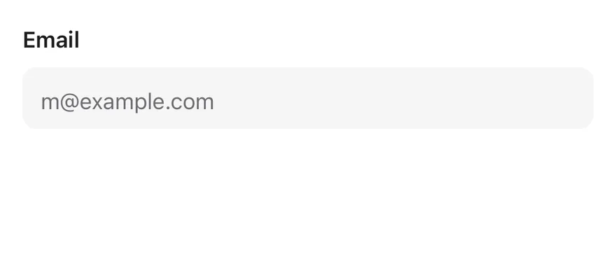
A label linked to an input through `nativeID` and `accessibilityLabelledBy`.
```tsx
import { View } from "react-native"
import { Input } from "@/components/ui/input"
import { Label } from "@/components/ui/label"
export function LabelWithInputExample() {
return (
Email
)
}
```
```swift
import EsuissUI
import SwiftUI
struct LabelWithInput: View {
@State private var email = ""
var body: some View {
VStack(alignment: .leading, spacing: 8) {
FieldLabel("Email")
.accessibilityHidden(true)
TextField(String("m@example.com"), text: $email)
.textFieldStyle(.input)
.keyboardType(.emailAddress)
.textInputAutocapitalization(.never)
.accessibilityLabel(Text("Email"))
}
.frame(maxWidth: .infinity, alignment: .leading)
}
}
```
```kotlin
import androidx.compose.foundation.layout.Arrangement
import androidx.compose.foundation.layout.Column
import androidx.compose.runtime.Composable
import androidx.compose.runtime.getValue
import androidx.compose.runtime.mutableStateOf
import androidx.compose.runtime.saveable.rememberSaveable
import androidx.compose.runtime.setValue
import androidx.compose.ui.Modifier
import androidx.compose.ui.semantics.contentDescription
import androidx.compose.ui.semantics.semantics
import androidx.compose.ui.unit.dp
import com.esuiss.ui.components.Input
import com.esuiss.ui.components.Label
@Composable
fun LabelWithInput() {
var email by rememberSaveable { mutableStateOf("") }
Column(verticalArrangement = Arrangement.spacedBy(8.dp)) {
Label("Email")
Input(email, { email = it }, Modifier.semantics { contentDescription = "Email" }, placeholder = "m@example.com")
}
}
```
### With checkbox
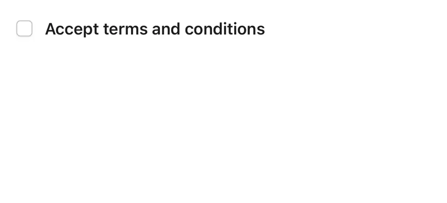
A label next to a checkbox that toggles it when pressed.
```tsx
import * as React from "react"
import { View } from "react-native"
import { Checkbox } from "@/components/ui/checkbox"
import { Label } from "@/components/ui/label"
function WithCheckboxDemo() {
const [checked, setChecked] = React.useState(false)
return (
setChecked((v) => !v)}>
Accept terms and conditions
)
}
export function LabelWithCheckboxExample() {
return (
Disabled label
)
}
```
```swift
import EsuissUI
import SwiftUI
struct LabelDisabledExample: View {
var body: some View {
FieldLabel("Disabled label")
.disabled(true)
}
}
```
```kotlin
import androidx.compose.runtime.Composable
import com.esuiss.ui.components.Label
@Composable
fun LabelDisabledExample() {
Label("Disabled label", enabled = false)
}
```
## API Reference
### Label
Also accepts the props of `React.ComponentProps`.
## Accessibility
- The label text reports its `disabled` state in `accessibilityState`.
- Link it to its control with `nativeID` on the label and `accessibilityLabelledBy` on the control.
## Notes
- Text uses the `text-foreground` token, and `opacity-50` when disabled.
- Light and dark colors follow the system appearance.