# Item
A flexible row that pairs media, a title, a description and actions, for lists and settings.
Item is an open-source component from suiss/ui for React, React Native, SwiftUI and Jetpack Compose. The @esuiss/ui CLI copies its source into your project, so you own the code.
Source: https://ui.suiss.app/docs/components/item
**React**
**Example**
```tsx
import { ShieldCheckIcon } from "@phosphor-icons/react"
import { Button } from "@/components/ui/button"
import {
Item,
ItemActions,
ItemContent,
ItemDescription,
ItemMedia,
ItemTitle,
} from "@/components/ui/item"
export default function ItemDemo() {
return (
Two-factor authentication
Add an extra layer of security to your account.
)
}
```
`Item` is a row container. Inside it, `ItemMedia` holds an icon, image or avatar, `ItemContent` stacks an `ItemTitle` and `ItemDescription`, and `ItemActions` holds buttons or indicators at the end. `ItemHeader` and `ItemFooter` span the full width of the item, above and below the main row. The whole item can also render as a link or button.
Use the `render` prop to turn the whole item into a link or button.
`ItemGroup` stacks items as a list, and its `inset` variant groups them into a rounded list on `bg-muted`, like iOS Settings. Place an `ItemSeparator` between items to divide them. Use items to display content; for form controls with labels and validation, use `Field`.
## Installation
### CLI
```bash title="Terminal"
npx shadcn@latest add @esuiss/item
```
Works in any project with a `components.json`. See [Installation](https://ui.suiss.app/docs/installation#add-components) for the one-line registry setup. Or use the suiss/ui CLI:
```bash title="Terminal"
npx @esuiss/ui@latest add item
```
### Manual
1. Install the dependencies and add the [`cn` helper](https://ui.suiss.app/docs/installation#the-cn-helper):
```bash title="Terminal"
npm install @base-ui/react class-variance-authority
```
2. Copy the source into `components/ui/item.tsx`:
```tsx title="components/ui/item.tsx"
import { mergeProps } from "@base-ui/react/merge-props"
import { useRender } from "@base-ui/react/use-render"
import { cva, type VariantProps } from "class-variance-authority"
import type * as React from "react"
import { cn } from "@/lib/utils"
function ItemGroup({
className,
variant = "default",
...props
}: React.ComponentProps<"div"> & { variant?: "default" | "inset" }) {
return (
)
}
function ItemSeparator({ className, ...props }: React.ComponentProps<"div">) {
return (
)
}
const itemVariants = cva(
"group/item flex w-full flex-wrap items-center rounded-xl border text-base transition-colors duration-100 outline-none focus-visible:border-ring focus-visible:ring-3 focus-visible:ring-ring/50 [a]:transition-colors [a]:hover:bg-accent [a]:hover:text-accent-foreground",
{
variants: {
variant: {
default: "border-transparent",
outline: "border-border",
muted: "border-transparent bg-muted/50",
},
size: {
default: "gap-3.5 px-4 py-3.5",
sm: "gap-3.5 px-3.5 py-3",
xs: "gap-2.5 px-3 py-2.5 in-data-[slot=dropdown-menu-content]:p-0",
},
},
defaultVariants: {
variant: "default",
size: "default",
},
}
)
function Item({
className,
variant = "default",
size = "default",
render,
...props
}: useRender.ComponentProps<"div"> & VariantProps) {
return useRender({
defaultTagName: "div",
props: mergeProps<"div">(
{
className: cn(itemVariants({ variant, size, className })),
},
props
),
render,
state: {
slot: "item",
variant,
size,
},
})
}
const itemMediaVariants = cva(
"flex shrink-0 items-center justify-center gap-2 group-has-data-[slot=item-description]/item:translate-y-0.5 group-has-data-[slot=item-description]/item:self-start [&_svg]:pointer-events-none",
{
variants: {
variant: {
default: "bg-transparent",
icon: "[&_svg:not([class*='size-'])]:size-4",
image:
"size-10 overflow-hidden rounded-md group-data-[size=sm]/item:size-8 group-data-[size=xs]/item:size-6 group-data-[size=xs]/item:rounded-sm [&_img]:size-full [&_img]:object-cover",
},
},
defaultVariants: {
variant: "default",
},
}
)
function ItemMedia({
className,
variant = "default",
...props
}: React.ComponentProps<"div"> & VariantProps) {
return (
)
}
function ItemContent({ className, ...props }: React.ComponentProps<"div">) {
return (
)
}
function ItemTitle({ className, ...props }: React.ComponentProps<"div">) {
return (
)
}
function ItemDescription({ className, ...props }: React.ComponentProps<"p">) {
return (
)
}
function ItemHeader({ className, ...props }: React.ComponentProps<"div">) {
return (
)
}
function ItemFooter({ className, ...props }: React.ComponentProps<"div">) {
return (
)
}
export {
Item,
ItemActions,
ItemContent,
ItemDescription,
ItemFooter,
ItemGroup,
ItemHeader,
ItemMedia,
ItemSeparator,
ItemTitle,
}
```
3. Update the import paths to match your project.
## Usage
```tsx
import { ItemGroup, ItemSeparator, Item, ItemMedia, ItemContent, ItemTitle, ItemDescription, ItemActions, ItemHeader, ItemFooter } from "@/components/ui/item"
```
```tsx
Two-factor authentication
Add an extra layer of security to your account.
```
`ItemGroup` has the `list` role, so set `role="listitem"` on each `Item` inside it. Choose a `variant` for the item's border and background, and a `size` for its padding. Items inside a group with `sm` or `xs` items are spaced more tightly.
When `ItemDescription` is present, the media aligns to the top of the item instead of its center. The title is limited to one line and the description to two.
## Examples
### Variants
The `default`, `outline` and `muted` item variants.
**Example**
```tsx
import { Button } from "@/components/ui/button"
import {
Item,
ItemActions,
ItemContent,
ItemDescription,
ItemTitle,
} from "@/components/ui/item"
export default function ItemVariants() {
return (
{(["default", "outline", "muted"] as const).map((variant) => (
{variant.charAt(0).toUpperCase() + variant.slice(1)} item
A short description of this list entry.
))}
)
}
```
### Sizes
The `default`, `sm` and `xs` item sizes.
**Example**
```tsx
import { CaretRightIcon, CheckCircleIcon } from "@phosphor-icons/react"
import {
Item,
ItemActions,
ItemContent,
ItemMedia,
ItemTitle,
} from "@/components/ui/item"
export default function ItemSizes() {
return (
{(["default", "sm", "xs"] as const).map((size) => (
Your profile has been verified
))}
)
}
```
### As link
An item rendered as a link, so the whole row is one focusable target.
**Example**
```tsx
import { BellIcon, CaretRightIcon } from "@phosphor-icons/react"
import {
Item,
ItemActions,
ItemContent,
ItemDescription,
ItemMedia,
ItemTitle,
} from "@/components/ui/item"
export default function ItemAsLink() {
return (
}>
Notification settings
Choose what you want to be notified about.
)
}
```
### With image
A list of people with image media, separators and an invite button on each row.
**Example**
```tsx
import { PlusIcon } from "@phosphor-icons/react"
import { Button } from "@/components/ui/button"
import {
Item,
ItemActions,
ItemContent,
ItemDescription,
ItemGroup,
ItemMedia,
ItemSeparator,
ItemTitle,
} from "@/components/ui/item"
const people = [
{
name: "Olivia Martin",
email: "olivia@example.com",
avatar: "https://i.pravatar.cc/96?img=12",
},
{
name: "Liam Chen",
email: "liam@example.com",
avatar: "https://github.com/vercel.png",
},
{
name: "Sofia Rossi",
email: "sofia@example.com",
avatar: "https://github.com/github.png",
},
]
export default function ItemWithImage() {
return (
{people.map((person, index) => (
{index > 0 && }
{person.name}{person.email}
))}
)
}
```
### Inset
The same list in an `inset` item group, forming a rounded list with inset separators.
**Example**
```tsx
import { PlusIcon } from "@phosphor-icons/react"
import { Button } from "@/components/ui/button"
import {
Item,
ItemActions,
ItemContent,
ItemDescription,
ItemGroup,
ItemMedia,
ItemSeparator,
ItemTitle,
} from "@/components/ui/item"
const people = [
{
name: "Olivia Martin",
email: "olivia@example.com",
avatar: "https://i.pravatar.cc/96?img=12",
},
{
name: "Liam Chen",
email: "liam@example.com",
avatar: "https://github.com/vercel.png",
},
{
name: "Sofia Rossi",
email: "sofia@example.com",
avatar: "https://github.com/github.png",
},
]
export default function ItemInset() {
return (
{people.map((person, index) => (
{index > 0 && }
{person.name}{person.email}
))}
)
}
```
### With avatar
An item with an `Avatar` as media and a Message button.
**Example**
```tsx
import { Avatar, AvatarFallback, AvatarImage } from "@/components/ui/avatar"
import { Button } from "@/components/ui/button"
import {
Item,
ItemActions,
ItemContent,
ItemDescription,
ItemMedia,
ItemTitle,
} from "@/components/ui/item"
export default function ItemWithAvatar() {
return (
OMOlivia MartinLast seen 5 minutes ago
)
}
```
### With header and footer
A plan summary with a price in the header and a renewal date and action in the footer.
**Example**
```tsx
import { Button } from "@/components/ui/button"
import {
Item,
ItemContent,
ItemDescription,
ItemFooter,
ItemHeader,
ItemTitle,
} from "@/components/ui/item"
export default function ItemWithHeaderAndFooter() {
return (
Pro plan$24/mo
Unlimited projects, priority support, and advanced analytics.
Renews on May 1
)
}
```
## API Reference
- `Item`
- `ItemMedia`
- `ItemContent`
- `ItemTitle`
- `ItemDescription`
- `ItemActions`
- `ItemHeader`
- `ItemTitle`
- `ItemFooter`
- `ItemGroup`
- `ItemSeparator`
- `Item`
- `ItemMedia`
- `ItemContent`
- `ItemTitle`
- `ItemDescription`
- `ItemActions`
### ItemGroup
Stacks items as a list, or groups them into an inset list.
| Prop | Type | Default | Description |
| --- | --- | --- | --- |
| `variant` | `"default" \| "inset"` | `"default"` | `inset` groups the items into a rounded list on `bg-muted`, with square item corners and separators inset from the start. |
Also accepts the props of `React.ComponentProps<"div">`.
### ItemSeparator
A divider between items.
Also accepts the props of `React.ComponentProps<"div">`.
### Item
The row container for media, content and actions.
| Prop | Type | Default | Description |
| --- | --- | --- | --- |
| `variant` | `"default" \| "outline" \| "muted"` | `"default"` | `default` has no border or background, `outline` adds a border, and `muted` adds a subtle background. |
| `size` | `"default" \| "sm" \| "xs"` | `"default"` | Sets the padding and gap: `default` is the roomiest, then `sm`, then `xs`. |
Also accepts the props of `useRender.ComponentProps<"div">`.
### ItemMedia
Holds an icon, image or avatar at the start of the item.
| Prop | Type | Default | Description |
| --- | --- | --- | --- |
| `variant` | `"default" \| "icon" \| "image"` | `"default"` | `icon` sizes an icon, `image` crops an image into a rounded square that scales with the item size, and `default` renders the media as is. |
Also accepts the props of `React.ComponentProps<"div">`.
### ItemContent
Stacks the title and description.
Also accepts the props of `React.ComponentProps<"div">`.
### ItemTitle
The item's title, limited to one line.
Also accepts the props of `React.ComponentProps<"div">`.
### ItemDescription
Supporting text, limited to two lines.
Also accepts the props of `React.ComponentProps<"p">`.
### ItemActions
Holds buttons or indicators at the end of the item.
Also accepts the props of `React.ComponentProps<"div">`.
### ItemHeader
A full-width row above the item's content.
Also accepts the props of `React.ComponentProps<"div">`.
### ItemFooter
A full-width row below the item's content.
Also accepts the props of `React.ComponentProps<"div">`.
## Accessibility
- `ItemGroup` has the `list` role; give each `Item` in it the `listitem` role.
- `ItemSeparator` has the `none` role, so it is ignored by assistive technology.
- An item rendered as a link or button is a single focusable element and shows a focus ring.
- Give icon-only action buttons an accessible name with `aria-label`.
## Notes
- Styling hooks: `data-slot` values `item-group`, `item-separator`, `item`, `item-media`, `item-content`, `item-title`, `item-description`, `item-actions`, `item-header` and `item-footer`.
- `Item` sets `data-variant` and `data-size`; `ItemGroup` and `ItemMedia` set `data-variant`.
- An item rendered as an anchor gets the `accent` background on hover.
- Uses the `border`, `muted`, `accent`, `muted-foreground` and `primary` colors.
**React Native, SwiftUI, Jetpack Compose**
```tsx
import { CaretRightIcon, ShieldCheckIcon } from "phosphor-react-native"
import { View } from "react-native"
import { Badge } from "@/components/ui/badge"
import { Button } from "@/components/ui/button"
import { Icon } from "@/components/ui/icon"
import { Item, ItemActions, ItemContent, ItemDescription, ItemFooter, ItemHeader, ItemMedia, ItemTitle } from "@/components/ui/item"
import { Text } from "@/components/ui/text"
export function ItemExample() {
return (
Basic item
A simple item with a title and a description.
undefined}>
Your profile has been verified.HeaderNew
Items can carry a header and a footer.
Footer
)
}
```
```swift
import EsuissUI
import PhosphorSwift
import SwiftUI
struct ItemExample: View {
var body: some View {
VStack(alignment: .leading, spacing: 16) {
Item(.outline) {
ItemContent {
ItemTitle("Basic item")
ItemDescription("A simple item with a title and a description.")
}
ItemActions {
Button("Action") {}
.buttonStyle(.variant(.outline, size: .sm))
}
}
Item(.muted, size: .sm, action: {}) {
ItemMedia(.icon) {
Ph.shieldCheck.regular
}
ItemContent {
ItemTitle("Your profile has been verified.")
}
ItemActions {
ItemChevron()
}
}
Item(.outline, size: .xs) {
ItemHeader {
ItemTitle("Header")
Badge("New")
}
ItemContent {
ItemDescription("Items can carry a header and a footer.")
}
ItemFooter {
Text("Footer")
.textStyle(.sm)
.foregroundStyle(EsuissColor.mutedForeground)
}
}
}
}
}
struct ItemChevron: View {
var body: some View {
Ph.caretRight.regular
.frame(width: 16, height: 16)
.foregroundStyle(EsuissColor.mutedForeground)
}
}
```
```kotlin
import androidx.compose.foundation.layout.Arrangement
import androidx.compose.foundation.layout.Column
import androidx.compose.foundation.layout.fillMaxWidth
import androidx.compose.runtime.Composable
import androidx.compose.ui.Modifier
import androidx.compose.ui.unit.dp
import com.adamglin.PhosphorIcons
import com.adamglin.phosphoricons.Regular
import com.adamglin.phosphoricons.regular.CaretRight
import com.adamglin.phosphoricons.regular.ShieldCheck
import com.esuiss.ui.components.Badge
import com.esuiss.ui.components.Button
import com.esuiss.ui.components.ButtonSize
import com.esuiss.ui.components.ButtonVariant
import com.esuiss.ui.components.Icon
import com.esuiss.ui.components.Item
import com.esuiss.ui.components.ItemActions
import com.esuiss.ui.components.ItemContent
import com.esuiss.ui.components.ItemDescription
import com.esuiss.ui.components.ItemFooter
import com.esuiss.ui.components.ItemHeader
import com.esuiss.ui.components.ItemMedia
import com.esuiss.ui.components.ItemMediaVariant
import com.esuiss.ui.components.ItemSize
import com.esuiss.ui.components.ItemTitle
import com.esuiss.ui.components.ItemVariant
import com.esuiss.ui.components.Text
import com.esuiss.ui.theme.EsuissTheme
import com.esuiss.ui.theme.Typography
@Composable
fun ItemCaret() {
Icon(PhosphorIcons.Regular.CaretRight, contentDescription = null, size = 16.dp, tint = EsuissTheme.colors.mutedForeground)
}
@Composable
fun ItemDefault() {
Column(Modifier.fillMaxWidth(), verticalArrangement = Arrangement.spacedBy(16.dp)) {
Item(variant = ItemVariant.Outline, role = null) {
ItemContent {
ItemTitle("Basic item")
ItemDescription("A simple item with a title and a description.")
}
ItemActions {
Button("Action", onClick = {}, variant = ButtonVariant.Outline, size = ButtonSize.Sm)
}
}
Item(variant = ItemVariant.Muted, size = ItemSize.Sm, onClick = {}) {
ItemMedia(variant = ItemMediaVariant.Icon) {
Icon(PhosphorIcons.Regular.ShieldCheck, contentDescription = null)
}
ItemContent {
ItemTitle("Your profile has been verified.")
}
ItemActions { ItemCaret() }
}
Item(variant = ItemVariant.Outline, size = ItemSize.Xs, role = null) {
ItemHeader {
ItemTitle("Header")
Badge("New")
}
ItemContent {
ItemDescription("Items can carry a header and a footer.")
}
ItemFooter {
Text("Footer", style = Typography.sm.copy(color = EsuissTheme.colors.mutedForeground))
}
}
}
}
```
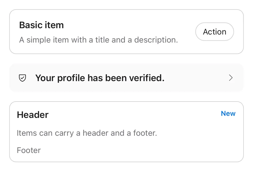
`Item` is a row that renders as a `Pressable` with the `button` role when it has `onPress` or `onLongPress`, and as a plain `View` with the `listitem` role otherwise. It has three variants (`default`, `outline`, `muted`) and three sizes (`default`, `sm`, `xs`).
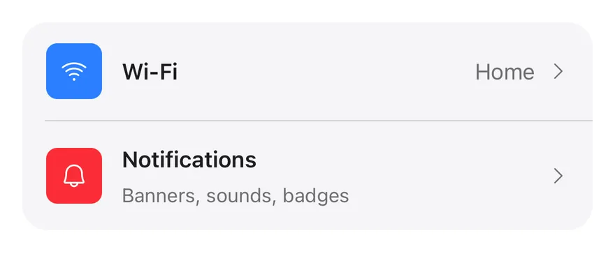
`ItemGroup` stacks items as a list. Its `inset` variant joins them into one rounded card with square inner corners, which suits settings screens; add `ItemSeparator` between rows to draw an inset divider.
## Installation
**React Native**
```bash title="Terminal"
npx shadcn@latest add @esuiss-rn/item
```
See [Installation](https://ui.suiss.app/docs/installation) for the `components.json` setup. Or use the suiss/ui CLI:
```bash title="Terminal"
npx @esuiss/ui@latest add item
```
**SwiftUI**
```bash title="Terminal"
npx @esuiss/ui@latest add item --platform swift
```
**Jetpack Compose**
```bash title="Terminal"
npx @esuiss/ui@latest add item --platform kotlin
```
The CLI also adds what it builds on: [Icon](https://ui.suiss.app/docs/components/icon), [Text](https://ui.suiss.app/docs/components/text).
### Manual
**React Native**
**Uniwind**
1. Install the dependencies:
```bash title="Terminal"
npx expo install class-variance-authority cn
```
2. Add the pieces it builds on: [Icon](https://ui.suiss.app/docs/components/icon), [Text](https://ui.suiss.app/docs/components/text), and the primitives `components/primitives/types.tsx`, `components/primitives/use-render.tsx`.
3. Copy the source into `components/ui/item.tsx`:
```tsx title="uniwind/components/ui/item.tsx"
import { cva, type VariantProps } from "class-variance-authority"
import { cn } from "cn"
import * as React from "react"
import { Pressable, View, type ViewProps } from "react-native"
import type { RenderProp } from "@/components/primitives/types"
import { useRender } from "@/components/primitives/use-render"
import { IconClassContext } from "@/components/ui/icon"
import { Text, TextClassContext } from "@/components/ui/text"
type ItemSize = "default" | "sm" | "xs"
const ItemGroupContext = React.createContext<{ inset: boolean }>({
inset: false,
})
const ItemContext = React.createContext<{ size: ItemSize }>({
size: "default",
})
function ItemGroup({
className,
variant = "default",
...props
}: ViewProps & { variant?: "default" | "inset" }) {
const inset = variant === "inset"
const contextValue = React.useMemo(() => ({ inset }), [inset])
return (
)
}
function ItemSeparator({ className, ...props }: ViewProps) {
const { inset } = React.useContext(ItemGroupContext)
return (
)
}
const itemVariants = cva(
"w-full flex-row flex-wrap items-center rounded-xl border",
{
variants: {
variant: {
default: "border-transparent",
outline: "border-border",
muted: "border-transparent bg-muted/50",
},
size: {
default: "gap-3.5 px-4 py-3.5",
sm: "gap-3.5 px-3.5 py-3",
xs: "gap-2.5 px-3 py-2.5",
},
},
defaultVariants: {
variant: "default",
size: "default",
},
}
)
type ItemProps = React.ComponentProps &
VariantProps & {
render?: RenderProp, Record>
}
function Item({
className,
variant = "default",
size = "default",
render,
...props
}: ItemProps) {
const { inset } = React.useContext(ItemGroupContext)
const interactive = Boolean(props.onPress || props.onLongPress)
const contextValue = React.useMemo(
() => ({ size: size ?? "default" }),
[size]
)
const element = useRender({
defaultComponent: interactive ? Pressable : View,
render,
props: [
{
role: interactive ? "button" : "listitem",
className: cn(
itemVariants({ variant, size }),
inset && "rounded-none",
interactive && "active:opacity-80",
props.disabled && "opacity-50",
className
),
},
props,
],
})
return (
{element}
)
}
const itemMediaVariants = cva(
"shrink-0 flex-row items-center justify-center gap-2",
{
variants: {
variant: {
default: "",
icon: "",
image: "size-10 overflow-hidden rounded-md",
},
},
defaultVariants: {
variant: "default",
},
}
)
function ItemMedia({
className,
variant = "default",
...props
}: ViewProps & VariantProps) {
const { size } = React.useContext(ItemContext)
return (
)
}
function ItemContent({ className, ...props }: ViewProps) {
const { size } = React.useContext(ItemContext)
return (
)
}
function ItemTitle({
className,
numberOfLines = 1,
...props
}: React.ComponentProps) {
return (
)
}
function ItemDescription({
className,
numberOfLines = 2,
...props
}: React.ComponentProps) {
return (
)
}
function ItemActions({ className, ...props }: ViewProps) {
return (
)
}
function ItemHeader({ className, ...props }: ViewProps) {
return (
)
}
function ItemFooter({ className, ...props }: ViewProps) {
return (
)
}
export {
Item,
ItemActions,
ItemContent,
ItemDescription,
ItemFooter,
ItemGroup,
ItemGroupContext,
ItemHeader,
ItemMedia,
ItemSeparator,
ItemTitle,
}
```
4. Update the import paths to match your project.
**NativeWind**
1. Install the dependencies:
```bash title="Terminal"
npx expo install class-variance-authority cn
```
2. Add the pieces it builds on: [Icon](https://ui.suiss.app/docs/components/icon), [Text](https://ui.suiss.app/docs/components/text), and the primitives `components/primitives/types.tsx`, `components/primitives/use-render.tsx`.
3. Copy the source into `components/ui/item.tsx`:
```tsx title="nativewind/components/ui/item.tsx"
import { cva, type VariantProps } from "class-variance-authority"
import { cn } from "cn"
import * as React from "react"
import { Pressable, View, type ViewProps } from "react-native"
import type { RenderProp } from "@/components/primitives/types"
import { useRender } from "@/components/primitives/use-render"
import { IconClassContext } from "@/components/ui/icon"
import { Text, TextClassContext } from "@/components/ui/text"
type ItemSize = "default" | "sm" | "xs"
const ItemGroupContext = React.createContext<{ inset: boolean }>({
inset: false,
})
const ItemContext = React.createContext<{ size: ItemSize }>({
size: "default",
})
function ItemGroup({
className,
variant = "default",
...props
}: ViewProps & { variant?: "default" | "inset" }) {
const inset = variant === "inset"
const contextValue = React.useMemo(() => ({ inset }), [inset])
return (
)
}
function ItemSeparator({ className, ...props }: ViewProps) {
const { inset } = React.useContext(ItemGroupContext)
return (
)
}
const itemVariants = cva(
"w-full flex-row flex-wrap items-center rounded-xl border",
{
variants: {
variant: {
default: "border-transparent",
outline: "border-border",
muted: "border-transparent bg-muted-50",
},
size: {
default: "gap-3.5 px-4 py-3.5",
sm: "gap-3.5 px-3.5 py-3",
xs: "gap-2.5 px-3 py-2.5",
},
},
defaultVariants: {
variant: "default",
size: "default",
},
}
)
type ItemProps = React.ComponentProps &
VariantProps & {
render?: RenderProp, Record>
}
function Item({
className,
variant = "default",
size = "default",
render,
...props
}: ItemProps) {
const { inset } = React.useContext(ItemGroupContext)
const interactive = Boolean(props.onPress || props.onLongPress)
const contextValue = React.useMemo(
() => ({ size: size ?? "default" }),
[size]
)
const element = useRender({
defaultComponent: interactive ? Pressable : View,
render,
props: [
{
role: interactive ? "button" : "listitem",
className: cn(
itemVariants({ variant, size }),
inset && "rounded-none",
interactive && "active:opacity-80",
props.disabled && "opacity-50",
className
),
},
props,
],
})
return (
{element}
)
}
const itemMediaVariants = cva(
"shrink-0 flex-row items-center justify-center gap-2",
{
variants: {
variant: {
default: "",
icon: "",
image: "size-10 overflow-hidden rounded-md",
},
},
defaultVariants: {
variant: "default",
},
}
)
function ItemMedia({
className,
variant = "default",
...props
}: ViewProps & VariantProps) {
const { size } = React.useContext(ItemContext)
return (
)
}
function ItemContent({ className, ...props }: ViewProps) {
const { size } = React.useContext(ItemContext)
return (
)
}
function ItemTitle({
className,
numberOfLines = 1,
...props
}: React.ComponentProps) {
return (
)
}
function ItemDescription({
className,
numberOfLines = 2,
...props
}: React.ComponentProps) {
return (
)
}
function ItemActions({ className, ...props }: ViewProps) {
return (
)
}
function ItemHeader({ className, ...props }: ViewProps) {
return (
)
}
function ItemFooter({ className, ...props }: ViewProps) {
return (
)
}
export {
Item,
ItemActions,
ItemContent,
ItemDescription,
ItemFooter,
ItemGroup,
ItemGroupContext,
ItemHeader,
ItemMedia,
ItemSeparator,
ItemTitle,
}
```
4. Update the import paths to match your project.
**StyleSheet**
1. Add the pieces it builds on: [Icon](https://ui.suiss.app/docs/components/icon), [Text](https://ui.suiss.app/docs/components/text), and the primitives `components/primitives/types.tsx`, `components/primitives/use-render.tsx`.
2. Copy the source into `components/ui/item.tsx`:
```tsx title="stylesheet/components/ui/item.tsx"
import * as React from "react"
import {
Pressable,
type PressableStateCallbackType,
type StyleProp,
StyleSheet,
View,
type ViewProps,
type ViewStyle,
} from "react-native"
import type { RenderProp } from "@/components/primitives/types"
import { useRender } from "@/components/primitives/use-render"
import { IconSizeContext } from "@/components/ui/icon"
import { Text, TextStyleContext } from "@/components/ui/text"
import { fontSize, radius, useTheme } from "@/components/ui/theme"
type ItemSize = "default" | "sm" | "xs"
type ItemVariant = "default" | "outline" | "muted"
const ItemGroupContext = React.createContext<{ inset: boolean }>({
inset: false,
})
const ItemContext = React.createContext<{ size: ItemSize }>({
size: "default",
})
const styles = StyleSheet.create({
group: { width: "100%", flexDirection: "column", gap: 16 },
groupInset: { gap: 0, overflow: "hidden", borderRadius: radius["2xl"] },
separator: { marginVertical: 8, height: 1, flexShrink: 0 },
separatorInset: { marginVertical: 0, marginStart: 16 },
item: {
width: "100%",
flexDirection: "row",
flexWrap: "wrap",
alignItems: "center",
borderRadius: radius.xl,
borderWidth: 1,
borderColor: "transparent",
},
default: { gap: 14, paddingHorizontal: 16, paddingVertical: 14 },
sm: { gap: 14, paddingHorizontal: 14, paddingVertical: 12 },
xs: { gap: 10, paddingHorizontal: 12, paddingVertical: 10 },
media: {
flexShrink: 0,
flexDirection: "row",
alignItems: "center",
justifyContent: "center",
gap: 8,
},
mediaImage: {
width: 40,
height: 40,
overflow: "hidden",
borderRadius: radius.md,
},
content: { minWidth: 0, flex: 1, flexDirection: "column", gap: 4 },
title: { ...fontSize.base, fontWeight: "600" },
description: { ...fontSize.sm, textAlign: "left" },
actions: { flexDirection: "row", alignItems: "center", gap: 8 },
row: {
width: "100%",
flexDirection: "row",
alignItems: "center",
justifyContent: "space-between",
gap: 8,
},
})
function ItemGroup({
style,
variant = "default",
...props
}: ViewProps & { variant?: "default" | "inset" }) {
const { colors } = useTheme()
const inset = variant === "inset"
const contextValue = React.useMemo(() => ({ inset }), [inset])
return (
)
}
function ItemSeparator({ style, ...props }: ViewProps) {
const { colors } = useTheme()
const { inset } = React.useContext(ItemGroupContext)
return (
)
}
function withAlpha(color: string, alpha: number) {
if (!color.startsWith("#") || color.length !== 7) return color
const r = Number.parseInt(color.slice(1, 3), 16)
const g = Number.parseInt(color.slice(3, 5), 16)
const b = Number.parseInt(color.slice(5, 7), 16)
return `rgba(${r}, ${g}, ${b}, ${alpha})`
}
type ItemProps = Omit, "style"> & {
variant?: ItemVariant
size?: ItemSize
style?:
| StyleProp
| ((state: PressableStateCallbackType) => StyleProp)
render?: RenderProp, Record>
}
function Item({
style,
variant = "default",
size = "default",
render,
...props
}: ItemProps) {
const { colors } = useTheme()
const { inset } = React.useContext(ItemGroupContext)
const interactive = Boolean(props.onPress || props.onLongPress)
const contextValue = React.useMemo(() => ({ size }), [size])
const base: StyleProp = [
styles.item,
styles[size],
variant === "outline" && { borderColor: colors.border },
variant === "muted" && {
backgroundColor: withAlpha(colors.muted, 0.5),
},
inset && { borderRadius: 0 },
props.disabled && { opacity: 0.5 },
]
const element = useRender({
defaultComponent: interactive ? Pressable : View,
render,
props: [
{
role: interactive ? "button" : "listitem",
style: interactive
? (state: PressableStateCallbackType) => [
base,
state.pressed && { opacity: 0.8 },
typeof style === "function" ? style(state) : style,
]
: [
base,
typeof style === "function" ? style({ pressed: false }) : style,
],
},
props,
],
})
return (
{element}
)
}
function ItemMedia({
style,
variant = "default",
...props
}: ViewProps & { variant?: "default" | "icon" | "image" }) {
const { size } = React.useContext(ItemContext)
const image = variant === "image"
return (
)
}
function ItemContent({ style, ...props }: ViewProps) {
const { size } = React.useContext(ItemContext)
return (
)
}
function ItemTitle({
style,
numberOfLines = 1,
...props
}: React.ComponentProps) {
const { colors } = useTheme()
return (
)
}
function ItemDescription({
style,
numberOfLines = 2,
...props
}: React.ComponentProps) {
const { colors } = useTheme()
return (
)
}
function ItemActions({ style, ...props }: ViewProps) {
const { colors } = useTheme()
return (
)
}
function ItemHeader({ style, ...props }: ViewProps) {
return
}
function ItemFooter({ style, ...props }: ViewProps) {
return
}
export {
Item,
ItemActions,
ItemContent,
ItemDescription,
ItemFooter,
ItemGroup,
ItemGroupContext,
ItemHeader,
ItemMedia,
ItemSeparator,
ItemTitle,
}
```
3. Update the import paths to match your project.
**SwiftUI**
1. Target iOS 17 or later.
2. Copy the theme files every view uses:
- `swift/Theme/Theme.swift`: [source](https://github.com/e-suiss/ui/blob/main/packages/mobile/swiftui/Sources/EsuissUI/Theme/Theme.swift)
- `swift/Theme/Tokens.swift`: [source](https://github.com/e-suiss/ui/blob/main/packages/mobile/swiftui/Sources/EsuissUI/Theme/Tokens.swift)
3. Copy the source and every file it uses:
```swift title="swift/Components/Item.swift"
import SwiftUI
public enum ItemVariant: CaseIterable, Sendable {
case `default`, outline, muted
}
public enum ItemSize: CaseIterable, Sendable {
case `default`, sm, xs
var horizontalPadding: CGFloat {
switch self {
case .default: 16
case .sm: 14
case .xs: 12
}
}
var verticalPadding: CGFloat {
switch self {
case .default: 14
case .sm: 12
case .xs: 10
}
}
var gap: CGFloat {
self == .xs ? 10 : 14
}
var groupGap: CGFloat {
switch self {
case .default: 16
case .sm: 10
case .xs: 8
}
}
var mediaImage: CGFloat {
switch self {
case .default: 40
case .sm: 32
case .xs: 24
}
}
}
public enum ItemGroupVariant: CaseIterable, Sendable {
case `default`, inset
}
extension EnvironmentValues {
@Entry var itemSize: ItemSize = .default
@Entry var itemGroupInset = false
@Entry var itemHasDescription = false
}
struct ItemGapKey: PreferenceKey {
static var defaultValue: CGFloat? { nil }
static func reduce(value: inout CGFloat?, nextValue: () -> CGFloat?) {
guard let next = nextValue() else { return }
value = min(value ?? next, next)
}
}
struct ItemDescriptionKey: PreferenceKey {
static var defaultValue: Bool { false }
static func reduce(value: inout Bool, nextValue: () -> Bool) {
value = value || nextValue()
}
}
enum ItemSlot: Sendable {
case media, content, actions, fullRow, other
}
struct ItemSlotKey: LayoutValueKey {
static let defaultValue = ItemSlot.other
}
public struct ItemGroup: View {
let variant: ItemGroupVariant
let content: Content
@State private var gap: CGFloat?
public init(_ variant: ItemGroupVariant = .default, @ViewBuilder content: () -> Content) {
self.variant = variant
self.content = content()
}
public var body: some View {
let inset = variant == .inset
let shape = RoundedRectangle(cornerRadius: Radius.xl2, style: .continuous)
VStack(alignment: .leading, spacing: inset ? 0 : gap ?? ItemSize.default.groupGap) {
content
}
.frame(maxWidth: .infinity, alignment: .leading)
.environment(\.itemGroupInset, inset)
.onPreferenceChange(ItemGapKey.self) { gap = $0 }
.transformPreference(ItemGapKey.self) { $0 = nil }
.background(inset ? EsuissColor.muted : .clear, in: shape)
.clipShape(inset ? AnyShape(shape) : AnyShape(Rectangle()))
.accessibilityElement(children: .contain)
}
}
public struct ItemSeparator: View {
@Environment(\.itemGroupInset) private var inset
public init() {}
public var body: some View {
Separator()
.padding(.vertical, inset ? 0 : 8)
.padding(.leading, inset ? 16 : 0)
}
}
public struct Item: View {
let variant: ItemVariant
let size: ItemSize
let action: (() -> Void)?
let content: Content
@State private var hasDescription = false
@Environment(\.itemGroupInset) private var inset
public init(
_ variant: ItemVariant = .default,
size: ItemSize = .default,
action: (() -> Void)? = nil,
@ViewBuilder content: () -> Content
) {
self.variant = variant
self.size = size
self.action = action
self.content = content()
}
public var body: some View {
Group {
if let action {
Button(action: action) {
surface
}
.buttonStyle(ItemButtonStyle(variant: variant, inset: inset))
} else {
surface.background(ItemBackground(variant: variant, inset: inset))
}
}
.preference(key: ItemGapKey.self, value: size.groupGap)
}
private var surface: some View {
ItemLayout(gap: size.gap, topAlignMedia: hasDescription) {
content
}
.scaledFont(.base)
.foregroundStyle(EsuissColor.foreground)
.padding(.horizontal, size.horizontalPadding)
.padding(.vertical, size.verticalPadding)
.frame(maxWidth: .infinity, alignment: .leading)
.environment(\.itemSize, size)
.environment(\.itemHasDescription, hasDescription)
.onPreferenceChange(ItemDescriptionKey.self) { hasDescription = $0 }
.contentShape(Rectangle())
}
}
private struct ItemBackground: View {
let variant: ItemVariant
let inset: Bool
var body: some View {
let shape = RoundedRectangle(cornerRadius: inset ? 0 : Radius.xl, style: .continuous)
ZStack {
shape.fill(variant == .muted ? EsuissColor.muted.opacity(0.5) : .clear)
if variant == .outline {
shape.strokeBorder(EsuissColor.border)
}
}
}
}
private struct ItemButtonStyle: ButtonStyle {
let variant: ItemVariant
let inset: Bool
@Environment(\.isEnabled) private var isEnabled
func makeBody(configuration: Configuration) -> some View {
configuration.label
.background(ItemBackground(variant: variant, inset: inset))
.opacity(isEnabled ? (configuration.isPressed ? 0.8 : 1) : 0.5)
}
}
struct ItemLayout: Layout {
var gap: CGFloat
var topAlignMedia: Bool
private struct Line {
var indices: [Int]
var full: Bool
}
private func lines(_ subviews: Subviews) -> [Line] {
var result: [Line] = []
var current: [Int] = []
for index in subviews.indices {
if subviews[index][ItemSlotKey.self] == .fullRow {
if !current.isEmpty { result.append(Line(indices: current, full: false)) }
current = []
result.append(Line(indices: [index], full: true))
} else {
current.append(index)
}
}
if !current.isEmpty { result.append(Line(indices: current, full: false)) }
return result
}
private func widths(_ line: Line, subviews: Subviews, width: CGFloat?) -> [CGFloat] {
if line.full {
return [width ?? subviews[line.indices[0]].sizeThatFits(.unspecified).width]
}
let spacing = gap * CGFloat(max(line.indices.count - 1, 0))
let flexible = line.indices.first { subviews[$0][ItemSlotKey.self] == .content }
var fixed: [Int: CGFloat] = [:]
for index in line.indices where index != flexible {
fixed[index] = subviews[index].sizeThatFits(.unspecified).width
}
let used = fixed.values.reduce(0, +) + spacing
return line.indices.map { index in
if index == flexible {
if let width { return max(width - used, 0) }
return subviews[index].sizeThatFits(.unspecified).width
}
return fixed[index] ?? 0
}
}
func sizeThatFits(proposal: ProposedViewSize, subviews: Subviews, cache: inout ()) -> CGSize {
var height: CGFloat = 0
var widest: CGFloat = 0
let all = lines(subviews)
for (position, line) in all.enumerated() {
let sizes = widths(line, subviews: subviews, width: proposal.width)
var lineHeight: CGFloat = 0
for (index, width) in zip(line.indices, sizes) {
lineHeight = max(lineHeight, subviews[index].sizeThatFits(ProposedViewSize(width: width, height: nil)).height)
}
let spacing = gap * CGFloat(max(line.indices.count - 1, 0))
widest = max(widest, sizes.reduce(0, +) + (line.full ? 0 : spacing))
height += lineHeight + (position > 0 ? gap : 0)
}
return CGSize(width: proposal.width ?? widest, height: height)
}
func placeSubviews(in bounds: CGRect, proposal: ProposedViewSize, subviews: Subviews, cache: inout ()) {
var y = bounds.minY
for line in lines(subviews) {
let sizes = widths(line, subviews: subviews, width: bounds.width)
var heights: [CGFloat] = []
for (index, width) in zip(line.indices, sizes) {
heights.append(subviews[index].sizeThatFits(ProposedViewSize(width: width, height: nil)).height)
}
let lineHeight = heights.max() ?? 0
var x = bounds.minX
for (offset, index) in line.indices.enumerated() {
let width = sizes[offset]
let height = heights[offset]
let top = topAlignMedia && subviews[index][ItemSlotKey.self] == .media
let originY = top ? y + 2 : y + (lineHeight - height) / 2
subviews[index].place(
at: CGPoint(x: x, y: originY),
anchor: .topLeading,
proposal: ProposedViewSize(width: width, height: height)
)
x += width + gap
}
y += lineHeight + gap
}
}
}
public enum ItemMediaVariant: CaseIterable, Sendable {
case `default`, icon, image
}
public struct ItemMedia: View {
let variant: ItemMediaVariant
let content: Content
@Environment(\.itemSize) private var size
public init(_ variant: ItemMediaVariant = .default, @ViewBuilder content: () -> Content) {
self.variant = variant
self.content = content()
}
public var body: some View {
Group {
switch variant {
case .default:
HStack(spacing: 8) { content }
case .icon:
content.frame(width: 16, height: 16)
case .image:
content
.scaledToFill()
.frame(width: size.mediaImage, height: size.mediaImage)
.clipShape(RoundedRectangle(cornerRadius: size == .xs ? Radius.sm : Radius.md, style: .continuous))
}
}
.accessibilityHidden(variant != .default)
.layoutValue(key: ItemSlotKey.self, value: .media)
}
}
public struct ItemContent: View {
let content: Content
@Environment(\.itemSize) private var size
public init(@ViewBuilder content: () -> Content) {
self.content = content()
}
public var body: some View {
VStack(alignment: .leading, spacing: size == .xs ? 2 : 4) {
content
}
.frame(maxWidth: .infinity, alignment: .leading)
.layoutValue(key: ItemSlotKey.self, value: .content)
}
}
public struct ItemTitle: View {
let content: Content
public init(@ViewBuilder content: () -> Content) {
self.content = content()
}
public var body: some View {
HStack(spacing: 8) {
content
}
.scaledTextStyle(.base, weight: .semibold)
.foregroundStyle(EsuissColor.foreground)
.lineLimit(1)
.accessibilityElement(children: .combine)
}
}
extension ItemTitle where Content == Text {
public init(_ title: LocalizedStringKey) {
self.init { Text(title) }
}
public init(verbatim title: String) {
self.init { Text(verbatim: title) }
}
}
public struct ItemDescription: View {
let text: Text
public init(_ description: LocalizedStringKey) {
text = Text(description)
}
public init(verbatim description: String) {
text = Text(verbatim: description)
}
public var body: some View {
text
.scaledTextStyle(.sm)
.foregroundStyle(EsuissColor.mutedForeground)
.multilineTextAlignment(.leading)
.lineLimit(2)
.fixedSize(horizontal: false, vertical: true)
.preference(key: ItemDescriptionKey.self, value: true)
}
}
public struct ItemActions: View {
let content: Content
public init(@ViewBuilder content: () -> Content) {
self.content = content()
}
public var body: some View {
HStack(spacing: 8) {
content
}
.fixedSize()
.layoutValue(key: ItemSlotKey.self, value: .actions)
}
}
public struct ItemHeader: View {
let content: Content
public init(@ViewBuilder content: () -> Content) {
self.content = content()
}
public var body: some View {
SpaceBetween(spacing: 8) {
content
}
.frame(maxWidth: .infinity)
.layoutValue(key: ItemSlotKey.self, value: .fullRow)
}
}
public struct ItemFooter: View {
let content: Content
public init(@ViewBuilder content: () -> Content) {
self.content = content()
}
public var body: some View {
SpaceBetween(spacing: 8) {
content
}
.frame(maxWidth: .infinity)
.layoutValue(key: ItemSlotKey.self, value: .fullRow)
}
}
struct SpaceBetween: Layout {
var spacing: CGFloat
func sizeThatFits(proposal: ProposedViewSize, subviews: Subviews, cache: inout ()) -> CGSize {
let sizes = subviews.map { $0.sizeThatFits(.unspecified) }
let natural = sizes.reduce(0) { $0 + $1.width } + spacing * CGFloat(max(subviews.count - 1, 0))
return CGSize(width: proposal.width ?? natural, height: sizes.map(\.height).max() ?? 0)
}
func placeSubviews(in bounds: CGRect, proposal: ProposedViewSize, subviews: Subviews, cache: inout ()) {
let sizes = subviews.map { $0.sizeThatFits(.unspecified) }
let total = sizes.reduce(0) { $0 + $1.width }
let gaps = CGFloat(max(subviews.count - 1, 0))
let gap = subviews.count > 1 ? max(spacing, (bounds.width - total) / gaps) : 0
var x = bounds.minX
for (index, view) in subviews.enumerated() {
let size = sizes[index]
view.place(
at: CGPoint(x: x, y: bounds.midY - size.height / 2),
anchor: .topLeading,
proposal: ProposedViewSize(size)
)
x += size.width + gap
}
}
}
```
- `swift/Components/Separator.swift`: see [Separator](https://ui.suiss.app/docs/components/separator.md)
- `swift/Components/TextVariant.swift`: [source](https://github.com/e-suiss/ui/blob/main/packages/mobile/swiftui/Sources/EsuissUI/Components/TextVariant.swift)
4. Add the files to your app target.
**Jetpack Compose**
1. Set `minSdk` to 24 or higher and add the dependencies:
```kotlin title="build.gradle.kts"
implementation(platform("androidx.compose:compose-bom:2026.09.00"))
implementation("androidx.compose.foundation:foundation")
implementation("androidx.compose.ui:ui")
implementation("com.adamglin:phosphor-icon-android:1.0.0")
```
2. Copy the theme files every view uses:
- `kotlin/theme/Theme.kt`: [source](https://github.com/e-suiss/ui/blob/main/packages/mobile/kotlin/ui/src/main/kotlin/com/esuiss/ui/theme/Theme.kt)
- `kotlin/theme/Tokens.kt`: [source](https://github.com/e-suiss/ui/blob/main/packages/mobile/kotlin/ui/src/main/kotlin/com/esuiss/ui/theme/Tokens.kt)
3. Copy the source and every file it uses:
```kt title="kotlin/components/Item.kt"
package com.esuiss.ui.components
import androidx.compose.foundation.background
import androidx.compose.foundation.border
import androidx.compose.foundation.combinedClickable
import androidx.compose.foundation.interaction.MutableInteractionSource
import androidx.compose.foundation.interaction.collectIsPressedAsState
import androidx.compose.foundation.layout.Arrangement
import androidx.compose.foundation.layout.Box
import androidx.compose.foundation.layout.BoxScope
import androidx.compose.foundation.layout.Column
import androidx.compose.foundation.layout.ColumnScope
import androidx.compose.foundation.layout.PaddingValues
import androidx.compose.foundation.layout.Row
import androidx.compose.foundation.layout.RowScope
import androidx.compose.foundation.layout.fillMaxWidth
import androidx.compose.foundation.layout.height
import androidx.compose.foundation.layout.heightIn
import androidx.compose.foundation.layout.padding
import androidx.compose.foundation.layout.size
import androidx.compose.foundation.shape.RoundedCornerShape
import androidx.compose.foundation.text.BasicText
import androidx.compose.runtime.Composable
import androidx.compose.runtime.CompositionLocalProvider
import androidx.compose.runtime.DisposableEffect
import androidx.compose.runtime.Stable
import androidx.compose.runtime.getValue
import androidx.compose.runtime.mutableIntStateOf
import androidx.compose.runtime.remember
import androidx.compose.runtime.setValue
import androidx.compose.runtime.staticCompositionLocalOf
import androidx.compose.ui.Alignment
import androidx.compose.ui.Modifier
import androidx.compose.ui.draw.alpha
import androidx.compose.ui.draw.clip
import androidx.compose.ui.graphics.Color
import androidx.compose.ui.graphics.RectangleShape
import androidx.compose.ui.graphics.Shape
import androidx.compose.ui.layout.Layout
import androidx.compose.ui.layout.Measurable
import androidx.compose.ui.layout.Placeable
import androidx.compose.ui.layout.layoutId
import androidx.compose.ui.semantics.Role
import androidx.compose.ui.semantics.isTraversalGroup
import androidx.compose.ui.semantics.selected
import androidx.compose.ui.semantics.semantics
import androidx.compose.ui.text.font.FontWeight
import androidx.compose.ui.text.style.TextOverflow
import androidx.compose.ui.unit.Constraints
import androidx.compose.ui.unit.Dp
import androidx.compose.ui.unit.dp
import com.esuiss.ui.theme.EsuissTheme
import com.esuiss.ui.theme.Radius
import com.esuiss.ui.theme.Typography
enum class ItemVariant { Default, Outline, Muted }
enum class ItemSize(
internal val horizontalPadding: Dp,
internal val verticalPadding: Dp,
internal val gap: Dp,
internal val contentGap: Dp,
internal val imageSize: Dp,
) {
Default(16.dp, 14.dp, 14.dp, 4.dp, 40.dp),
Sm(14.dp, 12.dp, 14.dp, 4.dp, 32.dp),
Xs(12.dp, 10.dp, 10.dp, 2.dp, 24.dp),
}
enum class ItemGroupVariant { Default, Inset }
enum class ItemMediaVariant { Default, Icon, Image }
private enum class ItemSlot { Media, Content, Actions, Header, Footer }
@Stable
private class ItemState(val size: ItemSize) {
var descriptions by mutableIntStateOf(0)
}
private val LocalItemState = staticCompositionLocalOf { null }
internal val LocalItemGroupVariant = staticCompositionLocalOf { null }
@Composable
fun ItemGroup(
modifier: Modifier = Modifier,
variant: ItemGroupVariant = ItemGroupVariant.Default,
content: @Composable ColumnScope.() -> Unit,
) {
val colors = EsuissTheme.colors
val inset = variant == ItemGroupVariant.Inset
val shape = RoundedCornerShape(Radius.xl2)
Column(
modifier = modifier
.fillMaxWidth()
.then(if (inset) Modifier.clip(shape).background(colors.muted, shape) else Modifier)
.semantics { isTraversalGroup = true },
verticalArrangement = if (inset) Arrangement.Top else Arrangement.spacedBy(16.dp),
) {
CompositionLocalProvider(LocalItemGroupVariant provides variant) {
content()
}
}
}
@Composable
fun ItemSeparator(modifier: Modifier = Modifier) {
val inset = LocalItemGroupVariant.current == ItemGroupVariant.Inset
Box(
modifier = modifier
.fillMaxWidth()
.padding(start = if (inset) 16.dp else 0.dp)
.padding(vertical = if (inset) 0.dp else 8.dp)
.height(1.dp)
.background(EsuissTheme.colors.border),
)
}
@Composable
fun Item(
modifier: Modifier = Modifier,
variant: ItemVariant = ItemVariant.Default,
size: ItemSize = ItemSize.Default,
onClick: (() -> Unit)? = null,
onLongClick: (() -> Unit)? = null,
enabled: Boolean = true,
selected: Boolean? = null,
role: Role? = Role.Button,
onClickLabel: String? = null,
content: @Composable () -> Unit,
) {
val inset = LocalItemGroupVariant.current == ItemGroupVariant.Inset
val shape = if (inset) RectangleShape else RoundedCornerShape(Radius.xl)
ItemFrame(
modifier = modifier,
variant = variant,
size = size,
shape = shape,
padding = PaddingValues(horizontal = size.horizontalPadding, vertical = size.verticalPadding),
onClick = onClick,
onLongClick = onLongClick,
enabled = enabled,
selected = selected,
role = role,
onClickLabel = onClickLabel,
content = content,
)
}
@Composable
internal fun ItemFrame(
modifier: Modifier,
variant: ItemVariant,
size: ItemSize,
shape: Shape,
padding: PaddingValues,
onClick: (() -> Unit)?,
onLongClick: (() -> Unit)?,
enabled: Boolean,
selected: Boolean?,
role: Role?,
onClickLabel: String?,
minHeight: Dp = 0.dp,
gap: Dp = size.gap,
content: @Composable () -> Unit,
) {
val colors = EsuissTheme.colors
val interaction = remember { MutableInteractionSource() }
val pressed by interaction.collectIsPressedAsState()
val state = remember(size) { ItemState(size) }
val interactive = onClick != null || onLongClick != null
val background = when {
selected == true -> colors.accent
variant == ItemVariant.Muted -> colors.muted.copy(alpha = colors.muted.alpha * 0.5f)
else -> Color.Transparent
}
val foreground = colors.foreground
val behaviour = if (interactive) {
Modifier
.heightIn(min = maxOf(minHeight, 48.dp))
.combinedClickable(
interactionSource = interaction,
indication = null,
enabled = enabled,
onClickLabel = onClickLabel,
role = role,
onLongClick = onLongClick,
onClick = onClick ?: {},
)
} else {
Modifier
.heightIn(min = minHeight)
.semantics(mergeDescendants = true) {}
}
Box(
modifier = modifier
.fillMaxWidth()
.alpha(
when {
!enabled -> 0.5f
pressed && interactive -> 0.8f
else -> 1f
},
)
.clip(shape)
.background(background, shape)
.then(if (variant == ItemVariant.Outline) Modifier.border(1.dp, colors.border, shape) else Modifier)
.then(if (selected != null) Modifier.semantics { this.selected = selected } else Modifier)
.then(behaviour)
.padding(padding),
contentAlignment = Alignment.CenterStart,
) {
CompositionLocalProvider(
LocalItemState provides state,
LocalContentStyle provides Typography.base.copy(color = foreground),
LocalContentColor provides foreground,
LocalIconSize provides 16.dp,
) {
ItemLayout(gap, state.descriptions > 0, content)
}
}
}
@Composable
private fun ItemLayout(gap: Dp, mediaAtTop: Boolean, content: @Composable () -> Unit) {
Layout(content = content, modifier = Modifier.fillMaxWidth()) { measurables, constraints ->
val gapPx = gap.roundToPx()
val nudge = if (mediaAtTop) 2.dp.roundToPx() else 0
val lines = mutableListOf>()
var current = mutableListOf()
measurables.forEach { measurable ->
val slot = measurable.layoutId
if (slot == ItemSlot.Header || slot == ItemSlot.Footer) {
if (current.isNotEmpty()) lines += current
lines += listOf(measurable)
current = mutableListOf()
} else {
current += measurable
}
}
if (current.isNotEmpty()) lines += current
val bounded = constraints.hasBoundedWidth
val available = if (bounded) constraints.maxWidth else Constraints.Infinity
val measured = lines.map { line ->
val placeables = arrayOfNulls(line.size)
val flexIndex = line.indexOfFirst { it.layoutId == ItemSlot.Content }
var used = gapPx * (line.size - 1).coerceAtLeast(0)
line.forEachIndexed { index, measurable ->
if (index == flexIndex) return@forEachIndexed
val full = measurable.layoutId == ItemSlot.Header || measurable.layoutId == ItemSlot.Footer
val childConstraints = when {
full && bounded -> Constraints(minWidth = available, maxWidth = available)
bounded -> Constraints(maxWidth = (available - used).coerceAtLeast(0))
else -> Constraints()
}
val placeable = measurable.measure(childConstraints)
placeables[index] = placeable
used += placeable.width
}
if (flexIndex >= 0) {
val remaining = (available - used).coerceAtLeast(0)
placeables[flexIndex] = line[flexIndex].measure(
if (bounded) Constraints(minWidth = remaining, maxWidth = remaining) else Constraints(),
)
}
placeables.requireNoNulls().toList()
}
val width = if (bounded) {
constraints.maxWidth
} else {
measured.maxOfOrNull { line -> line.sumOf { it.width } + gapPx * (line.size - 1).coerceAtLeast(0) } ?: 0
}
val lineHeights = measured.mapIndexed { lineIndex, line ->
line.mapIndexed { index, placeable ->
val isMedia = lines[lineIndex][index].layoutId == ItemSlot.Media
placeable.height + if (isMedia) nudge else 0
}.maxOrNull() ?: 0
}
val height = (lineHeights.sum() + gapPx * (measured.size - 1).coerceAtLeast(0))
.coerceIn(constraints.minHeight, constraints.maxHeight)
layout(width, height) {
var y = 0
measured.forEachIndexed { lineIndex, line ->
val lineHeight = lineHeights[lineIndex]
var x = 0
line.forEachIndexed { index, placeable ->
val isMedia = lines[lineIndex][index].layoutId == ItemSlot.Media
val top = if (isMedia && mediaAtTop) nudge else (lineHeight - placeable.height) / 2
placeable.placeRelative(x, y + top)
x += placeable.width + gapPx
}
y += lineHeight + gapPx
}
}
}
}
@Composable
fun ItemMedia(
modifier: Modifier = Modifier,
variant: ItemMediaVariant = ItemMediaVariant.Default,
content: @Composable BoxScope.() -> Unit,
) {
val size = LocalItemState.current?.size ?: ItemSize.Default
val sizing = when (variant) {
ItemMediaVariant.Image -> {
val shape = RoundedCornerShape(if (size == ItemSize.Xs) Radius.sm else Radius.md)
Modifier.size(size.imageSize).clip(shape)
}
else -> Modifier
}
Box(
modifier = modifier.layoutId(ItemSlot.Media).then(sizing),
contentAlignment = Alignment.Center,
) {
CompositionLocalProvider(LocalIconSize provides if (variant == ItemMediaVariant.Icon) 16.dp else LocalIconSize.current) {
content()
}
}
}
@Composable
fun ItemContent(
modifier: Modifier = Modifier,
content: @Composable ColumnScope.() -> Unit,
) {
val size = LocalItemState.current?.size ?: ItemSize.Default
Column(
modifier = modifier.layoutId(ItemSlot.Content),
verticalArrangement = Arrangement.spacedBy(size.contentGap),
content = content,
)
}
@Composable
fun ItemTitle(
modifier: Modifier = Modifier,
content: @Composable RowScope.() -> Unit,
) {
val color = LocalContentColor.current
Row(
modifier = modifier,
horizontalArrangement = Arrangement.spacedBy(8.dp),
verticalAlignment = Alignment.CenterVertically,
) {
CompositionLocalProvider(
LocalContentStyle provides Typography.base.copy(color = color, fontWeight = FontWeight.SemiBold),
) {
content()
}
}
}
@Composable
fun ItemTitle(text: String, modifier: Modifier = Modifier) {
val color = LocalContentColor.current
BasicText(
text,
modifier = modifier,
style = Typography.base.copy(color = color, fontWeight = FontWeight.SemiBold),
maxLines = 1,
overflow = TextOverflow.Ellipsis,
)
}
@Composable
fun ItemDescription(text: String, modifier: Modifier = Modifier) {
val state = LocalItemState.current
if (state != null) {
DisposableEffect(state) {
state.descriptions += 1
onDispose { state.descriptions -= 1 }
}
}
BasicText(
text,
modifier = modifier,
style = Typography.sm.copy(color = EsuissTheme.colors.mutedForeground),
maxLines = 2,
overflow = TextOverflow.Ellipsis,
)
}
@Composable
fun ItemActions(
modifier: Modifier = Modifier,
content: @Composable RowScope.() -> Unit,
) {
Row(
modifier = modifier.layoutId(ItemSlot.Actions),
horizontalArrangement = Arrangement.spacedBy(8.dp),
verticalAlignment = Alignment.CenterVertically,
content = content,
)
}
@Composable
fun ItemHeader(
modifier: Modifier = Modifier,
content: @Composable RowScope.() -> Unit,
) {
Row(
modifier = modifier.layoutId(ItemSlot.Header),
horizontalArrangement = Arrangement.SpaceBetween,
verticalAlignment = Alignment.CenterVertically,
content = content,
)
}
@Composable
fun ItemFooter(
modifier: Modifier = Modifier,
content: @Composable RowScope.() -> Unit,
) {
Row(
modifier = modifier.layoutId(ItemSlot.Footer),
horizontalArrangement = Arrangement.SpaceBetween,
verticalAlignment = Alignment.CenterVertically,
content = content,
)
}
```
- `kotlin/components/Button.kt`: see [Button](https://ui.suiss.app/docs/components/button.md)
- `kotlin/components/ButtonGroup.kt`: see [Button Group](https://ui.suiss.app/docs/components/button-group.md)
- `kotlin/components/Content.kt`: [source](https://github.com/e-suiss/ui/blob/main/packages/mobile/kotlin/ui/src/main/kotlin/com/esuiss/ui/components/Content.kt)
- `kotlin/components/Header.kt`: see [Header](https://ui.suiss.app/docs/components/header.md)
- `kotlin/components/Icon.kt`: see [Icon](https://ui.suiss.app/docs/components/icon.md)
4. Update the `com.esuiss.ui` package names to match your project.
## Usage
```tsx
import { ItemGroup, ItemSeparator, Item, ItemMedia, ItemContent, ItemTitle, ItemDescription, ItemActions, ItemHeader, ItemFooter } from "@/components/ui/item"
```
```tsx
Basic item
A simple item with a title and a description.
undefined}>
Your profile has been verified.HeaderNew
Items can carry a header and a footer.
Footer
```
Compose a row from `ItemMedia`, `ItemContent` (holding `ItemTitle` and `ItemDescription`) and `ItemActions`. Use `ItemHeader` and `ItemFooter` for full-width rows above or below the main content.
`ItemMedia` with `variant="icon"` sizes icons to 16 points; `variant="image"` makes a square thumbnail that shrinks with the item size. `ItemTitle` truncates to one line and `ItemDescription` to two by default; override with `numberOfLines`. Text inside `ItemActions` picks up `text-muted-foreground`.
Pass `render` to render the row as another component while keeping the item styles.
## Examples
### Inset group
Pressable rows in an inset group, with colored icon tiles, separators and trailing chevrons.
```tsx
import { BellIcon, CaretRightIcon, WifiHighIcon } from "phosphor-react-native"
import { Icon } from "@/components/ui/icon"
import { Item, ItemActions, ItemContent, ItemDescription, ItemGroup, ItemMedia, ItemSeparator, ItemTitle } from "@/components/ui/item"
import { Text } from "@/components/ui/text"
export function ItemInsetGroupExample() {
return (
undefined}>
Wi-FiHome undefined}>
NotificationsBanners, sounds, badges
)
}
```
```swift
import EsuissUI
import PhosphorSwift
import SwiftUI
struct ItemInsetGroupExample: View {
var body: some View {
ItemGroup(.inset) {
Item(action: {}) {
ItemMedia(.image) {
ItemTile(icon: Ph.wifiHigh.regular, color: EsuissColor.primary)
}
ItemContent {
ItemTitle("Wi-Fi")
}
ItemActions {
Text("Home")
ItemChevron()
}
}
ItemSeparator()
Item(action: {}) {
ItemMedia(.image) {
ItemTile(icon: Ph.bell.regular, color: EsuissColor.destructive)
}
ItemContent {
ItemTitle("Notifications")
ItemDescription("Banners, sounds, badges")
}
ItemActions {
ItemChevron()
}
}
}
}
}
struct ItemChevron: View {
var body: some View {
Ph.caretRight.regular
.frame(width: 16, height: 16)
.foregroundStyle(EsuissColor.mutedForeground)
}
}
struct ItemTile: View {
let icon: Image
let color: Color
var body: some View {
ZStack {
color
icon
.frame(width: 20, height: 20)
.foregroundStyle(EsuissColor.primaryForeground)
}
}
}
```
```kotlin
import androidx.compose.foundation.background
import androidx.compose.foundation.layout.Box
import androidx.compose.runtime.Composable
import androidx.compose.ui.Modifier
import androidx.compose.ui.graphics.Color
import androidx.compose.ui.graphics.vector.ImageVector
import androidx.compose.ui.unit.dp
import com.adamglin.PhosphorIcons
import com.adamglin.phosphoricons.Regular
import com.adamglin.phosphoricons.regular.Bell
import com.adamglin.phosphoricons.regular.CaretRight
import com.adamglin.phosphoricons.regular.WifiHigh
import com.esuiss.ui.components.Icon
import com.esuiss.ui.components.Item
import com.esuiss.ui.components.ItemActions
import com.esuiss.ui.components.ItemContent
import com.esuiss.ui.components.ItemDescription
import com.esuiss.ui.components.ItemGroup
import com.esuiss.ui.components.ItemGroupVariant
import com.esuiss.ui.components.ItemMedia
import com.esuiss.ui.components.ItemMediaVariant
import com.esuiss.ui.components.ItemSeparator
import com.esuiss.ui.components.ItemTitle
import com.esuiss.ui.components.Text
import com.esuiss.ui.theme.EsuissTheme
import com.esuiss.ui.theme.Palette
@Composable
fun ItemCaret() {
Icon(PhosphorIcons.Regular.CaretRight, contentDescription = null, size = 16.dp, tint = EsuissTheme.colors.mutedForeground)
}
@Composable
fun ItemSettingsMedia(icon: ImageVector, background: Color) {
ItemMedia(variant = ItemMediaVariant.Image) {
Box(Modifier.matchParentSize().background(background))
Icon(icon, contentDescription = null, size = 20.dp, tint = EsuissTheme.colors.primaryForeground)
}
}
@Composable
fun ItemInsetGroup() {
val colors = EsuissTheme.colors
ItemGroup(variant = ItemGroupVariant.Inset) {
Item(onClick = {}) {
ItemSettingsMedia(PhosphorIcons.Regular.WifiHigh, Palette.blue500)
ItemContent {
ItemTitle("Wi-Fi")
}
ItemActions {
Text("Home")
ItemCaret()
}
}
ItemSeparator()
Item(onClick = {}) {
ItemSettingsMedia(PhosphorIcons.Regular.Bell, Palette.red500)
ItemContent {
ItemTitle("Notifications")
ItemDescription("Banners, sounds, badges")
}
ItemActions { ItemCaret() }
}
}
}
```
## API Reference
### ItemGroup
List container for items.
| Prop | Type | Default | Description |
| --- | --- | --- | --- |
| `variant` | `"default" \| "inset"` | `"default"` | `default` stacks items with a gap; `inset` joins them into one rounded card. |
Also accepts the props of `ViewProps`.
### ItemSeparator
Divider between items, inset inside an inset group.
Also accepts the props of `ViewProps`.
### Item
The row itself, pressable when given a press handler.
| Prop | Type | Default | Description |
| --- | --- | --- | --- |
| `variant` | `"default" \| "outline" \| "muted"` | `"default"` | Visual style. |
| `size` | `"default" \| "sm" \| "xs"` | `"default"` | Padding and gap. |
| `render` | `RenderProp` | - | Renders the item as another element, such as a `Pressable`. |
Also accepts the props of `ItemProps`.
### ItemMedia
Leading icon, image or avatar.
| Prop | Type | Default | Description |
| --- | --- | --- | --- |
| `variant` | `"default" \| "icon" \| "image"` | `"default"` | `default`, `icon` for 16-point icons, or `image` for a square thumbnail. |
Also accepts the props of `ViewProps`.
### ItemContent
Flexible column for the title and description.
Also accepts the props of `ViewProps`.
### ItemTitle
Single-line title.
Also accepts the props of `React.ComponentProps`.
### ItemDescription
Secondary text, up to two lines.
Also accepts the props of `React.ComponentProps`.
### ItemActions
Trailing row for values, buttons or chevrons.
Also accepts the props of `ViewProps`.
### ItemHeader
Full-width row above the content.
Also accepts the props of `ViewProps`.
### ItemFooter
Full-width row below the content.
Also accepts the props of `ViewProps`.
## Accessibility
- `ItemGroup` has the `list` role.
- A static `Item` has the `listitem` role; an item with `onPress` or `onLongPress` has the `button` role and fades to 80% opacity while pressed.
- `disabled` dims the item and blocks presses.
- `ItemSeparator` is hidden from VoiceOver and TalkBack.
## Notes
- Uses `bg-muted` for inset groups and the `muted` variant, `border-border` for `outline`, and `opacity-80` for the pressed state.
- Colors follow the system appearance.
