# Input OTP
A segmented field for entering one-time passcodes, one character per slot.
Input OTP is an open-source component from suiss/ui for React, React Native, SwiftUI and Jetpack Compose. The @esuiss/ui CLI copies its source into your project, so you own the code.
Source: https://ui.suiss.app/docs/components/input-otp
**React**
**Example**
```tsx
import {
InputOTP,
InputOTPGroup,
InputOTPSeparator,
InputOTPSlot,
} from "@/components/ui/input-otp"
export default function InputOtpDemo() {
return (
)
}
```
Input OTP is built on the `input-otp` library. `InputOTP` renders a single hidden text input that holds the whole code, and displays it through `InputOTPSlot` elements, each showing the character at its `index`. Group slots with `InputOTPGroup`, and place an `InputOTPSeparator` between groups to split a code, for example into two sets of three.
Use it for verification and two-factor codes. For other short values, use `Input`.
## Installation
### CLI
```bash title="Terminal"
npx shadcn@latest add @esuiss/input-otp
```
Works in any project with a `components.json`. See [Installation](https://ui.suiss.app/docs/installation#add-components) for the one-line registry setup. Or use the suiss/ui CLI:
```bash title="Terminal"
npx @esuiss/ui@latest add input-otp
```
### Manual
1. Install the dependencies and add the [`cn` helper](https://ui.suiss.app/docs/installation#the-cn-helper):
```bash title="Terminal"
npm install @phosphor-icons/react input-otp
```
2. Copy the source into `components/ui/input-otp.tsx`:
```tsx title="components/ui/input-otp.tsx"
"use client"
import { MinusIcon } from "@phosphor-icons/react"
import { OTPInput, OTPInputContext } from "input-otp"
import * as React from "react"
import { cn } from "@/lib/utils"
function InputOTP({
className,
containerClassName,
value,
defaultValue,
onChange,
...props
}: React.ComponentProps & {
containerClassName?: string
}) {
const [uncontrolledValue, setUncontrolledValue] = React.useState(
defaultValue === undefined ? "" : String(defaultValue)
)
return (
{
if (value === undefined) setUncontrolledValue(next)
onChange?.(next)
}}
containerClassName={cn("flex items-center", containerClassName)}
spellCheck={false}
className={cn("disabled:cursor-not-allowed", className)}
{...props}
/>
)
}
function InputOTPGroup({ className, ...props }: React.ComponentProps<"div">) {
return (
)
}
function InputOTPSlot({
index,
className,
...props
}: React.ComponentProps<"div"> & {
index: number
}) {
const inputOTPContext = React.useContext(OTPInputContext)
const { char, hasFakeCaret, isActive } = inputOTPContext?.slots[index] ?? {}
return (
{char}
{hasFakeCaret && (
)}
)
}
function InputOTPSeparator({ ...props }: React.ComponentProps<"div">) {
return (
)
}
export { InputOTP, InputOTPGroup, InputOTPSeparator, InputOTPSlot }
```
3. Update the import paths to match your project.
## Usage
```tsx
import { InputOTP, InputOTPGroup, InputOTPSlot, InputOTPSeparator } from "@/components/ui/input-otp"
```
```tsx
```
Set `maxLength` to the length of the code and render one `InputOTPSlot` for each position, with `index` values from `0`. The value is uncontrolled with `defaultValue`, or controlled with `value` and `onChange`, which receives the code as a string. Restrict accepted characters with `pattern`, for example with `REGEXP_ONLY_DIGITS_AND_CHARS` from `input-otp`.
Typing fills the slots in order and stops at `maxLength`; Backspace removes the last character. Set `aria-invalid` on `InputOTP` to show the error style on every slot.
## Examples
### Filled
A code that starts filled from `defaultValue`.
**Example**
```tsx
import {
InputOTP,
InputOTPGroup,
InputOTPSeparator,
InputOTPSlot,
} from "@/components/ui/input-otp"
export default function InputOtpFilled() {
return (
)
}
```
### Single group
Six slots in a single group with no separator.
**Example**
```tsx
import {
InputOTP,
InputOTPGroup,
InputOTPSlot,
} from "@/components/ui/input-otp"
export default function InputOtpSingleGroup() {
return (
{Array.from({ length: 6 }, (_, index) => (
))}
)
}
```
### Four digits
A four-digit code with `maxLength` set to `4`.
**Example**
```tsx
import {
InputOTP,
InputOTPGroup,
InputOTPSlot,
} from "@/components/ui/input-otp"
export default function InputOtpFourDigits() {
return (
)
}
```
### Alphanumeric
A code that accepts letters and digits using the `REGEXP_ONLY_DIGITS_AND_CHARS` pattern.
**Example**
```tsx
import { REGEXP_ONLY_DIGITS_AND_CHARS } from "input-otp"
import {
InputOTP,
InputOTPGroup,
InputOTPSeparator,
InputOTPSlot,
} from "@/components/ui/input-otp"
export default function InputOtpAlphanumeric() {
return (
)
}
```
### Invalid
An invalid code with every slot outlined in the error color.
**Example**
```tsx
import {
InputOTP,
InputOTPGroup,
InputOTPSlot,
} from "@/components/ui/input-otp"
export default function InputOtpInvalid() {
return (
{Array.from({ length: 6 }, (_, index) => (
))}
)
}
```
### Disabled
A disabled code that keeps its value and dims its slots and separator.
**Example**
```tsx
import {
InputOTP,
InputOTPGroup,
InputOTPSeparator,
InputOTPSlot,
} from "@/components/ui/input-otp"
export default function InputOtpDisabled() {
return (
)
}
```
## API Reference
- `InputOTP`
- `InputOTPGroup`
- `InputOTPSlot`
- `InputOTPSeparator`
### InputOTP
The root that holds the code in a single hidden input.
| Prop | Type | Default | Description |
| --- | --- | --- | --- |
| `containerClassName` | `string` | - | Classes applied to the element that wraps the slots. |
Also accepts the props of `React.ComponentProps`.
### InputOTPGroup
Groups adjacent slots.
Also accepts the props of `React.ComponentProps<"div">`.
### InputOTPSlot
Displays one character of the code and a caret when active.
| Prop | Type | Default | Description |
| --- | --- | --- | --- |
| `index` | `number` | Required | The position of the character this slot displays. |
Also accepts the props of `React.ComponentProps<"div">`.
### InputOTPSeparator
A dash shown between groups of slots.
Also accepts the props of `React.ComponentProps<"div">`.
## Accessibility
- The code is entered into one native text input, so it has the `textbox` role. Give it an accessible name with `aria-label` or an associated label.
- Slots are visual only; assistive technology reads the value of the input.
- `InputOTPSeparator` has the `separator` role.
- When `disabled`, the input cannot be edited and the slots are dimmed.
## Notes
- Styling hooks: `data-slot` values `input-otp`, `input-otp-group`, `input-otp-slot` and `input-otp-separator`. The active slot gets `data-active="true"` and a `primary` border.
- Slots react to the invalid and disabled states of the input through the `data-input-otp-container` attribute on its container.
- The blinking caret uses the `animate-caret-blink` animation.
- Uses the `secondary`, `primary` and `destructive` colors, and `opacity-50` when disabled.
**React Native, SwiftUI, Jetpack Compose**
```tsx
import { InputOTP, InputOTPGroup, InputOTPSeparator, InputOTPSlot } from "@/components/ui/input-otp"
export function InputOtpExample() {
return (
)
}
```
```swift
import EsuissUI
import SwiftUI
struct InputOTPDefaultDemo: View {
@State private var text = ""
var body: some View {
InputOTP(text: $text, length: 6) {
InputOTPGroup {
InputOTPSlot(index: 0)
InputOTPSlot(index: 1)
InputOTPSlot(index: 2)
}
InputOTPSeparator()
InputOTPGroup {
InputOTPSlot(index: 3)
InputOTPSlot(index: 4)
InputOTPSlot(index: 5)
}
}
}
}
```
```kotlin
import androidx.compose.foundation.layout.Column
import androidx.compose.runtime.Composable
import androidx.compose.runtime.getValue
import androidx.compose.runtime.mutableStateOf
import androidx.compose.runtime.saveable.rememberSaveable
import androidx.compose.runtime.setValue
import com.esuiss.ui.components.InputOTP
import com.esuiss.ui.components.InputOTPGroup
import com.esuiss.ui.components.InputOTPSeparator
import com.esuiss.ui.components.InputOTPSlot
@Composable
fun InputOTPDefault() {
var value by rememberSaveable { mutableStateOf("") }
Column {
InputOTP(value, { value = it }, maxLength = 6) {
InputOTPGroup {
InputOTPSlot(0)
InputOTPSlot(1)
InputOTPSlot(2)
}
InputOTPSeparator()
InputOTPGroup {
InputOTPSlot(3)
InputOTPSlot(4)
InputOTPSlot(5)
}
}
}
}
```
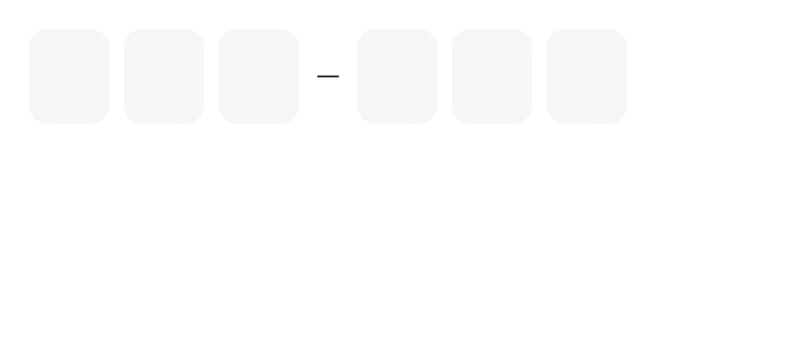
`InputOTP` is backed by one hidden `TextInput` and shows each character in an `InputOTPSlot`. The active slot gets a `border-primary` border and a blinking caret. The hidden input uses the one-time-code autofill hints, so codes from messages can be filled in automatically, and pasting fills every slot.
Group slots with `InputOTPGroup` and place an `InputOTPSeparator` between groups for codes such as `123-456`.
## Installation
**React Native**
```bash title="Terminal"
npx shadcn@latest add @esuiss-rn/input-otp
```
See [Installation](https://ui.suiss.app/docs/installation) for the `components.json` setup. Or use the suiss/ui CLI:
```bash title="Terminal"
npx @esuiss/ui@latest add input-otp
```
**SwiftUI**
```bash title="Terminal"
npx @esuiss/ui@latest add input-otp --platform swift
```
**Jetpack Compose**
```bash title="Terminal"
npx @esuiss/ui@latest add input-otp --platform kotlin
```
The CLI also adds what it builds on: [Icon](https://ui.suiss.app/docs/components/icon), [Text](https://ui.suiss.app/docs/components/text).
### Manual
**React Native**
**Uniwind**
1. Install the dependencies:
```bash title="Terminal"
npx expo install cn phosphor-react-native react-native-reanimated react-native-svg react-native-worklets
```
2. Add the pieces it builds on: [Icon](https://ui.suiss.app/docs/components/icon), [Text](https://ui.suiss.app/docs/components/text), and the primitives `components/primitives/otp-field.tsx`, `components/primitives/use-render.tsx`.
3. Copy the source into `components/ui/input-otp.tsx`:
```tsx title="uniwind/components/ui/input-otp.tsx"
import { cn } from "cn"
import { MinusIcon } from "phosphor-react-native"
import * as React from "react"
import { View } from "react-native"
import Animated, {
cancelAnimation,
ReduceMotion,
useAnimatedStyle,
useSharedValue,
withDelay,
withRepeat,
withSequence,
withTiming,
} from "react-native-reanimated"
import * as OTPFieldPrimitive from "@/components/primitives/otp-field"
import { resolveClassName } from "@/components/primitives/use-render"
import { Icon } from "@/components/ui/icon"
import { Text } from "@/components/ui/text"
type InputOTPSlotClassNames = {
className?: string
textClassName?: string
}
const InputOTPSlotClassContext = React.createContext<
InputOTPSlotClassNames | undefined
>(undefined)
function InputOTP({
className,
...props
}: React.ComponentProps) {
return (
cn("flex-row items-center gap-2", resolveClassName(className, state))
}
{...props}
/>
)
}
function InputOTPGroup({
className,
...props
}: React.ComponentProps) {
return (
)
}
function InputOTPCaret() {
const opacity = useSharedValue(1)
React.useEffect(() => {
opacity.value = withRepeat(
withSequence(
withTiming(0, { duration: 200 }),
withDelay(300, withTiming(1, { duration: 200 })),
withDelay(300, withTiming(1, { duration: 0 }))
),
-1,
false,
undefined,
ReduceMotion.System
)
return () => cancelAnimation(opacity)
}, [opacity])
const caretStyle = useAnimatedStyle(() => ({ opacity: opacity.value }))
return (
)
}
function InputOTPSlot({
index,
className,
...props
}: Omit, "children">) {
const slotClassNames = React.useContext(InputOTPSlotClassContext)
return (
cn(
"relative h-13 w-11 items-center justify-center rounded-lg border-[1.5px] border-transparent bg-secondary",
state.disabled && "opacity-50",
state.active && "z-10 border-primary",
slotClassNames?.className,
resolveClassName(className, state)
)
}
{...props}
>
{(slot) => (
<>
{slot.char}
{slot.hasFakeCaret ? : null}
)}
)
}
function InputOTPSeparator({
className,
...props
}: React.ComponentProps) {
return (
cn("items-center", resolveClassName(className, state))
}
{...props}
>
)
}
function OTPSeparatorIcon() {
const { disabled } = OTPFieldPrimitive.useRootContext().state
return (
)
}
export type { InputOTPSlotClassNames }
export {
InputOTP,
InputOTPGroup,
InputOTPSeparator,
InputOTPSlot,
InputOTPSlotClassContext,
}
```
4. Update the import paths to match your project.
**NativeWind**
1. Install the dependencies:
```bash title="Terminal"
npx expo install cn phosphor-react-native react-native-reanimated react-native-svg react-native-worklets
```
2. Add the pieces it builds on: [Icon](https://ui.suiss.app/docs/components/icon), [Text](https://ui.suiss.app/docs/components/text), and the primitives `components/primitives/otp-field.tsx`, `components/primitives/use-render.tsx`.
3. Copy the source into `components/ui/input-otp.tsx`:
```tsx title="nativewind/components/ui/input-otp.tsx"
import { cn } from "cn"
import { MinusIcon } from "phosphor-react-native"
import * as React from "react"
import { View } from "react-native"
import Animated, {
cancelAnimation,
ReduceMotion,
useAnimatedStyle,
useSharedValue,
withDelay,
withRepeat,
withSequence,
withTiming,
} from "react-native-reanimated"
import * as OTPFieldPrimitive from "@/components/primitives/otp-field"
import { resolveClassName } from "@/components/primitives/use-render"
import { Icon } from "@/components/ui/icon"
import { Text } from "@/components/ui/text"
type InputOTPSlotClassNames = {
className?: string
textClassName?: string
}
const InputOTPSlotClassContext = React.createContext<
InputOTPSlotClassNames | undefined
>(undefined)
function InputOTP({
className,
...props
}: React.ComponentProps) {
return (
cn("flex-row items-center gap-2", resolveClassName(className, state))
}
{...props}
/>
)
}
function InputOTPGroup({
className,
...props
}: React.ComponentProps) {
return (
)
}
function InputOTPCaret() {
const opacity = useSharedValue(1)
React.useEffect(() => {
opacity.value = withRepeat(
withSequence(
withTiming(0, { duration: 200 }),
withDelay(300, withTiming(1, { duration: 200 })),
withDelay(300, withTiming(1, { duration: 0 }))
),
-1,
false,
undefined,
ReduceMotion.System
)
return () => cancelAnimation(opacity)
}, [opacity])
const caretStyle = useAnimatedStyle(() => ({ opacity: opacity.value }))
return (
)
}
function InputOTPSlot({
index,
className,
...props
}: Omit, "children">) {
const slotClassNames = React.useContext(InputOTPSlotClassContext)
return (
cn(
"relative h-[3.25rem] w-11 items-center justify-center rounded-lg border-[1.5px] border-transparent bg-secondary",
state.disabled && "opacity-50",
state.active && "z-10 border-primary",
slotClassNames?.className,
resolveClassName(className, state)
)
}
{...props}
>
{(slot) => (
<>
{slot.char}
{slot.hasFakeCaret ? : null}
)}
)
}
function InputOTPSeparator({
className,
...props
}: React.ComponentProps) {
return (
cn("items-center", resolveClassName(className, state))
}
{...props}
>
)
}
function OTPSeparatorIcon() {
const { disabled } = OTPFieldPrimitive.useRootContext().state
return (
)
}
export type { InputOTPSlotClassNames }
export {
InputOTP,
InputOTPGroup,
InputOTPSeparator,
InputOTPSlot,
InputOTPSlotClassContext,
}
```
4. Update the import paths to match your project.
**StyleSheet**
1. Install the dependencies:
```bash title="Terminal"
npx expo install phosphor-react-native react-native-reanimated react-native-svg react-native-worklets
```
2. Add the pieces it builds on: [Icon](https://ui.suiss.app/docs/components/icon), [Text](https://ui.suiss.app/docs/components/text), and the primitives `components/primitives/otp-field.tsx`, `components/primitives/use-render.tsx`.
3. Copy the source into `components/ui/input-otp.tsx`:
```tsx title="stylesheet/components/ui/input-otp.tsx"
import { MinusIcon } from "phosphor-react-native"
import * as React from "react"
import { StyleSheet, type TextStyle, View, type ViewStyle } from "react-native"
import Animated, {
cancelAnimation,
ReduceMotion,
useAnimatedStyle,
useSharedValue,
withDelay,
withRepeat,
withSequence,
withTiming,
} from "react-native-reanimated"
import * as OTPFieldPrimitive from "@/components/primitives/otp-field"
import { Icon } from "@/components/ui/icon"
import { Text } from "@/components/ui/text"
import { fontSize, radius, useTheme } from "@/components/ui/theme"
type InputOTPSlotStyles = {
style?: ViewStyle
textStyle?: TextStyle
}
const InputOTPSlotStyleContext = React.createContext<
InputOTPSlotStyles | undefined
>(undefined)
const styles = StyleSheet.create({
root: { flexDirection: "row", alignItems: "center", gap: 8 },
group: { flexDirection: "row", alignItems: "center", gap: 8 },
slot: {
position: "relative",
height: 52,
width: 44,
alignItems: "center",
justifyContent: "center",
borderRadius: radius.lg,
borderWidth: 1.5,
borderColor: "transparent",
},
slotActive: { zIndex: 10 },
char: { ...fontSize.xl, fontWeight: "600", fontVariant: ["tabular-nums"] },
caretContainer: {
position: "absolute",
top: 0,
left: 0,
right: 0,
bottom: 0,
alignItems: "center",
justifyContent: "center",
},
caret: { height: 24, width: 2, borderRadius: 9999 },
separator: { alignItems: "center" },
})
function InputOTP({
style,
...props
}: React.ComponentProps) {
return (
[
styles.root,
typeof style === "function" ? style(state) : style,
]}
{...props}
/>
)
}
function InputOTPGroup({ style, ...props }: React.ComponentProps) {
return
}
function InputOTPCaret() {
const { colors } = useTheme()
const opacity = useSharedValue(1)
React.useEffect(() => {
opacity.value = withRepeat(
withSequence(
withTiming(0, { duration: 200 }),
withDelay(300, withTiming(1, { duration: 200 })),
withDelay(300, withTiming(1, { duration: 0 }))
),
-1,
false,
undefined,
ReduceMotion.System
)
return () => cancelAnimation(opacity)
}, [opacity])
const caretStyle = useAnimatedStyle(() => ({ opacity: opacity.value }))
return (
)
}
function InputOTPSlot({
index,
style,
...props
}: Omit, "children">) {
const { colors } = useTheme()
const slotStyles = React.useContext(InputOTPSlotStyleContext)
return (
[
styles.slot,
{ backgroundColor: colors.secondary },
state.disabled && { opacity: 0.5 },
state.active && [styles.slotActive, { borderColor: colors.primary }],
slotStyles?.style,
typeof style === "function" ? style(state) : style,
]}
{...props}
>
{(slot) => (
<>
{slot.char}
{slot.hasFakeCaret ? : null}
)}
)
}
function InputOTPSeparator({
style,
...props
}: React.ComponentProps) {
return (
[
styles.separator,
typeof style === "function" ? style(state) : style,
]}
{...props}
>
)
}
function OTPSeparatorIcon() {
const { colors } = useTheme()
const { disabled } = OTPFieldPrimitive.useRootContext().state
return (
)
}
export type { InputOTPSlotStyles }
export {
InputOTP,
InputOTPGroup,
InputOTPSeparator,
InputOTPSlot,
InputOTPSlotStyleContext,
}
```
4. Update the import paths to match your project.
**SwiftUI**
1. Target iOS 17 or later.
2. Add the Swift package to your app:
```swift title="Package.swift"
.package(url: "https://github.com/phosphor-icons/swift", from: "2.1.0")
```
3. Copy the theme files every view uses:
- `swift/Theme/Theme.swift`: [source](https://github.com/e-suiss/ui/blob/main/packages/mobile/swiftui/Sources/EsuissUI/Theme/Theme.swift)
- `swift/Theme/Tokens.swift`: [source](https://github.com/e-suiss/ui/blob/main/packages/mobile/swiftui/Sources/EsuissUI/Theme/Tokens.swift)
4. Copy the source and every file it uses:
```swift title="swift/Components/InputOTP.swift"
import PhosphorSwift
import SwiftUI
struct InputOTPContext {
var characters: [Character]
var length: Int
var focused: Bool
}
struct InputOTPTone: Equatable {
var danger = false
var verified = false
var dimmed = false
var pops: [Int] = []
}
extension EnvironmentValues {
@Entry var inputOTP = InputOTPContext(characters: [], length: 0, focused: false)
@Entry var inputOTPTone = InputOTPTone()
@Entry var inputOTPFocus: Binding?
}
public struct InputOTP: View {
@Binding var text: String
let length: Int
let allowed: CharacterSet
let content: Content
@FocusState private var focused: Bool
@Environment(\.inputOTPFocus) private var externalFocus
public init(
text: Binding,
length: Int,
allowed: CharacterSet = .decimalDigits,
@ViewBuilder content: () -> Content
) {
_text = text
self.length = length
self.allowed = allowed
self.content = content()
}
public var body: some View {
HStack(spacing: 8) {
content
}
.accessibilityHidden(true)
.environment(\.inputOTP, InputOTPContext(characters: Array(text), length: length, focused: focused))
.background {
TextField("", text: filtered)
.textContentType(.oneTimeCode)
.keyboardType(allowed == .decimalDigits ? .numberPad : .asciiCapable)
.textInputAutocapitalization(.never)
.autocorrectionDisabled()
.focused($focused)
.foregroundStyle(.clear)
.tint(.clear)
.accessibilityLabel(Text("One-time code"))
.accessibilityValue(Text(verbatim: text))
}
.contentShape(Rectangle())
.onTapGesture { focused = true }
.onAppear {
if externalFocus?.wrappedValue == true { focused = true }
}
.onChange(of: focused) { _, new in
if let externalFocus, externalFocus.wrappedValue != new { externalFocus.wrappedValue = new }
}
.onChange(of: externalFocus?.wrappedValue) { _, new in
if let new, new != focused { focused = new }
}
}
private var filtered: Binding {
Binding(
get: { text },
set: { newValue in
let scalars = newValue.unicodeScalars.filter { allowed.contains($0) }
text = String(String.UnicodeScalarView(scalars).prefix(length))
}
)
}
}
extension InputOTP where Content == InputOTPGroup, Int, InputOTPSlot>> {
public init(text: Binding, length: Int, allowed: CharacterSet = .decimalDigits) {
self.init(text: text, length: length, allowed: allowed) {
InputOTPGroup {
ForEach(0..: View {
let content: Content
public init(@ViewBuilder content: () -> Content) {
self.content = content()
}
public var body: some View {
HStack(spacing: 8) {
content
}
}
}
public struct InputOTPSlot: View {
let index: Int
@Environment(\.inputOTP) private var context
@Environment(\.inputOTPTone) private var tone
@Environment(\.isEnabled) private var isEnabled
@Environment(\.isInvalid) private var invalid
@Environment(\.colorScheme) private var colorScheme
@Environment(\.accessibilityReduceMotion) private var reduceMotion
@ScaledMetric(relativeTo: .title2) private var scale: CGFloat = 1
public init(index: Int) {
self.index = index
}
public var body: some View {
let shape = RoundedRectangle(cornerRadius: Radius.lg, style: .continuous)
let character = index < context.characters.count ? context.characters[index] : nil
let active = isEnabled && context.focused
&& index == min(context.characters.count, context.length - 1)
let pop = index < tone.pops.count ? tone.pops[index] : 0
let still = reduceMotion
ZStack {
if let character {
Text(String(character))
.font(.system(size: TextStyle.xl.size * scale, weight: .semibold))
.monospacedDigit()
.foregroundStyle(foreground)
} else if active {
InputOTPCaret()
}
}
.frame(width: 44 * scale, height: 52 * scale)
.background(background, in: shape)
.overlay {
shape.strokeBorder(border(active: active), lineWidth: 1.5)
}
.opacity((tone.dimmed ? 0.6 : 1) * (isEnabled ? 1 : 0.5))
.animation(.easeInOut(duration: 0.3), value: tone)
.animation(.easeInOut(duration: 0.3), value: invalid)
.keyframeAnimator(initialValue: CGFloat(1), trigger: pop) { view, value in
view.scaleEffect(still ? 1 : value)
} keyframes: { _ in
KeyframeTrack {
LinearKeyframe(0.8, duration: 0.001)
CubicKeyframe(1.08, duration: 0.144)
CubicKeyframe(1, duration: 0.096)
}
}
.zIndex(active ? 1 : 0)
}
private var foreground: Color {
if tone.verified { return Color.adaptive(light: Palette.green600, dark: Palette.green400) }
if tone.danger { return EsuissColor.destructive }
return EsuissColor.foreground
}
private var background: Color {
if tone.verified { return Color.adaptive(light: Palette.green500.opacity(0.1), dark: Palette.green500.opacity(0.2)) }
if invalid { return EsuissColor.destructive.opacity(colorScheme == .dark ? 0.1 : 0.05) }
return EsuissColor.secondary
}
private func border(active: Bool) -> Color {
if !isEnabled { return .clear }
if tone.verified { return Palette.green500 }
if invalid { return EsuissColor.destructive }
return active ? EsuissColor.primary : .clear
}
}
private struct InputOTPCaret: View {
@Environment(\.accessibilityReduceMotion) private var reduceMotion
var body: some View {
TimelineView(.periodic(from: .now, by: 0.5)) { timeline in
let phase = Int(timeline.date.timeIntervalSinceReferenceDate * 2) % 2
Capsule()
.fill(EsuissColor.primary)
.frame(width: 2, height: 24)
.opacity(reduceMotion || phase == 0 ? 1 : 0)
.animation(reduceMotion ? nil : .easeInOut(duration: 0.2), value: phase)
}
}
}
public struct InputOTPSeparator: View {
@Environment(\.isEnabled) private var isEnabled
public init() {}
public var body: some View {
Ph.minus.regular
.frame(width: 16, height: 16)
.foregroundStyle(EsuissColor.foreground)
.opacity(isEnabled ? 1 : 0.5)
}
}
```
- `swift/Components/Field.swift`: see [Field](https://ui.suiss.app/docs/components/field.md)
- `swift/Components/Separator.swift`: see [Separator](https://ui.suiss.app/docs/components/separator.md)
- `swift/Components/TextVariant.swift`: [source](https://github.com/e-suiss/ui/blob/main/packages/mobile/swiftui/Sources/EsuissUI/Components/TextVariant.swift)
5. Add the files to your app target.
**Jetpack Compose**
1. Set `minSdk` to 24 or higher and add the dependencies:
```kotlin title="build.gradle.kts"
implementation(platform("androidx.compose:compose-bom:2026.09.00"))
implementation("androidx.compose.foundation:foundation")
implementation("androidx.compose.ui:ui")
implementation("com.adamglin:phosphor-icon-android:1.0.0")
```
2. Copy the theme files every view uses:
- `kotlin/theme/Theme.kt`: [source](https://github.com/e-suiss/ui/blob/main/packages/mobile/kotlin/ui/src/main/kotlin/com/esuiss/ui/theme/Theme.kt)
- `kotlin/theme/Tokens.kt`: [source](https://github.com/e-suiss/ui/blob/main/packages/mobile/kotlin/ui/src/main/kotlin/com/esuiss/ui/theme/Tokens.kt)
3. Copy the source and every file it uses:
```kt title="kotlin/components/InputOTP.kt"
package com.esuiss.ui.components
import androidx.compose.animation.animateColorAsState
import androidx.compose.animation.core.Animatable
import androidx.compose.animation.core.animateFloat
import androidx.compose.animation.core.animateFloatAsState
import androidx.compose.animation.core.infiniteRepeatable
import androidx.compose.animation.core.keyframes
import androidx.compose.animation.core.rememberInfiniteTransition
import androidx.compose.animation.core.tween
import androidx.compose.foundation.background
import androidx.compose.foundation.border
import androidx.compose.foundation.interaction.MutableInteractionSource
import androidx.compose.foundation.interaction.collectIsFocusedAsState
import androidx.compose.foundation.layout.Arrangement
import androidx.compose.foundation.layout.Box
import androidx.compose.foundation.layout.Row
import androidx.compose.foundation.layout.RowScope
import androidx.compose.foundation.layout.size
import androidx.compose.foundation.shape.CircleShape
import androidx.compose.foundation.shape.RoundedCornerShape
import androidx.compose.foundation.text.BasicText
import androidx.compose.foundation.text.BasicTextField
import androidx.compose.foundation.text.KeyboardActions
import androidx.compose.foundation.text.KeyboardOptions
import androidx.compose.runtime.Composable
import androidx.compose.runtime.CompositionLocalProvider
import androidx.compose.runtime.Immutable
import androidx.compose.runtime.LaunchedEffect
import androidx.compose.runtime.getValue
import androidx.compose.runtime.remember
import androidx.compose.runtime.rememberUpdatedState
import androidx.compose.runtime.staticCompositionLocalOf
import androidx.compose.ui.Alignment
import androidx.compose.ui.Modifier
import androidx.compose.ui.autofill.ContentType
import androidx.compose.ui.draw.alpha
import androidx.compose.ui.graphics.Color
import androidx.compose.ui.graphics.SolidColor
import androidx.compose.ui.graphics.graphicsLayer
import androidx.compose.ui.semantics.clearAndSetSemantics
import androidx.compose.ui.semantics.contentType
import androidx.compose.ui.semantics.semantics
import androidx.compose.ui.text.TextRange
import androidx.compose.ui.text.TextStyle
import androidx.compose.ui.text.font.FontWeight
import androidx.compose.ui.text.input.ImeAction
import androidx.compose.ui.text.input.KeyboardType
import androidx.compose.ui.text.input.TextFieldValue
import androidx.compose.ui.unit.dp
import androidx.compose.ui.zIndex
import com.adamglin.PhosphorIcons
import com.adamglin.phosphoricons.Regular
import com.adamglin.phosphoricons.regular.Minus
import com.esuiss.ui.theme.EsuissTheme
import com.esuiss.ui.theme.Palette
import com.esuiss.ui.theme.Radius
import com.esuiss.ui.theme.Typography
internal enum class OtpTone { Default, Verifying, Verified, Invalid }
@Immutable
internal class OtpAppearance(val tone: OtpTone, val pop: Boolean)
internal val LocalOtpAppearance = staticCompositionLocalOf { OtpAppearance(OtpTone.Default, pop = false) }
@Immutable
private class OtpState(
val value: String,
val maxLength: Int,
val focused: Boolean,
val enabled: Boolean,
val invalid: Boolean,
val appearance: OtpAppearance,
)
private val LocalOtpState = staticCompositionLocalOf {
OtpState("", 0, focused = false, enabled = true, invalid = false, appearance = OtpAppearance(OtpTone.Default, pop = false))
}
@Composable
fun InputOTP(
value: String,
onValueChange: (String) -> Unit,
maxLength: Int,
modifier: Modifier = Modifier,
enabled: Boolean = LocalFieldState.current.enabled,
invalid: Boolean = LocalFieldState.current.invalid,
readOnly: Boolean = false,
keyboardType: KeyboardType = KeyboardType.NumberPassword,
onComplete: ((String) -> Unit)? = null,
keyboardActions: KeyboardActions = KeyboardActions.Default,
interactionSource: MutableInteractionSource? = null,
content: @Composable RowScope.() -> Unit = {
InputOTPGroup {
repeat(maxLength) { InputOTPSlot(it) }
}
},
) {
val source = interactionSource ?: remember { MutableInteractionSource() }
val focused by source.collectIsFocusedAsState()
val currentValue by rememberUpdatedState(value)
val appearance = LocalOtpAppearance.current
val numeric = keyboardType == KeyboardType.NumberPassword || keyboardType == KeyboardType.Number
BasicTextField(
value = TextFieldValue(value, TextRange(value.length)),
onValueChange = { next ->
val filtered = next.text
.filter { if (numeric) it.isDigit() else it.isLetterOrDigit() }
.take(maxLength)
if (filtered != currentValue) {
onValueChange(filtered)
if (filtered.length == maxLength) onComplete?.invoke(filtered)
}
},
modifier = modifier.semantics { contentType = ContentType.SmsOtpCode },
enabled = enabled,
readOnly = readOnly,
textStyle = TextStyle(color = Color.Transparent),
keyboardOptions = KeyboardOptions(keyboardType = keyboardType, imeAction = ImeAction.Done),
keyboardActions = keyboardActions,
singleLine = true,
interactionSource = source,
cursorBrush = SolidColor(Color.Transparent),
decorationBox = {
CompositionLocalProvider(LocalOtpState provides OtpState(value, maxLength, focused, enabled, invalid, appearance)) {
Row(
modifier = Modifier.clearAndSetSemantics {},
horizontalArrangement = Arrangement.spacedBy(8.dp),
verticalAlignment = Alignment.CenterVertically,
content = content,
)
}
},
)
}
@Composable
fun InputOTPGroup(
modifier: Modifier = Modifier,
content: @Composable RowScope.() -> Unit,
) {
Row(
modifier = modifier,
horizontalArrangement = Arrangement.spacedBy(8.dp),
verticalAlignment = Alignment.CenterVertically,
content = content,
)
}
@Composable
fun InputOTPSlot(index: Int, modifier: Modifier = Modifier) {
val colors = EsuissTheme.colors
val state = LocalOtpState.current
val tone = state.appearance.tone
val char = state.value.getOrNull(index)
val active = state.focused && state.maxLength > 0 &&
index == state.value.length.coerceAtMost(state.maxLength - 1)
val shape = RoundedCornerShape(Radius.lg)
val dangerFill = colors.destructive.copy(alpha = if (colors.isDark) 0.1f else 0.05f)
val background = when {
tone == OtpTone.Verified -> Palette.green500.copy(alpha = if (colors.isDark) 0.2f else 0.1f)
tone == OtpTone.Invalid || state.invalid -> dangerFill
else -> colors.secondary
}
val border = when {
!state.enabled -> Color.Transparent
tone == OtpTone.Verified -> Palette.green500
tone == OtpTone.Invalid -> colors.destructive
active -> colors.primary
state.invalid -> colors.destructive
else -> Color.Transparent
}
val foreground = when {
tone == OtpTone.Verified -> if (colors.isDark) Palette.green400 else Palette.green600
tone == OtpTone.Invalid -> colors.destructive
else -> colors.foreground
}
val spec = tween(if (tone == OtpTone.Default) 150 else 300, easing = FormEasing)
val animatedBackground by animateColorAsState(background, spec, label = "background")
val animatedBorder by animateColorAsState(border, spec, label = "border")
val animatedForeground by animateColorAsState(foreground, spec, label = "foreground")
val alpha by animateFloatAsState(
when {
!state.enabled -> 0.5f
tone == OtpTone.Verifying -> 0.6f
else -> 1f
},
tween(300, easing = FormEasing),
label = "alpha",
)
val reduced = formReducedMotion()
val scale = remember { Animatable(1f) }
val pop = state.appearance.pop
LaunchedEffect(char) {
if (char != null && pop && !reduced) {
scale.snapTo(0.8f)
scale.animateTo(
1f,
keyframes {
durationMillis = 240
0.8f at 0 using FormEasing
1.08f at 144 using FormEasing
1f at 240
},
)
}
}
Box(
modifier = modifier
.zIndex(if (active) 1f else 0f)
.graphicsLayer {
this.alpha = alpha
scaleX = scale.value
scaleY = scale.value
}
.size(width = 44.dp, height = 52.dp)
.background(animatedBackground, shape)
.border(1.5.dp, animatedBorder, shape),
contentAlignment = Alignment.Center,
) {
if (char != null) {
BasicText(
char.toString(),
style = Typography.xl.copy(
color = animatedForeground,
fontWeight = FontWeight.SemiBold,
fontFeatureSettings = "tnum",
),
)
} else if (active && tone == OtpTone.Default) {
OtpCaret()
}
}
}
@Composable
fun InputOTPSeparator(modifier: Modifier = Modifier) {
val colors = EsuissTheme.colors
val enabled = LocalOtpState.current.enabled
Icon(
PhosphorIcons.Regular.Minus,
contentDescription = null,
modifier = modifier.alpha(if (enabled) 1f else 0.5f),
size = 16.dp,
tint = colors.foreground,
)
}
@Composable
private fun OtpCaret() {
val reduced = formReducedMotion()
val transition = rememberInfiniteTransition(label = "caret")
val blink by transition.animateFloat(
initialValue = 1f,
targetValue = 1f,
animationSpec = infiniteRepeatable(
keyframes {
durationMillis = 1000
1f at 0
0f at 200
0f at 500
1f at 700
1f at 1000
},
),
label = "caret",
)
Box(
Modifier
.graphicsLayer { alpha = if (reduced) 1f else blink }
.size(width = 2.dp, height = 24.dp)
.background(EsuissTheme.colors.primary, CircleShape),
)
}
```
- `kotlin/components/Content.kt`: [source](https://github.com/e-suiss/ui/blob/main/packages/mobile/kotlin/ui/src/main/kotlin/com/esuiss/ui/components/Content.kt)
- `kotlin/components/Field.kt`: see [Field](https://ui.suiss.app/docs/components/field.md)
- `kotlin/components/FormSupport.kt`: [source](https://github.com/e-suiss/ui/blob/main/packages/mobile/kotlin/ui/src/main/kotlin/com/esuiss/ui/components/FormSupport.kt)
- `kotlin/components/Icon.kt`: see [Icon](https://ui.suiss.app/docs/components/icon.md)
- `kotlin/components/Label.kt`: see [Label](https://ui.suiss.app/docs/components/label.md)
- `kotlin/components/Separator.kt`: see [Separator](https://ui.suiss.app/docs/components/separator.md)
4. Update the `com.esuiss.ui` package names to match your project.
## Usage
```tsx
import { InputOTP, InputOTPGroup, InputOTPSlot, InputOTPSeparator } from "@/components/ui/input-otp"
```
```tsx
```
Set `length` and render one `InputOTPSlot` per `index`. Use `value` with `onValueChange` for controlled state, or `defaultValue`. `onValueComplete` fires when every slot is filled.
`validationType` limits input to `numeric` (the default number pad), `alpha`, `alphanumeric` or `none`, and `onValueInvalid` reports rejected characters. Set `mask` to hide the characters.
Use `InputOTPSlotClassContext` to style every slot at once, or `className` on a single slot.
## Examples
### Controlled
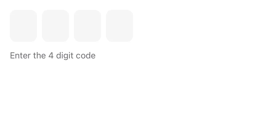
Controlled with `value` and `onValueChange`.
```tsx
import * as React from "react"
import { View } from "react-native"
import { InputOTP, InputOTPGroup, InputOTPSlot } from "@/components/ui/input-otp"
import { Text } from "@/components/ui/text"
function slotIndexes(length: number) {
return Array.from({ length }, (_, index) => index)
}
function ControlledDemo() {
const [value, setValue] = React.useState("")
const [completed, setCompleted] = React.useState(null)
return (
{slotIndexes(4).map((index) => (
))}
{completed ? `Submitted ${completed}` : "Enter the 4 digit code"}
)
}
export function InputOtpControlledExample() {
return (
)
}
```
```swift
import EsuissUI
import SwiftUI
struct InputOTPControlledDemo: View {
@State private var value = ""
@State private var completed: String?
var body: some View {
VStack(alignment: .leading, spacing: 12) {
InputOTP(text: $value, length: 4)
Text(completed.map { "Submitted \($0)" } ?? "Enter the 4 digit code")
.textVariant(.muted)
}
.onChange(of: value) { _, next in
if next.count == 4 { completed = next }
}
}
}
```
```kotlin
import androidx.compose.foundation.layout.Arrangement
import androidx.compose.foundation.layout.Column
import androidx.compose.runtime.Composable
import androidx.compose.runtime.getValue
import androidx.compose.runtime.mutableStateOf
import androidx.compose.runtime.saveable.rememberSaveable
import androidx.compose.runtime.setValue
import androidx.compose.ui.unit.dp
import com.esuiss.ui.components.InputOTP
import com.esuiss.ui.components.Text
import com.esuiss.ui.components.TextVariant
@Composable
fun InputOTPControlled() {
var value by rememberSaveable { mutableStateOf("") }
var completed by rememberSaveable { mutableStateOf(null) }
Column(verticalArrangement = Arrangement.spacedBy(12.dp)) {
InputOTP(value, { value = it }, maxLength = 4, onComplete = { completed = it })
Text(completed?.let { "Submitted $it" } ?: "Enter the 4 digit code", variant = TextVariant.Muted)
}
}
```
### Alphanumeric
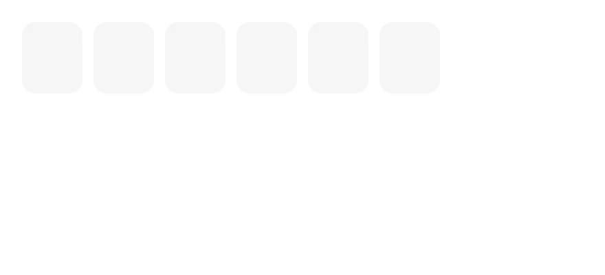
Letters and numbers with `validationType="alphanumeric"`.
```tsx
import { InputOTP, InputOTPGroup, InputOTPSlot } from "@/components/ui/input-otp"
function slotIndexes(length: number) {
return Array.from({ length }, (_, index) => index)
}
export function InputOtpAlphanumericExample() {
return (
value.toUpperCase()}
>
{slotIndexes(6).map((index) => (
))}
)
}
```
```swift
import EsuissUI
import SwiftUI
struct InputOTPAlphanumericDemo: View {
@State private var value = ""
var body: some View {
InputOTP(
text: Binding(get: { value }, set: { value = $0.uppercased() }),
length: 6,
allowed: .alphanumerics
)
}
}
```
```kotlin
import androidx.compose.foundation.layout.Column
import androidx.compose.runtime.Composable
import androidx.compose.runtime.getValue
import androidx.compose.runtime.mutableStateOf
import androidx.compose.runtime.saveable.rememberSaveable
import androidx.compose.runtime.setValue
import androidx.compose.ui.text.input.KeyboardType
import com.esuiss.ui.components.InputOTP
@Composable
fun InputOTPAlphanumeric() {
var value by rememberSaveable { mutableStateOf("") }
Column {
InputOTP(value, { value = it.uppercase() }, maxLength = 6, keyboardType = KeyboardType.Ascii)
}
}
```
**React Native**
### Masked
A four-digit code with hidden characters.

```tsx
import { InputOTP, InputOTPGroup, InputOTPSlot } from "@/components/ui/input-otp"
function slotIndexes(length: number) {
return Array.from({ length }, (_, index) => index)
}
export function InputOtpMaskedExample() {
return (
{slotIndexes(4).map((index) => (
))}
)
}
```
### Disabled
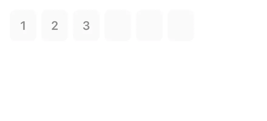
A disabled field with a partial value.
```tsx
import { InputOTP, InputOTPGroup, InputOTPSlot } from "@/components/ui/input-otp"
function slotIndexes(length: number) {
return Array.from({ length }, (_, index) => index)
}
export function InputOtpDisabledExample() {
return (
{slotIndexes(6).map((index) => (
))}
)
}
```
```swift
import EsuissUI
import SwiftUI
struct InputOTPDisabledExample: View {
var body: some View {
InputOTPDemo(length: 6, initial: "123")
.disabled(true)
}
}
struct InputOTPDemo: View {
let length: Int
@State private var text: String
init(length: Int, initial: String = "") {
self.length = length
_text = State(initialValue: initial)
}
var body: some View {
InputOTP(text: $text, length: length)
}
}
```
```kotlin
import androidx.compose.foundation.layout.Column
import androidx.compose.runtime.Composable
import androidx.compose.runtime.getValue
import androidx.compose.runtime.mutableStateOf
import androidx.compose.runtime.saveable.rememberSaveable
import androidx.compose.runtime.setValue
import com.esuiss.ui.components.InputOTP
@Composable
fun InputOTPDisabled() {
var value by rememberSaveable { mutableStateOf("123") }
Column {
InputOTP(value, { value = it }, maxLength = 6, enabled = false)
}
}
```
## API Reference
### InputOTP
Root that owns the hidden input and the value.
Also accepts the props of `React.ComponentProps`.
### InputOTPGroup
Row of adjacent slots.
Also accepts the props of `React.ComponentProps`.
### InputOTPSlot
Box that shows one character.
Also accepts the props of `React.ComponentProps`.
### InputOTPSeparator
Dash between groups.
Also accepts the props of `React.ComponentProps`.
## Accessibility
- Screen readers interact with the hidden input, labelled "N character code" by default; pass `inputProps` with an `accessibilityLabel` to localize it.
- The visual slots are hidden from VoiceOver and TalkBack.
- `disabled` is exposed on the input.
## Notes
- The hidden input sets `textContentType="oneTimeCode"` for iOS and `autoComplete="one-time-code"` for Android autofill.
- The caret blink respects the system Reduce Motion setting.
- Uses `bg-secondary`, `border-primary` and `bg-primary` tokens; light and dark follow the system appearance.