# Input Group

A text field with icons, text, buttons or keyboard hints attached inside its border.

Input Group is an open-source component from suiss/ui for React, React Native, SwiftUI and Jetpack Compose. The @esuiss/ui CLI copies its source into your project, so you own the code.

Source: https://ui.suiss.app/docs/components/input-group

**React**

**Example**

```tsx
import { MagnifyingGlassIcon } from "@phosphor-icons/react"
import {
  InputGroup,
  InputGroupAddon,
  InputGroupInput,
} from "@/components/ui/input-group"

export default function InputGroupDemo() {
  return (
    <div className="w-96">
      <InputGroup>
        <InputGroupInput placeholder="Search..." />
        <InputGroupAddon>
          <MagnifyingGlassIcon />
        </InputGroupAddon>
        <InputGroupAddon align="inline-end">12 results</InputGroupAddon>
      </InputGroup>
    </div>
  )
}
```

`InputGroup` is the container that draws the field's background, border and focus ring. Inside it, place one control, either `InputGroupInput` or `InputGroupTextarea`, and one or more `InputGroupAddon` elements. An addon can hold icons, `InputGroupText`, `InputGroupButton` or a `Kbd`, and is placed before, after, above or below the control with its `align` prop.

Use an input group when supporting content belongs inside the field, such as a search icon, a currency symbol, a clear button or a send button. For a plain field, use `Input`; for a field with a filterable list of options, use `Combobox`, which is built on this component.

## Installation

### CLI

```bash title="Terminal"
npx shadcn@latest add @esuiss/input-group
```

Works in any project with a `components.json`. See [Installation](https://ui.suiss.app/docs/installation#add-components) for the one-line registry setup. Or use the suiss/ui CLI:

```bash title="Terminal"
npx @esuiss/ui@latest add input-group
```

### Manual

1. Install the dependencies and add the [`cn` helper](https://ui.suiss.app/docs/installation#the-cn-helper):

```bash title="Terminal"
npm install class-variance-authority
```

2. Add the pieces it builds on: [Button](https://ui.suiss.app/docs/components/button), [Input](https://ui.suiss.app/docs/components/input), [Textarea](https://ui.suiss.app/docs/components/textarea).

3. Copy the source into `components/ui/input-group.tsx`:

```tsx title="components/ui/input-group.tsx"
"use client"

import { cva, type VariantProps } from "class-variance-authority"
import type * as React from "react"
import { Button } from "@/components/ui/button"
import { Input } from "@/components/ui/input"
import { Textarea } from "@/components/ui/textarea"
import { cn } from "@/lib/utils"

function InputGroup({ className, ...props }: React.ComponentProps<"div">) {
  return (
    <div
      data-slot="input-group"
      role="group"
      className={cn(
        "group/input-group relative flex h-11 w-full min-w-0 items-center rounded-lg border border-transparent bg-secondary transition-[color,box-shadow,background-color] outline-none in-data-[slot=combobox-content]:focus-within:border-inherit in-data-[slot=combobox-content]:focus-within:ring-0 in-data-[slot=combobox-content]:outline-none! has-data-[align=block-end]:rounded-xl has-data-[align=block-start]:rounded-xl has-[[data-slot=input-group-control]:focus-visible]:border-ring has-[[data-slot=input-group-control]:focus-visible]:ring-3 has-[[data-slot=input-group-control]:focus-visible]:ring-ring/50 has-[[data-slot][aria-invalid=true]]:border-destructive has-[[data-slot][aria-invalid=true]]:ring-3 has-[[data-slot][aria-invalid=true]]:ring-destructive/20 dark:has-[[data-slot][aria-invalid=true]]:ring-destructive/40 has-[[data-slot][aria-invalid=true]]:bg-destructive/5 dark:has-[[data-slot][aria-invalid=true]]:bg-destructive/10 has-[textarea]:rounded-xl has-[>[data-align=block-end]]:h-auto has-[>[data-align=block-end]]:flex-col has-[>[data-align=block-start]]:h-auto has-[>[data-align=block-start]]:flex-col has-[>textarea]:h-auto has-[>[data-align=block-end]]:[&>input]:pt-3 has-[>[data-align=block-start]]:[&>input]:pb-3 has-[>[data-align=inline-end]]:[&>input]:pe-1.5 has-[>[data-align=inline-start]]:[&>input]:ps-1.5 data-[disabled=true]:opacity-50 has-[[data-slot=input-group-control]:disabled]:opacity-50",
        className
      )}
      {...props}
    />
  )
}

const inputGroupAddonVariants = cva(
  "flex h-auto cursor-text items-center justify-center gap-2 py-2 text-base text-muted-foreground select-none [&>svg:not([class*='size-'])]:size-4 group-data-[disabled=true]/input-group:opacity-50 group-has-[[data-slot=input-group-control]:disabled]/input-group:opacity-50",
  {
    variants: {
      align: {
        "inline-start": "order-first ps-3 has-[>button]:-ms-1 has-[>kbd]:-ms-1",
        "inline-end": "order-last pe-3 has-[>button]:-me-1 has-[>kbd]:-me-1",
        "block-start":
          "order-first w-full justify-start px-3 pt-3 group-has-[>input]/input-group:pt-3.5 [.border-b]:pb-3.5",
        "block-end":
          "order-last w-full justify-start px-3 pb-3 group-has-[>input]/input-group:pb-3.5 [.border-t]:pt-3.5",
      },
    },
    defaultVariants: {
      align: "inline-start",
    },
  }
)

function InputGroupAddon({
  className,
  align = "inline-start",
  onClick,
  ...props
}: React.ComponentProps<"div"> & VariantProps<typeof inputGroupAddonVariants>) {
  return (
    <div
      role="group"
      data-slot="input-group-addon"
      data-align={align}
      className={cn(inputGroupAddonVariants({ align }), className)}
      {...props}
      onClick={(event) => {
        onClick?.(event)
        if (
          event.defaultPrevented ||
          (event.target as HTMLElement).closest("button")
        ) {
          return
        }
        event.currentTarget.parentElement
          ?.querySelector<HTMLElement>("input, textarea")
          ?.focus()
      }}
    />
  )
}

const inputGroupButtonVariants = cva(
  "flex items-center gap-2 rounded-full text-sm shadow-none",
  {
    variants: {
      size: {
        xs: "h-6 gap-1 rounded-full px-1.5 [&>svg:not([class*='size-'])]:size-3.5",
        sm: "h-8 gap-1.5 rounded-full px-2.5 has-[>svg]:px-2.5",
        "icon-xs": "size-6 rounded-full p-0 has-[>svg]:p-0",
        "icon-sm": "size-8 p-0 has-[>svg]:p-0",
      },
    },
    defaultVariants: {
      size: "xs",
    },
  }
)

function InputGroupButton({
  className,
  type = "button",
  variant = "ghost",
  size = "xs",
  ...props
}: Omit<React.ComponentProps<typeof Button>, "size" | "type"> &
  VariantProps<typeof inputGroupButtonVariants> & {
    type?: "button" | "submit" | "reset"
  }) {
  return (
    <Button
      type={type}
      data-size={size}
      variant={variant}
      className={cn(inputGroupButtonVariants({ size }), className)}
      {...props}
    />
  )
}

function InputGroupText({ className, ...props }: React.ComponentProps<"span">) {
  return (
    <span
      className={cn(
        "flex items-center gap-2 text-base text-muted-foreground [&_svg]:pointer-events-none [&_svg:not([class*='size-'])]:size-4",
        className
      )}
      {...props}
    />
  )
}

function InputGroupInput({
  className,
  ...props
}: Omit<React.ComponentProps<"input">, "size">) {
  return (
    <Input
      data-slot="input-group-control"
      className={cn(
        "flex-1 rounded-none border-0 bg-transparent shadow-none ring-0 focus-visible:ring-0 focus-visible:outline-none disabled:bg-transparent aria-invalid:ring-0 aria-invalid:bg-transparent dark:aria-invalid:bg-transparent dark:bg-transparent",
        className
      )}
      {...props}
    />
  )
}

function InputGroupTextarea({
  className,
  ...props
}: React.ComponentProps<"textarea">) {
  return (
    <Textarea
      data-slot="input-group-control"
      className={cn(
        "flex-1 resize-none rounded-none border-0 bg-transparent py-2.5 shadow-none ring-0 focus-visible:ring-0 focus-visible:outline-none disabled:bg-transparent aria-invalid:ring-0 aria-invalid:bg-transparent dark:aria-invalid:bg-transparent dark:bg-transparent",
        className
      )}
      {...props}
    />
  )
}

export {
  InputGroup,
  InputGroupAddon,
  InputGroupButton,
  InputGroupInput,
  InputGroupText,
  InputGroupTextarea,
}
```

4. Update the import paths to match your project.

## Usage

```tsx
import { InputGroup, InputGroupAddon, InputGroupButton, InputGroupText, InputGroupInput, InputGroupTextarea } from "@/components/ui/input-group"
```

```tsx
<div className="w-96">
  <InputGroup>
    <InputGroupInput placeholder="Search..." />
    <InputGroupAddon>
      <MagnifyingGlassIcon />
    </InputGroupAddon>
    <InputGroupAddon align="inline-end">12 results</InputGroupAddon>
  </InputGroup>
</div>
```

Addons are positioned with CSS order, so you can place them before or after the control in your markup. `inline-start` and `inline-end` sit beside the control; `block-start` and `block-end` sit above or below it and make the group grow to fit. Clicking an addon outside its buttons focuses the group's `input`.

`InputGroupButton` defaults to `type="button"`, so it does not submit a surrounding form unless you set `type="submit"`. Set `aria-invalid` on the control to show the error style on the whole group. To dim a disabled group's addons, disable the control and set `data-disabled="true"` on `InputGroup`.

## Examples

### Search

A search field with a clear button that appears only when there is text.

**Example**

```tsx
import { MagnifyingGlassIcon, XCircleIcon } from "@phosphor-icons/react"
import * as React from "react"
import {
  InputGroup,
  InputGroupAddon,
  InputGroupButton,
  InputGroupInput,
} from "@/components/ui/input-group"

function SearchField() {
  const [query, setQuery] = React.useState("MacBook")
  return (
    <InputGroup>
      <InputGroupInput
        aria-label="Search"
        placeholder="Search"
        value={query}
        onChange={(event) => setQuery(event.target.value)}
      />
      <InputGroupAddon>
        <MagnifyingGlassIcon />
      </InputGroupAddon>
      {query && (
        <InputGroupAddon align="inline-end">
          <InputGroupButton
            size="icon-xs"
            aria-label="Clear search"
            className="text-muted-foreground"
            onClick={() => setQuery("")}
          >
            <XCircleIcon className="fill-muted-foreground text-background" />
          </InputGroupButton>
        </InputGroupAddon>
      )}
    </InputGroup>
  )
}

export default function InputGroupSearch() {
  return (
    <div className="w-96">
      <SearchField />
    </div>
  )
}
```

### With text

Text addons for a currency symbol and code, and for a URL prefix and suffix.

**Example**

```tsx
import {
  InputGroup,
  InputGroupAddon,
  InputGroupInput,
  InputGroupText,
} from "@/components/ui/input-group"

export default function InputGroupWithText() {
  return (
    <div className="w-96">
      <div className="flex flex-col gap-4">
        <InputGroup>
          <InputGroupAddon>
            <InputGroupText>$</InputGroupText>
          </InputGroupAddon>
          <InputGroupInput placeholder="0.00" />
          <InputGroupAddon align="inline-end">
            <InputGroupText>USD</InputGroupText>
          </InputGroupAddon>
        </InputGroup>
        <InputGroup>
          <InputGroupAddon>
            <InputGroupText>https://</InputGroupText>
          </InputGroupAddon>
          <InputGroupInput placeholder="example.com" className="ps-0.5" />
          <InputGroupAddon align="inline-end">
            <InputGroupText>.com</InputGroupText>
          </InputGroupAddon>
        </InputGroup>
      </div>
    </div>
  )
}
```

### With buttons

Buttons inside the field for copying a link, subscribing, and showing information.

**Example**

```tsx
import { CheckIcon, CopyIcon, InfoIcon } from "@phosphor-icons/react"
import {
  InputGroup,
  InputGroupAddon,
  InputGroupButton,
  InputGroupInput,
} from "@/components/ui/input-group"

export default function InputGroupWithButtons() {
  return (
    <div className="w-96">
      <div className="flex flex-col gap-4">
        <InputGroup>
          <InputGroupInput
            defaultValue="https://example.com/invite/x7k2"
            aria-label="Invite link"
            readOnly
          />
          <InputGroupAddon align="inline-end">
            <InputGroupButton size="icon-xs" aria-label="Copy">
              <CopyIcon />
            </InputGroupButton>
          </InputGroupAddon>
        </InputGroup>
        <InputGroup>
          <InputGroupInput placeholder="Enter your email" />
          <InputGroupAddon align="inline-end">
            <InputGroupButton variant="secondary">Subscribe</InputGroupButton>
          </InputGroupAddon>
        </InputGroup>
        <InputGroup>
          <InputGroupInput placeholder="Username" defaultValue="janedoe" />
          <InputGroupAddon align="inline-end">
            <InputGroupButton size="icon-xs" aria-label="Info">
              <InfoIcon />
            </InputGroupButton>
            <CheckIcon className="text-green-600" />
          </InputGroupAddon>
        </InputGroup>
      </div>
    </div>
  )
}
```

### Button sizes

The `xs`, `icon-xs` and `icon-sm` button sizes in one addon.

**Example**

```tsx
import { CopyIcon, PaperclipIcon } from "@phosphor-icons/react"
import {
  InputGroup,
  InputGroupAddon,
  InputGroupButton,
  InputGroupInput,
} from "@/components/ui/input-group"

export default function InputGroupButtonSizes() {
  return (
    <div className="w-96">
      <InputGroup>
        <InputGroupInput placeholder="Type a command..." />
        <InputGroupAddon align="inline-end">
          <InputGroupButton size="xs">Extra small</InputGroupButton>
          <InputGroupButton size="icon-xs" aria-label="Copy">
            <CopyIcon />
          </InputGroupButton>
          <InputGroupButton size="icon-sm" aria-label="Attach">
            <PaperclipIcon />
          </InputGroupButton>
        </InputGroupAddon>
      </InputGroup>
    </div>
  )
}
```

### With kbd

A search field with a keyboard shortcut hint at the end.

**Example**

```tsx
import { MagnifyingGlassIcon } from "@phosphor-icons/react"
import {
  InputGroup,
  InputGroupAddon,
  InputGroupInput,
} from "@/components/ui/input-group"
import { Kbd } from "@/components/ui/kbd"

export default function InputGroupWithKbd() {
  return (
    <div className="w-96">
      <InputGroup>
        <InputGroupInput placeholder="Search documentation..." />
        <InputGroupAddon>
          <MagnifyingGlassIcon />
        </InputGroupAddon>
        <InputGroupAddon align="inline-end">
          <Kbd mod>K</Kbd>
        </InputGroupAddon>
      </InputGroup>
    </div>
  )
}
```

### Block addons

Addons placed above and below the input with `block-start` and `block-end`.

**Example**

```tsx
import {
  InputGroup,
  InputGroupAddon,
  InputGroupInput,
  InputGroupText,
} from "@/components/ui/input-group"

export default function InputGroupBlockAddons() {
  return (
    <div className="w-96">
      <div className="flex flex-col gap-4">
        <InputGroup>
          <InputGroupInput placeholder="Enter a title" />
          <InputGroupAddon align="block-start">
            <InputGroupText>Title</InputGroupText>
          </InputGroupAddon>
        </InputGroup>
        <InputGroup>
          <InputGroupInput placeholder="Enter an amount" />
          <InputGroupAddon align="block-end">
            <InputGroupText>Minimum payment is $5.00</InputGroupText>
          </InputGroupAddon>
        </InputGroup>
      </div>
    </div>
  )
}
```

### With textarea

A chat-style textarea with attach and send buttons and usage text in a bottom addon.

**Example**

```tsx
import { ArrowUpIcon, PaperclipIcon } from "@phosphor-icons/react"
import {
  InputGroup,
  InputGroupAddon,
  InputGroupButton,
  InputGroupText,
  InputGroupTextarea,
} from "@/components/ui/input-group"

export default function InputGroupWithTextarea() {
  return (
    <div className="w-96">
      <InputGroup>
        <InputGroupTextarea placeholder="Ask, search, or chat..." />
        <InputGroupAddon align="block-end">
          <InputGroupButton size="icon-xs" aria-label="Attach file">
            <PaperclipIcon />
          </InputGroupButton>
          <InputGroupText className="ms-auto">52% used</InputGroupText>
          <InputGroupButton
            variant="default"
            size="icon-xs"
            className="rounded-full"
            aria-label="Send"
          >
            <ArrowUpIcon />
          </InputGroupButton>
        </InputGroupAddon>
      </InputGroup>
    </div>
  )
}
```

### Invalid

An invalid input that shows the error style on the whole group.

**Example**

```tsx
import { InfoIcon } from "@phosphor-icons/react"
import {
  InputGroup,
  InputGroupAddon,
  InputGroupInput,
} from "@/components/ui/input-group"

export default function InputGroupInvalid() {
  return (
    <div className="w-96">
      <InputGroup>
        <InputGroupInput defaultValue="jane@" aria-label="Email" aria-invalid />
        <InputGroupAddon align="inline-end">
          <InfoIcon className="text-destructive" />
        </InputGroupAddon>
      </InputGroup>
    </div>
  )
}
```

### Disabled

A disabled group with a dimmed background and addon.

**Example**

```tsx
import { MagnifyingGlassIcon } from "@phosphor-icons/react"
import {
  InputGroup,
  InputGroupAddon,
  InputGroupInput,
} from "@/components/ui/input-group"

export default function InputGroupDisabled() {
  return (
    <div className="w-96">
      <InputGroup data-disabled="true">
        <InputGroupInput placeholder="Search..." disabled />
        <InputGroupAddon>
          <MagnifyingGlassIcon />
        </InputGroupAddon>
      </InputGroup>
    </div>
  )
}
```

## API Reference

- `InputGroup`
- `InputGroupInput`
- `InputGroupAddon`
  - `InputGroupText`
  - `InputGroupButton`
- `InputGroupTextarea`

### InputGroup

The container that draws the field and holds the control and addons.

Also accepts the props of `React.ComponentProps<"div">`.

### InputGroupAddon

Holds icons, text or buttons beside, above or below the control.

| Prop | Type | Default | Description |
| --- | --- | --- | --- |
| `align` | `"inline-start" \| "inline-end" \| "block-start" \| "block-end"` | `"inline-start"` | Places the addon before (`inline-start`) or after (`inline-end`) the control, or above (`block-start`) or below (`block-end`) it. |

Also accepts the props of `React.ComponentProps<"div">`.

### InputGroupButton

A compact button sized to fit inside the field.

| Prop | Type | Default | Description |
| --- | --- | --- | --- |
| `size` | `"xs" \| "sm" \| "icon-xs" \| "icon-sm"` | `"xs"` | `xs` for a small text button, or `icon-xs` and `icon-sm` for square icon buttons. `sm` keeps the base button size. |
| `type` | `"button" \| "submit" \| "reset"` | `"button"` | The native button type. Defaults to `button` so the button does not submit forms. |

Also accepts the props of `React.ComponentProps<typeof Button>`.

### InputGroupText

Static text or an icon with text, such as a unit or prefix.

Also accepts the props of `React.ComponentProps<"span">`.

### InputGroupInput

The single-line text control of the group.

Also accepts the props of `React.ComponentProps<"input">`.

### InputGroupTextarea

The multi-line text control of the group.

Also accepts the props of `React.ComponentProps<"textarea">`.

## Accessibility

- `InputGroup` and `InputGroupAddon` have the `group` role.
- Give the control an accessible name with a label or `aria-label`; placeholder text and addon text do not name it.
- Give icon-only buttons an accessible name with `aria-label`.
- Buttons in addons are reachable with Tab after the control.
- Set `aria-invalid` on the control to communicate a validation error.

## Notes

- Styling hooks: `data-slot` values `input-group`, `input-group-addon` and `input-group-control` (on the input or textarea). Addons set `data-align`, and buttons set `data-size`.
- The group's rounded corners grow when it contains a textarea or a block addon.
- Uses the `secondary`, `muted-foreground` and `destructive` colors, and `opacity-50` when disabled.

**React Native, SwiftUI, Jetpack Compose**
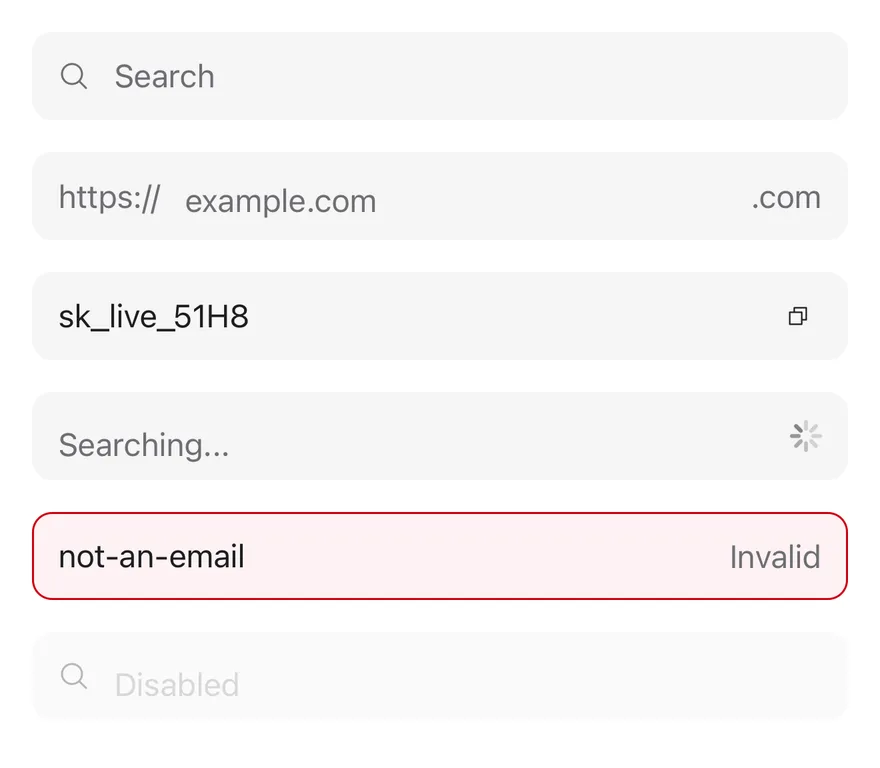
![Preview](https://ui.suiss.app/previews/components-input-group--default.light.webp)

```tsx
import { CopyIcon, MagnifyingGlassIcon, XIcon } from "phosphor-react-native"
import * as React from "react"
import { View } from "react-native"
import { Icon } from "@/components/ui/icon"
import { InputGroup, InputGroupAddon, InputGroupButton, InputGroupInput, InputGroupText } from "@/components/ui/input-group"
import { Spinner } from "@/components/ui/spinner"

function SearchDemo() {
  const [value, setValue] = React.useState("")
  return (
    <InputGroup>
      <InputGroupInput
        placeholder="Search"
        value={value}
        onValueChange={setValue}
      />
      <InputGroupAddon>
        <Icon as={MagnifyingGlassIcon} />
      </InputGroupAddon>
      {value ? (
        <InputGroupAddon align="inline-end">
          <InputGroupButton
            size="icon-xs"
            accessibilityLabel="Clear"
            onPress={() => setValue("")}
          >
            <Icon as={XIcon} />
          </InputGroupButton>
        </InputGroupAddon>
      ) : null}
    </InputGroup>
  )
}

export function InputGroupExample() {
  return (
    <View className="gap-4">
      <SearchDemo />
      <InputGroup>
        <InputGroupAddon>
          <InputGroupText>https://</InputGroupText>
        </InputGroupAddon>
        <InputGroupInput placeholder="example.com" autoCapitalize="none" />
        <InputGroupAddon align="inline-end">
          <InputGroupText>.com</InputGroupText>
        </InputGroupAddon>
      </InputGroup>
      <InputGroup>
        <InputGroupInput defaultValue="sk_live_51H8" />
        <InputGroupAddon align="inline-end">
          <InputGroupButton size="icon-xs" accessibilityLabel="Copy">
            <Icon as={CopyIcon} />
          </InputGroupButton>
        </InputGroupAddon>
      </InputGroup>
      <InputGroup>
        <InputGroupInput placeholder="Searching..." />
        <InputGroupAddon align="inline-end">
          <Spinner />
        </InputGroupAddon>
      </InputGroup>
      <InputGroup invalid>
        <InputGroupInput defaultValue="not-an-email" />
        <InputGroupAddon align="inline-end">
          <InputGroupText>Invalid</InputGroupText>
        </InputGroupAddon>
      </InputGroup>
      <InputGroup disabled>
        <InputGroupInput placeholder="Disabled" />
        <InputGroupAddon>
          <Icon as={MagnifyingGlassIcon} />
        </InputGroupAddon>
      </InputGroup>
    </View>
  )
}
```

```swift
import EsuissUI
import PhosphorSwift
import SwiftUI

struct InputGroupIcon: View {
  let image: Image

  var body: some View {
    image.frame(width: 16, height: 16)
  }
}

struct InputGroupSearchDemo: View {
  @State private var value = ""

  var body: some View {
    InputGroup {
      InputGroupInput("Search", text: $value)
      InputGroupAddon {
        InputGroupIcon(image: Ph.magnifyingGlass.regular)
      }
      if !value.isEmpty {
        InputGroupAddon(align: .inlineEnd) {
          InputGroupButton(size: .iconXs) {
            value = ""
          } label: {
            InputGroupIcon(image: Ph.x.regular)
          }
          .accessibilityLabel(Text("Clear"))
        }
      }
    }
  }
}

struct InputGroupDefaultDemo: View {
  @State private var domain = ""
  @State private var key = "sk_live_51H8"
  @State private var searching = ""
  @State private var email = "not-an-email"
  @State private var disabled = ""

  var body: some View {
    VStack(alignment: .leading, spacing: 16) {
      InputGroupSearchDemo()
      InputGroup {
        InputGroupAddon {
          InputGroupText("https://")
        }
        InputGroupInput("example.com", text: $domain)
          .textInputAutocapitalization(.never)
        InputGroupAddon(align: .inlineEnd) {
          InputGroupText(".com")
        }
      }
      InputGroup {
        InputGroupInput("", text: $key)
        InputGroupAddon(align: .inlineEnd) {
          InputGroupButton(size: .iconXs) {} label: {
            InputGroupIcon(image: Ph.copy.regular)
          }
          .accessibilityLabel(Text("Copy"))
        }
      }
      InputGroup {
        InputGroupInput("Searching...", text: $searching)
        InputGroupAddon(align: .inlineEnd) {
          Spinner()
        }
      }
      InputGroup {
        InputGroupInput("", text: $email)
        InputGroupAddon(align: .inlineEnd) {
          InputGroupText("Invalid")
        }
      }
      .invalid()
      InputGroup {
        InputGroupInput("Disabled", text: $disabled)
        InputGroupAddon {
          InputGroupIcon(image: Ph.magnifyingGlass.regular)
        }
      }
      .disabled(true)
    }
  }
}
```

```kotlin
import androidx.compose.foundation.layout.Arrangement
import androidx.compose.foundation.layout.Column
import androidx.compose.foundation.layout.fillMaxWidth
import androidx.compose.foundation.text.KeyboardOptions
import androidx.compose.runtime.Composable
import androidx.compose.runtime.getValue
import androidx.compose.runtime.mutableStateOf
import androidx.compose.runtime.saveable.rememberSaveable
import androidx.compose.runtime.setValue
import androidx.compose.ui.Modifier
import androidx.compose.ui.text.input.KeyboardCapitalization
import androidx.compose.ui.unit.dp
import com.adamglin.PhosphorIcons
import com.adamglin.phosphoricons.Regular
import com.adamglin.phosphoricons.regular.Copy
import com.adamglin.phosphoricons.regular.MagnifyingGlass
import com.adamglin.phosphoricons.regular.X
import com.esuiss.ui.components.Icon
import com.esuiss.ui.components.InputGroup
import com.esuiss.ui.components.InputGroupAddon
import com.esuiss.ui.components.InputGroupAddonAlign
import com.esuiss.ui.components.InputGroupButton
import com.esuiss.ui.components.InputGroupButtonSize
import com.esuiss.ui.components.InputGroupInput
import com.esuiss.ui.components.InputGroupText
import com.esuiss.ui.components.Spinner

@Composable
fun InputGroupSearch() {
    var value by rememberSaveable { mutableStateOf("") }
    InputGroup {
        InputGroupInput(value, { value = it }, placeholder = "Search")
        InputGroupAddon {
            Icon(PhosphorIcons.Regular.MagnifyingGlass, contentDescription = null)
        }
        if (value.isNotEmpty()) {
            InputGroupAddon(align = InputGroupAddonAlign.InlineEnd) {
                InputGroupButton(onClick = { value = "" }, size = InputGroupButtonSize.IconXs) {
                    Icon(PhosphorIcons.Regular.X, contentDescription = "Clear")
                }
            }
        }
    }
}

@Composable
fun InputGroupDefault() {
    var domain by rememberSaveable { mutableStateOf("") }
    var key by rememberSaveable { mutableStateOf("sk_live_51H8") }
    var searching by rememberSaveable { mutableStateOf("") }
    var email by rememberSaveable { mutableStateOf("not-an-email") }
    var disabled by rememberSaveable { mutableStateOf("") }
    Column(Modifier.fillMaxWidth(), verticalArrangement = Arrangement.spacedBy(16.dp)) {
        InputGroupSearch()
        InputGroup {
            InputGroupAddon { InputGroupText("https://") }
            InputGroupInput(
                domain,
                { domain = it },
                placeholder = "example.com",
                keyboardOptions = KeyboardOptions(capitalization = KeyboardCapitalization.None),
            )
            InputGroupAddon(align = InputGroupAddonAlign.InlineEnd) { InputGroupText(".com") }
        }
        InputGroup {
            InputGroupInput(key, { key = it })
            InputGroupAddon(align = InputGroupAddonAlign.InlineEnd) {
                InputGroupButton(onClick = {}, size = InputGroupButtonSize.IconXs) {
                    Icon(PhosphorIcons.Regular.Copy, contentDescription = "Copy")
                }
            }
        }
        InputGroup {
            InputGroupInput(searching, { searching = it }, placeholder = "Searching...")
            InputGroupAddon(align = InputGroupAddonAlign.InlineEnd) { Spinner() }
        }
        InputGroup(invalid = true) {
            InputGroupInput(email, { email = it })
            InputGroupAddon(align = InputGroupAddonAlign.InlineEnd) { InputGroupText("Invalid") }
        }
        InputGroup(enabled = false) {
            InputGroupInput(disabled, { disabled = it }, placeholder = "Disabled")
            InputGroupAddon {
                Icon(PhosphorIcons.Regular.MagnifyingGlass, contentDescription = null)
            }
        }
    }
}
```

`InputGroup` draws one `bg-secondary` field and places an `InputGroupInput` or `InputGroupTextarea` inside it with addons around. Addons can sit on the start or end of the same line (`inline-start`, `inline-end`), or above or below the input (`block-start`, `block-end`), which turns the group into a column.

The group shows the focus border while its input is focused, and reads the disabled and invalid state from a surrounding Field. Pressing an addon focuses the input.

## Installation

**React Native**

```bash title="Terminal"
npx shadcn@latest add @esuiss-rn/input-group
```

See [Installation](https://ui.suiss.app/docs/installation) for the `components.json` setup. Or use the suiss/ui CLI:

```bash title="Terminal"
npx @esuiss/ui@latest add input-group
```

**SwiftUI**

```bash title="Terminal"
npx @esuiss/ui@latest add input-group --platform swift
```

**Jetpack Compose**

```bash title="Terminal"
npx @esuiss/ui@latest add input-group --platform kotlin
```

The CLI also adds what it builds on: [Button](https://ui.suiss.app/docs/components/button), [Icon](https://ui.suiss.app/docs/components/icon), [Input](https://ui.suiss.app/docs/components/input), [Text](https://ui.suiss.app/docs/components/text), [Textarea](https://ui.suiss.app/docs/components/textarea).

### Manual

**React Native**

**Uniwind**

1. Install the dependencies:

```bash title="Terminal"
npx expo install class-variance-authority cn
```

2. Add the pieces it builds on: [Button](https://ui.suiss.app/docs/components/button), [Icon](https://ui.suiss.app/docs/components/icon), [Input](https://ui.suiss.app/docs/components/input), [Text](https://ui.suiss.app/docs/components/text), [Textarea](https://ui.suiss.app/docs/components/textarea), and the primitives `components/primitives/field.tsx`, `components/primitives/use-render.tsx`.

3. Copy the source into `components/ui/input-group.tsx`:

```tsx title="uniwind/components/ui/input-group.tsx"
import { cva, type VariantProps } from "class-variance-authority"
import { cn } from "cn"
import * as React from "react"
import { Pressable, type TextInput, View, type ViewProps } from "react-native"
import { useFieldRootContext } from "@/components/primitives/field"
import { resolveClassName } from "@/components/primitives/use-render"
import { Button } from "@/components/ui/button"
import { IconClassContext } from "@/components/ui/icon"
import { Input } from "@/components/ui/input"
import { Text, TextClassContext } from "@/components/ui/text"
import { Textarea } from "@/components/ui/textarea"

type InputGroupAlign =
  | "inline-start"
  | "inline-end"
  | "block-start"
  | "block-end"

type InputGroupContextProps = {
  block: boolean
  disabled: boolean
  inputRef: React.RefObject<React.ComponentRef<typeof TextInput> | null>
  setFocused: (focused: boolean) => void
}

const InputGroupContext = React.createContext<InputGroupContextProps | null>(
  null
)

function useInputGroup() {
  const context = React.useContext(InputGroupContext)
  if (!context) {
    throw new Error("useInputGroup must be used within an <InputGroup />")
  }
  return context
}

const START: InputGroupAlign[] = ["inline-start", "block-start"]

function alignOf(node: React.ReactNode): InputGroupAlign | null {
  if (!React.isValidElement<{ align?: InputGroupAlign }>(node)) return null
  if (node.type !== InputGroupAddon) return null
  return node.props.align ?? "inline-start"
}

function InputGroup({
  className,
  children,
  disabled = false,
  invalid,
  ...props
}: ViewProps & { disabled?: boolean; invalid?: boolean }) {
  const field = useFieldRootContext()
  const inputRef = React.useRef<React.ComponentRef<typeof TextInput> | null>(
    null
  )
  const [focused, setFocused] = React.useState(false)
  const isDisabled = disabled || field.state.disabled
  const isInvalid = invalid ?? field.state.invalid
  const nodes = React.Children.toArray(children)
  const aligns = nodes.map(alignOf)
  const block = aligns.some(
    (align) => align === "block-start" || align === "block-end"
  )
  const multiline = nodes.some(
    (node) => React.isValidElement(node) && node.type === InputGroupTextarea
  )
  const ordered = [
    ...nodes.filter((_, index) =>
      START.includes(aligns[index] as InputGroupAlign)
    ),
    ...nodes.filter((_, index) => aligns[index] === null),
    ...nodes.filter(
      (_, index) =>
        aligns[index] !== null &&
        !START.includes(aligns[index] as InputGroupAlign)
    ),
  ]
  const contextValue = React.useMemo(
    () => ({ block, disabled: isDisabled, inputRef, setFocused }),
    [block, isDisabled]
  )
  return (
    <InputGroupContext.Provider value={contextValue}>
      <View
        role="group"
        className={cn(
          "relative h-11 w-full min-w-0 flex-row items-center rounded-lg border border-transparent bg-secondary",
          (block || multiline) && "h-auto rounded-xl",
          block && "flex-col items-stretch",
          focused && "border-ring ring-3 ring-ring/50",
          isInvalid &&
            "border-destructive bg-destructive/5 dark:bg-destructive/10",
          isDisabled && "opacity-50",
          className
        )}
        {...props}
      >
        {ordered}
      </View>
    </InputGroupContext.Provider>
  )
}

const inputGroupAddonVariants = cva(
  "flex-row items-center justify-center gap-2 py-2",
  {
    variants: {
      align: {
        "inline-start": "ps-3",
        "inline-end": "pe-3",
        "block-start": "w-full justify-start px-3 pt-3",
        "block-end": "w-full justify-start px-3 pb-3",
      },
    },
    defaultVariants: {
      align: "inline-start",
    },
  }
)

function InputGroupAddon({
  className,
  align = "inline-start",
  onPress,
  ...props
}: React.ComponentProps<typeof Pressable> &
  VariantProps<typeof inputGroupAddonVariants>) {
  const { inputRef } = useInputGroup()
  return (
    <TextClassContext.Provider value="text-base text-muted-foreground">
      <IconClassContext.Provider value="size-4 text-muted-foreground">
        <Pressable
          accessible={false}
          className={cn(inputGroupAddonVariants({ align }), className)}
          onPress={(event) => {
            onPress?.(event)
            inputRef.current?.focus()
          }}
          {...props}
        />
      </IconClassContext.Provider>
    </TextClassContext.Provider>
  )
}

const BUTTON_SIZE = {
  xs: "xs",
  sm: "sm",
  "icon-xs": "icon-xs",
  "icon-sm": "icon-sm",
} as const

function InputGroupButton({
  className,
  variant = "ghost",
  size = "xs",
  ...props
}: Omit<React.ComponentProps<typeof Button>, "size"> & {
  size?: keyof typeof BUTTON_SIZE
}) {
  return (
    <Button
      variant={variant}
      size={BUTTON_SIZE[size]}
      className={cn("rounded-full", size === "xs" && "px-1.5", className)}
      {...props}
    />
  )
}

function InputGroupText({
  className,
  ...props
}: React.ComponentProps<typeof Text>) {
  return <Text className={className} {...props} />
}

function InputGroupInput({
  className,
  onFocus,
  onBlur,
  ref,
  ...props
}: React.ComponentProps<typeof Input>) {
  const { block, disabled, inputRef, setFocused } = useInputGroup()
  return (
    <Input
      {...props}
      ref={(node: React.ComponentRef<typeof TextInput> | null) => {
        inputRef.current = node
        if (typeof ref === "function") ref(node)
        else if (ref) ref.current = node
      }}
      disabled={disabled || props.disabled}
      onFocus={(event) => {
        setFocused(true)
        onFocus?.(event)
      }}
      onBlur={(event) => {
        setFocused(false)
        onBlur?.(event)
      }}
      className={(state) =>
        cn(
          block ? "w-full" : "flex-1",
          "rounded-none border-0 bg-transparent",
          resolveClassName(className, state)
        )
      }
    />
  )
}

function InputGroupTextarea({
  className,
  onFocus,
  onBlur,
  ref,
  ...props
}: React.ComponentProps<typeof Textarea>) {
  const { disabled, inputRef, setFocused } = useInputGroup()
  return (
    <Textarea
      {...props}
      ref={(node: React.ComponentRef<typeof TextInput> | null) => {
        inputRef.current = node
        if (typeof ref === "function") ref(node)
        else if (ref) ref.current = node
      }}
      disabled={disabled || props.disabled}
      onFocus={(event) => {
        setFocused(true)
        onFocus?.(event)
      }}
      onBlur={(event) => {
        setFocused(false)
        onBlur?.(event)
      }}
      className={(state) =>
        cn(
          "w-full flex-1 rounded-none border-0 bg-transparent py-2.5",
          resolveClassName(className, state)
        )
      }
    />
  )
}

export {
  InputGroup,
  InputGroupAddon,
  InputGroupButton,
  InputGroupInput,
  InputGroupText,
  InputGroupTextarea,
}
```

4. Update the import paths to match your project.

**NativeWind**

1. Install the dependencies:

```bash title="Terminal"
npx expo install class-variance-authority cn
```

2. Add the pieces it builds on: [Button](https://ui.suiss.app/docs/components/button), [Icon](https://ui.suiss.app/docs/components/icon), [Input](https://ui.suiss.app/docs/components/input), [Text](https://ui.suiss.app/docs/components/text), [Textarea](https://ui.suiss.app/docs/components/textarea), and the primitives `components/primitives/field.tsx`, `components/primitives/use-render.tsx`.

3. Copy the source into `components/ui/input-group.tsx`:

```tsx title="nativewind/components/ui/input-group.tsx"
import { cva, type VariantProps } from "class-variance-authority"
import { cn } from "cn"
import * as React from "react"
import { Pressable, type TextInput, View, type ViewProps } from "react-native"
import { useFieldRootContext } from "@/components/primitives/field"
import { resolveClassName } from "@/components/primitives/use-render"
import { Button } from "@/components/ui/button"
import { IconClassContext } from "@/components/ui/icon"
import { Input } from "@/components/ui/input"
import { Text, TextClassContext } from "@/components/ui/text"
import { Textarea } from "@/components/ui/textarea"

type InputGroupAlign =
  | "inline-start"
  | "inline-end"
  | "block-start"
  | "block-end"

type InputGroupContextProps = {
  block: boolean
  disabled: boolean
  inputRef: React.RefObject<React.ComponentRef<typeof TextInput> | null>
  setFocused: (focused: boolean) => void
}

const InputGroupContext = React.createContext<InputGroupContextProps | null>(
  null
)

function useInputGroup() {
  const context = React.useContext(InputGroupContext)
  if (!context) {
    throw new Error("useInputGroup must be used within an <InputGroup />")
  }
  return context
}

const START: InputGroupAlign[] = ["inline-start", "block-start"]

function alignOf(node: React.ReactNode): InputGroupAlign | null {
  if (!React.isValidElement<{ align?: InputGroupAlign }>(node)) return null
  if (node.type !== InputGroupAddon) return null
  return node.props.align ?? "inline-start"
}

function InputGroup({
  className,
  children,
  disabled = false,
  invalid,
  ...props
}: ViewProps & { disabled?: boolean; invalid?: boolean }) {
  const field = useFieldRootContext()
  const inputRef = React.useRef<React.ComponentRef<typeof TextInput> | null>(
    null
  )
  const [focused, setFocused] = React.useState(false)
  const isDisabled = disabled || field.state.disabled
  const isInvalid = invalid ?? field.state.invalid
  const nodes = React.Children.toArray(children)
  const aligns = nodes.map(alignOf)
  const block = aligns.some(
    (align) => align === "block-start" || align === "block-end"
  )
  const multiline = nodes.some(
    (node) => React.isValidElement(node) && node.type === InputGroupTextarea
  )
  const ordered = [
    ...nodes.filter((_, index) =>
      START.includes(aligns[index] as InputGroupAlign)
    ),
    ...nodes.filter((_, index) => aligns[index] === null),
    ...nodes.filter(
      (_, index) =>
        aligns[index] !== null &&
        !START.includes(aligns[index] as InputGroupAlign)
    ),
  ]
  const contextValue = React.useMemo(
    () => ({ block, disabled: isDisabled, inputRef, setFocused }),
    [block, isDisabled]
  )
  return (
    <InputGroupContext.Provider value={contextValue}>
      <View
        role="group"
        className={cn(
          "relative h-11 w-full min-w-0 flex-row items-center rounded-lg border border-transparent bg-secondary",
          (block || multiline) && "h-auto rounded-xl",
          block && "flex-col items-stretch",
          focused && "border-ring ring ring-ring-50",
          isInvalid &&
            "border-destructive bg-destructive-5 dark:bg-destructive-10",
          isDisabled && "opacity-50",
          className
        )}
        {...props}
      >
        {ordered}
      </View>
    </InputGroupContext.Provider>
  )
}

const inputGroupAddonVariants = cva(
  "flex-row items-center justify-center gap-2 py-2",
  {
    variants: {
      align: {
        "inline-start": "ps-3",
        "inline-end": "pe-3",
        "block-start": "w-full justify-start px-3 pt-3",
        "block-end": "w-full justify-start px-3 pb-3",
      },
    },
    defaultVariants: {
      align: "inline-start",
    },
  }
)

function InputGroupAddon({
  className,
  align = "inline-start",
  onPress,
  ...props
}: React.ComponentProps<typeof Pressable> &
  VariantProps<typeof inputGroupAddonVariants>) {
  const { inputRef } = useInputGroup()
  return (
    <TextClassContext.Provider value="text-base text-muted-foreground">
      <IconClassContext.Provider value="size-4 text-muted-foreground">
        <Pressable
          accessible={false}
          className={cn(inputGroupAddonVariants({ align }), className)}
          onPress={(event) => {
            onPress?.(event)
            inputRef.current?.focus()
          }}
          {...props}
        />
      </IconClassContext.Provider>
    </TextClassContext.Provider>
  )
}

const BUTTON_SIZE = {
  xs: "xs",
  sm: "sm",
  "icon-xs": "icon-xs",
  "icon-sm": "icon-sm",
} as const

function InputGroupButton({
  className,
  variant = "ghost",
  size = "xs",
  ...props
}: Omit<React.ComponentProps<typeof Button>, "size"> & {
  size?: keyof typeof BUTTON_SIZE
}) {
  return (
    <Button
      variant={variant}
      size={BUTTON_SIZE[size]}
      className={cn("rounded-full", size === "xs" && "px-1.5", className)}
      {...props}
    />
  )
}

function InputGroupText({
  className,
  ...props
}: React.ComponentProps<typeof Text>) {
  return <Text className={className} {...props} />
}

function InputGroupInput({
  className,
  onFocus,
  onBlur,
  ref,
  ...props
}: React.ComponentProps<typeof Input>) {
  const { block, disabled, inputRef, setFocused } = useInputGroup()
  return (
    <Input
      {...props}
      ref={(node: React.ComponentRef<typeof TextInput> | null) => {
        inputRef.current = node
        if (typeof ref === "function") ref(node)
        else if (ref) ref.current = node
      }}
      disabled={disabled || props.disabled}
      onFocus={(event) => {
        setFocused(true)
        onFocus?.(event)
      }}
      onBlur={(event) => {
        setFocused(false)
        onBlur?.(event)
      }}
      className={(state) =>
        cn(
          block ? "w-full" : "flex-1",
          "rounded-none border-0 bg-transparent",
          resolveClassName(className, state)
        )
      }
    />
  )
}

function InputGroupTextarea({
  className,
  onFocus,
  onBlur,
  ref,
  ...props
}: React.ComponentProps<typeof Textarea>) {
  const { disabled, inputRef, setFocused } = useInputGroup()
  return (
    <Textarea
      {...props}
      ref={(node: React.ComponentRef<typeof TextInput> | null) => {
        inputRef.current = node
        if (typeof ref === "function") ref(node)
        else if (ref) ref.current = node
      }}
      disabled={disabled || props.disabled}
      onFocus={(event) => {
        setFocused(true)
        onFocus?.(event)
      }}
      onBlur={(event) => {
        setFocused(false)
        onBlur?.(event)
      }}
      className={(state) =>
        cn(
          "w-full flex-1 rounded-none border-0 bg-transparent py-2.5",
          resolveClassName(className, state)
        )
      }
    />
  )
}

export {
  InputGroup,
  InputGroupAddon,
  InputGroupButton,
  InputGroupInput,
  InputGroupText,
  InputGroupTextarea,
}
```

4. Update the import paths to match your project.

**StyleSheet**

1. Add the pieces it builds on: [Button](https://ui.suiss.app/docs/components/button), [Icon](https://ui.suiss.app/docs/components/icon), [Input](https://ui.suiss.app/docs/components/input), [Text](https://ui.suiss.app/docs/components/text), [Textarea](https://ui.suiss.app/docs/components/textarea), and the primitives `components/primitives/field.tsx`, `components/primitives/use-render.tsx`.

2. Copy the source into `components/ui/input-group.tsx`:

```tsx title="stylesheet/components/ui/input-group.tsx"
import * as React from "react"
import {
  Pressable,
  StyleSheet,
  type TextInput,
  View,
  type ViewProps,
} from "react-native"
import { useFieldRootContext } from "@/components/primitives/field"
import { Button, type ButtonSize } from "@/components/ui/button"
import { IconSizeContext } from "@/components/ui/icon"
import { Input } from "@/components/ui/input"
import { Text, TextStyleContext } from "@/components/ui/text"
import { Textarea } from "@/components/ui/textarea"
import { fontSize, radius, useTheme } from "@/components/ui/theme"

type InputGroupAlign =
  | "inline-start"
  | "inline-end"
  | "block-start"
  | "block-end"

type InputGroupContextProps = {
  block: boolean
  disabled: boolean
  inputRef: React.RefObject<React.ComponentRef<typeof TextInput> | null>
  setFocused: (focused: boolean) => void
}

const InputGroupContext = React.createContext<InputGroupContextProps | null>(
  null
)

function useInputGroup() {
  const context = React.useContext(InputGroupContext)
  if (!context) {
    throw new Error("useInputGroup must be used within an <InputGroup />")
  }
  return context
}

const START: InputGroupAlign[] = ["inline-start", "block-start"]

const styles = StyleSheet.create({
  root: {
    position: "relative",
    height: 44,
    width: "100%",
    minWidth: 0,
    flexDirection: "row",
    alignItems: "center",
    borderRadius: radius.lg,
    borderWidth: 1,
    borderColor: "transparent",
  },
  auto: { height: "auto", borderRadius: radius.xl },
  block: { flexDirection: "column", alignItems: "stretch" },
  addon: {
    flexDirection: "row",
    alignItems: "center",
    justifyContent: "center",
    gap: 8,
    paddingVertical: 8,
  },
  "inline-start": { paddingStart: 12 },
  "inline-end": { paddingEnd: 12 },
  "block-start": {
    width: "100%",
    justifyContent: "flex-start",
    paddingHorizontal: 12,
    paddingTop: 12,
  },
  "block-end": {
    width: "100%",
    justifyContent: "flex-start",
    paddingHorizontal: 12,
    paddingBottom: 12,
  },
  control: {
    borderRadius: 0,
    borderWidth: 0,
    backgroundColor: "transparent",
  },
})

function withAlpha(color: string, alpha: number) {
  if (!color.startsWith("#") || color.length !== 7) return color
  const r = Number.parseInt(color.slice(1, 3), 16)
  const g = Number.parseInt(color.slice(3, 5), 16)
  const b = Number.parseInt(color.slice(5, 7), 16)
  return `rgba(${r}, ${g}, ${b}, ${alpha})`
}

function alignOf(node: React.ReactNode): InputGroupAlign | null {
  if (!React.isValidElement<{ align?: InputGroupAlign }>(node)) return null
  if (node.type !== InputGroupAddon) return null
  return node.props.align ?? "inline-start"
}

function InputGroup({
  style,
  children,
  disabled = false,
  invalid,
  ...props
}: ViewProps & { disabled?: boolean; invalid?: boolean }) {
  const { colors, isDark } = useTheme()
  const field = useFieldRootContext()
  const inputRef = React.useRef<React.ComponentRef<typeof TextInput> | null>(
    null
  )
  const [focused, setFocused] = React.useState(false)
  const isDisabled = disabled || field.state.disabled
  const isInvalid = invalid ?? field.state.invalid
  const nodes = React.Children.toArray(children)
  const aligns = nodes.map(alignOf)
  const block = aligns.some(
    (align) => align === "block-start" || align === "block-end"
  )
  const multiline = nodes.some(
    (node) => React.isValidElement(node) && node.type === InputGroupTextarea
  )
  const ordered = [
    ...nodes.filter((_, index) =>
      START.includes(aligns[index] as InputGroupAlign)
    ),
    ...nodes.filter((_, index) => aligns[index] === null),
    ...nodes.filter(
      (_, index) =>
        aligns[index] !== null &&
        !START.includes(aligns[index] as InputGroupAlign)
    ),
  ]
  const contextValue = React.useMemo(
    () => ({ block, disabled: isDisabled, inputRef, setFocused }),
    [block, isDisabled]
  )
  return (
    <InputGroupContext.Provider value={contextValue}>
      <View
        role="group"
        style={[
          styles.root,
          { backgroundColor: colors.secondary },
          (block || multiline) && styles.auto,
          block && styles.block,
          focused && { borderColor: colors.ring },
          isInvalid && {
            borderColor: colors.destructive,
            backgroundColor: withAlpha(colors.destructive, isDark ? 0.1 : 0.05),
          },
          isDisabled && { opacity: 0.5 },
          style,
        ]}
        {...props}
      >
        {ordered}
      </View>
    </InputGroupContext.Provider>
  )
}

function InputGroupAddon({
  style,
  align = "inline-start",
  onPress,
  ...props
}: React.ComponentProps<typeof Pressable> & { align?: InputGroupAlign }) {
  const { colors } = useTheme()
  const { inputRef } = useInputGroup()
  const color = colors.mutedForeground
  return (
    <TextStyleContext.Provider value={{ ...fontSize.base, color }}>
      <IconSizeContext.Provider value={16}>
        <Pressable
          accessible={false}
          style={(state) => [
            styles.addon,
            styles[align],
            typeof style === "function" ? style(state) : style,
          ]}
          onPress={(event) => {
            onPress?.(event)
            inputRef.current?.focus()
          }}
          {...props}
        />
      </IconSizeContext.Provider>
    </TextStyleContext.Provider>
  )
}

const BUTTON_SIZE = {
  xs: "xs",
  sm: "sm",
  "icon-xs": "icon-xs",
  "icon-sm": "icon-sm",
} as const satisfies Record<string, ButtonSize>

function InputGroupButton({
  style,
  variant = "ghost",
  size = "xs",
  ...props
}: Omit<React.ComponentProps<typeof Button>, "size"> & {
  size?: keyof typeof BUTTON_SIZE
}) {
  return (
    <Button
      variant={variant}
      size={BUTTON_SIZE[size]}
      style={(state) => [
        { borderRadius: radius.full },
        size === "xs" && { paddingHorizontal: 6 },
        typeof style === "function" ? style(state) : style,
      ]}
      {...props}
    />
  )
}

function InputGroupText(props: React.ComponentProps<typeof Text>) {
  return <Text {...props} />
}

type FocusHandler = NonNullable<React.ComponentProps<typeof Input>["onFocus"]>

type BlurHandler = NonNullable<React.ComponentProps<typeof Input>["onBlur"]>

function useControl(
  ref: React.Ref<React.ComponentRef<typeof TextInput>> | undefined,
  onFocus: FocusHandler | undefined,
  onBlur: BlurHandler | undefined
) {
  const { block, disabled, inputRef, setFocused } = useInputGroup()
  return {
    block,
    disabled,
    ref: (node: React.ComponentRef<typeof TextInput> | null) => {
      inputRef.current = node
      if (typeof ref === "function") ref(node)
      else if (ref) ref.current = node
    },
    onFocus: (event: Parameters<FocusHandler>[0]) => {
      setFocused(true)
      onFocus?.(event)
    },
    onBlur: (event: Parameters<BlurHandler>[0]) => {
      setFocused(false)
      onBlur?.(event)
    },
  }
}

function InputGroupInput({
  style,
  onFocus,
  onBlur,
  ref,
  ...props
}: React.ComponentProps<typeof Input>) {
  const control = useControl(ref, onFocus, onBlur)
  return (
    <Input
      {...props}
      ref={control.ref}
      disabled={control.disabled || props.disabled}
      onFocus={control.onFocus}
      onBlur={control.onBlur}
      style={(state) => [
        styles.control,
        control.block ? { width: "100%" } : { flex: 1 },
        typeof style === "function" ? style(state) : style,
      ]}
    />
  )
}

function InputGroupTextarea({
  style,
  onFocus,
  onBlur,
  ref,
  ...props
}: React.ComponentProps<typeof Textarea>) {
  const control = useControl(ref, onFocus, onBlur)
  return (
    <Textarea
      {...props}
      ref={control.ref}
      disabled={control.disabled || props.disabled}
      onFocus={control.onFocus}
      onBlur={control.onBlur}
      style={(state) => [
        styles.control,
        { width: "100%", flex: 1, paddingVertical: 10 },
        typeof style === "function" ? style(state) : style,
      ]}
    />
  )
}

export {
  InputGroup,
  InputGroupAddon,
  InputGroupButton,
  InputGroupInput,
  InputGroupText,
  InputGroupTextarea,
}
```

3. Update the import paths to match your project.

**SwiftUI**

1. Target iOS 17 or later.

2. Add the Swift package to your app:

```swift title="Package.swift"
.package(url: "https://github.com/phosphor-icons/swift", from: "2.1.0")
```

3. Copy the theme files every view uses:

- `swift/Theme/Theme.swift`: [source](https://github.com/e-suiss/ui/blob/main/packages/mobile/swiftui/Sources/EsuissUI/Theme/Theme.swift)

- `swift/Theme/Tokens.swift`: [source](https://github.com/e-suiss/ui/blob/main/packages/mobile/swiftui/Sources/EsuissUI/Theme/Tokens.swift)

4. Copy the source and every file it uses:

```swift title="swift/Components/InputGroup.swift"
import SwiftUI

public enum InputGroupAddonAlign: CaseIterable, Sendable, Hashable {
  case inlineStart, inlineEnd, blockStart, blockEnd

  var isBlock: Bool {
    self == .blockStart || self == .blockEnd
  }
}

struct InputGroupContext: Sendable {
  var focusRequest = 0
  var addons: Set<InputGroupAddonAlign> = []
  var requestFocus: @MainActor @Sendable () -> Void = {}
}

extension EnvironmentValues {
  @Entry var inputGroup: InputGroupContext? = nil
}

struct InputGroupAddonsKey: PreferenceKey {
  static var defaultValue: Set<InputGroupAddonAlign> { [] }

  static func reduce(value: inout Set<InputGroupAddonAlign>, nextValue: () -> Set<InputGroupAddonAlign>) {
    value.formUnion(nextValue())
  }
}

struct InputGroupFocusedKey: PreferenceKey {
  static var defaultValue: Bool { false }

  static func reduce(value: inout Bool, nextValue: () -> Bool) {
    value = value || nextValue()
  }
}

struct InputGroupMultilineKey: PreferenceKey {
  static var defaultValue: Bool { false }

  static func reduce(value: inout Bool, nextValue: () -> Bool) {
    value = value || nextValue()
  }
}

struct InputGroupButtonKey: PreferenceKey {
  static var defaultValue: Bool { false }

  static func reduce(value: inout Bool, nextValue: () -> Bool) {
    value = value || nextValue()
  }
}

enum InputGroupSlot: Sendable, Equatable {
  case control
  case addon(InputGroupAddonAlign)
}

struct InputGroupSlotKey: LayoutValueKey {
  static let defaultValue = InputGroupSlot.control
}

public struct InputGroup<Content: View>: View {
  let content: Content

  @State private var focusRequest = 0
  @State private var addons: Set<InputGroupAddonAlign> = []
  @State private var focused = false
  @State private var multiline = false
  @Environment(\.isEnabled) private var isEnabled
  @Environment(\.isInvalid) private var invalid
  @Environment(\.colorScheme) private var colorScheme

  public init(@ViewBuilder content: () -> Content) {
    self.content = content()
  }

  public var body: some View {
    let request = $focusRequest
    let rounded = multiline || addons.contains(.blockStart) || addons.contains(.blockEnd)
    ButtonGroupItem(radius: rounded ? Radius.xl : Radius.lg) { shape in
      InputGroupLayout {
        content
      }
      .frame(maxWidth: .infinity, minHeight: 44)
      .environment(
        \.inputGroup,
        InputGroupContext(
          focusRequest: focusRequest,
          addons: addons,
          requestFocus: { request.wrappedValue += 1 }
        )
      )
      .onPreferenceChange(InputGroupAddonsKey.self) { addons = $0 }
      .onPreferenceChange(InputGroupFocusedKey.self) { focused = $0 }
      .onPreferenceChange(InputGroupMultilineKey.self) { multiline = $0 }
      .background(background, in: shape)
      .overlay {
        shape.strokeBorder(border, lineWidth: 1)
      }
      .contentShape(shape)
    }
    .accessibilityElement(children: .contain)
  }

  private var background: Color {
    if invalid { return EsuissColor.destructive.opacity(colorScheme == .dark ? 0.1 : 0.05) }
    return EsuissColor.secondary
  }

  private var border: Color {
    if invalid { return EsuissColor.destructive }
    return focused ? EsuissColor.ring : .clear
  }
}

struct InputGroupLayout: Layout {
  private struct Rows {
    var top: [Int] = []
    var leading: [Int] = []
    var controls: [Int] = []
    var trailing: [Int] = []
    var bottom: [Int] = []
  }

  private func rows(_ subviews: Subviews) -> Rows {
    var rows = Rows()
    for index in subviews.indices {
      switch subviews[index][InputGroupSlotKey.self] {
      case .control: rows.controls.append(index)
      case .addon(.inlineStart): rows.leading.append(index)
      case .addon(.inlineEnd): rows.trailing.append(index)
      case .addon(.blockStart): rows.top.append(index)
      case .addon(.blockEnd): rows.bottom.append(index)
      }
    }
    return rows
  }

  private func middle(_ rows: Rows, subviews: Subviews, width: CGFloat?) -> [(Int, CGFloat)] {
    let fixed = (rows.leading + rows.trailing).map { ($0, subviews[$0].sizeThatFits(.unspecified).width) }
    let used = fixed.reduce(0) { $0 + $1.1 }
    let share: CGFloat
    if let width, !rows.controls.isEmpty {
      share = max(width - used, 0) / CGFloat(rows.controls.count)
    } else {
      share = 0
    }
    let widths = Dictionary(uniqueKeysWithValues: fixed)
    let ordered = rows.leading + rows.controls + rows.trailing
    return ordered.map { index in
      if let fixedWidth = widths[index] { return (index, fixedWidth) }
      return (index, width == nil ? subviews[index].sizeThatFits(.unspecified).width : share)
    }
  }

  func sizeThatFits(proposal: ProposedViewSize, subviews: Subviews, cache: inout ()) -> CGSize {
    let rows = rows(subviews)
    let width = proposal.width
    var height: CGFloat = 0
    var widest: CGFloat = 0
    for index in rows.top + rows.bottom {
      let size = subviews[index].sizeThatFits(ProposedViewSize(width: width, height: nil))
      height += size.height
      widest = max(widest, size.width)
    }
    let line = middle(rows, subviews: subviews, width: width)
    var lineHeight: CGFloat = 0
    var lineWidth: CGFloat = 0
    for (index, itemWidth) in line {
      lineHeight = max(lineHeight, subviews[index].sizeThatFits(ProposedViewSize(width: itemWidth, height: nil)).height)
      lineWidth += itemWidth
    }
    height += lineHeight
    return CGSize(width: width ?? max(widest, lineWidth), height: height)
  }

  func placeSubviews(in bounds: CGRect, proposal: ProposedViewSize, subviews: Subviews, cache: inout ()) {
    let rows = rows(subviews)
    var y = bounds.minY
    for index in rows.top {
      let size = subviews[index].sizeThatFits(ProposedViewSize(width: bounds.width, height: nil))
      subviews[index].place(at: CGPoint(x: bounds.minX, y: y), anchor: .topLeading, proposal: ProposedViewSize(width: bounds.width, height: size.height))
      y += size.height
    }
    var bottomHeight: CGFloat = 0
    for index in rows.bottom {
      bottomHeight += subviews[index].sizeThatFits(ProposedViewSize(width: bounds.width, height: nil)).height
    }
    let line = middle(rows, subviews: subviews, width: bounds.width)
    let lineHeight = max(bounds.maxY - bottomHeight - y, 0)
    var x = bounds.minX
    for (index, width) in line {
      let height = subviews[index].sizeThatFits(ProposedViewSize(width: width, height: nil)).height
      let control = subviews[index][InputGroupSlotKey.self] == .control
      let placed = control ? max(height, lineHeight) : height
      subviews[index].place(
        at: CGPoint(x: x, y: y + (lineHeight - placed) / 2),
        anchor: .topLeading,
        proposal: ProposedViewSize(width: width, height: placed)
      )
      x += width
    }
    y += lineHeight
    for index in rows.bottom {
      let size = subviews[index].sizeThatFits(ProposedViewSize(width: bounds.width, height: nil))
      subviews[index].place(at: CGPoint(x: bounds.minX, y: y), anchor: .topLeading, proposal: ProposedViewSize(width: bounds.width, height: size.height))
      y += size.height
    }
  }
}

public struct InputGroupAddon<Content: View>: View {
  let align: InputGroupAddonAlign
  let content: Content

  @State private var hasButton = false
  @Environment(\.inputGroup) private var group
  @Environment(\.isEnabled) private var isEnabled

  public init(align: InputGroupAddonAlign = .inlineStart, @ViewBuilder content: () -> Content) {
    self.align = align
    self.content = content()
  }

  public var body: some View {
    HStack(spacing: 8) {
      content
    }
    .labelStyle(ButtonLabelStyle(spacing: 8, iconSize: 16))
    .scaledFont(.base)
    .foregroundStyle(EsuissColor.mutedForeground)
    .opacity(isEnabled ? 1 : 0.5)
    .lineLimit(1)
    .padding(.vertical, align.isBlock ? 0 : 8)
    .padding(.top, align == .blockStart ? 12 : 0)
    .padding(.bottom, align == .blockEnd ? 12 : 0)
    .padding(.leading, leading)
    .padding(.trailing, trailing)
    .frame(maxWidth: align.isBlock ? .infinity : nil, alignment: .leading)
    .contentShape(Rectangle())
    .onTapGesture { group?.requestFocus() }
    .onPreferenceChange(InputGroupButtonKey.self) { hasButton = $0 }
    .transformPreference(InputGroupButtonKey.self) { $0 = false }
    .preference(key: InputGroupAddonsKey.self, value: [align])
    .layoutValue(key: InputGroupSlotKey.self, value: .addon(align))
  }

  private var leading: CGFloat {
    switch align {
    case .inlineStart: hasButton ? 8 : 12
    case .inlineEnd: 0
    case .blockStart, .blockEnd: 12
    }
  }

  private var trailing: CGFloat {
    switch align {
    case .inlineEnd: hasButton ? 8 : 12
    case .inlineStart: 0
    case .blockStart, .blockEnd: 12
    }
  }
}

public enum InputGroupButtonSize: CaseIterable, Sendable {
  case xs, sm, iconXs, iconSm
}

public struct InputGroupButton<Label: View>: View {
  public typealias Size = InputGroupButtonSize

  let variant: VariantButtonStyle.Variant
  let size: Size
  let action: () -> Void
  let label: Label

  public init(
    variant: VariantButtonStyle.Variant = .ghost,
    size: Size = .xs,
    action: @escaping () -> Void,
    @ViewBuilder label: () -> Label
  ) {
    self.variant = variant
    self.size = size
    self.action = action
    self.label = label()
  }

  public var body: some View {
    Button(action: action) {
      label
    }
    .buttonStyle(style)
    .preference(key: InputGroupButtonKey.self, value: true)
  }

  private var style: VariantButtonStyle {
    switch size {
    case .xs:
      VariantButtonStyle(variant, size: .xs, metrics: ButtonMetrics(horizontalPadding: 6, spacing: 4, iconSize: 14, textStyle: .sm))
    case .sm:
      VariantButtonStyle(variant, size: .sm)
    case .iconXs:
      VariantButtonStyle(variant, size: .iconXs, metrics: ButtonMetrics(horizontalPadding: 0, spacing: 4, iconSize: 14, textStyle: .sm))
    case .iconSm:
      VariantButtonStyle(variant, size: .iconSm)
    }
  }
}

extension InputGroupButton where Label == Text {
  public init(
    _ title: LocalizedStringKey,
    variant: VariantButtonStyle.Variant = .ghost,
    size: Size = .xs,
    action: @escaping () -> Void
  ) {
    self.init(variant: variant, size: size, action: action) { Text(title) }
  }
}

public struct InputGroupText<Content: View>: View {
  let content: Content

  public init(@ViewBuilder content: () -> Content) {
    self.content = content()
  }

  public var body: some View {
    HStack(spacing: 8) {
      content
    }
    .labelStyle(ButtonLabelStyle(spacing: 8, iconSize: 16))
    .scaledFont(.base)
    .foregroundStyle(EsuissColor.mutedForeground)
  }
}

extension InputGroupText where Content == Text {
  public init(_ text: LocalizedStringKey) {
    self.init { Text(text) }
  }

  public init(verbatim text: String) {
    self.init { Text(verbatim: text) }
  }
}

public struct InputGroupInput: View {
  let title: LocalizedStringKey
  let text: Binding<String>

  @Environment(\.inputGroup) private var group
  @Environment(\.isEnabled) private var isEnabled

  public init(_ title: LocalizedStringKey, text: Binding<String>) {
    self.title = title
    self.text = text
  }

  public var body: some View {
    let addons = group?.addons ?? []
    TextField(title, text: text)
      .textFieldStyle(.plain)
      .scaledFont(.base)
      .foregroundStyle(EsuissColor.foreground)
      .tint(EsuissColor.primary)
      .opacity(isEnabled ? 1 : 0.5)
      .padding(.leading, addons.contains(.inlineStart) ? 6 : 12)
      .padding(.trailing, addons.contains(.inlineEnd) ? 6 : 12)
      .frame(maxWidth: .infinity, minHeight: 44)
      .modifier(InputGroupFocus(request: group?.focusRequest ?? 0))
      .layoutValue(key: InputGroupSlotKey.self, value: .control)
  }
}

public struct InputGroupTextarea: View {
  let title: LocalizedStringKey
  let text: Binding<String>
  let lineLimit: ClosedRange<Int>

  @Environment(\.inputGroup) private var group
  @Environment(\.isEnabled) private var isEnabled

  public init(_ title: LocalizedStringKey, text: Binding<String>, lineLimit: ClosedRange<Int> = 2...8) {
    self.title = title
    self.text = text
    self.lineLimit = lineLimit
  }

  public var body: some View {
    TextField(title, text: text, axis: .vertical)
      .textFieldStyle(.plain)
      .lineLimit(lineLimit)
      .scaledFont(.base)
      .foregroundStyle(EsuissColor.foreground)
      .tint(EsuissColor.primary)
      .opacity(isEnabled ? 1 : 0.5)
      .padding(.horizontal, 12)
      .padding(.vertical, 10)
      .frame(maxWidth: .infinity, alignment: .topLeading)
      .modifier(InputGroupFocus(request: group?.focusRequest ?? 0))
      .preference(key: InputGroupMultilineKey.self, value: true)
      .layoutValue(key: InputGroupSlotKey.self, value: .control)
  }
}

struct InputGroupFocus: ViewModifier {
  let request: Int

  @FocusState private var focused: Bool

  func body(content: Content) -> some View {
    content
      .focused($focused)
      .contentShape(Rectangle())
      .onTapGesture { focused = true }
      .onChange(of: request) { focused = true }
      .preference(key: InputGroupFocusedKey.self, value: focused)
  }
}
```

- `swift/Components/Button.swift`: see [Button](https://ui.suiss.app/docs/components/button.md)

- `swift/Components/ButtonGroup.swift`: see [Button Group](https://ui.suiss.app/docs/components/button-group.md)

- `swift/Components/Checkbox.swift`: see [Checkbox](https://ui.suiss.app/docs/components/checkbox.md)

- `swift/Components/Field.swift`: see [Field](https://ui.suiss.app/docs/components/field.md)

- `swift/Components/Haptics.swift`: see [Haptics](https://ui.suiss.app/docs/components/haptics.md)

- `swift/Components/Separator.swift`: see [Separator](https://ui.suiss.app/docs/components/separator.md)

- `swift/Components/TextVariant.swift`: [source](https://github.com/e-suiss/ui/blob/main/packages/mobile/swiftui/Sources/EsuissUI/Components/TextVariant.swift)

5. Add the files to your app target.

**Jetpack Compose**

1. Set `minSdk` to 24 or higher and add the dependencies:

```kotlin title="build.gradle.kts"
implementation(platform("androidx.compose:compose-bom:2026.09.00"))
implementation("androidx.compose.foundation:foundation")
implementation("androidx.compose.ui:ui")
```

2. Copy the theme files every view uses:

- `kotlin/theme/Theme.kt`: [source](https://github.com/e-suiss/ui/blob/main/packages/mobile/kotlin/ui/src/main/kotlin/com/esuiss/ui/theme/Theme.kt)

- `kotlin/theme/Tokens.kt`: [source](https://github.com/e-suiss/ui/blob/main/packages/mobile/kotlin/ui/src/main/kotlin/com/esuiss/ui/theme/Tokens.kt)

3. Copy the source and every file it uses:

```kt title="kotlin/components/InputGroup.kt"
package com.esuiss.ui.components

import androidx.compose.foundation.gestures.detectTapGestures
import androidx.compose.foundation.layout.Arrangement
import androidx.compose.foundation.layout.Box
import androidx.compose.foundation.layout.Row
import androidx.compose.foundation.layout.RowScope
import androidx.compose.foundation.layout.fillMaxWidth
import androidx.compose.foundation.layout.padding
import androidx.compose.foundation.shape.RoundedCornerShape
import androidx.compose.foundation.text.BasicText
import androidx.compose.foundation.text.BasicTextField
import androidx.compose.foundation.text.KeyboardActions
import androidx.compose.foundation.text.KeyboardOptions
import androidx.compose.foundation.text.selection.LocalTextSelectionColors
import androidx.compose.runtime.Composable
import androidx.compose.runtime.CompositionLocalProvider
import androidx.compose.runtime.DisposableEffect
import androidx.compose.runtime.Stable
import androidx.compose.runtime.getValue
import androidx.compose.runtime.mutableIntStateOf
import androidx.compose.runtime.mutableStateOf
import androidx.compose.runtime.remember
import androidx.compose.runtime.setValue
import androidx.compose.runtime.staticCompositionLocalOf
import androidx.compose.ui.Alignment
import androidx.compose.ui.Modifier
import androidx.compose.ui.focus.FocusRequester
import androidx.compose.ui.focus.focusRequester
import androidx.compose.ui.focus.onFocusChanged
import androidx.compose.ui.graphics.SolidColor
import androidx.compose.ui.input.pointer.pointerInput
import androidx.compose.ui.layout.Layout
import androidx.compose.ui.layout.Placeable
import androidx.compose.ui.layout.layoutId
import androidx.compose.ui.semantics.error
import androidx.compose.ui.semantics.isTraversalGroup
import androidx.compose.ui.semantics.semantics
import androidx.compose.ui.text.input.VisualTransformation
import androidx.compose.ui.unit.Constraints
import androidx.compose.ui.unit.dp
import com.esuiss.ui.theme.EsuissTheme
import com.esuiss.ui.theme.Radius
import com.esuiss.ui.theme.Typography

enum class InputGroupAddonAlign { InlineStart, InlineEnd, BlockStart, BlockEnd }

enum class InputGroupButtonSize(internal val buttonSize: ButtonSize) {
    Xs(ButtonSize.Xs),
    Sm(ButtonSize.Sm),
    IconXs(ButtonSize.IconXs),
    IconSm(ButtonSize.IconSm),
}

private object InputGroupControl

@Stable
private class InputGroupState {
    val focusRequester = FocusRequester()
    var focused by mutableStateOf(false)
    var enabled by mutableStateOf(true)
    var invalid by mutableStateOf(false)
    var inlineStart by mutableIntStateOf(0)
    var inlineEnd by mutableIntStateOf(0)
    var blockStart by mutableIntStateOf(0)
    var blockEnd by mutableIntStateOf(0)
    var multiline by mutableIntStateOf(0)
    var controls by mutableIntStateOf(0)
}

@Stable
private class InputGroupAddonState {
    var buttons by mutableIntStateOf(0)
}

private val LocalInputGroup = staticCompositionLocalOf<InputGroupState?> { null }

private val LocalInputGroupAddon = staticCompositionLocalOf<InputGroupAddonState?> { null }

@Composable
fun InputGroup(
    modifier: Modifier = Modifier,
    enabled: Boolean = LocalFieldState.current.enabled,
    invalid: Boolean = LocalFieldState.current.invalid,
    content: @Composable () -> Unit,
) {
    val colors = EsuissTheme.colors
    val state = remember { InputGroupState() }
    state.enabled = enabled
    state.invalid = invalid
    val tall = state.blockStart > 0 || state.blockEnd > 0 || state.multiline > 0
    val item = rememberButtonGroupItem(LocalButtonGroup.current, RoundedCornerShape(if (tall) Radius.xl else Radius.lg))
    CompositionLocalProvider(
        LocalInputGroup provides state,
        LocalTextSelectionColors provides formSelectionColors(colors),
    ) {
        Layout(
            content = content,
            modifier = modifier
                .then(item.modifier)
                .fillMaxWidth()
                .formInputSurface(colors, item.shape, state.focused, invalid, enabled)
                .semantics { isTraversalGroup = true },
        ) { measurables, constraints ->
            val width = if (constraints.hasBoundedWidth) constraints.maxWidth else 320.dp.roundToPx()
            val rowMin = 44.dp.roundToPx()
            val blockStart = measurables.filter { it.layoutId == InputGroupAddonAlign.BlockStart }
                .map { it.measure(Constraints(minWidth = width, maxWidth = width)) }
            val blockEnd = measurables.filter { it.layoutId == InputGroupAddonAlign.BlockEnd }
                .map { it.measure(Constraints(minWidth = width, maxWidth = width)) }
            var used = 0
            val start = measurables.filter { it.layoutId == InputGroupAddonAlign.InlineStart }
                .map { it.measure(Constraints(maxWidth = (width - used).coerceAtLeast(0))).also { p -> used += p.width } }
            val end = measurables.filter { it.layoutId == InputGroupAddonAlign.InlineEnd }
                .map { it.measure(Constraints(maxWidth = (width - used).coerceAtLeast(0))).also { p -> used += p.width } }
            val middleMeasurables = measurables.filter { it.layoutId !is InputGroupAddonAlign }
            val remaining = (width - used).coerceAtLeast(0)
            val share = if (middleMeasurables.isEmpty()) 0 else remaining / middleMeasurables.size
            val middle = middleMeasurables.map { it.measure(Constraints(minWidth = share, maxWidth = share)) }
            val inline: List<Placeable> = start + middle + end
            val rowHeight = maxOf(if (tall) 0 else rowMin, inline.maxOfOrNull { it.height } ?: 0)
            val height = blockStart.sumOf { it.height } + rowHeight + blockEnd.sumOf { it.height }
            layout(width, height.coerceIn(constraints.minHeight, constraints.maxHeight)) {
                var y = 0
                blockStart.forEach {
                    it.placeRelative(0, y)
                    y += it.height
                }
                var x = 0
                inline.forEach {
                    it.placeRelative(x, y + (rowHeight - it.height) / 2)
                    x += it.width
                }
                y += rowHeight
                blockEnd.forEach {
                    it.placeRelative(0, y)
                    y += it.height
                }
            }
        }
    }
}

@Composable
fun InputGroupAddon(
    modifier: Modifier = Modifier,
    align: InputGroupAddonAlign = InputGroupAddonAlign.InlineStart,
    content: @Composable RowScope.() -> Unit,
) {
    val colors = EsuissTheme.colors
    val group = LocalInputGroup.current
    val addon = remember { InputGroupAddonState() }
    if (group != null) {
        DisposableEffect(group, align) {
            when (align) {
                InputGroupAddonAlign.InlineStart -> group.inlineStart += 1
                InputGroupAddonAlign.InlineEnd -> group.inlineEnd += 1
                InputGroupAddonAlign.BlockStart -> group.blockStart += 1
                InputGroupAddonAlign.BlockEnd -> group.blockEnd += 1
            }
            onDispose {
                when (align) {
                    InputGroupAddonAlign.InlineStart -> group.inlineStart -= 1
                    InputGroupAddonAlign.InlineEnd -> group.inlineEnd -= 1
                    InputGroupAddonAlign.BlockStart -> group.blockStart -= 1
                    InputGroupAddonAlign.BlockEnd -> group.blockEnd -= 1
                }
            }
        }
    }
    val enabled = group?.enabled ?: true
    val hasButton = addon.buttons > 0
    val hasControl = (group?.controls ?: 0) > 0 && (group?.multiline ?: 0) == 0
    val edge = if (hasButton) 8.dp else 12.dp
    val padding = when (align) {
        InputGroupAddonAlign.InlineStart -> Modifier.padding(start = edge, top = 8.dp, bottom = 8.dp)
        InputGroupAddonAlign.InlineEnd -> Modifier.padding(end = edge, top = 8.dp, bottom = 8.dp)
        InputGroupAddonAlign.BlockStart -> Modifier.padding(start = 12.dp, end = 12.dp, top = if (hasControl) 14.dp else 12.dp)
        InputGroupAddonAlign.BlockEnd -> Modifier.padding(start = 12.dp, end = 12.dp, bottom = if (hasControl) 14.dp else 12.dp)
    }
    val foreground = colors.mutedForeground
    Row(
        modifier = modifier
            .layoutId(align)
            .pointerInput(group) {
                detectTapGestures {
                    if (group != null && group.enabled && group.controls > 0) group.focusRequester.requestFocus()
                }
            }
            .then(padding),
        horizontalArrangement = Arrangement.spacedBy(8.dp, if (align == InputGroupAddonAlign.BlockStart || align == InputGroupAddonAlign.BlockEnd) Alignment.Start else Alignment.CenterHorizontally),
        verticalAlignment = Alignment.CenterVertically,
    ) {
        CompositionLocalProvider(
            LocalInputGroupAddon provides addon,
            LocalContentStyle provides Typography.base.copy(color = foreground),
            LocalContentColor provides foreground,
            LocalIconSize provides 16.dp,
        ) {
            content()
        }
    }
}

@Composable
fun InputGroupText(
    modifier: Modifier = Modifier,
    content: @Composable RowScope.() -> Unit,
) {
    Row(
        modifier = modifier,
        horizontalArrangement = Arrangement.spacedBy(8.dp),
        verticalAlignment = Alignment.CenterVertically,
        content = content,
    )
}

@Composable
fun InputGroupText(text: String, modifier: Modifier = Modifier) {
    BasicText(text, modifier = modifier, style = LocalContentStyle.current, maxLines = 1)
}

@Composable
fun InputGroupButton(
    onClick: () -> Unit,
    modifier: Modifier = Modifier,
    size: InputGroupButtonSize = InputGroupButtonSize.Xs,
    variant: ButtonVariant = ButtonVariant.Ghost,
    enabled: Boolean = true,
    content: @Composable RowScope.() -> Unit,
) {
    val addon = LocalInputGroupAddon.current
    if (addon != null) {
        DisposableEffect(addon) {
            addon.buttons += 1
            onDispose { addon.buttons -= 1 }
        }
    }
    val groupEnabled = LocalInputGroup.current?.enabled ?: true
    Button(
        onClick = onClick,
        modifier = modifier,
        variant = variant,
        size = size.buttonSize,
        enabled = enabled && groupEnabled,
    ) {
        CompositionLocalProvider(LocalIconSize provides if (size == InputGroupButtonSize.Xs) 14.dp else LocalIconSize.current) {
            content()
        }
    }
}

@Composable
fun InputGroupButton(
    text: String,
    onClick: () -> Unit,
    modifier: Modifier = Modifier,
    size: InputGroupButtonSize = InputGroupButtonSize.Xs,
    variant: ButtonVariant = ButtonVariant.Ghost,
    enabled: Boolean = true,
) {
    InputGroupButton(onClick, modifier, size, variant, enabled) {
        BasicText(text, style = LocalContentStyle.current, maxLines = 1)
    }
}

@Composable
private fun RegisterControl(group: InputGroupState?, multiline: Boolean) {
    if (group == null) return
    DisposableEffect(group, multiline) {
        group.controls += 1
        if (multiline) group.multiline += 1
        onDispose {
            group.controls -= 1
            if (multiline) group.multiline -= 1
        }
    }
}

@Composable
fun InputGroupInput(
    value: String,
    onValueChange: (String) -> Unit,
    modifier: Modifier = Modifier,
    placeholder: String? = null,
    readOnly: Boolean = false,
    keyboardOptions: KeyboardOptions = KeyboardOptions.Default,
    keyboardActions: KeyboardActions = KeyboardActions.Default,
    visualTransformation: VisualTransformation = VisualTransformation.None,
) {
    val group = LocalInputGroup.current
    RegisterControl(group, multiline = false)
    val colors = EsuissTheme.colors
    val enabled = group?.enabled ?: true
    val invalid = group?.invalid ?: false
    val textStyle = Typography.base.copy(color = colors.foreground)
    val start = if ((group?.inlineStart ?: 0) > 0) 6.dp else 12.dp
    val end = if ((group?.inlineEnd ?: 0) > 0) 6.dp else 12.dp
    val hasBlockStart = (group?.blockStart ?: 0) > 0
    val hasBlockEnd = (group?.blockEnd ?: 0) > 0
    val top = when {
        hasBlockEnd -> 12.dp
        hasBlockStart -> 8.dp
        else -> 11.dp
    }
    val bottom = when {
        hasBlockStart -> 12.dp
        hasBlockEnd -> 8.dp
        else -> 11.dp
    }
    BasicTextField(
        value = value,
        onValueChange = onValueChange,
        modifier = modifier
            .layoutId(InputGroupControl)
            .then(if (group != null) Modifier.focusRequester(group.focusRequester).onFocusChanged { group.focused = it.isFocused } else Modifier)
            .then(if (invalid) Modifier.semantics { error("Invalid") } else Modifier),
        enabled = enabled,
        readOnly = readOnly,
        textStyle = textStyle,
        keyboardOptions = keyboardOptions,
        keyboardActions = keyboardActions,
        singleLine = true,
        visualTransformation = visualTransformation,
        cursorBrush = SolidColor(colors.primary),
        decorationBox = { inner ->
            Box(
                modifier = Modifier
                    .fillMaxWidth()
                    .padding(start = start, end = end, top = top, bottom = bottom),
                contentAlignment = Alignment.CenterStart,
            ) {
                if (value.isEmpty() && placeholder != null) {
                    BasicText(
                        placeholder,
                        style = textStyle.copy(color = colors.mutedForeground),
                        maxLines = 1,
                    )
                }
                inner()
            }
        },
    )
}

@Composable
fun InputGroupTextarea(
    value: String,
    onValueChange: (String) -> Unit,
    modifier: Modifier = Modifier,
    placeholder: String? = null,
    readOnly: Boolean = false,
    minLines: Int = 3,
    maxLines: Int = Int.MAX_VALUE,
    keyboardOptions: KeyboardOptions = KeyboardOptions.Default,
    keyboardActions: KeyboardActions = KeyboardActions.Default,
) {
    val group = LocalInputGroup.current
    RegisterControl(group, multiline = true)
    val colors = EsuissTheme.colors
    val enabled = group?.enabled ?: true
    val invalid = group?.invalid ?: false
    val textStyle = Typography.base.copy(color = colors.foreground)
    BasicTextField(
        value = value,
        onValueChange = onValueChange,
        modifier = modifier
            .layoutId(InputGroupControl)
            .then(if (group != null) Modifier.focusRequester(group.focusRequester).onFocusChanged { group.focused = it.isFocused } else Modifier)
            .then(if (invalid) Modifier.semantics { error("Invalid") } else Modifier),
        enabled = enabled,
        readOnly = readOnly,
        textStyle = textStyle,
        keyboardOptions = keyboardOptions,
        keyboardActions = keyboardActions,
        minLines = minLines,
        maxLines = maxLines,
        cursorBrush = SolidColor(colors.primary),
        decorationBox = { inner ->
            Box(
                modifier = Modifier
                    .fillMaxWidth()
                    .padding(horizontal = 12.dp, vertical = 10.dp),
                contentAlignment = Alignment.TopStart,
            ) {
                if (value.isEmpty() && placeholder != null) {
                    BasicText(
                        placeholder,
                        style = textStyle.copy(color = colors.mutedForeground),
                    )
                }
                inner()
            }
        },
    )
}
```

- `kotlin/components/Button.kt`: see [Button](https://ui.suiss.app/docs/components/button.md)

- `kotlin/components/ButtonGroup.kt`: see [Button Group](https://ui.suiss.app/docs/components/button-group.md)

- `kotlin/components/Content.kt`: [source](https://github.com/e-suiss/ui/blob/main/packages/mobile/kotlin/ui/src/main/kotlin/com/esuiss/ui/components/Content.kt)

- `kotlin/components/Field.kt`: see [Field](https://ui.suiss.app/docs/components/field.md)

- `kotlin/components/FormSupport.kt`: [source](https://github.com/e-suiss/ui/blob/main/packages/mobile/kotlin/ui/src/main/kotlin/com/esuiss/ui/components/FormSupport.kt)

- `kotlin/components/Icon.kt`: see [Icon](https://ui.suiss.app/docs/components/icon.md)

- `kotlin/components/Label.kt`: see [Label](https://ui.suiss.app/docs/components/label.md)

- `kotlin/components/Separator.kt`: see [Separator](https://ui.suiss.app/docs/components/separator.md)

4. Update the `com.esuiss.ui` package names to match your project.

## Usage

```tsx
import { InputGroup, InputGroupAddon, InputGroupButton, InputGroupText, InputGroupInput, InputGroupTextarea } from "@/components/ui/input-group"
```

```tsx
<View className="gap-4">
  <SearchDemo />
  <InputGroup>
    <InputGroupAddon>
      <InputGroupText>https://</InputGroupText>
    </InputGroupAddon>
    <InputGroupInput placeholder="example.com" autoCapitalize="none" />
    <InputGroupAddon align="inline-end">
      <InputGroupText>.com</InputGroupText>
    </InputGroupAddon>
  </InputGroup>
  <InputGroup>
    <InputGroupInput defaultValue="sk_live_51H8" />
    <InputGroupAddon align="inline-end">
      <InputGroupButton size="icon-xs" accessibilityLabel="Copy">
        <Icon as={CopyIcon} />
      </InputGroupButton>
    </InputGroupAddon>
  </InputGroup>
  <InputGroup>
    <InputGroupInput placeholder="Searching..." />
    <InputGroupAddon align="inline-end">
      <Spinner />
    </InputGroupAddon>
  </InputGroup>
  <InputGroup invalid>
    <InputGroupInput defaultValue="not-an-email" />
    <InputGroupAddon align="inline-end">
      <InputGroupText>Invalid</InputGroupText>
    </InputGroupAddon>
  </InputGroup>
  <InputGroup disabled>
    <InputGroupInput placeholder="Disabled" />
    <InputGroupAddon>
      <Icon as={MagnifyingGlassIcon} />
    </InputGroupAddon>
  </InputGroup>
</View>
```

Add children in any order; the group sorts start addons before the input and end addons after it. Put short labels such as a URL prefix or a unit in `InputGroupText`, and actions in `InputGroupButton`, a small rounded `Button` that defaults to the `ghost` variant and `xs` size.

Use a `block-end` addon with `InputGroupTextarea` for a footer row, for example a character count and a send button. Set `invalid` or `disabled` on the group, or let a Field provide them.

## Examples

### With textarea

A textarea with a footer row holding a usage label and a button.

![Preview](https://ui.suiss.app/previews/components-input-group--with-textarea.light.webp)

```tsx
import { ArrowUpIcon } from "phosphor-react-native"
import { Icon } from "@/components/ui/icon"
import { InputGroup, InputGroupAddon, InputGroupButton, InputGroupText, InputGroupTextarea } from "@/components/ui/input-group"

export function InputGroupWithTextareaExample() {
  return (
    <InputGroup>
      <InputGroupTextarea
        placeholder="Ask, search or chat..."
        numberOfLines={3}
      />
      <InputGroupAddon align="block-end" className="justify-between">
        <InputGroupText>52% used</InputGroupText>
        <InputGroupButton
          variant="default"
          size="icon-xs"
          accessibilityLabel="Send"
        >
          <Icon as={ArrowUpIcon} />
        </InputGroupButton>
      </InputGroupAddon>
    </InputGroup>
  )
}
```

```swift
import EsuissUI
import PhosphorSwift
import SwiftUI

struct InputGroupIcon: View {
  let image: Image

  var body: some View {
    image.frame(width: 16, height: 16)
  }
}

struct InputGroupTextareaDemo: View {
  @State private var message = ""

  var body: some View {
    InputGroup {
      InputGroupTextarea("Ask, search or chat...", text: $message, lineLimit: 3...8)
      InputGroupAddon(align: .blockEnd) {
        InputGroupText("52% used")
        Spacer(minLength: 0)
        InputGroupButton(variant: .default, size: .iconXs) {} label: {
          InputGroupIcon(image: Ph.arrowUp.regular)
        }
        .accessibilityLabel(Text("Send"))
      }
    }
  }
}
```

```kotlin
import androidx.compose.foundation.layout.Spacer
import androidx.compose.foundation.layout.fillMaxWidth
import androidx.compose.runtime.Composable
import androidx.compose.runtime.getValue
import androidx.compose.runtime.mutableStateOf
import androidx.compose.runtime.saveable.rememberSaveable
import androidx.compose.runtime.setValue
import androidx.compose.ui.Modifier
import com.adamglin.PhosphorIcons
import com.adamglin.phosphoricons.Regular
import com.adamglin.phosphoricons.regular.ArrowUp
import com.esuiss.ui.components.ButtonVariant
import com.esuiss.ui.components.Icon
import com.esuiss.ui.components.InputGroup
import com.esuiss.ui.components.InputGroupAddon
import com.esuiss.ui.components.InputGroupAddonAlign
import com.esuiss.ui.components.InputGroupButton
import com.esuiss.ui.components.InputGroupButtonSize
import com.esuiss.ui.components.InputGroupText
import com.esuiss.ui.components.InputGroupTextarea

@Composable
fun InputGroupWithTextarea() {
    var value by rememberSaveable { mutableStateOf("") }
    InputGroup {
        InputGroupTextarea(value, { value = it }, placeholder = "Ask, search or chat...", minLines = 3)
        InputGroupAddon(Modifier.fillMaxWidth(), align = InputGroupAddonAlign.BlockEnd) {
            InputGroupText("52% used")
            Spacer(Modifier.weight(1f))
            InputGroupButton(onClick = {}, size = InputGroupButtonSize.IconXs, variant = ButtonVariant.Default) {
                Icon(PhosphorIcons.Regular.ArrowUp, contentDescription = "Send")
            }
        }
    }
}
```

### Block start

A label addon above the input with `block-start`.

![Preview](https://ui.suiss.app/previews/components-input-group--block-start.light.webp)

```tsx
import { InputGroup, InputGroupAddon, InputGroupInput } from "@/components/ui/input-group"
import { Text } from "@/components/ui/text"

export function InputGroupBlockStartExample() {
  return (
    <InputGroup>
      <InputGroupInput placeholder="Enter your name" />
      <InputGroupAddon align="block-start">
        <Text className="text-sm font-medium text-foreground">Full name</Text>
      </InputGroupAddon>
    </InputGroup>
  )
}
```

```swift
import EsuissUI
import SwiftUI

struct InputGroupBlockStartDemo: View {
  @State private var name = ""

  var body: some View {
    InputGroup {
      InputGroupInput("Enter your name", text: $name)
      InputGroupAddon(align: .blockStart) {
        Text("Full name")
          .textStyle(.sm, weight: .medium)
          .foregroundStyle(EsuissColor.foreground)
      }
    }
  }
}
```

```kotlin
import androidx.compose.runtime.Composable
import androidx.compose.runtime.getValue
import androidx.compose.runtime.mutableStateOf
import androidx.compose.runtime.saveable.rememberSaveable
import androidx.compose.runtime.setValue
import androidx.compose.ui.text.font.FontWeight
import com.esuiss.ui.components.InputGroup
import com.esuiss.ui.components.InputGroupAddon
import com.esuiss.ui.components.InputGroupAddonAlign
import com.esuiss.ui.components.InputGroupInput
import com.esuiss.ui.components.Text
import com.esuiss.ui.theme.EsuissTheme
import com.esuiss.ui.theme.Typography

@Composable
fun InputGroupBlockStart() {
    var value by rememberSaveable { mutableStateOf("") }
    InputGroup {
        InputGroupInput(value, { value = it }, placeholder = "Enter your name")
        InputGroupAddon(align = InputGroupAddonAlign.BlockStart) {
            Text("Full name", style = Typography.sm.copy(fontWeight = FontWeight.Medium, color = EsuissTheme.colors.foreground))
        }
    }
}
```

## API Reference

### InputGroup

Field container that lays out the input and addons.

| Prop | Type | Default | Description |
| --- | --- | --- | --- |
| `disabled` | `boolean` | `false` | Disables the group and its input. |
| `invalid` | `boolean` | - | Shows the destructive border and tint. |

Also accepts the props of `ViewProps`.

### InputGroupAddon

Slot for text, icons or buttons beside or around the input.

| Prop | Type | Default | Description |
| --- | --- | --- | --- |
| `align` | `"inline-start" \| "inline-end" \| "block-start" \| "block-end"` | `"inline-start"` | `inline-start`, `inline-end`, `block-start` or `block-end`. Defaults to `inline-start`. |

Also accepts the props of `React.ComponentProps<typeof Pressable>`.

### InputGroupButton

Compact button inside an addon.

| Prop | Type | Default | Description |
| --- | --- | --- | --- |
| `size` | `keyof typeof BUTTON_SIZE` | `"xs"` | `xs`, `sm`, `icon-xs` or `icon-sm`. Defaults to `xs`. |

Also accepts the props of `React.ComponentProps<typeof Button>`.

### InputGroupText

Text inside an addon.

Also accepts the props of `React.ComponentProps<typeof Text>`.

### InputGroupInput

Single-line input without its own border.

Also accepts the props of `React.ComponentProps<typeof Input>`.

### InputGroupTextarea

Multi-line input without its own border.

Also accepts the props of `React.ComponentProps<typeof Textarea>`.

## Accessibility

- The container has the `group` role.
- Addons are not separate accessibility elements; their text is not announced with the input, so give the input an `accessibilityLabel` that includes needed context.
- Icon-only buttons need an `accessibilityLabel`.

## Notes

- Uses `bg-secondary`, `border-ring`, `border-destructive` tokens, with `opacity-50` when disabled; the invalid tint is stronger in dark mode.
- In Uniwind and NativeWind, a focused field also draws the `ring-3 ring-ring/50` focus ring.
- Light and dark follow the system appearance.

