# Input
A single-line text field for entering and editing short values.
Input is an open-source component from suiss/ui for React, React Native, SwiftUI and Jetpack Compose. The @esuiss/ui CLI copies its source into your project, so you own the code.
Source: https://ui.suiss.app/docs/components/input
**React**
**Example**
```tsx
import { Input } from "@/components/ui/input"
export default function InputDemo() {
return (
)
}
```
`Input` renders a native `input` element with a filled control style. It supports every native input `type`, including `email`, `password`, `number`, `search` and `file`, and adds a `size` prop for three heights.
Use it for short, free-form values. For multi-line text use a textarea, for icons, buttons or text attached to the field use `InputGroup`, and for one-time codes use `InputOTP`.
## Installation
### CLI
```bash title="Terminal"
npx shadcn@latest add @esuiss/input
```
Works in any project with a `components.json`. See [Installation](https://ui.suiss.app/docs/installation#add-components) for the one-line registry setup. Or use the suiss/ui CLI:
```bash title="Terminal"
npx @esuiss/ui@latest add input
```
### Manual
1. Install the dependencies and add the [`cn` helper](https://ui.suiss.app/docs/installation#the-cn-helper):
```bash title="Terminal"
npm install @base-ui/react
```
2. Copy the source into `components/ui/input.tsx`:
```tsx title="components/ui/input.tsx"
import { Input as InputPrimitive } from "@base-ui/react/input"
import type * as React from "react"
import { cn } from "@/lib/utils"
function Input({
className,
type,
size = "default",
...props
}: Omit, "size"> & {
size?: "sm" | "md" | "default"
}) {
return (
)
}
export { Input }
```
3. Update the import paths to match your project.
## Usage
```tsx
import { Input } from "@/components/ui/input"
```
```tsx
```
Use `defaultValue` for an uncontrolled field, or `value` with `onChange` to control it. Give every input a visible label, for example with `FieldLabel` inside a `Field`, or set `aria-label` when a visible label is not possible. Choose a `size` that matches neighboring controls such as a `Button`.
## Examples
### Sizes
The `sm`, `md` and `default` sizes, each next to a button of matching height.
**Example**
```tsx
import { Button } from "@/components/ui/button"
import { Input } from "@/components/ui/input"
export default function InputSizes() {
return (
)
}
```
### Types
Inputs with `email`, `password`, `number` and `search` types.
**Example**
```tsx
import { Input } from "@/components/ui/input"
export default function InputTypes() {
return (
)
}
```
### With value
An input that starts with a `defaultValue`.
**Example**
```tsx
import { Input } from "@/components/ui/input"
export default function InputWithValue() {
return (
)
}
```
### File
A file input with an accessible name that accepts a chosen file.
**Example**
```tsx
import { Input } from "@/components/ui/input"
export default function InputFile() {
return (
)
}
```
### Invalid
An input marked with `aria-invalid`, showing the error style.
**Example**
```tsx
import { Input } from "@/components/ui/input"
export default function InputInvalid() {
return (
)
}
```
### Disabled
A disabled input that ignores typing.
**Example**
```tsx
import { Input } from "@/components/ui/input"
export default function InputDisabled() {
return (
)
}
```
## API Reference
### Input
The text field.
| Prop | Type | Default | Description |
| --- | --- | --- | --- |
| `size` | `"sm" \| "md" \| "default"` | `"default"` | Sets the height and text size: `default` is the tallest, `md` is medium and `sm` is the most compact with a smaller radius. |
Also accepts the props of `React.ComponentProps<"input">`.
## Accessibility
- Renders a native `input`, so the role follows its `type`: `textbox` by default, `spinbutton` for `number` and `searchbox` for `search`.
- Needs an accessible name from an associated label or `aria-label`.
- Set `aria-invalid` to communicate a validation error.
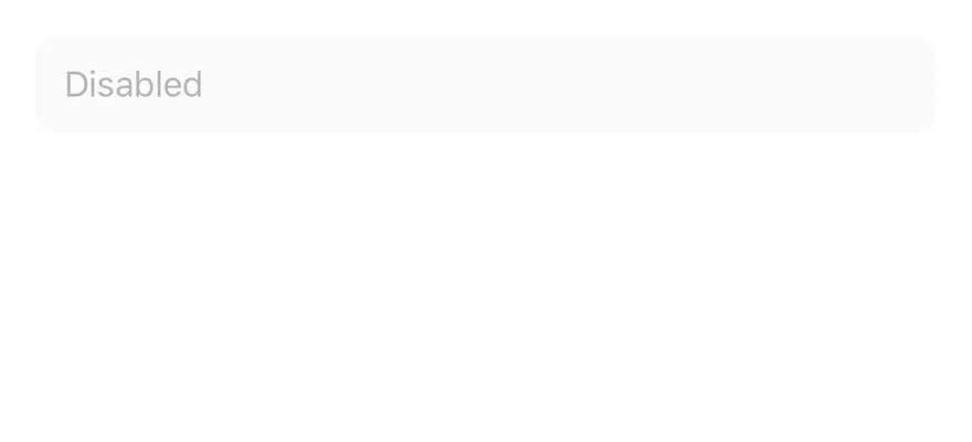
- A disabled input cannot be focused or edited.
## Notes
- Styling hooks: `data-slot="input"` and `data-size`.
- Uses the `secondary`, `primary` (caret), `muted-foreground` (placeholder) and `destructive` colors, and `opacity-50` when disabled.
- The native `size` attribute is replaced by the `size` prop.
**React Native, SwiftUI, Jetpack Compose**
```tsx
import { Input } from "@/components/ui/input"
export function InputExample() {
return (
)
}
```
```swift
import EsuissUI
import SwiftUI
struct InputExample: View {
var body: some View {
InputDemo(placeholder: "Email")
}
}
struct InputDemo: View {
let placeholder: LocalizedStringKey
var size: InputStyle.Size = .default
@State private var text: String
init(placeholder: LocalizedStringKey, size: InputStyle.Size = .default, initial: String = "") {
self.placeholder = placeholder
self.size = size
_text = State(initialValue: initial)
}
var body: some View {
TextField(placeholder, text: $text)
.textFieldStyle(.input(size: size))
}
}
```
```kotlin
import androidx.compose.foundation.layout.fillMaxWidth
import androidx.compose.runtime.Composable
import androidx.compose.runtime.getValue
import androidx.compose.runtime.mutableStateOf
import androidx.compose.runtime.saveable.rememberSaveable
import androidx.compose.runtime.setValue
import androidx.compose.ui.Modifier
import com.esuiss.ui.components.Input
@Composable
fun InputExample() {
InputSingle(initial = "", placeholder = "Email")
}
@Composable
fun InputSingle(initial: String, placeholder: String, enabled: Boolean = true) {
var value by rememberSaveable { mutableStateOf(initial) }
Input(value, { value = it }, Modifier.fillMaxWidth(), enabled = enabled, placeholder = placeholder)
}
```
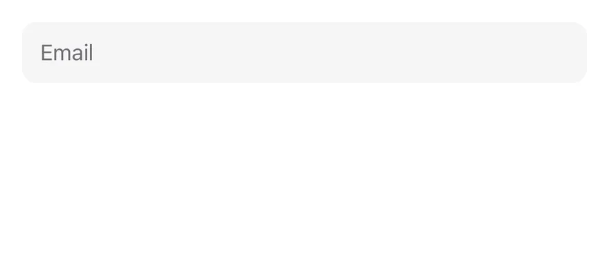
`Input` wraps a `TextInput` through the field control primitive. It tracks its own focused, filled, invalid and disabled state and styles itself from that state: a focus border while editing, a destructive border and tint when invalid, and 50% opacity when disabled.
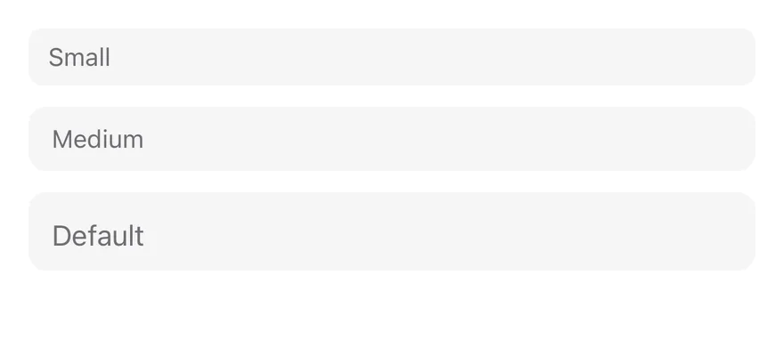
It comes in three sizes: `default` (44 pt), `md` and `sm`. Use the default size for forms on a full screen, and the smaller sizes inside dense layouts such as toolbars or sheets.
## Installation
**React Native**
```bash title="Terminal"
npx shadcn@latest add @esuiss-rn/input
```
See [Installation](https://ui.suiss.app/docs/installation) for the `components.json` setup. Or use the suiss/ui CLI:
```bash title="Terminal"
npx @esuiss/ui@latest add input
```
**SwiftUI**
```bash title="Terminal"
npx @esuiss/ui@latest add input --platform swift
```
**Jetpack Compose**
```bash title="Terminal"
npx @esuiss/ui@latest add input --platform kotlin
```
### Manual
**React Native**
**Uniwind**
1. Install the dependencies:
```bash title="Terminal"
npx expo install cn
```
2. Add the pieces it builds on: the primitives `components/primitives/input.tsx`, `components/primitives/use-render.tsx`.
3. Copy the source into `components/ui/input.tsx`:
```tsx title="uniwind/components/ui/input.tsx"
import { cn } from "cn"
import * as InputPrimitive from "@/components/primitives/input"
import { resolveClassName } from "@/components/primitives/use-render"
type InputSize = "sm" | "md" | "default"
function Input({
className,
size = "default",
...props
}: React.ComponentProps & {
size?: InputSize
}) {
return (
cn(
"h-11 w-full min-w-0 flex-row items-center rounded-lg border border-transparent bg-secondary px-3 py-1 text-[16px] text-secondary-foreground",
size === "md" && "h-9 text-[14px]",
size === "sm" && "h-8 rounded-md px-2.5 text-[14px]",
state.focused && "border-ring ring-3 ring-ring/50",
state.invalid &&
"border-destructive bg-destructive/5 dark:bg-destructive/10",
state.disabled && "opacity-50",
resolveClassName(className, state)
)
}
placeholderTextColorClassName="accent-muted-foreground"
cursorColorClassName="accent-primary"
selectionColorClassName="accent-primary"
{...props}
/>
)
}
export { Input }
```
4. Update the import paths to match your project.
**NativeWind**
1. Install the dependencies:
```bash title="Terminal"
npx expo install cn nativewind
```
2. Add the pieces it builds on: the primitives `components/primitives/input.tsx`, `components/primitives/use-render.tsx`.
3. Copy the source into `components/ui/input.tsx`:
```tsx title="nativewind/components/ui/input.tsx"
import { cn } from "cn"
import { cssInterop } from "nativewind"
import { TextInput } from "react-native"
import * as InputPrimitive from "@/components/primitives/input"
import { resolveClassName } from "@/components/primitives/use-render"
declare module "react-native" {
interface TextInputProps {
cursorColorClassName?: string
selectionColorClassName?: string
}
}
cssInterop(TextInput, {
className: { target: "style", nativeStyleToProp: { textAlign: true } },
placeholderClassName: {
target: false,
nativeStyleToProp: { color: "placeholderTextColor" },
},
cursorColorClassName: {
target: false,
nativeStyleToProp: { color: "cursorColor" },
},
selectionColorClassName: {
target: false,
nativeStyleToProp: { color: "selectionColor" },
},
})
type InputSize = "sm" | "md" | "default"
function Input({
className,
size = "default",
...props
}: React.ComponentProps & {
size?: InputSize
}) {
return (
cn(
"h-11 w-full min-w-0 flex-row items-center rounded-lg border border-transparent bg-secondary px-3 py-1 text-[16px] text-secondary-foreground",
size === "md" && "h-9 text-[14px]",
size === "sm" && "h-8 rounded-md px-2.5 text-[14px]",
state.focused && "border-ring ring ring-ring-50",
state.invalid &&
"border-destructive bg-destructive-5 dark:bg-destructive-10",
state.disabled && "opacity-50",
resolveClassName(className, state)
)
}
placeholderClassName="text-muted-foreground"
cursorColorClassName="text-primary"
selectionColorClassName="text-primary"
{...props}
/>
)
}
export { Input }
```
4. Update the import paths to match your project.
**StyleSheet**
1. Add the pieces it builds on: the primitives `components/primitives/input.tsx`, `components/primitives/use-render.tsx`.
2. Copy the source into `components/ui/input.tsx`:
```tsx title="stylesheet/components/ui/input.tsx"
import { StyleSheet } from "react-native"
import * as InputPrimitive from "@/components/primitives/input"
import { fontSize, radius, useTheme } from "@/components/ui/theme"
type InputSize = "sm" | "md" | "default"
function withAlpha(color: string, alpha: number) {
if (!color.startsWith("#") || color.length !== 7) return color
const r = Number.parseInt(color.slice(1, 3), 16)
const g = Number.parseInt(color.slice(3, 5), 16)
const b = Number.parseInt(color.slice(5, 7), 16)
return `rgba(${r}, ${g}, ${b}, ${alpha})`
}
const styles = StyleSheet.create({
root: {
fontSize: fontSize.base.fontSize,
height: 44,
width: "100%",
minWidth: 0,
flexDirection: "row",
alignItems: "center",
borderRadius: radius.lg,
borderWidth: 1,
borderColor: "transparent",
paddingHorizontal: 12,
paddingVertical: 4,
},
md: { fontSize: fontSize.sm.fontSize, height: 36 },
sm: {
fontSize: fontSize.sm.fontSize,
height: 32,
borderRadius: radius.md,
paddingHorizontal: 10,
},
})
function Input({
style,
size = "default",
...props
}: React.ComponentProps & {
size?: InputSize
}) {
const { colors, isDark } = useTheme()
return (
[
styles.root,
size === "md" && styles.md,
size === "sm" && styles.sm,
{ backgroundColor: colors.secondary, color: colors.foreground },
state.focused && { borderColor: colors.ring },
state.invalid && {
borderColor: colors.destructive,
backgroundColor: withAlpha(colors.destructive, isDark ? 0.1 : 0.05),
},
state.disabled && { opacity: 0.5 },
typeof style === "function" ? style(state) : style,
]}
placeholderTextColor={colors.mutedForeground}
cursorColor={colors.primary}
selectionColor={colors.primary}
{...props}
/>
)
}
export { Input }
```
3. Update the import paths to match your project.
**SwiftUI**
1. Target iOS 17 or later.
2. Copy the theme files every view uses:
- `swift/Theme/Theme.swift`: [source](https://github.com/e-suiss/ui/blob/main/packages/mobile/swiftui/Sources/EsuissUI/Theme/Theme.swift)
- `swift/Theme/Tokens.swift`: [source](https://github.com/e-suiss/ui/blob/main/packages/mobile/swiftui/Sources/EsuissUI/Theme/Tokens.swift)
3. Copy the source and every file it uses:
```swift title="swift/Components/Input.swift"
import SwiftUI
public struct InputStyle: TextFieldStyle {
public enum Size: CaseIterable, Sendable {
case `default`, md, sm
var height: CGFloat {
switch self {
case .default: 44
case .md: 36
case .sm: 32
}
}
var horizontalPadding: CGFloat {
self == .sm ? 10 : 12
}
var radius: CGFloat {
self == .sm ? Radius.md : Radius.lg
}
var textStyle: TextStyle {
self == .default ? .base : .sm
}
}
let size: Size
public init(size: Size = .default) {
self.size = size
}
public func _body(configuration: TextField) -> some View {
configuration.modifier(InputField(
radius: size.radius,
horizontalPadding: size.horizontalPadding,
verticalPadding: 4,
minHeight: size.height,
textStyle: size.textStyle,
alignment: .leading
))
}
}
extension TextFieldStyle where Self == InputStyle {
public static func input(size: InputStyle.Size = .default) -> InputStyle {
InputStyle(size: size)
}
public static var input: InputStyle { InputStyle() }
}
struct InputField: ViewModifier {
let radius: CGFloat
let horizontalPadding: CGFloat
let verticalPadding: CGFloat
let minHeight: CGFloat
let textStyle: TextStyle
let alignment: Alignment
@FocusState private var focused: Bool
@Environment(\.isEnabled) private var isEnabled
@Environment(\.isInvalid) private var invalid
@Environment(\.colorScheme) private var colorScheme
nonisolated init(
radius: CGFloat,
horizontalPadding: CGFloat,
verticalPadding: CGFloat,
minHeight: CGFloat,
textStyle: TextStyle,
alignment: Alignment
) {
self.radius = radius
self.horizontalPadding = horizontalPadding
self.verticalPadding = verticalPadding
self.minHeight = minHeight
self.textStyle = textStyle
self.alignment = alignment
}
func body(content: Content) -> some View {
ButtonGroupItem(radius: radius) { shape in
content
.focused($focused)
.scaledFont(textStyle)
.foregroundStyle(EsuissColor.foreground)
.tint(EsuissColor.primary)
.padding(.horizontal, horizontalPadding)
.padding(.vertical, verticalPadding)
.frame(maxWidth: .infinity, minHeight: minHeight, alignment: alignment)
.background(background, in: shape)
.overlay {
shape.strokeBorder(border, lineWidth: 1)
}
.contentShape(shape)
.opacity(isEnabled ? 1 : 0.5)
.onTapGesture { focused = true }
}
}
private var background: Color {
if invalid { return EsuissColor.destructive.opacity(colorScheme == .dark ? 0.1 : 0.05) }
return EsuissColor.secondary
}
private var border: Color {
if invalid { return EsuissColor.destructive }
return focused ? EsuissColor.ring : .clear
}
}
```
- `swift/Components/Button.swift`: see [Button](https://ui.suiss.app/docs/components/button.md)
- `swift/Components/ButtonGroup.swift`: see [Button Group](https://ui.suiss.app/docs/components/button-group.md)
- `swift/Components/Field.swift`: see [Field](https://ui.suiss.app/docs/components/field.md)
- `swift/Components/Separator.swift`: see [Separator](https://ui.suiss.app/docs/components/separator.md)
- `swift/Components/TextVariant.swift`: [source](https://github.com/e-suiss/ui/blob/main/packages/mobile/swiftui/Sources/EsuissUI/Components/TextVariant.swift)
4. Add the files to your app target.
**Jetpack Compose**
1. Set `minSdk` to 24 or higher and add the dependencies:
```kotlin title="build.gradle.kts"
implementation(platform("androidx.compose:compose-bom:2026.09.00"))
implementation("androidx.compose.foundation:foundation")
implementation("androidx.compose.ui:ui")
```
2. Copy the theme files every view uses:
- `kotlin/theme/Theme.kt`: [source](https://github.com/e-suiss/ui/blob/main/packages/mobile/kotlin/ui/src/main/kotlin/com/esuiss/ui/theme/Theme.kt)
- `kotlin/theme/Tokens.kt`: [source](https://github.com/e-suiss/ui/blob/main/packages/mobile/kotlin/ui/src/main/kotlin/com/esuiss/ui/theme/Tokens.kt)
3. Copy the source and every file it uses:
```kt title="kotlin/components/Input.kt"
package com.esuiss.ui.components
import androidx.compose.foundation.interaction.MutableInteractionSource
import androidx.compose.foundation.interaction.collectIsFocusedAsState
import androidx.compose.foundation.layout.Box
import androidx.compose.foundation.layout.fillMaxWidth
import androidx.compose.foundation.layout.height
import androidx.compose.foundation.layout.padding
import androidx.compose.foundation.shape.RoundedCornerShape
import androidx.compose.foundation.text.BasicText
import androidx.compose.foundation.text.BasicTextField
import androidx.compose.foundation.text.KeyboardActions
import androidx.compose.foundation.text.KeyboardOptions
import androidx.compose.foundation.text.selection.LocalTextSelectionColors
import androidx.compose.runtime.Composable
import androidx.compose.runtime.CompositionLocalProvider
import androidx.compose.runtime.getValue
import androidx.compose.runtime.remember
import androidx.compose.ui.Alignment
import androidx.compose.ui.Modifier
import androidx.compose.ui.graphics.SolidColor
import androidx.compose.ui.layout.layoutId
import androidx.compose.ui.semantics.error
import androidx.compose.ui.semantics.semantics
import androidx.compose.ui.text.input.VisualTransformation
import androidx.compose.ui.unit.Dp
import androidx.compose.ui.unit.dp
import com.esuiss.ui.theme.EsuissTheme
import com.esuiss.ui.theme.Radius
import com.esuiss.ui.theme.Typography
enum class InputSize(
internal val height: Dp,
internal val horizontalPadding: Dp,
internal val radius: Dp,
) {
Default(44.dp, 12.dp, Radius.lg),
Md(36.dp, 12.dp, Radius.lg),
Sm(32.dp, 10.dp, Radius.md),
}
@Composable
fun Input(
value: String,
onValueChange: (String) -> Unit,
modifier: Modifier = Modifier,
size: InputSize = InputSize.Default,
enabled: Boolean = LocalFieldState.current.enabled,
readOnly: Boolean = false,
invalid: Boolean = LocalFieldState.current.invalid,
placeholder: String? = null,
keyboardOptions: KeyboardOptions = KeyboardOptions.Default,
keyboardActions: KeyboardActions = KeyboardActions.Default,
visualTransformation: VisualTransformation = VisualTransformation.None,
interactionSource: MutableInteractionSource? = null,
) {
val colors = EsuissTheme.colors
val source = interactionSource ?: remember { MutableInteractionSource() }
val focused by source.collectIsFocusedAsState()
val group = LocalButtonGroup.current
val item = rememberButtonGroupItem(group, RoundedCornerShape(size.radius))
val textStyle = (if (size == InputSize.Default) Typography.base else Typography.sm)
.copy(color = colors.foreground)
CompositionLocalProvider(LocalTextSelectionColors provides formSelectionColors(colors)) {
BasicTextField(
value = value,
onValueChange = onValueChange,
modifier = modifier
.then(if (group != null) Modifier.layoutId(ButtonGroupFill) else Modifier)
.then(item.modifier)
.fillMaxWidth()
.height(size.height)
.formInputSurface(colors, item.shape, focused, invalid, enabled)
.then(if (invalid) Modifier.semantics { error("Invalid") } else Modifier),
enabled = enabled,
readOnly = readOnly,
textStyle = textStyle,
keyboardOptions = keyboardOptions,
keyboardActions = keyboardActions,
singleLine = true,
visualTransformation = visualTransformation,
interactionSource = source,
cursorBrush = SolidColor(colors.primary),
decorationBox = { inner ->
Box(
modifier = Modifier.padding(horizontal = size.horizontalPadding),
contentAlignment = Alignment.CenterStart,
) {
if (value.isEmpty() && placeholder != null) {
BasicText(
placeholder,
style = textStyle.copy(color = colors.mutedForeground),
maxLines = 1,
)
}
inner()
}
},
)
}
}
```
- `kotlin/components/ButtonGroup.kt`: see [Button Group](https://ui.suiss.app/docs/components/button-group.md)
- `kotlin/components/Content.kt`: [source](https://github.com/e-suiss/ui/blob/main/packages/mobile/kotlin/ui/src/main/kotlin/com/esuiss/ui/components/Content.kt)
- `kotlin/components/Field.kt`: see [Field](https://ui.suiss.app/docs/components/field.md)
- `kotlin/components/FormSupport.kt`: [source](https://github.com/e-suiss/ui/blob/main/packages/mobile/kotlin/ui/src/main/kotlin/com/esuiss/ui/components/FormSupport.kt)
- `kotlin/components/Label.kt`: see [Label](https://ui.suiss.app/docs/components/label.md)
- `kotlin/components/Separator.kt`: see [Separator](https://ui.suiss.app/docs/components/separator.md)
4. Update the `com.esuiss.ui` package names to match your project.
## Usage
```tsx
import { Input } from "@/components/ui/input"
```
```tsx
```
Pass any `TextInput` prop, such as `placeholder`, `secureTextEntry`, `keyboardType` or `inputMode`, to get the matching field type.
The value works controlled with `value` and `onValueChange(value, details)`, or uncontrolled with `defaultValue`. Inside a `Field`, the input picks up the field's label, description, invalid and disabled state, so you usually set `invalid` on the `Field` instead of on the input.
`className` can be a function that receives the state (`focused`, `invalid`, `disabled`, `filled`, …) and returns classes.
## Examples
### Types
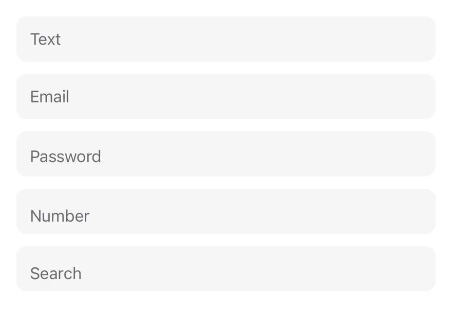
Text, email, password, number and search fields set through standard `TextInput` props.
```tsx
import { View } from "react-native"
import { Input } from "@/components/ui/input"
import { Text } from "@/components/ui/text"
export function InputTypesExample() {
return (
)
}
```
```swift
import EsuissUI
import SwiftUI
struct InputTypesDemo: View {
@State private var text = ""
@State private var email = ""
@State private var password = ""
@State private var number = ""
@State private var search = ""
var body: some View {
VStack(alignment: .leading, spacing: 12) {
TextField("Text", text: $text)
.textFieldStyle(.input)
TextField("Email", text: $email)
.textFieldStyle(.input)
.keyboardType(.emailAddress)
.textInputAutocapitalization(.never)
SecureField("Password", text: $password)
.textFieldStyle(.input)
TextField("Number", text: $number)
.textFieldStyle(.input)
.keyboardType(.numberPad)
TextField("Search", text: $search)
.textFieldStyle(.input)
.submitLabel(.search)
}
}
}
```
```kotlin
import androidx.compose.foundation.layout.Arrangement
import androidx.compose.foundation.layout.Column
import androidx.compose.foundation.layout.fillMaxWidth
import androidx.compose.foundation.text.KeyboardOptions
import androidx.compose.runtime.Composable
import androidx.compose.runtime.getValue
import androidx.compose.runtime.mutableStateOf
import androidx.compose.runtime.saveable.rememberSaveable
import androidx.compose.runtime.setValue
import androidx.compose.ui.Modifier
import androidx.compose.ui.text.input.ImeAction
import androidx.compose.ui.text.input.KeyboardCapitalization
import androidx.compose.ui.text.input.KeyboardType
import androidx.compose.ui.text.input.PasswordVisualTransformation
import androidx.compose.ui.unit.dp
import com.esuiss.ui.components.Input
import com.esuiss.ui.components.Text
val InputEmailKeyboard = KeyboardOptions(
capitalization = KeyboardCapitalization.None,
keyboardType = KeyboardType.Email,
)
@Composable
fun InputTypes() {
var text by rememberSaveable { mutableStateOf("") }
var email by rememberSaveable { mutableStateOf("") }
var password by rememberSaveable { mutableStateOf("") }
var number by rememberSaveable { mutableStateOf("") }
var search by rememberSaveable { mutableStateOf("") }
Column(Modifier.fillMaxWidth(), verticalArrangement = Arrangement.spacedBy(12.dp)) {
Input(text, { text = it }, placeholder = "Text")
Input(email, { email = it }, placeholder = "Email", keyboardOptions = InputEmailKeyboard)
Input(
password,
{ password = it },
placeholder = "Password",
keyboardOptions = KeyboardOptions(keyboardType = KeyboardType.Password),
visualTransformation = PasswordVisualTransformation(),
)
Input(number, { number = it }, placeholder = "Number", keyboardOptions = KeyboardOptions(keyboardType = KeyboardType.Number))
Input(search, { search = it }, placeholder = "Search", keyboardOptions = KeyboardOptions(imeAction = ImeAction.Search))
}
}
```
### Sizes
The `sm`, `md` and default sizes.
```tsx
import { View } from "react-native"
import { Input } from "@/components/ui/input"
export function InputSizesExample() {
return (
)
}
```
```swift
import EsuissUI
import SwiftUI
struct InputSizesExample: View {
var body: some View {
VStack(alignment: .leading, spacing: 12) {
InputDemo(placeholder: "Small", size: .sm)
InputDemo(placeholder: "Medium", size: .md)
InputDemo(placeholder: "Default")
}
}
}
struct InputDemo: View {
let placeholder: LocalizedStringKey
var size: InputStyle.Size = .default
@State private var text: String
init(placeholder: LocalizedStringKey, size: InputStyle.Size = .default, initial: String = "") {
self.placeholder = placeholder
self.size = size
_text = State(initialValue: initial)
}
var body: some View {
TextField(placeholder, text: $text)
.textFieldStyle(.input(size: size))
}
}
```
```kotlin
import androidx.compose.foundation.layout.Arrangement
import androidx.compose.foundation.layout.Column
import androidx.compose.foundation.layout.fillMaxWidth
import androidx.compose.runtime.Composable
import androidx.compose.runtime.getValue
import androidx.compose.runtime.mutableStateOf
import androidx.compose.runtime.saveable.rememberSaveable
import androidx.compose.runtime.setValue
import androidx.compose.ui.Modifier
import androidx.compose.ui.unit.dp
import com.esuiss.ui.components.Input
import com.esuiss.ui.components.InputSize
@Composable
fun InputSizes() {
var small by rememberSaveable { mutableStateOf("") }
var medium by rememberSaveable { mutableStateOf("") }
var default by rememberSaveable { mutableStateOf("") }
Column(Modifier.fillMaxWidth(), verticalArrangement = Arrangement.spacedBy(12.dp)) {
Input(small, { small = it }, size = InputSize.Sm, placeholder = "Small")
Input(medium, { medium = it }, size = InputSize.Md, placeholder = "Medium")
Input(default, { default = it }, placeholder = "Default")
}
}
```
### With value
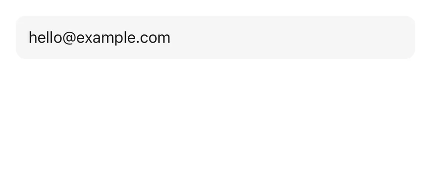
An input that starts with a `defaultValue`.
```tsx
import { Input } from "@/components/ui/input"
export function InputWithValueExample() {
return (
)
}
```
```swift
import EsuissUI
import SwiftUI
struct InputWithValueExample: View {
var body: some View {
InputDemo(placeholder: "Email", initial: "hello@example.com")
}
}
struct InputDemo: View {
let placeholder: LocalizedStringKey
var size: InputStyle.Size = .default
@State private var text: String
init(placeholder: LocalizedStringKey, size: InputStyle.Size = .default, initial: String = "") {
self.placeholder = placeholder
self.size = size
_text = State(initialValue: initial)
}
var body: some View {
TextField(placeholder, text: $text)
.textFieldStyle(.input(size: size))
}
}
```
```kotlin
import androidx.compose.foundation.layout.fillMaxWidth
import androidx.compose.runtime.Composable
import androidx.compose.runtime.getValue
import androidx.compose.runtime.mutableStateOf
import androidx.compose.runtime.saveable.rememberSaveable
import androidx.compose.runtime.setValue
import androidx.compose.ui.Modifier
import com.esuiss.ui.components.Input
@Composable
fun InputWithValueExample() {
InputSingle(initial = "hello@example.com", placeholder = "Email")
}
@Composable
fun InputSingle(initial: String, placeholder: String, enabled: Boolean = true) {
var value by rememberSaveable { mutableStateOf(initial) }
Input(value, { value = it }, Modifier.fillMaxWidth(), enabled = enabled, placeholder = placeholder)
}
```
### With label
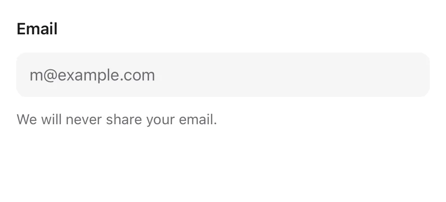
An input inside a `Field` with a label and description.
```tsx
import { Field, FieldDescription, FieldLabel } from "@/components/ui/field"
import { Input } from "@/components/ui/input"
export function InputWithLabelExample() {
return (
EmailWe will never share your email.
)
}
```
```swift
import EsuissUI
import SwiftUI
struct InputWithLabelDemo: View {
@State private var email = ""
var body: some View {
Field {
FieldLabel("Email")
.accessibilityHidden(true)
TextField(text: $email, prompt: Text(verbatim: "m@example.com")) {
Text("Email")
}
.textFieldStyle(.input)
.keyboardType(.emailAddress)
.textInputAutocapitalization(.never)
.accessibilityLabel(Text("Email"))
FieldDescription("We will never share your email.")
}
}
}
```
```kotlin
import androidx.compose.foundation.text.KeyboardOptions
import androidx.compose.runtime.Composable
import androidx.compose.runtime.getValue
import androidx.compose.runtime.mutableStateOf
import androidx.compose.runtime.saveable.rememberSaveable
import androidx.compose.runtime.setValue
import androidx.compose.ui.text.input.KeyboardCapitalization
import androidx.compose.ui.text.input.KeyboardType
import com.esuiss.ui.components.Field
import com.esuiss.ui.components.FieldDescription
import com.esuiss.ui.components.FieldLabel
import com.esuiss.ui.components.Input
val InputEmailKeyboard = KeyboardOptions(
capitalization = KeyboardCapitalization.None,
keyboardType = KeyboardType.Email,
)
@Composable
fun InputWithLabel() {
var value by rememberSaveable { mutableStateOf("") }
Field {
FieldLabel("Email")
Input(value, { value = it }, placeholder = "m@example.com", keyboardOptions = InputEmailKeyboard)
FieldDescription("We will never share your email.")
}
}
```
### Invalid
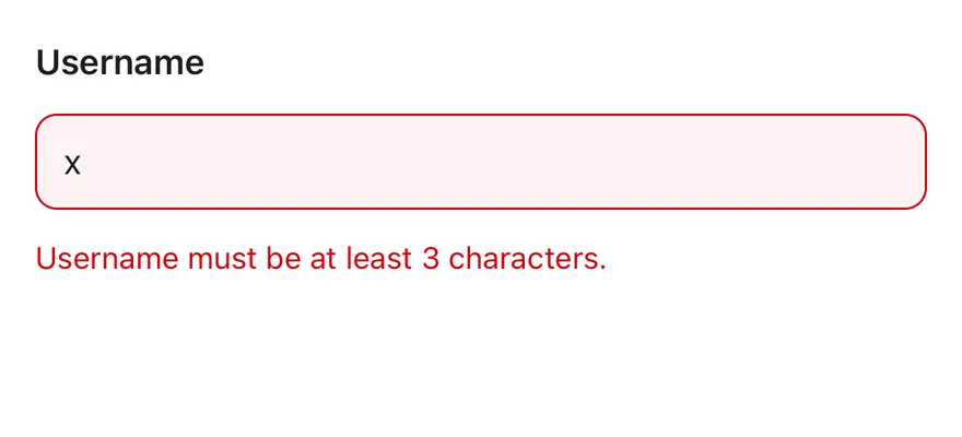
An input inside an invalid `Field` with an error message.
```tsx
import { Field, FieldError, FieldLabel } from "@/components/ui/field"
import { Input } from "@/components/ui/input"
export function InputInvalidExample() {
return (
UsernameUsername must be at least 3 characters.
)
}
```
```swift
import EsuissUI
import SwiftUI
struct InputInvalidDemo: View {
@State private var username = "x"
var body: some View {
Field(invalid: true) {
FieldLabel("Username")
.accessibilityHidden(true)
TextField("", text: $username)
.textFieldStyle(.input)
.accessibilityLabel(Text("Username"))
FieldError("Username must be at least 3 characters.")
}
}
}
```
```kotlin
import androidx.compose.runtime.Composable
import androidx.compose.runtime.getValue
import androidx.compose.runtime.mutableStateOf
import androidx.compose.runtime.saveable.rememberSaveable
import androidx.compose.runtime.setValue
import com.esuiss.ui.components.Field
import com.esuiss.ui.components.FieldError
import com.esuiss.ui.components.FieldLabel
import com.esuiss.ui.components.Input
@Composable
fun InputInvalid() {
var value by rememberSaveable { mutableStateOf("x") }
Field(invalid = true) {
FieldLabel("Username")
Input(value, { value = it })
FieldError("Username must be at least 3 characters.")
}
}
```
### Controlled
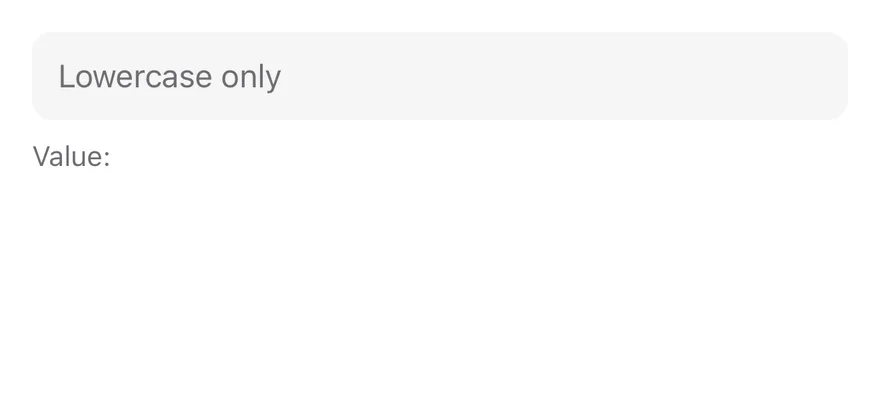
A controlled input that mirrors its value below.
```tsx
import * as React from "react"
import { View } from "react-native"
import { Input } from "@/components/ui/input"
import { Text } from "@/components/ui/text"
function ControlledDemo() {
const [value, setValue] = React.useState("")
return (
setValue(next.toLowerCase())}
/>
Value: {value}
)
}
export function InputControlledExample() {
return (
)
}
```
```swift
import EsuissUI
import SwiftUI
struct InputControlledDemo: View {
@State private var value = ""
var body: some View {
VStack(alignment: .leading, spacing: 8) {
TextField(
"Lowercase only",
text: Binding(get: { value }, set: { value = $0.lowercased() })
)
.textFieldStyle(.input)
.textInputAutocapitalization(.never)
Text(verbatim: "Value: \(value)")
.textVariant(.muted)
}
}
}
```
```kotlin
import androidx.compose.foundation.layout.Arrangement
import androidx.compose.foundation.layout.Column
import androidx.compose.foundation.layout.fillMaxWidth
import androidx.compose.foundation.text.KeyboardOptions
import androidx.compose.runtime.Composable
import androidx.compose.runtime.getValue
import androidx.compose.runtime.mutableStateOf
import androidx.compose.runtime.saveable.rememberSaveable
import androidx.compose.runtime.setValue
import androidx.compose.ui.Modifier
import androidx.compose.ui.text.input.KeyboardCapitalization
import androidx.compose.ui.unit.dp
import com.esuiss.ui.components.Input
import com.esuiss.ui.components.Text
import com.esuiss.ui.components.TextVariant
@Composable
fun InputControlled() {
var value by rememberSaveable { mutableStateOf("") }
Column(Modifier.fillMaxWidth(), verticalArrangement = Arrangement.spacedBy(8.dp)) {
Input(
value,
{ value = it.lowercase() },
placeholder = "Lowercase only",
keyboardOptions = KeyboardOptions(capitalization = KeyboardCapitalization.None),
)
Text("Value: $value", variant = TextVariant.Muted)
}
}
```
### Disabled
A disabled input.
```tsx
import { Input } from "@/components/ui/input"
export function InputDisabledExample() {
return (
)
}
```
```swift
import EsuissUI
import SwiftUI
struct InputDisabledExample: View {
var body: some View {
InputDemo(placeholder: "Disabled")
.disabled(true)
}
}
struct InputDemo: View {
let placeholder: LocalizedStringKey
var size: InputStyle.Size = .default
@State private var text: String
init(placeholder: LocalizedStringKey, size: InputStyle.Size = .default, initial: String = "") {
self.placeholder = placeholder
self.size = size
_text = State(initialValue: initial)
}
var body: some View {
TextField(placeholder, text: $text)
.textFieldStyle(.input(size: size))
}
}
```
```kotlin
import androidx.compose.foundation.layout.fillMaxWidth
import androidx.compose.runtime.Composable
import androidx.compose.runtime.getValue
import androidx.compose.runtime.mutableStateOf
import androidx.compose.runtime.saveable.rememberSaveable
import androidx.compose.runtime.setValue
import androidx.compose.ui.Modifier
import com.esuiss.ui.components.Input
@Composable
fun InputDisabledExample() {
InputSingle(initial = "", placeholder = "Disabled", enabled = false)
}
@Composable
fun InputSingle(initial: String, placeholder: String, enabled: Boolean = true) {
var value by rememberSaveable { mutableStateOf(initial) }
Input(value, { value = it }, Modifier.fillMaxWidth(), enabled = enabled, placeholder = placeholder)
}
```
## API Reference
### Input
| Prop | Type | Default | Description |
| --- | --- | --- | --- |
| `size` | `InputSize` | `"default"` | Height and text size: `default`, `md` or `sm`. |
Also accepts the props of `React.ComponentProps`.
## Accessibility
- Inside a `Field`, the input is linked to the field label through `accessibilityLabelledBy` and gets the label as `accessibilityLabel` and the description as `accessibilityHint`.
- `disabled` is set in `accessibilityState` and makes the input non-editable.
- Outside a `Field`, give the input an `accessibilityLabel`; a placeholder alone is not a label.
## Notes
- Uses the `bg-secondary`, `border-ring` and `border-destructive` tokens, with `opacity-50` when disabled.
- In Uniwind and NativeWind, a focused field also draws the `ring-3 ring-ring/50` focus ring.
- Placeholder, cursor and selection colors come from the `muted-foreground` and `primary` tokens.
- Light and dark colors follow the system appearance.