[data-slot=field]]:has-data-checked:border-primary has-[>[data-slot=field]]:has-data-checked:ring-1 has-[>[data-slot=field]]:has-data-checked:ring-primary has-[>[data-slot=field]]:has-data-selected:border-primary has-[>[data-slot=field]]:has-data-selected:ring-1 has-[>[data-slot=field]]:has-data-selected:ring-primary has-[>[data-slot=field]]:rounded-xl has-[>[data-slot=field]]:border has-[>[data-slot=field]]:not-has-[:disabled,[data-disabled]]:hover:bg-accent has-[>[data-slot=field]]:has-focus-visible:border-ring has-[>[data-slot=field]]:has-focus-visible:ring-3 has-[>[data-slot=field]]:has-focus-visible:ring-ring/50 *:data-[slot=field]:p-4 has-[>[data-slot=field]]:not-has-[:disabled,[data-disabled]]:hover:text-accent-foreground group-data-[disabled=true]/field:opacity-50",
"has-[>[data-slot=field]]:w-full has-[>[data-slot=field]]:flex-col",
className
)}
{...props}
/>
)
}
function FieldTitle({ className, ...props }: React.ComponentProps<"div">) {
return (
)
}
function FieldDescription({ className, ...props }: React.ComponentProps<"p">) {
return (
a]:text-primary [&>a]:underline [&>a]:underline-offset-2",
className
)}
{...props}
/>
)
}
function FieldSeparator({
children,
className,
...props
}: React.ComponentProps<"div"> & {
children?: React.ReactNode
}) {
return (
{children}
)}
)
}
function FieldError({
className,
children,
errors,
...props
}: React.ComponentProps<"div"> & {
errors?: Array<{ message?: string } | undefined>
}) {
const content = useMemo(() => {
if (children) {
return children
}
if (!errors?.length) {
return null
}
const uniqueErrors = [
...new Map(errors.map((error) => [error?.message, error])).values(),
]
if (uniqueErrors?.length === 1) {
return uniqueErrors[0]?.message
}
return (
{uniqueErrors.map(
(error) =>
error?.message && {error.message}
)}
)
}, [children, errors])
if (!content) {
return null
}
return (
{content}
)
}
export {
Field,
FieldContent,
FieldDescription,
FieldError,
FieldGroup,
FieldLabel,
FieldLegend,
FieldSeparator,
FieldSet,
FieldTitle,
}
```
4. Update the import paths to match your project.
## Usage
```tsx
import { FieldSet, FieldLegend, FieldGroup, Field, FieldContent, FieldLabel, FieldTitle, FieldDescription, FieldSeparator, FieldError } from "@/components/ui/field"
```
```tsx
Username
Choose a unique name for your account.
```
Connect each `FieldLabel` to its control with `htmlFor` and `id`. Set `orientation="horizontal"` to place the label beside the control, for example for a checkbox or switch, or `responsive` to switch from vertical to horizontal when the surrounding `FieldGroup` is wide enough.
To show an error, set `aria-invalid` on the control and render a `FieldError` with children or an `errors` array. Pass `data-disabled` on a `Field` to dim its label when the control is disabled.
To build selectable cards, place a horizontal `Field` inside a `FieldLabel`; the label gets a border, and a highlighted ring when the control inside it is checked.
## Examples
### With help link
A description that contains a link, styled with `text-primary` and an underline.
**Example**
```tsx
import { Field, FieldDescription, FieldLabel } from "@/components/ui/field"
import { Input } from "@/components/ui/input"
export default function FieldWithHelpLink() {
return (
)
}
```
### Inset
Horizontal fields in an `inset` field group, forming a rounded settings list with separators.
**Example**
```tsx
import {
Field,
FieldDescription,
FieldGroup,
FieldLabel,
FieldLegend,
FieldSet,
} from "@/components/ui/field"
import { Input } from "@/components/ui/input"
import { Switch } from "@/components/ui/switch"
export default function FieldInset() {
return (
Account
Name
Email
Product updates
Your name and email appear on invoices.
)
}
```
### With textarea
A field that labels and describes a `Textarea`.
**Example**
```tsx
import { Field, FieldDescription, FieldLabel } from "@/components/ui/field"
import { Textarea } from "@/components/ui/textarea"
export default function FieldWithTextarea() {
return (
Feedback
Your feedback helps us improve.
)
}
```
### Invalid
An invalid field with an error message announced as an alert.
**Example**
```tsx
import { Field, FieldError, FieldLabel } from "@/components/ui/field"
import { Input } from "@/components/ui/input"
export default function FieldInvalid() {
return (
Email
Enter a valid email address.
)
}
```
### Multiple errors
A `FieldError` that renders an `errors` array as a bulleted list.
**Example**
```tsx
import { Field, FieldError, FieldLabel } from "@/components/ui/field"
import { Input } from "@/components/ui/input"
export default function FieldMultipleErrors() {
return (
Password
)
}
```
### Disabled
A disabled field with a dimmed label and a disabled input.
**Example**
```tsx
import { Field, FieldDescription, FieldLabel } from "@/components/ui/field"
import { Input } from "@/components/ui/input"
export default function FieldDisabled() {
return (
Workspace URL
Contact an admin to change this.
)
}
```
### Horizontal
Horizontal fields with a checkbox and a switch, one with a description in `FieldContent`.
**Example**
```tsx
import { Checkbox } from "@/components/ui/checkbox"
import {
Field,
FieldContent,
FieldDescription,
FieldGroup,
FieldLabel,
} from "@/components/ui/field"
import { Switch } from "@/components/ui/switch"
export default function FieldHorizontal() {
return (
Accept terms and conditions
Marketing emails
Receive emails about new products and features.
)
}
```
### Choice cards
Radio options presented as selectable cards by nesting a `Field` inside a `FieldLabel`.
**Example**
```tsx
import {
Field,
FieldContent,
FieldDescription,
FieldLabel,
FieldLegend,
FieldSet,
FieldTitle,
} from "@/components/ui/field"
import { RadioGroup, RadioGroupItem } from "@/components/ui/radio-group"
export default function FieldChoiceCards() {
return (
Plan
Select the plan that fits your team.
Starter
For individuals and small projects.
Pro
For growing teams that need more.
)
}
```
### Form
A complete payment form built from field sets, groups, a separator and actions.
**Example**
```tsx
import { Button } from "@/components/ui/button"
import { Checkbox } from "@/components/ui/checkbox"
import {
Field,
FieldDescription,
FieldGroup,
FieldLabel,
FieldLegend,
FieldSeparator,
FieldSet,
} from "@/components/ui/field"
import { Input } from "@/components/ui/input"
import { Textarea } from "@/components/ui/textarea"
export default function FieldForm() {
return (
)
}
```
### Separator with text
A `FieldSeparator` with text between a sign-in button and an email field.
**Example**
```tsx
import { Button } from "@/components/ui/button"
import {
Field,
FieldGroup,
FieldLabel,
FieldSeparator,
} from "@/components/ui/field"
import { Input } from "@/components/ui/input"
export default function FieldSeparatorWithText() {
return (
Continue with Apple
Or continue with
Email
)
}
```
## API Reference
- `Field`
- `FieldLabel`
- `FieldDescription`
- `FieldError`
- `FieldSet`
- `FieldLegend`
- `FieldGroup`
- `Field`
- `FieldLabel`
- `FieldDescription`
- `FieldLabel`
- `Field`
- `FieldContent`
- `FieldTitle`
- `FieldDescription`
- `FieldGroup`
- `Field`
- `FieldLabel`
- `FieldContent`
- `FieldLabel`
- `FieldDescription`
- `FieldDescription`
- `FieldSet`
- `FieldLegend`
- `FieldDescription`
- `FieldSeparator`
### FieldSet
Groups related fields in a native `fieldset`.
Also accepts the props of `React.ComponentProps<"fieldset">`.
### FieldLegend
The caption of a field set.
| Prop | Type | Default | Description |
| --- | --- | --- | --- |
| `variant` | `"legend" \| "label"` | `"legend"` | Sets `data-variant` to `legend` or `label` so the legend can be styled as a section caption or as a field label. |
Also accepts the props of `React.ComponentProps<"legend">`.
### FieldGroup
Stacks fields with consistent spacing, or groups them into an inset list.
| Prop | Type | Default | Description |
| --- | --- | --- | --- |
| `variant` | `"default" \| "inset"` | `"default"` | `inset` groups the fields into a rounded list on `bg-muted`, with separators between rows and inputs aligned to the end. |
Also accepts the props of `React.ComponentProps<"div">`.
### Field
Wraps a single control with its label, description and error.
| Prop | Type | Default | Description |
| --- | --- | --- | --- |
| `orientation` | `"vertical" \| "horizontal" \| "responsive"` | `"vertical"` | `vertical` stacks the label above the control, `horizontal` places them side by side, and `responsive` switches to horizontal when the field group is wide enough. |
Also accepts the props of `React.ComponentProps<"div">`.
### FieldContent
Stacks a label and description next to a control in a horizontal field.
Also accepts the props of `React.ComponentProps<"div">`.
### FieldLabel
The label of a field's control.
Also accepts the props of `React.ComponentProps`.
### FieldTitle
A heading inside a field that is not a label, such as the title of a choice card.
Also accepts the props of `React.ComponentProps<"div">`.
### FieldDescription
Supporting text that describes the control.
Also accepts the props of `React.ComponentProps<"p">`.
### FieldSeparator
A divider between sections, with optional centered text.
| Prop | Type | Default | Description |
| --- | --- | --- | --- |
| `children` | `React.ReactNode` | - | Optional text centered on the separator line. |
Also accepts the props of `React.ComponentProps<"div">`.
### FieldError
An error message for the field.
| Prop | Type | Default | Description |
| --- | --- | --- | --- |
| `errors` | `Array<{ message?: string } \| undefined>` | - | A list of error objects to display. Duplicate messages are removed; one message renders as text and several render as a list. Ignored when children are provided. |
Also accepts the props of `React.ComponentProps<"div">`.
## Accessibility
- `Field` has the `group` role and links its descriptions and errors to its first control through `aria-describedby`, updating the link when they change.
- `FieldSet` renders a native `fieldset`, which takes its accessible name from `FieldLegend`.
- `FieldError` has the `alert` role, so assistive technology announces it when it appears. It renders nothing when it has no children and no errors.
- Set `aria-invalid` on the control to mark it invalid; `FieldError` does not set it for you.
- Clicking a `FieldLabel` focuses or toggles its associated control.
## Notes
- Styling hooks: `data-slot` values `field-set`, `field-legend`, `field-group`, `field`, `field-content`, `field-label` (used by both `FieldLabel` and `FieldTitle`), `field-description`, `field-separator` and `field-error`.
- `Field` sets `data-orientation`, and `FieldGroup` and `FieldLegend` set `data-variant`.
- `FieldGroup` is a container query context named `field-group`, which drives the `responsive` orientation.
- Uses the `muted`, `border`, `muted-foreground`, `primary`, `destructive` and `accent` colors.
**React Native, SwiftUI, Jetpack Compose**
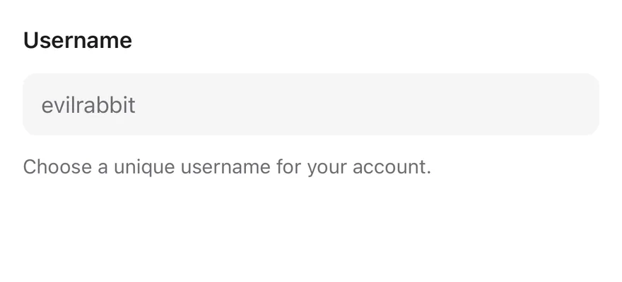
```tsx
import { Field, FieldDescription, FieldLabel } from "@/components/ui/field"
import { Input } from "@/components/ui/input"
export function FieldExample() {
return (
Username
Choose a unique username for your account.
)
}
```
```swift
import EsuissUI
import SwiftUI
struct FieldDefaultDemo: View {
@State private var username = ""
var body: some View {
Field {
FieldLabel("Username")
.accessibilityHidden(true)
TextField("evilrabbit", text: $username)
.textFieldStyle(.input)
.textInputAutocapitalization(.never)
.accessibilityLabel(Text("Username"))
FieldDescription("Choose a unique username for your account.")
}
}
}
```
```kotlin
import androidx.compose.foundation.text.KeyboardOptions
import androidx.compose.runtime.Composable
import androidx.compose.runtime.getValue
import androidx.compose.runtime.mutableStateOf
import androidx.compose.runtime.saveable.rememberSaveable
import androidx.compose.runtime.setValue
import androidx.compose.ui.Modifier
import androidx.compose.ui.semantics.contentDescription
import androidx.compose.ui.semantics.semantics
import androidx.compose.ui.text.input.KeyboardCapitalization
import com.esuiss.ui.components.Field
import com.esuiss.ui.components.FieldDescription
import com.esuiss.ui.components.FieldLabel
import com.esuiss.ui.components.Input
val FieldPlainText = KeyboardOptions(capitalization = KeyboardCapitalization.None, autoCorrectEnabled = false)
@Composable
fun FieldDefault() {
var value by rememberSaveable { mutableStateOf("") }
Field {
FieldLabel("Username")
Input(
value,
{ value = it },
Modifier.semantics { contentDescription = "Username" },
placeholder = "evilrabbit",
keyboardOptions = FieldPlainText,
)
FieldDescription("Choose a unique username for your account.")
}
}
```
`Field` wraps one control, such as an `Input`, `Textarea` or `Switch`, with a `FieldLabel`, an optional `FieldDescription` and a `FieldError`. It shares the field's disabled and invalid state with the control and handles validation: required values, length limits and custom `validate` functions, checked on submit, blur or change.
`FieldSet` and `FieldLegend` group related fields under a heading, and `FieldGroup` stacks fields. The `inset` variant of `FieldGroup` turns the fields into rows on a rounded `bg-muted` surface with hairlines between them, like a settings list.
## Installation
**React Native**
```bash title="Terminal"
npx shadcn@latest add @esuiss-rn/field
```
See [Installation](https://ui.suiss.app/docs/installation) for the `components.json` setup. Or use the suiss/ui CLI:
```bash title="Terminal"
npx @esuiss/ui@latest add field
```
**SwiftUI**
```bash title="Terminal"
npx @esuiss/ui@latest add field --platform swift
```
**Jetpack Compose**
```bash title="Terminal"
npx @esuiss/ui@latest add field --platform kotlin
```
The CLI also adds what it builds on: [Separator](https://ui.suiss.app/docs/components/separator).
### Manual
**React Native**
**Uniwind**
1. Install the dependencies:
```bash title="Terminal"
npx expo install cn
```
2. Add the pieces it builds on: [Separator](https://ui.suiss.app/docs/components/separator), and the primitives `components/primitives/field.tsx`, `components/primitives/fieldset.tsx`, `components/primitives/use-render.tsx`.
3. Copy the source into `components/ui/field.tsx`:
```tsx title="uniwind/components/ui/field.tsx"
import { cn } from "cn"
import * as React from "react"
import { Text as RNText, View } from "react-native"
import * as FieldPrimitive from "@/components/primitives/field"
import * as FieldsetPrimitive from "@/components/primitives/fieldset"
import { resolveClassName } from "@/components/primitives/use-render"
import { Separator } from "@/components/ui/separator"
type FieldGroupVariant = "default" | "inset"
type FieldOrientation = "vertical" | "horizontal" | "responsive"
interface FieldGroupItemContextValue {
variant: FieldGroupVariant
index: number
}
const FieldGroupItemContext =
React.createContext(null)
const FieldSetInsetContext = React.createContext(false)
const FieldInsetContext = React.createContext(false)
function FieldSet({
className,
children,
...props
}: React.ComponentProps) {
const inset = React.Children.toArray(children).some(
(child) =>
React.isValidElement<{ variant?: FieldGroupVariant }>(child) &&
child.type === FieldGroup &&
child.props.variant === "inset"
)
return (
cn(
"flex-col",
inset ? "gap-2" : "gap-6",
resolveClassName(className, state)
)
}
{...props}
>
{children}
)
}
function FieldLegend({
className,
variant = "legend",
...props
}: React.ComponentProps & {
variant?: "legend" | "label"
}) {
const inset = React.useContext(FieldSetInsetContext)
return (
cn(
"mb-3 text-base font-semibold text-foreground",
inset &&
"mb-0 ps-4 text-xs font-normal uppercase text-muted-foreground",
state.disabled && "opacity-50",
resolveClassName(className, state)
)
}
{...props}
/>
)
}
function FieldGroup({
className,
variant = "default",
children,
...props
}: React.ComponentProps & { variant?: FieldGroupVariant }) {
let index = 0
const items = React.Children.map(children, (child) => {
if (!React.isValidElement(child)) return child
const value = { variant, index }
index += 1
return (
{child}
)
})
return (
{items}
)
}
const ORIENTATION_CLASS: Record = {
vertical: "flex-col",
horizontal: "flex-row items-center",
responsive: "flex-col md:flex-row md:items-center",
}
function Field({
className,
orientation = "vertical",
children,
...props
}: React.ComponentProps & {
orientation?: FieldOrientation
}) {
const item = React.useContext(FieldGroupItemContext)
const inset = item?.variant === "inset"
return (
cn(
"w-full gap-3",
ORIENTATION_CLASS[orientation],
inset && "relative min-h-11 justify-center px-4 py-1.5",
resolveClassName(className, state)
)
}
{...props}
>
{inset && item.index > 0 ? (
)
}
function FieldContent({
className,
...props
}: React.ComponentProps) {
return ) {
const inset = React.useContext(FieldInsetContext)
return (
cn(
"text-base font-semibold text-foreground",
inset && "font-normal",
state.disabled && "opacity-50",
resolveClassName(className, state)
)
}
{...props}
/>
)
}
function FieldTitle({
className,
...props
}: React.ComponentProps) {
const field = FieldPrimitive.useFieldRootContext()
return (
) {
const inset = React.useContext(FieldSetInsetContext)
return (
cn(
"text-start text-sm font-normal text-muted-foreground",
inset && "ps-4 text-xs",
resolveClassName(className, state)
)
}
{...props}
/>
)
}
function FieldSeparator({
children,
className,
...props
}: React.ComponentProps & { children?: React.ReactNode }) {
return (
{children}
) : null}
)
}
function errorContent(messages: string[]) {
if (messages.length === 1) return messages[0]
if (messages.length > 1) {
return messages.map((message) => `• ${message}`).join("\n")
}
return undefined
}
function FieldError({
className,
children,
errors,
match,
...props
}: React.ComponentProps & {
errors?: Array<{ message?: string } | undefined>
}) {
const messages = React.useMemo(() => {
if (!errors?.length) return []
return [
...new Set(
errors
.map((error) => error?.message)
.filter((message): message is string => Boolean(message))
),
]
}, [errors])
const content = children ?? errorContent(messages)
return (
cn(
"text-sm font-normal text-destructive",
resolveClassName(className, state)
)
}
{...props}
>
{content}
)
}
export {
Field,
FieldContent,
FieldDescription,
FieldError,
FieldGroup,
FieldLabel,
FieldLegend,
FieldSeparator,
FieldSet,
FieldTitle,
}
```
4. Update the import paths to match your project.
**NativeWind**
1. Install the dependencies:
```bash title="Terminal"
npx expo install cn
```
2. Add the pieces it builds on: [Separator](https://ui.suiss.app/docs/components/separator), and the primitives `components/primitives/field.tsx`, `components/primitives/fieldset.tsx`, `components/primitives/use-render.tsx`.
3. Copy the source into `components/ui/field.tsx`:
```tsx title="nativewind/components/ui/field.tsx"
import { cn } from "cn"
import * as React from "react"
import { Text as RNText, View } from "react-native"
import * as FieldPrimitive from "@/components/primitives/field"
import * as FieldsetPrimitive from "@/components/primitives/fieldset"
import { resolveClassName } from "@/components/primitives/use-render"
import { Separator } from "@/components/ui/separator"
type FieldGroupVariant = "default" | "inset"
type FieldOrientation = "vertical" | "horizontal" | "responsive"
interface FieldGroupItemContextValue {
variant: FieldGroupVariant
index: number
}
const FieldGroupItemContext =
React.createContext(null)
const FieldSetInsetContext = React.createContext(false)
const FieldInsetContext = React.createContext(false)
function FieldSet({
className,
children,
...props
}: React.ComponentProps) {
const inset = React.Children.toArray(children).some(
(child) =>
React.isValidElement<{ variant?: FieldGroupVariant }>(child) &&
child.type === FieldGroup &&
child.props.variant === "inset"
)
return (
cn(
"flex-col",
inset ? "gap-2" : "gap-6",
resolveClassName(className, state)
)
}
{...props}
>
{children}
)
}
function FieldLegend({
className,
variant = "legend",
...props
}: React.ComponentProps & {
variant?: "legend" | "label"
}) {
const inset = React.useContext(FieldSetInsetContext)
return (
cn(
"mb-3 text-base font-semibold text-foreground",
inset &&
"mb-0 ps-4 text-xs font-normal uppercase text-muted-foreground",
state.disabled && "opacity-50",
resolveClassName(className, state)
)
}
{...props}
/>
)
}
function FieldGroup({
className,
variant = "default",
children,
...props
}: React.ComponentProps & { variant?: FieldGroupVariant }) {
let index = 0
const items = React.Children.map(children, (child) => {
if (!React.isValidElement(child)) return child
const value = { variant, index }
index += 1
return (
{child}
)
})
return (
{items}
)
}
const ORIENTATION_CLASS: Record = {
vertical: "flex-col",
horizontal: "flex-row items-center",
responsive: "flex-col md:flex-row md:items-center",
}
function Field({
className,
orientation = "vertical",
children,
...props
}: React.ComponentProps & {
orientation?: FieldOrientation
}) {
const item = React.useContext(FieldGroupItemContext)
const inset = item?.variant === "inset"
return (
cn(
"w-full gap-3",
ORIENTATION_CLASS[orientation],
inset && "relative min-h-11 justify-center px-4 py-1.5",
resolveClassName(className, state)
)
}
{...props}
>
{inset && item.index > 0 ? (
)
}
function FieldContent({
className,
...props
}: React.ComponentProps) {
return ) {
const inset = React.useContext(FieldInsetContext)
return (
cn(
"text-base font-semibold text-foreground",
inset && "font-normal",
state.disabled && "opacity-50",
resolveClassName(className, state)
)
}
{...props}
/>
)
}
function FieldTitle({
className,
...props
}: React.ComponentProps) {
const field = FieldPrimitive.useFieldRootContext()
return (
) {
const inset = React.useContext(FieldSetInsetContext)
return (
cn(
"text-start text-sm font-normal text-muted-foreground",
inset && "ps-4 text-xs",
resolveClassName(className, state)
)
}
{...props}
/>
)
}
function FieldSeparator({
children,
className,
...props
}: React.ComponentProps & { children?: React.ReactNode }) {
return (
{children}
) : null}
)
}
function errorContent(messages: string[]) {
if (messages.length === 1) return messages[0]
if (messages.length > 1) {
return messages.map((message) => `• ${message}`).join("\n")
}
return undefined
}
function FieldError({
className,
children,
errors,
match,
...props
}: React.ComponentProps & {
errors?: Array<{ message?: string } | undefined>
}) {
const messages = React.useMemo(() => {
if (!errors?.length) return []
return [
...new Set(
errors
.map((error) => error?.message)
.filter((message): message is string => Boolean(message))
),
]
}, [errors])
const content = children ?? errorContent(messages)
return (
cn(
"text-sm font-normal text-destructive",
resolveClassName(className, state)
)
}
{...props}
>
{content}
)
}
export {
Field,
FieldContent,
FieldDescription,
FieldError,
FieldGroup,
FieldLabel,
FieldLegend,
FieldSeparator,
FieldSet,
FieldTitle,
}
```
4. Update the import paths to match your project.
**StyleSheet**
1. Add the pieces it builds on: [Separator](https://ui.suiss.app/docs/components/separator), and the primitives `components/primitives/field.tsx`, `components/primitives/fieldset.tsx`, `components/primitives/use-render.tsx`.
2. Copy the source into `components/ui/field.tsx`:
```tsx title="stylesheet/components/ui/field.tsx"
import * as React from "react"
import {
Text as RNText,
StyleSheet,
useWindowDimensions,
View,
} from "react-native"
import * as FieldPrimitive from "@/components/primitives/field"
import * as FieldsetPrimitive from "@/components/primitives/fieldset"
import { Separator } from "@/components/ui/separator"
import { fontSize, radius, useTheme } from "@/components/ui/theme"
type FieldGroupVariant = "default" | "inset"
type FieldOrientation = "vertical" | "horizontal" | "responsive"
interface FieldGroupItemContextValue {
variant: FieldGroupVariant
index: number
}
const FieldGroupItemContext =
React.createContext(null)
const FieldSetInsetContext = React.createContext(false)
const FieldInsetContext = React.createContext(false)
const styles = StyleSheet.create({
set: { flexDirection: "column", gap: 24 },
setInset: { gap: 8 },
legend: { ...fontSize.base, marginBottom: 12, fontWeight: "600" },
legendInset: {
...fontSize.xs,
marginBottom: 0,
paddingStart: 16,
fontWeight: "400",
textTransform: "uppercase",
},
group: { width: "100%", flexDirection: "column", gap: 28 },
groupInset: { gap: 0, overflow: "hidden", borderRadius: radius["2xl"] },
field: { width: "100%", gap: 12 },
vertical: { flexDirection: "column" },
horizontal: { flexDirection: "row", alignItems: "center" },
fieldInset: {
position: "relative",
minHeight: 44,
justifyContent: "center",
paddingHorizontal: 16,
paddingVertical: 6,
},
insetDivider: {
position: "absolute",
top: 0,
end: 0,
start: 16,
height: 1,
},
content: { flex: 1, flexDirection: "column", gap: 4 },
label: { ...fontSize.base, fontWeight: "600" },
labelInset: { fontWeight: "400" },
title: { ...fontSize.base, fontWeight: "600" },
description: { ...fontSize.sm, fontWeight: "400", textAlign: "auto" },
descriptionInset: { ...fontSize.xs, paddingStart: 16 },
separator: {
position: "relative",
marginVertical: -8,
height: 20,
justifyContent: "center",
},
separatorLine: { position: "absolute", top: "50%", start: 0 },
separatorContent: {
...fontSize.sm,
alignSelf: "center",
paddingHorizontal: 8,
},
error: { ...fontSize.sm, fontWeight: "400" },
})
function FieldSet({
style,
children,
...props
}: React.ComponentProps) {
const inset = React.Children.toArray(children).some(
(child) =>
React.isValidElement<{ variant?: FieldGroupVariant }>(child) &&
child.type === FieldGroup &&
child.props.variant === "inset"
)
return (
[
styles.set,
inset && styles.setInset,
typeof style === "function" ? style(state) : style,
]}
{...props}
>
{children}
)
}
function FieldLegend({
style,
variant = "legend",
...props
}: React.ComponentProps & {
variant?: "legend" | "label"
}) {
const { colors } = useTheme()
const inset = React.useContext(FieldSetInsetContext)
return (
[
styles.legend,
{ color: colors.foreground },
inset && [styles.legendInset, { color: colors.mutedForeground }],
state.disabled && { opacity: 0.5 },
typeof style === "function" ? style(state) : style,
]}
{...props}
/>
)
}
function FieldGroup({
style,
variant = "default",
children,
...props
}: React.ComponentProps & { variant?: FieldGroupVariant }) {
const { colors } = useTheme()
let index = 0
const items = React.Children.map(children, (child) => {
if (!React.isValidElement(child)) return child
const value = { variant, index }
index += 1
return (
{child}
)
})
return (
{items}
)
}
function Field({
style,
orientation = "vertical",
children,
...props
}: React.ComponentProps & {
orientation?: FieldOrientation
}) {
const { colors } = useTheme()
const { width } = useWindowDimensions()
const item = React.useContext(FieldGroupItemContext)
const inset = item?.variant === "inset"
const horizontal =
orientation === "horizontal" ||
(orientation === "responsive" && width >= 768)
return (
[
styles.field,
horizontal ? styles.horizontal : styles.vertical,
inset && styles.fieldInset,
typeof style === "function" ? style(state) : style,
]}
{...props}
>
{inset && item.index > 0 ? (
)
}
function FieldContent({ style, ...props }: React.ComponentProps) {
return ) {
const { colors } = useTheme()
const inset = React.useContext(FieldInsetContext)
return (
[
styles.label,
inset && styles.labelInset,
{ color: colors.foreground },
state.disabled && { opacity: 0.5 },
typeof style === "function" ? style(state) : style,
]}
{...props}
/>
)
}
function FieldTitle({ style, ...props }: React.ComponentProps) {
const { colors } = useTheme()
const field = FieldPrimitive.useFieldRootContext()
return (
) {
const { colors } = useTheme()
const inset = React.useContext(FieldSetInsetContext)
return (
[
styles.description,
inset && styles.descriptionInset,
{ color: colors.mutedForeground },
typeof style === "function" ? style(state) : style,
]}
{...props}
/>
)
}
function FieldSeparator({
children,
style,
...props
}: React.ComponentProps & { children?: React.ReactNode }) {
const { colors } = useTheme()
return (
{children}
) : null}
)
}
function FieldError({
style,
children,
errors,
match,
...props
}: React.ComponentProps & {
errors?: Array<{ message?: string } | undefined>
}) {
const { colors } = useTheme()
const messages = React.useMemo(() => {
if (!errors?.length) return []
return [
...new Set(
errors
.map((error) => error?.message)
.filter((message): message is string => Boolean(message))
),
]
}, [errors])
let summary: string | undefined
if (messages.length === 1) summary = messages[0]
if (messages.length > 1) {
summary = messages.map((message) => `• ${message}`).join("\n")
}
const content = children ?? summary
return (
[
styles.error,
{ color: colors.destructive },
typeof style === "function" ? style(state) : style,
]}
{...props}
>
{content}
)
}
export {
Field,
FieldContent,
FieldDescription,
FieldError,
FieldGroup,
FieldLabel,
FieldLegend,
FieldSeparator,
FieldSet,
FieldTitle,
}
```
3. Update the import paths to match your project.
**SwiftUI**
1. Target iOS 17 or later.
2. Copy the theme files every view uses:
- `swift/Theme/Theme.swift`: [source](https://github.com/e-suiss/ui/blob/main/packages/mobile/swiftui/Sources/EsuissUI/Theme/Theme.swift)
- `swift/Theme/Tokens.swift`: [source](https://github.com/e-suiss/ui/blob/main/packages/mobile/swiftui/Sources/EsuissUI/Theme/Tokens.swift)
3. Copy the source and every file it uses:
```swift title="swift/Components/Field.swift"
import SwiftUI
extension EnvironmentValues {
@Entry public var isInvalid = false
@Entry var fieldInset = false
@Entry var fieldGroupInset = false
@Entry var fieldSetInset = false
}
extension View {
public func invalid(_ isInvalid: Bool = true) -> some View {
environment(\.isInvalid, isInvalid)
}
}
public enum FieldOrientation: CaseIterable, Sendable {
case vertical, horizontal
}
public struct Field: View {
let orientation: FieldOrientation
let invalid: Bool?
let content: Content
@Environment(\.fieldGroupInset) private var inset
@Environment(\.isInvalid) private var inheritedInvalid
public init(
orientation: FieldOrientation = .vertical,
invalid: Bool? = nil,
@ViewBuilder content: () -> Content
) {
self.orientation = orientation
self.invalid = invalid
self.content = content()
}
public var body: some View {
Group {
switch orientation {
case .vertical:
VStack(alignment: .leading, spacing: 12) { content }
case .horizontal:
HStack(alignment: .center, spacing: 12) { content }
}
}
.frame(maxWidth: .infinity, alignment: .leading)
.padding(.horizontal, inset ? 16 : 0)
.padding(.vertical, inset ? 6 : 0)
.frame(minHeight: inset ? 44 : nil)
.overlay(alignment: .top) {
if inset {
EsuissColor.border
.frame(height: 1)
.padding(.leading, 16)
.offset(y: -1)
}
}
.environment(\.fieldInset, inset)
.environment(\.fieldGroupInset, false)
.environment(\.isInvalid, invalid ?? inheritedInvalid)
}
}
public struct FieldContent: View {
let content: Content
public init(@ViewBuilder content: () -> Content) {
self.content = content()
}
public var body: some View {
VStack(alignment: .leading, spacing: 4) {
content
}
.frame(maxWidth: .infinity, alignment: .leading)
}
}
public struct FieldTitle: View {
let text: Text
@Environment(\.isEnabled) private var isEnabled
public init(_ title: LocalizedStringKey) {
text = Text(title)
}
public init(_ title: S) {
text = Text(title)
}
public var body: some View {
text
.scaledTextStyle(.base, weight: .semibold)
.foregroundStyle(EsuissColor.foreground)
.opacity(isEnabled ? 1 : 0.5)
}
}
public struct FieldDescription: View {
let text: Text
@Environment(\.fieldSetInset) private var inset
public init(_ description: LocalizedStringKey) {
text = Text(description)
}
public init(_ description: S) {
text = Text(description)
}
public var body: some View {
text
.scaledTextStyle(inset ? .xs : .sm)
.foregroundStyle(EsuissColor.mutedForeground)
.multilineTextAlignment(.leading)
.fixedSize(horizontal: false, vertical: true)
.padding(.leading, inset ? 16 : 0)
}
}
public struct FieldError: View {
let messages: [String]
let text: Text?
public init(_ message: LocalizedStringKey) {
messages = []
text = Text(message)
}
public init(errors: [String?]) {
var seen = Set()
messages = errors.compactMap { $0 }.filter { !$0.isEmpty && seen.insert($0).inserted }
text = nil
}
public var body: some View {
if let content {
content
.scaledTextStyle(.sm)
.foregroundStyle(EsuissColor.destructive)
.multilineTextAlignment(.leading)
.fixedSize(horizontal: false, vertical: true)
}
}
private var content: Text? {
if let text { return text }
switch messages.count {
case 0: return nil
case 1: return Text(verbatim: messages[0])
default: return Text(verbatim: messages.map { "\u{2022} \($0)" }.joined(separator: "\n"))
}
}
}
public enum FieldGroupVariant: CaseIterable, Sendable {
case `default`, inset
}
public struct FieldGroup: View {
let variant: FieldGroupVariant
let content: Content
public init(_ variant: FieldGroupVariant = .default, @ViewBuilder content: () -> Content) {
self.variant = variant
self.content = content()
}
public var body: some View {
styled
.environment(\.fieldGroupInset, variant == .inset)
.environment(\.fieldSetInset, false)
.transformPreference(FieldSetInsetKey.self) { $0 = variant == .inset }
}
@ViewBuilder private var styled: some View {
let stack = VStack(alignment: .leading, spacing: variant == .inset ? 0 : 28) {
content
}
.frame(maxWidth: .infinity, alignment: .leading)
if variant == .inset {
let shape = RoundedRectangle(cornerRadius: Radius.xl2, style: .continuous)
stack
.background(EsuissColor.muted, in: shape)
.clipShape(shape)
} else {
stack
}
}
}
struct FieldSetInsetKey: PreferenceKey {
static let defaultValue = false
static func reduce(value: inout Bool, nextValue: () -> Bool) {
value = value || nextValue()
}
}
public struct FieldSet: View {
let content: Content
@State private var inset = false
public init(@ViewBuilder content: () -> Content) {
self.content = content()
}
public var body: some View {
VStack(alignment: .leading, spacing: inset ? 8 : 24) {
content
}
.frame(maxWidth: .infinity, alignment: .leading)
.environment(\.fieldSetInset, inset)
.onPreferenceChange(FieldSetInsetKey.self) { inset = $0 }
.transformPreference(FieldSetInsetKey.self) { $0 = false }
.accessibilityElement(children: .contain)
}
}
public struct FieldLegend: View {
public enum Variant: CaseIterable, Sendable {
case legend, label
}
let text: Text
let variant: Variant
@Environment(\.fieldSetInset) private var inset
@Environment(\.isEnabled) private var isEnabled
public init(_ title: LocalizedStringKey, variant: Variant = .legend) {
text = Text(title)
self.variant = variant
}
public init(_ title: S, variant: Variant = .legend) {
text = Text(title)
self.variant = variant
}
public var body: some View {
Group {
if inset {
text
.textCase(.uppercase)
.scaledTextStyle(.xs)
.foregroundStyle(EsuissColor.mutedForeground)
.padding(.leading, 16)
} else {
text
.scaledTextStyle(.base, weight: .semibold)
.foregroundStyle(EsuissColor.foreground)
.padding(.bottom, 12)
}
}
.opacity(isEnabled ? 1 : 0.5)
.accessibilityAddTraits(variant == .legend ? .isHeader : [])
}
}
public struct FieldSeparator: View {
let content: Content
public init(@ViewBuilder content: () -> Content) {
self.content = content()
}
public var body: some View {
ZStack {
Separator()
content
.scaledTextStyle(.sm)
.foregroundStyle(EsuissColor.mutedForeground)
.padding(.horizontal, 8)
.background(EsuissColor.background)
}
.frame(minHeight: 20)
.padding(.vertical, -8)
}
}
extension FieldSeparator where Content == EmptyView {
public init() {
self.init { EmptyView() }
}
}
extension FieldSeparator where Content == Text {
public init(_ title: LocalizedStringKey) {
self.init { Text(title) }
}
}
```
- `swift/Components/Separator.swift`: see [Separator](https://ui.suiss.app/docs/components/separator.md)
- `swift/Components/TextVariant.swift`: [source](https://github.com/e-suiss/ui/blob/main/packages/mobile/swiftui/Sources/EsuissUI/Components/TextVariant.swift)
4. Add the files to your app target.
**Jetpack Compose**
1. Set `minSdk` to 24 or higher and add the dependencies:
```kotlin title="build.gradle.kts"
implementation(platform("androidx.compose:compose-bom:2026.09.00"))
implementation("androidx.compose.foundation:foundation")
implementation("androidx.compose.ui:ui")
```
2. Copy the theme files every view uses:
- `kotlin/theme/Theme.kt`: [source](https://github.com/e-suiss/ui/blob/main/packages/mobile/kotlin/ui/src/main/kotlin/com/esuiss/ui/theme/Theme.kt)
- `kotlin/theme/Tokens.kt`: [source](https://github.com/e-suiss/ui/blob/main/packages/mobile/kotlin/ui/src/main/kotlin/com/esuiss/ui/theme/Tokens.kt)
3. Copy the source and every file it uses:
```kt title="kotlin/components/Field.kt"
package com.esuiss.ui.components
import androidx.compose.foundation.background
import androidx.compose.foundation.gestures.Orientation
import androidx.compose.foundation.layout.Arrangement
import androidx.compose.foundation.layout.Box
import androidx.compose.foundation.layout.Column
import androidx.compose.foundation.layout.ColumnScope
import androidx.compose.foundation.layout.LayoutScopeMarker
import androidx.compose.foundation.layout.Row
import androidx.compose.foundation.layout.RowScope
import androidx.compose.foundation.layout.fillMaxWidth
import androidx.compose.foundation.layout.heightIn
import androidx.compose.foundation.layout.padding
import androidx.compose.foundation.shape.RoundedCornerShape
import androidx.compose.foundation.text.BasicText
import androidx.compose.runtime.Composable
import androidx.compose.runtime.CompositionLocalProvider
import androidx.compose.runtime.Immutable
import androidx.compose.runtime.remember
import androidx.compose.runtime.staticCompositionLocalOf
import androidx.compose.ui.Alignment
import androidx.compose.ui.Modifier
import androidx.compose.ui.draw.alpha
import androidx.compose.ui.draw.clip
import androidx.compose.ui.layout.layout
import androidx.compose.ui.platform.LocalConfiguration
import androidx.compose.ui.semantics.LiveRegionMode
import androidx.compose.ui.semantics.heading
import androidx.compose.ui.semantics.liveRegion
import androidx.compose.ui.semantics.semantics
import androidx.compose.ui.text.font.FontWeight
import androidx.compose.ui.unit.dp
import com.esuiss.ui.theme.EsuissTheme
import com.esuiss.ui.theme.Radius
import com.esuiss.ui.theme.Typography
enum class FieldOrientation { Vertical, Horizontal, Responsive }
enum class FieldGroupVariant { Default, Inset }
enum class FieldLegendVariant { Legend, Label }
@Immutable
internal class FieldState(val enabled: Boolean, val invalid: Boolean)
internal val LocalFieldState = staticCompositionLocalOf { FieldState(enabled = true, invalid = false) }
private val LocalFieldSetInset = staticCompositionLocalOf { false }
private val LocalFieldGroupVariant = staticCompositionLocalOf { null }
private val LocalFieldInset = staticCompositionLocalOf { false }
@LayoutScopeMarker
@Immutable
interface FieldScope {
fun Modifier.weight(weight: Float): Modifier
}
private class RowFieldScope(private val scope: RowScope) : FieldScope {
override fun Modifier.weight(weight: Float): Modifier = with(scope) { this@weight.weight(weight, true) }
}
private object ColumnFieldScope : FieldScope {
override fun Modifier.weight(weight: Float): Modifier = this
}
@Composable
fun FieldSet(
modifier: Modifier = Modifier,
variant: FieldGroupVariant = FieldGroupVariant.Default,
enabled: Boolean = true,
content: @Composable ColumnScope.() -> Unit,
) {
val inset = variant == FieldGroupVariant.Inset
CompositionLocalProvider(
LocalFieldSetInset provides inset,
LocalFieldState provides FieldState(enabled, LocalFieldState.current.invalid),
) {
Column(
modifier = modifier.fillMaxWidth(),
verticalArrangement = Arrangement.spacedBy(if (inset) 8.dp else 24.dp),
content = content,
)
}
}
@Composable
fun FieldLegend(
text: String,
modifier: Modifier = Modifier,
variant: FieldLegendVariant = FieldLegendVariant.Legend,
) {
val colors = EsuissTheme.colors
val inset = LocalFieldSetInset.current
val enabled = LocalFieldState.current.enabled
val style = if (inset) {
Typography.xs.copy(color = colors.mutedForeground)
} else {
Typography.base.copy(color = colors.foreground, fontWeight = FontWeight.SemiBold)
}
BasicText(
text = if (inset) text.uppercase() else text,
modifier = modifier
.alpha(if (enabled) 1f else 0.5f)
.then(if (variant == FieldLegendVariant.Legend) Modifier.semantics { heading() } else Modifier)
.padding(start = if (inset) 16.dp else 0.dp, bottom = if (inset) 0.dp else 12.dp),
style = style,
)
}
@Composable
fun FieldGroup(
modifier: Modifier = Modifier,
variant: FieldGroupVariant = FieldGroupVariant.Default,
content: @Composable () -> Unit,
) {
val colors = EsuissTheme.colors
CompositionLocalProvider(
LocalFieldSetInset provides false,
LocalFieldGroupVariant provides variant,
) {
if (variant == FieldGroupVariant.Inset) {
FormDividedStack(
orientation = Orientation.Vertical,
dividerColor = colors.border,
modifier = modifier
.fillMaxWidth()
.clip(RoundedCornerShape(Radius.xl2))
.background(colors.muted),
dividerInsetStart = 16.dp,
content = content,
)
} else {
Column(
modifier = modifier.fillMaxWidth(),
verticalArrangement = Arrangement.spacedBy(28.dp),
) {
content()
}
}
}
}
@Composable
fun Field(
modifier: Modifier = Modifier,
orientation: FieldOrientation = FieldOrientation.Vertical,
enabled: Boolean = LocalFieldState.current.enabled,
invalid: Boolean = false,
content: @Composable FieldScope.() -> Unit,
) {
val inset = LocalFieldGroupVariant.current == FieldGroupVariant.Inset
val horizontal = when (orientation) {
FieldOrientation.Vertical -> false
FieldOrientation.Horizontal -> true
FieldOrientation.Responsive -> LocalConfiguration.current.screenWidthDp >= 768
}
val sizing = modifier
.fillMaxWidth()
.then(if (inset) Modifier.heightIn(min = 44.dp).padding(horizontal = 16.dp, vertical = 6.dp) else Modifier)
CompositionLocalProvider(
LocalFieldGroupVariant provides null,
LocalFieldInset provides inset,
LocalFieldState provides FieldState(enabled, invalid),
) {
if (horizontal) {
Row(
modifier = sizing,
horizontalArrangement = Arrangement.spacedBy(12.dp),
verticalAlignment = Alignment.CenterVertically,
) {
val scope = remember(this) { RowFieldScope(this) }
scope.content()
}
} else {
Column(
modifier = sizing,
verticalArrangement = Arrangement.spacedBy(12.dp, Alignment.CenterVertically),
) {
ColumnFieldScope.content()
}
}
}
}
@Composable
fun FieldScope.FieldContent(
modifier: Modifier = Modifier,
content: @Composable ColumnScope.() -> Unit,
) {
Column(
modifier = modifier.weight(1f),
verticalArrangement = Arrangement.spacedBy(4.dp),
content = content,
)
}
@Composable
fun FieldLabel(text: String, modifier: Modifier = Modifier) {
val colors = EsuissTheme.colors
val enabled = LocalFieldState.current.enabled
BasicText(
text = text,
modifier = modifier.alpha(if (enabled) 1f else 0.5f),
style = Typography.base.copy(
color = colors.foreground,
fontWeight = if (LocalFieldInset.current) FontWeight.Normal else FontWeight.SemiBold,
),
)
}
@Composable
fun FieldTitle(text: String, modifier: Modifier = Modifier) {
val colors = EsuissTheme.colors
val enabled = LocalFieldState.current.enabled
BasicText(
text = text,
modifier = modifier.alpha(if (enabled) 1f else 0.5f),
style = Typography.base.copy(
color = colors.foreground,
fontWeight = FontWeight.SemiBold,
),
)
}
@Composable
fun FieldDescription(text: String, modifier: Modifier = Modifier) {
val colors = EsuissTheme.colors
val inset = LocalFieldSetInset.current
BasicText(
text = text,
modifier = modifier.padding(start = if (inset) 16.dp else 0.dp),
style = (if (inset) Typography.xs else Typography.sm).copy(color = colors.mutedForeground),
)
}
@Composable
fun FieldSeparator(
modifier: Modifier = Modifier,
text: String? = null,
) {
val colors = EsuissTheme.colors
Box(
modifier = modifier
.fillMaxWidth()
.layout { measurable, constraints ->
val placeable = measurable.measure(constraints)
val overlap = 8.dp.roundToPx()
val height = (placeable.height - overlap * 2).coerceAtLeast(0)
layout(placeable.width, height) { placeable.place(0, -overlap) }
}
.heightIn(min = 20.dp),
contentAlignment = Alignment.Center,
) {
Separator()
if (text != null) {
BasicText(
text = text,
modifier = Modifier.background(colors.background).padding(horizontal = 8.dp),
style = Typography.sm.copy(color = colors.mutedForeground),
)
}
}
}
@Composable
fun FieldError(text: String?, modifier: Modifier = Modifier) {
if (text.isNullOrEmpty()) return
BasicText(
text = text,
modifier = modifier.semantics { liveRegion = LiveRegionMode.Polite },
style = Typography.sm.copy(color = EsuissTheme.colors.destructive),
)
}
@Composable
fun FieldError(errors: List, modifier: Modifier = Modifier) {
val messages = errors.filterNotNull().filter { it.isNotEmpty() }.distinct()
val text = when (messages.size) {
0 -> null
1 -> messages[0]
else -> messages.joinToString("\n") { "• $it" }
}
FieldError(text, modifier)
}
```
- `kotlin/components/Content.kt`: [source](https://github.com/e-suiss/ui/blob/main/packages/mobile/kotlin/ui/src/main/kotlin/com/esuiss/ui/components/Content.kt)
- `kotlin/components/FormSupport.kt`: [source](https://github.com/e-suiss/ui/blob/main/packages/mobile/kotlin/ui/src/main/kotlin/com/esuiss/ui/components/FormSupport.kt)
- `kotlin/components/Label.kt`: see [Label](https://ui.suiss.app/docs/components/label.md)
- `kotlin/components/Separator.kt`: see [Separator](https://ui.suiss.app/docs/components/separator.md)
4. Update the `com.esuiss.ui` package names to match your project.
## Usage
```tsx
import { FieldSet, FieldLegend, FieldGroup, Field, FieldContent, FieldLabel, FieldTitle, FieldDescription, FieldSeparator, FieldError } from "@/components/ui/field"
```
```tsx
Username
Choose a unique username for your account.
```
Put a `FieldLabel`, the control and a `FieldError` inside `Field`. The control is labelled by the label and uses the description and error text as its accessibility hint. Set `invalid` to force the error state, or let validation decide it.
`FieldError` shows its children, or the messages from `errors` (for example from a form library), and can be limited to one failure with `match`, such as `tooShort`. Use `orientation="horizontal"` for a label beside a switch or checkbox, with `FieldContent` holding a `FieldTitle` and `FieldDescription`.
`FieldSeparator` divides fields and can show short text such as "or" in the middle.
## Examples
### Invalid
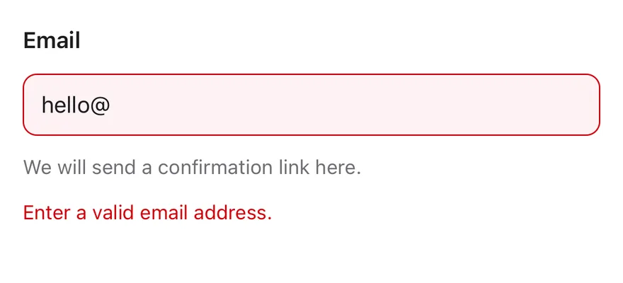
A field in the invalid state with an error message.
```tsx
import { Field, FieldDescription, FieldError, FieldLabel } from "@/components/ui/field"
import { Input } from "@/components/ui/input"
export function FieldInvalidExample() {
return (
Email
We will send a confirmation link here.
Enter a valid email address.
)
}
```
```swift
import EsuissUI
import SwiftUI
struct FieldInvalidDemo: View {
@State private var email = "hello@"
var body: some View {
Field(invalid: true) {
FieldLabel("Email")
.accessibilityHidden(true)
TextField("Email", text: $email)
.textFieldStyle(.input)
.keyboardType(.emailAddress)
.textInputAutocapitalization(.never)
.accessibilityLabel(Text("Email"))
FieldDescription("We will send a confirmation link here.")
FieldError("Enter a valid email address.")
}
}
}
```
```kotlin
import androidx.compose.foundation.text.KeyboardOptions
import androidx.compose.runtime.Composable
import androidx.compose.runtime.getValue
import androidx.compose.runtime.mutableStateOf
import androidx.compose.runtime.saveable.rememberSaveable
import androidx.compose.runtime.setValue
import androidx.compose.ui.Modifier
import androidx.compose.ui.semantics.contentDescription
import androidx.compose.ui.semantics.semantics
import androidx.compose.ui.text.input.KeyboardCapitalization
import androidx.compose.ui.text.input.KeyboardType
import com.esuiss.ui.components.Field
import com.esuiss.ui.components.FieldDescription
import com.esuiss.ui.components.FieldError
import com.esuiss.ui.components.FieldLabel
import com.esuiss.ui.components.Input
val FieldEmailText = KeyboardOptions(
capitalization = KeyboardCapitalization.None,
autoCorrectEnabled = false,
keyboardType = KeyboardType.Email,
)
@Composable
fun FieldInvalid() {
var value by rememberSaveable { mutableStateOf("hello@") }
Field(invalid = true) {
FieldLabel("Email")
Input(value, { value = it }, Modifier.semantics { contentDescription = "Email" }, keyboardOptions = FieldEmailText)
FieldDescription("We will send a confirmation link here.")
FieldError("Enter a valid email address.")
}
}
```
### Validation
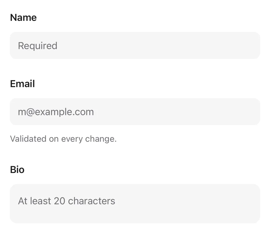
Required, custom and minimum-length validation on blur and on change.
```tsx
import { Field, FieldDescription, FieldError, FieldGroup, FieldLabel } from "@/components/ui/field"
import { Input } from "@/components/ui/input"
import { Textarea } from "@/components/ui/textarea"
export function FieldValidationExample() {
return (
Name
typeof value === "string" && value.includes("@")
? null
: "Email must contain @."
}
>
Email
Validated on every change.
Bio
Tell us a little more.
)
}
```
```swift
import EsuissUI
import SwiftUI
enum FieldMessages {
static let required = "This field is required."
static func tooShort(_ minLength: Int) -> String {
"Use at least \(minLength) characters."
}
}
struct FieldValidationDemo: View {
enum Focus: Hashable {
case name, email, bio
}
@State private var name = ""
@State private var email = ""
@State private var bio = ""
@State private var nameError: String?
@State private var emailError: String?
@State private var bioError: String?
@State private var nameTouched = false
@State private var bioTouched = false
@FocusState private var focus: Focus?
var body: some View {
FieldGroup {
Field(invalid: nameError != nil) {
FieldLabel("Name")
.accessibilityHidden(true)
TextField("Required", text: $name)
.textFieldStyle(.input)
.focused($focus, equals: .name)
.accessibilityLabel(Text("Name"))
FieldError(errors: [nameError])
}
Field(invalid: emailError != nil) {
FieldLabel("Email")
.accessibilityHidden(true)
TextField("m@example.com", text: $email)
.textFieldStyle(.input)
.keyboardType(.emailAddress)
.textInputAutocapitalization(.never)
.focused($focus, equals: .email)
.accessibilityLabel(Text("Email"))
FieldDescription("Validated on every change.")
FieldError(errors: [emailError])
}
Field(invalid: bioError != nil) {
FieldLabel("Bio")
.accessibilityHidden(true)
TextField("At least 20 characters", text: $bio, axis: .vertical)
.textFieldStyle(.textarea)
.focused($focus, equals: .bio)
.accessibilityLabel(Text("Bio"))
if bioError != nil {
FieldError("Tell us a little more.")
}
}
}
.onChange(of: focus) { previous, _ in
switch previous {
case .name:
nameTouched = true
nameError = validateName()
case .bio:
bioTouched = true
bioError = validateBio()
default:
break
}
}
.onChange(of: name) {
if nameTouched { nameError = validateName() }
}
.onChange(of: email) {
emailError = email.contains("@") ? nil : "Email must contain @."
}
.onChange(of: bio) {
if bioTouched { bioError = validateBio() }
}
}
func validateName() -> String? {
name.isEmpty ? FieldMessages.required : nil
}
func validateBio() -> String? {
!bio.isEmpty && bio.count < 20 ? FieldMessages.tooShort(20) : nil
}
}
let required = "This field is required."
func tooShort(_ minLength: Int) -> String {
"Use at least \(minLength) characters."
}
```
```kotlin
import androidx.compose.foundation.text.KeyboardOptions
import androidx.compose.runtime.Composable
import androidx.compose.runtime.getValue
import androidx.compose.runtime.mutableStateOf
import androidx.compose.runtime.remember
import androidx.compose.runtime.rememberUpdatedState
import androidx.compose.runtime.saveable.rememberSaveable
import androidx.compose.runtime.setValue
import androidx.compose.ui.Modifier
import androidx.compose.ui.focus.onFocusChanged
import androidx.compose.ui.semantics.contentDescription
import androidx.compose.ui.semantics.semantics
import androidx.compose.ui.text.input.KeyboardCapitalization
import androidx.compose.ui.text.input.KeyboardType
import com.esuiss.ui.components.Field
import com.esuiss.ui.components.FieldDescription
import com.esuiss.ui.components.FieldError
import com.esuiss.ui.components.FieldGroup
import com.esuiss.ui.components.FieldLabel
import com.esuiss.ui.components.Input
import com.esuiss.ui.components.Textarea
val FieldEmailText = KeyboardOptions(
capitalization = KeyboardCapitalization.None,
autoCorrectEnabled = false,
keyboardType = KeyboardType.Email,
)
class FieldFocus {
var focused = false
}
@Composable
fun fieldOnBlur(onBlur: () -> Unit): Modifier {
val focus = remember { FieldFocus() }
val current by rememberUpdatedState(onBlur)
return Modifier.onFocusChanged { state ->
if (focus.focused && !state.isFocused) current()
focus.focused = state.isFocused
}
}
@Composable
fun FieldValidation() {
var name by rememberSaveable { mutableStateOf("") }
var nameError by rememberSaveable { mutableStateOf(null) }
var email by rememberSaveable { mutableStateOf("") }
var emailError by rememberSaveable { mutableStateOf(null) }
var bio by rememberSaveable { mutableStateOf("") }
var bioShort by rememberSaveable { mutableStateOf(false) }
FieldGroup {
Field(invalid = nameError != null) {
FieldLabel("Name")
Input(
name,
{
name = it
if (nameError != null && it.isNotEmpty()) nameError = null
},
Modifier
.semantics { contentDescription = "Name" }
.then(fieldOnBlur { nameError = if (name.isEmpty()) FieldRequiredMessage else null }),
placeholder = "Required",
)
FieldError(nameError)
}
Field(invalid = emailError != null) {
FieldLabel("Email")
Input(
email,
{
email = it
emailError = if (it.contains("@")) null else "Email must contain @."
},
Modifier.semantics { contentDescription = "Email" },
placeholder = "m@example.com",
keyboardOptions = FieldEmailText,
)
FieldDescription("Validated on every change.")
FieldError(emailError)
}
Field(invalid = bioShort) {
FieldLabel("Bio")
Textarea(
bio,
{
bio = it
if (bioShort && (it.isEmpty() || it.length >= 20)) bioShort = false
},
Modifier
.semantics { contentDescription = "Bio" }
.then(fieldOnBlur { bioShort = bio.isNotEmpty() && bio.length < 20 }),
placeholder = "At least 20 characters",
)
FieldError(if (bioShort) "Tell us a little more." else null)
}
}
}
```
### Disabled
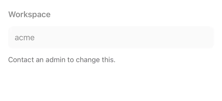
A disabled field.
```tsx
import { Field, FieldDescription, FieldLabel } from "@/components/ui/field"
import { Input } from "@/components/ui/input"
export function FieldDisabledExample() {
return (
Workspace
Contact an admin to change this.
)
}
```
```swift
import EsuissUI
import SwiftUI
struct FieldDisabledDemo: View {
@State private var workspace = "acme"
var body: some View {
Field {
FieldLabel("Workspace")
.accessibilityHidden(true)
TextField("Workspace", text: $workspace)
.textFieldStyle(.input)
.accessibilityLabel(Text("Workspace"))
FieldDescription("Contact an admin to change this.")
}
.disabled(true)
}
}
```
```kotlin
import androidx.compose.runtime.Composable
import androidx.compose.runtime.getValue
import androidx.compose.runtime.mutableStateOf
import androidx.compose.runtime.saveable.rememberSaveable
import androidx.compose.runtime.setValue
import androidx.compose.ui.Modifier
import androidx.compose.ui.semantics.contentDescription
import androidx.compose.ui.semantics.semantics
import com.esuiss.ui.components.Field
import com.esuiss.ui.components.FieldDescription
import com.esuiss.ui.components.FieldLabel
import com.esuiss.ui.components.Input
@Composable
fun FieldDisabled() {
var value by rememberSaveable { mutableStateOf("acme") }
Field(enabled = false) {
FieldLabel("Workspace")
Input(value, { value = it }, Modifier.semantics { contentDescription = "Workspace" })
FieldDescription("Contact an admin to change this.")
}
}
```
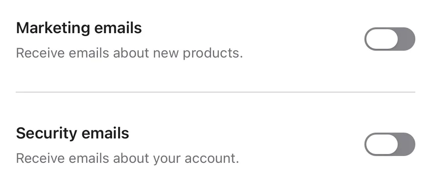
### Horizontal
Switch rows with a title and description beside the control.
```tsx
import { Field, FieldContent, FieldDescription, FieldGroup, FieldSeparator, FieldTitle } from "@/components/ui/field"
import { Switch } from "@/components/ui/switch"
export function FieldHorizontalExample() {
return (
Marketing emails
Receive emails about new products.
Security emails
Receive emails about your account.
)
}
```
```swift
import EsuissUI
import SwiftUI
struct FieldHorizontalDemo: View {
@State private var marketing = false
@State private var security = false
var body: some View {
FieldGroup {
Field(orientation: .horizontal) {
FieldContent {
FieldTitle("Marketing emails")
FieldDescription("Receive emails about new products.")
}
Toggle(isOn: $marketing) { EmptyView() }
.toggleStyle(.switch(size: .default))
.accessibilityLabel(Text("Marketing emails"))
}
FieldSeparator()
Field(orientation: .horizontal) {
FieldContent {
FieldTitle("Security emails")
FieldDescription("Receive emails about your account.")
}
Toggle(isOn: $security) { EmptyView() }
.toggleStyle(.switch(size: .default))
.accessibilityLabel(Text("Security emails"))
}
}
}
}
```
```kotlin
import androidx.compose.runtime.Composable
import androidx.compose.runtime.getValue
import androidx.compose.runtime.mutableStateOf
import androidx.compose.runtime.saveable.rememberSaveable
import androidx.compose.runtime.setValue
import androidx.compose.ui.Modifier
import androidx.compose.ui.semantics.contentDescription
import androidx.compose.ui.semantics.semantics
import com.esuiss.ui.components.Field
import com.esuiss.ui.components.FieldContent
import com.esuiss.ui.components.FieldDescription
import com.esuiss.ui.components.FieldGroup
import com.esuiss.ui.components.FieldOrientation
import com.esuiss.ui.components.FieldSeparator
import com.esuiss.ui.components.FieldTitle
import com.esuiss.ui.components.Switch
@Composable
fun FieldHorizontal() {
var marketing by rememberSaveable { mutableStateOf(false) }
var security by rememberSaveable { mutableStateOf(false) }
FieldGroup {
Field(orientation = FieldOrientation.Horizontal) {
FieldContent {
FieldTitle("Marketing emails")
FieldDescription("Receive emails about new products.")
}
Switch(marketing, { marketing = it }, Modifier.semantics { contentDescription = "Marketing emails" })
}
FieldSeparator()
Field(orientation = FieldOrientation.Horizontal) {
FieldContent {
FieldTitle("Security emails")
FieldDescription("Receive emails about your account.")
}
Switch(security, { security = it }, Modifier.semantics { contentDescription = "Security emails" })
}
}
}
```
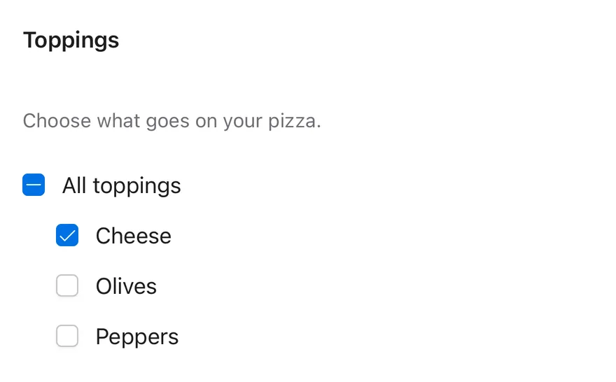
### Checkbox group
A fieldset of checkboxes with a legend.
```tsx
import * as React from "react"
import { View } from "react-native"
import * as CheckboxGroupPrimitive from "@/components/primitives/checkbox-group"
import { Checkbox } from "@/components/ui/checkbox"
import { FieldDescription, FieldLegend, FieldSet } from "@/components/ui/field"
import { Text } from "@/components/ui/text"
const TOPPINGS = ["cheese", "olives", "peppers"]
function ToppingsDemo() {
const [value, setValue] = React.useState(["cheese"])
return (
Toppings
Choose what goes on your pizza.
All toppings
{TOPPINGS.map((topping) => (
{topping}
))}
)
}
export function FieldCheckboxGroupExample() {
return (
= ["cheese"]
var body: some View {
FieldSet {
FieldLegend("Toppings")
FieldDescription("Choose what goes on your pizza.")
VStack(alignment: .leading, spacing: 12) {
Toggle(sources: Self.toppings.map(binding), isOn: \.self) {
Text("All toppings")
.textStyle(.base)
.foregroundStyle(EsuissColor.foreground)
}
.toggleStyle(.checkbox)
ForEach(Self.toppings, id: \.self) { topping in
Toggle(isOn: binding(topping)) {
Text(verbatim: topping.capitalized)
.textStyle(.base)
.foregroundStyle(EsuissColor.foreground)
}
.toggleStyle(.checkbox)
.padding(.leading, 24)
}
}
}
}
func binding(_ topping: String) -> Binding {
Binding(
get: { selected.contains(topping) },
set: { isOn in
if isOn { selected.insert(topping) } else { selected.remove(topping) }
}
)
}
}
let toppings = ["cheese", "olives", "peppers"]
```
```kotlin
import androidx.compose.foundation.layout.Arrangement
import androidx.compose.foundation.layout.Column
import androidx.compose.foundation.layout.Row
import androidx.compose.foundation.layout.padding
import androidx.compose.runtime.Composable
import androidx.compose.runtime.getValue
import androidx.compose.runtime.mutableStateOf
import androidx.compose.runtime.saveable.rememberSaveable
import androidx.compose.runtime.setValue
import androidx.compose.ui.Alignment
import androidx.compose.ui.Modifier
import androidx.compose.ui.semantics.contentDescription
import androidx.compose.ui.semantics.semantics
import androidx.compose.ui.state.ToggleableState
import androidx.compose.ui.unit.dp
import com.esuiss.ui.components.Checkbox
import com.esuiss.ui.components.FieldDescription
import com.esuiss.ui.components.FieldLegend
import com.esuiss.ui.components.FieldSet
import com.esuiss.ui.components.Text
import com.esuiss.ui.components.TriStateCheckbox
val FieldToppings = listOf("cheese", "olives", "peppers")
@Composable
fun FieldCheckboxGroup() {
var value by rememberSaveable { mutableStateOf(listOf("cheese")) }
val parent = when (value.size) {
0 -> ToggleableState.Off
FieldToppings.size -> ToggleableState.On
else -> ToggleableState.Indeterminate
}
FieldSet {
FieldLegend("Toppings")
FieldDescription("Choose what goes on your pizza.")
Column(verticalArrangement = Arrangement.spacedBy(12.dp)) {
Row(horizontalArrangement = Arrangement.spacedBy(12.dp), verticalAlignment = Alignment.CenterVertically) {
TriStateCheckbox(
parent,
{ value = if (parent == ToggleableState.On) emptyList() else FieldToppings },
Modifier.semantics { contentDescription = "All toppings" },
)
Text("All toppings")
}
FieldToppings.forEach { topping ->
val label = topping.replaceFirstChar { it.uppercaseChar() }
Row(
modifier = Modifier.padding(start = 24.dp),
horizontalArrangement = Arrangement.spacedBy(12.dp),
verticalAlignment = Alignment.CenterVertically,
) {
Checkbox(
topping in value,
{ checked -> value = if (checked) FieldToppings.filter { it in value || it == topping } else value - topping },
Modifier.semantics { contentDescription = label },
)
Text(label)
}
}
}
}
}
```
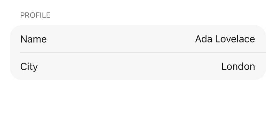
### Inset
An `inset` group of rows on a rounded surface.
```tsx
import { Field, FieldGroup, FieldLabel, FieldLegend, FieldSet } from "@/components/ui/field"
import { Input } from "@/components/ui/input"
export function FieldInsetExample() {
return (
Profile
Name
City
)
}
```
```swift
import EsuissUI
import SwiftUI
struct FieldInsetDemo: View {
@State private var name = "Ada Lovelace"
@State private var city = "London"
var body: some View {
FieldSet {
FieldLegend("Profile")
FieldGroup(.inset) {
FieldInsetRow(title: "Name", text: $name)
FieldInsetRow(title: "City", text: $city)
}
}
}
}
struct FieldInsetRow: View {
let title: LocalizedStringKey
@Binding var text: String
var body: some View {
Field(orientation: .horizontal) {
FieldLabel(title)
.frame(maxWidth: .infinity, alignment: .leading)
.accessibilityHidden(true)
TextField(title, text: $text)
.textFieldStyle(.plain)
.multilineTextAlignment(.trailing)
.textStyle(.base)
.foregroundStyle(EsuissColor.foreground)
.frame(maxWidth: .infinity, minHeight: 32)
.accessibilityLabel(Text(title))
}
}
}
```
```kotlin
import androidx.compose.foundation.layout.Row
import androidx.compose.foundation.layout.height
import androidx.compose.foundation.text.BasicTextField
import androidx.compose.runtime.Composable
import androidx.compose.runtime.getValue
import androidx.compose.runtime.mutableStateOf
import androidx.compose.runtime.saveable.rememberSaveable
import androidx.compose.runtime.setValue
import androidx.compose.ui.Alignment
import androidx.compose.ui.Modifier
import androidx.compose.ui.graphics.SolidColor
import androidx.compose.ui.semantics.contentDescription
import androidx.compose.ui.semantics.semantics
import androidx.compose.ui.text.style.TextAlign
import androidx.compose.ui.unit.dp
import com.esuiss.ui.components.Field
import com.esuiss.ui.components.FieldGroup
import com.esuiss.ui.components.FieldGroupVariant
import com.esuiss.ui.components.FieldLabel
import com.esuiss.ui.components.FieldLegend
import com.esuiss.ui.components.FieldOrientation
import com.esuiss.ui.components.FieldSet
import com.esuiss.ui.theme.EsuissTheme
import com.esuiss.ui.theme.Typography
@Composable
fun FieldInsetInput(value: String, onValueChange: (String) -> Unit, label: String, modifier: Modifier) {
val colors = EsuissTheme.colors
BasicTextField(
value = value,
onValueChange = onValueChange,
modifier = modifier
.height(32.dp)
.semantics { contentDescription = label },
textStyle = Typography.base.copy(color = colors.foreground, textAlign = TextAlign.End),
singleLine = true,
cursorBrush = SolidColor(colors.primary),
decorationBox = { inner ->
Row(verticalAlignment = Alignment.CenterVertically) { inner() }
},
)
}
@Composable
fun FieldInset() {
var name by rememberSaveable { mutableStateOf("Ada Lovelace") }
var city by rememberSaveable { mutableStateOf("London") }
FieldSet {
FieldLegend("Profile")
FieldGroup(variant = FieldGroupVariant.Inset) {
Field(orientation = FieldOrientation.Horizontal) {
FieldLabel("Name", Modifier.weight(1f))
FieldInsetInput(name, { name = it }, "Name", Modifier.weight(1f))
}
Field(orientation = FieldOrientation.Horizontal) {
FieldLabel("City", Modifier.weight(1f))
FieldInsetInput(city, { city = it }, "City", Modifier.weight(1f))
}
}
}
}
```
### Form
A complete form with validation and a submit button.
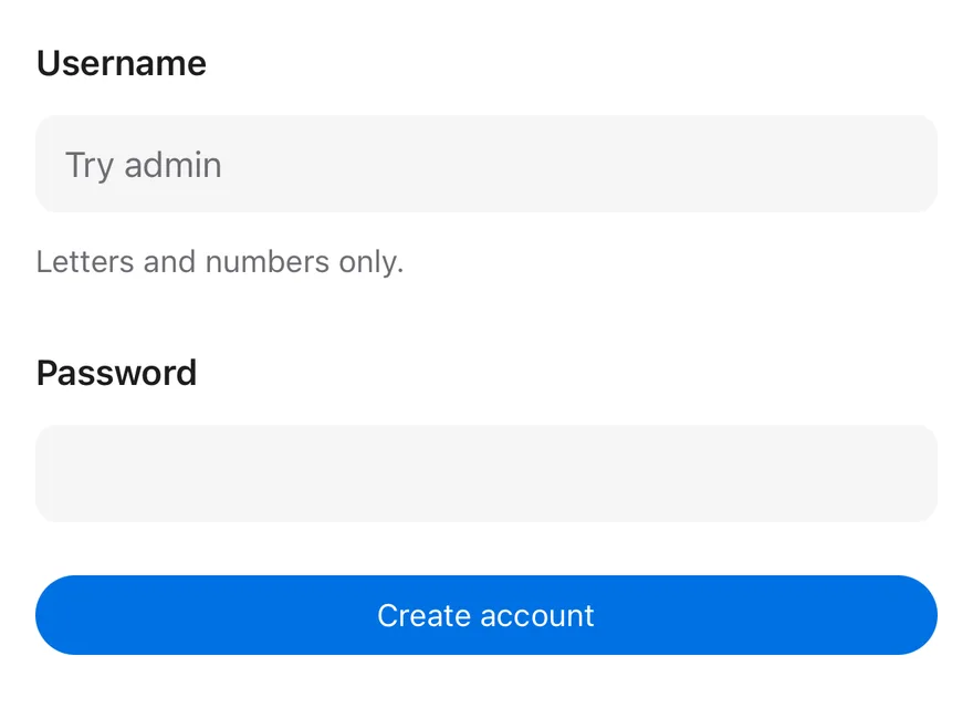
```tsx
import * as React from "react"
import * as FormPrimitive from "@/components/primitives/form"
import { Button } from "@/components/ui/button"
import { Field, FieldDescription, FieldError, FieldGroup, FieldLabel } from "@/components/ui/field"
import { Input } from "@/components/ui/input"
import { Text } from "@/components/ui/text"
const DIGIT = /\d/
function FormDemo() {
const actionsRef = React.useRef(null)
const [errors, setErrors] = React.useState({})
const [submitted, setSubmitted] = React.useState(null)
return (
{
if (values.username === "admin") {
setErrors({ username: "This username is taken." })
return
}
setSubmitted(JSON.stringify(values))
}}
className="gap-6"
>
Username
Letters and numbers only.
typeof value === "string" && DIGIT.test(value)
? null
: "Include at least one number."
}
>
Password
actionsRef.current?.submit()}>
Create account
{submitted ? Submitted: {submitted} : null}
)
}
export function FieldFormExample() {
return (
= buildList {
if (username.isEmpty()) add(FieldRequiredMessage)
if (taken) add("This username is taken.")
}
fun fieldPasswordErrors(password: String): List = buildList {
if (password.isEmpty()) add(FieldRequiredMessage)
if (password.isNotEmpty() && password.length < 8) add("Use at least 8 characters.")
if (!password.any { it.isDigit() }) add("Include at least one number.")
}
@Composable
fun FieldForm() {
var username by rememberSaveable { mutableStateOf("") }
var password by rememberSaveable { mutableStateOf("") }
var taken by rememberSaveable { mutableStateOf(false) }
var attempted by rememberSaveable { mutableStateOf(false) }
var submitted by rememberSaveable { mutableStateOf(null) }
val usernameErrors = if (attempted) fieldUsernameErrors(username, taken) else emptyList()
val passwordErrors = if (attempted) fieldPasswordErrors(password) else emptyList()
Column(Modifier.fillMaxWidth(), verticalArrangement = Arrangement.spacedBy(24.dp)) {
FieldGroup {
Field(invalid = usernameErrors.isNotEmpty()) {
FieldLabel("Username")
Input(
username,
{
username = it
taken = false
},
Modifier.semantics { contentDescription = "Username" },
placeholder = "Try admin",
keyboardOptions = FieldPlainText,
)
FieldDescription("Letters and numbers only.")
FieldError(usernameErrors)
}
Field(invalid = passwordErrors.isNotEmpty()) {
FieldLabel("Password")
Input(
password,
{ password = it },
Modifier.semantics { contentDescription = "Password" },
keyboardOptions = KeyboardOptions(keyboardType = KeyboardType.Password),
visualTransformation = PasswordVisualTransformation(),
)
FieldError(passwordErrors)
}
}
Button(
"Create account",
onClick = {
attempted = true
val invalid = fieldUsernameErrors(username, false).isNotEmpty() || fieldPasswordErrors(password).isNotEmpty()
if (invalid) return@Button
if (username == "admin") {
taken = true
return@Button
}
submitted = "{\"username\":\"$username\",\"password\":\"$password\"}"
},
modifier = Modifier.fillMaxWidth(),
)
submitted?.let { Text("Submitted: $it", variant = TextVariant.Muted) }
}
}
```
## API Reference
### FieldSet
Group of related fields.
Also accepts the props of `React.ComponentProps`.
### FieldLegend
Heading for a fieldset.
| Prop | Type | Default | Description |
| --- | --- | --- | --- |
| `variant` | `"legend" \| "label"` | `"legend"` | `legend` (heading) or `label`. |
Also accepts the props of `React.ComponentProps`.
### FieldGroup
Stack of fields, plain or inset.
| Prop | Type | Default | Description |
| --- | --- | --- | --- |
| `variant` | `FieldGroupVariant` | `"default"` | `default` or `inset`. |
Also accepts the props of `React.ComponentProps`.
### Field
One field that shares state with its control.
| Prop | Type | Default | Description |
| --- | --- | --- | --- |
| `orientation` | `FieldOrientation` | `"vertical"` | `vertical`, `horizontal` or `responsive`. |
Also accepts the props of `React.ComponentProps`.
### FieldContent
Column for a title and description beside a control.
Also accepts the props of `React.ComponentProps`.
### FieldLabel
Label linked to the control.
Also accepts the props of `React.ComponentProps`.
### FieldTitle
Bold text for a field's title.
Also accepts the props of `React.ComponentProps`.
### FieldDescription
Helper text.
Also accepts the props of `React.ComponentProps`.
### FieldSeparator
Divider with optional centered text.
| Prop | Type | Default | Description |
| --- | --- | --- | --- |
| `children` | `React.ReactNode` | - | |
Also accepts the props of `React.ComponentProps`.
### FieldError
Error message shown when validation fails.
| Prop | Type | Default | Description |
| --- | --- | --- | --- |
| `errors` | `Array<{ message?: string } \| undefined>` | - | Array of `{ message }` objects to show. |
Also accepts the props of `React.ComponentProps`.
## Accessibility
- The control is labelled by `FieldLabel` and gets the description and error text as its accessibility hint.
- `FieldError` has the `alert` role, so screen readers announce it when it appears.
- `FieldSet` has the `group` role labelled by its legend; the legend has the `header` role.
- Disabled state is passed to the label and control.
## Notes
- Uses `text-foreground`, `text-muted-foreground`, `text-destructive` and `bg-muted` tokens; light and dark follow the system appearance.
- Inset separators use start and end offsets, so they flip in right-to-left layouts.