# Empty
A placeholder that explains why a view has no content and what people can do next.
Empty is an open-source component from suiss/ui for React, React Native, SwiftUI and Jetpack Compose. The @esuiss/ui CLI copies its source into your project, so you own the code.
Source: https://ui.suiss.app/docs/components/empty
**React**
**Example**
```tsx
import { ArrowUpRightIcon, FolderSimpleIcon } from "@phosphor-icons/react"
import { Button } from "@/components/ui/button"
import {
Empty,
EmptyContent,
EmptyDescription,
EmptyHeader,
EmptyMedia,
EmptyTitle,
} from "@/components/ui/empty"
export default function EmptyDemo() {
return (
No projects yet
You haven't created any projects yet. Get started by creating
your first project.
)
}
```
`Empty` is a centered container for empty states. Inside it, `EmptyHeader` groups an optional `EmptyMedia` with an `EmptyTitle` and `EmptyDescription`, and `EmptyContent` holds the actions, such as buttons, a search field or a help link. All parts are plain, styled elements with no interactive behavior of their own.
Use it when a list, folder, search or page has nothing to show. Keep the title short and use the description to suggest a next step.
## Installation
### CLI
```bash title="Terminal"
npx shadcn@latest add @esuiss/empty
```
Works in any project with a `components.json`. See [Installation](https://ui.suiss.app/docs/installation#add-components) for the one-line registry setup. Or use the suiss/ui CLI:
```bash title="Terminal"
npx @esuiss/ui@latest add empty
```
### Manual
1. Install the dependencies and add the [`cn` helper](https://ui.suiss.app/docs/installation#the-cn-helper):
```bash title="Terminal"
npm install class-variance-authority
```
2. Copy the source into `components/ui/empty.tsx`:
```tsx title="components/ui/empty.tsx"
import { cva, type VariantProps } from "class-variance-authority"
import { cn } from "@/lib/utils"
function Empty({ className, ...props }: React.ComponentProps<"div">) {
return (
)
}
function EmptyHeader({ className, ...props }: React.ComponentProps<"div">) {
return (
)
}
const emptyMediaVariants = cva(
"mb-2 flex shrink-0 items-center justify-center [&_svg]:pointer-events-none [&_svg]:shrink-0",
{
variants: {
variant: {
default: "bg-transparent",
icon: "flex size-10 shrink-0 items-center justify-center rounded-lg bg-muted text-foreground [&_svg:not([class*='size-'])]:size-5",
},
},
defaultVariants: {
variant: "default",
},
}
)
function EmptyMedia({
className,
variant = "default",
...props
}: React.ComponentProps<"div"> & VariantProps) {
return (
)
}
function EmptyTitle({ className, ...props }: React.ComponentProps<"div">) {
return (
)
}
function EmptyDescription({ className, ...props }: React.ComponentProps<"p">) {
return (
a]:underline [&>a:hover]:text-primary",
className
)}
{...props}
/>
)
}
function EmptyContent({ className, ...props }: React.ComponentProps<"div">) {
return (
)
}
export {
Empty,
EmptyContent,
EmptyDescription,
EmptyHeader,
EmptyMedia,
EmptyTitle,
}
```
3. Update the import paths to match your project.
## Usage
```tsx
import { Empty, EmptyHeader, EmptyMedia, EmptyTitle, EmptyDescription, EmptyContent } from "@/components/ui/empty"
```
```tsx
No projects yet
You haven't created any projects yet. Get started by creating
your first project.
```
`Empty` has a dashed border style but no border width by default; add `border` through `className` to show an outline. Set `EmptyMedia` to `variant="icon"` for a small icon in a tinted tile, or keep the default to render media such as a large icon or illustration as is. Links placed directly inside `EmptyDescription` are underlined.
## Examples
### Outline
An empty state with a visible dashed outline, added through `className="border"`.
**Example**
```tsx
import { CloudIcon } from "@phosphor-icons/react"
import { Button } from "@/components/ui/button"
import {
Empty,
EmptyContent,
EmptyDescription,
EmptyHeader,
EmptyMedia,
EmptyTitle,
} from "@/components/ui/empty"
export default function EmptyOutline() {
return (
Cloud storage is empty
Upload files to your cloud storage to access them anywhere.
)
}
```
### Default media
An empty state with a large icon in `EmptyMedia` using the default variant.
**Example**
```tsx
import { FolderSimpleIcon } from "@phosphor-icons/react"
import {
Empty,
EmptyDescription,
EmptyHeader,
EmptyMedia,
EmptyTitle,
} from "@/components/ui/empty"
export default function EmptyDefaultMedia() {
return (
This folder is emptyDrag files here to add them.
)
}
```
### With search
A not-found state with an `InputGroup` search field and a support link in `EmptyContent`.
**Example**
```tsx
import { MagnifyingGlassIcon } from "@phosphor-icons/react"
import {
Empty,
EmptyContent,
EmptyDescription,
EmptyHeader,
EmptyTitle,
} from "@/components/ui/empty"
import {
InputGroup,
InputGroupAddon,
InputGroupInput,
} from "@/components/ui/input-group"
export default function EmptyWithSearch() {
return (
404 - Not found
The page you're looking for doesn't exist. Try searching
for what you need below.
Need help? Contact support
)
}
```
## API Reference
- `Empty`
- `EmptyHeader`
- `EmptyMedia`
- `EmptyTitle`
- `EmptyDescription`
- `EmptyContent`
- `EmptyDescription`
### Empty
The centered container for the empty state.
Also accepts the props of `React.ComponentProps<"div">`.
### EmptyHeader
Groups the media, title and description.
Also accepts the props of `React.ComponentProps<"div">`.
### EmptyMedia
Holds an icon or image above the title.
| Prop | Type | Default | Description |
| --- | --- | --- | --- |
| `variant` | `"default" \| "icon"` | `"default"` | `icon` places the icon in a small rounded `bg-muted` tile; `default` renders the media without a background. |
Also accepts the props of `React.ComponentProps<"div">`.
### EmptyTitle
The short heading of the empty state.
Also accepts the props of `React.ComponentProps<"div">`.
### EmptyDescription
Supporting text that explains the state or suggests a next step.
Also accepts the props of `React.ComponentProps<"p">`.
### EmptyContent
Holds actions such as buttons, inputs or links.
Also accepts the props of `React.ComponentProps<"div">`.
## Accessibility
- `EmptyTitle` renders a `div`, not a heading. If the empty state should appear in the document outline, render a heading element inside it or pass the appropriate role and level.
- Give interactive elements in `EmptyContent` clear accessible names.
## Notes
- Styling hooks: `data-slot` values `empty`, `empty-header`, `empty-icon` (on `EmptyMedia`), `empty-title`, `empty-description` and `empty-content`.
- `EmptyMedia` also sets `data-variant`.
- `EmptyDescription` renders a `div` element even though it accepts paragraph props.
- Uses the `muted`, `foreground`, `muted-foreground` and `primary` tokens.
**React Native, SwiftUI, Jetpack Compose**
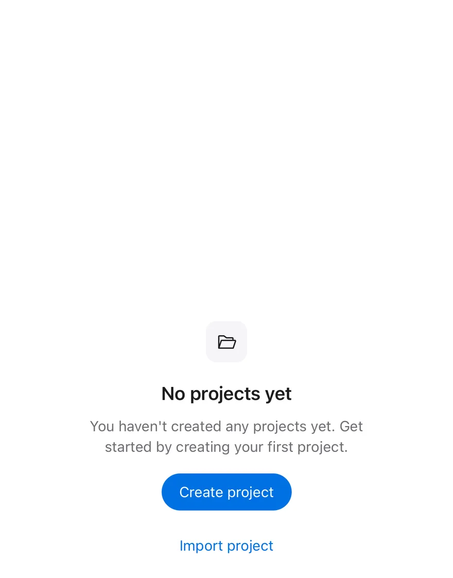
```tsx
import { FolderOpenIcon } from "phosphor-react-native"
import { Button } from "@/components/ui/button"
import { Empty, EmptyContent, EmptyDescription, EmptyHeader, EmptyMedia, EmptyTitle } from "@/components/ui/empty"
import { Icon } from "@/components/ui/icon"
import { Text } from "@/components/ui/text"
export function EmptyExample() {
return (
No projects yet
You haven't created any projects yet. Get started by creating your
first project.
)
}
```
```swift
import EsuissUI
import PhosphorSwift
import SwiftUI
struct EmptyExample: View {
var body: some View {
Empty {
EmptyHeader {
EmptyMedia(.icon) { Ph.folderOpen.regular }
EmptyTitle("No projects yet")
EmptyDescription("You haven't created any projects yet. Get started by creating your first project.")
}
EmptyContent {
Button("Create project") {}
.buttonStyle(.variant())
Button("Import project") {}
.buttonStyle(.variant(.link))
}
}
}
}
```
```kotlin
import androidx.compose.runtime.Composable
import com.adamglin.PhosphorIcons
import com.adamglin.phosphoricons.Regular
import com.adamglin.phosphoricons.regular.FolderOpen
import com.esuiss.ui.components.Button
import com.esuiss.ui.components.ButtonVariant
import com.esuiss.ui.components.Empty
import com.esuiss.ui.components.EmptyContent
import com.esuiss.ui.components.EmptyDescription
import com.esuiss.ui.components.EmptyHeader
import com.esuiss.ui.components.EmptyMedia
import com.esuiss.ui.components.EmptyMediaVariant
import com.esuiss.ui.components.EmptyTitle
import com.esuiss.ui.components.Icon
@Composable
fun EmptyDefault() {
Empty {
EmptyHeader {
EmptyMedia(variant = EmptyMediaVariant.Icon) {
Icon(PhosphorIcons.Regular.FolderOpen, contentDescription = null)
}
EmptyTitle("No projects yet")
EmptyDescription("You haven't created any projects yet. Get started by creating your first project.")
}
EmptyContent {
Button("Create project", onClick = {})
Button("Import project", onClick = {}, variant = ButtonVariant.Link)
}
}
}
```
`Empty` is a centered column that fills the available space and holds an `EmptyHeader` with optional `EmptyMedia`, an `EmptyTitle` and an `EmptyDescription`, followed by `EmptyContent` for actions. Text is centered and the header and content are limited to a readable width.
Use it for empty lists, search results with no matches and first-run screens.
## Installation
**React Native**
```bash title="Terminal"
npx shadcn@latest add @esuiss-rn/empty
```
See [Installation](https://ui.suiss.app/docs/installation) for the `components.json` setup. Or use the suiss/ui CLI:
```bash title="Terminal"
npx @esuiss/ui@latest add empty
```
**SwiftUI**
```bash title="Terminal"
npx @esuiss/ui@latest add empty --platform swift
```
**Jetpack Compose**
```bash title="Terminal"
npx @esuiss/ui@latest add empty --platform kotlin
```
The CLI also adds what it builds on: [Icon](https://ui.suiss.app/docs/components/icon), [Text](https://ui.suiss.app/docs/components/text).
### Manual
**React Native**
**Uniwind**
1. Install the dependencies:
```bash title="Terminal"
npx expo install class-variance-authority cn
```
2. Add the pieces it builds on: [Icon](https://ui.suiss.app/docs/components/icon), [Text](https://ui.suiss.app/docs/components/text).
3. Copy the source into `components/ui/empty.tsx`:
```tsx title="uniwind/components/ui/empty.tsx"
import { cva, type VariantProps } from "class-variance-authority"
import { cn } from "cn"
import { View, type ViewProps } from "react-native"
import { IconClassContext } from "@/components/ui/icon"
import { Text, TextClassContext } from "@/components/ui/text"
function Empty({ className, ...props }: ViewProps) {
return (
)
}
function EmptyHeader({ className, ...props }: ViewProps) {
return (
)
}
const emptyMediaVariants = cva("mb-2 shrink-0 items-center justify-center", {
variants: {
variant: {
default: "bg-transparent",
icon: "size-10 rounded-lg bg-muted",
},
},
defaultVariants: {
variant: "default",
},
})
function EmptyMedia({
className,
variant = "default",
...props
}: ViewProps & VariantProps) {
return (
)
}
function EmptyTitle({
className,
...props
}: React.ComponentProps) {
return (
)
}
function EmptyDescription({
className,
...props
}: React.ComponentProps) {
return (
)
}
function EmptyContent({ className, ...props }: ViewProps) {
return (
)
}
export {
Empty,
EmptyContent,
EmptyDescription,
EmptyHeader,
EmptyMedia,
EmptyTitle,
}
```
4. Update the import paths to match your project.
**NativeWind**
1. Install the dependencies:
```bash title="Terminal"
npx expo install class-variance-authority cn
```
2. Add the pieces it builds on: [Icon](https://ui.suiss.app/docs/components/icon), [Text](https://ui.suiss.app/docs/components/text).
3. Copy the source into `components/ui/empty.tsx`:
```tsx title="nativewind/components/ui/empty.tsx"
import { cva, type VariantProps } from "class-variance-authority"
import { cn } from "cn"
import { View, type ViewProps } from "react-native"
import { IconClassContext } from "@/components/ui/icon"
import { Text, TextClassContext } from "@/components/ui/text"
function Empty({ className, ...props }: ViewProps) {
return (
)
}
function EmptyHeader({ className, ...props }: ViewProps) {
return (
)
}
const emptyMediaVariants = cva("mb-2 shrink-0 items-center justify-center", {
variants: {
variant: {
default: "bg-transparent",
icon: "size-10 rounded-lg bg-muted",
},
},
defaultVariants: {
variant: "default",
},
})
function EmptyMedia({
className,
variant = "default",
...props
}: ViewProps & VariantProps) {
return (
)
}
function EmptyTitle({
className,
...props
}: React.ComponentProps) {
return (
)
}
function EmptyDescription({
className,
...props
}: React.ComponentProps) {
return (
)
}
function EmptyContent({ className, ...props }: ViewProps) {
return (
)
}
export {
Empty,
EmptyContent,
EmptyDescription,
EmptyHeader,
EmptyMedia,
EmptyTitle,
}
```
4. Update the import paths to match your project.
**StyleSheet**
1. Add the pieces it builds on: [Icon](https://ui.suiss.app/docs/components/icon), [Text](https://ui.suiss.app/docs/components/text).
2. Copy the source into `components/ui/empty.tsx`:
```tsx title="stylesheet/components/ui/empty.tsx"
import { StyleSheet, View, type ViewProps } from "react-native"
import { IconSizeContext } from "@/components/ui/icon"
import { Text, TextStyleContext } from "@/components/ui/text"
import { fontSize, radius, useTheme } from "@/components/ui/theme"
const styles = StyleSheet.create({
root: {
width: "100%",
minWidth: 0,
flex: 1,
flexDirection: "column",
alignItems: "center",
justifyContent: "center",
gap: 16,
borderRadius: radius["2xl"],
padding: 48,
},
header: {
width: "100%",
maxWidth: 384,
flexDirection: "column",
alignItems: "center",
gap: 8,
},
media: {
marginBottom: 8,
flexShrink: 0,
alignItems: "center",
justifyContent: "center",
},
mediaIcon: { width: 40, height: 40, borderRadius: radius.lg },
title: { ...fontSize.lg, fontWeight: "600", textAlign: "center" },
description: { ...fontSize.sm, textAlign: "center" },
content: {
width: "100%",
maxWidth: 384,
minWidth: 0,
flexDirection: "column",
alignItems: "center",
gap: 16,
},
})
function Empty({ style, ...props }: ViewProps) {
return (
)
}
function EmptyHeader({ style, ...props }: ViewProps) {
return
}
function EmptyMedia({
style,
variant = "default",
...props
}: ViewProps & { variant?: "default" | "icon" }) {
const { colors } = useTheme()
const icon = variant === "icon"
return (
)
}
function EmptyTitle({ style, ...props }: React.ComponentProps) {
const { colors } = useTheme()
return (
)
}
function EmptyDescription({
style,
...props
}: React.ComponentProps) {
const { colors } = useTheme()
return (
)
}
function EmptyContent({ style, ...props }: ViewProps) {
return
}
export {
Empty,
EmptyContent,
EmptyDescription,
EmptyHeader,
EmptyMedia,
EmptyTitle,
}
```
3. Update the import paths to match your project.
**SwiftUI**
1. Target iOS 17 or later.
2. Copy the theme files every view uses:
- `swift/Theme/Theme.swift`: [source](https://github.com/e-suiss/ui/blob/main/packages/mobile/swiftui/Sources/EsuissUI/Theme/Theme.swift)
- `swift/Theme/Tokens.swift`: [source](https://github.com/e-suiss/ui/blob/main/packages/mobile/swiftui/Sources/EsuissUI/Theme/Tokens.swift)
3. Copy the source and every file it uses:
```swift title="swift/Components/Empty.swift"
import SwiftUI
public struct Empty: View {
let content: Content
public init(@ViewBuilder content: () -> Content) {
self.content = content()
}
public var body: some View {
VStack(spacing: 16) {
content
}
.multilineTextAlignment(.center)
.padding(48)
.frame(maxWidth: .infinity, maxHeight: .infinity)
.accessibilityElement(children: .contain)
}
}
public struct EmptyHeader: View {
let content: Content
public init(@ViewBuilder content: () -> Content) {
self.content = content()
}
public var body: some View {
VStack(spacing: 8) {
content
}
.frame(maxWidth: 384)
}
}
public enum EmptyMediaVariant: CaseIterable, Sendable {
case `default`, icon
}
public struct EmptyMedia: View {
let variant: EmptyMediaVariant
let content: Content
public init(_ variant: EmptyMediaVariant = .default, @ViewBuilder content: () -> Content) {
self.variant = variant
self.content = content()
}
public var body: some View {
Group {
switch variant {
case .default:
content
case .icon:
content
.frame(width: 20, height: 20)
.foregroundStyle(EsuissColor.foreground)
.frame(width: 40, height: 40)
.background(EsuissColor.muted, in: RoundedRectangle(cornerRadius: Radius.lg, style: .continuous))
}
}
.padding(.bottom, 8)
.accessibilityHidden(true)
}
}
public struct EmptyTitle: View {
let text: Text
public init(_ title: LocalizedStringKey) {
text = Text(title)
}
public init(verbatim title: String) {
text = Text(verbatim: title)
}
public var body: some View {
text
.scaledTextStyle(.lg, weight: .semibold)
.foregroundStyle(EsuissColor.foreground)
.fixedSize(horizontal: false, vertical: true)
.accessibilityAddTraits(.isHeader)
}
}
public struct EmptyDescription: View {
let text: Text
public init(_ description: LocalizedStringKey) {
text = Text(description)
}
public init(verbatim description: String) {
text = Text(verbatim: description)
}
public var body: some View {
text
.scaledTextStyle(TextStyle(size: TextStyle.sm.size, lineHeight: 24))
.foregroundStyle(EsuissColor.mutedForeground)
.tint(EsuissColor.primary)
.fixedSize(horizontal: false, vertical: true)
}
}
public struct EmptyContent: View {
let content: Content
public init(@ViewBuilder content: () -> Content) {
self.content = content()
}
public var body: some View {
VStack(spacing: 16) {
content
}
.scaledFont(.base)
.foregroundStyle(EsuissColor.foreground)
.frame(maxWidth: 384)
}
}
```
- `swift/Components/TextVariant.swift`: [source](https://github.com/e-suiss/ui/blob/main/packages/mobile/swiftui/Sources/EsuissUI/Components/TextVariant.swift)
4. Add the files to your app target.
**Jetpack Compose**
1. Set `minSdk` to 24 or higher and add the dependencies:
```kotlin title="build.gradle.kts"
implementation(platform("androidx.compose:compose-bom:2026.09.00"))
implementation("androidx.compose.foundation:foundation")
implementation("androidx.compose.ui:ui")
```
2. Copy the theme files every view uses:
- `kotlin/theme/Theme.kt`: [source](https://github.com/e-suiss/ui/blob/main/packages/mobile/kotlin/ui/src/main/kotlin/com/esuiss/ui/theme/Theme.kt)
- `kotlin/theme/Tokens.kt`: [source](https://github.com/e-suiss/ui/blob/main/packages/mobile/kotlin/ui/src/main/kotlin/com/esuiss/ui/theme/Tokens.kt)
3. Copy the source and every file it uses:
```kt title="kotlin/components/Empty.kt"
package com.esuiss.ui.components
import androidx.compose.foundation.background
import androidx.compose.foundation.layout.Arrangement
import androidx.compose.foundation.layout.Box
import androidx.compose.foundation.layout.BoxScope
import androidx.compose.foundation.layout.Column
import androidx.compose.foundation.layout.ColumnScope
import androidx.compose.foundation.layout.fillMaxWidth
import androidx.compose.foundation.layout.padding
import androidx.compose.foundation.layout.size
import androidx.compose.foundation.layout.widthIn
import androidx.compose.foundation.shape.RoundedCornerShape
import androidx.compose.foundation.text.BasicText
import androidx.compose.runtime.Composable
import androidx.compose.runtime.CompositionLocalProvider
import androidx.compose.ui.Alignment
import androidx.compose.ui.Modifier
import androidx.compose.ui.semantics.heading
import androidx.compose.ui.semantics.semantics
import androidx.compose.ui.text.font.FontWeight
import androidx.compose.ui.text.style.TextAlign
import androidx.compose.ui.unit.dp
import androidx.compose.ui.unit.sp
import com.esuiss.ui.theme.EsuissTheme
import com.esuiss.ui.theme.Radius
import com.esuiss.ui.theme.Typography
enum class EmptyMediaVariant { Default, Icon }
@Composable
fun Empty(
modifier: Modifier = Modifier,
content: @Composable ColumnScope.() -> Unit,
) {
val colors = EsuissTheme.colors
Column(
modifier = modifier
.fillMaxWidth()
.padding(48.dp),
horizontalAlignment = Alignment.CenterHorizontally,
verticalArrangement = Arrangement.spacedBy(16.dp, Alignment.CenterVertically),
) {
CompositionLocalProvider(
LocalContentStyle provides Typography.base.copy(color = colors.foreground, textAlign = TextAlign.Center),
LocalContentColor provides colors.foreground,
) {
content()
}
}
}
@Composable
fun EmptyHeader(
modifier: Modifier = Modifier,
content: @Composable ColumnScope.() -> Unit,
) {
Column(
modifier = modifier.widthIn(max = 384.dp).semantics(mergeDescendants = true) {},
horizontalAlignment = Alignment.CenterHorizontally,
verticalArrangement = Arrangement.spacedBy(8.dp),
content = content,
)
}
@Composable
fun EmptyMedia(
modifier: Modifier = Modifier,
variant: EmptyMediaVariant = EmptyMediaVariant.Default,
content: @Composable BoxScope.() -> Unit,
) {
val colors = EsuissTheme.colors
val surface = if (variant == EmptyMediaVariant.Icon) {
val shape = RoundedCornerShape(Radius.lg)
Modifier.size(40.dp).background(colors.muted, shape)
} else {
Modifier
}
Box(
modifier = modifier.padding(bottom = 8.dp).then(surface),
contentAlignment = Alignment.Center,
) {
CompositionLocalProvider(
LocalIconSize provides if (variant == EmptyMediaVariant.Icon) 20.dp else LocalIconSize.current,
LocalContentColor provides colors.foreground,
) {
content()
}
}
}
@Composable
fun EmptyTitle(text: String, modifier: Modifier = Modifier) {
BasicText(
text,
modifier = modifier.semantics { heading() },
style = Typography.lg.copy(
color = EsuissTheme.colors.foreground,
fontWeight = FontWeight.SemiBold,
textAlign = TextAlign.Center,
),
)
}
@Composable
fun EmptyDescription(text: String, modifier: Modifier = Modifier) {
BasicText(
text,
modifier = modifier,
style = Typography.sm.copy(
color = EsuissTheme.colors.mutedForeground,
lineHeight = 24.sp,
textAlign = TextAlign.Center,
),
)
}
@Composable
fun EmptyContent(
modifier: Modifier = Modifier,
content: @Composable ColumnScope.() -> Unit,
) {
Column(
modifier = modifier.widthIn(max = 384.dp).fillMaxWidth(),
horizontalAlignment = Alignment.CenterHorizontally,
verticalArrangement = Arrangement.spacedBy(16.dp),
content = content,
)
}
```
- `kotlin/components/Content.kt`: [source](https://github.com/e-suiss/ui/blob/main/packages/mobile/kotlin/ui/src/main/kotlin/com/esuiss/ui/components/Content.kt)
- `kotlin/components/Icon.kt`: see [Icon](https://ui.suiss.app/docs/components/icon.md)
4. Update the `com.esuiss.ui` package names to match your project.
## Usage
```tsx
import { Empty, EmptyHeader, EmptyMedia, EmptyTitle, EmptyDescription, EmptyContent } from "@/components/ui/empty"
```
```tsx
No projects yet
You haven't created any projects yet. Get started by creating your
first project.
```
`EmptyMedia` has two variants: `default` shows its child as is, such as an illustration, and `icon` puts an `Icon` in a small rounded tile. Put buttons or links in `EmptyContent`.
Add a background class such as `bg-muted` to `Empty` for a filled panel.
## Examples
### Muted
A filled panel with only a title and description.
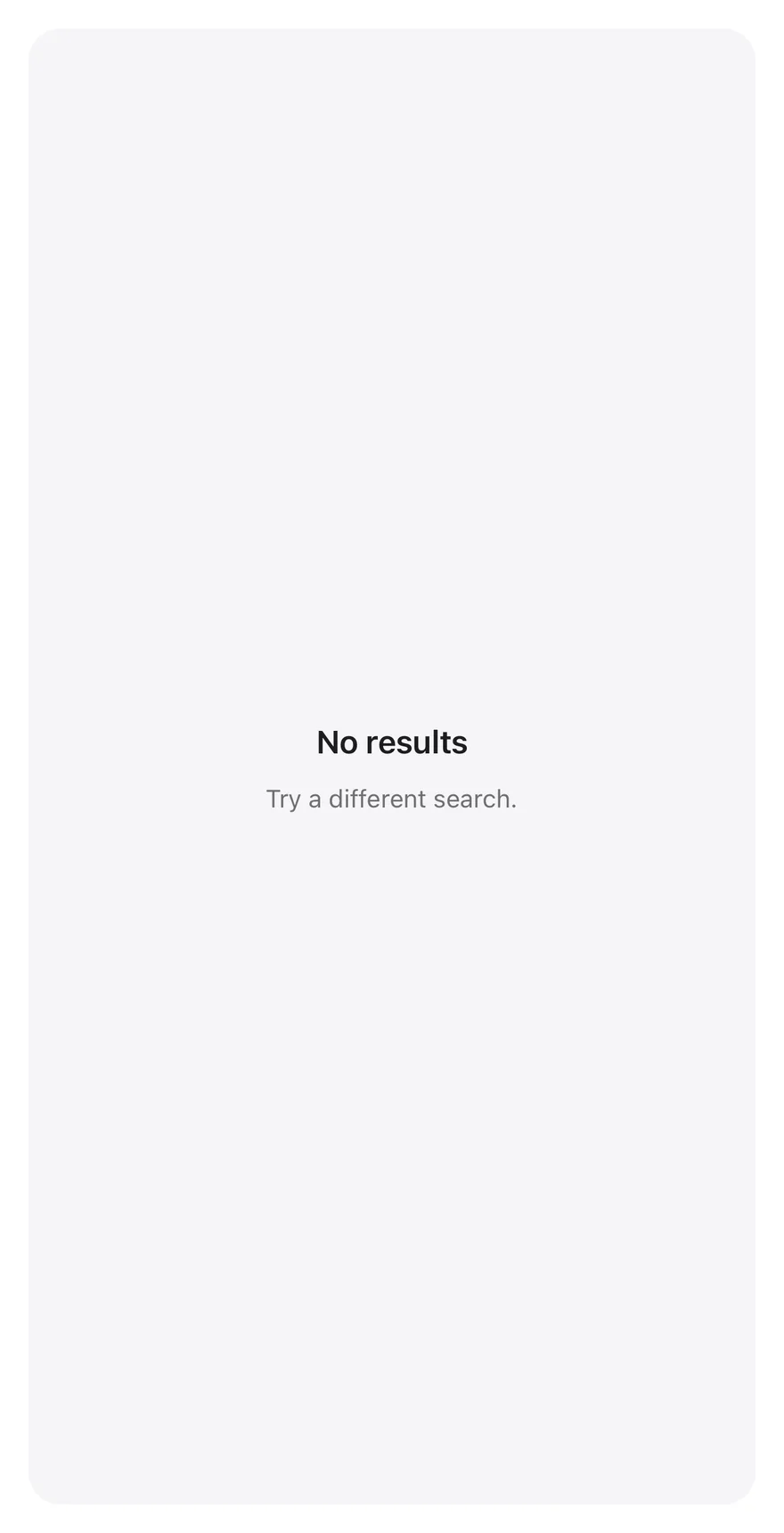
```tsx
import { Empty, EmptyDescription, EmptyHeader, EmptyTitle } from "@/components/ui/empty"
export function EmptyMutedExample() {
return (
No resultsTry a different search.
)
}
```
```swift
import EsuissUI
import SwiftUI
struct EmptyMutedExample: View {
var body: some View {
Empty {
EmptyHeader {
EmptyTitle("No results")
EmptyDescription("Try a different search.")
}
}
.background(EsuissColor.muted, in: RoundedRectangle(cornerRadius: Radius.xl2, style: .continuous))
}
}
```
```kotlin
import androidx.compose.foundation.background
import androidx.compose.foundation.shape.RoundedCornerShape
import androidx.compose.runtime.Composable
import androidx.compose.ui.Modifier
import com.esuiss.ui.components.Empty
import com.esuiss.ui.components.EmptyDescription
import com.esuiss.ui.components.EmptyHeader
import com.esuiss.ui.components.EmptyTitle
import com.esuiss.ui.theme.EsuissTheme
import com.esuiss.ui.theme.Radius
@Composable
fun EmptyMuted() {
Empty(Modifier.background(EsuissTheme.colors.muted, RoundedCornerShape(Radius.xl2))) {
EmptyHeader {
EmptyTitle("No results")
EmptyDescription("Try a different search.")
}
}
}
```
## API Reference
### Empty
Centered container.
Also accepts the props of `ViewProps`.
### EmptyHeader
Column for media, title and description.
Also accepts the props of `ViewProps`.
### EmptyMedia
Decorative icon or illustration.
| Prop | Type | Default | Description |
| --- | --- | --- | --- |
| `variant` | `"default" \| "icon"` | `"default"` | `default` or `icon`. |
Also accepts the props of `ViewProps`.
### EmptyTitle
Heading.
Also accepts the props of `React.ComponentProps`.
### EmptyDescription
Supporting text.
Also accepts the props of `React.ComponentProps`.
### EmptyContent
Area for actions.
Also accepts the props of `ViewProps`.
## Accessibility
- `EmptyTitle` has the `heading` role.
- `EmptyMedia` is hidden from screen readers, so the title and description must carry the message.
## Notes
- Uses `bg-muted`, `text-foreground` and `text-muted-foreground` tokens; light and dark follow the system appearance.