# Drawer

A panel that slides in from an edge of the screen and can be dismissed with a swipe.

Drawer is an open-source component from suiss/ui for React, React Native, SwiftUI and Jetpack Compose. The @esuiss/ui CLI copies its source into your project, so you own the code.

Source: https://ui.suiss.app/docs/components/drawer

**React**

**Example**

```tsx
import { Button } from "@/components/ui/button"
import {
  Drawer,
  DrawerClose,
  DrawerContent,
  DrawerDescription,
  DrawerFooter,
  DrawerHeader,
  DrawerTitle,
  DrawerTrigger,
} from "@/components/ui/drawer"

export default function DrawerDemo() {
  return (
    <Drawer swipeDirection="down" floating={false} showSwipeHandle modal>
      <DrawerTrigger render={<Button variant="outline" />}>
        Open drawer
      </DrawerTrigger>
      <DrawerContent>
        <DrawerHeader>
          <DrawerTitle>Move goal</DrawerTitle>
          <DrawerDescription>Set your daily activity goal.</DrawerDescription>
        </DrawerHeader>
        <div className="flex flex-col items-center gap-1 p-4">
          <span className="text-5xl font-semibold tracking-tight">350</span>
          <span className="text-muted-foreground text-xs uppercase">
            Calories per day
          </span>
        </div>
        <DrawerFooter>
          <Button>Save goal</Button>
          <DrawerClose render={<Button variant="outline" />}>
            Cancel
          </DrawerClose>
        </DrawerFooter>
      </DrawerContent>
    </Drawer>
  )
}
```

Drawer wraps the Base UI Drawer. The `Drawer` root manages the open state and the swipe direction, and `DrawerTrigger` opens it. `DrawerContent` renders the panel in a portal, over a dimmed `DrawerOverlay` when modal, with an optional swipe handle and close button. Inside it, `DrawerHeader` holds the `DrawerTitle` and `DrawerDescription`, and `DrawerFooter` holds the actions. `DrawerClose` closes the drawer from any element.

The drawer opens from the bottom by default and can also open from the top, left or right. It supports snap points, a floating style inset from the screen edges, and a non-modal mode. To get the iOS sheet effect, where the page behind scales down as a bottom drawer opens, wrap the page in `DrawerProvider` with `DrawerIndentBackground` and `DrawerIndent`. Use a drawer for touch-friendly, swipeable panels; for a centered window, use a dialog.

## Installation

### CLI

```bash title="Terminal"
npx shadcn@latest add @esuiss/drawer
```

Works in any project with a `components.json`. See [Installation](https://ui.suiss.app/docs/installation#add-components) for the one-line registry setup. Or use the suiss/ui CLI:

```bash title="Terminal"
npx @esuiss/ui@latest add drawer
```

### Manual

1. Install the dependencies and add the [`cn` helper](https://ui.suiss.app/docs/installation#the-cn-helper):

```bash title="Terminal"
npm install @base-ui/react @phosphor-icons/react
```

2. Add the pieces it builds on: [Button](https://ui.suiss.app/docs/components/button), `use-scrollbar-gap`.

3. Copy the source into `components/ui/drawer.tsx`:

```tsx title="components/ui/drawer.tsx"
"use client"

import { Drawer as DrawerPrimitive } from "@base-ui/react/drawer"
import { XIcon } from "@phosphor-icons/react"
import * as React from "react"
import { Button } from "@/components/ui/button"
import { useScrollbarGap } from "@/hooks/use-scrollbar-gap"
import { cn } from "@/lib/utils"

type DrawerContextProps = {
  floating: boolean
  hasSnapPoints: boolean
  modal: DrawerPrimitive.Root.Props["modal"]
  showSwipeHandle: boolean
  swipeDirection: NonNullable<DrawerPrimitive.Root.Props["swipeDirection"]>
}

const DrawerContext = React.createContext<DrawerContextProps | null>(null)

type DrawerIndentContextProps = {
  raised: boolean
  setRaised: (id: string, raised: boolean) => void
}

const DrawerIndentContext =
  React.createContext<DrawerIndentContextProps | null>(null)

function useDrawer() {
  const context = React.useContext(DrawerContext)

  if (!context) {
    throw new Error("useDrawer must be used within a Drawer.")
  }

  return context
}

function DrawerProvider({ children }: DrawerPrimitive.Provider.Props) {
  const [raisers, setRaisers] = React.useState<ReadonlySet<string>>(
    () => new Set()
  )
  const setRaised = React.useCallback((id: string, raised: boolean) => {
    setRaisers((current) => {
      if (current.has(id) === raised) return current
      const next = new Set(current)
      if (raised) next.add(id)
      else next.delete(id)
      return next
    })
  }, [])
  const raised = raisers.size > 0
  const contextValue = React.useMemo(
    () => ({ raised, setRaised }),
    [raised, setRaised]
  )

  return (
    <DrawerIndentContext.Provider value={contextValue}>
      <DrawerPrimitive.Provider>{children}</DrawerPrimitive.Provider>
    </DrawerIndentContext.Provider>
  )
}

function DrawerIndentBackground({
  className,
  ...props
}: DrawerPrimitive.IndentBackground.Props) {
  return (
    <DrawerPrimitive.IndentBackground
      data-slot="drawer-indent-background"
      className={cn(
        "fixed inset-0 -z-10 bg-foreground dark:bg-background",
        className
      )}
      {...props}
    />
  )
}

function DrawerIndent({ className, ...props }: DrawerPrimitive.Indent.Props) {
  const indent = React.useContext(DrawerIndentContext)

  return (
    <DrawerPrimitive.Indent
      data-slot="drawer-indent"
      data-raised={indent?.raised ? "" : undefined}
      className={cn(
        "relative min-h-dvh origin-top bg-background transition-[scale,translate,border-radius] duration-450 ease-[cubic-bezier(0.32,0.72,0,1)] data-raised:translate-y-[max(env(safe-area-inset-top),--spacing(3))] data-raised:scale-[0.94] data-raised:overflow-hidden data-raised:rounded-2xl motion-reduce:transition-none",
        className
      )}
      {...props}
    />
  )
}

function Drawer({
  floating = false,
  modal = true,
  showSwipeHandle = false,
  snapPoints,
  swipeDirection = "down",
  open: openProp,
  defaultOpen = false,
  onOpenChange,
  snapPoint: snapPointProp,
  defaultSnapPoint,
  onSnapPointChange,
  ...props
}: DrawerPrimitive.Root.Props & {
  floating?: boolean
  showSwipeHandle?: boolean
}) {
  const hasSnapPoints = snapPoints != null && snapPoints.length > 0
  const indent = React.useContext(DrawerIndentContext)
  const setRaised = indent?.setRaised
  const raiseId = React.useId()
  const initialSnapPoint = defaultSnapPoint ?? snapPoints?.[0] ?? null
  const [uncontrolledOpen, setUncontrolledOpen] = React.useState(defaultOpen)
  const [uncontrolledSnapPoint, setUncontrolledSnapPoint] =
    React.useState(initialSnapPoint)
  const open = openProp ?? uncontrolledOpen
  const snapPoint =
    snapPointProp !== undefined ? snapPointProp : uncontrolledSnapPoint
  const raised =
    open &&
    !floating &&
    swipeDirection === "down" &&
    (!hasSnapPoints || snapPoint === snapPoints.at(-1))

  React.useEffect(() => {
    if (!setRaised) return
    setRaised(raiseId, raised)
    return () => setRaised(raiseId, false)
  }, [setRaised, raiseId, raised])

  const contextValue = React.useMemo(
    () => ({ floating, hasSnapPoints, modal, showSwipeHandle, swipeDirection }),
    [floating, hasSnapPoints, modal, showSwipeHandle, swipeDirection]
  )

  return (
    <DrawerContext.Provider value={contextValue}>
      <DrawerPrimitive.Root
        data-slot="drawer"
        modal={modal}
        snapPoints={snapPoints}
        swipeDirection={swipeDirection}
        open={openProp}
        defaultOpen={defaultOpen}
        onOpenChange={(next, eventDetails) => {
          setUncontrolledOpen(next)
          if (next) setUncontrolledSnapPoint(initialSnapPoint)
          onOpenChange?.(next, eventDetails)
        }}
        snapPoint={snapPointProp}
        defaultSnapPoint={defaultSnapPoint}
        onSnapPointChange={(next, eventDetails) => {
          setUncontrolledSnapPoint(next)
          onSnapPointChange?.(next, eventDetails)
        }}
        {...props}
      />
    </DrawerContext.Provider>
  )
}

function DrawerTrigger({ ...props }: DrawerPrimitive.Trigger.Props) {
  return <DrawerPrimitive.Trigger data-slot="drawer-trigger" {...props} />
}

function DrawerPortal({ ...props }: DrawerPrimitive.Portal.Props) {
  return <DrawerPrimitive.Portal data-slot="drawer-portal" {...props} />
}

function DrawerClose({ ...props }: DrawerPrimitive.Close.Props) {
  return <DrawerPrimitive.Close data-slot="drawer-close" {...props} />
}

function DrawerOverlay({
  className,
  ...props
}: DrawerPrimitive.Backdrop.Props) {
  useScrollbarGap()

  return (
    <DrawerPrimitive.Backdrop
      data-slot="drawer-overlay"
      className={cn(
        "fixed inset-0 z-50 min-h-dvh bg-black/50 opacity-[max(var(--drawer-overlay-min-opacity,0),calc(1-var(--drawer-swipe-progress)))] transition-opacity duration-450 ease-[cubic-bezier(0.32,0.72,0,1)] select-none data-ending-style:pointer-events-none data-ending-style:opacity-0 data-ending-style:duration-[calc(var(--drawer-swipe-strength)*400ms)] data-snap-points:[--drawer-overlay-min-opacity:0.5] data-starting-style:opacity-0 data-swiping:duration-0 supports-[-webkit-touch-callout:none]:absolute",
        className
      )}
      {...props}
    />
  )
}

function DrawerSwipeHandle({
  className,
  ...props
}: React.ComponentProps<"div">) {
  return (
    <div
      data-slot="drawer-swipe-handle"
      aria-hidden="true"
      className={cn(
        "relative z-10 flex shrink-0 cursor-grab transition-opacity duration-200 group-data-nested-drawer-open/drawer-popup:opacity-0 group-data-nested-drawer-swiping/drawer-popup:opacity-100 group-data-[swipe-axis=x]/drawer-popup:h-full group-data-[swipe-axis=x]/drawer-popup:w-3 group-data-[swipe-axis=x]/drawer-popup:items-center group-data-[swipe-axis=y]/drawer-popup:h-3 group-data-[swipe-axis=y]/drawer-popup:w-full group-data-[swipe-axis=y]/drawer-popup:justify-center group-data-[swipe-direction=down]/drawer-popup:items-end group-data-[swipe-direction=left]/drawer-popup:order-last group-data-[swipe-direction=left]/drawer-popup:justify-start group-data-[swipe-direction=right]/drawer-popup:justify-end group-data-[swipe-direction=up]/drawer-popup:order-last group-data-[swipe-direction=up]/drawer-popup:items-start after:block after:shrink-0 after:rounded-full after:bg-border group-data-[swipe-axis=x]/drawer-popup:after:h-9 group-data-[swipe-axis=x]/drawer-popup:after:w-1.25 group-data-[swipe-axis=y]/drawer-popup:after:h-1.25 group-data-[swipe-axis=y]/drawer-popup:after:w-9 active:cursor-grabbing",
        className
      )}
      {...props}
    />
  )
}

function DrawerContent({
  className,
  children,
  showCloseButton = false,
  closeLabel,
  ...props
}: DrawerPrimitive.Popup.Props & {
  showCloseButton?: boolean
  closeLabel?: string
}) {
  const { floating, hasSnapPoints, modal, showSwipeHandle, swipeDirection } =
    useDrawer()
  const swipeAxis =
    swipeDirection === "down" || swipeDirection === "up" ? "y" : "x"

  return (
    <DrawerPortal data-slot="drawer-portal">
      {modal === true && (
        <DrawerOverlay data-snap-points={hasSnapPoints ? "" : undefined} />
      )}
      <DrawerPrimitive.Viewport
        data-slot="drawer-viewport"
        data-modal={modal}
        className="pointer-events-none fixed inset-0 z-50 select-none data-[modal=true]:pointer-events-auto"
      >
        <DrawerPrimitive.Popup
          data-slot="drawer-popup"
          data-swipe-axis={swipeAxis}
          data-floating={floating ? "" : undefined}
          data-snap-points={hasSnapPoints ? "" : undefined}
          className={cn(
            "group/drawer-popup pointer-events-auto fixed z-50 m-(--drawer-inset,0px) flex h-(--drawer-content-height) max-h-(--drawer-content-max-height,none) min-h-0 w-(--drawer-content-width,auto) transform-[translate3d(var(--translate-x,0px),var(--translate-y,0px),0)_scale(var(--stack-scale))] flex-col rounded-3xl bg-popover text-base text-popover-foreground shadow-xl transition-[transform,height,opacity,filter] duration-450 ease-[cubic-bezier(0.22,1,0.36,1)] will-change-transform outline-none select-none [--drawer-bleed-background:transparent] data-floating:[--drawer-inset:--spacing(2)] [--drawer-stacked-shadow:0_-20px_25px_-5px_rgb(0_0_0/0.1),0_-8px_10px_-6px_rgb(0_0_0/0.1)] [interpolate-size:allow-keywords] data-[swipe-direction=down]:data-nested-drawer-open:shadow-(--drawer-stacked-shadow)",
            "data-nested-drawer-open:overflow-hidden data-nested-drawer-open:brightness-95",
            "not-data-floating:data-[swipe-direction=down]:rounded-b-none not-data-floating:data-[swipe-direction=down]:pb-[env(safe-area-inset-bottom)] not-data-floating:data-[swipe-direction=left]:rounded-l-none not-data-floating:data-[swipe-direction=right]:rounded-r-none not-data-floating:data-[swipe-direction=up]:rounded-t-none",
            "after:pointer-events-none after:absolute after:bg-(--drawer-bleed-background,var(--color-popover)) data-[swipe-axis=x]:after:inset-y-0 data-[swipe-axis=x]:after:w-(--bleed) data-[swipe-axis=y]:after:inset-x-0 data-[swipe-axis=y]:after:h-(--bleed) data-[swipe-direction=down]:after:top-full data-[swipe-direction=left]:after:right-full data-[swipe-direction=right]:after:left-full data-[swipe-direction=up]:after:bottom-full",
            "[--drawer-content-height:var(--drawer-height,auto)] data-[swipe-axis=x]:[--drawer-content-width:75%] data-[swipe-axis=y]:[--drawer-content-max-height:calc(100dvh-6rem)] data-[swipe-axis=y]:data-snap-points:[--drawer-content-height:100dvh] data-[swipe-axis=x]:sm:[--drawer-content-width:24rem]",
            "[--bleed:3rem] [--peek:1rem] [--stack-height:var(--drawer-frontmost-height,var(--drawer-height,0px))] [--stack-peek-offset:max(0px,calc((var(--nested-drawers)-var(--stack-progress))*var(--peek)))] [--stack-progress:clamp(0,var(--drawer-swipe-progress),1)] [--stack-scale-base:max(0,calc(1-(var(--nested-drawers)*var(--stack-step))))] [--stack-scale:clamp(0,calc(var(--stack-scale-base)+(var(--stack-step)*var(--stack-progress))),1)] [--stack-shrink:calc(1-var(--stack-scale))] [--stack-step:0.05]",
            "data-ending-style:transform-(--closed-transform) data-ending-style:opacity-[0.9999] data-ending-style:duration-[calc(var(--drawer-swipe-strength)*400ms)] data-nested-drawer-swiping:duration-0 data-ending-style:data-nested-drawer-swiping:duration-[calc(var(--drawer-swipe-strength)*400ms)] data-starting-style:transform-(--closed-transform) data-swiping:duration-0 data-ending-style:data-swiping:duration-[calc(var(--drawer-swipe-strength)*400ms)]",
            "data-[swipe-axis=y]:inset-x-0 data-[swipe-axis=y]:data-nested-drawer-open:h-(--stack-height)",
            "data-[swipe-axis=x]:inset-y-0 data-[swipe-axis=x]:flex-row",
            "data-[swipe-direction=down]:bottom-0 data-[swipe-direction=down]:origin-bottom data-[swipe-direction=down]:[--closed-transform:translate3d(0,calc(100%+var(--drawer-inset,0px)+2px),0)] data-[swipe-direction=down]:[--translate-y:calc(var(--drawer-snap-point-offset,0px)+var(--drawer-swipe-movement-y)-var(--stack-peek-offset)-(var(--stack-shrink)*var(--stack-height)))]",
            "data-[swipe-direction=up]:top-0 data-[swipe-direction=up]:origin-top data-[swipe-direction=up]:[--closed-transform:translate3d(0,calc(-100%-var(--drawer-inset,0px)-2px),0)] data-[swipe-direction=up]:[--translate-y:calc(var(--drawer-snap-point-offset,0px)+var(--drawer-swipe-movement-y)+var(--stack-peek-offset)+(var(--stack-shrink)*var(--stack-height)))]",
            "data-[swipe-direction=left]:left-0 data-[swipe-direction=left]:origin-left data-[swipe-direction=left]:[--closed-transform:translate3d(calc(-100%-var(--drawer-inset,0px)-2px),0,0)] data-[swipe-direction=left]:[--translate-x:calc(var(--drawer-swipe-movement-x)+var(--stack-peek-offset)+(var(--stack-shrink)*100%))]",
            "data-[swipe-direction=right]:right-0 data-[swipe-direction=right]:origin-right data-[swipe-direction=right]:[--closed-transform:translate3d(calc(100%+var(--drawer-inset,0px)+2px),0,0)] data-[swipe-direction=right]:[--translate-x:calc(var(--drawer-swipe-movement-x)-var(--stack-peek-offset)-(var(--stack-shrink)*100%))]",
            className
          )}
          {...props}
        >
          {showSwipeHandle && <DrawerSwipeHandle />}
          <DrawerPrimitive.Content
            data-slot="drawer-content"
            className={cn(
              "flex min-h-0 flex-1 flex-col overflow-hidden overscroll-contain rounded-[inherit] transition-opacity duration-300 ease-[cubic-bezier(0.45,1.005,0,1.005)] select-text group-data-nested-drawer-open/drawer-popup:opacity-0 group-data-nested-drawer-swiping/drawer-popup:opacity-100 group-data-swiping/drawer-popup:select-none"
            )}
          >
            {children}
          </DrawerPrimitive.Content>
          {showCloseButton && (
            <DrawerPrimitive.Close
              data-slot="drawer-close-button"
              data-label={closeLabel ? "" : undefined}
              render={
                <Button
                  variant={closeLabel ? "plain" : "ghost"}
                  className={cn(
                    "absolute inset-e-4 top-2.75 group-has-data-[slot=drawer-swipe-handle]/drawer-popup:top-5.75",
                    closeLabel && "text-base",
                    !closeLabel &&
                      "bg-secondary hover:bg-[color-mix(in_oklab,var(--secondary),var(--foreground)_5%)]"
                  )}
                  size={closeLabel ? "sm" : "icon-sm"}
                />
              }
            >
              {closeLabel ?? (
                <>
                  <XIcon />
                  <span className="sr-only">Close</span>
                </>
              )}
            </DrawerPrimitive.Close>
          )}
        </DrawerPrimitive.Popup>
      </DrawerPrimitive.Viewport>
    </DrawerPortal>
  )
}

function DrawerHeader({ className, ...props }: React.ComponentProps<"div">) {
  return (
    <div
      data-slot="drawer-header"
      className={cn(
        "flex shrink-0 flex-col gap-0.5 p-4 pb-0 group-has-data-[slot=drawer-close-button]/drawer-popup:px-14 group-has-[[data-slot=drawer-close-button][data-label]]/drawer-popup:px-24 group-data-[swipe-axis=y]/drawer-popup:text-center",
        className
      )}
      {...props}
    />
  )
}

function DrawerFooter({ className, ...props }: React.ComponentProps<"div">) {
  return (
    <div
      data-slot="drawer-footer"
      className={cn("mt-auto flex shrink-0 flex-col gap-2 p-4 pt-0", className)}
      {...props}
    />
  )
}

function DrawerTitle({ className, ...props }: DrawerPrimitive.Title.Props) {
  return (
    <DrawerPrimitive.Title
      data-slot="drawer-title"
      className={cn("text-base font-semibold text-foreground", className)}
      {...props}
    />
  )
}

function DrawerDescription({
  className,
  ...props
}: DrawerPrimitive.Description.Props) {
  return (
    <DrawerPrimitive.Description
      data-slot="drawer-description"
      className={cn("text-sm text-balance text-muted-foreground", className)}
      {...props}
    />
  )
}

export {
  Drawer,
  DrawerClose,
  DrawerContent,
  DrawerDescription,
  DrawerFooter,
  DrawerHeader,
  DrawerIndent,
  DrawerIndentBackground,
  DrawerOverlay,
  DrawerPortal,
  DrawerProvider,
  DrawerSwipeHandle,
  DrawerTitle,
  DrawerTrigger,
}
```

4. Update the import paths to match your project.

## Usage

```tsx
import { DrawerProvider, DrawerIndentBackground, DrawerIndent, Drawer, DrawerTrigger, DrawerPortal, DrawerClose, DrawerOverlay, DrawerSwipeHandle, DrawerContent, DrawerHeader, DrawerFooter, DrawerTitle, DrawerDescription } from "@/components/ui/drawer"
```

```tsx
<Drawer swipeDirection="down" showSwipeHandle modal>
  <DrawerTrigger render={<Button variant="outline" />}>
    Open drawer
  </DrawerTrigger>
  <DrawerContent>
    <DrawerHeader>
      <DrawerTitle>Move goal</DrawerTitle>
      <DrawerDescription>Set your daily activity goal.</DrawerDescription>
    </DrawerHeader>
    <div className="flex flex-col items-center gap-1 p-4">
      <span className="text-5xl font-semibold tracking-tight">350</span>
      <span className="text-muted-foreground text-xs uppercase">
        Calories per day
      </span>
    </div>
    <DrawerFooter>
      <Button>Save goal</Button>
      <DrawerClose render={<Button variant="outline" />}>
        Cancel
      </DrawerClose>
    </DrawerFooter>
  </DrawerContent>
</Drawer>
```

The drawer is uncontrolled by default; set `defaultOpen` to start open, or control it with `open` and `onOpenChange`. Set `swipeDirection` to `down`, `up`, `left` or `right` to choose the edge it opens from and the direction it is swiped to close.

Pass `snapPoints`, such as `[0.5, 1]`, to let people drag the drawer between heights; it opens at the first snap point unless you set `defaultSnapPoint`, or control it with `snapPoint` and `onSnapPointChange`. Set `modal={false}` to keep the rest of the page interactive; no overlay is rendered in that case.

For the indented page effect, place `DrawerIndentBackground` and `DrawerIndent` inside `DrawerProvider` and put the page content in `DrawerIndent`. The page is scaled while a non-floating drawer that opens from the bottom is open, and, with snap points, only at the last snap point.

## Examples

### Directions

Four drawers that open from the bottom, top, left and right edges.

**Example**

```tsx
import { Button } from "@/components/ui/button"
import {
  Drawer,
  DrawerClose,
  DrawerContent,
  DrawerDescription,
  DrawerFooter,
  DrawerHeader,
  DrawerTitle,
  DrawerTrigger,
} from "@/components/ui/drawer"

export default function DrawerDirections() {
  return (
    <div className="flex flex-wrap items-center gap-3">
      {(["down", "up", "left", "right"] as const).map((direction) => (
        <Drawer
          key={direction}
          floating={false}
          showSwipeHandle
          modal
          swipeDirection={direction}
        >
          <DrawerTrigger render={<Button variant="outline" />}>
            {direction.charAt(0).toUpperCase() + direction.slice(1)}
          </DrawerTrigger>
          <DrawerContent>
            <DrawerHeader>
              <DrawerTitle>Notifications</DrawerTitle>
              <DrawerDescription>
                You have three unread messages.
              </DrawerDescription>
            </DrawerHeader>
            <DrawerFooter className="pt-4">
              <DrawerClose render={<Button variant="outline" />}>
                Close
              </DrawerClose>
            </DrawerFooter>
          </DrawerContent>
        </Drawer>
      ))}
    </div>
  )
}
```

### With close button

A drawer with an icon close button in the top corner.

**Example**

```tsx
import { Button } from "@/components/ui/button"
import {
  Drawer,
  DrawerContent,
  DrawerDescription,
  DrawerFooter,
  DrawerHeader,
  DrawerTitle,
  DrawerTrigger,
} from "@/components/ui/drawer"

export default function DrawerWithCloseButton() {
  return (
    <Drawer swipeDirection="down" floating={false} showSwipeHandle modal>
      <DrawerTrigger render={<Button variant="outline" />}>
        Open drawer
      </DrawerTrigger>
      <DrawerContent showCloseButton>
        <DrawerHeader>
          <DrawerTitle>Move goal</DrawerTitle>
          <DrawerDescription>Set your daily activity goal.</DrawerDescription>
        </DrawerHeader>
        <div className="flex flex-col items-center gap-1 p-4">
          <span className="text-5xl font-semibold tracking-tight">350</span>
          <span className="text-muted-foreground text-xs uppercase">
            Calories per day
          </span>
        </div>
        <DrawerFooter>
          <Button>Save goal</Button>
        </DrawerFooter>
      </DrawerContent>
    </Drawer>
  )
}
```

### With close label

A drawer whose close button shows a text label instead of an icon.

**Example**

```tsx
import { Button } from "@/components/ui/button"
import {
  Drawer,
  DrawerContent,
  DrawerDescription,
  DrawerFooter,
  DrawerHeader,
  DrawerTitle,
  DrawerTrigger,
} from "@/components/ui/drawer"

export default function DrawerWithCloseLabel() {
  return (
    <Drawer swipeDirection="down" floating={false} showSwipeHandle modal>
      <DrawerTrigger render={<Button variant="outline" />}>
        Open drawer
      </DrawerTrigger>
      <DrawerContent showCloseButton closeLabel="Close">
        <DrawerHeader>
          <DrawerTitle>Move goal</DrawerTitle>
          <DrawerDescription>Set your daily activity goal.</DrawerDescription>
        </DrawerHeader>
        <div className="flex flex-col items-center gap-1 p-4">
          <span className="text-5xl font-semibold tracking-tight">350</span>
          <span className="text-muted-foreground text-xs uppercase">
            Calories per day
          </span>
        </div>
        <DrawerFooter>
          <Button>Save goal</Button>
        </DrawerFooter>
      </DrawerContent>
    </Drawer>
  )
}
```

### Floating

A floating drawer, inset from the screen edges with rounded corners on all sides.

**Example**

```tsx
import { Button } from "@/components/ui/button"
import {
  Drawer,
  DrawerClose,
  DrawerContent,
  DrawerDescription,
  DrawerFooter,
  DrawerHeader,
  DrawerTitle,
  DrawerTrigger,
} from "@/components/ui/drawer"

export default function DrawerFloating() {
  return (
    <Drawer swipeDirection="down" floating showSwipeHandle modal>
      <DrawerTrigger render={<Button variant="outline" />}>
        Open drawer
      </DrawerTrigger>
      <DrawerContent>
        <DrawerHeader>
          <DrawerTitle>Move goal</DrawerTitle>
          <DrawerDescription>Set your daily activity goal.</DrawerDescription>
        </DrawerHeader>
        <div className="flex flex-col items-center gap-1 p-4">
          <span className="text-5xl font-semibold tracking-tight">350</span>
          <span className="text-muted-foreground text-xs uppercase">
            Calories per day
          </span>
        </div>
        <DrawerFooter>
          <Button>Save goal</Button>
          <DrawerClose render={<Button variant="outline" />}>
            Cancel
          </DrawerClose>
        </DrawerFooter>
      </DrawerContent>
    </Drawer>
  )
}
```

### With snap points

A drawer that opens at half height and expands when dragged up.

**Example**

```tsx
import { Button } from "@/components/ui/button"
import {
  Drawer,
  DrawerClose,
  DrawerContent,
  DrawerDescription,
  DrawerFooter,
  DrawerHeader,
  DrawerTitle,
  DrawerTrigger,
} from "@/components/ui/drawer"

export default function DrawerWithSnapPoints() {
  return (
    <Drawer
      swipeDirection="down"
      floating={false}
      showSwipeHandle
      modal
      snapPoints={[0.5, 1]}
    >
      <DrawerTrigger render={<Button variant="outline" />}>
        Open drawer
      </DrawerTrigger>
      <DrawerContent>
        <DrawerHeader>
          <DrawerTitle>Move goal</DrawerTitle>
          <DrawerDescription>Set your daily activity goal.</DrawerDescription>
        </DrawerHeader>
        <div className="flex flex-col items-center gap-1 p-4">
          <span className="text-5xl font-semibold tracking-tight">350</span>
          <span className="text-muted-foreground text-xs uppercase">
            Calories per day
          </span>
        </div>
        <DrawerFooter>
          <Button>Save goal</Button>
          <DrawerClose render={<Button variant="outline" />}>
            Cancel
          </DrawerClose>
        </DrawerFooter>
      </DrawerContent>
    </Drawer>
  )
}
```

### Non modal

A non-modal drawer that leaves the rest of the page interactive.

**Example**

```tsx
import { Button } from "@/components/ui/button"
import {
  Drawer,
  DrawerClose,
  DrawerContent,
  DrawerDescription,
  DrawerFooter,
  DrawerHeader,
  DrawerTitle,
  DrawerTrigger,
} from "@/components/ui/drawer"

export default function DrawerNonModal() {
  return (
    <Drawer
      swipeDirection="down"
      floating={false}
      showSwipeHandle
      modal={false}
    >
      <DrawerTrigger render={<Button variant="outline" />}>
        Open drawer
      </DrawerTrigger>
      <DrawerContent>
        <DrawerHeader>
          <DrawerTitle>Move goal</DrawerTitle>
          <DrawerDescription>Set your daily activity goal.</DrawerDescription>
        </DrawerHeader>
        <div className="flex flex-col items-center gap-1 p-4">
          <span className="text-5xl font-semibold tracking-tight">350</span>
          <span className="text-muted-foreground text-xs uppercase">
            Calories per day
          </span>
        </div>
        <DrawerFooter>
          <Button>Save goal</Button>
          <DrawerClose render={<Button variant="outline" />}>
            Cancel
          </DrawerClose>
        </DrawerFooter>
      </DrawerContent>
    </Drawer>
  )
}
```

### Sheet with detents

An iOS-style event sheet with snap points that scales the page behind it using `DrawerIndent`.

**Example**

```tsx
import { PlusIcon } from "@phosphor-icons/react"
import * as React from "react"
import { Button } from "@/components/ui/button"
import {
  Drawer,
  DrawerClose,
  DrawerContent,
  DrawerDescription,
  DrawerIndent,
  DrawerIndentBackground,
  DrawerProvider,
  DrawerTitle,
  DrawerTrigger,
} from "@/components/ui/drawer"
import { Input } from "@/components/ui/input"
import { Switch } from "@/components/ui/switch"

const days = Array.from({ length: 35 }, (_, index) => index - 2)

const weekdays = [
  "Sunday",
  "Monday",
  "Tuesday",
  "Wednesday",
  "Thursday",
  "Friday",
  "Saturday",
]

function CalendarExample() {
  const [open, setOpen] = React.useState(false)
  const [allDay, setAllDay] = React.useState(false)

  return (
    <DrawerProvider>
      <DrawerIndentBackground />
      <DrawerIndent className="flex flex-col px-4 pt-6 pb-10">
        <div className="mx-auto flex w-full max-w-md flex-col gap-4">
          <div className="flex items-center justify-between">
            <h2 className="text-3xl font-bold tracking-tight">October</h2>
            <Drawer
              open={open}
              onOpenChange={setOpen}
              snapPoints={[0.5, 1]}
              showSwipeHandle
            >
              <DrawerTrigger
                render={
                  <Button
                    variant="plain"
                    size="icon-lg"
                    aria-label="New event"
                  />
                }
              >
                <PlusIcon className="size-5.5" />
              </DrawerTrigger>
              <DrawerContent>
                <div className="flex items-center justify-between px-2 pt-1">
                  <DrawerClose render={<Button variant="plain" />}>
                    Cancel
                  </DrawerClose>
                  <DrawerTitle>New Event</DrawerTitle>
                  <Button
                    variant="plain"
                    className="font-semibold"
                    onClick={() => setOpen(false)}
                  >
                    Add
                  </Button>
                </div>
                <DrawerDescription className="sr-only">
                  Drag the handle up for the full form.
                </DrawerDescription>
                <div className="flex flex-col gap-4 overflow-y-auto p-4">
                  <div className="flex flex-col overflow-hidden rounded-xl bg-muted">
                    <Input
                      aria-label="Title"
                      placeholder="Title"
                      className="rounded-none border-0 bg-transparent"
                    />
                    <Input
                      aria-label="Location"
                      placeholder="Location or Video Call"
                      className="rounded-none border-0 border-t border-border bg-transparent"
                    />
                  </div>
                  <div className="flex flex-col divide-y divide-border overflow-hidden rounded-xl bg-muted">
                    <div className="flex min-h-11 items-center justify-between px-3 text-base">
                      <span id="all-day-label">All-day</span>
                      <Switch
                        aria-labelledby="all-day-label"
                        checked={allDay}
                        onCheckedChange={setAllDay}
                      />
                    </div>
                    <div className="flex min-h-11 items-center justify-between px-3 text-base">
                      Starts
                      <span className="text-muted-foreground">
                        {allDay ? "Oct 14" : "Oct 14, 9:00 AM"}
                      </span>
                    </div>
                    <div className="flex min-h-11 items-center justify-between px-3 text-base">
                      Ends
                      <span className="text-muted-foreground">
                        {allDay ? "Oct 14" : "Oct 14, 10:00 AM"}
                      </span>
                    </div>
                  </div>
                  <textarea
                    aria-label="Notes"
                    placeholder="Notes"
                    rows={6}
                    className="resize-none rounded-xl bg-muted p-3 text-base outline-none placeholder:text-muted-foreground focus-visible:ring-3 focus-visible:ring-ring/50"
                  />
                </div>
              </DrawerContent>
            </Drawer>
          </div>
          <div className="grid grid-cols-7 gap-y-3 text-center text-sm">
            {weekdays.map((day) => (
              <abbr
                key={day}
                title={day}
                className="text-xs font-semibold text-muted-foreground no-underline"
              >
                {day[0]}
              </abbr>
            ))}
            {days.map((day) => (
              <span
                key={day}
                className={
                  day === 14
                    ? "mx-auto flex size-9 items-center justify-center rounded-full bg-destructive font-semibold text-background"
                    : "flex h-9 items-center justify-center"
                }
              >
                {day > 0 && day <= 31 ? day : ""}
              </span>
            ))}
          </div>
          <div className="flex flex-col gap-2 rounded-2xl bg-muted p-4">
            <span className="text-sm font-semibold">Tuesday, October 14</span>
            <span className="text-sm text-muted-foreground">
              9:00 AM · Design review
            </span>
            <span className="text-sm text-muted-foreground">
              1:00 PM · Lunch with Sam
            </span>
          </div>
        </div>
      </DrawerIndent>
    </DrawerProvider>
  )
}

export default function DrawerSheetWithDetents() {
  return <CalendarExample />
}
```

## API Reference

- `Drawer`
- `DrawerTrigger`
- `DrawerContent`
  - `DrawerHeader`
    - `DrawerTitle`
    - `DrawerDescription`
  - `DrawerFooter`
    - `DrawerClose`

### DrawerProvider

Coordinates drawers with `DrawerIndent` so the page can react when a drawer opens.

Also accepts the props of `DrawerPrimitive.Provider.Props`.

### DrawerIndentBackground

The dark layer shown behind the page when it scales down.

Also accepts the props of `DrawerPrimitive.IndentBackground.Props`.

### DrawerIndent

Wraps the page content and scales it down while a bottom drawer is open.

Also accepts the props of `DrawerPrimitive.Indent.Props`.

### Drawer

The root that manages the open state, swipe direction and snap points.

| Prop | Type | Default | Description |
| --- | --- | --- | --- |
| `floating` | `boolean` | `false` | Insets the drawer from the screen edges and rounds all of its corners. |
| `showSwipeHandle` | `boolean` | `false` | Shows a grab bar on the edge of the panel that faces the screen center. |

Also accepts the props of `DrawerPrimitive.Root.Props`.

### DrawerTrigger

The button that opens the drawer.

Also accepts the props of `DrawerPrimitive.Trigger.Props`.

### DrawerPortal

Renders its children into a portal outside the current DOM hierarchy.

Also accepts the props of `DrawerPrimitive.Portal.Props`.

### DrawerClose

A button that closes the drawer.

Also accepts the props of `DrawerPrimitive.Close.Props`.

### DrawerOverlay

The dimmed layer behind a modal drawer, which fades as the drawer is swiped away.

Also accepts the props of `DrawerPrimitive.Backdrop.Props`.

### DrawerSwipeHandle

The grab bar people drag to move or dismiss the drawer.

Also accepts the props of `React.ComponentProps<"div">`.

### DrawerContent

The drawer panel, rendered in a portal with an optional overlay, swipe handle and close button.

| Prop | Type | Default | Description |
| --- | --- | --- | --- |
| `showCloseButton` | `boolean` | `false` | Shows a close button in the top corner. |
| `closeLabel` | `string` | - | Replaces the close button's icon with this text. |

Also accepts the props of `DrawerPrimitive.Popup.Props`.

### DrawerHeader

Groups the title and description.

Also accepts the props of `React.ComponentProps<"div">`.

### DrawerFooter

Holds the drawer's actions at the bottom of the panel.

Also accepts the props of `React.ComponentProps<"div">`.

### DrawerTitle

The drawer's title, which also names it for assistive technology.

Also accepts the props of `DrawerPrimitive.Title.Props`.

### DrawerDescription

Supporting text that describes the drawer for assistive technology.

Also accepts the props of `DrawerPrimitive.Description.Props`.

## Accessibility

- The panel has the `dialog` role. `DrawerTitle` provides its accessible name and `DrawerDescription` its accessible description.
- Opening the drawer moves focus inside it. Escape closes it and returns focus to the trigger.
- A non-modal drawer does not set `aria-modal`.
- The swipe handle is hidden from assistive technology, so always provide another way to close the drawer, such as a `DrawerClose` button.
- The icon-only close button has a visually hidden `Close` label.

## Notes

- Styling hooks: `data-slot` values such as `drawer-popup`, `drawer-content`, `drawer-overlay`, `drawer-swipe-handle`, `drawer-close-button`, `drawer-header`, `drawer-footer` and `drawer-indent`.
- The panel sets `data-swipe-direction`, `data-swipe-axis`, and, when applicable, `data-floating` and `data-snap-points`. A drawer at its last snap point gets `data-expanded`. `DrawerIndent` gets `data-raised` while the page is scaled.
- Side drawers are `75%` wide, and `24rem` wide from the `sm` breakpoint. Top and bottom drawers are limited to the viewport height minus `6rem`.
- Nested drawers stack, with the drawer behind scaled down slightly.
- Uses the `popover`, `background` and `border` colors, with a `bg-black/50` backdrop. Animations are disabled on `DrawerIndent` when reduced motion is preferred.

**React Native, SwiftUI, Jetpack Compose**
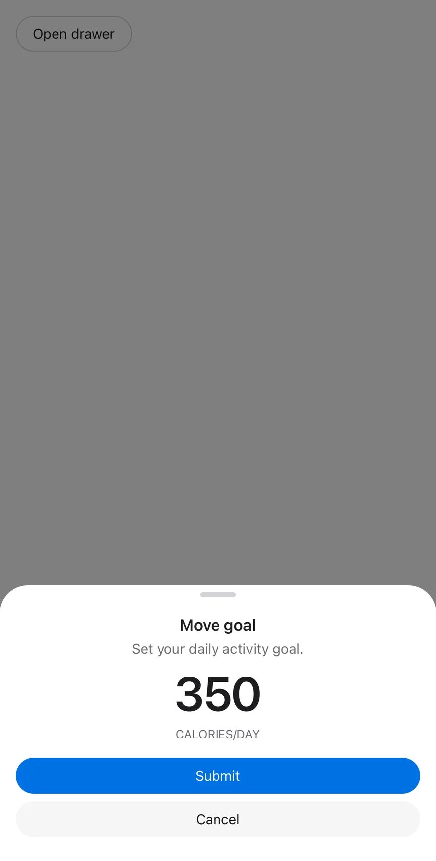
![Preview](https://ui.suiss.app/previews/components-drawer--open-by-default.light.webp)

```tsx
import { View } from "react-native"
import { Button } from "@/components/ui/button"
import { Drawer, DrawerClose, DrawerContent, DrawerDescription, DrawerFooter, DrawerHeader, DrawerTitle, DrawerTrigger } from "@/components/ui/drawer"
import { Text } from "@/components/ui/text"

function GoalContent() {
  return (
    <DrawerContent>
      <DrawerHeader>
        <DrawerTitle>Move goal</DrawerTitle>
        <DrawerDescription>Set your daily activity goal.</DrawerDescription>
      </DrawerHeader>
      <View className="items-center gap-1 p-4">
        <Text className="text-5xl font-semibold tracking-tight">350</Text>
        <Text className="text-xs text-muted-foreground uppercase">
          Calories/day
        </Text>
      </View>
      <DrawerFooter>
        <Button>
          <Text>Submit</Text>
        </Button>
        <DrawerClose render={<Button variant="secondary" />}>
          <Text>Cancel</Text>
        </DrawerClose>
      </DrawerFooter>
    </DrawerContent>
  )
}

export function DrawerOpenByDefaultExample() {
  return (
    <View className="items-start">
      <Drawer defaultOpen showSwipeHandle>
        <DrawerTrigger render={<Button variant="outline" />}>
          <Text>Open drawer</Text>
        </DrawerTrigger>
        <GoalContent />
      </Drawer>
    </View>
  )
}
```

```swift
import EsuissUI
import SwiftUI

struct DrawerOpenByDefaultExample: View {
  var body: some View {
    DrawerGoal(open: true)
  }
}

struct DrawerGoal: View {
  @State private var open: Bool

  init(open: Bool = false) {
    _open = State(initialValue: open)
  }

  var body: some View {
    Button("Open drawer") { open = true }
      .buttonStyle(.variant(.outline))
      .drawer(isPresented: $open) {
        DrawerGoalContent()
      }
  }
}

struct DrawerGoalContent: View {
  var body: some View {
    DrawerContent {
      DrawerHeader {
        DrawerTitle("Move goal")
        DrawerDescription("Set your daily activity goal.")
      }
      VStack(spacing: 4) {
        Text(verbatim: "350")
          .font(.system(size: 48, weight: .semibold))
          .tracking(-1.2)
          .foregroundStyle(EsuissColor.foreground)
        Text("Calories/day")
          .textCase(.uppercase)
          .textStyle(.xs)
          .foregroundStyle(EsuissColor.mutedForeground)
      }
      .frame(maxWidth: .infinity)
      .padding(16)
      DrawerFooter {
        Button {} label: {
          Text("Submit").frame(maxWidth: .infinity)
        }
        .buttonStyle(.variant())
        DrawerClose {
          Text("Cancel").frame(maxWidth: .infinity)
        }
        .buttonStyle(.variant(.secondary))
      }
    }
  }
}
```

```kotlin
import androidx.compose.foundation.layout.Column
import androidx.compose.runtime.Composable
import androidx.compose.runtime.getValue
import androidx.compose.runtime.mutableStateOf
import androidx.compose.runtime.saveable.rememberSaveable
import androidx.compose.runtime.setValue
import com.esuiss.ui.components.Button
import com.esuiss.ui.components.ButtonVariant
import com.esuiss.ui.components.Drawer

@Composable
fun DrawerOpenByDefaultExample() {
    DrawerGoal(defaultOpen = true, floating = false)
}

@Composable
fun DrawerGoal(defaultOpen: Boolean, floating: Boolean, label: String = "Open drawer") {
    var open by rememberSaveable { mutableStateOf(defaultOpen) }
    Column {
        Button(label, onClick = { open = true }, variant = ButtonVariant.Outline)
        Drawer(open = open, onOpenChange = { open = it }, floating = floating, showSwipeHandle = true) {
            DrawerGoalContent(onClose = { open = false })
        }
    }
}
```

`Drawer` presents content in a panel attached to an edge of the screen. It slides in from the bottom by default, or from the top, left or right with `swipeDirection`, and the user can drag it closed in that direction. The content renders through a portal (inside a full-window overlay on iOS) and respects the safe-area insets.

Set `floating` to inset the panel from the screen edges with all corners rounded. Use `snapPoints` to let a bottom drawer rest at several heights. Wrap your app in `DrawerProvider` and its screen in `DrawerIndent` to scale the page back behind an open bottom drawer.

## Installation

**React Native**

```bash title="Terminal"
npx shadcn@latest add @esuiss-rn/drawer
```

See [Installation](https://ui.suiss.app/docs/installation) for the `components.json` setup. Or use the suiss/ui CLI:

```bash title="Terminal"
npx @esuiss/ui@latest add drawer
```

**SwiftUI**

```bash title="Terminal"
npx @esuiss/ui@latest add drawer --platform swift
```

**Jetpack Compose**

```bash title="Terminal"
npx @esuiss/ui@latest add drawer --platform kotlin
```

The CLI also adds what it builds on: [Button](https://ui.suiss.app/docs/components/button), [Icon](https://ui.suiss.app/docs/components/icon), [Text](https://ui.suiss.app/docs/components/text). On React Native it also adds the animated view `components/ui/animated-view.tsx`.

### Manual

**React Native**

**Uniwind**

1. Install the dependencies:

```bash title="Terminal"
npx expo install cn phosphor-react-native react-native-reanimated react-native-safe-area-context react-native-screens react-native-svg react-native-worklets
```

2. Add the pieces it builds on: [Button](https://ui.suiss.app/docs/components/button), [Icon](https://ui.suiss.app/docs/components/icon), [Text](https://ui.suiss.app/docs/components/text), and the primitives `components/primitives/drawer.tsx`, `components/primitives/use-render.tsx`, and the animated view `components/ui/animated-view.tsx` from the next step.

3. Copy the animated view into `components/ui/animated-view.tsx`:

- `uniwind/components/ui/animated-view.tsx`: [source](https://github.com/e-suiss/ui/blob/main/packages/mobile/uniwind/components/ui/animated-view.tsx)

4. Copy the source into `components/ui/drawer.tsx`:

```tsx title="uniwind/components/ui/drawer.tsx"
import { cn } from "cn"
import { XIcon } from "phosphor-react-native"
import * as React from "react"
import {
  Platform,
  useWindowDimensions,
  View,
  type ViewProps,
  type ViewStyle,
} from "react-native"
import {
  FadeIn,
  FadeOut,
  ReduceMotion,
  SlideInDown,
  SlideInLeft,
  SlideInRight,
  SlideInUp,
  SlideOutDown,
  SlideOutLeft,
  SlideOutRight,
  SlideOutUp,
  useAnimatedStyle,
  withTiming,
} from "react-native-reanimated"
import { useSafeAreaInsets } from "react-native-safe-area-context"
import { FullWindowOverlay as RNFullWindowOverlay } from "react-native-screens"
import * as DrawerPrimitive from "@/components/primitives/drawer"
import { resolveClassName } from "@/components/primitives/use-render"
import { AnimatedView } from "@/components/ui/animated-view"
import { Button } from "@/components/ui/button"
import { Icon } from "@/components/ui/icon"
import { Text } from "@/components/ui/text"

type SwipeDirection = DrawerPrimitive.SwipeDirection

type DrawerContextProps = {
  floating: boolean
  hasSnapPoints: boolean
  modal: DrawerPrimitive.RootProps["modal"]
  showSwipeHandle: boolean
  swipeDirection: SwipeDirection
}

const DrawerContext = React.createContext<DrawerContextProps | null>(null)

type DrawerIndentContextProps = {
  raised: boolean
  setRaised: (raised: boolean) => void
}

const DrawerIndentContext =
  React.createContext<DrawerIndentContextProps | null>(null)

type DrawerContentContextProps = {
  hasCloseButton: boolean
  hasCloseLabel: boolean
}

const DrawerContentContext = React.createContext<DrawerContentContextProps>({
  hasCloseButton: false,
  hasCloseLabel: false,
})

function useDrawer() {
  const context = React.useContext(DrawerContext)
  if (!context) {
    throw new Error("useDrawer must be used within a Drawer.")
  }
  return context
}

const FullWindowOverlay =
  Platform.OS === "ios" ? RNFullWindowOverlay : React.Fragment

const EASE_DURATION = 450

const ENTERING = {
  down: SlideInDown,
  up: SlideInUp,
  left: SlideInLeft,
  right: SlideInRight,
} as const

const EXITING = {
  down: SlideOutDown,
  up: SlideOutUp,
  left: SlideOutLeft,
  right: SlideOutRight,
} as const

function DrawerProvider({ children }: DrawerPrimitive.ProviderProps) {
  const [raised, setRaised] = React.useState(false)
  const contextValue = React.useMemo(() => ({ raised, setRaised }), [raised])
  return (
    <DrawerIndentContext.Provider value={contextValue}>
      <DrawerPrimitive.Provider>{children}</DrawerPrimitive.Provider>
    </DrawerIndentContext.Provider>
  )
}

function DrawerIndentBackground({
  className,
  ...props
}: React.ComponentProps<typeof DrawerPrimitive.IndentBackground>) {
  return (
    <DrawerPrimitive.IndentBackground
      className={(state) =>
        cn(
          "absolute top-0 right-0 bottom-0 left-0 -z-10 bg-foreground dark:bg-background",
          resolveClassName(className, state)
        )
      }
      {...props}
    />
  )
}

const INDENT_ORIGIN: ViewStyle = { transformOrigin: "top" }

function DrawerIndent({
  className,
  style,
  children,
  ...props
}: React.ComponentProps<typeof DrawerPrimitive.Indent>) {
  const indent = React.useContext(DrawerIndentContext)
  const raised = indent?.raised ?? false
  const insets = useSafeAreaInsets()
  const offset = Math.max(insets.top, 12)

  const animatedStyle = useAnimatedStyle(() => {
    const config = {
      duration: EASE_DURATION,
      reduceMotion: ReduceMotion.System,
    }
    return {
      borderRadius: withTiming(raised ? 18 : 0, config),
      transform: [
        { translateY: withTiming(raised ? offset : 0, config) },
        { scale: withTiming(raised ? 0.94 : 1, config) },
      ],
    }
  }, [raised, offset])

  return (
    <DrawerPrimitive.Indent
      render={<AnimatedView style={[INDENT_ORIGIN, animatedStyle]} />}
      className={(state) =>
        cn(
          "relative flex-1 overflow-hidden bg-background",
          resolveClassName(className, state)
        )
      }
      style={style}
      {...props}
    >
      {children}
    </DrawerPrimitive.Indent>
  )
}

function DrawerRaise({ floating }: { floating: boolean }) {
  const indent = React.useContext(DrawerIndentContext)
  const setRaised = indent?.setRaised
  const { dialog, swipeDirection, expanded } =
    DrawerPrimitive.useDrawerRootContext("Drawer")
  const raised =
    dialog.root.open && !floating && swipeDirection === "down" && expanded

  React.useEffect(() => {
    if (!setRaised) return
    setRaised(raised)
    return () => setRaised(false)
  }, [setRaised, raised])

  return null
}

function Drawer({
  floating = false,
  modal = true,
  showSwipeHandle = false,
  snapPoints,
  swipeDirection = "down",
  children,
  ...props
}: DrawerPrimitive.RootProps & {
  floating?: boolean
  showSwipeHandle?: boolean
}) {
  const hasSnapPoints = snapPoints != null && snapPoints.length > 0
  const contextValue = React.useMemo(
    () => ({ floating, hasSnapPoints, modal, showSwipeHandle, swipeDirection }),
    [floating, hasSnapPoints, modal, showSwipeHandle, swipeDirection]
  )
  return (
    <DrawerContext.Provider value={contextValue}>
      <DrawerPrimitive.Root
        modal={modal}
        snapPoints={snapPoints}
        swipeDirection={swipeDirection}
        {...props}
      >
        <DrawerRaise floating={floating} />
        {children}
      </DrawerPrimitive.Root>
    </DrawerContext.Provider>
  )
}

const DrawerTrigger = DrawerPrimitive.Trigger

const DrawerPortal = DrawerPrimitive.Portal

const DrawerClose = DrawerPrimitive.Close

function DrawerOverlay({
  className,
  ...props
}: React.ComponentProps<typeof DrawerPrimitive.Backdrop>) {
  return (
    <AnimatedView
      entering={FadeIn.duration(EASE_DURATION).reduceMotion(
        ReduceMotion.System
      )}
      exiting={FadeOut.duration(300).reduceMotion(ReduceMotion.System)}
      className="absolute top-0 right-0 bottom-0 left-0 z-50"
      style={{ pointerEvents: "box-none" }}
    >
      <DrawerPrimitive.Backdrop
        className={(state) =>
          cn(
            "absolute top-0 right-0 bottom-0 left-0 bg-black/50",
            resolveClassName(className, state)
          )
        }
        {...props}
      />
    </AnimatedView>
  )
}

function DrawerSwipeHandle({ className, ...props }: ViewProps) {
  const { swipeDirection } = useDrawer()
  const horizontal = swipeDirection === "left" || swipeDirection === "right"
  return (
    <View
      accessible={false}
      importantForAccessibility="no-hide-descendants"
      className={cn(
        "relative z-10 shrink-0 flex",
        horizontal
          ? "h-full w-3 items-center justify-center"
          : "h-3 w-full items-center justify-center",
        swipeDirection === "down" && "justify-end",
        swipeDirection === "up" && "justify-start",
        className
      )}
      {...props}
    >
      <View
        className={cn(
          "shrink-0 rounded-full bg-border",
          horizontal ? "h-9 w-[5px]" : "h-[5px] w-9"
        )}
      />
    </View>
  )
}

const POSITION: Record<SwipeDirection, string> = {
  down: "bottom-0 left-0 right-0",
  up: "top-0 left-0 right-0",
  left: "top-0 bottom-0 left-0 w-3/4 sm:max-w-sm",
  right: "top-0 bottom-0 right-0 w-3/4 sm:max-w-sm",
}

const DOCKED_RADIUS: Record<SwipeDirection, string> = {
  down: "rounded-b-none",
  up: "rounded-t-none",
  left: "rounded-l-none",
  right: "rounded-r-none",
}

const BLEED: Record<SwipeDirection, string> = {
  down: "top-full left-0 right-0 h-12",
  up: "bottom-full left-0 right-0 h-12",
  left: "right-full top-0 bottom-0 w-12",
  right: "left-full top-0 bottom-0 w-12",
}

function DrawerContent({
  className,
  style,
  children,
  portalHost,
  showCloseButton = false,
  closeLabel,
  ...props
}: React.ComponentProps<typeof DrawerPrimitive.Popup> & {
  portalHost?: string
  showCloseButton?: boolean
  closeLabel?: string
}) {
  const drawerContext = useDrawer()
  const { floating, hasSnapPoints, modal, showSwipeHandle, swipeDirection } =
    drawerContext
  const insets = useSafeAreaInsets()
  const { height } = useWindowDimensions()
  const horizontal = swipeDirection === "left" || swipeDirection === "right"
  const inset = floating ? 8 : 0
  const handleLast = swipeDirection === "up" || swipeDirection === "left"

  const frameStyle = React.useMemo<ViewStyle>(
    () => ({
      pointerEvents: "box-none",
      ...(floating && swipeDirection !== "down" && { top: insets.top }),
      ...(floating && swipeDirection !== "up" && { bottom: insets.bottom }),
      ...(floating && swipeDirection !== "right" && { left: insets.left }),
      ...(floating && swipeDirection !== "left" && { right: insets.right }),
    }),
    [floating, swipeDirection, insets]
  )

  const popupStyle = React.useMemo<ViewStyle>(
    () => ({
      margin: inset,
      ...(!horizontal && {
        maxHeight: height - Math.max(96, insets.top + 24),
      }),
      ...(!floating &&
        swipeDirection !== "up" && { paddingBottom: insets.bottom }),
      ...(!floating && swipeDirection !== "down" && { paddingTop: insets.top }),
    }),
    [floating, horizontal, swipeDirection, insets, height, inset]
  )

  const contentContext = React.useMemo(
    () => ({
      hasCloseButton: showCloseButton,
      hasCloseLabel: showCloseButton && closeLabel !== undefined,
    }),
    [showCloseButton, closeLabel]
  )

  return (
    <DrawerPortal hostName={portalHost}>
      <DrawerContext.Provider value={drawerContext}>
        <FullWindowOverlay>
          {modal === true ? <DrawerOverlay /> : null}
          <DrawerPrimitive.Viewport className="absolute top-0 right-0 bottom-0 left-0 z-50">
            <AnimatedView
              entering={ENTERING[swipeDirection]
                .duration(EASE_DURATION)
                .reduceMotion(ReduceMotion.System)}
              exiting={EXITING[swipeDirection]
                .duration(300)
                .reduceMotion(ReduceMotion.System)}
              className={cn("absolute z-50", POSITION[swipeDirection])}
              style={frameStyle}
            >
              <DrawerPrimitive.Popup
                className={(state) =>
                  cn(
                    "flex min-h-0 flex-col rounded-3xl bg-popover shadow-xl",
                    horizontal && "flex-1 flex-row",
                    !floating && DOCKED_RADIUS[swipeDirection],
                    resolveClassName(className, state)
                  )
                }
                style={(state) => [
                  popupStyle,
                  typeof style === "function" ? style(state) : style,
                ]}
                {...props}
              >
                {floating ? null : (
                  <View
                    accessible={false}
                    className={cn("absolute bg-popover", BLEED[swipeDirection])}
                    style={{ pointerEvents: "none" }}
                  />
                )}
                {showSwipeHandle && !handleLast ? <DrawerSwipeHandle /> : null}
                <DrawerContentContext.Provider value={contentContext}>
                  <DrawerPrimitive.Content
                    className={cn(
                      "flex min-h-0 shrink flex-col overflow-hidden rounded-3xl",
                      (hasSnapPoints || horizontal) && "flex-1"
                    )}
                  >
                    {children}
                  </DrawerPrimitive.Content>
                </DrawerContentContext.Provider>
                {showSwipeHandle && handleLast ? <DrawerSwipeHandle /> : null}
                {showCloseButton ? (
                  <DrawerPrimitive.Close
                    render={
                      <Button
                        variant={closeLabel ? "plain" : "ghost"}
                        size={closeLabel ? "sm" : "icon-sm"}
                        className={cn(
                          "absolute right-4",
                          showSwipeHandle ? "top-[23px]" : "top-[11px]",
                          !closeLabel && "bg-secondary active:opacity-80"
                        )}
                      />
                    }
                    hitSlop={8}
                    accessibilityLabel={closeLabel ? undefined : "Close"}
                  >
                    {closeLabel ? (
                      <Text className="text-base">{closeLabel}</Text>
                    ) : (
                      <Icon as={XIcon} className="size-4 text-foreground" />
                    )}
                  </DrawerPrimitive.Close>
                ) : null}
              </DrawerPrimitive.Popup>
            </AnimatedView>
          </DrawerPrimitive.Viewport>
        </FullWindowOverlay>
      </DrawerContext.Provider>
    </DrawerPortal>
  )
}

function DrawerHeader({ className, ...props }: ViewProps) {
  const { swipeDirection } = useDrawer()
  const { hasCloseButton, hasCloseLabel } =
    React.useContext(DrawerContentContext)
  const vertical = swipeDirection === "down" || swipeDirection === "up"
  return (
    <View
      className={cn(
        "flex shrink-0 flex-col gap-0.5 p-4 pb-0",
        hasCloseButton && "px-14",
        hasCloseLabel && "px-24",
        vertical && "items-center",
        className
      )}
      {...props}
    />
  )
}

function DrawerFooter({ className, ...props }: ViewProps) {
  return (
    <View
      className={cn("mt-auto flex shrink-0 flex-col gap-2 p-4 pt-0", className)}
      {...props}
    />
  )
}

function DrawerTitle({
  className,
  ...props
}: React.ComponentProps<typeof DrawerPrimitive.Title>) {
  const { swipeDirection } = useDrawer()
  const vertical = swipeDirection === "down" || swipeDirection === "up"
  return (
    <DrawerPrimitive.Title
      className={(state) =>
        cn(
          "text-base font-semibold text-foreground",
          vertical && "text-center",
          resolveClassName(className, state)
        )
      }
      {...props}
    />
  )
}

function DrawerDescription({
  className,
  ...props
}: React.ComponentProps<typeof DrawerPrimitive.Description>) {
  const { swipeDirection } = useDrawer()
  const vertical = swipeDirection === "down" || swipeDirection === "up"
  return (
    <DrawerPrimitive.Description
      className={(state) =>
        cn(
          "text-sm text-muted-foreground",
          vertical && "text-center",
          resolveClassName(className, state)
        )
      }
      {...props}
    />
  )
}

export {
  Drawer,
  DrawerClose,
  DrawerContent,
  DrawerDescription,
  DrawerFooter,
  DrawerHeader,
  DrawerIndent,
  DrawerIndentBackground,
  DrawerOverlay,
  DrawerPortal,
  DrawerProvider,
  DrawerSwipeHandle,
  DrawerTitle,
  DrawerTrigger,
}
```

5. Update the import paths to match your project.

**NativeWind**

1. Install the dependencies:

```bash title="Terminal"
npx expo install cn phosphor-react-native react-native-reanimated react-native-safe-area-context react-native-screens react-native-svg react-native-worklets
```

2. Add the pieces it builds on: [Button](https://ui.suiss.app/docs/components/button), [Icon](https://ui.suiss.app/docs/components/icon), [Text](https://ui.suiss.app/docs/components/text), and the primitives `components/primitives/drawer.tsx`, `components/primitives/use-render.tsx`, and the animated view `components/ui/animated-view.tsx` from the next step.

3. Copy the animated view into `components/ui/animated-view.tsx`:

- `nativewind/components/ui/animated-view.tsx`: [source](https://github.com/e-suiss/ui/blob/main/packages/mobile/nativewind/components/ui/animated-view.tsx)

4. Copy the source into `components/ui/drawer.tsx`:

```tsx title="nativewind/components/ui/drawer.tsx"
import { cn } from "cn"
import { XIcon } from "phosphor-react-native"
import * as React from "react"
import {
  Platform,
  useWindowDimensions,
  View,
  type ViewProps,
  type ViewStyle,
} from "react-native"
import {
  FadeIn,
  FadeOut,
  ReduceMotion,
  SlideInDown,
  SlideInLeft,
  SlideInRight,
  SlideInUp,
  SlideOutDown,
  SlideOutLeft,
  SlideOutRight,
  SlideOutUp,
  useAnimatedStyle,
  withTiming,
} from "react-native-reanimated"
import { useSafeAreaInsets } from "react-native-safe-area-context"
import { FullWindowOverlay as RNFullWindowOverlay } from "react-native-screens"
import * as DrawerPrimitive from "@/components/primitives/drawer"
import { resolveClassName } from "@/components/primitives/use-render"
import { AnimatedView } from "@/components/ui/animated-view"
import { Button } from "@/components/ui/button"
import { Icon } from "@/components/ui/icon"
import { Text } from "@/components/ui/text"

type SwipeDirection = DrawerPrimitive.SwipeDirection

type DrawerContextProps = {
  floating: boolean
  hasSnapPoints: boolean
  modal: DrawerPrimitive.RootProps["modal"]
  showSwipeHandle: boolean
  swipeDirection: SwipeDirection
}

const DrawerContext = React.createContext<DrawerContextProps | null>(null)

type DrawerIndentContextProps = {
  raised: boolean
  setRaised: (raised: boolean) => void
}

const DrawerIndentContext =
  React.createContext<DrawerIndentContextProps | null>(null)

type DrawerContentContextProps = {
  hasCloseButton: boolean
  hasCloseLabel: boolean
}

const DrawerContentContext = React.createContext<DrawerContentContextProps>({
  hasCloseButton: false,
  hasCloseLabel: false,
})

function useDrawer() {
  const context = React.useContext(DrawerContext)
  if (!context) {
    throw new Error("useDrawer must be used within a Drawer.")
  }
  return context
}

const FullWindowOverlay =
  Platform.OS === "ios" ? RNFullWindowOverlay : React.Fragment

const EASE_DURATION = 450

const ENTERING = {
  down: SlideInDown,
  up: SlideInUp,
  left: SlideInLeft,
  right: SlideInRight,
} as const

const EXITING = {
  down: SlideOutDown,
  up: SlideOutUp,
  left: SlideOutLeft,
  right: SlideOutRight,
} as const

function DrawerProvider({ children }: DrawerPrimitive.ProviderProps) {
  const [raised, setRaised] = React.useState(false)
  const contextValue = React.useMemo(() => ({ raised, setRaised }), [raised])
  return (
    <DrawerIndentContext.Provider value={contextValue}>
      <DrawerPrimitive.Provider>{children}</DrawerPrimitive.Provider>
    </DrawerIndentContext.Provider>
  )
}

function DrawerIndentBackground({
  className,
  ...props
}: React.ComponentProps<typeof DrawerPrimitive.IndentBackground>) {
  return (
    <DrawerPrimitive.IndentBackground
      className={(state) =>
        cn(
          "absolute top-0 right-0 bottom-0 left-0 -z-10 bg-foreground dark:bg-background",
          resolveClassName(className, state)
        )
      }
      {...props}
    />
  )
}

const INDENT_ORIGIN: ViewStyle = { transformOrigin: "top" }

function DrawerIndent({
  className,
  style,
  children,
  ...props
}: React.ComponentProps<typeof DrawerPrimitive.Indent>) {
  const indent = React.useContext(DrawerIndentContext)
  const raised = indent?.raised ?? false
  const insets = useSafeAreaInsets()
  const offset = Math.max(insets.top, 12)

  const animatedStyle = useAnimatedStyle(() => {
    const config = {
      duration: EASE_DURATION,
      reduceMotion: ReduceMotion.System,
    }
    return {
      borderRadius: withTiming(raised ? 18 : 0, config),
      transform: [
        { translateY: withTiming(raised ? offset : 0, config) },
        { scale: withTiming(raised ? 0.94 : 1, config) },
      ],
    }
  }, [raised, offset])

  return (
    <DrawerPrimitive.Indent
      render={<AnimatedView style={[INDENT_ORIGIN, animatedStyle]} />}
      className={(state) =>
        cn(
          "relative flex-1 overflow-hidden bg-background",
          resolveClassName(className, state)
        )
      }
      style={style}
      {...props}
    >
      {children}
    </DrawerPrimitive.Indent>
  )
}

function DrawerRaise({ floating }: { floating: boolean }) {
  const indent = React.useContext(DrawerIndentContext)
  const setRaised = indent?.setRaised
  const { dialog, swipeDirection, expanded } =
    DrawerPrimitive.useDrawerRootContext("Drawer")
  const raised =
    dialog.root.open && !floating && swipeDirection === "down" && expanded

  React.useEffect(() => {
    if (!setRaised) return
    setRaised(raised)
    return () => setRaised(false)
  }, [setRaised, raised])

  return null
}

function Drawer({
  floating = false,
  modal = true,
  showSwipeHandle = false,
  snapPoints,
  swipeDirection = "down",
  children,
  ...props
}: DrawerPrimitive.RootProps & {
  floating?: boolean
  showSwipeHandle?: boolean
}) {
  const hasSnapPoints = snapPoints != null && snapPoints.length > 0
  const contextValue = React.useMemo(
    () => ({ floating, hasSnapPoints, modal, showSwipeHandle, swipeDirection }),
    [floating, hasSnapPoints, modal, showSwipeHandle, swipeDirection]
  )
  return (
    <DrawerContext.Provider value={contextValue}>
      <DrawerPrimitive.Root
        modal={modal}
        snapPoints={snapPoints}
        swipeDirection={swipeDirection}
        {...props}
      >
        <DrawerRaise floating={floating} />
        {children}
      </DrawerPrimitive.Root>
    </DrawerContext.Provider>
  )
}

const DrawerTrigger = DrawerPrimitive.Trigger

const DrawerPortal = DrawerPrimitive.Portal

const DrawerClose = DrawerPrimitive.Close

function DrawerOverlay({
  className,
  ...props
}: React.ComponentProps<typeof DrawerPrimitive.Backdrop>) {
  return (
    <AnimatedView
      entering={FadeIn.duration(EASE_DURATION).reduceMotion(
        ReduceMotion.System
      )}
      exiting={FadeOut.duration(300).reduceMotion(ReduceMotion.System)}
      className="absolute top-0 right-0 bottom-0 left-0 z-50"
      style={{ pointerEvents: "box-none" }}
    >
      <DrawerPrimitive.Backdrop
        className={(state) =>
          cn(
            "absolute top-0 right-0 bottom-0 left-0 bg-black/50",
            resolveClassName(className, state)
          )
        }
        {...props}
      />
    </AnimatedView>
  )
}

function DrawerSwipeHandle({ className, ...props }: ViewProps) {
  const { swipeDirection } = useDrawer()
  const horizontal = swipeDirection === "left" || swipeDirection === "right"
  return (
    <View
      accessible={false}
      importantForAccessibility="no-hide-descendants"
      className={cn(
        "relative z-10 shrink-0 flex",
        horizontal
          ? "h-full w-3 items-center justify-center"
          : "h-3 w-full items-center justify-center",
        swipeDirection === "down" && "justify-end",
        swipeDirection === "up" && "justify-start",
        className
      )}
      {...props}
    >
      <View
        className={cn(
          "shrink-0 rounded-full bg-border",
          horizontal ? "h-9 w-[5px]" : "h-[5px] w-9"
        )}
      />
    </View>
  )
}

const POSITION: Record<SwipeDirection, string> = {
  down: "bottom-0 left-0 right-0",
  up: "top-0 left-0 right-0",
  left: "top-0 bottom-0 left-0 w-3/4 sm:max-w-sm",
  right: "top-0 bottom-0 right-0 w-3/4 sm:max-w-sm",
}

const DOCKED_RADIUS: Record<SwipeDirection, string> = {
  down: "rounded-b-none",
  up: "rounded-t-none",
  left: "rounded-l-none",
  right: "rounded-r-none",
}

const BLEED: Record<SwipeDirection, string> = {
  down: "top-full left-0 right-0 h-12",
  up: "bottom-full left-0 right-0 h-12",
  left: "right-full top-0 bottom-0 w-12",
  right: "left-full top-0 bottom-0 w-12",
}

function DrawerContent({
  className,
  style,
  children,
  portalHost,
  showCloseButton = false,
  closeLabel,
  ...props
}: React.ComponentProps<typeof DrawerPrimitive.Popup> & {
  portalHost?: string
  showCloseButton?: boolean
  closeLabel?: string
}) {
  const drawerContext = useDrawer()
  const { floating, hasSnapPoints, modal, showSwipeHandle, swipeDirection } =
    drawerContext
  const insets = useSafeAreaInsets()
  const { height } = useWindowDimensions()
  const horizontal = swipeDirection === "left" || swipeDirection === "right"
  const inset = floating ? 8 : 0
  const handleLast = swipeDirection === "up" || swipeDirection === "left"

  const frameStyle = React.useMemo<ViewStyle>(
    () => ({
      pointerEvents: "box-none",
      ...(floating && swipeDirection !== "down" && { top: insets.top }),
      ...(floating && swipeDirection !== "up" && { bottom: insets.bottom }),
      ...(floating && swipeDirection !== "right" && { left: insets.left }),
      ...(floating && swipeDirection !== "left" && { right: insets.right }),
    }),
    [floating, swipeDirection, insets]
  )

  const popupStyle = React.useMemo<ViewStyle>(
    () => ({
      margin: inset,
      ...(!horizontal && {
        maxHeight: height - Math.max(96, insets.top + 24),
      }),
      ...(!floating &&
        swipeDirection !== "up" && { paddingBottom: insets.bottom }),
      ...(!floating && swipeDirection !== "down" && { paddingTop: insets.top }),
    }),
    [floating, horizontal, swipeDirection, insets, height, inset]
  )

  const contentContext = React.useMemo(
    () => ({
      hasCloseButton: showCloseButton,
      hasCloseLabel: showCloseButton && closeLabel !== undefined,
    }),
    [showCloseButton, closeLabel]
  )

  return (
    <DrawerPortal hostName={portalHost}>
      <DrawerContext.Provider value={drawerContext}>
        <FullWindowOverlay>
          {modal === true ? <DrawerOverlay /> : null}
          <DrawerPrimitive.Viewport className="absolute top-0 right-0 bottom-0 left-0 z-50">
            <AnimatedView
              entering={ENTERING[swipeDirection]
                .duration(EASE_DURATION)
                .reduceMotion(ReduceMotion.System)}
              exiting={EXITING[swipeDirection]
                .duration(300)
                .reduceMotion(ReduceMotion.System)}
              className={cn("absolute z-50", POSITION[swipeDirection])}
              style={frameStyle}
            >
              <DrawerPrimitive.Popup
                className={(state) =>
                  cn(
                    "flex min-h-0 flex-col rounded-3xl bg-popover shadow-xl",
                    horizontal && "flex-1 flex-row",
                    !floating && DOCKED_RADIUS[swipeDirection],
                    resolveClassName(className, state)
                  )
                }
                style={(state) => [
                  popupStyle,
                  typeof style === "function" ? style(state) : style,
                ]}
                {...props}
              >
                {floating ? null : (
                  <View
                    accessible={false}
                    className={cn("absolute bg-popover", BLEED[swipeDirection])}
                    style={{ pointerEvents: "none" }}
                  />
                )}
                {showSwipeHandle && !handleLast ? <DrawerSwipeHandle /> : null}
                <DrawerContentContext.Provider value={contentContext}>
                  <DrawerPrimitive.Content
                    className={cn(
                      "flex min-h-0 shrink flex-col overflow-hidden rounded-3xl",
                      (hasSnapPoints || horizontal) && "flex-1"
                    )}
                  >
                    {children}
                  </DrawerPrimitive.Content>
                </DrawerContentContext.Provider>
                {showSwipeHandle && handleLast ? <DrawerSwipeHandle /> : null}
                {showCloseButton ? (
                  <DrawerPrimitive.Close
                    render={
                      <Button
                        variant={closeLabel ? "plain" : "ghost"}
                        size={closeLabel ? "sm" : "icon-sm"}
                        className={cn(
                          "absolute right-4",
                          showSwipeHandle ? "top-[23px]" : "top-[11px]",
                          !closeLabel && "bg-secondary active:opacity-80"
                        )}
                      />
                    }
                    hitSlop={8}
                    accessibilityLabel={closeLabel ? undefined : "Close"}
                  >
                    {closeLabel ? (
                      <Text className="text-base">{closeLabel}</Text>
                    ) : (
                      <Icon as={XIcon} className="size-4 text-foreground" />
                    )}
                  </DrawerPrimitive.Close>
                ) : null}
              </DrawerPrimitive.Popup>
            </AnimatedView>
          </DrawerPrimitive.Viewport>
        </FullWindowOverlay>
      </DrawerContext.Provider>
    </DrawerPortal>
  )
}

function DrawerHeader({ className, ...props }: ViewProps) {
  const { swipeDirection } = useDrawer()
  const { hasCloseButton, hasCloseLabel } =
    React.useContext(DrawerContentContext)
  const vertical = swipeDirection === "down" || swipeDirection === "up"
  return (
    <View
      className={cn(
        "flex shrink-0 flex-col gap-0.5 p-4 pb-0",
        hasCloseButton && "px-14",
        hasCloseLabel && "px-24",
        vertical && "items-center",
        className
      )}
      {...props}
    />
  )
}

function DrawerFooter({ className, ...props }: ViewProps) {
  return (
    <View
      className={cn("mt-auto flex shrink-0 flex-col gap-2 p-4 pt-0", className)}
      {...props}
    />
  )
}

function DrawerTitle({
  className,
  ...props
}: React.ComponentProps<typeof DrawerPrimitive.Title>) {
  const { swipeDirection } = useDrawer()
  const vertical = swipeDirection === "down" || swipeDirection === "up"
  return (
    <DrawerPrimitive.Title
      className={(state) =>
        cn(
          "text-base font-semibold text-foreground",
          vertical && "text-center",
          resolveClassName(className, state)
        )
      }
      {...props}
    />
  )
}

function DrawerDescription({
  className,
  ...props
}: React.ComponentProps<typeof DrawerPrimitive.Description>) {
  const { swipeDirection } = useDrawer()
  const vertical = swipeDirection === "down" || swipeDirection === "up"
  return (
    <DrawerPrimitive.Description
      className={(state) =>
        cn(
          "text-sm text-muted-foreground",
          vertical && "text-center",
          resolveClassName(className, state)
        )
      }
      {...props}
    />
  )
}

export {
  Drawer,
  DrawerClose,
  DrawerContent,
  DrawerDescription,
  DrawerFooter,
  DrawerHeader,
  DrawerIndent,
  DrawerIndentBackground,
  DrawerOverlay,
  DrawerPortal,
  DrawerProvider,
  DrawerSwipeHandle,
  DrawerTitle,
  DrawerTrigger,
}
```

5. Update the import paths to match your project.

**StyleSheet**

1. Install the dependencies:

```bash title="Terminal"
npx expo install phosphor-react-native react-native-reanimated react-native-safe-area-context react-native-screens react-native-svg react-native-worklets
```

2. Add the pieces it builds on: [Button](https://ui.suiss.app/docs/components/button), [Icon](https://ui.suiss.app/docs/components/icon), [Text](https://ui.suiss.app/docs/components/text), and the primitives `components/primitives/drawer.tsx`, `components/primitives/use-render.tsx`, and the animated view `components/ui/animated-view.tsx` from the next step.

3. Copy the animated view into `components/ui/animated-view.tsx`:

- `stylesheet/components/ui/animated-view.tsx`: [source](https://github.com/e-suiss/ui/blob/main/packages/mobile/stylesheet/components/ui/animated-view.tsx)

4. Copy the source into `components/ui/drawer.tsx`:

```tsx title="stylesheet/components/ui/drawer.tsx"
import { XIcon } from "phosphor-react-native"
import * as React from "react"
import {
  Platform,
  StyleSheet,
  useWindowDimensions,
  View,
  type ViewProps,
  type ViewStyle,
} from "react-native"
import {
  FadeIn,
  FadeOut,
  ReduceMotion,
  SlideInDown,
  SlideInLeft,
  SlideInRight,
  SlideInUp,
  SlideOutDown,
  SlideOutLeft,
  SlideOutRight,
  SlideOutUp,
  useAnimatedStyle,
  withTiming,
} from "react-native-reanimated"
import { useSafeAreaInsets } from "react-native-safe-area-context"
import { FullWindowOverlay as RNFullWindowOverlay } from "react-native-screens"
import * as DrawerPrimitive from "@/components/primitives/drawer"
import { AnimatedView } from "@/components/ui/animated-view"
import { Button } from "@/components/ui/button"
import { Icon } from "@/components/ui/icon"
import { Text } from "@/components/ui/text"
import { fontSize, radius, shadow, useTheme } from "@/components/ui/theme"

type SwipeDirection = DrawerPrimitive.SwipeDirection

type DrawerContextProps = {
  floating: boolean
  hasSnapPoints: boolean
  modal: DrawerPrimitive.RootProps["modal"]
  showSwipeHandle: boolean
  swipeDirection: SwipeDirection
}

const DrawerContext = React.createContext<DrawerContextProps | null>(null)

type DrawerIndentContextProps = {
  raised: boolean
  setRaised: (raised: boolean) => void
}

const DrawerIndentContext =
  React.createContext<DrawerIndentContextProps | null>(null)

type DrawerContentContextProps = {
  hasCloseButton: boolean
  hasCloseLabel: boolean
}

const DrawerContentContext = React.createContext<DrawerContentContextProps>({
  hasCloseButton: false,
  hasCloseLabel: false,
})

function useDrawer() {
  const context = React.useContext(DrawerContext)
  if (!context) {
    throw new Error("useDrawer must be used within a Drawer.")
  }
  return context
}

const FullWindowOverlay =
  Platform.OS === "ios" ? RNFullWindowOverlay : React.Fragment

const EASE_DURATION = 450

const ENTERING = {
  down: SlideInDown,
  up: SlideInUp,
  left: SlideInLeft,
  right: SlideInRight,
} as const

const EXITING = {
  down: SlideOutDown,
  up: SlideOutUp,
  left: SlideOutLeft,
  right: SlideOutRight,
} as const

const styles = StyleSheet.create({
  fill: { ...StyleSheet.absoluteFill },
  layer: { ...StyleSheet.absoluteFill, zIndex: 50, pointerEvents: "box-none" },
  indentBackground: { ...StyleSheet.absoluteFill, zIndex: -10 },
  indent: {
    position: "relative",
    flex: 1,
    overflow: "hidden",
    transformOrigin: "top",
  },
  frame: { position: "absolute", zIndex: 50 },
  popup: {
    display: "flex",
    minHeight: 0,
    flexDirection: "column",
    borderRadius: radius["3xl"],
    ...shadow.xl,
  },
  popupHorizontal: { flex: 1, flexDirection: "row" },
  bleed: { position: "absolute", pointerEvents: "none" },
  content: {
    display: "flex",
    minHeight: 0,
    flexShrink: 1,
    flexDirection: "column",
    overflow: "hidden",
    borderRadius: radius["3xl"],
  },
  contentFill: { flex: 1 },
  handle: {
    position: "relative",
    zIndex: 10,
    flexShrink: 0,
    alignItems: "center",
    justifyContent: "center",
  },
  handleVertical: { height: 12, width: "100%" },
  handleHorizontal: { height: "100%", width: 12 },
  handleBar: { flexShrink: 0, borderRadius: radius.full },
  handleBarVertical: { height: 5, width: 36 },
  handleBarHorizontal: { height: 36, width: 5 },
  close: { position: "absolute", right: 16 },
  closeIcon: { flexShrink: 0 },
  closeLabel: { ...fontSize.base },
  header: {
    display: "flex",
    flexShrink: 0,
    flexDirection: "column",
    gap: 2,
    padding: 16,
    paddingBottom: 0,
  },
  headerCentered: { alignItems: "center" },
  footer: {
    marginTop: "auto",
    display: "flex",
    flexShrink: 0,
    flexDirection: "column",
    gap: 8,
    padding: 16,
    paddingTop: 0,
  },
  title: { ...fontSize.base, fontWeight: "600" },
  description: { ...fontSize.sm },
  centered: { textAlign: "center" },
})

const POSITION: Record<SwipeDirection, ViewStyle> = {
  down: { bottom: 0, left: 0, right: 0 },
  up: { top: 0, left: 0, right: 0 },
  left: { top: 0, bottom: 0, left: 0, width: "75%" },
  right: { top: 0, bottom: 0, right: 0, width: "75%" },
}

const DOCKED_RADIUS: Record<SwipeDirection, ViewStyle> = {
  down: { borderBottomLeftRadius: 0, borderBottomRightRadius: 0 },
  up: { borderTopLeftRadius: 0, borderTopRightRadius: 0 },
  left: { borderTopLeftRadius: 0, borderBottomLeftRadius: 0 },
  right: { borderTopRightRadius: 0, borderBottomRightRadius: 0 },
}

const BLEED: Record<SwipeDirection, ViewStyle> = {
  down: { top: "100%", left: 0, right: 0, height: 48 },
  up: { bottom: "100%", left: 0, right: 0, height: 48 },
  left: { right: "100%", top: 0, bottom: 0, width: 48 },
  right: { left: "100%", top: 0, bottom: 0, width: 48 },
}

function DrawerProvider({ children }: DrawerPrimitive.ProviderProps) {
  const [raised, setRaised] = React.useState(false)
  const contextValue = React.useMemo(() => ({ raised, setRaised }), [raised])
  return (
    <DrawerIndentContext.Provider value={contextValue}>
      <DrawerPrimitive.Provider>{children}</DrawerPrimitive.Provider>
    </DrawerIndentContext.Provider>
  )
}

function DrawerIndentBackground({
  style,
  ...props
}: React.ComponentProps<typeof DrawerPrimitive.IndentBackground>) {
  const { colors, isDark } = useTheme()
  return (
    <DrawerPrimitive.IndentBackground
      style={(state) => [
        styles.indentBackground,
        { backgroundColor: isDark ? colors.background : colors.foreground },
        typeof style === "function" ? style(state) : style,
      ]}
      {...props}
    />
  )
}

function DrawerIndent({
  style,
  children,
  ...props
}: React.ComponentProps<typeof DrawerPrimitive.Indent>) {
  const { colors } = useTheme()
  const indent = React.useContext(DrawerIndentContext)
  const raised = indent?.raised ?? false
  const insets = useSafeAreaInsets()
  const offset = Math.max(insets.top, 12)

  const animatedStyle = useAnimatedStyle(() => {
    const config = {
      duration: EASE_DURATION,
      reduceMotion: ReduceMotion.System,
    }
    return {
      borderRadius: withTiming(raised ? radius["2xl"] : 0, config),
      transform: [
        { translateY: withTiming(raised ? offset : 0, config) },
        { scale: withTiming(raised ? 0.94 : 1, config) },
      ],
    }
  }, [raised, offset])

  return (
    <DrawerPrimitive.Indent
      render={<AnimatedView style={animatedStyle} />}
      style={(state) => [
        styles.indent,
        { backgroundColor: colors.background },
        typeof style === "function" ? style(state) : style,
      ]}
      {...props}
    >
      {children}
    </DrawerPrimitive.Indent>
  )
}

function DrawerRaise({ floating }: { floating: boolean }) {
  const indent = React.useContext(DrawerIndentContext)
  const setRaised = indent?.setRaised
  const { dialog, swipeDirection, expanded } =
    DrawerPrimitive.useDrawerRootContext("Drawer")
  const raised =
    dialog.root.open && !floating && swipeDirection === "down" && expanded

  React.useEffect(() => {
    if (!setRaised) return
    setRaised(raised)
    return () => setRaised(false)
  }, [setRaised, raised])

  return null
}

function Drawer({
  floating = false,
  modal = true,
  showSwipeHandle = false,
  snapPoints,
  swipeDirection = "down",
  children,
  ...props
}: DrawerPrimitive.RootProps & {
  floating?: boolean
  showSwipeHandle?: boolean
}) {
  const hasSnapPoints = snapPoints != null && snapPoints.length > 0
  const contextValue = React.useMemo(
    () => ({ floating, hasSnapPoints, modal, showSwipeHandle, swipeDirection }),
    [floating, hasSnapPoints, modal, showSwipeHandle, swipeDirection]
  )
  return (
    <DrawerContext.Provider value={contextValue}>
      <DrawerPrimitive.Root
        modal={modal}
        snapPoints={snapPoints}
        swipeDirection={swipeDirection}
        {...props}
      >
        <DrawerRaise floating={floating} />
        {children}
      </DrawerPrimitive.Root>
    </DrawerContext.Provider>
  )
}

const DrawerTrigger = DrawerPrimitive.Trigger

const DrawerPortal = DrawerPrimitive.Portal

const DrawerClose = DrawerPrimitive.Close

function DrawerOverlay({
  style,
  ...props
}: React.ComponentProps<typeof DrawerPrimitive.Backdrop>) {
  return (
    <AnimatedView
      entering={FadeIn.duration(EASE_DURATION).reduceMotion(
        ReduceMotion.System
      )}
      exiting={FadeOut.duration(300).reduceMotion(ReduceMotion.System)}
      style={styles.layer}
    >
      <DrawerPrimitive.Backdrop
        style={(state) => [
          styles.fill,
          { backgroundColor: "rgba(0, 0, 0, 0.5)" },
          typeof style === "function" ? style(state) : style,
        ]}
        {...props}
      />
    </AnimatedView>
  )
}

function DrawerSwipeHandle({ style, ...props }: ViewProps) {
  const { colors } = useTheme()
  const { swipeDirection } = useDrawer()
  const horizontal = swipeDirection === "left" || swipeDirection === "right"
  return (
    <View
      accessible={false}
      importantForAccessibility="no-hide-descendants"
      style={[
        styles.handle,
        horizontal ? styles.handleHorizontal : styles.handleVertical,
        swipeDirection === "down" && { justifyContent: "flex-end" },
        swipeDirection === "up" && { justifyContent: "flex-start" },
        style,
      ]}
      {...props}
    >
      <View
        style={[
          styles.handleBar,
          horizontal ? styles.handleBarHorizontal : styles.handleBarVertical,
          { backgroundColor: colors.border },
        ]}
      />
    </View>
  )
}

function DrawerContent({
  style,
  children,
  portalHost,
  showCloseButton = false,
  closeLabel,
  ...props
}: React.ComponentProps<typeof DrawerPrimitive.Popup> & {
  portalHost?: string
  showCloseButton?: boolean
  closeLabel?: string
}) {
  const { colors } = useTheme()
  const drawerContext = useDrawer()
  const { floating, hasSnapPoints, modal, showSwipeHandle, swipeDirection } =
    drawerContext
  const insets = useSafeAreaInsets()
  const { width, height } = useWindowDimensions()
  const horizontal = swipeDirection === "left" || swipeDirection === "right"
  const inset = floating ? 8 : 0
  const handleLast = swipeDirection === "up" || swipeDirection === "left"

  const frameStyle = React.useMemo<ViewStyle>(
    () => ({
      ...POSITION[swipeDirection],
      pointerEvents: "box-none",
      ...(horizontal && width >= 640 && { maxWidth: 384 }),
      ...(floating && swipeDirection !== "down" && { top: insets.top }),
      ...(floating && swipeDirection !== "up" && { bottom: insets.bottom }),
      ...(floating && swipeDirection !== "right" && { left: insets.left }),
      ...(floating && swipeDirection !== "left" && { right: insets.right }),
    }),
    [floating, horizontal, swipeDirection, insets, width]
  )

  const popupStyle = React.useMemo<ViewStyle>(
    () => ({
      margin: inset,
      ...(!horizontal && {
        maxHeight: height - Math.max(96, insets.top + 24),
      }),
      ...(!floating &&
        swipeDirection !== "up" && { paddingBottom: insets.bottom }),
      ...(!floating && swipeDirection !== "down" && { paddingTop: insets.top }),
    }),
    [floating, horizontal, swipeDirection, insets, height, inset]
  )

  const contentContext = React.useMemo(
    () => ({
      hasCloseButton: showCloseButton,
      hasCloseLabel: showCloseButton && closeLabel !== undefined,
    }),
    [showCloseButton, closeLabel]
  )

  return (
    <DrawerPortal hostName={portalHost}>
      <DrawerContext.Provider value={drawerContext}>
        <FullWindowOverlay>
          {modal === true ? <DrawerOverlay /> : null}
          <DrawerPrimitive.Viewport style={styles.layer}>
            <AnimatedView
              entering={ENTERING[swipeDirection]
                .duration(EASE_DURATION)
                .reduceMotion(ReduceMotion.System)}
              exiting={EXITING[swipeDirection]
                .duration(300)
                .reduceMotion(ReduceMotion.System)}
              style={[styles.frame, frameStyle]}
            >
              <DrawerPrimitive.Popup
                style={(state) => [
                  styles.popup,
                  { backgroundColor: colors.popover },
                  horizontal && styles.popupHorizontal,
                  !floating && DOCKED_RADIUS[swipeDirection],
                  popupStyle,
                  typeof style === "function" ? style(state) : style,
                ]}
                {...props}
              >
                {floating ? null : (
                  <View
                    accessible={false}
                    style={[
                      styles.bleed,
                      BLEED[swipeDirection],
                      { backgroundColor: colors.popover },
                    ]}
                  />
                )}
                {showSwipeHandle && !handleLast ? <DrawerSwipeHandle /> : null}
                <DrawerContentContext.Provider value={contentContext}>
                  <DrawerPrimitive.Content
                    style={[
                      styles.content,
                      (hasSnapPoints || horizontal) && styles.contentFill,
                    ]}
                  >
                    {children}
                  </DrawerPrimitive.Content>
                </DrawerContentContext.Provider>
                {showSwipeHandle && handleLast ? <DrawerSwipeHandle /> : null}
                {showCloseButton ? (
                  <DrawerPrimitive.Close
                    render={
                      <Button
                        variant={closeLabel ? "plain" : "ghost"}
                        size={closeLabel ? "sm" : "icon-sm"}
                        style={({ pressed }) => [
                          styles.close,
                          { top: showSwipeHandle ? 23 : 11 },
                          !closeLabel && {
                            backgroundColor: pressed
                              ? colors.border
                              : colors.secondary,
                          },
                        ]}
                      />
                    }
                    hitSlop={8}
                    accessibilityLabel={closeLabel ? undefined : "Close"}
                  >
                    {closeLabel ? (
                      <Text style={styles.closeLabel}>{closeLabel}</Text>
                    ) : (
                      <Icon
                        as={XIcon}
                        size={16}
                        color={colors.foreground}
                        style={styles.closeIcon}
                      />
                    )}
                  </DrawerPrimitive.Close>
                ) : null}
              </DrawerPrimitive.Popup>
            </AnimatedView>
          </DrawerPrimitive.Viewport>
        </FullWindowOverlay>
      </DrawerContext.Provider>
    </DrawerPortal>
  )
}

function DrawerHeader({ style, ...props }: ViewProps) {
  const { swipeDirection } = useDrawer()
  const { hasCloseButton, hasCloseLabel } =
    React.useContext(DrawerContentContext)
  const vertical = swipeDirection === "down" || swipeDirection === "up"
  return (
    <View
      style={[
        styles.header,
        hasCloseButton && { paddingHorizontal: hasCloseLabel ? 96 : 56 },
        vertical && styles.headerCentered,
        style,
      ]}
      {...props}
    />
  )
}

function DrawerFooter({ style, ...props }: ViewProps) {
  return <View style={[styles.footer, style]} {...props} />
}

function DrawerTitle({
  style,
  ...props
}: React.ComponentProps<typeof DrawerPrimitive.Title>) {
  const { colors } = useTheme()
  const { swipeDirection } = useDrawer()
  const vertical = swipeDirection === "down" || swipeDirection === "up"
  return (
    <DrawerPrimitive.Title
      style={(state) => [
        styles.title,
        { color: colors.foreground },
        vertical && styles.centered,
        typeof style === "function" ? style(state) : style,
      ]}
      {...props}
    />
  )
}

function DrawerDescription({
  style,
  ...props
}: React.ComponentProps<typeof DrawerPrimitive.Description>) {
  const { colors } = useTheme()
  const { swipeDirection } = useDrawer()
  const vertical = swipeDirection === "down" || swipeDirection === "up"
  return (
    <DrawerPrimitive.Description
      style={(state) => [
        styles.description,
        { color: colors.mutedForeground },
        vertical && styles.centered,
        typeof style === "function" ? style(state) : style,
      ]}
      {...props}
    />
  )
}

export {
  Drawer,
  DrawerClose,
  DrawerContent,
  DrawerDescription,
  DrawerFooter,
  DrawerHeader,
  DrawerIndent,
  DrawerIndentBackground,
  DrawerOverlay,
  DrawerPortal,
  DrawerProvider,
  DrawerSwipeHandle,
  DrawerTitle,
  DrawerTrigger,
}
```

5. Update the import paths to match your project.

**SwiftUI**

1. Target iOS 17 or later.

2. Add the Swift package to your app:

```swift title="Package.swift"
.package(url: "https://github.com/phosphor-icons/swift", from: "2.1.0")
```

3. Copy the theme files every view uses:

- `swift/Theme/Theme.swift`: [source](https://github.com/e-suiss/ui/blob/main/packages/mobile/swiftui/Sources/EsuissUI/Theme/Theme.swift)

- `swift/Theme/Tokens.swift`: [source](https://github.com/e-suiss/ui/blob/main/packages/mobile/swiftui/Sources/EsuissUI/Theme/Tokens.swift)

4. Copy the source and every file it uses:

```swift title="swift/Components/Drawer.swift"
import SwiftUI

extension View {
  public func drawer<Content: View>(
    isPresented: Binding<Bool>,
    detents: Set<PresentationDetent>? = nil,
    selection: Binding<PresentationDetent>? = nil,
    onDismiss: (() -> Void)? = nil,
    @ViewBuilder content: @escaping () -> Content
  ) -> some View {
    let binding = isPresented
    return sheet(isPresented: isPresented, onDismiss: onDismiss) {
      DrawerHost(detents: detents, selection: selection, content: content)
        .environment(\.overlayDismiss, OverlayDismiss { binding.wrappedValue = false })
    }
  }
}

extension EnvironmentValues {
  @Entry var drawerFitsContent = false
}

struct DrawerHost<Content: View>: View {
  let detents: Set<PresentationDetent>?
  let selection: Binding<PresentationDetent>?
  @ViewBuilder let content: () -> Content

  @State private var height: CGFloat = 0
  @State private var bottomInset: CGFloat = 0

  var body: some View {
    let styled = content()
      .environment(\.drawerFitsContent, detents == nil)
      .frame(maxWidth: .infinity, maxHeight: detents == nil ? nil : .infinity, alignment: .top)
      .onGeometryChange(for: CGFloat.self) { proxy in
        proxy.size.height
      } action: { value in
        height = value
      }
      .background {
        GeometryReader { proxy in
          Color.clear.onAppear { bottomInset = proxy.safeAreaInsets.bottom }
        }
      }
      .presentationDragIndicator(.visible)
      .presentationBackground(EsuissColor.popover)
      .presentationCornerRadius(Radius.xl3)
    if let detents, let selection {
      styled.presentationDetents(detents, selection: selection)
    } else if let detents {
      styled.presentationDetents(detents)
    } else {
      styled.presentationDetents([.height(max(height + bottomInset, 1))])
    }
  }
}

public struct DrawerContent<Content: View>: View {
  let showCloseButton: Bool
  let closeLabel: LocalizedStringKey?
  let content: Content

  @Environment(\.drawerFitsContent) private var fitsContent

  public init(
    showCloseButton: Bool = false,
    closeLabel: LocalizedStringKey? = nil,
    @ViewBuilder content: () -> Content
  ) {
    self.showCloseButton = showCloseButton
    self.closeLabel = closeLabel
    self.content = content()
  }

  public var body: some View {
    VStack(alignment: .leading, spacing: 0) {
      content
    }
    .padding(.top, 12)
    .frame(maxWidth: .infinity, maxHeight: fitsContent ? nil : .infinity, alignment: .top)
    .fixedSize(horizontal: false, vertical: fitsContent)
    .environment(\.overlayCloseInset, showCloseButton ? (closeLabel == nil ? 56 : 96) : 0)
    .overlay(alignment: .topTrailing) {
      if showCloseButton {
        OverlayCloseButton(label: closeLabel)
          .padding(.top, closeLabel == nil ? 23 : 21)
          .padding(.trailing, 16)
      }
    }
    .background(EsuissColor.popover)
  }
}

public struct DrawerHeader<Content: View>: View {
  let content: Content

  @Environment(\.overlayCloseInset) private var closeInset

  public init(@ViewBuilder content: () -> Content) {
    self.content = content()
  }

  public var body: some View {
    VStack(spacing: 2) {
      content
    }
    .multilineTextAlignment(.center)
    .frame(maxWidth: .infinity)
    .padding(.top, 16)
    .padding(.horizontal, max(closeInset, 16))
  }
}

public struct DrawerFooter<Content: View>: View {
  let content: Content

  public init(@ViewBuilder content: () -> Content) {
    self.content = content()
  }

  public var body: some View {
    VStack(spacing: 0) {
      Spacer(minLength: 0)
      VStack(spacing: 8) {
        content
      }
      .frame(maxWidth: .infinity)
      .padding([.horizontal, .bottom], 16)
    }
  }
}

public typealias DrawerTitle = DialogTitle
public typealias DrawerDescription = DialogDescription
public typealias DrawerClose<Label: View> = DialogClose<Label>
```

- `swift/Components/Button.swift`: see [Button](https://ui.suiss.app/docs/components/button.md)

- `swift/Components/ButtonGroup.swift`: see [Button Group](https://ui.suiss.app/docs/components/button-group.md)

- `swift/Components/Dialog.swift`: see [Dialog](https://ui.suiss.app/docs/components/dialog.md)

- `swift/Components/Overlay.swift`: [source](https://github.com/e-suiss/ui/blob/main/packages/mobile/swiftui/Sources/EsuissUI/Components/Overlay.swift)

- `swift/Components/TextVariant.swift`: [source](https://github.com/e-suiss/ui/blob/main/packages/mobile/swiftui/Sources/EsuissUI/Components/TextVariant.swift)

5. Add the files to your app target.

**Jetpack Compose**

1. Set `minSdk` to 24 or higher and add the dependencies:

```kotlin title="build.gradle.kts"
implementation(platform("androidx.compose:compose-bom:2026.09.00"))
implementation("androidx.compose.foundation:foundation")
implementation("androidx.compose.ui:ui")
implementation("com.adamglin:phosphor-icon-android:1.0.0")
```

2. Copy the theme files every view uses:

- `kotlin/theme/Theme.kt`: [source](https://github.com/e-suiss/ui/blob/main/packages/mobile/kotlin/ui/src/main/kotlin/com/esuiss/ui/theme/Theme.kt)

- `kotlin/theme/Tokens.kt`: [source](https://github.com/e-suiss/ui/blob/main/packages/mobile/kotlin/ui/src/main/kotlin/com/esuiss/ui/theme/Tokens.kt)

3. Copy the source and every file it uses:

```kt title="kotlin/components/Drawer.kt"
package com.esuiss.ui.components

import androidx.compose.animation.core.CubicBezierEasing
import androidx.compose.animation.core.tween
import androidx.compose.foundation.background
import androidx.compose.foundation.gestures.AnchoredDraggableDefaults
import androidx.compose.foundation.gestures.AnchoredDraggableState
import androidx.compose.foundation.gestures.DraggableAnchors
import androidx.compose.foundation.gestures.Orientation
import androidx.compose.foundation.gestures.anchoredDraggable
import androidx.compose.foundation.gestures.animateTo
import androidx.compose.foundation.gestures.detectTapGestures
import androidx.compose.foundation.layout.Arrangement
import androidx.compose.foundation.layout.Box
import androidx.compose.foundation.layout.BoxWithConstraints
import androidx.compose.foundation.layout.Column
import androidx.compose.foundation.layout.ColumnScope
import androidx.compose.foundation.layout.Spacer
import androidx.compose.foundation.layout.WindowInsets
import androidx.compose.foundation.layout.WindowInsetsSides
import androidx.compose.foundation.layout.fillMaxSize
import androidx.compose.foundation.layout.fillMaxWidth
import androidx.compose.foundation.layout.height
import androidx.compose.foundation.layout.heightIn
import androidx.compose.foundation.layout.offset
import androidx.compose.foundation.layout.only
import androidx.compose.foundation.layout.padding
import androidx.compose.foundation.layout.safeDrawing
import androidx.compose.foundation.layout.size
import androidx.compose.foundation.layout.windowInsetsPadding
import androidx.compose.foundation.shape.CircleShape
import androidx.compose.foundation.shape.RoundedCornerShape
import androidx.compose.foundation.text.BasicText
import androidx.compose.runtime.Composable
import androidx.compose.runtime.CompositionLocalProvider
import androidx.compose.runtime.Immutable
import androidx.compose.runtime.LaunchedEffect
import androidx.compose.runtime.getValue
import androidx.compose.runtime.mutableIntStateOf
import androidx.compose.runtime.mutableStateOf
import androidx.compose.runtime.remember
import androidx.compose.runtime.rememberUpdatedState
import androidx.compose.runtime.setValue
import androidx.compose.runtime.snapshotFlow
import androidx.compose.runtime.staticCompositionLocalOf
import androidx.compose.ui.Alignment
import androidx.compose.ui.Modifier
import androidx.compose.ui.draw.clip
import androidx.compose.ui.graphics.RectangleShape
import androidx.compose.ui.graphics.graphicsLayer
import androidx.compose.ui.input.pointer.pointerInput
import androidx.compose.ui.layout.onSizeChanged
import androidx.compose.ui.platform.LocalDensity
import androidx.compose.ui.semantics.clearAndSetSemantics
import androidx.compose.ui.semantics.paneTitle
import androidx.compose.ui.semantics.semantics
import androidx.compose.ui.unit.IntOffset
import androidx.compose.ui.unit.dp
import com.esuiss.ui.theme.EsuissTheme
import com.esuiss.ui.theme.Palette
import com.esuiss.ui.theme.Radius
import com.esuiss.ui.theme.Shadows
import com.esuiss.ui.theme.Typography
import com.esuiss.ui.theme.shadow
import kotlin.math.roundToInt
import kotlinx.coroutines.flow.drop

private const val Hidden = -1

private val DrawerEasing = CubicBezierEasing(0.32f, 0.72f, 0f, 1f)

@Immutable
private data class DrawerInfo(
    val hasCloseButton: Boolean,
    val hasCloseLabel: Boolean,
    val fillsHeight: Boolean,
)

private val LocalDrawerInfo = staticCompositionLocalOf { DrawerInfo(false, false, false) }

internal val LocalDrawerSquareTop = staticCompositionLocalOf { false }

@Composable
fun Drawer(
    open: Boolean,
    onOpenChange: (Boolean) -> Unit,
    modifier: Modifier = Modifier,
    snapPoints: List<Float> = emptyList(),
    onSnapPointChange: (Float) -> Unit = {},
    floating: Boolean = false,
    showSwipeHandle: Boolean = false,
    showCloseButton: Boolean = false,
    closeLabel: String? = null,
    content: @Composable ColumnScope.() -> Unit,
) {
    val squareTop = LocalDrawerSquareTop.current
    var visible by remember { mutableStateOf(false) }
    if (open && !visible) visible = true
    val state = remember { AnchoredDraggableState(initialValue = Hidden) }
    var sheetHeight by remember { mutableIntStateOf(0) }
    val paneTitle = remember { PaneTitleState() }
    val spec = tween<Float>(450, easing = DrawerEasing)
    val currentOpen by rememberUpdatedState(open)
    val currentOnOpenChange by rememberUpdatedState(onOpenChange)
    val currentOnSnapPointChange by rememberUpdatedState(onSnapPointChange)
    val currentSnapPoints by rememberUpdatedState(snapPoints)
    val close = { if (currentOpen) currentOnOpenChange(false) }

    LaunchedEffect(open, sheetHeight) {
        if (sheetHeight == 0) {
            if (!open) visible = false
            return@LaunchedEffect
        }
        if (open) {
            if (state.targetValue == Hidden) state.animateTo(0, spec)
        } else {
            state.animateTo(Hidden, tween(300, easing = DrawerEasing))
            visible = false
            sheetHeight = 0
        }
    }

    LaunchedEffect(state) {
        snapshotFlow { state.settledValue }.drop(1).collect { value ->
            if (value == Hidden) {
                if (currentOpen) currentOnOpenChange(false)
            } else {
                currentSnapPoints.getOrNull(value)?.let { currentOnSnapPointChange(it) }
            }
        }
    }

    val colors = EsuissTheme.colors
    val density = LocalDensity.current
    ModalWindow(
        visible = visible,
        onDismissRequest = close,
        dismissOnBackPress = true,
        paneTitle = paneTitle.value,
    ) {
        BoxWithConstraints(modifier = Modifier.fillMaxSize()) {
            val windowHeight = constraints.maxHeight
            val topInset = WindowInsets.safeDrawing.getTop(density)
            val maxSheetHeight = windowHeight - maxOf(with(density) { 96.dp.roundToPx() }, topInset + with(density) { 24.dp.roundToPx() })
            val fixedHeight = if (snapPoints.isNotEmpty()) {
                minOf(maxSheetHeight, (snapPoints.max() * windowHeight).roundToInt())
            } else {
                null
            }
            val rawOffset = state.offset
            val offset = if (rawOffset.isNaN()) sheetHeight.toFloat() else rawOffset
            val lowestOpen = if (snapPoints.isEmpty()) {
                0f
            } else {
                sheetHeight - minOf(sheetHeight.toFloat(), snapPoints.min() * windowHeight)
            }
            val scrimAlpha = if (sheetHeight == 0) {
                0f
            } else {
                ((sheetHeight - offset) / (sheetHeight - lowestOpen).coerceAtLeast(1f)).coerceIn(0f, 1f)
            }

            Box(
                modifier = Modifier
                    .fillMaxSize()
                    .graphicsLayer { alpha = scrimAlpha }
                    .background(Palette.black.copy(alpha = 0.5f))
                    .pointerInput(Unit) { detectTapGestures { close() } },
            )

            val shape = when {
                floating -> RoundedCornerShape(Radius.xl3)
                squareTop -> RectangleShape
                else -> RoundedCornerShape(topStart = Radius.xl3, topEnd = Radius.xl3)
            }
            Box(
                modifier = Modifier
                    .align(Alignment.BottomCenter)
                    .fillMaxWidth()
                    .then(
                        if (floating) {
                            Modifier
                                .windowInsetsPadding(WindowInsets.safeDrawing.only(WindowInsetsSides.Bottom + WindowInsetsSides.Horizontal))
                                .padding(8.dp)
                        } else {
                            Modifier
                        },
                    )
                    .offset { IntOffset(0, offset.roundToInt()) }
                    .graphicsLayer { alpha = if (rawOffset.isNaN()) 0f else 1f }
                    .then(
                        if (fixedHeight != null) {
                            Modifier.height(with(density) { fixedHeight.toDp() })
                        } else {
                            Modifier.heightIn(max = with(density) { maxSheetHeight.toDp() })
                        },
                    )
                    .onSizeChanged { size ->
                        val height = size.height
                        val anchors = DraggableAnchors {
                            Hidden at height.toFloat()
                            if (snapPoints.isEmpty()) {
                                0 at 0f
                            } else {
                                snapPoints.forEachIndexed { index, point ->
                                    index at height - minOf(height.toFloat(), point * windowHeight)
                                }
                            }
                        }
                        state.updateAnchors(anchors, state.targetValue)
                        sheetHeight = height
                    }
                    .anchoredDraggable(
                        state = state,
                        orientation = Orientation.Vertical,
                        flingBehavior = AnchoredDraggableDefaults.flingBehavior(
                            state = state,
                            positionalThreshold = { it * 0.5f },
                            animationSpec = spec,
                        ),
                    )
                    .then(modifier)
                    .shadow(Shadows.lg, shape)
                    .clip(shape)
                    .background(colors.popover, shape)
                    .pointerInput(Unit) {}
                    .semantics { paneTitle.value?.let { this.paneTitle = it } },
            ) {
                Column(
                    modifier = Modifier
                        .fillMaxWidth()
                        .then(if (floating) Modifier else Modifier.windowInsetsPadding(WindowInsets.safeDrawing.only(WindowInsetsSides.Bottom))),
                ) {
                    if (showSwipeHandle) DrawerHandle()
                    CompositionLocalProvider(
                        LocalDrawerSquareTop provides false,
                        LocalPaneTitle provides paneTitle,
                        LocalDrawerInfo provides DrawerInfo(showCloseButton, showCloseButton && closeLabel != null, fixedHeight != null),
                        LocalContentStyle provides Typography.base.copy(color = colors.foreground),
                        LocalContentColor provides colors.foreground,
                    ) {
                        Column(
                            modifier = Modifier.fillMaxWidth().then(if (fixedHeight != null) Modifier.weight(1f) else Modifier),
                            content = content,
                        )
                    }
                }
                if (showCloseButton) {
                    OverlayCloseButton(
                        onClick = close,
                        label = closeLabel,
                        modifier = Modifier
                            .align(Alignment.TopEnd)
                            .padding(
                                top = (if (showSwipeHandle) 23.dp else 11.dp) - (if (closeLabel != null) 0.dp else 6.dp),
                                end = if (closeLabel != null) 16.dp else 10.dp,
                            ),
                    )
                }
            }
        }
    }
}

@Composable
private fun DrawerHandle() {
    Box(
        modifier = Modifier
            .fillMaxWidth()
            .height(12.dp)
            .clearAndSetSemantics {},
        contentAlignment = Alignment.BottomCenter,
    ) {
        Box(
            modifier = Modifier
                .size(width = 36.dp, height = 5.dp)
                .background(EsuissTheme.colors.border, CircleShape),
        )
    }
}

@Composable
fun DrawerHeader(
    modifier: Modifier = Modifier,
    content: @Composable ColumnScope.() -> Unit,
) {
    val info = LocalDrawerInfo.current
    val horizontal = when {
        info.hasCloseLabel -> 96.dp
        info.hasCloseButton -> 56.dp
        else -> 16.dp
    }
    Column(
        modifier = modifier.fillMaxWidth().padding(start = horizontal, end = horizontal, top = 16.dp),
        horizontalAlignment = Alignment.CenterHorizontally,
        verticalArrangement = Arrangement.spacedBy(2.dp),
        content = content,
    )
}

@Composable
fun ColumnScope.DrawerFooter(
    modifier: Modifier = Modifier,
    content: @Composable ColumnScope.() -> Unit,
) {
    if (LocalDrawerInfo.current.fillsHeight) {
        Spacer(Modifier.weight(1f))
    }
    Column(
        modifier = modifier.fillMaxWidth().padding(start = 16.dp, end = 16.dp, bottom = 16.dp),
        verticalArrangement = Arrangement.spacedBy(8.dp),
        content = content,
    )
}

@Composable
fun DrawerTitle(text: String, modifier: Modifier = Modifier) {
    OverlayTitle(text, modifier, titleStyle(EsuissTheme.colors, centered = true))
}

@Composable
fun DrawerDescription(text: String, modifier: Modifier = Modifier) {
    BasicText(text, modifier = modifier, style = descriptionStyle(EsuissTheme.colors, centered = true))
}
```

- `kotlin/components/Button.kt`: see [Button](https://ui.suiss.app/docs/components/button.md)

- `kotlin/components/ButtonGroup.kt`: see [Button Group](https://ui.suiss.app/docs/components/button-group.md)

- `kotlin/components/Content.kt`: [source](https://github.com/e-suiss/ui/blob/main/packages/mobile/kotlin/ui/src/main/kotlin/com/esuiss/ui/components/Content.kt)

- `kotlin/components/Icon.kt`: see [Icon](https://ui.suiss.app/docs/components/icon.md)

- `kotlin/components/Overlay.kt`: [source](https://github.com/e-suiss/ui/blob/main/packages/mobile/kotlin/ui/src/main/kotlin/com/esuiss/ui/components/Overlay.kt)

4. Update the `com.esuiss.ui` package names to match your project.

## Usage

```tsx
import { DrawerProvider, DrawerIndentBackground, DrawerIndent, Drawer, DrawerOverlay, DrawerSwipeHandle, DrawerContent, DrawerHeader, DrawerFooter, DrawerTitle, DrawerDescription } from "@/components/ui/drawer"
```

```tsx
<View className="items-start">
  <Drawer defaultOpen showSwipeHandle>
    <DrawerTrigger render={<Button variant="outline" />}>
      <Text>Open drawer</Text>
    </DrawerTrigger>
    <GoalContent />
  </Drawer>
</View>
```

Compose `DrawerTrigger` and `DrawerContent` with a `DrawerHeader` (`DrawerTitle`, `DrawerDescription`), your content and a `DrawerFooter`. Use `DrawerClose` to close it from a button.

Set `showSwipeHandle` to show a grab handle, and `showCloseButton` on the content for a corner close button, with `closeLabel` for a text button. `snapPoints` accepts fractions of the screen such as `[0.4, 1]`; control the current one with `snapPoint` and `onSnapPointChange`.

With `modal={false}` there is no scrim. For the scaled background, render `DrawerIndentBackground` behind a `DrawerIndent` inside `DrawerProvider`.

## Examples

### Default

![Preview](https://ui.suiss.app/previews/components-drawer--default.light.webp)

```tsx
import { View } from "react-native"
import { Button } from "@/components/ui/button"
import { Drawer, DrawerClose, DrawerContent, DrawerDescription, DrawerFooter, DrawerHeader, DrawerTitle, DrawerTrigger } from "@/components/ui/drawer"
import { Text } from "@/components/ui/text"

function GoalContent() {
  return (
    <DrawerContent>
      <DrawerHeader>
        <DrawerTitle>Move goal</DrawerTitle>
        <DrawerDescription>Set your daily activity goal.</DrawerDescription>
      </DrawerHeader>
      <View className="items-center gap-1 p-4">
        <Text className="text-5xl font-semibold tracking-tight">350</Text>
        <Text className="text-xs text-muted-foreground uppercase">
          Calories/day
        </Text>
      </View>
      <DrawerFooter>
        <Button>
          <Text>Submit</Text>
        </Button>
        <DrawerClose render={<Button variant="secondary" />}>
          <Text>Cancel</Text>
        </DrawerClose>
      </DrawerFooter>
    </DrawerContent>
  )
}

export function DrawerExample() {
  return (
    <View className="items-start">
      <Drawer showSwipeHandle>
        <DrawerTrigger render={<Button variant="outline" />}>
          <Text>Open drawer</Text>
        </DrawerTrigger>
        <GoalContent />
      </Drawer>
    </View>
  )
}
```

```swift
import EsuissUI
import SwiftUI

struct DrawerGoal: View {
  @State private var open: Bool

  init(open: Bool = false) {
    _open = State(initialValue: open)
  }

  var body: some View {
    Button("Open drawer") { open = true }
      .buttonStyle(.variant(.outline))
      .drawer(isPresented: $open) {
        DrawerGoalContent()
      }
  }
}

struct DrawerGoalContent: View {
  var body: some View {
    DrawerContent {
      DrawerHeader {
        DrawerTitle("Move goal")
        DrawerDescription("Set your daily activity goal.")
      }
      VStack(spacing: 4) {
        Text(verbatim: "350")
          .font(.system(size: 48, weight: .semibold))
          .tracking(-1.2)
          .foregroundStyle(EsuissColor.foreground)
        Text("Calories/day")
          .textCase(.uppercase)
          .textStyle(.xs)
          .foregroundStyle(EsuissColor.mutedForeground)
      }
      .frame(maxWidth: .infinity)
      .padding(16)
      DrawerFooter {
        Button {} label: {
          Text("Submit").frame(maxWidth: .infinity)
        }
        .buttonStyle(.variant())
        DrawerClose {
          Text("Cancel").frame(maxWidth: .infinity)
        }
        .buttonStyle(.variant(.secondary))
      }
    }
  }
}
```

```kotlin
import androidx.compose.foundation.layout.Column
import androidx.compose.runtime.Composable
import androidx.compose.runtime.getValue
import androidx.compose.runtime.mutableStateOf
import androidx.compose.runtime.saveable.rememberSaveable
import androidx.compose.runtime.setValue
import com.esuiss.ui.components.Button
import com.esuiss.ui.components.ButtonVariant
import com.esuiss.ui.components.Drawer

@Composable
fun DrawerExample() {
    DrawerGoal(defaultOpen = false, floating = false)
}

@Composable
fun DrawerGoal(defaultOpen: Boolean, floating: Boolean, label: String = "Open drawer") {
    var open by rememberSaveable { mutableStateOf(defaultOpen) }
    Column {
        Button(label, onClick = { open = true }, variant = ButtonVariant.Outline)
        Drawer(open = open, onOpenChange = { open = it }, floating = floating, showSwipeHandle = true) {
            DrawerGoalContent(onClose = { open = false })
        }
    }
}
```

### Snap points

A drawer that rests at 40% and full height.

![Preview](https://ui.suiss.app/previews/components-drawer--snap-points.light.webp)

```tsx
import { ScrollView, View } from "react-native"
import { Button } from "@/components/ui/button"
import { Drawer, DrawerContent, DrawerDescription, DrawerHeader, DrawerTitle, DrawerTrigger } from "@/components/ui/drawer"
import { Text } from "@/components/ui/text"

const ITEMS = Array.from({ length: 20 }, (_, index) => `Item ${index + 1}`)

export function DrawerSnapPointsExample() {
  return (
    <View className="items-start">
      <Drawer snapPoints={[0.4, 1]} showSwipeHandle>
        <DrawerTrigger render={<Button variant="outline" />}>
          <Text>Open with snap points</Text>
        </DrawerTrigger>
        <DrawerContent showCloseButton>
          <DrawerHeader>
            <DrawerTitle>Snap points</DrawerTitle>
            <DrawerDescription>
              Drag up to expand, drag down to collapse or dismiss.
            </DrawerDescription>
          </DrawerHeader>
          <ScrollView contentContainerClassName="gap-3 p-4">
            {ITEMS.map((item) => (
              <View
                key={item}
                className="h-12 justify-center rounded-xl bg-muted px-4"
              >
                <Text>{item}</Text>
              </View>
            ))}
          </ScrollView>
        </DrawerContent>
      </Drawer>
    </View>
  )
}
```

```swift
import EsuissUI
import SwiftUI

struct DrawerSnapPoints: View {
  @State private var open = false

  var body: some View {
    Button("Open with snap points") { open = true }
      .buttonStyle(.variant(.outline))
      .drawer(isPresented: $open, detents: [.fraction(0.4), .large]) {
        DrawerContent(showCloseButton: true) {
          DrawerHeader {
            DrawerTitle("Snap points")
            DrawerDescription("Drag up to expand, drag down to collapse or dismiss.")
          }
          ScrollView {
            VStack(spacing: 12) {
              ForEach(1...20, id: \.self) { index in
                Text(verbatim: "Item \(index)")
                  .textStyle(.base)
                  .foregroundStyle(EsuissColor.foreground)
                  .padding(.horizontal, 16)
                  .frame(maxWidth: .infinity, minHeight: 48, alignment: .leading)
                  .background(EsuissColor.muted, in: RoundedRectangle(cornerRadius: Radius.xl, style: .continuous))
              }
            }
            .padding(16)
          }
        }
      }
  }
}
```

```kotlin
import androidx.compose.foundation.background
import androidx.compose.foundation.layout.Arrangement
import androidx.compose.foundation.layout.Box
import androidx.compose.foundation.layout.Column
import androidx.compose.foundation.layout.fillMaxWidth
import androidx.compose.foundation.layout.height
import androidx.compose.foundation.layout.padding
import androidx.compose.foundation.rememberScrollState
import androidx.compose.foundation.shape.RoundedCornerShape
import androidx.compose.foundation.verticalScroll
import androidx.compose.runtime.Composable
import androidx.compose.runtime.getValue
import androidx.compose.runtime.mutableStateOf
import androidx.compose.runtime.saveable.rememberSaveable
import androidx.compose.runtime.setValue
import androidx.compose.ui.Alignment
import androidx.compose.ui.Modifier
import androidx.compose.ui.draw.clip
import androidx.compose.ui.unit.dp
import com.esuiss.ui.components.Button
import com.esuiss.ui.components.ButtonVariant
import com.esuiss.ui.components.Drawer
import com.esuiss.ui.components.DrawerDescription
import com.esuiss.ui.components.DrawerHeader
import com.esuiss.ui.components.DrawerTitle
import com.esuiss.ui.components.Text
import com.esuiss.ui.theme.EsuissTheme
import com.esuiss.ui.theme.Radius

val DrawerItems = List(20) { "Item ${it + 1}" }

@Composable
fun DrawerSnapPoints() {
    var open by rememberSaveable { mutableStateOf(false) }
    Column {
        Button("Open with snap points", onClick = { open = true }, variant = ButtonVariant.Outline)
        Drawer(
            open = open,
            onOpenChange = { open = it },
            snapPoints = listOf(0.4f, 1f),
            showSwipeHandle = true,
            showCloseButton = true,
        ) {
            DrawerHeader {
                DrawerTitle("Snap points")
                DrawerDescription("Drag up to expand, drag down to collapse or dismiss.")
            }
            Column(
                modifier = Modifier
                    .weight(1f, fill = false)
                    .verticalScroll(rememberScrollState())
                    .padding(16.dp),
                verticalArrangement = Arrangement.spacedBy(12.dp),
            ) {
                DrawerItems.forEach { item ->
                    Box(
                        modifier = Modifier
                            .fillMaxWidth()
                            .height(48.dp)
                            .clip(RoundedCornerShape(Radius.xl))
                            .background(EsuissTheme.colors.muted)
                            .padding(horizontal = 16.dp),
                        contentAlignment = Alignment.CenterStart,
                    ) {
                        Text(item)
                    }
                }
            }
        }
    }
}
```

**React Native, Jetpack Compose**

### Floating

A floating drawer inset from the edges.

![Preview](https://ui.suiss.app/previews/components-drawer--floating.light.webp)

```tsx
import { View } from "react-native"
import { Button } from "@/components/ui/button"
import { Drawer, DrawerClose, DrawerContent, DrawerDescription, DrawerFooter, DrawerHeader, DrawerTitle, DrawerTrigger } from "@/components/ui/drawer"
import { Text } from "@/components/ui/text"

function GoalContent() {
  return (
    <DrawerContent>
      <DrawerHeader>
        <DrawerTitle>Move goal</DrawerTitle>
        <DrawerDescription>Set your daily activity goal.</DrawerDescription>
      </DrawerHeader>
      <View className="items-center gap-1 p-4">
        <Text className="text-5xl font-semibold tracking-tight">350</Text>
        <Text className="text-xs text-muted-foreground uppercase">
          Calories/day
        </Text>
      </View>
      <DrawerFooter>
        <Button>
          <Text>Submit</Text>
        </Button>
        <DrawerClose render={<Button variant="secondary" />}>
          <Text>Cancel</Text>
        </DrawerClose>
      </DrawerFooter>
    </DrawerContent>
  )
}

export function DrawerFloatingExample() {
  return (
    <View className="items-start">
      <Drawer floating showSwipeHandle>
        <DrawerTrigger render={<Button variant="outline" />}>
          <Text>Open floating drawer</Text>
        </DrawerTrigger>
        <GoalContent />
      </Drawer>
    </View>
  )
}
```

```kotlin
import androidx.compose.foundation.layout.Column
import androidx.compose.runtime.Composable
import androidx.compose.runtime.getValue
import androidx.compose.runtime.mutableStateOf
import androidx.compose.runtime.saveable.rememberSaveable
import androidx.compose.runtime.setValue
import com.esuiss.ui.components.Button
import com.esuiss.ui.components.ButtonVariant
import com.esuiss.ui.components.Drawer

@Composable
fun DrawerFloatingExample() {
    DrawerGoal(defaultOpen = false, floating = true, label = "Open floating drawer")
}

@Composable
fun DrawerGoal(defaultOpen: Boolean, floating: Boolean, label: String = "Open drawer") {
    var open by rememberSaveable { mutableStateOf(defaultOpen) }
    Column {
        Button(label, onClick = { open = true }, variant = ButtonVariant.Outline)
        Drawer(open = open, onOpenChange = { open = it }, floating = floating, showSwipeHandle = true) {
            DrawerGoalContent(onClose = { open = false })
        }
    }
}
```

**React Native**

### Sides

Drawers from the top, bottom, left and right.

![Preview](https://ui.suiss.app/previews/components-drawer--sides.light.webp)

```tsx
import { View } from "react-native"
import { Button } from "@/components/ui/button"
import { Drawer, DrawerContent, DrawerDescription, DrawerHeader, DrawerTitle, DrawerTrigger } from "@/components/ui/drawer"
import { Text } from "@/components/ui/text"

export function DrawerSidesExample() {
  return (
    <View className="items-start gap-3">
      {(["up", "right", "down", "left"] as const).map((direction) => (
        <Drawer key={direction} swipeDirection={direction} showSwipeHandle>
          <DrawerTrigger render={<Button variant="outline" />}>
            <Text>Swipe {direction}</Text>
          </DrawerTrigger>
          <DrawerContent showCloseButton closeLabel="Done">
            <DrawerHeader>
              <DrawerTitle>Swipe {direction} to close</DrawerTitle>
              <DrawerDescription>
                This drawer is dismissed by swiping {direction}.
              </DrawerDescription>
            </DrawerHeader>
            <View className="p-4">
              <Text className="text-sm text-muted-foreground">
                Android back and the VoiceOver escape gesture also close it.
              </Text>
            </View>
          </DrawerContent>
        </Drawer>
      ))}
    </View>
  )
}
```

## API Reference

### DrawerProvider

Tracks open drawers for the indent effect.

Also accepts the props of `DrawerPrimitive.ProviderProps`.

### DrawerIndentBackground

Background shown behind the scaled screen.

Also accepts the props of `React.ComponentProps<typeof DrawerPrimitive.IndentBackground>`.

### DrawerIndent

Screen wrapper that scales back while a bottom drawer is open.

Also accepts the props of `React.ComponentProps<typeof DrawerPrimitive.Indent>`.

### Drawer

Root that holds the open state, direction and snap points.

| Prop | Type | Default | Description |
| --- | --- | --- | --- |
| `floating` | `boolean` | `false` | Insets the panel from the edges. |
| `showSwipeHandle` | `boolean` | `false` | Shows a grab handle. |

Also accepts the props of `DrawerPrimitive.RootProps`.

### DrawerOverlay

Dimmed scrim behind a modal drawer.

Also accepts the props of `React.ComponentProps<typeof DrawerPrimitive.Backdrop>`.

### DrawerSwipeHandle

Grab handle on the dragging edge.

Also accepts the props of `ViewProps`.

### DrawerContent

Sliding panel with optional handle and close button.

| Prop | Type | Default | Description |
| --- | --- | --- | --- |
| `portalHost` | `string` | - | Name of the portal host to render into. |
| `showCloseButton` | `boolean` | `false` | Shows a corner close button. |
| `closeLabel` | `string` | - | Text for the close button instead of the icon. |

Also accepts the props of `React.ComponentProps<typeof DrawerPrimitive.Popup>`.

### DrawerHeader

Area for the title and description.

Also accepts the props of `ViewProps`.

### DrawerFooter

Area for actions at the end of the panel.

Also accepts the props of `ViewProps`.

### DrawerTitle

Drawer heading, centered for top and bottom drawers.

Also accepts the props of `React.ComponentProps<typeof DrawerPrimitive.Title>`.

### DrawerDescription

Supporting text.

Also accepts the props of `React.ComponentProps<typeof DrawerPrimitive.Description>`.

## Accessibility

- The popup has the `dialog` role and is labelled by the title.
- The swipe handle and decorative edge fill are hidden from screen readers.
- The icon close button is labelled "Close".

## Notes

- Padding follows the safe-area insets, and a docked drawer extends its background past the screen edge so drag overshoot shows no gap.
- Animations respect the system Reduce Motion setting.
- Uses `bg-popover`, `bg-black/50` and `bg-border` tokens; light and dark follow the system appearance.

