# Context Menu

A menu of actions that opens at the pointer when people right-click an area.

Context Menu is an open-source component from suiss/ui for React, React Native, SwiftUI and Jetpack Compose. The @esuiss/ui CLI copies its source into your project, so you own the code.

Source: https://ui.suiss.app/docs/components/context-menu

**React**

**Example**

```tsx
import {
  ArrowClockwiseIcon,
  ArrowLeftIcon,
  ArrowRightIcon,
  TrashIcon,
} from "@phosphor-icons/react"
import {
  ContextMenu,
  ContextMenuCheckboxItem,
  ContextMenuContent,
  ContextMenuGroup,
  ContextMenuItem,
  ContextMenuLabel,
  ContextMenuRadioGroup,
  ContextMenuRadioItem,
  ContextMenuSeparator,
  ContextMenuShortcut,
  ContextMenuSub,
  ContextMenuSubContent,
  ContextMenuSubTrigger,
  ContextMenuTrigger,
} from "@/components/ui/context-menu"

export default function ContextMenuDemo() {
  return (
    <ContextMenu>
      <ContextMenuTrigger className="text-muted-foreground flex h-40 w-72 items-center justify-center rounded-2xl border border-dashed text-sm">
        Right click here
      </ContextMenuTrigger>
      <ContextMenuContent>
        <ContextMenuGroup>
          <ContextMenuItem>
            <ArrowLeftIcon />
            Back
            <ContextMenuShortcut mod>[</ContextMenuShortcut>
          </ContextMenuItem>
          <ContextMenuItem disabled>
            <ArrowRightIcon />
            Forward
            <ContextMenuShortcut mod>]</ContextMenuShortcut>
          </ContextMenuItem>
          <ContextMenuItem>
            <ArrowClockwiseIcon />
            Reload
            <ContextMenuShortcut mod>R</ContextMenuShortcut>
          </ContextMenuItem>
        </ContextMenuGroup>
        <ContextMenuSeparator />
        <ContextMenuSub>
          <ContextMenuSubTrigger>More tools</ContextMenuSubTrigger>
          <ContextMenuSubContent>
            <ContextMenuItem>Save page as...</ContextMenuItem>
            <ContextMenuItem>Create shortcut...</ContextMenuItem>
            <ContextMenuItem>Developer tools</ContextMenuItem>
          </ContextMenuSubContent>
        </ContextMenuSub>
        <ContextMenuSeparator />
        <ContextMenuGroup>
          <ContextMenuCheckboxItem defaultChecked>
            Show bookmarks bar
          </ContextMenuCheckboxItem>
          <ContextMenuCheckboxItem>Show full URLs</ContextMenuCheckboxItem>
        </ContextMenuGroup>
        <ContextMenuSeparator />
        <ContextMenuRadioGroup defaultValue="ada">
          <ContextMenuLabel inset>People</ContextMenuLabel>
          <ContextMenuRadioItem value="ada">Ada Lovelace</ContextMenuRadioItem>
          <ContextMenuRadioItem value="alan">Alan Turing</ContextMenuRadioItem>
        </ContextMenuRadioGroup>
        <ContextMenuSeparator />
        <ContextMenuItem variant="destructive">
          <TrashIcon />
          Delete
          <ContextMenuShortcut mod>⌫</ContextMenuShortcut>
        </ContextMenuItem>
      </ContextMenuContent>
    </ContextMenu>
  )
}
```

Context menu wraps the context menu primitive of the chosen base. The `ContextMenu` root manages the open state and `ContextMenuTrigger` defines the area that opens the menu. `ContextMenuContent` renders the menu in a portal at the pointer position. Inside it, use `ContextMenuItem` for actions, `ContextMenuCheckboxItem` for toggles, and `ContextMenuRadioGroup` with `ContextMenuRadioItem` for a single choice. Organize items with `ContextMenuGroup`, `ContextMenuLabel` and `ContextMenuSeparator`, and nest a submenu with `ContextMenuSub`, `ContextMenuSubTrigger` and `ContextMenuSubContent`. `ContextMenuShortcut` displays a keyboard shortcut at the end of an item.

Use a context menu for secondary actions on an object. Because it is hidden until a right-click or long press, make the same actions available elsewhere. For a menu opened from a visible button, use a dropdown menu.

## Installation

### CLI

```bash title="Terminal"
npx shadcn@latest add @esuiss/context-menu
```

Works in any project with a `components.json`. See [Installation](https://ui.suiss.app/docs/installation#add-components) for the one-line registry setup. Or use the suiss/ui CLI:

```bash title="Terminal"
npx @esuiss/ui@latest add context-menu
```

### Manual

1. Install the dependencies and add the [`cn` helper](https://ui.suiss.app/docs/installation#the-cn-helper):

```bash title="Terminal"
npm install @base-ui/react @phosphor-icons/react
```

2. Add the pieces it builds on: `use-platform`.

3. Copy the source into `components/ui/context-menu.tsx`:

```tsx title="components/ui/context-menu.tsx"
"use client"

import { ContextMenu as ContextMenuPrimitive } from "@base-ui/react/context-menu"
import { CaretRightIcon, CheckIcon } from "@phosphor-icons/react"
import type * as React from "react"
import { useModifierKey } from "@/hooks/use-platform"
import { cn } from "@/lib/utils"

function ContextMenu({ ...props }: ContextMenuPrimitive.Root.Props) {
  return <ContextMenuPrimitive.Root data-slot="context-menu" {...props} />
}

function ContextMenuPortal({ ...props }: ContextMenuPrimitive.Portal.Props) {
  return (
    <ContextMenuPrimitive.Portal data-slot="context-menu-portal" {...props} />
  )
}

function ContextMenuTrigger({
  className,
  ...props
}: ContextMenuPrimitive.Trigger.Props) {
  return (
    <ContextMenuPrimitive.Trigger
      data-slot="context-menu-trigger"
      className={cn("select-none", className)}
      {...props}
    />
  )
}

function ContextMenuContent({
  className,
  align = "start",
  alignOffset = 4,
  side = "inline-end",
  sideOffset = 0,
  ...props
}: ContextMenuPrimitive.Popup.Props &
  Pick<
    ContextMenuPrimitive.Positioner.Props,
    "align" | "alignOffset" | "side" | "sideOffset"
  >) {
  return (
    <ContextMenuPrimitive.Portal>
      <ContextMenuPrimitive.Positioner
        className="isolate z-50 outline-none"
        align={align}
        alignOffset={alignOffset}
        side={side}
        sideOffset={sideOffset}
      >
        <ContextMenuPrimitive.Popup
          data-slot="context-menu-content"
          className={cn(
            "cn-menu-target cn-menu-translucent z-50 max-h-(--available-height) min-w-48 origin-(--transform-origin) overflow-x-hidden overflow-y-auto rounded-xl bg-popover p-1.5 text-popover-foreground shadow-lg ring-1 ring-foreground/5 duration-100 outline-none data-[side=bottom]:slide-in-from-top-2 data-[side=inline-end]:slide-in-from-start-2 data-[side=inline-start]:slide-in-from-end-2 data-[side=left]:slide-in-from-right-2 data-[side=right]:slide-in-from-left-2 data-[side=top]:slide-in-from-bottom-2 dark:ring-foreground/10 data-open:animate-in data-open:fade-in-0 data-open:zoom-in-95 data-closed:animate-out data-closed:fade-out-0 data-closed:zoom-out-95",
            className
          )}
          {...props}
        />
      </ContextMenuPrimitive.Positioner>
    </ContextMenuPrimitive.Portal>
  )
}

function ContextMenuGroup({ ...props }: ContextMenuPrimitive.Group.Props) {
  return (
    <ContextMenuPrimitive.Group data-slot="context-menu-group" {...props} />
  )
}

function ContextMenuLabel({
  className,
  inset,
  ...props
}: ContextMenuPrimitive.GroupLabel.Props & {
  inset?: boolean
}) {
  return (
    <ContextMenuPrimitive.GroupLabel
      data-slot="context-menu-label"
      data-inset={inset ? "" : undefined}
      className={cn(
        "px-3 py-2.5 text-xs font-semibold text-muted-foreground data-inset:ps-9.5",
        className
      )}
      {...props}
    />
  )
}

function ContextMenuItem({
  className,
  inset,
  variant = "default",
  ...props
}: ContextMenuPrimitive.Item.Props & {
  inset?: boolean
  variant?: "default" | "destructive"
}) {
  return (
    <ContextMenuPrimitive.Item
      data-slot="context-menu-item"
      data-inset={inset ? "" : undefined}
      data-variant={variant}
      className={cn(
        "group/context-menu-item relative flex cursor-default items-center gap-2.5 rounded-md px-3 py-2 text-base outline-hidden select-none focus:bg-accent focus:text-accent-foreground data-inset:ps-9.5 data-[variant=destructive]:text-destructive data-[variant=destructive]:focus:bg-destructive/10 dark:data-[variant=destructive]:focus:bg-destructive/20 data-[variant=destructive]:focus:text-destructive data-disabled:pointer-events-none [&_svg]:pointer-events-none [&_svg]:shrink-0 [&_svg:not([class*='size-'])]:size-4 focus:*:[svg]:text-accent-foreground data-[variant=destructive]:*:[svg]:text-destructive data-disabled:opacity-50",
        className
      )}
      {...props}
    />
  )
}

function ContextMenuSub({ ...props }: ContextMenuPrimitive.SubmenuRoot.Props) {
  return (
    <ContextMenuPrimitive.SubmenuRoot data-slot="context-menu-sub" {...props} />
  )
}

function ContextMenuSubTrigger({
  className,
  inset,
  children,
  ...props
}: ContextMenuPrimitive.SubmenuTrigger.Props & {
  inset?: boolean
}) {
  return (
    <ContextMenuPrimitive.SubmenuTrigger
      data-slot="context-menu-sub-trigger"
      data-inset={inset ? "" : undefined}
      className={cn(
        "flex cursor-default items-center rounded-md px-3 py-2 text-base outline-hidden select-none focus:bg-accent focus:text-accent-foreground data-inset:ps-9.5 data-popup-open:bg-accent data-popup-open:text-accent-foreground [&_svg]:pointer-events-none [&_svg]:shrink-0 [&_svg:not([class*='size-'])]:size-4",
        className
      )}
      {...props}
    >
      {children}
      <CaretRightIcon className="rtl:rotate-180 ms-auto" />
    </ContextMenuPrimitive.SubmenuTrigger>
  )
}

function ContextMenuSubContent({
  ...props
}: React.ComponentProps<typeof ContextMenuContent>) {
  return (
    <ContextMenuContent
      data-slot="context-menu-sub-content"
      className="cn-menu-target cn-menu-translucent shadow-lg"
      side="inline-end"
      {...props}
    />
  )
}

function ContextMenuCheckboxItem({
  className,
  children,
  checked,
  inset,
  ...props
}: ContextMenuPrimitive.CheckboxItem.Props & {
  inset?: boolean
}) {
  return (
    <ContextMenuPrimitive.CheckboxItem
      data-slot="context-menu-checkbox-item"
      data-inset={inset ? "" : undefined}
      className={cn(
        "relative flex cursor-default items-center gap-2.5 rounded-md py-2 pe-8 ps-3 text-base outline-hidden select-none focus:bg-accent focus:text-accent-foreground data-inset:ps-9.5 data-disabled:pointer-events-none [&_svg]:pointer-events-none [&_svg]:shrink-0 [&_svg:not([class*='size-'])]:size-4 data-disabled:opacity-50",
        className
      )}
      checked={checked}
      {...props}
    >
      <span className="pointer-events-none absolute inset-e-2">
        <ContextMenuPrimitive.CheckboxItemIndicator>
          <CheckIcon />
        </ContextMenuPrimitive.CheckboxItemIndicator>
      </span>
      {children}
    </ContextMenuPrimitive.CheckboxItem>
  )
}

function ContextMenuRadioGroup({
  ...props
}: ContextMenuPrimitive.RadioGroup.Props) {
  return (
    <ContextMenuPrimitive.RadioGroup
      data-slot="context-menu-radio-group"
      {...props}
    />
  )
}

function ContextMenuRadioItem({
  className,
  children,
  inset,
  ...props
}: ContextMenuPrimitive.RadioItem.Props & {
  inset?: boolean
}) {
  return (
    <ContextMenuPrimitive.RadioItem
      data-slot="context-menu-radio-item"
      data-inset={inset ? "" : undefined}
      className={cn(
        "relative flex cursor-default items-center gap-2.5 rounded-md py-2 pe-8 ps-3 text-base outline-hidden select-none focus:bg-accent focus:text-accent-foreground data-inset:ps-9.5 data-disabled:pointer-events-none [&_svg]:pointer-events-none [&_svg]:shrink-0 [&_svg:not([class*='size-'])]:size-4 data-disabled:opacity-50",
        className
      )}
      {...props}
    >
      <span className="pointer-events-none absolute inset-e-2">
        <ContextMenuPrimitive.RadioItemIndicator>
          <CheckIcon />
        </ContextMenuPrimitive.RadioItemIndicator>
      </span>
      {children}
    </ContextMenuPrimitive.RadioItem>
  )
}

function ContextMenuSeparator({
  className,
  ...props
}: ContextMenuPrimitive.Separator.Props) {
  return (
    <ContextMenuPrimitive.Separator
      data-slot="context-menu-separator"
      className={cn("-mx-1.5 my-1.5 h-px bg-border/50", className)}
      {...props}
    />
  )
}

function ContextMenuShortcut({
  className,
  mod,
  children,
  ...props
}: React.ComponentProps<"span"> & { mod?: boolean }) {
  const modifier = useModifierKey(children != null)

  return (
    <span
      data-slot="context-menu-shortcut"
      className={cn(
        "max-md:hidden ms-auto text-xs text-muted-foreground group-focus/context-menu-item:text-foreground",
        className
      )}
      {...props}
    >
      {mod && modifier}
      {children}
    </span>
  )
}

export {
  ContextMenu,
  ContextMenuCheckboxItem,
  ContextMenuContent,
  ContextMenuGroup,
  ContextMenuItem,
  ContextMenuLabel,
  ContextMenuPortal,
  ContextMenuRadioGroup,
  ContextMenuRadioItem,
  ContextMenuSeparator,
  ContextMenuShortcut,
  ContextMenuSub,
  ContextMenuSubContent,
  ContextMenuSubTrigger,
  ContextMenuTrigger,
}
```

4. Update the import paths to match your project.

## Usage

```tsx
import { ContextMenu, ContextMenuPortal, ContextMenuTrigger, ContextMenuContent, ContextMenuGroup, ContextMenuLabel, ContextMenuItem, ContextMenuSub, ContextMenuSubTrigger, ContextMenuSubContent, ContextMenuCheckboxItem, ContextMenuRadioGroup, ContextMenuRadioItem, ContextMenuSeparator, ContextMenuShortcut } from "@/components/ui/context-menu"
```

```tsx
<ContextMenu>
  <ContextMenuTrigger className="text-muted-foreground flex h-40 w-72 items-center justify-center rounded-2xl border border-dashed text-sm">
    Right click here
  </ContextMenuTrigger>
  <ContextMenuContent>
    <ContextMenuGroup>
      <ContextMenuItem>
        <ArrowLeftIcon />
        Back
        <ContextMenuShortcut mod>[</ContextMenuShortcut>
      </ContextMenuItem>
      <ContextMenuItem disabled>
        <ArrowRightIcon />
        Forward
        <ContextMenuShortcut mod>]</ContextMenuShortcut>
      </ContextMenuItem>
      <ContextMenuItem>
        <ArrowClockwiseIcon />
        Reload
        <ContextMenuShortcut mod>R</ContextMenuShortcut>
      </ContextMenuItem>
    </ContextMenuGroup>
    <ContextMenuSeparator />
    <ContextMenuSub>
      <ContextMenuSubTrigger>More tools</ContextMenuSubTrigger>
      <ContextMenuSubContent>
        <ContextMenuItem>Save page as...</ContextMenuItem>
        <ContextMenuItem>Create shortcut...</ContextMenuItem>
        <ContextMenuItem>Developer tools</ContextMenuItem>
      </ContextMenuSubContent>
    </ContextMenuSub>
    <ContextMenuSeparator />
    <ContextMenuGroup>
      <ContextMenuCheckboxItem defaultChecked>
        Show bookmarks bar
      </ContextMenuCheckboxItem>
      <ContextMenuCheckboxItem>Show full URLs</ContextMenuCheckboxItem>
    </ContextMenuGroup>
    <ContextMenuSeparator />
    <ContextMenuRadioGroup defaultValue="ada">
      <ContextMenuLabel inset>People</ContextMenuLabel>
      <ContextMenuRadioItem value="ada">Ada Lovelace</ContextMenuRadioItem>
      <ContextMenuRadioItem value="alan">Alan Turing</ContextMenuRadioItem>
    </ContextMenuRadioGroup>
    <ContextMenuSeparator />
    <ContextMenuItem variant="destructive">
      <TrashIcon />
      Delete
      <ContextMenuShortcut mod>⌫</ContextMenuShortcut>
    </ContextMenuItem>
  </ContextMenuContent>
</ContextMenu>
```

Checkbox items are uncontrolled with `defaultChecked`, or controlled with `checked` and `onCheckedChange`. Radio groups take `defaultValue`, or `value` and `onValueChange`, and each radio item needs a `value`. Respond to an action with the item's `onClick`. Selecting a regular item closes the menu; checkbox and radio items keep it open.

Set `inset` on items and labels that have no icon so their text aligns with items that do, or with the indicators of checkbox and radio items. Set `variant="destructive"` on items that delete or remove something.

## Examples

### Inset

A file menu where `inset` aligns a label and items without icons, ending with a destructive item.

**Example**

```tsx
import {
  ContextMenu,
  ContextMenuContent,
  ContextMenuGroup,
  ContextMenuItem,
  ContextMenuLabel,
  ContextMenuSeparator,
  ContextMenuTrigger,
} from "@/components/ui/context-menu"

export default function ContextMenuInset() {
  return (
    <ContextMenu>
      <ContextMenuTrigger className="text-muted-foreground flex h-40 w-72 items-center justify-center rounded-2xl border border-dashed text-sm">
        Right click a file
      </ContextMenuTrigger>
      <ContextMenuContent>
        <ContextMenuGroup>
          <ContextMenuLabel inset>report.pdf</ContextMenuLabel>
          <ContextMenuItem inset>Open</ContextMenuItem>
          <ContextMenuItem inset>Rename</ContextMenuItem>
          <ContextMenuItem inset>Duplicate</ContextMenuItem>
        </ContextMenuGroup>
        <ContextMenuSeparator />
        <ContextMenuItem inset variant="destructive">
          Move to trash
        </ContextMenuItem>
      </ContextMenuContent>
    </ContextMenu>
  )
}
```

## API Reference

- `ContextMenu`
- `ContextMenuTrigger`
- `ContextMenuContent`
  - `ContextMenuGroup`
    - `ContextMenuItem`
      - `ContextMenuShortcut`
    - `ContextMenuCheckboxItem`
    - `ContextMenuLabel`
  - `ContextMenuSeparator`
  - `ContextMenuSub`
    - `ContextMenuSubTrigger`
    - `ContextMenuSubContent`
      - `ContextMenuItem`
  - `ContextMenuRadioGroup`
    - `ContextMenuLabel`
    - `ContextMenuRadioItem`
  - `ContextMenuItem`
    - `ContextMenuShortcut`

### ContextMenu

The root that manages the menu's open state.

Also accepts the props of the primitive part it wraps.

### ContextMenuPortal

Renders its children into a portal outside the current DOM hierarchy.

Also accepts the props of the primitive part it wraps.

### ContextMenuTrigger

The area that opens the menu on right-click.

Also accepts the props of the primitive part it wraps.

### ContextMenuContent

The menu panel, rendered in a portal at the pointer position.

Also accepts the props of the primitive parts it wraps.

### ContextMenuGroup

Groups related items.

Also accepts the props of the primitive part it wraps.

### ContextMenuLabel

A heading for a group of items.

| Prop | Type | Default | Description |
| --- | --- | --- | --- |
| `inset` | `boolean` | - | Adds leading padding so the label aligns with items that have an icon or indicator. |

Also accepts the props of the primitive part it wraps.

### ContextMenuItem

An action in the menu.

| Prop | Type | Default | Description |
| --- | --- | --- | --- |
| `inset` | `boolean` | - | Adds leading padding so the item aligns with items that have an icon or indicator. |
| `variant` | `"default" \| "destructive"` | `"default"` | `destructive` colors the item and its icon with the `destructive` color. |

Also accepts the props of the primitive part it wraps.

### ContextMenuSub

The root of a nested submenu.

Also accepts the props of the primitive part it wraps.

### ContextMenuSubTrigger

The item that opens a submenu, shown with a trailing caret.

| Prop | Type | Default | Description |
| --- | --- | --- | --- |
| `inset` | `boolean` | - | Adds leading padding so the trigger aligns with items that have an icon or indicator. |

Also accepts the props of the primitive part it wraps.

### ContextMenuSubContent

The panel of a submenu, opened beside its trigger.

Also accepts the props of `React.ComponentProps<typeof ContextMenuContent>`.

### ContextMenuCheckboxItem

An item that toggles a setting on or off and shows a check mark when on.

| Prop | Type | Default | Description |
| --- | --- | --- | --- |
| `inset` | `boolean` | - | Adds leading padding so the item aligns with other inset items. |

Also accepts the props of the primitive part it wraps.

### ContextMenuRadioGroup

Groups radio items so that only one can be selected.

Also accepts the props of the primitive part it wraps.

### ContextMenuRadioItem

An item in a radio group that shows a check mark when selected.

| Prop | Type | Default | Description |
| --- | --- | --- | --- |
| `inset` | `boolean` | - | Adds leading padding so the item aligns with other inset items. |

Also accepts the props of the primitive part it wraps.

### ContextMenuSeparator

A divider between groups of items.

Also accepts the props of the primitive part it wraps.

### ContextMenuShortcut

Displays a keyboard shortcut at the end of an item.

| Prop | Type | Default | Description |
| --- | --- | --- | --- |
| `mod` | `boolean` | - | Prefixes the shortcut with the platform modifier key, `⌘` on Apple platforms and `Ctrl+` elsewhere. |

Also accepts the props of `React.ComponentProps<"span">`.

## Accessibility

- The menu has the `menu` role. Items have the `menuitem`, `menuitemcheckbox` or `menuitemradio` role, and checkbox and radio items set `aria-checked`.
- Disabled items set `aria-disabled` and cannot be chosen.
- Arrow keys move between items. On a submenu trigger, the Right Arrow opens the submenu and moves focus into it, and the Left Arrow returns to the trigger. The arrow directions follow the reading direction.
- Escape closes the menu, and choosing a regular item closes it.
- `ContextMenuShortcut` only displays a shortcut; it does not register one. It is hidden on small screens.

## Notes

- Styling hooks: `data-slot` values such as `context-menu-content`, `context-menu-item`, `context-menu-checkbox-item`, `context-menu-radio-item`, `context-menu-sub-trigger`, `context-menu-label`, `context-menu-separator` and `context-menu-shortcut`.
- Items set `data-inset` and `data-variant`; disabled items get `data-disabled`, and an open submenu trigger gets `data-popup-open`.
- By default the menu opens on the `inline-end` side of the pointer, aligned to `start`.
- The trigger sets `select-none` so long-pressing does not select its text.
- Uses the `popover`, `accent`, `destructive` and `border` colors.

**React Native, SwiftUI, Jetpack Compose**

**React Native, Jetpack Compose**
![Preview](https://ui.suiss.app/previews/components-context-menu--open-by-default.light.webp)

```tsx
import * as React from "react"
import { ContextMenu, ContextMenuCheckboxItem, ContextMenuContent, ContextMenuItem, ContextMenuLabel, ContextMenuRadioGroup, ContextMenuRadioItem, ContextMenuSeparator, ContextMenuSub, ContextMenuSubContent, ContextMenuSubTrigger, ContextMenuTrigger } from "@/components/ui/context-menu"
import { Text } from "@/components/ui/text"

function TriggerArea() {
  return (
    <ContextMenuTrigger className="border-border h-36 w-full items-center justify-center rounded-md border border-dashed">
      <Text className="text-sm text-muted-foreground">Long press here</Text>
    </ContextMenuTrigger>
  )
}

function ContextMenuDemo({ defaultOpen }: { defaultOpen?: boolean }) {
  const [showBookmarks, setShowBookmarks] = React.useState(true)
  const [showUrls, setShowUrls] = React.useState(false)
  const [person, setPerson] = React.useState("pedro")
  return (
    <ContextMenu defaultOpen={defaultOpen}>
      <TriggerArea />
      <ContextMenuContent className="w-64">
        <ContextMenuItem inset>
          <Text>Back</Text>
        </ContextMenuItem>
        <ContextMenuItem inset disabled>
          <Text>Forward</Text>
        </ContextMenuItem>
        <ContextMenuItem inset>
          <Text>Reload</Text>
        </ContextMenuItem>
        <ContextMenuSub>
          <ContextMenuSubTrigger inset>
            <Text>More tools</Text>
          </ContextMenuSubTrigger>
          <ContextMenuSubContent className="w-48">
            <ContextMenuItem>
              <Text>Save page</Text>
            </ContextMenuItem>
            <ContextMenuItem>
              <Text>Create shortcut</Text>
            </ContextMenuItem>
            <ContextMenuSeparator />
            <ContextMenuItem variant="destructive">
              <Text>Delete</Text>
            </ContextMenuItem>
          </ContextMenuSubContent>
        </ContextMenuSub>
        <ContextMenuSeparator />
        <ContextMenuCheckboxItem
          checked={showBookmarks}
          onCheckedChange={setShowBookmarks}
        >
          <Text>Show bookmarks</Text>
        </ContextMenuCheckboxItem>
        <ContextMenuCheckboxItem
          checked={showUrls}
          onCheckedChange={setShowUrls}
        >
          <Text>Show full URLs</Text>
        </ContextMenuCheckboxItem>
        <ContextMenuSeparator />
        <ContextMenuRadioGroup value={person} onValueChange={setPerson}>
          <ContextMenuLabel inset>People</ContextMenuLabel>
          <ContextMenuRadioItem value="pedro">
            <Text>Pedro Duarte</Text>
          </ContextMenuRadioItem>
          <ContextMenuRadioItem value="colm">
            <Text>Colm Tuite</Text>
          </ContextMenuRadioItem>
        </ContextMenuRadioGroup>
      </ContextMenuContent>
    </ContextMenu>
  )
}

export function ContextMenuOpenByDefaultExample() {
  return (
    <ContextMenuDemo defaultOpen />
  )
}
```

```kotlin
import androidx.compose.foundation.layout.Box
import androidx.compose.foundation.layout.Column
import androidx.compose.foundation.layout.fillMaxWidth
import androidx.compose.foundation.layout.height
import androidx.compose.foundation.layout.width
import androidx.compose.runtime.Composable
import androidx.compose.runtime.getValue
import androidx.compose.runtime.mutableStateOf
import androidx.compose.runtime.saveable.rememberSaveable
import androidx.compose.runtime.setValue
import androidx.compose.ui.Alignment
import androidx.compose.ui.Modifier
import androidx.compose.ui.draw.drawBehind
import androidx.compose.ui.geometry.CornerRadius
import androidx.compose.ui.geometry.Offset
import androidx.compose.ui.geometry.Size
import androidx.compose.ui.graphics.PathEffect
import androidx.compose.ui.graphics.drawscope.Stroke
import androidx.compose.ui.unit.dp
import com.esuiss.ui.components.ContextMenu
import com.esuiss.ui.components.DropdownMenuCheckboxItem
import com.esuiss.ui.components.DropdownMenuItem
import com.esuiss.ui.components.DropdownMenuLabel
import com.esuiss.ui.components.DropdownMenuRadioGroup
import com.esuiss.ui.components.DropdownMenuRadioItem
import com.esuiss.ui.components.DropdownMenuSeparator
import com.esuiss.ui.components.DropdownMenuSub
import com.esuiss.ui.components.MenuItemVariant
import com.esuiss.ui.components.Text
import com.esuiss.ui.theme.EsuissTheme
import com.esuiss.ui.theme.Radius
import com.esuiss.ui.theme.Typography

@Composable
fun ContextMenuOpenByDefaultExample() {
    ContextMenuDemo(defaultOpen = true)
}

@Composable
fun ContextMenuTriggerArea() {
    val color = EsuissTheme.colors.border
    Box(
        modifier = Modifier
            .fillMaxWidth()
            .height(144.dp)
            .drawBehind {
                val stroke = 1.dp.toPx()
                drawRoundRect(
                    color = color,
                    topLeft = Offset(stroke / 2, stroke / 2),
                    size = Size(size.width - stroke, size.height - stroke),
                    cornerRadius = CornerRadius(Radius.md.toPx()),
                    style = Stroke(stroke, pathEffect = PathEffect.dashPathEffect(floatArrayOf(4.dp.toPx(), 3.dp.toPx()))),
                )
            },
        contentAlignment = Alignment.Center,
    ) {
        Text("Long press here", style = Typography.sm.copy(color = EsuissTheme.colors.mutedForeground))
    }
}

@Composable
fun ContextMenuDemo(defaultOpen: Boolean) {
    var open by rememberSaveable { mutableStateOf(defaultOpen) }
    var showBookmarks by rememberSaveable { mutableStateOf(true) }
    var showUrls by rememberSaveable { mutableStateOf(false) }
    var person by rememberSaveable { mutableStateOf("pedro") }
    ContextMenu(
        expanded = open,
        onExpandedChange = { open = it },
        trigger = { ContextMenuTriggerArea() },
        modifier = Modifier.width(256.dp),
    ) {
        DropdownMenuItem("Back", onClick = {}, inset = true)
        DropdownMenuItem("Forward", onClick = {}, inset = true, enabled = false)
        DropdownMenuItem("Reload", onClick = {}, inset = true)
        DropdownMenuSub("More tools", inset = true) {
            Column(Modifier.width(192.dp)) {
                DropdownMenuItem("Save page", onClick = {})
                DropdownMenuItem("Create shortcut", onClick = {})
                DropdownMenuSeparator()
                DropdownMenuItem("Delete", onClick = {}, variant = MenuItemVariant.Destructive)
            }
        }
        DropdownMenuSeparator()
        DropdownMenuCheckboxItem("Show bookmarks", checked = showBookmarks, onCheckedChange = { showBookmarks = it })
        DropdownMenuCheckboxItem("Show full URLs", checked = showUrls, onCheckedChange = { showUrls = it })
        DropdownMenuSeparator()
        DropdownMenuRadioGroup(value = person, onValueChange = { person = it }) {
            DropdownMenuLabel("People", inset = true)
            DropdownMenuRadioItem("pedro", "Pedro Duarte")
            DropdownMenuRadioItem("colm", "Colm Tuite")
        }
    }
}
```

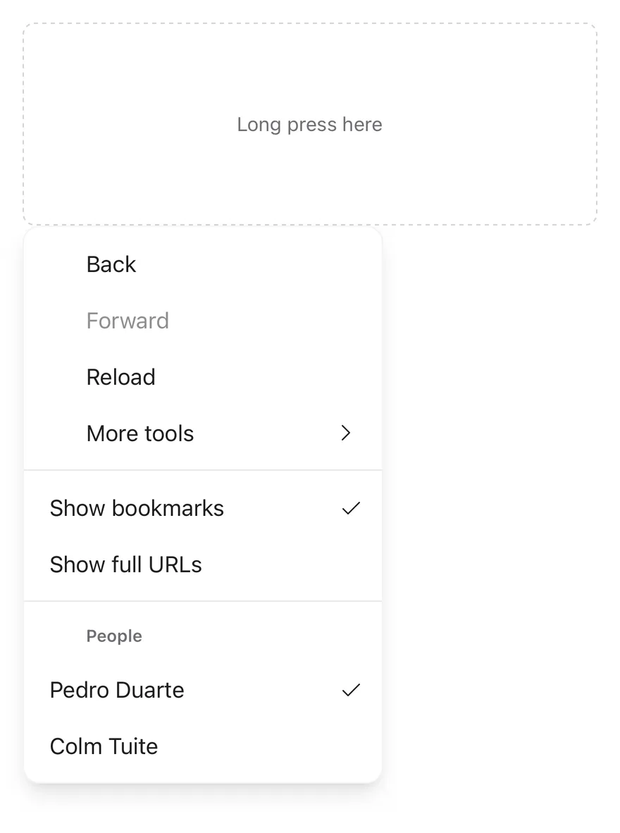
`ContextMenu` attaches a menu to a `ContextMenuTrigger` area. A long press opens `ContextMenuContent` at the position of the finger with a medium impact haptic. The content renders through a portal (inside a full-window overlay on iOS) as a raised, rounded card.

Items can be plain actions, checkbox items, radio items in a group, or a submenu. `ContextMenuSubContent` expands in place under its trigger, and the caret turns to point down while it is open.

## Installation

**React Native**

```bash title="Terminal"
npx shadcn@latest add @esuiss-rn/context-menu
```

See [Installation](https://ui.suiss.app/docs/installation) for the `components.json` setup. Or use the suiss/ui CLI:

```bash title="Terminal"
npx @esuiss/ui@latest add context-menu
```

**SwiftUI**

```bash title="Terminal"
npx @esuiss/ui@latest add context-menu --platform swift
```

**Jetpack Compose**

```bash title="Terminal"
npx @esuiss/ui@latest add context-menu --platform kotlin
```

The CLI also adds what it builds on: [Icon](https://ui.suiss.app/docs/components/icon), [Text](https://ui.suiss.app/docs/components/text). On React Native it also adds the animated view `components/ui/animated-view.tsx`.

### Manual

**React Native**

**Uniwind**

1. Install the dependencies:

```bash title="Terminal"
npx expo install cn phosphor-react-native react-native-reanimated react-native-screens react-native-svg react-native-worklets
```

2. Add the pieces it builds on: [Icon](https://ui.suiss.app/docs/components/icon), [Text](https://ui.suiss.app/docs/components/text), and the primitives `components/primitives/context-menu.tsx`, `components/primitives/use-render.tsx`, and the animated view `components/ui/animated-view.tsx` from the next step.

3. Copy the animated view into `components/ui/animated-view.tsx`:

- `uniwind/components/ui/animated-view.tsx`: [source](https://github.com/e-suiss/ui/blob/main/packages/mobile/uniwind/components/ui/animated-view.tsx)

4. Copy the source into `components/ui/context-menu.tsx`:

```tsx title="uniwind/components/ui/context-menu.tsx"
import { cn } from "cn"
import { CaretRightIcon, CheckIcon } from "phosphor-react-native"
import * as React from "react"
import { Platform, View } from "react-native"
import { FadeIn, ReduceMotion } from "react-native-reanimated"
import { FullWindowOverlay as RNFullWindowOverlay } from "react-native-screens"
import * as ContextMenuPrimitive from "@/components/primitives/context-menu"
import { resolveClassName } from "@/components/primitives/use-render"
import { AnimatedView } from "@/components/ui/animated-view"
import { Icon } from "@/components/ui/icon"
import { TextClassContext } from "@/components/ui/text"

const ContextMenu = ContextMenuPrimitive.Root

const ContextMenuTrigger = ContextMenuPrimitive.Trigger

const ContextMenuGroup = ContextMenuPrimitive.Group

const ContextMenuSub = ContextMenuPrimitive.SubmenuRoot

const ContextMenuRadioGroup = ContextMenuPrimitive.RadioGroup

const FullWindowOverlay =
  Platform.OS === "ios" ? RNFullWindowOverlay : React.Fragment

type PositionerProps = React.ComponentProps<
  typeof ContextMenuPrimitive.Positioner
>

function ContextMenuContent({
  className,
  align = "start",
  alignOffset = 0,
  side = "bottom",
  sideOffset = 0,
  portalHost,
  ...props
}: React.ComponentProps<typeof ContextMenuPrimitive.Popup> &
  Pick<PositionerProps, "align" | "alignOffset" | "side" | "sideOffset"> & {
    portalHost?: string
  }) {
  return (
    <ContextMenuPrimitive.Portal hostName={portalHost}>
      <FullWindowOverlay>
        <ContextMenuPrimitive.Positioner
          align={align}
          alignOffset={alignOffset}
          side={side}
          sideOffset={sideOffset}
        >
          <AnimatedView entering={FadeIn.reduceMotion(ReduceMotion.System)}>
            <TextClassContext.Provider value="text-base text-foreground">
              <ContextMenuPrimitive.Popup
                className={(state) =>
                  cn(
                    "min-w-48 rounded-xl border border-foreground/5 bg-popover p-1.5 shadow-lg dark:border-foreground/10",
                    resolveClassName(className, state)
                  )
                }
                {...props}
              />
            </TextClassContext.Provider>
          </AnimatedView>
        </ContextMenuPrimitive.Positioner>
      </FullWindowOverlay>
    </ContextMenuPrimitive.Portal>
  )
}

function ContextMenuSubTrigger({
  className,
  inset,
  children,
  iconClassName,
  ...props
}: React.ComponentProps<typeof ContextMenuPrimitive.SubmenuTrigger> & {
  children?: React.ReactNode
  iconClassName?: string
  inset?: boolean
}) {
  const { open } = ContextMenuPrimitive.useMenuRootContext().floating
  return (
    <TextClassContext.Provider
      value={cn("select-none text-base text-foreground")}
    >
      <ContextMenuPrimitive.SubmenuTrigger
        className={(state) =>
          cn(
            "group flex-row items-center gap-2 rounded-md px-3 py-2",
            props.disabled && "opacity-50",
            state.highlighted && "opacity-80",
            state.open && !state.highlighted && "bg-accent",
            state.open && "mb-1",
            inset && "pl-9.5",
            resolveClassName(className, state)
          )
        }
        {...props}
      >
        {children}
        <View className={cn("ml-auto shrink-0", open && "rotate-90")}>
          <Icon as={CaretRightIcon} className={cn("size-4", iconClassName)} />
        </View>
      </ContextMenuPrimitive.SubmenuTrigger>
    </TextClassContext.Provider>
  )
}

function ContextMenuSubContent({
  className,
  ...props
}: React.ComponentProps<typeof ContextMenuPrimitive.Popup>) {
  return (
    <AnimatedView entering={FadeIn.reduceMotion(ReduceMotion.System)}>
      <ContextMenuPrimitive.Popup
        className={(state) =>
          cn(
            "min-w-36 rounded-xl border border-foreground/5 bg-popover p-1.5 shadow-lg dark:border-foreground/10",
            resolveClassName(className, state)
          )
        }
        {...props}
      />
    </AnimatedView>
  )
}

function ContextMenuItem({
  className,
  inset,
  variant = "default",
  ...props
}: React.ComponentProps<typeof ContextMenuPrimitive.Item> & {
  inset?: boolean
  variant?: "default" | "destructive"
}) {
  const destructive = variant === "destructive"
  return (
    <TextClassContext.Provider
      value={cn(
        "select-none text-base text-foreground",
        destructive && "text-destructive"
      )}
    >
      <ContextMenuPrimitive.Item
        className={(state) =>
          cn(
            "group relative flex-row items-center gap-2.5 rounded-md px-3 py-2",
            props.disabled && "opacity-50",
            state.highlighted && "opacity-80",
            inset && "pl-9.5",
            resolveClassName(className, state)
          )
        }
        {...props}
      />
    </TextClassContext.Provider>
  )
}

function ContextMenuCheckboxItem({
  className,
  children,
  inset,
  ...props
}: React.ComponentProps<typeof ContextMenuPrimitive.CheckboxItem> & {
  children?: React.ReactNode
  inset?: boolean
}) {
  return (
    <TextClassContext.Provider
      value={cn("select-none text-base text-foreground")}
    >
      <ContextMenuPrimitive.CheckboxItem
        className={(state) =>
          cn(
            "group relative flex-row items-center gap-2.5 rounded-md py-2 pr-8 pl-3",
            props.disabled && "opacity-50",
            state.highlighted && "opacity-80",
            inset && "pl-9.5",
            resolveClassName(className, state)
          )
        }
        {...props}
      >
        <View className="absolute right-2 size-4 items-center justify-center">
          <ContextMenuPrimitive.CheckboxItemIndicator>
            <Icon as={CheckIcon} className="size-4" />
          </ContextMenuPrimitive.CheckboxItemIndicator>
        </View>
        {children}
      </ContextMenuPrimitive.CheckboxItem>
    </TextClassContext.Provider>
  )
}

function ContextMenuRadioItem({
  className,
  children,
  inset,
  ...props
}: React.ComponentProps<typeof ContextMenuPrimitive.RadioItem> & {
  children?: React.ReactNode
  inset?: boolean
}) {
  return (
    <TextClassContext.Provider
      value={cn("select-none text-base text-foreground")}
    >
      <ContextMenuPrimitive.RadioItem
        className={(state) =>
          cn(
            "group relative flex-row items-center gap-2.5 rounded-md py-2 pr-8 pl-3",
            props.disabled && "opacity-50",
            state.highlighted && "opacity-80",
            inset && "pl-9.5",
            resolveClassName(className, state)
          )
        }
        {...props}
      >
        <View className="absolute right-2 size-4 items-center justify-center">
          <ContextMenuPrimitive.RadioItemIndicator>
            <Icon as={CheckIcon} className="size-4" />
          </ContextMenuPrimitive.RadioItemIndicator>
        </View>
        {children}
      </ContextMenuPrimitive.RadioItem>
    </TextClassContext.Provider>
  )
}

function ContextMenuLabel({
  className,
  inset,
  ...props
}: React.ComponentProps<typeof ContextMenuPrimitive.GroupLabel> & {
  inset?: boolean
}) {
  return (
    <ContextMenuPrimitive.GroupLabel
      className={(state) =>
        cn(
          "px-3 py-2.5 text-xs font-semibold text-muted-foreground",
          inset && "pl-9.5",
          resolveClassName(className, state)
        )
      }
      {...props}
    />
  )
}

function ContextMenuSeparator({
  className,
  ...props
}: React.ComponentProps<typeof ContextMenuPrimitive.Separator>) {
  return (
    <ContextMenuPrimitive.Separator
      className={(state) =>
        cn(
          "-mx-1.5 my-1.5 h-px bg-border/50",
          resolveClassName(className, state)
        )
      }
      {...props}
    />
  )
}

export {
  ContextMenu,
  ContextMenuCheckboxItem,
  ContextMenuContent,
  ContextMenuGroup,
  ContextMenuItem,
  ContextMenuLabel,
  ContextMenuRadioGroup,
  ContextMenuRadioItem,
  ContextMenuSeparator,
  ContextMenuSub,
  ContextMenuSubContent,
  ContextMenuSubTrigger,
  ContextMenuTrigger,
}
```

5. Update the import paths to match your project.

**NativeWind**

1. Install the dependencies:

```bash title="Terminal"
npx expo install cn phosphor-react-native react-native-reanimated react-native-screens react-native-svg react-native-worklets
```

2. Add the pieces it builds on: [Icon](https://ui.suiss.app/docs/components/icon), [Text](https://ui.suiss.app/docs/components/text), and the primitives `components/primitives/context-menu.tsx`, `components/primitives/use-render.tsx`, and the animated view `components/ui/animated-view.tsx` from the next step.

3. Copy the animated view into `components/ui/animated-view.tsx`:

- `nativewind/components/ui/animated-view.tsx`: [source](https://github.com/e-suiss/ui/blob/main/packages/mobile/nativewind/components/ui/animated-view.tsx)

4. Copy the source into `components/ui/context-menu.tsx`:

```tsx title="nativewind/components/ui/context-menu.tsx"
import { cn } from "cn"
import { CaretRightIcon, CheckIcon } from "phosphor-react-native"
import * as React from "react"
import { Platform, View } from "react-native"
import { FadeIn, ReduceMotion } from "react-native-reanimated"
import { FullWindowOverlay as RNFullWindowOverlay } from "react-native-screens"
import * as ContextMenuPrimitive from "@/components/primitives/context-menu"
import { resolveClassName } from "@/components/primitives/use-render"
import { AnimatedView } from "@/components/ui/animated-view"
import { Icon } from "@/components/ui/icon"
import { TextClassContext } from "@/components/ui/text"

const ContextMenu = ContextMenuPrimitive.Root

const ContextMenuTrigger = ContextMenuPrimitive.Trigger

const ContextMenuGroup = ContextMenuPrimitive.Group

const ContextMenuSub = ContextMenuPrimitive.SubmenuRoot

const ContextMenuRadioGroup = ContextMenuPrimitive.RadioGroup

const FullWindowOverlay =
  Platform.OS === "ios" ? RNFullWindowOverlay : React.Fragment

type PositionerProps = React.ComponentProps<
  typeof ContextMenuPrimitive.Positioner
>

function ContextMenuContent({
  className,
  align = "start",
  alignOffset = 0,
  side = "bottom",
  sideOffset = 0,
  portalHost,
  ...props
}: React.ComponentProps<typeof ContextMenuPrimitive.Popup> &
  Pick<PositionerProps, "align" | "alignOffset" | "side" | "sideOffset"> & {
    portalHost?: string
  }) {
  return (
    <ContextMenuPrimitive.Portal hostName={portalHost}>
      <FullWindowOverlay>
        <ContextMenuPrimitive.Positioner
          align={align}
          alignOffset={alignOffset}
          side={side}
          sideOffset={sideOffset}
        >
          <AnimatedView entering={FadeIn.reduceMotion(ReduceMotion.System)}>
            <TextClassContext.Provider value="text-base text-foreground">
              <ContextMenuPrimitive.Popup
                className={(state) =>
                  cn(
                    "min-w-48 rounded-xl border border-foreground-5 bg-popover p-1.5 shadow-lg dark:border-foreground-10",
                    resolveClassName(className, state)
                  )
                }
                {...props}
              />
            </TextClassContext.Provider>
          </AnimatedView>
        </ContextMenuPrimitive.Positioner>
      </FullWindowOverlay>
    </ContextMenuPrimitive.Portal>
  )
}

function ContextMenuSubTrigger({
  className,
  inset,
  children,
  iconClassName,
  ...props
}: React.ComponentProps<typeof ContextMenuPrimitive.SubmenuTrigger> & {
  children?: React.ReactNode
  iconClassName?: string
  inset?: boolean
}) {
  const { open } = ContextMenuPrimitive.useMenuRootContext().floating
  return (
    <TextClassContext.Provider
      value={cn("select-none text-base text-foreground")}
    >
      <ContextMenuPrimitive.SubmenuTrigger
        className={(state) =>
          cn(
            "group flex-row items-center gap-2 rounded-md px-3 py-2",
            props.disabled && "opacity-50",
            state.highlighted && "opacity-80",
            state.open && !state.highlighted && "bg-accent",
            state.open && "mb-1",
            inset && "pl-[2.375rem]",
            resolveClassName(className, state)
          )
        }
        {...props}
      >
        {children}
        <View className={cn("ml-auto shrink-0", open && "rotate-90")}>
          <Icon as={CaretRightIcon} className={cn("size-4", iconClassName)} />
        </View>
      </ContextMenuPrimitive.SubmenuTrigger>
    </TextClassContext.Provider>
  )
}

function ContextMenuSubContent({
  className,
  ...props
}: React.ComponentProps<typeof ContextMenuPrimitive.Popup>) {
  return (
    <AnimatedView entering={FadeIn.reduceMotion(ReduceMotion.System)}>
      <ContextMenuPrimitive.Popup
        className={(state) =>
          cn(
            "min-w-36 rounded-xl border border-foreground-5 bg-popover p-1.5 shadow-lg dark:border-foreground-10",
            resolveClassName(className, state)
          )
        }
        {...props}
      />
    </AnimatedView>
  )
}

function ContextMenuItem({
  className,
  inset,
  variant = "default",
  ...props
}: React.ComponentProps<typeof ContextMenuPrimitive.Item> & {
  inset?: boolean
  variant?: "default" | "destructive"
}) {
  const destructive = variant === "destructive"
  return (
    <TextClassContext.Provider
      value={cn(
        "select-none text-base text-foreground",
        destructive && "text-destructive"
      )}
    >
      <ContextMenuPrimitive.Item
        className={(state) =>
          cn(
            "group relative flex-row items-center gap-2.5 rounded-md px-3 py-2",
            props.disabled && "opacity-50",
            state.highlighted && "opacity-80",
            inset && "pl-[2.375rem]",
            resolveClassName(className, state)
          )
        }
        {...props}
      />
    </TextClassContext.Provider>
  )
}

function ContextMenuCheckboxItem({
  className,
  children,
  inset,
  ...props
}: React.ComponentProps<typeof ContextMenuPrimitive.CheckboxItem> & {
  children?: React.ReactNode
  inset?: boolean
}) {
  return (
    <TextClassContext.Provider
      value={cn("select-none text-base text-foreground")}
    >
      <ContextMenuPrimitive.CheckboxItem
        className={(state) =>
          cn(
            "group relative flex-row items-center gap-2.5 rounded-md py-2 pr-8 pl-3",
            props.disabled && "opacity-50",
            state.highlighted && "opacity-80",
            inset && "pl-[2.375rem]",
            resolveClassName(className, state)
          )
        }
        {...props}
      >
        <View className="absolute right-2 size-4 items-center justify-center">
          <ContextMenuPrimitive.CheckboxItemIndicator>
            <Icon as={CheckIcon} className="size-4" />
          </ContextMenuPrimitive.CheckboxItemIndicator>
        </View>
        {children}
      </ContextMenuPrimitive.CheckboxItem>
    </TextClassContext.Provider>
  )
}

function ContextMenuRadioItem({
  className,
  children,
  inset,
  ...props
}: React.ComponentProps<typeof ContextMenuPrimitive.RadioItem> & {
  children?: React.ReactNode
  inset?: boolean
}) {
  return (
    <TextClassContext.Provider
      value={cn("select-none text-base text-foreground")}
    >
      <ContextMenuPrimitive.RadioItem
        className={(state) =>
          cn(
            "group relative flex-row items-center gap-2.5 rounded-md py-2 pr-8 pl-3",
            props.disabled && "opacity-50",
            state.highlighted && "opacity-80",
            inset && "pl-[2.375rem]",
            resolveClassName(className, state)
          )
        }
        {...props}
      >
        <View className="absolute right-2 size-4 items-center justify-center">
          <ContextMenuPrimitive.RadioItemIndicator>
            <Icon as={CheckIcon} className="size-4" />
          </ContextMenuPrimitive.RadioItemIndicator>
        </View>
        {children}
      </ContextMenuPrimitive.RadioItem>
    </TextClassContext.Provider>
  )
}

function ContextMenuLabel({
  className,
  inset,
  ...props
}: React.ComponentProps<typeof ContextMenuPrimitive.GroupLabel> & {
  inset?: boolean
}) {
  return (
    <ContextMenuPrimitive.GroupLabel
      className={(state) =>
        cn(
          "px-3 py-2.5 text-xs font-semibold text-muted-foreground",
          inset && "pl-[2.375rem]",
          resolveClassName(className, state)
        )
      }
      {...props}
    />
  )
}

function ContextMenuSeparator({
  className,
  ...props
}: React.ComponentProps<typeof ContextMenuPrimitive.Separator>) {
  return (
    <ContextMenuPrimitive.Separator
      className={(state) =>
        cn(
          "-mx-1.5 my-1.5 h-px bg-border-50",
          resolveClassName(className, state)
        )
      }
      {...props}
    />
  )
}

export {
  ContextMenu,
  ContextMenuCheckboxItem,
  ContextMenuContent,
  ContextMenuGroup,
  ContextMenuItem,
  ContextMenuLabel,
  ContextMenuRadioGroup,
  ContextMenuRadioItem,
  ContextMenuSeparator,
  ContextMenuSub,
  ContextMenuSubContent,
  ContextMenuSubTrigger,
  ContextMenuTrigger,
}
```

5. Update the import paths to match your project.

**StyleSheet**

1. Install the dependencies:

```bash title="Terminal"
npx expo install phosphor-react-native react-native-reanimated react-native-screens react-native-svg react-native-worklets
```

2. Add the pieces it builds on: [Icon](https://ui.suiss.app/docs/components/icon), [Text](https://ui.suiss.app/docs/components/text), and the primitives `components/primitives/context-menu.tsx`, `components/primitives/use-render.tsx`, and the animated view `components/ui/animated-view.tsx` from the next step.

3. Copy the animated view into `components/ui/animated-view.tsx`:

- `stylesheet/components/ui/animated-view.tsx`: [source](https://github.com/e-suiss/ui/blob/main/packages/mobile/stylesheet/components/ui/animated-view.tsx)

4. Copy the source into `components/ui/context-menu.tsx`:

```tsx title="stylesheet/components/ui/context-menu.tsx"
import type { IconProps as PhosphorIconProps } from "phosphor-react-native"
import { CaretRightIcon, CheckIcon } from "phosphor-react-native"
import * as React from "react"
import {
  Platform,
  type StyleProp,
  StyleSheet,
  type TextStyle,
  View,
  type ViewStyle,
} from "react-native"
import { FadeIn, ReduceMotion } from "react-native-reanimated"
import { FullWindowOverlay as RNFullWindowOverlay } from "react-native-screens"
import * as ContextMenuPrimitive from "@/components/primitives/context-menu"
import { resolveStyle } from "@/components/primitives/use-render"
import { AnimatedView } from "@/components/ui/animated-view"
import { Icon } from "@/components/ui/icon"
import { TextStyleContext } from "@/components/ui/text"
import { fontSize, radius, shadow, useTheme } from "@/components/ui/theme"

const ContextMenu = ContextMenuPrimitive.Root

const ContextMenuTrigger = ContextMenuPrimitive.Trigger

const ContextMenuGroup = ContextMenuPrimitive.Group

const ContextMenuSub = ContextMenuPrimitive.SubmenuRoot

const ContextMenuRadioGroup = ContextMenuPrimitive.RadioGroup

const FullWindowOverlay =
  Platform.OS === "ios" ? RNFullWindowOverlay : React.Fragment

const styles = StyleSheet.create({
  itemText: { ...fontSize.base, userSelect: "none" },
  subTrigger: {
    flexDirection: "row",
    alignItems: "center",
    gap: 8,
    borderRadius: radius.md,
    paddingHorizontal: 12,
    paddingVertical: 8,
  },
  subTriggerIcon: { marginLeft: "auto", flexShrink: 0 },
  subTriggerIconOpen: { transform: [{ rotate: "90deg" }] },
  subContent: {
    minWidth: 144,
    borderRadius: radius.xl,
    borderWidth: 1,
    padding: 6,
    ...shadow.lg,
  },
  content: {
    minWidth: 192,
    borderRadius: radius.xl,
    borderWidth: 1,
    padding: 6,
    ...shadow.lg,
  },
  item: {
    position: "relative",
    flexDirection: "row",
    alignItems: "center",
    gap: 10,
    borderRadius: radius.md,
    paddingHorizontal: 12,
    paddingVertical: 8,
  },
  checkItem: {
    position: "relative",
    flexDirection: "row",
    alignItems: "center",
    gap: 10,
    borderRadius: radius.md,
    paddingVertical: 8,
    paddingRight: 32,
    paddingLeft: 12,
  },
  indicator: {
    position: "absolute",
    right: 8,
    width: 16,
    height: 16,
    alignItems: "center",
    justifyContent: "center",
  },
  label: {
    paddingHorizontal: 12,
    paddingVertical: 10,
    ...fontSize.xs,
    fontWeight: "600",
  },
  inset: { paddingLeft: 38 },
  separator: {
    marginHorizontal: -6,
    marginVertical: 6,
    height: 1,
    opacity: 0.5,
  },
})

function usePopupColors() {
  const { colors, isDark } = useTheme()
  return {
    borderColor: `${colors.foreground}${isDark ? "1a" : "0d"}`,
    backgroundColor: colors.popover,
  }
}

type PositionerProps = React.ComponentProps<
  typeof ContextMenuPrimitive.Positioner
>

function ContextMenuContent({
  style,
  align = "start",
  alignOffset = 0,
  side = "bottom",
  sideOffset = 0,
  portalHost,
  ...props
}: React.ComponentProps<typeof ContextMenuPrimitive.Popup> &
  Pick<PositionerProps, "align" | "alignOffset" | "side" | "sideOffset"> & {
    portalHost?: string
  }) {
  const { colors } = useTheme()
  const popupColors = usePopupColors()
  return (
    <ContextMenuPrimitive.Portal hostName={portalHost}>
      <FullWindowOverlay>
        <ContextMenuPrimitive.Positioner
          align={align}
          alignOffset={alignOffset}
          side={side}
          sideOffset={sideOffset}
        >
          <AnimatedView entering={FadeIn.reduceMotion(ReduceMotion.System)}>
            <TextStyleContext.Provider
              value={{ ...fontSize.base, color: colors.foreground }}
            >
              <ContextMenuPrimitive.Popup
                style={(state) => [
                  styles.content,
                  popupColors,
                  resolveStyle(style, state) as StyleProp<ViewStyle>,
                ]}
                {...props}
              />
            </TextStyleContext.Provider>
          </AnimatedView>
        </ContextMenuPrimitive.Positioner>
      </FullWindowOverlay>
    </ContextMenuPrimitive.Portal>
  )
}

function ContextMenuSubTrigger({
  style,
  inset,
  children,
  iconStyle,
  ...props
}: React.ComponentProps<typeof ContextMenuPrimitive.SubmenuTrigger> & {
  children?: React.ReactNode
  iconStyle?: PhosphorIconProps["style"]
  inset?: boolean
}) {
  const { open } = ContextMenuPrimitive.useMenuRootContext().floating
  const { colors } = useTheme()
  return (
    <TextStyleContext.Provider
      value={{
        ...styles.itemText,
        color: colors.foreground,
      }}
    >
      <ContextMenuPrimitive.SubmenuTrigger
        style={(state) => [
          styles.subTrigger,
          state.open && { backgroundColor: colors.accent },
          state.open && { marginBottom: 4 },
          state.highlighted && { opacity: 0.8 },
          props.disabled && { opacity: 0.5 },
          inset && styles.inset,
          resolveStyle(style, state) as StyleProp<ViewStyle>,
        ]}
        {...props}
      >
        {children}
        <View
          style={[styles.subTriggerIcon, open && styles.subTriggerIconOpen]}
        >
          <Icon as={CaretRightIcon} size={16} style={iconStyle} />
        </View>
      </ContextMenuPrimitive.SubmenuTrigger>
    </TextStyleContext.Provider>
  )
}

function ContextMenuSubContent({
  style,
  ...props
}: React.ComponentProps<typeof ContextMenuPrimitive.Popup>) {
  const popupColors = usePopupColors()
  return (
    <AnimatedView entering={FadeIn.reduceMotion(ReduceMotion.System)}>
      <ContextMenuPrimitive.Popup
        style={(state) => [
          styles.subContent,
          popupColors,
          resolveStyle(style, state) as StyleProp<ViewStyle>,
        ]}
        {...props}
      />
    </AnimatedView>
  )
}

function ContextMenuItem({
  style,
  inset,
  variant = "default",
  ...props
}: React.ComponentProps<typeof ContextMenuPrimitive.Item> & {
  inset?: boolean
  variant?: "default" | "destructive"
}) {
  const { colors } = useTheme()
  const destructive = variant === "destructive"
  const color = destructive ? colors.destructive : colors.foreground
  return (
    <TextStyleContext.Provider
      value={{
        ...styles.itemText,
        color,
      }}
    >
      <ContextMenuPrimitive.Item
        style={(state) => [
          styles.item,
          state.highlighted && { opacity: 0.8 },
          props.disabled && { opacity: 0.5 },
          inset && styles.inset,
          resolveStyle(style, state) as StyleProp<ViewStyle>,
        ]}
        {...props}
      />
    </TextStyleContext.Provider>
  )
}

function ContextMenuCheckboxItem({
  style,
  children,
  inset,
  ...props
}: React.ComponentProps<typeof ContextMenuPrimitive.CheckboxItem> & {
  children?: React.ReactNode
  inset?: boolean
}) {
  const { colors } = useTheme()
  return (
    <TextStyleContext.Provider
      value={{
        ...styles.itemText,
        color: colors.foreground,
      }}
    >
      <ContextMenuPrimitive.CheckboxItem
        style={(state) => [
          styles.checkItem,
          state.highlighted && { opacity: 0.8 },
          props.disabled && { opacity: 0.5 },
          inset && styles.inset,
          resolveStyle(style, state) as StyleProp<ViewStyle>,
        ]}
        {...props}
      >
        <View style={styles.indicator}>
          <ContextMenuPrimitive.CheckboxItemIndicator>
            <Icon as={CheckIcon} size={16} />
          </ContextMenuPrimitive.CheckboxItemIndicator>
        </View>
        {children}
      </ContextMenuPrimitive.CheckboxItem>
    </TextStyleContext.Provider>
  )
}

function ContextMenuRadioItem({
  style,
  children,
  inset,
  ...props
}: React.ComponentProps<typeof ContextMenuPrimitive.RadioItem> & {
  children?: React.ReactNode
  inset?: boolean
}) {
  const { colors } = useTheme()
  return (
    <TextStyleContext.Provider
      value={{
        ...styles.itemText,
        color: colors.foreground,
      }}
    >
      <ContextMenuPrimitive.RadioItem
        style={(state) => [
          styles.checkItem,
          state.highlighted && { opacity: 0.8 },
          props.disabled && { opacity: 0.5 },
          inset && styles.inset,
          resolveStyle(style, state) as StyleProp<ViewStyle>,
        ]}
        {...props}
      >
        <View style={styles.indicator}>
          <ContextMenuPrimitive.RadioItemIndicator>
            <Icon as={CheckIcon} size={16} />
          </ContextMenuPrimitive.RadioItemIndicator>
        </View>
        {children}
      </ContextMenuPrimitive.RadioItem>
    </TextStyleContext.Provider>
  )
}

function ContextMenuLabel({
  style,
  inset,
  ...props
}: React.ComponentProps<typeof ContextMenuPrimitive.GroupLabel> & {
  inset?: boolean
}) {
  const { colors } = useTheme()
  return (
    <ContextMenuPrimitive.GroupLabel
      style={(state) => [
        styles.label,
        { color: colors.mutedForeground },
        inset && styles.inset,
        resolveStyle(style, state) as StyleProp<TextStyle>,
      ]}
      {...props}
    />
  )
}

function ContextMenuSeparator({
  style,
  ...props
}: React.ComponentProps<typeof ContextMenuPrimitive.Separator>) {
  const { colors } = useTheme()
  return (
    <ContextMenuPrimitive.Separator
      style={(state) => [
        styles.separator,
        { backgroundColor: colors.border },
        resolveStyle(style, state) as StyleProp<ViewStyle>,
      ]}
      {...props}
    />
  )
}

export {
  ContextMenu,
  ContextMenuCheckboxItem,
  ContextMenuContent,
  ContextMenuGroup,
  ContextMenuItem,
  ContextMenuLabel,
  ContextMenuRadioGroup,
  ContextMenuRadioItem,
  ContextMenuSeparator,
  ContextMenuSub,
  ContextMenuSubContent,
  ContextMenuSubTrigger,
  ContextMenuTrigger,
}
```

5. Update the import paths to match your project.

**SwiftUI**

1. Target iOS 17 or later.

2. Add the Swift package to your app:

```swift title="Package.swift"
.package(url: "https://github.com/phosphor-icons/swift", from: "2.1.0")
```

3. Copy the theme files every view uses:

- `swift/Theme/Theme.swift`: [source](https://github.com/e-suiss/ui/blob/main/packages/mobile/swiftui/Sources/EsuissUI/Theme/Theme.swift)

- `swift/Theme/Tokens.swift`: [source](https://github.com/e-suiss/ui/blob/main/packages/mobile/swiftui/Sources/EsuissUI/Theme/Tokens.swift)

4. Copy the source and every file it uses:

```swift title="swift/Components/ContextMenu.swift"
import SwiftUI

public typealias ContextMenuItem<Label: View> = DropdownMenuItem<Label>
public typealias ContextMenuCheckboxItem<Label: View> = DropdownMenuCheckboxItem<Label>
public typealias ContextMenuRadioGroup<Content: View> = DropdownMenuRadioGroup<Content>
public typealias ContextMenuRadioItem<Label: View> = DropdownMenuRadioItem<Label>
public typealias ContextMenuLabel = DropdownMenuLabel
public typealias ContextMenuGroup<Content: View> = DropdownMenuGroup<Content>
public typealias ContextMenuSeparator = DropdownMenuSeparator
public typealias ContextMenuSub<Label: View, Content: View> = DropdownMenuSub<Label, Content>

extension View {
  public func contextMenu<Items: View, Preview: View>(
    @ViewBuilder items: () -> Items,
    @ViewBuilder preview: () -> Preview,
    previewRadius: CGFloat
  ) -> some View {
    contentShape(.contextMenuPreview, RoundedRectangle(cornerRadius: previewRadius, style: .continuous))
      .contextMenu(menuItems: items, preview: preview)
  }

  public func contextMenu<Items: View>(
    previewRadius: CGFloat,
    @ViewBuilder items: () -> Items
  ) -> some View {
    contentShape(.contextMenuPreview, RoundedRectangle(cornerRadius: previewRadius, style: .continuous))
      .contextMenu(menuItems: items)
  }
}
```

- `swift/Components/Button.swift`: see [Button](https://ui.suiss.app/docs/components/button.md)

- `swift/Components/ButtonGroup.swift`: see [Button Group](https://ui.suiss.app/docs/components/button-group.md)

- `swift/Components/DropdownMenu.swift`: see [Dropdown Menu](https://ui.suiss.app/docs/components/dropdown-menu.md)

- `swift/Components/Field.swift`: see [Field](https://ui.suiss.app/docs/components/field.md)

- `swift/Components/Overlay.swift`: [source](https://github.com/e-suiss/ui/blob/main/packages/mobile/swiftui/Sources/EsuissUI/Components/Overlay.swift)

- `swift/Components/Select.swift`: see [Select](https://ui.suiss.app/docs/components/select.md)

- `swift/Components/Separator.swift`: see [Separator](https://ui.suiss.app/docs/components/separator.md)

- `swift/Components/TextVariant.swift`: [source](https://github.com/e-suiss/ui/blob/main/packages/mobile/swiftui/Sources/EsuissUI/Components/TextVariant.swift)

5. Add the files to your app target.

**Jetpack Compose**

1. Set `minSdk` to 24 or higher and add the dependencies:

```kotlin title="build.gradle.kts"
implementation(platform("androidx.compose:compose-bom:2026.09.00"))
implementation("androidx.compose.foundation:foundation")
implementation("androidx.compose.ui:ui")
implementation("com.adamglin:phosphor-icon-android:1.0.0")
```

2. Copy the theme files every view uses:

- `kotlin/theme/Theme.kt`: [source](https://github.com/e-suiss/ui/blob/main/packages/mobile/kotlin/ui/src/main/kotlin/com/esuiss/ui/theme/Theme.kt)

- `kotlin/theme/Tokens.kt`: [source](https://github.com/e-suiss/ui/blob/main/packages/mobile/kotlin/ui/src/main/kotlin/com/esuiss/ui/theme/Tokens.kt)

3. Copy the source and every file it uses:

```kt title="kotlin/components/ContextMenu.kt"
package com.esuiss.ui.components

import androidx.compose.foundation.layout.Box
import androidx.compose.foundation.layout.ColumnScope
import androidx.compose.runtime.Composable
import androidx.compose.runtime.getValue
import androidx.compose.runtime.mutableStateOf
import androidx.compose.runtime.remember
import androidx.compose.runtime.setValue
import androidx.compose.ui.Modifier
import androidx.compose.ui.hapticfeedback.HapticFeedbackType
import androidx.compose.ui.semantics.onLongClick
import androidx.compose.ui.semantics.semantics
import androidx.compose.ui.unit.IntOffset
import androidx.compose.ui.unit.dp
import androidx.compose.ui.unit.round

@Composable
fun ContextMenu(
    expanded: Boolean,
    onExpandedChange: (Boolean) -> Unit,
    trigger: @Composable () -> Unit,
    modifier: Modifier = Modifier,
    enabled: Boolean = true,
    content: @Composable ColumnScope.() -> Unit,
) {
    var point by remember { mutableStateOf<IntOffset?>(null) }
    val haptics = rememberHaptics()
    Box(
        modifier = rememberLongPressModifier(enabled) {
            point = it.round()
            haptics.perform(HapticFeedbackType.LongPress)
            onExpandedChange(true)
        }.semantics {
            if (enabled) {
                onLongClick(label = "Open menu") {
                    point = null
                    onExpandedChange(true)
                    true
                }
            }
        },
    ) {
        trigger()
        MenuPopup(
            expanded = expanded,
            onDismissRequest = { onExpandedChange(false) },
            modifier = modifier,
            side = PopupSide.Bottom,
            align = PopupAlign.Start,
            sideOffset = 0.dp,
            alignOffset = 0.dp,
            minWidth = 192.dp,
            point = point,
            content = content,
        )
    }
}
```

- `kotlin/components/Button.kt`: see [Button](https://ui.suiss.app/docs/components/button.md)

- `kotlin/components/ButtonGroup.kt`: see [Button Group](https://ui.suiss.app/docs/components/button-group.md)

- `kotlin/components/Checkbox.kt`: see [Checkbox](https://ui.suiss.app/docs/components/checkbox.md)

- `kotlin/components/Content.kt`: [source](https://github.com/e-suiss/ui/blob/main/packages/mobile/kotlin/ui/src/main/kotlin/com/esuiss/ui/components/Content.kt)

- `kotlin/components/DropdownMenu.kt`: see [Dropdown Menu](https://ui.suiss.app/docs/components/dropdown-menu.md)

- `kotlin/components/Field.kt`: see [Field](https://ui.suiss.app/docs/components/field.md)

- `kotlin/components/FormSupport.kt`: [source](https://github.com/e-suiss/ui/blob/main/packages/mobile/kotlin/ui/src/main/kotlin/com/esuiss/ui/components/FormSupport.kt)

- `kotlin/components/Haptics.kt`: see [Haptics](https://ui.suiss.app/docs/components/haptics.md)

- `kotlin/components/Icon.kt`: see [Icon](https://ui.suiss.app/docs/components/icon.md)

- `kotlin/components/Label.kt`: see [Label](https://ui.suiss.app/docs/components/label.md)

- `kotlin/components/Overlay.kt`: [source](https://github.com/e-suiss/ui/blob/main/packages/mobile/kotlin/ui/src/main/kotlin/com/esuiss/ui/components/Overlay.kt)

- `kotlin/components/Separator.kt`: see [Separator](https://ui.suiss.app/docs/components/separator.md)

4. Update the `com.esuiss.ui` package names to match your project.

## Usage

```tsx
import { ContextMenuContent, ContextMenuSubTrigger, ContextMenuSubContent, ContextMenuItem, ContextMenuCheckboxItem, ContextMenuRadioItem, ContextMenuLabel, ContextMenuSeparator } from "@/components/ui/context-menu"
```

```tsx
<ContextMenuDemo defaultOpen />
```

Wrap the long-pressable area in `ContextMenuTrigger` and list `ContextMenuItem`s in `ContextMenuContent`. Items close the menu when pressed unless `closeOnPress={false}`.

Use `ContextMenuCheckboxItem` with `checked` and `onCheckedChange`, and `ContextMenuRadioItem` inside a `ContextMenuRadioGroup` with `value` and `onValueChange`. Group items with `ContextMenuGroup` and `ContextMenuLabel`, and divide sections with `ContextMenuSeparator`.

Set `variant="destructive"` on an item that deletes or removes. Use `inset` on items without an icon to align them with items that have one.

## Examples

### Default

![Preview](https://ui.suiss.app/previews/components-context-menu--default.light.webp)

```tsx
import * as React from "react"
import { ContextMenu, ContextMenuCheckboxItem, ContextMenuContent, ContextMenuItem, ContextMenuLabel, ContextMenuRadioGroup, ContextMenuRadioItem, ContextMenuSeparator, ContextMenuSub, ContextMenuSubContent, ContextMenuSubTrigger, ContextMenuTrigger } from "@/components/ui/context-menu"
import { Text } from "@/components/ui/text"

function TriggerArea() {
  return (
    <ContextMenuTrigger className="border-border h-36 w-full items-center justify-center rounded-md border border-dashed">
      <Text className="text-sm text-muted-foreground">Long press here</Text>
    </ContextMenuTrigger>
  )
}

function ContextMenuDemo({ defaultOpen }: { defaultOpen?: boolean }) {
  const [showBookmarks, setShowBookmarks] = React.useState(true)
  const [showUrls, setShowUrls] = React.useState(false)
  const [person, setPerson] = React.useState("pedro")
  return (
    <ContextMenu defaultOpen={defaultOpen}>
      <TriggerArea />
      <ContextMenuContent className="w-64">
        <ContextMenuItem inset>
          <Text>Back</Text>
        </ContextMenuItem>
        <ContextMenuItem inset disabled>
          <Text>Forward</Text>
        </ContextMenuItem>
        <ContextMenuItem inset>
          <Text>Reload</Text>
        </ContextMenuItem>
        <ContextMenuSub>
          <ContextMenuSubTrigger inset>
            <Text>More tools</Text>
          </ContextMenuSubTrigger>
          <ContextMenuSubContent className="w-48">
            <ContextMenuItem>
              <Text>Save page</Text>
            </ContextMenuItem>
            <ContextMenuItem>
              <Text>Create shortcut</Text>
            </ContextMenuItem>
            <ContextMenuSeparator />
            <ContextMenuItem variant="destructive">
              <Text>Delete</Text>
            </ContextMenuItem>
          </ContextMenuSubContent>
        </ContextMenuSub>
        <ContextMenuSeparator />
        <ContextMenuCheckboxItem
          checked={showBookmarks}
          onCheckedChange={setShowBookmarks}
        >
          <Text>Show bookmarks</Text>
        </ContextMenuCheckboxItem>
        <ContextMenuCheckboxItem
          checked={showUrls}
          onCheckedChange={setShowUrls}
        >
          <Text>Show full URLs</Text>
        </ContextMenuCheckboxItem>
        <ContextMenuSeparator />
        <ContextMenuRadioGroup value={person} onValueChange={setPerson}>
          <ContextMenuLabel inset>People</ContextMenuLabel>
          <ContextMenuRadioItem value="pedro">
            <Text>Pedro Duarte</Text>
          </ContextMenuRadioItem>
          <ContextMenuRadioItem value="colm">
            <Text>Colm Tuite</Text>
          </ContextMenuRadioItem>
        </ContextMenuRadioGroup>
      </ContextMenuContent>
    </ContextMenu>
  )
}

export function ContextMenuExample() {
  return (
    <ContextMenuDemo />
  )
}
```

```swift
import EsuissUI
import SwiftUI

struct ContextMenuTriggerArea: View {
  var body: some View {
    Text("Long press here")
      .textStyle(.sm)
      .foregroundStyle(EsuissColor.mutedForeground)
      .frame(maxWidth: .infinity)
      .frame(height: 144)
      .background(EsuissColor.background, in: RoundedRectangle(cornerRadius: Radius.md, style: .continuous))
      .overlay {
        RoundedRectangle(cornerRadius: Radius.md, style: .continuous)
          .strokeBorder(EsuissColor.border, style: StrokeStyle(lineWidth: 1, dash: [4, 3]))
      }
  }
}

struct ContextMenuDemo: View {
  @State private var showBookmarks = true
  @State private var showUrls = false
  @State private var person = "pedro"

  var body: some View {
    ContextMenuTriggerArea()
      .contextMenu(previewRadius: Radius.md) {
        ContextMenuItem("Back", inset: true) {}
        ContextMenuItem("Forward", inset: true) {}
          .disabled(true)
        ContextMenuItem("Reload", inset: true) {}
        ContextMenuSub("More tools", inset: true) {
          ContextMenuItem("Save page") {}
          ContextMenuItem("Create shortcut") {}
          ContextMenuSeparator()
          ContextMenuItem("Delete", variant: .destructive) {}
        }
        ContextMenuSeparator()
        ContextMenuCheckboxItem("Show bookmarks", isOn: $showBookmarks)
        ContextMenuCheckboxItem("Show full URLs", isOn: $showUrls)
        ContextMenuSeparator()
        ContextMenuRadioGroup(selection: $person) {
          ContextMenuLabel("People", inset: true)
          ContextMenuRadioItem("Pedro Duarte", value: "pedro")
          ContextMenuRadioItem("Colm Tuite", value: "colm")
        }
      }
  }
}
```

```kotlin
import androidx.compose.foundation.layout.Box
import androidx.compose.foundation.layout.Column
import androidx.compose.foundation.layout.fillMaxWidth
import androidx.compose.foundation.layout.height
import androidx.compose.foundation.layout.width
import androidx.compose.runtime.Composable
import androidx.compose.runtime.getValue
import androidx.compose.runtime.mutableStateOf
import androidx.compose.runtime.saveable.rememberSaveable
import androidx.compose.runtime.setValue
import androidx.compose.ui.Alignment
import androidx.compose.ui.Modifier
import androidx.compose.ui.draw.drawBehind
import androidx.compose.ui.geometry.CornerRadius
import androidx.compose.ui.geometry.Offset
import androidx.compose.ui.geometry.Size
import androidx.compose.ui.graphics.PathEffect
import androidx.compose.ui.graphics.drawscope.Stroke
import androidx.compose.ui.unit.dp
import com.esuiss.ui.components.ContextMenu
import com.esuiss.ui.components.DropdownMenuCheckboxItem
import com.esuiss.ui.components.DropdownMenuItem
import com.esuiss.ui.components.DropdownMenuLabel
import com.esuiss.ui.components.DropdownMenuRadioGroup
import com.esuiss.ui.components.DropdownMenuRadioItem
import com.esuiss.ui.components.DropdownMenuSeparator
import com.esuiss.ui.components.DropdownMenuSub
import com.esuiss.ui.components.MenuItemVariant
import com.esuiss.ui.components.Text
import com.esuiss.ui.theme.EsuissTheme
import com.esuiss.ui.theme.Radius
import com.esuiss.ui.theme.Typography

@Composable
fun ContextMenuExample() {
    ContextMenuDemo(defaultOpen = false)
}

@Composable
fun ContextMenuTriggerArea() {
    val color = EsuissTheme.colors.border
    Box(
        modifier = Modifier
            .fillMaxWidth()
            .height(144.dp)
            .drawBehind {
                val stroke = 1.dp.toPx()
                drawRoundRect(
                    color = color,
                    topLeft = Offset(stroke / 2, stroke / 2),
                    size = Size(size.width - stroke, size.height - stroke),
                    cornerRadius = CornerRadius(Radius.md.toPx()),
                    style = Stroke(stroke, pathEffect = PathEffect.dashPathEffect(floatArrayOf(4.dp.toPx(), 3.dp.toPx()))),
                )
            },
        contentAlignment = Alignment.Center,
    ) {
        Text("Long press here", style = Typography.sm.copy(color = EsuissTheme.colors.mutedForeground))
    }
}

@Composable
fun ContextMenuDemo(defaultOpen: Boolean) {
    var open by rememberSaveable { mutableStateOf(defaultOpen) }
    var showBookmarks by rememberSaveable { mutableStateOf(true) }
    var showUrls by rememberSaveable { mutableStateOf(false) }
    var person by rememberSaveable { mutableStateOf("pedro") }
    ContextMenu(
        expanded = open,
        onExpandedChange = { open = it },
        trigger = { ContextMenuTriggerArea() },
        modifier = Modifier.width(256.dp),
    ) {
        DropdownMenuItem("Back", onClick = {}, inset = true)
        DropdownMenuItem("Forward", onClick = {}, inset = true, enabled = false)
        DropdownMenuItem("Reload", onClick = {}, inset = true)
        DropdownMenuSub("More tools", inset = true) {
            Column(Modifier.width(192.dp)) {
                DropdownMenuItem("Save page", onClick = {})
                DropdownMenuItem("Create shortcut", onClick = {})
                DropdownMenuSeparator()
                DropdownMenuItem("Delete", onClick = {}, variant = MenuItemVariant.Destructive)
            }
        }
        DropdownMenuSeparator()
        DropdownMenuCheckboxItem("Show bookmarks", checked = showBookmarks, onCheckedChange = { showBookmarks = it })
        DropdownMenuCheckboxItem("Show full URLs", checked = showUrls, onCheckedChange = { showUrls = it })
        DropdownMenuSeparator()
        DropdownMenuRadioGroup(value = person, onValueChange = { person = it }) {
            DropdownMenuLabel("People", inset = true)
            DropdownMenuRadioItem("pedro", "Pedro Duarte")
            DropdownMenuRadioItem("colm", "Colm Tuite")
        }
    }
}
```

### Simple

A short list of plain items.

![Preview](https://ui.suiss.app/previews/components-context-menu--simple.light.webp)

```tsx
import { View } from "react-native"
import { ContextMenu, ContextMenuContent, ContextMenuItem, ContextMenuTrigger } from "@/components/ui/context-menu"
import { Text } from "@/components/ui/text"

function TriggerArea() {
  return (
    <ContextMenuTrigger className="border-border h-36 w-full items-center justify-center rounded-md border border-dashed">
      <Text className="text-sm text-muted-foreground">Long press here</Text>
    </ContextMenuTrigger>
  )
}

export function ContextMenuSimpleExample() {
  return (
    <View>
      <ContextMenu>
        <TriggerArea />
        <ContextMenuContent className="w-48">
          <ContextMenuItem>
            <Text>Profile</Text>
          </ContextMenuItem>
          <ContextMenuItem>
            <Text>Billing</Text>
          </ContextMenuItem>
          <ContextMenuItem>
            <Text>Team</Text>
          </ContextMenuItem>
          <ContextMenuItem>
            <Text>Subscription</Text>
          </ContextMenuItem>
        </ContextMenuContent>
      </ContextMenu>
    </View>
  )
}
```

```swift
import EsuissUI
import SwiftUI

struct ContextMenuSimpleExample: View {
  var body: some View {
    ContextMenuTriggerArea()
      .contextMenu(previewRadius: Radius.md) {
        ContextMenuItem("Profile") {}
        ContextMenuItem("Billing") {}
        ContextMenuItem("Team") {}
        ContextMenuItem("Subscription") {}
      }
  }
}

struct ContextMenuTriggerArea: View {
  var body: some View {
    Text("Long press here")
      .textStyle(.sm)
      .foregroundStyle(EsuissColor.mutedForeground)
      .frame(maxWidth: .infinity)
      .frame(height: 144)
      .background(EsuissColor.background, in: RoundedRectangle(cornerRadius: Radius.md, style: .continuous))
      .overlay {
        RoundedRectangle(cornerRadius: Radius.md, style: .continuous)
          .strokeBorder(EsuissColor.border, style: StrokeStyle(lineWidth: 1, dash: [4, 3]))
      }
  }
}
```

```kotlin
import androidx.compose.foundation.layout.Box
import androidx.compose.foundation.layout.fillMaxWidth
import androidx.compose.foundation.layout.height
import androidx.compose.foundation.layout.width
import androidx.compose.runtime.Composable
import androidx.compose.runtime.getValue
import androidx.compose.runtime.mutableStateOf
import androidx.compose.runtime.saveable.rememberSaveable
import androidx.compose.runtime.setValue
import androidx.compose.ui.Alignment
import androidx.compose.ui.Modifier
import androidx.compose.ui.draw.drawBehind
import androidx.compose.ui.geometry.CornerRadius
import androidx.compose.ui.geometry.Offset
import androidx.compose.ui.geometry.Size
import androidx.compose.ui.graphics.PathEffect
import androidx.compose.ui.graphics.drawscope.Stroke
import androidx.compose.ui.unit.dp
import com.esuiss.ui.components.ContextMenu
import com.esuiss.ui.components.DropdownMenuItem
import com.esuiss.ui.components.Text
import com.esuiss.ui.theme.EsuissTheme
import com.esuiss.ui.theme.Radius
import com.esuiss.ui.theme.Typography

@Composable
fun ContextMenuTriggerArea() {
    val color = EsuissTheme.colors.border
    Box(
        modifier = Modifier
            .fillMaxWidth()
            .height(144.dp)
            .drawBehind {
                val stroke = 1.dp.toPx()
                drawRoundRect(
                    color = color,
                    topLeft = Offset(stroke / 2, stroke / 2),
                    size = Size(size.width - stroke, size.height - stroke),
                    cornerRadius = CornerRadius(Radius.md.toPx()),
                    style = Stroke(stroke, pathEffect = PathEffect.dashPathEffect(floatArrayOf(4.dp.toPx(), 3.dp.toPx()))),
                )
            },
        contentAlignment = Alignment.Center,
    ) {
        Text("Long press here", style = Typography.sm.copy(color = EsuissTheme.colors.mutedForeground))
    }
}

@Composable
fun ContextMenuSimple() {
    var open by rememberSaveable { mutableStateOf(false) }
    ContextMenu(
        expanded = open,
        onExpandedChange = { open = it },
        trigger = { ContextMenuTriggerArea() },
        modifier = Modifier.width(192.dp),
    ) {
        DropdownMenuItem("Profile", onClick = {})
        DropdownMenuItem("Billing", onClick = {})
        DropdownMenuItem("Team", onClick = {})
        DropdownMenuItem("Subscription", onClick = {})
    }
}
```

## API Reference

### ContextMenu

The root that manages the open state.

| Prop | Type | Default | Description |
| --- | --- | --- | --- |
| `open` | `boolean` | - | Whether the menu is open, for controlled use. |
| `defaultOpen` | `boolean` | `false` | Whether the menu starts open when uncontrolled. |
| `onOpenChange` | `(open: boolean, details) => void` | - | Called when the menu opens or closes. |
| `disabled` | `boolean` | `false` | Prevents the menu from opening. |

### ContextMenuContent

Floating menu card.

| Prop | Type | Default | Description |
| --- | --- | --- | --- |
| `portalHost` | `string` | - | Name of the portal host to render into. |

Also accepts the props of `React.ComponentProps<typeof ContextMenuPrimitive.Popup>`, `PositionerProps`.

### ContextMenuSubTrigger

Row that expands the submenu.

| Prop | Type | Default | Description |
| --- | --- | --- | --- |
| `children` | `React.ReactNode` | - |  |
| `iconClassName` | `string` | - | Extra classes for the caret icon. |
| `inset` | `boolean` | - | Adds start padding. |

Also accepts the props of `React.ComponentProps<typeof ContextMenuPrimitive.SubmenuTrigger>`.

### ContextMenuSubContent

Items of the submenu.

Also accepts the props of `React.ComponentProps<typeof ContextMenuPrimitive.Popup>`.

### ContextMenuItem

Action row.

| Prop | Type | Default | Description |
| --- | --- | --- | --- |
| `inset` | `boolean` | - | Adds start padding to align with icon items. |
| `variant` | `"default" \| "destructive"` | `"default"` | `default` or `destructive`. |

Also accepts the props of `React.ComponentProps<typeof ContextMenuPrimitive.Item>`.

### ContextMenuCheckboxItem

Row with a check mark that toggles.

| Prop | Type | Default | Description |
| --- | --- | --- | --- |
| `children` | `React.ReactNode` | - |  |
| `inset` | `boolean` | - | Adds start padding. |

Also accepts the props of `React.ComponentProps<typeof ContextMenuPrimitive.CheckboxItem>`.

### ContextMenuRadioItem

Row that selects one value in its group.

| Prop | Type | Default | Description |
| --- | --- | --- | --- |
| `children` | `React.ReactNode` | - |  |
| `inset` | `boolean` | - | Adds start padding. |

Also accepts the props of `React.ComponentProps<typeof ContextMenuPrimitive.RadioItem>`.

### ContextMenuLabel

Heading for a group.

| Prop | Type | Default | Description |
| --- | --- | --- | --- |
| `inset` | `boolean` | - | Adds start padding. |

Also accepts the props of `React.ComponentProps<typeof ContextMenuPrimitive.GroupLabel>`.

### ContextMenuSeparator

Line between sections.

Also accepts the props of `React.ComponentProps<typeof ContextMenuPrimitive.Separator>`.

## Accessibility

- The trigger exposes a `longpress` accessibility action, so VoiceOver and TalkBack users can open the menu, and reports its `expanded` state.
- The popup has the `menu` role; items use `menuitem`, `checkbox` and `radio` roles, and radio groups use `radiogroup`.
- Separators have the `separator` role.

## Notes

- Uses the `bg-popover` token; a highlighted item fades to `opacity-80` and a disabled one to `opacity-50`; light and dark follow the system appearance.
- The fade-in respects the system Reduce Motion setting.

