# Bubble
A chat-style message bubble with variants, alignment, a tail and optional reactions.
Bubble is an open-source component from suiss/ui for React, React Native, SwiftUI and Jetpack Compose. The @esuiss/ui CLI copies its source into your project, so you own the code.
Source: https://ui.suiss.app/docs/components/bubble
**React**
**Example**
```tsx
import { Bubble, BubbleContent } from "@/components/ui/bubble"
export default function BubbleDemo() {
return (
Are we still on for lunch tomorrow?
)
}
```
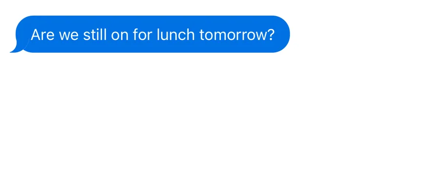
A `Bubble` wraps a `BubbleContent`, which renders the rounded message body. Add `BubbleReactions` inside the bubble to pin a reaction pill to its top or bottom edge. Stack bubbles in a `BubbleGroup` to form a conversation.
Align bubbles to the `start` or `end` of the conversation. The tail appears only on the last bubble in a run of consecutive bubbles with the same alignment, and never on the `outline` or `ghost` variants. Use Bubble for chat transcripts and assistant replies; for a full message row with avatar and metadata, see Message.
## Installation
### CLI
```bash title="Terminal"
npx shadcn@latest add @esuiss/bubble
```
Works in any project with a `components.json`. See [Installation](https://ui.suiss.app/docs/installation#add-components) for the one-line registry setup. Or use the suiss/ui CLI:
```bash title="Terminal"
npx @esuiss/ui@latest add bubble
```
### Manual
1. Install the dependencies and add the [`cn` helper](https://ui.suiss.app/docs/installation#the-cn-helper):
```bash title="Terminal"
npm install @base-ui/react class-variance-authority
```
2. Copy the source into `components/ui/bubble.tsx`:
```tsx title="components/ui/bubble.tsx"
import { mergeProps } from "@base-ui/react/merge-props"
import { useRender } from "@base-ui/react/use-render"
import { cva, type VariantProps } from "class-variance-authority"
import type * as React from "react"
import { cn } from "@/lib/utils"
function BubbleGroup({ className, ...props }: React.ComponentProps<"div">) {
return (
)
}
const bubbleVariants = cva(
"group/bubble relative flex w-fit has-[>[data-slot=bubble-reactions][data-side=bottom]]:mb-5 has-[>[data-slot=bubble-reactions][data-side=top]]:mt-5 max-w-[80%] min-w-0 flex-col gap-1 group-data-[align=end]/message:self-end data-[align=end]:self-end data-[variant=ghost]:max-w-full",
{
variants: {
variant: {
default:
"[--bubble-bg:var(--primary)] *:data-[slot=bubble-content]:text-primary-foreground [&>[data-slot=bubble-content]:is(button,a):hover]:[--bubble-bg:color-mix(in_oklab,var(--primary)_80%,transparent)]",
secondary:
"[--bubble-bg:var(--secondary)] *:data-[slot=bubble-content]:text-secondary-foreground [&>[data-slot=bubble-content]:is(button,a):hover]:[--bubble-bg:color-mix(in_oklab,var(--secondary)_80%,transparent)]",
muted:
"[--bubble-bg:var(--muted)] [&>[data-slot=bubble-content]:is(button,a):hover]:[--bubble-bg:color-mix(in_oklab,var(--muted),var(--foreground)_5%)]",
tinted:
"[--bubble-bg:color-mix(in_oklab,var(--primary)_12%,transparent)] *:data-[slot=bubble-content]:text-foreground [&>[data-slot=bubble-content]:is(button,a):hover]:[--bubble-bg:color-mix(in_oklab,var(--primary)_20%,transparent)]",
outline:
"[--bubble-bg:var(--background)] *:data-[slot=bubble-content]:border-border [&>[data-slot=bubble-content]:is(button,a):hover]:[--bubble-bg:var(--secondary)] [&>[data-slot=bubble-content]:is(button,a):hover]:text-foreground",
ghost:
"*:data-[slot=bubble-content]:rounded-none *:data-[slot=bubble-content]:p-0 [&>[data-slot=bubble-content]:is(button,a):hover]:bg-accent [&>[data-slot=bubble-content]:is(button,a):hover]:text-accent-foreground",
destructive:
"[--bubble-bg:color-mix(in_oklab,var(--destructive)_10%,transparent)] dark:[--bubble-bg:color-mix(in_oklab,var(--destructive)_20%,transparent)] *:data-[slot=bubble-content]:text-destructive [&>[data-slot=bubble-content]:is(button,a):hover]:[--bubble-bg:color-mix(in_oklab,var(--destructive)_20%,transparent)] dark:[&>[data-slot=bubble-content]:is(button,a):hover]:[--bubble-bg:color-mix(in_oklab,var(--destructive)_30%,transparent)] [&>[data-slot=bubble-content]:is(button,a):hover]:text-[color-mix(in_oklab,var(--destructive),var(--foreground)_15%)] dark:[&>[data-slot=bubble-content]:is(button,a):hover]:text-destructive",
},
},
defaultVariants: {
variant: "default",
},
}
)
function Bubble({
variant = "default",
align = "start",
className,
...props
}: React.ComponentProps<"div"> &
VariantProps & {
align?: "start" | "end"
}) {
return (
)
}
function BubbleContent({
className,
render,
...props
}: useRender.ComponentProps<"div">) {
return useRender({
defaultTagName: "div",
props: mergeProps<"div">(
{
className: cn(
"w-fit max-w-full min-w-0 relative rounded-2xl border [background:linear-gradient(var(--bubble-bg),var(--bubble-bg)),var(--bubble-surface,var(--background))] border-transparent px-3.5 py-1.5 text-base wrap-break-word group-data-[align=end]/bubble:self-end group-data-[align=end]/message:self-end before:absolute before:-start-[7.9px] before:-bottom-px before:hidden before:size-5 before:[background:inherit] before:[clip-path:path('M7_0H20V4A16_16_0_0_1_4_20H0V19.54A10_10_0_0_0_7_10Z')] rtl:before:-scale-x-100 group-data-[align=end]/bubble:before:-scale-x-100 group-data-[align=end]/message:before:-scale-x-100 rtl:group-data-[align=end]/bubble:before:scale-x-100 rtl:group-data-[align=end]/message:before:scale-x-100 group-data-[align=end]/bubble:before:start-auto group-data-[align=end]/message:before:start-auto group-data-[align=end]/bubble:before:-end-[7.9px] group-data-[align=end]/message:before:-end-[7.9px] [[data-slot=bubble][data-align=start]:not([data-slot=message][data-align=end]_*):not([data-variant=ghost]):not([data-variant=outline]):not(:has(+[data-slot=bubble][data-align=start]))>&]:before:block [[data-slot=bubble]:is([data-align=end],[data-slot=message][data-align=end]_*):not([data-variant=ghost]):not([data-variant=outline]):not(:has(+[data-slot=bubble]:is([data-align=end],[data-slot=message][data-align=end]_*)))>&]:before:block [button]:text-start [button,a]:transition-colors [button,a]:outline-none [button,a]:focus-visible:border-ring [button,a]:focus-visible:ring-3 [button,a]:focus-visible:ring-ring/50",
className
),
},
props
),
render,
state: {
slot: "bubble-content",
},
})
}
const bubbleReactionsVariants = cva(
"absolute z-10 flex w-fit shrink-0 items-center justify-center gap-1 rounded-full bg-muted px-1.5 py-0.5 text-sm ring-3 ring-[var(--bubble-surface,var(--background))] has-[button]:p-0",
{
variants: {
side: {
top: "top-0 -translate-y-3/4",
bottom: "bottom-0 translate-y-3/4",
},
align: {
start: "start-3",
end: "end-3",
},
},
defaultVariants: {
side: "bottom",
align: "end",
},
}
)
function BubbleReactions({
side = "bottom",
align = "end",
className,
...props
}: React.ComponentProps<"div"> & {
align?: "start" | "end"
side?: "top" | "bottom"
}) {
return (
)
}
export { Bubble, BubbleContent, BubbleGroup, BubbleReactions }
```
3. Update the import paths to match your project.
## Usage
```tsx
import { BubbleGroup, Bubble, BubbleContent, BubbleReactions } from "@/components/ui/bubble"
```
```tsx
Are we still on for lunch tomorrow?
```
Set `align="end"` for messages sent by the current user and leave the default `start` for incoming messages.
`BubbleContent` renders a `div` by default. Render it as a `button` or `a` for tappable bubbles, such as suggested replies; these get hover and focus styles.
Use the `render` prop of `BubbleContent` to change its element.
`BubbleReactions` defaults to the bottom-end corner. The bubble adds margin on that side so reactions do not overlap neighboring bubbles.
## Examples
### Variants
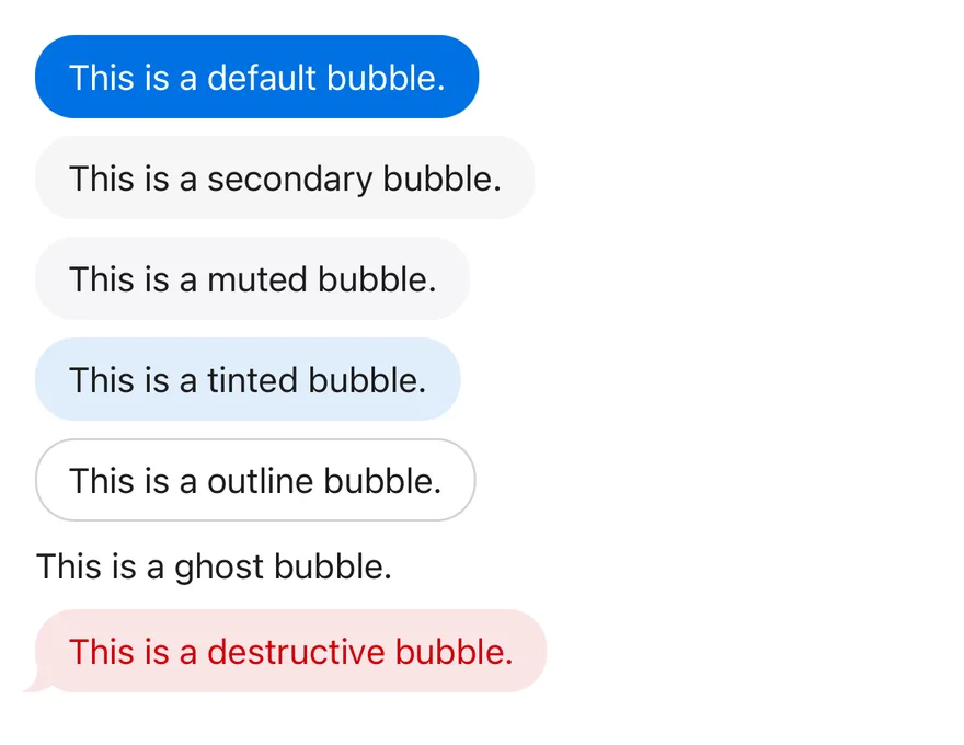
Shows every variant, from `default` to `destructive`.
**Example**
```tsx
import { Bubble, BubbleContent, BubbleGroup } from "@/components/ui/bubble"
export default function BubbleVariants() {
return (
{(
[
"default",
"secondary",
"muted",
"tinted",
"outline",
"ghost",
"destructive",
] as const
).map((variant) => (
This is a {variant} bubble.
))}
)
}
```
### Conversation
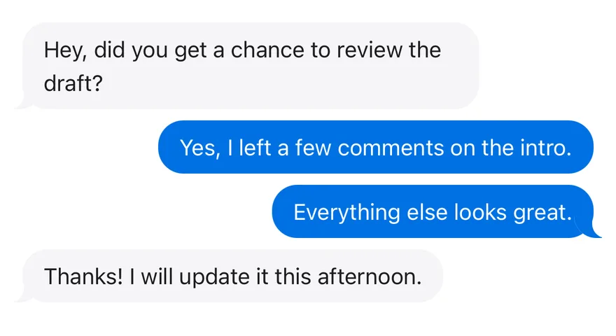
An exchange of incoming `muted` and outgoing `end`-aligned bubbles.
**Example**
```tsx
import { Bubble, BubbleContent, BubbleGroup } from "@/components/ui/bubble"
export default function BubbleConversation() {
return (
Hey, did you get a chance to review the draft?
Yes, I left a few comments on the intro.
Everything else looks great.
Thanks! I will update it this afternoon.
)
}
```
### With reactions
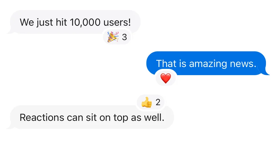
Pins reactions to different corners with `side` and `align`.
**Example**
```tsx
import {
Bubble,
BubbleContent,
BubbleGroup,
BubbleReactions,
} from "@/components/ui/bubble"
export default function BubbleWithReactions() {
return (
We just hit 10,000 users!🎉 3That is amazing news.❤️Reactions can sit on top as well.👍 2
)
}
```
### Interactive
Renders the content as a `button`.
**Example**
```tsx
import { Bubble, BubbleContent } from "@/components/ui/bubble"
export default function BubbleInteractive() {
return (
}>
Show me the latest release notes
)
}
```
## API Reference
- `Bubble`
- `BubbleContent`
- `BubbleGroup`
- `Bubble`
- `BubbleContent`
- `BubbleReactions`
### BubbleGroup
A vertical stack of bubbles.
Also accepts the props of `React.ComponentProps<"div">`.
### Bubble
The positioned wrapper that sets variant and alignment.
| Prop | Type | Default | Description |
| --- | --- | --- | --- |
| `variant` | `"default" \| "secondary" \| "muted" \| "tinted" \| "outline" \| "ghost" \| "destructive"` | `"default"` | Background and text color: `default` (primary), `secondary`, `muted`, `tinted`, `outline`, `ghost` (no background or padding) or `destructive`. |
| `align` | `"start" \| "end"` | `"start"` | Which side of the conversation the bubble sits on: `start` or `end`. |
Also accepts the props of `React.ComponentProps<"div">`.
### BubbleContent
The rounded message body, with the tail.
Also accepts the props of `useRender.ComponentProps<"div">`.
### BubbleReactions
A small pill for reactions, overlapping the bubble's edge.
| Prop | Type | Default | Description |
| --- | --- | --- | --- |
| `align` | `"start" \| "end"` | `"end"` | Horizontal position along the bubble edge: `start` or `end`. |
| `side` | `"top" \| "bottom"` | `"bottom"` | Which edge of the bubble the reactions overlap: `top` or `bottom`. |
Also accepts the props of `React.ComponentProps<"div">`.
## Accessibility
- Bubbles are static content by default and contribute no focusable elements.
- When `BubbleContent` renders a `button` or `a`, it is in the tab order and shows a focus ring.
- Reactions are plain content; if they are emoji, consider adding text that screen readers can announce.
## Notes
- Styling hooks: `data-slot="bubble"`, `"bubble-content"`, `"bubble-group"` and `"bubble-reactions"`, plus `data-variant` and `data-align` on the bubble and `data-side` and `data-align` on reactions.
- The background is set through the `--bubble-bg` custom property. Set `--bubble-surface` when bubbles sit on a surface other than `--background`, so the tail and reaction ring blend in.
- Bubbles are capped at 80% of the container width, except the `ghost` variant.
- Bubbles also align to `end` when inside a `message` slot with `data-align="end"`.
**React Native, SwiftUI, Jetpack Compose**
```tsx
import { Bubble, BubbleContent } from "@/components/ui/bubble"
export function BubbleExample() {
return (
Are we still on for lunch tomorrow?
)
}
```
```swift
import EsuissUI
import SwiftUI
struct BubbleExample: View {
var body: some View {
Bubble {
BubbleContent("Are we still on for lunch tomorrow?")
}
}
}
```
```kotlin
import androidx.compose.runtime.Composable
import com.esuiss.ui.components.Bubble
import com.esuiss.ui.components.BubbleContent
@Composable
fun BubbleDefault() {
Bubble {
BubbleContent("Are we still on for lunch tomorrow?")
}
}
```
`Bubble` lays out one message aligned to the `start` or `end` of the conversation, and `BubbleContent` draws the rounded bubble with an SVG tail on the aligned side. Seven variants are available: `default` (primary), `secondary`, `muted`, `tinted`, `outline`, `ghost` and `destructive`; `outline` and `ghost` have no tail.
`BubbleGroup` stacks messages and shows the tail only on the last bubble of each run from the same side, so consecutive messages read as one block. `BubbleReactions` pins a small reaction pill to the top or bottom edge of a bubble.
## Installation
**React Native**
```bash title="Terminal"
npx shadcn@latest add @esuiss-rn/bubble
```
See [Installation](https://ui.suiss.app/docs/installation) for the `components.json` setup. Or use the suiss/ui CLI:
```bash title="Terminal"
npx @esuiss/ui@latest add bubble
```
**SwiftUI**
```bash title="Terminal"
npx @esuiss/ui@latest add bubble --platform swift
```
**Jetpack Compose**
```bash title="Terminal"
npx @esuiss/ui@latest add bubble --platform kotlin
```
The CLI also adds what it builds on: [Icon](https://ui.suiss.app/docs/components/icon), [Text](https://ui.suiss.app/docs/components/text).
### Manual
**React Native**
**Uniwind**
1. Install the dependencies:
```bash title="Terminal"
npx expo install cn phosphor-react-native react-native-svg
```
2. Add the pieces it builds on: [Icon](https://ui.suiss.app/docs/components/icon), [Text](https://ui.suiss.app/docs/components/text), and the primitives `components/primitives/types.tsx`, `components/primitives/use-render.tsx`.
3. Copy the source into `components/ui/bubble.tsx`:
```tsx title="uniwind/components/ui/bubble.tsx"
import { cn } from "cn"
import type { IconProps as PhosphorIconProps } from "phosphor-react-native"
import * as React from "react"
import {
type GestureResponderEvent,
I18nManager,
Pressable,
View,
type ViewProps,
} from "react-native"
import Svg, { Path } from "react-native-svg"
import type { RenderProp } from "@/components/primitives/types"
import { useRender } from "@/components/primitives/use-render"
import { Icon, IconClassContext } from "@/components/ui/icon"
import { Text, TextClassContext } from "@/components/ui/text"
type BubbleAlign = "start" | "end"
type BubbleVariant =
| "default"
| "secondary"
| "muted"
| "tinted"
| "outline"
| "ghost"
| "destructive"
type BubbleContextValue = {
variant: BubbleVariant
align: BubbleAlign
tail: boolean
}
const BubbleAlignContext = React.createContext(
undefined
)
const BubbleTailContext = React.createContext(true)
const BubbleContext = React.createContext({
variant: "default",
align: "start",
tail: true,
})
const TAIL_PATH = "M7 0H20V4A16 16 0 0 1 4 20H0V19.54A10 10 0 0 0 7 10Z"
const CONTENT_TEXT: Record = {
default: "text-primary-foreground",
secondary: "text-secondary-foreground",
muted: "text-foreground",
tinted: "text-foreground",
outline: "text-foreground",
ghost: "text-foreground",
destructive: "text-destructive",
}
const CONTENT_BACKGROUND: Record = {
default: "bg-primary",
secondary: "bg-secondary",
muted: "bg-muted",
tinted: "bg-primary/12",
outline: "border-border bg-background",
ghost: "bg-transparent",
destructive: "bg-destructive/10 dark:bg-destructive/20",
}
const TAIL_COLOR: Record = {
default: "text-primary",
secondary: "text-secondary",
muted: "text-muted",
tinted: "text-primary/12",
outline: "text-background",
ghost: "text-transparent",
destructive: "text-destructive/10 dark:text-destructive/20",
}
function wrapText(children: React.ReactNode) {
const output: React.ReactNode[] = []
let run: (string | number)[] = []
const flush = () => {
if (run.length === 0) return
output.push({run.join("")})
run = []
}
for (const child of React.Children.toArray(children)) {
if (typeof child === "string" || typeof child === "number") {
run.push(child)
} else {
flush()
output.push(child)
}
}
flush()
return output
}
function BubbleGroup({ className, children, ...props }: ViewProps) {
const groupAlign = React.useContext(BubbleAlignContext)
const nodes = React.Children.toArray(children)
const alignOf = (node: React.ReactNode): BubbleAlign | null => {
if (!React.isValidElement<{ align?: BubbleAlign }>(node)) return null
if (node.type !== Bubble) return null
return node.props.align ?? groupAlign ?? "start"
}
return (
{nodes.map((node, index) => {
const align = alignOf(node)
if (align === null || !React.isValidElement(node)) return node
const tail = alignOf(nodes[index + 1]) !== align
return (
{node}
)
})}
)
}
function Bubble({
variant = "default",
align: alignProp,
className,
children,
...props
}: ViewProps & {
variant?: BubbleVariant
align?: BubbleAlign
}) {
const inheritedAlign = React.useContext(BubbleAlignContext)
const tail = React.useContext(BubbleTailContext)
const align = alignProp ?? inheritedAlign ?? "start"
let reactionSide: "top" | "bottom" | null = null
React.Children.forEach(children, (child) => {
if (
React.isValidElement<{ side?: "top" | "bottom" }>(child) &&
child.type === BubbleReactions
) {
reactionSide = child.props.side ?? "bottom"
}
})
const context = React.useMemo(
() => ({
variant,
align,
tail: tail && variant !== "ghost" && variant !== "outline",
}),
[variant, align, tail]
)
return (
{children}
)
}
function BubbleTailShape({ color, size, style }: PhosphorIconProps) {
return (
)
}
function BubbleTail({
variant,
align,
}: {
variant: BubbleVariant
align: BubbleAlign
}) {
const mirrored = (align === "end") !== I18nManager.isRTL
return (
)
}
function BubbleContent({
className,
render,
children,
onPress,
onLongPress,
onPressIn,
onPressOut,
...props
}: React.ComponentProps &
React.RefAttributes> & {
render?: RenderProp, Record>
}) {
const { variant, align, tail } = React.useContext(BubbleContext)
const [pressed, setPressed] = React.useState(false)
const interactive = Boolean(onPress || onLongPress || render)
const element = useRender({
defaultComponent: interactive ? Pressable : View,
render,
props: [
{
className: cn(
"relative min-w-0 max-w-full rounded-2xl border border-transparent px-3.5 py-1.5",
align === "end" ? "self-end" : "self-start",
CONTENT_BACKGROUND[variant],
pressed && "opacity-80",
variant === "ghost" && "rounded-none border-0 p-0",
className
),
role: onPress || onLongPress ? "button" : undefined,
onPress,
onLongPress,
onPressIn: (event: GestureResponderEvent) => {
setPressed(true)
onPressIn?.(event)
},
onPressOut: (event: GestureResponderEvent) => {
setPressed(false)
onPressOut?.(event)
},
children: (
<>
{tail ? : null}
{wrapText(children as React.ReactNode)}
),
},
props,
],
})
return (
{element}
)
}
function BubbleReactions({
side = "bottom",
align = "end",
className,
children,
...props
}: ViewProps & {
align?: BubbleAlign
side?: "top" | "bottom"
}) {
return (
{wrapText(children)}
)
}
export {
Bubble,
BubbleAlignContext,
BubbleContent,
BubbleGroup,
BubbleReactions,
}
```
4. Update the import paths to match your project.
**NativeWind**
1. Install the dependencies:
```bash title="Terminal"
npx expo install cn phosphor-react-native react-native-svg
```
2. Add the pieces it builds on: [Icon](https://ui.suiss.app/docs/components/icon), [Text](https://ui.suiss.app/docs/components/text), and the primitives `components/primitives/types.tsx`, `components/primitives/use-render.tsx`.
3. Copy the source into `components/ui/bubble.tsx`:
```tsx title="nativewind/components/ui/bubble.tsx"
import { cn } from "cn"
import type { IconProps as PhosphorIconProps } from "phosphor-react-native"
import * as React from "react"
import {
type GestureResponderEvent,
I18nManager,
Pressable,
View,
type ViewProps,
} from "react-native"
import Svg, { Path } from "react-native-svg"
import type { RenderProp } from "@/components/primitives/types"
import { useRender } from "@/components/primitives/use-render"
import { Icon, IconClassContext } from "@/components/ui/icon"
import { Text, TextClassContext } from "@/components/ui/text"
type BubbleAlign = "start" | "end"
type BubbleVariant =
| "default"
| "secondary"
| "muted"
| "tinted"
| "outline"
| "ghost"
| "destructive"
type BubbleContextValue = {
variant: BubbleVariant
align: BubbleAlign
tail: boolean
}
const BubbleAlignContext = React.createContext(
undefined
)
const BubbleTailContext = React.createContext(true)
const BubbleContext = React.createContext({
variant: "default",
align: "start",
tail: true,
})
const TAIL_PATH = "M7 0H20V4A16 16 0 0 1 4 20H0V19.54A10 10 0 0 0 7 10Z"
const CONTENT_TEXT: Record = {
default: "text-primary-foreground",
secondary: "text-secondary-foreground",
muted: "text-foreground",
tinted: "text-foreground",
outline: "text-foreground",
ghost: "text-foreground",
destructive: "text-destructive",
}
const CONTENT_BACKGROUND: Record = {
default: "bg-primary",
secondary: "bg-secondary",
muted: "bg-muted",
tinted: "bg-primary-12",
outline: "border-border bg-background",
ghost: "bg-transparent",
destructive: "bg-destructive-10 dark:bg-destructive-20",
}
const TAIL_COLOR: Record = {
default: "text-primary",
secondary: "text-secondary",
muted: "text-muted",
tinted: "text-primary-12",
outline: "text-background",
ghost: "text-transparent",
destructive: "text-destructive-10 dark:text-destructive-20",
}
function wrapText(children: React.ReactNode) {
const output: React.ReactNode[] = []
let run: (string | number)[] = []
const flush = () => {
if (run.length === 0) return
output.push({run.join("")})
run = []
}
for (const child of React.Children.toArray(children)) {
if (typeof child === "string" || typeof child === "number") {
run.push(child)
} else {
flush()
output.push(child)
}
}
flush()
return output
}
function BubbleGroup({ className, children, ...props }: ViewProps) {
const groupAlign = React.useContext(BubbleAlignContext)
const nodes = React.Children.toArray(children)
const alignOf = (node: React.ReactNode): BubbleAlign | null => {
if (!React.isValidElement<{ align?: BubbleAlign }>(node)) return null
if (node.type !== Bubble) return null
return node.props.align ?? groupAlign ?? "start"
}
return (
{nodes.map((node, index) => {
const align = alignOf(node)
if (align === null || !React.isValidElement(node)) return node
const tail = alignOf(nodes[index + 1]) !== align
return (
{node}
)
})}
)
}
function Bubble({
variant = "default",
align: alignProp,
className,
children,
...props
}: ViewProps & {
variant?: BubbleVariant
align?: BubbleAlign
}) {
const inheritedAlign = React.useContext(BubbleAlignContext)
const tail = React.useContext(BubbleTailContext)
const align = alignProp ?? inheritedAlign ?? "start"
let reactionSide: "top" | "bottom" | null = null
React.Children.forEach(children, (child) => {
if (
React.isValidElement<{ side?: "top" | "bottom" }>(child) &&
child.type === BubbleReactions
) {
reactionSide = child.props.side ?? "bottom"
}
})
const context = React.useMemo(
() => ({
variant,
align,
tail: tail && variant !== "ghost" && variant !== "outline",
}),
[variant, align, tail]
)
return (
{children}
)
}
function BubbleTailShape({ color, size, style }: PhosphorIconProps) {
return (
)
}
function BubbleTail({
variant,
align,
}: {
variant: BubbleVariant
align: BubbleAlign
}) {
const mirrored = (align === "end") !== I18nManager.isRTL
return (
)
}
function BubbleContent({
className,
render,
children,
onPress,
onLongPress,
onPressIn,
onPressOut,
...props
}: React.ComponentProps &
React.RefAttributes> & {
render?: RenderProp, Record>
}) {
const { variant, align, tail } = React.useContext(BubbleContext)
const [pressed, setPressed] = React.useState(false)
const interactive = Boolean(onPress || onLongPress || render)
const element = useRender({
defaultComponent: interactive ? Pressable : View,
render,
props: [
{
className: cn(
"relative min-w-0 max-w-full rounded-2xl border border-transparent px-3.5 py-1.5",
align === "end" ? "self-end" : "self-start",
CONTENT_BACKGROUND[variant],
pressed && "opacity-80",
variant === "ghost" && "rounded-none border-0 p-0",
className
),
role: onPress || onLongPress ? "button" : undefined,
onPress,
onLongPress,
onPressIn: (event: GestureResponderEvent) => {
setPressed(true)
onPressIn?.(event)
},
onPressOut: (event: GestureResponderEvent) => {
setPressed(false)
onPressOut?.(event)
},
children: (
<>
{tail ? : null}
{wrapText(children as React.ReactNode)}
),
},
props,
],
})
return (
{element}
)
}
function BubbleReactions({
side = "bottom",
align = "end",
className,
children,
...props
}: ViewProps & {
align?: BubbleAlign
side?: "top" | "bottom"
}) {
return (
{wrapText(children)}
)
}
export {
Bubble,
BubbleAlignContext,
BubbleContent,
BubbleGroup,
BubbleReactions,
}
```
4. Update the import paths to match your project.
**StyleSheet**
1. Install the dependencies:
```bash title="Terminal"
npx expo install phosphor-react-native react-native-svg
```
2. Add the pieces it builds on: [Icon](https://ui.suiss.app/docs/components/icon), [Text](https://ui.suiss.app/docs/components/text), and the primitives `components/primitives/types.tsx`, `components/primitives/use-render.tsx`.
3. Copy the source into `components/ui/bubble.tsx`:
```tsx title="stylesheet/components/ui/bubble.tsx"
import type { IconProps as PhosphorIconProps } from "phosphor-react-native"
import * as React from "react"
import {
type GestureResponderEvent,
I18nManager,
Pressable,
type StyleProp,
StyleSheet,
View,
type ViewProps,
type ViewStyle,
} from "react-native"
import Svg, { Path } from "react-native-svg"
import type { RenderProp } from "@/components/primitives/types"
import { useRender } from "@/components/primitives/use-render"
import { Icon } from "@/components/ui/icon"
import { Text, TextStyleContext } from "@/components/ui/text"
import {
fontSize,
radius,
type ThemeColors,
useTheme,
} from "@/components/ui/theme"
type BubbleAlign = "start" | "end"
type BubbleVariant =
| "default"
| "secondary"
| "muted"
| "tinted"
| "outline"
| "ghost"
| "destructive"
type BubbleContextValue = {
variant: BubbleVariant
align: BubbleAlign
tail: boolean
}
const BubbleAlignContext = React.createContext(
undefined
)
const BubbleTailContext = React.createContext(true)
const BubbleContext = React.createContext({
variant: "default",
align: "start",
tail: true,
})
const TAIL_PATH = "M7 0H20V4A16 16 0 0 1 4 20H0V19.54A10 10 0 0 0 7 10Z"
const styles = StyleSheet.create({
group: { minWidth: 0, flexDirection: "column", gap: 8 },
bubble: {
position: "relative",
minWidth: 0,
maxWidth: "80%",
flexDirection: "column",
gap: 4,
},
content: {
position: "relative",
minWidth: 0,
maxWidth: "100%",
borderRadius: radius["2xl"],
borderWidth: 1,
borderColor: "transparent",
paddingHorizontal: 14,
paddingVertical: 6,
},
ghost: { borderRadius: 0, borderWidth: 0, padding: 0, paddingHorizontal: 0 },
tail: { position: "absolute", bottom: -1, width: 20, height: 20 },
layer: { position: "absolute", top: 0, right: 0, bottom: 0, left: 0 },
reactions: {
position: "absolute",
zIndex: 10,
flexDirection: "row",
alignItems: "center",
justifyContent: "center",
gap: 4,
borderRadius: radius.full,
borderWidth: 3,
paddingHorizontal: 6,
paddingVertical: 2,
},
})
function withAlpha(color: string, alpha: number) {
if (!color.startsWith("#") || color.length !== 7) return color
const r = Number.parseInt(color.slice(1, 3), 16)
const g = Number.parseInt(color.slice(3, 5), 16)
const b = Number.parseInt(color.slice(5, 7), 16)
return `rgba(${r}, ${g}, ${b}, ${alpha})`
}
function bubbleColors(
variant: BubbleVariant,
colors: ThemeColors,
isDark: boolean
) {
switch (variant) {
case "default":
return { background: colors.primary, text: colors.primaryForeground }
case "secondary":
return { background: colors.secondary, text: colors.secondaryForeground }
case "muted":
return { background: colors.muted, text: colors.foreground }
case "tinted":
return {
background: withAlpha(colors.primary, 0.12),
text: colors.foreground,
}
case "outline":
return {
background: colors.background,
text: colors.foreground,
border: colors.border,
}
case "ghost":
return { background: "transparent", text: colors.foreground }
default:
return {
background: withAlpha(colors.destructive, isDark ? 0.2 : 0.1),
text: colors.destructive,
}
}
}
function wrapText(children: React.ReactNode) {
const output: React.ReactNode[] = []
let run: (string | number)[] = []
const flush = () => {
if (run.length === 0) return
output.push({run.join("")})
run = []
}
for (const child of React.Children.toArray(children)) {
if (typeof child === "string" || typeof child === "number") {
run.push(child)
} else {
flush()
output.push(child)
}
}
flush()
return output
}
function BubbleGroup({ style, children, ...props }: ViewProps) {
const groupAlign = React.useContext(BubbleAlignContext)
const nodes = React.Children.toArray(children)
const alignOf = (node: React.ReactNode): BubbleAlign | null => {
if (!React.isValidElement<{ align?: BubbleAlign }>(node)) return null
if (node.type !== Bubble) return null
return node.props.align ?? groupAlign ?? "start"
}
return (
{nodes.map((node, index) => {
const align = alignOf(node)
if (align === null || !React.isValidElement(node)) return node
const tail = alignOf(nodes[index + 1]) !== align
return (
{node}
)
})}
)
}
function Bubble({
variant = "default",
align: alignProp,
style,
children,
...props
}: ViewProps & {
variant?: BubbleVariant
align?: BubbleAlign
}) {
const inheritedAlign = React.useContext(BubbleAlignContext)
const tail = React.useContext(BubbleTailContext)
const align = alignProp ?? inheritedAlign ?? "start"
let reactionSide: "top" | "bottom" | null = null
React.Children.forEach(children, (child) => {
if (
React.isValidElement<{ side?: "top" | "bottom" }>(child) &&
child.type === BubbleReactions
) {
reactionSide = child.props.side ?? "bottom"
}
})
const context = React.useMemo(
() => ({
variant,
align,
tail: tail && variant !== "ghost" && variant !== "outline",
}),
[variant, align, tail]
)
return (
{children}
)
}
function BubbleTailShape({ color, size, style }: PhosphorIconProps) {
return (
)
}
function BubbleTail({
color,
surface,
align,
}: {
color: string
surface: string
align: BubbleAlign
}) {
const mirrored = (align === "end") !== I18nManager.isRTL
return (
)
}
function BubbleContent({
style,
render,
children,
onPress,
onLongPress,
onPressIn,
onPressOut,
...props
}: Omit, "style"> &
React.RefAttributes> & {
style?: StyleProp
render?: RenderProp, Record>
}) {
const { colors, isDark } = useTheme()
const { variant, align, tail } = React.useContext(BubbleContext)
const [pressed, setPressed] = React.useState(false)
const interactive = Boolean(onPress || onLongPress || render)
const palette = bubbleColors(variant, colors, isDark)
const element = useRender({
defaultComponent: interactive ? Pressable : View,
render,
props: [
{
style: [
styles.content,
{ alignSelf: align === "end" ? "flex-end" : "flex-start" },
{ backgroundColor: palette.background },
palette.border ? { borderColor: palette.border } : null,
variant === "ghost" && styles.ghost,
pressed && { opacity: 0.8 },
style,
],
role: onPress || onLongPress ? "button" : undefined,
onPress,
onLongPress,
onPressIn: (event: GestureResponderEvent) => {
setPressed(true)
onPressIn?.(event)
},
onPressOut: (event: GestureResponderEvent) => {
setPressed(false)
onPressOut?.(event)
},
children: (
<>
{tail ? (
) : null}
{wrapText(children as React.ReactNode)}
),
},
props,
],
})
return (
{element}
)
}
function BubbleReactions({
side = "bottom",
align = "end",
style,
children,
...props
}: ViewProps & {
align?: BubbleAlign
side?: "top" | "bottom"
}) {
const { colors } = useTheme()
return (
{wrapText(children)}
)
}
export {
Bubble,
BubbleAlignContext,
BubbleContent,
BubbleGroup,
BubbleReactions,
}
```
4. Update the import paths to match your project.
**SwiftUI**
1. Target iOS 17 or later.
2. Copy the theme files every view uses:
- `swift/Theme/Theme.swift`: [source](https://github.com/e-suiss/ui/blob/main/packages/mobile/swiftui/Sources/EsuissUI/Theme/Theme.swift)
- `swift/Theme/Tokens.swift`: [source](https://github.com/e-suiss/ui/blob/main/packages/mobile/swiftui/Sources/EsuissUI/Theme/Tokens.swift)
3. Copy the source and every file it uses:
```swift title="swift/Components/Bubble.swift"
import SwiftUI
public enum BubbleVariant: CaseIterable, Sendable {
case `default`, secondary, muted, tinted, outline, ghost, destructive
var hasTail: Bool {
self != .ghost && self != .outline
}
}
public enum BubbleAlign: CaseIterable, Sendable {
case start, end
}
public enum BubbleReactionsSide: CaseIterable, Sendable {
case top, bottom
}
struct BubbleRunEntry: Equatable {
let id: UUID
let align: BubbleAlign
let tail: Bool
}
enum BubbleRun {
static func tails(_ entries: [BubbleRunEntry]) -> Set {
var result = Set()
for (index, entry) in entries.enumerated() where entry.tail {
let next = index + 1 < entries.count ? entries[index + 1] : nil
if next?.align != entry.align {
result.insert(entry.id)
}
}
return result
}
}
struct BubbleRunKey: PreferenceKey {
static var defaultValue: [BubbleRunEntry] { [] }
static func reduce(value: inout [BubbleRunEntry], nextValue: () -> [BubbleRunEntry]) {
value.append(contentsOf: nextValue())
}
}
struct BubbleRunScope: ViewModifier {
@State private var tails: Set?
func body(content: Content) -> some View {
content
.environment(\.bubbleTails, tails)
.onPreferenceChange(BubbleRunKey.self) { entries in
tails = BubbleRun.tails(entries)
}
.transformPreference(BubbleRunKey.self) { $0 = [] }
}
}
struct BubbleStyle: Sendable {
var variant: BubbleVariant = .default
var align: BubbleAlign = .start
var tail = false
}
public struct BubbleGroup: View {
let content: Content
public init(@ViewBuilder content: () -> Content) {
self.content = content()
}
public var body: some View {
VStack(alignment: .leading, spacing: 8) {
content
}
.frame(maxWidth: .infinity, alignment: .leading)
.modifier(BubbleRunScope())
}
}
public struct Bubble: View {
public typealias Variant = BubbleVariant
public typealias Align = BubbleAlign
let variant: Variant
let align: Align
let onLongPress: (() -> Void)?
let content: Content
@State private var id = UUID()
@Environment(\.messageAlign) private var messageAlign
@Environment(\.bubbleTails) private var tails
public init(
variant: Variant = .default,
align: Align = .start,
onLongPress: (() -> Void)? = nil,
@ViewBuilder content: () -> Content
) {
self.variant = variant
self.align = align
self.onLongPress = onLongPress
self.content = content()
}
public var body: some View {
let resolved: Align = messageAlign == .end ? .end : align
let tail = variant.hasTail && (tails.map { $0.contains(id) } ?? true)
BubbleLayout(align: resolved, fraction: variant == .ghost ? 1 : 0.8) {
content
}
.environment(\.bubbleStyle, BubbleStyle(variant: variant, align: resolved, tail: tail))
.modifier(BubbleLongPress(action: onLongPress))
.frame(maxWidth: .infinity, alignment: resolved == .end ? .trailing : .leading)
.preference(key: BubbleRunKey.self, value: [BubbleRunEntry(id: id, align: resolved, tail: variant.hasTail)])
.preference(key: MessageGhostKey.self, value: variant == .ghost)
}
}
private struct BubbleLongPress: ViewModifier {
let action: (() -> Void)?
func body(content: Content) -> some View {
if let action {
content
.contentShape(Rectangle())
.onLongPressGesture(minimumDuration: 0.5, maximumDistance: 10, perform: action)
.accessibilityAction(named: Text("Show actions"), action)
} else {
content
}
}
}
public struct BubbleContent: View {
let action: (() -> Void)?
let content: Content
@Environment(\.bubbleStyle) private var style
public init(@ViewBuilder content: () -> Content) {
action = nil
self.content = content()
}
public init(action: @escaping () -> Void, @ViewBuilder content: () -> Content) {
self.action = action
self.content = content()
}
public var body: some View {
if let action {
Button(action: action) {
content
}
.buttonStyle(BubbleContentButtonStyle(style: style))
} else {
BubbleContentBody(style: style, pressed: false) {
content
}
}
}
}
extension BubbleContent where Content == Text {
public init(_ text: LocalizedStringKey) {
self.init { Text(text) }
}
public init(verbatim text: String) {
self.init { Text(verbatim: text) }
}
}
private struct BubbleContentButtonStyle: ButtonStyle {
let style: BubbleStyle
func makeBody(configuration: Configuration) -> some View {
BubbleContentBody(style: style, pressed: configuration.isPressed) {
configuration.label
}
}
}
private struct BubbleContentBody: View {
let style: BubbleStyle
let pressed: Bool
let content: Content
@Environment(\.screenBackground) private var surface
init(style: BubbleStyle, pressed: Bool, @ViewBuilder content: () -> Content) {
self.style = style
self.pressed = pressed
self.content = content()
}
var body: some View {
let ghost = style.variant == .ghost
let shape = BubbleShape(tail: style.tail, mirrored: style.align == .end)
content
.scaledTextStyle(.base)
.foregroundStyle(foreground)
.multilineTextAlignment(.leading)
.fixedSize(horizontal: false, vertical: true)
.padding(.horizontal, ghost ? 0 : 15)
.padding(.vertical, ghost ? 0 : 7)
.background {
if !ghost {
shape.fill(background)
}
}
.overlay {
if style.variant == .outline {
RoundedRectangle(cornerRadius: Radius.xl2, style: .continuous)
.strokeBorder(EsuissColor.border, lineWidth: 1)
}
}
.contentShape(shape)
.opacity(pressed ? 0.8 : 1)
}
private var foreground: Color {
switch style.variant {
case .default: EsuissColor.primaryForeground
case .destructive: EsuissColor.destructive
case .secondary: EsuissColor.secondaryForeground
case .muted, .tinted, .outline, .ghost: EsuissColor.foreground
}
}
private var background: Color {
switch style.variant {
case .default: EsuissColor.primary
case .secondary: EsuissColor.secondary
case .muted: EsuissColor.muted
case .tinted: Color.adaptive(light: EsuissColor.primary.opacity(0.1), dark: EsuissColor.primary.opacity(0.2))
case .outline: surface
case .ghost: .clear
case .destructive: Color.adaptive(light: EsuissColor.destructive.opacity(0.1), dark: EsuissColor.destructive.opacity(0.2))
}
}
}
struct BubbleShape: Shape {
let tail: Bool
let mirrored: Bool
func path(in rect: CGRect) -> Path {
let body = RoundedRectangle(cornerRadius: Radius.xl2, style: .continuous).path(in: rect)
guard tail else { return body }
let originX = mirrored ? rect.maxX + 6.9 - 20 : rect.minX - 6.9
let originY = rect.maxY - 20
let points = BubbleShape.tailPoints.map { point in
CGPoint(x: originX + (mirrored ? 20 - point.x : point.x), y: originY + point.y)
}
var tailPath = Path()
tailPath.addLines(points)
tailPath.closeSubpath()
return body.union(tailPath)
}
static let tailPoints: [CGPoint] = {
var points = [CGPoint(x: 7, y: 0), CGPoint(x: 20, y: 0), CGPoint(x: 20, y: 4)]
for step in 1...12 {
let angle = Double(step) / 12 * .pi / 2
points.append(CGPoint(x: 4 + 16 * cos(angle), y: 4 + 16 * sin(angle)))
}
points.append(CGPoint(x: 0, y: 20))
points.append(CGPoint(x: 0, y: 19.54))
let start = atan2(9.54, 3.0)
for step in 1...12 {
let angle = start * (1 - Double(step) / 12)
points.append(CGPoint(x: -3 + 10 * cos(angle), y: 10 + 10 * sin(angle)))
}
return points
}()
}
struct BubbleReactionsPlacement: Equatable, Sendable {
let side: BubbleReactionsSide
let align: BubbleAlign
}
struct BubbleReactionsKey: LayoutValueKey {
static let defaultValue: BubbleReactionsPlacement? = nil
}
public struct BubbleReactions: View {
let side: BubbleReactionsSide
let align: BubbleAlign
let content: Content
@Environment(\.screenBackground) private var surface
public init(
side: BubbleReactionsSide = .bottom,
align: BubbleAlign = .end,
@ViewBuilder content: () -> Content
) {
self.side = side
self.align = align
self.content = content()
}
public var body: some View {
HStack(spacing: 4) {
content
}
.scaledFont(.sm)
.lineLimit(1)
.fixedSize()
.foregroundStyle(EsuissColor.foreground)
.padding(.horizontal, 6)
.padding(.vertical, 2)
.background(EsuissColor.muted, in: Capsule())
.background {
Capsule().fill(surface).padding(-3)
}
.accessibilityElement(children: .combine)
.layoutValue(key: BubbleReactionsKey.self, value: BubbleReactionsPlacement(side: side, align: align))
}
}
extension BubbleReactions where Content == Text {
public init(_ text: LocalizedStringKey, side: BubbleReactionsSide = .bottom, align: BubbleAlign = .end) {
self.init(side: side, align: align) { Text(text) }
}
public init(verbatim text: String, side: BubbleReactionsSide = .bottom, align: BubbleAlign = .end) {
self.init(side: side, align: align) { Text(verbatim: text) }
}
}
struct BubbleLayout: Layout {
let align: BubbleAlign
let fraction: CGFloat
private let spacing: CGFloat = 4
private let reactionMargin: CGFloat = 20
private func measure(_ proposal: ProposedViewSize, subviews: Subviews) -> (sizes: [CGSize], width: CGFloat, height: CGFloat) {
let limit = proposal.width.map { $0 * fraction }
var sizes: [CGSize] = []
var width: CGFloat = 0
var height: CGFloat = 0
var count = 0
for subview in subviews {
if subview[BubbleReactionsKey.self] != nil {
sizes.append(subview.sizeThatFits(.unspecified))
continue
}
let size = subview.sizeThatFits(ProposedViewSize(width: limit, height: nil))
sizes.append(size)
width = max(width, size.width)
height += size.height + (count > 0 ? spacing : 0)
count += 1
}
return (sizes, width, height)
}
private func margins(_ subviews: Subviews) -> (top: CGFloat, bottom: CGFloat) {
let sides = subviews.compactMap { $0[BubbleReactionsKey.self]?.side }
return (sides.contains(.top) ? reactionMargin : 0, sides.contains(.bottom) ? reactionMargin : 0)
}
func sizeThatFits(proposal: ProposedViewSize, subviews: Subviews, cache: inout ()) -> CGSize {
let measured = measure(proposal, subviews: subviews)
let margins = margins(subviews)
return CGSize(width: measured.width, height: measured.height + margins.top + margins.bottom)
}
func placeSubviews(in bounds: CGRect, proposal: ProposedViewSize, subviews: Subviews, cache: inout ()) {
let measured = measure(proposal, subviews: subviews)
let margins = margins(subviews)
let box = CGRect(
x: bounds.minX,
y: bounds.minY + margins.top,
width: bounds.width,
height: measured.height
)
var y = box.minY
for (index, subview) in subviews.enumerated() {
let size = measured.sizes[index]
if let placement = subview[BubbleReactionsKey.self] {
let x = placement.align == .end ? box.maxX - 12 - size.width : box.minX + 12
let top = placement.side == .bottom ? box.maxY - size.height * 0.25 : box.minY - size.height * 0.75
subview.place(at: CGPoint(x: x, y: top), proposal: ProposedViewSize(size))
continue
}
let x = align == .end ? box.maxX - size.width : box.minX
subview.place(at: CGPoint(x: x, y: y), proposal: ProposedViewSize(width: size.width, height: size.height))
y += size.height + spacing
}
}
}
extension EnvironmentValues {
@Entry var bubbleStyle = BubbleStyle()
@Entry var bubbleTails: Set? = nil
}
```
- `swift/Components/KeyboardScrollView.swift`: see [Keyboard Scroll View](https://ui.suiss.app/docs/components/keyboard-scroll-view.md)
- `swift/Components/Message.swift`: see [Message](https://ui.suiss.app/docs/components/message.md)
- `swift/Components/Screen.swift`: see [Screen](https://ui.suiss.app/docs/components/screen.md)
- `swift/Components/TextVariant.swift`: [source](https://github.com/e-suiss/ui/blob/main/packages/mobile/swiftui/Sources/EsuissUI/Components/TextVariant.swift)
4. Add the files to your app target.
**Jetpack Compose**
1. Set `minSdk` to 24 or higher and add the dependencies:
```kotlin title="build.gradle.kts"
implementation(platform("androidx.compose:compose-bom:2026.09.00"))
implementation("androidx.compose.foundation:foundation")
implementation("androidx.compose.ui:ui")
```
2. Copy the theme files every view uses:
- `kotlin/theme/Theme.kt`: [source](https://github.com/e-suiss/ui/blob/main/packages/mobile/kotlin/ui/src/main/kotlin/com/esuiss/ui/theme/Theme.kt)
- `kotlin/theme/Tokens.kt`: [source](https://github.com/e-suiss/ui/blob/main/packages/mobile/kotlin/ui/src/main/kotlin/com/esuiss/ui/theme/Tokens.kt)
3. Copy the source and every file it uses:
```kt title="kotlin/components/Bubble.kt"
package com.esuiss.ui.components
import androidx.compose.foundation.background
import androidx.compose.foundation.border
import androidx.compose.foundation.combinedClickable
import androidx.compose.foundation.gestures.detectTapGestures
import androidx.compose.foundation.interaction.MutableInteractionSource
import androidx.compose.foundation.interaction.collectIsPressedAsState
import androidx.compose.foundation.layout.Arrangement
import androidx.compose.foundation.layout.Box
import androidx.compose.foundation.layout.Row
import androidx.compose.foundation.layout.RowScope
import androidx.compose.foundation.layout.padding
import androidx.compose.foundation.shape.CircleShape
import androidx.compose.foundation.shape.RoundedCornerShape
import androidx.compose.foundation.text.BasicText
import androidx.compose.runtime.Composable
import androidx.compose.runtime.CompositionLocalProvider
import androidx.compose.runtime.DisposableEffect
import androidx.compose.runtime.SideEffect
import androidx.compose.runtime.compositionLocalOf
import androidx.compose.runtime.getValue
import androidx.compose.runtime.mutableStateOf
import androidx.compose.runtime.remember
import androidx.compose.runtime.rememberUpdatedState
import androidx.compose.runtime.setValue
import androidx.compose.ui.Alignment
import androidx.compose.ui.Modifier
import androidx.compose.ui.draw.alpha
import androidx.compose.ui.geometry.CornerRadius
import androidx.compose.ui.geometry.Offset
import androidx.compose.ui.geometry.Size
import androidx.compose.ui.draw.drawBehind
import androidx.compose.ui.graphics.Color
import androidx.compose.ui.graphics.RectangleShape
import androidx.compose.ui.graphics.compositeOver
import androidx.compose.ui.graphics.drawscope.withTransform
import androidx.compose.ui.graphics.vector.PathParser
import androidx.compose.ui.hapticfeedback.HapticFeedbackType
import androidx.compose.ui.input.pointer.pointerInput
import androidx.compose.ui.layout.Layout
import androidx.compose.ui.layout.layoutId
import androidx.compose.ui.semantics.onLongClick
import androidx.compose.ui.semantics.semantics
import androidx.compose.ui.unit.Constraints
import androidx.compose.ui.unit.constrainHeight
import androidx.compose.ui.unit.constrainWidth
import androidx.compose.ui.unit.Dp
import androidx.compose.ui.unit.LayoutDirection
import androidx.compose.ui.unit.dp
import com.esuiss.ui.theme.Colors
import com.esuiss.ui.theme.EsuissTheme
import com.esuiss.ui.theme.Radius
import com.esuiss.ui.theme.Typography
import kotlin.math.roundToInt
enum class BubbleVariant { Default, Secondary, Muted, Tinted, Outline, Ghost, Destructive }
enum class BubbleAlign { Start, End }
enum class BubbleReactionsSide { Top, Bottom }
internal class BubbleSlot {
var align by mutableStateOf(BubbleAlign.Start)
var tailed by mutableStateOf(true)
}
private class BubbleInfo(val variant: BubbleVariant, val align: BubbleAlign, val slot: BubbleSlot)
private class BubbleReactionsSlot(val side: BubbleReactionsSide, val align: BubbleAlign)
private val LocalBubble = compositionLocalOf { null }
internal val LocalBubbleAlign = compositionLocalOf { BubbleAlign.Start }
private val TailPath = PathParser().parsePathString("M7 0H20V4A16 16 0 0 1 4 20H0V19.54A10 10 0 0 0 7 10Z").toPath()
@Composable
internal fun BubbleStack(
modifier: Modifier,
spacing: Dp,
alignEnd: Boolean,
content: @Composable () -> Unit,
) {
Layout(content = content, modifier = modifier) { measurables, constraints ->
val loose = constraints.copy(minWidth = 0, minHeight = 0)
val placeables = measurables.map { it.measure(loose) }
val slots = measurables.map { it.layoutId as? BubbleSlot }
slots.forEachIndexed { index, slot ->
if (slot != null) {
val next = slots.getOrNull(index + 1)
slot.tailed = next == null || next.align != slot.align
}
}
val gap = spacing.roundToPx()
val width = if (constraints.hasBoundedWidth) constraints.maxWidth else placeables.maxOfOrNull { it.width } ?: 0
val height = placeables.sumOf { it.height } + gap * (placeables.size - 1).coerceAtLeast(0)
layout(width, constraints.constrainHeight(height)) {
var y = 0
placeables.forEachIndexed { index, placeable ->
val end = alignEnd || slots[index]?.align == BubbleAlign.End
placeable.placeRelative(if (end) width - placeable.width else 0, y)
y += placeable.height + gap
}
}
}
}
@Composable
fun BubbleGroup(
modifier: Modifier = Modifier,
content: @Composable () -> Unit,
) {
BubbleStack(modifier, 8.dp, alignEnd = false, content = content)
}
@Composable
fun Bubble(
modifier: Modifier = Modifier,
variant: BubbleVariant = BubbleVariant.Default,
align: BubbleAlign = LocalBubbleAlign.current,
content: @Composable () -> Unit,
) {
val slot = remember { BubbleSlot() }
SideEffect { slot.align = align }
val message = LocalMessage.current
if (variant == BubbleVariant.Ghost && message != null) {
DisposableEffect(message) {
message.ghosts += 1
onDispose { message.ghosts -= 1 }
}
}
val fraction = if (variant == BubbleVariant.Ghost) 1f else 0.8f
val end = align == BubbleAlign.End
CompositionLocalProvider(LocalBubble provides BubbleInfo(variant, align, slot)) {
Layout(content = content, modifier = modifier.layoutId(slot)) { measurables, constraints ->
val maxWidth = if (constraints.hasBoundedWidth) (constraints.maxWidth * fraction).roundToInt() else Constraints.Infinity
val gap = 4.dp.roundToPx()
val inset = 12.dp.roundToPx()
val reserve = 20.dp.roundToPx()
val childConstraints = Constraints(maxWidth = maxWidth, maxHeight = constraints.maxHeight)
val items = measurables.filter { it.layoutId !is BubbleReactionsSlot }.map { it.measure(childConstraints) }
val reactions = measurables.filter { it.layoutId is BubbleReactionsSlot }.map {
it.layoutId as BubbleReactionsSlot to it.measure(Constraints(maxWidth = maxWidth))
}
val columnWidth = items.maxOfOrNull { it.width } ?: 0
val columnHeight = items.sumOf { it.height } + gap * (items.size - 1).coerceAtLeast(0)
val top = if (reactions.any { it.first.side == BubbleReactionsSide.Top }) reserve else 0
val bottom = if (reactions.any { it.first.side == BubbleReactionsSide.Bottom }) reserve else 0
val width = constraints.constrainWidth(columnWidth)
layout(width, constraints.constrainHeight(top + columnHeight + bottom)) {
var y = top
items.forEach { placeable ->
placeable.placeRelative(if (end) width - placeable.width else 0, y)
y += placeable.height + gap
}
reactions.forEach { (data, placeable) ->
val x = if (data.align == BubbleAlign.End) width - inset - placeable.width else inset
val ry = if (data.side == BubbleReactionsSide.Bottom) {
top + columnHeight - placeable.height / 4
} else {
top - placeable.height * 3 / 4
}
placeable.placeRelative(x, ry, 1f)
}
}
}
}
}
@Composable
fun BubbleContent(
modifier: Modifier = Modifier,
onClick: (() -> Unit)? = null,
onLongPress: (() -> Unit)? = null,
content: @Composable () -> Unit,
) {
val colors = EsuissTheme.colors
val info = LocalBubble.current
val variant = info?.variant ?: BubbleVariant.Default
val align = info?.align ?: LocalBubbleAlign.current
val slot = info?.slot
val haptics = rememberHaptics()
val interaction = remember { MutableInteractionSource() }
val clicked by interaction.collectIsPressedAsState()
var holding by remember { mutableStateOf(false) }
val pressed = clicked || holding
val background = bubbleBackground(variant, colors)
val foreground = bubbleForeground(variant, colors)
val ghost = variant == BubbleVariant.Ghost
val shape = if (ghost) RectangleShape else RoundedCornerShape(Radius.xl2)
val tailing = variant != BubbleVariant.Ghost && variant != BubbleVariant.Outline
val longPress = onLongPress?.let { action ->
{
haptics.perform(HapticFeedbackType.LongPress)
action()
}
}
val currentLongPress by rememberUpdatedState(longPress)
val gestures = when {
onClick != null -> Modifier.combinedClickable(
interactionSource = interaction,
indication = null,
onLongClick = longPress,
onClick = onClick,
)
longPress != null -> Modifier
.pointerInput(Unit) {
detectTapGestures(
onPress = {
holding = true
tryAwaitRelease()
holding = false
},
onLongPress = { currentLongPress?.invoke() },
)
}
.semantics {
onLongClick {
longPress()
true
}
}
else -> Modifier
}
Box(
modifier = modifier
.alpha(if (pressed) 0.8f else 1f)
.drawBehind {
if (tailing && (slot?.tailed ?: true)) {
val unit = 1.dp.toPx()
val end = (align == BubbleAlign.End) != (layoutDirection == LayoutDirection.Rtl)
val left = if (end) size.width + 6.9f * unit else -6.9f * unit
val top = size.height + unit - 20f * unit
withTransform({
translate(left, top)
scale(if (end) -unit else unit, unit, Offset.Zero)
}) {
drawPath(TailPath, background)
}
}
}
.background(background, shape)
.then(if (variant == BubbleVariant.Outline) Modifier.border(1.dp, colors.border, shape) else Modifier)
.then(gestures)
.then(if (ghost) Modifier else Modifier.padding(horizontal = 15.dp, vertical = 7.dp)),
) {
CompositionLocalProvider(
LocalContentStyle provides Typography.base.copy(color = foreground),
LocalContentColor provides foreground,
) {
content()
}
}
}
@Composable
fun BubbleContent(
text: String,
modifier: Modifier = Modifier,
onClick: (() -> Unit)? = null,
onLongPress: (() -> Unit)? = null,
) {
BubbleContent(modifier, onClick, onLongPress) {
BasicText(text, style = LocalContentStyle.current)
}
}
@Composable
fun BubbleReactions(
modifier: Modifier = Modifier,
side: BubbleReactionsSide = BubbleReactionsSide.Bottom,
align: BubbleAlign = BubbleAlign.End,
content: @Composable RowScope.() -> Unit,
) {
val colors = EsuissTheme.colors
Row(
modifier = modifier
.layoutId(BubbleReactionsSlot(side, align))
.drawBehind {
val ring = 3.dp.toPx()
drawRoundRect(
color = colors.background,
topLeft = Offset(-ring, -ring),
size = Size(size.width + ring * 2, size.height + ring * 2),
cornerRadius = CornerRadius(size.height / 2 + ring),
)
}
.background(colors.muted, CircleShape)
.padding(horizontal = 6.dp, vertical = 2.dp),
horizontalArrangement = Arrangement.spacedBy(4.dp, Alignment.CenterHorizontally),
verticalAlignment = Alignment.CenterVertically,
) {
CompositionLocalProvider(
LocalContentStyle provides Typography.sm.copy(color = colors.foreground),
LocalContentColor provides colors.foreground,
LocalIconSize provides 16.dp,
) {
content()
}
}
}
@Composable
fun BubbleReactions(
text: String,
modifier: Modifier = Modifier,
side: BubbleReactionsSide = BubbleReactionsSide.Bottom,
align: BubbleAlign = BubbleAlign.End,
) {
BubbleReactions(modifier, side, align) {
BasicText(text, style = LocalContentStyle.current, maxLines = 1)
}
}
private fun bubbleBackground(variant: BubbleVariant, colors: Colors): Color =
if (variant == BubbleVariant.Ghost) bubbleFill(variant, colors) else bubbleFill(variant, colors).compositeOver(colors.background)
private fun bubbleFill(variant: BubbleVariant, colors: Colors): Color = when (variant) {
BubbleVariant.Default -> colors.primary
BubbleVariant.Secondary -> colors.secondary
BubbleVariant.Muted -> colors.muted
BubbleVariant.Tinted -> colors.primary.copy(alpha = if (colors.isDark) 0.2f else 0.1f)
BubbleVariant.Outline -> colors.background
BubbleVariant.Ghost -> Color.Transparent
BubbleVariant.Destructive -> colors.destructive.copy(alpha = if (colors.isDark) 0.2f else 0.1f)
}
private fun bubbleForeground(variant: BubbleVariant, colors: Colors): Color = when (variant) {
BubbleVariant.Default -> colors.primaryForeground
BubbleVariant.Destructive -> colors.destructive
else -> colors.foreground
}
```
- `kotlin/components/Avatar.kt`: see [Avatar](https://ui.suiss.app/docs/components/avatar.md)
- `kotlin/components/Button.kt`: see [Button](https://ui.suiss.app/docs/components/button.md)
- `kotlin/components/ButtonGroup.kt`: see [Button Group](https://ui.suiss.app/docs/components/button-group.md)
- `kotlin/components/Content.kt`: [source](https://github.com/e-suiss/ui/blob/main/packages/mobile/kotlin/ui/src/main/kotlin/com/esuiss/ui/components/Content.kt)
- `kotlin/components/Haptics.kt`: see [Haptics](https://ui.suiss.app/docs/components/haptics.md)
- `kotlin/components/Icon.kt`: see [Icon](https://ui.suiss.app/docs/components/icon.md)
- `kotlin/components/Message.kt`: see [Message](https://ui.suiss.app/docs/components/message.md)
- `kotlin/components/SignaturePad.kt`: see [Signature Pad](https://ui.suiss.app/docs/components/signature-pad.md)
4. Update the `com.esuiss.ui` package names to match your project.
## Usage
```tsx
import { BubbleGroup, Bubble, BubbleContent, BubbleReactions } from "@/components/ui/bubble"
```
```tsx
Are we still on for lunch tomorrow?
```
Wrap each message in `Bubble` and put its text in `BubbleContent`; plain strings are wrapped in `Text`. Set `align="end"` for messages from the current user, or provide a default through `BubbleAlignContext`.
`BubbleContent` becomes a `Pressable` when you pass `onPress`, `onLongPress` or `render`, and it fades to 80% opacity while pressed. Use `render` to attach it to a trigger such as a context menu.
`BubbleReactions` takes `side` (`top` or `bottom`) and `align` (`start` or `end`), and the bubble adds margin so the pill does not overlap its neighbors.
## Examples
### Variants
All seven variants.
```tsx
import { Bubble, BubbleContent, BubbleGroup } from "@/components/ui/bubble"
const VARIANTS = [
"default",
"secondary",
"muted",
"tinted",
"outline",
"ghost",
"destructive",
] as const
export function BubbleVariantsExample() {
return (
{VARIANTS.map((variant) => (
This is a {variant} bubble.
))}
)
}
```
```swift
import EsuissUI
import SwiftUI
struct BubbleVariantsExample: View {
var body: some View {
BubbleGroup {
ForEach(BubbleVariantSample.all, id: \.name) { sample in
Bubble(variant: sample.variant) {
BubbleContent(verbatim: "This is a \(sample.name) bubble.")
}
}
}
}
}
struct BubbleVariantSample {
let variant: BubbleVariant
let name: String
static let all: [BubbleVariantSample] = [
BubbleVariantSample(variant: .default, name: "default"),
BubbleVariantSample(variant: .secondary, name: "secondary"),
BubbleVariantSample(variant: .muted, name: "muted"),
BubbleVariantSample(variant: .tinted, name: "tinted"),
BubbleVariantSample(variant: .outline, name: "outline"),
BubbleVariantSample(variant: .ghost, name: "ghost"),
BubbleVariantSample(variant: .destructive, name: "destructive"),
]
}
let all: [BubbleVariantSample] = [
BubbleVariantSample(variant: .default, name: "default"),
BubbleVariantSample(variant: .secondary, name: "secondary"),
BubbleVariantSample(variant: .muted, name: "muted"),
BubbleVariantSample(variant: .tinted, name: "tinted"),
BubbleVariantSample(variant: .outline, name: "outline"),
BubbleVariantSample(variant: .ghost, name: "ghost"),
BubbleVariantSample(variant: .destructive, name: "destructive"),
]
```
```kotlin
import androidx.compose.runtime.Composable
import com.esuiss.ui.components.Bubble
import com.esuiss.ui.components.BubbleContent
import com.esuiss.ui.components.BubbleGroup
import com.esuiss.ui.components.BubbleVariant
@Composable
fun BubbleVariants() {
BubbleGroup {
BubbleVariant.entries.forEach { variant ->
Bubble(variant = variant) {
BubbleContent("This is a ${variant.name.lowercase()} bubble.")
}
}
}
}
```
### Conversation
A `BubbleGroup` with messages from both sides and merged tails.
```tsx
import { Bubble, BubbleContent, BubbleGroup } from "@/components/ui/bubble"
export function BubbleConversationExample() {
return (
Hey, did you get a chance to review the draft?
Yes, I left a few comments on the intro.Everything else looks great.Thanks! I will update it this afternoon.
)
}
```
```swift
import EsuissUI
import SwiftUI
struct BubbleConversationExample: View {
var body: some View {
BubbleGroup {
Bubble(variant: .muted) {
BubbleContent("Hey, did you get a chance to review the draft?")
}
Bubble(align: .end) {
BubbleContent("Yes, I left a few comments on the intro.")
}
Bubble(align: .end) {
BubbleContent("Everything else looks great.")
}
Bubble(variant: .muted) {
BubbleContent("Thanks! I will update it this afternoon.")
}
}
}
}
```
```kotlin
import androidx.compose.runtime.Composable
import com.esuiss.ui.components.Bubble
import com.esuiss.ui.components.BubbleAlign
import com.esuiss.ui.components.BubbleContent
import com.esuiss.ui.components.BubbleGroup
import com.esuiss.ui.components.BubbleVariant
@Composable
fun BubbleConversation() {
BubbleGroup {
Bubble(variant = BubbleVariant.Muted) {
BubbleContent("Hey, did you get a chance to review the draft?")
}
Bubble(align = BubbleAlign.End) {
BubbleContent("Yes, I left a few comments on the intro.")
}
Bubble(align = BubbleAlign.End) {
BubbleContent("Everything else looks great.")
}
Bubble(variant = BubbleVariant.Muted) {
BubbleContent("Thanks! I will update it this afternoon.")
}
}
}
```
### With reactions
Reaction pills on the bottom and top edges.
```tsx
import { Bubble, BubbleContent, BubbleGroup, BubbleReactions } from "@/components/ui/bubble"
export function BubbleWithReactionsExample() {
return (
We just hit 10,000 users!🎉 3That is amazing news.❤️Reactions can sit on top as well.👍 2
)
}
```
```swift
import EsuissUI
import SwiftUI
struct BubbleWithReactionsExample: View {
var body: some View {
BubbleGroup {
Bubble(variant: .muted) {
BubbleContent("We just hit 10,000 users!")
BubbleReactions(verbatim: "🎉 3")
}
Bubble(align: .end) {
BubbleContent("That is amazing news.")
BubbleReactions(verbatim: "❤️", align: .start)
}
Bubble(variant: .secondary) {
BubbleContent("Reactions can sit on top as well.")
BubbleReactions(verbatim: "👍 2", side: .top)
}
}
}
}
```
```kotlin
import androidx.compose.runtime.Composable
import com.esuiss.ui.components.Bubble
import com.esuiss.ui.components.BubbleAlign
import com.esuiss.ui.components.BubbleContent
import com.esuiss.ui.components.BubbleGroup
import com.esuiss.ui.components.BubbleReactions
import com.esuiss.ui.components.BubbleReactionsSide
import com.esuiss.ui.components.BubbleVariant
@Composable
fun BubbleWithReactions() {
BubbleGroup {
Bubble(variant = BubbleVariant.Muted) {
BubbleContent("We just hit 10,000 users!")
BubbleReactions("🎉 3")
}
Bubble(align = BubbleAlign.End) {
BubbleContent("That is amazing news.")
BubbleReactions("❤️", align = BubbleAlign.Start)
}
Bubble(variant = BubbleVariant.Secondary) {
BubbleContent("Reactions can sit on top as well.")
BubbleReactions("👍 2", side = BubbleReactionsSide.Top)
}
}
}
```
### Interactive
A pressable `outline` bubble with `onPress`.
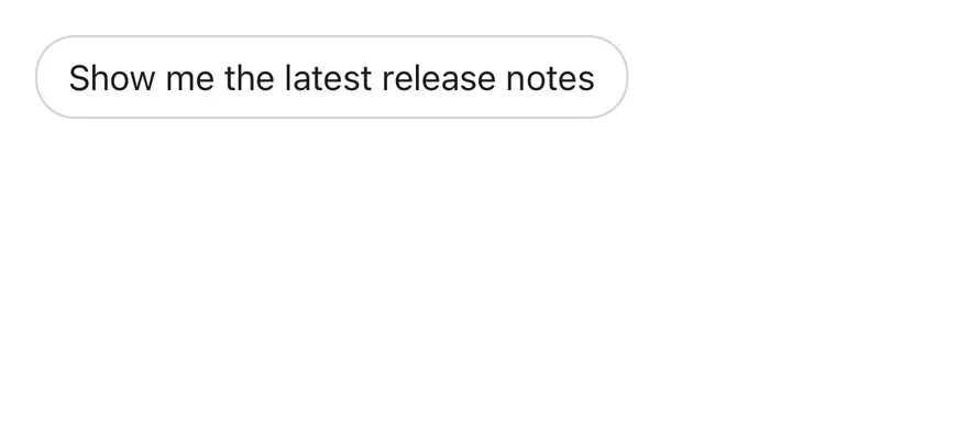
```tsx
import { Bubble, BubbleContent } from "@/components/ui/bubble"
export function BubbleInteractiveExample() {
return (
undefined}>
Show me the latest release notes
)
}
```
```swift
import EsuissUI
import SwiftUI
struct BubbleInteractiveExample: View {
var body: some View {
Bubble(variant: .outline) {
BubbleContent(action: {}) {
Text("Show me the latest release notes")
}
}
}
}
```
```kotlin
import androidx.compose.runtime.Composable
import com.esuiss.ui.components.Bubble
import com.esuiss.ui.components.BubbleContent
import com.esuiss.ui.components.BubbleVariant
@Composable
fun BubbleInteractive() {
Bubble(variant = BubbleVariant.Outline) {
BubbleContent("Show me the latest release notes", onClick = {})
}
}
```
### Long press actions
A bubble that opens a context menu on long press.
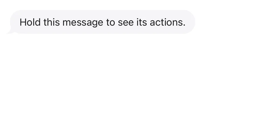
```tsx
import { View } from "react-native"
import { ContextActions, ContextActionsContent, ContextActionsItem, ContextActionsTrigger } from "@/components/patterns/context-actions"
import { Bubble, BubbleContent } from "@/components/ui/bubble"
export function BubbleLongPressActionsExample() {
return (
}
>
Hold this message to see its actions.
ReplyCopyDelete
)
}
```
```swift
import EsuissUI
import SwiftUI
struct BubbleLongPressActionsExample: View {
var body: some View {
Bubble(variant: .muted) {
BubbleContent("Hold this message to see its actions.")
.accessibilityLabel(Text("Message from Maya"))
.contextActions {
ContextActionsItem("Reply") {}
ContextActionsItem("Copy") {}
ContextActionsItem("Delete", variant: .destructive) {}
}
}
}
}
```
```kotlin
import androidx.compose.foundation.layout.Column
import androidx.compose.runtime.Composable
import androidx.compose.ui.Modifier
import androidx.compose.ui.semantics.contentDescription
import androidx.compose.ui.semantics.semantics
import com.esuiss.ui.components.Bubble
import com.esuiss.ui.components.BubbleContent
import com.esuiss.ui.components.BubbleVariant
import com.esuiss.ui.components.MenuItemVariant
import com.esuiss.ui.patterns.ContextActions
import com.esuiss.ui.patterns.ContextActionsContent
import com.esuiss.ui.patterns.ContextActionsItem
import com.esuiss.ui.patterns.ContextActionsTrigger
@Composable
fun BubbleLongPressActions() {
Column {
ContextActions {
ContextActionsTrigger(Modifier.semantics { contentDescription = "Message from Maya" }) {
Bubble(variant = BubbleVariant.Muted) {
BubbleContent("Hold this message to see its actions.")
}
}
ContextActionsContent {
ContextActionsItem("Reply", onClick = {})
ContextActionsItem("Copy", onClick = {})
ContextActionsItem("Delete", onClick = {}, variant = MenuItemVariant.Destructive)
}
}
}
}
```
## API Reference
### BubbleGroup
Column that decides which bubbles show a tail.
Also accepts the props of `ViewProps`.
### Bubble
One message, aligned to the start or end.
| Prop | Type | Default | Description |
| --- | --- | --- | --- |
| `variant` | `BubbleVariant` | `"default"` | `default`, `secondary`, `muted`, `tinted`, `outline`, `ghost` or `destructive`. |
| `align` | `BubbleAlign` | - | `start` or `end`. Defaults to `start`. |
Also accepts the props of `ViewProps`.
### BubbleContent
The bubble itself, optionally pressable.
| Prop | Type | Default | Description |
| --- | --- | --- | --- |
| `render` | `RenderProp, Record>` | - | Element to render instead of the default view or pressable. |
Also accepts the props of `React.ComponentProps`, `React.RefAttributes`.
### BubbleReactions
Reaction pill on the edge of a bubble.
| Prop | Type | Default | Description |
| --- | --- | --- | --- |
| `align` | `BubbleAlign` | `"end"` | `start` or `end` along the bubble. Defaults to `end`. |
| `side` | `"top" \| "bottom"` | `"bottom"` | `top` or `bottom`. Defaults to `bottom`. |
Also accepts the props of `ViewProps`.
## Accessibility
- `BubbleContent` gets the `button` role when it has `onPress` or `onLongPress`.
- The tail is hidden from VoiceOver and TalkBack.
- Give long-press bubbles an `accessibilityLabel` that says who sent the message.
## Notes
- The tail mirrors itself for `end` alignment and in right-to-left layouts.
- Uses `bg-primary`, `bg-secondary`, `bg-muted` and `bg-destructive/10 dark:bg-destructive/20` tokens, with `opacity-80` while pressed; light and dark follow the system appearance.