button>svg]:grid has-[>button>svg]:grid-cols-[1fr_auto_auto_1fr]",
className
)}
{...props}
/>
)
}
function AlertSheetHeader({
className,
...props
}: React.ComponentProps<"div">) {
return (
)
}
function AlertSheetTitle({
className,
...props
}: AlertSheetPrimitive.Title.Props) {
return (
)
}
function AlertSheetDescription({
className,
...props
}: AlertSheetPrimitive.Description.Props) {
return (
)
}
const alertSheetActionVariants = cva(
"flex min-h-14 w-full cursor-pointer items-center justify-center gap-2 px-4 text-lg has-[>svg]:grid has-[>svg]:grid-cols-subgrid has-[>svg]:gap-x-3 has-[>svg]:text-start [&>svg]:col-start-2 [&_svg:not([class*='size-'])]:size-5 outline-none hover:bg-[color-mix(in_oklab,var(--popover),var(--foreground)_5%)] focus-visible:ring-3 focus-visible:ring-ring/50 disabled:pointer-events-none disabled:opacity-50",
{
variants: {
variant: {
default: "text-primary",
destructive: "text-destructive",
},
},
defaultVariants: {
variant: "default",
},
}
)
function AlertSheetAction({
className,
variant,
...props
}: AlertSheetPrimitive.Close.Props &
VariantProps
) {
return (
)
}
function AlertSheetCancel({
className,
...props
}: AlertSheetPrimitive.Close.Props) {
return (
)
}
export {
AlertSheet,
AlertSheetAction,
AlertSheetCancel,
AlertSheetContent,
AlertSheetDescription,
AlertSheetGroup,
AlertSheetHeader,
AlertSheetOverlay,
AlertSheetPortal,
AlertSheetTitle,
AlertSheetTrigger,
}
```
4. Update the import paths to match your project.
## Usage
```tsx
import { AlertSheet, AlertSheetTrigger, AlertSheetPortal, AlertSheetOverlay, AlertSheetContent, AlertSheetGroup, AlertSheetHeader, AlertSheetTitle, AlertSheetDescription, AlertSheetAction, AlertSheetCancel } from "@/components/ui/alert-sheet"
```
```tsx
}>
Delete order
Delete order
Order #1042 will be permanently deleted. This action cannot be
undone.
Delete Order
Cancel
```
Every sheet needs an `AlertSheetTitle` for its accessible name. If the title should not be visible, hide it with `className="sr-only"`.
By default the sheet is `dismissible` and behaves like a regular dialog. Set `dismissible={false}` to render it as an alert dialog instead.
When the sheet opens, focus moves to `AlertSheetCancel` unless you pass your own `initialFocus` to `AlertSheetContent`. Every action and the cancel button close the sheet. Control the open state with `open` and `onOpenChange`, or use `defaultOpen`.
## Examples
### With title
Shows a visible title above the description.
**Example**
```tsx
import {
AlertSheet,
AlertSheetAction,
AlertSheetCancel,
AlertSheetContent,
AlertSheetDescription,
AlertSheetGroup,
AlertSheetHeader,
AlertSheetTitle,
AlertSheetTrigger,
} from "@/components/ui/alert-sheet"
import { Button } from "@/components/ui/button"
export default function AlertSheetWithTitle() {
return (
}>
Sign out
Sign out of your account?
You will need to sign in again to access your projects.
Sign Out
Cancel
)
}
```
### Multiple actions
Offers a default and a destructive action in one group.
**Example**
```tsx
import {
AlertSheet,
AlertSheetAction,
AlertSheetCancel,
AlertSheetContent,
AlertSheetGroup,
AlertSheetHeader,
AlertSheetTitle,
AlertSheetTrigger,
} from "@/components/ui/alert-sheet"
import { Button } from "@/components/ui/button"
export default function AlertSheetMultipleActions() {
return (
}>
Close draft
Save changes to this draft?
Save Draft
Delete Draft
Cancel
)
}
```
### Not dismissible
With `dismissible={false}` the sheet is an alert dialog: pressing outside does not close it, so one of the choices has to be made.
**Example**
```tsx
import {
AlertSheet,
AlertSheetAction,
AlertSheetCancel,
AlertSheetContent,
AlertSheetDescription,
AlertSheetGroup,
AlertSheetHeader,
AlertSheetTitle,
AlertSheetTrigger,
} from "@/components/ui/alert-sheet"
import { Button } from "@/components/ui/button"
export default function AlertSheetNotDismissible() {
return (
}>
Delete order
Delete order
Order #1042 will be permanently deleted. This action cannot be
undone.
Delete Order
Cancel
)
}
```
## API Reference
- `AlertSheet`
- `AlertSheetTrigger`
- `AlertSheetContent`
- `AlertSheetGroup`
- `AlertSheetHeader`
- `AlertSheetTitle`
- `AlertSheetDescription`
- `AlertSheetAction`
- `AlertSheetCancel`
### AlertSheet
The root that manages the open state and dismissal behavior.
| Prop | Type | Default | Description |
| --- | --- | --- | --- |
| `dismissible` | `boolean` | `true` | When `true`, renders as a dialog; when `false`, renders as an alert dialog. |
Also accepts the props of the primitive part it wraps.
### AlertSheetTrigger
The control that opens the sheet.
Also accepts the props of the primitive part it wraps.
### AlertSheetPortal
Renders the sheet into a portal outside the DOM hierarchy.
Also accepts the props of the primitive part it wraps.
### AlertSheetOverlay
The full-screen scrim behind the sheet.
Also accepts the props of the primitive part it wraps.
### AlertSheetContent
The bottom-anchored container, rendered with its own portal and overlay.
Also accepts the props of the primitive part it wraps.
### AlertSheetGroup
A rounded surface that stacks the header and actions with dividers.
Also accepts the props of `React.ComponentProps<"div">`.
### AlertSheetHeader
A padded wrapper for the title and description.
Also accepts the props of `React.ComponentProps<"div">`.
### AlertSheetTitle
The heading that names the sheet.
Also accepts the props of the primitive part it wraps.
### AlertSheetDescription
Supporting text that describes the sheet.
Also accepts the props of the primitive part it wraps.
### AlertSheetAction
A full-width row button that performs an action and closes the sheet.
| Prop | Type | Default | Description |
| --- | --- | --- | --- |
| `variant` | `"default" \| "destructive"` | `"default"` | Text color of the action. `default` uses `text-primary`; `destructive` uses `text-destructive`. |
Also accepts the props of the primitive part it wraps.
### AlertSheetCancel
A separate, bold button that dismisses the sheet.
Also accepts the props of the primitive part it wraps.
## Accessibility
- With `dismissible` (the default) the popup has the `dialog` role; with `dismissible={false}` it has the `alertdialog` role.
- The popup is named by `AlertSheetTitle` and described by `AlertSheetDescription`.
- Focus moves to the cancel button on open and returns to the trigger on close.
- `Escape` closes the sheet.
## Notes
- Styling hooks: `data-slot` values from `alert-sheet` through `alert-sheet-cancel`.
- The sheet slides up from `translate-y-full` as it opens and back down as it closes, and its bottom padding respects `env(safe-area-inset-bottom)`.
- When an action contains an icon, the group switches to a grid so icons and labels align across rows.
**React Native, SwiftUI, Jetpack Compose**
```tsx
import { View } from "react-native"
import { AlertSheet, AlertSheetAction, AlertSheetCancel, AlertSheetContent, AlertSheetDescription, AlertSheetGroup, AlertSheetHeader, AlertSheetTitle, AlertSheetTrigger } from "@/components/ui/alert-sheet"
import { Button } from "@/components/ui/button"
import { Text } from "@/components/ui/text"
function SheetBody() {
return (
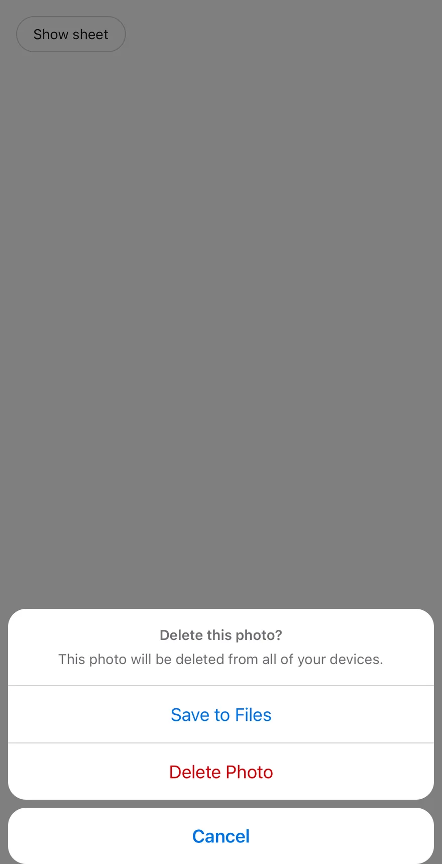
Delete this photo?
This photo will be deleted from all of your devices.
Save to Files
Delete Photo
Cancel
)
}
export function AlertSheetOpenByDefaultExample() {
return (
}>
Show sheet
)
}
```
```swift
import EsuissUI
import SwiftUI
struct AlertSheetOpenByDefaultExample: View {
var body: some View {
AlertSheetDemo(title: "Show sheet", open: true) {
AlertSheetBody()
}
}
}
struct AlertSheetDemo: View {
let title: LocalizedStringKey
let dismissible: Bool
let content: () -> Body
@State private var open: Bool
init(
title: LocalizedStringKey,
open: Bool = false,
dismissible: Bool = true,
@ViewBuilder content: @escaping () -> Body
) {
self.title = title
self.dismissible = dismissible
self.content = content
_open = State(initialValue: open)
}
var body: some View {
Button(title) { open = true }
.buttonStyle(.variant(.outline))
.alertSheet(isPresented: $open, dismissible: dismissible, content: content)
}
}
struct AlertSheetBody: View {
var body: some View {
AlertSheetContent {
AlertSheetGroup {
AlertSheetHeader {
AlertSheetTitle("Delete this photo?")
AlertSheetDescription("This photo will be deleted from all of your devices.")
}
AlertSheetAction("Save to Files")
AlertSheetAction("Delete Photo", variant: .destructive)
}
AlertSheetCancel("Cancel")
}
}
}
```
```kotlin
import androidx.compose.foundation.layout.Column
import androidx.compose.runtime.Composable
import androidx.compose.runtime.getValue
import androidx.compose.runtime.mutableStateOf
import androidx.compose.runtime.saveable.rememberSaveable
import androidx.compose.runtime.setValue
import com.esuiss.ui.components.AlertSheet
import com.esuiss.ui.components.AlertSheetAction
import com.esuiss.ui.components.AlertSheetActionVariant
import com.esuiss.ui.components.AlertSheetCancel
import com.esuiss.ui.components.AlertSheetDescription
import com.esuiss.ui.components.AlertSheetGroup
import com.esuiss.ui.components.AlertSheetHeader
import com.esuiss.ui.components.AlertSheetTitle
import com.esuiss.ui.components.Button
import com.esuiss.ui.components.ButtonVariant
@Composable
fun AlertSheetOpenByDefaultExample() {
AlertSheetDefault(defaultOpen = true)
}
@Composable
fun AlertSheetDefault(defaultOpen: Boolean) {
var open by rememberSaveable { mutableStateOf(defaultOpen) }
Column {
Button("Show sheet", onClick = { open = true }, variant = ButtonVariant.Outline)
AlertSheet(open = open, onOpenChange = { open = it }) {
AlertSheetGroup {
AlertSheetHeader {
AlertSheetTitle("Delete this photo?")
AlertSheetDescription("This photo will be deleted from all of your devices.")
}
AlertSheetAction("Save to Files", onClick = {})
AlertSheetAction("Delete Photo", onClick = {}, variant = AlertSheetActionVariant.Destructive)
}
AlertSheetCancel("Cancel")
}
}
}
```
`AlertSheet` presents a set of choices related to the current context. `AlertSheetContent` renders through a portal (inside a full-window overlay on iOS), slides up from the bottom over a dimmed scrim, and respects the safe-area insets.
Actions sit in an `AlertSheetGroup`, a rounded card that draws a hairline between each child, and `AlertSheetCancel` sits below it as its own card with bold text. Use it for two to a few actions; for a single decision that needs confirmation, use Alert Dialog.
## Installation
**React Native**
```bash title="Terminal"
npx shadcn@latest add @esuiss-rn/alert-sheet
```
See [Installation](https://ui.suiss.app/docs/installation) for the `components.json` setup. Or use the suiss/ui CLI:
```bash title="Terminal"
npx @esuiss/ui@latest add alert-sheet
```
**SwiftUI**
```bash title="Terminal"
npx @esuiss/ui@latest add alert-sheet --platform swift
```
**Jetpack Compose**
```bash title="Terminal"
npx @esuiss/ui@latest add alert-sheet --platform kotlin
```
The CLI also adds what it builds on: [Icon](https://ui.suiss.app/docs/components/icon), [Text](https://ui.suiss.app/docs/components/text). On React Native it also adds the animated view `components/ui/animated-view.tsx`.
### Manual
**React Native**
**Uniwind**
1. Install the dependencies:
```bash title="Terminal"
npx expo install class-variance-authority cn react-native-reanimated react-native-safe-area-context react-native-screens react-native-worklets
```
2. Add the pieces it builds on: [Icon](https://ui.suiss.app/docs/components/icon), [Text](https://ui.suiss.app/docs/components/text), and the primitives `components/primitives/alert-dialog.tsx`, `components/primitives/dialog.tsx`, `components/primitives/use-render.tsx`, and the animated view `components/ui/animated-view.tsx` from the next step.
3. Copy the animated view into `components/ui/animated-view.tsx`:
- `uniwind/components/ui/animated-view.tsx`: [source](https://github.com/e-suiss/ui/blob/main/packages/mobile/uniwind/components/ui/animated-view.tsx)
4. Copy the source into `components/ui/alert-sheet.tsx`:
```tsx title="uniwind/components/ui/alert-sheet.tsx"
import { cva, type VariantProps } from "class-variance-authority"
import { cn } from "cn"
import * as React from "react"
import { Platform, View, type ViewProps } from "react-native"
import {
Easing,
FadeIn,
FadeOut,
ReduceMotion,
SlideInDown,
SlideOutDown,
} from "react-native-reanimated"
import { useSafeAreaInsets } from "react-native-safe-area-context"
import { FullWindowOverlay as RNFullWindowOverlay } from "react-native-screens"
import * as AlertSheetPrimitive from "@/components/primitives/alert-dialog"
import * as DialogPrimitive from "@/components/primitives/dialog"
import { resolveClassName } from "@/components/primitives/use-render"
import { AnimatedView } from "@/components/ui/animated-view"
import { IconClassContext } from "@/components/ui/icon"
import { Text, TextClassContext } from "@/components/ui/text"
const FullWindowOverlay =
Platform.OS === "ios" ? RNFullWindowOverlay : React.Fragment
const EASING = Easing.bezier(0.32, 0.72, 0, 1)
function AlertSheet({
dismissible = true,
...props
}: AlertSheetPrimitive.RootProps & { dismissible?: boolean }) {
if (dismissible) {
return
}
return
}
const AlertSheetTrigger = AlertSheetPrimitive.Trigger
const AlertSheetPortal = AlertSheetPrimitive.Portal
function AlertSheetOverlay({
className,
...props
}: React.ComponentProps) {
return (
}
className={(state) =>
cn(
"absolute top-0 right-0 bottom-0 left-0 z-50 bg-black/50",
resolveClassName(className, state)
)
}
{...props}
/>
)
}
function AlertSheetContent({
className,
style,
portalHost,
...props
}: React.ComponentProps & {
portalHost?: string
}) {
const insets = useSafeAreaInsets()
return (
cn(
"w-full flex-col gap-2 p-2",
resolveClassName(className, state)
)
}
style={(state) => [
{
paddingBottom: Math.max(8, insets.bottom),
paddingLeft: Math.max(8, insets.left),
paddingRight: Math.max(8, insets.right),
},
typeof style === "function" ? style(state) : style,
]}
{...props}
/>
)
}
function AlertSheetGroup({ className, children, ...props }: ViewProps) {
const items = React.Children.toArray(children).filter(Boolean)
return (
{items.map((child, index) => (
{index > 0 ? (
) : null}
{child}
))}
)
}
function AlertSheetHeader({ className, ...props }: ViewProps) {
return (
)
}
function AlertSheetTitle({
className,
...props
}: React.ComponentProps) {
return (
cn(
"text-center text-sm font-semibold text-muted-foreground",
resolveClassName(className, state)
)
}
{...props}
/>
)
}
function AlertSheetDescription({
className,
...props
}: React.ComponentProps) {
return (
cn(
"text-center text-sm text-muted-foreground",
resolveClassName(className, state)
)
}
{...props}
/>
)
}
const alertSheetActionVariants = cva(
"min-h-14 w-full flex-row items-center justify-center gap-3 px-4 active:opacity-80"
)
const alertSheetActionTextVariants = cva("text-center text-lg", {
variants: {
variant: {
default: "text-primary",
destructive: "text-destructive",
},
disabled: {
true: "opacity-50",
},
},
defaultVariants: {
variant: "default",
},
})
function wrapText(children: React.ReactNode) {
if (typeof children === "string" || typeof children === "number") {
return {children}
}
return children
}
type AlertSheetActionProps = Omit<
React.ComponentProps,
"children"
> &
VariantProps & {
children?: React.ReactNode
}
function AlertSheetAction({
className,
variant,
disabled,
children,
...props
}: AlertSheetActionProps) {
const textClass = alertSheetActionTextVariants({
variant,
disabled: Boolean(disabled),
})
return (
cn(alertSheetActionVariants(), resolveClassName(className, state))
}
{...props}
>
{wrapText(children)}
)
}
function AlertSheetCancel({
className,
disabled,
children,
...props
}: Omit) {
const textClass = cn(
alertSheetActionTextVariants({ disabled: Boolean(disabled) }),
"font-semibold"
)
return (
cn(
alertSheetActionVariants(),
"rounded-2xl bg-popover active:opacity-80",
resolveClassName(className, state)
)
}
{...props}
>
{wrapText(children)}
)
}
export {
AlertSheet,
AlertSheetAction,
AlertSheetCancel,
AlertSheetContent,
AlertSheetDescription,
AlertSheetGroup,
AlertSheetHeader,
AlertSheetOverlay,
AlertSheetPortal,
AlertSheetTitle,
AlertSheetTrigger,
}
```
5. Update the import paths to match your project.
**NativeWind**
1. Install the dependencies:
```bash title="Terminal"
npx expo install class-variance-authority cn react-native-reanimated react-native-safe-area-context react-native-screens react-native-worklets
```
2. Add the pieces it builds on: [Icon](https://ui.suiss.app/docs/components/icon), [Text](https://ui.suiss.app/docs/components/text), and the primitives `components/primitives/alert-dialog.tsx`, `components/primitives/dialog.tsx`, `components/primitives/use-render.tsx`, and the animated view `components/ui/animated-view.tsx` from the next step.
3. Copy the animated view into `components/ui/animated-view.tsx`:
- `nativewind/components/ui/animated-view.tsx`: [source](https://github.com/e-suiss/ui/blob/main/packages/mobile/nativewind/components/ui/animated-view.tsx)
4. Copy the source into `components/ui/alert-sheet.tsx`:
```tsx title="nativewind/components/ui/alert-sheet.tsx"
import { cva, type VariantProps } from "class-variance-authority"
import { cn } from "cn"
import * as React from "react"
import { Platform, View, type ViewProps } from "react-native"
import {
Easing,
FadeIn,
FadeOut,
ReduceMotion,
SlideInDown,
SlideOutDown,
} from "react-native-reanimated"
import { useSafeAreaInsets } from "react-native-safe-area-context"
import { FullWindowOverlay as RNFullWindowOverlay } from "react-native-screens"
import * as AlertSheetPrimitive from "@/components/primitives/alert-dialog"
import * as DialogPrimitive from "@/components/primitives/dialog"
import { resolveClassName } from "@/components/primitives/use-render"
import { AnimatedView } from "@/components/ui/animated-view"
import { IconClassContext } from "@/components/ui/icon"
import { Text, TextClassContext } from "@/components/ui/text"
const FullWindowOverlay =
Platform.OS === "ios" ? RNFullWindowOverlay : React.Fragment
const EASING = Easing.bezier(0.32, 0.72, 0, 1)
function AlertSheet({
dismissible = true,
...props
}: AlertSheetPrimitive.RootProps & { dismissible?: boolean }) {
if (dismissible) {
return
}
return
}
const AlertSheetTrigger = AlertSheetPrimitive.Trigger
const AlertSheetPortal = AlertSheetPrimitive.Portal
function AlertSheetOverlay({
className,
...props
}: React.ComponentProps) {
return (
}
className={(state) =>
cn(
"absolute top-0 right-0 bottom-0 left-0 z-50 bg-black/50",
resolveClassName(className, state)
)
}
{...props}
/>
)
}
function AlertSheetContent({
className,
style,
portalHost,
...props
}: React.ComponentProps & {
portalHost?: string
}) {
const insets = useSafeAreaInsets()
return (
cn(
"w-full flex-col gap-2 p-2",
resolveClassName(className, state)
)
}
style={(state) => [
{
paddingBottom: Math.max(8, insets.bottom),
paddingLeft: Math.max(8, insets.left),
paddingRight: Math.max(8, insets.right),
},
typeof style === "function" ? style(state) : style,
]}
{...props}
/>
)
}
function AlertSheetGroup({ className, children, ...props }: ViewProps) {
const items = React.Children.toArray(children).filter(Boolean)
return (
{items.map((child, index) => (
{index > 0 ? (
) : null}
{child}
))}
)
}
function AlertSheetHeader({ className, ...props }: ViewProps) {
return (
)
}
function AlertSheetTitle({
className,
...props
}: React.ComponentProps) {
return (
cn(
"text-center text-sm font-semibold text-muted-foreground",
resolveClassName(className, state)
)
}
{...props}
/>
)
}
function AlertSheetDescription({
className,
...props
}: React.ComponentProps) {
return (
cn(
"text-center text-sm text-muted-foreground",
resolveClassName(className, state)
)
}
{...props}
/>
)
}
const alertSheetActionVariants = cva(
"min-h-14 w-full flex-row items-center justify-center gap-3 px-4 active:opacity-80"
)
const alertSheetActionTextVariants = cva("text-center text-lg", {
variants: {
variant: {
default: "text-primary",
destructive: "text-destructive",
},
disabled: {
true: "opacity-50",
},
},
defaultVariants: {
variant: "default",
},
})
function wrapText(children: React.ReactNode) {
if (typeof children === "string" || typeof children === "number") {
return {children}
}
return children
}
type AlertSheetActionProps = Omit<
React.ComponentProps,
"children"
> &
VariantProps & {
children?: React.ReactNode
}
function AlertSheetAction({
className,
variant,
disabled,
children,
...props
}: AlertSheetActionProps) {
const textClass = alertSheetActionTextVariants({
variant,
disabled: Boolean(disabled),
})
return (
cn(alertSheetActionVariants(), resolveClassName(className, state))
}
{...props}
>
{wrapText(children)}
)
}
function AlertSheetCancel({
className,
disabled,
children,
...props
}: Omit) {
const textClass = cn(
alertSheetActionTextVariants({ disabled: Boolean(disabled) }),
"font-semibold"
)
return (
cn(
alertSheetActionVariants(),
"rounded-2xl bg-popover active:opacity-80",
resolveClassName(className, state)
)
}
{...props}
>
{wrapText(children)}
)
}
export {
AlertSheet,
AlertSheetAction,
AlertSheetCancel,
AlertSheetContent,
AlertSheetDescription,
AlertSheetGroup,
AlertSheetHeader,
AlertSheetOverlay,
AlertSheetPortal,
AlertSheetTitle,
AlertSheetTrigger,
}
```
5. Update the import paths to match your project.
**StyleSheet**
1. Install the dependencies:
```bash title="Terminal"
npx expo install react-native-reanimated react-native-safe-area-context react-native-screens react-native-worklets
```
2. Add the pieces it builds on: [Icon](https://ui.suiss.app/docs/components/icon), [Text](https://ui.suiss.app/docs/components/text), and the primitives `components/primitives/alert-dialog.tsx`, `components/primitives/dialog.tsx`, `components/primitives/use-render.tsx`, and the animated view `components/ui/animated-view.tsx` from the next step.
3. Copy the animated view into `components/ui/animated-view.tsx`:
- `stylesheet/components/ui/animated-view.tsx`: [source](https://github.com/e-suiss/ui/blob/main/packages/mobile/stylesheet/components/ui/animated-view.tsx)
4. Copy the source into `components/ui/alert-sheet.tsx`:
```tsx title="stylesheet/components/ui/alert-sheet.tsx"
import * as React from "react"
import {
Platform,
Pressable,
StyleSheet,
type TextStyle,
View,
type ViewProps,
} from "react-native"
import {
Easing,
FadeIn,
FadeOut,
ReduceMotion,
SlideInDown,
SlideOutDown,
} from "react-native-reanimated"
import { useSafeAreaInsets } from "react-native-safe-area-context"
import { FullWindowOverlay as RNFullWindowOverlay } from "react-native-screens"
import * as AlertSheetPrimitive from "@/components/primitives/alert-dialog"
import * as DialogPrimitive from "@/components/primitives/dialog"
import { AnimatedView } from "@/components/ui/animated-view"
import { IconSizeContext } from "@/components/ui/icon"
import { Text, TextStyleContext } from "@/components/ui/text"
import { fontSize, radius, useTheme } from "@/components/ui/theme"
const FullWindowOverlay =
Platform.OS === "ios" ? RNFullWindowOverlay : React.Fragment
const EASING = Easing.bezier(0.32, 0.72, 0, 1)
const styles = StyleSheet.create({
backdrop: { ...StyleSheet.absoluteFill, zIndex: 50 },
container: {
...StyleSheet.absoluteFill,
zIndex: 50,
alignItems: "center",
justifyContent: "flex-end",
pointerEvents: "box-none",
},
frame: { width: "100%", maxWidth: 448, pointerEvents: "box-none" },
content: { width: "100%", flexDirection: "column", gap: 8, padding: 8 },
group: {
flexDirection: "column",
overflow: "hidden",
borderRadius: radius["2xl"],
},
separator: { height: 1 },
header: {
flexDirection: "column",
alignItems: "center",
gap: 4,
padding: 16,
},
title: { ...fontSize.sm, fontWeight: "600", textAlign: "center" },
description: { ...fontSize.sm, textAlign: "center" },
action: {
minHeight: 56,
width: "100%",
flexDirection: "row",
alignItems: "center",
justifyContent: "center",
gap: 12,
paddingHorizontal: 16,
},
cancel: { borderRadius: radius["2xl"] },
})
function AlertSheet({
dismissible = true,
...props
}: AlertSheetPrimitive.RootProps & { dismissible?: boolean }) {
if (dismissible) {
return
}
return
}
const AlertSheetTrigger = AlertSheetPrimitive.Trigger
const AlertSheetPortal = AlertSheetPrimitive.Portal
function AlertSheetOverlay({
style,
...props
}: React.ComponentProps) {
return (
}
style={(state) => [
styles.backdrop,
{ backgroundColor: "rgba(0, 0, 0, 0.5)" },
typeof style === "function" ? style(state) : style,
]}
{...props}
/>
)
}
function AlertSheetContent({
style,
portalHost,
...props
}: React.ComponentProps & {
portalHost?: string
}) {
const insets = useSafeAreaInsets()
return (
[
styles.content,
{
paddingBottom: Math.max(8, insets.bottom),
paddingLeft: Math.max(8, insets.left),
paddingRight: Math.max(8, insets.right),
},
typeof style === "function" ? style(state) : style,
]}
{...props}
/>
)
}
function AlertSheetGroup({ style, children, ...props }: ViewProps) {
const { colors } = useTheme()
const items = React.Children.toArray(children).filter(Boolean)
return (
{items.map((child, index) => (
{index > 0 ? (
) : null}
{child}
))}
)
}
function AlertSheetHeader({ style, ...props }: ViewProps) {
return (
)
}
function AlertSheetTitle({
style,
...props
}: React.ComponentProps) {
const { colors } = useTheme()
return (
[
styles.title,
{ color: colors.mutedForeground },
typeof style === "function" ? style(state) : style,
]}
{...props}
/>
)
}
function AlertSheetDescription({
style,
...props
}: React.ComponentProps) {
const { colors } = useTheme()
return (
[
styles.description,
{ color: colors.mutedForeground },
typeof style === "function" ? style(state) : style,
]}
{...props}
/>
)
}
function wrapText(children: React.ReactNode) {
if (typeof children === "string" || typeof children === "number") {
return {children}
}
return children
}
type AlertSheetActionProps = Omit<
React.ComponentProps,
"children"
> & {
variant?: "default" | "destructive"
children?: React.ReactNode
}
function useActionText(variant: "default" | "destructive"): TextStyle {
const { colors } = useTheme()
const color = variant === "destructive" ? colors.destructive : colors.primary
return {
...fontSize.lg,
textAlign: "center",
color,
}
}
function AlertSheetAction({
style,
variant = "default",
disabled,
children,
...props
}: AlertSheetActionProps) {
const textStyle = useActionText(variant)
return (
[
styles.action,
pressed && { opacity: 0.8 },
disabled && { opacity: 0.5 },
typeof style === "function"
? style({ disabled: Boolean(disabled) })
: style,
]}
/>
}
{...props}
>
{wrapText(children)}
)
}
function AlertSheetCancel({
style,
disabled,
children,
...props
}: Omit) {
const { colors } = useTheme()
const textStyle = useActionText("default")
return (
[
styles.action,
styles.cancel,
{ backgroundColor: colors.popover },
pressed && { opacity: 0.8 },
disabled && { opacity: 0.5 },
typeof style === "function"
? style({ disabled: Boolean(disabled) })
: style,
]}
/>
}
{...props}
>
{wrapText(children)}
)
}
export {
AlertSheet,
AlertSheetAction,
AlertSheetCancel,
AlertSheetContent,
AlertSheetDescription,
AlertSheetGroup,
AlertSheetHeader,
AlertSheetOverlay,
AlertSheetPortal,
AlertSheetTitle,
AlertSheetTrigger,
}
```
5. Update the import paths to match your project.
**SwiftUI**
1. Target iOS 17 or later.
2. Add the Swift package to your app:
```swift title="Package.swift"
.package(url: "https://github.com/phosphor-icons/swift", from: "2.1.0")
```
3. Copy the theme files every view uses:
- `swift/Theme/Theme.swift`: [source](https://github.com/e-suiss/ui/blob/main/packages/mobile/swiftui/Sources/EsuissUI/Theme/Theme.swift)
- `swift/Theme/Tokens.swift`: [source](https://github.com/e-suiss/ui/blob/main/packages/mobile/swiftui/Sources/EsuissUI/Theme/Tokens.swift)
4. Copy the source and every file it uses:
```swift title="swift/Components/AlertSheet.swift"
import SwiftUI
extension View {
public func alertSheet(
isPresented: Binding,
dismissible: Bool = true,
@ViewBuilder content: @escaping () -> Content
) -> some View {
modifier(
CoverPresenter(
isPresented: isPresented,
enter: .timingCurve(0.32, 0.72, 0, 1, duration: 0.3),
exit: .timingCurve(0.32, 0.72, 0, 1, duration: 0.25)
) { visible in
AlertSheetStage(visible: visible, dismissible: dismissible, content: content)
}
)
}
}
struct AlertSheetStage: View {
let visible: Bool
let dismissible: Bool
@ViewBuilder let content: () -> Content
@Environment(\.overlayDismiss) private var dismiss
@Environment(\.accessibilityReduceMotion) private var reduceMotion
var body: some View {
let hidden = !visible
let slide = !reduceMotion
ZStack(alignment: .bottom) {
ScrimLayer(visible: visible, dismissible: dismissible)
content()
.visualEffect { view, proxy in
view.offset(y: hidden && slide ? proxy.size.height + 16 : 0)
}
.opacity(hidden && !slide ? 0 : 1)
}
.accessibilityAction(.escape) { dismiss?() }
}
}
public struct AlertSheetContent: View {
let content: Content
public init(@ViewBuilder content: () -> Content) {
self.content = content()
}
public var body: some View {
VStack(spacing: 8) {
content
}
.multilineTextAlignment(.center)
.frame(maxWidth: 448)
.padding(8)
.frame(maxWidth: .infinity)
.accessibilityElement(children: .contain)
.accessibilityAddTraits(.isModal)
}
}
public struct AlertSheetGroup: View {
let content: Content
public init(@ViewBuilder content: () -> Content) {
self.content = content()
}
public var body: some View {
let shape = RoundedRectangle(cornerRadius: Radius.xl2, style: .continuous)
SeparatedStack {
content
}
.frame(maxWidth: .infinity)
.background(EsuissColor.border)
.clipShape(shape)
.foregroundStyle(EsuissColor.foreground)
}
}
public struct AlertSheetHeader: View {
let content: Content
public init(@ViewBuilder content: () -> Content) {
self.content = content()
}
public var body: some View {
VStack(spacing: 4) {
content
}
.padding(16)
.frame(maxWidth: .infinity)
.background(EsuissColor.popover)
}
}
public struct AlertSheetTitle: View {
let text: Text
public init(_ title: LocalizedStringKey) {
text = Text(title)
}
public init(verbatim title: String) {
text = Text(verbatim: title)
}
public var body: some View {
text
.scaledTextStyle(.sm, weight: .semibold)
.foregroundStyle(EsuissColor.mutedForeground)
.fixedSize(horizontal: false, vertical: true)
.accessibilityAddTraits(.isHeader)
}
}
public struct AlertSheetDescription: View {
let text: Text
public init(_ description: LocalizedStringKey) {
text = Text(description)
}
public init(verbatim description: String) {
text = Text(verbatim: description)
}
public var body: some View {
text
.scaledTextStyle(.sm)
.foregroundStyle(EsuissColor.mutedForeground)
.fixedSize(horizontal: false, vertical: true)
}
}
public enum AlertSheetActionVariant: CaseIterable, Sendable {
case `default`, destructive
}
struct AlertSheetActionStyle: ButtonStyle {
let variant: AlertSheetActionVariant
var cancel = false
@Environment(\.isEnabled) private var isEnabled
func makeBody(configuration: Configuration) -> some View {
configuration.label
.labelStyle(ButtonLabelStyle(spacing: 12, iconSize: 20))
.scaledFont(.lg, weight: cancel ? .semibold : .regular)
.foregroundStyle(variant == .destructive ? EsuissColor.destructive : EsuissColor.primary)
.opacity(isEnabled ? 1 : 0.5)
.lineLimit(2)
.padding(.horizontal, 16)
.padding(.vertical, 8)
.frame(maxWidth: .infinity, minHeight: 56)
.background(EsuissColor.popover)
.overlay {
if configuration.isPressed && isEnabled {
EsuissColor.foreground.opacity(0.1)
}
}
.contentShape(Rectangle())
}
}
public struct AlertSheetAction: View {
let variant: AlertSheetActionVariant
let action: (() -> Void)?
let label: Label
@Environment(\.overlayDismiss) private var dismiss
public init(
variant: AlertSheetActionVariant = .default,
action: (() -> Void)? = nil,
@ViewBuilder label: () -> Label
) {
self.variant = variant
self.action = action
self.label = label()
}
public var body: some View {
Button(role: variant == .destructive ? .destructive : nil) {
action?()
dismiss?()
} label: {
label
}
.buttonStyle(AlertSheetActionStyle(variant: variant))
}
}
extension AlertSheetAction where Label == Text {
public init(
_ title: LocalizedStringKey,
variant: AlertSheetActionVariant = .default,
action: (() -> Void)? = nil
) {
self.init(variant: variant, action: action) { Text(title) }
}
}
extension AlertSheetAction where Label == SwiftUI.Label {
public init(
_ title: LocalizedStringKey,
icon: Image,
variant: AlertSheetActionVariant = .default,
action: (() -> Void)? = nil
) {
self.init(variant: variant, action: action) {
SwiftUI.Label { Text(title) } icon: { icon }
}
}
}
public struct AlertSheetCancel: View {
let action: (() -> Void)?
let label: Label
@Environment(\.overlayDismiss) private var dismiss
public init(action: (() -> Void)? = nil, @ViewBuilder label: () -> Label) {
self.action = action
self.label = label()
}
public var body: some View {
Button(role: .cancel) {
action?()
dismiss?()
} label: {
label
}
.buttonStyle(AlertSheetActionStyle(variant: .default, cancel: true))
.clipShape(RoundedRectangle(cornerRadius: Radius.xl2, style: .continuous))
}
}
extension AlertSheetCancel where Label == Text {
public init(_ title: LocalizedStringKey = "Cancel", action: (() -> Void)? = nil) {
self.init(action: action) { Text(title) }
}
}
struct SeparatedStack: Layout {
var spacing: CGFloat = 1
private func heights(_ subviews: Subviews, width: CGFloat?) -> [CGFloat] {
subviews.map { $0.sizeThatFits(ProposedViewSize(width: width, height: nil)).height }
}
func sizeThatFits(proposal: ProposedViewSize, subviews: Subviews, cache: inout ()) -> CGSize {
let visible = heights(subviews, width: proposal.width).filter { $0 > 0 }
let height = visible.reduce(0, +) + spacing * CGFloat(max(visible.count - 1, 0))
let width = proposal.width ?? subviews.map { $0.sizeThatFits(.unspecified).width }.max() ?? 0
return CGSize(width: width, height: height)
}
func placeSubviews(in bounds: CGRect, proposal: ProposedViewSize, subviews: Subviews, cache: inout ()) {
var y = bounds.minY
var first = true
for (view, height) in zip(subviews, heights(subviews, width: bounds.width)) {
if height <= 0 {
view.place(at: CGPoint(x: bounds.minX, y: y), anchor: .topLeading, proposal: ProposedViewSize(width: bounds.width, height: 0))
continue
}
if !first { y += spacing }
first = false
view.place(at: CGPoint(x: bounds.minX, y: y), anchor: .topLeading, proposal: ProposedViewSize(width: bounds.width, height: height))
y += height
}
}
}
```
- `swift/Components/Button.swift`: see [Button](https://ui.suiss.app/docs/components/button.md)
- `swift/Components/ButtonGroup.swift`: see [Button Group](https://ui.suiss.app/docs/components/button-group.md)
- `swift/Components/Overlay.swift`: [source](https://github.com/e-suiss/ui/blob/main/packages/mobile/swiftui/Sources/EsuissUI/Components/Overlay.swift)
- `swift/Components/TextVariant.swift`: [source](https://github.com/e-suiss/ui/blob/main/packages/mobile/swiftui/Sources/EsuissUI/Components/TextVariant.swift)
5. Add the files to your app target.
**Jetpack Compose**
1. Set `minSdk` to 24 or higher and add the dependencies:
```kotlin title="build.gradle.kts"
implementation(platform("androidx.compose:compose-bom:2026.09.00"))
implementation("androidx.compose.foundation:foundation")
implementation("androidx.compose.ui:ui")
implementation("com.adamglin:phosphor-icon-android:1.0.0")
```
2. Copy the theme files every view uses:
- `kotlin/theme/Theme.kt`: [source](https://github.com/e-suiss/ui/blob/main/packages/mobile/kotlin/ui/src/main/kotlin/com/esuiss/ui/theme/Theme.kt)
- `kotlin/theme/Tokens.kt`: [source](https://github.com/e-suiss/ui/blob/main/packages/mobile/kotlin/ui/src/main/kotlin/com/esuiss/ui/theme/Tokens.kt)
3. Copy the source and every file it uses:
```kt title="kotlin/components/AlertSheet.kt"
package com.esuiss.ui.components
import androidx.compose.animation.AnimatedVisibility
import androidx.compose.animation.core.MutableTransitionState
import androidx.compose.animation.core.tween
import androidx.compose.animation.fadeIn
import androidx.compose.animation.fadeOut
import androidx.compose.animation.slideInVertically
import androidx.compose.animation.slideOutVertically
import androidx.compose.foundation.background
import androidx.compose.foundation.clickable
import androidx.compose.foundation.gestures.Orientation
import androidx.compose.foundation.interaction.MutableInteractionSource
import androidx.compose.foundation.interaction.collectIsPressedAsState
import androidx.compose.foundation.layout.Arrangement
import androidx.compose.foundation.layout.Box
import androidx.compose.foundation.layout.Column
import androidx.compose.foundation.layout.ColumnScope
import androidx.compose.foundation.layout.Row
import androidx.compose.foundation.layout.WindowInsets
import androidx.compose.foundation.layout.WindowInsetsSides
import androidx.compose.foundation.layout.asPaddingValues
import androidx.compose.foundation.layout.fillMaxSize
import androidx.compose.foundation.layout.fillMaxWidth
import androidx.compose.foundation.layout.heightIn
import androidx.compose.foundation.layout.only
import androidx.compose.foundation.layout.padding
import androidx.compose.foundation.layout.safeDrawing
import androidx.compose.foundation.layout.widthIn
import androidx.compose.foundation.layout.windowInsetsPadding
import androidx.compose.foundation.shape.RoundedCornerShape
import androidx.compose.foundation.text.BasicText
import androidx.compose.runtime.Composable
import androidx.compose.runtime.CompositionLocalProvider
import androidx.compose.runtime.getValue
import androidx.compose.runtime.remember
import androidx.compose.runtime.staticCompositionLocalOf
import androidx.compose.ui.Alignment
import androidx.compose.ui.Modifier
import androidx.compose.ui.draw.alpha
import androidx.compose.ui.draw.clip
import androidx.compose.ui.graphics.vector.ImageVector
import androidx.compose.ui.input.pointer.pointerInput
import androidx.compose.ui.platform.LocalDensity
import androidx.compose.ui.semantics.Role
import androidx.compose.ui.semantics.paneTitle
import androidx.compose.ui.semantics.semantics
import androidx.compose.ui.text.font.FontWeight
import androidx.compose.ui.text.style.TextAlign
import androidx.compose.ui.unit.dp
import com.esuiss.ui.theme.EsuissTheme
import com.esuiss.ui.theme.Radius
import com.esuiss.ui.theme.Typography
enum class AlertSheetActionVariant { Default, Destructive }
private const val AlertSheetDuration = 300
private val LocalAlertSheetClose = staticCompositionLocalOf<() -> Unit> { {} }
@Composable
fun AlertSheet(
open: Boolean,
onOpenChange: (Boolean) -> Unit,
modifier: Modifier = Modifier,
dismissible: Boolean = true,
content: @Composable ColumnScope.() -> Unit,
) {
val transition = remember { MutableTransitionState(false) }
transition.targetState = open
val paneTitle = remember { PaneTitleState() }
val reduced = formReducedMotion()
val colors = EsuissTheme.colors
val close = { if (open) onOpenChange(false) }
ModalWindow(
visible = transition.currentState || transition.targetState,
onDismissRequest = close,
dismissOnBackPress = true,
paneTitle = paneTitle.value,
) {
val bottom = maxOf(8.dp, WindowInsets.safeDrawing.asPaddingValues().calculateBottomPadding())
val bottomPx = with(LocalDensity.current) { bottom.roundToPx() }
Box(modifier = Modifier.fillMaxSize()) {
Scrim(transition, AlertSheetDuration, AlertSheetDuration, onClick = if (dismissible) close else null)
AnimatedVisibility(
visibleState = transition,
modifier = Modifier
.align(Alignment.BottomCenter)
.windowInsetsPadding(WindowInsets.safeDrawing.only(WindowInsetsSides.Horizontal))
.padding(start = 8.dp, end = 8.dp, top = 8.dp, bottom = bottom),
enter = if (reduced) {
fadeIn(tween(AlertSheetDuration))
} else {
slideInVertically(tween(AlertSheetDuration, easing = FormEasing)) { it + bottomPx }
},
exit = if (reduced) {
fadeOut(tween(AlertSheetDuration))
} else {
slideOutVertically(tween(AlertSheetDuration, easing = FormEasing)) { it + bottomPx }
},
) {
Column(
modifier = modifier
.widthIn(max = 448.dp)
.fillMaxWidth()
.pointerInput(Unit) {}
.semantics { paneTitle.value?.let { this.paneTitle = it } },
verticalArrangement = Arrangement.spacedBy(8.dp),
) {
CompositionLocalProvider(
LocalPaneTitle provides paneTitle,
LocalAlertSheetClose provides close,
LocalContentStyle provides Typography.base.copy(color = colors.foreground),
LocalContentColor provides colors.foreground,
) {
content()
}
}
}
}
}
}
@Composable
fun AlertSheetGroup(
modifier: Modifier = Modifier,
content: @Composable () -> Unit,
) {
val colors = EsuissTheme.colors
val shape = RoundedCornerShape(Radius.xl2)
FormDividedStack(
orientation = Orientation.Vertical,
dividerColor = colors.border,
modifier = modifier
.fillMaxWidth()
.clip(shape)
.background(colors.popover, shape),
content = content,
)
}
@Composable
fun AlertSheetHeader(
modifier: Modifier = Modifier,
content: @Composable ColumnScope.() -> Unit,
) {
Column(
modifier = modifier
.fillMaxWidth()
.padding(16.dp),
horizontalAlignment = Alignment.CenterHorizontally,
verticalArrangement = Arrangement.spacedBy(4.dp),
content = content,
)
}
@Composable
fun AlertSheetTitle(text: String, modifier: Modifier = Modifier) {
OverlayTitle(
text,
modifier,
Typography.sm.copy(
color = EsuissTheme.colors.mutedForeground,
fontWeight = FontWeight.SemiBold,
textAlign = TextAlign.Center,
),
)
}
@Composable
fun AlertSheetDescription(text: String, modifier: Modifier = Modifier) {
BasicText(
text,
modifier = modifier,
style = Typography.sm.copy(color = EsuissTheme.colors.mutedForeground, textAlign = TextAlign.Center),
)
}
@Composable
private fun AlertSheetButton(
text: String,
onClick: () -> Unit,
modifier: Modifier,
variant: AlertSheetActionVariant,
enabled: Boolean,
icon: ImageVector?,
emphasized: Boolean,
) {
val colors = EsuissTheme.colors
val close = LocalAlertSheetClose.current
val interaction = remember { MutableInteractionSource() }
val pressed by interaction.collectIsPressedAsState()
val foreground = if (variant == AlertSheetActionVariant.Destructive) colors.destructive else colors.primary
Row(
modifier = modifier
.fillMaxWidth()
.heightIn(min = 56.dp)
.alpha(
when {
!enabled -> 0.5f
pressed -> 0.8f
else -> 1f
},
)
.clickable(
interactionSource = interaction,
indication = null,
enabled = enabled,
role = Role.Button,
onClick = {
onClick()
close()
},
)
.padding(horizontal = 16.dp, vertical = 8.dp),
horizontalArrangement = Arrangement.spacedBy(12.dp, Alignment.CenterHorizontally),
verticalAlignment = Alignment.CenterVertically,
) {
if (icon != null) Icon(icon, contentDescription = null, size = 20.dp, tint = foreground)
BasicText(
text,
style = Typography.lg.copy(
color = foreground,
fontWeight = if (emphasized) FontWeight.SemiBold else FontWeight.Normal,
textAlign = TextAlign.Center,
),
)
}
}
@Composable
fun AlertSheetAction(
text: String,
onClick: () -> Unit,
modifier: Modifier = Modifier,
variant: AlertSheetActionVariant = AlertSheetActionVariant.Default,
enabled: Boolean = true,
icon: ImageVector? = null,
) {
AlertSheetButton(text, onClick, modifier, variant, enabled, icon, emphasized = false)
}
@Composable
fun AlertSheetCancel(
text: String = "Cancel",
modifier: Modifier = Modifier,
onClick: () -> Unit = {},
) {
val colors = EsuissTheme.colors
val shape = RoundedCornerShape(Radius.xl2)
Box(modifier = modifier.fillMaxWidth().clip(shape).background(colors.popover, shape)) {
AlertSheetButton(text, onClick, Modifier, AlertSheetActionVariant.Default, true, null, emphasized = true)
}
}
```
- `kotlin/components/Button.kt`: see [Button](https://ui.suiss.app/docs/components/button.md)
- `kotlin/components/ButtonGroup.kt`: see [Button Group](https://ui.suiss.app/docs/components/button-group.md)
- `kotlin/components/Content.kt`: [source](https://github.com/e-suiss/ui/blob/main/packages/mobile/kotlin/ui/src/main/kotlin/com/esuiss/ui/components/Content.kt)
- `kotlin/components/FormSupport.kt`: [source](https://github.com/e-suiss/ui/blob/main/packages/mobile/kotlin/ui/src/main/kotlin/com/esuiss/ui/components/FormSupport.kt)
- `kotlin/components/Icon.kt`: see [Icon](https://ui.suiss.app/docs/components/icon.md)
- `kotlin/components/Overlay.kt`: [source](https://github.com/e-suiss/ui/blob/main/packages/mobile/kotlin/ui/src/main/kotlin/com/esuiss/ui/components/Overlay.kt)
4. Update the `com.esuiss.ui` package names to match your project.
## Usage
```tsx
import { AlertSheet, AlertSheetOverlay, AlertSheetContent, AlertSheetGroup, AlertSheetHeader, AlertSheetTitle, AlertSheetDescription, AlertSheetAction, AlertSheetCancel } from "@/components/ui/alert-sheet"
```
```tsx
}>
Show sheet
```
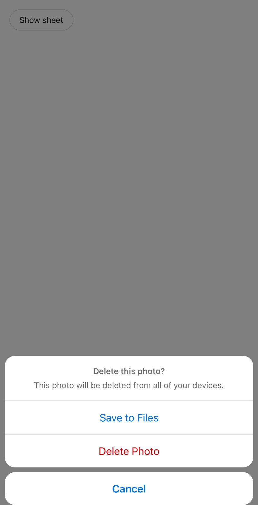
Compose `AlertSheetTrigger` and `AlertSheetContent`. Inside the content, put an `AlertSheetGroup` with an optional `AlertSheetHeader` (`AlertSheetTitle`, `AlertSheetDescription`) followed by `AlertSheetAction`s, then an `AlertSheetCancel`.
Every action closes the sheet when pressed. String children are wrapped in `Text` automatically. Use `variant="destructive"` on an action that deletes or removes, and `disabled` to dim and block it.
By default the sheet is dismissible and a tap on the scrim closes it. Set `dismissible={false}` to require an explicit choice.
## Examples
### Default
```tsx
import { View } from "react-native"
import { AlertSheet, AlertSheetAction, AlertSheetCancel, AlertSheetContent, AlertSheetDescription, AlertSheetGroup, AlertSheetHeader, AlertSheetTitle, AlertSheetTrigger } from "@/components/ui/alert-sheet"
import { Button } from "@/components/ui/button"
import { Text } from "@/components/ui/text"
function SheetBody() {
return (
Delete this photo?
This photo will be deleted from all of your devices.
Save to Files
Delete Photo
Cancel
)
}
export function AlertSheetExample() {
return (
}>
Show sheet
)
}
```
```swift
import EsuissUI
import SwiftUI
struct AlertSheetExample: View {
var body: some View {
AlertSheetDemo(title: "Show sheet") {
AlertSheetBody()
}
}
}
struct AlertSheetDemo: View {
let title: LocalizedStringKey
let dismissible: Bool
let content: () -> Body
@State private var open: Bool
init(
title: LocalizedStringKey,
open: Bool = false,
dismissible: Bool = true,
@ViewBuilder content: @escaping () -> Body
) {
self.title = title
self.dismissible = dismissible
self.content = content
_open = State(initialValue: open)
}
var body: some View {
Button(title) { open = true }
.buttonStyle(.variant(.outline))
.alertSheet(isPresented: $open, dismissible: dismissible, content: content)
}
}
struct AlertSheetBody: View {
var body: some View {
AlertSheetContent {
AlertSheetGroup {
AlertSheetHeader {
AlertSheetTitle("Delete this photo?")
AlertSheetDescription("This photo will be deleted from all of your devices.")
}
AlertSheetAction("Save to Files")
AlertSheetAction("Delete Photo", variant: .destructive)
}
AlertSheetCancel("Cancel")
}
}
}
```
```kotlin
import androidx.compose.foundation.layout.Column
import androidx.compose.runtime.Composable
import androidx.compose.runtime.getValue
import androidx.compose.runtime.mutableStateOf
import androidx.compose.runtime.saveable.rememberSaveable
import androidx.compose.runtime.setValue
import com.esuiss.ui.components.AlertSheet
import com.esuiss.ui.components.AlertSheetAction
import com.esuiss.ui.components.AlertSheetActionVariant
import com.esuiss.ui.components.AlertSheetCancel
import com.esuiss.ui.components.AlertSheetDescription
import com.esuiss.ui.components.AlertSheetGroup
import com.esuiss.ui.components.AlertSheetHeader
import com.esuiss.ui.components.AlertSheetTitle
import com.esuiss.ui.components.Button
import com.esuiss.ui.components.ButtonVariant
@Composable
fun AlertSheetExample() {
AlertSheetDefault(defaultOpen = false)
}
@Composable
fun AlertSheetDefault(defaultOpen: Boolean) {
var open by rememberSaveable { mutableStateOf(defaultOpen) }
Column {
Button("Show sheet", onClick = { open = true }, variant = ButtonVariant.Outline)
AlertSheet(open = open, onOpenChange = { open = it }) {
AlertSheetGroup {
AlertSheetHeader {
AlertSheetTitle("Delete this photo?")
AlertSheetDescription("This photo will be deleted from all of your devices.")
}
AlertSheetAction("Save to Files", onClick = {})
AlertSheetAction("Delete Photo", onClick = {}, variant = AlertSheetActionVariant.Destructive)
}
AlertSheetCancel("Cancel")
}
}
}
```
### Not dismissible
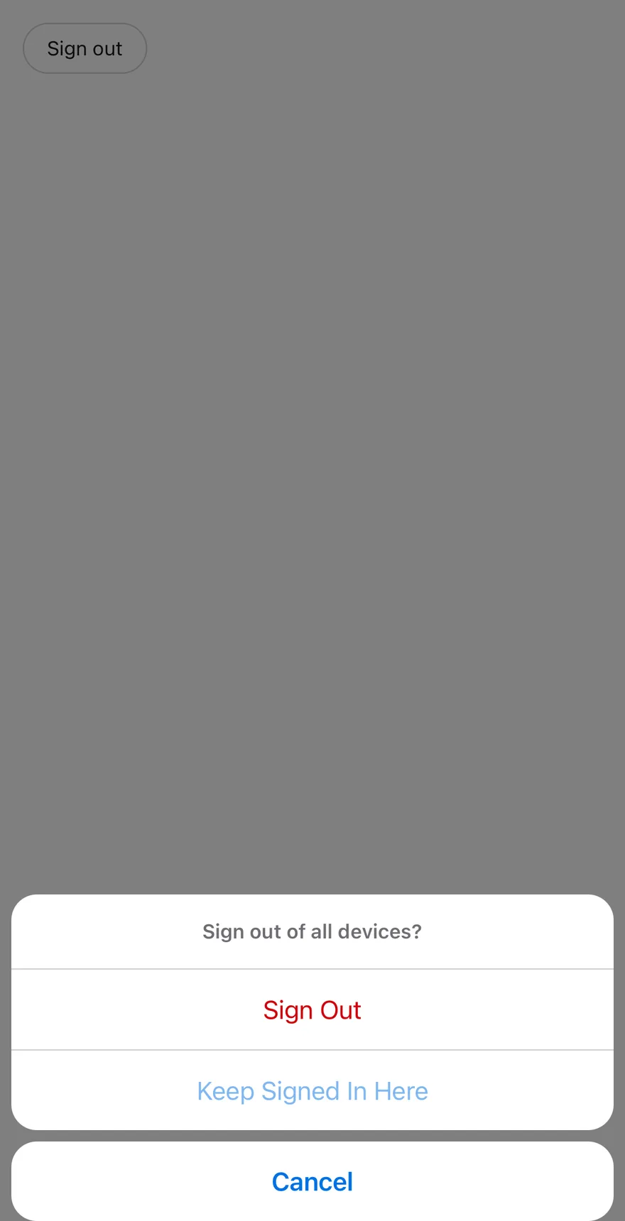
`dismissible={false}` with a destructive and a disabled action.
```tsx
import { View } from "react-native"
import { AlertSheet, AlertSheetAction, AlertSheetCancel, AlertSheetContent, AlertSheetGroup, AlertSheetHeader, AlertSheetTitle, AlertSheetTrigger } from "@/components/ui/alert-sheet"
import { Button } from "@/components/ui/button"
import { Text } from "@/components/ui/text"
export function AlertSheetNotDismissibleExample() {
return (
}>
Sign out
Sign out of all devices?
Sign Out
Keep Signed In Here
Cancel
)
}
```
```swift
import EsuissUI
import SwiftUI
struct AlertSheetNotDismissibleExample: View {
var body: some View {
AlertSheetDemo(title: "Sign out", dismissible: false) {
AlertSheetContent {
AlertSheetGroup {
AlertSheetHeader {
AlertSheetTitle("Sign out of all devices?")
}
AlertSheetAction("Sign Out", variant: .destructive)
AlertSheetAction("Keep Signed In Here")
.disabled(true)
}
AlertSheetCancel("Cancel")
}
}
}
}
struct AlertSheetDemo: View {
let title: LocalizedStringKey
let dismissible: Bool
let content: () -> Body
@State private var open: Bool
init(
title: LocalizedStringKey,
open: Bool = false,
dismissible: Bool = true,
@ViewBuilder content: @escaping () -> Body
) {
self.title = title
self.dismissible = dismissible
self.content = content
_open = State(initialValue: open)
}
var body: some View {
Button(title) { open = true }
.buttonStyle(.variant(.outline))
.alertSheet(isPresented: $open, dismissible: dismissible, content: content)
}
}
```
```kotlin
import androidx.compose.foundation.layout.Column
import androidx.compose.runtime.Composable
import androidx.compose.runtime.getValue
import androidx.compose.runtime.mutableStateOf
import androidx.compose.runtime.saveable.rememberSaveable
import androidx.compose.runtime.setValue
import com.esuiss.ui.components.AlertSheet
import com.esuiss.ui.components.AlertSheetAction
import com.esuiss.ui.components.AlertSheetActionVariant
import com.esuiss.ui.components.AlertSheetCancel
import com.esuiss.ui.components.AlertSheetGroup
import com.esuiss.ui.components.AlertSheetHeader
import com.esuiss.ui.components.AlertSheetTitle
import com.esuiss.ui.components.Button
import com.esuiss.ui.components.ButtonVariant
@Composable
fun AlertSheetNotDismissible() {
var open by rememberSaveable { mutableStateOf(false) }
Column {
Button("Sign out", onClick = { open = true }, variant = ButtonVariant.Outline)
AlertSheet(open = open, onOpenChange = { open = it }, dismissible = false) {
AlertSheetGroup {
AlertSheetHeader {
AlertSheetTitle("Sign out of all devices?")
}
AlertSheetAction("Sign Out", onClick = {}, variant = AlertSheetActionVariant.Destructive)
AlertSheetAction("Keep Signed In Here", onClick = {}, enabled = false)
}
AlertSheetCancel("Cancel")
}
}
}
```
## API Reference
### AlertSheet
Root that holds the open state.
| Prop | Type | Default | Description |
| --- | --- | --- | --- |
| `dismissible` | `boolean` | `true` | When `false`, the scrim no longer closes the sheet. Defaults to `true`. |
Also accepts the props of `AlertSheetPrimitive.RootProps`.
### AlertSheetOverlay
Dimmed scrim behind the sheet.
Also accepts the props of `React.ComponentProps`.
### AlertSheetContent
Bottom-anchored container that slides in and out.
| Prop | Type | Default | Description |
| --- | --- | --- | --- |
| `portalHost` | `string` | - | Name of the portal host to render into. |
Also accepts the props of `React.ComponentProps`.
### AlertSheetGroup
Rounded card that separates its children with hairlines.
Also accepts the props of `ViewProps`.
### AlertSheetHeader
Centered block for the title and description.
Also accepts the props of `ViewProps`.
### AlertSheetTitle
Small, bold heading for the sheet.
Also accepts the props of `React.ComponentProps`.
### AlertSheetDescription
Supporting text below the title.
Also accepts the props of `React.ComponentProps`.
### AlertSheetAction
Full-width action row that closes the sheet.
| Prop | Type | Default | Description |
| --- | --- | --- | --- |
| `variant` | `"default" \| "destructive"` | `"default"` | Text color of the action. |
Also accepts the props of `AlertSheetActionProps`.
### AlertSheetCancel
Separate cancel card with bold text.
Also accepts the props of `AlertSheetActionProps`.
## Accessibility
- When dismissible the popup has the `dialog` role, otherwise `alertdialog`; it is labelled by the title and marked as modal for VoiceOver.
- Focus moves to the title when the sheet opens.
- Actions have the `button` role with a `disabled` state.
- Separators between actions are hidden from screen readers.
## Notes
- Padding uses the bottom and side safe-area insets, with a minimum of 8 points.
- On iOS the content is wrapped in a full-window overlay.
- Animations respect the system Reduce Motion setting.
- Uses `bg-popover`, `text-primary` and `text-destructive` tokens, with `opacity-80` while pressed; light and dark follow the system appearance.