# Alert Dialog
A modal dialog that interrupts the user to confirm an important action or acknowledge information.
Alert Dialog is an open-source component from suiss/ui for React, React Native, SwiftUI and Jetpack Compose. The @esuiss/ui CLI copies its source into your project, so you own the code.
Source: https://ui.suiss.app/docs/components/alert-dialog
**React**
**Example**
```tsx
import {
AlertDialog,
AlertDialogAction,
AlertDialogCancel,
AlertDialogContent,
AlertDialogDescription,
AlertDialogFooter,
AlertDialogHeader,
AlertDialogTitle,
AlertDialogTrigger,
} from "@/components/ui/alert-dialog"
import { Button } from "@/components/ui/button"
export default function AlertDialogDemo() {
return (
}>
Sign out
Sign out of your account?
You will need to sign in again to access your projects and settings.
Cancel
Sign out
)
}
```
Alert Dialog wraps the alert dialog primitive of the chosen base. An `AlertDialog` root contains an `AlertDialogTrigger` and an `AlertDialogContent`. The content renders its own portal and scrim overlay, and typically holds an `AlertDialogHeader` (with optional `AlertDialogMedia`, plus `AlertDialogTitle` and `AlertDialogDescription`) followed by an `AlertDialogFooter` with `AlertDialogCancel` and `AlertDialogAction` buttons.
Use it when a decision must be made before continuing, such as signing out or deleting data. Unlike a regular dialog, it is not dismissed by clicking outside. For a choice of actions anchored to the bottom of the screen, use Alert Sheet.
## Installation
### CLI
```bash title="Terminal"
npx shadcn@latest add @esuiss/alert-dialog
```
Works in any project with a `components.json`. See [Installation](https://ui.suiss.app/docs/installation#add-components) for the one-line registry setup. Or use the suiss/ui CLI:
```bash title="Terminal"
npx @esuiss/ui@latest add alert-dialog
```
### Manual
1. Install the dependencies and add the [`cn` helper](https://ui.suiss.app/docs/installation#the-cn-helper):
```bash title="Terminal"
npm install @base-ui/react
```
2. Add the pieces it builds on: [Button](https://ui.suiss.app/docs/components/button), `use-scrollbar-gap`.
3. Copy the source into `components/ui/alert-dialog.tsx`:
```tsx title="components/ui/alert-dialog.tsx"
"use client"
import { AlertDialog as AlertDialogPrimitive } from "@base-ui/react/alert-dialog"
import type * as React from "react"
import { Button } from "@/components/ui/button"
import { useScrollbarGap } from "@/hooks/use-scrollbar-gap"
import { cn } from "@/lib/utils"
function AlertDialog({ ...props }: AlertDialogPrimitive.Root.Props) {
return
}
function AlertDialogTrigger({ ...props }: AlertDialogPrimitive.Trigger.Props) {
return (
)
}
function AlertDialogPortal({ ...props }: AlertDialogPrimitive.Portal.Props) {
return (
)
}
function AlertDialogOverlay({
className,
...props
}: AlertDialogPrimitive.Backdrop.Props) {
useScrollbarGap()
return (
)
}
function AlertDialogContent({
className,
size = "default",
...props
}: AlertDialogPrimitive.Popup.Props & {
size?: "default" | "sm"
}) {
return (
)
}
function AlertDialogHeader({
className,
...props
}: React.ComponentProps<"div">) {
return (
)
}
function AlertDialogFooter({
className,
...props
}: React.ComponentProps<"div">) {
return (
)
}
function AlertDialogMedia({
className,
...props
}: React.ComponentProps<"div">) {
return (
)
}
function AlertDialogTitle({
className,
...props
}: React.ComponentProps) {
return (
)
}
function AlertDialogDescription({
className,
...props
}: React.ComponentProps) {
return (
)
}
function AlertDialogAction({
className,
variant = "default",
size = "default",
...props
}: AlertDialogPrimitive.Close.Props &
Pick, "variant" | "size">) {
return (
}
{...props}
/>
)
}
function AlertDialogCancel({
className,
variant = "secondary",
size = "default",
...props
}: AlertDialogPrimitive.Close.Props &
Pick, "variant" | "size">) {
return (
}
{...props}
/>
)
}
export {
AlertDialog,
AlertDialogAction,
AlertDialogCancel,
AlertDialogContent,
AlertDialogDescription,
AlertDialogFooter,
AlertDialogHeader,
AlertDialogMedia,
AlertDialogOverlay,
AlertDialogPortal,
AlertDialogTitle,
AlertDialogTrigger,
}
```
4. Update the import paths to match your project.
## Usage
```tsx
import { AlertDialog, AlertDialogTrigger, AlertDialogPortal, AlertDialogOverlay, AlertDialogContent, AlertDialogHeader, AlertDialogFooter, AlertDialogMedia, AlertDialogTitle, AlertDialogDescription, AlertDialogAction, AlertDialogCancel } from "@/components/ui/alert-dialog"
```
```tsx
}>
Sign out
Sign out of your account?
You will need to sign in again to access your projects and settings.
Cancel
Sign out
```
`AlertDialogContent` already includes `AlertDialogPortal` and `AlertDialogOverlay`, so you rarely use those parts directly.
`AlertDialogAction` and `AlertDialogCancel` both close the dialog and render a `Button`; pass `variant` and `size` to style them. Cancel defaults to the `secondary` variant and Action to `default`. Use `variant="destructive"` on the action for irreversible operations.
The dialog is uncontrolled by default; use `defaultOpen`, or control it with `open` and `onOpenChange`.
## Examples
### Small
A narrower dialog using `size="sm"` with a destructive action.
**Example**
```tsx
import {
AlertDialog,
AlertDialogAction,
AlertDialogCancel,
AlertDialogContent,
AlertDialogDescription,
AlertDialogFooter,
AlertDialogHeader,
AlertDialogTitle,
AlertDialogTrigger,
} from "@/components/ui/alert-dialog"
import { Button } from "@/components/ui/button"
export default function AlertDialogSmall() {
return (
}>
Discard draft
Discard draft?
Your unsaved message will be lost.
Keep
Discard
)
}
```
### With media
Adds an icon above the title with `AlertDialogMedia`.
**Example**
```tsx
import { TrashIcon } from "@phosphor-icons/react"
import {
AlertDialog,
AlertDialogAction,
AlertDialogCancel,
AlertDialogContent,
AlertDialogDescription,
AlertDialogFooter,
AlertDialogHeader,
AlertDialogMedia,
AlertDialogTitle,
AlertDialogTrigger,
} from "@/components/ui/alert-dialog"
import { Button } from "@/components/ui/button"
export default function AlertDialogWithMedia() {
return (
}>
Delete project
Delete this project?
This permanently removes the project and all of its files. This
action cannot be undone.
Cancel
Delete
)
}
```
## API Reference
- `AlertDialog`
- `AlertDialogTrigger`
- `AlertDialogContent`
- `AlertDialogHeader`
- `AlertDialogTitle`
- `AlertDialogDescription`
- `AlertDialogMedia`
- `AlertDialogFooter`
- `AlertDialogCancel`
- `AlertDialogAction`
### AlertDialog
The root that manages the open state.
Also accepts the props of the primitive part it wraps.
### AlertDialogTrigger
The control that opens the dialog.
Also accepts the props of the primitive part it wraps.
### AlertDialogPortal
Renders the dialog into a portal outside the DOM hierarchy.
Also accepts the props of the primitive part it wraps.
### AlertDialogOverlay
The full-screen scrim behind the dialog.
Also accepts the props of the primitive part it wraps.
### AlertDialogContent
The dialog surface, rendered with its own portal and overlay.
| Prop | Type | Default | Description |
| --- | --- | --- | --- |
| `size` | `"default" \| "sm"` | `"default"` | Maximum width of the dialog. `sm` is narrower than `default`. |
Also accepts the props of the primitive part it wraps.
### AlertDialogHeader
A centered layout wrapper for the media, title and description.
Also accepts the props of `React.ComponentProps<"div">`.
### AlertDialogFooter
A two-column grid for the cancel and action buttons.
Also accepts the props of `React.ComponentProps<"div">`.
### AlertDialogMedia
A circular container for an icon or image above the title.
Also accepts the props of `React.ComponentProps<"div">`.
### AlertDialogTitle
The heading that names the dialog.
Also accepts the props of `React.ComponentProps`.
### AlertDialogDescription
Supporting text that describes the dialog.
Also accepts the props of `React.ComponentProps`.
### AlertDialogAction
A button that confirms and closes the dialog.
Also accepts the props of the primitive part it wraps, plus `Button`.
### AlertDialogCancel
A button that dismisses the dialog without acting.
Also accepts the props of the primitive part it wraps, plus `Button`.
## Accessibility
- The popup has the `alertdialog` role, named by `AlertDialogTitle` and described by `AlertDialogDescription`.
- Opening moves focus into the dialog; closing returns focus to the trigger.
- `Escape` closes the dialog.
- Clicking the overlay does not close it; a choice must be made with a footer button or `Escape`.
## Notes
- Styling hooks: `data-slot` values from `alert-dialog` through `alert-dialog-cancel`; the content also sets `data-size`.
- Surface tokens: `bg-popover` for the dialog, `bg-black/50` for the overlay and `bg-muted` for media.
- Enter and exit use fade and zoom animations keyed to `data-open` and `data-closed`.
**React Native, SwiftUI, Jetpack Compose**
```tsx
import { View } from "react-native"
import { AlertDialog, AlertDialogAction, AlertDialogCancel, AlertDialogContent, AlertDialogDescription, AlertDialogFooter, AlertDialogHeader, AlertDialogTitle, AlertDialogTrigger } from "@/components/ui/alert-dialog"
import { Button } from "@/components/ui/button"
import { Text } from "@/components/ui/text"
function AlertDialogBody() {
return (
Are you absolutely sure?
This action cannot be undone. This will permanently delete your
account and remove your data from our servers.
Cancel
Continue
)
}
export function AlertDialogOpenByDefaultExample() {
return (
}>
Show dialog
)
}
```
```swift
import EsuissUI
import SwiftUI
struct AlertDialogOpenByDefaultExample: View {
var body: some View {
AlertDialogDemo(title: "Show dialog", variant: .outline, open: true) {
AlertDialogBody()
}
}
}
struct AlertDialogDemo: View {
let title: LocalizedStringKey
let variant: VariantButtonStyle.Variant
let content: () -> Body
@State private var open: Bool
init(
title: LocalizedStringKey,
variant: VariantButtonStyle.Variant,
open: Bool = false,
@ViewBuilder content: @escaping () -> Body
) {
self.title = title
self.variant = variant
self.content = content
_open = State(initialValue: open)
}
var body: some View {
Button(title) { open = true }
.buttonStyle(.variant(variant))
.alertDialog(isPresented: $open, content: content)
}
}
struct AlertDialogBody: View {
var body: some View {
AlertDialogContent {
AlertDialogHeader {
AlertDialogTitle("Are you absolutely sure?")
AlertDialogDescription(
"This action cannot be undone. This will permanently delete your account and remove your data from our servers."
)
}
AlertDialogFooter {
AlertDialogCancel()
AlertDialogAction("Continue")
}
}
}
}
```
```kotlin
import androidx.compose.foundation.layout.Column
import androidx.compose.runtime.Composable
import androidx.compose.runtime.getValue
import androidx.compose.runtime.mutableStateOf
import androidx.compose.runtime.saveable.rememberSaveable
import androidx.compose.runtime.setValue
import com.esuiss.ui.components.AlertDialog
import com.esuiss.ui.components.AlertDialogAction
import com.esuiss.ui.components.AlertDialogCancel
import com.esuiss.ui.components.AlertDialogDescription
import com.esuiss.ui.components.AlertDialogFooter
import com.esuiss.ui.components.AlertDialogHeader
import com.esuiss.ui.components.AlertDialogTitle
import com.esuiss.ui.components.Button
import com.esuiss.ui.components.ButtonVariant
@Composable
fun AlertDialogOpenByDefaultExample() {
AlertDialogDefault(defaultOpen = true)
}
@Composable
fun AlertDialogDefault(defaultOpen: Boolean) {
var open by rememberSaveable { mutableStateOf(defaultOpen) }
Column {
Button("Show dialog", onClick = { open = true }, variant = ButtonVariant.Outline)
AlertDialog(open = open, onOpenChange = { open = it }) {
AlertDialogHeader {
AlertDialogTitle("Are you absolutely sure?")
AlertDialogDescription(
"This action cannot be undone. This will permanently delete your account and remove your data from our servers.",
)
}
AlertDialogFooter {
AlertDialogCancel("Cancel")
AlertDialogAction("Continue", onClick = {})
}
}
}
}
```
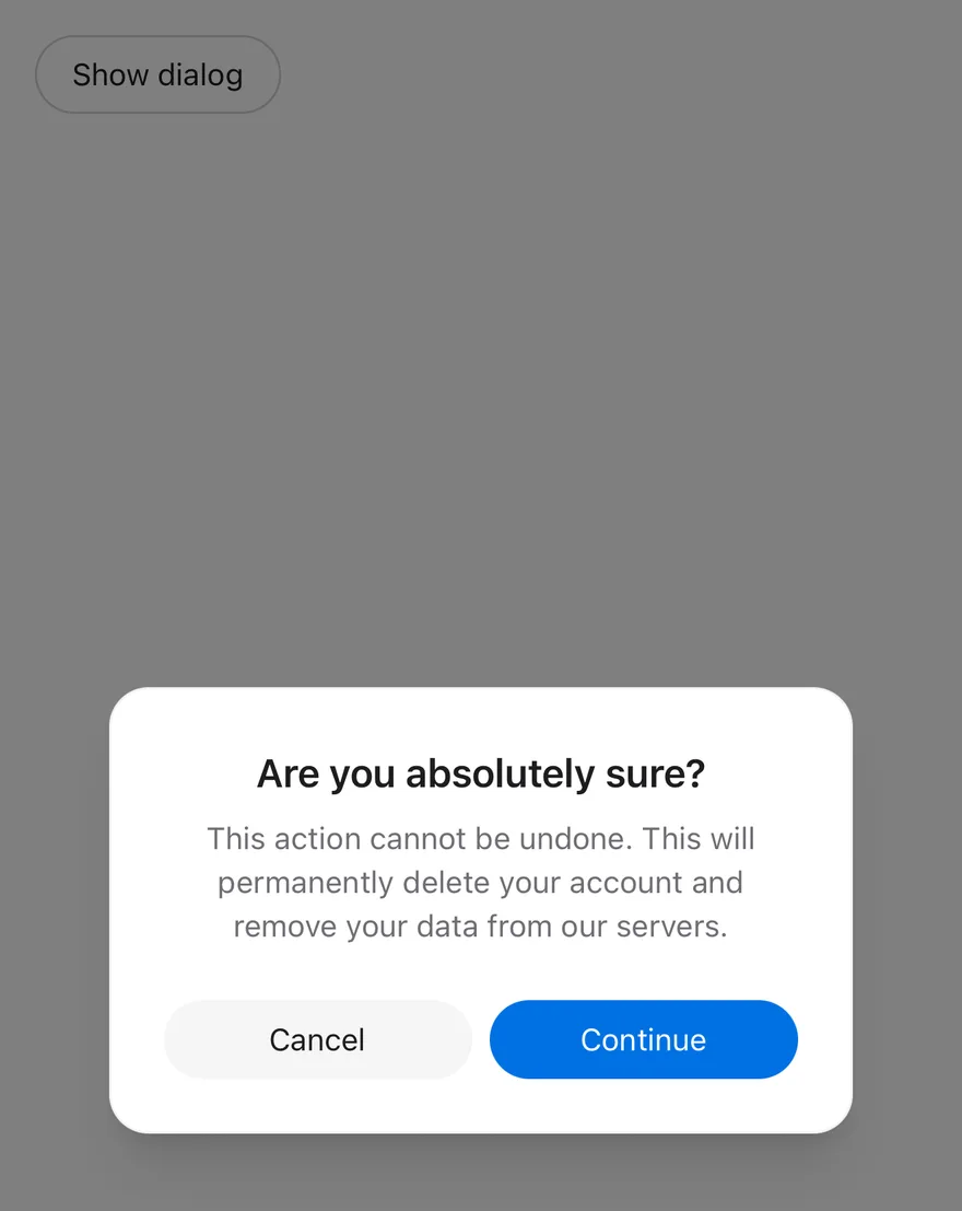
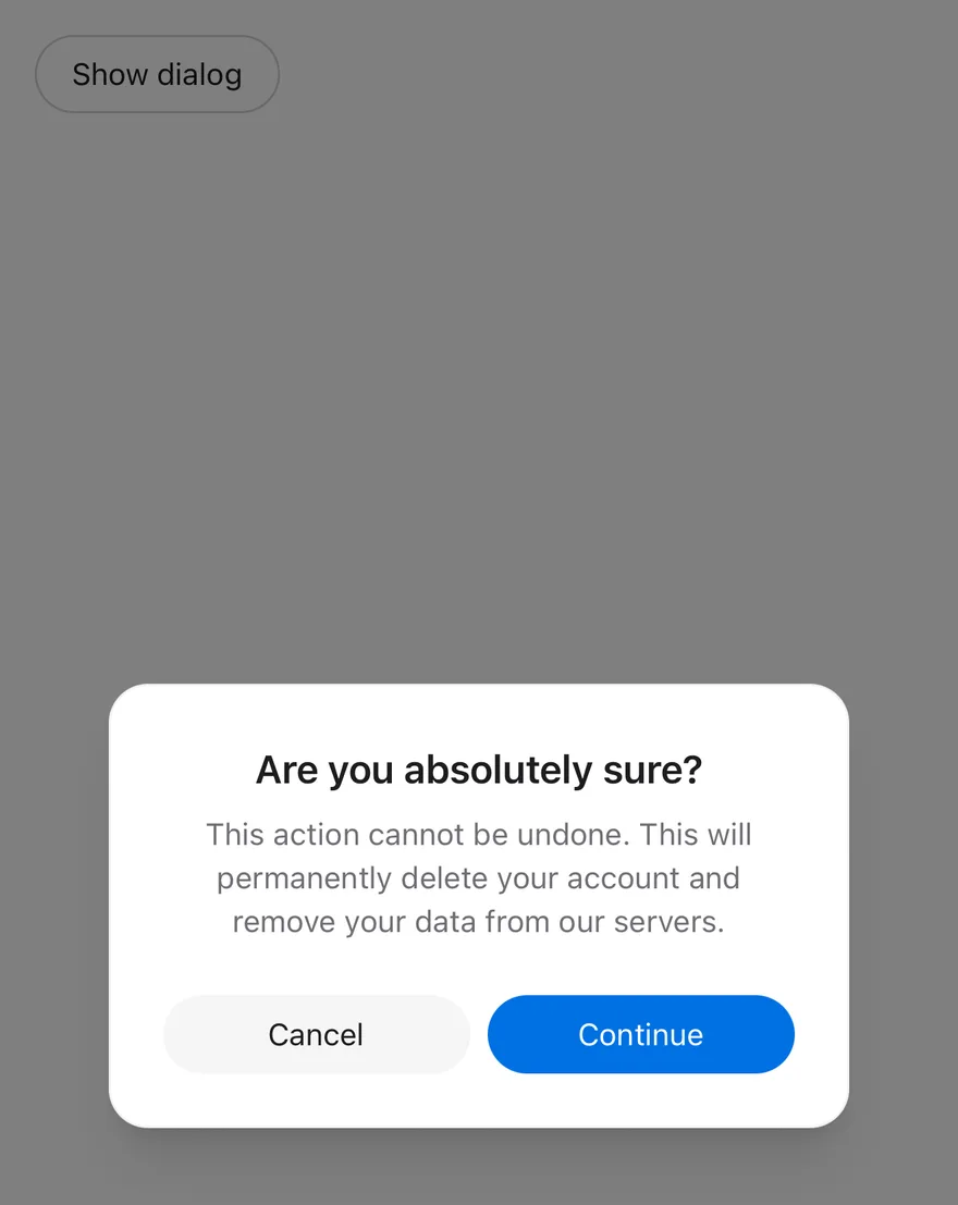
`AlertDialog` is a modal that cannot be dismissed by tapping the scrim. `AlertDialogContent` renders through a portal (inside a full-window overlay on iOS) with a dimmed scrim and a centered card that scales and fades in.
Use it for confirmations that need an explicit choice, such as deleting data. For less critical content that can be dismissed freely, use Dialog; for a list of choices anchored to the bottom of the screen, use Alert Sheet.
## Installation
**React Native**
```bash title="Terminal"
npx shadcn@latest add @esuiss-rn/alert-dialog
```
See [Installation](https://ui.suiss.app/docs/installation) for the `components.json` setup. Or use the suiss/ui CLI:
```bash title="Terminal"
npx @esuiss/ui@latest add alert-dialog
```
**SwiftUI**
```bash title="Terminal"
npx @esuiss/ui@latest add alert-dialog --platform swift
```
**Jetpack Compose**
```bash title="Terminal"
npx @esuiss/ui@latest add alert-dialog --platform kotlin
```
The CLI also adds what it builds on: [Button](https://ui.suiss.app/docs/components/button), [Icon](https://ui.suiss.app/docs/components/icon), [Text](https://ui.suiss.app/docs/components/text). On React Native it also adds the animated view `components/ui/animated-view.tsx`.
### Manual
**React Native**
**Uniwind**
1. Install the dependencies:
```bash title="Terminal"
npx expo install cn react-native-reanimated react-native-screens react-native-worklets
```
2. Add the pieces it builds on: [Button](https://ui.suiss.app/docs/components/button), [Icon](https://ui.suiss.app/docs/components/icon), [Text](https://ui.suiss.app/docs/components/text), and the primitives `components/primitives/alert-dialog.tsx`, `components/primitives/use-render.tsx`, and the animated view `components/ui/animated-view.tsx` from the next step.
3. Copy the animated view into `components/ui/animated-view.tsx`:
- `uniwind/components/ui/animated-view.tsx`: [source](https://github.com/e-suiss/ui/blob/main/packages/mobile/uniwind/components/ui/animated-view.tsx)
4. Copy the source into `components/ui/alert-dialog.tsx`:
```tsx title="uniwind/components/ui/alert-dialog.tsx"
import { cn } from "cn"
import * as React from "react"
import { Platform, View, type ViewProps } from "react-native"
import {
FadeIn,
FadeOut,
Keyframe,
ReduceMotion,
} from "react-native-reanimated"
import { FullWindowOverlay as RNFullWindowOverlay } from "react-native-screens"
import * as AlertDialogPrimitive from "@/components/primitives/alert-dialog"
import { resolveClassName } from "@/components/primitives/use-render"
import { AnimatedView } from "@/components/ui/animated-view"
import { Button } from "@/components/ui/button"
import { IconClassContext } from "@/components/ui/icon"
import { TextClassContext } from "@/components/ui/text"
const AlertDialog = AlertDialogPrimitive.Root
const AlertDialogTrigger = AlertDialogPrimitive.Trigger
const AlertDialogPortal = AlertDialogPrimitive.Portal
const FullWindowOverlay =
Platform.OS === "ios" ? RNFullWindowOverlay : React.Fragment
const POPUP_ENTERING = new Keyframe({
0: { opacity: 0, transform: [{ scale: 0.95 }] },
100: { opacity: 1, transform: [{ scale: 1 }] },
})
.duration(150)
.reduceMotion(ReduceMotion.System)
const POPUP_EXITING = new Keyframe({
0: { opacity: 1, transform: [{ scale: 1 }] },
100: { opacity: 0, transform: [{ scale: 0.95 }] },
})
.duration(100)
.reduceMotion(ReduceMotion.System)
const AlertDialogFooterContext = React.createContext(false)
function AlertDialogOverlay({
className,
...props
}: React.ComponentProps) {
return (
}
className={(state) =>
cn(
"absolute top-0 right-0 bottom-0 left-0 z-50 bg-black/50",
resolveClassName(className, state)
)
}
{...props}
/>
)
}
function AlertDialogContent({
className,
portalHost,
size = "default",
...props
}: React.ComponentProps & {
portalHost?: string
size?: "default" | "sm"
}) {
return (
cn(
"z-50 w-full flex-col gap-6 rounded-2xl border border-foreground/5 bg-popover p-6 shadow-xl dark:border-foreground/10",
resolveClassName(className, state)
)
}
{...props}
/>
)
}
function AlertDialogHeader({ className, ...props }: ViewProps) {
return (
)
}
function AlertDialogFooter({ className, ...props }: ViewProps) {
return (
)
}
function AlertDialogMedia({ className, ...props }: ViewProps) {
return (
)
}
function AlertDialogTitle({
className,
...props
}: React.ComponentProps) {
return (
cn(
"text-center text-lg font-semibold text-foreground",
resolveClassName(className, state)
)
}
{...props}
/>
)
}
function AlertDialogDescription({
className,
...props
}: React.ComponentProps) {
return (
cn(
"text-center text-sm text-muted-foreground",
resolveClassName(className, state)
)
}
{...props}
/>
)
}
function AlertDialogAction({
className,
variant = "default",
size = "default",
...props
}: React.ComponentProps &
Pick, "variant" | "size">) {
const inFooter = React.useContext(AlertDialogFooterContext)
return (
}
className={(state) =>
cn(inFooter && "flex-1", resolveClassName(className, state))
}
{...props}
/>
)
}
function AlertDialogCancel({
className,
variant = "secondary",
size = "default",
...props
}: React.ComponentProps &
Pick, "variant" | "size">) {
const inFooter = React.useContext(AlertDialogFooterContext)
return (
}
className={(state) =>
cn(inFooter && "flex-1", resolveClassName(className, state))
}
{...props}
/>
)
}
export {
AlertDialog,
AlertDialogAction,
AlertDialogCancel,
AlertDialogContent,
AlertDialogDescription,
AlertDialogFooter,
AlertDialogHeader,
AlertDialogMedia,
AlertDialogOverlay,
AlertDialogPortal,
AlertDialogTitle,
AlertDialogTrigger,
}
```
5. Update the import paths to match your project.
**NativeWind**
1. Install the dependencies:
```bash title="Terminal"
npx expo install cn react-native-reanimated react-native-screens react-native-worklets
```
2. Add the pieces it builds on: [Button](https://ui.suiss.app/docs/components/button), [Icon](https://ui.suiss.app/docs/components/icon), [Text](https://ui.suiss.app/docs/components/text), and the primitives `components/primitives/alert-dialog.tsx`, `components/primitives/use-render.tsx`, and the animated view `components/ui/animated-view.tsx` from the next step.
3. Copy the animated view into `components/ui/animated-view.tsx`:
- `nativewind/components/ui/animated-view.tsx`: [source](https://github.com/e-suiss/ui/blob/main/packages/mobile/nativewind/components/ui/animated-view.tsx)
4. Copy the source into `components/ui/alert-dialog.tsx`:
```tsx title="nativewind/components/ui/alert-dialog.tsx"
import { cn } from "cn"
import * as React from "react"
import { Platform, View, type ViewProps } from "react-native"
import {
FadeIn,
FadeOut,
Keyframe,
ReduceMotion,
} from "react-native-reanimated"
import { FullWindowOverlay as RNFullWindowOverlay } from "react-native-screens"
import * as AlertDialogPrimitive from "@/components/primitives/alert-dialog"
import { resolveClassName } from "@/components/primitives/use-render"
import { AnimatedView } from "@/components/ui/animated-view"
import { Button } from "@/components/ui/button"
import { IconClassContext } from "@/components/ui/icon"
import { TextClassContext } from "@/components/ui/text"
const AlertDialog = AlertDialogPrimitive.Root
const AlertDialogTrigger = AlertDialogPrimitive.Trigger
const AlertDialogPortal = AlertDialogPrimitive.Portal
const FullWindowOverlay =
Platform.OS === "ios" ? RNFullWindowOverlay : React.Fragment
const POPUP_ENTERING = new Keyframe({
0: { opacity: 0, transform: [{ scale: 0.95 }] },
100: { opacity: 1, transform: [{ scale: 1 }] },
})
.duration(150)
.reduceMotion(ReduceMotion.System)
const POPUP_EXITING = new Keyframe({
0: { opacity: 1, transform: [{ scale: 1 }] },
100: { opacity: 0, transform: [{ scale: 0.95 }] },
})
.duration(100)
.reduceMotion(ReduceMotion.System)
const AlertDialogFooterContext = React.createContext(false)
function AlertDialogOverlay({
className,
...props
}: React.ComponentProps) {
return (
}
className={(state) =>
cn(
"absolute top-0 right-0 bottom-0 left-0 z-50 bg-black/50",
resolveClassName(className, state)
)
}
{...props}
/>
)
}
function AlertDialogContent({
className,
portalHost,
size = "default",
...props
}: React.ComponentProps & {
portalHost?: string
size?: "default" | "sm"
}) {
return (
cn(
"z-50 w-full flex-col gap-6 rounded-2xl border border-foreground-5 bg-popover p-6 shadow-xl dark:border-foreground-10",
resolveClassName(className, state)
)
}
{...props}
/>
)
}
function AlertDialogHeader({ className, ...props }: ViewProps) {
return (
)
}
function AlertDialogFooter({ className, ...props }: ViewProps) {
return (
)
}
function AlertDialogMedia({ className, ...props }: ViewProps) {
return (
)
}
function AlertDialogTitle({
className,
...props
}: React.ComponentProps) {
return (
cn(
"text-center text-lg font-semibold text-foreground",
resolveClassName(className, state)
)
}
{...props}
/>
)
}
function AlertDialogDescription({
className,
...props
}: React.ComponentProps) {
return (
cn(
"text-center text-sm text-muted-foreground",
resolveClassName(className, state)
)
}
{...props}
/>
)
}
function AlertDialogAction({
className,
variant = "default",
size = "default",
...props
}: React.ComponentProps &
Pick, "variant" | "size">) {
const inFooter = React.useContext(AlertDialogFooterContext)
return (
}
className={(state) =>
cn(inFooter && "flex-1", resolveClassName(className, state))
}
{...props}
/>
)
}
function AlertDialogCancel({
className,
variant = "secondary",
size = "default",
...props
}: React.ComponentProps &
Pick, "variant" | "size">) {
const inFooter = React.useContext(AlertDialogFooterContext)
return (
}
className={(state) =>
cn(inFooter && "flex-1", resolveClassName(className, state))
}
{...props}
/>
)
}
export {
AlertDialog,
AlertDialogAction,
AlertDialogCancel,
AlertDialogContent,
AlertDialogDescription,
AlertDialogFooter,
AlertDialogHeader,
AlertDialogMedia,
AlertDialogOverlay,
AlertDialogPortal,
AlertDialogTitle,
AlertDialogTrigger,
}
```
5. Update the import paths to match your project.
**StyleSheet**
1. Install the dependencies:
```bash title="Terminal"
npx expo install react-native-reanimated react-native-screens react-native-worklets
```
2. Add the pieces it builds on: [Button](https://ui.suiss.app/docs/components/button), [Icon](https://ui.suiss.app/docs/components/icon), [Text](https://ui.suiss.app/docs/components/text), and the primitives `components/primitives/alert-dialog.tsx`, `components/primitives/use-render.tsx`, and the animated view `components/ui/animated-view.tsx` from the next step.
3. Copy the animated view into `components/ui/animated-view.tsx`:
- `stylesheet/components/ui/animated-view.tsx`: [source](https://github.com/e-suiss/ui/blob/main/packages/mobile/stylesheet/components/ui/animated-view.tsx)
4. Copy the source into `components/ui/alert-dialog.tsx`:
```tsx title="stylesheet/components/ui/alert-dialog.tsx"
import * as React from "react"
import { Platform, StyleSheet, View, type ViewProps } from "react-native"
import {
FadeIn,
FadeOut,
Keyframe,
ReduceMotion,
} from "react-native-reanimated"
import { FullWindowOverlay as RNFullWindowOverlay } from "react-native-screens"
import * as AlertDialogPrimitive from "@/components/primitives/alert-dialog"
import { AnimatedView } from "@/components/ui/animated-view"
import { Button } from "@/components/ui/button"
import { TextStyleContext } from "@/components/ui/text"
import { fontSize, radius, shadow, useTheme } from "@/components/ui/theme"
const AlertDialog = AlertDialogPrimitive.Root
const AlertDialogTrigger = AlertDialogPrimitive.Trigger
const AlertDialogPortal = AlertDialogPrimitive.Portal
const FullWindowOverlay =
Platform.OS === "ios" ? RNFullWindowOverlay : React.Fragment
const POPUP_ENTERING = new Keyframe({
0: { opacity: 0, transform: [{ scale: 0.95 }] },
100: { opacity: 1, transform: [{ scale: 1 }] },
})
.duration(150)
.reduceMotion(ReduceMotion.System)
const POPUP_EXITING = new Keyframe({
0: { opacity: 1, transform: [{ scale: 1 }] },
100: { opacity: 0, transform: [{ scale: 0.95 }] },
})
.duration(100)
.reduceMotion(ReduceMotion.System)
const AlertDialogFooterContext = React.createContext(false)
const styles = StyleSheet.create({
backdrop: { ...StyleSheet.absoluteFill, zIndex: 50 },
container: {
...StyleSheet.absoluteFill,
zIndex: 50,
alignItems: "center",
justifyContent: "center",
padding: 16,
pointerEvents: "box-none",
},
containerInner: { width: "100%", maxWidth: 340, pointerEvents: "box-none" },
containerInnerSm: { maxWidth: 320 },
content: {
zIndex: 50,
width: "100%",
flexDirection: "column",
gap: 24,
borderRadius: radius["2xl"],
borderWidth: 1,
padding: 24,
...shadow.xl,
},
header: { flexDirection: "column", alignItems: "center", gap: 6 },
footer: { flexDirection: "row", gap: 8 },
footerItem: { flex: 1 },
media: {
marginBottom: 8,
width: 64,
height: 64,
alignItems: "center",
justifyContent: "center",
borderRadius: radius.full,
},
title: { ...fontSize.lg, fontWeight: "600", textAlign: "center" },
description: { ...fontSize.sm, textAlign: "center" },
})
function withAlpha(hex: string, alpha: number) {
const value = Number.parseInt(hex.slice(1), 16)
return `rgba(${(value >> 16) & 255}, ${(value >> 8) & 255}, ${value & 255}, ${alpha})`
}
function AlertDialogOverlay({
style,
...props
}: React.ComponentProps) {
return (
}
style={(state) => [
styles.backdrop,
{ backgroundColor: "rgba(0, 0, 0, 0.5)" },
typeof style === "function" ? style(state) : style,
]}
{...props}
/>
)
}
function AlertDialogContent({
style,
portalHost,
size = "default",
...props
}: React.ComponentProps & {
portalHost?: string
size?: "default" | "sm"
}) {
const { colors, isDark } = useTheme()
return (
[
styles.content,
{
borderColor: withAlpha(
colors.foreground,
isDark ? 0.1 : 0.05
),
backgroundColor: colors.popover,
},
typeof style === "function" ? style(state) : style,
]}
{...props}
/>
)
}
function AlertDialogHeader({ style, ...props }: ViewProps) {
return (
)
}
function AlertDialogFooter({ style, ...props }: ViewProps) {
return (
)
}
function AlertDialogMedia({ style, ...props }: ViewProps) {
const { colors } = useTheme()
return (
)
}
function AlertDialogTitle({
style,
...props
}: React.ComponentProps) {
const { colors } = useTheme()
return (
[
styles.title,
{ color: colors.foreground },
typeof style === "function" ? style(state) : style,
]}
{...props}
/>
)
}
function AlertDialogDescription({
style,
...props
}: React.ComponentProps) {
const { colors } = useTheme()
return (
[
styles.description,
{ color: colors.mutedForeground },
typeof style === "function" ? style(state) : style,
]}
{...props}
/>
)
}
function AlertDialogAction({
style,
variant = "default",
size = "default",
...props
}: React.ComponentProps &
Pick, "variant" | "size">) {
const inFooter = React.useContext(AlertDialogFooterContext)
return (
}
style={(state) => [
inFooter && styles.footerItem,
typeof style === "function" ? style(state) : style,
]}
{...props}
/>
)
}
function AlertDialogCancel({
style,
variant = "secondary",
size = "default",
...props
}: React.ComponentProps &
Pick, "variant" | "size">) {
const inFooter = React.useContext(AlertDialogFooterContext)
return (
}
style={(state) => [
inFooter && styles.footerItem,
typeof style === "function" ? style(state) : style,
]}
{...props}
/>
)
}
export {
AlertDialog,
AlertDialogAction,
AlertDialogCancel,
AlertDialogContent,
AlertDialogDescription,
AlertDialogFooter,
AlertDialogHeader,
AlertDialogMedia,
AlertDialogOverlay,
AlertDialogPortal,
AlertDialogTitle,
AlertDialogTrigger,
}
```
5. Update the import paths to match your project.
**SwiftUI**
1. Target iOS 17 or later.
2. Add the Swift package to your app:
```swift title="Package.swift"
.package(url: "https://github.com/phosphor-icons/swift", from: "2.1.0")
```
3. Copy the theme files every view uses:
- `swift/Theme/Theme.swift`: [source](https://github.com/e-suiss/ui/blob/main/packages/mobile/swiftui/Sources/EsuissUI/Theme/Theme.swift)
- `swift/Theme/Tokens.swift`: [source](https://github.com/e-suiss/ui/blob/main/packages/mobile/swiftui/Sources/EsuissUI/Theme/Tokens.swift)
4. Copy the source and every file it uses:
```swift title="swift/Components/AlertDialog.swift"
import SwiftUI
extension View {
public func alertDialog(
isPresented: Binding,
@ViewBuilder content: @escaping () -> Content
) -> some View {
modifier(
CoverPresenter(isPresented: isPresented) { visible in
CenteredStage(visible: visible, dismissible: false, content: content)
}
)
}
}
public struct AlertDialogContent: View {
public enum Size: CaseIterable, Sendable {
case `default`, sm
}
let size: Size
let content: Content
public init(size: Size = .default, @ViewBuilder content: () -> Content) {
self.size = size
self.content = content()
}
public var body: some View {
VStack(spacing: 24) {
content
}
.padding(24)
.frame(maxWidth: size == .sm ? 320 : 340)
.popupSurface(radius: Radius.xl2)
.accessibilityElement(children: .contain)
.accessibilityAddTraits(.isModal)
}
}
public struct AlertDialogHeader: View {
let content: Content
public init(@ViewBuilder content: () -> Content) {
self.content = content()
}
public var body: some View {
VStack(spacing: 6) {
content
}
.multilineTextAlignment(.center)
.frame(maxWidth: .infinity)
}
}
public struct AlertDialogMedia: View {
let content: Content
public init(@ViewBuilder content: () -> Content) {
self.content = content()
}
public var body: some View {
content
.frame(width: 32, height: 32)
.foregroundStyle(EsuissColor.foreground)
.frame(width: 64, height: 64)
.background(EsuissColor.muted, in: Circle())
.padding(.bottom, 8)
.accessibilityHidden(true)
}
}
public struct AlertDialogTitle: View {
let text: Text
public init(_ title: LocalizedStringKey) {
text = Text(title)
}
public init(verbatim title: String) {
text = Text(verbatim: title)
}
public var body: some View {
text
.textStyle(.lg, weight: .semibold)
.foregroundStyle(EsuissColor.foreground)
.multilineTextAlignment(.center)
.fixedSize(horizontal: false, vertical: true)
.accessibilityAddTraits(.isHeader)
}
}
public struct AlertDialogDescription: View {
let text: Text
public init(_ description: LocalizedStringKey) {
text = Text(description)
}
public init(verbatim description: String) {
text = Text(verbatim: description)
}
public var body: some View {
text
.textStyle(.sm)
.foregroundStyle(EsuissColor.mutedForeground)
.multilineTextAlignment(.center)
.fixedSize(horizontal: false, vertical: true)
}
}
public struct AlertDialogFooter: View {
let content: Content
public init(@ViewBuilder content: () -> Content) {
self.content = content()
}
public var body: some View {
HStack(spacing: 8) {
content
}
.frame(maxWidth: .infinity)
}
}
public struct AlertDialogAction: View {
let variant: VariantButtonStyle.Variant
let size: VariantButtonStyle.Size
let action: (() -> Void)?
let label: Label
@Environment(\.overlayDismiss) private var dismiss
public init(
variant: VariantButtonStyle.Variant = .default,
size: VariantButtonStyle.Size = .default,
action: (() -> Void)? = nil,
@ViewBuilder label: () -> Label
) {
self.variant = variant
self.size = size
self.action = action
self.label = label()
}
public var body: some View {
Button {
action?()
dismiss?()
} label: {
label.frame(maxWidth: .infinity)
}
.buttonStyle(.variant(variant, size: size))
}
}
extension AlertDialogAction where Label == Text {
public init(
_ title: LocalizedStringKey,
variant: VariantButtonStyle.Variant = .default,
size: VariantButtonStyle.Size = .default,
action: (() -> Void)? = nil
) {
self.init(variant: variant, size: size, action: action) { Text(title) }
}
}
public struct AlertDialogCancel: View {
let variant: VariantButtonStyle.Variant
let size: VariantButtonStyle.Size
let action: (() -> Void)?
let label: Label
public init(
variant: VariantButtonStyle.Variant = .secondary,
size: VariantButtonStyle.Size = .default,
action: (() -> Void)? = nil,
@ViewBuilder label: () -> Label
) {
self.variant = variant
self.size = size
self.action = action
self.label = label()
}
public var body: some View {
AlertDialogAction(variant: variant, size: size, action: action) { label }
}
}
extension AlertDialogCancel where Label == Text {
public init(
_ title: LocalizedStringKey = "Cancel",
variant: VariantButtonStyle.Variant = .secondary,
size: VariantButtonStyle.Size = .default,
action: (() -> Void)? = nil
) {
self.init(variant: variant, size: size, action: action) { Text(title) }
}
}
```
- `swift/Components/Button.swift`: see [Button](https://ui.suiss.app/docs/components/button.md)
- `swift/Components/ButtonGroup.swift`: see [Button Group](https://ui.suiss.app/docs/components/button-group.md)
- `swift/Components/Dialog.swift`: see [Dialog](https://ui.suiss.app/docs/components/dialog.md)
- `swift/Components/Overlay.swift`: [source](https://github.com/e-suiss/ui/blob/main/packages/mobile/swiftui/Sources/EsuissUI/Components/Overlay.swift)
- `swift/Components/TextVariant.swift`: [source](https://github.com/e-suiss/ui/blob/main/packages/mobile/swiftui/Sources/EsuissUI/Components/TextVariant.swift)
5. Add the files to your app target.
**Jetpack Compose**
1. Set `minSdk` to 24 or higher and add the dependencies:
```kotlin title="build.gradle.kts"
implementation(platform("androidx.compose:compose-bom:2026.09.00"))
implementation("androidx.compose.foundation:foundation")
implementation("androidx.compose.ui:ui")
implementation("com.adamglin:phosphor-icon-android:1.0.0")
```
2. Copy the theme files every view uses:
- `kotlin/theme/Theme.kt`: [source](https://github.com/e-suiss/ui/blob/main/packages/mobile/kotlin/ui/src/main/kotlin/com/esuiss/ui/theme/Theme.kt)
- `kotlin/theme/Tokens.kt`: [source](https://github.com/e-suiss/ui/blob/main/packages/mobile/kotlin/ui/src/main/kotlin/com/esuiss/ui/theme/Tokens.kt)
3. Copy the source and every file it uses:
```kt title="kotlin/components/AlertDialog.kt"
package com.esuiss.ui.components
import androidx.compose.foundation.background
import androidx.compose.foundation.layout.Arrangement
import androidx.compose.foundation.layout.Box
import androidx.compose.foundation.layout.BoxScope
import androidx.compose.foundation.layout.Column
import androidx.compose.foundation.layout.ColumnScope
import androidx.compose.foundation.layout.Row
import androidx.compose.foundation.layout.RowScope
import androidx.compose.foundation.layout.fillMaxWidth
import androidx.compose.foundation.layout.padding
import androidx.compose.foundation.layout.size
import androidx.compose.foundation.shape.CircleShape
import androidx.compose.foundation.text.BasicText
import androidx.compose.runtime.Composable
import androidx.compose.runtime.CompositionLocalProvider
import androidx.compose.runtime.staticCompositionLocalOf
import androidx.compose.ui.Alignment
import androidx.compose.ui.Modifier
import androidx.compose.ui.unit.Dp
import androidx.compose.ui.unit.dp
import com.esuiss.ui.theme.EsuissTheme
import com.esuiss.ui.theme.Typography
enum class AlertDialogSize(val maxWidth: Dp) {
Default(340.dp),
Sm(320.dp),
}
private val LocalAlertDialogClose = staticCompositionLocalOf<() -> Unit> { {} }
@Composable
fun AlertDialog(
open: Boolean,
onOpenChange: (Boolean) -> Unit,
modifier: Modifier = Modifier,
size: AlertDialogSize = AlertDialogSize.Default,
content: @Composable ColumnScope.() -> Unit,
) {
val close = { onOpenChange(false) }
CompositionLocalProvider(LocalAlertDialogClose provides close) {
CenteredModal(
open = open,
onDismissRequest = close,
dismissOnScrimClick = false,
maxWidth = size.maxWidth,
modifier = modifier,
content = content,
)
}
}
@Composable
fun AlertDialogHeader(
modifier: Modifier = Modifier,
content: @Composable ColumnScope.() -> Unit,
) {
Column(
modifier = modifier.fillMaxWidth(),
horizontalAlignment = Alignment.CenterHorizontally,
verticalArrangement = Arrangement.spacedBy(6.dp),
content = content,
)
}
@Composable
fun AlertDialogMedia(
modifier: Modifier = Modifier,
content: @Composable BoxScope.() -> Unit,
) {
val colors = EsuissTheme.colors
Box(
modifier = modifier
.padding(bottom = 8.dp)
.size(64.dp)
.background(colors.muted, CircleShape),
contentAlignment = Alignment.Center,
) {
CompositionLocalProvider(LocalIconSize provides 32.dp, LocalContentColor provides colors.foreground) {
content()
}
}
}
@Composable
fun AlertDialogTitle(text: String, modifier: Modifier = Modifier) {
OverlayTitle(text, modifier, titleStyle(EsuissTheme.colors, Typography.lg, centered = true))
}
@Composable
fun AlertDialogDescription(text: String, modifier: Modifier = Modifier) {
BasicText(text, modifier = modifier, style = descriptionStyle(EsuissTheme.colors, centered = true))
}
@Composable
fun AlertDialogFooter(
modifier: Modifier = Modifier,
content: @Composable RowScope.() -> Unit,
) {
Row(
modifier = modifier.fillMaxWidth(),
horizontalArrangement = Arrangement.spacedBy(8.dp),
verticalAlignment = Alignment.CenterVertically,
content = content,
)
}
@Composable
fun RowScope.AlertDialogAction(
text: String,
onClick: () -> Unit,
modifier: Modifier = Modifier,
variant: ButtonVariant = ButtonVariant.Default,
size: ButtonSize = ButtonSize.Default,
) {
val close = LocalAlertDialogClose.current
Button(
text = text,
onClick = {
onClick()
close()
},
modifier = modifier.weight(1f),
variant = variant,
size = size,
)
}
@Composable
fun RowScope.AlertDialogCancel(
text: String,
modifier: Modifier = Modifier,
onClick: () -> Unit = {},
variant: ButtonVariant = ButtonVariant.Secondary,
size: ButtonSize = ButtonSize.Default,
) {
AlertDialogAction(text, onClick, modifier, variant, size)
}
```
- `kotlin/components/Button.kt`: see [Button](https://ui.suiss.app/docs/components/button.md)
- `kotlin/components/ButtonGroup.kt`: see [Button Group](https://ui.suiss.app/docs/components/button-group.md)
- `kotlin/components/Content.kt`: [source](https://github.com/e-suiss/ui/blob/main/packages/mobile/kotlin/ui/src/main/kotlin/com/esuiss/ui/components/Content.kt)
- `kotlin/components/Dialog.kt`: see [Dialog](https://ui.suiss.app/docs/components/dialog.md)
- `kotlin/components/Icon.kt`: see [Icon](https://ui.suiss.app/docs/components/icon.md)
- `kotlin/components/Overlay.kt`: [source](https://github.com/e-suiss/ui/blob/main/packages/mobile/kotlin/ui/src/main/kotlin/com/esuiss/ui/components/Overlay.kt)
4. Update the `com.esuiss.ui` package names to match your project.
## Usage
```tsx
import { AlertDialogOverlay, AlertDialogContent, AlertDialogHeader, AlertDialogFooter, AlertDialogMedia, AlertDialogTitle, AlertDialogDescription, AlertDialogAction, AlertDialogCancel } from "@/components/ui/alert-dialog"
```
```tsx
}>
Show dialog
```
Compose `AlertDialogTrigger`, then `AlertDialogContent` with an `AlertDialogHeader` (`AlertDialogTitle`, `AlertDialogDescription`) and an `AlertDialogFooter` holding `AlertDialogCancel` and `AlertDialogAction`. Both footer buttons close the dialog and stretch to equal widths inside the footer.
`AlertDialogAction` and `AlertDialogCancel` accept Button's `variant` and `size`; use `variant="destructive"` for destructive confirmations. Add `AlertDialogMedia` above the title for an icon badge.
Use `open` and `onOpenChange` for controlled state, or `defaultOpen` for uncontrolled. Pass `portalHost` to render into a named portal host.
## Examples
### Default
```tsx
import { View } from "react-native"
import { AlertDialog, AlertDialogAction, AlertDialogCancel, AlertDialogContent, AlertDialogDescription, AlertDialogFooter, AlertDialogHeader, AlertDialogTitle, AlertDialogTrigger } from "@/components/ui/alert-dialog"
import { Button } from "@/components/ui/button"
import { Text } from "@/components/ui/text"
function AlertDialogBody() {
return (
Are you absolutely sure?
This action cannot be undone. This will permanently delete your
account and remove your data from our servers.
Cancel
Continue
)
}
export function AlertDialogExample() {
return (
}>
Show dialog
)
}
```
```swift
import EsuissUI
import SwiftUI
struct AlertDialogExample: View {
var body: some View {
AlertDialogDemo(title: "Show dialog", variant: .outline) {
AlertDialogBody()
}
}
}
struct AlertDialogDemo: View {
let title: LocalizedStringKey
let variant: VariantButtonStyle.Variant
let content: () -> Body
@State private var open: Bool
init(
title: LocalizedStringKey,
variant: VariantButtonStyle.Variant,
open: Bool = false,
@ViewBuilder content: @escaping () -> Body
) {
self.title = title
self.variant = variant
self.content = content
_open = State(initialValue: open)
}
var body: some View {
Button(title) { open = true }
.buttonStyle(.variant(variant))
.alertDialog(isPresented: $open, content: content)
}
}
struct AlertDialogBody: View {
var body: some View {
AlertDialogContent {
AlertDialogHeader {
AlertDialogTitle("Are you absolutely sure?")
AlertDialogDescription(
"This action cannot be undone. This will permanently delete your account and remove your data from our servers."
)
}
AlertDialogFooter {
AlertDialogCancel()
AlertDialogAction("Continue")
}
}
}
}
```
```kotlin
import androidx.compose.foundation.layout.Column
import androidx.compose.runtime.Composable
import androidx.compose.runtime.getValue
import androidx.compose.runtime.mutableStateOf
import androidx.compose.runtime.saveable.rememberSaveable
import androidx.compose.runtime.setValue
import com.esuiss.ui.components.AlertDialog
import com.esuiss.ui.components.AlertDialogAction
import com.esuiss.ui.components.AlertDialogCancel
import com.esuiss.ui.components.AlertDialogDescription
import com.esuiss.ui.components.AlertDialogFooter
import com.esuiss.ui.components.AlertDialogHeader
import com.esuiss.ui.components.AlertDialogTitle
import com.esuiss.ui.components.Button
import com.esuiss.ui.components.ButtonVariant
@Composable
fun AlertDialogExample() {
AlertDialogDefault(defaultOpen = false)
}
@Composable
fun AlertDialogDefault(defaultOpen: Boolean) {
var open by rememberSaveable { mutableStateOf(defaultOpen) }
Column {
Button("Show dialog", onClick = { open = true }, variant = ButtonVariant.Outline)
AlertDialog(open = open, onOpenChange = { open = it }) {
AlertDialogHeader {
AlertDialogTitle("Are you absolutely sure?")
AlertDialogDescription(
"This action cannot be undone. This will permanently delete your account and remove your data from our servers.",
)
}
AlertDialogFooter {
AlertDialogCancel("Cancel")
AlertDialogAction("Continue", onClick = {})
}
}
}
}
```
### Small
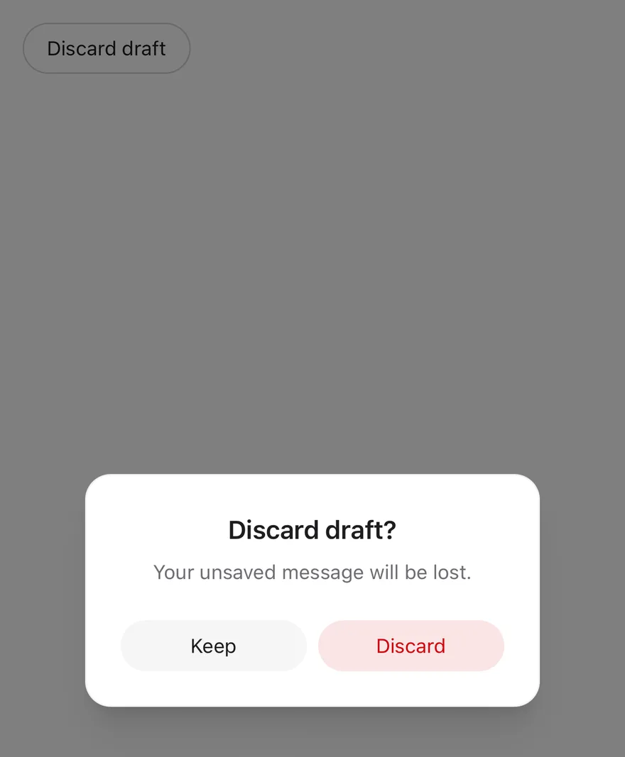
The narrower `sm` content size.
```tsx
import { View } from "react-native"
import { AlertDialog, AlertDialogAction, AlertDialogCancel, AlertDialogContent, AlertDialogDescription, AlertDialogFooter, AlertDialogHeader, AlertDialogTitle, AlertDialogTrigger } from "@/components/ui/alert-dialog"
import { Button } from "@/components/ui/button"
import { Text } from "@/components/ui/text"
export function AlertDialogSmallExample() {
return (
}>
Discard draft
Discard draft?
Your unsaved message will be lost.
Keep
Discard
)
}
```
```swift
import EsuissUI
import SwiftUI
struct AlertDialogSmallExample: View {
var body: some View {
AlertDialogDemo(title: "Discard draft", variant: .outline) {
AlertDialogContent(size: .sm) {
AlertDialogHeader {
AlertDialogTitle("Discard draft?")
AlertDialogDescription("Your unsaved message will be lost.")
}
AlertDialogFooter {
AlertDialogCancel("Keep")
AlertDialogAction("Discard", variant: .destructive)
}
}
}
}
}
struct AlertDialogDemo: View {
let title: LocalizedStringKey
let variant: VariantButtonStyle.Variant
let content: () -> Body
@State private var open: Bool
init(
title: LocalizedStringKey,
variant: VariantButtonStyle.Variant,
open: Bool = false,
@ViewBuilder content: @escaping () -> Body
) {
self.title = title
self.variant = variant
self.content = content
_open = State(initialValue: open)
}
var body: some View {
Button(title) { open = true }
.buttonStyle(.variant(variant))
.alertDialog(isPresented: $open, content: content)
}
}
```
```kotlin
import androidx.compose.foundation.layout.Column
import androidx.compose.runtime.Composable
import androidx.compose.runtime.getValue
import androidx.compose.runtime.mutableStateOf
import androidx.compose.runtime.saveable.rememberSaveable
import androidx.compose.runtime.setValue
import com.esuiss.ui.components.AlertDialog
import com.esuiss.ui.components.AlertDialogAction
import com.esuiss.ui.components.AlertDialogCancel
import com.esuiss.ui.components.AlertDialogDescription
import com.esuiss.ui.components.AlertDialogFooter
import com.esuiss.ui.components.AlertDialogHeader
import com.esuiss.ui.components.AlertDialogSize
import com.esuiss.ui.components.AlertDialogTitle
import com.esuiss.ui.components.Button
import com.esuiss.ui.components.ButtonVariant
@Composable
fun AlertDialogSmall() {
var open by rememberSaveable { mutableStateOf(false) }
Column {
Button("Discard draft", onClick = { open = true }, variant = ButtonVariant.Outline)
AlertDialog(open = open, onOpenChange = { open = it }, size = AlertDialogSize.Sm) {
AlertDialogHeader {
AlertDialogTitle("Discard draft?")
AlertDialogDescription("Your unsaved message will be lost.")
}
AlertDialogFooter {
AlertDialogCancel("Keep")
AlertDialogAction("Discard", onClick = {}, variant = ButtonVariant.Destructive)
}
}
}
}
```
### With media
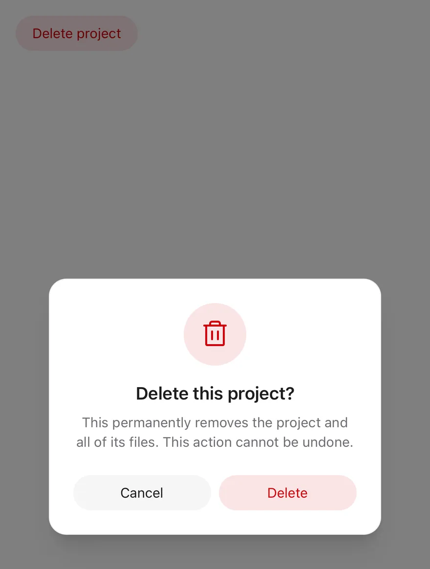
An icon badge above the title with `AlertDialogMedia`.
```tsx
import { TrashIcon } from "phosphor-react-native"
import { View } from "react-native"
import { AlertDialog, AlertDialogAction, AlertDialogCancel, AlertDialogContent, AlertDialogDescription, AlertDialogFooter, AlertDialogHeader, AlertDialogMedia, AlertDialogTitle, AlertDialogTrigger } from "@/components/ui/alert-dialog"
import { Button } from "@/components/ui/button"
import { Icon } from "@/components/ui/icon"
import { Text } from "@/components/ui/text"
export function AlertDialogWithMediaExample() {
return (
}>
Delete project
Delete this project?
This permanently removes the project and all of its files. This
action cannot be undone.
Cancel
Delete
)
}
```
```swift
import EsuissUI
import PhosphorSwift
import SwiftUI
struct AlertDialogWithMediaExample: View {
var body: some View {
AlertDialogDemo(title: "Delete project", variant: .destructive) {
AlertDialogContent {
AlertDialogHeader {
AlertDialogMedia {
Ph.trash.regular
.foregroundStyle(EsuissColor.destructive)
}
AlertDialogTitle("Delete this project?")
AlertDialogDescription(
"This permanently removes the project and all of its files. This action cannot be undone."
)
}
AlertDialogFooter {
AlertDialogCancel()
AlertDialogAction("Delete", variant: .destructive)
}
}
}
}
}
struct AlertDialogDemo: View {
let title: LocalizedStringKey
let variant: VariantButtonStyle.Variant
let content: () -> Body
@State private var open: Bool
init(
title: LocalizedStringKey,
variant: VariantButtonStyle.Variant,
open: Bool = false,
@ViewBuilder content: @escaping () -> Body
) {
self.title = title
self.variant = variant
self.content = content
_open = State(initialValue: open)
}
var body: some View {
Button(title) { open = true }
.buttonStyle(.variant(variant))
.alertDialog(isPresented: $open, content: content)
}
}
```
```kotlin
import androidx.compose.foundation.background
import androidx.compose.foundation.layout.Box
import androidx.compose.foundation.layout.Column
import androidx.compose.foundation.shape.CircleShape
import androidx.compose.runtime.Composable
import androidx.compose.runtime.getValue
import androidx.compose.runtime.mutableStateOf
import androidx.compose.runtime.saveable.rememberSaveable
import androidx.compose.runtime.setValue
import androidx.compose.ui.Modifier
import com.adamglin.PhosphorIcons
import com.adamglin.phosphoricons.Regular
import com.adamglin.phosphoricons.regular.Trash
import com.esuiss.ui.components.AlertDialog
import com.esuiss.ui.components.AlertDialogAction
import com.esuiss.ui.components.AlertDialogCancel
import com.esuiss.ui.components.AlertDialogDescription
import com.esuiss.ui.components.AlertDialogFooter
import com.esuiss.ui.components.AlertDialogHeader
import com.esuiss.ui.components.AlertDialogMedia
import com.esuiss.ui.components.AlertDialogTitle
import com.esuiss.ui.components.Button
import com.esuiss.ui.components.ButtonVariant
import com.esuiss.ui.components.Icon
import com.esuiss.ui.theme.EsuissTheme
@Composable
fun AlertDialogWithMedia() {
var open by rememberSaveable { mutableStateOf(false) }
val colors = EsuissTheme.colors
Column {
Button("Delete project", onClick = { open = true }, variant = ButtonVariant.Destructive)
AlertDialog(open = open, onOpenChange = { open = it }) {
AlertDialogHeader {
AlertDialogMedia {
Box(
Modifier
.matchParentSize()
.background(colors.popover, CircleShape)
.background(colors.destructive.copy(alpha = 0.1f), CircleShape),
)
Icon(PhosphorIcons.Regular.Trash, contentDescription = null, tint = colors.destructive)
}
AlertDialogTitle("Delete this project?")
AlertDialogDescription(
"This permanently removes the project and all of its files. This action cannot be undone.",
)
}
AlertDialogFooter {
AlertDialogCancel("Cancel")
AlertDialogAction("Delete", onClick = {}, variant = ButtonVariant.Destructive)
}
}
}
}
```
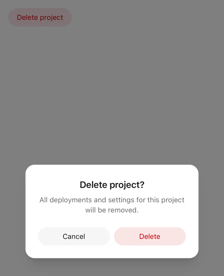
### Destructive
A destructive action button for an irreversible confirmation.
```tsx
import { View } from "react-native"
import { AlertDialog, AlertDialogAction, AlertDialogCancel, AlertDialogContent, AlertDialogDescription, AlertDialogFooter, AlertDialogHeader, AlertDialogTitle, AlertDialogTrigger } from "@/components/ui/alert-dialog"
import { Button } from "@/components/ui/button"
import { Text } from "@/components/ui/text"
export function AlertDialogDestructiveExample() {
return (
}>
Delete project
Delete project?
All deployments and settings for this project will be removed.
Cancel
Delete
)
}
```
```swift
import EsuissUI
import SwiftUI
struct AlertDialogDestructiveExample: View {
var body: some View {
AlertDialogDemo(title: "Delete project", variant: .destructive) {
AlertDialogContent {
AlertDialogHeader {
AlertDialogTitle("Delete project?")
AlertDialogDescription("All deployments and settings for this project will be removed.")
}
AlertDialogFooter {
AlertDialogCancel()
AlertDialogAction("Delete", variant: .destructive)
}
}
}
}
}
struct AlertDialogDemo: View {
let title: LocalizedStringKey
let variant: VariantButtonStyle.Variant
let content: () -> Body
@State private var open: Bool
init(
title: LocalizedStringKey,
variant: VariantButtonStyle.Variant,
open: Bool = false,
@ViewBuilder content: @escaping () -> Body
) {
self.title = title
self.variant = variant
self.content = content
_open = State(initialValue: open)
}
var body: some View {
Button(title) { open = true }
.buttonStyle(.variant(variant))
.alertDialog(isPresented: $open, content: content)
}
}
```
```kotlin
import androidx.compose.foundation.layout.Column
import androidx.compose.runtime.Composable
import androidx.compose.runtime.getValue
import androidx.compose.runtime.mutableStateOf
import androidx.compose.runtime.saveable.rememberSaveable
import androidx.compose.runtime.setValue
import com.esuiss.ui.components.AlertDialog
import com.esuiss.ui.components.AlertDialogAction
import com.esuiss.ui.components.AlertDialogCancel
import com.esuiss.ui.components.AlertDialogDescription
import com.esuiss.ui.components.AlertDialogFooter
import com.esuiss.ui.components.AlertDialogHeader
import com.esuiss.ui.components.AlertDialogTitle
import com.esuiss.ui.components.Button
import com.esuiss.ui.components.ButtonVariant
@Composable
fun AlertDialogDestructive() {
var open by rememberSaveable { mutableStateOf(false) }
Column {
Button("Delete project", onClick = { open = true }, variant = ButtonVariant.Destructive)
AlertDialog(open = open, onOpenChange = { open = it }) {
AlertDialogHeader {
AlertDialogTitle("Delete project?")
AlertDialogDescription("All deployments and settings for this project will be removed.")
}
AlertDialogFooter {
AlertDialogCancel("Cancel")
AlertDialogAction("Delete", onClick = {}, variant = ButtonVariant.Destructive)
}
}
}
}
```
## API Reference
### AlertDialog
The root that manages the open state.
| Prop | Type | Default | Description |
| --- | --- | --- | --- |
| `open` | `boolean` | - | Whether the dialog is open, for controlled use. |
| `defaultOpen` | `boolean` | `false` | Whether the dialog starts open when uncontrolled. |
| `onOpenChange` | `(open: boolean, details) => void` | - | Called when the dialog opens or closes. |
### AlertDialogOverlay
Dimmed scrim behind the dialog.
Also accepts the props of `React.ComponentProps`.
### AlertDialogContent
Centered card with scale and fade transitions.
| Prop | Type | Default | Description |
| --- | --- | --- | --- |
| `portalHost` | `string` | - | Name of the portal host to render into. |
| `size` | `"default" \| "sm"` | `"default"` | `default` or `sm` maximum width. |
Also accepts the props of `React.ComponentProps`.
### AlertDialogHeader
Centered column for the title and description.
Also accepts the props of `ViewProps`.
### AlertDialogFooter
Row of actions with equal-width buttons.
Also accepts the props of `ViewProps`.
### AlertDialogMedia
Round badge for an icon above the title.
Also accepts the props of `ViewProps`.
### AlertDialogTitle
Dialog heading.
Also accepts the props of `React.ComponentProps`.
### AlertDialogDescription
Supporting text below the title.
Also accepts the props of `React.ComponentProps`.
### AlertDialogAction
Button that confirms and closes the dialog.
Also accepts the props of `React.ComponentProps`, `React.ComponentProps`.
### AlertDialogCancel
Secondary button that closes the dialog.
Also accepts the props of `React.ComponentProps`, `React.ComponentProps`.
## Accessibility
- The popup has the `alertdialog` role, is labelled by the title and is marked as modal for VoiceOver.
- Focus moves to the title when the dialog opens.
- Tapping the scrim does not close it; the Android back button and the VoiceOver escape gesture do.
- The title has the `heading` role, and the action buttons have the `button` role.
## Notes
- On iOS the content is wrapped in a full-window overlay so it appears above native navigation.
- Enter and exit animations respect the system Reduce Motion setting.
- Uses `bg-popover`, `bg-black/50`, `text-foreground` and `text-muted-foreground` tokens; light and dark follow the system appearance.