# Alert
A static callout that draws attention to an important message without interrupting the user.
Alert is an open-source component from suiss/ui for React, React Native, SwiftUI and Jetpack Compose. The @esuiss/ui CLI copies its source into your project, so you own the code.
Source: https://ui.suiss.app/docs/components/alert
**React**
**Example**
```tsx
import { InfoIcon } from "@phosphor-icons/react"
import { Alert, AlertDescription, AlertTitle } from "@/components/ui/alert"
export default function AlertDemo() {
return (
Update available
A new version is ready to install. Restart the app to apply it.
)
}
```
An `Alert` is a rounded container with an optional leading icon, an `AlertTitle`, an optional `AlertDescription` and an optional `AlertAction`. Place the icon as a direct child; the layout switches to a two-column grid so the title and description align beside it.
Use an alert for inline, persistent messages such as updates, warnings or errors. To interrupt the user and require a decision, use Alert Dialog instead; for short-lived notifications, use Toast.
## Installation
### CLI
```bash title="Terminal"
npx shadcn@latest add @esuiss/alert
```
Works in any project with a `components.json`. See [Installation](https://ui.suiss.app/docs/installation#add-components) for the one-line registry setup. Or use the suiss/ui CLI:
```bash title="Terminal"
npx @esuiss/ui@latest add alert
```
### Manual
1. Install the dependencies and add the [`cn` helper](https://ui.suiss.app/docs/installation#the-cn-helper):
```bash title="Terminal"
npm install class-variance-authority
```
2. Copy the source into `components/ui/alert.tsx`:
```tsx title="components/ui/alert.tsx"
import { cva, type VariantProps } from "class-variance-authority"
import type * as React from "react"
import { cn } from "@/lib/utils"
const alertVariants = cva(
"group/alert relative grid w-full gap-0.5 rounded-2xl p-5 text-start text-base has-data-[slot=alert-action]:pe-24 has-[>svg]:grid-cols-[auto_1fr] has-[>svg]:gap-x-3 has-data-[slot=alert-description]:*:[svg]:row-span-2 *:[svg]:translate-y-px *:[svg:not([class*='size-'])]:size-5",
{
variants: {
variant: {
default: "bg-muted text-foreground *:[svg]:text-primary",
destructive: "bg-muted text-foreground *:[svg]:text-destructive",
},
},
defaultVariants: {
variant: "default",
},
}
)
function Alert({
className,
variant,
...props
}: React.ComponentProps<"div"> & VariantProps) {
return (
)
}
function AlertTitle({ className, ...props }: React.ComponentProps<"div">) {
return (
svg]/alert:col-start-2 [&_a]:underline [&_a]:hover:text-foreground",
className
)}
{...props}
/>
)
}
function AlertDescription({
className,
...props
}: React.ComponentProps<"div">) {
return (
)
}
function AlertAction({ className, ...props }: React.ComponentProps<"div">) {
return (
)
}
export { Alert, AlertAction, AlertDescription, AlertTitle }
```
3. Update the import paths to match your project.
## Usage
```tsx
import { Alert, AlertTitle, AlertDescription, AlertAction } from "@/components/ui/alert"
```
```tsx
Update available
A new version is ready to install. Restart the app to apply it.
```
Put an icon from your icon library (or any `svg`) first inside `Alert`; it is sized to `size-5` unless it already has a size class. When `AlertDescription` is present the icon spans both rows.
`AlertAction` is positioned in the top-end corner, and the alert reserves end padding for it automatically.
## Examples
### Destructive
Tints the icon with the destructive color for errors.
**Example**
```tsx
import { WarningCircleIcon } from "@phosphor-icons/react"
import { Alert, AlertDescription, AlertTitle } from "@/components/ui/alert"
export default function AlertDestructive() {
return (
Payment failed
Your card was declined. Update your billing details to continue.
)
}
```
### Without icon
A title and description with no leading icon.
**Example**
```tsx
import { Alert, AlertDescription, AlertTitle } from "@/components/ui/alert"
export default function AlertWithoutIcon() {
return (
Scheduled maintenance
The service will be unavailable on Sunday from 2:00 to 4:00 AM.
)
}
```
### Title only
An icon with a single line of text and no description.
**Example**
```tsx
import { InfoIcon } from "@phosphor-icons/react"
import { Alert, AlertTitle } from "@/components/ui/alert"
export default function AlertTitleOnly() {
return (
Your changes have been saved.
)
}
```
### With action
Places a small button in the top-end corner with `AlertAction`.
**Example**
```tsx
import { InfoIcon } from "@phosphor-icons/react"
import {
Alert,
AlertAction,
AlertDescription,
AlertTitle,
} from "@/components/ui/alert"
import { Button } from "@/components/ui/button"
export default function AlertWithAction() {
return (
Storage almost full
You have used 90% of your storage. Upgrade for more space.
)
}
```
## API Reference
- `Alert`
- `AlertTitle`
- `AlertDescription`
- `AlertAction`
### Alert
The container that lays out the icon, text and action.
| Prop | Type | Default | Description |
| --- | --- | --- | --- |
| `variant` | `"default" \| "destructive"` | `"default"` | Icon color. `default` uses `text-primary`; `destructive` uses `text-destructive`. |
Also accepts the props of `React.ComponentProps<"div">`.
### AlertTitle
The bold headline of the message.
Also accepts the props of `React.ComponentProps<"div">`.
### AlertDescription
Secondary text that explains the message.
Also accepts the props of `React.ComponentProps<"div">`.
### AlertAction
An absolutely positioned slot for a button or link in the top-end corner.
Also accepts the props of `React.ComponentProps<"div">`.
## Accessibility
- `Alert` renders with `role="alert"`, so assistive technology announces its content when it appears.
- Interactive content in `AlertAction` stays in the normal tab order.
- Decorative icons should not need a label; put the meaning in the title text.
## Notes
- Styling hooks: `data-slot="alert"`, `"alert-title"`, `"alert-description"` and `"alert-action"`.
- Both variants use `bg-muted`; they differ only in icon color (`text-primary` or `text-destructive`).
- Links inside the title or description are underlined automatically.
**React Native, SwiftUI, Jetpack Compose**

```tsx
import { CheckCircleIcon } from "phosphor-react-native"
import { Alert, AlertDescription, AlertTitle } from "@/components/ui/alert"
export function AlertExample() {
return (
Payment successful
Your payment of $29.99 has been processed. A receipt has been sent to
your email.
)
}
```
```swift
import EsuissUI
import PhosphorSwift
import SwiftUI
struct AlertExample: View {
var body: some View {
InlineAlert(icon: Ph.checkCircle.regular) {
AlertTitle("Payment successful")
AlertDescription("Your payment of $29.99 has been processed. A receipt has been sent to your email.")
}
}
}
```
```kotlin
import androidx.compose.runtime.Composable
import com.adamglin.PhosphorIcons
import com.adamglin.phosphoricons.Regular
import com.adamglin.phosphoricons.regular.CheckCircle
import com.esuiss.ui.components.Alert
import com.esuiss.ui.components.AlertDescription
import com.esuiss.ui.components.AlertTitle
@Composable
fun AlertDefault() {
Alert(icon = PhosphorIcons.Regular.CheckCircle) {
AlertTitle("Payment successful")
AlertDescription("Your payment of \$29.99 has been processed. A receipt has been sent to your email.")
}
}
```
`Alert` is a `View` on a rounded `bg-muted` surface with an optional leading icon, a title and description column, and an optional action pinned to the top-end corner. It is static and stays in the layout; it is not a toast or a modal.
Use the `default` variant for neutral information, where the icon uses the primary color, and `destructive` for errors, where the icon uses the destructive color.
## Installation
**React Native**
```bash title="Terminal"
npx shadcn@latest add @esuiss-rn/alert
```
See [Installation](https://ui.suiss.app/docs/installation) for the `components.json` setup. Or use the suiss/ui CLI:
```bash title="Terminal"
npx @esuiss/ui@latest add alert
```
**SwiftUI**
```bash title="Terminal"
npx @esuiss/ui@latest add alert --platform swift
```
**Jetpack Compose**
```bash title="Terminal"
npx @esuiss/ui@latest add alert --platform kotlin
```
The CLI also adds what it builds on: [Icon](https://ui.suiss.app/docs/components/icon), [Text](https://ui.suiss.app/docs/components/text).
### Manual
**React Native**
**Uniwind**
1. Install the dependencies:
```bash title="Terminal"
npx expo install cn phosphor-react-native react-native-svg
```
2. Add the pieces it builds on: [Icon](https://ui.suiss.app/docs/components/icon), [Text](https://ui.suiss.app/docs/components/text).
3. Copy the source into `components/ui/alert.tsx`:
```tsx title="uniwind/components/ui/alert.tsx"
import { cn } from "cn"
import type { Icon as PhosphorIcon } from "phosphor-react-native"
import * as React from "react"
import { View } from "react-native"
import { Icon } from "@/components/ui/icon"
import { Text, TextClassContext } from "@/components/ui/text"
function Alert({
className,
variant = "default",
children,
icon,
iconClassName,
...props
}: React.ComponentProps &
React.RefAttributes> & {
icon?: PhosphorIcon
variant?: "default" | "destructive"
iconClassName?: string
}) {
const nodes = React.Children.toArray(children)
const actions = nodes.filter(
(node) => React.isValidElement(node) && node.type === AlertAction
)
const content = nodes.filter((node) => !actions.includes(node))
return (
0 && "pe-24",
className
)}
{...props}
>
{icon ? (
) : null}
{content}
{actions}
)
}
function AlertTitle({
className,
...props
}: React.ComponentProps) {
return
}
function AlertDescription({
className,
...props
}: React.ComponentProps) {
return
}
function AlertAction({
className,
...props
}: React.ComponentProps &
React.RefAttributes>) {
return
}
export { Alert, AlertAction, AlertDescription, AlertTitle }
```
4. Update the import paths to match your project.
**NativeWind**
1. Install the dependencies:
```bash title="Terminal"
npx expo install cn phosphor-react-native react-native-svg
```
2. Add the pieces it builds on: [Icon](https://ui.suiss.app/docs/components/icon), [Text](https://ui.suiss.app/docs/components/text).
3. Copy the source into `components/ui/alert.tsx`:
```tsx title="nativewind/components/ui/alert.tsx"
import { cn } from "cn"
import type { Icon as PhosphorIcon } from "phosphor-react-native"
import * as React from "react"
import { View } from "react-native"
import { Icon } from "@/components/ui/icon"
import { Text, TextClassContext } from "@/components/ui/text"
function Alert({
className,
variant = "default",
children,
icon,
iconClassName,
...props
}: React.ComponentProps &
React.RefAttributes> & {
icon?: PhosphorIcon
variant?: "default" | "destructive"
iconClassName?: string
}) {
const nodes = React.Children.toArray(children)
const actions = nodes.filter(
(node) => React.isValidElement(node) && node.type === AlertAction
)
const content = nodes.filter((node) => !actions.includes(node))
return (
0 && "pe-24",
className
)}
{...props}
>
{icon ? (
) : null}
{content}
{actions}
)
}
function AlertTitle({
className,
...props
}: React.ComponentProps) {
return
}
function AlertDescription({
className,
...props
}: React.ComponentProps) {
return
}
function AlertAction({
className,
...props
}: React.ComponentProps &
React.RefAttributes>) {
return
}
export { Alert, AlertAction, AlertDescription, AlertTitle }
```
4. Update the import paths to match your project.
**StyleSheet**
1. Install the dependencies:
```bash title="Terminal"
npx expo install phosphor-react-native react-native-svg
```
2. Add the pieces it builds on: [Icon](https://ui.suiss.app/docs/components/icon), [Text](https://ui.suiss.app/docs/components/text).
3. Copy the source into `components/ui/alert.tsx`:
```tsx title="stylesheet/components/ui/alert.tsx"
import type {
Icon as PhosphorIcon,
IconProps as PhosphorIconProps,
} from "phosphor-react-native"
import * as React from "react"
import { StyleSheet, View } from "react-native"
import { Icon } from "@/components/ui/icon"
import { Text, TextStyleContext } from "@/components/ui/text"
import { fontSize, radius, useTheme } from "@/components/ui/theme"
const styles = StyleSheet.create({
root: {
position: "relative",
width: "100%",
flexDirection: "row",
gap: 12,
borderRadius: radius["2xl"],
padding: 20,
},
withAction: { paddingEnd: 96 },
icon: { marginTop: 1 },
content: { flex: 1, gap: 2 },
title: { fontWeight: "600" },
action: { position: "absolute", top: 16, end: 16 },
})
function Alert({
style,
variant = "default",
children,
icon,
iconStyle,
...props
}: React.ComponentProps &
React.RefAttributes> & {
icon?: PhosphorIcon
variant?: "default" | "destructive"
iconStyle?: PhosphorIconProps["style"]
}) {
const { colors } = useTheme()
const nodes = React.Children.toArray(children)
const actions = nodes.filter(
(node) => React.isValidElement(node) && node.type === AlertAction
)
const content = nodes.filter((node) => !actions.includes(node))
return (
0 && styles.withAction,
style,
]}
{...props}
>
{icon ? (
) : null}
{content}
{actions}
)
}
function AlertTitle({ style, ...props }: React.ComponentProps) {
return
}
function AlertDescription({
style,
...props
}: React.ComponentProps) {
const { colors } = useTheme()
return
}
function AlertAction({
style,
...props
}: React.ComponentProps &
React.RefAttributes>) {
return
}
export { Alert, AlertAction, AlertDescription, AlertTitle }
```
4. Update the import paths to match your project.
**SwiftUI**
1. Target iOS 17 or later.
2. Copy the theme files every view uses:
- `swift/Theme/Theme.swift`: [source](https://github.com/e-suiss/ui/blob/main/packages/mobile/swiftui/Sources/EsuissUI/Theme/Theme.swift)
- `swift/Theme/Tokens.swift`: [source](https://github.com/e-suiss/ui/blob/main/packages/mobile/swiftui/Sources/EsuissUI/Theme/Tokens.swift)
3. Copy the source and every file it uses:
```swift title="swift/Components/Alert.swift"
import SwiftUI
public struct InlineAlert: View {
public enum Variant: CaseIterable, Sendable {
case `default`, destructive
}
let variant: Variant
let icon: Image?
let content: Content
let action: Action
@ScaledMetric(relativeTo: .body) private var iconSize: CGFloat = 20
public init(
_ variant: Variant = .default,
icon: Image? = nil,
@ViewBuilder content: () -> Content,
@ViewBuilder action: () -> Action
) {
self.variant = variant
self.icon = icon
self.content = content()
self.action = action()
}
public var body: some View {
HStack(alignment: .top, spacing: 12) {
if let icon {
icon
.resizable()
.scaledToFit()
.frame(width: iconSize, height: iconSize)
.foregroundStyle(variant == .destructive ? EsuissColor.destructive : EsuissColor.primary)
.padding(.top, 1)
.accessibilityHidden(true)
}
VStack(alignment: .leading, spacing: 2) {
content
}
.frame(maxWidth: .infinity, alignment: .leading)
.fixedSize(horizontal: false, vertical: true)
if Action.self != EmptyView.self {
action
.alignmentGuide(.top) { $0[.top] + 4 }
.padding(.trailing, -4)
}
}
.scaledTextStyle(.base)
.foregroundStyle(EsuissColor.foreground)
.padding(20)
.frame(maxWidth: .infinity, alignment: .leading)
.background(EsuissColor.muted, in: RoundedRectangle(cornerRadius: Radius.xl2, style: .continuous))
.accessibilityElement(children: .contain)
}
}
extension InlineAlert where Action == EmptyView {
public init(_ variant: Variant = .default, icon: Image? = nil, @ViewBuilder content: () -> Content) {
self.init(variant, icon: icon, content: content) { EmptyView() }
}
}
public struct AlertTitle: View {
let text: Text
public init(_ title: LocalizedStringKey) {
text = Text(title)
}
public init(_ title: S) {
text = Text(title)
}
public var body: some View {
text
.scaledTextStyle(.base, weight: .semibold)
.foregroundStyle(EsuissColor.foreground)
}
}
public struct AlertDescription: View {
let text: Text
public init(_ description: LocalizedStringKey) {
text = Text(description)
}
public init(_ description: S) {
text = Text(description)
}
public var body: some View {
text
.scaledTextStyle(.base)
.foregroundStyle(EsuissColor.mutedForeground)
}
}
```
- `swift/Components/TextVariant.swift`: [source](https://github.com/e-suiss/ui/blob/main/packages/mobile/swiftui/Sources/EsuissUI/Components/TextVariant.swift)
4. Add the files to your app target.
**Jetpack Compose**
1. Set `minSdk` to 24 or higher and add the dependencies:
```kotlin title="build.gradle.kts"
implementation(platform("androidx.compose:compose-bom:2026.09.00"))
implementation("androidx.compose.foundation:foundation")
implementation("androidx.compose.ui:ui")
```
2. Copy the theme files every view uses:
- `kotlin/theme/Theme.kt`: [source](https://github.com/e-suiss/ui/blob/main/packages/mobile/kotlin/ui/src/main/kotlin/com/esuiss/ui/theme/Theme.kt)
- `kotlin/theme/Tokens.kt`: [source](https://github.com/e-suiss/ui/blob/main/packages/mobile/kotlin/ui/src/main/kotlin/com/esuiss/ui/theme/Tokens.kt)
3. Copy the source and every file it uses:
```kt title="kotlin/components/Alert.kt"
package com.esuiss.ui.components
import androidx.compose.foundation.background
import androidx.compose.foundation.layout.Arrangement
import androidx.compose.foundation.layout.Box
import androidx.compose.foundation.layout.Column
import androidx.compose.foundation.layout.ColumnScope
import androidx.compose.foundation.layout.Row
import androidx.compose.foundation.layout.fillMaxWidth
import androidx.compose.foundation.layout.padding
import androidx.compose.foundation.shape.RoundedCornerShape
import androidx.compose.runtime.Composable
import androidx.compose.runtime.CompositionLocalProvider
import androidx.compose.ui.Alignment
import androidx.compose.ui.Modifier
import androidx.compose.ui.graphics.vector.ImageVector
import androidx.compose.ui.semantics.LiveRegionMode
import androidx.compose.ui.semantics.liveRegion
import androidx.compose.ui.semantics.semantics
import androidx.compose.ui.text.font.FontWeight
import androidx.compose.ui.unit.dp
import com.esuiss.ui.theme.EsuissTheme
import com.esuiss.ui.theme.Radius
import com.esuiss.ui.theme.Typography
enum class AlertVariant { Default, Destructive }
@Composable
fun Alert(
modifier: Modifier = Modifier,
variant: AlertVariant = AlertVariant.Default,
icon: ImageVector? = null,
action: (@Composable () -> Unit)? = null,
content: @Composable ColumnScope.() -> Unit,
) {
val colors = EsuissTheme.colors
val shape = RoundedCornerShape(Radius.xl2)
Box(
modifier = modifier
.fillMaxWidth()
.background(colors.muted, shape)
.semantics { liveRegion = LiveRegionMode.Polite },
) {
Row(
modifier = Modifier
.fillMaxWidth()
.padding(start = 20.dp, top = 20.dp, bottom = 20.dp, end = if (action != null) 96.dp else 20.dp),
horizontalArrangement = Arrangement.spacedBy(12.dp),
) {
CompositionLocalProvider(
LocalContentStyle provides Typography.base.copy(color = colors.foreground),
LocalContentColor provides colors.foreground,
) {
if (icon != null) {
Icon(
icon,
contentDescription = null,
modifier = Modifier.padding(top = 1.dp),
size = 20.dp,
tint = if (variant == AlertVariant.Destructive) colors.destructive else colors.primary,
)
}
Column(Modifier.weight(1f), verticalArrangement = Arrangement.spacedBy(2.dp), content = content)
}
}
if (action != null) {
Box(Modifier.align(Alignment.TopEnd).padding(top = 16.dp, end = 16.dp)) {
action()
}
}
}
}
@Composable
fun AlertTitle(text: String, modifier: Modifier = Modifier) {
Text(text, modifier, style = Typography.base.copy(color = EsuissTheme.colors.foreground, fontWeight = FontWeight.SemiBold))
}
@Composable
fun AlertDescription(text: String, modifier: Modifier = Modifier) {
Text(text, modifier, style = Typography.base.copy(color = EsuissTheme.colors.mutedForeground))
}
```
- `kotlin/components/Content.kt`: [source](https://github.com/e-suiss/ui/blob/main/packages/mobile/kotlin/ui/src/main/kotlin/com/esuiss/ui/components/Content.kt)
- `kotlin/components/Icon.kt`: see [Icon](https://ui.suiss.app/docs/components/icon.md)
- `kotlin/components/Text.kt`: see [Text](https://ui.suiss.app/docs/components/text.md)
4. Update the `com.esuiss.ui` package names to match your project.
## Usage
```tsx
import { Alert, AlertTitle, AlertDescription, AlertAction } from "@/components/ui/alert"
```
```tsx
Payment successful
Your payment of $29.99 has been processed. A receipt has been sent to
your email.
```
Pass a Phosphor icon component to `icon`, and compose `AlertTitle` and `AlertDescription` as children. Any `AlertAction` child is detected and placed in the corner, and extra end padding is added so the text does not run under it.
Use `iconClassName` to adjust the icon's size or color.
## Examples
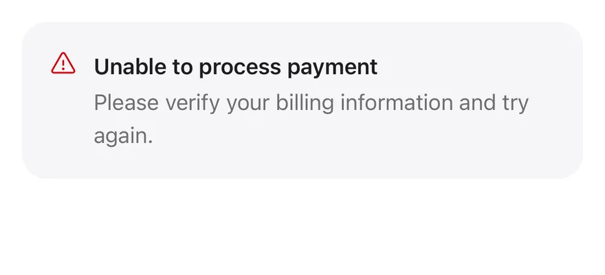
### Destructive
The `destructive` variant with a destructive-colored icon.
```tsx
import { WarningIcon } from "phosphor-react-native"
import { Alert, AlertDescription, AlertTitle } from "@/components/ui/alert"
export function AlertDestructiveExample() {
return (
Unable to process payment
Please verify your billing information and try again.
)
}
```
```swift
import EsuissUI
import PhosphorSwift
import SwiftUI
struct AlertDestructiveExample: View {
var body: some View {
InlineAlert(.destructive, icon: Ph.warning.regular) {
AlertTitle("Unable to process payment")
AlertDescription("Please verify your billing information and try again.")
}
}
}
```
```kotlin
import androidx.compose.runtime.Composable
import com.adamglin.PhosphorIcons
import com.adamglin.phosphoricons.Regular
import com.adamglin.phosphoricons.regular.Warning
import com.esuiss.ui.components.Alert
import com.esuiss.ui.components.AlertDescription
import com.esuiss.ui.components.AlertTitle
import com.esuiss.ui.components.AlertVariant
@Composable
fun AlertDestructive() {
Alert(icon = PhosphorIcons.Regular.Warning, variant = AlertVariant.Destructive) {
AlertTitle("Unable to process payment")
AlertDescription("Please verify your billing information and try again.")
}
}
```
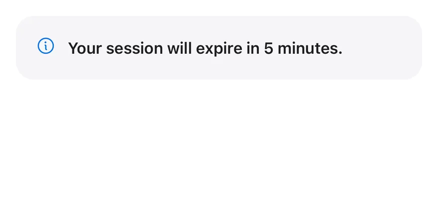
### Title only
An alert with only a title.
```tsx
import { InfoIcon } from "phosphor-react-native"
import { Alert, AlertTitle } from "@/components/ui/alert"
export function AlertTitleOnlyExample() {
return (
Your session will expire in 5 minutes.
)
}
```
```swift
import EsuissUI
import PhosphorSwift
import SwiftUI
struct AlertTitleOnlyExample: View {
var body: some View {
InlineAlert(icon: Ph.info.regular) {
AlertTitle("Your session will expire in 5 minutes.")
}
}
}
```
```kotlin
import androidx.compose.runtime.Composable
import com.adamglin.PhosphorIcons
import com.adamglin.phosphoricons.Regular
import com.adamglin.phosphoricons.regular.Info
import com.esuiss.ui.components.Alert
import com.esuiss.ui.components.AlertTitle
@Composable
fun AlertTitleOnly() {
Alert(icon = PhosphorIcons.Regular.Info) {
AlertTitle("Your session will expire in 5 minutes.")
}
}
```
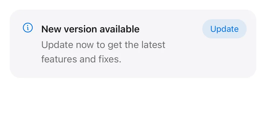
### With action
An `AlertAction` button in the top-end corner.
```tsx
import { InfoIcon } from "phosphor-react-native"
import { Alert, AlertAction, AlertDescription, AlertTitle } from "@/components/ui/alert"
import { Button } from "@/components/ui/button"
import { Text } from "@/components/ui/text"
export function AlertWithActionExample() {
return (
New version available
Update now to get the latest features and fixes.
)
}
```
```swift
import EsuissUI
import PhosphorSwift
import SwiftUI
struct AlertWithActionExample: View {
var body: some View {
InlineAlert(icon: Ph.info.regular) {
AlertTitle("New version available")
AlertDescription("Update now to get the latest features and fixes.")
} action: {
Button("Update") {}
.buttonStyle(.variant(.tinted, size: .sm))
}
}
}
```
```kotlin
import androidx.compose.runtime.Composable
import com.adamglin.PhosphorIcons
import com.adamglin.phosphoricons.Regular
import com.adamglin.phosphoricons.regular.Info
import com.esuiss.ui.components.Alert
import com.esuiss.ui.components.AlertDescription
import com.esuiss.ui.components.AlertTitle
import com.esuiss.ui.components.Button
import com.esuiss.ui.components.ButtonSize
import com.esuiss.ui.components.ButtonVariant
@Composable
fun AlertWithAction() {
Alert(
icon = PhosphorIcons.Regular.Info,
action = { Button("Update", onClick = {}, size = ButtonSize.Sm, variant = ButtonVariant.Tinted) },
) {
AlertTitle("New version available")
AlertDescription("Update now to get the latest features and fixes.")
}
}
```
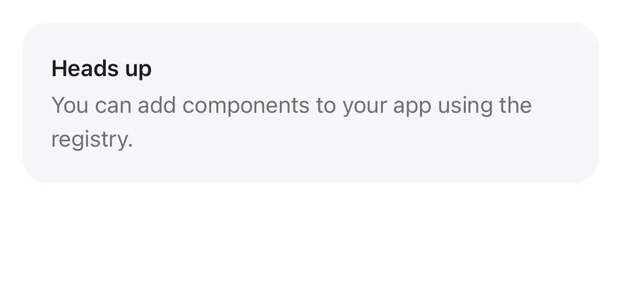
### Without icon
An alert with text only and no icon.
```tsx
import { Alert, AlertDescription, AlertTitle } from "@/components/ui/alert"
export function AlertWithoutIconExample() {
return (
Heads up
You can add components to your app using the registry.
)
}
```
```swift
import EsuissUI
import SwiftUI
struct AlertWithoutIconExample: View {
var body: some View {
InlineAlert {
AlertTitle("Heads up")
AlertDescription("You can add components to your app using the registry.")
}
}
}
```
```kotlin
import androidx.compose.runtime.Composable
import com.esuiss.ui.components.Alert
import com.esuiss.ui.components.AlertDescription
import com.esuiss.ui.components.AlertTitle
@Composable
fun AlertWithoutIcon() {
Alert {
AlertTitle("Heads up")
AlertDescription("You can add components to your app using the registry.")
}
}
```
## API Reference
### Alert
Container with the icon, text column and action.
| Prop | Type | Default | Description |
| --- | --- | --- | --- |
| `icon` | `PhosphorIcon` | - | Phosphor icon component shown before the text. |
| `variant` | `"default" \| "destructive"` | `"default"` | `default` or `destructive`; changes the icon color. |
| `iconClassName` | `string` | - | Extra classes for the icon. |
Also accepts the props of `React.ComponentProps`, `React.RefAttributes`.
### AlertTitle
Bold first line.
Also accepts the props of `React.ComponentProps`.
### AlertDescription
Secondary-colored supporting text.
Also accepts the props of `React.ComponentProps`.
### AlertAction
Slot positioned in the top-end corner.
Also accepts the props of `React.ComponentProps`, `React.RefAttributes`.
## Accessibility
- The container has the `alert` role.
- The icon is decorative; put the meaning in the title or description.
## Notes
- Uses `bg-muted`, `text-foreground`, `text-primary` and `text-destructive` tokens; light and dark follow the system appearance.
- The action is positioned with `end-4`, so it flips in right-to-left layouts.