# Pie Chart Half
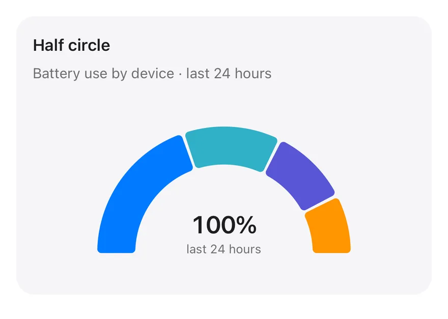
A semicircular gauge-style pie showing battery share by device, with a caption under the arc.
Pie Chart Half is an open-source chart from suiss/ui for React, React Native, SwiftUI and Jetpack Compose. The @esuiss/ui CLI copies its source into your project, so you own the code.
Source: https://ui.suiss.app/docs/charts/pie-chart-half
**React**
**Example**
```tsx title="components/charts/pie-chart-half.tsx"
"use client"
import { Pie, PieChart } from "recharts"
import {
Card,
CardContent,
CardDescription,
CardHeader,
CardTitle,
} from "@/components/ui/card"
import {
type ChartConfig,
ChartContainer,
ChartTooltip,
ChartTooltipContent,
} from "@/components/ui/chart"
const chartData = [
{ device: "phone", share: 40, fill: "var(--color-phone)" },
{ device: "laptop", share: 25, fill: "var(--color-laptop)" },
{ device: "tablet", share: 20, fill: "var(--color-tablet)" },
{ device: "watch", share: 15, fill: "var(--color-watch)" },
]
const chartConfig = {
share: { label: "Share" },
phone: { label: "Phone", color: "var(--chart-1)" },
laptop: { label: "Laptop", color: "var(--chart-2)" },
tablet: { label: "Tablet", color: "var(--chart-3)" },
watch: { label: "Watch", color: "var(--chart-4)" },
} satisfies ChartConfig
export function PieChartHalf() {
return (
Half circle
Battery use by device · last 24 hours
(
{chartConfig[name as keyof typeof chartConfig].label} ·{" "}
{value}%
)}
/>
}
/>
100%
last 24 hours
)
}
```
A semicircular donut that reads like a gauge, with a figure and caption tucked under the arc. Use it in compact cards where a full circle takes too much height.
## Installation
### CLI
```bash title="Terminal"
npx shadcn@latest add @esuiss/pie-chart-half
```
Works in any project with a `components.json`. See [Installation](https://ui.suiss.app/docs/installation#add-components) for the one-line registry setup. Or use the suiss/ui CLI:
```bash title="Terminal"
npx @esuiss/ui@latest add charts pie-chart-half
```
### Manual
1. Install the dependencies:
```bash title="Terminal"
npm install recharts
```
2. Add the pieces it builds on: [Card](https://ui.suiss.app/docs/components/card), [Chart](https://ui.suiss.app/docs/components/chart).
3. Copy the source into `components/charts/pie-chart-half.tsx`:
```tsx title="components/charts/pie-chart-half.tsx"
"use client"
import { Pie, PieChart } from "recharts"
import {
Card,
CardContent,
CardDescription,
CardHeader,
CardTitle,
} from "@/components/ui/card"
import {
type ChartConfig,
ChartContainer,
ChartTooltip,
ChartTooltipContent,
} from "@/components/ui/chart"
const chartData = [
{ device: "phone", share: 40, fill: "var(--color-phone)" },
{ device: "laptop", share: 25, fill: "var(--color-laptop)" },
{ device: "tablet", share: 20, fill: "var(--color-tablet)" },
{ device: "watch", share: 15, fill: "var(--color-watch)" },
]
const chartConfig = {
share: { label: "Share" },
phone: { label: "Phone", color: "var(--chart-1)" },
laptop: { label: "Laptop", color: "var(--chart-2)" },
tablet: { label: "Tablet", color: "var(--chart-3)" },
watch: { label: "Watch", color: "var(--chart-4)" },
} satisfies ChartConfig
export function PieChartHalf() {
return (
Half circle
Battery use by device · last 24 hours
(
{chartConfig[name as keyof typeof chartConfig].label} ·{" "}
{value}%
)}
/>
}
/>
100%
last 24 hours
)
}
```
4. Update the import paths to match your project.
## Usage
```tsx
import { PieChartHalf } from "@/components/charts/pie-chart-half"
```
```tsx
```
Replace `chartData` with your categories and their shares, and add each key to `chartConfig`. The tooltip appends a percent sign, so change its formatter if your values aren't percentages. Update the figure and caption under the arc, which are plain text.
## Notes
The centered figure and caption are hard-coded, not computed from the data. The arc's size depends on the container height, so check the fit if you change the chart's height.
**React Native, SwiftUI, Jetpack Compose**
```tsx title="uniwind/components/charts/pie-chart-half.tsx"
import { View } from "react-native"
import {
Card,
CardContent,
CardDescription,
CardHeader,
CardTitle,
} from "@/components/ui/card"
import {
type ChartConfig,
ChartContainer,
ChartTooltip,
ChartTooltipContent,
Pie,
PieChart,
} from "@/components/ui/chart"
import { Text } from "@/components/ui/text"
const chartData = [
{ device: "phone", share: 40 },
{ device: "laptop", share: 25 },
{ device: "tablet", share: 20 },
{ device: "watch", share: 15 },
]
const chartConfig = {
share: { label: "Share" },
phone: { label: "Phone", color: "chart-1" },
laptop: { label: "Laptop", color: "chart-2" },
tablet: { label: "Tablet", color: "chart-3" },
watch: { label: "Watch", color: "chart-4" },
} satisfies ChartConfig
export function PieChartHalf() {
return (
Half circle
Battery use by device · last 24 hours
100%
last 24 hours
(
{`${chartConfig[name as keyof typeof chartConfig].label} · `}
{`${String(value)}%`}
)}
/>
}
/>
)
}
```
```swift title="swift/Charts/PieChartHalf.swift"
import Charts
import SwiftUI
private let chartData: [(device: String, share: Double)] = [
("phone", 40), ("laptop", 25), ("tablet", 20), ("watch", 15),
]
private let chartConfig: ChartConfig = [
"share": .init("Share"),
"phone": .init("Phone", color: EsuissColor.chart1),
"laptop": .init("Laptop", color: EsuissColor.chart2),
"tablet": .init("Tablet", color: EsuissColor.chart3),
"watch": .init("Watch", color: EsuissColor.chart4),
]
private let total = chartData.reduce(0) { $0 + $1.share }
public struct PieChartHalf: View {
@State private var selection: Int?
public init() {}
public var body: some View {
let outer: CGFloat = 124.5
Card(.filled, size: .sm) {
CardHeader("Half circle", description: "Battery use by device · last 24 hours")
CardContent {
ChartContainer(config: chartConfig) {
ChartAnimator { progress in
Chart {
ForEach(chartData, id: \.device) { item in
SectorMark(angle: .value("Share", item.share * progress), innerRadius: .ratio(0.7), angularInset: 1)
.cornerRadius(4)
.foregroundStyle(chartConfig.color(item.device))
}
ChartSectorRest(total: total, progress: progress)
SectorMark(angle: .value("Share", total))
.foregroundStyle(.clear)
}
.contentShape(Rectangle().size(width: outer + 26, height: outer * 2).offset(x: outer - 26))
.chartTooltip(
angle: chartData.map(\.share),
labels: chartData.map { chartConfig.label($0.device) },
startAngle: .degrees(-90),
endAngle: .degrees(90),
innerRadius: 0.7,
selection: $selection,
accessibilityLabel: "Half circle",
items: { [ChartTooltipItem(chartData[$0].device, value: chartData[$0].share)] }
) { payload in
ChartTooltipContent(payload, hideLabel: true) { item in
HStack(spacing: 0) {
Text("\(Text(LocalizedStringKey(chartConfig.label(item.key)))) · ")
Text(verbatim: "\(item.value.formatted(.number))%")
.fontWeight(.semibold)
.monospacedDigit()
}
}
}
.frame(width: outer * 2, height: outer * 2)
.padding(.top, 26.5)
.frame(maxWidth: .infinity)
.frame(height: 176, alignment: .top)
.overlay(alignment: .bottom) {
VStack(spacing: 0) {
Text(verbatim: "100%")
.textStyle(.xl2, weight: .semibold)
.monospacedDigit()
Text("last 24 hours")
.textStyle(.xs)
.foregroundStyle(EsuissColor.mutedForeground)
}
.padding(.bottom, 21)
.allowsHitTesting(false)
.accessibilityHidden(true)
}
}
}
.frame(height: 176)
}
}
}
}
```
```kt title="kotlin/charts/PieChartHalf.kt"
package com.esuiss.ui.charts
import androidx.compose.foundation.layout.Box
import androidx.compose.foundation.layout.Column
import androidx.compose.foundation.layout.Row
import androidx.compose.foundation.layout.fillMaxWidth
import androidx.compose.foundation.layout.height
import androidx.compose.foundation.layout.padding
import androidx.compose.foundation.text.BasicText
import androidx.compose.runtime.Composable
import androidx.compose.ui.Alignment
import androidx.compose.ui.Modifier
import androidx.compose.ui.semantics.clearAndSetSemantics
import androidx.compose.ui.text.font.FontWeight
import androidx.compose.ui.unit.dp
import com.esuiss.ui.components.Card
import com.esuiss.ui.components.CardContent
import com.esuiss.ui.components.CardHeader
import com.esuiss.ui.components.CardSize
import com.esuiss.ui.components.CardVariant
import com.esuiss.ui.components.ChartConfig
import com.esuiss.ui.components.ChartConfigItem
import com.esuiss.ui.components.ChartContainer
import com.esuiss.ui.components.ChartTooltipContent
import com.esuiss.ui.components.PieChart
import com.esuiss.ui.theme.EsuissTheme
import com.esuiss.ui.theme.Typography
import java.text.NumberFormat
import java.util.Locale
private class PieHalfDeviceShare(val device: String, val share: Double)
private val chartData = listOf(
PieHalfDeviceShare("phone", 40.0),
PieHalfDeviceShare("laptop", 25.0),
PieHalfDeviceShare("tablet", 20.0),
PieHalfDeviceShare("watch", 15.0),
)
private val chartConfig = ChartConfig(
"share" to ChartConfigItem("Share"),
"phone" to ChartConfigItem("Phone") { chart1 },
"laptop" to ChartConfigItem("Laptop") { chart2 },
"tablet" to ChartConfigItem("Tablet") { chart3 },
"watch" to ChartConfigItem("Watch") { chart4 },
)
@Composable
fun PieChartHalf(modifier: Modifier = Modifier) {
val colors = EsuissTheme.colors
val number = NumberFormat.getNumberInstance(Locale.US)
Card(modifier, variant = CardVariant.Filled, size = CardSize.Sm) {
CardHeader("Half circle", description = "Battery use by device · last 24 hours")
CardContent {
Box(
Modifier
.fillMaxWidth()
.height(176.dp),
) {
ChartContainer(chartConfig, Modifier.matchParentSize()) {
PieChart(accessibilityLabel = "Half circle") {
ChartTooltip {
ChartTooltipContent(
hideLabel = true,
formatter = { item ->
Row {
BasicText(
"${chartConfig[item.key]?.label ?: item.key} · ",
style = Typography.xs.copy(color = colors.foreground),
)
BasicText(
"${number.format(item.value)}%",
style = Typography.xs.copy(color = colors.foreground, fontWeight = FontWeight.SemiBold, fontFeatureSettings = "tnum"),
)
}
},
)
}
Pie(
chartData,
value = { it.share },
nameKey = { it.device },
cy = 0.88f,
startAngle = 180f,
endAngle = 0f,
innerRadius = 1.05f,
outerRadius = 1.5f,
paddingAngle = 1.5f,
cornerRadius = 4.dp,
)
}
}
Column(
Modifier
.align(Alignment.BottomCenter)
.padding(bottom = 21.dp)
.clearAndSetSemantics {},
horizontalAlignment = Alignment.CenterHorizontally,
) {
BasicText(
"100%",
style = Typography.xl2.copy(color = colors.foreground, fontWeight = FontWeight.SemiBold, fontFeatureSettings = "tnum"),
)
BasicText("last 24 hours", style = Typography.xs.copy(color = colors.mutedForeground))
}
}
}
}
}
```
A `PieChart` drawn from 180 to 0 degrees, with rounded, spaced slices. `chartData` holds a percentage `share` per device. A centered `Text` shows the 100% total, and the tooltip uses a custom `formatter` to print each share as a percentage.
## Installation
**React Native**
```bash title="Terminal"
npx shadcn@latest add @esuiss-rn/pie-chart-half
```
See [Installation](https://ui.suiss.app/docs/installation) for the `components.json` setup. Or use the suiss/ui CLI:
```bash title="Terminal"
npx @esuiss/ui@latest add pie-chart-half
```
**SwiftUI**
```bash title="Terminal"
npx @esuiss/ui@latest add pie-chart-half --platform swift
```
**Jetpack Compose**
```bash title="Terminal"
npx @esuiss/ui@latest add pie-chart-half --platform kotlin
```
The CLI also adds what it builds on: [Card](https://ui.suiss.app/docs/components/card), [Chart](https://ui.suiss.app/docs/components/chart), [Text](https://ui.suiss.app/docs/components/text).
### Manual
**React Native**
**Uniwind**
1. Add the pieces it builds on: [Card](https://ui.suiss.app/docs/components/card), [Chart](https://ui.suiss.app/docs/components/chart), [Text](https://ui.suiss.app/docs/components/text).
2. Copy the source into `components/charts/pie-chart-half.tsx`:
- `uniwind/components/charts/pie-chart-half.tsx`: shown above
3. Update the import paths to match your project.
**NativeWind**
1. Add the pieces it builds on: [Card](https://ui.suiss.app/docs/components/card), [Chart](https://ui.suiss.app/docs/components/chart), [Text](https://ui.suiss.app/docs/components/text).
2. Copy the source into `components/charts/pie-chart-half.tsx`:
```tsx title="nativewind/components/charts/pie-chart-half.tsx"
import { View } from "react-native"
import {
Card,
CardContent,
CardDescription,
CardHeader,
CardTitle,
} from "@/components/ui/card"
import {
type ChartConfig,
ChartContainer,
ChartTooltip,
ChartTooltipContent,
Pie,
PieChart,
} from "@/components/ui/chart"
import { Text } from "@/components/ui/text"
const chartData = [
{ device: "phone", share: 40 },
{ device: "laptop", share: 25 },
{ device: "tablet", share: 20 },
{ device: "watch", share: 15 },
]
const chartConfig = {
share: { label: "Share" },
phone: { label: "Phone", color: "chart-1" },
laptop: { label: "Laptop", color: "chart-2" },
tablet: { label: "Tablet", color: "chart-3" },
watch: { label: "Watch", color: "chart-4" },
} satisfies ChartConfig
export function PieChartHalf() {
return (
Half circle
Battery use by device · last 24 hours
100%
last 24 hours
(
{`${chartConfig[name as keyof typeof chartConfig].label} · `}
{`${String(value)}%`}
)}
/>
}
/>
)
}
```
3. Update the import paths to match your project.
**StyleSheet**
1. Add the pieces it builds on: [Card](https://ui.suiss.app/docs/components/card), [Chart](https://ui.suiss.app/docs/components/chart), [Text](https://ui.suiss.app/docs/components/text).
2. Copy the source into `components/charts/pie-chart-half.tsx`:
```tsx title="stylesheet/components/charts/pie-chart-half.tsx"
import { StyleSheet, View } from "react-native"
import {
Card,
CardContent,
CardDescription,
CardHeader,
CardTitle,
} from "@/components/ui/card"
import {
type ChartConfig,
ChartContainer,
ChartTooltip,
ChartTooltipContent,
Pie,
PieChart,
} from "@/components/ui/chart"
import { Text } from "@/components/ui/text"
import { fontSize, useTheme } from "@/components/ui/theme"
const chartData = [
{ device: "phone", share: 40 },
{ device: "laptop", share: 25 },
{ device: "tablet", share: 20 },
{ device: "watch", share: 15 },
]
const chartConfig = {
share: { label: "Share" },
phone: { label: "Phone", color: "chart-1" },
laptop: { label: "Laptop", color: "chart-2" },
tablet: { label: "Tablet", color: "chart-3" },
watch: { label: "Watch", color: "chart-4" },
} satisfies ChartConfig
const styles = StyleSheet.create({
overlay: {
position: "absolute",
left: 0,
right: 0,
bottom: "12%",
alignItems: "center",
},
value: {
...fontSize["2xl"],
fontWeight: "600",
letterSpacing: -0.7,
fontVariant: ["tabular-nums"],
},
caption: { ...fontSize.xs },
strong: { fontWeight: "600", fontVariant: ["tabular-nums"] },
chart: { height: 176 },
})
export function PieChartHalf() {
const { colors } = useTheme()
return (
Half circle
Battery use by device · last 24 hours
100%
last 24 hours
(
{`${chartConfig[name as keyof typeof chartConfig].label} · `}
{`${String(value)}%`}
)}
/>
}
/>
)
}
```
3. Update the import paths to match your project.
**SwiftUI**
1. Target iOS 17 or later.
2. Copy the theme files every view uses:
- `swift/Theme/Theme.swift`: [source](https://github.com/e-suiss/ui/blob/main/packages/mobile/swiftui/Sources/EsuissUI/Theme/Theme.swift)
- `swift/Theme/Tokens.swift`: [source](https://github.com/e-suiss/ui/blob/main/packages/mobile/swiftui/Sources/EsuissUI/Theme/Tokens.swift)
3. Copy the source and every file it uses:
- `swift/Charts/PieChartHalf.swift`: shown above
- `swift/Components/Card.swift`: see [Card](https://ui.suiss.app/docs/components/card.md)
- `swift/Components/Chart.swift`: see [Chart](https://ui.suiss.app/docs/components/chart.md)
- `swift/Components/Haptics.swift`: see [Haptics](https://ui.suiss.app/docs/components/haptics.md)
- `swift/Components/Item.swift`: see [Item](https://ui.suiss.app/docs/components/item.md)
- `swift/Components/Separator.swift`: see [Separator](https://ui.suiss.app/docs/components/separator.md)
- `swift/Components/TextVariant.swift`: [source](https://github.com/e-suiss/ui/blob/main/packages/mobile/swiftui/Sources/EsuissUI/Components/TextVariant.swift)
4. Add the files to your app target.
**Jetpack Compose**
1. Set `minSdk` to 24 or higher and add the dependencies:
```kotlin title="build.gradle.kts"
implementation(platform("androidx.compose:compose-bom:2026.09.00"))
implementation("androidx.compose.foundation:foundation")
implementation("androidx.compose.ui:ui")
```
2. Copy the theme files every view uses:
- `kotlin/theme/Theme.kt`: [source](https://github.com/e-suiss/ui/blob/main/packages/mobile/kotlin/ui/src/main/kotlin/com/esuiss/ui/theme/Theme.kt)
- `kotlin/theme/Tokens.kt`: [source](https://github.com/e-suiss/ui/blob/main/packages/mobile/kotlin/ui/src/main/kotlin/com/esuiss/ui/theme/Tokens.kt)
3. Copy the source and every file it uses:
- `kotlin/charts/PieChartHalf.kt`: shown above
- `kotlin/components/Card.kt`: see [Card](https://ui.suiss.app/docs/components/card.md)
- `kotlin/components/Chart.kt`: see [Chart](https://ui.suiss.app/docs/components/chart.md)
- `kotlin/components/Content.kt`: [source](https://github.com/e-suiss/ui/blob/main/packages/mobile/kotlin/ui/src/main/kotlin/com/esuiss/ui/components/Content.kt)
- `kotlin/components/FormSupport.kt`: [source](https://github.com/e-suiss/ui/blob/main/packages/mobile/kotlin/ui/src/main/kotlin/com/esuiss/ui/components/FormSupport.kt)
- `kotlin/components/Haptics.kt`: see [Haptics](https://ui.suiss.app/docs/components/haptics.md)
- `kotlin/components/Icon.kt`: see [Icon](https://ui.suiss.app/docs/components/icon.md)
4. Update the `com.esuiss.ui` package names to match your project.
## Usage
```tsx
import { PieChartHalf } from "@/components/charts/pie-chart-half"
```
```tsx
```
Replace `chartData` with your shares and update `chartConfig` and the caption under the arc. The component takes no props.