# Pie Chart Donut Text
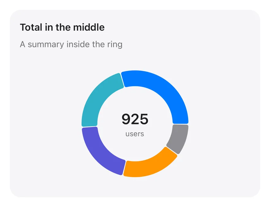
A donut with the total number of users displayed in the center of the ring.
Pie Chart Donut Text is an open-source chart from suiss/ui for React, React Native, SwiftUI and Jetpack Compose. The @esuiss/ui CLI copies its source into your project, so you own the code.
Source: https://ui.suiss.app/docs/charts/pie-chart-donut-text
**React**
**Example**
```tsx title="components/charts/pie-chart-donut-text.tsx"
"use client"
import { Pie, PieChart } from "recharts"
import {
Card,
CardContent,
CardDescription,
CardHeader,
CardTitle,
} from "@/components/ui/card"
import {
type ChartConfig,
ChartContainer,
ChartTooltip,
ChartTooltipContent,
} from "@/components/ui/chart"
const chartData = [
{ device: "phone", users: 275, fill: "var(--color-phone)" },
{ device: "laptop", users: 200, fill: "var(--color-laptop)" },
{ device: "tablet", users: 187, fill: "var(--color-tablet)" },
{ device: "watch", users: 173, fill: "var(--color-watch)" },
{ device: "other", users: 90, fill: "var(--color-other)" },
]
const chartConfig = {
users: { label: "Users" },
phone: { label: "Phone", color: "var(--chart-1)" },
laptop: { label: "Laptop", color: "var(--chart-2)" },
tablet: { label: "Tablet", color: "var(--chart-3)" },
watch: { label: "Watch", color: "var(--chart-4)" },
other: { label: "Other", color: "var(--chart-5)" },
} satisfies ChartConfig
const total = chartData.reduce((sum, item) => sum + item.users, 0)
export function PieChartDonutText() {
return (
Total in the middleA summary inside the ring
}
/>
{total.toLocaleString("en-US")}
users
)
}
```
A donut with the total shown in its center, so readers get the overall number and the breakdown in one glance. Prefer it over the plain donut when the total is the headline.
## Installation
### CLI
```bash title="Terminal"
npx shadcn@latest add @esuiss/pie-chart-donut-text
```
Works in any project with a `components.json`. See [Installation](https://ui.suiss.app/docs/installation#add-components) for the one-line registry setup. Or use the suiss/ui CLI:
```bash title="Terminal"
npx @esuiss/ui@latest add charts pie-chart-donut-text
```
### Manual
1. Install the dependencies:
```bash title="Terminal"
npm install recharts
```
2. Add the pieces it builds on: [Card](https://ui.suiss.app/docs/components/card), [Chart](https://ui.suiss.app/docs/components/chart).
3. Copy the source into `components/charts/pie-chart-donut-text.tsx`:
```tsx title="components/charts/pie-chart-donut-text.tsx"
"use client"
import { Pie, PieChart } from "recharts"
import {
Card,
CardContent,
CardDescription,
CardHeader,
CardTitle,
} from "@/components/ui/card"
import {
type ChartConfig,
ChartContainer,
ChartTooltip,
ChartTooltipContent,
} from "@/components/ui/chart"
const chartData = [
{ device: "phone", users: 275, fill: "var(--color-phone)" },
{ device: "laptop", users: 200, fill: "var(--color-laptop)" },
{ device: "tablet", users: 187, fill: "var(--color-tablet)" },
{ device: "watch", users: 173, fill: "var(--color-watch)" },
{ device: "other", users: 90, fill: "var(--color-other)" },
]
const chartConfig = {
users: { label: "Users" },
phone: { label: "Phone", color: "var(--chart-1)" },
laptop: { label: "Laptop", color: "var(--chart-2)" },
tablet: { label: "Tablet", color: "var(--chart-3)" },
watch: { label: "Watch", color: "var(--chart-4)" },
other: { label: "Other", color: "var(--chart-5)" },
} satisfies ChartConfig
const total = chartData.reduce((sum, item) => sum + item.users, 0)
export function PieChartDonutText() {
return (
Total in the middleA summary inside the ring
}
/>
{total.toLocaleString("en-US")}
users
)
}
```
4. Update the import paths to match your project.
## Usage
```tsx
import { PieChartDonutText } from "@/components/charts/pie-chart-donut-text"
```
```tsx
```
Replace `chartData` and the category entries in `chartConfig`; the center total is summed from the data automatically. Change the caption under the number to your unit, and adjust `innerRadius` if a longer number needs more room.
## Notes
The center text sits on top of the chart but lets pointer events through, so slice tooltips still work.
**React Native, SwiftUI, Jetpack Compose**
```tsx title="uniwind/components/charts/pie-chart-donut-text.tsx"
import { View } from "react-native"
import {
Card,
CardContent,
CardDescription,
CardHeader,
CardTitle,
} from "@/components/ui/card"
import {
type ChartConfig,
ChartContainer,
ChartTooltip,
ChartTooltipContent,
Pie,
PieChart,
} from "@/components/ui/chart"
import { Text } from "@/components/ui/text"
const chartData = [
{ device: "phone", users: 275 },
{ device: "laptop", users: 200 },
{ device: "tablet", users: 187 },
{ device: "watch", users: 173 },
{ device: "other", users: 90 },
]
const chartConfig = {
users: { label: "Users" },
phone: { label: "Phone", color: "chart-1" },
laptop: { label: "Laptop", color: "chart-2" },
tablet: { label: "Tablet", color: "chart-3" },
watch: { label: "Watch", color: "chart-4" },
other: { label: "Other", color: "chart-5" },
} satisfies ChartConfig
const total = chartData.reduce((sum, item) => sum + item.users, 0)
function formatTotal(value: number) {
try {
return new Intl.NumberFormat("en-US").format(value)
} catch {
return String(value).replace(/\B(?=(\d{3})+(?!\d))/g, ",")
}
}
export function PieChartDonutText() {
return (
Total in the middleA summary inside the ring
{formatTotal(total)}
users}
/>
)
}
```
```swift title="swift/Charts/PieChartDonutText.swift"
import Charts
import SwiftUI
private let chartData: [(device: String, users: Double)] = [
("phone", 275), ("laptop", 200), ("tablet", 187), ("watch", 173), ("other", 90),
]
private let chartConfig: ChartConfig = [
"users": .init("Users"),
"phone": .init("Phone", color: EsuissColor.chart1),
"laptop": .init("Laptop", color: EsuissColor.chart2),
"tablet": .init("Tablet", color: EsuissColor.chart3),
"watch": .init("Watch", color: EsuissColor.chart4),
"other": .init("Other", color: EsuissColor.chart5),
]
private let total = chartData.reduce(0) { $0 + $1.users }
public struct PieChartDonutText: View {
@State private var selection: Int?
public init() {}
public var body: some View {
Card(.filled, size: .sm) {
CardHeader("Total in the middle", description: "A summary inside the ring")
CardContent {
ChartContainer(config: chartConfig) {
ChartAnimator { progress in
Chart {
ForEach(chartData, id: \.device) { item in
SectorMark(angle: .value("Users", item.users * progress), innerRadius: .ratio(0.62), outerRadius: .ratio(0.88), angularInset: 0.75)
.cornerRadius(3)
.foregroundStyle(chartConfig.color(item.device))
}
ChartSectorRest(total: total, progress: progress)
}
.background {
VStack(spacing: 0) {
Text(total, format: .number)
.textStyle(.xl2, weight: .semibold)
.monospacedDigit()
Text("users")
.textStyle(.xs)
.foregroundStyle(EsuissColor.mutedForeground)
}
.multilineTextAlignment(.center)
}
.chartTooltip(
angle: chartData.map(\.users),
labels: chartData.map { chartConfig.label($0.device) },
innerRadius: 0.62,
outerRadius: 0.88,
selection: $selection,
accessibilityLabel: "Total in the middle",
items: { [ChartTooltipItem(chartData[$0].device, value: chartData[$0].users)] }
) { payload in
ChartTooltipContent(payload, hideLabel: true)
}
.padding(5)
}
}
.frame(height: 208)
}
}
}
}
```
```kt title="kotlin/charts/PieChartDonutText.kt"
package com.esuiss.ui.charts
import androidx.compose.foundation.layout.Box
import androidx.compose.foundation.layout.Column
import androidx.compose.foundation.layout.fillMaxWidth
import androidx.compose.foundation.layout.height
import androidx.compose.foundation.text.BasicText
import androidx.compose.runtime.Composable
import androidx.compose.ui.Alignment
import androidx.compose.ui.Modifier
import androidx.compose.ui.semantics.clearAndSetSemantics
import androidx.compose.ui.text.font.FontWeight
import androidx.compose.ui.unit.dp
import com.esuiss.ui.components.Card
import com.esuiss.ui.components.CardContent
import com.esuiss.ui.components.CardHeader
import com.esuiss.ui.components.CardSize
import com.esuiss.ui.components.CardVariant
import com.esuiss.ui.components.ChartConfig
import com.esuiss.ui.components.ChartConfigItem
import com.esuiss.ui.components.ChartContainer
import com.esuiss.ui.components.ChartTooltipContent
import com.esuiss.ui.components.PieChart
import com.esuiss.ui.theme.EsuissTheme
import com.esuiss.ui.theme.Typography
import java.text.NumberFormat
import java.util.Locale
private class PieDonutTextDeviceUsers(val device: String, val users: Double)
private val chartData = listOf(
PieDonutTextDeviceUsers("phone", 275.0),
PieDonutTextDeviceUsers("laptop", 200.0),
PieDonutTextDeviceUsers("tablet", 187.0),
PieDonutTextDeviceUsers("watch", 173.0),
PieDonutTextDeviceUsers("other", 90.0),
)
private val chartConfig = ChartConfig(
"users" to ChartConfigItem("Users"),
"phone" to ChartConfigItem("Phone") { chart1 },
"laptop" to ChartConfigItem("Laptop") { chart2 },
"tablet" to ChartConfigItem("Tablet") { chart3 },
"watch" to ChartConfigItem("Watch") { chart4 },
"other" to ChartConfigItem("Other") { chart5 },
)
private val total = chartData.sumOf { it.users }
@Composable
fun PieChartDonutText(modifier: Modifier = Modifier) {
val colors = EsuissTheme.colors
Card(modifier, variant = CardVariant.Filled, size = CardSize.Sm) {
CardHeader("Total in the middle", description = "A summary inside the ring")
CardContent {
Box(
Modifier
.fillMaxWidth()
.height(208.dp),
) {
ChartContainer(chartConfig, Modifier.matchParentSize()) {
PieChart(accessibilityLabel = "Total in the middle, ${NumberFormat.getNumberInstance(Locale.US).format(total)} users") {
ChartTooltip { ChartTooltipContent(hideLabel = true) }
Pie(
chartData,
value = { it.users },
nameKey = { it.device },
innerRadius = 0.62f,
outerRadius = 0.88f,
strokeWidth = 0.dp,
paddingAngle = 1f,
cornerRadius = 3.dp,
)
}
}
Column(
Modifier
.align(Alignment.Center)
.clearAndSetSemantics {},
horizontalAlignment = Alignment.CenterHorizontally,
) {
BasicText(
NumberFormat.getNumberInstance(Locale.US).format(total),
style = Typography.xl2.copy(color = colors.foreground, fontWeight = FontWeight.SemiBold, fontFeatureSettings = "tnum"),
)
BasicText("users", style = Typography.xs.copy(color = colors.mutedForeground))
}
}
}
}
}
```
A `PieChart` donut with small gaps and rounded slice corners. `chartData` holds one record per device with a `users` count. The total is summed from `chartData` and drawn as `Text` layered over the ring. Pressing a slice shows a tooltip.
## Installation
**React Native**
```bash title="Terminal"
npx shadcn@latest add @esuiss-rn/pie-chart-donut-text
```
See [Installation](https://ui.suiss.app/docs/installation) for the `components.json` setup. Or use the suiss/ui CLI:
```bash title="Terminal"
npx @esuiss/ui@latest add pie-chart-donut-text
```
**SwiftUI**
```bash title="Terminal"
npx @esuiss/ui@latest add pie-chart-donut-text --platform swift
```
**Jetpack Compose**
```bash title="Terminal"
npx @esuiss/ui@latest add pie-chart-donut-text --platform kotlin
```
The CLI also adds what it builds on: [Card](https://ui.suiss.app/docs/components/card), [Chart](https://ui.suiss.app/docs/components/chart), [Text](https://ui.suiss.app/docs/components/text).
### Manual
**React Native**
**Uniwind**
1. Add the pieces it builds on: [Card](https://ui.suiss.app/docs/components/card), [Chart](https://ui.suiss.app/docs/components/chart), [Text](https://ui.suiss.app/docs/components/text).
2. Copy the source into `components/charts/pie-chart-donut-text.tsx`:
- `uniwind/components/charts/pie-chart-donut-text.tsx`: shown above
3. Update the import paths to match your project.
**NativeWind**
1. Add the pieces it builds on: [Card](https://ui.suiss.app/docs/components/card), [Chart](https://ui.suiss.app/docs/components/chart), [Text](https://ui.suiss.app/docs/components/text).
2. Copy the source into `components/charts/pie-chart-donut-text.tsx`:
```tsx title="nativewind/components/charts/pie-chart-donut-text.tsx"
import { View } from "react-native"
import {
Card,
CardContent,
CardDescription,
CardHeader,
CardTitle,
} from "@/components/ui/card"
import {
type ChartConfig,
ChartContainer,
ChartTooltip,
ChartTooltipContent,
Pie,
PieChart,
} from "@/components/ui/chart"
import { Text } from "@/components/ui/text"
const chartData = [
{ device: "phone", users: 275 },
{ device: "laptop", users: 200 },
{ device: "tablet", users: 187 },
{ device: "watch", users: 173 },
{ device: "other", users: 90 },
]
const chartConfig = {
users: { label: "Users" },
phone: { label: "Phone", color: "chart-1" },
laptop: { label: "Laptop", color: "chart-2" },
tablet: { label: "Tablet", color: "chart-3" },
watch: { label: "Watch", color: "chart-4" },
other: { label: "Other", color: "chart-5" },
} satisfies ChartConfig
const total = chartData.reduce((sum, item) => sum + item.users, 0)
function formatTotal(value: number) {
try {
return new Intl.NumberFormat("en-US").format(value)
} catch {
return String(value).replace(/\B(?=(\d{3})+(?!\d))/g, ",")
}
}
export function PieChartDonutText() {
return (
Total in the middleA summary inside the ring
{formatTotal(total)}
users}
/>
)
}
```
3. Update the import paths to match your project.
**StyleSheet**
1. Add the pieces it builds on: [Card](https://ui.suiss.app/docs/components/card), [Chart](https://ui.suiss.app/docs/components/chart), [Text](https://ui.suiss.app/docs/components/text).
2. Copy the source into `components/charts/pie-chart-donut-text.tsx`:
```tsx title="stylesheet/components/charts/pie-chart-donut-text.tsx"
import { StyleSheet, View } from "react-native"
import {
Card,
CardContent,
CardDescription,
CardHeader,
CardTitle,
} from "@/components/ui/card"
import {
type ChartConfig,
ChartContainer,
ChartTooltip,
ChartTooltipContent,
Pie,
PieChart,
} from "@/components/ui/chart"
import { Text } from "@/components/ui/text"
import { fontSize, useTheme } from "@/components/ui/theme"
const chartData = [
{ device: "phone", users: 275 },
{ device: "laptop", users: 200 },
{ device: "tablet", users: 187 },
{ device: "watch", users: 173 },
{ device: "other", users: 90 },
]
const chartConfig = {
users: { label: "Users" },
phone: { label: "Phone", color: "chart-1" },
laptop: { label: "Laptop", color: "chart-2" },
tablet: { label: "Tablet", color: "chart-3" },
watch: { label: "Watch", color: "chart-4" },
other: { label: "Other", color: "chart-5" },
} satisfies ChartConfig
const total = chartData.reduce((sum, item) => sum + item.users, 0)
function formatTotal(value: number) {
try {
return new Intl.NumberFormat("en-US").format(value)
} catch {
return String(value).replace(/\B(?=(\d{3})+(?!\d))/g, ",")
}
}
const styles = StyleSheet.create({
overlay: {
...StyleSheet.absoluteFill,
alignItems: "center",
justifyContent: "center",
},
value: {
...fontSize["2xl"],
fontWeight: "600",
letterSpacing: -0.7,
fontVariant: ["tabular-nums"],
},
caption: { ...fontSize.xs },
chart: { height: 208 },
})
export function PieChartDonutText() {
const { colors } = useTheme()
return (
Total in the middleA summary inside the ring{formatTotal(total)}
users
}
/>
)
}
```
3. Update the import paths to match your project.
**SwiftUI**
1. Target iOS 17 or later.
2. Copy the theme files every view uses:
- `swift/Theme/Theme.swift`: [source](https://github.com/e-suiss/ui/blob/main/packages/mobile/swiftui/Sources/EsuissUI/Theme/Theme.swift)
- `swift/Theme/Tokens.swift`: [source](https://github.com/e-suiss/ui/blob/main/packages/mobile/swiftui/Sources/EsuissUI/Theme/Tokens.swift)
3. Copy the source and every file it uses:
- `swift/Charts/PieChartDonutText.swift`: shown above
- `swift/Components/Card.swift`: see [Card](https://ui.suiss.app/docs/components/card.md)
- `swift/Components/Chart.swift`: see [Chart](https://ui.suiss.app/docs/components/chart.md)
- `swift/Components/Haptics.swift`: see [Haptics](https://ui.suiss.app/docs/components/haptics.md)
- `swift/Components/Item.swift`: see [Item](https://ui.suiss.app/docs/components/item.md)
- `swift/Components/Separator.swift`: see [Separator](https://ui.suiss.app/docs/components/separator.md)
- `swift/Components/TextVariant.swift`: [source](https://github.com/e-suiss/ui/blob/main/packages/mobile/swiftui/Sources/EsuissUI/Components/TextVariant.swift)
4. Add the files to your app target.
**Jetpack Compose**
1. Set `minSdk` to 24 or higher and add the dependencies:
```kotlin title="build.gradle.kts"
implementation(platform("androidx.compose:compose-bom:2026.09.00"))
implementation("androidx.compose.foundation:foundation")
implementation("androidx.compose.ui:ui")
```
2. Copy the theme files every view uses:
- `kotlin/theme/Theme.kt`: [source](https://github.com/e-suiss/ui/blob/main/packages/mobile/kotlin/ui/src/main/kotlin/com/esuiss/ui/theme/Theme.kt)
- `kotlin/theme/Tokens.kt`: [source](https://github.com/e-suiss/ui/blob/main/packages/mobile/kotlin/ui/src/main/kotlin/com/esuiss/ui/theme/Tokens.kt)
3. Copy the source and every file it uses:
- `kotlin/charts/PieChartDonutText.kt`: shown above
- `kotlin/components/Card.kt`: see [Card](https://ui.suiss.app/docs/components/card.md)
- `kotlin/components/Chart.kt`: see [Chart](https://ui.suiss.app/docs/components/chart.md)
- `kotlin/components/Content.kt`: [source](https://github.com/e-suiss/ui/blob/main/packages/mobile/kotlin/ui/src/main/kotlin/com/esuiss/ui/components/Content.kt)
- `kotlin/components/FormSupport.kt`: [source](https://github.com/e-suiss/ui/blob/main/packages/mobile/kotlin/ui/src/main/kotlin/com/esuiss/ui/components/FormSupport.kt)
- `kotlin/components/Haptics.kt`: see [Haptics](https://ui.suiss.app/docs/components/haptics.md)
- `kotlin/components/Icon.kt`: see [Icon](https://ui.suiss.app/docs/components/icon.md)
4. Update the `com.esuiss.ui` package names to match your project.
## Usage
```tsx
import { PieChartDonutText } from "@/components/charts/pie-chart-donut-text"
```
```tsx
```
Replace `chartData` with your records; the center total recalculates from it. Update the `users` caption and `chartConfig` labels and colors to match. The component takes no props.