# Pie Chart Default
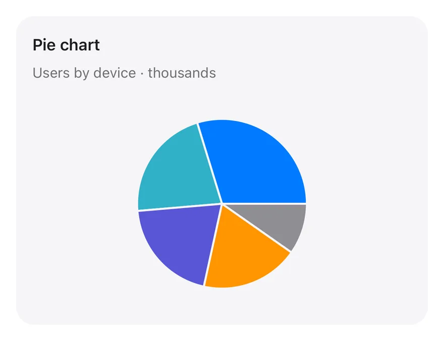
A full pie split into five device slices, separated by thin card-colored borders.
Pie Chart Default is an open-source chart from suiss/ui for React, React Native, SwiftUI and Jetpack Compose. The @esuiss/ui CLI copies its source into your project, so you own the code.
Source: https://ui.suiss.app/docs/charts/pie-chart-default
**React**
**Example**
```tsx title="components/charts/pie-chart-default.tsx"
"use client"
import { Pie, PieChart } from "recharts"
import {
Card,
CardContent,
CardDescription,
CardHeader,
CardTitle,
} from "@/components/ui/card"
import {
type ChartConfig,
ChartContainer,
ChartTooltip,
ChartTooltipContent,
} from "@/components/ui/chart"
const chartData = [
{ device: "phone", users: 275, fill: "var(--color-phone)" },
{ device: "laptop", users: 200, fill: "var(--color-laptop)" },
{ device: "tablet", users: 187, fill: "var(--color-tablet)" },
{ device: "watch", users: 173, fill: "var(--color-watch)" },
{ device: "other", users: 90, fill: "var(--color-other)" },
]
const chartConfig = {
users: { label: "Users" },
phone: { label: "Phone", color: "var(--chart-1)" },
laptop: { label: "Laptop", color: "var(--chart-2)" },
tablet: { label: "Tablet", color: "var(--chart-3)" },
watch: { label: "Watch", color: "var(--chart-4)" },
other: { label: "Other", color: "var(--chart-5)" },
} satisfies ChartConfig
export function PieChartDefault() {
return (
Pie chart
Users by device · thousands
}
/>
)
}
```
A full pie split into five slices separated by thin gaps, with a tooltip for each slice. Use it for a quick part-to-whole view of a small number of categories.
## Installation
### CLI
```bash title="Terminal"
npx shadcn@latest add @esuiss/pie-chart-default
```
Works in any project with a `components.json`. See [Installation](https://ui.suiss.app/docs/installation#add-components) for the one-line registry setup. Or use the suiss/ui CLI:
```bash title="Terminal"
npx @esuiss/ui@latest add charts pie-chart-default
```
### Manual
1. Install the dependencies:
```bash title="Terminal"
npm install recharts
```
2. Add the pieces it builds on: [Card](https://ui.suiss.app/docs/components/card), [Chart](https://ui.suiss.app/docs/components/chart).
3. Copy the source into `components/charts/pie-chart-default.tsx`:
```tsx title="components/charts/pie-chart-default.tsx"
"use client"
import { Pie, PieChart } from "recharts"
import {
Card,
CardContent,
CardDescription,
CardHeader,
CardTitle,
} from "@/components/ui/card"
import {
type ChartConfig,
ChartContainer,
ChartTooltip,
ChartTooltipContent,
} from "@/components/ui/chart"
const chartData = [
{ device: "phone", users: 275, fill: "var(--color-phone)" },
{ device: "laptop", users: 200, fill: "var(--color-laptop)" },
{ device: "tablet", users: 187, fill: "var(--color-tablet)" },
{ device: "watch", users: 173, fill: "var(--color-watch)" },
{ device: "other", users: 90, fill: "var(--color-other)" },
]
const chartConfig = {
users: { label: "Users" },
phone: { label: "Phone", color: "var(--chart-1)" },
laptop: { label: "Laptop", color: "var(--chart-2)" },
tablet: { label: "Tablet", color: "var(--chart-3)" },
watch: { label: "Watch", color: "var(--chart-4)" },
other: { label: "Other", color: "var(--chart-5)" },
} satisfies ChartConfig
export function PieChartDefault() {
return (
Pie chart
Users by device · thousands
}
/>
)
}
```
4. Update the import paths to match your project.
## Usage
```tsx
import { PieChartDefault } from "@/components/charts/pie-chart-default"
```
```tsx
```
Give each record a category key, a value and a `fill` that references its color, then add a label and color for every key in `chartConfig`. Point `dataKey` and `nameKey` on the `Pie` at your value and category fields.
## Notes
Pies work best with about five slices or fewer; group the long tail into an Other slice.
**React Native, SwiftUI, Jetpack Compose**
```tsx title="uniwind/components/charts/pie-chart-default.tsx"
import {
Card,
CardContent,
CardDescription,
CardHeader,
CardTitle,
} from "@/components/ui/card"
import {
type ChartConfig,
ChartContainer,
ChartTooltip,
ChartTooltipContent,
Pie,
PieChart,
} from "@/components/ui/chart"
const chartData = [
{ device: "phone", users: 275 },
{ device: "laptop", users: 200 },
{ device: "tablet", users: 187 },
{ device: "watch", users: 173 },
{ device: "other", users: 90 },
]
const chartConfig = {
users: { label: "Users" },
phone: { label: "Phone", color: "chart-1" },
laptop: { label: "Laptop", color: "chart-2" },
tablet: { label: "Tablet", color: "chart-3" },
watch: { label: "Watch", color: "chart-4" },
other: { label: "Other", color: "chart-5" },
} satisfies ChartConfig
export function PieChartDefault() {
return (
Pie chart
Users by device · thousands
}
/>
)
}
```
```swift title="swift/Charts/PieChartDefault.swift"
import Charts
import SwiftUI
private let chartData: [(device: String, users: Double)] = [
("phone", 275), ("laptop", 200), ("tablet", 187), ("watch", 173), ("other", 90),
]
private let chartConfig: ChartConfig = [
"users": .init("Users"),
"phone": .init("Phone", color: EsuissColor.chart1),
"laptop": .init("Laptop", color: EsuissColor.chart2),
"tablet": .init("Tablet", color: EsuissColor.chart3),
"watch": .init("Watch", color: EsuissColor.chart4),
"other": .init("Other", color: EsuissColor.chart5),
]
public struct PieChartDefault: View {
@State private var selection: Int?
public init() {}
public var body: some View {
Card(.filled, size: .sm) {
CardHeader("Pie chart", description: "Users by device · thousands")
CardContent {
ChartContainer(config: chartConfig) {
ChartAnimator { progress in
Chart {
ForEach(chartData, id: \.device) { item in
SectorMark(angle: .value("Users", item.users * progress), outerRadius: .ratio(0.85), angularInset: 1)
.foregroundStyle(chartConfig.color(item.device))
}
ChartSectorRest(total: chartData.reduce(0) { $0 + $1.users }, progress: progress)
}
.chartTooltip(
angle: chartData.map(\.users),
labels: chartData.map { chartConfig.label($0.device) },
outerRadius: 0.85,
selection: $selection,
accessibilityLabel: "Pie chart",
items: { [ChartTooltipItem(chartData[$0].device, value: chartData[$0].users)] }
) { payload in
ChartTooltipContent(payload, hideLabel: true)
}
.padding(5)
}
}
.frame(height: 208)
}
}
}
}
```
```kt title="kotlin/charts/PieChartDefault.kt"
package com.esuiss.ui.charts
import androidx.compose.foundation.layout.fillMaxWidth
import androidx.compose.foundation.layout.height
import androidx.compose.runtime.Composable
import androidx.compose.ui.Modifier
import androidx.compose.ui.unit.dp
import com.esuiss.ui.components.Card
import com.esuiss.ui.components.CardContent
import com.esuiss.ui.components.CardHeader
import com.esuiss.ui.components.CardSize
import com.esuiss.ui.components.CardVariant
import com.esuiss.ui.components.ChartConfig
import com.esuiss.ui.components.ChartConfigItem
import com.esuiss.ui.components.ChartContainer
import com.esuiss.ui.components.ChartTooltipContent
import com.esuiss.ui.components.PieChart
import com.esuiss.ui.theme.EsuissTheme
private class PieDefaultDeviceUsers(val device: String, val users: Double)
private val chartData = listOf(
PieDefaultDeviceUsers("phone", 275.0),
PieDefaultDeviceUsers("laptop", 200.0),
PieDefaultDeviceUsers("tablet", 187.0),
PieDefaultDeviceUsers("watch", 173.0),
PieDefaultDeviceUsers("other", 90.0),
)
private val chartConfig = ChartConfig(
"users" to ChartConfigItem("Users"),
"phone" to ChartConfigItem("Phone") { chart1 },
"laptop" to ChartConfigItem("Laptop") { chart2 },
"tablet" to ChartConfigItem("Tablet") { chart3 },
"watch" to ChartConfigItem("Watch") { chart4 },
"other" to ChartConfigItem("Other") { chart5 },
)
@Composable
fun PieChartDefault(modifier: Modifier = Modifier) {
val colors = EsuissTheme.colors
Card(modifier, variant = CardVariant.Filled, size = CardSize.Sm) {
CardHeader("Pie chart", description = "Users by device · thousands")
CardContent {
ChartContainer(
chartConfig,
Modifier
.fillMaxWidth()
.height(208.dp),
) {
PieChart(accessibilityLabel = "Pie chart") {
ChartTooltip { ChartTooltipContent(hideLabel = true) }
Pie(
chartData,
value = { it.users },
nameKey = { it.device },
outerRadius = 0.85f,
stroke = colors.muted,
strokeWidth = 2.dp,
)
}
}
}
}
}
```
The simplest `PieChart`: one `Pie` inside a `Card`, with slices separated by a thin stroke in the card color. `chartData` holds one record per device with a `users` count. Pressing a slice shows a tooltip with its name and value.
## Installation
**React Native**
```bash title="Terminal"
npx shadcn@latest add @esuiss-rn/pie-chart-default
```
See [Installation](https://ui.suiss.app/docs/installation) for the `components.json` setup. Or use the suiss/ui CLI:
```bash title="Terminal"
npx @esuiss/ui@latest add pie-chart-default
```
**SwiftUI**
```bash title="Terminal"
npx @esuiss/ui@latest add pie-chart-default --platform swift
```
**Jetpack Compose**
```bash title="Terminal"
npx @esuiss/ui@latest add pie-chart-default --platform kotlin
```
The CLI also adds what it builds on: [Card](https://ui.suiss.app/docs/components/card), [Chart](https://ui.suiss.app/docs/components/chart).
### Manual
**React Native**
**Uniwind**
1. Add the pieces it builds on: [Card](https://ui.suiss.app/docs/components/card), [Chart](https://ui.suiss.app/docs/components/chart).
2. Copy the source into `components/charts/pie-chart-default.tsx`:
- `uniwind/components/charts/pie-chart-default.tsx`: shown above
3. Update the import paths to match your project.
**NativeWind**
1. Add the pieces it builds on: [Card](https://ui.suiss.app/docs/components/card), [Chart](https://ui.suiss.app/docs/components/chart).
2. Copy the source into `components/charts/pie-chart-default.tsx`:
```tsx title="nativewind/components/charts/pie-chart-default.tsx"
import {
Card,
CardContent,
CardDescription,
CardHeader,
CardTitle,
} from "@/components/ui/card"
import {
type ChartConfig,
ChartContainer,
ChartTooltip,
ChartTooltipContent,
Pie,
PieChart,
} from "@/components/ui/chart"
const chartData = [
{ device: "phone", users: 275 },
{ device: "laptop", users: 200 },
{ device: "tablet", users: 187 },
{ device: "watch", users: 173 },
{ device: "other", users: 90 },
]
const chartConfig = {
users: { label: "Users" },
phone: { label: "Phone", color: "chart-1" },
laptop: { label: "Laptop", color: "chart-2" },
tablet: { label: "Tablet", color: "chart-3" },
watch: { label: "Watch", color: "chart-4" },
other: { label: "Other", color: "chart-5" },
} satisfies ChartConfig
export function PieChartDefault() {
return (
Pie chart
Users by device · thousands
}
/>
)
}
```
3. Update the import paths to match your project.
**StyleSheet**
1. Add the pieces it builds on: [Card](https://ui.suiss.app/docs/components/card), [Chart](https://ui.suiss.app/docs/components/chart).
2. Copy the source into `components/charts/pie-chart-default.tsx`:
```tsx title="stylesheet/components/charts/pie-chart-default.tsx"
import {
Card,
CardContent,
CardDescription,
CardHeader,
CardTitle,
} from "@/components/ui/card"
import {
type ChartConfig,
ChartContainer,
ChartTooltip,
ChartTooltipContent,
Pie,
PieChart,
} from "@/components/ui/chart"
const chartData = [
{ device: "phone", users: 275 },
{ device: "laptop", users: 200 },
{ device: "tablet", users: 187 },
{ device: "watch", users: 173 },
{ device: "other", users: 90 },
]
const chartConfig = {
users: { label: "Users" },
phone: { label: "Phone", color: "chart-1" },
laptop: { label: "Laptop", color: "chart-2" },
tablet: { label: "Tablet", color: "chart-3" },
watch: { label: "Watch", color: "chart-4" },
other: { label: "Other", color: "chart-5" },
} satisfies ChartConfig
export function PieChartDefault() {
return (
Pie chart
Users by device · thousands
}
/>
)
}
```
3. Update the import paths to match your project.
**SwiftUI**
1. Target iOS 17 or later.
2. Copy the theme files every view uses:
- `swift/Theme/Theme.swift`: [source](https://github.com/e-suiss/ui/blob/main/packages/mobile/swiftui/Sources/EsuissUI/Theme/Theme.swift)
- `swift/Theme/Tokens.swift`: [source](https://github.com/e-suiss/ui/blob/main/packages/mobile/swiftui/Sources/EsuissUI/Theme/Tokens.swift)
3. Copy the source and every file it uses:
- `swift/Charts/PieChartDefault.swift`: shown above
- `swift/Components/Card.swift`: see [Card](https://ui.suiss.app/docs/components/card.md)
- `swift/Components/Chart.swift`: see [Chart](https://ui.suiss.app/docs/components/chart.md)
- `swift/Components/Haptics.swift`: see [Haptics](https://ui.suiss.app/docs/components/haptics.md)
- `swift/Components/Item.swift`: see [Item](https://ui.suiss.app/docs/components/item.md)
- `swift/Components/Separator.swift`: see [Separator](https://ui.suiss.app/docs/components/separator.md)
- `swift/Components/TextVariant.swift`: [source](https://github.com/e-suiss/ui/blob/main/packages/mobile/swiftui/Sources/EsuissUI/Components/TextVariant.swift)
4. Add the files to your app target.
**Jetpack Compose**
1. Set `minSdk` to 24 or higher and add the dependencies:
```kotlin title="build.gradle.kts"
implementation(platform("androidx.compose:compose-bom:2026.09.00"))
implementation("androidx.compose.foundation:foundation")
implementation("androidx.compose.ui:ui")
```
2. Copy the theme files every view uses:
- `kotlin/theme/Theme.kt`: [source](https://github.com/e-suiss/ui/blob/main/packages/mobile/kotlin/ui/src/main/kotlin/com/esuiss/ui/theme/Theme.kt)
- `kotlin/theme/Tokens.kt`: [source](https://github.com/e-suiss/ui/blob/main/packages/mobile/kotlin/ui/src/main/kotlin/com/esuiss/ui/theme/Tokens.kt)
3. Copy the source and every file it uses:
- `kotlin/charts/PieChartDefault.kt`: shown above
- `kotlin/components/Card.kt`: see [Card](https://ui.suiss.app/docs/components/card.md)
- `kotlin/components/Chart.kt`: see [Chart](https://ui.suiss.app/docs/components/chart.md)
- `kotlin/components/Content.kt`: [source](https://github.com/e-suiss/ui/blob/main/packages/mobile/kotlin/ui/src/main/kotlin/com/esuiss/ui/components/Content.kt)
- `kotlin/components/FormSupport.kt`: [source](https://github.com/e-suiss/ui/blob/main/packages/mobile/kotlin/ui/src/main/kotlin/com/esuiss/ui/components/FormSupport.kt)
- `kotlin/components/Haptics.kt`: see [Haptics](https://ui.suiss.app/docs/components/haptics.md)
- `kotlin/components/Icon.kt`: see [Icon](https://ui.suiss.app/docs/components/icon.md)
4. Update the `com.esuiss.ui` package names to match your project.
## Usage
```tsx
import { PieChartDefault } from "@/components/charts/pie-chart-default"
```
```tsx
```
Replace `chartData` with your records and keep `dataKey` and `nameKey` in step with your field names. Add one entry per slice to `chartConfig` with its label and color; the component takes no props.