# Area Chart Gradient
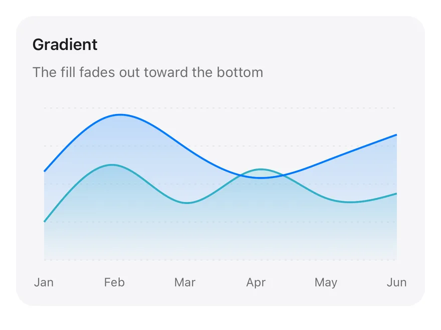
Two overlapping areas whose fills fade out toward the bottom using SVG linear gradients.
Area Chart Gradient is an open-source chart from suiss/ui for React, React Native, SwiftUI and Jetpack Compose. The @esuiss/ui CLI copies its source into your project, so you own the code.
Source: https://ui.suiss.app/docs/charts/area-chart-gradient
**React**
**Example**
```tsx title="components/charts/area-chart-gradient.tsx"
"use client"
import * as React from "react"
import { Area, AreaChart, CartesianGrid, XAxis } from "recharts"
import {
Card,
CardContent,
CardDescription,
CardHeader,
CardTitle,
} from "@/components/ui/card"
import {
type ChartConfig,
ChartContainer,
ChartTooltip,
ChartTooltipContent,
} from "@/components/ui/chart"
const chartData = [
{ month: "January", desktop: 186, mobile: 80 },
{ month: "February", desktop: 305, mobile: 200 },
{ month: "March", desktop: 237, mobile: 120 },
{ month: "April", desktop: 173, mobile: 190 },
{ month: "May", desktop: 209, mobile: 130 },
{ month: "June", desktop: 264, mobile: 140 },
]
const chartConfig = {
desktop: { label: "Desktop", color: "var(--chart-1)" },
mobile: { label: "Mobile", color: "var(--chart-2)" },
} satisfies ChartConfig
export function AreaChartGradient() {
const id = React.useId()
return (
Gradient
The fill fades out toward the bottom
value.slice(0, 3)}
/>
} />
)
}
```
Two overlapping series whose fills fade to transparent toward the baseline, so the lower series stays visible through the upper one. Reach for it over the flat-filled default when you compare two series that cross each other.
## Installation
### CLI
```bash title="Terminal"
npx shadcn@latest add @esuiss/area-chart-gradient
```
Works in any project with a `components.json`. See [Installation](https://ui.suiss.app/docs/installation#add-components) for the one-line registry setup. Or use the suiss/ui CLI:
```bash title="Terminal"
npx @esuiss/ui@latest add charts area-chart-gradient
```
### Manual
1. Install the dependencies:
```bash title="Terminal"
npm install recharts
```
2. Add the pieces it builds on: [Card](https://ui.suiss.app/docs/components/card), [Chart](https://ui.suiss.app/docs/components/chart).
3. Copy the source into `components/charts/area-chart-gradient.tsx`:
```tsx title="components/charts/area-chart-gradient.tsx"
"use client"
import * as React from "react"
import { Area, AreaChart, CartesianGrid, XAxis } from "recharts"
import {
Card,
CardContent,
CardDescription,
CardHeader,
CardTitle,
} from "@/components/ui/card"
import {
type ChartConfig,
ChartContainer,
ChartTooltip,
ChartTooltipContent,
} from "@/components/ui/chart"
const chartData = [
{ month: "January", desktop: 186, mobile: 80 },
{ month: "February", desktop: 305, mobile: 200 },
{ month: "March", desktop: 237, mobile: 120 },
{ month: "April", desktop: 173, mobile: 190 },
{ month: "May", desktop: 209, mobile: 130 },
{ month: "June", desktop: 264, mobile: 140 },
]
const chartConfig = {
desktop: { label: "Desktop", color: "var(--chart-1)" },
mobile: { label: "Mobile", color: "var(--chart-2)" },
} satisfies ChartConfig
export function AreaChartGradient() {
const id = React.useId()
return (
Gradient
The fill fades out toward the bottom
value.slice(0, 3)}
/>
} />
)
}
```
4. Update the import paths to match your project.
## Usage
```tsx
import { AreaChartGradient } from "@/components/charts/area-chart-gradient"
```
```tsx
```
Replace `chartData` and rename the two series keys consistently across the data, the areas and `chartConfig`. Each series needs its own gradient in the `defs` block, so add or rename one when you add a series. Raise or lower the top stop's `stopOpacity` to make the fill stronger or subtler.
## Notes
The series are drawn in source order, so the last `Area` sits on top. Focus the plot and use the arrow keys to move the tooltip between months.
**React Native, SwiftUI, Jetpack Compose**
```tsx title="uniwind/components/charts/area-chart-gradient.tsx"
import {
Card,
CardContent,
CardDescription,
CardHeader,
CardTitle,
} from "@/components/ui/card"
import {
Area,
AreaChart,
CartesianGrid,
type ChartConfig,
ChartContainer,
ChartTooltip,
ChartTooltipContent,
XAxis,
} from "@/components/ui/chart"
const chartData = [
{ month: "January", desktop: 186, mobile: 80 },
{ month: "February", desktop: 305, mobile: 200 },
{ month: "March", desktop: 237, mobile: 120 },
{ month: "April", desktop: 173, mobile: 190 },
{ month: "May", desktop: 209, mobile: 130 },
{ month: "June", desktop: 264, mobile: 140 },
]
const chartConfig = {
desktop: { label: "Desktop", color: "chart-1" },
mobile: { label: "Mobile", color: "chart-2" },
} satisfies ChartConfig
const fade = {
stops: [
{ offset: 0, opacity: 0.38 },
{ offset: 1, opacity: 0.02 },
],
}
export function AreaChartGradient() {
return (
Gradient
The fill fades out toward the bottom
value.slice(0, 3)}
/>
} />
)
}
```
```swift title="swift/Charts/AreaChartGradient.swift"
import Charts
import SwiftUI
private let chartData: [(month: String, desktop: Double, mobile: Double)] = [
("January", 186, 80),
("February", 305, 200),
("March", 237, 120),
("April", 173, 190),
("May", 209, 130),
("June", 264, 140),
]
private let chartConfig: ChartConfig = [
"desktop": .init("Desktop", color: EsuissColor.chart1),
"mobile": .init("Mobile", color: EsuissColor.chart2),
]
private func value(_ key: String, _ index: Int) -> Double {
key == "desktop" ? chartData[index].desktop : chartData[index].mobile
}
public struct AreaChartGradient: View {
@State private var selection: Int?
public init() {}
public var body: some View {
Card(.filled, size: .sm) {
CardHeader("Gradient", description: "The fill fades out toward the bottom")
CardContent {
ChartContainer(config: chartConfig) {
ChartAnimator { progress in
Chart {
ForEach(["mobile", "desktop"], id: \.self) { key in
let color = chartConfig.color(key)
ForEach(chartData.indices, id: \.self) { index in
AreaMark(x: .value("Month", index), y: .value("Visitors", value(key, index)), series: .value("Series", key))
.interpolationMethod(.catmullRom)
.foregroundStyle(LinearGradient(colors: [color.opacity(0.38), color.opacity(0.02)], startPoint: .top, endPoint: .bottom))
LineMark(x: .value("Month", index), y: .value("Visitors", value(key, index)), series: .value("Series", key))
.interpolationMethod(.catmullRom)
.lineStyle(StrokeStyle(lineWidth: 2, lineCap: .round, lineJoin: .round))
.foregroundStyle(color)
}
.chartReveal(progress, x: 0...(chartData.count - 1))
if let selection {
PointMark(x: .value("Month", selection), y: .value("Visitors", value(key, selection)))
.symbolSize(64)
.foregroundStyle(color)
}
}
}
.chartXScale(domain: 0...(chartData.count - 1), range: .plotDimension(padding: 12))
.chartXAxis { ChartAxis.x(values: Array(chartData.indices)) { String(chartData[$0].month.prefix(3)) } }
.chartYAxis { ChartAxis.grid() }
.chartTooltip(
x: Array(chartData.indices),
labels: chartData.map(\.month),
selection: $selection,
accessibilityLabel: "Gradient",
items: { index in ["mobile", "desktop"].map { ChartTooltipItem($0, value: value($0, index)) } }
) { payload in
ChartTooltipContent(payload)
}
}
}
.frame(height: 192)
}
}
}
}
```
```kt title="kotlin/charts/AreaChartGradient.kt"
package com.esuiss.ui.charts
import androidx.compose.foundation.layout.fillMaxWidth
import androidx.compose.foundation.layout.height
import androidx.compose.runtime.Composable
import androidx.compose.ui.Modifier
import androidx.compose.ui.unit.dp
import com.esuiss.ui.components.AreaChart
import com.esuiss.ui.components.Card
import com.esuiss.ui.components.CardContent
import com.esuiss.ui.components.CardHeader
import com.esuiss.ui.components.CardSize
import com.esuiss.ui.components.CardVariant
import com.esuiss.ui.components.ChartConfig
import com.esuiss.ui.components.ChartConfigItem
import com.esuiss.ui.components.ChartContainer
import com.esuiss.ui.components.ChartCurve
import com.esuiss.ui.components.ChartFill
import com.esuiss.ui.components.ChartMargin
import com.esuiss.ui.components.ChartTooltipContent
private class AreaGradientRow(val month: String, val desktop: Double, val mobile: Double)
private val chartData = listOf(
AreaGradientRow("January", 186.0, 80.0),
AreaGradientRow("February", 305.0, 200.0),
AreaGradientRow("March", 237.0, 120.0),
AreaGradientRow("April", 173.0, 190.0),
AreaGradientRow("May", 209.0, 130.0),
AreaGradientRow("June", 264.0, 140.0),
)
private val chartConfig = ChartConfig(
"desktop" to ChartConfigItem("Desktop") { chart1 },
"mobile" to ChartConfigItem("Mobile") { chart2 },
)
@Composable
fun AreaChartGradient(modifier: Modifier = Modifier) {
Card(modifier, variant = CardVariant.Filled, size = CardSize.Sm) {
CardHeader("Gradient", description = "The fill fades out toward the bottom")
CardContent {
ChartContainer(
chartConfig,
Modifier
.fillMaxWidth()
.height(192.dp),
) {
AreaChart(
chartData,
margin = ChartMargin(top = 10.dp, right = 12.dp, bottom = 0.dp, left = 12.dp),
accessibilityLabel = "Gradient",
) {
CartesianGrid(strokeDasharray = listOf(2f, 4f))
XAxis(label = { it.month }, tickMargin = 8.dp, interval = 0, tickFormatter = { it.take(3) })
ChartTooltip { ChartTooltipContent() }
Area(
"mobile",
value = { it.mobile },
curve = ChartCurve.Natural,
strokeWidth = 2.dp,
fill = ChartFill.VerticalGradient(topAlpha = 0.38f, bottomAlpha = 0.02f),
)
Area(
"desktop",
value = { it.desktop },
curve = ChartCurve.Natural,
strokeWidth = 2.dp,
fill = ChartFill.VerticalGradient(topAlpha = 0.38f, bottomAlpha = 0.02f),
)
}
}
}
}
}
```
Two series, desktop and mobile, drawn as natural curves on the same axis. Both use a shared gradient fill that fades out toward the baseline, so the overlap stays readable. A month axis, a dashed grid and a tooltip listing both values complete the chart.
## Installation
**React Native**
```bash title="Terminal"
npx shadcn@latest add @esuiss-rn/area-chart-gradient
```
See [Installation](https://ui.suiss.app/docs/installation) for the `components.json` setup. Or use the suiss/ui CLI:
```bash title="Terminal"
npx @esuiss/ui@latest add area-chart-gradient
```
**SwiftUI**
```bash title="Terminal"
npx @esuiss/ui@latest add area-chart-gradient --platform swift
```
**Jetpack Compose**
```bash title="Terminal"
npx @esuiss/ui@latest add area-chart-gradient --platform kotlin
```
The CLI also adds what it builds on: [Card](https://ui.suiss.app/docs/components/card), [Chart](https://ui.suiss.app/docs/components/chart).
### Manual
**React Native**
**Uniwind**
1. Add the pieces it builds on: [Card](https://ui.suiss.app/docs/components/card), [Chart](https://ui.suiss.app/docs/components/chart).
2. Copy the source into `components/charts/area-chart-gradient.tsx`:
- `uniwind/components/charts/area-chart-gradient.tsx`: shown above
3. Update the import paths to match your project.
**NativeWind**
1. Add the pieces it builds on: [Card](https://ui.suiss.app/docs/components/card), [Chart](https://ui.suiss.app/docs/components/chart).
2. Copy the source into `components/charts/area-chart-gradient.tsx`:
```tsx title="nativewind/components/charts/area-chart-gradient.tsx"
import {
Card,
CardContent,
CardDescription,
CardHeader,
CardTitle,
} from "@/components/ui/card"
import {
Area,
AreaChart,
CartesianGrid,
type ChartConfig,
ChartContainer,
ChartTooltip,
ChartTooltipContent,
XAxis,
} from "@/components/ui/chart"
const chartData = [
{ month: "January", desktop: 186, mobile: 80 },
{ month: "February", desktop: 305, mobile: 200 },
{ month: "March", desktop: 237, mobile: 120 },
{ month: "April", desktop: 173, mobile: 190 },
{ month: "May", desktop: 209, mobile: 130 },
{ month: "June", desktop: 264, mobile: 140 },
]
const chartConfig = {
desktop: { label: "Desktop", color: "chart-1" },
mobile: { label: "Mobile", color: "chart-2" },
} satisfies ChartConfig
const fade = {
stops: [
{ offset: 0, opacity: 0.38 },
{ offset: 1, opacity: 0.02 },
],
}
export function AreaChartGradient() {
return (
Gradient
The fill fades out toward the bottom
value.slice(0, 3)}
/>
} />
)
}
```
3. Update the import paths to match your project.
**StyleSheet**
1. Add the pieces it builds on: [Card](https://ui.suiss.app/docs/components/card), [Chart](https://ui.suiss.app/docs/components/chart).
2. Copy the source into `components/charts/area-chart-gradient.tsx`:
```tsx title="stylesheet/components/charts/area-chart-gradient.tsx"
import {
Card,
CardContent,
CardDescription,
CardHeader,
CardTitle,
} from "@/components/ui/card"
import {
Area,
AreaChart,
CartesianGrid,
type ChartConfig,
ChartContainer,
ChartTooltip,
ChartTooltipContent,
XAxis,
} from "@/components/ui/chart"
const chartData = [
{ month: "January", desktop: 186, mobile: 80 },
{ month: "February", desktop: 305, mobile: 200 },
{ month: "March", desktop: 237, mobile: 120 },
{ month: "April", desktop: 173, mobile: 190 },
{ month: "May", desktop: 209, mobile: 130 },
{ month: "June", desktop: 264, mobile: 140 },
]
const chartConfig = {
desktop: { label: "Desktop", color: "chart-1" },
mobile: { label: "Mobile", color: "chart-2" },
} satisfies ChartConfig
const fade = {
stops: [
{ offset: 0, opacity: 0.38 },
{ offset: 1, opacity: 0.02 },
],
}
export function AreaChartGradient() {
return (
Gradient
The fill fades out toward the bottom
value.slice(0, 3)}
/>
} />
)
}
```
3. Update the import paths to match your project.
**SwiftUI**
1. Target iOS 17 or later.
2. Copy the theme files every view uses:
- `swift/Theme/Theme.swift`: [source](https://github.com/e-suiss/ui/blob/main/packages/mobile/swiftui/Sources/EsuissUI/Theme/Theme.swift)
- `swift/Theme/Tokens.swift`: [source](https://github.com/e-suiss/ui/blob/main/packages/mobile/swiftui/Sources/EsuissUI/Theme/Tokens.swift)
3. Copy the source and every file it uses:
- `swift/Charts/AreaChartGradient.swift`: shown above
- `swift/Components/Card.swift`: see [Card](https://ui.suiss.app/docs/components/card.md)
- `swift/Components/Chart.swift`: see [Chart](https://ui.suiss.app/docs/components/chart.md)
- `swift/Components/Haptics.swift`: see [Haptics](https://ui.suiss.app/docs/components/haptics.md)
- `swift/Components/Item.swift`: see [Item](https://ui.suiss.app/docs/components/item.md)
- `swift/Components/Separator.swift`: see [Separator](https://ui.suiss.app/docs/components/separator.md)
- `swift/Components/TextVariant.swift`: [source](https://github.com/e-suiss/ui/blob/main/packages/mobile/swiftui/Sources/EsuissUI/Components/TextVariant.swift)
4. Add the files to your app target.
**Jetpack Compose**
1. Set `minSdk` to 24 or higher and add the dependencies:
```kotlin title="build.gradle.kts"
implementation(platform("androidx.compose:compose-bom:2026.09.00"))
implementation("androidx.compose.foundation:foundation")
implementation("androidx.compose.ui:ui")
```
2. Copy the theme files every view uses:
- `kotlin/theme/Theme.kt`: [source](https://github.com/e-suiss/ui/blob/main/packages/mobile/kotlin/ui/src/main/kotlin/com/esuiss/ui/theme/Theme.kt)
- `kotlin/theme/Tokens.kt`: [source](https://github.com/e-suiss/ui/blob/main/packages/mobile/kotlin/ui/src/main/kotlin/com/esuiss/ui/theme/Tokens.kt)
3. Copy the source and every file it uses:
- `kotlin/charts/AreaChartGradient.kt`: shown above
- `kotlin/components/Card.kt`: see [Card](https://ui.suiss.app/docs/components/card.md)
- `kotlin/components/Chart.kt`: see [Chart](https://ui.suiss.app/docs/components/chart.md)
- `kotlin/components/Content.kt`: [source](https://github.com/e-suiss/ui/blob/main/packages/mobile/kotlin/ui/src/main/kotlin/com/esuiss/ui/components/Content.kt)
- `kotlin/components/FormSupport.kt`: [source](https://github.com/e-suiss/ui/blob/main/packages/mobile/kotlin/ui/src/main/kotlin/com/esuiss/ui/components/FormSupport.kt)
- `kotlin/components/Haptics.kt`: see [Haptics](https://ui.suiss.app/docs/components/haptics.md)
- `kotlin/components/Icon.kt`: see [Icon](https://ui.suiss.app/docs/components/icon.md)
4. Update the `com.esuiss.ui` package names to match your project.
## Usage
```tsx
import { AreaChartGradient } from "@/components/charts/area-chart-gradient"
```
```tsx
```
Replace `chartData` with your records and change each `dataKey` to match your fields. Add or rename series in `chartConfig`, and change the `fade` stops to make the gradient stronger or lighter. The component takes no props.