# Area Chart Default
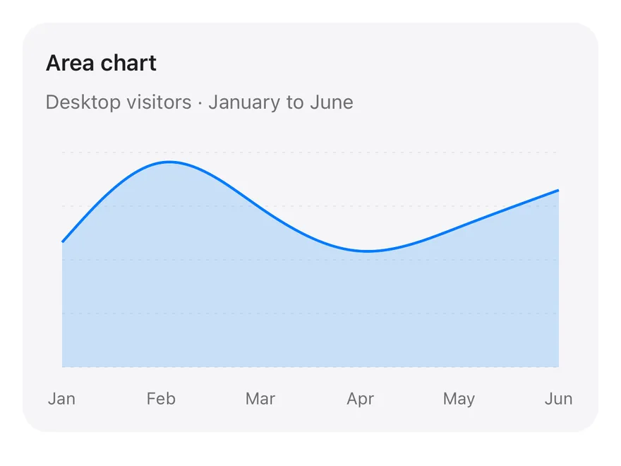
A single filled area with a smooth curve showing one series across six months.
Area Chart Default is an open-source chart from suiss/ui for React, React Native, SwiftUI and Jetpack Compose. The @esuiss/ui CLI copies its source into your project, so you own the code.
Source: https://ui.suiss.app/docs/charts/area-chart-default
**React**
**Example**
```tsx title="components/charts/area-chart-default.tsx"
"use client"
import { Area, AreaChart, CartesianGrid, XAxis } from "recharts"
import {
Card,
CardContent,
CardDescription,
CardHeader,
CardTitle,
} from "@/components/ui/card"
import {
type ChartConfig,
ChartContainer,
ChartTooltip,
ChartTooltipContent,
} from "@/components/ui/chart"
const chartData = [
{ month: "January", desktop: 186, mobile: 80 },
{ month: "February", desktop: 305, mobile: 200 },
{ month: "March", desktop: 237, mobile: 120 },
{ month: "April", desktop: 173, mobile: 190 },
{ month: "May", desktop: 209, mobile: 130 },
{ month: "June", desktop: 264, mobile: 140 },
]
const chartConfig = {
desktop: { label: "Desktop", color: "var(--chart-1)" },
} satisfies ChartConfig
export function AreaChartDefault() {
return (
Area chart
Desktop visitors · January to June
value.slice(0, 3)}
/>
} />
)
}
```
The baseline area chart: one series as a smooth, lightly filled curve with a month axis and a tooltip, and no value axis. Start here when you only need the shape of a trend and want to build up from the simplest version.
## Installation
### CLI
```bash title="Terminal"
npx shadcn@latest add @esuiss/area-chart-default
```
Works in any project with a `components.json`. See [Installation](https://ui.suiss.app/docs/installation#add-components) for the one-line registry setup. Or use the suiss/ui CLI:
```bash title="Terminal"
npx @esuiss/ui@latest add charts area-chart-default
```
### Manual
1. Install the dependencies:
```bash title="Terminal"
npm install recharts
```
2. Add the pieces it builds on: [Card](https://ui.suiss.app/docs/components/card), [Chart](https://ui.suiss.app/docs/components/chart).
3. Copy the source into `components/charts/area-chart-default.tsx`:
```tsx title="components/charts/area-chart-default.tsx"
"use client"
import { Area, AreaChart, CartesianGrid, XAxis } from "recharts"
import {
Card,
CardContent,
CardDescription,
CardHeader,
CardTitle,
} from "@/components/ui/card"
import {
type ChartConfig,
ChartContainer,
ChartTooltip,
ChartTooltipContent,
} from "@/components/ui/chart"
const chartData = [
{ month: "January", desktop: 186, mobile: 80 },
{ month: "February", desktop: 305, mobile: 200 },
{ month: "March", desktop: 237, mobile: 120 },
{ month: "April", desktop: 173, mobile: 190 },
{ month: "May", desktop: 209, mobile: 130 },
{ month: "June", desktop: 264, mobile: 140 },
]
const chartConfig = {
desktop: { label: "Desktop", color: "var(--chart-1)" },
} satisfies ChartConfig
export function AreaChartDefault() {
return (
Area chart
Desktop visitors · January to June
value.slice(0, 3)}
/>
} />
)
}
```
4. Update the import paths to match your project.
## Usage
```tsx
import { AreaChartDefault } from "@/components/charts/area-chart-default"
```
```tsx
```
Replace `chartData` with your records and change each `dataKey` to match your field names. Rename the series entry in `chartConfig` and pick its label and color there. Change the curve shape with the `type` prop on the area, for example to straight lines or steps.
## Notes
Focus the plot and use the arrow keys to move the tooltip between months. Colors come from `chartConfig`, so they follow light and dark mode without extra work.
**React Native, SwiftUI, Jetpack Compose**
```tsx title="uniwind/components/charts/area-chart-default.tsx"
import {
Card,
CardContent,
CardDescription,
CardHeader,
CardTitle,
} from "@/components/ui/card"
import {
Area,
AreaChart,
CartesianGrid,
type ChartConfig,
ChartContainer,
ChartTooltip,
ChartTooltipContent,
XAxis,
} from "@/components/ui/chart"
const chartData = [
{ month: "January", desktop: 186, mobile: 80 },
{ month: "February", desktop: 305, mobile: 200 },
{ month: "March", desktop: 237, mobile: 120 },
{ month: "April", desktop: 173, mobile: 190 },
{ month: "May", desktop: 209, mobile: 130 },
{ month: "June", desktop: 264, mobile: 140 },
]
const chartConfig = {
desktop: { label: "Desktop", color: "chart-1" },
} satisfies ChartConfig
export function AreaChartDefault() {
return (
Area chart
Desktop visitors · January to June
value.slice(0, 3)}
/>
} />
)
}
```
```swift title="swift/Charts/AreaChartDefault.swift"
import Charts
import SwiftUI
private let chartData: [(month: String, desktop: Double, mobile: Double)] = [
("January", 186, 80),
("February", 305, 200),
("March", 237, 120),
("April", 173, 190),
("May", 209, 130),
("June", 264, 140),
]
private let chartConfig: ChartConfig = [
"desktop": .init("Desktop", color: EsuissColor.chart1),
]
public struct AreaChartDefault: View {
@State private var selection: Int?
public init() {}
public var body: some View {
Card(.filled, size: .sm) {
CardHeader("Area chart", description: "Desktop visitors · January to June")
CardContent {
ChartContainer(config: chartConfig) {
ChartAnimator { progress in
Chart {
ForEach(chartData.indices, id: \.self) { index in
AreaMark(x: .value("Month", index), y: .value("Desktop", chartData[index].desktop))
.interpolationMethod(.catmullRom)
.foregroundStyle(chartConfig.color("desktop").opacity(0.18))
LineMark(x: .value("Month", index), y: .value("Desktop", chartData[index].desktop))
.interpolationMethod(.catmullRom)
.lineStyle(StrokeStyle(lineWidth: 2, lineCap: .round, lineJoin: .round))
.foregroundStyle(chartConfig.color("desktop"))
}
.chartReveal(progress, x: 0...(chartData.count - 1))
if let selection {
PointMark(x: .value("Month", selection), y: .value("Desktop", chartData[selection].desktop))
.symbolSize(64)
.foregroundStyle(chartConfig.color("desktop"))
}
}
.chartXScale(domain: 0...(chartData.count - 1), range: .plotDimension(padding: 12))
.chartXAxis { ChartAxis.x(values: Array(chartData.indices)) { String(chartData[$0].month.prefix(3)) } }
.chartYAxis { ChartAxis.grid() }
.chartTooltip(
x: Array(chartData.indices),
labels: chartData.map(\.month),
selection: $selection,
accessibilityLabel: "Area chart",
items: { [ChartTooltipItem("desktop", value: chartData[$0].desktop)] }
) { payload in
ChartTooltipContent(payload, indicator: .line)
}
}
}
.frame(height: 192)
}
}
}
}
```
```kt title="kotlin/charts/AreaChartDefault.kt"
package com.esuiss.ui.charts
import androidx.compose.foundation.layout.fillMaxWidth
import androidx.compose.foundation.layout.height
import androidx.compose.runtime.Composable
import androidx.compose.ui.Modifier
import androidx.compose.ui.unit.dp
import com.esuiss.ui.components.AreaChart
import com.esuiss.ui.components.Card
import com.esuiss.ui.components.CardContent
import com.esuiss.ui.components.CardHeader
import com.esuiss.ui.components.CardSize
import com.esuiss.ui.components.CardVariant
import com.esuiss.ui.components.ChartConfig
import com.esuiss.ui.components.ChartConfigItem
import com.esuiss.ui.components.ChartContainer
import com.esuiss.ui.components.ChartCurve
import com.esuiss.ui.components.ChartFill
import com.esuiss.ui.components.ChartMargin
import com.esuiss.ui.components.ChartTooltipContent
import com.esuiss.ui.components.ChartTooltipIndicator
private class AreaDefaultRow(val month: String, val desktop: Double, val mobile: Double)
private val chartData = listOf(
AreaDefaultRow("January", 186.0, 80.0),
AreaDefaultRow("February", 305.0, 200.0),
AreaDefaultRow("March", 237.0, 120.0),
AreaDefaultRow("April", 173.0, 190.0),
AreaDefaultRow("May", 209.0, 130.0),
AreaDefaultRow("June", 264.0, 140.0),
)
private val chartConfig = ChartConfig(
"desktop" to ChartConfigItem("Desktop") { chart1 },
)
@Composable
fun AreaChartDefault(modifier: Modifier = Modifier) {
Card(modifier, variant = CardVariant.Filled, size = CardSize.Sm) {
CardHeader("Area chart", description = "Desktop visitors · January to June")
CardContent {
ChartContainer(
chartConfig,
Modifier
.fillMaxWidth()
.height(192.dp),
) {
AreaChart(
chartData,
margin = ChartMargin(top = 10.dp, right = 12.dp, bottom = 0.dp, left = 12.dp),
accessibilityLabel = "Area chart",
) {
CartesianGrid(strokeDasharray = listOf(2f, 4f))
XAxis(label = { it.month }, tickMargin = 8.dp, interval = 0, tickFormatter = { it.take(3) })
ChartTooltip { ChartTooltipContent(indicator = ChartTooltipIndicator.Line) }
Area(
"desktop",
value = { it.desktop },
curve = ChartCurve.Natural,
strokeWidth = 2.dp,
fill = ChartFill.Solid(alpha = 0.18f),
)
}
}
}
}
}
```
The baseline area chart inside a `Card`: one series drawn as a natural curve with a light fill, a dashed horizontal grid, a month axis and a tooltip with a line indicator. There is no value axis. Press and drag across the plot to move the tooltip between months.
## Installation
**React Native**
```bash title="Terminal"
npx shadcn@latest add @esuiss-rn/area-chart-default
```
See [Installation](https://ui.suiss.app/docs/installation) for the `components.json` setup. Or use the suiss/ui CLI:
```bash title="Terminal"
npx @esuiss/ui@latest add area-chart-default
```
**SwiftUI**
```bash title="Terminal"
npx @esuiss/ui@latest add area-chart-default --platform swift
```
**Jetpack Compose**
```bash title="Terminal"
npx @esuiss/ui@latest add area-chart-default --platform kotlin
```
The CLI also adds what it builds on: [Card](https://ui.suiss.app/docs/components/card), [Chart](https://ui.suiss.app/docs/components/chart).
### Manual
**React Native**
**Uniwind**
1. Add the pieces it builds on: [Card](https://ui.suiss.app/docs/components/card), [Chart](https://ui.suiss.app/docs/components/chart).
2. Copy the source into `components/charts/area-chart-default.tsx`:
- `uniwind/components/charts/area-chart-default.tsx`: shown above
3. Update the import paths to match your project.
**NativeWind**
1. Add the pieces it builds on: [Card](https://ui.suiss.app/docs/components/card), [Chart](https://ui.suiss.app/docs/components/chart).
2. Copy the source into `components/charts/area-chart-default.tsx`:
```tsx title="nativewind/components/charts/area-chart-default.tsx"
import {
Card,
CardContent,
CardDescription,
CardHeader,
CardTitle,
} from "@/components/ui/card"
import {
Area,
AreaChart,
CartesianGrid,
type ChartConfig,
ChartContainer,
ChartTooltip,
ChartTooltipContent,
XAxis,
} from "@/components/ui/chart"
const chartData = [
{ month: "January", desktop: 186, mobile: 80 },
{ month: "February", desktop: 305, mobile: 200 },
{ month: "March", desktop: 237, mobile: 120 },
{ month: "April", desktop: 173, mobile: 190 },
{ month: "May", desktop: 209, mobile: 130 },
{ month: "June", desktop: 264, mobile: 140 },
]
const chartConfig = {
desktop: { label: "Desktop", color: "chart-1" },
} satisfies ChartConfig
export function AreaChartDefault() {
return (
Area chart
Desktop visitors · January to June
value.slice(0, 3)}
/>
} />
)
}
```
3. Update the import paths to match your project.
**StyleSheet**
1. Add the pieces it builds on: [Card](https://ui.suiss.app/docs/components/card), [Chart](https://ui.suiss.app/docs/components/chart).
2. Copy the source into `components/charts/area-chart-default.tsx`:
```tsx title="stylesheet/components/charts/area-chart-default.tsx"
import {
Card,
CardContent,
CardDescription,
CardHeader,
CardTitle,
} from "@/components/ui/card"
import {
Area,
AreaChart,
CartesianGrid,
type ChartConfig,
ChartContainer,
ChartTooltip,
ChartTooltipContent,
XAxis,
} from "@/components/ui/chart"
const chartData = [
{ month: "January", desktop: 186, mobile: 80 },
{ month: "February", desktop: 305, mobile: 200 },
{ month: "March", desktop: 237, mobile: 120 },
{ month: "April", desktop: 173, mobile: 190 },
{ month: "May", desktop: 209, mobile: 130 },
{ month: "June", desktop: 264, mobile: 140 },
]
const chartConfig = {
desktop: { label: "Desktop", color: "chart-1" },
} satisfies ChartConfig
export function AreaChartDefault() {
return (
Area chart
Desktop visitors · January to June
value.slice(0, 3)}
/>
} />
)
}
```
3. Update the import paths to match your project.
**SwiftUI**
1. Target iOS 17 or later.
2. Copy the theme files every view uses:
- `swift/Theme/Theme.swift`: [source](https://github.com/e-suiss/ui/blob/main/packages/mobile/swiftui/Sources/EsuissUI/Theme/Theme.swift)
- `swift/Theme/Tokens.swift`: [source](https://github.com/e-suiss/ui/blob/main/packages/mobile/swiftui/Sources/EsuissUI/Theme/Tokens.swift)
3. Copy the source and every file it uses:
- `swift/Charts/AreaChartDefault.swift`: shown above
- `swift/Components/Card.swift`: see [Card](https://ui.suiss.app/docs/components/card.md)
- `swift/Components/Chart.swift`: see [Chart](https://ui.suiss.app/docs/components/chart.md)
- `swift/Components/Haptics.swift`: see [Haptics](https://ui.suiss.app/docs/components/haptics.md)
- `swift/Components/Item.swift`: see [Item](https://ui.suiss.app/docs/components/item.md)
- `swift/Components/Separator.swift`: see [Separator](https://ui.suiss.app/docs/components/separator.md)
- `swift/Components/TextVariant.swift`: [source](https://github.com/e-suiss/ui/blob/main/packages/mobile/swiftui/Sources/EsuissUI/Components/TextVariant.swift)
4. Add the files to your app target.
**Jetpack Compose**
1. Set `minSdk` to 24 or higher and add the dependencies:
```kotlin title="build.gradle.kts"
implementation(platform("androidx.compose:compose-bom:2026.09.00"))
implementation("androidx.compose.foundation:foundation")
implementation("androidx.compose.ui:ui")
```
2. Copy the theme files every view uses:
- `kotlin/theme/Theme.kt`: [source](https://github.com/e-suiss/ui/blob/main/packages/mobile/kotlin/ui/src/main/kotlin/com/esuiss/ui/theme/Theme.kt)
- `kotlin/theme/Tokens.kt`: [source](https://github.com/e-suiss/ui/blob/main/packages/mobile/kotlin/ui/src/main/kotlin/com/esuiss/ui/theme/Tokens.kt)
3. Copy the source and every file it uses:
- `kotlin/charts/AreaChartDefault.kt`: shown above
- `kotlin/components/Card.kt`: see [Card](https://ui.suiss.app/docs/components/card.md)
- `kotlin/components/Chart.kt`: see [Chart](https://ui.suiss.app/docs/components/chart.md)
- `kotlin/components/Content.kt`: [source](https://github.com/e-suiss/ui/blob/main/packages/mobile/kotlin/ui/src/main/kotlin/com/esuiss/ui/components/Content.kt)
- `kotlin/components/FormSupport.kt`: [source](https://github.com/e-suiss/ui/blob/main/packages/mobile/kotlin/ui/src/main/kotlin/com/esuiss/ui/components/FormSupport.kt)
- `kotlin/components/Haptics.kt`: see [Haptics](https://ui.suiss.app/docs/components/haptics.md)
- `kotlin/components/Icon.kt`: see [Icon](https://ui.suiss.app/docs/components/icon.md)
4. Update the `com.esuiss.ui` package names to match your project.
## Usage
```tsx
import { AreaChartDefault } from "@/components/charts/area-chart-default"
```
```tsx
```
Replace `chartData` with your records and change each `dataKey` to match your fields. Rename the series in `chartConfig` to set its label and color. The component takes no props.