# Signup Trial
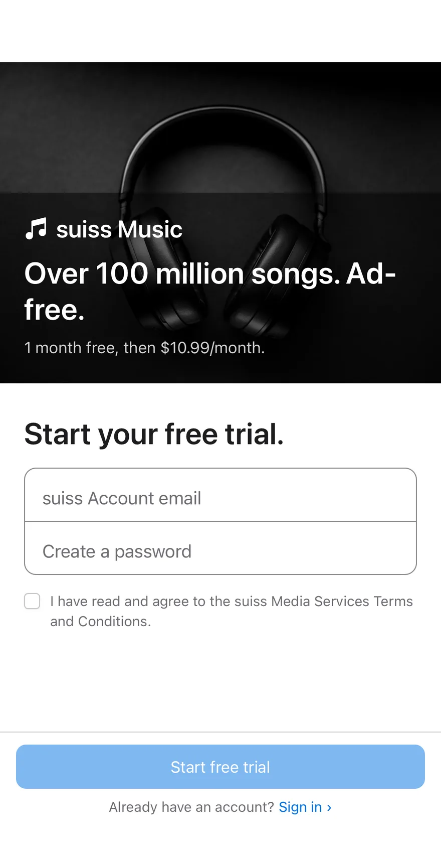
A free trial signup split between a promotional image panel and a short form with a password strength meter.
Signup Trial is an open-source block from suiss/ui for React, React Native, SwiftUI and Jetpack Compose. The @esuiss/ui CLI copies its source into your project, so you own the code.
Source: https://ui.suiss.app/docs/blocks/signup-trial
**React**
**Example**
```tsx title="components/blocks/signup-trial.tsx"
"use client"
import { CheckIcon, MusicNotesIcon } from "@phosphor-icons/react"
import * as React from "react"
import { Button } from "@/components/ui/button"
import { Checkbox } from "@/components/ui/checkbox"
import { Input } from "@/components/ui/input"
import { Label } from "@/components/ui/label"
const EMAIL = /.+@.+\..+/
const UPPERCASE = /[A-Z]/
const LOWERCASE = /[a-z]/
const DIGIT = /\d/
const SYMBOL = /[^A-Za-z0-9]/
const image =
"https://images.unsplash.com/photo-1599669454699-248893623440?w=1200&q=80&auto=format&fit=crop"
const levels = [
"bg-red-500",
"bg-orange-500",
"bg-yellow-500",
"bg-green-500",
"bg-green-500",
] as const
const strength = (value: string) =>
[
value.length >= 8,
UPPERCASE.test(value) && LOWERCASE.test(value),
DIGIT.test(value),
SYMBOL.test(value),
].filter(Boolean).length
const strengthLabel = ["Weak", "Weak", "Fair", "Good", "Strong"]
export function SignupTrial() {
const [email, setEmail] = React.useState("")
const [password, setPassword] = React.useState("")
const [terms, setTerms] = React.useState(false)
const [done, setDone] = React.useState(false)
const score = strength(password)
const valid = EMAIL.test(email) && score >= 3 && terms
if (done) {
return (
Welcome to suiss Music.
Your one-month free trial has started.
)
}
return (
suiss Music
Over 100 million songs. Ad-free.
1 month free, then $10.99/month.
)
}
```
A free trial signup that pairs a promotional image panel with a short form: email, password with a strength meter, and a terms checkbox. The submit button stays disabled until the form is valid. The panel sits beside the form on desktop and above it on mobile. Use it for trial, waitlist or account signups that need a sales pitch alongside.
## Installation
### CLI
```bash title="Terminal"
npx shadcn@latest add @esuiss/signup-trial
```
Works in any project with a `components.json`. See [Installation](https://ui.suiss.app/docs/installation#add-components) for the one-line registry setup. Or use the suiss/ui CLI:
```bash title="Terminal"
npx @esuiss/ui@latest add blocks signup-trial
```
### Manual
1. Install the dependencies:
```bash title="Terminal"
npm install @phosphor-icons/react
```
2. Add the pieces it builds on: [Button](https://ui.suiss.app/docs/components/button), [Checkbox](https://ui.suiss.app/docs/components/checkbox), [Input](https://ui.suiss.app/docs/components/input), [Label](https://ui.suiss.app/docs/components/label).
3. Copy the source into `components/blocks/signup-trial.tsx`:
```tsx title="components/blocks/signup-trial.tsx"
"use client"
import { CheckIcon, MusicNotesIcon } from "@phosphor-icons/react"
import * as React from "react"
import { Button } from "@/components/ui/button"
import { Checkbox } from "@/components/ui/checkbox"
import { Input } from "@/components/ui/input"
import { Label } from "@/components/ui/label"
const EMAIL = /.+@.+\..+/
const UPPERCASE = /[A-Z]/
const LOWERCASE = /[a-z]/
const DIGIT = /\d/
const SYMBOL = /[^A-Za-z0-9]/
const image =
"https://images.unsplash.com/photo-1599669454699-248893623440?w=1200&q=80&auto=format&fit=crop"
const levels = [
"bg-red-500",
"bg-orange-500",
"bg-yellow-500",
"bg-green-500",
"bg-green-500",
] as const
const strength = (value: string) =>
[
value.length >= 8,
UPPERCASE.test(value) && LOWERCASE.test(value),
DIGIT.test(value),
SYMBOL.test(value),
].filter(Boolean).length
const strengthLabel = ["Weak", "Weak", "Fair", "Good", "Strong"]
export function SignupTrial() {
const [email, setEmail] = React.useState("")
const [password, setPassword] = React.useState("")
const [terms, setTerms] = React.useState(false)
const [done, setDone] = React.useState(false)
const score = strength(password)
const valid = EMAIL.test(email) && score >= 3 && terms
if (done) {
return (
Welcome to suiss Music.
Your one-month free trial has started.
)
}
return (
suiss Music
Over 100 million songs. Ad-free.
1 month free, then $10.99/month.
)
}
```
4. Update the import paths to match your project.
## Usage
```tsx
import { SignupTrial } from "@/components/blocks/signup-trial"
```
```tsx
```
Replace the promotional copy, the `image` constant and the success branch with your trial signup call. `strength` scores length, mixed case, a digit and a symbol, and the form needs 3 of 4, so tune it to your password policy. Point `#sign-in` at your sign-in page.
## Notes
The strength meter exposes its level to screen readers. The promo panel is a CSS background image from Unsplash with no text alternative, so keep its copy meaningful.
**React Native, SwiftUI, Jetpack Compose**
```tsx title="uniwind/components/blocks/signup-trial.tsx"
import { cn } from "cn"
import { CheckIcon, MusicNotesIcon } from "phosphor-react-native"
import * as React from "react"
import { Image, Pressable, View } from "react-native"
import { FadeIn, FadeInDown, ReduceMotion } from "react-native-reanimated"
import { AnimatedView } from "@/components/ui/animated-view"
import { BottomBar, BottomBarContent } from "@/components/ui/bottom-bar"
import { Button } from "@/components/ui/button"
import { Checkbox } from "@/components/ui/checkbox"
import { Icon } from "@/components/ui/icon"
import {
InputAccessoryBar,
InputAccessoryBarInput,
} from "@/components/ui/input-accessory-bar"
import { KeyboardScrollView } from "@/components/ui/keyboard-scroll-view"
import { Label } from "@/components/ui/label"
import { Screen } from "@/components/ui/screen"
import { Text } from "@/components/ui/text"
const EMAIL = /.+@.+\..+/
const UPPERCASE = /[A-Z]/
const LOWERCASE = /[a-z]/
const DIGIT = /\d/
const SYMBOL = /[^A-Za-z0-9]/
const IMAGE =
"https://images.unsplash.com/photo-1599669454699-248893623440?w=1200&q=80&auto=format&fit=crop"
const LEVELS = [
"bg-red-500",
"bg-red-500",
"bg-orange-500",
"bg-yellow-500",
"bg-green-500",
]
const STRENGTH_LABEL = ["Weak", "Weak", "Fair", "Good", "Strong"]
const INPUT_CLASS =
"h-13 rounded-none border-transparent bg-transparent px-4 text-lg"
const strength = (value: string) =>
[
value.length >= 8,
UPPERCASE.test(value) && LOWERCASE.test(value),
DIGIT.test(value),
SYMBOL.test(value),
].filter(Boolean).length
function SignupTrial({
onSignIn,
onSubmit,
}: {
onSignIn?: () => void
onSubmit?: (email: string, password: string) => void
}) {
const [email, setEmail] = React.useState("")
const [password, setPassword] = React.useState("")
const [terms, setTerms] = React.useState(false)
const [done, setDone] = React.useState(false)
const score = strength(password)
const valid = EMAIL.test(email) && score >= 3 && terms
if (done) {
return (
Welcome to suiss Music.
Your one-month free trial has started.
setDone(false)}
className="active:opacity-60"
>
Start over ›
)
}
return (
suiss Music
Over 100 million songs. Ad-free.
1 month free, then $10.99/month.
Start your free trial.
{password ? (
{[0, 1, 2, 3].map((bar) => (
))}
) : null}
Already have an account?
Sign in ›
)
}
export { SignupTrial }
```
```swift title="swift/Blocks/SignupTrial.swift"
import PhosphorSwift
import SwiftUI
public struct SignupTrial: View {
enum FocusField: Hashable {
case email, password
}
static let image = URL(string: "https://images.unsplash.com/photo-1599669454699-248893623440?w=1200&q=80&auto=format&fit=crop")
private var onSignIn: (() -> Void)?
private var onSubmit: ((String, String) -> Void)?
@State private var email: String
@State private var password: String
@State private var terms: Bool
@State private var done: Bool
@FocusState private var focus: FocusField?
@Environment(\.accessibilityReduceMotion) private var reduceMotion
public init(onSubmit: ((_ email: String, _ password: String) -> Void)? = nil, onSignIn: (() -> Void)? = nil) {
self.init(email: "", password: "", terms: false)
self.onSubmit = onSubmit
self.onSignIn = onSignIn
}
init(email: String, password: String, terms: Bool, done: Bool = false) {
_email = State(initialValue: email)
_password = State(initialValue: password)
_terms = State(initialValue: terms)
_done = State(initialValue: done)
}
private var score: Int {
[
password.count >= 8,
password.contains(where: \.isUppercase) && password.contains(where: \.isLowercase),
password.contains(where: \.isNumber),
password.contains { !$0.isLetter && !$0.isNumber },
].filter { $0 }.count
}
private var valid: Bool {
email.wholeMatch(of: /.+@.+\..+/) != nil && score >= 3 && terms
}
public var body: some View {
Screen(edges: [.bottom]) {
if done {
welcome
.transition(.opacity.combined(with: .offset(y: 18)))
} else {
KeyboardScrollView {
VStack(spacing: 0) {
hero
form
}
}
.inputAccessoryBar(focus: $focus, order: [.email, .password])
BottomBar {
BottomBarContent {
Button("Start free trial") {
onSubmit?(email, password)
done = true
}
.buttonStyle(.variant(.default, size: .lg, block: true))
.disabled(!valid)
HStack(spacing: 4) {
Text("Already have an account?")
.scaledFont(.sm)
.foregroundStyle(EsuissColor.mutedForeground)
Button("Sign in ›") { onSignIn?() }
.buttonStyle(SignupTrialLinkStyle())
}
}
}
}
}
.animation(reduceMotion ? nil : .timingCurve(0.32, 0.72, 0, 1, duration: 0.6), value: done)
}
private var hero: some View {
VStack(alignment: .leading, spacing: 0) {
Label {
Text(verbatim: "suiss Music")
} icon: {
Ph.musicNotes.fill.frame(width: 26, height: 26)
}
.labelStyle(SignupTrialHeroLabelStyle())
.scaledFont(.xl, weight: .semibold)
Text("Over 100 million songs. Ad-free.")
.scaledTextStyle(.xl2, weight: .bold)
.padding(.top, 10)
Text("1 month free, then $10.99/month.")
.scaledTextStyle(.base)
.opacity(0.8)
.padding(.top, 8)
}
.foregroundStyle(Palette.white)
.fixedSize(horizontal: false, vertical: true)
.padding(24)
.padding(.top, 112)
.frame(maxWidth: .infinity, minHeight: 340, alignment: .bottomLeading)
.background {
ZStack {
Palette.black
AsyncImage(url: Self.image) { phase in
if let image = phase.image {
image.resizable().scaledToFill()
}
}
LinearGradient(colors: [.clear, Palette.black.opacity(0.8)], startPoint: .top, endPoint: .bottom)
}
.clipped()
.accessibilityHidden(true)
}
.accessibilityElement(children: .combine)
}
private var form: some View {
let shape = RoundedRectangle(cornerRadius: Radius.xl, style: .continuous)
return VStack(alignment: .leading, spacing: 16) {
Text("Start your free trial.")
.scaledTextStyle(.xl2, weight: .bold)
VStack(spacing: 0) {
TextField("suiss Account email", text: $email)
.textContentType(.emailAddress)
.keyboardType(.emailAddress)
.textInputAutocapitalization(.never)
.autocorrectionDisabled()
.submitLabel(.next)
.focused($focus, equals: .email)
.modifier(SignupTrialFieldText())
EsuissColor.input.frame(height: 1)
SecureField("Create a password", text: $password)
.textContentType(.newPassword)
.submitLabel(.done)
.focused($focus, equals: .password)
.modifier(SignupTrialFieldText())
}
.background(EsuissColor.background, in: shape)
.overlay {
shape.strokeBorder(focus != nil ? EsuissColor.ring : EsuissColor.input, lineWidth: 1)
}
if !password.isEmpty {
meter
.transition(.opacity.combined(with: .offset(y: 4)))
}
Toggle(isOn: $terms) {
Text("I have read and agree to the suiss Media Services Terms and Conditions.")
.scaledTextStyle(.sm)
.foregroundStyle(EsuissColor.mutedForeground)
.fixedSize(horizontal: false, vertical: true)
}
.toggleStyle(.checkbox)
}
.padding(.horizontal, 24)
.padding(.vertical, 28)
.animation(reduceMotion ? nil : .easeOut(duration: 0.3), value: password.isEmpty)
}
private var meter: some View {
let levels: [Color] = [Palette.red500, Palette.red500, Palette.orange500, Palette.yellow500, Palette.green500]
let labels: [LocalizedStringKey] = ["Weak", "Weak", "Fair", "Good", "Strong"]
return HStack(spacing: 4) {
ForEach(0..<4, id: \.self) { bar in
Capsule()
.fill(bar < max(1, score) ? levels[score] : EsuissColor.secondary)
.frame(height: 4)
}
}
.animation(.easeInOut(duration: 0.3), value: score)
.accessibilityElement(children: .ignore)
.accessibilityLabel(Text("Password strength"))
.accessibilityValue(Text(labels[score]))
}
private var welcome: some View {
VStack(spacing: 14) {
Ph.check.bold
.frame(width: 38, height: 38)
.foregroundStyle(EsuissColor.primaryForeground)
.frame(width: 76, height: 76)
.background(Palette.green500, in: Circle())
.accessibilityHidden(true)
Text("Welcome to suiss Music.")
.scaledTextStyle(.xl2, weight: .bold)
Text("Your one-month free trial has started.")
.scaledTextStyle(.lg)
.foregroundStyle(EsuissColor.mutedForeground)
Button("Start over ›") { done = false }
.buttonStyle(SignupTrialLinkStyle(style: .lg))
}
.multilineTextAlignment(.center)
.fixedSize(horizontal: false, vertical: true)
.padding(24)
.frame(maxWidth: .infinity, maxHeight: .infinity)
}
}
private struct SignupTrialFieldText: ViewModifier {
func body(content: Content) -> some View {
content
.scaledFont(.lg)
.foregroundStyle(EsuissColor.foreground)
.tint(EsuissColor.primary)
.padding(.horizontal, 16)
.frame(maxWidth: .infinity, minHeight: 52, alignment: .leading)
}
}
private struct SignupTrialHeroLabelStyle: LabelStyle {
func makeBody(configuration: Configuration) -> some View {
HStack(spacing: 6) {
configuration.icon
configuration.title
}
}
}
private struct SignupTrialLinkStyle: ButtonStyle {
var style: TextStyle = .sm
func makeBody(configuration: Configuration) -> some View {
configuration.label
.scaledFont(style)
.foregroundStyle(EsuissColor.primary)
.opacity(configuration.isPressed ? 0.8 : 1)
.frame(minHeight: 32)
.contentShape(Rectangle())
}
}
```
```kt title="kotlin/blocks/SignupTrial.kt"
package com.esuiss.ui.blocks
import androidx.compose.animation.AnimatedVisibility
import androidx.compose.animation.animateColorAsState
import androidx.compose.animation.core.Animatable
import androidx.compose.animation.core.CubicBezierEasing
import androidx.compose.animation.core.tween
import androidx.compose.animation.fadeIn
import androidx.compose.animation.slideInVertically
import androidx.compose.foundation.background
import androidx.compose.foundation.border
import androidx.compose.foundation.clickable
import androidx.compose.foundation.interaction.MutableInteractionSource
import androidx.compose.foundation.interaction.collectIsPressedAsState
import androidx.compose.foundation.layout.Arrangement
import androidx.compose.foundation.layout.Box
import androidx.compose.foundation.layout.Column
import androidx.compose.foundation.layout.FlowRow
import androidx.compose.foundation.layout.PaddingValues
import androidx.compose.foundation.layout.Row
import androidx.compose.foundation.layout.Spacer
import androidx.compose.foundation.layout.WindowInsets
import androidx.compose.foundation.layout.fillMaxSize
import androidx.compose.foundation.layout.fillMaxWidth
import androidx.compose.foundation.layout.height
import androidx.compose.foundation.layout.padding
import androidx.compose.foundation.layout.size
import androidx.compose.foundation.layout.statusBars
import androidx.compose.foundation.layout.windowInsetsPadding
import androidx.compose.foundation.selection.toggleable
import androidx.compose.foundation.shape.CircleShape
import androidx.compose.foundation.shape.RoundedCornerShape
import androidx.compose.foundation.text.BasicText
import androidx.compose.foundation.text.BasicTextField
import androidx.compose.foundation.text.KeyboardActions
import androidx.compose.foundation.text.KeyboardOptions
import androidx.compose.runtime.Composable
import androidx.compose.runtime.LaunchedEffect
import androidx.compose.runtime.getValue
import androidx.compose.runtime.mutableStateOf
import androidx.compose.runtime.remember
import androidx.compose.runtime.saveable.rememberSaveable
import androidx.compose.runtime.setValue
import androidx.compose.ui.Alignment
import androidx.compose.ui.Modifier
import androidx.compose.ui.draw.clip
import androidx.compose.ui.focus.FocusDirection
import androidx.compose.ui.graphics.SolidColor
import androidx.compose.ui.graphics.graphicsLayer
import androidx.compose.ui.platform.LocalFocusManager
import androidx.compose.ui.semantics.ProgressBarRangeInfo
import androidx.compose.ui.semantics.Role
import androidx.compose.ui.semantics.contentDescription
import androidx.compose.ui.semantics.heading
import androidx.compose.ui.semantics.progressBarRangeInfo
import androidx.compose.ui.semantics.semantics
import androidx.compose.ui.semantics.stateDescription
import androidx.compose.ui.text.font.FontWeight
import androidx.compose.ui.text.input.ImeAction
import androidx.compose.ui.text.input.KeyboardType
import androidx.compose.ui.text.input.PasswordVisualTransformation
import androidx.compose.ui.text.input.VisualTransformation
import androidx.compose.ui.text.style.TextAlign
import androidx.compose.ui.unit.dp
import com.adamglin.PhosphorIcons
import com.adamglin.phosphoricons.Bold
import com.adamglin.phosphoricons.Fill
import com.adamglin.phosphoricons.bold.Check
import com.adamglin.phosphoricons.fill.MusicNotes
import com.esuiss.ui.components.BottomBar
import com.esuiss.ui.components.BottomBarContent
import com.esuiss.ui.components.Button
import com.esuiss.ui.components.ButtonSize
import com.esuiss.ui.components.Checkbox
import com.esuiss.ui.components.Icon
import com.esuiss.ui.components.InputAccessoryBar
import com.esuiss.ui.components.InputAccessoryState
import com.esuiss.ui.components.KeyboardScrollView
import com.esuiss.ui.components.Screen
import com.esuiss.ui.components.ScreenEdge
import com.esuiss.ui.components.inputAccessory
import com.esuiss.ui.components.rememberInputAccessoryState
import com.esuiss.ui.theme.EsuissTheme
import com.esuiss.ui.theme.Palette
import com.esuiss.ui.theme.Radius
import com.esuiss.ui.theme.Typography
private val EmailPattern = Regex(".+@.+\\..+")
private val RevealEasing = CubicBezierEasing(0.32f, 0.72f, 0f, 1f)
private val StrengthLabels = listOf("Weak", "Weak", "Fair", "Good", "Strong")
private fun strength(value: String): Int = listOf(
value.length >= 8,
value.any { it.isUpperCase() } && value.any { it.isLowerCase() },
value.any { it.isDigit() },
value.any { !it.isLetterOrDigit() },
).count { it }
@Composable
fun SignupTrial(
modifier: Modifier = Modifier,
onSubmit: (email: String, password: String) -> Unit = { _, _ -> },
onSignIn: () -> Unit = {},
) {
val colors = EsuissTheme.colors
var email by rememberSaveable { mutableStateOf("") }
var password by remember { mutableStateOf("") }
var terms by rememberSaveable { mutableStateOf(false) }
var done by rememberSaveable { mutableStateOf(false) }
val accessory = rememberInputAccessoryState()
val score = strength(password)
val valid = EmailPattern.matches(email) && score >= 3 && terms
fun submit() {
if (!valid) return
onSubmit(email, password)
done = true
}
Screen(modifier, edges = setOf(ScreenEdge.Bottom, ScreenEdge.Left, ScreenEdge.Right)) {
if (done) {
Success { done = false }
return@Screen
}
Column(Modifier.fillMaxSize()) {
KeyboardScrollView(modifier = Modifier.weight(1f)) {
Hero()
Column(
modifier = Modifier.padding(PaddingValues(horizontal = 24.dp, vertical = 32.dp)),
verticalArrangement = Arrangement.spacedBy(16.dp),
) {
BasicText(
"Start your free trial.",
modifier = Modifier.semantics { heading() },
style = Typography.xl3.copy(color = colors.foreground, fontWeight = FontWeight.SemiBold),
)
val shape = RoundedCornerShape(Radius.xl)
Column(
Modifier
.fillMaxWidth()
.clip(shape)
.background(colors.background, shape)
.border(1.dp, colors.input, shape),
) {
StackInput(email, { email = it }, "suiss Account email", accessory, 0, KeyboardType.Email)
Box(
Modifier
.fillMaxWidth()
.height(1.dp)
.background(colors.input),
)
StackInput(password, { password = it }, "Create a password", accessory, 1, KeyboardType.Password, secret = true)
}
AnimatedVisibility(
visible = password.isNotEmpty(),
enter = fadeIn(tween(800)) + slideInVertically(tween(800)) { it / 4 },
) {
StrengthMeter(score)
}
Row(
modifier = Modifier.toggleable(
value = terms,
interactionSource = remember { MutableInteractionSource() },
indication = null,
role = Role.Checkbox,
) { terms = it },
horizontalArrangement = Arrangement.spacedBy(10.dp),
) {
Checkbox(checked = terms, onCheckedChange = null, modifier = Modifier.padding(top = 2.dp))
BasicText(
"I have read and agree to the suiss Media Services Terms and Conditions.",
modifier = Modifier.weight(1f),
style = Typography.sm.copy(color = colors.mutedForeground),
)
}
FlowRow(
modifier = Modifier.fillMaxWidth(),
horizontalArrangement = Arrangement.spacedBy(4.dp, Alignment.CenterHorizontally),
) {
BasicText("Already have an account?", style = Typography.sm.copy(color = colors.mutedForeground))
LinkText("Sign in ›", onSignIn)
}
}
}
BottomBar {
BottomBarContent {
Button("Start free trial", ::submit, size = ButtonSize.Lg, block = true, enabled = valid)
}
}
}
InputAccessoryBar(accessory)
}
}
@Composable
private fun Hero() {
val colors = EsuissTheme.colors
Box(
Modifier
.fillMaxWidth()
.background(Palette.indigo500),
) {
Column(
Modifier
.windowInsetsPadding(WindowInsets.statusBars)
.padding(start = 24.dp, end = 24.dp, top = 112.dp, bottom = 24.dp),
) {
Row(horizontalArrangement = Arrangement.spacedBy(6.dp), verticalAlignment = Alignment.CenterVertically) {
Icon(PhosphorIcons.Fill.MusicNotes, contentDescription = null, size = 26.dp, tint = Palette.white)
BasicText("suiss Music", style = Typography.xl2.copy(color = Palette.white, fontWeight = FontWeight.SemiBold))
}
Spacer(Modifier.height(10.dp))
BasicText(
"Over 100 million songs. Ad-free.",
style = Typography.xl3.copy(color = Palette.white, fontWeight = FontWeight.SemiBold),
)
Spacer(Modifier.height(8.dp))
BasicText(
"1 month free, then \$10.99/month.",
style = Typography.base.copy(color = Palette.white.copy(alpha = 0.8f)),
)
}
}
}
@Composable
private fun StrengthMeter(score: Int) {
val colors = EsuissTheme.colors
val level = when (score) {
0 -> Palette.red500
1 -> Palette.orange500
2 -> Palette.yellow500
else -> Palette.green500
}
Row(
modifier = Modifier
.fillMaxWidth()
.semantics {
contentDescription = "Password strength"
stateDescription = StrengthLabels[score]
progressBarRangeInfo = ProgressBarRangeInfo(score.toFloat(), 0f..4f, steps = 3)
},
horizontalArrangement = Arrangement.spacedBy(4.dp),
) {
repeat(4) { bar ->
val fill by animateColorAsState(if (bar < maxOf(1, score)) level else colors.secondary, tween(300), label = "bar")
Box(
Modifier
.weight(1f)
.height(4.dp)
.background(fill, CircleShape),
)
}
}
}
@Composable
private fun StackInput(
value: String,
onValueChange: (String) -> Unit,
placeholder: String,
accessory: InputAccessoryState,
index: Int,
keyboardType: KeyboardType,
secret: Boolean = false,
) {
val colors = EsuissTheme.colors
val focus = LocalFocusManager.current
val style = Typography.lg.copy(color = colors.foreground)
BasicTextField(
value = value,
onValueChange = onValueChange,
modifier = Modifier
.fillMaxWidth()
.height(52.dp)
.inputAccessory(accessory, index)
.semantics { contentDescription = placeholder },
textStyle = style,
singleLine = true,
cursorBrush = SolidColor(colors.primary),
visualTransformation = if (secret) PasswordVisualTransformation() else VisualTransformation.None,
keyboardOptions = KeyboardOptions(keyboardType = keyboardType, imeAction = if (secret) ImeAction.Done else ImeAction.Next),
keyboardActions = KeyboardActions(
onNext = { focus.moveFocus(FocusDirection.Next) },
onDone = { focus.clearFocus() },
),
decorationBox = { inner ->
Box(Modifier.padding(horizontal = 16.dp), contentAlignment = Alignment.CenterStart) {
if (value.isEmpty()) BasicText(placeholder, style = style.copy(color = colors.mutedForeground), maxLines = 1)
inner()
}
},
)
}
@Composable
private fun LinkText(text: String, onClick: () -> Unit) {
val interaction = remember { MutableInteractionSource() }
val pressed by interaction.collectIsPressedAsState()
BasicText(
text,
modifier = Modifier
.graphicsLayer { alpha = if (pressed) 0.8f else 1f }
.clickable(interactionSource = interaction, indication = null, role = Role.Button, onClick = onClick),
style = Typography.sm.copy(color = EsuissTheme.colors.primary),
)
}
@Composable
private fun Success(onStartOver: () -> Unit) {
val colors = EsuissTheme.colors
val appear = remember { Animatable(0f) }
LaunchedEffect(Unit) { appear.animateTo(1f, tween(1000, easing = RevealEasing)) }
val interaction = remember { MutableInteractionSource() }
val pressed by interaction.collectIsPressedAsState()
Column(
modifier = Modifier
.fillMaxSize()
.windowInsetsPadding(WindowInsets.statusBars)
.padding(24.dp)
.graphicsLayer {
alpha = appear.value
translationY = (1f - appear.value) * 18.dp.toPx()
},
verticalArrangement = Arrangement.spacedBy(14.dp, Alignment.CenterVertically),
horizontalAlignment = Alignment.CenterHorizontally,
) {
Box(
Modifier
.size(76.dp)
.background(Palette.green500, CircleShape),
contentAlignment = Alignment.Center,
) {
Icon(PhosphorIcons.Bold.Check, contentDescription = null, size = 38.dp, tint = colors.primaryForeground)
}
BasicText(
"Welcome to suiss Music.",
modifier = Modifier.semantics { heading() },
style = Typography.xl3.copy(color = colors.foreground, fontWeight = FontWeight.SemiBold, textAlign = TextAlign.Center),
)
BasicText(
"Your one-month free trial has started.",
style = Typography.lg.copy(color = colors.mutedForeground, textAlign = TextAlign.Center),
)
BasicText(
"Start over ›",
modifier = Modifier
.graphicsLayer { alpha = if (pressed) 0.8f else 1f }
.clickable(interactionSource = interaction, indication = null, role = Role.Button, onClick = onStartOver),
style = Typography.lg.copy(color = colors.primary),
)
}
}
```
A hero image sits above an `InputAccessoryBar` with email and password inputs; the password shows a five-level strength meter as you type. A `Checkbox` with a `Label` accepts the terms, and the Start free trial `Button` in the `BottomBar` stays disabled until the form is valid, then shows a welcome screen. A sign-in link sits below.
## Installation
**React Native**
```bash title="Terminal"
npx shadcn@latest add @esuiss-rn/signup-trial
```
See [Installation](https://ui.suiss.app/docs/installation) for the `components.json` setup. Or use the suiss/ui CLI:
```bash title="Terminal"
npx @esuiss/ui@latest add signup-trial
```
**SwiftUI**
```bash title="Terminal"
npx @esuiss/ui@latest add signup-trial --platform swift
```
**Jetpack Compose**
```bash title="Terminal"
npx @esuiss/ui@latest add signup-trial --platform kotlin
```
The CLI also adds what it builds on: [Bottom Bar](https://ui.suiss.app/docs/components/bottom-bar), [Button](https://ui.suiss.app/docs/components/button), [Checkbox](https://ui.suiss.app/docs/components/checkbox), [Icon](https://ui.suiss.app/docs/components/icon), [Input Accessory Bar](https://ui.suiss.app/docs/components/input-accessory-bar), [Keyboard Scroll View](https://ui.suiss.app/docs/components/keyboard-scroll-view), [Label](https://ui.suiss.app/docs/components/label), [Screen](https://ui.suiss.app/docs/components/screen), [Text](https://ui.suiss.app/docs/components/text). On React Native it also adds the animated view `components/ui/animated-view.tsx`.
### Manual
**React Native**
**Uniwind**
1. Install the dependencies:
```bash title="Terminal"
npx expo install cn phosphor-react-native react-native-reanimated react-native-svg react-native-worklets
```
2. Add the pieces it builds on: [Bottom Bar](https://ui.suiss.app/docs/components/bottom-bar), [Button](https://ui.suiss.app/docs/components/button), [Checkbox](https://ui.suiss.app/docs/components/checkbox), [Icon](https://ui.suiss.app/docs/components/icon), [Input Accessory Bar](https://ui.suiss.app/docs/components/input-accessory-bar), [Keyboard Scroll View](https://ui.suiss.app/docs/components/keyboard-scroll-view), [Label](https://ui.suiss.app/docs/components/label), [Screen](https://ui.suiss.app/docs/components/screen), [Text](https://ui.suiss.app/docs/components/text), and the animated view `components/ui/animated-view.tsx` from the next step.
3. Copy the animated view into `components/ui/animated-view.tsx`:
- `uniwind/components/ui/animated-view.tsx`: [source](https://github.com/e-suiss/ui/blob/main/packages/mobile/uniwind/components/ui/animated-view.tsx)
4. Copy the source into `components/blocks/signup-trial.tsx`:
- `uniwind/components/blocks/signup-trial.tsx`: shown above
5. Update the import paths to match your project.
**NativeWind**
1. Install the dependencies:
```bash title="Terminal"
npx expo install cn phosphor-react-native react-native-reanimated react-native-svg react-native-worklets
```
2. Add the pieces it builds on: [Bottom Bar](https://ui.suiss.app/docs/components/bottom-bar), [Button](https://ui.suiss.app/docs/components/button), [Checkbox](https://ui.suiss.app/docs/components/checkbox), [Icon](https://ui.suiss.app/docs/components/icon), [Input Accessory Bar](https://ui.suiss.app/docs/components/input-accessory-bar), [Keyboard Scroll View](https://ui.suiss.app/docs/components/keyboard-scroll-view), [Label](https://ui.suiss.app/docs/components/label), [Screen](https://ui.suiss.app/docs/components/screen), [Text](https://ui.suiss.app/docs/components/text), and the animated view `components/ui/animated-view.tsx` from the next step.
3. Copy the animated view into `components/ui/animated-view.tsx`:
- `nativewind/components/ui/animated-view.tsx`: [source](https://github.com/e-suiss/ui/blob/main/packages/mobile/nativewind/components/ui/animated-view.tsx)
4. Copy the source into `components/blocks/signup-trial.tsx`:
```tsx title="nativewind/components/blocks/signup-trial.tsx"
import { cn } from "cn"
import { CheckIcon, MusicNotesIcon } from "phosphor-react-native"
import * as React from "react"
import { Image, Pressable, View } from "react-native"
import { FadeIn, FadeInDown, ReduceMotion } from "react-native-reanimated"
import { AnimatedView } from "@/components/ui/animated-view"
import { BottomBar, BottomBarContent } from "@/components/ui/bottom-bar"
import { Button } from "@/components/ui/button"
import { Checkbox } from "@/components/ui/checkbox"
import { Icon } from "@/components/ui/icon"
import {
InputAccessoryBar,
InputAccessoryBarInput,
} from "@/components/ui/input-accessory-bar"
import { KeyboardScrollView } from "@/components/ui/keyboard-scroll-view"
import { Label } from "@/components/ui/label"
import { Screen } from "@/components/ui/screen"
import { Text } from "@/components/ui/text"
const EMAIL = /.+@.+\..+/
const UPPERCASE = /[A-Z]/
const LOWERCASE = /[a-z]/
const DIGIT = /\d/
const SYMBOL = /[^A-Za-z0-9]/
const IMAGE =
"https://images.unsplash.com/photo-1599669454699-248893623440?w=1200&q=80&auto=format&fit=crop"
const LEVELS = [
"bg-red-500",
"bg-red-500",
"bg-orange-500",
"bg-yellow-500",
"bg-green-500",
]
const STRENGTH_LABEL = ["Weak", "Weak", "Fair", "Good", "Strong"]
const INPUT_CLASS =
"h-[3.25rem] rounded-none border-transparent bg-transparent px-4 text-lg"
const strength = (value: string) =>
[
value.length >= 8,
UPPERCASE.test(value) && LOWERCASE.test(value),
DIGIT.test(value),
SYMBOL.test(value),
].filter(Boolean).length
function SignupTrial({
onSignIn,
onSubmit,
}: {
onSignIn?: () => void
onSubmit?: (email: string, password: string) => void
}) {
const [email, setEmail] = React.useState("")
const [password, setPassword] = React.useState("")
const [terms, setTerms] = React.useState(false)
const [done, setDone] = React.useState(false)
const score = strength(password)
const valid = EMAIL.test(email) && score >= 3 && terms
if (done) {
return (
Welcome to suiss Music.
Your one-month free trial has started.
setDone(false)}
className="active:opacity-60"
>
Start over ›
)
}
return (
suiss Music
Over 100 million songs. Ad-free.
1 month free, then $10.99/month.
Start your free trial.
{password ? (
{[0, 1, 2, 3].map((bar) => (
))}
) : null}
Already have an account?
Sign in ›
)
}
export { SignupTrial }
```
5. Update the import paths to match your project.
**StyleSheet**
1. Install the dependencies:
```bash title="Terminal"
npx expo install phosphor-react-native react-native-reanimated react-native-svg react-native-worklets
```
2. Add the pieces it builds on: [Bottom Bar](https://ui.suiss.app/docs/components/bottom-bar), [Button](https://ui.suiss.app/docs/components/button), [Checkbox](https://ui.suiss.app/docs/components/checkbox), [Icon](https://ui.suiss.app/docs/components/icon), [Input Accessory Bar](https://ui.suiss.app/docs/components/input-accessory-bar), [Keyboard Scroll View](https://ui.suiss.app/docs/components/keyboard-scroll-view), [Label](https://ui.suiss.app/docs/components/label), [Screen](https://ui.suiss.app/docs/components/screen), [Text](https://ui.suiss.app/docs/components/text), and the animated view `components/ui/animated-view.tsx` from the next step.
3. Copy the animated view into `components/ui/animated-view.tsx`:
- `stylesheet/components/ui/animated-view.tsx`: [source](https://github.com/e-suiss/ui/blob/main/packages/mobile/stylesheet/components/ui/animated-view.tsx)
4. Copy the source into `components/blocks/signup-trial.tsx`:
```tsx title="stylesheet/components/blocks/signup-trial.tsx"
import { CheckIcon, MusicNotesIcon } from "phosphor-react-native"
import * as React from "react"
import { Image, Pressable, StyleSheet, View } from "react-native"
import { FadeIn, FadeInDown, ReduceMotion } from "react-native-reanimated"
import { AnimatedView } from "@/components/ui/animated-view"
import { BottomBar, BottomBarContent } from "@/components/ui/bottom-bar"
import { Button } from "@/components/ui/button"
import { Checkbox } from "@/components/ui/checkbox"
import { Icon } from "@/components/ui/icon"
import {
InputAccessoryBar,
InputAccessoryBarInput,
} from "@/components/ui/input-accessory-bar"
import { KeyboardScrollView } from "@/components/ui/keyboard-scroll-view"
import { Label } from "@/components/ui/label"
import { Screen } from "@/components/ui/screen"
import { Text } from "@/components/ui/text"
import {
fontSize,
palette,
radius,
type ThemeColors,
useTheme,
} from "@/components/ui/theme"
type Tone = keyof ThemeColors | keyof typeof palette
function tone(colors: ThemeColors, key: Tone) {
return { ...colors, ...palette }[key]
}
const EMAIL = /.+@.+\..+/
const UPPERCASE = /[A-Z]/
const LOWERCASE = /[a-z]/
const DIGIT = /\d/
const SYMBOL = /[^A-Za-z0-9]/
const IMAGE =
"https://images.unsplash.com/photo-1599669454699-248893623440?w=1200&q=80&auto=format&fit=crop"
const LEVELS: Tone[] = [
"red500",
"red500",
"orange500",
"yellow500",
"green500",
]
const STRENGTH_LABEL = ["Weak", "Weak", "Fair", "Good", "Strong"]
const strength = (value: string) =>
[
value.length >= 8,
UPPERCASE.test(value) && LOWERCASE.test(value),
DIGIT.test(value),
SYMBOL.test(value),
].filter(Boolean).length
const styles = StyleSheet.create({
center: {
flex: 1,
alignItems: "center",
justifyContent: "center",
padding: 24,
},
done: { alignItems: "center", gap: 14 },
badge: {
width: 76,
height: 76,
alignItems: "center",
justifyContent: "center",
borderRadius: radius.full,
},
heading: { ...fontSize["3xl"], fontWeight: "600" },
hero: { height: 320, justifyContent: "flex-end", overflow: "hidden" },
image: {
position: "absolute",
top: 0,
left: 0,
width: "100%",
height: "100%",
},
heroText: { padding: 24, paddingTop: 20 },
brand: { flexDirection: "row", alignItems: "center", gap: 6 },
form: { gap: 16, paddingHorizontal: 24, paddingTop: 32 },
stack: {
overflow: "hidden",
borderRadius: radius.xl,
borderWidth: 1,
},
input: {
...fontSize.lg,
height: 52,
borderRadius: 0,
borderColor: "transparent",
backgroundColor: "transparent",
paddingHorizontal: 16,
},
meter: { flexDirection: "row", gap: 4 },
meterBar: { height: 4, flex: 1, borderRadius: radius.full },
terms: { flexDirection: "row", alignItems: "flex-start", gap: 10 },
signIn: {
flexDirection: "row",
flexWrap: "wrap",
justifyContent: "center",
columnGap: 4,
},
})
function SignupTrial({
onSignIn,
onSubmit,
}: {
onSignIn?: () => void
onSubmit?: (email: string, password: string) => void
}) {
const { colors } = useTheme()
const [email, setEmail] = React.useState("")
const [password, setPassword] = React.useState("")
const [terms, setTerms] = React.useState(false)
const [done, setDone] = React.useState(false)
const score = strength(password)
const valid = EMAIL.test(email) && score >= 3 && terms
const onMedia = { color: palette.white }
if (done) {
return (
Welcome to suiss Music.
Your one-month free trial has started.
setDone(false)}
style={({ pressed }) => pressed && { opacity: 0.6 }}
>
Start over ›
)
}
return (
suiss Music
Over 100 million songs. Ad-free.
1 month free, then $10.99/month.
Start your free trial.
{password ? (
{[0, 1, 2, 3].map((bar) => (
))}
) : null}
Already have an account?
pressed && { opacity: 0.6 }}
>
Sign in ›
)
}
export { SignupTrial }
```
5. Update the import paths to match your project.
**SwiftUI**
1. Target iOS 17 or later.
2. Add the Swift package to your app:
```swift title="Package.swift"
.package(url: "https://github.com/phosphor-icons/swift", from: "2.1.0")
```
3. Copy the theme files every view uses:
- `swift/Theme/Theme.swift`: [source](https://github.com/e-suiss/ui/blob/main/packages/mobile/swiftui/Sources/EsuissUI/Theme/Theme.swift)
- `swift/Theme/Tokens.swift`: [source](https://github.com/e-suiss/ui/blob/main/packages/mobile/swiftui/Sources/EsuissUI/Theme/Tokens.swift)
4. Copy the source and every file it uses:
- `swift/Blocks/SignupTrial.swift`: shown above
- `swift/Components/BottomBar.swift`: see [Bottom Bar](https://ui.suiss.app/docs/components/bottom-bar.md)
- `swift/Components/Button.swift`: see [Button](https://ui.suiss.app/docs/components/button.md)
- `swift/Components/ButtonGroup.swift`: see [Button Group](https://ui.suiss.app/docs/components/button-group.md)
- `swift/Components/Checkbox.swift`: see [Checkbox](https://ui.suiss.app/docs/components/checkbox.md)
- `swift/Components/Field.swift`: see [Field](https://ui.suiss.app/docs/components/field.md)
- `swift/Components/Haptics.swift`: see [Haptics](https://ui.suiss.app/docs/components/haptics.md)
- `swift/Components/InputAccessoryBar.swift`: see [Input Accessory Bar](https://ui.suiss.app/docs/components/input-accessory-bar.md)
- `swift/Components/KeyboardScrollView.swift`: see [Keyboard Scroll View](https://ui.suiss.app/docs/components/keyboard-scroll-view.md)
- `swift/Components/Screen.swift`: see [Screen](https://ui.suiss.app/docs/components/screen.md)
- `swift/Components/Separator.swift`: see [Separator](https://ui.suiss.app/docs/components/separator.md)
- `swift/Components/TextVariant.swift`: [source](https://github.com/e-suiss/ui/blob/main/packages/mobile/swiftui/Sources/EsuissUI/Components/TextVariant.swift)
5. Add the files to your app target.
**Jetpack Compose**
1. Set `minSdk` to 24 or higher and add the dependencies:
```kotlin title="build.gradle.kts"
implementation(platform("androidx.compose:compose-bom:2026.09.00"))
implementation("androidx.compose.foundation:foundation")
implementation("androidx.compose.ui:ui")
implementation("com.adamglin:phosphor-icon-android:1.0.0")
```
2. Copy the theme files every view uses:
- `kotlin/theme/Theme.kt`: [source](https://github.com/e-suiss/ui/blob/main/packages/mobile/kotlin/ui/src/main/kotlin/com/esuiss/ui/theme/Theme.kt)
- `kotlin/theme/Tokens.kt`: [source](https://github.com/e-suiss/ui/blob/main/packages/mobile/kotlin/ui/src/main/kotlin/com/esuiss/ui/theme/Tokens.kt)
3. Copy the source and every file it uses:
- `kotlin/blocks/SignupTrial.kt`: shown above
- `kotlin/components/BottomBar.kt`: see [Bottom Bar](https://ui.suiss.app/docs/components/bottom-bar.md)
- `kotlin/components/Button.kt`: see [Button](https://ui.suiss.app/docs/components/button.md)
- `kotlin/components/ButtonGroup.kt`: see [Button Group](https://ui.suiss.app/docs/components/button-group.md)
- `kotlin/components/Checkbox.kt`: see [Checkbox](https://ui.suiss.app/docs/components/checkbox.md)
- `kotlin/components/Content.kt`: [source](https://github.com/e-suiss/ui/blob/main/packages/mobile/kotlin/ui/src/main/kotlin/com/esuiss/ui/components/Content.kt)
- `kotlin/components/Field.kt`: see [Field](https://ui.suiss.app/docs/components/field.md)
- `kotlin/components/FormSupport.kt`: [source](https://github.com/e-suiss/ui/blob/main/packages/mobile/kotlin/ui/src/main/kotlin/com/esuiss/ui/components/FormSupport.kt)
- `kotlin/components/Haptics.kt`: see [Haptics](https://ui.suiss.app/docs/components/haptics.md)
- `kotlin/components/Icon.kt`: see [Icon](https://ui.suiss.app/docs/components/icon.md)
- `kotlin/components/InputAccessoryBar.kt`: see [Input Accessory Bar](https://ui.suiss.app/docs/components/input-accessory-bar.md)
- `kotlin/components/KeyboardScrollView.kt`: see [Keyboard Scroll View](https://ui.suiss.app/docs/components/keyboard-scroll-view.md)
- `kotlin/components/Label.kt`: see [Label](https://ui.suiss.app/docs/components/label.md)
- `kotlin/components/Screen.kt`: see [Screen](https://ui.suiss.app/docs/components/screen.md)
- `kotlin/components/Separator.kt`: see [Separator](https://ui.suiss.app/docs/components/separator.md)
4. Update the `com.esuiss.ui` package names to match your project.
## Usage
```tsx
import { SignupTrial } from "@/components/blocks/signup-trial"
```
```tsx
```
Replace `IMAGE` and the copy with your own. `onSubmit` receives the email and password, and `onSignIn` handles the sign-in link. The hero photo is an Unsplash placeholder.