# Permission Primer
A screen that explains why the app needs a permission before asking, with Allow and Not now buttons.
Permission Primer is an open-source block from suiss/ui for React Native, SwiftUI and Jetpack Compose. The @esuiss/ui CLI copies its source into your project, so you own the code.
Source: https://ui.suiss.app/docs/blocks/permission-primer
**React Native, SwiftUI, Jetpack Compose**
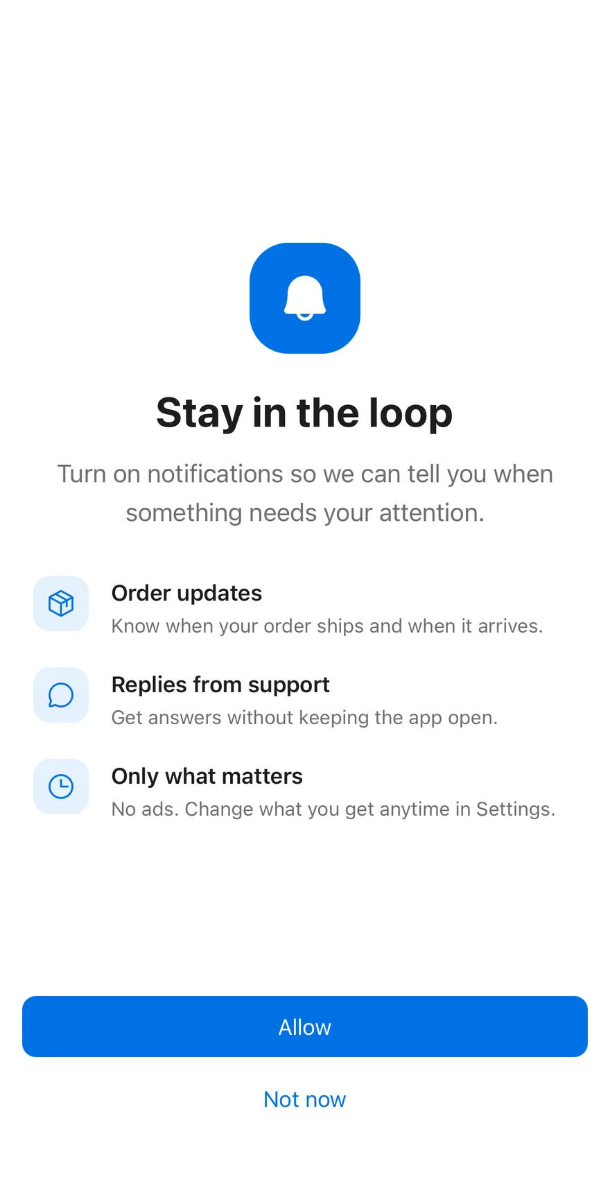
```tsx title="uniwind/components/blocks/permission-primer.tsx"
import {
BellIcon,
ChatCircleIcon,
ClockIcon,
PackageIcon,
type Icon as PhosphorIcon,
} from "phosphor-react-native"
import { ScrollView, View } from "react-native"
import { BottomBar, BottomBarContent } from "@/components/ui/bottom-bar"
import { Button } from "@/components/ui/button"
import { Icon } from "@/components/ui/icon"
import { Screen } from "@/components/ui/screen"
import { Text } from "@/components/ui/text"
type PermissionPrimerBenefit = {
icon: PhosphorIcon
title: string
description: string
}
const DEFAULT_BENEFITS: PermissionPrimerBenefit[] = [
{
icon: PackageIcon,
title: "Order updates",
description: "Know when your order ships and when it arrives.",
},
{
icon: ChatCircleIcon,
title: "Replies from support",
description: "Get answers without keeping the app open.",
},
{
icon: ClockIcon,
title: "Only what matters",
description: "No ads. Change what you get anytime in Settings.",
},
]
function PermissionPrimer({
icon = BellIcon,
title = "Stay in the loop",
description = "Turn on notifications so we can tell you when something needs your attention.",
benefits = DEFAULT_BENEFITS,
allowLabel = "Allow",
dismissLabel = "Not now",
onAllow,
onDismiss,
}: {
icon?: PhosphorIcon
title?: string
description?: string
benefits?: PermissionPrimerBenefit[]
allowLabel?: string
dismissLabel?: string
onAllow?: () => void
onDismiss?: () => void
}) {
return (
{title}
{description}
{benefits.map((benefit) => (
{benefit.title}
{benefit.description}
))}
)
}
export type { PermissionPrimerBenefit }
export { PermissionPrimer }
```
```swift title="swift/Blocks/PermissionPrimer.swift"
import PhosphorSwift
import SwiftUI
public struct PermissionPrimerBenefit: Identifiable {
public let id = UUID()
let icon: Image
let title: Text
let description: Text
public init(icon: Image, title: LocalizedStringKey, description: LocalizedStringKey) {
self.icon = icon
self.title = Text(title)
self.description = Text(description)
}
public init(icon: Image, verbatim title: String, description: String) {
self.icon = icon
self.title = Text(verbatim: title)
self.description = Text(verbatim: description)
}
}
public struct PermissionPrimer: View {
let icon: Image
let title: Text
let description: Text
let benefits: [PermissionPrimerBenefit]
let allowLabel: LocalizedStringKey
let dismissLabel: LocalizedStringKey
let onAllow: () -> Void
let onDismiss: () -> Void
public init(
icon: Image = Ph.bellRinging.duotone,
title: LocalizedStringKey = "Turn on notifications",
description: LocalizedStringKey = "We'll only let you know about things that matter to you. You can change this any time in Settings.",
benefits: [PermissionPrimerBenefit] = PermissionPrimer.notificationBenefits,
allowLabel: LocalizedStringKey = "Allow",
dismissLabel: LocalizedStringKey = "Not now",
onAllow: @escaping () -> Void,
onDismiss: @escaping () -> Void
) {
self.icon = icon
self.title = Text(title)
self.description = Text(description)
self.benefits = benefits
self.allowLabel = allowLabel
self.dismissLabel = dismissLabel
self.onAllow = onAllow
self.onDismiss = onDismiss
}
public static var notificationBenefits: [PermissionPrimerBenefit] {
[
PermissionPrimerBenefit(
icon: Ph.creditCard.regular,
title: "Payments",
description: "Know the moment money leaves or lands in your account."
),
PermissionPrimerBenefit(
icon: Ph.shieldCheck.regular,
title: "Security alerts",
description: "Hear about new sign-ins and unusual activity right away."
),
PermissionPrimerBenefit(
icon: Ph.chatCircle.regular,
title: "Messages",
description: "Get replies from friends and support without opening the app."
),
]
}
public var body: some View {
Screen {
KeyboardScrollView {
VStack(spacing: 0) {
icon
.frame(width: 44, height: 44)
.foregroundStyle(EsuissColor.primary)
.frame(width: 88, height: 88)
.background(Color.adaptive(light: EsuissColor.primary.opacity(0.1), dark: EsuissColor.primary.opacity(0.2)), in: RoundedRectangle(cornerRadius: Radius.xl3, style: .continuous))
.accessibilityHidden(true)
title
.scaledTextStyle(.xl2, weight: .bold)
.multilineTextAlignment(.center)
.padding(.top, 24)
.accessibilityAddTraits(.isHeader)
description
.scaledTextStyle(.lg)
.foregroundStyle(EsuissColor.mutedForeground)
.multilineTextAlignment(.center)
.padding(.top, 12)
VStack(alignment: .leading, spacing: 20) {
ForEach(benefits) { benefit in
HStack(alignment: .top, spacing: 14) {
benefit.icon
.frame(width: 22, height: 22)
.foregroundStyle(EsuissColor.primary)
.frame(width: 40, height: 40)
.background(EsuissColor.muted, in: RoundedRectangle(cornerRadius: Radius.lg, style: .continuous))
.accessibilityHidden(true)
VStack(alignment: .leading, spacing: 2) {
benefit.title
.scaledFont(.base, weight: .semibold)
benefit.description
.scaledTextStyle(.sm)
.foregroundStyle(EsuissColor.mutedForeground)
}
.frame(maxWidth: .infinity, alignment: .leading)
}
.accessibilityElement(children: .combine)
}
}
.padding(.top, 36)
}
.fixedSize(horizontal: false, vertical: true)
.frame(maxWidth: .infinity)
.padding(.horizontal, 24)
.padding(.top, 64)
.padding(.bottom, 24)
}
BottomBar(separator: false) {
BottomBarContent {
Button(allowLabel, action: onAllow)
.buttonStyle(.variant(.default, size: .lg, block: true))
Button(dismissLabel, action: onDismiss)
.buttonStyle(.variant(.plain, size: .lg, block: true))
}
}
}
}
}
```
```kt title="kotlin/blocks/PermissionPrimer.kt"
package com.esuiss.ui.blocks
import androidx.compose.foundation.background
import androidx.compose.foundation.layout.Arrangement
import androidx.compose.foundation.layout.Box
import androidx.compose.foundation.layout.BoxWithConstraints
import androidx.compose.foundation.layout.Column
import androidx.compose.foundation.layout.Row
import androidx.compose.foundation.layout.Spacer
import androidx.compose.foundation.layout.fillMaxSize
import androidx.compose.foundation.layout.fillMaxWidth
import androidx.compose.foundation.layout.height
import androidx.compose.foundation.layout.heightIn
import androidx.compose.foundation.layout.padding
import androidx.compose.foundation.layout.size
import androidx.compose.foundation.layout.widthIn
import androidx.compose.foundation.rememberScrollState
import androidx.compose.foundation.shape.CircleShape
import androidx.compose.foundation.shape.RoundedCornerShape
import androidx.compose.foundation.text.BasicText
import androidx.compose.foundation.verticalScroll
import androidx.compose.runtime.Composable
import androidx.compose.runtime.Immutable
import androidx.compose.ui.Alignment
import androidx.compose.ui.Modifier
import androidx.compose.ui.graphics.vector.ImageVector
import androidx.compose.ui.semantics.heading
import androidx.compose.ui.semantics.semantics
import androidx.compose.ui.text.font.FontWeight
import androidx.compose.ui.text.style.TextAlign
import androidx.compose.ui.unit.dp
import com.adamglin.PhosphorIcons
import com.adamglin.phosphoricons.Fill
import com.adamglin.phosphoricons.Regular
import com.adamglin.phosphoricons.fill.Bell
import com.adamglin.phosphoricons.regular.ChatCircle
import com.adamglin.phosphoricons.regular.Package
import com.adamglin.phosphoricons.regular.ShieldCheck
import com.esuiss.ui.components.BottomBar
import com.esuiss.ui.components.BottomBarContent
import com.esuiss.ui.components.Button
import com.esuiss.ui.components.ButtonSize
import com.esuiss.ui.components.ButtonVariant
import com.esuiss.ui.components.Icon
import com.esuiss.ui.components.Screen
import com.esuiss.ui.theme.EsuissTheme
import com.esuiss.ui.theme.Typography
@Immutable
class PermissionPrimerBenefit(
val icon: ImageVector,
val title: String,
val description: String,
)
private val DemoBenefits = listOf(
PermissionPrimerBenefit(PhosphorIcons.Regular.ChatCircle, "Messages", "Know right away when someone writes to you."),
PermissionPrimerBenefit(PhosphorIcons.Regular.Package, "Order updates", "See when your order ships and arrives."),
PermissionPrimerBenefit(PhosphorIcons.Regular.ShieldCheck, "Security alerts", "Get told about new sign-ins to your account."),
)
@Composable
fun PermissionPrimer(
modifier: Modifier = Modifier,
icon: ImageVector = PhosphorIcons.Fill.Bell,
title: String = "Turn on notifications",
description: String = "We only send what matters. You can change this anytime in Settings.",
benefits: List = DemoBenefits,
allowLabel: String = "Allow",
dismissLabel: String = "Not now",
onAllow: () -> Unit = {},
onDismiss: () -> Unit = {},
) {
val colors = EsuissTheme.colors
Screen(modifier) {
Column(Modifier.fillMaxSize()) {
BoxWithConstraints(Modifier.weight(1f)) {
val height = maxHeight
Column(
Modifier
.fillMaxSize()
.verticalScroll(rememberScrollState()),
) {
Column(
modifier = Modifier
.fillMaxWidth()
.heightIn(min = height)
.padding(horizontal = 24.dp, vertical = 32.dp),
verticalArrangement = Arrangement.Center,
horizontalAlignment = Alignment.CenterHorizontally,
) {
Box(
Modifier
.size(88.dp)
.background(colors.primary, RoundedCornerShape(22.dp)),
contentAlignment = Alignment.Center,
) {
Icon(icon, contentDescription = null, size = 44.dp, tint = colors.primaryForeground)
}
Spacer(Modifier.height(24.dp))
BasicText(
title,
modifier = Modifier.semantics { heading() },
style = Typography.xl3.copy(color = colors.foreground, fontWeight = FontWeight.Bold, textAlign = TextAlign.Center),
)
Spacer(Modifier.height(12.dp))
BasicText(
description,
modifier = Modifier.widthIn(max = 420.dp),
style = Typography.lg.copy(color = colors.mutedForeground, textAlign = TextAlign.Center),
)
Spacer(Modifier.height(36.dp))
Column(
modifier = Modifier.widthIn(max = 420.dp),
verticalArrangement = Arrangement.spacedBy(20.dp),
) {
benefits.forEach { BenefitRow(it) }
}
}
}
}
BottomBar {
BottomBarContent {
Button(allowLabel, onAllow, size = ButtonSize.Lg, block = true)
Button(dismissLabel, onDismiss, modifier = Modifier.fillMaxWidth(), variant = ButtonVariant.Plain)
}
}
}
}
}
@Composable
private fun BenefitRow(benefit: PermissionPrimerBenefit) {
val colors = EsuissTheme.colors
Row(
modifier = Modifier
.fillMaxWidth()
.semantics(mergeDescendants = true) {},
horizontalArrangement = Arrangement.spacedBy(16.dp),
verticalAlignment = Alignment.CenterVertically,
) {
Box(
Modifier
.size(44.dp)
.background(colors.primary.copy(alpha = if (colors.isDark) 0.2f else 0.1f), CircleShape),
contentAlignment = Alignment.Center,
) {
Icon(benefit.icon, contentDescription = null, size = 22.dp, tint = colors.primary)
}
Column(Modifier.weight(1f), verticalArrangement = Arrangement.spacedBy(2.dp)) {
BasicText(benefit.title, style = Typography.base.copy(color = colors.foreground, fontWeight = FontWeight.SemiBold))
BasicText(benefit.description, style = Typography.sm.copy(color = colors.mutedForeground))
}
}
}
```
A primer shown before a system permission prompt: a large icon, a title, a description and a list of benefits, each with its own icon. Allow and Not now buttons sit in a `BottomBar`. By default it asks for notifications.
## Installation
**React Native**
```bash title="Terminal"
npx shadcn@latest add @esuiss-rn/permission-primer
```
See [Installation](https://ui.suiss.app/docs/installation) for the `components.json` setup. Or use the suiss/ui CLI:
```bash title="Terminal"
npx @esuiss/ui@latest add permission-primer
```
**SwiftUI**
```bash title="Terminal"
npx @esuiss/ui@latest add permission-primer --platform swift
```
**Jetpack Compose**
```bash title="Terminal"
npx @esuiss/ui@latest add permission-primer --platform kotlin
```
The CLI also adds what it builds on: [Bottom Bar](https://ui.suiss.app/docs/components/bottom-bar), [Button](https://ui.suiss.app/docs/components/button), [Icon](https://ui.suiss.app/docs/components/icon), [Screen](https://ui.suiss.app/docs/components/screen), [Text](https://ui.suiss.app/docs/components/text).
### Manual
**React Native**
**Uniwind**
1. Install the dependencies:
```bash title="Terminal"
npx expo install phosphor-react-native react-native-svg
```
2. Add the pieces it builds on: [Bottom Bar](https://ui.suiss.app/docs/components/bottom-bar), [Button](https://ui.suiss.app/docs/components/button), [Icon](https://ui.suiss.app/docs/components/icon), [Screen](https://ui.suiss.app/docs/components/screen), [Text](https://ui.suiss.app/docs/components/text).
3. Copy the source into `components/blocks/permission-primer.tsx`:
- `uniwind/components/blocks/permission-primer.tsx`: shown above
4. Update the import paths to match your project.
**NativeWind**
1. Install the dependencies:
```bash title="Terminal"
npx expo install phosphor-react-native react-native-svg
```
2. Add the pieces it builds on: [Bottom Bar](https://ui.suiss.app/docs/components/bottom-bar), [Button](https://ui.suiss.app/docs/components/button), [Icon](https://ui.suiss.app/docs/components/icon), [Screen](https://ui.suiss.app/docs/components/screen), [Text](https://ui.suiss.app/docs/components/text).
3. Copy the source into `components/blocks/permission-primer.tsx`:
```tsx title="nativewind/components/blocks/permission-primer.tsx"
import {
BellIcon,
ChatCircleIcon,
ClockIcon,
PackageIcon,
type Icon as PhosphorIcon,
} from "phosphor-react-native"
import { ScrollView, View } from "react-native"
import { BottomBar, BottomBarContent } from "@/components/ui/bottom-bar"
import { Button } from "@/components/ui/button"
import { Icon } from "@/components/ui/icon"
import { Screen } from "@/components/ui/screen"
import { Text } from "@/components/ui/text"
type PermissionPrimerBenefit = {
icon: PhosphorIcon
title: string
description: string
}
const DEFAULT_BENEFITS: PermissionPrimerBenefit[] = [
{
icon: PackageIcon,
title: "Order updates",
description: "Know when your order ships and when it arrives.",
},
{
icon: ChatCircleIcon,
title: "Replies from support",
description: "Get answers without keeping the app open.",
},
{
icon: ClockIcon,
title: "Only what matters",
description: "No ads. Change what you get anytime in Settings.",
},
]
function PermissionPrimer({
icon = BellIcon,
title = "Stay in the loop",
description = "Turn on notifications so we can tell you when something needs your attention.",
benefits = DEFAULT_BENEFITS,
allowLabel = "Allow",
dismissLabel = "Not now",
onAllow,
onDismiss,
}: {
icon?: PhosphorIcon
title?: string
description?: string
benefits?: PermissionPrimerBenefit[]
allowLabel?: string
dismissLabel?: string
onAllow?: () => void
onDismiss?: () => void
}) {
return (
{title}
{description}
{benefits.map((benefit) => (
{benefit.title}
{benefit.description}
))}
)
}
export type { PermissionPrimerBenefit }
export { PermissionPrimer }
```
4. Update the import paths to match your project.
**StyleSheet**
1. Install the dependencies:
```bash title="Terminal"
npx expo install phosphor-react-native react-native-svg
```
2. Add the pieces it builds on: [Bottom Bar](https://ui.suiss.app/docs/components/bottom-bar), [Button](https://ui.suiss.app/docs/components/button), [Icon](https://ui.suiss.app/docs/components/icon), [Screen](https://ui.suiss.app/docs/components/screen), [Text](https://ui.suiss.app/docs/components/text).
3. Copy the source into `components/blocks/permission-primer.tsx`:
```tsx title="stylesheet/components/blocks/permission-primer.tsx"
import {
BellIcon,
ChatCircleIcon,
ClockIcon,
PackageIcon,
type Icon as PhosphorIcon,
} from "phosphor-react-native"
import { ScrollView, StyleSheet, View } from "react-native"
import { BottomBar, BottomBarContent } from "@/components/ui/bottom-bar"
import { Button } from "@/components/ui/button"
import { Icon } from "@/components/ui/icon"
import { Screen } from "@/components/ui/screen"
import { Text } from "@/components/ui/text"
import { fontSize, radius, useTheme } from "@/components/ui/theme"
function withAlpha(color: string, alpha: number) {
if (!color.startsWith("#") || color.length !== 7) return color
const r = Number.parseInt(color.slice(1, 3), 16)
const g = Number.parseInt(color.slice(3, 5), 16)
const b = Number.parseInt(color.slice(5, 7), 16)
return `rgba(${r}, ${g}, ${b}, ${alpha})`
}
type PermissionPrimerBenefit = {
icon: PhosphorIcon
title: string
description: string
}
const DEFAULT_BENEFITS: PermissionPrimerBenefit[] = [
{
icon: PackageIcon,
title: "Order updates",
description: "Know when your order ships and when it arrives.",
},
{
icon: ChatCircleIcon,
title: "Replies from support",
description: "Get answers without keeping the app open.",
},
{
icon: ClockIcon,
title: "Only what matters",
description: "No ads. Change what you get anytime in Settings.",
},
]
const styles = StyleSheet.create({
content: {
flexGrow: 1,
justifyContent: "center",
gap: 32,
paddingHorizontal: 24,
paddingVertical: 40,
},
intro: { alignItems: "center", gap: 12 },
tile: {
marginBottom: 12,
width: 80,
height: 80,
alignItems: "center",
justifyContent: "center",
borderRadius: radius["3xl"],
},
title: { ...fontSize["3xl"], fontWeight: "700", textAlign: "center" },
description: { ...fontSize.lg, textAlign: "center" },
list: { gap: 20 },
row: { flexDirection: "row", alignItems: "flex-start", gap: 16 },
badge: {
width: 40,
height: 40,
alignItems: "center",
justifyContent: "center",
borderRadius: radius.xl,
},
text: { flex: 1, gap: 2 },
benefitTitle: { ...fontSize.base, fontWeight: "600" },
benefitDescription: { ...fontSize.sm },
})
function PermissionPrimer({
icon = BellIcon,
title = "Stay in the loop",
description = "Turn on notifications so we can tell you when something needs your attention.",
benefits = DEFAULT_BENEFITS,
allowLabel = "Allow",
dismissLabel = "Not now",
onAllow,
onDismiss,
}: {
icon?: PhosphorIcon
title?: string
description?: string
benefits?: PermissionPrimerBenefit[]
allowLabel?: string
dismissLabel?: string
onAllow?: () => void
onDismiss?: () => void
}) {
const { colors, isDark } = useTheme()
return (
{title}
{description}
{benefits.map((benefit) => (
{benefit.title}
{benefit.description}
))}
)
}
export type { PermissionPrimerBenefit }
export { PermissionPrimer }
```
4. Update the import paths to match your project.
**SwiftUI**
1. Target iOS 17 or later.
2. Add the Swift package to your app:
```swift title="Package.swift"
.package(url: "https://github.com/phosphor-icons/swift", from: "2.1.0")
```
3. Copy the theme files every view uses:
- `swift/Theme/Theme.swift`: [source](https://github.com/e-suiss/ui/blob/main/packages/mobile/swiftui/Sources/EsuissUI/Theme/Theme.swift)
- `swift/Theme/Tokens.swift`: [source](https://github.com/e-suiss/ui/blob/main/packages/mobile/swiftui/Sources/EsuissUI/Theme/Tokens.swift)
4. Copy the source and every file it uses:
- `swift/Blocks/PermissionPrimer.swift`: shown above
- `swift/Components/BottomBar.swift`: see [Bottom Bar](https://ui.suiss.app/docs/components/bottom-bar.md)
- `swift/Components/Button.swift`: see [Button](https://ui.suiss.app/docs/components/button.md)
- `swift/Components/ButtonGroup.swift`: see [Button Group](https://ui.suiss.app/docs/components/button-group.md)
- `swift/Components/KeyboardScrollView.swift`: see [Keyboard Scroll View](https://ui.suiss.app/docs/components/keyboard-scroll-view.md)
- `swift/Components/Screen.swift`: see [Screen](https://ui.suiss.app/docs/components/screen.md)
- `swift/Components/TextVariant.swift`: [source](https://github.com/e-suiss/ui/blob/main/packages/mobile/swiftui/Sources/EsuissUI/Components/TextVariant.swift)
5. Add the files to your app target.
**Jetpack Compose**
1. Set `minSdk` to 24 or higher and add the dependencies:
```kotlin title="build.gradle.kts"
implementation(platform("androidx.compose:compose-bom:2026.09.00"))
implementation("androidx.compose.foundation:foundation")
implementation("androidx.compose.ui:ui")
implementation("com.adamglin:phosphor-icon-android:1.0.0")
```
2. Copy the theme files every view uses:
- `kotlin/theme/Theme.kt`: [source](https://github.com/e-suiss/ui/blob/main/packages/mobile/kotlin/ui/src/main/kotlin/com/esuiss/ui/theme/Theme.kt)
- `kotlin/theme/Tokens.kt`: [source](https://github.com/e-suiss/ui/blob/main/packages/mobile/kotlin/ui/src/main/kotlin/com/esuiss/ui/theme/Tokens.kt)
3. Copy the source and every file it uses:
- `kotlin/blocks/PermissionPrimer.kt`: shown above
- `kotlin/components/BottomBar.kt`: see [Bottom Bar](https://ui.suiss.app/docs/components/bottom-bar.md)
- `kotlin/components/Button.kt`: see [Button](https://ui.suiss.app/docs/components/button.md)
- `kotlin/components/ButtonGroup.kt`: see [Button Group](https://ui.suiss.app/docs/components/button-group.md)
- `kotlin/components/Content.kt`: [source](https://github.com/e-suiss/ui/blob/main/packages/mobile/kotlin/ui/src/main/kotlin/com/esuiss/ui/components/Content.kt)
- `kotlin/components/Icon.kt`: see [Icon](https://ui.suiss.app/docs/components/icon.md)
- `kotlin/components/Screen.kt`: see [Screen](https://ui.suiss.app/docs/components/screen.md)
4. Update the `com.esuiss.ui` package names to match your project.
## Usage
```tsx
import { PermissionPrimer } from "@/components/blocks/permission-primer"
```
```tsx
```
Every piece is a prop: `icon`, `title`, `description`, `benefits`, `allowLabel` and `dismissLabel`. Request the real permission in `onAllow` and close the screen in `onDismiss`.